True S/R Ultimate [Wonra]# True S/R Ultimate - TradingView Description
## Short Description (for script settings)
```
Volume-weighted Support & Resistance levels with buyer/seller pressure analysis. Shows the strongest levels based on historical price reactions and trading volume.
```
## Full Description
```
█ OVERVIEW
True S/R Ultimate identifies genuine support and resistance levels by analyzing historical pivot points weighted by trading volume. Unlike traditional S/R indicators that draw lines everywhere, this indicator filters and displays only the strongest levels where significant trading activity occurred.
The indicator uses a multi-factor approach:
• Volume accumulation at each price level
• Number of times price has touched/reacted to the level
• Buyer vs Seller pressure ratio at each zone
█ HOW IT WORKS
The indicator detects pivot highs and lows across your specified lookback period. When multiple pivots occur near the same price, they are grouped together, and their volumes are accumulated. This creates "volume clusters" that represent areas where traders have historically found value.
LEVEL NAMING:
• S1, S2, S3... = Support levels (below current price), ranked by volume strength
• R1, R2, R3... = Resistance levels (above current price), ranked by volume strength
• S1/R1 = Strongest level with highest accumulated volume
• S5/R5 = Weakest displayed level
█ READING THE LABELS
Each level displays:
┌─────────────────────────────────┐
│ R2 │ 1,789 │ ← Level name + Price
│ Vol: 21.8M │ 🟢 BUY 64% │ ← Volume + Dominant pressure
└─────────────────────────────────┘
VOLUME (Vol):
Shows the total accumulated trading volume at this level. Higher volume = stronger level.
• K = Thousands (1K = 1,000)
• M = Millions (1M = 1,000,000)
• B = Billions (1B = 1,000,000,000)
PRESSURE INDICATOR:
• 🟢 BUY XX% = Buyers were dominant at this level (bullish pressure)
• 🔴 SELL XX% = Sellers were dominant at this level (bearish pressure)
• Percentage shows the strength of the dominant side
█ COLOR CODING
The indicator uses smart color coding based on WHO was in control at each level:
GREEN/TEAL ZONES (🟢 BUY pressure > 50%):
• Buyers were more aggressive when price hit this level
• For SUPPORT: Strong buy interest, likely to bounce again
• For RESISTANCE: May break through as buyers are willing to pay higher
RED ZONES (🔴 SELL pressure > 50%):
• Sellers were more aggressive when price hit this level
• For RESISTANCE: Strong selling pressure, likely to reject again
• For SUPPORT: Weaker support, may break down
█ HOW TO USE
SCENARIO 1: Price approaching GREEN Support (e.g., S1 with 🟢 BUY 76%)
✓ This is a HIGH-PROBABILITY bounce zone
✓ Previous touches showed strong buyer absorption
✓ Consider LONG entries with stop below the zone
SCENARIO 2: Price approaching RED Resistance (e.g., R1 with 🔴 SELL 71%)
✓ This is a HIGH-PROBABILITY rejection zone
✓ Previous touches showed strong seller distribution
✓ Consider SHORT entries with stop above the zone
SCENARIO 3: Price approaching GREEN Resistance (e.g., R2 with 🟢 BUY 64%)
⚠ This resistance may be WEAK
⚠ Buyers were aggressive here before - may break through
⚠ Wait for confirmation before shorting
SCENARIO 4: Price approaching RED Support (e.g., S3 with 🔴 SELL 72%)
⚠ This support may be WEAK
⚠ Sellers were aggressive here - may break down
⚠ Be cautious with long entries
█ WHY LEVELS ABOVE PRICE CAN BE GREEN
When you see a RESISTANCE level (above current price) colored GREEN:
• It means when price was previously AT that level, BUYERS were dominant
• This doesn't mean the level is now support
• It means if price revisits this zone, it might break THROUGH (not reject)
• The buying pressure from before suggests demand at that price
Conversely, when you see a SUPPORT level (below price) colored RED:
• Previous touches showed sellers were in control
• This support may be weaker than it appears
• Consider tighter stop losses if going long at this level
█ SETTINGS
📊 MAIN SETTINGS
• Lookback Bars: How far back to analyze (default: 500)
• Minimum Touches: Required reactions to form a valid level (default: 2)
• Zone Width: Tolerance for grouping similar prices (default: 1%)
• Pivot Length: Sensitivity for detecting pivots (default: 5)
🎨 DISPLAY
• Max Levels: How many S/R levels to show per side (default: 5)
• Show Zone Boxes: Visual boxes around each level
🎨 COLORS
• Bullish/Buyers: Color for buy-dominated zones
• Bearish/Sellers: Color for sell-dominated zones
█ BEST PRACTICES
1. Use on higher timeframes (4H, Daily) for stronger levels
2. Combine with other confluence (trendlines, EMAs, Fibonacci)
3. Watch for volume confirmation when price approaches a level
4. S1/R1 are your primary levels - trade these with more size
5. S4/S5 or R4/R5 may be weaker - use confirmation
█ ALERTS
The indicator includes built-in alert conditions:
• "Near Support" - Price approaching strongest support
• "Near Resistance" - Price approaching strongest resistance
█ CREDITS
Developed by Wonra
Concept: Volume Profile meets Smart Money Concepts
```
## Tags (for TradingView)
```
support, resistance, volume, levels, zones, institutional, smart-money, supply-demand, order-flow, volume-profile
```
볼륨

MarketMind LITEM🜁rketMind LITE ────────────────────
Essential Market Awareness, Reduced to Its Core
M🜁rketMind LITE is a lightweight market awareness tool designed to display essential situational context .
It provides basic orientation and movement awareness without interpretation, risk framing, diagnostics, or decision guidance.
This script is designed as a standalone awareness layer. It does not evaluate trade quality, issue signals, or influence decision-making.
WHAT IT DOES ────────────────────
M🜁rketMind LITE presents a minimal, static view of current market conditions focused entirely on awareness rather than analysis.
The system displays only essential context, allowing traders to stay oriented without introducing judgment, noise, or implied direction.
The script provides visibility into:
Time-of-day session context
Basic market regime classification (trending, range-bound, mixed)
Short-term momentum direction only (up, down, neutral)
A clean, static HUD display
M🜁rketMind LITE also includes a minimal visual state indicator that reflects recent price responsiveness, intended to be observed over time alongside the trader’s own experience.
The goal is to support awareness without influence .
HOW TO USE IT ────────────────────
M🜁rketMind LITE is not a signal generator.
It is designed to remain visible in the background of any chart, offering quiet orientation while traders rely entirely on their own process for analysis and execution.
Common use cases include:
Maintaining session awareness
Preserving context during focused trading periods
Reducing cognitive load while monitoring markets
M🜁rketMind LITE does not evaluate risk, alignment, or opportunity.
It simply shows what is happening.
DESIGN PHILOSOPHY ────────────────────
M🜁rketMind LITE is intentionally minimal.
It includes only essential awareness elements and excludes all interpretive or evaluative logic:
Situational context only
Directional momentum (up / down / neutral)
No diagnostics, confidence, or conviction framing
No process, risk, or quality assessment
Presentation controls only (HUD on/off, size, position)
Nothing is inferred.
Nothing is suggested.
This script shows market state without interpretation.
WHO IT IS FOR ────────────────────
M🜁rketMind LITE is suited for traders who:
Want passive situational awareness
Prefer minimal on-chart information
Already operate with a defined decision process
It is not designed for:
Analytical or diagnostic use
Risk evaluation or context synthesis
Traders seeking guidance or confirmation
IMPORTANT NOTES ────────────────────
M🜁rketMind LITE does not provide financial advice
No system can predict future price behavior
This tool is designed for awareness only
Used appropriately, M🜁rketMind LITE helps traders stay oriented without interference.

MarketMind PRO+M🜁rketMind PRO+ ────────────────────
Advanced Market Interpretation & Conviction Context
M🜁rketMind PRO+ is an advanced market interpretation system designed for traders who require structured insight into alignment, stability, and contextual agreement — without alerts, signals, or hindsight-based indicators.
Rather than issuing instructions or trade direction, M🜁rketMind PRO+ focuses on interpreting how market conditions relate to one another , whether internal agreement is present, and whether the environment supports conviction or restraint.
This script is designed as a standalone interpretive analysis tool. It does not provide execution guidance or predictive guarantees.
WHAT IT DOES ────────────────────
M🜁rketMind PRO+ evaluates current market conditions across multiple analytical dimensions — including macro environment, sector behavior, momentum, structure, liquidity, stability, and session dynamics — and synthesizes them into a structured, human-readable HUD.
In addition to describing what is happening, the system interprets internal agreement and contextual coherence , helping traders understand whether conditions appear supportive, fragile, or transitional.
The script provides insight into:
Market bias and directional alignment
Regime and phase behavior across sessions
Momentum quality, degradation, and stall dynamics
Internal agreement and alignment consistency
Structural stability and transition risk
Contextual factors that may support or undermine conviction
The goal is to clarify how well conditions agree internally , not to tell traders what action to take.
HOW TO USE IT ────────────────────
M🜁rketMind PRO+ is not a signal generator.
It is designed to complement discretionary price action, rule-based systems, or systematic strategies by helping traders evaluate higher-order context, such as:
How aligned are current conditions, and how broad is that agreement?
Is momentum supported, fragile, or deteriorating?
Does the environment appear stable, transitional, or deceptive?
Does this context justify conviction, or suggest restraint?
M🜁rketMind PRO+ emphasizes synthesis over reaction, preserving chart clarity while providing interpretive depth.
DESIGN PHILOSOPHY ────────────────────
M🜁rketMind PRO+ is intentionally interpretive.
It focuses on contextual agreement and stability , rather than isolated signals or prescriptive outputs:
Multi-dimensional context and alignment interpretation
Internal agreement and coherence awareness
Stability and transition sensitivity
Session-aware interpretive framing
No alerts, entries, or execution logic
No forward performance claims or guarantees
Nothing is instructed.
Nothing is promised.
This script explains how conditions relate , not what to trade.
WHO IT IS FOR ────────────────────
M🜁rketMind PRO+ is suited for traders who:
Require interpretive context beyond surface-level awareness
Manage exposure across changing regimes
Value understanding alignment, stability, and agreement
Prefer synthesis over single-indicator workflows
It is not designed for:
Buy or sell alerts
Automated execution systems
Traders seeking prescriptive instructions
IMPORTANT NOTES ────────────────────
M🜁rketMind PRO+ does not provide financial advice
No system can predict future price behavior with certainty
This tool is designed to support judgment, not replace it
Used appropriately, M🜁rketMind PRO+ helps traders operate with greater selectivity, contextual clarity, and risk awareness

GC1 Participation Regime - sudoThis indicator analyzes COMEX GC1! futures activity and maps it directly onto your XAU price chart, allowing you to see when gold futures participation meaningfully increases or fades - without cluttering your workflow.
Here is the TLDR version of the description (below):
The "regime" is calculated by measuring how active GC1! futures are, compared to their own recent history. On each bar, the indicator looks at two things - volume (how much trading occurred) and true range (how much price actually moved). Each of these is compared to its recent average using a normalized score, which simply answers whether today’s activity is higher, normal, or lower than usual. Those two normalized values are then combined into a single participation score , optionally smoothed to reduce noise. That score is compared against user-defined thresholds and classified into one of four regimes - Low, Normal, High, or Extreme participation . In short, the regime shows whether current GC1! futures activity is unusually quiet or unusually active relative to its own recent behavior , without making any directional assumptions.
What this indicator does
-Measures GC1! futures volume and true range relative to their own historical behavior using z-scores
-Combines those metrics into a single participation score
-Classifies the market into four participation regimes
Low
Normal
High
Extreme
Projects those regimes directly onto the XAU price chart
Visual elements
Background shading
-Gray - Low participation
-Blue - Normal participation
-Green - High participation
-Orange - Extreme participation
Regime shift markers
-Upward triangle below price when participation increases
-Downward triangle above price when participation decreases
Volume-informed candle coloring (optional)
-High GC volume + bullish candle
-High GC volume + bearish candle
-Low GC volume + bullish candle
-Low GC volume + bearish candle
These visuals help you instantly identify whether price movement is occurring with real futures participation or during thinner conditions.
How to use it
-Identify high-quality environments for execution when participation is elevated
-Filter breakouts, trends, and reversals based on whether GC futures are involved
-Avoid overconfidence during low-participation regimes, where price moves are more prone to failure
-Use regime transitions as context , not signals!!
-This indicator is designed to be contextual , not predictive .
Customization
-Adjustable lookback lengths for volume and range
-Fully tunable regime thresholds
-Optional background shading
-Optional regime shift markers
-Optional candle recoloring based on GC volume behavior
Everything can be dialed up or down depending on how visually minimal you want your chart to be.
Notes
-Built specifically around COMEX GC1! futures
-Designed to disappear if GC data is unavailable
-Works on all intraday and higher timeframes

BK AK-Ghost Ladder⚔️ BK AK-Ghost Ladder — Smart Money Gaps. True Support/Resistance. ⚔️
There are already some excellent FVG tools out there—built by traders who’ve put in real work studying imbalance, liquidity, and smart money behavior.
BK AK-Ghost Ladder is simply my version of that idea: my attempt to take what I learned from those great frameworks and push it further into volume, structure, lifecycle, and accountability—so every zone is treated as a living, graded object, not just a static box on a chart.
Why “Ghost Ladder”? Because the real market is full of invisible rungs—thin pockets of liquidity, imbalance steps, and defended boundaries that price climbs and falls through like a ladder you can’t see until it matters. This tool is built to reveal those rungs before you get punished by them.
“AK” in the name is not branding—it’s honor. It belongs to my mentor A.K., whose standard of discipline and clarity sits behind every decision in this tool. Above that, all glory and gratitude to Gd—the real source of any wisdom, edge, or endurance we have in this game.
🧠 What BK AK-Ghost Ladder Actually Does
This is a full institutional FVG/SR system, not a paintbrush. It:
Detects and manages bullish & bearish FVG zones using ATR/percent filters and aging logic
Assigns a 0–100 institutional strength score and 1–5★ rating to every zone
Builds a per-zone lower-timeframe volume profile with POC, volume delta, and optional volume text
Tracks historical touches, breaks, role reversals, merging, clustering, and divergence at the zone
Runs per-zone backtest stats and feeds that into an adaptive/ML-style confidence weight
Compresses the whole environment into a real-time Info Table: bias, market position, nearest S/R, risk, session
Fires alerts only when something actually matters: strong FVGs, magnetic pull, divergence at a level
If price is the map, this is the layer that tells you which levels are real and which are noise.
🧱 Core Engine — Institutional Zone Logic
Smart FVG Detection
Clean 3-bar gap logic for bullish & bearish FVGs
ATR or % based minimum gap size + optional distance filter from price
Zone aging with max life in bars and optional “reset on touch”
Overlap & proximity control:
Prevent overlapping zones
Enforce minimum bar spacing
Or keep only the strongest zone in a cluster
Institutional Strength & Rating
Each zone gets a score (0–100) + star rating (1–5★) based on:
Volume vs average (with optional lower timeframe split)
Gap size vs ATR
Pivot confluence
Historical meaningful touches
Role reversal (support ↔ resistance)
MTF FVG alignment
Session weighting (Asian / London / NY / overlaps)
Order block overlap & imbalance behavior
VWAP proximity/extremes
Fib level alignment
Delta divergence
Zone clustering & consolidation
Adaptive “performance weight” from historical reactions
Bad zones don’t just look weaker—they literally get filtered out when you enable minimum star / institutional filters.
📊 In-Zone Volume & Profile Intelligence
Each zone can be backed by lower-timeframe volume:
Per-zone volume histogram inside the gap
POC line at the most traded price in that zone
Optional total volume label
POC line color shifts with volume delta (buy vs sell pressure)
Additional bull/bear volume bars alongside the zone and/or numeric volume text inside the box
You’re not just staring at a gap—you’re seeing the liquidity pocket inside the gap.
🎯 Structure, Confluence & Role Reversal
The engine includes deep structural context:
Pivots: stored swing highs/lows for S/R confluence
MTF FVG Confluence: two extra timeframes for higher-timeframe alignment
Fibonacci Levels: auto-mapped 0.236 / 0.382 / 0.5 / 0.618 / 0.786 with optional lines & labels
Order Blocks & Imbalance: engulfing OB detection + volume/imbalance filters
VWAP Intelligence: VWAP proximity/extreme bonuses, optional short-form plotting
Delta Divergence: volume-based confirmation flags for zones under real internal pressure
Smart S/R Positioning & Role Flip
Hide “wrong side” zones or auto-flip roles when broken & retested
Track broken zones for N bars, then retire them
Mark role reversals with badges and strength bonuses
Support/resistance is treated like behavior, not just lines.
🤖 Adaptive Learning & Backtesting
Each zone is monitored when price touches it:
Checks if price respects the zone and moves X points away (success)
Or violates beyond failure threshold (failure)
Tracks successes, failures, and win rate per zone
Feeds a confidence score into an adaptive weight so consistently performing zones matter more
Zones that meet the bar get ML/🤖 marking when enabled
The script doesn’t just say “this looks strong”—it tracks how it actually behaved.
📋 Info Table & Sessions — On-Chart War Room
On the latest bar, an Info Table summarizes:
Zone count (bull vs bear)
Market position (NEAR SUPPORT / NEAR RESISTANCE / ABOVE RESISTANCE / BELOW SUPPORT / NEUTRAL)
Nearest S/R levels
Trade bias (BULLISH / BEARISH / NEUTRAL)
Active session (ASIAN / LONDON / NY / OVERLAP / OFF)
Risk level (LOW / MED / HIGH)
Sessions are coded in EST with multipliers so you can weight London/NY more heavily than Asia if that matches your playbook.
Hover the table for a strategy tooltip: live market posture, suggested behavior near the zones, and context around the current environment.
⚠ Divergence & Alerts
Real-time RSI/OBV/ADX divergence detection at the zone
Flexible visual modes: border, icon, color change, or combinations
Alerts included:
Magnetic Zone Pull (price entering ATR-based “field” of a strong zone)
Strong Bullish FVG
Strong Bearish FVG
Divergence at Zone
Let the chart call you when a real decision point appears, instead of forcing you to stare all day.
🕹 How to Use BK AK-Ghost Ladder
1️⃣ Build Bias With Structure
Use the Info Table, star ratings, and where the 4–5★ zones cluster relative to price to decide which side of the tape you’re allowed to trade on.
2️⃣ Only Trade From Strong, Aligned Zones
Focus on 4–5★ zones with confluence (pivots, Fib, OB, VWAP, clustering).
Use the zone body/wick region as your execution area, not some random mid-air candle.
3️⃣ Treat Role Reversal & Clusters as Campaign Nodes
When a strong zone breaks, flips role, and collects touches, that’s campaign territory—not scalp noise.
4️⃣ Use Divergence/Delta as a Brake, Not a Toy
If divergence lights up at your level, respect it: size down, wait for confirmation, or stand down.
5️⃣ Let the Engine Filter Junk For You
Tune volMultiplier, star thresholds, session multipliers, distance filters, and min star rating to match your timeframe and instrument.
This script’s job is to remove your excuse for taking low-quality trades.
📜 Boundaries & Wisdom
King Solomon wrote:
“Do not remove the ancient boundary stone that your fathers have set.”
This tool is built around that idea. It maps where the real boundaries live—where smart money defends, attacks, traps, and reverses.
It will not give you discipline. It will simply remove the illusion that “you didn’t know the level was there.”
⚔️ BK AK-Ghost Ladder — Map the Smart Money Gaps. Trade Only the Real Levels.
May Gd bless your vision, your patience, and every decision you make at the edge. 🙏

Session Volume Profile - Asia London NYSession Volume Profile – Asia, London, NY
Description
OVERVIEW
Session Volume Profile is a technical analysis indicator designed to visualize how volume is distributed during the three primary global trading sessions: Asia, London, and New York. The script separates intraday volume data into time-defined sessions to help traders observe where trading activity concentrated and how value areas evolve as liquidity transitions between regions.
This indicator is intended for market structure and contextual analysis, not signal generation.
TECHNICAL OUTPUT
For each enabled session, the indicator calculates and displays:
Point of Control (POC)
The price level with the highest traded volume during the session.
Value Area High / Low (VAH / VAL)
The price range containing a user-defined percentage of total session volume (commonly 70%).
Session Volume Histogram
A horizontal volume-at-price visualization showing relative participation across price levels, highlighting high- and low-volume areas.
CALCULATION FRAMEWORK
Session Segmentation
Sessions are identified using exchange-based time boundaries. Each session is processed independently to prevent overlap and ensure clean separation of volume data.
Volume Binning
Intraday volume is allocated into discrete price buckets using an array-based structure. The resolution of these buckets is controlled by the Histogram Density input.
Value Area Expansion
The script identifies the session’s POC and expands outward in both directions until the selected percentage of total volume is reached, defining the Value Area High and Low.
HOW TO USE
Session Context
Observe how price reacts to prior-session POC and value areas when a new session begins.
Customization Controls
Individual sessions can be enabled or disabled, and visual opacity can be adjusted to maintain clarity on lower timeframes.
Session Awareness
An optional countdown timer displays remaining session time to help traders stay aware of upcoming liquidity transitions.
DESIGN NOTES
This indicator visualizes historical volume distribution only. It does not identify specific participants or predict future price behavior. All calculations are derived exclusively from price and volume data available on the chart.
DISCLAIMER
This script is provided for educational and analytical purposes only. It does not generate trade signals, alerts, or financial advice. Historical volume distributions do not guarantee future market behavior.

Dark Pool Pulse - Volume Pressure OscillatorDark Pool Pulse – Volume Pressure Oscillator
Description
OVERVIEW
Dark Pool Pulse is a protected technical analysis oscillator designed to visualize changes in directional volume pressure over time. The indicator transforms cumulative buying and selling activity into a normalized oscillator to help traders contextualize periods of relative market stability versus expansion.
The script is intended as a market condition visualization tool, not a signal generator.
CORE CONCEPT
The indicator evaluates the balance between buying and selling volume by tracking cumulative directional pressure. This pressure is used as a proxy for broader liquidity behavior, allowing traders to assess whether price action is occurring in a relatively stable environment or during periods of accelerating participation.
Rather than focusing on individual candles, the oscillator emphasizes persistence of volume imbalance across a rolling window.
CALCULATION FRAMEWORK
Directional Volume Pressure
The script measures the difference between buying and selling volume on each bar and accumulates this value over time to form a Net Pressure series.
Normalization Process
To make pressure comparable across symbols and timeframes, the cumulative series is normalized using a dynamic lookback window. This process scales the output to a bounded range between 0 and 100.
Oscillator Construction
The normalized pressure value is plotted as a single oscillator, allowing traders to observe shifts in participation intensity rather than raw volume magnitude.
INTERPRETING THE OSCILLATOR
60–100: Relative Stability
Indicates sustained volume balance and slower pressure changes, often associated with consolidation or mean-reverting conditions.
0–40: Relative Expansion
Indicates persistent directional pressure, often associated with momentum-driven or higher-volatility environments.
These zones are contextual references, not predictive thresholds.
DESIGN INTENT & LIMITATIONS
Dark Pool Pulse does not identify specific participants, venues, or transactions. It does not measure actual dark pool activity and should not be interpreted as such. All calculations are derived solely from publicly available price and volume data.
The script does not generate trade signals, alerts, or execution guidance.
SOURCE & DISCLAIMER
Published as a protected script to preserve the specific normalization techniques used in the pressure calculations.
This indicator is provided for educational and analytical purposes only and should be used alongside other forms of technical analysis.

Candle Strength Analyzer by The Ultimate Bull Run🎯 WHAT IT MEASURES
The score combines 4 key factors:
1️⃣ BODY RATIO (30%)
How much of the candle is "body" vs "wicks"
• 90%+ = Marubozu (very strong)
• 70%+ = Strong
• <30% = Weak/Indecision
2️⃣ CLOSE POSITION (25%)
Where the candle closed within its range
• Bullish closing near high = Strong
• Bearish closing near low = Strong
• Closing in middle = Weak
3️⃣ RELATIVE VOLUME - RVOL (25%)
Current volume compared to average
• RVOL 2.0+ = Very high activity
• RVOL 1.5+ = High (confirmed move)
• RVOL <0.7 = Low (unconfirmed)
4️⃣ SIZE vs ATR (20%)
Candle size compared to typical volatility
• 2x ATR = Large, significant
• 1x ATR = Normal
• 0.5x ATR = Small, insignificant

ADP Heiken Ashi [Wonra]**Heiken Ashi candles dynamically colored by Accumulation/Distribution Pressure (ADP) zones for enhanced trend visualization**
---
## 📝 Full Description:
### ADP Heiken Ashi
This indicator combines **Heiken Ashi candles** with **Accumulation/Distribution Pressure (ADP)** analysis to provide enhanced trend visualization through dynamic candle coloring.
---
### 🔬 How It Works
**Accumulation/Distribution Pressure (ADP)** is a volume-weighted momentum oscillator that measures buying and selling pressure on a 0-100 scale:
- **ADP < 45**: Accumulation Zone (buying pressure dominant)
- **ADP > 55**: Distribution Zone (selling pressure dominant)
- **ADP 45-55**: Neutral Zone (balanced pressure)
**The Calculation:**
1. Price change is compared to True Range to determine directional strength
2. Volume is applied as a weight to amplify significant moves
3. RMA smoothing creates a stable 0-100 oscillator
4. A JMA (Jurik Moving Average) signal line provides trend context
**Heiken Ashi candles** are then colored based on the ADP zone:
- **Bright Green**: Bullish HA candle in Accumulation Zone with rising ADP
- **Bright Red**: Bearish HA candle in Distribution Zone with falling ADP
- **Orange**: Bullish HA in Distribution (potential exhaustion warning)
- **Blue**: Bearish HA in Accumulation (potential reversal brewing)
---
### 🎨 Visual Guide
| Candle Color | Meaning |
|--------------|---------|
| **Bright Green** | Strong bullish momentum + smart money accumulating |
| **Light Green** | Bullish but neutral zone - proceed with caution |
| **Bright Red** | Strong bearish momentum + distribution underway |
| **Light Red** | Bearish but neutral zone - watch for changes |
| **Orange** | Bullish price but distribution detected - warning |
| **Blue** | Bearish price but accumulation detected - reversal possible |
---
### ⚙️ Settings
**ADP Settings:**
- `ADP Period` (default: 14): Lookback period for pressure calculation
- `AD Weight`: Balance between pure AD ratio and signed weighting
- `Price Weighted Volume`: Apply price as additional volume weight
**JMA Signal Settings:**
- `JMA Length` (default: 21): Smoothing period for signal line
- `JMA Phase`: Overshoot control (-100 to +100)
- `JMA Power`: Smoothness factor (1-5)
**Zone Settings:**
- `Accumulation Zone`: ADP level below which accumulation is detected
- `Distribution Zone`: ADP level above which distribution is detected
---
### 📊 Info Panel
The top-right panel displays:
- Current ADP value with zone coloring
- JMA signal line value
- Current zone status (Accumulation/Distribution/Neutral)
- ADP momentum direction (Rising/Falling)
---
### 📈 Best Use Cases
- **Trend Confirmation**: Verify trend strength through zone analysis
- **Divergence Detection**: Price vs ADP zone divergence
- **Momentum Analysis**: Track accumulation/distribution phases
- **Context Overlay**: Use alongside other analysis tools
---
### ⚠️ Important Notes
- This is a **visualization tool**, not a trading signal generator
- Heiken Ashi candles smooth price action and may lag real prices
- Always combine with other analysis methods
- Past performance does not guarantee future results
---
### 🔄 Version History
**v1.1**
- Simplified to pure visualization tool
- Enhanced ADP zone coloring
- Added JMA signal line for context
- Streamlined info panel
---
**Created by Wonra | 2025**

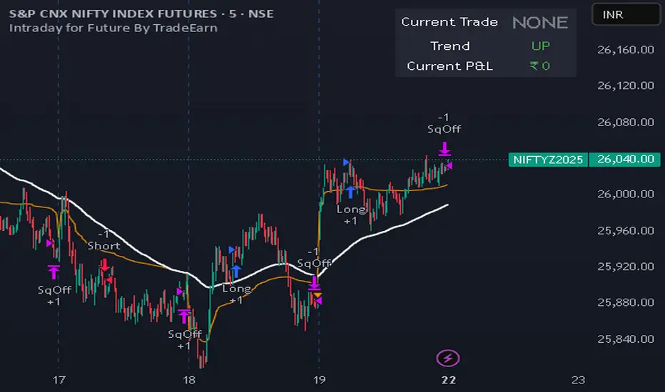
Intraday for Future By TradeEarnIntraday Strategy (StochRSI + VWAP + EMA)
Overview The Intraday Pullback Scalper is a specialized trend-following strategy designed for futures and equity traders who prefer to enter existing trends on pullbacks rather than chasing breakouts. By combining volume-weighted data (VWAP) with exponential moving averages (EMA) and momentum oscillators (Stochastic RSI), this script identifies high-probability entry points during intraday sessions. It includes built-in automation hooks (Alerts) compatible with bridge services for seamless execution.
How It Works
The strategy relies on a three-step confirmation process to filter noise and precision-time entries:
Trend Definition (The Filter):
VWAP (Volume Weighted Average Price): Acts as the primary regime filter. Longs are only permitted if price > VWAP; Shorts only if price < VWAP.
EMA (Exponential Moving Average): A secondary trend filter (default 100 periods) ensures alignment with the broader trend.
Time Range Breakout (Optional): Users can enable an "Initial Balance" filter where trades are only taken if the price breaks out of a specific time range (e.g., first hour High/Low).
Entry Trigger (The Signal):
Long Entry: The market must be in an Uptrend (Price > VWAP & EMA). The script waits for a "dip" where the Stochastic RSI drops below the Oversold level (default 20) and then crosses back up.
Short Entry: The market must be in a Downtrend (Price < VWAP & EMA). The script waits for a "rally" where the Stochastic RSI rises above the Overbought level (default 80) and then crosses back down.
Risk Management:
The strategy uses fixed Target Profit and Stop Loss values defined in currency (₹) relative to the trade quantity.
It features visual SL and TP lines on the chart for the duration of the trade to assist with manual monitoring.
Key Features
Universal Compatibility: Works on the "Current Chart" (Nifty, Bank Nifty, Stocks, Commodities) without needing complex dropdown selection.
Visual Dashboard: An on-screen table displays the Current Trade Status (Long/Short), Trend Direction, and Running P&L in real-time.
Algobaba Bridge Ready: Pre-formatted alert messages are included for users utilizing the Algobaba bridge for automation (supports MIS/NRML product types).
Customizable Trend Filters: Users can toggle the Time Range filter or adjust the VWAP Anchor (Session, Week, Month).
Settings & Configuration
Trade Quantity: Set your default lot size (e.g., 50 for Nifty).
Risk Settings: Define Target and Stop Loss in Rupees (₹) per trade setup.
Indicators: Adjustable lengths for EMA, RSI, and Stochastic.
Trading Window: Restrict entries to specific session hours (e.g., 09:15 - 15:10).
⚠️ IMPORTANT DISCLAIMER & RISK WARNING ⚠️
1. Educational Purpose Only This strategy script is provided solely for educational, informational, and research purposes. It does not constitute financial advice, investment recommendations, or a solicitation to buy or sell any securities, futures, or derivatives. The author is not a SEBI registered Research Analyst or Investment Advisor.
2. No Guarantee of Profit The "P&L" and performance metrics displayed on the chart are hypothetical and based on historical data. Past performance is not indicative of future results. Market conditions change, and a strategy that worked in the past may fail in the future.
3. Limitations of Backtesting
Slippage & Commission: The script results may not fully account for real-world execution costs such as broker commissions, taxes (STT/GST), slippage, or liquidity issues.
Repainting/Data Lag: While every effort is made to ensure code stability, real-time data feeds may vary from historical data due to internet latency or data provider differences.
4. High Risk in Derivatives Trading Futures and Options (F&O) involves a substantial risk of loss and is not suitable for every investor. You can lose more than your initial capital. Please assess your risk tolerance and financial situation before trading.
5. Automation & Third-Party Tools This script includes alert messages formatted for third-party bridge services (e.g., Algobaba). The author assumes no responsibility for:
Technical failures, API errors, or connectivity issues with your broker or bridge provider.
Incorrect order execution resulting from automation.
Users are solely responsible for monitoring their trades and verifying order execution.
Usage Agreement By using this script, you acknowledge that you are trading at your own risk and hold the author harmless from any losses incurred. Always test on a paper trading account before deploying real capital.
PSP VPCR Lead-Lag Sell Signal V2 30MTF 10% ProfitDescription
The PSP VPCR Lead-Lag Sell Signal V2 is an advanced sentiment-based trading tool designed to identify high-probability trend reversals in the Nifty Index and other markets. It operates on the "Lead-Lag" principle, which recognizes that Options Data—specifically the Volume Put Call Ratio (VPCR)—often moves ahead of the actual spot price.
By analyzing the divergence between price action and VPCR, this indicator detects when market momentum is losing steam even if prices are still climbing, or finding hidden strength even if prices are falling.
How it Works
The script uses a sophisticated Pivot-Based Divergence logic to ensure high accuracy and minimal noise:
Negative Divergence (Sell Signal): Occurs when the Nifty spot price makes a new "High," but the VPCR fails to break its previous "High". This indicates a lack of aggressive put writing at higher levels, signaling a potential market top.
Positive Divergence (Buy Signal): Occurs when the price makes a new "Low," but the VPCR remains above its previous "Low". This suggests hidden support and a potential trend reversal to the upside.
Non-Repainting Logic: To ensure reliability, the signals are generated based on confirmed pivot points. Once a candle closes and the pivot is confirmed, the signal remains fixed on the chart.
Key Features
Lead-Lag Analysis: Uses VPCR as a leading indicator to predict price exhaustion before it happens.
Optimized for Performance: Unlike basic divergence scripts that fire on every candle, this version uses a Pivot Lookback system to filter out market noise and provide only significant signals.
Multi-Market Applicability: While designed for Nifty, it can be applied to any asset where VPCR or similar volume-based PCR data is available.
Usage Instructions
Indicator Setup: Add the script to your chart (ideally on 5m, 15m, or 30m timeframes).
External Data Source: In the indicator settings, link the VPCR Data Source to your preferred VPCR indicator or data feed.
Trade Confirmation: Use the SELL (DIV) and BUY (DIV) labels as a primary signal, confirming with your existing price action or volume-based strategies.
Footprint.Pro [Elykia]OVERVIEW
The Footprint Pro is a comprehensive Order Flow and Footprint analysis tool designed to visualize buying and selling pressure inside each candlestick. Unlike standard charts that only show OHLC, this script reconstructs the internal volume distribution to display the interaction between buyers (Ask) and sellers (Bid) at every price level.
METHODOLOGY & DATA PRECISION
For maximum accuracy, this script is designed to be applied on a 1-second (1s) chart timeframe .
Reconstruction Engine: It harvests granular 1-second data to reconstruct and draw Footprint candles for higher timeframes (from 1 Minute up to 15 Minutes).
Why 1-second? By processing 1-second intervals, the script captures the exact price levels where volume was traded with near-tick precision. This allows for the creation of accurate Volume Profiles and Delta calculations inside the candle, creating a high-definition view impossible to achieve with standard timeframe data.
CALCULATION MODES & STYLES
The script processes this data using distinct algorithms and visualization styles to adapt to different market conditions.
Timeframe Mode: Reconstructs standard time-based footprints (e.g., viewing M5 candles while remaining on the 1s chart).
Simulated Range Bars: Uses a custom algorithm to ignore time and close bars based on pure price movement (Volatility).
Why use Range Mode? Unlike time-based charts, Range bars filter out "noise" during low volatility (choppy markets) and clarify market structure, allowing traders to see pure price action and volume distribution without the distortion of time.
Visualization Styles:
Standard Style: Displays the numeric Bid x Ask values for precise reading of order flow.
Profile Style: Displays a Volume Histogram inside the candle for a visual reading of volume nodes.
KEY FEATURES & ORIGINALITY
1. Multi-Timeframe SMT Divergence Engine
The "Smart Money Technique" (SMT) module performs a background scan on 4 distinct timeframes simultaneously (e.g., 30s, 1m, 2m, 5m).
Logic: It continuously compares the Pivots (Highs/Lows) of the current asset against a correlated comparison asset (e.g., NQ vs. ES or EURUSD vs. DXY).
Signal: If Asset A makes a Higher High while Asset B makes a Lower High on ANY of the 4 monitored timeframes, a specific divergence label is plotted on the chart.
2. Imbalance & Stacked Imbalances
The script detects volume "Imbalances" (diagonal aggressive volume disparity).
Stacked Imbalances: If three consecutive imbalances are detected, the script draws a "Wall" zone (box), highlighting areas where aggressive participants trapped the market or defended a level.
3. Smart Assistant (Real-time Context)
To assist traders in live conditions, a logic engine analyzes the last 5-10 reconstructed candles to provide context labels:
Liquidity Sweeps: Breaks of recent highs/lows followed by immediate rejection (Turtle Soup).
Absorption: High volume traded without price progression (Limit orders blocking Market orders).
Traps: High Delta in the opposite direction of the candle color.
INCLUDED SETUPS
The script monitors volume anomalies and displays specific markers (Triangles):
Setup 1 (Rejection): Detects a wicked candle where the Delta confirms the rejection direction.
Setup 2 (Exhaustion): Identifies the end of a move by detecting a sharp drop in Volume combined with a POC located at the candle's extreme.
Setup 3 (Failed Aggression): Identifies "Stopping Volume" where a massive volume spike fails to push the price further.
IMPORTANT: READ BEFORE USE
This script uses a granular reconstruction engine. To work correctly, you MUST set your chart timeframe to 1 second (1s) .
Default Configuration:
The indicator is pre-configured to display 1-Minute Footprints.
For Range Mode, the script includes an Auto-Range feature that automatically sets the Range Height based on the ticker symbol detected (e.g., specific values for ES, NQ, BTC, etc.).
All these parameters (Timeframe, Range Height, Auto-Mode) can be customized in the Indicator Settings (Inputs).
Step-by-Step Setup:
Open your chart and select the 1-second (1s) timeframe.
Hide the original candles: Click the "Eye" icon next to the main symbol name (top left) or set the main candle opacity to 0. This is necessary to see the Footprint clearly without the 1s bars cluttering the view.
Add the indicator to the chart.
The script will load with the default 1-minute configuration. To change it (e.g., to Range Bars), open the Settings.
DISCLAIMER
This tool is for informational and educational purposes only. It does not constitute financial advice or a signal service. Past performance of the detected patterns (SMT, Imbalances) does not guarantee future results. Trading involves a high level of risk.
ACCESS
This is an invite-only script. To obtain access, please use the link provided in the Signature field below.

DAF VP Lite🎁 Volume Profile Indicator
VP Lite is a lightweight volume profile indicator that helps you identify key price levels where significant trading activity occurred.
📍 Core Features
• POC (Point of Control): The price level with the highest volume
• VAH/VAL (Value Area High/Low): The boundaries that contain 70% of total volume
• IB (Initial Balance): Opening range reference
📊 Multi-Timeframe Support
Day / Week / Month / Quarter / Half-Year / Year
⸻
🎁 成交量分布指标
VP Lite 是一款轻量级成交量分布指标,帮助你识别成交密集的关键价格区域。
📍 核心功能
• POC(成交量控制点): 成交量最集中的价格
• VAH/VAL(价值区间高/低): 覆盖总成交量 70% 的上下边界
• IB(初始平衡区间): 开盘区间参考
📊 多周期支持
天 / 周 / 月 / 季度 / 半年 / 年

KINETIC GOLD NQ Velocity Breakout [Ash_TheTrader]
🚀 Stop Guessing. Start Scalping with Physics.
Introducing the KINETIC GOLD NQ ⚡ VELOCITY BREAKOUT System
Author: Ash_TheTrader
Assets: Gold (XAUUSD), Nasdaq (US100), Bitcoin (BTC)
Style: High-Frequency Scalping (M1/M5)
---
🛑 The Problem: Why Most Indicators Fail
You’ve been there. The RSI says "Oversold," so you buy. But price keeps crashing. The Moving Average crosses over, so you enter. But the trend is already over.
Why? Because those indicators are lagging . They tell you what happened 10 candles ago.
⚡ The Solution: The "Physics" of Price
Markets move like objects in the real world. They have Velocity (Speed) and Momentum (Mass).
The Kinetic Velocity Breakout (KMB) system doesn't look at "Overbought" or "Oversold." It looks for FORCE .
It answers one simple question: Is the market moving fast enough to pay me?
---
🧠 The 4 "Smart Logic" Features
1. The Velocity Speedometer 🏎️
Most candles are "noise." This system ignores them. It uses a Normalized Volatility Engine to detect when price hits "WARP SPEED".
• Blue: Slow (Cruising). Don't touch.
• Yellow: Accelerating. Get ready.
• Red: WARP SPEED. Institutional money is entering.
2. The 1.5x Impulse Rule 💥
The algorithm strictly enforces the "1.5x Law." A signal ONLY fires if the breakout candle is 1.5 times larger than the average of the last 3 candles.
• Result? No more fakeouts. We only trade real expansions.
3. "Smart Mode" AI Dashboard 🖥️
A heads-up display (HUD) lives on your chart, auto-detecting your trading environment:
• Auto-Session: Tells you if you are in London, New York, or Asia.
• Risk Mode: Shows if you are using "Aggressive" or "Normal" logic.
• Status: Gives you a text readout like "READY ⚡" or "WAIT..."
4. Auto-Pilot Risk Management 🛡️
Scalping is fast. You don't have time to calculate Pips.
• The script draws the lines for you.
• As soon as a "ROCKET" signal appears, a Green TP Line (2x Reward) and Red SL Line appear instantly.
---
🎮 How to Trade: The 3-Step "Kinetic" Strategy
This strategy is designed for Gold (XAUUSD) and Nasdaq (US100) on the 5-Minute Timeframe .
Step 1: The "Yellow" Warning ⚠️
Watch the Smart Structure Lines (Dashed Lines).
• If the candles turn Yellow or the Dashboard says "FAST" , wake up.
• This means pressure is building against a key level.
Step 2: The "Warp" Trigger 🚀
Wait for a Confirmed Breakout . You are looking for:
1. A candle closes OUTSIDE the dashed structure line.
2. The candle color is NEON CYAN (Bullish) or NEON MAGENTA (Bearish).
3. The Signal Label appears: "ROCKET" (Buy) or "DROP" (Sell).
👉 Rule: No Label? No Trade. The 1.5x Logic saves you from bad trades.
Step 3: The Execution 💰
1. Enter at the close of the signal candle.
2. Stop Loss: Place it exactly on the Red Line provided by the indicator.
3. Take Profit: Place it on the Green Line .
4. Walk away. Let the physics work.
---
⚙️ Customizing Your Style
The script comes with two built-in "Personalities":
🛡️ Normal Scalper (Default)
• Best for: New traders, Funded Accounts.
• Logic: Waits for strong confirmation. High Win Rate.
• Risk: 1:2 Risk/Reward.
⚠️ QuickScalper (Aggressive)
• Best for: Gold M1, Volatility Hunters.
• Logic: Enters earlier on 1.2x Impulse. More signals, faster exits.
• Risk: 1:1.5 Risk/Reward (Grab the cash and go).
---
👇 Get the Code
Search for: KINETIC ⚡ in the TradingView library.
"Markets are physics. Trade the Velocity, not the noise." — @Ash_TheTrader

DAF Climax VolIn trading, only two things never lie: extreme price rejection and abnormal volume expansion.
Climax Vol is designed to capture key reversal conditions built on “extreme rejection + abnormal volume”. It’s not a typical MACD or RSI — it focuses on volume-driven divergence at market extremes.
Its working principle is simple and brutal:
When the market drops into a low area, the candle prints a long lower wick, and volume suddenly explodes (for example, 3× the normal level). What does this imply? It often means heavy absorption of panic selling (stopping/absorption behavior).
The same logic applies at the top.
✨ Indicator Features
• Noise rejection: Only monitors major tops and bottoms; ignores mid-trend volume spikes.
• Data visualization: Displays the real-time volume multiplier directly on the candle (e.g., Vol: 2.7x), letting you instantly gauge the intensity of participation.
• Clean interface: No flashy arrows — only candle color changes and key data. Zero chart clutter.
👉 Best for: Major cryptocurrencies like BTC / ETH
👉 Best for: Catching wicks, validating support & resistance, identifying fake breakouts
👉 Best for: Higher timeframes — 4H and 1D recommended for best accuracy
⸻
在交易中,只有两样东西不会骗人:价格的极致拒绝 和 成交量的异常放大。
Climax Vol 用来捕捉「极端价格拒绝 + 异常放量」下的潜在反转条件。它不是普通的 MACD 或 RSI,而是专注于极端位置的量能失衡/放量背离。
它的工作原理很简单粗暴:
当市场跌到低位区域,K线收出长下影,同时成交量突然爆炸(比如平时的 3 倍),这通常意味着恐慌抛压正在被强力承接/吸收(Stopping / Absorption 行为)。顶部同理。
✨ 指标特点
• 拒绝噪音: 只监控阶段性顶底,半山腰的放量不看。
• 数据可视化: 可以在K线上直接看到当前的量能倍数(例如 Vol: 2.7x),一眼看出放量强度。
• 界面清爽: 去掉花里胡哨的箭头,只保留K线变色和关键数据,不干扰盘面。
👉 适用: 主流加密货币 BTC / ETH
👉 适用: 抓针、验证支撑压力位、识别假突破
👉 适用: 时间级别越高越有效,推荐 4小时 / 1天 K线图


Guru Dronacharya Pro Institutional Option Intelligence# Guru Dronacharya Pro – Institutional Option Intelligence
## 🎯 Professional Options Trading Indicator with Dynamic Intensity System
**Guru Dronacharya Pro** is an advanced institutional-grade indicator designed specifically for **NSE Options traders** (NIFTY, BANKNIFTY, FINNIFTY, MIDCPNIFTY). It combines intelligent option chain analysis, volatility detection, and a revolutionary **intensity-based visualization system** to help you identify high-probability option trades.
***
## ✨ KEY FEATURES
### 🔥 **Dynamic Intensity System** (Unique Feature)
- **Adaptive Brightness**: Candles automatically brighten when movement, volume, and volatility surge
- **Multi-Factor Analysis**: Combines Volume Surge + IV Expansion + Price Acceleration
- **Real-Time Intensity Score**: 0-100% intensity meter for both CE and PE
- **Visual Intelligence**: Instantly spot when options are heating up 🔥
### 🎯 **Intelligent Strike Selection**
- **Auto-Select Best Pair**: Scans ±5 strikes from ATM to find optimal CE/PE pairs
- **Compression Analysis**: Identifies strikes with minimal price difference (premium parity)
- **Liquidity Filter**: Ensures selected options have sufficient volume
- **Manual Override**: Take control with manual strike selection when needed
### 📈 **Advanced Signal Generation**
- **Buy Call Signals**: Triggered on CE breakout + volatility expansion + momentum
- **Buy Put Signals**: Triggered on PE breakout + volatility expansion + momentum
- **Multi-Filter Confirmation**: BBW expansion, EMA trend, delta momentum, dominance
- **No Repainting**: All signals confirmed on bar close
### 📊 **Professional Analytics Panel**
- **🔥 Intensity Metrics**: Real-time CE/PE activity levels
- **PCR (Put-Call Ratio)**: Volume-based market sentiment
- **Volume Delta**: CE vs PE volume comparison with trend
- **IV Percentile**: 1-year implied volatility ranking
- **BBW (Bollinger Band Width)**: Volatility expansion detector
- **Momentum Trackers**: Real-time CE/PE momentum analysis
- **Premium Ratio**: CE/PE price relationship analysis
### 🎨 **Customizable Visualization**
- **Dual Candle Display**: Side-by-side CE and PE premium tracking
- **Normalized View**: % change from open (easier comparison)
- **Absolute View**: Raw premium values
- **EMA Overlays**: Trend confirmation lines
- **Theme-Aware**: Auto-detects dark/light mode for optimal visibility
- **Adjustable Tables**: Position and size controls for metrics panel
***
## 💡 WHAT MAKES IT UNIQUE?
### **1. Intensity-Based Coloring** 🔥
Traditional indicators show static colors. **Guru Dronacharya Pro** uses dynamic brightness:
- **Dim Candles** = Low activity (avoid these setups)
- **Medium Brightness** = Building momentum (watch closely)
- **Bright Candles** = High activity (trade opportunities!) 🔥🔥
This helps you:
✅ Focus on liquid, moving options
✅ Avoid low-volume, dead zones
✅ Identify institutional money flow
✅ Time entries during volatility expansion
### **2. Smart Strike Selection**
No more guessing which strike to trade! The indicator:
- Scans multiple strikes simultaneously
- Finds pairs with balanced premiums
- Filters out illiquid options
- Highlights the best trading pair
### **3. Multi-Timeframe Compatible**
Works on any timeframe:
- **1-5 min**: Scalping and day trading
- **15-30 min**: Intraday swing trades
- **1H+**: Positional option strategies
***
## 📖 HOW TO USE
### **Step 1: Configure Your Symbol**
1. Set **Underlying** (NSE:NIFTY, NSE:BANKNIFTY, etc.)
2. Enter **Expiry Date** (Year, Month, Day)
3. Input **ATM Strike** (rounded to nearest strike interval)
4. Choose **Symbol Format** (NSE Standard, NSE Weekly, or Custom)
### **Step 2: Understand the Display**
**Chart Elements:**
- **Green/Lime Candles** = Call Option (CE)
- **Pink/Magenta Candles** = Put Option (PE)
- **Brightness** = Activity intensity (brighter = more action!)
- **Triangle Up** = Buy Call Signal ▲
- **Triangle Down** = Buy Put Signal ▼
**Metrics Panel (Bottom Right):**
- **🔥 CE/PE INT**: Intensity score (higher = better)
- **PCR**: Above 1.0 = Bullish, Below 1.0 = Bearish
- **VOL Δ**: Positive = CE volume dominance
- **IV%ile**: Above 70 = High IV (premium sellers advantage)
- **BBW**: Expansion indicator (⚡ = expanding)
- **Momentum**: Price acceleration tracker
### **Step 3: Trading Rules**
**For Buying Calls (Bullish):**
1. Wait for ▲ signal below CE candle
2. Check **CE INT > 40%** (moderate to high activity)
3. Confirm **CE BBW ⚡** (volatility expanding)
4. Verify **CE Mom** positive (momentum building)
5. **Entry**: Current CE premium
6. **Target**: Use Fibonacci levels or book on intensity drop
**For Buying Puts (Bearish):**
1. Wait for ▼ signal above PE candle
2. Check **PE INT > 40%** (moderate to high activity)
3. Confirm **PE BBW ⚡** (volatility expanding)
4. Verify **PE Mom** positive (momentum building)
5. **Entry**: Current PE premium
6. **Target**: Use Fibonacci levels or book on intensity drop
**Risk Management:**
- Avoid trades when intensity < 30% (low liquidity)
- Higher intensity = tighter stops (volatile moves)
- Watch for intensity divergence (price up, intensity down = weakness)
***
## ⚙️ SETTINGS GUIDE
### **Group 1: UNDERLYING & SYMBOL**
- **Underlying**: Main index/stock ticker
- **Option Root**: Symbol prefix (NIFTY, BANKNIFTY, etc.)
- **Strike Interval**: 50 for NIFTY, 100 for BANKNIFTY
- **Expiry Date**: Target expiry (Year/Month/Day)
- **Spot Source**: Auto (First 5m), Live Close, or Manual
### **Group 2: OPTION CHAIN SCANNER**
- **ATM Strike**: Center point for scanning (manually input)
- **Scan Range**: ±N strikes to scan (1-5)
- **Compression Threshold**: Max CE-PE difference % (8% default)
- **Min Volume**: Liquidity filter (100 default)
- **Auto-Select**: Enable for automatic best pair selection
### **Group 3: SIGNAL FILTERS**
- **BBW Length**: Volatility calculation period (20 default)
- **BBW Expansion Threshold**: Multiplier for expansion (1.30x)
- **Min BBW**: Minimum volatility % (2.0%)
- **EMA Filter**: Enable trend confirmation (21 EMA)
- **Delta Momentum**: Require CE > PE momentum for calls (vice versa)
### **Group 4: SIGNAL DISPLAY**
- **Show Buy Signals**: Toggle call/put signals
- Simple triangle markers (▲ for calls, ▼ for puts)
### **Group 5: VISUALIZATION**
- **Plot Candles**: Show CE/PE candlesticks
- **Normalize to % Change**: Compare premiums as % (recommended)
- **Show EMA**: Display trend lines
- **Show Metrics Panel**: Display analytics table
- **Table Position**: Move metrics panel (9 positions)
- **Table Size**: Adjust text size (Tiny to Huge)
### **Group 6: OPTION ANALYTICS**
- **Show PCR**: Put-Call Ratio display
- **Show Volume Analysis**: Volume delta tracking
- **Show IV Percentile**: 1-year IV ranking
### **Group 7: INTENSITY SYSTEM** 🔥
- **Enable Intensity Coloring**: Turn on dynamic brightness
- **Intensity Smoothing**: Higher = smoother (3 default)
- **Volume Weight**: Impact of volume surges (35%)
- **IV/BBW Weight**: Impact of volatility expansion (40%)
- **Movement Weight**: Impact of price acceleration (25%)
- **Min Brightness**: Dimmest state (70% transparency)
- **Max Brightness**: Brightest state (0% = fully opaque)
***
## 🎓 TRADING STRATEGIES
### **Strategy 1: Intensity Breakout**
- Wait for intensity to rise from <30% to >60%
- Enter on signal with bright candle
- Exit when intensity drops below 40%
### **Strategy 2: Volatility Expansion**
- Monitor BBW indicator
- Enter on ⚡ expansion + signal
- Target quick 20-30% premium gains
### **Strategy 3: PCR Contrarian**
- PCR > 1.3 = Oversold (look for call signals)
- PCR < 0.7 = Overbought (look for put signals)
- Combine with intensity confirmation
### **Strategy 4: Volume Delta Momentum**
- Strong positive VOL Δ = CE buying pressure
- Enter calls on dips with high CE intensity
- Vice versa for puts
***
## 📋 SUPPORTED EXCHANGES & SYMBOLS
**Exchanges:**
- NSE (National Stock Exchange of India)
**Supported Underlyings:**
- NIFTY 50
- BANKNIFTY
- FINNIFTY
- MIDCPNIFTY
- Individual stocks with liquid options
**Option Formats:**
- NSE Standard: `NSE:NIFTY251230C25900`
- NSE Weekly: `NSE:NIFTY25DEC25900CE`
- Custom/Broker-Specific formats
***
## ⚡ PERFORMANCE OPTIMIZATION
This indicator is optimized for speed:
- **Tuple-based security requests** (80% faster than standard)
- **Minimal repainting** (signals confirmed on bar close)
- **Efficient array operations**
- **Smart caching** of repeated calculations
- Works smoothly even on 1-minute charts
***
## 🚨 ALERTS
Built-in alert conditions:
- **Buy Call Signal**: Triggered on confirmed call entry
- **Buy Put Signal**: Triggered on confirmed put entry
**Setup:**
1. Click "Create Alert" on TradingView
2. Select "Guru Dronacharya Pro"
3. Choose "Buy Call Signal" or "Buy Put Signal"
4. Set notification method (popup/email/webhook)
***
## ⚠️ RISK DISCLAIMER
**IMPORTANT**: This indicator is for **educational purposes only**.
- Options trading carries substantial risk of loss
- Past performance does not guarantee future results
- Always use proper risk management (stop losses, position sizing)
- No indicator guarantees profitable trades
- Test thoroughly on paper/sim before live trading
- Consult a financial advisor before trading
**The creator is not responsible for any trading losses incurred using this indicator.**
***
## 🔄 VERSION HISTORY
**v1.0 (Current)**
- Initial release
- Dynamic intensity system
- Intelligent strike selection
- Multi-filter signal generation
- Professional analytics panel
- Theme-aware visualization
- Full customization support
***
## 💬 FEEDBACK & SUPPORT
Found this indicator helpful? Please:
- ⭐ Leave a rating
- 💬 Share your experience in comments
- 📊 Publish your chart ideas using this indicator
- 🔔 Follow for updates and new indicators
**Questions?** Drop a comment, and I'll help you optimize your settings!
***
## 🏆 WHO IS THIS FOR?
✅ **Intraday Option Traders** (scalping & day trading)
✅ **Swing Option Traders** (multi-day positions)
✅ **Premium Buyers** (directional option strategies)
✅ **Technical Analysts** (volatility & momentum-based)
✅ **NSE Options Specialists** (NIFTY/BANKNIFTY focused)
❌ **NOT suitable for:**
- Complete beginners (learn basics first)
- Premium sellers (different indicator needed)
- Set-and-forget strategies (requires active monitoring)
***
## 🙏 ACKNOWLEDGMENTS
Named after **Guru Dronacharya**, the legendary teacher from Mahabharata known for precision, discipline, and strategic mastery – qualities every successful trader needs.
**May your trades be profitable and your risk be managed! 🚀**
***
**Tags:** Options Trading, NSE Options, NIFTY Options, BANKNIFTY Options, Option Chain Analysis, Volatility Trading, Intensity System, Indian Stock Market, Intraday Trading, Premium Analysis, PCR Indicator, Options Signals
***
**Legal:** This indicator does not constitute financial advice. All trading decisions are your responsibility. Always trade with risk capital you can afford to lose.

Wyckoff Dual WaveBased on the Wyckoff Method this indicator identifies small and large wave structures and generates trend following signals. It uses dual moving averages Small Wave MA and Large Wave MA to analyze wave cycles combined with volume confirmation KD stochastic and double top and bottom patterns for entry and exit signals.
Key featuresDual wave analysis for small and large timeframes. Customizable MA periods and trend confirmation rules including 3 Day Breakaway and Close Confirmation. Volume based signal validation and KD oscillator filters. Visual wave lines trend colors and clear buy and sell labels such as Long Short DBOT DTOP V BUY and V SELL.
Adjust MA periods PCT factors and signal toggles to fit different assets and timeframes. Ideal for Wyckoff focused traders seeking structured wave and trend analysis. Note For optimal use combine with price action and market context.
No suitable analytical tools for Wyckoff waves have been found so far, and most of the indicator’s concepts are derived from Wyckoff’s book The Tape Reading and Market Tactics.
The traditional Wyckoff Theory focuses on wave analysis and daily timeframe analysis, with waves based on percentage changes. This indicator is mainly designed for intraday trading. I developed it on 15-second charts, and it can also be applied to 1-minute, 3-minute, 5-minute and other short timeframes. For Wyckoff wave analysis on the daily timeframe, I will specifically develop a dedicated percentage-based daily Wyckoff wave tool in the future.
Wyckoff waves emphasize dynamic analysis. It is recommended to use this indicator together with support and resistance tools for dynamic analysis. Observe the price behavior when it touches support or resistance levels to decide the next trading move.

DTR + ATR + OR + VWAP PRO (Merged Model)This indicator combined
Day Trading Range
ATR
VWAP
Open Rang for the selected time frame

BT Session VP & VolatilityBT Session VP v0.6 is a professional-grade Session Volume Profile designed for futures, index, and intraday traders who need clean, accurate session structure without clutter.
This tool builds a true volume distribution for each trading session using lower-timeframe data, detects high- and low-volume nodes, and tracks a dynamic Point of Control (POC) to help traders identify balance, acceptance, and trend conditions in real time.
• Index futures, session-based crypto trading
• Intraday equity index trading
• Momentum scalping with session context
• Auction market theory workflows
Features
• True session-based volume profile (RTH or ETH)
• Futures-correct ETH handling (18:00–17:00 session)
• Hard session fencing — no volume bleed between sessions
• Lower-timeframe volume aggregation for accuracy
• Dynamic Point of Control (POC) tracking
• High Volume Nodes (HVN) and Low Volume Nodes (LVN)
• Live session and prior session profiles
• Optional volatility-weighted volume
• Fully customizable colors, opacity, and labels
**Volatility-Weighted Volume** is an optional feature that adjusts how volume contributes to the session profile based on current market volatility.
Instead of treating all volume equally, BT Session VP can weight volume more heavily during periods of expansion and less during periods of compression.
When volatility weighting is enabled:
• If volatility is above its recent average, volume is amplified; below volume is dampened
• The strength of this effect is controlled by a user-defined multiplier
• Volatility weighting does not change price levels, Iit does not introduce signals or repainting. It only affects how volume contributes to the distribution
• The feature can be disabled at any time for a traditional volume profile
The Point of Control is calculated dynamically as the session evolves.
• If the POC remains stable for N bars, the market is considered balanced
• If the POC shifts upward, it reflects bullish acceptance
• If the POC shifts downward, it reflects bearish acceptance
• POC color changes automatically based on these conditions
This allows traders to quickly distinguish between balance, rotation, and trend days.
• HVN represent price levels where the market previously accepted value
• LVN represent areas of rejection or inefficiency
Nodes are filtered using:
• Local dominance logic
• Minimum separation (prevents clustering)
These levels often act as:
• Support / resistance
• Acceptance or rejection zones
• Rotation targets during balance
How traders use BT Session VP
• Identify balance vs trend days early
• Use POC direction to confirm market regime
• Trade rotations between HVNs during balance
• Fade LVNs during rejection
• Use prior session nodes as reaction levels
• Combine with momentum tools for confirmation
This indicator is designed to provide context , not signals.
It works best when combined with execution tools, order flow, or momentum confirmation.

Explosive Candle Detector [CodeAlchemyLab]Explosive Candle Detector
This indicator identifies potential high-momentum trading opportunities by detecting explosive candles that form after consolidation periods (base candles).
How It Works:
The indicator uses a two-candle pattern system:
Base Candle (Boring): A consolidation candle where the wicks are larger than the body, indicating indecision and potential accumulation/distribution by smart money. This represents a compression phase where price is being absorbed.
Explosive Candle: A momentum candle that appears immediately after a base candle, with a size at least 50% larger than the base candle. This represents an expansion phase where price breaks out with strong directional movement.
Features:
• Detects bullish explosive candles (green markers below candle)
• Detects bearish explosive candles (red markers above candle)
• Highlights base candles with background color
• Customizable explosive threshold (default: 50% size increase)
• Clean visual signals for easy pattern recognition
Trading Applications:
• Supply and Demand zone identification
• Breakout confirmation signals
• Momentum trade entries
• Order block detection
• Smart money accumulation/distribution phases
Best Used With:
Support/resistance levels, trend analysis, and volume confirmation for optimal trade setups.
Parameter:
Boring Candle Parameters:
1. Min wick ratio (0.6 = 60%): The total wicks (upper + lower) must be at least 60% of the candle's total range. Higher values = more wick required, meaning the candle is more "indecisive" with long wicks.
2. Max body ratio (0.4 = 40%): The body must be at most 40% of the candle's total range. Lower values = smaller body required, confirming the candle is mostly wicks with a small body.
Example: If candle range is 100 pips, wicks must be ≥60 pips and body must be ≤40 pips.
──────────────────────────────────────────
Explosive Candle Parameters:
3. Min size vs Boring (1.5 = 150%): The explosive candle must be at least 1.5x (or 50% bigger) than the boring candle's range. If boring candle is 100 pips, explosive must be ≥150 pips.
4. Min body ratio (0.5 = 50%): The explosive candle's body must be at least 50% of its total range. This ensures it's a strong directional move with a large body, not just wicks.
──────────────────────────────────────────
In Simple Terms:
• Boring candle = Big wicks, small body (consolidation/indecision)
• Explosive candle = Big body, much larger than boring candle (strong directional move)

VWAP Multi-Timeframe Pro═══════════════════════════════════════════════════════════════════════════════
VWAP Multi-Timeframe Pro - 6 VWAP + Dynamic Levels - Alphaomega18
📝 COMPLETE DESCRIPTION
═══════════════════════════════════════════════════════════════════════════════
🎯 THE MOST COMPLETE VWAP INDICATOR ON THE MARKETPLACE
VWAP Multi-Timeframe Pro simultaneously displays 6 different VWAPs (Asia/London/NY Sessions + Daily/Weekly/Monthly) with key price levels and intelligent dynamic color for complete institutional market vision.
Designed for professional traders: futures, forex, crypto, stocks. Compatible all timeframes.
🔥 WHY THIS INDICATOR IS UNIQUE
Other VWAP indicators display 1 or 2 VWAPs maximum.
**VWAP MTF Pro gives you EVERYTHING in one indicator:**
✅ **6 Simultaneous VWAPs**: Asia, London, NY, Daily, Weekly, Monthly
✅ **3 Key Price Levels**: Previous VWAP, Daily Open, Previous Close
✅ **Dynamic Color**: GREEN line if price above, RED if below
✅ **Standard Deviation Bands**: ±1σ, ±2σ, ±3σ for extreme deviations
✅ **10 Configurable Alerts**: Crossovers and extreme zones
✅ **100% Customizable**: Colors, styles, selective display
One indicator = Complete 24/7 institutional flow vision!
📊 THE 6 DISPLAYED VWAPS
🔷 **1. VWAP ASIA SESSION** (Yellow default)
→ Customizable Asian session (00:00-08:00 default)
→ Visible only during Asia session
→ Identifies key Asian trading levels
🔷 **2. VWAP LONDON SESSION** (Cyan default)
→ European session (08:00-16:00 default)
→ Visible only during London session
→ Captures European institutional flow
🔷 **3. VWAP NY SESSION** (Orange default)
→ American session (15:30-22:00 default)
→ Visible only during NY session
→ Highest volume of the day
🔷 **4. VWAP DAILY** (Blue default)
→ Full day VWAP
→ Most important level for day traders
→ Major support/resistance
🔷 **5. VWAP WEEKLY** (Purple default)
→ Weekly VWAP
→ Medium-term trend
→ Key level for swing traders
🔷 **6. VWAP MONTHLY** (Fuchsia default)
→ Monthly VWAP
→ Long-term vision
→ Major institutional levels
📍 3 ESSENTIAL PRICE LEVELS (NEW)
🔷 **PREVIOUS DAY VWAP CLOSE** (Dashed line - Dynamic color!)
**The Revolutionary Feature:**
→ Displays previous day's VWAP Daily close
→ **GREEN line** when price ABOVE = Bullish signal ✅
→ **RED line** when price BELOW = Bearish signal ❌
→ Changes color in real-time at crossover!
**Why it's powerful:**
```
If you're trading LONG and line is GREEN:
→ You're on right side of market
→ Institutions are with you
→ Hold trade with confidence
If line turns RED:
→ EXIT immediately
→ Momentum has changed
→ Institutions selling now
```
🔷 **DAILY OPEN** (White dotted default)
→ Current day's opening price
→ Major psychological level
→ Intraday support/resistance
🔷 **PREVIOUS DAY CLOSE** (Purple dotted default)
→ Previous day's close
→ Gap analysis (up/down/none)
→ Critical institutional level
📏 STANDARD DEVIATION BANDS
**3 Bands on each side of VWAP:**
→ ±1σ (68% of distribution)
→ ±2σ (95% of distribution)
→ ±3σ (99.7% of distribution)
**VWAP selection for bands:**
Choose from: Asia / London / NY / Daily / Weekly / Monthly
**Usage:**
```
Price reaches +3σ:
→ Extreme overbought
→ Reversal or consolidation likely
→ Take LONG profits or prepare SHORT
Price reaches -3σ:
→ Extreme oversold
→ Reversal or consolidation likely
→ Take SHORT profits or prepare LONG
Price between ±1σ:
→ "Normal" zone
→ Trading range
→ Wait for breakout
```
🎯 REAL USE CASES
📌 **CASE 1: MNQ Day Trading with Dynamic Color**
**Morning Setup:**
```
08:00 - Market opens
→ Price at 16,300
→ Prev Day VWAP Close at 16,250
→ Line = GREEN ✅ (price above)
→ Signal: Bullish sentiment confirmed
Action: Look for LONG setups only
Avoid: SHORT trades against trend
```
**Momentum Change:**
```
10:30 - Price drops rapidly
→ Price drops to 16,240
→ Line turns RED ❗
→ Signal: Momentum changed!
Action: EXIT LONG positions immediately
Look for: SHORT setups now
```
**Result:**
→ You stay on right side of market permanently
→ No fighting institutions
→ Profits maximized, losses minimized
📌 **CASE 2: Gap Analysis with Daily Open + Prev Close**
**Gap UP:**
```
Daily Open (white): 16,320
Prev Day Close (purple): 16,280
Gap = +40 points
Analysis:
→ Bullish gap
→ If VWAP prev line = GREEN = Continuation
→ If price retests Prev Close (purple) and bounces = LONG entry
```
**Gap DOWN:**
```
Daily Open (white): 16,240
Prev Day Close (purple): 16,280
Gap = -40 points
Analysis:
→ Bearish gap
→ If VWAP prev line = RED = Continuation
→ If price rallies to Prev Close (purple) and rejects = SHORT entry
```
📌 **CASE 3: Multi-Timeframe Confirmation**
**LONG Setup Maximum Conviction:**
```
✅ Price > VWAP Monthly (fuchsia) → Long-term bullish trend
✅ Price > VWAP Weekly (purple) → Medium-term bullish trend
✅ Price > VWAP Daily (blue) → Short-term bullish trend
✅ Prev Day VWAP = GREEN → Today's momentum bullish
✅ Price > Daily Open (white) → Positive opening
Signal: ALL timeframes aligned LONG!
Action: LONG entry with strong conviction
Stop: Below VWAP Daily
```
**SHORT Setup Maximum Conviction:**
```
✅ Price < VWAP Monthly (fuchsia) → Long-term bearish trend
✅ Price < VWAP Weekly (purple) → Medium-term bearish trend
✅ Price < VWAP Daily (blue) → Short-term bearish trend
✅ Prev Day VWAP = RED → Today's momentum bearish
✅ Price < Daily Open (white) → Negative opening
Signal: ALL timeframes aligned SHORT!
Action: SHORT entry with strong conviction
Stop: Above VWAP Daily
```
📌 **CASE 4: Session Trading (London/NY Overlap)**
**15:30 - NY Session Opens:**
```
Before 15:30:
→ Price in VWAP London (cyan)
→ Consolidation, range
15:30 - NY opens:
→ VWAP NY (orange) appears
→ Volume explodes
→ Price breaks above VWAP Daily (blue)
→ Prev Day VWAP = GREEN ✅
Action:
→ LONG entry on breakout
→ Stop below VWAP Daily
→ Target +3σ upper band
```
⚙️ COMPLETE CUSTOMIZATION
🎨 **EACH VWAP IS CONFIGURABLE:**
**For each VWAP (6 groups):**
→ Show/Hide (On/Off)
→ Customizable color
→ Line thickness (1-5)
**Asia/London/NY Sessions:**
→ Configurable start/end hours
→ Adapt to your timezone
→ Customize per market
**Forex Example:**
```
Asia: 00:00-08:00 (Tokyo)
London: 08:00-16:00 (London)
NY: 13:00-20:00 (New York)
```
**US Futures Example:**
```
Asia: 18:00-02:00 (overnight)
London: 02:00-08:30
NY: 08:30-15:00 (RTH)
```
🎨 **PREVIOUS DAY VWAP - Dynamic Color:**
→ **Dynamic Color (Green/Red)**: On/Off
• ON = Line changes color (GREEN/RED)
• OFF = Fixed color
→ **Color Above**: Color when price above (default: Green)
→ **Color Below**: Color when price below (default: Red)
→ **Static Color**: If Dynamic Color OFF (default: White)
→ **Line Width**: Thickness (1-5)
→ **Line Style**: Solid / Dashed / Dotted
🎨 **DAILY PRICE LEVELS:**
**Daily Open:**
→ Show/Hide
→ Color (default: White)
→ Thickness
→ Style (Solid/Dashed/Dotted)
**Previous Day Close:**
→ Show/Hide
→ Color (default: Purple/Fuchsia)
→ Thickness
→ Style (Solid/Dashed/Dotted)
📏 **STANDARD DEVIATION BANDS:**
→ **Show Bands**: On/Off
→ **Bands Timeframe**: Choose VWAP (Asia/London/NY/Daily/Weekly/Monthly)
→ **Standard Deviation 1/2/3**: σ values (default: 1.0 / 2.0 / 3.0)
→ **Upper Colors**: Customizable
→ **Lower Colors**: Customizable
👁️ **DISPLAY:**
→ **Show Labels**: Display price labels (On/Off)
→ **Label Size**: Tiny / Small / Normal / Large
🔔 COMPLETE ALERTS (10 ALERTS)
**VWAP Daily Crossovers:**
1. Price > VWAP Daily
2. Price < VWAP Daily
**Extreme Bands:**
3. Price reaches +3σ
4. Price reaches -3σ
**Previous Day VWAP:**
5. Price > Previous Day VWAP
6. Price < Previous Day VWAP
**Daily Open:**
7. Price > Daily Open
8. Price < Daily Open
**Previous Day Close:**
9. Price > Previous Close
10. Price < Previous Close
💡 MARKETS AND TIMEFRAMES
✅ **ALL markets compatible:**
• Futures (ES, NQ, YM, RTY, MNQ, MES, etc.)
• Forex (EUR/USD, GBP/USD, USD/JPY, etc.)
• Crypto (BTC, ETH, altcoins - 24/7)
• Stocks (Tesla, Apple, Nvidia, etc.)
• Indices (S&P 500, Nasdaq, Dow Jones)
• Commodities (Gold, Oil, etc.)
✅ **All timeframes:**
• Scalping: 1min, 5min
• Day Trading: 15min, 30min, 1H ⭐ (optimal!)
• Swing Trading: 4H, Daily
• Position Trading: Weekly
Note: More reliable with real volume data
→ TradingView Premium recommended for tick data
🏆 UNIQUE ADVANTAGES
✅ **6 Simultaneous VWAPs**: Complete multi-timeframe vision
✅ **Dynamic color**: GREEN/RED for instant vision
✅ **3 Price levels**: Prev VWAP + Open + Prev Close
✅ **Standard deviation bands**: ±3σ for extreme zones
✅ **Customizable sessions**: Asia/London/NY adaptable
✅ **10 alerts**: All key crossovers
✅ **100% customizable**: Colors, styles, display
✅ **Automatic labels**: Real-time price display
✅ **Optimized code**: Light, fast, no lag
✅ **No repaint**: Reliable and stable signals
📊 RECOMMENDED CONFIGURATION
**For MNQ/ES Day Trading (15min):**
```
═══ VWAP Sessions ═══
Asia: ✅ ON (Yellow)
London: ✅ ON (Cyan)
NY: ✅ ON (Orange)
═══ VWAP Timeframes ═══
Daily: ✅ ON (Blue)
Weekly: ✅ ON (Purple)
Monthly: ❌ OFF (too long-term)
═══ Previous Day VWAP ═══
Show: ✅ ON
Dynamic Color: ✅ ON (CRITICAL!)
Color Above: Green
Color Below: Red
Width: 2-3
═══ Daily Price Levels ═══
Daily Open: ✅ ON (White dotted)
Prev Day Close: ✅ ON (Purple dotted)
═══ Bands ═══
Show Bands: ✅ ON
Timeframe: Daily
σ: 1.0 / 2.0 / 3.0
═══ Display ═══
Labels: ✅ ON
Size: Small
```
**For Scalping (1-5min):**
```
Sessions: Asia/London/NY by hour
Daily/Weekly: ON
Monthly: OFF
Prev Day VWAP: ON with Dynamic Color
Bands: Daily, ±2σ max
Labels: Small or Tiny
```
**For Swing Trading (4H-Daily):**
```
Sessions: OFF (not relevant)
Daily: ON
Weekly: ON
Monthly: ON
Prev Day VWAP: ON
Bands: Weekly, ±3σ
Labels: Normal or Large
```
🎓 QUICK USAGE GUIDE
**Simple Rules for Day Traders:**
1. **Prev VWAP Line Color = Day Direction**
→ GREEN = Trade LONG only
→ RED = Trade SHORT only
2. **Price above ALL VWAPs = Maximum bullish**
→ Look for LONG setups only
→ No SHORT counter-trend
3. **Price below ALL VWAPs = Maximum bearish**
→ Look for SHORT setups only
→ No LONG counter-trend
4. **Price between VWAPs = Neutral zone**
→ Wait for clear breakout
→ Range-bound, careful scalp
5. **±3σ bands = Extreme zones**
→ Take profits
→ Or wait for reversal
💪 TRADER PSYCHOLOGY
**What this indicator solves:**
❌ "I don't know if trend continues"
→ Check prev VWAP line color: GREEN = continues
❌ "I take profits too early from fear"
→ As long as line GREEN, hold LONG with confidence
❌ "I hold my losses too long"
→ Line turns RED? EXIT immediately!
❌ "I trade counter-trend"
→ 6 VWAPs visible = Impossible to mistake direction
❌ "I don't know where to put stop"
→ Stop below VWAP Daily for LONG, above for SHORT
**Result:**
✅ Increased confidence
✅ Reinforced discipline
✅ Maximized profits
✅ Trading with institutions
🔗 PERFECT COMPLEMENT
**Combine VWAP MTF Pro with:**
• **Order Flow Signals** → Institutional absorptions (💎▲🚀)
• **Order Flow CVD** → Real-time order flow
• **Fair Value Gaps** → Inefficiency zones
• **Market Profile** → POC/VPOC
**VWAP MTF Pro** = Institutional price levels
**Order Flow** = Flow confirmation
→ Complete trading system!
⚠️ DISCLAIMER
Technical indicators are decision support tools. No indicator guarantees profits. Always use:
• Appropriate risk management
• Stop loss on every trade
• Proper position sizing
• Demo account testing first
VWAP MTF Pro improves your analysis but doesn't replace a complete strategy with money management.
🚀 INSTALLATION
1. Copy the Pine Script code
2. Open Pine Editor in TradingView
3. Paste the code
4. Click "Add to Chart"
5. Indicator displays on chart (overlay)
6. Configure parameters to your preferences
7. Activate desired alerts
8. Trade with complete institutional vision!
💡 PRO TIP
**The Golden VWAP Rule:**
"NEVER trade against ALL aligned VWAPs"
If Monthly + Weekly + Daily ALL point down:
→ Bearish market on ALL timeframes
→ Trade SHORT only
→ No LONG = Suicide
If Monthly + Weekly + Daily ALL point up:
→ Bullish market on ALL timeframes
→ Trade LONG only
→ No SHORT = Lost money
This simple rule can **save your account**!
📞 CONTACT AND SUPPORT
Created by Alphaomega18
For questions, bugs or suggestions:
Find my other indicators:
• Order Flow Signals (institutional signals)
• Order Flow Dashboard (CVD oscillator)
• Order Flow CVD Simple (trend vision)
• Fair Value Gap Detector
• Volume & Volatility Crisis Detector

Wyckoff PRO Institutional🔹 Wyckoff NTA – Institutional Context Engine
Institutional Market Context Based on Wyckoff Methodology
📌 Overview
Wyckoff NTA – Institutional Context Engine is a public, closed-source analytical script developed by NexTrade Academy, designed to identify and quantify the true institutional market context using classic Wyckoff methodology adapted into a modern algorithmic framework.
This script is NOT a signal system and does not provide precise entry or exit points.
Its purpose is to function as a context engine, helping traders understand WHEN the market is operable and IN WHICH DIRECTION it is statistically reasonable to look for opportunities.
🧠 Methodology & Conceptual Framework
Wyckoff NTA evaluates the combined behavior of price, volume, and volatility, following the core principles of the Wyckoff method to interpret institutional intent behind market movements.
The script analyzes market conditions through the following conceptual components:
1️⃣ Wyckoff Phase Identification
The indicator classifies the current market environment into the main institutional Wyckoff phases:
Accumulation
Distribution
Markup
Markdown
Reaccumulation
Redistribution
These phases describe where the market is within its cycle, not where to trade.
2️⃣ Institutional Intent Event Detection
Wyckoff NTA detects key events associated with Wyckoff methodology, such as:
Spring
Upthrust
Sign of Strength (SOS)
Sign of Weakness (SOW)
These events are treated as contextual confirmations, not standalone trade signals.
3️⃣ Market Operability Assessment
The script evaluates whether current conditions are operable or non-operable, based on the relationship between:
Structural development
Participation (volume behavior)
Price efficiency and volatility
This process filters out:
Low-intent environments
Transitional phases
Low-probability market conditions
🔢 Wyckoff Dynamic Score (0–100)
All evaluated components are aggregated into a Wyckoff Dynamic Score, which summarizes the quality of the current market context:
Below 40 → Non-operable context
40 to 60 → Weak context (A+ setups only)
60 to 80 → Operable context
Above 80 → Strong institutional context
This score does not trigger trades.
It is designed to enable or block decisions within a defined trading plan.
🎨 Visualization Modes
Wyckoff NTA includes multiple visualization modes to support different use cases:
DESK → Professional execution (minimal, no visual noise)
PRO → Active trading with enhanced visual context
EDU → Educational and learning-focused analysis
Each mode prioritizes clarity, objectivity, and controlled information density.
🎯 Intended Use
This script is designed for:
Institutional and advanced discretionary traders
Market Structure and Smart Money approaches
Swing and intraday trading
Contextual trade filtering and bias validation
Integration with execution systems such as NTC (NexTrade Concept)
It should always be used alongside:
A defined execution model
Proper risk management
Trading discipline
⚠️ Important Disclaimer
❌ No performance guarantees
❌ Not an automated trading system
❌ Does not constitute investment advice
✅ Contextual analytical tool only
All trading decisions remain the sole responsibility of the user.
🏷️ Credits
Developed by NexTrade Academy
Institutional Trading · Market Structure · Context First
Educational and professional analytical tool
Use at your own risk
