Recovery Adaptive Optimizer [Starbots]Recovery Adaptive Optimizer is a high-performance, on-chart parameter optimization engine designed specifically for the Recovery Adaptive Strategy.
It enables professional traders and quantitative researchers to systematically evaluate thousands of parameter combinations directly within Pine Script, without relying on external tools.
The optimizer performs a full simulation of the strategy logic, replicating adaptive position sizing, dynamic take-profit expansion, and loss-streak behavior with precision.
🧠 Optimization Methodology
The optimizer executes a multi-configuration simulation grid in parallel, where each configuration represents a unique combination of:
Base Take-Profit (%)
Take-Profit Factor
Stop-Loss (%)
Position Size Factor
Volatility Filter (On / Off)
Flat-Market Filter (On / Off)
Trend Filter (On / Off)
Each configuration is evaluated using the same execution logic as the strategy:
Single-position model
Loss-streak-based scaling
Step-capped progression
Bar-confirmed entries and exits
Commission-aware equity accounting
This allows precise comparative analysis across high-volatility market conditions, where parameter sensitivity and expansion behavior are most relevant.
Optional features include:
Higher-timeframe signal evaluation
Volatility-conditioned execution
Flat-market exclusion
EMA trend alignment (manual toggle)
All filters can be evaluated independently across the optimization grid.
📊 Performance Metrics & Ranking
Each configuration is evaluated using multiple institutional-grade metrics:
Net Profit (%)
Maximum Drawdown (%)
Win Rate
Trade Count
Equity Curve Peak-to-Valley 'Drawdown'
Configurations are ranked using a score metric:
Score = Profit % ÷ Max Drawdown %
This allows rapid identification of parameter sets that balance performance efficiency and capital utilization.
🏆 Automated Best-Case Selection
At the end of the historical data window, the optimizer additionally identifies and displays:
🏆 Best Configuration by Net Profit
🛡️ Best Configuration by Lowest Drawdown
🎯 Best Configuration by Win Rate (with optional minimum profitability threshold)
Top-ranked configurations are displayed via ranked comparison table (Top 5 or Top 15 results)
🧩 Intended Use
This optimizer is designed for:
Professional traders
Systematic strategy developers
Quantitative research
Parameter tuning for volatile markets
Strategy calibration across different instruments and timeframes
It provides a structured, transparent environment for identifying robust parameter clusters rather than single isolated results.
Statistics

Recovery Adaptive Strategy [Starbots]🔁 Recovery Adaptive Strategy
Recovery Adaptive Strategy is an advanced, single-position trading strategy designed for professional traders who require adaptive exposure control, dynamic profit targeting, and rule-based recovery mechanics in high-volatility market environments.
The strategy applies a structured loss-streak framework where position sizing and take-profit objectives evolve systematically based on prior trade outcomes, while maintaining strict one-position execution at all times.
🧠 Strategic Framework
This strategy is built around a controlled adaptive execution model:
Only one position is active at any time
Each closed trade directly influences the parameters of the next entry
After a losing trade:
Position size scales according to a defined factor
Take-profit expands proportionally using a configurable multiplier
After a winning trade:
All parameters reset to their base configuration
Scaling progression is capped via a configurable maximum step limit
The methodology is designed to efficiently capitalize on expansion phases, volatility impulses, and directional inefficiencies, making it particularly suitable for high-volatility instruments and regimes.
⚙️ Adaptive Position Management
Position Sizing Modes
Percentage of Equity
Fixed Base Currency Amount (USDT / USD / EUR, etc.)
Each subsequent step applies a configurable size multiplier, enabling precise control over exposure progression across loss streaks.
🎯Dynamic Take-Profit Scaling
Take-profit levels increase automatically with each scaling step
A dedicated TP multiplier allows fine-tuning of profit expansion behavior
All targets are recalculated and updated dynamically while positions are open
Execution Control
Single-position logic (no grid, no concurrent hedging)
Optional forced exit and full reset upon reaching the maximum scaling step
Bar-confirmed execution to avoid signal repainting
📈 Signal Generation & Market Filters
The strategy supports multiple professional-grade entry models, selectable via settings:
MACD (12,26,9)
DMI (14)
RSI (70 / 30)
Stochastic (14,3,3)
Bollinger Bands + RSI
Market Structure (BOS / CHoCH)
Additional execution layers include:
Higher-timeframe signal evaluation
Volatility-based trade filtering
EMA trend alignment
Flat-market detection (optional)
The strategy is optimized for active, volatile markets, where price expansion and follow-through are frequent.
📊 Institutional-Style Analytics & Visualization
Integrated analytics provide full transparency into strategy behavior:
Adaptive Scaling Table
Position size per step
Take-profit expansion per step
Loss-streak hit distribution
On-Chart Execution Labels
Equity Usage Overview
Monthly & Yearly Performance Calendar
Backtest vs. Leverage Projection Dashboard
All dashboards and visual components are optional and configurable.
🧩 Intended Use
This strategy is designed for:
Advanced discretionary traders
Systematic traders
Quantitative research and optimization
High-volatility instruments and environments
It emphasizes structure, adaptability, and execution discipline, rather than static position sizing or fixed targets.

NQ Market DNA: ML ScorerNQ Market DNA: ML Scorer — Indicator Description
NQ Market DNA: ML Scorer is a session-structure and machine-learning scoring tool designed specifically for Nasdaq futures (NQ/MNQ). It converts the market’s overnight behavior into a single, probability-style score (0–100%) and a clear directional bias for the upcoming New York session.
This script is not a generic “trend indicator.” It is a rules-based implementation of a machine-learning model whose feature set and weightings were built and calibrated in Python using historical session data. The Pine Script version is the real-time execution layer: it measures the live session structure, applies the model weights, and displays the result on-chart.
________________________________________
What the indicator plots
1) Session Boxes (Structure Map)
The indicator draws three session ranges using boxes and a midline:
• Asia Session (20:00–02:00 NY time by default)
• London Session (02:00–08:00 NY time by default)
• New York Session (08:00–16:00 NY time by default)
Each session box:
• Expands in real time as highs/lows develop
• Includes a dotted midline (session midpoint)
• “Locks” its final values once the session ends
2) Extension Levels (Target Interaction)
When Asia or London ends, the script projects high and low extension lines forward into the day. These lines extend until one of the following happens:
• Price trades back through the level (a touch/cross condition), or
• The script reaches the hard stop at 16:00 (end of NY session)
This makes it easy to visually track whether later sessions respect or invalidate prior-session extremes.
________________________________________
The ML scoring concept
Output: “Probability of High First” (0–100%)
The model’s output is a normalized score intended to behave like a probability. Practically:
• Score ≥ 50% → Bullish bias (“London High First”)
• Score < 50% → Bearish bias (“London Low First”)
The score is produced by summing weighted session features. If a feature is bullish, it contributes its weight; if bearish, it contributes zero. The weights approximately sum to ~100, so the final score naturally maps into a 0–100 range.
Bias coloring
The on-chart score cell uses a risk-style color gradient:
• Strong Bullish (typically > 75): green
• Neutral / mixed (around 40–75): orange
• Bearish / weak (below ~40): red
________________________________________
Features used by the model (and why they matter)
The ML scorer is driven by session positioning, trend, and volatility. Your Python research determined the relative importance of each feature; the largest weights reflect the strongest historical explanatory power.
Primary drivers (most important)
1. NY Open Location (Weight ~63.73%)
Checks whether the NY session opens above or below the London midpoint.
This is treated as the dominant structural signal because it captures whether NY is opening in the “upper half” or “lower half” of London’s range.
2. London Trend (Weight ~28.09%)
London close vs London open (bullish if close > open).
This represents whether London printed a directional push versus chop.
3. London Outcome / Structure (Weight ~4.21%)
Classifies London relative to Asia:
o “High-only sweep” (bullish structure) if London breaks Asia high without breaking Asia low
This is a proxy for one-sided liquidity behavior rather than symmetric volatility.
Minor factors (smaller weights, but still additive)
4. London Volatility (Weight ~1.11%)
London range relative to its own rolling average (lookback-controlled).
Used as a contextual amplifier: higher-than-normal London range can support continuation.
5. Asia Volatility (Weight ~1.05%)
Asia range relative to its rolling average.
Helps distinguish “quiet overnight” vs “expanded overnight,” which can change the day’s tendency.
6. Asia Trend (Weight ~1.00%)
Asia close vs Asia open.
A light directional context input.
7. London Open Location vs Asia Mid (Weight ~0.81%)
Whether London opens above/below the Asia midpoint.
Helps quantify early handoff positioning.
________________________________________
How to read the table
The table is designed to be a compact decision panel:
• ML PREDICTOR: the score (%) for the current day once NY has opened
• NY Bias: bullish or bearish interpretation based on the 50 threshold
• Top Drivers: shows the state of the highest-weighted features (NY location, London trend, structure)
• Minor Factors: a condensed read on volatility context (e.g., “High Vol” vs “Mixed/Low”)
This layout lets you quickly understand not only the bias, but what caused it.
________________________________________
Best-practice usage notes
• This tool is intended to be used as a context engine, not a standalone entry signal.
• It is most effective when combined with your execution framework (levels, risk model, confirmations, etc.).
• Because it relies on session boundaries, chart symbol and market hours must match the intended instrument (NQ futures) for the cleanest behavior.
________________________________________
Critical disclaimer and settings warning
IMPORTANT — DO NOT CHANGE SETTINGS.
This indicator’s machine-learning weights and feature calibration were derived in Python from historical data under a specific configuration (session windows, timezone, and feature definitions). Changing any inputs—especially session times, timezone, rolling windows, or ML feature weights—can materially invalidate the model’s expected behavior and may produce misleading outputs.
Use with caution.
This script is provided for educational and informational purposes only and does not constitute financial advice. Futures trading involves substantial risk and is not suitable for all traders. Past performance and historical patterns do not guarantee future results. You are solely responsible for any trading decisions and risk management.
If you ever re-train or re-calibrate the model in Python, update the weights only by replacing them with the new Python-derived values as a complete set—do not “tune” them manually.

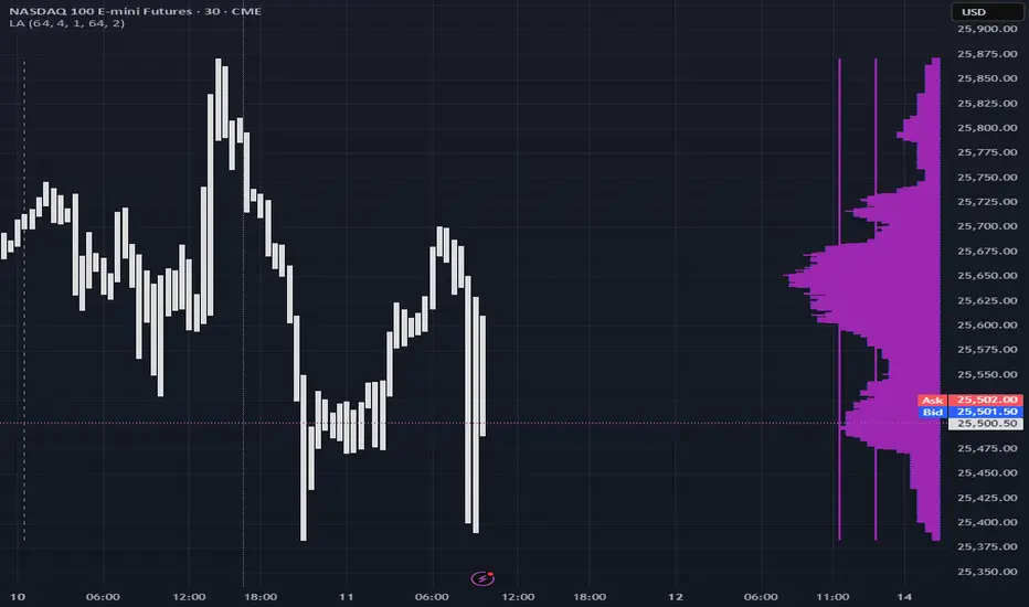
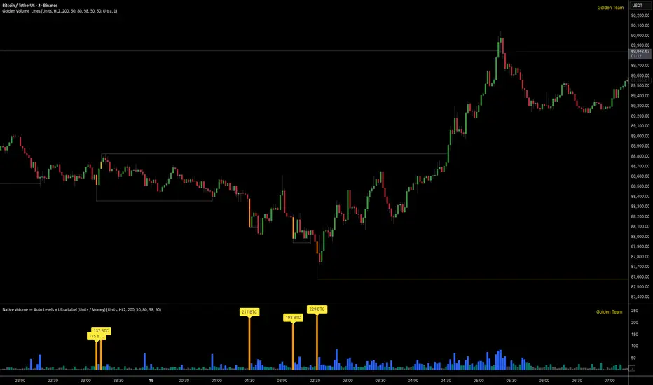
Golden Volume Lines📌 Golden Volume — Lines (Golden Team)
Golden Volume — Lines is an advanced volume-based indicator that detects Ultra High Volume candles using a statistical percentile model, then automatically draws and tracks key price levels derived from those candles.
The indicator highlights where real market interest and liquidity appear and shows how price reacts when those levels are broken.
🔍 How It Works
Volume Measurement
Choose between:
Units (raw volume)
Money (Volume × Average Price)
Average price can be calculated using HL2 or OHLC4.
Percentile-Based Classification
Volume is classified into:
Medium
High
Ultra High Volume
Thresholds are calculated using a rolling percentile window.
Ultra Volume candles are colored orange.
Dynamic High & Low Levels
For every Ultra Volume candle:
A High and Low dotted line is drawn.
Lines extend to the right until price breaks them.
Smart Line Break Detection (Wick-Based)
A line is considered broken when price wicks through it.
When a break occurs:
🟧 Orange line → broken by an Ultra Volume candle
⚪ White line → broken by a normal candle
The line stops exactly at the breaking candle.
🔔 Alerts
Alert on Ultra High Volume candles
Alert when a High or Low line is broken
Separate alerts for:
Break by Ultra Volume candle
Break by Normal candle
🎯 Use Cases
Breakout & continuation confirmation
Liquidity sweep detection
Volume-validated support & resistance
Market reaction after extreme participation
⚙️ Key Inputs
Volume display mode (Units / Money)
Percentile thresholds
Lookback window size
Maximum number of active Ultra levels
Optional dynamic alerts
⚠️ Disclaimer
This indicator is a volume and market structure tool, not a standalone trading system.
Always use proper risk management and additional confirmation.
ShayanFx XAU M5 This indicator starts working at 8 am New York market time and you have 3 hours to get signals from it.
We enter a trade on any candle that gives a signal. We place the stop loss behind the same candle and take a reward of 2.
We are not allowed to take more than 2 trades during the day. If the first trade is closed with profit, we will not open another trade, but if the first trade is closed with loss, we are allowed to take another signal.

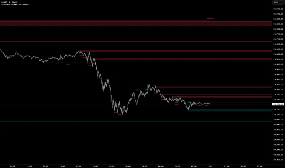
KIMATIX Market StructureKIMATIX Market Structure is a professional-grade market structure and liquidity framework built for traders who focus on institutional price behavior, not lagging indicators.
This tool continuously analyzes price to map internal (micro) and external (macro) structure, giving you a clear read on whether the market is in continuation, transition, or reversal. Instead of guessing trend direction, you see it unfold in real time through structure breaks and shifts.
What the indicator helps you identify
Micro & Macro Market Structure
Internal structure for execution and timing
Higher-structure context for directional bias
Market Structure Breaks (MSB) vs. Shifts
MSB highlights continuation strength
Shift signals potential trend transition
Institutional Zones
Automatically derived zones where displacement occurred
Designed to highlight areas of likely reaction, mitigation, or continuation
Strong vs. Weak Highs and Lows
Instantly see which extremes are protected and which are vulnerable to liquidity raids
Optional Swing Logic (HH / HL / LH / LL)
For traders who want classic structure confirmation layered on top
Historical vs. Present Mode
Study full structure development or keep the chart clean and execution-focused
The indicator is intentionally not a signal generator. It is a decision-support tool designed to give clarity, context, and confluence. Best results come from combining it with session timing, liquidity concepts, and your execution model.
Built with strict object management and internal safeguards, the script remains fast and stable even on lower timeframes and extended chart history.
If you trade price action, liquidity, and structure, this tool is designed to fit seamlessly into your workflow.
More Indicators here: kimatixtrading.com
support@tennaflow.comAI-Powered Market Sentiment & Trend Detector for Bitcoin
Experience next-level trading with an AI-driven indicator optimized for the 5-minute timeframe. Using advanced AI algorithms to detect market fear and predict trend shifts with precision.
Notes: Only subscribers can use this indicator.
Subscription Access: $168/month .
Email: support@tennaflow.com
Trading Pair:
BINANCE:BTCUSDT26Z2025

SVTR [Ultimate]SVTR v1.0 is a fully automated trading strategy designed to identify high-probability market opportunities using structured momentum, trend validation, and risk-controlled execution logic.
This strategy is not a simple signal generator.
It is a complete decision engine that evaluates market conditions, confirms entries with multiple filters, and manages trades automatically according to predefined logic.
Built for traders who want consistency, discipline, and objective execution, SVTR removes emotional bias and delivers rule-based trading across different market environments.
KEY FEATURES
• Fully automated entry and exit logic
• Multi-layer confirmation system
• Momentum and trend validation
• Smart trade filtering to reduce noise
• Works on multiple markets and timeframes
• Non-repainting logic
• Alert-ready for automation and integrations
AUTOMATED STRATEGY LOGIC
SVTR continuously analyzes the market and only executes trades when all required conditions align.
This prevents overtrading and avoids weak or low-quality setups.
The strategy is designed to:
Enter when momentum and direction are confirmed
Avoid choppy and uncertain market phases
Exit trades based on objective, rule-driven logic
Maintain consistency regardless of emotions or bias
WHY THIS STRATEGY?
Most traders fail not because of bad ideas, but because of:
Late entries
Emotional decisions
Overtrading
Lack of discipline
SVTR v1.0 solves these problems by automating the decision process and executing trades exactly as designed, every time.
You trade the system.
Not your emotions.
WHO IS IT FOR?
• Traders looking for automated execution
• System-based and rule-driven traders
• Swing traders and intraday traders
• Traders who want consistency over discretion
• Users who want a ready-to-use strategy framework
IMPORTANT NOTES
• Invite-Only / Private access
• Source code is protected
• Designed for backtesting, automation, and live monitoring
• Strategy behavior may vary depending on market conditions and settings
VERSION
v1.0 – Initial Private Release
Future updates may include optimizations, additional filters, and performance improvements.
FINAL STATEMENT
SVTR v1.0 is built for traders who value structure, confirmation, and automation over guesswork.
If you are looking for a strategy that executes with discipline, filters weak setups, and operates as a complete automated system, this strategy is designed for you.

Gamma & Volatility Levels [Pro]General Purpose
This indicator analyzes volatility levels and expected price movements, combining gamma concepts (financial options) with volatility analysis to identify support and resistance zones.
Main Components
High Volatility Level (HVL): Calculates a volatility level based on the simple moving average (SMA) of the price plus one standard deviation. This level is represented by an orange line showing where volatility is concentrated.
Expected Movement (Movimiento Esperante): Uses the Average True Range (ATR) multiplied by an adjustable factor to project potential upward and downward movement ranges from the current price. It is drawn in green (upward) and red (downward).
Gamma Levels (Nivelas Gamma): Identifies two key levels: the call resistance (highest high of the last 50 periods) in blue, and the put support (lowest low) in purple. These are based on recent extreme prices.
Additional Information: The indicator calculates the percentage distance between the current price and the HVL, displaying it in a label.
Visual Elements
Colored lines on the chart for each level.
Labels with exact values next to each line.
A table in the upper right corner summarizing all calculated values.
Options to show or hide each element according to preference.
This is a useful tool for traders who work with options or seek to identify levels of extreme volatility and dynamic support/resistance zones.

Al Brooks - Bar CountIndicator Purpose:
This indicator displays bar counts on the chart to help traders identify important time nodes and cycle transitions
Features smart session filtering with automatic futures/stock detection and appropriate trading session counting
Core Features:
Smart asset detection: Auto-detect futures and stocks
Session filter toggle: Choose all-day or session-specific counting
Auto timezone handling: Chicago time for futures, NY time for stocks
Flexible display control: Customizable display frequency and label size
Session Settings:
8:30-15:15 (CT) / Futures mode: Chicago time 8:30-15:15 (CT)
9:30-16:00 (ET) / Stock mode: New York time 9:30-16:00 (ET)
All-day mode: Count from first bar of the day
Timeframe Correspondence:
Multiples of 3: Correspond to 15-minute chart update cycles
Multiples of 12: Correspond to 1-hour chart update cycles
18: Key nodes, important time turning points

Dynamic MAs Zscore | Lyro RSThe Dynamic MAs Zscore is an adaptive momentum and valuation oscillator built around advanced moving averages and statistical Z-Score normalization. By combining a wide selection of moving average types with dynamic deviation bands, this indicator delivers clear insights into trend strength , directional bias , and relative valuation — all in a clean, visually intuitive format.
━━━━━━━━━━━━━━━
Key Features
━━━━━━━━━━━━━━━
Dynamic Moving Average Engine
Applies one of 12 selectable moving average types (SMA, EMA, WMA, VWMA, HMA, ALMA, TEMA, etc.) to the chosen source. This allows fine-tuning between responsiveness and smoothness depending on market conditions.
Z-Score Normalization
Transforms the selected moving average into a standardized Z-Score:
(MA − mean) / standard deviation
This normalization makes momentum strength comparable across assets and timeframes.
Adaptive Deviation Bands
Upper and lower bands are derived from the rolling standard deviation of the Z-Score:
Custom band length
Independent positive and negative multipliers
These bands dynamically expand and contract with volatility.
Dual Signal Modes
Trend Mode – Focuses on directional continuation. Color changes and signals occur when Z-Score breaks above or below deviation bands.
Valuation Mode – Highlights relative overvaluation and undervaluation using a gradient color scale and predefined value zones.
Advanced Visual System
Includes bold layered plots, gradient fills, background shading, and candle/bar coloring to clearly reflect current market state.
Custom Color Palettes
Choose from multiple preset themes (Classic, Mystic, Accented, Royal) or define your own bullish and bearish colors.
━━━━━━━━━━━━━━━
How It Works
━━━━━━━━━━━━━━━
MA Calculation – The selected moving average type is applied to the chosen price source.
Z-Score Computation – The MA is normalized over a user-defined lookback period to quantify deviation from its mean.
Band Construction – Standard deviation of the Z-Score is calculated over the band length and scaled by positive/negative multipliers.
Mode-Dependent Logic
Trend Mode – Breaks above the upper band signal bullish momentum; breaks below the lower band signal bearish momentum.
Valuation Mode – A gradient reflects relative valuation from undervalued to overvalued, with background highlights at extreme Z-Score levels.
━━━━━━━━━━━━━━━
Signal Interpretation
━━━━━━━━━━━━━━━
Trend Confirmation
In Trend Mode, sustained moves beyond deviation bands indicate strong directional bias.
Momentum Strength
The distance of the Z-Score from zero reflects the intensity of trend momentum.
Relative Valuation
In Valuation Mode, deep negative Z-Scores suggest undervaluation, while high positive Z-Scores suggest overvaluation.
Visual Clarity
Bar and candle coloring aligned with oscillator state allows for rapid assessment of market conditions.
━━━━━━━━━━━━━━━
Customization
━━━━━━━━━━━━━━━
Adjust MA type and length to balance speed vs. smoothness.
Modify Z-Score length to control sensitivity.
Tune band length and multipliers for volatility adaptation.
Switch between Trend and Valuation modes depending on strategy.
Personalize visuals using preset or custom color palettes.
━━━━━━━━━━━━━━━
Alerts
━━━━━━━━━━━━━━━
Bullish condition when Z-Score > 0
Bearish condition when Z-Score < 0
Overvalued and undervalued valuation alerts
⚠️ Disclaimer
This indicator is intended for technical analysis and educational purposes only. It does not guarantee profitable outcomes and should be used alongside other tools, confirmation methods, and sound risk management. The author is not responsible for any financial decisions made using this indicator.

EMA Slope Angle# EMA Slope Angle Indicator
A professional, non-repainting overlay indicator that visualizes EMA slope strength as an angle in degrees, providing instant visual feedback through dynamic EMA coloring and comprehensive trend analysis.
## ORIGINALITY
This indicator is original in its approach to slope measurement:
- **Angle-based calculation**: Uses arctangent to calculate slope as an angle in degrees (not percentage), providing a more intuitive measure of trend strength
- **Dynamic visual feedback**: Combines real-time EMA line coloring with regime detection, creating a continuous visual representation of market conditions
- **Comprehensive analysis**: Integrates angle-based trend shift signals with optional statistical analysis in a single, cohesive tool
- **Non-repainting design**: All calculations use confirmed bars only, ensuring reliable, deterministic output
## HOW IT WORKS
The indicator calculates the EMA slope angle using trigonometric functions:
```
Angle = arctan((EMA_current - EMA_past) / lookback_bars) × 180/π
```
This provides an intuitive measure where:
- **Steep angles** = strong trends (visualized with saturated colors)
- **Shallow angles** = weak trends (visualized with lighter colors)
- **Near-zero angles** = flat/consolidation (visualized in gray)
The EMA line color dynamically reflects:
- **Direction**: Green shades for uptrends, red shades for downtrends
- **Strength**: Color intensity based on normalized angle (stronger slopes = more saturated colors)
- **Regime**: Gray for flat conditions when angle is below threshold
## KEY FEATURES
### Dynamic EMA Coloring
- EMA line color changes continuously based on slope strength
- Color intensity reflects trend strength (50-100% opacity range)
- Instant visual feedback without cluttering the chart
### Regime Detection
- Automatically classifies market conditions: **RISING**, **FALLING**, or **FLAT**
- Configurable angle thresholds for regime classification
- Real-time regime updates on confirmed bars only
### Trend-Shift Signals
- Detects transitions from FLAT to RISING/FALLING regimes
- Visual arrows on chart when significant trend shifts occur
- Prevents signal spam by only triggering from FLAT state
- Configurable trigger thresholds for signal sensitivity
### KPI Dashboard
- Real-time angle display (rounded to 1 decimal place)
- Current regime status with color coding
- Last signal tracking (UP/DOWN/NONE)
- Positioned in top-right corner for easy reference
### Advanced Angle Statistics (Optional)
- Detailed breakdown of angle distribution across 9 granular buckets:
- 0-0.2°, 0.2-0.5°, 0.5-1°, 1-1.5°, 1.5-2°, 2-3°, 3-5°, 5-10°, >10°
- Shows count and percentage for each bucket
- Automatically resets on symbol/timeframe changes
- Useful for analyzing historical slope patterns
## SETTINGS
### Main Settings
- **EMA Length**: Period for exponential moving average (default: 50)
- **Slope Lookback Bars**: Number of bars to compare for slope calculation (default: 5)
### Angle Settings
- **Flat Angle Threshold**: Maximum angle for FLAT regime classification (default: 2.0°)
- **Rising Angle Trigger**: Minimum angle to trigger RISING regime and UP signals (default: 1.0°)
- **Falling Angle Trigger**: Maximum angle to trigger FALLING regime and DOWN signals (default: -1.0°)
- **Max Angle for Color Saturation**: Maximum angle for full color intensity (default: 30.0°)
### Display Options
- **Uptrend Color**: Color for rising trends (default: dark green)
- **Downtrend Color**: Color for falling trends (default: dark red)
- **Flat Color**: Color for flat conditions (default: gray)
- **Show Trend-Shift Signals**: Toggle signal arrows on/off (default: true)
- **Show Angle Statistics**: Toggle statistics dashboard on/off (default: false)
## NON-REPAINTING GUARANTEE
- All calculations use confirmed bars only (`barstate.isconfirmed`)
- No future bar references
- No higher timeframe calls using `request.security()`
- Deterministic output - what you see is what you get
- Reliable for backtesting and live trading
## USE CASES
- **Trend Identification**: Instantly identify trend strength and direction at a glance
- **Reversal Detection**: Spot trend reversals early through regime changes
- **Trade Filtering**: Filter trades based on slope strength and regime
- **Consolidation Monitoring**: Identify flat market conditions for range trading
- **Pattern Analysis**: Study historical angle distributions to understand market behavior
- **Momentum Assessment**: Gauge trend momentum through visual color intensity
## LIMITATIONS
- Angle calculation depends on EMA length and lookback period settings
- Regime classification is based on configurable thresholds - adjust to match your trading style
- Signals only trigger when transitioning from FLAT state to prevent spam
- Statistics reset on symbol/timeframe changes (by design)
- Color intensity is normalized to max angle setting - adjust for your market's typical ranges
## TECHNICAL NOTES
- Uses Pine Script v6
- Overlay indicator (plots on price chart)
- No external dependencies
- Compatible with all TradingView chart types
- Works on all timeframes and symbols
## DISCLAIMER
This indicator is designed for visual trend analysis and educational purposes. Always combine with other technical analysis tools, fundamental analysis, and proper risk management strategies. Past performance does not guarantee future results. Trading involves risk of loss.
---
**Perfect for**: Swing traders, day traders, trend followers, and market analysts seeking intuitive trend strength visualization.

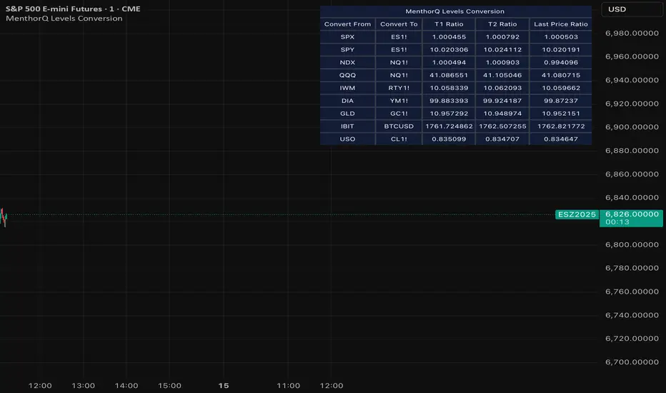
MenthorQ Levels ConversionLevels Conversion helps traders accurately overlay price levels from spot/index ETFs and indices (like SPX, SPY, QQQ, NDX) onto futures charts (like ES, NQ, etc.).
Because futures and spot/index prices don’t trade at the same price, your levels will be misaligned if you plot them directly. Futures typically trade at a spread or ratio versus their related index/ETF. This indicator solves that by calculating the conversion ratio automatically, so your levels stay aligned on the futures chart.
How it works
This script calculates the ratio between Asset A and Asset B and applies it to convert levels from one instrument to the other (for example, SPX → ES, QQQ → NQ).
Ratio options (3 modes)
You can choose one of three ratio sources:
✅ T1 Ratio (Morning Snapshot)
Select a specific time to “lock” the ratio.
Default: 10:00 AM ET (morning session snapshot)
✅ T2 Ratio (Afternoon Snapshot)
Select a second time to “lock” the ratio.
Default: 3:30 PM ET (afternoon snapshot)
✅ Last Price Ratio (Live)
Uses the last traded price of both assets to compute the ratio.
Note: To refresh the “Last Price” baseline, simply remove and re-add the indicator.
Learn more about Levels Conversions: menthorq.com
Common levels conversions
Some popular use-cases include:
- SPX Gamma Levels → ES
- SPY Gamma Levels → ES
- QQQ Gamma Levels → NQ
- NDX Gamma Levels → NQ
- SPX Intraday Gamma Levels → ES
- QQQ Intraday Gamma Levels → NQ
- SPX Swing Trading Levels → ES
- QQQ Swing Trading Levels → NQ
- GLD Levels → GC
- DIA Levels → YM
- USO Levels → CL
- NVDA / MAG7 Levels → QQQ
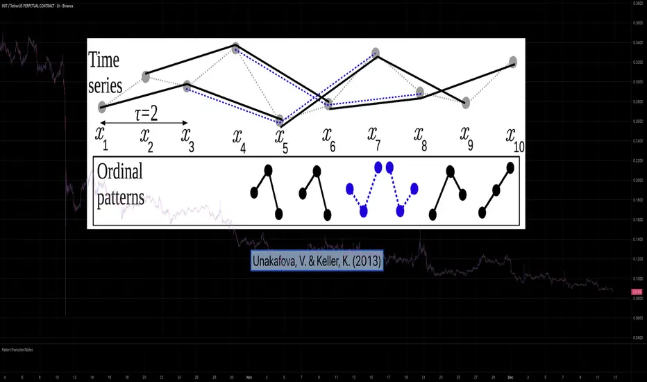
PatternTransitionTablesPatternTransitionTables Library
🌸 Part of GoemonYae Trading System (GYTS) 🌸
🌸 --------- 1. INTRODUCTION --------- 🌸
💮 Overview
This library provides precomputed state transition tables to enable ultra-efficient, O(1) computation of Ordinal Patterns. It is designed specifically to support high-performance indicators calculating Permutation Entropy and related complexity measures.
💮 The Problem & Solution
Calculating Permutation Entropy, as introduced by Bandt and Pompe (2002), typically requires computing ordinal patterns within a sliding window at every time step. The standard successive-pattern method (Equations 2+3 in the paper) requires ≤ 4d-1 operations per update.
Unakafova and Keller (2013) demonstrated that successive ordinal patterns "overlap" significantly. By knowing the current pattern index and the relative rank (position l) of just the single new data point, the next pattern index can be determined via a precomputed look-up table. Computing l still requires d comparisons, but the table lookup itself is O(1), eliminating the need for d multiplications and d additions. This reduces total operations from ≤ 4d-1 to ≤ 2d per update (Table 4). This library contains these precomputed tables for orders d = 2 through d = 5.
🌸 --------- 2. THEORETICAL BACKGROUND --------- 🌸
💮 Permutation Entropy
Bandt, C., & Pompe, B. (2002). Permutation entropy: A natural complexity measure for time series.
doi.org
This concept quantifies the complexity of a system by comparing the order of neighbouring values rather than their magnitudes. It is robust against noise and non-linear distortions, making it ideal for financial time series analysis.
💮 Efficient Computation
Unakafova, V. A., & Keller, K. (2013). Efficiently Measuring Complexity on the Basis of Real-World Data.
doi.org
This library implements the transition function φ_d(n, l) described in Equation 5 of the paper. It maps a current pattern index (n) and the position of the new value (l) to the successor pattern, reducing the complexity of updates to constant time O(1).
🌸 --------- 3. LIBRARY FUNCTIONALITY --------- 🌸
💮 Data Structure
The library stores transition matrices as flattened 1D integer arrays. These tables are mathematically rigorous representations of the factorial number system used to enumerate permutations.
💮 Core Function: get_successor()
This is the primary interface for the library for direct pattern updates.
• Input: The current pattern index and the rank position of the incoming price data.
• Process: Routes the request to the specific transition table for the chosen order (d=2 to d=5).
• Output: The integer index of the next ordinal pattern.
💮 Table Access: get_table()
This function returns the entire flattened transition table for a specified dimension. This enables local caching of the table (e.g. in an indicator's init() method), avoiding the overhead of repeated library calls during the calculation loop.
💮 Supported Orders & Terminology
The parameter d is the order of ordinal patterns (following Bandt & Pompe 2002). Each pattern of order d contains (d+1) data points, yielding (d+1)! unique patterns:
• d=2: 3 points → 6 unique patterns, 3 successor positions
• d=3: 4 points → 24 unique patterns, 4 successor positions
• d=4: 5 points → 120 unique patterns, 5 successor positions
• d=5: 6 points → 720 unique patterns, 6 successor positions
Note: d=6 is not implemented. The resulting code size (approx. 191k tokens) exceeds the Pine Script limit of 100k tokens (as of 2025-12).
EMA + ATR Semi-Auto strategy -Kohei Matsumura-EMAとATRを自動調節するストラテジー
This is an EMA- and ATR-based trading strategy that adapts its parameters according to recent market behavior and performance characteristics.
The strategy dynamically adjusts trend sensitivity and risk management settings to maintain robustness across varying market conditions, while operating strictly on confirmed price data.

online Moment-Based Adaptive Detection🙏🏻 oMBAD (online Moment-Based Adaptive Detection): adaptive anomaly || outlier || novelty detection, higher-order standardized moments; at O(1) time complexity
For TradingView users: this entity would truly unleash its true potential for you ‘only’ if you work with tick-based & seconds-based resolutions, otherwise I recommend to keep using original non-online MBAD . Otherwise it may only help with a much faster backtesting & strategy development processes.
...
Main features :
O(1) time complexity: the whole method works @ O(1) time complexity, it’s lighting fast and cheap
HFT-ready: frequency, amount and magnitude of data points are irrelevant
Axiomatic: no need to optimize or to provide arbitrary hyperparameters, adaptive thresholds are completely data-driven and based on combination of higher-order central moments
Accepts weights: the method can gain additional information by accepting weights (e.g. volume weighting)
Example use cases for high-frequency trading:
Ordeflow analysis: can be applied on non-aggregated flow of market orders to gauge its imbalance and momentum
Liquidity provision: can be applied to high-resolution || tick data to place and dynamically adjust prices of limit orders
ML-based signals: online estimates of higher-order central moments can be used as features & in further feature engineering for trading signal generation
Operation & control: can be applied on PnL stream of your strategy for immediate returns analysis and equity control
Abstract:
This method is the online version of originally O(n) MBAD (Moment-Based Adaptive Detection) . It uses higher-order central & standardized moments to naturally estimate data’s extremums using all data while not touching order-statistics (i.e. current min and max) at all. By the same principles it also estimates “ever-possible” values given the data-generating process stays the same.
This online version achieves reduced time complexity to O(1) by using weighted exponential smoothing, and in particular is based on Pebay et al (2008) work, which provides mathematically correct results for the moments, and is numerically stable, unlike the raw sum-based estimates of moments.
Additionally, I provide adjustments for non-continuous lattice geometry of orderbooks, and correct re-quantization math, allowing to artificially increase the native tick size.
The guidelines of how to adjust alpha (smoothing parameter of exponential smoothing) in order to completely match certain types of moving averages, or to minimize errors with ones when it’s impossible to match; are also provided.
Mathematical correctness of the realization was verified experimentally by observing the exact match with the original non-recursive MBAD in expanding window mode, and confirmed by 2 AI agents independently. Both weighted and non-weighted versions were tested successfully.
...
^^ On micro level with moving window size 1
^^ With artificial tick size increase, moving window size 64
^^ Expanding window mode anchored to session start
^^ Demonstrates numerical stability even on very large inputs
...
∞

Macroeconomic Dashboard by DGTMacroeconomic Dashboard is a script tailored for traders and investors using top-down strategies to navigate global markets. It integrates key macroeconomic indicators, such as monetary policy, inflation, yields, and market sentiment, directly into financial charts.
By visualizing real-time macro data alongside asset price movements, this tool bridges the gap between traditional economic metrics and technical analysis. Whether analyzing crypto or traditional markets, users can better contextualize price action within broader economic cycles and trends.
Designed to support macro-informed decision-making, it helps identify shifts in liquidity, policy direction, and risk appetite, enhancing strategic trade entries and portfolio positioning.
KEY FEATURES
⯌ Macro Dashboard
The script provides a macro dashboard that tracks changes across key economic dimensions: monetary policy, inflation and growth, bond markets, and risk indicators. With built-in anomaly detection and trend analysis across short-, mid-, and long-term timeframes, it helps interpret market moves through a macroeconomic lens, whether analyzing equities, commodities, or digital assets.
⯌ Macro on Chart
By visualizing macro data such as M2 money supply, CPI, treasury yields, and volatility indices, users can more easily correlate economic developments with price action, enhancing situational awareness and decision-making.
MACRO METRICS
The script covers five core macroeconomic domains, each with key metrics:
Liquidity & Monetary Policy
Global M2 Money Supply
Federal Funds Rate
Reverse Repo Operations
Inflation & Economic Growth
Consumer Price Index (CPI)
Producer Price Index (PPI)
Real GDP Growth
Yields & Bond Markets
10-Year Treasury Yield
2-Year Treasury Yield
Yield Curve (10Y–2Y Spread)
Global Risk & Currency Indicators
U.S. Dollar Index (DXY)
Volatility Index (VIX)
Economic Policy Uncertainty Index
Equities, Commodities & Crypto
S&P 500 (SPX)
Nasdaq 100 (NDX)
Gold (XAU/USD)
Crude Oil (WTI)
Bitcoin (BTCUSD)
DISCLAIMER
This script is intended for informational and educational purposes only. It does not constitute financial, investment, or trading advice. All trading decisions made based on its output are solely the responsibility of the user.
유료 스크립트

Shiori TFGI Lite Technical Fear and Greed Index (Open Source)Shiori’s TFGI Lite
Technical Fear & Greed Index (Open Source)
---
English — Official Description
Shiori’s TFGI Lite is an open-source Technical Fear & Greed Index designed to help traders and investors understand market emotion, not predict price.
Instead of generating buy or sell signals, this indicator focuses on answering a calmer, more important question:
> Is the market emotionally stretched away from its own historical balance?
TFGI Lite combines three well-known technical dimensions — volatility, price deviation, and momentum — and normalizes them into a single, intuitive 0–100 sentiment scale.
What This Indicator Is
* A market context tool, not a trading signal
* A way to observe emotional extremes and misalignment
* Designed for any asset, any timeframe
* Fully open source, transparent and adjustable
Core Components
* Fear Factor: Short-term vs long-term ATR ratio with logarithmic compression
* Greed Factor: Price Z-score with tanh-based normalization
* Momentum Factor: Classic RSI as emotional momentum
These factors are blended and gently smoothed to form the current sentiment level.
Historical Baseline & Deviation
TFGI Lite introduces a historical baseline concept:
* The baseline represents the market’s own emotional equilibrium
* Deviation measures how far current sentiment has drifted from that equilibrium
This allows the indicator to highlight conditions such as:
* 🔥 Overheated: High sentiment + strong positive deviation
* 💎 Undervalued: Low sentiment + strong negative deviation
* ⚠️ Misaligned: Emotionally extreme, but inconsistent with historical behavior
How to Use (Lite Philosophy)
* Use TFGI Lite as a background compass, not a trigger
* Combine it with price structure, risk management, and your own strategy
* Extreme readings suggest emotional tension, not immediate reversal
> Think of TFGI Lite as market weather — it tells you the climate, not when to open or close the door.
About Parameters & Customization
All parameters in TFGI Lite are fully adjustable. Markets have different personalities — volatility, sentiment range, and emotional extremes vary by asset and timeframe.
You are encouraged to:
* Adjust fear/greed thresholds based on the asset you trade
* Tune smoothing and baseline lengths to match your timeframe
* Treat sentiment levels as relative, not universal absolutes
There is no single “correct” setting — TFGI Lite is designed to adapt to your market, not force the market into a fixed model.
Important Notes
* This is a technical sentiment indicator, not financial advice
* No future performance is implied
* Designed to reduce emotional decision-making, not replace it
---
🇹🇼 繁體中文 — 指標說明
Shiori’s TFGI Lite(技術型恐懼與貪婪指數) 是一款開源的市場情緒指標,目的不是預測價格,而是幫助你理解市場當下的「情緒狀態」。
與其問「現在該不該買或賣」,TFGI Lite 更關心的是:
> 市場情緒是否已經偏離了它自己的歷史平衡?
本指標整合三個常見但關鍵的技術面向,並統一轉換為 0–100 的情緒刻度,讓市場狀態一眼可讀。
這個指標是什麼
* 市場情緒與狀態觀察工具(非買賣訊號)
* 用來辨識情緒極端與錯位狀態
* 適用於任何商品與任何週期
* 完全開源,可學習、可調整
核心構成
* 恐懼因子:短期 / 長期 ATR 比例(對數壓縮)
* 貪婪因子:價格 Z-Score(tanh 正規化)
* 動能因子:RSI 作為情緒動量
歷史基準與偏離
TFGI Lite 引入「歷史情緒基準」的概念:
* 基準代表市場長期的情緒平衡
* 偏離值顯示當前情緒與自身歷史的距離
因此可以辨識:
* 🔥 過熱(高情緒 + 正向偏離)
* 💎 低估(低情緒 + 負向偏離)
* ⚠️ 錯位(情緒極端,但不符合歷史行為)
使用建議(Lite 精神)
* 將 TFGI Lite 作為「背景雷達」,而非進出場依據
* 搭配價格結構、風險控管與個人策略
* 情緒極端不等於立刻反轉
> 你可以把它想像成市場的天氣預報,而不是交易指令。
參數調整與個人化說明
本指標中的所有參數皆可調整。不同市場、不同商品,其波動特性與情緒區間並不相同。
建議你:
* 依標的特性自行調整恐懼 / 貪婪門檻
* 依交易週期調整平滑與基準長度
* 將情緒數值視為「相對狀態」,而非固定答案
TFGI Lite 的設計初衷,是讓你定義市場,而不是被單一參數綁住。
溫馨提示
如果你在調整指標參數時遇到不熟悉的項目,請點擊參數旁邊的 「!」圖示,每個設定都有清楚的說明。
本指標設計為可慢慢探索,請依自己的節奏理解市場狀態。
---
🇯🇵 日本語 — インジケーター説明
Shiori’s TFGI Lite は、価格を予測するための指標ではなく、
市場の「感情状態」を可視化するためのオープンソース指標です。
この指標が問いかけるのは、
> 現在の市場感情は、過去のバランスからどれだけ乖離しているのか?
という一点です。
特徴
* 売買シグナルではありません
* 市場心理の極端さやズレを観察するためのツールです
* すべての銘柄・時間軸に対応
* 学習・調整可能なオープンソース
構成要素
* 恐怖要素:ATR 比率(対数圧縮)
* 強欲要素:価格 Z スコア(tanh 正規化)
* モメンタム:RSI
ベースラインと乖離
市場自身の感情的な基準点と、
現在の感情との距離を測定します。
過熱・割安・感情のズレを視覚的に把握できます。
パラメータ調整について
TFGI Lite のすべてのパラメータは調整可能です。市場ごとにボラティリティや感情の振れ幅は異なります。
* 恐怖・強欲の閾値は銘柄に応じて調整してください
* 時間軸に合わせて平滑化やベースライン期間を変更できます
* 数値は絶対値ではなく、相対的な感情状態として捉えてください
この指標は、市場に合わせて柔軟に使うことを前提に設計されています。
フレンドリーヒント
入力項目で分からない設定がある場合は、横に表示されている 「!」アイコン をクリックしてください。各パラメータには分かりやすい説明が用意されています。
このインジケーターは、落ち着いて市場の状態を理解するためのものです。
---
🇰🇷 한국어 — 지표 설명
Shiori’s TFGI Lite는 매수·매도 신호를 제공하는 지표가 아니라,
시장 감정의 상태를 이해하기 위한 기술적 심리 지표입니다.
이 지표의 핵심 질문은 다음과 같습니다.
> 현재 시장 감정은 과거의 균형 상태에서 얼마나 벗어나 있는가?
특징
* 거래 신호 아님
* 시장 심리의 과열·저평가·불일치를 관찰
* 모든 자산, 모든 타임프레임 지원
* 오픈소스 기반
구성 요소
* 공포 요인: ATR 비율 (로그 압축)
* 탐욕 요인: Z-Score (tanh 정규화)
* 모멘텀: RSI
활용 방법
TFGI Lite는 배경 지표로 사용하세요.
가격 구조와 리스크 관리와 함께 사용할 때 가장 효과적입니다.
파라미터 조정 안내
TFGI Lite의 모든 설정 값은 사용자가 직접 조정할 수 있습니다. 자산마다 변동성과 감정 범위는 서로 다릅니다.
* 공포 / 탐욕 기준값은 종목 특성에 맞게 조정하세요
* 타임프레임에 따라 스무딩 및 기준 기간을 변경할 수 있습니다
* 감정 수치는 절대적인 값이 아닌 상대적 상태로 해석하세요
이 지표는 하나의 정답을 강요하지 않고, 시장에 맞춰 적응하도록 설계되었습니다.
친절한 안내
설정 값이 익숙하지 않다면, 항목 옆에 있는 "!" 아이콘을 클릭해 보세요. 각 입력값마다 설명이 제공됩니다.
이 지표는 천천히 시장의 맥락을 이해하도록 설계되었습니다.
---
Educational purpose only. Not financial advice.
---
#FearAndGreed #MarketSentiment #TradingPsychology #TechnicalAnalysis #OpenSourceIndicator #Volatility #RSI #ATR #ZScore #MultiAsset #TradingView #Shiori

Quantifiable Broadening Formations [STAT TRADING]Broadening Formations v4
━━━━━━━━━━━━━━━━━━━━━━━━━━━━━━━━━━━━━━━━━━━━━━━━━━━━━━━━━━━━━━━━━━━━━━━━━━━━━━━
OVERVIEW
Automatically identifies and draws Broadening Formations — expanding price structures that reveal where the market is auctioning both higher and lower to find fair value.
This indicator uses a quantifiable, rule-based approach to detect expansion patterns and dynamically tracks the evolution of price ranges in real-time. No subjective drawing required — the indicator handles everything automatically.
━━━━━━━━━━━━━━━━━━━━━━━━━━━━━━━━━━━━━━━━━━━━━━━━━━━━━━━━━━━━━━━━━━━━━━━━━━━━━━━
FEATURES
▸ Bar Classification System
Each bar is labeled based on its relationship to the previous bar:
1 = Inside Bar — Range contraction, price stayed within prior bar
2u = Trending Up — Higher high AND higher low
2d = Trending Down — Lower high AND lower low
3 = Outside Bar — Expansion, higher high AND lower low in single bar
C3 = Composite 3 — Multi-bar expansion pattern (2d→2u or 2u→2d completing the range)
Color coding helps identify conviction:
• Green = Bullish structure with bullish close
• Red = Bearish structure with bearish close
• Orange = Conflicted (structure and close disagree)
• Yellow = Outside Bar (3)
• Purple = Composite 3 (C3)
▸ Automatic Formation Detection
The indicator detects when price proves it can take both sides of a range, then:
• Draws dynamic upper and lower boundary lines
• Extends lines forward as projected support/resistance
• Updates the formation in real-time as price makes new highs or lows
• Detects breakouts when price closes through boundaries with conviction
▸ Support/Resistance Test Dots
Visual markers show when price tests the formation boundaries:
• Red dot at high = Price wicked into upper resistance but closed below (failed test)
• Green dot at low = Price wicked into lower support but closed above (held support)
These dots help you see where the market is probing the boundaries before a decisive move.
▸ Breakout & Reclaim Detection
Clear labels mark key events:
• BREAKOUT ↑ = Close above upper boundary (bullish break)
• BREAKOUT ↓ = Close below lower boundary (bearish break)
• RECLAIM ↑ = Failed breakdown, price recovered back into range
• RECLAIM ↓ = Failed breakout, price fell back into range
Reclaims are powerful signals — failed breakouts often lead to strong moves in the opposite direction. The formation automatically expands to include the failed move.
▸ Sub-Formations (Internal Triangles)
White lines show nested formations within larger structures. These internal patterns can provide earlier signals before the major formation resolves.
Sub-formations only appear when they are truly internal to the parent (not touching parent boundaries).
▸ Formation Labels
Each formation is labeled at its trigger point:
• 3 = Triggered by outside bar
• C3 = Triggered by composite pattern
• R1, R2... = Number of reclaims (e.g., "3 R2" = outside bar trigger with 2 reclaims)
━━━━━━━━━━━━━━━━━━━━━━━━━━━━━━━━━━━━━━━━━━━━━━━━━━━━━━━━━━━━━━━━━━━━━━━━━━━━━━━
SETTINGS
Show Bar Classification Labels Display 1/2u/2d/3/C3 below each bar
Detect Composite 3s Identify multi-bar expansion patterns
Show Sub/Internal Formations Display nested formations in white
Show Support/Resistance Test Dots Mark boundary tests with colored dots
Show Breakout/Reclaim Labels Label breakouts and reclaims
Major BF Line Color Color for primary formation lines
Sub BF Line Color Color for nested formation lines
Line Width Thickness of formation lines
Bars to Project Forward How far to extend lines into the future
━━━━━━━━━━━━━━━━━━━━━━━━━━━━━━━━━━━━━━━━━━━━━━━━━━━━━━━━━━━━━━━━━━━━━━━━━━━━━━━
ALERTS
Set alerts for key events:
• Outside Bar (3) — Single-bar expansion detected
• Composite 3 (C3) — Multi-bar expansion pattern detected
• New BF Started — New broadening formation triggered
• BF Break — Price closed through formation boundary
• BF Reclaim — Failed breakout, formation continues with expanded range
━━━━━━━━━━━━━━━━━━━━━━━━━━━━━━━━━━━━━━━━━━━━━━━━━━━━━━━━━━━━━━━━━━━━━━━━━━━━━━━
HOW TO USE
Understand your position:
Are you near the upper boundary, lower boundary, or mid-range? Context matters.
Watch for closes, not wicks:
Wicks test levels. Closes show conviction. The indicator only triggers breakouts on closes through the boundary.
Pay attention to reclaims:
A break that fails and reclaims often leads to an aggressive move the other direction. The "R" count on the label shows how many times this has happened.
Use test dots for entries:
Multiple red dots at resistance followed by a green bar = potential short setup. Multiple green dots at support followed by a red bar = potential long setup.
Sub-formations give early signals:
When an internal triangle breaks, it can front-run the larger formation's move.
━━━━━━━━━━━━━━━━━━━━━━━━━━━━━━━━━━━━━━━━━━━━━━━━━━━━━━━━━━━━━━━━━━━━━━━━━━━━━━━
NOTES
• Works on all timeframes and instruments
• Lines update dynamically as new bars form
• Historical formations are preserved on the chart
• Composite 3s (C3) are shown in purple to distinguish from single-bar triggers
• Best used to understand current market structure — combine with your existing strategy for entries
━━━━━━━━━━━━━━━━━━━━━━━━━━━━━━━━━━━━━━━━━━━━━━━━━━━━━━━━━━━━━━━━━━━━━━━━━━━━━━━
Objective structure. No guesswork.
p.s This is a public version in a different language than our true BF identification algorithm. There will be some bugs and it is unlikely we will fix it in the near future.

BTC Regime Oscillator (MC + Spread) [1D]ONLY SUPPOSED TO BE USED FOR BTC PERPS, AND SPOT LEVERAGING:
This is a risk oscillator that measures whether Bitcoin’s price is supported by real capital or is running ahead of it, and converts that into a simple risk-regime oscillator.
It's built with market cap, and FDV, and Z-scores compressed to -100 <-> 100
I created this indicator because I got tired of FOMO Twitter and Wall Street games.
DO NOT USE THIS AS A BEGIN-ALL-AND-END-ALL. YOU NEED TO USE THIS AS A CONFIRMATION INDICATOR, AND ON HTF ONLY (1D>) IF YOU USE THIS ON LOWER TIMEFRAMES, YOU ARE FEEDING YOUR MONEY TO A LOW-LIFE DING BAT ON WALL STREET. HERE IS HOW IT WORKS:
This indicator is Split up by
A) Market Cap
--> Represents real money in BTC
--> Ownership capital
--> If MC is rising, money is entering BTC
B) FDV (Fully Diluted Valuation)
--> For BTC: price(21M) (21,000,000)
--> Represents the theoretical valuation
--> Since BTC really has a fixed cap, FDV mostly tracks the price
C) Oscillators
Both MC and FDV are:
--> Logged (to handle scale)
--> Normalized (Z-score)
--> Compressed to -100 <-> 100
HERE ARE THREE THINGS YOU ARE GOING TO SEE ON THE CHART
A) The market cap oscillator (MC OSC)
--> Normalized trend of real capital
RISING: Indicates capital inflow
FALLING: Indicates capital outflow
B) FDV Oscillator
--> Normalized trend of valuation pressure
ABOVE MC: Price is ahead of capital
BELOW MC: Capital is keeping up
!!!! FDV IS CONTEXT NOT SIGNALS !!!!
C) Spread = (FDV - MC)
--> The difference between valuation and capital
(THIS IS THE CORE SIGNAL)
NEGATIVE: Capital is gonna lead price
NEAR 0: Balanced
POSITIVE: Price leads capital
(THIS MEANS STRESS FOR BTC, NOT DILLUTION!)
WHAT DOES -60, 0, 60 MEAN?:
--> These are meant to serve as risk zones, not buy/sell dynamics; this is not the same as an RSI oscillator.
A) 0 level
--> Price and capital are balanced
--> No structural stress
(TRADE WITH NORMAL POSITION SIZE, AND NORMAL EXPECTATIONS)
B) Below -60 (Supportive/Compressed)
--> BTC is relatively cheap to recent history
--> Capital supports price well
(ALWAYS REMEMBER TO CONFIRM THIS WITH WHAT THE CHART IS TELLING YOU)
--> Press trends
--> Use higher ATRs
--> Pullbacks are better here
C) Above 60 (Overextension, or fragile)
--> BTC is expensive relative to recent history
--> Price is ahead of capital
(ALWAYS REMEMBER TO CONFIRM THIS WITH WHAT THE CHART IS TELLING YOU)
--> Reduce leverage, use smaller ATR
--> Use lower ATRs, TP faster
--> Do not chase breakouts
--> Expect volatility and whipsaws
"Can I press trades right now? Or do I need to hog my capital?"
CONDITIONS:
Spread Less than 0 and below -60 = Press trades
Spread near 0 = Normal trading conditions
Spread is Greater than 0 or above 60+ = Capital protection

Volume Analysis🙏🏻 (signed) Volume Analysis is 2 of 2 structural layer / ordeflow analysis scripts, while the first one is Liquidity Analysis. Both are independent so can’t be released together as a single script, but should be used together.
The same math used in this script can be applied to other types of aggressive volume data: non-aggregated flow of market orders, volume traded of put vs call options.
There’s no universal agreement about terminology, but this script works with volumes signed by the aggressor who initiated a transaction. Then these volumes get aggregated by time and a cumulative sum is calculated. Mostly this is widely known as Cumulative Volume Delta.
However this script works with 'inferred' volumes vs the provided ones. It’s the better choice for equities, bonds; neutral choice for currencies; and suboptimal choice for natural and artificial commodities.
Contents:
Output description;
How to analyze & use the outputs;
How to use it together with Liquidity Analysis script;
How did I use both scripts to finish The Leap profitably and skipped many losses.
1. Output description
Color of the CVD line reflects (signed) volume imbalance state: red is negative, purple is neutral, blue is positive.
3 purple lines are lower deviation (lower band), basis (middle band), upper deviation (upper band): used to generate signals by a ruleset that would be explained in a minute
Gray number in the script’s status line is the advised input you may put into Inferred volume multiplier in script’s setting, I will explain it
Vertical dash line marks the moving window end, this way you can be certain over what exact data you see the profile was built.
2. How to analyze & use the outputs
Setup up the script:
Moving window length: set it to ~ ¼ of your data analysis window. E.g if you see on your charts and use ~ 256 bars, set the length to 64.
Inferred volume multiplier: you can easily leave it 256, this is not a critical factor for the math, it’s mostly there if you want to ~ equate inferred volumes with real ones in scale. For this, use the gray number in the script status line, it’s calculated as ratio of long term real volumes weighted avg to long term inferred volumes weighted avg.
Again, changing the inferred volume multiplier won’t affect the math.
Use 2 timeframes: main one and a far lower one 3 steps down, just like on the screenshot.
Find out current volume imbalance state:
As mentioned before, based on CVD line color, it can be negative, neutral or positive. This is the state variable that changes slowly and denies/confirms the signals generated by crossovers of CVD line and 3 purple thresholds.
For this I use my own very fast and lightweight metric that is totally statistically grounded, utilizes temporal information, and calculates volume imbalance without using heavy math like regressions as it’s usually done. It also provides a natural neutral zone, when volume imbalance is not strong enough to be confirmed.
...
CVD-based signals:
First you need to understand what precisely a touch of a threshold is:
Touch: an event when either of these 2 happens:
One CVD datapoint is above the threshold, and the next CVD datapoint is below the threshold
One CVD datapoint is below the threshold, and the next CVD datapoint is above the threshold
These are usually called crossovers/crossunders.
Now with the 3 purple thresholds we follow this logic:
Monitor the last touched threshold;
Once another threshold is touched, here we may generate a signal but only once !, after the first generated signal at that threshold we can’t generate more signals on this threshold, we need to wait when CVD comes to another threshold.
If CVD touches one threshold, and then goes down and touches another threshold downwards, we wait when CVD makes a datapoint above this threshold. When it happens, we register a long signal
If CVD touches one threshold, and then goes up and touches another threshold upwards, we wait when CVD makes a datapoint below this threshold. When it happens, we register a short signal
However, don’t open new trades against the current volume imbalance state. So don’t open shorts when the CDV line is blue, and don’t open longs when CVD line is red.
Btw, this technique I call it “reclaim” of a level/threshold. It can be applied to horizontal levels, and it’s very powerful especially when you fade levels on very volatility assets like BTC. This technique allows you to Not fade a level straight away, but wait when price goes past the level a bit, and then comes back and reclaims it, only there you enter, and moreover you now have a very well defined risk point.
The last part is multi-timeframe logic. Prefer to act when a lower timeframe is Not against the main timeframe. That’s all, no multiple higher timeframes are needed.
3. How to use it together with Liquidity Analysis script.
That script also has a mean to generate its own signals, and another state variable called Liquidity Imbalance.
So now you’re not only looking at volume imbalance but also at liquidity imbalance that would deny/confirm the CVD based signal. You need at least one of these two to favor your long or short.
This is the same logic widely used in HFT, where MM bots cancel/shift/resize orders when book is too onesided And ordeflow is one sided as well.
4. How did I use both scripts to finish The Leap profitably and skipped many losses.
Even tho you can use structural information as your main strategic layer, as many so-called orderflow traders do, I traded in objective style: my fade signals were volatility based in essence, and I used ordeflow for better entries and stops, but most importantly to skip losses.
When ‘both‘ liquidity imbalance and volume imbalance (in their main timeframes) were against my trades, I skipped them all, saving many ~$500 stop losses (that was my basis risk unit for the Leap). Unless I had a very strong objective signal, i.e. confluence of several signals, or just one higher timeframe signal, I did all these skips.
I traded ~ intraweek timeframe, so I was analyzing either the last 230 30min bars or 1380 5min bars. Both Liquidity Analysis and (signed) Volume Analysis scripts were set to moving window length 46 or 276 for either granularity.
I finished the leap with 9% profit and max DD ~ 5%, a bit short of my goal of 12.5%. If not these 2 scripts I would’ve finished a bit above breakeven I think.
,,,
Another thing, I made these 2 scripts invite-only because they are made particularly for trading, particularly for certain types of market data. These are tools adapted for particular use case, not like my other posts with general math entities like Kernel Density Estimation or Kalman filter, that you can take and apply properly on any data you need yourself.
However these are made from general math entities like everything else. ‘All’ the components are available in my other scripts, ideas, and other sources related to me. If you want to reverse-engineer these, you can find all the components you need in my already posted open source work.
∞
Worstfx Key Time Windows + 5 Day Journal🕒 Key Time Windows — Features & Purpose
✔️ Includes 6 Major Time Windows:
• 7:45 PM (Asia Open Overview)
• 12:00 AM (Daily Reset Liquidity Shift)
• 2:00 AM (London Accumulation / Manipulation)
• 7:00 AM (Pre-NY / Expansion Setup)
• 10:00 AM (NY Reversal Window)
• 2:00 PM (NY Power Move / Final Push) ← added
These windows are not random — they are the exact points in the day where:
• Liquidity resets
• Volatility compresses or expands
• Session trends form or reverse
• Market makers reposition
• High-probability setups appear
The panel shows:
➤ INSIDE
You are currently in the window.
Expect movement, structure breaks, or trap/reversal behavior.
➤ NEAR
Approaching a key window.
Prepare, observe order flow, plan entries.
➤ FAR
Out of the actionable range.
Ideal for reducing screen time and avoiding emotional trades.
➤ IDLE
The window passed.
High-probability moment is over — walk away or wait for the next one.
⚡ Why this matters
Most blown accounts come from trading outside high-probability times.
Your edge comes from timing, not randomness.
This panel keeps your brain aligned with the correct moments — not boredom, FOMO, or impulse.
📊 5-Day Performance Journal — Features
✔️ Enter daily P/L manually
• Monday → Friday
• Accepts positive or negative values
• Example: +2500, -300, 0
✔️ Auto-Calculated Weekly Total
• Shown right next to Friday
• Colored based on profit or loss
• Light highlight tint to stand out without distractions
✔️ Two Clean Layouts
• Vertical → For corner placement
• Horizontal → For header-like week summaries
✔️ Psychology Through Design
• Green = rewarded discipline
• Red = consequence of breaking plan
• White-dim = zero day → neutral, no shame, no heat
The goal is not the number —
It’s accountability, awareness, and emotional grounding.
🧠Consistency Over Drama
The weekly total next to Friday forces your brain to think in weeks, not minutes.
Bad day?
You stop early to protect weekly total.
Good day?
You don’t overtrade because the number is already green.
This shifts your psychology from:
“I need to win right now.”
to:
“I need to preserve my weekly edge.
🔋To unlock the full power of the framework, run this together with Worstfx Fractal Sessions🔋

Liquidity Analysis🙏🏻 Liquidity Analysis is 1 of 2 structural layer / orderflow layer analysis scripts. Both are independent so can’t be released together as a single script, but should be used together. The second one which is called (Signed) Volume Analysis is incoming.
The same math used in this script can be applied on other types of profile-like data: orderbooks, trading volumes of all options for each strike.
Important: market or volume profile, just as orderbooks and options traded volume by strikes, are all liquidity ‘estimates’, showing where liquidity is more likely or less likely to be. These estimates however, especially combined with other info, are really useful and reliable.
This script works with inferred volumes vs the provided one. It's the better choice for equities, bonds; neutral choice for currencies; and suboptimal choice for natural & artificial commodities.
Contents:
Output description;
How to analyze & use the outputs;
How to use it together with upcoming (Signed) Volume Analysis script;
How did I use both scripts to finish The Leap profitably and skipped many losses.
1. Output description
Color of the profile reflects the liquidity imbalance state: red is negative, purple is neutral, blue is positive.
Bar coloring represents history values of liquidity imbalance for backtesting purposes. It can be turned on/off in the script's Style settings.
Two purple vertical lines represent calculated borders of excessive liquidity (HVN), scarce liquidity (LVN), and sufficient liquidity (NVN) zones.
Vertical dash line marks the moving window end, this way you can be certain over what exact data you see the profile was built.
2. How to analyze & use the outputs
Setup up the script:
Moving window length: set it to ~ ¼ of your data analysis window. E.g if you see on your charts and use ~ 256 bars, set the length to 64.
Native tick size multiplier: leave it at 0 to calculate optimal number of rows automatically, or set it manually to match native tick size multiples you desire.
Use 2 timeframes: main one and a far lower one 3 steps down, just like on the screenshot.
Native lot size multiplier allows to round profile rows themselves to nearest multiples of native lot size. I added this just in case any1 needs it.
Find out current liquidity imbalance state:
As mentioned before, based on profile color, it can be negative, neutral or positive. This is the state variable that changes slowly and denies/confirms the signals that would be explained in the minute.
I use my own statistically grounded imbalance metric (no hardcoded/learned thresholds), that unlike mainstream imbalance metrics (e.g orderbook imbalance as sum of bids vs sum of asks) provides a natural neutral zone, when liquidity imbalance is ofc there but not strong enough to be considered.
…
Profile-based signals: look at profile shape vs 2 vertical purple lines.
where profile rows exceed the left purple line, these prices are considered HVN. Too much potential liquidity is there.
where profile rows don’t exceed the right purple line, these prices are considered LVN. Potential thin/lack of liquidity is expected there.
where profile rows are in between these 2 purple lines, these are NVN, or neutral liquidity zones.
Trading ruleset itself is based on couple of simple rules:
Only! Use limit orders hence provide liquidity in LVNs and Only! use stop-market orders hence consume liquidity in HVNs;
These orders should be put in advance ‘only’. This is how you discover the direction or orders: you can only put sell limit orders above you and buy limit orders below you, and you can only put buy stop orders above you, and sell stop orders below you.
This is really it. It may look weird, but once you just try to follow these 2 rules letter by letter for 1 hour, you’ll see how liquidity trading works.
Now once you know that, just don’t open new trades against the liquidity imbalance state. So don’t open shorts when the profile is blue, and don’t open longs when it’s red.
The last part is multi-timeframe logic. Prefer to act when a lower timeframe is Not against the main timeframe. That’s all, no multiple higher timeframes are needed.
3. How to use it together with upcoming (Signed) Volume Analysis script.
That upcoming script would also have a mean to generate its own signals, and another state variable called volume imbalance.
So now you’re not only looking at liquidity imbalance but also at volume imbalance that would deny/confirm a profile based signal. You need at least one of these to favor your long or short.
This is the same logic widely used in HFT, where MM bots cancel/shift/resize orders when book is too onesided And ordeflow is one sided as well.
4. How did I use both scripts to finish The Leap profitably and skipped many losses.
Even tho you can use structural information as your main strategic layer, as many so-called orderflow traders do, I traded in objective style: my fade signals were volatility based in essence, and I used ordeflow for better entries and stops, but most importantly to skip losses.
When ‘both‘ liquidity imbalance and volume imbalance (in their main timeframes) were against my trades, I skipped them all, saving many ~$500 stop losses (that was my basis risk unit for the Leap). Unless I had a very strong objective signal, i.e confluence of several signals, or just one higher timeframe signal, I did all these skips.
I traded ~ intraweek timeframe, so I was analyzing either the last 230 30min bars or 1380 5min bars. Both Liquidity Analysis and (signed) Volume Analysis scripts were set to moving window length 46 or 276 for either granulary.
I finished the leap with 9% profit and max DD ~ 5%, a bit short of my goal of 12.5%. If not these 2 scripts I would’ve finished a bit above breakeven I think.
∞