Strategy Validator PRO - Backtest & Alerts📊 Strategy Validator PRO is a professional analytical indicator for TradingView designed to evaluate trade configurations, risk structure, and potential outcomes under current market conditions.
The indicator generates trade signals, visualizes entry and exit levels, and provides statistical context to support data-driven trading decisions rather than assumptions.
⚠️ PRO version is available by invitation only.
A simplified FREE version is publicly available for concept evaluation.
🔶 Core Concept
Most indicators answer the question:
“Where to enter?”
Strategy Validator PRO focuses on a more important one:
“How justified is this trade under current market conditions?”
The indicator applies a predefined analytical logic and evaluates how well the current trade setup aligns with statistically stable market conditions identified on an extended historical dataset.
🔶 Key Features
📈 Trade Configuration Analysis
The indicator evaluates:
• signal quality
• current market regime (trend, consolidation, volatility)
• risk-to-outcome structure
• historical behavior of similar setups
🎯 The goal is to filter weak or unfavorable trade conditions rather than simply generate signals.
🎯 Trade Structure on Chart
Each trade is displayed directly on the chart with a clear structure:
• Entry — trade entry level
• Take Profit — projected target level
• Stop Loss — risk limitation level based on market structure and volatility
This allows immediate understanding of trade boundaries without manual calculations.
🧪 Integrated Backtest Dashboard
The indicator displays performance statistics for the active logic:
• Win Rate
• Profit Factor
• Maximum Drawdown
• Net Profit
• Total Trades
Two panels are available:
• BACKTEST — historical performance overview
• POSITION — details of the current open trade
📌 Historical data is used to provide statistical context, not to predict future performance.
🔔 TradingView Alerts (PRO)
In the PRO version, alerts can be configured using TradingView’s native alert system.
Alerts may be created for:
• trade configuration formation
• target level reached
• risk limitation triggered
Available alert formats:
• Simple — plain text
• With levels — including price levels
• JSON — structured format for external analysis
🔶 PRO vs FREE
🟢 FREE
• Base analytical logic
• Limited historical depth
• Core trade structure
• Backtest dashboard
• Trade history
🔵 PRO
• Extended historical analysis
• Higher statistical sampling depth
• Trade condition filtering
• TradingView alerts
FREE version is intended for concept evaluation.
PRO version is designed for systematic and disciplined trading.
🔶 Markets & Timeframes
🌍 Compatible with all TradingView markets:
• Crypto
• Forex
• Stocks & ETFs
• Indices
• Commodities
• Futures
⏱ Works on all timeframes — from intraday to long-term.
🔶 Access
🔓 FREE version
Publicly available.
🔐 PRO version
Available by invitation.
Access can be requested via the author’s profile links or by contacting the author directly.
⚠️ Important Notice
This indicator is an analytical tool and does not guarantee profitability.
It is not a trading robot or automated execution system.
Past performance does not guarantee future results.
Always apply proper risk management.
Statistics

ES1! H1 Stats+ES1! H1 Stats - Detailed Prob & Excursion Indicator
Overview
ES1! H1 Stats - Detailed Prob & Excursion is a specialized statistical overlay indicator for TradingView, tailored for E-mini S&P 500 futures (ES1!) on a 1-hour framework. It provides real-time insights into the probability of price returning to the hourly open after sweeping the previous hour’s high (PHH) or previous hour’s low (PHL), based on historical data segmented by hour (0–23) and 20-minute intervals. The indicator visualizes these sweeps with lines, labels, circles, background fills, and “excursion zones” (also called “Magic Boxes”) that highlight median/mean extensions post-sweep, along with percentile lines (75th / 90th / 95th) for gauging potential “pain” or extreme moves. This tool is designed for intraday S&P 500 traders focusing on liquidity sweeps and mean-reversion behavior, helping to quantify edge using empirical probabilities and excursion statistics.
The data is hardcoded from extensive historical analysis of ES1! behavior (e.g., probabilities ranging roughly from ~7% to ~91%, with sample sizes up to 2000+ per segment), making it a backtested reference rather than a dynamic learning model. It emphasizes visual clarity during active hours, with options to filter for Regular Trading Hours (RTH: 09:00–15:59 ET) or high-probability (>70%) events only. Note: This is an educational tool for analyzing market structure; it does not predict future performance or provide trading signals/advice. Past data does not guarantee future results, and users should backtest on current conditions (as of December 2025 data availability) and use at their own risk, in compliance with TradingView’s house rules.
Key Features
• Sweep Detection & Probability Labels: Identifies when price breaks PHH (upside) or PHL (downside), displaying a centered label with probability of returning to the hourly open, sample size (N), time of sweep, and a checkmark (✅) if the open is retested post-sweep.
• Visual Lines & Markers: Draws hourly open (h.o.), PHH, and PHL lines with customizable styles/colors; adds small circles on sweep bars for quick spotting.
• Breakout→Open Background Fill: Shaded zone from sweep bar until price returns to open, visualizing extension duration and retracement.
• Excursion (Pain) Zone - “Magic Box”: Post-sweep box showing median/mean extension percentages, colored dynamically by probability (green high, orange mid, red low); includes dashed lines for 75th/90th/95th percentiles to mark statistical extremes.
• Time-Segmented Data: Probabilities and excursions vary by hour (0–23) and 20-min segments (0–19 min: _0, 20–39: _1, 40–59: _2), capturing intraday nuances (e.g., higher probs in early/late hours).
• Filters for Focus: RTH-only mode hides non-session elements; high-prob-only shows >70% events to reduce noise.
• Alerts: Triggers on PHH/PHL sweeps with messages for chart checks.
How It Works
• Data Foundation: Uses pre-computed maps for probabilities (prob_high_taken/prob_low_taken), sample sizes, and excursions (mean, median, p75/p90/p95 as percentages of open). Data is initialized on the first bar via f_init_high_data() and f_init_low_data(), covering 24 hours with 3 segments each (e.g., key "9_1" for 09:20–09:39). Probabilities represent historical likelihood of price returning to open after sweep; excursions quantify average/rare extensions (e.g., 0.156% mean = 0.156% of open price).
• Period Detection: On new 1H bars (new_period_bar), resets visuals, draws lines for open/PHH/PHL extending 1 hour forward, and labels if enabled. Uses request.security on standard ticker for real OHLC, bypassing chart transformations (e.g., Heikin Ashi).
• Sweep Logic: On each bar, checks if real high > PHH or real low < PHL. If so, fetches segment-specific data (hour + floor(minute/20)), displays probability label centered mid-hour. Skips if filtered (RTH-only or <70% prob).
• Excursion Visualization: If enabled, draws “Magic Box” from 1-min to 58-min into the hour, bounded by mean/median levels (top/bottom adjusted for high/low sweep). Adds percentile lines with labels (e.g., “75%”) at right end. Box color reflects prob strength for quick bias assessment.
• Retest Check: Monitors for open retest post-sweep (high/low cross open, or gap scenarios from prev bar). Adds ✅ to label if hit on subsequent bars (skips sweep bar to avoid false positives). Stops background fill on retest or at 58-min mark.
• Background Fill: Activates on sweep, shades until retest, using user color.
• Cleanup & Performance: Manages labels in arrays, clears on new periods; no excess drawing beyond max counts (500 lines/labels/boxes).
This setup blends statistical backtesting with real-time visualization: hardcoded data provides empirical probabilities/excursions (reducing subjectivity in breakouts), while dynamic elements (lines, fills, boxes) overlay structure on the chart. It helps ES traders assess if a sweep is “high-edge” (e.g., >70% probability of reverting) or likely to run (low probability, high excursion), pairing historical context with current price action.
Settings and Customization
Inputs are grouped for ease:
Settings:
o Show RTH Only (9:00–15:59): Restricts to main session (default: false; tooltip: for RTH-focused stats).
o Show High Prob Only (>70%): Filters low-prob sweeps visually (default: false; tooltip: highlights confidence).
Visuals:
o Show Line Labels: Toggle “h.o.” / “phh” / “phl” (default: true).
o Period Open Line Color: Gray 50% (default).
o Previous High/Low Line Colors: Gray 100% (default).
o Open Line Style/Width: Dotted/1 (default; options: Solid/Dotted/Dashed).
Breakout→Open Background:
o Show Breakout→Open Background: Toggle fill (default: true).
o Fill Color: Teal 85% (default).
Breakout Circles:
o Show Breakout Circles: Toggle (default: true).
o PHH/PHL Break Circle Colors: White 20% (default).
Info Label Style:
o Text Size: Small (default; options: Auto/Tiny/Normal/Large/Huge).
o Label Text Color: White (default).
o Low/Mid/High Probability Colors: Red 20% / Orange 20% / Green 20% (default).
Excursion (Pain) Zone:
o Show Excursion Zone: Toggle Magic Box (default: true).
o Excursion Box Color: Gray 75% (default; dynamic overrides).
o 75th/90th/95th Percentile Lines: Orange 30% / Red 30% / Dark Red 100% (default).
No additional tables/plots; all elements are lines/labels/boxes for overlay focus.
Usage Tips
• Breakout Trading: Watch for sweeps with high probability (>70%, green label) as potential fades back to open; low probability (red) may signal runs—use the excursion box for targets (e.g., exit at 90th percentile for extremes).
• Time Awareness: Probabilities often peak in key liquidity windows and drop in quieter hours; segments capture momentum shifts (e.g., _2 often lower prob).
• RTH Focus: Enable for cleaner stats during high-liquidity session hours; disable for a 24-hour view.
• Visual Filtering: Use high-prob-only in volatile conditions to reduce noise; combine with volume or other confluence tools for confirmation.
• Alerts Integration: Set TradingView alerts on sweeps; check label for probability/N before acting.
• Chart Setup: Best on 1H or lower ES1! charts; adjust text size for readability on smaller screens.
• Backtesting: Manually review historical sweeps against data maps to validate; update hardcoded values if new data emerges (as of 2025).
Limitations
• Fixed Data: Hardcoded stats may not reflect recent market changes (e.g., post-2025 regime shifts); not adaptive.
• Reactive Only: Detects sweeps after they occur; no predictive signals.
• Timeframe Specific: Locked to 1H logic; may not translate to other assets/timeframes without recoding data.
• Visual Clutter: On busy charts, labels/boxes may overlap—toggle selectively.
• No Live Stats: Sample sizes are historical; real-time N/prob not updated.
• Gaps & Extremes: Handles gaps in retest logic, but rare events (e.g., macro news) may exceed the 95th percentile.
Disclaimer
This indicator is for informational and educational purposes only. Trading involves significant risk of loss and is not suitable for all investors. The hardcoded data represents past E-mini S&P 500 futures (ES1!) performance and does not guarantee future outcomes. No claims of profitability are made—results depend on market conditions, user strategy, and risk management. Consult a financial advisor before trading, and backtest extensively. Abiding by TradingView rules, this tool provides no investment recommendations.

6B1! H1 Stats+6B1! H1 Stats - Detailed Prob & Excursion Indicator
Overview
6B1! H1 Stats - Detailed Prob & Excursion is a specialized statistical overlay indicator for TradingView, tailored for British Pound futures (6B1!) on a 1-hour framework. It provides real-time insights into the probability of price returning to the hourly open after sweeping the previous hour’s high (PHH) or previous hour’s low (PHL), based on historical data segmented by hour (0–23) and 20-minute intervals. The indicator visualizes these sweeps with lines, labels, circles, background fills, and “excursion zones” (also called “Magic Boxes”) that highlight median/mean extensions post-sweep, along with percentile lines (75th / 90th / 95th) for gauging potential “pain” or extreme moves. This tool is designed for intraday British Pound traders focusing on liquidity sweeps and mean-reversion behavior, helping to quantify edge using empirical probabilities and excursion statistics.
The data is hardcoded from extensive historical analysis of 6B1! behavior (e.g., probabilities ranging roughly from ~7% to ~91%, with sample sizes up to 2000+ per segment), making it a backtested reference rather than a dynamic learning model. It emphasizes visual clarity during active hours, with options to filter for Regular Trading Hours (RTH: 09:00–15:59 ET) or high-probability (>70%) events only. Note: This is an educational tool for analyzing market structure; it does not predict future performance or provide trading signals/advice. Past data does not guarantee future results, and users should backtest on current conditions (as of December 2025 data availability) and use at their own risk, in compliance with TradingView’s house rules.
________________________________________
Key Features
• Sweep Detection & Probability Labels: Identifies when price breaks PHH (upside) or PHL (downside), displaying a centered label with probability of returning to the hourly open, sample size (N), time of sweep, and a checkmark (✅) if the open is retested post-sweep.
• Visual Lines & Markers: Draws hourly open (h.o.), PHH, and PHL lines with customizable styles/colors; adds small circles on sweep bars for quick spotting.
• Breakout→Open Background Fill: Shaded zone from sweep bar until price returns to open, visualizing extension duration and retracement.
• Excursion (Pain) Zone - “Magic Box”: Post-sweep box showing median/mean extension percentages, colored dynamically by probability (green high, orange mid, red low); includes dashed lines for 75th/90th/95th percentiles to mark statistical extremes.
• Time-Segmented Data: Probabilities and excursions vary by hour (0–23) and 20-min segments (0–19 min: _0, 20–39: _1, 40–59: _2), capturing intraday nuances (e.g., higher probs in early/late hours).
• Filters for Focus: RTH-only mode hides non-session elements; high-prob-only shows >70% events to reduce noise.
• Alerts: Triggers on PHH/PHL sweeps with messages for chart checks.
________________________________________
How It Works
• Data Foundation: Uses pre-computed maps for probabilities (prob_high_taken/prob_low_taken), sample sizes, and excursions (mean, median, p75/p90/p95 as percentages of open). Data is initialized on the first bar via f_init_high_data() and f_init_low_data(), covering 24 hours with 3 segments each (e.g., key "9_1" for 09:20–09:39). Probabilities represent historical likelihood of price returning to open after sweep; excursions quantify average/rare extensions (e.g., 0.156% mean = 0.156% of open price).
• Period Detection: On new 1H bars (new_period_bar), resets visuals, draws lines for open/PHH/PHL extending 1 hour forward, and labels if enabled. Uses request.security on standard ticker for real OHLC, bypassing chart transformations (e.g., Heikin Ashi).
• Sweep Logic: On each bar, checks if real high > PHH or real low < PHL. If so, fetches segment-specific data (hour + floor(minute/20)), displays probability label centered mid-hour. Skips if filtered (RTH-only or <70% prob).
• Excursion Visualization: If enabled, draws “Magic Box” from 1-min to 58-min into the hour, bounded by mean/median levels (top/bottom adjusted for high/low sweep). Adds percentile lines with labels (e.g., “75%”) at right end. Box color reflects prob strength for quick bias assessment.
• Retest Check: Monitors for open retest post-sweep (high/low cross open, or gap scenarios from prev bar). Adds ✅ to label if hit on subsequent bars (skips sweep bar to avoid false positives). Stops background fill on retest or at 58-min mark.
• Background Fill: Activates on sweep, shades until retest, using user color.
• Cleanup & Performance: Manages labels in arrays, clears on new periods; no excess drawing beyond max counts (500 lines/labels/boxes).
This setup blends statistical backtesting with real-time visualization: hardcoded data provides empirical probabilities/excursions (reducing subjectivity in breakouts), while dynamic elements (lines, fills, boxes) overlay structure on the chart. It helps British Pound traders assess if a sweep is “high-edge” (e.g., >70% probability of reverting) or likely to run (low probability, high excursion), pairing historical context with current price action.
________________________________________
Settings and Customization
Inputs are grouped for ease:
1. Settings:
o Show RTH Only (9:00–15:59): Restricts to main session (default: false; tooltip: for RTH-focused stats).
o Show High Prob Only (>70%): Filters low-prob sweeps visually (default: false; tooltip: highlights confidence).
2. Visuals:
o Show Line Labels: Toggle “h.o.” / “phh” / “phl” (default: true).
o Period Open Line Color: Gray 50% (default).
o Previous High/Low Line Colors: Gray 100% (default).
o Open Line Style/Width: Dotted/1 (default; options: Solid/Dotted/Dashed).
3. Breakout→Open Background:
o Show Breakout→Open Background: Toggle fill (default: true).
o Fill Color: Teal 85% (default).
4. Breakout Circles:
o Show Breakout Circles: Toggle (default: true).
o PHH/PHL Break Circle Colors: White 20% (default).
5. Info Label Style:
o Text Size: Small (default; options: Auto/Tiny/Normal/Large/Huge).
o Label Text Color: White (default).
o Low/Mid/High Probability Colors: Red 20% / Orange 20% / Green 20% (default).
6. Excursion (Pain) Zone:
o Show Excursion Zone: Toggle Magic Box (default: true).
o Excursion Box Color: Gray 75% (default; dynamic overrides).
o 75th/90th/95th Percentile Lines: Orange 30% / Red 30% / Dark Red 100% (default).
No additional tables/plots; all elements are lines/labels/boxes for overlay focus.
________________________________________
Usage Tips
• Breakout Trading: Watch for sweeps with high probability (>70%, green label) as potential fades back to open; low probability (red) may signal runs—use the excursion box for targets (e.g., exit at 90th percentile for extremes).
• Time Awareness: Probabilities often peak in key liquidity windows and drop in quieter hours; segments capture momentum shifts (e.g., _2 often lower prob).
• RTH Focus: Enable for cleaner stats during high-liquidity session hours; disable for a 24-hour view.
• Visual Filtering: Use high-prob-only in volatile conditions to reduce noise; combine with volume or other confluence tools for confirmation.
• Alerts Integration: Set TradingView alerts on sweeps; check label for probability/N before acting.
• Chart Setup: Best on 1H or lower 6B1! charts; adjust text size for readability on smaller screens.
• Backtesting: Manually review historical sweeps against data maps to validate; update hardcoded values if new data emerges (as of 2025).
________________________________________
Limitations
• Fixed Data: Hardcoded stats may not reflect recent market changes (e.g., post-2025 regime shifts); not adaptive.
• Reactive Only: Detects sweeps after they occur; no predictive signals.
• Timeframe Specific: Locked to 1H logic; may not translate to other assets/timeframes without recoding data.
• Visual Clutter: On busy charts, labels/boxes may overlap—toggle selectively.
• No Live Stats: Sample sizes are historical; real-time N/prob not updated.
• Gaps & Extremes: Handles gaps in retest logic, but rare events (e.g., macro news) may exceed the 95th percentile.
________________________________________
Disclaimer
This indicator is for informational and educational purposes only. Trading involves significant risk of loss and is not suitable for all investors. The hardcoded data represents past British Pound futures (6B1!) performance and does not guarantee future outcomes. No claims of profitability are made—results depend on market conditions, user strategy, and risk management. Consult a financial advisor before trading, and backtest extensively. Abiding by TradingView rules, this tool provides no investment recommendations.

Market Session Terrain Monitor vs 1.0 (UTC)Summary
Market Session Terrain Monitor helps traders understand where the market is within its normal intraday behavior, not where it should go. It is a decision-support tool designed to reduce late entries, over-trading, and narrative bias by grounding intraday analysis in historical session statistics.
Purpose
Market Session Terrain Monitor provides statistical context for intraday market movement by analyzing how much each major trading session typically moves, how much it has moved so far, and what market state the current session inherits from previous sessions.
The indicator is designed to answer one core question:
Is the current session early, normal, or already expanded relative to its historical behavior?
This indicator does not predict direction and does not generate buy or sell signals. It is intended as a context and state-awareness tool to support independent, structure-based decision making.
Sessions Analyzed
The trading day is divided into three independent sessions, defined in UTC time:
• Asia
• London
• New York
Each session is analyzed separately using its own historical data. No session is assumed to control or predict the behavior of another.
Session Range
For each session, the indicator measures the session range, defined as the session high minus the session low. This captures how much the market actually moved during that session, regardless of direction.
P90 Expansion Benchmark
For each session, the indicator calculates a P90 expansion benchmark.
• P90 represents the range that only about ten percent of historical sessions exceed
• It reflects a large but repeatable expansion, not an extreme outlier
• It is used as a normalization reference so sessions with different volatility characteristics can be compared on equal terms
The P90 values are displayed in the table header in price units, such as USD, as a reference for scale.
Percent of P90
Current and previous session ranges are expressed as a percentage of that session’s own P90.
This shows:
• How much of a statistically large session has already been used
• Whether the session is still early, behaving normally, or approaching expansion
Rolling Comparative Table
The table displays three rows, ordered by time and anchored to the current active session:
• Current · Session
• Previous · Session
• Previous-2 · Session
Each row shows:
• Session name
• Session range in price units
• Session range as a percentage of that session’s P90
This rolling layout provides context about the market state inherited by the current session without implying causality.
How to Use the Indicator
The indicator helps with:
• Identifying whether a session is early or late in its statistical range
• Avoiding entries when a session is already stretched
• Recognizing compression versus expansion regimes
• Understanding the market state the current session inherits
The indicator does not:
• Predict direction
• Forecast highs or lows
• Assume that one session determines the next
Directional decisions should come from price structure, execution rules, and risk management.
Design Philosophy
• Range first, direction second
• State awareness over narrative
• Statistical normalization instead of absolute numbers
• Comparative, not predictive
The indicator intentionally avoids estimating remaining range or subtracting previous session movement, as those approaches introduce bias and false causality.
Suitable Markets
• Gold and silver
• Forex pairs
• Indices
• Other liquid instruments with clear session behavior

Market Session Terrain Monitor v1.0Summary
Market Session Terrain Monitor helps traders understand where the market is within its normal intraday behavior, not where it should go. It is a decision-support tool designed to reduce late entries, over-trading, and narrative bias by grounding intraday analysis in historical session statistics.
Purpose
Market Session Terrain Monitor provides statistical context for intraday market movement by analyzing how much each major trading session typically moves, how much it has moved so far, and what market state the current session inherits from previous sessions.
The indicator is designed to answer one core question:
Is the current session early, normal, or already expanded relative to its historical behavior?
This indicator does not predict direction and does not generate buy or sell signals. It is intended as a context and state-awareness tool to support independent, structure-based decision making.
Sessions Analyzed
The trading day is divided into three independent sessions, defined in UTC time:
• Asia
• London
• New York
Each session is analyzed separately using its own historical data. No session is assumed to control or predict the behavior of another.
Session Range
For each session, the indicator measures the session range, defined as the session high minus the session low. This captures how much the market actually moved during that session, regardless of direction.
P90 Expansion Benchmark
For each session, the indicator calculates a P90 expansion benchmark.
• P90 represents the range that only about ten percent of historical sessions exceed
• It reflects a large but repeatable expansion, not an extreme outlier
• It is used as a normalization reference so sessions with different volatility characteristics can be compared on equal terms
The P90 values are displayed in the table header in price units, such as USD, as a reference for scale.
Percent of P90
Current and previous session ranges are expressed as a percentage of that session’s own P90.
This shows:
• How much of a statistically large session has already been used
• Whether the session is still early, behaving normally, or approaching expansion
Rolling Comparative Table
The table displays three rows, ordered by time and anchored to the current active session:
• Current · Session
• Previous · Session
• Previous-2 · Session
Each row shows:
• Session name
• Session range in price units
• Session range as a percentage of that session’s P90
This rolling layout provides context about the market state inherited by the current session without implying causality.
How to Use the Indicator
The indicator helps with:
• Identifying whether a session is early or late in its statistical range
• Avoiding entries when a session is already stretched
• Recognizing compression versus expansion regimes
• Understanding the market state the current session inherits
The indicator does not:
• Predict direction
• Forecast highs or lows
• Assume that one session determines the next
Directional decisions should come from price structure, execution rules, and risk management.
Design Philosophy
• Range first, direction second
• State awareness over narrative
• Statistical normalization instead of absolute numbers
• Comparative, not predictive
The indicator intentionally avoids estimating remaining range or subtracting previous session movement, as those approaches introduce bias and false causality.
Suitable Markets
• Gold and silver
• Forex pairs
• Indices
• Other liquid instruments with clear session behavior

Option Chain Pro+ [Max Pain + PCR]
# 📊 Option Chain Pro+ - Complete Options Trading System
## 🎯 Overview
**Option Chain Pro+** is the most comprehensive options analysis indicator for Indian indices (NIFTY, BANKNIFTY, FINNIFTY, MIDCAP, SENSEX, BANKEX). This professional-grade tool combines real-time option chain data, Greeks calculation, Max Pain analysis, Put-Call Ratio (PCR), and intelligent trading signals - all in one powerful indicator.
Perfect for both **premium sellers** and **directional option buyers**, this indicator provides actionable trading signals with specific strike recommendations and entry prices.
---
## ✨ KEY FEATURES
### 📈 **Complete Option Chain Display**
- **Real-time option prices** for Calls and Puts across multiple strikes
- **All 5 Greeks**: Delta (Δ), Gamma (Γ), Theta (θ), Vega (ν), Rho (ρ)
- **Implied Volatility (IV)** for each strike
- **Put-Call Ratio (PCR)** column showing sentiment at each strike level
- **Configurable strikes** (5-15 strikes, default: 9)
- **Color-coded highlighting** for easy identification:
- 🟠 Orange: ATM (At-The-Money) strike
- 🔴 Red: Max Pain strike (💀MP)
- 🟢 Green: Recommended Call buy (🚀)
- 🟣 Magenta: Recommended Put buy (🔻)
### 💀 **Max Pain Analysis**
- **Automatic calculation** of Max Pain point (where option buyers lose most)
- **Visual highlighting** in option chain table
- **Chart level** plotting (red dashed line)
- **Trading signals** based on distance from Max Pain
- **Most effective** in expiry week (last 3-5 days)
### 📊 **Put-Call Ratio (PCR) Analysis**
- **Overall PCR**: Total Put premium / Total Call premium
- **Strike-wise PCR**: Individual PCR at each strike level
- **Color-coded signals**:
- 🔴 Red (PCR > 1.5): Bearish - Heavy put buying
- 🟠 Orange (PCR 0.7-1.5): Neutral - Balanced
- 🟢 Green (PCR < 0.7): Bullish - Heavy call buying
- **Support/Resistance identification** from PCR levels
### 🎯 **Intelligent Trading Signals**
#### **Greek-Based Analysis (7 Indicators)**
1. **DELTA**: Direction bias (Bullish/Bearish/Neutral)
2. **GAMMA**: Risk assessment (High/Moderate/Low)
3. **THETA**: Time decay speed (Fast/Moderate/Slow)
4. **VEGA**: Volatility environment (High/Moderate/Low)
5. **VIX**: Fear gauge (High/Moderate/Low fear)
6. **PCR**: Market sentiment (Bearish/Neutral/Bullish)
7. **MAX PAIN**: Price magnet effect (Below/At/Above)
#### **💰 Premium Selling Signals**
- **Automated recommendations** for credit strategies
- Signals: SELL PREMIUM / HEDGE/PROTECT / NEUTRAL STRATEGY
- Perfect for Iron Condors, Credit Spreads, and premium collection
#### **🚀 Option Buying Signals**
- **Specific strike recommendations** for directional trades
- **Entry prices** displayed in real-time
- **Risk/Reward assessment**: FAVORABLE / MODERATE / UNFAVORABLE
- **Visual highlighting** in option chain for recommended strikes
- Separate signals for Calls (🚀) and Puts (🔻)
### 📐 **Advanced Greeks Calculation**
- **Black-Scholes model** implementation in Pine Script
- **Real-time calculation** for all strikes
- **Accurate pricing** using current market data
- **Configurable risk-free rate** (default: 6.5%)
- **IV estimation** from India VIX with multiplier option
---
## 🔧 HOW IT WORKS
### **Data Collection**
1. Fetches real-time spot/futures price
2. Calculates ATM (At-The-Money) strike automatically
3. Retrieves option prices for configured number of strikes
4. Pulls India VIX for volatility estimation
### **Greeks Calculation**
- Implements Black-Scholes model for European options
- Calculates Delta, Gamma, Theta, Vega, Rho for each strike
- Uses 3 days to expiry (configurable via expiry date input)
- Adjusts for Indian market conventions
### **Max Pain Calculation**
- Simulates price settlement at each strike
- Calculates total option buyer losses (Calls + Puts)
- Identifies strike with maximum buyer loss
- Updates in real-time as prices change
### **PCR Analysis**
- Computes Put/Call premium ratio at each strike
- Aggregates overall PCR across all strikes
- Color-codes based on sentiment thresholds
- Identifies support/resistance from extreme PCR values
### **Signal Generation**
Combines multiple factors:
- Greek values (especially Delta, Gamma, Theta)
- VIX level (volatility environment)
- PCR sentiment (fear/greed gauge)
- Max Pain distance (price magnet)
- Generates BUY or SELL recommendations with specific strikes
---
## 🎨 VISUAL COMPONENTS
### **Main Option Chain Table (17 Columns)**
Left to Right:
1. **Call Greeks**: Rho, Gamma, Theta, Vega, Delta
2. **Call IV**: Implied Volatility
3. **Call Price**: Premium
4. **Strike**: Strike price with markers (*ATM, 💀MP, 🚀, 🔻)
5. **PCR**: Put-Call Ratio (color-coded)
6. **Put Price**: Premium
7. **Put IV**: Implied Volatility
8. **Put Greeks**: Delta, Vega, Theta, Gamma, Rho
**Footer**: ATM IV | Overall PCR | Max Pain | VIX | VWAP
### **Trading Signals Table (16 Rows)**
1. **Header**: Indicator | Value | Signal | Action
2. **7 Analysis Rows**: Delta, Gamma, Theta, Vega, VIX, PCR, Max Pain
3. **Sell Strategy**: Recommendation for premium selling
4. **Buy Opportunity**: Recommendation for directional buying
5. **Buy Details**: Specific strike + Entry price
6. **Risk/Reward**: Assessment of buy opportunity
### **Chart Elements**
- **Price plot**: Underlying price (white line)
- **ATM line**: Orange dashed horizontal line
- **Max Pain line**: Red dashed horizontal line
---
## ⚙️ SETTINGS & CUSTOMIZATION
### **Plot Settings**
- **Spot Symbol**: NIFTY, BANKNIFTY, MIDCAP, FINNIFTY, SENSEX, BANKEX
- **Ref Strike**: Manual strike reference (used when Auto Tracking = NONE)
- **Expiry Date**: Format YYYY-MM-DD (e.g., 2025-12-19)
- **Auto Tracking**: SPOT / FUTURES / NONE
- FUTURES (recommended): Uses futures price for ATM calculation
- SPOT: Uses spot index price
- NONE: Uses manual Ref Strike
- **Dashboard Location**: Position of option chain table (9 positions)
- **Signals Location**: Position of trading signals table (9 positions)
### **Display Settings**
- **Number of Strikes**: 5-15 (default: 9)
- More strikes = Better Max Pain accuracy
- Fewer strikes = Faster loading
- **Color Scheme**: Dark / Light
- **Show Trading Signals**: Toggle signals table ON/OFF
- **Show Symbols (Debug)**: Display option symbols instead of prices
### **Strike Difference**
Configure strike intervals for each index:
- NIFTY: 50 (default)
- BANKNIFTY: 100 (default)
- MIDCAP: 25 (default)
- FINNIFTY: 50 (default)
- SENSEX: 100 (default)
- BANKEX: 100 (default)
### **Advanced Settings**
- **Risk Free Rate**: 6.5% (default) - Used in Greeks calculation
- **IV Multiplier**: 1.0 (default) - Adjust VIX-based IV estimation
### **Buy Strategy**
- **Buy Strike Distance (OTM)**: 1-5 strikes (default: 2)
- 1 = Closer to ATM (higher probability, lower leverage)
- 2 = Balanced (recommended)
- 3-5 = Further OTM (lower probability, higher leverage)
---
## 📚 TRADING STRATEGIES SUPPORTED
### **1. Premium Selling Strategies**
**When to use**: High Theta + Low VIX + High IV Rank
- Iron Condors
- Credit Spreads (Bull/Bear)
- Naked Put selling (cash-secured)
- Ratio spreads
**Signals to watch**:
- SELL STRATEGY = "SELL PREMIUM"
- Theta > -15 (fast decay)
- VIX > 15 (high premiums)
- Gamma < 0.002 (low risk)
### **2. Directional Buying**
**When to use**: Low VIX + High Gamma + Strong trend
- ATM/OTM Call buying (bullish)
- ATM/OTM Put buying (bearish)
- Debit spreads
**Signals to watch**:
- BUY OPPORTUNITY = "🚀 BUY CALL" or "🔻 BUY PUT"
- RISK/REWARD = "FAVORABLE"
- VIX < 13 (cheap options)
- Clear directional bias from Delta
### **3. Max Pain Trading (Expiry Week)**
**When to use**: Last 3 days before expiry
- Price gravitates toward Max Pain
- Fade extremes, buy toward Max Pain
**Example**:
- Max Pain: 26000
- Current: 25850 (below)
- Action: Buy 25900 CE, target 26000
### **4. PCR Contrarian**
**When to use**: Extreme PCR readings
- PCR > 1.5: Excessive fear → Sell Puts
- PCR < 0.7: Excessive greed → Sell Calls
### **5. Support/Resistance from PCR**
**When to use**: Identify key levels
- High PCR at strike = Strong support (Put wall)
- Low PCR at strike = Strong resistance (Call wall)
---
## 💡 HOW TO USE
### **Step 1: Setup**
1. Add indicator to NIFTY/BANKNIFTY chart
2. Set expiry date (Thursday for weekly, last Thursday for monthly)
3. Choose number of strikes (9 recommended)
4. Select Auto Tracking = FUTURES
5. Position tables (Option Chain: top_right, Signals: bottom_right)
### **Step 2: Analyze Greeks**
Check the **Trading Signals Table**:
- **Delta**: Market direction bias
- **Gamma**: Risk of sudden moves
- **Theta**: Speed of time decay
- **Vega**: Volatility environment
- **VIX**: Overall fear/greed
- **PCR**: Put/Call sentiment
- **Max Pain**: Price magnet
### **Step 3: Identify Opportunities**
**For Premium Selling**:
- Check "💰 SELL STRATEGY" row
- If "SELL PREMIUM" → Look for credit spread setups
- High Theta + Low Gamma = Ideal for selling
**For Option Buying**:
- Check "🎯 BUY OPPORTUNITY" row
- If "🚀 BUY CALL" or "🔻 BUY PUT" appears
- Note the recommended STRIKE and PRICE
- Check RISK/REWARD assessment
- FAVORABLE = Full position size
- MODERATE = Half position size
- UNFAVORABLE = Wait
### **Step 4: Execute**
1. Locate highlighted strike in option chain (🚀 green or 🔻 magenta)
2. Verify price matches recommendation
3. Execute trade with proper position sizing
4. Set stop loss: 50% of premium paid for buyers
5. Target: 100-150% profit (2-2.5x)
### **Step 5: Monitor**
- **Max Pain line**: Price tends to gravitate here near expiry
- **PCR values**: Watch for shifts in sentiment
- **Greeks changes**: Delta/Gamma shifts indicate trend changes
- **VIX spikes**: Exit short premium positions if VIX > 20
---
## 🎓 INTERPRETATION GUIDE
### **Delta Signals**
- **> 0.6**: Bullish bias → Sell Puts / Buy Calls
- **0.4-0.6**: Neutral → Iron Condor / Range strategies
- **< 0.4**: Bearish bias → Sell Calls / Buy Puts
### **Gamma Signals**
- **> 0.002**: High risk → Avoid selling, spreads only
- **0.001-0.002**: Moderate risk → Use defined risk strategies
- **< 0.001**: Low risk → Safe to sell premium
### **Theta Signals**
- **|θ| > 20**: Fast decay → Aggressive premium selling
- **|θ| 10-20**: Moderate decay → Credit spreads
- **|θ| < 10**: Slow decay → Buy options (cheaper)
### **Vega Signals**
- **> 12**: High volatility → Sell volatility (straddles/strangles)
- **8-12**: Moderate → Neutral strategies
- **< 8**: Low volatility → Buy options (underpriced)
### **VIX Signals**
- **> 15**: High fear → Sell premium (expensive options)
- **12-15**: Moderate → Neutral
- **< 12**: Low fear → Buy protection / Long options
### **PCR Signals**
- **> 1.5**: Bearish (Put heavy) → Contrarian: Sell Puts
- **0.7-1.5**: Neutral (Balanced) → Range strategies
- **< 0.7**: Bullish (Call heavy) → Contrarian: Sell Calls
### **Max Pain Signals**
- **Below Max Pain**: Upside bias → Buy Calls / Sell Puts
- **At Max Pain**: Consolidation → Iron Condor
- **Above Max Pain**: Downside bias → Buy Puts / Sell Calls
---
## 📊 EXAMPLE SCENARIOS
### **Scenario 1: Premium Selling Setup**
```
Greeks Analysis:
- Delta: 0.52 (Neutral)
- Gamma: 0.0010 (Low Risk)
- Theta: -18 (Fast Decay)
- Vega: 13.5 (High Vol)
- VIX: 16.5 (High Fear)
- PCR: 1.4 (Neutral)
Signal: SELL PREMIUM ✅
Action: Sell Iron Condor
Setup: Sell 26050 CE + 25850 PE, Buy wings
```
### **Scenario 2: Bullish Buy Setup**
```
Greeks Analysis:
- Delta: 0.58 (Bullish)
- Gamma: 0.0018 (High - Big moves expected)
- Theta: -12 (Moderate)
- Vega: 8.5 (Moderate)
- VIX: 11.2 (Low - Cheap options)
- PCR: 1.6 (Bearish - Contrarian opportunity)
- Max Pain: 26000, Current: 25850
Signal: 🚀 BUY CALL
Strike: 26050 CE
Price: 12.50
Risk/Reward: FAVORABLE ✅
Action: Buy 26050 CE at ₹12.50
Target: ₹25-30 (2x)
Stop: ₹6 (50% loss)
```
### **Scenario 3: Max Pain Trade**
```
Max Pain: 26000
Current Price: 25850 (150 points below)
Days to Expiry: 2
PCR: 1.2 (Neutral)
Signal: BELOW MAX PAIN → Upside Likely
Action: Buy 25900 CE
Reason: Price likely to move toward Max Pain
Target: 26000 (Max Pain level)
```
---
## ⚠️ IMPORTANT NOTES
### **Data Limitations**
- Uses **simplified Greeks** calculation (assumes 3 DTE by default)
- Option prices may have slight delays (TradingView data refresh)
- Max Pain calculation is **approximation** based on current premiums
- Not all option symbols may be available on TradingView
### **Best Practices**
1. **Verify prices** on your broker platform before trading
2. **Use during market hours** (9:15 AM - 3:30 PM IST) for accurate data
3. **Most effective** 3-5 days before expiry
4. **Combine with price action** and trend analysis
5. **Risk management**: Never risk more than 2% per trade
### **Optimization Tips**
- **Increase strikes** to 9-11 for better Max Pain accuracy
- **Use FUTURES** tracking for liquid indices (NIFTY, BANKNIFTY)
- **Enable debug mode** initially to verify symbols are correct
- **Adjust IV Multiplier** if VIX seems over/underestimated
---
## 🔄 UPDATES & SUPPORT
### **Version 1.0 Features**
✅ Complete option chain display (17 columns)
✅ All 5 Greeks calculation
✅ Max Pain analysis
✅ Put-Call Ratio (PCR) - Overall + Strike-wise
✅ Trading signals (Buy + Sell)
✅ Specific strike recommendations
✅ Risk/Reward assessment
✅ Support for 6 Indian indices
✅ Configurable strikes (5-15)
✅ Dark/Light color schemes
✅ Auto ATM tracking
### **Planned Updates**
🔜 OI (Open Interest) data integration
🔜 Historical Max Pain tracking
🔜 PCR trends and momentum
🔜 Custom alerts for signals
🔜 Multi-expiry analysis
🔜 Volatility smile/skew display
---
## 📖 EDUCATIONAL RESOURCES
### **Understanding Greeks**
- **Delta**: Rate of change in option price vs underlying (0-1 for calls, -1-0 for puts)
- **Gamma**: Rate of change of Delta (highest at ATM)
- **Theta**: Time decay per day (always negative for buyers)
- **Vega**: Sensitivity to volatility changes
- **Rho**: Sensitivity to interest rate changes (less important for short-term)
### **Max Pain Theory**
Max Pain suggests that market makers manipulate prices toward the strike where option buyers lose the most money. While controversial, it has statistical validity in expiry week when:
1. Volume is high
2. Market makers hedge positions
3. Pin risk causes clustering at certain strikes
### **PCR as Sentiment Indicator**
- PCR > 1: More put buying than call buying (bearish)
- PCR < 1: More call buying than put buying (bullish)
- **Contrarian use**: Extreme readings often precede reversals
- **Confirmation use**: With trend for continuation trades
---
## 🎯 WHO IS THIS FOR?
### ✅ **Perfect For:**
- Options traders (all experience levels)
- Premium sellers (credit strategies)
- Directional option buyers
- Intraday option traders
- Swing traders in options
- Risk managers
- Market makers
- Professional traders
### ✅ **Use Cases:**
- Daily options trading on NIFTY/BANKNIFTY
- Weekly expiry strategies
- Monthly expiry positioning
- Volatility trading
- Hedging portfolios
- Greeks-based strategies
- Statistical arbitrage
---
## ⚖️ DISCLAIMER
**This indicator is for educational and informational purposes only.**
- NOT financial advice or recommendation to buy/sell
- Past performance does not guarantee future results
- Options trading involves substantial risk of loss
- Greeks calculations are theoretical models
- Max Pain is not guaranteed to be reached
- Always verify data with your broker
- Use proper risk management and position sizing
- Consult a financial advisor before trading
**The author is not responsible for any trading losses.**
---
## 📞 SUPPORT
For questions, issues, or feature requests:
- Comment below this indicator
- Check TradingView documentation for Pine Script basics
- Review NSE option chain for symbol verification
---
## 🏆 WHY CHOOSE THIS INDICATOR?
### **Comprehensive**
- Most complete options analysis tool on TradingView
- Combines Greeks + Max Pain + PCR + Signals in one
### **Professional**
- Used by professional traders
- Based on proven Black-Scholes model
- Real-time calculations
### **Actionable**
- Specific strike recommendations
- Entry prices displayed
- Clear Buy/Sell signals
- Risk/Reward assessment
### **Customizable**
- Multiple indices supported
- Configurable strikes
- Adjustable parameters
- Flexible positioning
### **Visual**
- Color-coded for easy reading
- Highlighted opportunities
- Chart levels for reference
- Professional table layouts
---
## 🚀 GET STARTED
1. **Add to chart**: Click "Add to favorites" ⭐
2. **Apply to NIFTY or BANKNIFTY** chart
3. **Set expiry date** in settings
4. **Configure strikes** (9 recommended)
5. **Start trading** with professional insights!
---
**Happy Trading! 📊💰**
*If you find this indicator useful, please like, comment, and share!*
*Your feedback helps improve future versions.*
---
**Tags**: #options #greeks #nifty #banknifty #maxpain #pcr #delta #gamma #theta #vega #optionchain #india #nse #trading #signals

Call-Put Cross Strike Match [Pro]📊 Call-Put Cross Strike Match - Professional Options Trading Indicator
Advanced NSE Options Analysis with AI-Powered Trading Signals & Dynamic Display
🎯 Overview
The Call-Put Cross Strike Match is an institutional-grade options analysis tool designed exclusively for NSE NIFTY and BANKNIFTY traders. Built on Pine Script v6, this indicator combines sophisticated cross-strike matching algorithms with intelligent trading signal generation to identify optimal options trading opportunities in real-time.
What makes it unique:
Analyzes 25 call-put combinations simultaneously
Generates actionable BUY/SELL signals using professional strategies
Fully customizable display with 9 table positions and 6 size options
Simplified setup with semi-automatic ATM detection
Clean, clutter-free interface with only essential information
Perfect for intraday scalpers, premium sellers, and positional options traders.
✨ Key Features
1. 🔍 Advanced Cross-Strike Matching Algorithm
The indicator calculates price differences for all 25 combinations (5 call strikes × 5 put strikes) and identifies the best matches based on put-call parity.
How it works:
Compares each call option price with every put option price
Calculates absolute difference: |Call - Put |
Ranks all 25 combinations from lowest to highest difference
Highlights top 3 or top 5 matches with visual checkmarks
Visual indicators:
✓✓ (Double check) = Best match (lowest price difference)
✓ (Single check) = Good matches (top 3 or top 5)
Empty cells = No match (significant price difference)
Why this matters:
When Call ≈ Put at same strike, it indicates fair pricing and synthetic position opportunities. The indicator automatically finds these opportunities across different strike combinations.
2. 🎯 Intelligent Trading Signals (Last Column)
The indicator generates professional trading recommendations based on Call-Put price difference analysis:
Signal Types:
BUY CE - Long call opportunity (bullish)
SELL CE - Short call opportunity (premium selling)
BUY PE - Long put opportunity (bearish/hedge)
SELL PE - Short put opportunity (premium selling)
BULL - Moderate bullish bias
BEAR - Moderate bearish bias
ATM - Neutral market (near parity)
NEUTRAL - No clear bias
Color-Coded for Quick Decisions:
🟩 Green = Long opportunities (BUY CE, BULL)
🟥 Red = Short call opportunities (SELL CE)
🟧 Orange = Long put opportunities (BUY PE)
🟫 Maroon = Short put opportunities (SELL PE)
⬛ Gray = Neutral zones (ATM, NEUTRAL)
3. 🤖 Three Professional Signal Modes
SMART Mode (Recommended) 🎯
Context-aware institutional strategy that considers strike position relative to spot price.
Signal Logic:
text
OTM Call Expensive (C-P > threshold, Strike > Spot):
→ SELL CE (Premium selling opportunity)
ITM Call Underpriced (C-P > threshold, Strike < Spot):
→ BUY CE (Synthetic long opportunity)
OTM Put Expensive (C-P < -threshold, Strike < Spot):
→ SELL PE (Premium selling opportunity)
ITM Put Underpriced (C-P < -threshold, Strike > Spot):
→ BUY PE (Protection or synthetic short)
Near Parity (|C-P| < threshold/4):
→ ATM (Neutral market, straddle/strangle zone)
Moderate Imbalance:
→ BULL or BEAR (Directional bias without extreme pricing)
Best for: Professional traders, option writers, synthetic position builders
MOMENTUM Mode 📈
Trend-following strategy that rides market momentum.
Signal Logic:
text
Calls Expensive (C-P > threshold):
→ BUY CE (Follow bullish momentum)
Puts Expensive (C-P < -threshold):
→ BUY PE (Follow bearish momentum)
Near Parity:
→ NEUTRAL (No clear trend)
Best for: Intraday scalpers, directional traders, swing traders
MEAN REVERSION Mode 🔄
Counter-trend strategy focused on premium selling.
Signal Logic:
text
Calls Overpriced (C-P > threshold):
→ SELL CE (Collect inflated premium)
Puts Overpriced (C-P < -threshold):
→ SELL PE (Collect inflated premium)
Near Parity:
→ ATM (Fair value, no edge)
Best for: Option writers, theta decay strategies, credit spread traders
4. 🎨 Fully Customizable Display
Dynamic Table Positioning (9 Options):
Top: left, center, right
Middle: left, center, right
Bottom: left, center, right
Choose position based on your chart layout and other indicators.
Dynamic Table Sizing (6 Options):
Auto - Adapts to content
Tiny - Minimal space (for cluttered charts)
Small - Default, best balance
Normal - Medium size (1080p monitors)
Large - Big text (4K monitors)
Huge - Maximum size (presentations)
Text scales intelligently:
Headers, data, and checkmarks adjust proportionally
Checkmarks remain visible even in tiny mode
Info row stays readable at all sizes
5. ⚙️ Simplified Input System
Auto Mode (Recommended):
Enter just 5 strikes once at market open - used for both calls and puts.
Example for NIFTY at 25,900:
text
Strike 1: 25850 (ATM - 100)
Strike 2: 25900 (ATM - 50)
Strike 3: 25950 (ATM)
Strike 4: 26000 (ATM + 50)
Strike 5: 26050 (ATM + 100)
Manual Mode (Advanced):
Enter separate call and put strikes for cross-strike arbitrage analysis.
Why this matters:
50% fewer inputs compared to traditional indicators
One-time setup at market open
Rarely needs updating (only if market moves 100+ points)
6. 🎛️ Semi-Automatic ATM Detection
The indicator automatically:
Detects current NIFTY/BANKNIFTY spot price
Calculates ATM strike (rounded to nearest 50 or 100)
Marks ATM strikes with *ATM in the table
Displays ATM and spot price in info box
No manual recalculation needed!
7. 📊 Clean Information Display
Main Table (Top/Middle/Bottom):
CE \ PE matrix showing all strike combinations
Checkmarks (✓✓ and ✓) highlighting best matches
SIGNAL column with color-coded trading recommendations
Best Match footer showing optimal combination
Info row displaying symbol, signal mode, and spot price
Info Box (Bottom Left):
Symbol (NIFTY/BANKNIFTY)
Signal Mode (Smart/Momentum/Mean Reversion)
Current Spot Price
Detected ATM Strike
Best Matched Call Strike
Best Matched Put Strike
Match Difference
C-P value for best match
📋 Quick Setup Guide (3 Steps)
Step 1: Add Indicator
Open NIFTY or BANKNIFTY chart on TradingView
Add "Call-Put Cross Strike Match " from indicators
Step 2: Configure Basic Settings
text
Symbol Detection: Auto (reads from chart)
Expiry Date: 251219 (format: YYMMDD for 19-Dec-2025)
Strike Mode: Auto
Strike Interval: 50 (for NIFTY) or 100 (for BANKNIFTY)
Step 3: Enter Strikes
At market open (9:15 AM), check current price and enter 5 strikes:
text
Example: NIFTY at 25,937
Strike 1: 25850 (ATM - 100)
Strike 2: 25900 (ATM - 50)
Strike 3: 25950 (ATM) ← Rounded to nearest 50
Strike 4: 26000 (ATM + 50)
Strike 5: 26050 (ATM + 100)
That's it! The indicator handles everything else automatically.
💡 Real-World Use Cases
1. 📉 Premium Selling (Mean Reversion Mode)
Scenario: Looking for overpriced options to write
How to use:
Set Signal Mode to "Mean Reversion"
Set Threshold: 30 (NIFTY) or 75 (BANKNIFTY)
Look for SELL CE or SELL PE signals with ✓ or ✓✓
Sell naked options or credit spreads at those strikes
Target 30-50% profit or 3-5 days theta decay
Perfect for: Credit spreads, iron condors, covered calls, naked puts
2. 📈 Directional Trading (Momentum Mode)
Scenario: Scalping intraday moves
How to use:
Set Signal Mode to "Momentum"
Set Threshold: 15 (aggressive) or 25 (conservative)
BUY CE signal + ✓✓ = Long call entry
Enter with tight stop (20% of premium)
Target 30-50% gain within 1-2 hours
Perfect for: Intraday scalping, swing trading, trend following
3. 🔄 Synthetic Positions (Smart Mode)
Scenario: Building synthetic long/short with defined risk
How to use:
Set Signal Mode to "Smart"
Look for BUY CE at ITM strike + SELL PE at OTM strike
Both should have ✓ indicator (good parity)
Creates synthetic long position
Lower capital than buying futures
Perfect for: Professional traders, arbitrage, capital efficiency
4. ⚖️ ATM Strategy Optimization (Smart Mode)
Scenario: Finding optimal strikes for straddle/strangle
How to use:
Identify strike marked *ATM
Check if signal shows ATM (balanced market)
If BULL/BEAR → Market has directional bias, adjust accordingly
✓✓ indicates best matched strike for neutral strategies
Perfect for: Volatility trading, earnings plays, event trading
5. 🛡️ Hedging Optimization (Smart Mode)
Scenario: Protecting long equity positions
How to use:
Look for BUY PE signals (protection signals)
Avoid strikes with SELL PE (expensive hedges)
✓✓ shows best value for hedge entry
Optimize hedge timing and strike selection
Perfect for: Portfolio hedging, risk management, protective puts
⚙️ Settings Guide
Symbol Settings
Symbol Detection: Auto (recommended) or Manual
Manual Symbol: NIFTY or BANKNIFTY
Expiry Date: Format YYMMDD (e.g., 251219 = 19-Dec-2025)
Update every Thursday after 3:30 PM for next week's expiry
Strike Settings
Strike Mode: Auto (recommended) or Manual
Strike Interval:
50 for NIFTY
100 for BANKNIFTY
Trading Signals
Signal Mode: Smart / Momentum / Mean Reversion
Smart: Professional institutional strategy (default)
Momentum: Trend-following for scalpers
Mean Reversion: Premium selling for writers
Signal Threshold: Sensitivity in points
NIFTY Recommendations:
Conservative: 30-40 points (fewer, higher quality signals)
Balanced: 20-25 points (default)
Aggressive: 10-15 points (more signals, more noise)
BANKNIFTY Recommendations:
Conservative: 75-100 points
Balanced: 50-60 points (default)
Aggressive: 30-40 points
Algorithm Settings
Matching Mode:
Top 3: Shows 3 best matches (cleaner display)
Top 5: Shows 5 best matches (more opportunities)
Display Settings
Show Matching Table: Enable/disable main table
Table Position: Choose from 9 positions
top_right (default) - Doesn't block price action
middle_right - Centered vertical view
bottom_right - If top is crowded
Table Size: Choose from 6 sizes
small (default) - Best for most users
normal - For 1080p/4K monitors
tiny - If you have many indicators
📊 Understanding The Table
Table Layout Example:
text
CE \ PE | 25950 | 25900 | 25850 | 26000 | 26050 | SIGNAL
---------|-------|-------|-------|-------|-------|--------
25850 | | | | | | SELL PE
25900*ATM| | ✓ | | | | ATM
25950 | ✓✓ | | | | | BULL
26000 | | | | ✓ | | BUY CE
26050 | | | | | | SELL CE
---------|-------|-------|-------|-------|-------|--------
Best Match: 25950 / 25950 (0.25)
Info: NIFTY | Smart | Spot:25881.9
Reading the Table:
Rows (Left): Call option strike prices
Columns (Top): Put option strike prices
Cells: Checkmarks where Call ≈ Put
✓✓: Best match (minimum price difference)
✓: Good matches (top 3 or 5)
Empty: Prices too different (no match)
*ATM: Automatically detected at-the-money strike
SIGNAL Column: Actionable trading recommendation for each call strike
Info Box Metrics:
Symbol: Currently analyzed index
Signal Mode: Active strategy
Spot: Current underlying price
ATM: Calculated at-the-money strike
Best Call: Matched call strike
Best Put: Matched put strike
Match Diff: Price difference (lower = better)
C-P (Best): Call minus Put for best match
📈 Best Practices
Strike Selection & Maintenance
At Market Open (9:15 AM):
Check current price (e.g., NIFTY at 25,937)
Round to nearest interval (25,950 for 50 interval)
Enter 5 strikes: -100, -50, 0, +50, +100 from ATM
Update Frequency:
Usually no update needed entire day
Update only if market moves 100+ points from initial ATM
Typically 0-2 updates per trading session
Signal Interpretation by Confidence Level
High Confidence (✓✓ + Signal):
Best match indicator present
Strongest signal quality
Highest probability setup
Medium Confidence (✓ + Signal):
Good match present
Reliable signal
Acceptable risk/reward
Low Confidence (Signal without ✓):
No match indicator
Strike far from parity
Requires additional confirmation
Risk Management Rules
Never trade signals blindly. Always:
✅ Confirm with price action and support/resistance
✅ Check overall market trend (NIFTY/BANKNIFTY direction)
✅ Consider time decay (theta) for your position
✅ Monitor IV changes (implied volatility)
✅ Use proper position sizing (1-2% risk per trade)
✅ Set stop losses (20-30% of premium for longs)
✅ Have profit targets (30-50% for scalps)
Timeframe Selection
Intraday Trading:
Use 5-minute or 15-minute chart
Momentum or Smart mode
Lower threshold (aggressive)
Quick entries and exits
Positional Trading:
Use hourly or daily chart
Smart or Mean Reversion mode
Higher threshold (conservative)
Swing trade positions
Combining with Other Tools
Recommended complements:
Support/resistance levels (horizontal lines)
Trend indicators (EMA 20/50, SuperTrend)
Volume analysis (confirm breakouts)
India VIX (volatility context)
Option chain data (open interest)
🎓 Strategy Examples
Strategy 1: Professional Premium Selling
text
Mode: Mean Reversion
Threshold: 30 (NIFTY) / 75 (BANKNIFTY)
Timeframe: Daily
Rules:
1. Wait for SELL CE or SELL PE signal
2. Verify strike has ✓ or ✓✓ (good parity)
3. Check if OTM (Strike away from spot)
4. Sell option or create credit spread
5. Target: 30-50% profit or 3-5 days theta
6. Stop: If signal changes to BUY
Position: Naked short or credit spreads
Risk: Define with spreads or capital allocation
Strategy 2: Intraday Momentum Scalping
text
Mode: Momentum
Threshold: 15 (aggressive)
Timeframe: 5-minute
Rules:
1. Wait for BUY CE signal + ✓✓
2. Enter long call immediately
3. Stop loss: 20% of premium paid
4. Target 1: 30% gain (partial exit)
5. Target 2: 50% gain (full exit)
6. Exit if signal changes or 2 hours pass
Position: Long calls or long puts only
Risk: 1-2% of capital per trade
Strategy 3: Synthetic Long Position
text
Mode: Smart
Threshold: 25 (NIFTY) / 60 (BANKNIFTY)
Timeframe: Hourly
Rules:
1. Identify BUY CE signal at ITM strike
2. Identify SELL PE signal at OTM strike
3. Both should have ✓ indicator
4. Buy ITM call + Sell OTM put = Synthetic Long
5. Lower capital than futures
6. Defined risk (width of strikes)
Position: Call debit + Put credit
Risk: Net debit paid (defined risk)
Strategy 4: ATM Straddle Entry
text
Mode: Smart
Threshold: 20 (default)
Timeframe: Daily
Rules:
1. Find strike marked *ATM
2. Check signal shows "ATM" (neutral)
3. Verify ✓✓ at that strike
4. Sell ATM call + Sell ATM put
5. Collect maximum premium
6. Exit at 30% profit or before expiry
Position: Short straddle or iron condor
Risk: Use defined risk (iron condor recommended)
🔔 Important Notes
Data Accuracy
Indicator uses TradingView's NSE options data feed
Always verify prices independently before trading
Ensure market is open (9:15 AM - 3:30 PM IST)
Check for "-" in cells indicating missing data
Expiry Management
Update expiry date every week on Thursday post-closing
Format: YYMMDD (6 digits)
Weekly expiry: Every Thursday
Monthly expiry: Last Thursday of month
Strike Format
NIFTY: Multiples of 50 (25850, 25900, 25950...)
BANKNIFTY: Multiples of 100 (51800, 51900, 52000...)
Wrong strikes = No data in table
Performance Optimization
Indicator updates every bar close
No lag or performance issues
Works on all timeframes (1m to 1D)
Maximum 5 calls + 5 puts = 10 security calls (within limits)
⚠️ Disclaimer
Trading options involves substantial risk of loss and is not suitable for all investors. This indicator is provided for educational and informational purposes only. It does not constitute financial advice, investment advice, or trading advice.
Important disclaimers:
Options can expire worthless, resulting in 100% loss
Past performance of signals is not indicative of future results
Accuracy depends on TradingView's NSE data feed
Signals are mathematical analysis, not predictions
You are solely responsible for your trading decisions
The developer is not liable for any trading losses incurred while using this indicator.
Before trading, ensure you understand:
Options Greeks (Delta, Gamma, Theta, Vega, Rho)
Implied volatility and its impact
Time decay and expiration risks
Assignment risk for short positions
Liquidity and slippage considerations
Margin requirements and capital needs
Always:
Use proper risk management (1-2% per trade)
Trade with capital you can afford to lose
Paper trade before live trading
Consult with a licensed financial advisor
Start with small position sizes
Never risk more than you can afford to lose
📊 Technical Specifications
Platform: TradingView Pine Script v6
Exchanges: NSE (National Stock Exchange of India)
Instruments: NIFTY, BANKNIFTY options
Timeframes: All (1m, 5m, 15m, 1h, 1D)
Strikes Analyzed: 5 calls × 5 puts = 25 combinations
Security Calls: 10 (5 calls + 5 puts)
Table Positions: 9 (all corners and centers)
Table Sizes: 6 (auto to huge)
Signal Modes: 3 (Smart, Momentum, Mean Reversion)
Performance: Optimized, minimal lag
🎯 Who Should Use This?
✅ Perfect For:
Options Traders: Intraday and positional
Premium Sellers: Option writers and theta strategists
Arbitrage Traders: Synthetic position builders
Straddle/Strangle Traders: ATM strategy traders
Professional Traders: Institutional-grade analysis
Volatility Traders: IV imbalance exploiters
Scalpers: Quick intraday moves
❌ Not Suitable For:
Stock options traders (NSE index-specific)
Equity-only traders (requires options knowledge)
International markets (NSE format only)
Complete beginners (requires basic options understanding)
💬 FAQ
Q: Why manual strike entry? Why not fully automatic?
A: Pine Script's type system limits fully automatic strike generation from live data. However, setup takes just 30 seconds once at market open, and the indicator handles all analysis automatically throughout the day.
Q: How often should I update strikes?
A: Rarely! Only when market moves 100+ points from initial ATM. Usually 0-2 times per day, even in volatile markets.
Q: Which Signal Mode is best?
A: Smart mode (default) for professional trading. Use Momentum for intraday scalping, Mean Reversion for premium selling.
Q: Can I use this for stock options?
A: No. The indicator is designed specifically for NSE index options (NIFTY and BANKNIFTY) with NSE format.
Q: Does it work on mobile?
A: Yes, but table display is optimized for desktop/tablet screens. Use "tiny" or "small" size on mobile.
Q: What if I see "-" in cells?
A: Check expiry format (YYMMDD), verify strikes match NSE strikes, and ensure market is open.
Q: What's the difference between ✓✓ and ✓?
A: ✓✓ = Best match (lowest price difference), highest quality. ✓ = Good matches (top 3-5), reliable quality.
Q: Can I backtest this indicator?
A: The indicator shows live analysis. For backtesting options strategies, you'll need historical options data and separate backtesting tools.
Q: What does the info box show?
A: Bottom-left box shows key metrics: symbol, signal mode, spot price, ATM strike, best matched strikes, match difference, and C-P value.
Q: Why no chart plotting?
A: v1.0 focuses on clean table display with maximum information density. Chart plotting may be added in future versions based on user feedback.
🙏 Credits
Developed by a professional options trader for the Indian trading community. Inspired by institutional trading desks and market makers who use call-put parity for daily trading decisions.
Found This Helpful?
⭐ Rate 5 stars if it improved your trading
💬 Comment with your strategy results
🔔 Follow for updates and new indicators
📢 Share with fellow options traders
Feature Requests
Continuous improvement based on trader feedback. Suggest features in comments!
Planned Features (v2.0):
Multi-expiry comparison
Greeks display (Delta, Theta, Vega)
Historical signal performance stats
Custom signal formulas
Export to CSV functionality
🏷️ Tags for Search
#Options #OptionsTrading #NIFTY #BANKNIFTY #NSE #India #OptionChain #CallPut #PutCallParity #Straddle #Strangle #ATM #TradingSignals #OptionsStrategy #PremiumSelling #OptionsScanner #Derivatives #IntradayTrading #VolatilityTrading #Arbitrage #SyntheticPosition #OptionsGreeks #OptionsSelling #OptionsWriting #IndianStockMarket #NSEOptions #OptionsAnalysis #TechnicalAnalysis #AlgoTrading #QuantTrading #ProfessionalTrading #TradingIndicator #PineScript #TradingView
📝 Version History
v1.0 (Current - Dec 2025)
Pine Script v6 implementation
Cross-strike matching (5×5 matrix, 25 combinations)
Three signal modes (Smart, Momentum, Mean Reversion)
Trading signal generation with color coding
Dynamic table positioning (9 positions)
Dynamic table sizing (6 sizes)
Intelligent text scaling
Semi-automatic ATM detection
Auto symbol detection
Simplified input system (50% fewer inputs in Auto mode)
Clean information display
Info box with key metrics
NSE NIFTY & BANKNIFTY support
Start trading smarter with institutional-grade options analysis! 📈💰🚀
Disclaimer: Options trading is subject to market risk. Please read all scheme-related documents carefully before investing.

UT Bilgi Paneli (Ugur TUFAN) English Description
UT Info Panel (Advanced Performance & Correlation Dashboard)
UT Info Panel is a comprehensive dashboard designed to help traders analyze the performance of an asset over multiple timeframes and compare it instantly with other assets or benchmark indices.
This tool overlays on the main chart, providing critical data in a clean, organized table located at the top-right corner without cluttering your workspace.
Key Features:
Detailed Performance Analysis:
Displays percentage returns for Daily, Weekly, Monthly, 3-Month, 6-Month, and 1-Year periods.
High & Low Distance Metrics:
Calculates the percentage distance to the 52-week (1 Year) High and Low levels.
Shows the distance to the All-Time High (ATH), helping to visualize potential recovery or growth margins.
Smart Dual Mode:
Mode 1 (Index Harmony): If no comparison symbols are entered, it compares the current asset with a benchmark index (e.g., XU100). It visually indicates directional correlation (Harmony) with checkmarks (✔) or crosses (✖).
Mode 2 (Multi-Asset Comparison): By adding up to 5 different symbols in the settings, the table automatically expands to show a side-by-side performance comparison of all selected assets.
Localized Visualization:
Data is presented with clear color coding (Green for positive, Red for negative) for easy reading.
How to Use:
When added, it defaults to the harmony mode with the benchmark index.
Open settings to input up to 5 different symbols you wish to compare.
The table automatically adjusts its size and positions itself at the top right.

Deviation Burn + Pivots + Advanced stop + Midpoint CancelA session-based range strategy that places buy and sell orders at the session high and low, expecting price reactions from these levels.
Additional filters help avoid low-probability trades.

Day of WeekDay of Week is an indicator that runs in a separate panel and colors the panel background according to the day of the week.
Main Features
Colors the background of the lower panel based on the day of the week
Includes all days, from Monday to Sunday
Customizable colors
Time Offset Correction
TradingView calculates the day of the week using the exchange’s timezone, which can cause visual inconsistencies on certain symbols.
To address this, the indicator includes a configurable time offset that allows the user to synchronize the calculated day with the day displayed on the chart.
By simply adjusting the Time Offset (hours) parameter, the background will align correctly with the visible chart calendar.

Abderrahman TradeIf you want access to this script, please send me a private message on TradingView.

Momentum Table View (Bar-Based)// NOTE:
// This script uses bar-based lookbacks instead of calendar months.
// Approximate conversions for daily charts:
// - 21 bars ≈ 1 month
// - 63 bars ≈ 3 months
// - 252 bars ≈ 1 year
// For other timeframes, adjust accordingly for different time periods and needs.
// For hourly I have it set at 24*5, 24*5*4 and then finally 24*5*4 to give the same,
// daily, weekly and monthly aggregate returns but on the hourly scale.
// Of course you can split it anyway you like as well depends on the expected needs you have.
Running idea so there will likely be revisions to the z scoring to possibly a different method and the atan angle represented in the code will also likely be changed at some point as to maybe a regression method. These changes will take time as this is only a secondary platform for me not the main source of data. In saying that the table has the data representing the log returns of an asset of n bars which I decided on over the original more accurate daily, weekly and monthly close points which the user can always specify using this method if wanting to be more accurate with the standard method of momentum returns factor.

PFA_ATR Locha: Clean Volatility RegimePerfect 👍
Below is the **TradingView-ready publishing text** using **ONLY**:
* **Bold →** ` ... `
* *Italics →* ` ... `
No markdown, no emojis, no extra formatting — **100% compatible with TradingView indicator description**.
ATR Locha – Volatility Regime Indicator
A market-condition tool to identify volatility compression and expansion
Description
ATR Locha is a volatility-regime indicator based on ATR expressed as a percentage of price (ATR%) . Instead of predicting price direction, it focuses on identifying market stress states —periods of unusually low volatility (compression) and unusually high volatility (panic or expansion).
Markets often remain calm for long periods and then move sharply when volatility expands. ATR Locha helps traders visually identify these conditions and prepare accordingly.
What the Indicator Shows
• ATR% line showing current volatility intensity
• Lower shaded zone representing volatility compression (ATR Locha zone)
• Upper shaded zone representing volatility expansion / panic
• Regime label displaying the current market state
Core Concept
Price trends often change only after volatility changes.
ATR Locha does not answer “Where will price go?”
It answers “Is risk quietly building or already exploding?”
How to Use ATR Locha
1. Compression Zone (ATR Locha Zone)
When ATR% enters the lower shaded region:
• Market volatility is suppressed
• Price ranges become narrow
• Risk of sudden expansion increases
Trading Insight
• Reduce leverage
• Avoid chasing late trends
• Prepare for breakouts or regime shifts
2. Expansion / Panic Zone
When ATR% enters the upper shaded region:
• Volatility is elevated
• Market is emotionally driven
• Large candles and gaps are common
Trading Insight
• Book partial profits
• Tighten stop losses
• Avoid aggressive fresh entries
3. Normal Regime
When ATR% stays between both zones:
• Market is balanced
• Trends or ranges behave normally
Trading Insight
• Follow your regular trading strategy
Best Use-Cases
• Index analysis (NIFTY, BANKNIFTY, global indices)
• Positional and swing trading
• Risk management and position sizing
• Market regime identification
Advantages (Pros)
• Clear identification of market regimes
• Objective and non-directional
• Acts as an early warning system
• Works well on daily and weekly charts
• Complements any price-based strategy
Limitations (Cons)
• Not a buy or sell signal
• Does not predict price direction
• Volatility compression can persist longer than expected
• Requires confirmation from price structure or volume
Common Mistakes to Avoid
• Using ATR Locha as a standalone trading system
• Expecting immediate breakouts from compression
• Ignoring price action and structure
• Over-leveraging during low volatility periods
Recommended Combinations
• ATR Locha + price structure analysis
• ATR Locha + trend indicators
• ATR Locha + options volatility (IV) analysis
• ATR Locha + support and resistance levels
Summary
ATR Locha is not a trading strategy.
It is a volatility and risk-condition detector .
It helps traders understand whether the market is:
• Calm
• Balanced
• Or under stress
Used correctly, ATR Locha improves discipline, risk awareness, and timing quality.
Disclaimer
ATR Locha is intended for educational and analytical purposes only. It does not constitute investment advice, trading recommendations, or a guarantee of future performance. Market conditions can change rapidly, and volatility regimes may persist longer than anticipated. Users should apply independent judgment, proper risk management, and additional confirmation before making any trading decisions.

GC1! H1 Stats+GC1! H1 Stats - Detailed Prob & Excursion Indicator
Overview
GC1! H1 Stats - Detailed Prob & Excursion is a specialized statistical overlay indicator for TradingView, tailored for Gold futures (GC1!) on a 1-hour framework. It provides real-time insights into the probability of price returning to the hourly open after sweeping the previous hour’s high (PHH) or previous hour’s low (PHL), based on historical data segmented by hour (0–23) and 20-minute intervals. The indicator visualizes these sweeps with lines, labels, circles, background fills, and “excursion zones” (also called “Magic Boxes”) that highlight median/mean extensions post-sweep, along with percentile lines (75th / 90th / 95th) for gauging potential “pain” or extreme moves. This tool is designed for intraday Gold traders focusing on liquidity sweeps and mean-reversion behavior, helping to quantify edge using empirical probabilities and excursion statistics.
The data is hardcoded from extensive historical analysis of GC1! behavior (e.g., probabilities ranging roughly from ~7% to ~91%, with sample sizes up to 2000+ per segment), making it a backtested reference rather than a dynamic learning model. It emphasizes visual clarity during active hours, with options to filter for Regular Trading Hours (RTH: 09:00–15:59 ET) or high-probability (>70%) events only. Note: This is an educational tool for analyzing market structure; it does not predict future performance or provide trading signals/advice. Past data does not guarantee future results, and users should backtest on current conditions (as of December 2025 data availability) and use at their own risk, in compliance with TradingView’s house rules.
________________________________________
Key Features
• Sweep Detection & Probability Labels: Identifies when price breaks PHH (upside) or PHL (downside), displaying a centered label with probability of returning to the hourly open, sample size (N), time of sweep, and a checkmark (✅) if the open is retested post-sweep.
• Visual Lines & Markers: Draws hourly open (h.o.), PHH, and PHL lines with customizable styles/colors; adds small circles on sweep bars for quick spotting.
• Breakout→Open Background Fill: Shaded zone from sweep bar until price returns to open, visualizing extension duration and retracement.
• Excursion (Pain) Zone - “Magic Box”: Post-sweep box showing median/mean extension percentages, colored dynamically by probability (green high, orange mid, red low); includes dashed lines for 75th/90th/95th percentiles to mark statistical extremes.
• Time-Segmented Data: Probabilities and excursions vary by hour (0–23) and 20-min segments (0–19 min: _0, 20–39: _1, 40–59: _2), capturing intraday nuances (e.g., higher probs in early/late hours).
• Filters for Focus: RTH-only mode hides non-session elements; high-prob-only shows >70% events to reduce noise.
• Alerts: Triggers on PHH/PHL sweeps with messages for chart checks.
________________________________________
How It Works
• Data Foundation: Uses pre-computed maps for probabilities (prob_high_taken/prob_low_taken), sample sizes, and excursions (mean, median, p75/p90/p95 as percentages of open). Data is initialized on the first bar via f_init_high_data() and f_init_low_data(), covering 24 hours with 3 segments each (e.g., key "9_1" for 09:20–09:39). Probabilities represent historical likelihood of price returning to open after sweep; excursions quantify average/rare extensions (e.g., 0.156% mean = 0.156% of open price).
• Period Detection: On new 1H bars (new_period_bar), resets visuals, draws lines for open/PHH/PHL extending 1 hour forward, and labels if enabled. Uses request.security on standard ticker for real OHLC, bypassing chart transformations (e.g., Heikin Ashi).
• Sweep Logic: On each bar, checks if real high > PHH or real low < PHL. If so, fetches segment-specific data (hour + floor(minute/20)), displays probability label centered mid-hour. Skips if filtered (RTH-only or <70% prob).
• Excursion Visualization: If enabled, draws “Magic Box” from 1-min to 58-min into the hour, bounded by mean/median levels (top/bottom adjusted for high/low sweep). Adds percentile lines with labels (e.g., “75%”) at right end. Box color reflects prob strength for quick bias assessment.
• Retest Check: Monitors for open retest post-sweep (high/low cross open, or gap scenarios from prev bar). Adds ✅ to label if hit on subsequent bars (skips sweep bar to avoid false positives). Stops background fill on retest or at 58-min mark.
• Background Fill: Activates on sweep, shades until retest, using user color.
• Cleanup & Performance: Manages labels in arrays, clears on new periods; no excess drawing beyond max counts (500 lines/labels/boxes).
This setup blends statistical backtesting with real-time visualization: hardcoded data provides empirical probabilities/excursions (reducing subjectivity in breakouts), while dynamic elements (lines, fills, boxes) overlay structure on the chart. It helps Gold traders assess if a sweep is “high-edge” (e.g., >70% probability of reverting) or likely to run (low probability, high excursion), pairing historical context with current price action.
________________________________________
Settings and Customization
Inputs are grouped for ease:
1. Settings:
o Show RTH Only (9:00–15:59): Restricts to main session (default: false; tooltip: for RTH-focused stats).
o Show High Prob Only (>70%): Filters low-prob sweeps visually (default: false; tooltip: highlights confidence).
2. Visuals:
o Show Line Labels: Toggle “h.o.” / “phh” / “phl” (default: true).
o Period Open Line Color: Gray 50% (default).
o Previous High/Low Line Colors: Gray 100% (default).
o Open Line Style/Width: Dotted/1 (default; options: Solid/Dotted/Dashed).
3. Breakout→Open Background:
o Show Breakout→Open Background: Toggle fill (default: true).
o Fill Color: Teal 85% (default).
4. Breakout Circles:
o Show Breakout Circles: Toggle (default: true).
o PHH/PHL Break Circle Colors: White 20% (default).
5. Info Label Style:
o Text Size: Small (default; options: Auto/Tiny/Normal/Large/Huge).
o Label Text Color: White (default).
o Low/Mid/High Probability Colors: Red 20% / Orange 20% / Green 20% (default).
6. Excursion (Pain) Zone:
o Show Excursion Zone: Toggle Magic Box (default: true).
o Excursion Box Color: Gray 75% (default; dynamic overrides).
o 75th/90th/95th Percentile Lines: Orange 30% / Red 30% / Dark Red 100% (default).
No additional tables/plots; all elements are lines/labels/boxes for overlay focus.
________________________________________
Usage Tips
• Breakout Trading: Watch for sweeps with high probability (>70%, green label) as potential fades back to open; low probability (red) may signal runs—use the excursion box for targets (e.g., exit at 90th percentile for extremes).
• Time Awareness: Probabilities often peak in key liquidity windows and drop in quieter hours; segments capture momentum shifts (e.g., _2 often lower prob).
• RTH Focus: Enable for cleaner stats during high-liquidity session hours; disable for a 24-hour view.
• Visual Filtering: Use high-prob-only in volatile conditions to reduce noise; combine with volume or other confluence tools for confirmation.
• Alerts Integration: Set TradingView alerts on sweeps; check label for probability/N before acting.
• Chart Setup: Best on 1H or lower GC1! charts; adjust text size for readability on smaller screens.
• Backtesting: Manually review historical sweeps against data maps to validate; update hardcoded values if new data emerges (as of 2025).
________________________________________
Limitations
• Fixed Data: Hardcoded stats may not reflect recent market changes (e.g., post-2025 regime shifts); not adaptive.
• Reactive Only: Detects sweeps after they occur; no predictive signals.
• Timeframe Specific: Locked to 1H logic; may not translate to other assets/timeframes without recoding data.
• Visual Clutter: On busy charts, labels/boxes may overlap—toggle selectively.
• No Live Stats: Sample sizes are historical; real-time N/prob not updated.
• Gaps & Extremes: Handles gaps in retest logic, but rare events (e.g., macro news) may exceed the 95th percentile.
________________________________________
Disclaimer
This indicator is for informational and educational purposes only. Trading involves significant risk of loss and is not suitable for all investors. The hardcoded data represents past Gold futures (GC1!) performance and does not guarantee future outcomes. No claims of profitability are made—results depend on market conditions, user strategy, and risk management. Consult a financial advisor before trading, and backtest extensively. Abiding by TradingView rules, this tool provides no investment recommendations.

BTC - Bitcoin Strategic Dashboard by RM Title: BTC - Bitcoin Strategic Dashboard | RM
Overview & Philosophy
The Bitcoin Strategic Dashboard is a comprehensive analytics tool designed to provide deeper market context beyond simple price action.
While a standard chart displays price history, this dashboard focuses on the structural health of the market. It aims to answer clearer questions: Is the asset statistically overextended? Is the current volatility compressed or expanding? How is Bitcoin currently correlating with traditional equity markets?
This script aggregates key data points—Performance, Risk, Valuation, and Macro Correlations—into a single, organized table. It is designed to be a quiet, high-density reference tool that sits unobtrusively in the corner of your screen, helping to contextualize daily price movements without cluttering your workspace.
Methodology & Module Breakdown
The dashboard is divided into 5 strategic modules. Here is exactly how to read them, how they are calculated, and how to interpret the data.
1. PERFORMANCE
This section answers: "Is Bitcoin actually beating the traditional market, and by how much?"
BTC Return : The raw percentage growth of Bitcoin.
Timeframes: 1-Year (Tactical Trend) and 4-Year (The Halving Cycle).
Alpha (vs SPX / Gold):
Meaning : "Alpha" measures true outperformance. It tells you how much better your capital worked in Bitcoin compared to the S&P 500 (Stocks) or Gold.
Calculation : We use a Relative Growth Ratio. Instead of simple subtraction, we calculate the growth factor of BTC divided by the growth factor of the Benchmark.
Interpretation :
Green: Bitcoin is outperforming. It is the superior vehicle for capital.
Red: Bitcoin is underperforming traditional assets (Opportunity Cost is high).
2. RISK PROFILE
This section answers: "How dangerous is the market right now?"
Drawdown (DD):
Meaning : The percentage loss from the 1-Year High.
Interpretation : Deep Drawdowns (e.g., > -50%) historically signal generational buying opportunities (Deep Red). Small Drawdowns (< -5%) signal we are near "Discovery Mode" (Blue/Green).
Sharpe Ratio:
Meaning : The industry standard for "Risk-Adjusted Return." It asks: "Is the profit worth the stress?"
Timeframe : Annualized over 365 Days.
Interpretation :
> 1.0: Good. The return justifies the risk.
> 2.0: Excellent. (Dark Green).
< 0.0: Bad. You are taking risk for negative returns.
Sortino Ratio:
Meaning : Similar to Sharpe, but it only counts downside volatility as "risk." Bitcoin often rallies aggressively (Good Volatility); Sortino ignores the upside "risk" and focuses only on minimizing losses.
Volatility (Vol) & Rank:
Meaning : How violently the price is moving.
Calculation : We compare the current 30-Day Volatility against the last 4 Years of volatility history (Rank 0-100).
Interpretation (The Squeeze Strategy) :
BLUE (Cold / <25%): Volatility is historically low. The market is "compressed." Big moves often follow these periods.
RED (Hot / >75%): Volatility is extreme. High risk of mean reversion or panic.
3. VALUATION & MOMENTUM
This section answers: "Is Bitcoin cheap or expensive?"
Mayer Multiple (MM):
Meaning: A "Godfather" of Bitcoin ratios.
Calculation : Current Price divided by the 200-Day Moving Average.
Interpretation :
< 0.8 (Blue): Historically "Cheap."
1.0: Fair Value (Price = Trend).
> 2.4 (Red): Speculative Bubble territory.
RSI (Relative Strength Index):
Timeframe : 14 Days.
Interpretation : >70 suggests the market is overheated (Red). <30 suggests oversold conditions (Blue).
Trend (ADX) :
Meaning : The Average Directional Index measures the strength of a trend, not the direction.
Interpretation : Values >25 (Green) indicate a strong trend is present. Values <20 (Gray) indicate a choppy/sideways market (no trend).
vs 200W (Macro):
Meaning : The distance to the 200-Week Moving Average.
Interpretation : This line is historically the "Cycle Bottom" or "Absolute Support" for Bitcoin. Being close to it (or below it) is rare and often marks cycle lows.
4. MACRO CORRELATIONS
This section answers: "Is Bitcoin moving on its own, or just following the Stock Market?"
vs TradFi (SPX):
Timeframe : 90-Day Correlation Coefficient.
Interpretation :
High Positive (Red): BTC is just acting like a tech stock. No "Safe Haven" status.
Negative/Zero (Green): BTC is "decoupled." It is moving independently of Wall Street.
vs DXY (US Dollar):
Interpretation : Bitcoin usually moves inverse to the Dollar.
Negative (Green): Normal healthy behavior.
Positive (Red): Warning signal. If both DXY and BTC rise, something is breaking in the system.
5. HISTORICAL LEDGER
A Year-by-Year breakdown of returns.
Feature : You can toggle the comparison column in the settings to compare Bitcoin against either S&P 500 or Gold.
Usage : Helps visualize the cyclical nature of returns (e.g., the 4-year cycle pattern of Green-Green-Green-Red).
How to Read the Visuals (Heatmap)
The dashboard uses a standardized Bloomberg-style heatmap to let you assess the market state in milliseconds:
🟢 Green: Profit / Good Performance / Positive Alpha.
🔴 Red: Loss / Overheating / High Risk.
🔵 Blue: "Cold" / Cheap / Low Volatility (Potential Buy Zones).
🟠 Orange: Warning / High Drawdown.
⚫ Gray/Black: Neutral or Fair Value.
Settings & Customization
Visuals: Change the text size (Tiny, Small, Normal) to fit your screen resolution.
Modules: You can toggle individual sections on/off to save screen space.
Calculation: Switch the Historical Benchmark between "S&P 500" and "Gold" depending on your thesis.
Disclaimer
This script is for research and educational purposes only. The metrics provided (Sharpe, Sortino, Mayer Multiple) are derived from historical data and do not guarantee future performance. "Cheap" (Low Mayer Multiple) does not mean the price cannot go lower. Always manage your own risk.
Tags
bitcoin, btc, bloomberg, terminal, dashboard, onchain, mayer multiple, sharpe ratio, volatility, alpha, risk management, Rob Maths

POWER STRATEGY - Perfect for Meme Coins by OeZkAN📈 POWER STRATEGY - PRO EXTENDED FILTER (NO FIB ATR, TUNABLE)
This is a comprehensive, multi-layered trend-following strategy designed for Pine Script v5. It is built around a core EMA Re-Test entry logic, significantly enhanced by multiple, optional filters for Conviction, Volatility, Multi-Timeframe (MTF) Alignment, and Price Action Context (like FVAG, Divergence, Mobility, and LSOB), making it highly customizable and robust.
🌟 Core Logic & Trend Filtering
The strategy aims to trade pullbacks/re-tests toward a primary Exponential Moving Average (EMA).
Primary Trend Filter (EMA): An adjustable EMA (default 50) determines the dominant trend.
Long Condition: Price is above the EMA.
Short Condition: Price is below the EMA.
Re-Test Entry: An entry signal is generated when the price briefly touches or crosses the EMA (the "Re-Test") but immediately rejects it and closes back on the trend side (e.g., a candle's low hits the EMA, but it closes bullishly above it).
Confirmation (Optional): The useConfirmation setting enforces a waiting period (confirmationBars) after the initial re-test to ensure the price moves a minimum distance (confirmationThreshold, measured in multiples of ATR) away from the re-test low/high, confirming the bounce strength.
🎯 Advanced Filter Stack (The 'Extended Filter')
This strategy integrates multiple optional filters, providing a high degree of control over trade quality. All filters use the ATR (Average True Range) for dynamic, volatility-adjusted calculations.
Volatility Filter: Ensures the market is neither too calm (minVolatility) nor too excessively volatile (maxVolatility) by comparing the current ATR to a long-term SMA of the ATR.
Conviction Score & MTF Alignment:
Conviction Score: A weighted score (max 6 points) combining the primary EMA trend (2 points) and alignment across three user-defined Multi-Timeframes (MTF TF1, TF2, TF3, 1 point each).
MTF Agreement: Requires a minimum number of timeframes (minTFAgreement) to agree with the entry direction. The Entry Conviction Level (minConvictionEntry) then acts as the final quality gate.
FVAG Filter (Fair Value Area Gap): Uses an SMA and ATR-based bands to identify when the price is pulling back into a 'Fair Value Area' (similar to Mean Reversion context) to align entries with high-probability reversal zones.
Pro Mobility Score (Optional): Measures the size of the current bar range relative to the average bar range over a mobilityLength period. Used to ensure sufficient current market movement for an effective trade.
LSOB Filter (Last Stagnant Order Block - simplified): Tries to detect if the price is near a recent low-volatility consolidation zone, filtering for potential breakout/continuation trades from these areas.
Divergence Filter (Optional): Uses RSI to check for Bullish or Bearish Divergence, aiming to align entries with underlying momentum shifts.
🛡️ Risk Management & Controllers
Dynamic TP/SL: Take Profit (TP1, TP2, TP3) and Stop Loss (SL) levels are dynamically calculated as multiples of the current ATR value.
Minimum R:R Ratio: The strategy blocks entries where the calculated Risk-to-Reward ratio (based on SL to TP1) is below a user-defined threshold (minRiskReward).
Trailing Stop: When activated (useTrailing), the stop-loss is moved to Breakeven after TP1 is hit, with an additional buffer (beBuffer x ATR). The stop then trails the price by a defined trailingDistance x ATR.
Auto-Fix Controllers: A unique feature designed to increase stability. The controllers monitor for core anomalies (errorMonitor) and calculation issues (calcIntegrity). In auto_fix mode, they apply non-intrusive fixes (e.g., temporarily relaxing the minConvictionEntry or disabling trailing stop if errors are detected) and can block entries for severe issues (safetyBlock).
🛠️ Customization and Use
This strategy is highly tunable. Users can selectively enable/disable filters to adapt the logic to different market conditions or assets.
Grouped Inputs: Inputs are logically grouped for easy adjustment of Trend, Volatility, Confirmation, Entry, TP/SL, Trailing, and various Filter settings.
Debug Mode: Enables detailed on-chart labels for internal variables (Conviction Score, Volatility, etc.) to aid in backtesting and optimization.
📢 Check Out My Other Work!
If you find this strategy valuable, please take a moment to explore my profile on TradingView. I have developed several other unique and robust Pine Script strategies and indicators focused on combining multiple data layers (price action, volume, volatility, and order flow concepts) into high-probability trading models.
They are definitely worth a look for any serious trader!
Disclaimer
This script is for educational and testing purposes only. Trading involves significant risk, and past performance is not indicative of future results.

Student Wyckoff Relative StrengthSTUDENT WYCKOFF Relative Strength compares one instrument against another and plots their relative performance as a single line.
Instead of asking “is this chart going up or down?”, the script answers a more practical question: “is THIS asset doing better or worse than my benchmark?”
━━━━━━━━━━
1. Concept
━━━━━━━━━━
The indicator builds a classic relative strength (RS) line:
• Main symbol = the chart you attach the script to.
• Benchmark symbol = any symbol you choose in the settings (index, ETF, sector, another coin, etc.).
RS is calculated as:
RS = Price(main symbol) / Price(benchmark)
If RS is rising, your symbol outperforms the benchmark.
If RS is falling, your symbol underperforms the benchmark.
You can optionally normalize RS from the first bar (start at 1 or 100) to clearly see how many times the asset has outperformed or lagged behind over the visible history.
This is not a “buy/sell” indicator. It is a **context tool** for rotation, selection and Wyckoff-style comparative analysis.
━━━━━━━━━━
2. How the RS line is built
━━━━━━━━━━
Inputs:
• Source of main symbol – default is close, but you can choose any OHLC/HL2/typical price etc.
• Benchmark symbol – ticker used as reference (index, sector, futures, Bitcoin, stablecoin pair, etc.).
• Benchmark timeframe – by default the current chart timeframe is used, or you can force a different TF.
The script uses `request.security()` with `lookahead_off` and `gaps_off` to pull benchmark prices **without look-ahead**.
A small epsilon is used internally to avoid division by zero when the benchmark price is very close to 0.
Normalization options:
• Normalize RS from first bar – if enabled, the very first valid RS value becomes “1” (or 100), and all further values are expressed relative to this starting point.
• Multiply RS by 100 – purely cosmetic; makes it easier to read RS as a “percentage-like” scale.
━━━━━━━━━━
3. Smoothing and color logic
━━━━━━━━━━
To help read the trend of relative strength, the script calculates a simple moving average of the RS line:
• RS MA length – period of smoothing over the RS values.
• Show RS moving average – toggle to display or hide this line.
Color logic:
• When RS is above its own MA → the line is drawn with the “stronger” color.
• When RS is below its MA → the line uses the “weaker” color.
• When RS is close to its MA → neutral color.
Optional background shading:
• When RS > RS MA → background can be tinted softly green (phase of relative strength).
• When RS < RS MA → background can be tinted softly red (phase of relative weakness).
This makes it easy to read the **trend of strength** at a glance, without measuring every small swing.
━━━━━━━━━━
4. How to interpret it
━━━━━━━━━━
Basic reading rules:
• Rising RS line
– The main symbol is outperforming the benchmark.
– In Wyckoff terms, this can indicate a leader within its group, or a sign of accumulation relative to the market.
• Falling RS line
– The main symbol is underperforming the benchmark.
– Can point to laggards, distribution, or simply an asset that is “dead money” compared to alternatives.
• Flat or choppy RS line
– No clear edge versus the benchmark; performance is similar or rotating back and forth.
With normalization on:
• RS > 1 (or > 100) – the asset has grown more than the benchmark since the starting point.
• RS < 1 (or < 100) – it has grown less (or fallen more) than the benchmark over the same period.
The RS moving average and colored background highlight whether this outperformance/underperformance is a **temporary fluctuation** or a more sustained phase.
━━━━━━━━━━
5. Practical uses
━━━━━━━━━━
This indicator is useful for:
• **Selecting stronger assets inside a group**
– Compare individual stocks vs an index, sector, or industry ETF.
– Compare altcoins vs BTC, ETH, or a crypto index.
– Prefer charts where RS is in a sustained uptrend rather than just price going “up on its own”.
• **Monitoring sector and rotation flows**
– Attach the script to sector ETFs or major coins and switch the benchmark to a broad market index.
– See where capital is rotating: which areas are gaining or losing strength over time.
• **Supporting Wyckoff-style analysis**
– Use RS together with volume, structure, phases and trading ranges.
– A breakout or SOS with rising RS vs the market tells a different story than the same pattern with falling RS.
• **Portfolio review and risk decisions**
– When an asset shows a long period of relative weakness, it may be a candidate to reduce or replace.
– When RS turns up from a long weak phase, it can signal the start of potential leadership (not an entry by itself, but a reason to study the chart deeper).
━━━━━━━━━━
6. Notes and disclaimer
━━━━━━━━━━
• Works on any symbol and timeframe available on TradingView.
• The last bar can change in real time as new prices arrive; this is normal behaviour for all indicators that depend on current close.
• There are no built-in alerts or trading signals – this tool is meant to support your own analysis and trading plan.
This script is published for educational and analytical purposes only.
It does not constitute financial or investment advice and does not guarantee any performance. Always test your ideas, understand the logic of your tools and use proper risk management.

Seasonal Trend by LogReturn ProSeasonal Trend by LogReturn Pro
Seasonal Trend by LogReturn Pro is a seasonality indicator that analyzes historical average logarithmic returns to visualize recurring price behavior throughout the trading year.
Instead of using simple price averages, this indicator is based on log returns, making it scale-independent and mathematically consistent across different price levels and assets.
🔍 How It Works
The indicator calculates daily logarithmic returns for each trading day of the year.
These returns are aggregated and averaged over a user-defined number of past years.
Based on this historical data, a seasonal trend profile is constructed that represents the statistically expected market behavior over the year.
All calculations are aligned by trading day index, not calendar days, ensuring accurate seasonality even across different years and holidays.
📈 Display Modes
The indicator offers two complementary visualizations:
1. Absolute Seasonal Projection (Main Chart)
- Projects a price path based on historical average log returns.
- Can be displayd:
- Only for the remaining part of the current year, or
- For the entire year, starting from the beginning.
- Useful for visualizing potential seasonal price tendencies relative to the current price.
2. Relative Seasonal Performance (Indicator Pane)
Shows the cumulative seasonal return in percentage terms.
Centered around a zero line for easy interpretation.
Ideal for identifying periods with historically positive or negative seasonal bias.
💡 Use Cases
Identifying seasonal bullish or bearish phases
Timing entries and exits based on historical tendencies
Combining seasonality with technical or fundamental analysis
Gaining a long-term probabilistic market perspective
⚠️ Disclaimer
This indicator is based on historical data and does not predict future price movements.
It should be used as a statistical reference tool, not as a standalone trading signal.
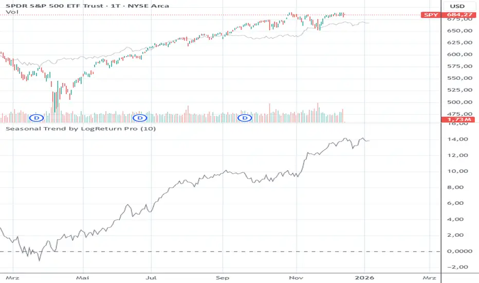
Session ATR Progression Tracker📊 Session ATR Progression Tracker - SIYL Regression Trading Tool
Track how much of your instrument's 7-day Average True Range (ATR) has been covered during the current trading session. This indicator is specifically designed for regression traders who follow the "Stay In Your Lane" (SIYL) methodology, helping you identify when the probability of mean reversion significantly increases. If you are interested in more on that check out Rod Casselli and tradersdevgroup.com.
🎯 Key Features:
• Real-time ATR Coverage Percentage - See at a glance what percentage of the 7-day ATR has been covered in the current session
• SIYL-Optimized Thresholds - See at a glance when the instrument has achieved 80% and 100% ATR coverage, the proven thresholds where mean reversion probability increases (customizable)
• Flexible Session Modes:
- Daily: Resets at calendar day change
- Session: Uses exchange-defined trading sessions
- Custom Session: Set your exact session start/end times (perfect for futures traders and international markets)
• Visual Alerts - Color-coded display (gray → orange → red) and optional background highlighting
• Repositionable Display - Choose from 9 screen positions to avoid chart clutter
• Session Markers - Green triangles mark the start of each new session
• Detailed Stats - View current range, ATR value, session high/low, and session status
💡 Why Use This Indicator?
This tool is built around a proven concept: regression trading becomes significantly more effective once a session has achieved at least 80% of its 7-day ATR. At this threshold, the probability of price reverting to mean increases substantially, creating higher-probability trade setups for SIYL practitioners.
Benefits for regression traders:
- Identify optimal entry points when mean reversion probability is highest (≥80% ATR coverage)
- Avoid premature regression entries before adequate range has been established
- Recognize when daily moves have "earned their range" and are ripe for reversal
- Time fade-the-move and counter-trend strategies with statistical backing
- Improve win rates by trading only after proven probability thresholds are met
⚙️ Setup Instructions:
1. Add the indicator to your chart
2. Select your preferred "Reset Mode" (recommend "Custom Session" for futures/international markets)
3. If using Custom Session, enter your session times in 24-hour format (e.g., 0930-1600 for US stocks, 1700-1600 for CME futures)
4. Adjust alert thresholds if desired (default: 80% and 100% - proven SIYL thresholds)
5. Position the display where it's most visible on your chart
📈 Works Across All Markets:
Stocks • Futures • Forex • Indices • Crypto • Commodities
Perfect for regression traders, mean reversion specialists, and SIYL practitioners who want to trade with probability on their side by entering only after the session has "earned its range."
---
Tip: For futures contracts with overnight sessions that span calendar days (like MES, MNQ, MYM), use "Custom Session" mode with your exchange's official session times for accurate tracking.

VolatilityCone by ImpliedVolatility ProVolatilityCone by ImpliedVolatility Pro
VolatilityCone by ImpliedVolatility Pro is a forward-looking volatility projection tool that visualizes expected price ranges based on implied volatility.
It draws a volatility cone starting from a user-defined date and projects statistically expected price boundaries into the future using standard deviation theory.
🔍 What does this indicator do?
This indicator calculates and plots price ranges that represent ±1, ±2, and ±3 standard deviations from a starting price, based on implied volatility.
The result is a cone-shaped projection that shows where price is statistically likely to move over time.
In addition, the indicator calculates a Z-Score, showing how far the current price deviates from the expected mean in volatility terms.
📐 Key Features
→ Forward projection based on implied volatility
→ Supports up to 3 standard deviation levels
→ Optional display of half standard deviation levels
→ Manually enter implied volatility or automatically fetch IV from another symbol (e.g. VIX)
→ Custom Start Date
→ The cone starts exactly at the selected date
→ Ideal for earnings, events, or cycle-based analysis
→ Displays the statistical mean price
→ Z-Score indicates how extreme the current price is relative to the cone
📊 How to Use
Price inside the cone
→ Normal volatility behavior
Price near ±1σ
→ Typical volatility range
Price near ±2σ or ±3σ
→ Statistically stretched or extreme conditions
Positive Z-Score
→ Price trading above the mean
Negative Z-Score
→ Price trading below the mean
This makes the indicator useful for:
→ Volatility analysis
→ Mean reversion strategies
→ Risk assessment
→ Event-based forecasting
→ Options-related analysis
⚙️ Notes & Disclaimer
This indicator is not a prediction tool, but a statistical projection
It assumes volatility follows a square-root-of-time model
Best used as a context tool, not as a standalone trading signal
Expectativa de Juros (Fed)An indicator that measures future expectations for US interest rates, measured by the difference between the Fed's interest rate and pricing on the CME.

Unmitigated Liquidity ZonesUnmitigated Liquidity Zones
Description:
Unmitigated Liquidity Zones is a professional-grade Smart Money Concepts (SMC) tool designed to visualize potential "draws on liquidity" automatically.
Unlike standard Support & Resistance indicators, this script focuses exclusively on unmitigated price levels — Swing Highs and Swing Lows that price has not yet revisited. These levels often harbor resting liquidity (Stop Losses, Buy/Sell Stops) and act as magnets for market makers.
How it works:
Detection: The script identifies significant Pivot Points based on your customizable length settings.
Visualization: It draws a line extending forward from the pivot, labeled with the exact Price and the Volume generated at that specific swing.
Mitigation Logic: The moment price "sweeps" or touches a level, the script treats the liquidity as "collected" and automatically removes the line and label from the chart. This keeps your workspace clean and focused only on active targets.
Key Features:
Dynamic Cleanup: Old levels are removed instantly upon testing. No chart clutter.
Volume Context: Displays the volume (formatted as K/M/B) of the pivot candle. This helps you distinguish between weak structure and strong institutional levels.
High Visibility: customizable bold lines and clear labels with backgrounds, designed to be visible on any chart theme.
Performance: Optimized using Pine Script v6 arrays to handle hundreds of levels without lag.
How to trade with this:
Targets: Use the opposing liquidity pools (Green lines for shorts, Red lines for longs) as high-probability Take Profit levels.
Reversals (Turtle Soup): Wait for price to sweep a bold liquidity line. If price aggressively reverses after taking the line, it indicates a "Liquidity Grab" setup.
Magnets: Price tends to gravitate toward "old" unmitigated levels.
Settings:
Pivot Length: Sensitivity of the swing detection (default: 20). Higher values find more significant/long-term levels.
Limit: Maximum number of active lines to prevent memory overload.
Visuals: Toggle Price/Volume labels, adjust line thickness and text size.

SigmaFlowSigmaFlow is a professional signal management connector designed to work with the SigmaFlow app. This indicator allows traders to structure trade setups (Entry, Stop Loss, TP1, TP2) on TradingView and send them into the SigmaFlow platform, where signals are managed, tracked, and delivered to Telegram.
Professional signal management — from TradingView to Telegram.
How SigmaFlow Works:
Sends trade data from TradingView to Telegram via the SigmaFlow platform.
SigmaFlow handles signal management, organization, history tracking, performance metrics, and Telegram delivery.
What It Does NOT Do:
Does not generate trading signals
Does not provide investment advice
Does not execute trades
Requirements:
TradingView plan with webhook alerts*
Active SigmaFlow account*
Disclaimer
SigmaFlow is a signal management and delivery tool only. All trade ideas are created manually by users. Trading involves risk and past performance does not guarantee future results.
