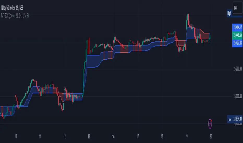
Divergance Based on Vortex IndicatorThe Vortex-Based Divergence Indicator represents a groundbreaking approach to analyzing market dynamics within the realm of technical analysis. Drawing inspiration from the concept of vortices and their cyclical patterns, this indicator strives to illuminate potential divergence points within financial markets, providing traders with valuable insights for informed decision-making.
At its foundation, the Vortex-Based Divergence Indicator builds upon the principles of the Vortex Indicator, a well-established tool for gauging momentum and identifying potential trend reversals. However, this innovative indicator goes a step further by focusing on the divergences that can occur between the Vortex Indicator and the actual price movements.
Divergences, which arise when the direction of an indicator's movement contradicts the direction of price action, hold paramount significance within the Vortex-Based Divergence Indicator. By integrating this indicator with other renowned oscillators, such as the Relative Strength Index (RSI) or the Moving Average Convergence Divergence (MACD), traders can augment their analytical capabilities significantly.
These complementary oscillators can corroborate or validate the signals generated by the Vortex-Based Divergence Indicator. For instance, when the Vortex-Based Divergence Indicator hints at a potential trend reversal, cross-referencing this insight with the RSI's overbought or oversold levels can enhance the accuracy of the prediction. Likewise, employing the MACD to confirm momentum shifts in conjunction with the Vortex Indicator's signals can provide a more comprehensive view of market dynamics.
It's crucial to emphasize the importance of synergy when combining these indicators. Rather than relying solely on the Vortex-Based Divergence Indicator, incorporating other oscillators acts as a checks-and-balances system, reducing false signals and enhancing the overall reliability of the trading strategy. However, prudent traders also recognize that no indicator or combination thereof is foolproof. Additional factors, such as fundamental analysis and market news, should also be considered to achieve well-rounded trading decisions.
In essence, the Vortex-Based Divergence Indicator's integration with established oscillators like RSI and MACD offers traders a powerful toolkit to navigate complex market landscapes. By leveraging the strengths of each indicator and cross-referencing their insights, traders can elevate their trading strategies to new heights of accuracy and effectiveness.
Sentiment

Double Supertrend HTF FilterDouble Supertrend HTF Filter: A Comprehensive Market Direction Tool
The Double Supertrend HTF Filter is an innovative tool designed for traders who seek a more holistic view of market trends. At its core, the indicator combines two Supertrends from different higher timeframes, providing a layered perspective on the market's direction. Instead of juggling between multiple timeframes or charts, traders get a consolidated view with this indicator. One of its standout features is the horizontal line at the bottom of the chart, which visually represents the alignment of the two Supertrends – a simple yet powerful way to gauge the combined sentiment of the two higher timeframes on your chart.
The Supertrend Indicator: Origins and Rationale
The Supertrend indicator, a popular tool among traders, was developed by Olivier Seban. At its essence, the Supertrend is a trend-following indicator, designed to identify and visualize the current market trend. It operates using average true range (ATR) values and price data, effectively smoothing out market noise to present clearer trend directions. When prices move with a consistent momentum upwards or downwards, the Supertrend remains below or above the price respectively, signaling the prevailing trend's direction. The rationale behind the Supertrend is its ability to adapt to price volatility. By factoring in the average true range, it dynamically adjusts itself, ensuring that it's not just based on price but also the inherent volatility of the market. This adaptability makes it a valuable tool for traders, offering insights into potential trend reversals and potential entry or exit points.
Filter Usage
The main idea behind the Double Supertrend HTF is to use the indicator as a filter in addition to a signal indicator to your liking. To illustrate, consider incorporating it with a MACD Oscillator, such as the one detailed in this article: When the solid line at the bottom of the chart turns green, it signals that both supertrends are up and thus allows for long positions, indicating a bullish sentiment across both the chosen higher timeframes. Conversely, a red line permits short positions, hinting at a bearish trend. Should the line turn yellow, it's a sign of caution. The market is indecisive, and it might be prudent to refrain from taking any trades until a clearer direction emerges.
Features of the Indicator
Understanding that traders have different preferences, the Double Supertrend HTF Filter comes with customizable features. With the easy user interface you can change the timeframe, ATR and factor to your preferred trading strategy. The default settings are set for the 30 minutes and 4 hour timeframe, which is my personal preference for scalping trades on lower timeframes (eg. 1min, 5 min, 10 min, 15 min). While the dual Supertrend lines offer valuable insights, a chart can become cluttered when combined with other indicators. Therefore, traders have the option to toggle on or off the display of the Supertrends. This ensures that you have the flexibility to maintain a clean chart view while still benefiting from the insights the tool provides at the bottom of the chart.
A Note on Usage
It's essential to highlight that the Double Supertrend HTF Filter is for educational purposes. While it offers a unique perspective on market trends and can be a valuable addition to a trader's toolkit, it's merely an example of how one can use the Supertrend as a filter. Always conduct thorough research and consider your trading strategy before making any decisions.
If you have any comments or ideas how to combine this filter with other indicators feel free to leave a comment.

Variation from Opening📈 Purpose: This script provides traders with a clear visualization of the percentage variation from the opening price for two major futures contracts: ES1! (S&P 500 futures) and NQ1! (Nasdaq 100 futures).
🔑 Key Features:
Real-Time Price Retrieval: Fetches the latest opening prices for ES1! and NQ1! contracts.
Percentage Variation Computation: Determines the percentage change from the opening price, offering traders an immediate view of market dynamics.
Clear Visualization: Plots the percentage variation for both contracts in distinct colors (red for ES1! and blue for NQ1!) for easy differentiation.
💡 Benefits:
Informed Trading: Understand intraday price movements to make better trading decisions.
Versatility: While tailored for ES1! and NQ1!, the script can be adapted for other securities.
Clean Display: A focused, clutter-free chart ensures traders can quickly gauge market movements.
🎯 Ideal For: Traders looking to monitor intraday price shifts of major futures contracts.
Equip yourself with the "Variation from Opening" script and enhance your trading insights!

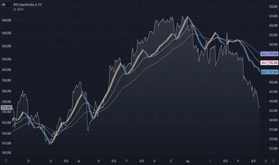
Bolton-Tremblay IndexThe Bolton-Tremblay Index (BOLTR) is a dynamic cumulative advance-decline indicator which incorporates the count of unchanged issues as a fundamental element. This index serves as a valuable tool for identifying shifts in market trends and gauging the overall strength or weakness of the market. To enhance its effectiveness and reveal underlying trends, BOLTR has been refined through a Heiken-Ashi transformation, resulting in a smoother and more insightful representation.
Calculation and Methodology:
r = (adv - dec) / unch
var float bt = na
bt := r > 0 ? nz(bt ) + math.sqrt(math.abs(r)) : nz(bt ) - math.sqrt(math.abs(r))
The BOLTR index is derived from a calculation involving three essential components: advancing issues (ADV), declining issues (DEC), and securities with unchanged closing prices (UNC). By formulating the ratio (ADV - DEC) / UNC, BOLTR captures the relationship between market movements and unchanged securities. This ratio then dictates whether the BOLTR index increases or decreases in the following period. If the ratio is positive, the index advances, and if negative, it retreats. This iterative process yields a cumulative index that reflects the evolving dynamics of market trends.
Heiken-Ashi Transformation:
The addition of a Heiken-Ashi transformation imparts a smoothing effect to the BOLTR index, revealing the underlying trend with greater clarity. This transformation diminishes noise and fluctuations, making it easier to identify meaningful shifts in market sentiment and overall market health.
Utility and Use Cases:
-The Bolton-Tremblay Index offers a range of applications that contribute to informed decision-making-
1. Trend Analysis: BOLTR provides insights into the changing trends of the market, helping traders and investors identify potential shifts in market sentiment.
2. Market Strength Assessment: By considering advancing, declining, and unchanged issues, BOLTR offers a comprehensive assessment of market strength and potential weaknesses.
3. Divergences: Traders can use BOLTR to detect divergences between price movements and the cumulative advance-decline dynamics, potentially signaling shifts in market direction.
The Bolton-Tremblay Index offers a versatile toolset for interpreting market trends, evaluating market health, and making better informed trading decisions.
See Also:
- Other Market Breadth Indicators-
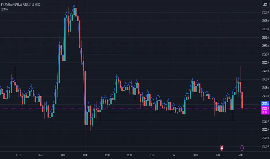
Spot lineSpot line serves the same purpose as the built-in "Compare or Add Symbol" feature, except it automatically switches symbols. It will try to find the spot version of whatever perpetual (.P) you're viewing on Binance, Coinbase, then KuCoin.
Source (O/H/L/C) is configurable in settings.
Each exchange is distinguishable by color.
PDHL levels with INTRADAY Auto FIBThe present script includes Previous day High/low levels and once the PDH or PDL breaks the present bar's background changes color according to the direction of price breakout.
It's helpful when working on lower timeframe charts with small screen space, so that the user can know that the PDHL has been taken out in one glance at the chart instead of scrolling all around to find out whether the PDH or PDL are broken or not.
The high and low of day before yesterday are also plotted for reference.
The intraday fib levels get drawn taking present day's high and low into account, useful to mark support/retest levels.
The color of the intraday AUTO FIB high and low lines also change from gray to respective assigned colors once the present day price crosses PDH or PDL this is helpful while viewing charts on mobile app.
Disclaimer: Only for studying price movement ideas, trading is not advised.

Combined Stock Session Percent Change MonitorIntroducing the "Combined Stock Session Percent Change Monitor" - a unique tool tailored for traders who wish to track the collective performance of up to five stocks in real-time during a trading session.
Key Features:
User Customization: Easily input and monitor any five stock symbols of your choice. By default, the script tracks "AAPL", "MSFT", "AMZN", "TSLA", and "NVDA".
Session-Based Tracking: The script captures and calculates the percentage change from the start of a trading session, set at 15:30. This allows traders to gauge intraday performance.
Visual Clarity: The combined percentage change is plotted as columns, with green indicating a positive change and red indicating a negative change. This provides a clear, visual representation of the stocks' collective performance.
Versatility: Whether you're tracking the performance of stocks in a specific sector, or you're keeping an eye on your personal portfolio's top holdings, this tool offers a concise view of collective stock movement.
Usage:
Simply input the desired stock symbols and let the script do the rest. The plotted columns will provide a quick snapshot of how these stocks are performing collectively since the session's start.
Conclusion:
Stay ahead of the market by monitoring the combined performance of your chosen stocks. Whether you're an intraday trader or a long-term investor, this tool offers valuable insights into collective stock behavior. Happy trading!
(Note: Always conduct your own research and due diligence before making any trading decisions. This tool is meant to aid in analysis and not to serve as financial advice.)
Realized Profit & Loss [BigBeluga]The Realized Loss & Profit indicator aims to find potential dips and tops in price by utilizing the security function syminfo.basecurrency + "_LOSSESADDRESSES".
The primary objective of this indicator is to present an average, favorable buying/selling opportunity based on the number of people currently in profit or loss.
The script takes into consideration the syminfo.basecurrency, so it should automatically adapt to the current coin.
🔶 USAGE
Users have the option to enable the display of either Loss or Profit, depending on their preferred visualization.
Examples of displaying Losses:
Example of displaying Profits:
🔶 CONCEPTS
The concept aims to assign a score to the data in the ticker representing the realized losses. This score will provide users with an average of buying/selling points that are better to the typical investor.
🔶 SETTINGS
Users have complete control over the script settings.
🔹 Calculation
• Profit: Display people in profit on an average of the selected length.
• Loss: Display people in loss on an average of the selected length.
🔹 Candle coloring
• True: Color the candle when data is above the threshold.
• False: Do not color the candle.
🔹 Levels
- Set the level of a specific threshold.
• Low: Low losses (green).
• Normal: Low normal (yellow).
• Medium: Low medium (orange).
• High: Low high (red).
🔹 Z-score Length: Length of the z-score moving window.
🔹 Threshold: Filter out non-significant values.
🔹 Histogram width: Width of the histogram.
🔹 Colors: Modify the colors of the displayed data.
🔶 LIMITATIONS
• Since the ticker from which we obtain data works only on the daily timeframe, we are
restricted to displaying data solely from the 1D timeframe.
• If the coin does not have any realized loss data, we can't use this script.

ATR + Momentum Shifts w/Take ProfitThis script is a technical analysis indicator designed to assist in identifying potential entry points and setting take profit levels in trading. It combines the Average True Range (ATR) indicator, momentum shifts, and customizable take profit levels to provide insights into potential market movements.
Differences from Currently Published Ones:
This script is unique due to its use of a combination of elements:
ATR and Momentum: The script combines the ATR indicator to provide dynamic support and resistance levels with the momentum indicator to identify shifts in the underlying momentum.
Customizable Take Profit Levels: It offers the ability to set take profit levels based on customizable multipliers of the ATR, helping traders manage potential profits.
How to Use:
ATR Bands: The script plots upper and lower ATR bands as potential dynamic support and resistance levels.
Shift Arrows: Arrows are plotted below bars for potential long entry opportunities (green triangle) and above bars for potential short entry opportunities (yellow triangle).
Take Profit Levels: The script also plots take profit levels both above and below the source price based on the ATR multipliers set in the inputs.
Markets and Conditions:
This script can be used across various financial markets, including stocks, forex, commodities, and cryptocurrencies. It's most effective in trending markets where momentum shifts can signal potential reversals or continuation of trends. Traders should consider the following conditions:
Trend Confirmation: Look for momentum shifts in the direction of the prevailing trend for higher probability setups.
Volatility: Higher volatility can amplify ATR movements and subsequently affect the placement of ATR bands and take profit levels.
Risk Management: Always implement proper risk management strategies to protect your capital.
Additional Considerations:
Customization: Traders can adjust input parameters like ATR length, momentum length, and take profit multipliers to match their trading style and market conditions.
Combining with Other Indicators: Consider using this indicator in conjunction with other technical indicators or chart patterns for confirmation.

Magic Trend By Market Mindset - Zero To EndlessMagic Trend indicator is an indicator combining the Commodity Channel Index (CCI) and the Average True Range (ATR) indicators.
The indicator is represented by a line that turns red when CCI readings are below 0 and converts to blue when CCI reaches above 0.
Color of the line can be treated as a trend indicator.
When CCI > 0 (Blue Color), price is assumed to be in uptrend and a buying momentum could be seen.
When CCI < 0 (Red Color), price is assumed to be in downtrend and a selling pressure could be seen.
Two Multipliers of ATR have been used. Default values for multiploier are : 1.5 and 3.0
It tells about the volatality in the price and also helps in deciding Entry poits, Stop loss points and sometimes Exit points.
If trend magic lines are not straight and moving upward/downward, continuition of the trend is expected and so Holding the position is adviced.
If the farther line (line with multiplier 3.0) is broken, a trend reversal can be seen soon.
In this case, squaring off and making reverse position is adviced near the other (1.5 mult) line.
If price is revolving in between these two lines... a sideways movement is expected.
Happy Trading
Market Mindset

SPDR TrackerMonitor all SPDR Index Funds in one location! The purpose of this indicator is to review which sectors are trend up vs down to better manage risk against SPY, other funds and/or individual stocks.
With this indicator it may become more apparent which sectors to begin investment in that are at lows compared to others, or use it to determine which stocks may be undervalued or overvalued against SPY.
There is a small table at the bottom where each fund symbol is presented along with it's mode value, last period change as well as last period volume - there's a tooltip that shows the description for each symbol for a quick reminder.
Review the configuration pane where:
Individual funds can have their visibility toggled
Change funds colors
Adjust display mode for each fund (SMA, EMA, VWMA, BBW, Change, ATR, VWAP - many more!)
Some presentation modes may look better on some timeframes vs others, adjust lengths and use anchor point for VWAP.
Future updates may bring about new features, I have some code organization and refactoring to do but wanted to share the idea anyways.
Feel free to drop any suggestions for feature enhancement and I hope it brings success to many, enjoy.

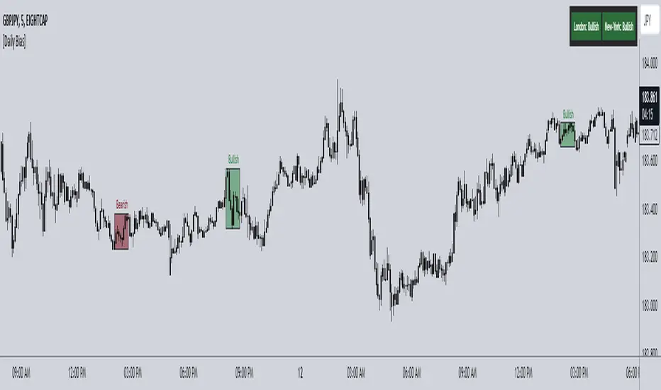
ICT Daily Bias Finder [DTCC]What is This?
The ICT Daily Bias Finder uses a method called "DTCC" to identify the London and New York session's bias, bullish or bearish. This indicator should only be relied on for 5 minute, and not other timeframes.
How do I use it?
Look at the previous days two boxes (labeled DTCC Bear/DTCC Bull), if both are bullish or both are bearish it is NOT recommended to rely on DTCC for that day. If the first one is bullish and second one is bearish, the DTCC for the next day says that London session will turn ABOVE midnight opening price, while New York will turn UNDER midnight opening price (longs in London, shorts in New York). If the second one is bearish and the first is bullish, the DTCC for the next day says that London session will turn UNDER midnight opening price, while New York will turn ABOVE midnight opening price (shorts in London, longs in New York)
Emoji guide to DTCC indicator:
🟢🟢: Don't trust DTCC for that day
🔴🔴: Don't trust DTCC for that day
🟢🔴: Longs in London above Midnight Opening Price, Shorts in New York under Midnight Opening Price
🔴🟢: Shorts in London under Midnight Opening Price, Longs in New York under Midnight Opening Price
Reminder: NEVER rely solely on DTCC, DTCC can be wrong and is not right 100% of times.
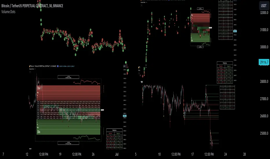
Liquidation Ranges + Volume/OI Dots [Kioseff Trading]Hello!
Introducing a multi-faceted indicator "Liquidation Ranges + Volume Dots" - this indicator replicates the volume dot tools found on various charting platforms and populates a liquidation range on crypto assets!
Features
Volume/OI dots populated according to user settings
Size of volume/OI dots corresponds to degree of abnormality
Naked level volume dots
Fixed range capabilities for volume/OI dots
Visible time range capabilities for volume/OI dots
Lower timeframe data used to discover iceberg orders (estimated using 1-minute data)
S/R lines drawn at high volume/OI areas
Liquidation ranges for crypto assets (10x - 100x)
Liquidation ranges are calculated using a popular crypto exchange's method
# of violations of liquidation ranges are recorded and presented in table
Pertinent high volume/OI price areas are recorded and presented in table
Personalized coloring for volume/OI dots
Net shorts / net long for the price range recorded
Lines shows reflecting net short & net long increases/decreases
Configurable volume/OI heatmap (displayed between liquidation ranges)
And some more (:
Liquidation Range
The liquidation range component of the indicator uses a popular crypto exchange's calculation (for liquidation ranges) to populate the chart for where 10x - 100x leverage orders are stopped out.
The image above depicts features corresponding to net shorts and net longs.
The image above shows features corresponding to liquidation zones for the underlying coin.
The image above shows the option to display volume/oi delta at the time the corresponding grid was traded at.
The image above shows an instance of using the "fixed range" feature for the script.
*The average price of the range is calculated to project liquidation zones.
*Heatmap is calculated using OI (or volume) delta.
Huge thank you to Pine Wizard @DonovanWall for his range filter code!
Price ranges are automatically detected using his calculation (:
Volume / OI Dots
Similar to other charting platforms, the volume/OI dots component of the indicator distinguishes "abnormal" changes in volume/OI; the detected price area is subsequently identified on the chart.
The detection method uses percent rank and calculates on the last bar of the chart. The "agelessness" of detection is contingent on user settings.
The image above shows volume dots in action; the size of each volume dot corresponds to the amount of volume at the price area.
Smaller dots = lower volume
Larger dots = higher volume
The image above exemplifies the highest aggression setting for volume/OI dot detection.
The table oriented top-right shows the highest volume areas (discovered on the 1-minute chart) for the calculated period.
The open interest change and corresponding price level are also shown. Results are listed in descending order but can also be listed in order of occurrence (most relevant).
Additionally, you can use the visible time range feature to detect volume dots.
The feature shows and explains how the visible range feature works. You select how many levels you want to detect and the script will detect the selected number of levels.
For instance, if I select to show 20 levels, the script will find the 20 highest volume/OI change price areas and distinguish them.
The image above shows a narrower price range.
The image above shows the same price range; however, the script is detecting the highest OI change price areas instead of volume.
* You can also set a fixed range with this feature
* Naked levels can be used
Additionally, you can select for the script to show only the highest volume/ OI change price area for each bar. When active, the script will successively identify the highest volume / OI change price area for the most recent bars.
Naked Levels
The image above shows and explains how naked levels can be detected when using the script.
And that's pretty much it!
Of course, there're a few more features you can check out when you use the script that haven't been explained here (:
Thank you again to @DonovanWall
Thank you to @Trendoscope for his binary insertion sort library (:
Thank you to @PineCoders for their time library
Thank you for checking this out!
Historic Volume/Market ProfilesHistoric Volume/Market Profile is a Periodic Volume Profile with all of the improvements known in the original Volume/Market Profile.
VMP is a 2 in 1 Volume and Market Profile Indicator.
HVMP uses the base of VMP to offer a quick and simple view at multiple historic profiles at the same time.
This includes:
Cluster Identification for High Volume and Low Volume Areas.
Maximizing granularity by utilizing boxes and lines to get up to 1000 rows.
New Inclusions in HVMP vs VMP:
HVMP granularity is determined by the # of profiles on display. By doing this, each profile will get an even amount of allocated rows to use and granularity is scaled per-profile, to fit within the row allowance.
For Example: 1000/(# of profiles) = Maximum # of rows per profile.
HVMP introduces the "Auto-Scale" Option (on by Default), this automatically fits each profile within the defined timeframe period to provide a consistent display when switching timeframes.
Even with "Auto-Scale" enabled, "Display Size" dictates which direction the profile is displayed.
Below is a Negative Display Size (Displays from right to left, starting at the end of the period)
Below is a Positive Display Size (Displays from left to right, starting at the beginning of the period)
HVMP is only for historical data, you can get a live profile with the same Node Identification using VMP (Volume Market/Profile). The indicator that this one is based on.
Find it Here: Volume/Market Profile
Enjoy!

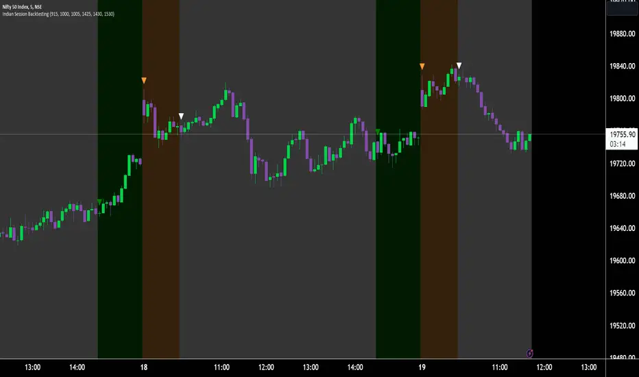
Indian Market Sessions for BacktestingThis indicator is designed to increase the quality of your backtesting in the Indian Market.
NSE & BSE run from 9:15 am IST to 3:30 pm IST.
Naturally different times have different kinds of volatility.
On your chart you will find premarked -
Saffron - 9:15 am to 10:30 am - Opening Session - High Volatility Observed Historically
White - 10:35 am to 2:25 pm - Middle Session - Lower Volatility Observed Historically
Green - 2:30 pm to 3:30 pm - Closing Session - Medium to High Volatility Observed Historically
You will also find the start of each session marked with an arrow.
Feel free to change the times from the input settings and the color and visibility from the style settings.
_______________
Usage:
When you backtest any strategies, say moving average crossovers, also mark the sessions in your sheet which will help you further increase accuracy.
Feel free to drop your doubts in the comments.