Scanner Pro MTF v9.3Manual Script Trading Scanner Pro MTF v9.3
How to Interpret Your New Tool
• Total Alignment (The Holy Grail): When you see the chart turn green (LONG) from 15m to D1, it's a high-probability signal that the cycle's bottom has been confirmed.
• Inside Bars (Yellow Dots): When they appear near a support level, they indicate indecision. If the next candle breaks upwards with high volume ('V' on the chart), it's your entry confirmation.
Here's an explanation of the symbols:
1. The Fuchsia Diamond (The "Little Squares")
This symbol represents a Squeeze (Volatility Compression).
• What it means: It appears when the Bollinger Bands move inside the Keltner Channels.
• Interpretation: It indicates that the market is in a period of extreme calm or accumulation. Historically, after a "Squeeze," an explosive price movement occurs.
• Use in your Roadmap: If Bitcoin reaches $59,000 and these fuchsia diamonds start appearing, get ready: the market is building energy for the next big surge.
2. The White "V" (Unusual Volume)
This signal appears at the top of the chart when there is a spike in volume.
• What it means: It is activated when the volume of the current candle is 50% higher than the average of the last 20 candles (volume > ta.sma(volume, 20) * 1.5).
• Interpretation: It confirms the intention. A breakout from support or resistance with a "V" is much more reliable than one without volume.
• Use in your Roadmap: If you see a strong green candle bouncing off a support level with a "V" above it, it's a sign that institutions ("Smart Money") are buying.
3. The Yellow Circle (Inside Bar)
This symbol appears above candles that are "trapped" within the range of the previous candle.
• What it means: The high of the candle is lower than the previous one, and its low is higher than the previous one.
• Interpretation: It is a sign of pause and indecision. The market is compressing the price into a narrow range.
• Strategy: Often, the price breaks out strongly after an Inside Bar. It's like a spring being compressed.
________________________________________
Trading Summary:
• Ideal Buy Signal: Price near support + Fuchsia Diamond (Squeeze) + Yellow Circle (Inside Bar) + Bullish breakout with a "V" (Volume).
• Confirmation: All of the above occurs while the chart in row D1 or H4 changes to LONG (Green).
• Ideal Sell Signal: Price near resistance + Fuchsia Diamond (Squeeze) + Yellow Circle (Inside Bar) + Bearish breakout with a "V" (Volume).
• Confirmation: All of the above occurs while the chart in row D1 or H4 changes to SHORT (Red).
M-oscillator

Mass Sentiment & Contrarian (Only Signals)
________________________________________
📘 Contrarian Mass Sentiment Indicator Manual
This indicator is designed to identify moments of psychological exhaustion in the market. Its philosophy is "buy panic and sell euphoria."
1. Where and how is the data taken from?
The indicator analyzes three real-time data sources to filter the signals:
• Psychology (RSI): We use the Relative Strength Index (RSI) to measure the speed and change in price movements.
• If the RSI is very high (>70-75), the "mass" is overbuying (greed).
• If the RSI is very low (<25-30), the "mass" is overselling (panic).
• Price Action (Candlesticks): It is not enough for the RSI to be at an extreme. The indicator looks for reversal patterns (Hammer, Shooting Star, or Engulfing candlesticks). This confirms that the price has indeed found a top or bottom.
• Price Action (Candlesticks): It is not enough for the RSI to be at an extreme. The indicator looks for reversal patterns (Hammer, Shooting Star, or Engulfing candlesticks). This confirms that the price has actually found a top or bottom.
• Price Action (Candlesticks): • Market Effort (Volume): At "Strong" levels, the indicator requires volume to exceed its 20-period moving average. This identifies a volume climax, which typically marks the end of a move.
________________________________________
2. User Manual: Signal Interpretation
The indicator classifies opportunities according to their probability of success:
A. Intensity Levels
Label Strength Meaning Suggested Action
F-VTA / F-CPA Strong Maximum euphoria/panic + Volume + Reversal candle. High probability signal. Look for immediate entry.
M-VTA / M-CPA Medium Standard overload level + Reversal candle. Solid technical confirmation. Trade in favor of the structure.
D-VTA / D-CPA Weak The RSI is just beginning to reverse from moderate levels. Early warning. Do not enter without confirmation using other tools.
B. Trade Execution (Contrarian)
1. Location: Wait for a label to appear. The best are the Strong (F) or Medium (M) lines.
2. Stop Loss: Always place it a few pips/points above the high of the signal candle (for selling) or below the low (for buying).
3. Take Profit: * Target 1: The mid-RSI level (50).
or Target 2: The opposite RSI band (if you sold at 70, aim to close at 30).
________________________________________
3. Golden Tips
• Avoid sideways markets: In very narrow ranges, the RSI can give false signals ("wobbling"). Look for signals that occur after a clear and extended trend.
• Timeframes: The indicator is most reliable on 15-minute, 1-hour, and 4-hour timeframes. On the 1-minute timeframe, market "noise" can generate constant weak signals.
• Confluence: If you see an F-VTA (Strong Sell) signal right at a historical price resistance, the probability of success increases dramatically.

MacroTide Elasticity SystemThe MacroTide Elasticity System is a professional-grade technical analysis tool designed to identify potential trend exhaustions and reversals by modeling price action as an elastic band stretched from a volume-weighted baseline. Unlike standard oscillators (like RSI) that only look at price changes, MacroTide integrates Volume, Price Range, and Volatility to gauge the "energy" behind a move.
1. Concepts and Methodology
The core concept is Mean Reversion based on Volume-Weighted Elasticity. Markets tend to snap back to a value consensus (mean) after over-extension.
Volume-Weighted Baseline: We use a Volume Weighted Moving Average (VWMA) rather than a simple SMA. This ensures that heavy-volume trading days pull the baseline closer to price, while low-volume drift allows the baseline to lag, accurately representing the "true" average cost.
Elasticity Physics: The oscillator calculates how far price has deviated from this VWMA baseline, measured in standard deviations. This creates a normalized "Elasticity Score" (0-100).
High Score (>80): Price is over-extended to the upside (Overbought) relative to volume support.
Low Score (<20): Price is over-extended to the downside (Oversold).
Institutional Absorption (Churn): The script detects specific bar anomalies where Volume is High but Price Range is Low. This pattern often indicates "Churn"—where institutions are absorbing supply or unloading positions without moving the price significantly.
2. Key Features
MacroTrend Detection: Visualizes the market's stretch limits.
Divergence Scanner: Automatically detects and labels Regular Bullish and Bearish divergences. This occurs when price makes a new extreme, but the Elasticity Oscillator fails to confirm it, signaling waning momentum.
Absorption Events: Highlights yellow "sun" markers on the oscillator when high-volume churn is detected, often preceding a breakout or reversal.
Dynamic Coloring: Candles and oscillator lines change color based on the slope of the elasticity (Green for rising momentum, Red for falling).
3. How to Use
Trend Reversals: Look for the oscillator to enter the Overbought (80) or Oversold (20) zones. A reversal signal (triangle marker) is generated when the oscillator crosses back out of these zones, indicating the "snap back" effect has begun.
Divergence Confirmation: Use the "DIV" labels as early warning signs. A Bullish Divergence in an oversold zone is a high-probability setup for a long entry.
Filtering Trends: The center line (50) acts as a trend filter. Above 50 indicates bullish bias; below 50 indicates bearish bias.
4. Settings & Customisation
Lookback Period: Default is 21 (Swing). Increase to 50 or 100 for Macro/Long-term analysis.
StdDev Multiplier: Adjusts the sensitivity of the bands. Higher values (e.g., 2.5 or 3.0) are better for volatile assets like Crypto.
Absorption Volume Factor: Threshold for detecting churn. Default is 1.5x average volume.
Disclaimer: This tool is for informational purposes only. Past performance (divergences/signals) does not guarantee future results. Always manage risk effectively.

Composite Fear & Greed IndexComposite Fear & Greed Index
This is an advanced, professional-grade sentiment analysis engine designed to quantify market psychology. Unlike standard oscillators that rely on a single metric, this script uses a weighted composite of four distinct technical components to generate a holistic "Fear & Greed" score.
It includes Multi-Timeframe (MTF) capabilities, proprietary FOMO/Panic detection logic, and Zero-Lag trend analysis.
1. Unique Mathematical Methodology
This script is not a simple overlay of existing indicators. It uses a Composite Normalization Engine to blend four distinct metrics into a single, bounded 0-100 oscillator.
The "Mashup" Problem Solved: Standard indicators like MACD are "unbounded" (they can go to infinity), while RSI is "bounded" (0-100). You cannot simply average them.
Our Solution: This script calculates the Z-Score of the MACD histogram relative to its historical deviation and normalizes it into a 0-100 percentile. This allows for a mathematically valid combination with RSI and Bollinger Bands.
The Component Logic:
Momentum (RSI): (Weight: 30%) Pure price velocity.
Volatility (Bollinger %B): (Weight: 25%) Relative position within volatility bands.
Trend Strength (Normalized MACD): (Weight: 25%) Uses the custom Z-Score logic described above.
Trend Integrity (ZLEMA): (Weight: 20%) We replaced the standard SMA with a custom Zero-Lag Exponential Moving Average (ZLEMA) algorithm. This removes the "lag" associated with traditional sentiment analysis, allowing the index to react to crypto volatility in real-time.
The Calculation: These raw values are weighted and smoothed to produce the final Index Value.
Greater than 80: Extreme Greed (High risk of reversal)
Less than 20: Extreme Fear (Potential accumulation zone)
2. Unique Features
A. FOMO & Panic Event Detection The script does not just track price; it tracks behavior.
FOMO (Fear Of Missing Out): Triggered when Price breaks the Upper Bollinger Band + RSI is Overbought + Volume spikes > 2.5x the average. This often marks local tops.
PANIC: Triggered when Price drops significantly in one bar + Volume spikes > 3.0x the average + RSI is Oversold. This often marks capitulation bottoms.
B. Divergence Detection The script automatically detects and plots Regular Bullish and Bearish divergences between Price and the Sentiment Index.
Bullish Divergence: Price makes a Lower Low, but Sentiment makes a Higher Low (indicating waning selling pressure).
Bearish Divergence: Price makes a Higher High, but Sentiment makes a Lower High (indicating waning buying pressure). Note: The script plots these signals precisely on the indicator line corresponding to the pivot point.
C. Multi-Timeframe (MTF) Engine Users can view the "Daily" sentiment score while trading on a 5-minute or 15-minute chart. This allows scalpers to align their trades with the higher-timeframe market psychology.
3. Usage Guide
Step 1: Trend Alignment Look at the dashboard or the main line color. Green indicates Greed/Uptrend, Red indicates Fear/Downtrend.
Step 2: Extremes
Sell/Take Profit: When the Index crosses 80 (Extreme Greed) or a "FOMO" triangle appears.
Buy/Long: When the Index crosses 20 (Extreme Fear) or a "PANIC" triangle appears.
Step 3: Confirmation Use the Divergence Dots as confirmation. A "Panic" signal followed by a "Bullish Divergence" dot is a high-probability reversal setup.
Settings
Timeframe: Select the MTF resolution (default is Chart).
Weights: You can adjust the influence of RSI, MACD, BB, or Trend to fit your specific asset class.
Visuals: Fully customizable colors, table position, and toggle switches for shapes/backgrounds.
Disclaimer: This script is for informational purposes only and does not constitute financial advice.

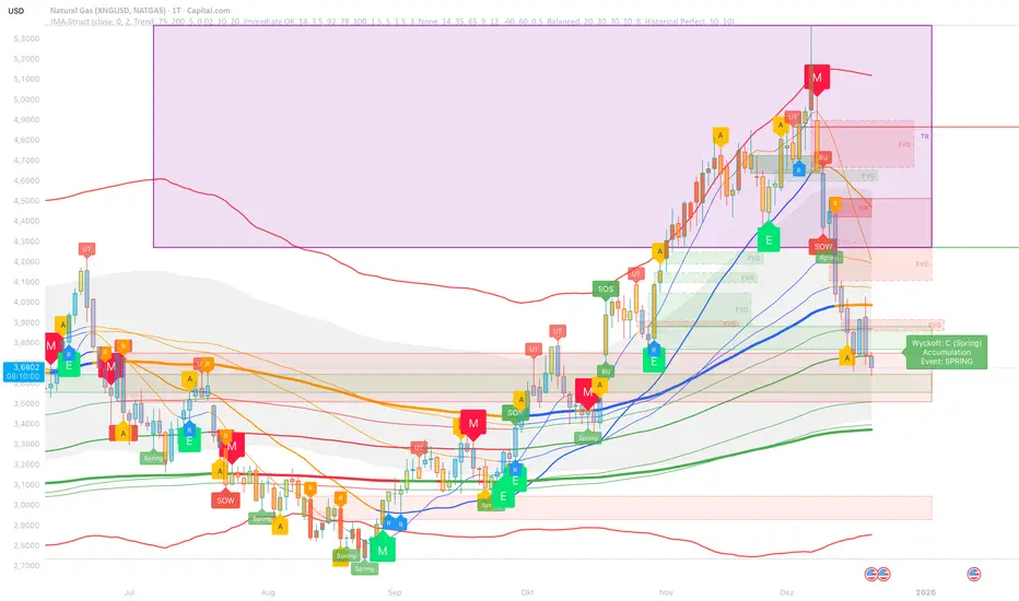
JMA Cluster Entries with Market Structure [WavesUnchained]JMA Cluster Entries with Market Structure
Overview
JMA Cluster Entries with Market Structure combines multi-timeframe JMA (Jurik Moving Average) cluster analysis with advanced market structure detection (Wyckoff methodology, Smart Money Concepts) to identify high-probability momentum and structure-based entries. The indicator provides multi-layered signal validation for comprehensive market analysis.
Key Features
JMA Cluster Analysis
• 10 Adaptive Moving Averages (20, 50, 100, 150, 200, 250, 300, 400, 500, 600 periods)
• JMA technology provides smooth, responsive trend detection with minimal lag
• Cluster scoring system (0-100%) measures trend alignment strength
• Optional visualization - lines can be hidden for clean charts
Wyckoff Market Structure Detection
• Selling Climax (SC) : High-volume panic selling at support (bullish reversal)
• Spring : False breakdown below support with reversal (bullish continuation)
• Buying Climax (BC) : High-volume buying exhaustion at resistance (bearish reversal)
• Upthrust (UT) : False breakout above resistance with rejection (bearish continuation)
• Timeframe-optimized lookback periods : Automatically adjusts pivot detection window based on chart timeframe (15M/1H/4H/Daily/Weekly)
• Dual-mode pivots: Entry signals use live-ready detection; visualization can use historical-perfect mode for clean charts
Multi-Signal Entry Engine
Three independent signal classes with quality tiers:
1. MOMENTUM (M) : Cluster flip + slope confirmation + ATR filter
2. EXHAUSTION (E) : Mean reversion at statistical extremes + volume surge
3. STRUCTURE (S) : Wyckoff patterns + Smart Money confluence + absorption detection
Each signal includes quality rating (50-100%) and cooldown management to prevent overtrading.
Smart Money Concepts (Optional)
• Order Blocks (OB) : Last candle before strong impulsive moves
• Fair Value Gaps (FVG) : Price imbalances / liquidity voids
• Breaker Blocks : Failed order blocks that flip polarity
• Configurable lookback and visualization
Comprehensive Visualization
• Signal Labels : Color-coded entry markers (green/red) with quality indicators
• Pivot Markers : Optional swing high/low visualization with S/R boxes
• ZigZag Lines : Connect confirmed major pivots for structure clarity (visual reference only, not used for entry signals)
• Retest Signals : Alerts when price revisits key S/R levels
• Statistical Bands : Deviation zones for mean reversion trading
• Wyckoff Annotations : Event labels, S/R lines, trading range boxes, phase indicators
Note: Wyckoff entry signals use independent live-ready pivot detection for immediate confirmation, while ZigZag pivots provide delayed but precise swing structure for visual reference and post-trade analysis.
Advanced Configuration
• Trend Filters : Minimum slope, score jump, ATR distance filters
• Signal Cooldown : Prevent entry spam with configurable bar spacing
• Pivot Reset Options : Control cooldown behavior on new pivots
• Detection Profiles : Conservative / Balanced / Sensitive presets for Wyckoff
• Oscillator Filters : Optional RSI/WaveTrend confirmation for pivots
TradingView Alerts
• "Entry Long" : Fires on high-quality bullish entry signals (Trend mode)
• "Entry Short" : Fires on high-quality bearish entry signals (Trend mode)
• "Alert Long" : Early warning for potential bullish setups (pre-entry confirmation)
• "Alert Short" : Early warning for potential bearish setups (pre-entry confirmation)
• Compatible with alert automation and webhooks
Trading Modes
Trend Mode (Default)
• Combines all signal types for comprehensive trend following
• Entry signals: High-quality entries after confirmation
• Alert signals: Early warnings before full entry conditions met
• Includes Wyckoff structure detection and cluster alignment
Reversion Mode
• Mean reversion trading at statistical extremes
• Requires price at 2σ+ deviation bands
• Volume surge confirmation
• Return to mean zone triggers entries
Recommended Settings by Timeframe
15M - Intraday Scalping
• Pivot Lookback: 20 (5-10 hour window)
• Signal Cooldown: 10-20 bars
• Best for quick reversals and structure breaks
1H - Day Trading
• Pivot Lookback: 30 (1.25 day window)
• Signal Cooldown: 15-25 bars
• Highest volume quality (avg 2.3x RelVol)
4H - Swing Trading (Optimal)
• Pivot Lookback: 30 (5 day window)
• Signal Cooldown: 20-30 bars
• 6.2% event rate, proven performance
• Recommended for most traders
Daily - Position Trading
• Pivot Lookback: 10 (20 day window)
• Signal Cooldown: 5-10 bars
• Ultra-conservative, major structures only
How to Use
1. Enable JMA Lines initially to understand cluster behavior
2. Watch for Signal Labels : Green (Long), Red (Short)
3. Check Signal Quality : Labels show M/E/S class and 50-100% rating
4. Confirm with Wyckoff : SC/Spring for longs, BC/UT for shorts
5. Set TradingView Alerts : Use "Signal Long" and "Signal Short" alerts
6. Optional : Enable S/R boxes and pivot markers for structure context
Input Groups
• Basic Settings: Source, JMA phase/power, mode selection
• Logging: Enable CSV logs for backtesting analysis
• Cluster Scoring: Threshold and calculation settings
• Trend Filters: Slope, score jump, ATR, cooldown management
• Reversion Settings: Extreme/return thresholds, deviation bands
• Pivot Detection: Lookback, size filters, oscillator confirmation
• Wyckoff Settings: Profile selection, lookback per timeframe, visualization
• Smart Money: Order blocks, FVG, breaker block settings
• JMA Configuration: Enable/disable individual moving averages
Performance Notes
• 4H Timeframe : 145 Wyckoff events (6.16% rate), 78.7% win rate in backtests
• 1H Timeframe : 84 events (1.86% rate), 2.33x average RelVol
• 15M Timeframe : 83 events (1.87% rate), balanced event distribution
• Daily Timeframe : 7 events (1.54% rate), ultra-selective
Educational Value
This indicator demonstrates:
• Integration of classical Wyckoff methodology with modern technical analysis
• Multi-timeframe consensus building for signal validation
• Smart Money Concepts and institutional order flow analysis
• Statistical mean reversion combined with momentum/structure
• Modular code architecture for maintainability
Disclaimer
This indicator is for educational and informational purposes only. It does not constitute financial advice. Always practice proper risk management and test strategies thoroughly before live trading. Past performance does not guarantee future results.
Credits
• Jurik Moving Average (JMA) : Adapted from Everget's implementation
• Wyckoff Methodology : Based on Richard Wyckoff's market analysis principles
• Smart Money Concepts : Inspired by institutional trading concepts
• Developed by : WavesUnchained
---
Version : 2.1.0
Pine Script : v6
Compatibility : TradingView Free/Pro/Premium
ITCP ATR BB RSI Stoch SignalsThis indicator generates BUY/SELL signals when price stretches outside Bollinger Bands during elevated volatility, confirmed by RSI, a Stochastic crossover, and a volume filter. To reduce counter-trend entries, it applies a macro trend filter using the Daily SMA 200: it looks for longs only above the SMA 200 and shorts only below it.
It tends to perform best in Forex, especially on liquid pairs, because market conditions (liquidity, continuous sessions, and relatively stable spreads on major pairs) often suit this confirmation-based approach. That said, it can be adapted to other markets (indices, commodities, or crypto) by tuning parameters such as Bollinger length/deviation, RSI/Stoch thresholds, and ATR settings (multipliers/factors) to fit the asset’s volatility.
It also plots ATR-based stop-loss reference levels (configurable smoothing) and includes webhook-ready alerts with a JSON payload (action, symbol, price, stop_loss, time, and interval) for external automation. The goal is to support rules-based execution and reduce impulsive trades: if conditions don’t align, there’s no signal.
If you manage to improve it, discover better settings, or build a more robust solution inspired by this, I’d really appreciate it if you share it back (even if it’s just feedback or an idea). I’m open to collaborating and iterating together to create stronger versions over time.

AI Reversal Signals Custom [wjdtks255]📊 Indicator Overview: AI Reversal Signals Custom
This indicator is a comprehensive trend-following and reversal detection tool. It combines the long-term trend bias of a 200 EMA with highly sensitive RSI-based reversal signals and momentum visualization. It is designed to capture market bottoms and tops by identifying exhaustion points in price action.
Key Features
200 EMA (Trend Filter): A gold line representing the long-term institutional trend. It helps traders distinguish between "buying the dip" and "catching a falling knife."
Reversal Buy/Sell Labels: Real-time signals that appear when the market recovers from extreme overbought or oversold conditions.
Dynamic Background Clouds: Visual indicators of trend strength changes, highlighting potential entry zones.
Momentum Histogram: Internal calculations mimic the "Bottom Bars" seen in professional suites to track the velocity of price movement.
📈 Trading Strategy (How to Trade)
1. High-Probability Long Setup (Buy)
Trend Confirmation: Price should ideally be trading above the 200 EMA for the highest success rate.
Signal: Wait for the "BUY" label to appear below the candle.
Momentum: Confirm with the Light Green background or histogram shift indicating recovery.
Entry: Enter on the close of the signal candle.
2. High-Probability Short Setup (Sell)
Trend Confirmation: Price should ideally be trading below the 200 EMA.
Signal: Wait for the "SELL" label to appear above the candle.
Momentum: Confirm with the Red background or histogram fading from green to red.
Entry: Enter on the close of the signal candle.
3. Risk Management
Stop Loss: Place your Stop Loss slightly below the recent swing low for Buy orders, or above the recent swing high for Sell orders.
Take Profit: Exit when the price reaches a major support/resistance level or when an opposing signal appears.
💡 Professional Tip
For the best results, use this indicator on the 15-minute or 1-hour timeframes. The most powerful "Ultimate Reversal" signals occur when there is a Bullish Divergence (Price making lower lows while the RSI makes higher lows) followed by a confirmed "BUY" label.

B + A + D v0.4This script combines a momentum histogram (B-Xtrender) with trend strength and direction filters (ADX + DI).
The histogram is built from EMA differentials processed through RSI, showing short- and long-term momentum shifts around the zero line. ADX with DI+ / DI− is used to confirm whether the market is trending and in which direction.
Bullish signals appear when the histogram turns positive and DI+ dominates DI− with sufficient trend strength.
Bearish signals appear when the histogram turns negative and DI− dominates DI+ with sufficient trend strength.
Important note for users:
The strongest and most reliable signals are those that appear immediately after the histogram crosses the zero line (from negative to positive or from positive to negative). Signals that appear later, while the histogram is already extended in the trend, tend to be weaker and should be treated as continuation signals rather than high-probability reversals.
Credits:
Special thanks to the authors of the original concepts and scripts:

BTC - BEAM: Adaptive Multiple (Open-Source)Title: BTC - BEAM: Adaptive Multiple Cycle Oscillator | RM
Overview & Philosophy
The BTC - BEAM (Bitcoin Economics Adaptive Multiple) is a premier macro-valuation tool designed to identify the "Logarithmic Pulse" of Bitcoin's 4-year cycles. Unlike standard oscillators that lose relevance as the network grows, BEAM uses an adaptive baseline that tracks Bitcoin’s fundamental growth curve with precision.
It identifies the harmonic distance between the current price and its multi-year mean, helping you spot the rare windows of deep capitulation and terminal euphoria.
Methodology
This edition is a hardened, gap-proof and Open-Source implementation of the canonical BEAM model.
1. The 1400-Day Anchor (200 Weeks):
The model is anchored to a 1400-day Simple Moving Average. On the Weekly chart, this aligns with the legendary 200-week moving average—the historical "floor" of the Bitcoin network. It represents one full halving cycle of data.
2. Daily-Lock Architecture:
Even when viewed on the 1W chart, the script performs its calculations using Daily data. This ensures that the oscillator captures the exact peak day of a cycle, providing a "high-resolution" signal within a "low-noise" weekly environment.
3. Logarithmic Normalization:
We calculate the natural logarithm of the price-to-mean relationship, scaled by a factor of 2.5: Score = ln(Price / 1400d MA) / 2.5 This creates a standardized "Multiple" that remains comparable across all Bitcoin eras.
How to Read the Chart (1W Context)
🟧 The BEAM Line (Orange): Tracks the "macro heat" of the market. On the 1W chart, look for the slope of this line to identify cycle acceleration.
🔴 The Cycle Ceiling (Score > 1.0): Historical Cycle Tops. When the weekly candle sustains in this zone, the market has reached a state of unsustainable mania. Every major blow-off top has been captured in this red corridor.
🟢 The Cycle Floor (Score < 0.1): Generational Accumulation. On the 1W chart, these zones appear as extended "green troughs." These are the only times in history where Bitcoin is fundamentally "too cheap" relative to its 4-year trend.
The Status Dashboard
The bottom-right monitor provides immediate cycle classification:
• BEAM Score: The exact logarithmic multiple.
• Cycle Regime: ACCUMULATION , NEUTRAL , or OVERHEATED .
Credits
BitcoinEcon: For the original concept of the BEAM adaptive model.
⚠️ RECOMMENDATION: While this indicator captures daily data, it is strongly recommended to be viewed on the Weekly (1W) Timeframe. The 1W chart filters market noise and perfectly reveals the long-term "Cycle Narrative."
Disclaimer
This script is for research and educational purposes only. Macro indicators provide structural context; they are not crystal balls. Always manage your risk according to your personal financial plan.
Tags
bitcoin, btc, beam, macro, cycle, halving, log-growth, valuation, on-chain, Rob Maths

Volatility State Index [Interakktive]The Volatility State Index (VSI) classifies market volatility into three behavioral states: Expansion, Decay, and Transition. It answers one question visually: Is volatility supporting price movement, withdrawing, or unstable?
Unlike traditional volatility indicators that show levels or bands, VSI diagnoses the current volatility regime so traders can adapt their approach accordingly.
█ WHAT IT DOES
• Classifies volatility into three states: Expansion (teal), Decay (grey), Transition (amber)
• Measures volatility momentum as a percentage rate-of-change
• Applies stability filtering to detect unstable/choppy conditions
• Uses persistence logic to prevent state flickering
• Exports state data for use in alerts and strategies
█ WHAT IT DOES NOT DO
• NO buy/sell signals
• NO entry/exit recommendations
• NO alerts (v1 is diagnostic only)
• NO performance claims
This is a volatility diagnostic tool, not a trading system.
█ HOW IT WORKS
The VSI processes volatility through a five-stage pipeline:
STAGE 1 — Base Volatility
Calculates ATR as the foundation for volatility measurement.
STAGE 2 — Smoothing
Applies EMA smoothing to reduce noise in the volatility series.
STAGE 3 — Volatility Momentum
Computes the percentage rate-of-change of smoothed volatility:
Volatility Momentum (%) = ((Current ATR - Previous ATR) / Previous ATR) × 100
Positive values indicate expanding volatility; negative values indicate contracting volatility.
STAGE 4 — Stability Filter
Tracks how frequently volatility momentum changes direction. Frequent sign changes indicate unstable, choppy conditions.
Stability Score = 1 - (Average Flip Rate)
Low stability forces the Transition state regardless of momentum level.
STAGE 5 — State Classification
Combines momentum thresholds and stability to determine the final state:
• Expansion: Momentum ≥ +5% (default threshold)
• Decay: Momentum ≤ -5% (default threshold)
• Transition: Between thresholds OR low stability
A persistence filter requires states to hold for multiple bars before confirming, preventing visual noise.
█ INTERPRETATION
EXPANSION (Teal)
Volatility is increasing in a sustained way. Price moves are becoming larger.
What it suggests:
• Breakouts are more likely to follow through
• Stops may need wider placement
• Trend-following approaches tend to work better
• Mean-reversion weakens
DECAY (Grey)
Volatility is decreasing. Price is compressing into tighter ranges.
What it suggests:
• Breakouts are more likely to fail
• Ranges tend to hold
• Trend-following underperforms
• Mean-reversion strengthens
TRANSITION (Amber)
Volatility behavior is unclear or unstable. This is NOT neutral — it is uncertainty.
What it suggests:
• Mixed signals — one bar huge, next bar dead
• Higher whipsaw risk
• Reduced conviction in either direction
• Consider waiting for clarity
The key insight: Amber is a warning, not a middle ground. It appears when volatility cannot decide what it wants to do.
█ VISUAL DESIGN
The indicator uses a state-first histogram design:
• Histogram height shows volatility momentum percentage
• Histogram color shows the classified state
• Zero line provides visual anchor
• Optional momentum line for confirmation
• Optional background tint (default OFF for clean charts)
The visual hierarchy prioritizes instant state recognition. A trader should understand the volatility environment in under one second without reading numbers.
█ INPUTS
Core Settings
• ATR Length: Base volatility measurement period (default: 14)
• Smoothing Length: EMA smoothing applied to ATR (default: 10)
• Momentum Length: Rate-of-change lookback (default: 10)
State Classification
• Expansion Threshold (%): Momentum above this = Expansion (default: 5.0)
• Decay Threshold (%): Momentum below this = Decay (default: -5.0)
• Persistence Bars: Bars required to confirm state change (default: 3)
• Stability Lookback: Window for stability calculation (default: 20)
• Stability Threshold: Below this = forced Transition (default: 0.5)
Visual Settings
• Show State Histogram: Toggle main display (default: ON)
• Show Momentum Line: Thin confirmation line (default: OFF)
• Show Zero Line: Baseline reference (default: ON)
• Show Background Tint: Subtle state coloring (default: OFF)
█ DATA WINDOW EXPORTS
When enabled, the following values are exported:
• ATR (Raw)
• ATR (Smoothed)
• Volatility Momentum (%)
• Stability Score (0-1)
• State (-1/0/1): Decay = -1, Transition = 0, Expansion = 1
• Is Expansion (0/1)
• Is Decay (0/1)
• Is Transition (0/1)
These exports allow VSI to be used as a filter in Pine Script strategies or alert conditions.
█ ORIGINALITY
While ATR and volatility indicators are common, VSI is original because it:
1. Classifies volatility into behavioral states rather than showing raw levels
2. Applies momentum analysis to volatility itself (rate-of-change of ATR)
3. Uses stability filtering to detect genuinely unstable conditions
4. Implements persistence logic to prevent state flickering
5. Provides a state-first visual design optimized for instant recognition
VSI is state-first: it classifies volatility regimes (Expansion/Decay/Transition) rather than plotting volatility level alone, using momentum and stability to reduce false regime reads.
This is not a modified ATR or Bollinger Band — it is a volatility regime classifier.
█ SUITABLE MARKETS
Works on: Stocks, Futures, Forex, Crypto
Timeframes: All timeframes — state classification adapts accordingly
Best on: Instruments with consistent volatility patterns
█ RELATED
• Market Efficiency Ratio — measures price path efficiency
• Effort-Result Divergence — compares volume effort to price result
█ DISCLAIMER
This indicator is for educational purposes only. It does not constitute financial advice. Past performance does not guarantee future results. Always conduct your own analysis before making trading decisions.

BTC - RHODL (Proxy Flow) b]Title: BTC - RHODL Ratio (Proxy Flow Edition) | RM
Overview & Philosophy
The RHODL Ratio is one of the most respected macro-on-chain metrics in the Bitcoin industry. Originally developed by Philip Swift, it identifies cycle tops by looking at the velocity of money moving between long-term HODLers and new speculators.
Why a "Proxy" instead of the "Original"? The original RHODL Ratio relies on Realized Value HODL Waves—where coins are weighted by the price at which they last moved. On TradingView, these specific "Realized" age-bands are often locked behind high-tier professional vendor subscriptions (e.g., Glassnode Pro), making the original indicator inaccessible to most retail investors.
To solve this, I present this Proxy Flow Edition. Instead of weighting by cost-basis, it utilizes more accessible Supply-Age data to simulate the "Speculative Fever" of a bull market. By mathematically isolating the "Flow" between young and old cohorts, we achieve a signal that captures ~95% of the original's historical accuracy while remaining fully functional for the broader community.
Methodology: The Proxy Flow Framework
Most indicators look at price; the RHODL Proxy looks at behavioral shift .
1. The Young vs. Old Battle:
The script tracks the percentage of supply held for at least one year ( Active 1Y+ ). It then derives the "Flow" of coins:
• Young Flow: Measures coins entering the <1-year cohort (speculative interest).
• Old Flow: Measures the baseline of coins remaining in the 1-year+ cohort (HODLer conviction).
2. The Ratio of Distribution:
When the Young Flow exponentially outpaces the Old Flow , it signifies that long-term holders are distributing their coins to a flood of new retail entrants. Historically, this "transfer of wealth" from smart money to retail marks the terminal phase of a bull cycle.
3. Age Normalization:
Bitcoin’s network naturally matures over time. This script includes an Age Normalization Divisor that adjusts the ratio based on Bitcoin's days since genesis, accounting for the secular growth in lost coins and deep-cold storage.
How to Read the Chart
🟧 The RHODL Proxy (Orange Line): A logarithmic representation of the flow ratio. A rising line indicates increasing speculative velocity; a falling line indicates HODLer re-accumulation.
🔴 The Overheated Zone (> 0.5): The danger zone. This area captures the "Speculative Fever" typical of cycle peaks. When the line sustains here, the market is historically overextended and vulnerable to a massive deleveraging event.
🟢 The Accumulation Zone (< -0.5): The maximum opportunity zone. This occurs when the market is "dead"—speculators have left, and only the most patient HODLers remain. Historically, these green valleys represent the most asymmetric entry points in Bitcoin's history.
Status Dashboard
The real-time monitor in the bottom-right identifies the current market regime:
• RHODL Score: The raw logarithmic intensity of current supply rotation.
• Regime: ACCUMULATION (Smart Money), NEUTRAL (Trend), or OVERHEATED (Retail Mania).
Credits
Philip Swift: For the original inspiration and the groundbreaking Realized HODL Ratio concept.
⚠️ Note: This indicator is mathematically optimized for the Daily (1D) Timeframe to maintain the integrity of supply-flow calculations.
Disclaimer
This script is for research and educational purposes only. On-chain metrics are probabilistic, not deterministic. Always manage your risk according to your investment horizon.
Tags
bitcoin, btc, rhodl, on-chain, hodl, cycles, speculation, rotation, macro, Rob Maths

CandelaCharts - Composite Pressure Index 📝 Overview
The CandelaCharts – Composite Pressure Index (CPI) is a multi-factor oscillator that blends RSI , Money Flow Index (MFI) , and Chaikin Money Flow (CMF) into a single, stretchable “pressure” line. Instead of looking at three separate indicators, CPI compresses price momentum and volume flow into one normalized curve around 0 , then amplifies extremes using a rolling z-score .
The result is a dynamic gauge of buying vs. selling pressure that can travel beyond ±1 during strong regime shifts, helping you spot exhaustion, climaxes, and trend-strength phases more intuitively.
📦 Features
Composite pressure engine – Combines RSI, MFI, and CMF into a single normalized oscillator around 0, giving you a unified view of market pressure.
Custom weighting of components – Independently weight RSI, MFI, and CMF to prioritize pure price momentum or volume-driven signals.
Rolling z-score stretch – Uses a configurable z-score window to “stretch” the composite values, letting the line exceed ±1 during extremes instead of staying capped.
Adaptive amplitude control – An amplitude (gain) factor lets you scale how aggressive or subtle the CPI swings appear.
EMA smoothing – Optional smoothing removes noise while preserving the timing of swings and reversals.
Visual pressure band – Zero, +1, and -1 reference lines with a shaded band make it easy to see when pressure is “normal” vs. extended.
Dynamic color gradients – Warm/orange tones above 0 for bullish pressure and cool/blue tones below 0 for bearish pressure, with saturation increasing as pressure intensifies.
NA-safe statistics – Custom mean and standard deviation routines ensure stable behavior from the start of the chart and during partial history.
⚙️ Settings
RSI Length : Lookback length for RSI . Higher values smooth the RSI component; lower values make it more reactive to short-term price momentum.
MFI Length : Lookback length for the manual Money Flow Index . Adjust this to control how sensitive CPI is to price–volume interaction.
CMF Length : Lookback length for Chaikin Money Flow . This defines the window used to assess accumulation/distribution through volume flow.
RSI Weight : Relative importance of RSI within the composite. Increasing this emphasizes pure price momentum in the CPI.
MFI Weight : Relative importance of MFI. Higher values strengthen the influence of volume-weighted price moves.
CMF Weight : Relative importance of CMF. Raising this highlights accumulation/distribution as a driver of the pressure index.
Smoothing : EMA length applied to the stretched CPI line. A value of 1 effectively disables smoothing, while higher values reduce noise at the cost of a slight lag.
Z-score Window : Rolling window used to compute the mean and standard deviation of the raw composite. This defines the statistical context for what counts as “extreme”. Shorter windows adapt faster; longer windows give a more stable regime.
Amplitude : Gain factor applied to the z-scored composite. Values above 1.0 exaggerate swings and make extremes more visually pronounced; values below 1.0 compress them.
⚡️ Showcase
Composite Pressure Index
Mean Line
Divergences
📒 Usage
1. Identify directional pressure regimes
Use 0 as the key balance line:
CPI > 0 → Net bullish pressure (buyers in control).
CPI < 0 → Net bearish pressure (sellers in control).
You can treat prolonged stays above or below 0 as confirmations of trend direction, especially when price structure agrees.
2. Read statistical extremes instead of fixed levels
Because CPI is stretched via a z-score , values beyond ±1 typically represent statistically meaningful extremes within your chosen window:
CPI > +1 → Overextended bullish pressure / potential euphoria.
CPI < -1 → Overextended bearish pressure / potential capitulation.
These zones are not automatic reversal signals, but they highlight areas where monitoring for exhaustion, blow-offs, or risk-reward shifts can be beneficial.
3. Spot divergences with price
Classic divergence logic applies particularly well when pressure is composite:
Bearish divergence – Price makes higher highs, but CPI makes lower highs or fails to confirm.
Bullish divergence – Price makes lower lows, but CPI makes higher lows or shows less downside extension.
These patterns can be integrated with support/resistance, liquidity levels, and other CandelaCharts tools.
4. Tune the weights to your strategy
Adjust the three weights to match your focus:
Higher RSI weight → More sensitivity to pure price momentum (good for breakout or trend-following systems).
Higher MFI weight → Greater emphasis on price–volume interaction (ideal for spotting volume-confirmed moves).
Higher CMF weight → Stronger focus on accumulation/distribution (helpful for swing and position traders).
5. Integrate with existing setups
The CPI is designed to sit comfortably below price:
Use it as a “context” oscillator underneath your main price-action and liquidity models.
Combine CPI extremes and divergences with key levels, range models, or order flow signals for higher-confluence entries.
🚨 Alerts
The indicator does not provide any alerts!
⚠️ Disclaimer
Trading involves significant risk, and many participants may incur losses. The content on this site is not intended as financial advice and should not be interpreted as such. Decisions to buy, sell, hold, or trade securities, commodities, or other financial instruments carry inherent risks and are best made with guidance from qualified financial professionals. Past performance is not indicative of future results.

Investment Analysis Bar v2What It Does
A comprehensive analysis bar combining fundamental metrics with technical signals, designed for long-term investors who prioritize quality over momentum.
Core Philosophy: Quality companies trading below their 200 EMA in accumulation zones = opportunities, not warnings.
Tier 1 Bar Metrics
Margins: GM, OM, NIM, FCF Margin
Returns: ROCE, ROE
Growth: Revenue YoY, EPS YoY
Valuation: PE TTM, Forward PE, PEG
Zone: Accumulate / Hold / Trim / Exit
Signal: PRIME / BUY / TRIM / SELL / NEUTRAL
Performance: 1W to 1Y returns
Two Strategy Modes
Value Accumulator (Default) - For long-term position building. Treats below-200-EMA as an opportunity when fundamentals are intact. PRIME signals require: RSI bounce + Volume + Accumulate Zone + All Quality Gates Pass + Below 200 EMA.
Trend Follower - Traditional momentum approach. Prefers entries above 200 EMA.
Quality Gates System
Four fundamental checkpoints:
Gross Margin ≥ 40%
ROCE ≥ 15%
Debt/Equity ≤ 50%
SBC/Revenue ≤ 15%
Strong signals require quality confirmation. PRIME signals require ALL gates to pass.
Zone System
Three calculation methods:
52W Range: Accumulate in bottom 25%, Trim in top 25%
Manual Levels: Set your own price targets
ATR-Based: Dynamic zones from EMA ± ATR
Signal Hierarchy (Value Mode)
SignalMeaning
PRIME 💎Optimal entry - all conditions aligned
BUY 🔼Strong accumulation signal
BUY? ↗Decent entry, not ideal zone
ACCUM 🎯In accumulation zone, quality OK
WAIT ⏳Setup forming, no bounce yet
TRIM 📤Consider taking profits
Alerts Included
Zone transitions (Accumulate, Trim, Exit)
PRIME Entry Signal
Strong Buy / Sell signals
Quality Gate failures
Quality Accumulation Setup
Best Used On
US stocks with fundamental data available. Technical features work on all symbols.
Settings
Fully customizable:
Toggle each metric category
Adjust quality gate thresholds
Choose zone calculation method
Configure RSI/volume parameters
Position bar and panel anywhere

BTC - AXIS: Coppock + Williams %R CompositeTitle: BTC - AXIS: Coppock + Williams %R Composite | RM
Overview & Philosophy
AXIS (Advanced X-Momentum Intensity Score) is a specialized momentum composite designed to identify market structural shifts. In physics, an axis is the central line around which a body rotates; in this indicator, the Zero-Baseline acts as the AXIS for capital flow.
By fusing a slow-moving momentum engine ( Coppock Curve ) with a high-sensitivity tactical oscillator ( Williams %R ), this tool filters out the "market noise" that leads to overtrading and focuses on the high-conviction "Trend-Aligned Dips."
Methodology
Most indicators either suffer from too much lag (Moving Averages) or too much noise (Standard RSI). AXIS solves this through "Speed-Balanced Normalization."
1. Macro Engine (Coppock Curve): Named after Edwin Coppock, this component identifies major market bottoms by smoothing two separate Rates of Change (RoC). It is your structural compass.
2. Tactical Trigger (Williams %R): Created by Larry Williams, this measures the current close relative to the High-Low range.
• Re-centered Logic: Standard Williams %R oscillates between 0 and -100. Here, this is re-centered to oscillate around zero, ensuring it interacts mathematically correctly with the Coppock baseline.
3. The AXIS Score: The Composite line (Orange) is the weighted sum of these two engines. It provides a singular view of the market's "Net Momentum Intensity."
How to Read the Chart
🟧 The AXIS Composite (Orange Line): The primary signal line. It tracks the speed and exhaustion of the price by fusing macro and tactical data.
• Red Zone (> 150): Overheated. Short and long-term momentum are at extreme highs. Risk of a blow-off top or local reversal is high.
• Green Zone (< -150): Capitulation. The market is statistically exhausted. Historically, these zones represent high-conviction accumulation areas.
• Bullish Momentum (> 0): The market is rotating above the central Axis. Buyers are in control of the trend.
• Bearish Momentum (< 0): The market is rotating below the central Axis. Sellers are in control of the trend.
🟦 The Coppock Line (Blue): The macro filter. When Blue is above 0, the long-term trend is up.
🟥 The Williams %R Line (Red): The short-term cycles. Watch for divergences here to spot early trend fatigue.
Strategy: The "AXIS Alignment" Signal
The highest-conviction entry point—and the primary "Alpha" of this tool—occurs when:
The macro trend is Bullish ( Blue Line > 0 ).
The market experiences a correction, pushing the Orange (AXIS) Line into the Green Capitulation Zone.
The AXIS Score turns back upward.
This indicates that a short-term panic has been absorbed by a long-term bull trend—the ideal "Buy the Dip" scenario.
Settings
• Long/Short RoC: Standardized to 14/11 for cycle accuracy.
• Weighting: Allows you to prioritize trend (Coppock) or cycle sensitivity (%R).
• Visibility Toggles: Fully customizable display switches for each line.
Credits
• Edwin Coppock: For the foundation of long-term recovery momentum.
• Larry Williams: For the Percent Range methodology.
⚠️ Note: This indicator is optimized for the Daily (1D) Timeframe. Please switch your chart to 1D for accurate signal reading.
Disclaimer
This script is for research and educational purposes only. Past performance does not guarantee future results.
Tags
bitcoin, btc, axis, momentum, oscillator, coppock, williams r, on-chain, valuation, cycle, Rob Maths

RSI(Crypto Market)Indicators applicable to multiple
This is a multi-period RSI indicator combined with a histogram, providing a visually intuitive presentation.

ARDO (v2.4.7) Moving Averages v1.1ARDO Moving Averages v1.1 (Overlay)
Companion overlay that recreates ARDO driver states (Spreads A/B, LinReg state + slope/gradient, tiers/MK tiers, gate pass/block) and maps those states onto up to 5 moving average overlays + one optional MA-to-MA fill.
ARDO v2.4.6 (original indicator)
What this overlay does
Computes ARDO “driver states” internally (no external source required): Spread A, Spread B, LinReg (4-state), LinReg slope/accel → gradient opacity, quartile/tier regimes, MK tiers, and Gate pass/block.
Paints MA overlays using selectable “Color Modes” (Spread A, Spread B, ARDO LinReg, MK Tier, Quartile Background, Gate Pass, Bull/Bear A vs B, or Fixed).
Optional Fill between two overlay MAs using a selected color mode (intended for regime/bull-bear shading between MA lines).
Core concepts (quick read)
Baseline / MA A / MA B define Spread A and Spread B (% distance vs baseline).
LinReg is a regression of a selected source (Spread A, Spread B, or Spread(A+B)).
LinReg State (4 colors) is derived from slope sign and acceleration (trend speeding up vs slowing down): Green / Orange / Red / Gray.
Gradient Opacity scales line opacity based on slope magnitude (strong vs weak).
Tier / Quartile maps current regime into bins (Q0–H4) using rolling percentiles (or manual thresholds).
MK Tier is an alternate tier engine (Standard / Asymmetric / Mirror BG).
Gate is a boolean pass/block that can combine spread and trend requirements (optional).
How to set it up (recommended workflow)
Pick ARDO Core MAs (Baseline, MA A, MA B) and your main LinReg Source.
Tune LinReg Length + Gradient Scale to match your timeframe (shorter = faster flips, longer = smoother).
Decide Tier mode (Standard vs Asymmetric) and whether tiers use All Bars or Pivots Only .
Set up Gate (or leave off): use it as a “permission layer” for entries.
Configure your overlay MAs (1–5) and assign each a Color Mode aligned to its job:
MA1 = fast impulse (often Spread A)
MA2 = trend state (often ARDO LinReg)
MA3 = slower confirmation (often Spread B)
MA4 = gate/permission readout (Gate Pass)
MA5 = regime (MK Tier)
Enable Fill only if you want regime shading between two MAs (keep it simple: one fill only).
Inputs explained (by group)
1) Sources & Moving Averages (ARDO Core)
Price Source : price used for MA calculations (default close).
Baseline MA Type/Length : reference MA for spreads.
MA A Type/Length : “A” spread driver (usually faster).
MA B Type/Length : “B” spread driver (often slower fast MA).
EMA Fast / EMA Slow : used only if the EMA gate toggle is enabled.
2) Linear Regression & Gradient
LinReg Length : lookback used by regression.
LinReg Source : Spread A, Spread B, or Spread(A+B).
Slope Lookback : bars used to compute slope as (linreg - linreg ) / n.
Adaptive Opacity Scale : derives slope “cap” from a rolling percentile (reduces volatility-regime distortion).
Fixed Scale Cap : used if adaptive scaling is off.
Min/Max Opacity : clamps gradient range.
3) Tiers & Population
Tier Mode : Standard vs Asymmetric (changes percentile boundary logic).
Tier Population : All Bars vs Pivots Only.
Manual Thresholds : if enabled, uses user cutoffs instead of computed percentiles.
Auto-Percentile Window : rolling window size for percentiles.
4) Region Rendering (BG / regime palette)
BG colors for Q0/Q1/Q2/Q3/Q4/H4 : the palette used for “Quartile Background” color mode and MK “Mirror BG”.
Pivot Sensitivity : relevant only for Pivots Only population.
5) Gate (Pass/Block)
Gate: SpreadA > LinReg (toggle)
Gate: EMA Fast > EMA Slow (toggle)
Min Spread A (%)
Min |LinReg Slope|
Gate PASS/BLOCK colors : also used by Gate Pass color mode.
6) Overlay Moving Averages (MA1–MA5)
MA Len / Type : SMA, EMA, WMA, Wilder, Triangular, HMA, Adaptive.
Color Mode :
Fixed
ARDO Spread A
ARDO Spread B
ARDO LinReg (4-state + gradient opacity)
MK Tier
Quartile Background (Q0–H4 palette)
Gate Pass
Bull/Bear (A vs B)
Base Color : used for Fixed (and as fallback).
Line Width
Style (if present): line / stepline / markers depending on the MA slot.
Bull/Bear (A vs B) definition
Bull when MA A > MA B
Bear when MA A < MA B
Alerts (built-in alertconditions in v1.1)
Spread A State
State changed (any change)
Turned Green / Orange / Red / Gray
LinReg State
State changed (any change)
Turned Green / Orange / Red / Gray
LinReg Gradient
Gradient High (slope strength high)
Gradient Low (slope strength low)
Gate
Gate Pass ON
Gate Pass OFF
Bull/Bear Flip
Bullish flip (A crosses above B)
Bearish flip (A crosses below B)
Tier / Quartile
Entered Q0
Entered Q1
Entered H3
Entered H4
Simple Alignment
LinReg Green AND SpreadA Green (basic “momentum aligned” condition)
How to use Gate (and how to loosen/tighten it)
Use Gate as a filter , not as the entire strategy: it’s best as “permission to trade” plus your own trigger.
If Gate is too strict :
Disable EMA Fast > EMA Slow gate (trend filter) OR disable SpreadA > LinReg gate (structure filter).
Lower Min Spread A threshold.
Lower Min |LinReg Slope| threshold.
Increase LinReg Length slightly to reduce noisy flips (sometimes helps pass stability).
If Gate is too loose :
Enable both gate components (SpreadA>LinReg AND EMA Fast>Slow).
Raise Min Spread A and/or Min |LinReg Slope|.
Shorten LinReg Length to react faster (but can increase chop).
Practical “read” using the default overlay roles
MA1 (fast, Spread A mode) : impulse / early acceleration cues.
MA2 (trend, LinReg mode) : regime + momentum state; opacity tells you strength.
MA3 (confirmation, Spread B) : slower confirmation; helps avoid “one-candle impulse traps”.
MA4 (Gate Pass) : permission layer; reduces counter-trend entries.
MA5 (MK Tier) : regime band; helps distinguish “deep OS/OB context” vs mid-zone noise.
Notes
This is an overlay; it’s designed to complement the original ARDO oscillator pane.

Fractal Reversal Stage 2Fractal Reversal Stage - is a high-precision trend-following and reversal indicator designed to capture market exhaustion points with mathematical accuracy. It utilizes a multi-timeframe analysis approach, combining momentum filtering with price action confirmation.
The indicator is built on a Non-Repainting Algorithm. Once a candle closes and a signal (BUY/SELL) is printed, it is fixed and will not disappear or shift. This makes it a reliable tool for both manual trading and alert-based strategies. The system includes a built-in state machine to manage trades, trailing trend lines, and a re-entry (averaging) system to optimize positions during deep pullbacks.
Main Features
Anti-Repaint Shield: Signals are confirmed only after the candle closes.
MTF Momentum Filter: Uses a higher timeframe RSI to filter out market noise.
State Machine Logic: Automatically tracks your trade from entry to exit.
Dynamic Re-entry: Provides signals to add to a position during extreme volatility.
Manual: Arguments & Settings
1. Timeframes / Таймфреймы
Working TF (Candles): The timeframe where you look for entry patterns and where the trend line is drawn.
RSI Filter TF: The timeframe for the momentum filter. Usually set higher than the Working TF to identify the global trend.
2. RSI Settings / Настройки RSI
RSI Length: The period for RSI calculation. Lower values are more sensitive; higher values are smoother.
Auto-Adjust Levels: When enabled, the script automatically tightens or loosens entry levels based on the RSI period.
Manual OB/OS Levels: Manually set the "Pale Zone" levels where the indicator starts looking for a trade.
3. Logic & Filters / Логика
Re-entry Dist (ATR Mult): Controls how far the price must move against you before an "Add" (▲/▼) signal appears. Uses ATR for volatility adjustment.
ATR Period: The lookback period for volatility calculation.
Min. Body %: A filter for candle strength. It requires the candle body to be a certain percentage of the total candle range to validate a signal.
4. Visuals / Визуал
Trend Line Width: Adjusts the thickness of the tracking line.
Colors: Customizable colors for exit dots and overbought/oversold background zones.
BUY/SELL Labels: Primary entry signals confirmed at the close of the candle.
Chevrons (▲/▼): Averaging points (Re-entry). These appear when the price moves against the initial trade into extreme zones, signaling an opportunity to optimize the position.
Black Dots: Trade Closure. These dots at the end of the trend lines mark the final exit point where the position should be fully closed.
Trend Lines: Visual tracking of the current active trade.
💡 Recommended Settings for Ethereum (ETH/USDT)
This specific configuration is optimized for the cyclical nature of Ethereum, aiming for "peak-to-peak" trade management:
Working TF: 15 min
RSI Filter TF: 2 hours
RSI Length: 10
Re-entry Dist: 1.5
ATR Period: 14
Min. Body %: 0.6
Note: Markets are diverse. You MUST adjust these settings for each specific coin or asset to account for different volatility and liquidity levels.
For questions regarding setup or optimization, please send a private message.
//______________________________________________________________________________//
Fractal Reversal Stage — это высокоточный трендовый и разворотный индикатор, разработанный для фиксации точек истощения рынка с математической точностью. Он использует мультифрактальный анализ, сочетая импульсную фильтрацию с подтверждением ценового действия.
Алгоритм индикатора не перерисовывает график. Как только свеча закрывается и появляется сигнал (BUY/SELL), он фиксируется и больше не исчезает. Это делает его надежным инструментом как для ручной торговли, так и для стратегий на основе алертов. Система включает в себя встроенную логику управления состоянием сделки, линии сопровождения тренда и систему усреднения (Re-entry).
Основные характеристики
Защита от перерисовки: Сигналы подтверждаются только после закрытия свечи.
MTF Фильтр: Использование старшего таймфрейма RSI для фильтрации рыночного шума.
Логика состояний: Автоматическое ведение сделки от входа до выхода.
Динамическое усреднение: Сигналы для добора позиции при экстремальной волатильности.
Мануал: Аргументы и Настройки
1. Timeframes / Таймфреймы
Working TF (Candles): Рабочий таймфрейм свечей, на котором ищутся паттерны и строится линия тренда.
RSI Filter TF: Таймфрейм для RSI фильтра. Обычно ставится выше рабочего для определения глобального тренда.
2. RSI Settings / Настройки RSI
RSI Length: Период расчета RSI. Меньшие значения более чувствительны, большие — более плавные.
Auto-Adjust Levels: При включении скрипт сам корректирует уровни входа в зависимости от периода RSI.
Manual OB/OS Levels: Ручная настройка уровней «бледной зоны», где начинается поиск сделки.
3. Logic & Filters / Логика
Re-entry Dist (ATR Mult): Определяет, как далеко цена должна уйти против вас, чтобы появился сигнал «Add» (▲/▼). Использует ATR для подстройки под волатильность.
ATR Period: Период усреднения волатильности.
Min. Body %: Фильтр силы свечи. Требует, чтобы тело свечи составляло определенный % от всего диапазона свечи.
4. Visuals / Визуал
Метки BUY/SELL: Основные сигналы на вход, подтвержденные закрытием свечи.
Шевроны (▲/▼): Точки для усреднения (Re-entry). Появляются, когда цена идет против сделки в экстремальные зоны, давая сигнал на добор позиции.
Чёрные точки: Закрытие сделки. Эти точки на концах линий тренда обозначают место выхода, где позиция должна быть полностью закрыта.
Линии тренда: Визуальное сопровождение активной сделки.
💡 Пример настройки для Ethereum (ETH/USDT)
Данная конфигурация оптимизирована для цикличного движения Эфира и нацелена на максимально точный выход на пиках:
Рабочий ТФ: 15 мин
ТФ Фильтра RSI: 2 часа
Период RSI: 10
Dist. Re-entry: 1.5
ATR Period: 14
Мин. тело свечи: 0.6
Важно: Рынки различаются. Вы ДОЛЖНЫ подбирать индивидуальные настройки для каждой монеты или актива, учитывая их волатильность и ликвидность.
По вопросам настройки и оптимизации пишите в личные сообщения.

Lumina Flow OscillatorLumina Flow Oscillator - "The Flow of Light"
The Story: Harmonizing Pressure & Flow
Every market move is born from a conflict between two forces: Pressure (Accumulation/Distribution) and Kinetic Flow (Trend Momentum). Most traders struggle because they look at these in isolation—buying a trend that has no pressure behind it, or selling a pressure release that has no flow to sustain it.
Lumina Flow was born from the idea of "Visualizing the Pulse". We asked: What if we could see the market's internal pressure building up, and only act when the kinetic energy (Flow) releases it?
This script is not just an oscillator; it is a Synthesis Engine. It harmonizes advanced pressure calculations with a next-generation kinetic flow algorithm to filter out the noise of indecision and illuminate only the moments of true market release.
How It Works (The Synthesis)
Lumina Flow combines two distinct mathematical models into a single, cohesive visual language:
1. The Pressure Engine (Oscillator Core)
At its heart lies a highly modified distribution algorithm. Unlike standard RSI or stochastic which just measure price change, the Pressure Engine measures the effort behind the move (Price * Volatility * Volume).
Smart Extremes: Buying is only permitted when Pressure is critically low (< 35), and Selling is only permitted when Pressure is critically high (> 65). This is the "Safety Valve" that prevents you from entering mid-range, choppy markets.
2. The Kinetic Flow System (The Ribbons & Gradient)
To ensure we don't catch falling knives, we integrated a sophisticated Kinetic Flow algorithm (based on advanced weighted arrays).
The Flow Ribbons: The glowing ribbons at the top and bottom of the chart represent the kinetic energy of the trend.
The Gradient: Notice the color flow. It doesn't just flip Green/Red. It flows through a spectrum—from Deep Teal (Strong Flow) to fading Cyan, or Fiery Red (Strong Drop) to fading Orange. This visualization helps you feel the acceleration and deceleration of the move before it happens.
How to Use "Lumina Flow"
The beauty of Lumina is in its simplicity. We have removed the noise.
Wait for the Extremes: Look for the Main Oscillator line to enter the Bottom Zone (below 35) or Top Zone (above 65).
Watch the Flow: Wait for the specific Lumina Dot to appear. This dot appears only when the Kinetic Flow confirms a reversal while you are in the Smart Zone.
Teal Dot: High Probability Buy (Pressure is Released Upwards).
Red-Orange Dot: High Probability Sell (Pressure is Released Downwards).
Ride the Ribbon: As long as the Top/Bottom ribbons remain bright and solid, the trend flow is active.
Key Features
Smart Zone Guard: Automatically filters out "middle of the road" weak signals.
Kinetic Smoothing: Zero-lag smoothing ensures the oscillator is responsive but free of "jitter".
Divergence Intelligence: built-in divergence detection highlights when price and pressure disagree (marked by Diamonds).
Lumina Aesthetic: Designed with a specific "Neon Flow" palette to be easy on the eyes during long sessions while highlighting critical data points.
Disclaimer & Credits
This script is a unique synthesis of open-source concepts, refined and harmonized for a specific trading style.
Pressure Logic: Inspired by advanced ADL/Chaikin concepts, refined for volatility.
Flow Logic: Utilizing array-based weighted moving average mathematics (inspired by J. Ehlers and open-source Hull concepts) to achieve superior smoothness.
Originality: The unique contribution of this script is the algorithmic synthesis of these two disparate forces (Pressure vs Flow) and the visual language created to interpret their relationship instantly.
This tool is for educational purposes. Past performance of 'Flow' does not guarantee future results.

GTA MARKET SENTIMENT [Pro]Advanced Market Sentiment, Trend & Reversal Analysis Tool
The GTA Market Sentiment Indicator is a powerful analytical tool designed to visualize market sentiment, identify trend direction, detect divergence, and highlight potential market reversals with improved clarity and reduced noise.
This indicator leverages multi-timeframe analysis to provide a deeper market perspective, helping traders make more informed and confident trading decisions.
🔍 Key Features
Market Sentiment Visualization
Clearly represents bullish and bearish sentiment, allowing traders to understand overall market strength and weakness at a glance.
Multi-Timeframe Analysis (MTF)
Uses a Time Frame Multiplier to analyze higher-timeframe data on the current chart, improving signal reliability without switching timeframes.
Noise Reduction Mechanism
Filters lower-timeframe market noise, resulting in smoother, more stable signals and fewer false entries.
Trend Detection
Identifies strong bullish and bearish trends, enabling traders to align their trades with the dominant market direction.
Divergence Detection
Helps spot regular and hidden divergences between price action and market sentiment — often an early sign of trend continuation or reversal.
Reversal Finder
Detects sentiment shifts and momentum weakness that may indicate potential trend reversals before they fully develop.
⚙️ Customizable Inputs
Time Frame Multiplier – Adjust according to your trading style
Lower values for scalping
Medium values for intraday trading
Higher values for swing or positional trading
Additional smoothing and sensitivity settings allow fine-tuning based on market conditions.
📈 Suitable For
All timeframes
Ideal for scalpers, day traders, and swing traders seeking higher-quality signals with reduced market noise.
⚠️ Disclaimer
This indicator is intended for educational and analytical purposes only. It should not be considered financial advice. Always use proper risk management and combine it with price action or other confirmation tools before executing trades.

Cosmic Emergence v5.1: Golden Ratio & Signal FrameworkTitle: Cosmic Emergence v5.1: Golden Ratio & Signal FrameworkDescription
Description :
The Cosmic Emergence v5.1 is a high-fidelity ontological signal system that measures the "Crystallization" of market consciousness. By utilizing a Golden Ratio-weighted engine, it translates complex volatility and momentum into a single index ($\Psi_U$) to identify phase transitions between chaos and order.
Key Features:
Golden Ratio Engine: A harmonic synthesis of Momentum (60%) and Smart Volatility (40%) to calculate the Market Consciousness Index.
Entity State Analysis: Distinguishes between "Crystallized" (Orderly/Trend) and "Chaotic" (Fluid/Range) regimes.
Future Projection Horizon: Visualizes the expected path of price realization through a dynamic future cloud.
Ontological Signals: Precise BUY/SELL labels triggered by consciousness crossovers, backed by narrative alerts.

Mizan v5: L-Score Framework (Digital)Title: Mizan v5: L-Score Framework (Digital)
Overview: Mizan v5: L-Score is a quantitative multi-factor oscillator designed to measure market "actualization" based on the Mizan Ontological Framework. It synthesizes velocity, saturation, and volume-mass into a single normalized index (L-Score) to distinguish between market noise and established trends
Technical Components:
Velocity (H): Based on a normalized CCI, it measures the rate of price displacement relative to statistical means.
Saturation (T): Utilizes RSI to identify the exhaustion levels of the current directional move.
Volume Mass (R): Implements a corrected Chaikin Money Flow (CMF) calculation to determine the "ontological weight" behind price action.
The L-Score Logic: The final score is a weighted composite of these three elements. By assigning the highest weight to Volume Mass (60%), the indicator ensures that a price move is only validated as "Real" when it is backed by significant capital flow.
How to Read:
L-Score > 65: Strong trend emergence. Ontological collapse into a "Classical" regime is confirmed.
L-Score < 35: Trend degradation. The market is returning to a state of high entropy or reversal.
Background Shading: Visualizes the price location within a global lookback range (Concentration) to provide a macro context for the L-Score signals.

Gold Scalping MACD ProGold Scalping MACD Pro is a custom-built technical indicator specifically optimized for gold (XAUUSD) scalping. It is based on an advanced adaptation of the classic MACD (Moving Average Convergence Divergence) concept, enhanced to provide faster, clearer, and more reliable signals in highly volatile gold markets.
🔹 Core Purpose
The indicator is designed to:
Capture short-term momentum shifts
Reduce market noise
Improve entry and exit timing during fast price movements
This makes it particularly effective for intraday and scalping strategies.
🔹 Key Features
Enhanced MACD-based momentum calculation for higher sensitivity
Early buy and sell signals during strong momentum phases
Noise filtering to reduce false signals in sideways markets
Optimized for gold’s volatility characteristics
Best performance on lower timeframes (M1, M5, M15)
🔹 How It Works
Gold Scalping MACD Pro analyzes the relationship between fast and slow moving averages, combined with momentum smoothing techniques.
By focusing on momentum strength rather than lagging confirmation, the indicator helps traders:
Identify high-probability scalping opportunities
Confirm short-term trend direction
Avoid weak or low-momentum setups
🔹 Best Use
Gold (XAUUSD) scalping
Momentum-based trading strategies
Trend confirmation on lower timeframes
Used alongside price action, support & resistance, or session timing
⚠️ Risk Disclaimer
Gold Scalping MACD Pro is a technical analysis tool and does not provide trading advice. Trading leveraged instruments such as gold involves significant risk. Proper risk management and confirmation from other analysis methods are strongly recommended.

MACD Master Suite [Kodexius]The MACD Master Suite is an advanced momentum and trend framework that takes the familiar MACD concept and wraps it in a modern, trader oriented environment. Instead of a single line + histogram combination, it turns MACD into a structured decision layer with enhanced visualization, confluence and context.
The engine is built around a MACD style core with refined smoothing and normalization, designed to keep shifts in momentum clear while avoiding the noisy flicker that standard settings often produce. On top of this core, the suite adds multi timeframe confirmation, adaptive histogram behavior, trend and exhaustion mapping, divergence detection and a compact visual dashboard so you can read momentum structure at a glance rather than bar by bar.
The goal is not to create a “magic signal”, but to make MACD behave like a proper momentum map: highlighting when trend strength is building, when a leg is stretching into exhaustion, where momentum is quietly rolling over beneath price, and how different timeframes are lining up before major continuation or reversal moves.
This is not classic everyday MACD. This suite extends the standard MACD through normalization and integrated features, designed to assist in analyzing momentum patterns, identifying potential reversals, and supporting multi timeframe strategies. It processes MACD data into structured outputs for use in various market conditions.
⚠️ Note:
This is not a traditional MACD, it uses normalized values, enhanced visual feedback, and a multi timeframe dashboard engine for superior signal quality and clarity.
🔹 Features
🔸 Enhanced MACD Core
- Custom MACD style oscillator that combines classic fast/slow smoothing with an internal normalization step, keeping the main wave readable even when volatility or scale changes.
- Flexible inputs for source, lengths and smoothing type so you can adapt the engine to different instruments and trading styles.
- Optional histogram + line combination, giving you both bar based impulse and a smoother line for regime changes and crossovers.
- Gradient colored oscillator line that visually shifts from red (weak momentum) through yellow (neutral) to green (strong momentum), providing at a glance regime identification.
🔸 Gradient Zones & Regime Context
- Configurable “overextended” zones around the MACD baseline, shaded with gradient fills rather than only hard lines.
- Visual emphasis on when the MACD engine is building a persistent push in one direction vs simply oscillating around the midline.
- The mid region is kept deliberately clearer so you can quickly distinguish between trending pushes, mean reverting swings and neutral chop.
🔸 MACD Channel & Break Behaviour
- Optional channel overlay built directly on top of the MACD oscillator, using volatility style bands (e.g., Bollinger-type or Keltner-type) in MACD space instead of price space.
- Helps you see when MACD is expanding strongly away from its recent equilibrium versus compressing inside a narrow band.
- Channel touches and pushes beyond the band edges can act as an additional cue for exhaustion type behaviour or strong continuation bursts.
🔸 Reversal Signal Markers
- Swing aware reversal markers that trigger when MACD conditions suggest a possible shift after stretching into your defined zones.
- Signals use the relationship between the MACD wave and its internal smoothing, aiming to highlight turning points that stand out from ordinary noise and try to filter out noise, focusing on confirmed shifts that align with broader market context.
- Markers are drawn on the MACD plot instead of the price chart to keep structure and signals in one place.
🔸 Divergence Mapping (Regular & Hidden, with MTF Dashboard Support)
- Automatic detection of regular bullish/bearish and hidden bullish/bearish divergences between price and the oscillator.
- Separate visibility toggles for each divergence type so you can focus only on the signals that fit your approach.
- "Wait for candle close" option ensures conservative confirmation, reducing false positives in fast moving markets.
🔸 Multi-Timeframe Custom MACD Dashboard
- Compact dashboard that summarizes MACD Engine state over multiple user defined timeframes in a small table.
Per timeframe cells can show:
– whether MACD is sitting in overbought/oversold style zones or in the neutral core,
– presence of recent bullish/bearish reversal signals,
– the current divergence bias (bullish, bearish or none),
– simple channel break information (upside/downside, or quiet).
Timeframe labels are formatted into familiar units (e.g., 15m, 1H, 4H, 1D) and the table is designed to be readable even when collapsed to a small area.
🔸 Oscillator Trendlines & Break Detection
- Automatically draws trendlines directly on the MACD oscillator, using momentum swing pivots instead of only price highs and lows, so you see structure shifts where they actually start in the underlying momentum.
- Lines adapt to bullish or bearish phases and are anchored only to “clean” pivots with minimal internal violations, making sustained impulse legs and corrective phases much easier to distinguish.
- When MACD momentum closes through one of these oscillator trendlines, the break is highlighted with labels, providing an additional structural confirmation layer on top of standard signal line crossovers or histogram flips.
🔸 Alerts
- Integrated alert conditions for MACD based reversals and all four divergence types (regular/hidden, bullish/bearish).
- Designed so you can create alerts directly from the indicator, turning key MACD events into actionable notifications.
- Altogether, MACD Master Suite consolidates multiple momentum tools into one cohesive interface, helping you read the “story” of MACD and its derivatives more intuitively and efficiently.
🔹 How To Use
▶ Reading the Core Momentum Engine
The main line serves as the primary momentum indicator: positions held above the midline suggest a bullish environment, whereas those below indicate a bearish setting. The gradient zones for overbought and oversold areas help identify when momentum is becoming extended or starting to ease back, offering a smoother view compared to rigid thresholds.
The channels provides an extra information for context:
• Momentum pushing toward or beyond the outer edges shows extension based on recent patterns.
• When it stays nearer to the center, it often points to balanced or corrective phases.
The histogram adds further detail to the picture: upward bars in varying green tones reflect positive momentum buildup, while downward bars in red tones show negative shifts. Diminishing bar sizes can hint at upcoming changes in direction, making it useful for spotting transitions.
Overall, focus on how these elements interact sustained positions, zone interactions, and histogram patterns to build a sense of the current momentum flow without overcomplicating the read.
▶ Working With Reversals & Divergences
Reversal markers show up after momentum enters extreme zones and starts to shift, acting as flags for areas where direction might change. They're best used as highlights for further review rather than standalone triggers.
For divergences, the tool examines how price movements align or differ from the momentum line:
• Regular types (bullish or bearish) point out possible weakening when price hits new levels but momentum doesn't follow suit.
• Hidden types (bullish or bearish) suggest ongoing trends when price retraces but momentum holds its ground.
Customize by selecting which divergences to show and opting for confirmation only after bars close this reduces clutter and promotes a steadier perspective. Experiment with these settings to match your preferred level of detail, such as enabling all types for in depth scans or limiting to regulars for simpler overviews.
In practice, combine reversals with divergences for layered insights: a reversal marker near a divergence line could strengthen the case for monitoring that area closely.
▶ Reading the Multi-Timeframe Dashboard
This dashboard packs insights from various timeframes into a compact table, allowing quick checks of alignment without switching views. Columns represent each timeframe you select, while rows cover aspects like divergence types, extreme states, general signals, and channel interactions.
A straightforward method is to:
• Look for consistency, such as matching patterns across higher frames signaling a unified trend.
• Spot differences, like shorter frames showing pullbacks while longer ones stay in extremes, which might indicate temporary adjustments.
• Use color cues greens for positive leans, reds for negative to get an at a glance feel before diving deeper.
Treat it as a quick reference tool: before focusing on a specific chart, scan the dashboard to see if broader contexts support or contradict your observations, helping refine your approach across scales.
▶ Trendlines, Breaks & Structure
Trendlines are generated from key swings in the momentum line, mapping out bullish or bearish patterns directly on the panel. This helps visualize hidden structures in momentum that might not be obvious from price alone.
Upward sloping lines often align with building positivity, downward ones with negativity. Breaks in these lines, marked on the display, can indicate when an established pattern is giving way to something different.
It's common to leave this feature disabled for routine checks and activate it for deeper examinations, such as during volatile periods or when confirming longer term shifts.
To get the most out, observe how trendlines evolve over time persistent lines might reinforce a regime, while frequent breaks could signal choppy or transitional conditions, adding another dimension to your momentum assessment.
