Periodic Activity Tracker [LuxAlgo]The Periodic Activity Tracker tool periodically tracks the cumulative buy and sell volume in a user-defined period and draws the corresponding matching bars and volume delta for each period.
Users can select a predefined aggregation period from the following options: Hourly, Daily, Weekly, and Monthly.
🔶 USAGE
This tool provides a simple and clear way of analyzing volumes for each aggregated period and is made up of the following elements:
Buy and sell volumes by period as red and green lines with color gradient area
Delta (difference) between buy & sell volume for each period
Buy & sell volume bars for each period
Separator between lines and bars, and period tags below each pair of bars for ease of reading
On the chart above we can see all the elements displayed, the volume level on the lines perfectly matches the volume level on the bars for each period.
In this case, the tool has the default settings so the anchor period is set to Daily and we can see how the period tag (each day of the week) is displayed below each pair of bars.
Users can disable the delta display and adjust the bar size.
🔹 Reading The Tool
In trading, assessing the strength of the bulls (buyers) and bears (sellers) is key to understanding the current trading environment. Which side, if any, has the upper hand? To answer this question, some traders look at volume in relation to price.
This tool provides you with a view of buy volume versus sell volume, allowing you to compare both sides of the market.
As with any volume tool, the key is to understand when the forces of the two groups are balanced or unbalanced.
As we can observe on the chart:
NOV '23: Buy volume greater than sell volume, both moving up close together, flat delta. We can see that the price is in range.
DEC '23: Buy volume bigger than Sell volume, both moving up but with a bigger difference, bigger delta than last month but still flat. We can see the price in the range above last month's range.
JAN '24: Buy and sell volume tied together, no delta whatsoever. We can see the price in range but testing above and below last month's range.
FEB '24: Buy volume explodes higher and sell volume cannot keep up, big growing delta. Price explodes higher above last month's range.
Traders need to understand that there is always an equal number of buyers and sellers in a liquid market, the quality here is how aggressive or passive they are. Who is 'attacking' and who is 'defending', who is using market orders to move prices, and who is using limit orders waiting to be filled?
This tool gives you the following information:
Lines: if the top line is green, the buyers are attacking, if it is red, the sellers are attacking.
Delta: represents the difference in their strength, if it is above 0 the buyers are stronger, if it is below 0 the sellers are stronger.
Bars: help you to see the difference in strength between buyers and sellers for each period at a glance.
🔹 Anchor Period
By default, the tool is set to Hourly. However, users can select from a number of predefined time periods.
Depending on the user's selection, the bars are displayed as follows:
Hourly : hours of the current day
Daily : days of the current week
Weekly : weeks of the current month
Monthly : months of the current year
On the chart above we can see the four periods displayed, starting at the top left and moving clockwise we have hourly, daily, weekly, and monthly.
🔶 DETAILS
🔹 Chart TimeFrame
The chart timeframe has a direct impact on the visualization of the tool, and the user should select a chart timeframe that is compatible with the Anchor period in the tool's settings panel.
For the chart timeframe to be compatible it must be less than the Anchor period parameter. If the user selects an incompatible chart timeframe, a warning message will be displayed.
As a rule of thumb, the smaller the chart timeframe, the more data the tool will collect, returning indications for longer-term price variations.
These are the recommended chart timeframes for each period:
Hourly : 5m charts or lower
Daily : 1H charts or lower
Weekly : 4H charts or lower
Monthly : 1D charts or lower
🔹 Warnings
This chart shows both types of warnings the user may receive
At the top, we can see the warning that is given when the 'Bar Width' parameter exceeds the allowed value.
At the bottom is the incompatible chart timeframe warning, which prompts the user to select a smaller chart timeframe or a larger "Anchor Period" parameter.
🔶 SETTINGS
🔹 Data Gathering
Anchor period: Time period representing each bar: hours of the day, days of the week, weeks of the month, and months of the year. The timeframe of the chart must be less than this parameter, otherwise a warning will be displayed.
🔹 Style
Bars width: Size of each bar, there is a maximum limit so a warning will be displayed if it is reached.
Volume color
Delta: Enable/Disable Delta Area Display
지표 및 전략
Gaps Profile [vnhilton]Note: If you get an error preventing indicator from executing due to a loop running longer than >500ms, please lower the amount of boxes shown and/or increase the minimum gap % threshold.
OVERVIEW
The Gaps Profile (GP) simply shows the remaining gaps on the chart that have yet to be closed. Gaps are created where there's a distance between the current open and the previous close. Big gaps suggest change in sentiment and volatility causing prices to pull away thereby creating gaps. Gaps can be used as pivot areas where price may attempt to close the inefficiency entirely and/or serve as supply/demand zones.
(FEATURES)
- 3 to 499 remaining up/down gaps can be displayed on the chart (furthest gaps away from price are removed to make way for new gaps)
- Minimum gap % threshold
- Ability to highlight largest or newest up/down gap
- 4 GP color themes: Mono, Up/Down, Up/Down Largest Gradients, Up/Down Newest Gradients
- GP Type: Left, Right (how it is built - overlapping gaps plotted from left/right to right/left)
- GP offset from current bar
- Box border width
- Box border style for up/down: Dashed, Dotted, Solid
- Toggles to hide border/box with ease

TTrades Daily Bias [TFO]Inspired by @TTrades_edu video on daily bias, this indicator aims to develop a higher timeframe bias and collect data on its success rate. While a handful of concepts were introduced in said video, this indicator focuses on one specific method that utilizes previous highs and lows. The following description will outline how the indicator works using the daily timeframe as an example, but the weekly timeframe is also an included option that functions in the exact same manner.
On the daily timeframe, there are a handful of possible scenarios that we consider: if price closes above its previous day high (PDH), the following day's bias will target PDH; if price trades above its PDH but closes back below it, the following day's bias will target its previous day low (PDL).
Similarly, if price closes below its PDL, the following day's bias will target PDL. If price trades below its PDL but closes back above it, the following day's bias will target PDH.
If price trades as an inside bar that doesn't take either PDH or PDL, it will refer to the previous candle for bias. If the previous day closed above its open, it will target PDH and vice versa. If price trades as an outside bar that takes both PDH and PDL, but closes inside that range, no bias is assigned.
With a rigid framework in place, we can apply it to the charts and observe the results.
As shown above, each new day starts by drawing out the PDH and PDL levels. They start out as blue and turn red once traded through (these are the default colors which can be changed in the indicator's settings). The triangles you see are plotted to indicate the time at which PDH or PDL was traded through. This color scheme is also applied to the table in the top right; once a bias is determined, that cell's color starts out as blue and turns red once the level is traded through.
The table indicates the success rate of price hitting the levels provided by each period's bias, followed by the success rate of price closing through said levels after reaching them, as well as the sample size of data collected for each scenario.
In the above crude oil futures (CL1!) 30m chart, we can glean a lot of information from the table in the top right. First we may note that the "PDH" cell is red, which indicates that the current day's bias was targeting PDH and it has already traded through that level. We might also note that the "PWH" cell is blue, which indicates that the weekly bias is targeting the previous week high (PWH) but price has yet to reach that level.
As an example of how to read the table's data, we can look at the "PDH" row of the crude oil chart above. The sample size here indicates that there were 279 instances where the daily bias was assigned as PDH. From this sample size, 76.7% of instances did go on to trade through PDH, and only 53.7% of those instances actually went on to close through PDH after hitting that level.
Of course, greater sample sizes and therefore greater statistical significance may be derived from higher timeframe charts that may go further back in time. The amount of data you can observe may also depend on your TradingView plan.
If we don't want to see the labels describing why bias is assigned a certain way, we can simply turn off the "Show Bias Reasoning" option. Additionally, if we want to see a visual of what the daily and weekly bias currently is, we can plot that along the top and bottom of the chart, as shown above. Here I have daily bias plotted at the top and weekly bias at the bottom, where the default colors of green and red indicate that the bias logic is expecting price to draw towards the given timeframe's previous high or low, respectively.
For a compact table view that doesn't take up much chart space, simply deselect the "Show Statistics" option. This will only show the color-coded bias column for a quick view of what levels are being anticipated (more user-friendly for mobile and other smaller screens).
Alerts can be configured to indicate the bias for a new period, and/or when price hits its previous highs and lows. Simply enable the alerts you want from the indicator's settings and create a new alert with this indicator as the condition. There will be options to use "Any alert() function call" which will alert whatever is selected from the settings, or you can use more specific alerts for bullish/bearish bias, whether price hit PDH/PDL, etc.
Lastly, while the goal of this indicator was to evaluate the effectiveness of a very specific bias strategy, please understand that past performance does not guarantee future results.
Risk Management Chart█ OVERVIEW
Risk Management Chart allows you to calculate and visualize equity and risk depend on your risk-reward statistics which you can set at the settings.
This script generates random trades and variants of each trade based on your settings of win/loss percent and shows it on the chart as different polyline and also shows thick line which is average of all trades.
It allows you to visualize and possible to analyze probability of your risk management. Be using different settings you can adjust and change your risk management for better profit in future.
It uses compound interest for each trade.
Each variant of trade is shown as a polyline with color from gradient depended on it last profit.
Also I made blurred lines for better visualization with function :
poly(_arr, _col, _t, _tr) =>
for t = 1 to _t
polyline.new(_arr, false, false, xloc.bar_index, color.new(_col, 0 + t * _tr), line_width = t)
█ HOW TO USE
Just add it to the cart and expand the window.
█ SETTINGS
Start Equity $ - Amount of money to start with (your equity for trades)
Win Probability % - Percent of your win / loss trades
Risk/Reward Ratio - How many profit you will get for each risk(depends on risk per trade %)
Number of Trades - How many trades will be generated for each variant of random trading
Number of variants(lines) - How many variants will be generated for each trade
Risk per Trade % -risk % of current equity for each trade
If you have any ask it at comments.
Hope it will be useful.
Order Chain [Kioseff Trading]Hello!
This indicator "Order Chain" uses live tick data (varip) to retrieve live tick volume.
This indicator must be used on a live market with volume data
Features
Live Tick Volume
Live Tick Volume Delta
Orders are appended to boxes, whose width and height are scaled proportional to the size of the order.
CVD recorded at relevant tick levels
Order chain spans up to 450 ticks (might include aggregates)
The image above shows key features for the indicator!
The image above explains line and color placements.
The image above shows the indicator in action for a live market!
How It Works
The indicator records the difference in volume from "now" and the previous tick. Predicated on whether the "now" price is greater than or less than price one tick prior, the difference in volume is recorded as "buy" or "sell" volume.
This filled order (or aggregates) is colored in congruence with price direction. The filled order is subsequently appended to its relevant tick level and added (buy order) or subtracted (sell order) from the CVD value at the identified tick level.
Of course, thank you to @PineCoders and @RicardoSantos for their awesome libraries :D
Thank you!

Gann Box (Zeiierman)█ Overview
The Gann Box (Zeiierman) is an indicator that provides visual insights using the principles of W.D. Gann's trading methods. Gann's techniques are based on geometry, astronomy, and astrology, and are used to predict important price levels and market trends. This indicator helps traders identify potential support and resistance levels, and forecast future price movements.
Gann used angles and various geometric constructions to divide time and price into proportionate parts. Gann indicators are often used to predict areas of support and resistance, key tops and bottoms, and future price moves.
█ How It Works
The indicator operates by identifying high and low points within a visible range on the chart and drawing a Gann Box between these points. The box is divided into segments based on selected percentages, which represent key levels for observing market reactions. It includes options to display labels, a Gann fan, and Gann angles for analysis. Advanced features allow extending the box into the future for predictive analysis and reversing its orientation for alternative viewpoints.
High and Low Points Identification: It starts by locating the highest and lowest price points visible on the chart.
Gann Box Construction: Draws a box from these points and divides it according to specified percentages, highlighting potential support and resistance levels.
█ How to Use
Support and Resistance Levels
Using a Gann angle to forecast support and resistance is probably the most popular way they are used. This technique frames the market, allowing the analyst to read the movement of the market inside this framework.
The lines within the Gann Box, drawn at the key percentages, create a grid of potential support and resistance levels. As prices fluctuate, these lines can act as barriers to price movement, with the price often pausing or reversing at these intervals.
Forecasting with the 'Extend' Feature: The indicator's ability to extend lines and boxes into the future provides traders with a forward-looking tool to anticipate potential market movements and prepare for them.
Gann Fan: This feature draws lines at a significant price angle, helping traders identify potential support and resistance levels based on the theory that prices move in predictable patterns.
Gann Curves: Gann Curves display dynamic support and resistance levels, aiding in the analysis of momentum and trend strength.
█ Settings
The indicator includes several settings that allow customization of its appearance and functionality:
⚪ General Settings
Reverse: This setting changes the orientation of labels and calculations within the Gann Box, providing alternative analytical perspectives. It essentially flips the Gann Box's direction, which can be useful in different market conditions or analysis scenarios.
Extend: Extends the drawing of Gann lines or boxes into the future beyond the current last bar. This feature is essential for forecasting future price movements and identifying potential support or resistance levels that lie outside the current price action.
⚪ Gann Box
Show Box: Toggles the visibility of the Gann Box on the chart. The Gann Box is a fundamental tool in Gann analysis, highlighting key levels based on selected high and low points to identify potential support and resistance areas.
Show Fibonacci Labels: Controls the display of Fibonacci labels within the Gann Box. These labels mark specific Fibonacci retracement levels, aiding traders in recognizing significant levels for potential reversals.
Box Visibility: Allows users to enable or disable individual boxes within the Gann Box, providing flexibility in focusing on specific levels of interest.
Percentage Levels: Defines the Fibonacci levels within the Gann Box. Traders can adjust these levels to customize the Gann Box according to their specific analysis needs.
Coloring: Customizes the color of each level within the Gann Box, enhancing visual clarity and differentiation between levels.
⚪ Gann Fan
Show Fan: Enables the Gann Fan, which draws lines at significant Gann angles from a particular point on the chart, helping identify potential support and resistance levels.
Fan Percentages and Coloring: Similar to the Gann Box, these settings allow traders to customize which Gann angles are displayed and how they are colored.
⚪ Gann Curves
Show Curves: When enabled, this setting draws Gann Curves on the chart. These curves are based on Gann percentages and provide a dynamic view of support and resistance levels as they adapt to changing market conditions.
Curve Percentages and Coloring: Define which curves are displayed and their colors, allowing for a tailored analysis experience.
⚪ Gann Angles
Show Angles: Toggles the display of Gann Angles, which are crucial for understanding the market's price and time dynamics, offering insights into future support and resistance levels.
Coloring: Customizes the color of the Gann Angles, making it easier to differentiate between various angles on the chart.
█ Alerts
The indicator includes several alert conditions for price breakouts from the Gann Box and specific levels, enabling traders to be notified of significant market movements.
-----------------
Disclaimer
The information contained in my Scripts/Indicators/Ideas/Algos/Systems does not constitute financial advice or a solicitation to buy or sell any securities of any type. I will not accept liability for any loss or damage, including without limitation any loss of profit, which may arise directly or indirectly from the use of or reliance on such information.
All investments involve risk, and the past performance of a security, industry, sector, market, financial product, trading strategy, backtest, or individual's trading does not guarantee future results or returns. Investors are fully responsible for any investment decisions they make. Such decisions should be based solely on an evaluation of their financial circumstances, investment objectives, risk tolerance, and liquidity needs.
My Scripts/Indicators/Ideas/Algos/Systems are only for educational purposes!

Daily Chess Puzzles [LuxAlgo]Play Chess Puzzles right on your Chart!
Daily Chess Puzzles brings you a new 1-Move chess puzzle straight to your chart every day.
🔶 USAGE
Submit your answer to see if your solution is correct! For quick access to the settings, Double-Click on the Chess board to open the settings interface.
The current active color (Who's move it is) is represented by the color of the information bar, and the corner board squares.
This game uses long algebraic notation without pieces names for submitting moves.
This method for determining moves is perfect for simplicity and clarity, and is standard for the Universal Chess Interface (UCI).
🔹 How to Notate
Long algebraic notation (without pieces name) is simple to understand. This notation does not use capture symbols or check/checkmate symbols; it uses only the squares involved in the move and any promotion occurring.
{Starting Square}{Ending Square}{Promotion Piece(if needed)}
Locate the starting square and the ending square of the piece being moved, without mentioning the piece itself.
Identify the column letters (a-h) and row numbers (1-8) that align with your desired move.
If a pawn reaches the opposite end of the board the pawn gets promoted, add the letter representing the piece it is promoted to at the end of the move.
Put it all together and you've got your notation!
Piece Notations for Pawn Promotions:
'n' for Knight ('k' is reserved for the King in chess notation)
'b' for Bishop
'r' for Rook
'q' for Queen
Normal Move Example: Moving a piece from e2 to e4 is notated as "e2e4".
Pawn Promotion Example: Promoting a pawn to a queen is notated as "e7e8q".
🔶 DETAILS
Miss a day? Yesterday's puzzle can be re-played, check the box for 'View Yesterday's Puzzle' in the settings.
This indicator makes use of Tooltips! . Hover over a square to see that square's notation.
This script makes use of 5 libraries, each storing 2 years worth of daily chess puzzles amounting to 10 years of unique daily chess puzzles.
"timenow" is used to determine which day it is, so even on a closed ticker or weekend or holiday a new chess puzzle will be displayed.
Users have the option to choose from 5 different board themes.

Ichimoku OscillatorHello All,
This is Ichimoku Oscillator that creates different oscillator layers, calculates the trend and possible entry/exit levels by using Ichimoku Cloud features.
There are four layer:
First layer is the distance between closing price and cloud (min or max, depending on the main trend)
Second layer is the distance between Lagging and Cloud X bars ago (X: the displacement)
Third layer is the distance between Conversion and Base lines
Fourth layer is the distance between both Leadlines
If all layers are visible maning that positive according to the main trend, you can take long/short position and when main trend changed then you should close the position. so it doesn't mean you can take position when main trend changed, you need to wait for all other conditions met (all layers(
there is take profit partially option. if Conversion and base lines cross then you can take profit partially. Optionally you can take profit partially when EMA line crosses Fourth layer.
Optionally ATR (average true range) is used for Conversion and baseline for protection from whipsaws. you can use it to stay on the trend longer time.
I added options to enable/disable the alert and customize alert messages. You can change alert messages as you wish. if you use ' close ' in the alert message then you can get closing price in the alert message when the alert was triggered.
There is an option Bounce Off Support/Resistance , if there is trend and if the price bounce off Support/Resistance zone then a tiny triangle is shown.
There are many other options for coloring, alerts etc.
Some screenshots:
Main trend:
Taking/closing positions:
Example alert messages:
Bounce off:
Colors:
Colors:
Colors:
Non-colored background:
P.S. For a few months I haven't published any new script because of some health issues. hope to be healthy and create new scripts in 2024 :)
Enjoy!

Volume Footprint Voids [BigBeluga]Volume Footprint Voids is a unique tool that uses lower timeframe calculation to plot different styles of single candle POC.
This indicator is very powerful for scalping and finding very precise entry and exits, spotting potential trapped traders, and more.
Unlike many other volume profiles, this aims to plot single candle profiles as well as their own footprints.
🔶 FEATURES
The script includes the following settings:
Windows: Plotting style and calculations
Coloring modes
Display modes
lower-timeframe calculations
🔶 CALCULATION
In the image above we can see how the script calculates each level position that will serve as a calculation process to see how much volume/closes there are within the levels.
In the image above, we can have a more clear example of how we count each candle close.
We use the prior screenshot as an example, after setting each level we will use the lower-timeframe input to measure the amount of closes within the ranges.
Depending on the lot size, the box will be larger or smaller, usually the POC will always have the highest box size.
NOTE: Size is the starting point, always from the low of the candle.
To find more voids, select a closer LTF to the current one you're using.
To find fewer voids, select a timeframe away from your current one.
Due to Pine Script limitations, we are only able to plot a certain amount of footprints, and we can't plot the whole history chart.
POC will be the largest block displayed, indicating the time point of control
Gray areas are closes above the average
Black are Void or imbalance that price will fill in the future, like FVG
The image above shows an incorrect size input that will lead to bad calculations, while on the other side, a correct size input that will lead to a clear vision and better calculation.
🔶 WINDOWS
The "▲▼" Mode will display delta buyers and delta sellers coloring with voids as black.
It also offers a gradient mode for a beautier visualization
The "Total Volume" mode will display the net volume within the lot size (closes within the levels).
This is useful to spot possible highest net volume within the same highest lot size.
The "POC + Gaps" will show both POC and Gaps as the highest block while all the rest will be considered as the smaller block.
This is useful to see where the highest lot were and if there are higher or lower imbalances within the candle
The last option "Gaps" will simply display the gaps as the highest block, while the POC as the lowest block.
This is useful to have a better view of the gaps areas
🔶 EXAMPLE
This is one of the most basic examples of how this script can be used. POC at the bottom creating a strong support area as price holds and creates higher voids gap that price fills while rising.
🔶 SETTINGS
Users have full control over the script, from colors to choosing the lower-timeframe inputs to disabling the lot size.

Auto Chart Patterns [Trendoscope®]🎲 Introducing our most comprehensive automatic chart pattern recognition indicator.
Last week, we published an idea on how to algorithmically identify and classify chart patterns.
This indicator is nothing but the initial implementation of the idea. Whatever we explained in that publication that users can do manually to identify and classify the pattern, this indicator will do it for them.
🎲 Process of identifying the patterns.
The bulk of the logic is implemented as part of the library - chartpatterns . The indicator is a shell that captures the user inputs and makes use of the library to deliver the outcome.
🎯 Here is the list of steps executed to identify the patterns on the chart.
Derive multi level recursive zigzag for multiple base zigzag length and depth combinations.
For each zigzag and level, check the last 5 pivots or 6 pivots (based on the input setting) for possibility of valid trend line pairs.
If there is a valid trend line pair, then there is pattern.
🎯 Rules for identifying the valid trend line pairs
There should be at least two trend lines that does not intersect between the starting and ending pivots.
The upper trend line should touch all the pivot highs of the last 5 or 6 pivots considered for scanning the patterns
The lower trend line should touch all the pivot lows of the last 5 or 6 pivots considered for scanning the patterns.
None of the candles from starting pivot to ending pivot should fall outside the trend lines (above upper trend line and below lower trend line)
The existence of a valid trend line pair signifies the existence of pattern. What type of pattern it is, to identify that we need to go through the classification rules.
🎲 Process of classification of the patterns.
We need to gather the following information before we classify the pattern.
Direction of upper trend line - rising, falling or flat
Direction of lower trend line - rising, falling or flat
Characteristics of trend line pair - converging, expanding, parallel
🎯 Broader Classifications
Broader classification would include the following types.
🚩 Classification Based on Geometrical Shapes
This includes
Wedges - both trend lines are moving in the same direction. But, the trend lines are either converging or diverging and not parallel to each other.
Triangles - trend lines are moving in different directions. Naturally, they are either converging or diverging.
Channels - Both trend lines are moving in the same direction, and they are parallel to each other within the limits of error.
🚩 Classification Based on Pattern Direction
This includes
Ascending/Rising Patterns - No trend line is moving in the downward direction and at least one trend line is moving upwards
Descending/Falling Patterns - No trend line is moving in the upward direction, and at least one trend line is moving downwards.
Flat - Both Trend Lines are Flat
Bi-Directional - Both trend lines are moving in opposite direction and none of them is flat.
🚩 Classification Based on Formation Dynamics
This includes
Converging Patterns - Trend Lines are converging towards each other
Diverging Patterns - Trend Lines are diverging from each other
Parallel Patterns - Trend Lines are parallel to each others
🎯 Individual Pattern Types
Now we have broader classifications. Let's go through in detail to find out fine-grained classification of each individual patterns.
🚩 Ascending/Uptrend Channel
This pattern belongs to the broader classifications - Ascending Patterns, Parallel Patterns and Channels. The rules for the Ascending/Uptrend Channel pattern are as below
Both trend lines are rising
Trend lines are parallel to each other
🚩 Descending/Downtrend Channel
This pattern belongs to the broader classifications - Descending Patterns, Parallel Patterns and Channels. The rules for the Descending/Downtrend Channel pattern are as below
Both trend lines are falling
Trend lines are parallel to each other
🚩 Ranging Channel
This pattern belongs to the broader classifications - Flat Patterns, Parallel Patterns and Channels. The rules for the Ranging Channel pattern are as below
Both trend lines are flat
Trend lines are parallel to each other
🚩 Rising Wedge - Expanding
This pattern belongs to the broader classifications - Rising Patterns, Diverging Patterns and Wedges. The rules for the Expanding Rising Wedge pattern are as below
Both trend lines are rising
Trend Lines are diverging.
🚩 Rising Wedge - Contracting
This pattern belongs to the broader classifications - Rising Patterns, Converging Patterns and Wedges. The rules for the Contracting Rising Wedge pattern are as below
Both trend lines are rising
Trend Lines are converging.
🚩 Falling Wedge - Expanding
This pattern belongs to the broader classifications - Falling Patterns, Diverging Patterns and Wedges. The rules for the Expanding Falling Wedge pattern are as below
Both trend lines are falling
Trend Lines are diverging.
🚩 Falling Wedge - Contracting
This pattern belongs to the broader classifications - Falling Patterns, Converging Patterns and Wedges. The rules for the Converging Falling Wedge are as below
Both trend lines are falling
Trend Lines are converging.
🚩 Rising/Ascending Triangle - Expanding
This pattern belongs to the broader classifications - Rising Patterns, Diverging Patterns and Triangles. The rules for the Expanding Ascending Triangle pattern are as below
The upper trend line is rising
The lower trend line is flat
Naturally, the trend lines are diverging from each other
🚩 Rising/Ascending Triangle - Contracting
This pattern belongs to the broader classifications - Rising Patterns, Converging Patterns and Triangles. The rules for the Contracting Ascending Triangle pattern are as below
The upper trend line is flat
The lower trend line is rising
Naturally, the trend lines are converging.
🚩 Falling/Descending Triangle - Expanding
This pattern belongs to the broader classifications - Falling Patterns, Diverging Patterns and Triangles. The rules for the Expanding Descending Triangle pattern are as below
The upper trend line is flat
The lower trend line is falling
Naturally, the trend lines are diverging from each other
🚩 Falling/Descending Triangle - Contracting
This pattern belongs to the broader classifications - Falling Patterns, Converging Patterns and Triangles. The rules for the Contracting Descending Triangle pattern are as below
The upper trend line is falling
The lower trend line is flat
Naturally, the trend lines are converging.
🚩 Converging Triangle
This pattern belongs to the broader classifications - Bi-Directional Patterns, Converging Patterns and Triangles. The rules for the Converging Triangle pattern are as below
The upper trend line is falling
The lower trend line is rising
Naturally, the trend lines are converging.
🚩 Diverging Triangle
This pattern belongs to the broader classifications - Bi-Directional Patterns, Diverging Patterns and Triangles. The rules for the Diverging Triangle pattern are as below
The upper trend line is rising
The lower trend line is falling
Naturally, the trend lines are diverging from each other.
🎲 Indicator Settings - Auto Chart Patterns
🎯 Zigzag Settings
Zigzag settings allow users to select the number of zigzag combinations to be used for pattern scanning, and also allows users to set zigzag length and depth combinations.
🎯 Scanning Settings
Number of Pivots - This can be either 5 or 6. Represents the number of pivots used for identification of patterns.
Error Threshold - Error threshold used for initial trend line validation.
Flat Threshold - Flat angle threshold is used to identify the slope and direction of trend lines.
Last Pivot Direction - Filters patterns based on the last pivot direction. The values can be up, down, both, or custom. When custom is selected, then the individual pattern specific last pivot direction setting is used instead of the generic one.
Verify Bar Ratio - Provides option to ignore extreme patterns where the ratios of zigzag lines are not proportionate to each other.
Avoid Overlap - When selected, the patterns that overlap with existing patterns will be ignored while scanning. Meaning, if the new pattern starting point falls between the start and end of an existing pattern, it will be ignored.
🎯 Group Classification Filters
Allows users to enable disable patterns based on group classifications.
🚩 Geometric Shapes Based Classifications
Wedges - Rising Wedge Expanding, Falling Wedge Expanding, Rising Wedge Contracting, Falling Wedge Contracting.
Channels - Ascending Channel, Descending Channel, Ranging Channel
Triangles - Converging Triangle, Diverging Triangle, Ascending Triangle Expanding, Descending Triangle Expanding, Ascending Triangle Contrcting and Descending Triangle Contracting
🚩 Direction Based Classifications
Rising - Rising Wedge Contracting, Rising Wedge Expanding, Ascending Triangle Contracting, Ascending Triangle Expanding and Ascending Channel
Falling - Falling Wedge Contracting, Falling Wedge Expanding, Descending Triangle Contracting, Descending Triangle Expanding and Descending Channel
Flat/Bi-directional - Ranging Channel, Converging Triangle, Diverging Triangle
🚩 Formation Dynamics Based Classifications
Expanding - Rising Wedge Expanding, Falling Wedge Expanding, Ascending Triangle Expanding, Descending Triangle Expanding, Diverging Triangle
Contracting - Rising Wedge Contracting, Falling Wedge Contracting, Ascending Triangle Contracting, Descending Triangle Contracting, Converging Triangle
Parallel - Ascending Channel, Descending Channgel and Ranging Channel
🎯 Individual Pattern Filters
These settings allow users to enable/disable individual patterns and also set last pivot direction filter individually for each pattern. Individual Last Pivot direction filters are only considered if the main "Last Pivot Direction" filter is set to "custom"
🎯 Display Settings
These are the settings that determine the indicator display. The details are provided in the tooltips and are self explanatory.
🎯 Alerts
A basic alert message is enabled upon detection of new pattern on the chart.

Modern Portfolio TheoryModern Portfolio Theory
The indicator is designed to apply the principles of Modern Portfolio Theory, a financial theory developed by Harry Markowitz. MPT aims to maximize portfolio returns for a given level of risk by diversifying investments.
User Inputs:
Users can customize various parameters, including the bar scale, risk-free rate, and the start year for the portfolio. Additionally, users can assign weights to different assets (symbols) in the portfolio.
Asset Selection:
Users can choose up to 10 different symbols (assets) for the portfolio. The script supports a variety of symbols, including cryptocurrencies such as BTCUSD and ETHUSD.
Weights and Allocation:
Users can assign weights to each selected asset, determining its percentage allocation in the portfolio. The script calculates the total portfolio weight to ensure it equals 100%. If total portfolio weight is lower then 100% you will see orange color with additional cash % bellow
If total portfolio weight is bigger then 100% you will see red big % warning.
Warning: (Total Weight must be 100%)
Cash Mode:
Risk and Return Calculation:
The script calculates the daily returns and standard deviation for each selected asset. These metrics are essential for assessing the risk and return of each asset, as well as the overall portfolio.
Scatter Plot Visualization:
The indicator includes a scatter plot that visualizes the risk-return profile of each asset. Each point on the plot represents an asset, and its position is determined by its risk (X-axis) and return (Y-axis).
Portfolio Optimization:
The script calculates the risk and return of the overall portfolio based on the selected assets and their weights. Based on the selected assets and their weights user can create optimal portfolio with preferable risk and return.
It then plots the portfolio point on the scatter plot, indicating its risk-return profile.
Additional Information:
The indicator provides a table displaying information about each selected asset, including its symbol, weight, and total portfolio weight. The table also shows the total portfolio weight and, if applicable, the percentage allocated to cash.
Visualization and Legend:
The script includes visual elements such as a legend, capital allocation line (CAL), and labels for risk-free rate and key information. This enhances the overall understanding of the portfolio's risk and return characteristics.
User Guidance:
The script provides informative labels and comments to guide users through the interpretation of the scatter plot, risk-return axes, and other key elements.
Interactivity:
Users can interact with the indicator on the TradingView platform, exploring different asset combinations and weightings to observe the resulting changes in the portfolio's risk and return.
In summary, this Pine Script serves as a comprehensive tool for traders and investors interested in applying Modern Portfolio Theory principles to optimize their portfolio allocations based on individual asset characteristics, risk preferences, and return

[MAD] Acceleration based dampened SMA projectionsThis indicator utilizes concepts of arrays inside arrays to calculate and display projections of multiple Smoothed Moving Average (SMA) lines via polylines.
This is partly an experiment as an educational post, on how to work with multidimensional arrays by using User-Defined Types
------------------
Input Controls for User Interaction:
The indicator provides several input controls, allowing users to adjust parameters like the SMA window, acceleration window, and dampening factors.
This flexibility lets users customize the behavior and appearance of the indicator to fit their analysis needs.
sma length:
Defines the length of the simple moving average (SMA).
acceleration window:
Sets the window size for calculating the acceleration of the SMA.
Input Series:
Selects the input source for calculating the SMA (typically the closing price).
Offset:
Determines the offset for the input source, affecting the positioning of the SMA. Here it´s possible to add external indicators like bollinger bands,.. in that case as double sma this sma should be very short.
(Thanks Fikira for that idea)
Startfactor dampening:
Initial dampening factor for the polynomial curve projections, influencing their starting curvature.
Growfactor dampening:
Growth rate of the dampening factor, affecting how the curvature of the projections changes over time.
Prediction length:
Sets the length of the projected polylines, extending beyond the current bar.
cleanup history:
Boolean input to control whether to clear the previous polyline projections before drawing new ones.
Key technologies used in this indicator include:
User-Defined Types (UDT) :
This indicator uses UDT to create a custom type named type_polypaths.
This type is designed to store information for each polyline, including an array of points (array), a color for the polyline, and a dampening factor.
UDTs in Pine Script enable the creation of complex data structures, which are essential for organizing and manipulating data efficiently.
type type_polypaths
array polyline_points = na
color polyline_color = na
float dampening_factor= na
Arrays and Nested Arrays:
The script heavily utilizes arrays.
For example, it uses a color array (colorpreset) to store different colors for the polyline.
Moreover, an array of type_polypaths (polypaths) is used, which is an array consisting of user-defined types. Each element of this array contains another array (polyline_points), demonstrating nested array usage.
This structure is essential for handling multiple polylines, each with its set of points and attributes.
var type_polypaths polypaths = array.new()
Polyline Creation and Manipulation:
The core visual aspect of the indicator is the creation of polylines.
Polyline points are calculated based on a dampened polynomial curve, which is influenced by the SMA's slope and acceleration.
Filling initial dampening data
array_size = 9
middle_index = math.floor(array_size / 2)
for i = 0 to array_size - 1
damp_factor = f_calculate_damp_factor(i, middle_index, Startfactor, Growfactor)
polyline_color = colorpreset.get(i)
polypaths.push(type_polypaths.new(array.new(0, na), polyline_color, damp_factor))
The script dynamically generates these polyline points and stores them in the polyline_points array of each type_polypaths instance based on those prefilled dampening factors
if barstate.islast or cleanup == false
for damp_factor_index = 0 to polypaths.size() - 1
GET_RW = polypaths.get(damp_factor_index)
GET_RW.polyline_points.clear()
for i = 0 to predictionlength
y = f_dampened_poly_curve(bar_index + i , src_input , sma_slope , sma_acceleration , GET_RW.dampening_factor)
p = chart.point.from_index(bar_index + i - src_off, y)
GET_RW.polyline_points.push(p)
polypaths.set(damp_factor_index, GET_RW)
Polyline Drawout
The polyline is then drawn on the chart using the polyline.new() function, which uses these points and additional attributes like color and width.
for pl_s = 0 to polypaths.size() - 1
GET_RO = polypaths.get(pl_s)
polyline.new(points = GET_RO.polyline_points, line_width = 1, line_color = GET_RO.polyline_color, xloc = xloc.bar_index)
If the cleanup input is enabled, existing polylines are deleted before new ones are drawn, maintaining clarity and accuracy in the visualization.
if cleanup
for pl_delete in polyline.all
pl_delete.delete()
------------------
The mathematics
in the (ABDP) indicator primarily focuses on projecting the behavior of a Smoothed Moving Average (SMA) based on its current trend and acceleration.
SMA Calculation:
The indicator computes a simple moving average (SMA) over a specified window (sma_window). This SMA serves as the baseline for further calculations.
Slope and Acceleration Analysis:
It calculates the slope of the SMA by subtracting the current SMA value from its previous value. Additionally, it computes the SMA's acceleration by evaluating the sum of differences between consecutive SMA values over an acceleration window (acceleration_window). This acceleration represents the rate of change of the SMA's slope.
sma_slope = src_input - src_input
sma_acceleration = sma_acceleration_sum_calc(src_input, acceleration_window) / acceleration_window
sma_acceleration_sum_calc(src, window) =>
sum = 0.0
for i = 0 to window - 1
if not na(src )
sum := sum + src - 2 * src + src
sum
Dampening Factors:
Custom dampening factors for each polyline, which are based on the user-defined starting and growth factors (Startfactor, Growfactor).
These factors adjust the curvature of the projected polylines, simulating various future scenarios of SMA movement.
f_calculate_damp_factor(index, middle, start_factor, growth_factor) =>
start_factor + (index - middle) * growth_factor
Polynomial Curve Projection:
Using the SMA value, its slope, acceleration, and dampening factors, the script calculates points for polynomial curves. These curves represent potential future paths of the SMA, factoring in its current direction and rate of change.
f_dampened_poly_curve(index, initial_value, initial_slope, acceleration, damp_factor) =>
delta = index - bar_index
initial_value + initial_slope * delta + 0.5 * damp_factor * acceleration * delta * delta
damp_factor = f_calculate_damp_factor(i, middle_index, Startfactor, Growfactor)
Have fun trading :-)

Live Economic Calendar by toodegrees⚠️ PLEASE READ ⚠️
Although this indicator is accurate in showcasing live and upcoming News Events, checking the original sources is always suggested. This indicator aims to save Time, but due to limitations it may not be 100% correct 100% of the Time.
Description:
The Live Economic Calendar indicator seamlessly integrates with external news sources to provide real-Time, upcoming, and past financial news directly on your Tradingview chart.
By having a clear understanding of when news are planned to be released, as well as their respective impact, analysts can prepare their weeks and days in advance. These injections of volatility can be harnessed by analysts to support their thesis, or may want to be avoided to ensure higher probability market conditions. Fundamentals and news releases transcend the boundaries of technical analysis, as their effects are difficult to predict or estimate.
Designed for both novice and experienced traders, the Live Economic Calendar indicator enhances your analysis by keeping you informed of the latest and upcoming market-moving news.
This is achieved with three different visual components:
News Table: A dedicated News Table shows the Day of the Week, Date, Time of the Day, Currency, Expected Impact, and News Name for each event (in chronological order). Once a news event has occurred, or the day is over, it will be greyed out – helping to focus on the next upcoming news events.
News Lines: Vertical lines plotted in the future help analysts monitor upcoming news events; vertical lines in the past help analysts spot and backtest previous news events that already occurred.
News Labels: Color-coded news labels will plot once the news events have occurred. This not only gives analysts a minimalistic visual cue, but also retains the information of which news were released at that Time in their tooltips.
Forex Factory Calendar News Feed:
The Forex Factory Data Feed includes news events from January 2007 to the present. The data is updated daily. Please see the Technical Description below for more information.
Forex Factory provides news for all major currencies and markets:
Australia (AUD)
Canada (CAD)
Switzerland (CHF)
China (CNY)
European Union (EUR)
United Kingdom (GBP)
Japan (JPY)
New Zealand (NZD)
United States of America (USD)
Further, there are four types of news impact, defined by respective color-coding which is retained to avoid confusion:
⚪ Holiday
🟡 Low Impact
🟠 Medium Impact
🔴 High Impact
News' Time of the day data is in 24H format, and 'All Day' news are marked at Daily candle open.
⚠️ Original Release Notes ⚠️
The original release of this indicator supports the Forex Factory News Calendar in EST (New York Time). Future updates will include multiple news sources, as well as supporting different Timezones.
Given Data limitations, the Daily chart can omit some data due to the market being close on some days. This will be fixed in the future once an efficient solution is implemented.
Key Features:
Impact-Based News Filtering: Filter news items based on their expected impact (holiday, low, medium, high) to focus on the most market-critical information.
Symbol-Specific News: Automatically filter news to display only what's relevant to the currency pair or trading symbol you are analyzing.
Custom Currency News: Want to see more than the news relevant to the current symbol? Toggle which markets' news you are most interested in.
Chart History: Keep your charts clean by displaying only the drawings of Today's news, or This Week's news.
Custom Lookback: Look further back in Time by choosing a custom number of Lookback Days, allowing you to backtest and keep in mind salient news events from the past.
Line and Label Customization: Both the News Lines and Labels are highly customizable (except the colors), allowing you to make the indicator yours.
Table History: Choose whether to focus on Today's news only, or the news for This Week.
Table Customization: The table colors and position are highly customizable, allowing you to make it fit your visual preference and your layouts' aesthetic.
"Wondering how it's done? 👇"
Technical Description:
This script utilizes Pine Seeds , a service integrated with TradingView for importing custom data. This stunning feature enables users to upload and access custom End Of Day (EOD) data, which can be updated as frequently as five times daily.
This data can be imported in one of two formats:
Single Value: integer or float
Candle Data: open, high, low, close, volume
Upon encountering Pine Seeds, I recognized its potential for importing financial news events. Given that Forex Factory is a primary source of financial news in my personal analysis, integrating it into my layouts seemed like an exciting opportunity. This integration is expected to provide significant value to users looking to integrate additional news feeds all in one place.
Development Challenges:
Format Limitations: News events must be converted into numerical values for import, due to the required Pine Seeds format.
Amount of Data: With all currencies considered, the system may encounter over 40 news events in a single day.
Data Availability: The reliance on End Of Day (EOD) data means that information for the current day is displayed with a delay, and accessing future data is not possible.
Solutions:
Encoding: Each news event is encoded as an integer in the "DCHHMMITYP" format.
D = day of the week
C = currency
HHMM = Time of day
I = news impact
TYP = event ID (see Event Library A and Event Library B )
To ensure data assignment for each candle across the open, high, low, close, and volume series, the value "999" is used as a placeholder:
Importing: Utilizing the encoding system, up to five news events per day can be imported for a singular Pine Seeds custom symbol.
By creating multiple custom Pine Seeds Symbols, efficient imports of a larger number of events is then easily achievable. Nine unique symbols have been established, accommodating up to 45 news events per day.
These symbols are searchable, and accessible as " TOODEGREES_FOREX_FACTORY_SLOT_N " where N ranges from 1 to 9.
The Pine Seeds data feed appears as follows:
Uploading Schedule: To ensure analysts are informed about current and upcoming week's news, events are uploaded one week in advance.
This approach is vital for preparing for potential market impacts across various asset classes and currencies, allowing visibility of an entire week's news ahead of Time.
Data Scraping:
Unfortunately Forex Factory doesn't offer an API to fetch their news feed.
Hence an ad hoc python scraper was developed to read and save news events from January 2007 till the present leveraging Selenium. The scraper algorithm is part of a larger script responsible for scraping data, formatting data, and creating all necessary datasets.
The pseudo-code for the python script is as follows:
Read and save news event data on Forex Factory
Format day of the week, currency, Time of the day, and impact data for the Encoding
Encode and save News Event IDs – Event ID dataset is created
Format news data for Pine Seeds (roll-back date by one week, assign news to open, high, low, close, and volume values)
Create Pine Seeds Datasets
This script is ran everyday at Futures market close (16:00 EST) to update the last part of the each dataset, ensuring accuracy, and taking into account last-minute news additions or revisions.
Once the data (next week's news) is imported by the Live Economic Calendar indicator, it's immediately decoded by leveraging the Forex Factory Decoding Library , and saved into an array.
Upon a new week open, the decoded data is used to plot news events on the chart and in the news table.
See the inner workings of these processes in the Forex Factory Utility Library .
Although these libraries are specifically built for this indicator, feel free to use them to create your own scripts. Looking forward to see what the Pine Script community comes up with!
Thank you for making it this far. Enjoy!
Ciao,
toodegrees
This tool is available ONLY on the TradingView platform.
Terms and Conditions
Our charting tools are provided for informational and educational purposes only and do not constitute financial, investment, or trading advice. Our charting tools are not designed to predict market movements or provide specific recommendations. Users should be aware that past performance is not indicative of future results and should not be relied upon for making financial decisions. By using our charting tools, the user agrees that Toodegrees and the Toodegrees Team are not responsible for any decisions made based on the information provided by these charting tools. The user assumes full responsibility and liability for any actions taken and the consequences thereof, including any loss of money or investments that may occur as a result of using these products. Hence, by using these charting tools, the user accepts and acknowledges that Toodegrees and the Toodegrees Team are not liable nor responsible for any unwanted outcome that arises from the development, or the use of these charting tools. Finally, the user indemnifies Toodegrees and the Toodegrees Team from any and all liability.
By continuing to use these charting tools, the user acknowledges and agrees to the Terms and Conditions outlined in this legal disclaimer.

chartpatternsLibrary "chartpatterns"
Library having complete chart pattern implementation
method draw(this)
draws pattern on the chart
Namespace types: Pattern
Parameters:
this (Pattern) : Pattern object that needs to be drawn
Returns: Current Pattern object
method erase(this)
erase the given pattern on the chart
Namespace types: Pattern
Parameters:
this (Pattern) : Pattern object that needs to be erased
Returns: Current Pattern object
method findPattern(this, properties, patterns)
Find patterns based on the currect zigzag object and store them in the patterns array
Namespace types: zg.Zigzag
Parameters:
this (Zigzag type from Trendoscope/ZigzagLite/2) : Zigzag object containing pivots
properties (PatternProperties) : PatternProperties object
patterns (Pattern ) : Array of Pattern objects
Returns: Current Pattern object
PatternProperties
Object containing properties for pattern scanning
Fields:
offset (series int) : Zigzag pivot offset. Set it to 1 for non repainting scan.
numberOfPivots (series int) : Number of pivots to be used in pattern search. Can be either 5 or 6
errorRatio (series float) : Error Threshold to be considered for comparing the slope of lines
flatRatio (series float) : Retracement ratio threshold used to determine if the lines are flat
checkBarRatio (series bool) : Also check bar ratio are within the limits while scanning the patterns
barRatioLimit (series float) : Bar ratio limit used for checking the bars. Used only when checkBarRatio is set to true
avoidOverlap (series bool)
patternLineWidth (series int) : Line width of the pattern trend lines
showZigzag (series bool) : show zigzag associated with pattern
zigzagLineWidth (series int) : line width of the zigzag lines. Used only when showZigzag is set to true
zigzagLineColor (series color) : color of the zigzag lines. Used only when showZigzag is set to true
showPatternLabel (series bool) : display pattern label containing the name
patternLabelSize (series string) : size of the pattern label. Used only when showPatternLabel is set to true
showPivotLabels (series bool) : Display pivot labels of the patterns marking 1-6
pivotLabelSize (series string) : size of the pivot label. Used only when showPivotLabels is set to true
pivotLabelColor (series color) : color of the pivot label outline. chart.bg_color or chart.fg_color are the appropriate values.
allowedPatterns (bool ) : array of bool encoding the allowed pattern types.
themeColors (color ) : color array of themes to be used.
Pattern
Object containing Individual Pattern data
Fields:
pivots (Pivot type from Trendoscope/ZigzagLite/2) : array of Zigzag Pivot points
trendLine1 (Line type from Trendoscope/LineWrapper/1) : First trend line joining pivots 1, 3, 5
trendLine2 (Line type from Trendoscope/LineWrapper/1) : Second trend line joining pivots 2, 4 (, 6)
properties (PatternProperties) : PatternProperties Object carrying common properties
patternColor (series color) : Individual pattern color. Lines and labels will be using this color.
ratioDiff (series float) : Difference between trendLine1 and trendLine2 ratios
zigzagLine (series polyline) : Internal zigzag line drawing Object
pivotLabels (label ) : array containning Pivot labels
patternLabel (series label) : pattern label Object
patternType (series int) : integer representing the pattern type
patternName (series string) : Type of pattern in string

Volume Speed [By MUQWISHI]▋ INTRODUCTION :
The “Volume Dynamic Scale Bar” is a method for determining the dominance of volume flow over a selected length and timeframe, indicating whether buyers or sellers are in control. In addition, it detects the average speed of volume flow over a specified period. This indicator is almost equivalent to Time & Sales (Tape) .
_______________________
▋ OVERVIEW:
_______________________
▋ ELEMENTS
(1) Volume Dynamic Scale Bar. As we observe, it has similar total up and down volume values to what we're seeing in the table. Note they have similar default inputs.
(2) A notice of a significant volume came.
(3) It estimates the speed of the average volume flow. In the tooltip, it shows the maximum and minimum recorded speeds along with the time since the chart was updated.
(4) Info of entered length and the selected timeframe.
(5) The widget will flash gradually for 3 seconds when there’s a significant volume occurred based on the selected timeframe.
_______________________
▋ INDICATOR SETTINGS:
(1) Timezone.
(2) Widget location and size on chart.
(3) Up & Down volume colors.
(4) Option to enable a visual flash when a single volume is more than {X value} of Average. For instance, 2 → means double the average volume.
(5) Fetch data from the selected lower timeframe.
(6) Number of bars at chosen timeframe.
(7) Volume OR Price Volume.
_____________________
▋ COMMENT:
The Volume Dynamic Scale Bar should not be taken as a major concept to build a trading decision.
Please let me know if you have any questions.
Thank you.

Christmas Toolkit [LuxAlgo]It's that time of the year... and what would be more appropriate than displaying Christmas-themed elements on your chart?
The Christmas Toolkit displays a tree containing elements affected by various technical indicators. If you're lucky, you just might also find a precious reindeer trotting toward the tree, how fancy!
🔶 USAGE
Each of the 7 X-mas balls is associated with a specific condition.
Each ball has a color indicating:
lime: very bullish
green: bullish
blue: holding the same position or sideline
red: bearish
darkRed: very bearish
From top to bottom:
🔹 RSI (length 14)
rsi < 20 - lime (+2 points)
rsi < 30 - green (+1 point)
rsi > 80 - darkRed (-2 points)
rsi > 70 - red (-1 point)
else - blue
🔹 Stoch (length 14)
stoch < 20 - lime (+2 points)
stoch < 30 - green (+1 point)
stoch > 80 - darkRed (-2 points)
stoch > 70 - red (-1 point)
else - blue
🔹 close vs. ema (length 20)
close > ema 20 - green (+1 point)
else - red (-1 point)
🔹 ema (length 20)
ema 20 rises - green (+1 point)
else - red (-1 point)
🔹 ema (length 50)
ema 50 rises - green (+1 point)
else - red (-1 point)
🔹 ema (length 100)
ema 100 rises - green (+1 point)
else - red (-1 point)
🔹 ema (length 200)
ema 200 rises - green (+1 point)
else - red (-1 point)
The above information can also be found on the right side of the tree.
You'll see the conditions associated with the specific X-mas ball and the meaning of color changes. This can also be visualized by hovering over the labels.
All values are added together, this result is used to color the star at the top of the tree, with a specific color indicating:
lime: very bullish (> 6 points)
green: bullish (6 points)
blue: holding the same position or sideline
red: bearish (-6 points)
darkRed: very bearish (< -6 points)
Switches to green/lime or red/dark red can be seen by the fallen stars at the bottom.
The Last Switch indicates the latest green/lime or red/dark red color (not blue)
🔶 ANIMATION
Randomly moving snowflakes are added to give it a wintry character.
There are also randomly moving stars in the tree.
Garland rotations, style, and color can be adjusted, together with the width and offset of the tree, put your tree anywhere on your chart!
Disabling the "static tree" setting will make the needles 'move'.
Have you happened to see the precious reindeer on the right? This proud reindeer moves towards the most recent candle. Who knows what this reindeer might be bringing to the tree?
🔶 SETTINGS
Width: Width of tree.
Offset: Offset of the tree.
Garland rotations: Amount of rotations, a high number gives other styles.
Color/Style: sets the color & style of garland stars.
Needles: sets the needle color.
Static Tree: Allows the tree needles to 'move' with each tick.
Reindeer Speed: Controls how fast the deer moves toward the most recent bar.
🔶 MESSAGE FROM THE LUXALGO TEAM
It has been an honor to contribute to the TradingView community and we are always so happy to see your supportive messages on our scripts.
We have posted a total of 78 script publications this year, which is no small feat & was only possible thanks to our team of Wizard developers @alexgrover + @dgtrd + @fikira , the development team behind Pine Script, and of course to the support of our legendary community.
Happy Holidays to you all, and we'll see ya next year! ☃️
GuageLibrary "Gauge"
The gauge library utilizes a gaugeParams object, encapsulating crucial parameters for gauge creation. Essential attributes include num (the measured value) , min (the minimum value equating to 100% on the gauge's minimum scale) , and max (the maximum value equating to 100% on the gauge's maximum scale) . The size attribute (defaulting to 10) splits the scale into increments, each representing 100% divided by the specified size.
The num value dynamically shifts within the gauge based on its percentage move from the mathematical average between min and max . When num is below the average, the minimum portion of the scale activates, displaying the appropriate percentage based on the distance from the average to the minimum. The same principle applies when num exceeds the average. The 100% scale is reached at either end when num equals min or max .
The library offers full customization, allowing users to configure color schemes, labels, and titles. The gauge can be displayed either vertically (default) or horizontally. The colors employ a gradient, adapting based on the number's movement. Overall, the gauge library provides a flexible and comprehensive tool for visualizing and interpreting numerical values within a specified range.

MarketHolidaysLibrary "MarketHolidays"
The MarketHolidays library compiles market holidays (including historical special market closures) into arrays, which can then be utilized in TradingView indicators and strategies to account for non-trading days. The datasets were split into different libraries to overcome compiling limitations, streamline the process of removing specific time frames if not needed, and to enhance code execution speed. The timestamps are generated using a custom Python script that employs the 'pandas_market_calendars' library. To build your own set of arrays, you can find the script and instructions at github.com
getHolidays(_country)
The getHolidays function aggregates holiday data from different time periods to create a single array with market holidays for a specified country.
Parameters:
_country (string) : The country code for which to retrieve market holidays. Accepts syminfo.country or pre-set country code in ISO 3166-1 alpha-2 format.
Returns: An array of timestamps of market holidays \ non-trading days for the given country.

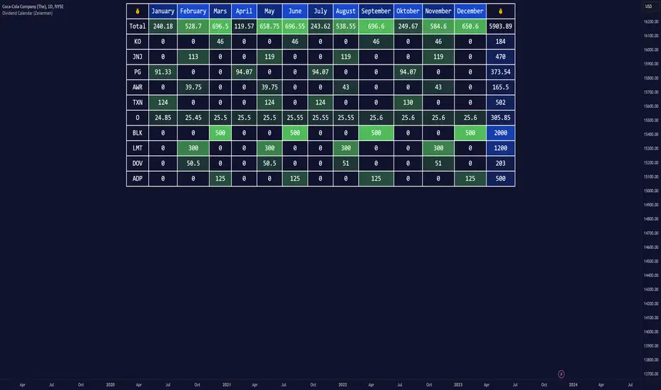
Dividend Calendar (Zeiierman)█ Overview
The Dividend Calendar is a financial tool designed for investors and analysts in the stock market. Its primary function is to provide a schedule of expected dividend payouts from various companies.
Dividends, which are portions of a company's earnings distributed to shareholders, represent a return on their investment. This calendar is particularly crucial for investors who prioritize dividend income, as it enables them to plan and manage their investment strategies with greater effectiveness. By offering a comprehensive overview of when dividends are due, the Dividend Calendar aids in informed decision-making, allowing investors to time their purchases and sales of stocks to optimize their dividend income. Additionally, it can be a valuable tool for forecasting cash flow and assessing the financial health and dividend-paying consistency of different companies.
█ How to Use
Dividend Yield Analysis:
By tracking dividend growth and payouts, traders can identify stocks with attractive dividend yields. This is particularly useful for income-focused investors who prioritize steady cash flow from their investments.
Income Planning:
For those relying on dividends as a source of income, the calendar helps in forecasting income.
Trend Identification:
Analyzing the growth rates of dividends helps in identifying long-term trends in a company's financial health. Consistently increasing dividends can be a sign of a company's strong financial position, while decreasing dividends might signal potential issues.
Portfolio Diversification:
The tool can assist in diversifying a portfolio by identifying a range of dividend-paying stocks across different sectors. This can help mitigate risk as different sectors may react differently to market conditions.
Timing Investments:
For those who follow a dividend capture strategy, this indicator can be invaluable. It can help in timing the buying and selling of stocks around their ex-dividend dates to maximize dividend income.
█ How it Works
This script is a comprehensive tool for tracking and analyzing stock dividend data. It calculates growth rates, monthly and yearly totals, and allows for custom date handling. Structured to be visually informative, it provides tables and alerts for the easy monitoring of dividend-paying stocks.
Data Retrieval and Estimation: It fetches dividend payout times and amounts for a list of stocks. The script also estimates future values based on historical data.
Growth Analysis: It calculates the average growth rate of dividend payments for each stock, providing insights into dividend consistency and growth over time.
Summation and Aggregation: The script sums up dividends on a monthly and yearly basis, allowing for a clear view of total payouts.
Customization and Alerts: Users can input custom months for dividend tracking. The script also generates alerts for upcoming or current dividend payouts.
Visualization: It produces various tables and visual representations, including full calendar views and income tables, to display the dividend data in an easily understandable format.
█ Settings
Overview:
Currency:
Description: This setting allows the user to specify the currency in which dividend values are displayed. By default, it's set to USD, but users can change it to their local currency.
Impact: Changing this value alters the currency denomination for all dividend values displayed by the script.
Ex-Date or Pay-Date:
Description: Users can select whether to show the Ex-dividend day or the Actual Payout day.
Impact: This changes the reference date for dividend data, affecting the timing of when dividends are shown as due or paid.
Estimate Forward:
Description: Enables traders to predict future dividends based on historical data.
Impact: When enabled, the script estimates future dividend payments, providing a forward-looking view of potential income.
Dividend Table Design:
Description: Choose between viewing the full dividend calendar, just the cumulative monthly dividend, or a summary view.
Impact: This alters the format and extent of the dividend data displayed, catering to different levels of detail a user might require.
Show Dividend Growth:
Description: Users can enable dividend growth tracking over a specified number of years.
Impact: When enabled, the script displays the growth rate of dividends over the selected number of years, providing insight into dividend trends.
Customize Stocks & User Inputs:
This setting allows users to customize the stocks they track, the number of shares they hold, the dividend payout amount, and the payout months.
Impact: Users can tailor the script to their specific portfolio, making the dividend data more relevant and personalized to their investments.
-----------------
Disclaimer
The information contained in my Scripts/Indicators/Ideas/Algos/Systems does not constitute financial advice or a solicitation to buy or sell any securities of any type. I will not accept liability for any loss or damage, including without limitation any loss of profit, which may arise directly or indirectly from the use of or reliance on such information.
All investments involve risk, and the past performance of a security, industry, sector, market, financial product, trading strategy, backtest, or individual's trading does not guarantee future results or returns. Investors are fully responsible for any investment decisions they make. Such decisions should be based solely on an evaluation of their financial circumstances, investment objectives, risk tolerance, and liquidity needs.
My Scripts/Indicators/Ideas/Algos/Systems are only for educational purposes!
Liquidity Price Depth Chart [LuxAlgo]The Liquidity Price Depth Chart is a unique indicator inspired by the visual representation of order book depth charts, highlighting sorted prices from bullish and bearish candles located on the chart's visible range, as well as their degree of liquidity.
Note that changing the chart's visible range will recalculate the indicator.
🔶 USAGE
The indicator can be used to visualize sorted bullish/bearish prices (in descending order), with bullish prices being highlighted on the left side of the chart, and bearish prices on the right. Prices are highlighted by dots, and connected by a line.
The displacement of a line relative to the x-axis is an indicator of liquidity, with a higher displacement highlighting prices with more volume.
These can also be easily identified by only keeping the dots, visible voids can be indicative of a price associated with significant volume or of a large price movement if the displacement is more visible for the price axis. These areas could play a key role in future trends.
Additionally, the location of the bullish/bearish prices with the highest volume is highlighted with dotted lines, with the returned horizontal lines being useful as potential support/resistances.
🔹 Liquidity Clusters
Clusters of liquidity can be spotted when the Liquidity Price Depth Chart exhibits more rectangular shapes rather than "V" shapes.
The steepest segments of the shape represent periods of non-stationarity/high volatility, while zones with clustered prices highlight zones of potential liquidity clusters, that is zones where traders accumulate positions.
🔹 Liquidity Sentiment
At the bottom of each area, a percentage can be visible. This percentage aims to indicate if the traded volume is more often associated with bullish or bearish price variations.
In the chart above we can see that bullish price variations make 63.89% of the total volume in the range visible range.
🔶 SETTINGS
🔹 Bullish Elements
Bullish Price Highest Volume Location: Shows the location of the bullish price variation with the highest associated volume using one horizontal and one vertical line.
Bullish Volume %: Displays the bullish volume percentage at the bottom of the depth chart.
🔹 Bearish Elements
Bearish Price Highest Volume Location: Shows the location of the bearish price variation with the highest associated volume using one horizontal and one vertical line.
Bearish Volume %: Displays the bearish volume percentage at the bottom of the depth chart.
🔹 Misc
Volume % Box Padding: Width of the volume % boxes at the bottom of the Liquidity Price Depth Chart as a percentage of the chart visible range

Intersection Value FunctionsWinning entry for the first Pinefest contest. The challenge required providing three functions returning the intersection value between two series source1 and source2 in the event of a cross, crossunder, and crossover.
Feel free to use the code however you like.
🔶 CHALLENGE FUNCTIONS
🔹 crossValue()
//@function Finds intersection value of 2 lines/values if any cross occurs - First function of challenge -> crossValue(source1, source2)
//@param source1 (float) source value 1
//@param source2 (float) source value 2
//@returns Intersection value
example:
value = crossValue(close, close )
🔹 crossoverValue()
//@function Finds intersection value of 2 lines/values if crossover occurs - Second function of challenge -> crossoverValue(source1, source2)
//@param source1 (float) source value 1
//@param source2 (float) source value 2
//@returns Intersection value
example:
value = crossoverValue(close, close )
🔹 crossunderValue()
//@function Finds intersect of 2 lines/values if crossunder occurs - Third function of challenge -> crossunderValue(source1, source2)
//@param source1 (float) source value 1
//@param source2 (float) source value 2
//@returns Intersection value
example:
value = crossunderValue(close, close )
🔶 DETAILS
A series of values can be displayed as a series of points, where the point location highlights its value, however, it is more common to connect each point with a line to have a continuous aspect.
A line is a geometrical object connecting two points, each having y and x coordinates. A line has a slope controlling its steepness and an intercept indicating where the line crosses an axis. With these elements, we can describe a line as follows:
slope × x + intercept
A cross between two series of values occurs when one series is greater or lower than the other while its previous value isn't.
We are interested in finding the "intersection value", that is the value where two crossing lines are equal. This problem can be approached via linear interpolation.
A simple and direct approach to finding our intersection value is to find the common scaling factor of the slopes of the lines, that is the multiplicative factor that multiplies both lines slopes such that the resulting points are equal.
Given:
A = Point A1 + m1 × scaling_factor
B = Point B1 + m2 × scaling_factor
where scaling_factor is the common scaling factor, and m1 and m2 the slopes:
m1 = Point A2 - Point A1
m2 = Point B2 - Point B1
In our cases, since the horizontal distance between two points is simply 1, our lines slopes are equal to their vertical distance (rise).
Under the event of a cross, there exists a scaling_factor satisfying A = B , which allows us to directly compute our intersection value. The solution is given by:
scaling_factor = (B1 - A1)/(m1 - m2)
As such our intersection value can be given by the following equivalent calculations:
(1) A1 + m1 × (B1 - A1)/(m1 - m2)
(2) B1 + m2 × (B1 - A1)/(m1 - m2)
(3) A2 - m2 × (A2 - B2)/(m1 - m2)
(4) B2 - m2 × (A2 - B2)/(m1 - m2)
The proposed functions use the third calculation.
This approach is equivalent to expressions using the classical line equation, with:
slope1 × x + intercept1 = slope2 × x + intercept2
By solving for x , the intersection point is obtained by evaluating any of the line equations for the obtained x solution.
🔶 APPLICATIONS
The intersection point of two crossing lines might lead to interesting applications and creations, in this section various information/tools derived from the proposed calculations are presented.
This supplementary material is available within the script.
🔹 Intersections As Support/Resistances
The script allows extending the lines of the intersection value when a cross is detected, these extended lines could have applications as support/resistance lines.
🔹 Using The Scaling Factor
The core of the proposed calculation method is the common scaling factor, which can be used to return useful information, such as the position of the cross relative to the x coordinates of a line.
The above image highlights two moving averages (in green and red), the cross-interval areas are highlighted in blue, and the intersection point is highlighted as a blue line.
The pane below shows a bar plot displaying:
1 - scaling factor = 1 -
Values closer to 1 indicate that the cross location is closer to x2 (the right coordinate of the lines), while values closer to 0 indicate that the cross location is closer to x1 .
🔹 Intersection Matrix
The main proposed functions of this challenge focus on the crossings between two series of values, however, we might be interested in applying this over a collection of series.
We can see in the image above how the lines connecting two points intersect with each other, we can construct a matrix populated with the intersection value of two corresponding lines. If (X, Y) represents the intersection value between lines X and Y we have the following matrix:
| Line A | Line B | Line C | Line D |
-------|--------|--------|--------|--------|
Line A | | (A, B) | (A, C) | (A, D) |
Line B | (B, A) | | (B, C) | (B, D) |
Line C | (C, A) | (C, B) | | (C, D) |
Line D | (D, A) | (D, B) | (D, C) | |
We can see that the upper triangular part of this matrix is redundant, which is why the script does not compute it. This function is provided in the script as intersectionMatrix :
//@function Return the N * N intersection matrix from an array of values
//@param array_series (array) array of values, requires an array supporting historical referencing
//@returns (matrix) Intersection matrix showing intersection values between all array entries
In the script, we create an intersection matrix from an array containing the outputs of simple moving averages with a period in a specific user set range and can highlight if a simple moving average of a certain period crosses with another moving average with a different period, as well as the intersection value.
🔹 Magnification Glass
Crosses on a chart can be quite small and might require zooming in significantly to see a detailed picture of them. Using the obtained scaling factor allows reconstructing crossing events with an higher resolution.
A simple supplementary zoomIn function is provided to this effect:
//@function Display an higher resolution representation of intersecting lines
//@param source1 (float) source value 1
//@param source2 (float) source value 2
//@param css1 (color) color of source 1 line
//@param css2 (color) color of source 2 line
//@param intersec_css (color) color of intersection line
//@param area_css (color) color of box area
Users can obtain a higher resolution by modifying the provided "Resolution" setting.
The function returns a higher resolution representation of the most recent crosses between two input series, the intersection value is also provided.

AR Forecast Scatterplot [SS]This is a showcase indicator of my recently released SPTS library (the partner of the SPTS indicator).
This is just to show some of the practical applications of the boring statistical functions contained within the library/SPTS indicator :-).
This is an autoregressive (AR), scatter plot forecaster. What this means is it tags a lag of 1, performs an autoregressive assessment over the desired training time, then uses what it learns over that training time to forecast the likely outcome.
Its not a machine learning (I am in the process of creating one like this, but it is taking quite some time to complete), but the model needs to learn to plan the statistical coefficients that will best mimic the current trend.
As of its current state, this actually surpassed my own expectations. I can show you some QQQ examples:
Example #1:
Prediction:
Actual:
Example #2:
Prediction:
Actual:
Pretty nuts, eh?
Statistics, I'm telling you, its the answer haha.
So how do we determine the train time?
Because this is not using machine learning to control for over/under representation of datasize (again, I am making a version that does this, but its a slow process), some quick tips at determine appropriate train time is to use the Tradingview Regression tool:
When you set the parameters to align with the current, strongest trend, it is more reliable.
You will see, that it acutally is forecasting a move back to the exact top of this trend, that is because it is using the same processes as the linear regression trend on Tradingview.
You can use a bar counter indicator ( such as mine available here ) to calculate the number or bars back for your model training.
You can verify that these parameters are appropriate by looking at the Model Data table (which can be toggled on and off). You want to see both a high correlation and a high R2 value.
Quick note on colour:
Green = represents the upper confidence predictions (best case scenario)
Blue = represents the most likely result
red = represents that lower confidence (not as best case scenario)
Hope you enjoy!
Safe trades everyone!

Volume Profile with a few polylinesThe base of "Volume Profile with a few polylines" is another script of mine, Volume Profile (Maps) .
The structure of maps is used to gather the data. However, the drawings is done with polylines.
This enables coders to draw an entire volume profile with just a few polylines, while the range is broader.
This results in the benefit to draw more "lines" than with line.new() / box.new() alone.
🔶 CONCEPTS
🔹 Polylines
polyline.new creates a new polyline instance and displays it on the chart, sequentially connecting all of the points in the `points` array with line segments.
The segments in the drawing can be straight or curved depending on the `curved` parameter.
In this script, points are connected, starting from the bottom. The created line moves up until there is a price level where a volume value needs to be displayed,
at which the line goes to the left to the concerning volume value, coming back at the same price level until the line returns to its initial x-axis,
after which the line will continue to rise until all values are displayed.
A polyline can contain maximum 10000 points (10K).
Since the line has to go back and forth, each price/volume line takes 3 points.
In the case that 20K bars all have a different price, we would need 60K points, or just 6 polylines. A maximum of 100 polylines can be displayed.
The 3 highest volume values are displayed with line.new(), each with their own colour.
🔹 Maps
A map object is a collection that consists of key - value pairs
Each key is unique and can only appear once. When adding a new value with a key that the map already contains, that value replaces the old value associated with the key .
You can change the value of a particular key though, for example adding volume (value) at the same price (key), the latter technique is used in this script.
Volume is added to the map, associated with a particular price (default close, can be set at high, low, open,...)
When the map already contains the same price (key), the value (volume) is added to the existing volume at the associated price.
A map can contain maximum 50K values, which is more than enough to hold 20K bars (Basic 5K - Premium plan 20K), so the whole history can be put into a map.
🔹 Rounding function
This publication contains 2 round functions, which can be used to widen the Volume Profile
Round
• "Round" set at zero -> nothing changes to the source number
• "Round" set below zero -> x digit(s) after the decimal point, starting from the right side, and rounded.
• "Round" set above zero -> x digit(s) before the decimal point, starting from the right side, and rounded.
Example: 123456.789
0->123456.789
1->123456.79
2->123456.8
3->123457
-1->123460
-2->123500
Step
Another option is custom steps.
After setting "Round" to "Step", choose the desired steps in price,
Examples
• 2 -> 1234.00, 1236.00, 1238.00, 1240.00
• 5 -> 1230.00, 1235.00, 1240.00, 1245.00
• 100 -> 1200.00, 1300.00, 1400.00, 1500.00
• 0.05 -> 1234.00, 1234.05, 1234.10, 1234.15
•••
🔶 FEATURES
🔹 Volume * currency
Let's take as example BTCUSD, relative to USD, 10 volume at a price of 100 BTCUSD will be very different than 10 volume at a price of 30000 (1K vs. 300K)
If you want volume to be associated with USD, enable Volume * currency . Volume will then be multiplied by the price:
• 10 volume, 1 BTC = 100 -> 1000
• 10 volume, 1 BTC = 30K -> 300K
Polylines has the attributes curved & closed.
When "curved" is enabled the drawing will connect all points from the `points` array using curved line segments.
When "closed" is enabled the drawing will also connect the first point to the last point from the `points` array, resulting in a closed polyline.
They are default disabled, but can be enabled:
🔶 DETAILS
🔹 Put
When the map doesn't contain a price, it will be added, using map.put(id, key, value)
In our code:
map.put(originalMap, price, volume)
or
originalMap.put(price, volume)
A key (price) is now associated with a value (volume) -> key : value
Since all keys are unique, we don't have to know its position to extract the value, we just need to know the key -> map.get(id, key)
We use map.get() when a certain key already exists in the map, and we want to add volume with that value.
if originalMap.contains(price)
originalMap.put(price, originalMap.get(price) + volume)
-> At the last bar, all prices (source) are now associated with volume.
🔶 SETTINGS
Source : Set source of choice; default close , can be set as high , low , open , ...
Volume & currency : Enable to multiply volume with price (see Features )
Amount of bars : Set amount of bars which you want to include in the Volume Profile
🔹 Round -> ' Round/Step '
Round -> see Concepts
Step -> see Concepts
🔹 Display Volume Profile
Offset: shifts the Volume Profile (max. 500 bars to the right of last bar, see Features )
Max width Volume Profile: largest volume will be x bars wide, the rest is displayed as a ratio against largest volume (see Features )
Colours
Curved: make lines curved
Closed: connect last with first point
🔶 LIMITATIONS
• Lines won't go further than first bar (coded).
• The Volume Profile can be placed maximum 500 bar to the right of last price.
