BFXLS - Compare styleDisplays BitFinex longs and shorts on your chart in the same was as if you add them by using TradingView's "compare" function - major advantage is that this works for all pairs that BitFinex supports without having to manually set up your chart each time.
Compare

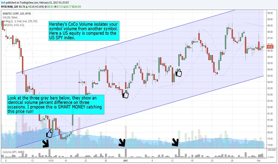
Hersheys CoCo VolumeCoCo Volume shows you volume movement of your symbol after subtracting the movement from another symbol, preferrably the sector or market the stock belongs to.
My latest update to my CoCoVolume Indicator. It calculates today's volume percent over the 60 period average for both your symbol and index, and displays that difference. If the percent is over the max it highlights the color, showing BIG action for that stock.
The last version was calculating the percent volume difference from yesterday to today for the stock and index and displaying the difference. The prior method had large swings on low volume stocks... this one shows the independent volume action much better. The default values will suit most stocks.
You can set three variables...
- the index symbol, default is SPY
- the period for averaging, default is 60
- the max volume percent, default is 500
Good trading!
Brian Hershey
Hersheys CoCo VolumeThis simple but powerful indicator takes the volume changes from another symbol and removes them from your symbol, so you can compare stock/market or stock/sector or sector/market relationships.
When used together with Hersheys CoCo Bars, you get a very unique view of what's going on!
Good trading!
Brian Hershey
UCS - Index RatingStill Confused, What's Strong and Weak?
Here is a simple Indicator for those who needs it.
Make Sure to Define the character for the Index, go to setup and modify you like.

Hersheys CoCoThis is my variation of the Correlation Coefficient and I call it "Hershey's CoCo". The indicator identifies very specific Stock, Sector and Market pressures on whatever symbol you are evaluating.
If interested, follow me and send me requests to evaluate your stock or sector as I refine this tool.
***********************************************
Price movement does not happen in isolation.
Stocks are held by various "containers" that can be traded independently and can affect the price of each stock. The most important of those containers are Sector and Market, while others include Industry, MarketCap and others.
For example, Market is simply the top level representation of all stocks, or the sea that carries, or sinks, all ships. You can monitor this level by looking at various indexes, ETFs and/or Funds. I use "VTI", the Vanguard Total Stock Market ETF.
Sectors can be monitored using any number of containers, like Vanguard Sector Index Funds or ProShares Ultra Sector Indexes. I use the S&P SPDR Sector Funds. A list of those are listed below.
Most of the techniques and indicators that deal with correlation and sector/market comparisons are not very detailed. Many simply overlay one price series over another, while you tediously follow the price lines from left to right trying to judge movement.
Another critical piece missing from other compare tools is normalizing each data series. Hershey's CoCo does this, so you can have confidence that the alerts you see are based on accurate comparisons at every level.
***********************************************
So let's get to the details! Hershey's CoCo currently compares 2 containers, so for this discussion we'll do Stock to Sector. You'll see arrows above and below some ticks of the price chart, plus a faint red or green background color.
Very Bull = Blue Arrow = Stock and Sector prices are up, Stock price up more
Bull = Green Arrow = Stock and Sector prices are up, Sector price up more
Bear = Red Arrow = Stock and Sector prices are down, Sector price down more
Very Bear = Black Arrow = Stock and Sector prices are down, Stock price down more
Neutral = No Arrow = Stock and Sector price movement equal
Arrow Length = Strength (the longer the arrow the bigger the difference)
Green Background = Bull = Above zero Simple Moving Average of all arrow values
Red Background = Bear = Below zero Simple Moving Average of all arrow values
To review, the Blacks and Blues are the HEAVIEST pressure... the LONGER the STRONGER!
