ICT CBDR Range |MC|This indicator plots the CBDR Range on the Chart (Credits go to TFlab)
💎 What Is the Central Bank Dealers Range (CBDR)? 💎
In the Inner Circle Trader (ICT) Strategy, the CBDR identifies the projected high and low of a trading day. This range is calculated between 2:00 PM and 8:00 PM New York time. By observing specific deviations from the average price within this window, traders estimate potential price movements for the next session.
The range is derived from average price action.
Deviation levels above and below this average help forecast price behavior.
These deviations indicate how far prices may extend from the central range.
💎 Ideal Range Parameters for CBDR 💎
To optimize CBDR effectiveness, traders should consider the following:
Range Height: Determined by measuring the highest and lowest price within the CBDR window. It is preferable to use candlestick bodies, although wicks can be considered when body size is minimal.
Optimal Range: The most reliable CBDR measurements occur within a range of 10 to 20 pips, ideally remaining under 40 pips.
Large Ranges: When the range exceeds 40 pips, short-term trades tend to perform more favorably.
💎 Benefits of Implementing CBDR 💎
Using the Central Bank Dealers Range offers multiple advantages:
Improved Price Forecasting: Enhances accuracy in predicting price movements.
Risk Minimization: Enables traders to avoid unfavorable trade conditions.
Higher Success Probability: Identifies high-probability trade setups.
Versatility: Applicable to various assets and timeframes.
💎 How to Apply CBDR in Daily Trading 💎
Each trading day, the market tends to move price 1–2 times the CBDR range against the prevailing trend to gather liquidity. Following this, a directional move in line with the trend often occurs, typically equivalent to four times the CBDR range.
💎 Bearish Market Scenario 💎
On bearish days:
Price may exceed the upper CBDR boundary by a maximum of two units.
A typical move is one unit above the range to collect stop orders.
The projected daily low is often three units below the CBDR, usually forming at the end of the London session.
💎 Bullish Market Scenario 💎
On bullish days:
Price generally drops no more than two units below the CBDR.
A downward movement of one unit is common to gather liquidity.
The projected high of the day appears three units above the CBDR, typically near the London session close.
💎 Best Timeframes for CBDR Strategy 💎
CBDR is most effective on the following intraday timeframes:
15-Minute Chart: Offers precise insight into short-term price fluctuations.
30-Minute Chart: Provides a broader perspective for swing trading and market planning.
💎 Most Suitable Markets and Pairs for CBDR 💎
Originally developed for NASDAQ and S&P 500, the CBDR approach has since been adapted for other financial instruments.
Recommended Currency Pairs:
GBP/USD
EUR/USD
Precious Metals:
XAU/USD
XAG/USD
These markets demonstrate favorable price behavior around the CBDR, making them ideal for this strategy.
Happy Trading!
밴드 및 채널


Leg-In | Boring (Small/Medium) | Leg-Out Strategy jayendra//@version=5
indicator("Leg-In | Boring (Small/Medium) | Leg-Out Strategy", overlay=true)
// ================= INPUTS =================
emaLen = input.int(50, "EMA Length")
atrLen = input.int(14, "ATR Length")
slMult = input.float(1.0, "Stop-Loss ATR x", step=0.1)
tpMult = input.float(2.0, "Take-Profit ATR x", step=0.1)
// ================= COLORS =================
legInColor = color.black
boringColor = color.blue
legOutColor = color.purple
// ================= CALCULATIONS =================
emaVal = ta.ema(close, emaLen)
atrVal = ta.atr(atrLen)
// Candle body sizes
legInSize = math.abs(close - open )
boringSize = math.abs(close - open )
legOutSize = math.abs(close - open)
// ================= RULES =================
// Leg-In: strong directional candle
legInValid = legInSize >= boringSize * 2
// Boring: small or medium size (flexible)
boringValid = (boringSize > atrVal * 0.3) and (boringSize <= legInSize)
// Leg-Out: breakout candle
legOutValid = legOutSize >= boringSize * 4
breakUp = high > high
breakDown = low < low
// Pattern valid
patternValid = legInValid and boringValid and legOutValid
// ================= DIRECTION =================
buySignal = patternValid and close > open and breakUp and close > emaVal
sellSignal = patternValid and close < open and breakDown and close < emaVal
setupFound = buySignal or sellSignal
// ================= CANDLE COLORING =================
barcolor(setupFound ? legOutColor : na)
barcolor(setupFound ? boringColor : na, offset=-1)
barcolor(setupFound ? legInColor : na, offset=-2)
// ================= PLOTS =================
plot(emaVal, color=color.orange, linewidth=2, title="EMA")
plotshape(buySignal, title="BUY", text="BUY",
style=shape.labelup, location=location.belowbar,
color=color.green, textcolor=color.white)
plotshape(sellSignal, title="SELL", text="SELL",
style=shape.labeldown, location=location.abovebar,
color=color.red, textcolor=color.white)
// ================= ALERTS =================
alertcondition(buySignal, title="BUY Alert", message="BUY: Leg-In (Black) → Boring (Blue, small/medium) → Leg-Out (Purple)")
alertcondition(sellSignal, title="SELL Alert", message="SELL: Leg-In (Black) → Boring (Blue, small/medium) → Leg-Out (Purple)")
// ================= STOP LOSS / TAKE PROFIT =================
var float buySL = na
var float buyTP = na
var float sellSL = na
var float sellTP = na
if buySignal
buySL := close - atrVal * slMult
buyTP := close + atrVal * tpMult
if sellSignal
sellSL := close + atrVal * slMult
sellTP := close - atrVal * tpMult
plot(buySL, color=color.red, style=plot.style_linebr, title="Buy SL")
plot(buyTP, color=color.green, style=plot.style_linebr, title="Buy TP")
plot(sellSL, color=color.red, style=plot.style_linebr, title="Sell SL")
plot(sellTP, color=color.green, style=plot.style_linebr, title="Sell TP")

Custom Intraday Indicator with FII and Operator Activity//@version=5
indicator("Custom Intraday Indicator with FII and Operator Activity", overlay=true)
// Moving Averages for Entry/Exit Signals
shortMA = ta.sma(close, 9)
longMA = ta.sma(close, 21)
entrySignal = ta.crossover(shortMA, longMA)
exitSignal = ta.crossunder(shortMA, longMA)
// Open Interest and OI Change
oi = request.security(syminfo.ticker + ":OI", timeframe.period, close)
oiChange = oi - ta.valuewhen(oi != na, oi, 1)
// FII and Operator Activity (Assuming data is available from a custom source)
fiiBuying = request.security("FII_BUYING_DATA", timeframe.period, close)
fiiSelling = request.security("FII_SELLING_DATA", timeframe.period, close)
operatorBuying = request.security("OPERATOR_BUYING_DATA", timeframe.period, close)
operatorSelling = request.security("OPERATOR_SELLING_DATA", timeframe.period, close)
// Support and Resistance Levels
pivotHigh = ta.highest(high, 10)
pivotLow = ta.lowest(low, 10)
// Plotting
plot(shortMA, color=color.blue, title="Short MA")
plot(longMA, color=color.red, title="Long MA")
plotshape(entrySignal, style=shape.triangleup, location=location.belowbar, color=color.green, title="Entry Signal")
plotshape(exitSignal, style=shape.triangledown, location=location.abovebar, color=color.red, title="Exit Signal")
plot(pivotHigh, color=color.orange, style=plot.style_line, title="Pivot High")
plot(pivotLow, color=color.purple, style=plot.style_line, title="Pivot Low")
// Display OI and OI Change
plot(oi, color=color.blue, title="Open Interest")
plot(oiChange, color=color.fuchsia, title="OI Change")
// Display FII and Operator Activity
plot(fiiBuying, color=color.green, title="FII Buying")
plot(fiiSelling, color=color.red, title="FII Selling")
plot(operatorBuying, color=color.blue, title="Operator Buying")
plot(operatorSelling, color=color.purple, title="Operator Selling")

Gyakkou Kyokushou System (Invite-only Overlay)This is an invite-only overlay indicator designed to help visually organize market context and reduce chart clutter. It does not execute trades. It provides visual guidance and optional alerts for decision support.
It overlays multiple visual modules such as trend ribbons (short/long moving-average ribbons), a moving-average bundle (GMMA-style visualization), Bollinger Bands for volatility reference, market session highlighting (Tokyo/London/New York with configurable time windows), and optional take-profit alerts based on a Heikin Ashi reference. Each module can be enabled/disabled, and colors/session times can be customized in settings.
This indicator is not financial advice. Signals/alerts are for reference only and do not guarantee results.
これは招待専用のオーバーレイ型インジケーターです。相場の状況を見やすく整理し、判断の補助として使います。自動売買は行いません。
短期帯/長期帯の移動平均の帯、移動平均線の束(GMMA風)、ボリンジャーバンド、市場時間(東京・ロンドン・NY)の背景ハイライト(時間は設定で変更可能)、平均足を参照した利確補助アラート等を、チャート上に重ねて表示します。各表示はオン/オフでき、色や時間などは設定から調整できます。
本インジケーターは投資助言ではありません。表示やアラートは参考情報であり、結果を保証しません。

MTF Multi Indicator Table by JAB76TABLE for trading with EMA and ICHIMOKU , HELPS IN ANALYSIS OF TREND

Best Algo (SIIT) By Nagaraj HiremathBest Algo (SIIT) By Nagaraj Hiremath is Based on Ema,Pivot,Renko Candle

Sistema Neutro GOULART HUD Regime Radar ORB VWAPSistema Neutro GOULART is an advanced visual trading indicator that integrates:
• A unified HUD displaying session status, ORB, VWAP, risk and market bias
• A Regime Radar heatmap (GO / WAIT / NO) designed to provide clarity without chart clutter
• ORB with straight daily lines and a clean zone limited to the current session
• Direction filtering using VWAP and VWAP slope
• Condition assessment based on risk and overall market context
• A harmonized visual design focused on objective decision-making
⚠️ This indicator does NOT generate trade signals.
It provides market context, regime classification, and quality assessment to support discretionary trading decisions.
Ideal for:
• Futures markets (ES, NQ, YM)
• Day trading using ORB + VWAP
• Traders who prioritize context, discipline, and structure over signals
For educational purposes only.

RSI with 3 Separate Smoothing AveragesRSI has 3 moving averages, to help trade better
RSI period can be adjusted
Moving average has multiple selections (SMA, EMA, HMA)
moving average cross over can be used as signal for trades
Trade at your own risk

Stoch RSI M5 / M30 / H1_Brando ValenciaIndicator Description
This indicator displays the Stochastic RSI for 5-minute, 30-minute, and 1-hour timeframes simultaneously in one stable MTF panel — no lookahead, no repainting.
Red (5m) → entry timing
Green (30m) → short-term / intraday bias
Blue (1h) → higher-timeframe context & direction
The calculation matches the TradingView default Stoch RSI (%K) exactly:
RSI length: 14
Stochastic length: 14
Smoothing: 3
Levels
Above 80 → overbought
Below 20 → oversold
50 → trend filter / equilibrium
Purpose
This indicator is not a standalone entry trigger, but a context and timing tool:
1h & 30m define direction
5m provides precise entry windows
Ideal for scalping and day trading (e.g. EUR/USD during London & New York sessions).

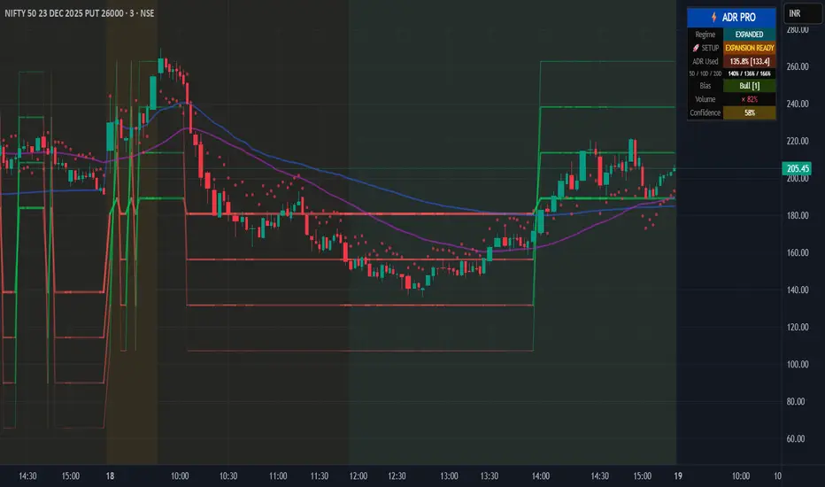
Institutional ADR Regime System [Pro]# 📊 Institutional ADR Regime System - Advanced Average Daily Range Analysis
## 🎯 Overview
The **Institutional ADR Regime System** is a comprehensive volatility and regime analysis tool designed for professional traders who use Average Daily Range (ADR) as a cornerstone of their intraday strategy. This indicator goes far beyond simple ADR calculation by integrating **multi-timeframe analysis**, **directional bias detection**, **volume confirmation**, **regime classification**, and **probability-based target projections**.
Built specifically for **Nifty, Bank Nifty, Stock Futures, Forex, and Crypto** traders, this system helps you identify high-probability setups based on volatility regimes and ADR expansion/compression cycles.
***
## 🚀 Key Features
### 📈 **Multi-Timeframe ADR Engine**
- **Three ADR Lookbacks**: Fast (5-period), Medium (10-period), Slow (20-period) for complete volatility context
- **Real-time Session Tracking**: Live calculation of current day's range vs ADR percentages
- **Multiple Calculation Methods**: True Range (gap-adjusted), High-Low (intraday), Close-to-Close
- **Configurable Base Timeframes**: Daily or Weekly ADR projections
### 🧠 **Intelligent Regime Classification**
- **4 Market Regimes**: Compressed (<65% ADR), Normal (65-120%), Expanded (120-150%), Exhausted (>150%)
- **Compression Cluster Detection**: Identifies "coiled spring" setups when market compresses for multiple consecutive days
- **Visual Regime Indicators**: Background color-coding for instant regime recognition
- **Automated Expansion Alerts**: Get notified when compression clusters are ready to break
### 🎯 **Dynamic Target Projection System**
- **4 Probabilistic Targets**: 50% / 75% / 100% / 125% ADR levels
- **Historical Hit-Rate Tracking**: See success rates for each target level over last N sessions
- **Confidence Scoring (0-100%)**: Multi-factor scoring based on regime, trend, volume, and statistics
- **Adaptive Transparency**: Target lines fade when confidence is low, highlight when high
### 📊 **Directional Context Engine**
- **Trend Filter**: Higher timeframe EMA alignment (auto-detects bullish/bearish bias)
- **VWAP Integration**: Monitors price position relative to VWAP for institutional bias
- **Multi-TF Trend Confirmation**: Optional higher timeframe trend filter (Weekly/Monthly)
- **Bias Scoring System**: -3 to +3 score combining trend, VWAP, and HTF alignment
- **Auto/Manual Mode**: Let the system decide bull/bear targets or override manually
### 📈 **Volume Confirmation Layer**
- **Volume MA Threshold**: Requires volume confirmation above customizable threshold (default 1.2×)
- **Real-time Volume Status**: Displays current volume as % of moving average
- **Volume-Gated Alerts**: Smart alerts only fire when volume confirms the move
### ⚖️ **Risk Management Module**
- **ATR-Based Stop Suggestions**: Auto-calculates suggested stop loss based on ATR multiplier
- **R:R Calculator**: Shows risk-reward ratios for each target level
- **Position Sizing Hints**: Helps determine appropriate lot size based on account risk %
- **Dynamic Stop Visualization**: Plots suggested stop level on chart
### 📊 **Professional Statistics Dashboard**
- **Real-Time ADR Usage Meter**: Shows % of ADR consumed (color-coded risk zones)
- **Multi-Period Comparison**: Current range vs 5D / 10D / 20D ADR
- **Historical Hit-Rates**: Target success rates tracked over configurable lookback
- **Playbook Hints**: Context-aware trading suggestions (Breakout Play, Fade Zone, Trend Day, etc.)
- **Compact/Full/Minimal Modes**: Choose your preferred panel size
- **Mobile-Optimized**: Readable on all screen sizes
### 🔔 **Smart Alert System**
- **Target 1 Approach**: Fires when price approaches T1 with high confidence + volume
- **Exhaustion Zone**: Alerts when ADR >150% used (fade opportunity)
- **Coiled Spring**: Triggers on compression cluster completion (expansion setup)
- **High-Probability Confirmation**: Multi-factor confirmation alerts (trend + volume + T1 break)
***
## 💡 Use Cases & Trading Applications
### ✅ **Intraday Range Traders**
- Identify compressed days for range-bound strategies
- Avoid overextended days with exhaustion warnings
- Scale into positions at probabilistic support/resistance levels
### ✅ **Breakout & Momentum Traders**
- Detect "coiled spring" compression clusters before expansion
- Enter on confirmed ADR breakouts with volume
- Use confidence scoring to filter low-probability setups
### ✅ **Mean Reversion & Fade Specialists**
- Identify exhaustion zones (>150% ADR) for counter-trend entries
- Fade extremes when price reaches 125% target with weak volume
- Use HTF resistance/support confluence with ADR targets
### ✅ **Position Traders (Swing)**
- Weekly ADR projections for multi-day targets
- Trend + ADR alignment for high-conviction entries
- R:R-based position sizing at each target level
### ✅ **Options Traders**
- Volatility regime classification for straddle/strangle timing
- Compression clusters = pre-expansion option buying opportunity
- Exhaustion zones = premium selling setups
***
## 🔧 Configuration Guide
### **Core Settings**
- **Market Type**: Equity / Futures / Forex / Crypto (affects session detection)
- **Base Timeframe**: Daily or Weekly ADR calculation
- **Target Direction**: Auto (trend-based) / Bull / Bear (manual override)
### **ADR Parameters**
- **Fast/Med/Slow Periods**: Customize ADR lookbacks (default: 5/10/20)
- **Calculation Method**: True Range (recommended) / High-Low / Close-to-Close
- **Regime Thresholds**: Adjust compression/expansion levels to your instrument
### **Session Settings** (Critical for Intraday)
- **Enable Session Filter**: Only calculate ADR during RTH (Regular Trading Hours)
- **Session Hours**: Set your market's trading hours (e.g., 09:15-15:30 IST for Nifty)
- **Timezone**: Select your market's timezone
### **Filters & Confirmations**
- **Trend EMA Length**: Adjust trend filter sensitivity (default: 50)
- **Volume Threshold**: Set volume confirmation multiplier (default: 1.2×)
- **Higher TF Trend**: Enable weekly/monthly trend filter
### **Risk Management**
- **Stop ATR Multiplier**: Default stop distance (default: 1.5× ATR)
- **Account Risk %**: For position sizing calculations
### **Statistics**
- **Statistical Lookback**: Hit-rate calculation period (default: 50 sessions)
- **Enable Stats**: Toggle historical probability tracking
***
## 📖 Interpretation Guide
### **Regime Colors** (Background)
- 🟠 **Orange**: Compressed (<65% ADR) - Range-bound day likely
- 🔵 **Aqua**: Expanded (120-150%) - Strong trending day
- 🔴 **Red**: Exhausted (>150%) - Overextended, fade zone
- ⚪ **Neutral**: Normal (65-120%) - Standard volatility
### **Target Line Transparency**
- **Bold/Solid**: High confidence (>70%) - Strong probability
- **Medium**: Moderate confidence (50-70%)
- **Faded**: Low confidence (<50%) - Caution advised
### **Bias Score**
- **+2 to +3**: Strong bullish alignment (trend + VWAP + HTF)
- **+1**: Weak bullish bias
- **0**: Neutral
- **-1**: Weak bearish bias
- **-2 to -3**: Strong bearish alignment
### **Playbook Hints**
- ⚡ **"BREAKOUT PLAY"**: Coiled spring detected, expansion imminent
- ⚠️ **"FADE ZONE"**: Exhausted + volume = reversal opportunity
- 📈 **"TREND DAY"**: Expanded regime + directional bias = follow trend
- 💤 **"RANGE TRADE"**: Compressed regime = buy support, sell resistance
- ➡️ **"NORMAL DAY"**: Standard conditions, no special setup
***
## 🎓 Trading Strategy Examples
### **Strategy 1: Compression Breakout**
1. Wait for 3+ consecutive compressed days (<65% ADR)
2. Monitor for "🚀 EXPANSION READY" alert
3. Enter on first 50% target break with volume confirmation
4. Target: 100-125% levels | Stop: Suggested ATR stop
### **Strategy 2: Exhaustion Fade**
1. Price reaches 125-150% ADR target
2. Volume confirmation present but regime shows "EXHAUSTED"
3. Enter counter-trend at target level
4. Target: Mean reversion to 75% level | Stop: 1.5× ATR beyond entry
### **Strategy 3: Trend Following**
1. Bias score ≥ +2 (or ≤ -2 for bearish)
2. Price in expanded regime (120-150%)
3. Enter on pullbacks to 50-75% levels
4. Target: Next sequential target | Stop: VWAP or EMA
***
## ⚙️ Technical Specifications
- **Pine Script Version**: v6
- **Chart Type**: Overlay indicator
- **Max Labels/Lines**: 500 each (optimized for performance)
- **Calculation Frequency**: Real-time (tick-by-tick)
- **Memory Usage**: Efficient array management for long-term statistics
- **Repaint Behavior**: No repainting - uses confirmed HTF data only
***
## 🔔 Alert Setup Guide
1. **Add Indicator** to chart
2. Click **"Create Alert"** (TradingView alert icon)
3. **Condition**: Select desired alert from dropdown:
- 🎯 T1 Approach
- ⚠️ Exhaustion Zone
- 🚀 Coiled Spring Active
- ✅ High-Probability Setup
4. **Configure frequency**: Once Per Bar Close (recommended)
5. **Enable notifications** (Email, SMS, Webhook)
***
## 📱 Best Practices
### ✅ **DO:**
- Combine with support/resistance zones for confluence
- Wait for volume confirmation on target breaks
- Use confidence score to filter low-probability setups
- Adjust session hours for your specific market
- Track hit-rates over time to calibrate thresholds
### ❌ **DON'T:**
- Trade against strong directional bias (score ≤ -2 or ≥ +2)
- Ignore regime classification (don't fade in expansion, don't breakout in compression)
- Chase targets in exhaustion zone without mean reversion plan
- Trade without volume confirmation in low-liquidity sessions
- Override auto bias without clear technical reason
***
## 🎯 Ideal For
✅ **Day Traders** (Nifty, Bank Nifty, Stock Futures)
✅ **Scalpers** (using 5-min / 15-min charts)
✅ **Swing Traders** (Weekly ADR mode)
✅ **Options Traders** (volatility regime analysis)
✅ **Prop Traders** (institutional-grade risk management)
***
## 📜 Disclaimer
This indicator is a **decision-support tool** and does not constitute financial advice. Past performance of hit-rates does not guarantee future results. Always use proper risk management, position sizing, and stop losses. The creator is not responsible for any trading losses incurred using this tool. Test thoroughly on paper/demo accounts before live trading.
***
## 🔄 Updates & Support
**Current Version**: 1.0
**Last Updated**: December 2025
For questions, feedback, or feature requests, comment below or message directly.
***
## 🏆 Credits
Developed by a quantitative trader for institutional-grade ADR analysis. Inspired by PivotBoss ADR methodology and enhanced with modern regime detection, multi-factor confirmation, and probability-based targeting.
***
**Tags**: #ADR #AverageDailyRange #VolatilityIndicator #RegimeAnalysis #IntradayTrading #NiftyTrading #BankNifty #Options #BreakoutStrategy #MeanReversion
***
**🌟 If this indicator helps your trading, please leave a like and share with fellow traders!**
Whale Trading Network Technical Indicator
Whale Trading Network — Technical Indicator (WTN)
What it does — signal families
WTN produces three signal types across three user‑selected timeframes: (1) Green : bottom setup candidates, (2) Gold : continuation confirmations, and (3) Red : early top warnings. It blends momentum with trend/structure context and suppresses prints during sustained downtrends or late‑stage rallies. Defaults target 4h, 1d, and 5d workflows.
Preamble — originality and invite‑only context
WTN is a controller‑driven, regime‑aware indicator that coordinates classic elements (RSI, MACD, Stochastic RSI, MAs, BBs) into a governed signal layer rather than a simple overlay. A latched Down‑Channel regime, a Top‑Zone swing gate, cross‑asset/timeframe normalization, confluence‑based dot permissions, and multi‑timeframe orchestration (gold‑only on the highest frame) work together to actively manage when signals are allowed. The sections below explain why this is not a mashup and why the closed‑source / vendor value resides in WTN’s state‑machine logic, interlock rules, normalization framework, and cross‑frame roles—presented at the concept level so traders and moderators can understand how it operates without exposing proprietary thresholds.
Why it’s not a simple mashup (originality & usefulness)
WTN is not a bundle of classic tools; it is a controller‑driven indicator with regime awareness, gating, and normalization that coordinates otherwise independent signals into a single, coherent decision layer. Instead of overlaying RSI + MACD + BB + MAs, WTN governs when those tools matter, how long their states persist, and when prints must be blocked—using rules a basic mashup does not provide.
What the controller actually governs
Identifies and latches regimes (e.g., sustained down‑channel) so print permissions change with context—not just oscillator ticks.
Applies gates (e.g., Top‑Zone) when swing positioning suggests late‑stage risk.
Normalizes and weights evidence so MACD, RSI, Stoch RSI, histogram behavior, and price context contribute coherently.
Coordinates timeframes so dots form a workflow (tactical → swing → continuation) rather than three unrelated overlays.
Regime awareness & hysteresis (stability by design)
A core source of originality is hysteresis : once WTN recognizes a down‑channel, it latches that regime and suppresses prints until persistent breakout evidence plus momentum stabilization appear. This prevents flip‑flopping during chop, “first‑bounce” head fakes, and lower‑high rallies that a simple overlay will often misclassify. The regime state is visible (tinted panel), so users know why signals are paused.
Context gates that actively refuse bad timing
Two key context gates reduce “chase‑the‑top” and “bottom‑fish” problems:
Down‑Channel Latch: Blocks bottom candidates while momentum/structure remain impaired, then re‑enables only after sustained improvement.
Top‑Zone Gate: Detects upper‑swing positioning with momentum decay and blocks prints until positioning resets, avoiding confirmations into exhaustion.
Normalization that makes confluence real
Classic indicators have incompatible scales that vary across assets and timeframes. WTN normalizes them:
MACD line/signal/histogram, RSI, and Stoch RSI are mapped to consistent ranges so slope tests and region checks are comparable.
This lets confluence be meaningful : no single tool dominates due to scale; each contributes proportionally to permissions.
Multi‑timeframe orchestration (coordinated, not duplicated)
WTN assigns roles across the three selected timeframes:
Shorter timeframe: Tactical green setups (higher risk), ideally validated by gold .
Middle timeframe: Swing validation with more selective gold .
Highest timeframe: Gold‑only continuation, prioritizing higher‑confidence confirmation.
On lower frames, gold requires a prior green ; on the highest frame, green never prints . This structure turns dots into a sequence rather than three independent overlays.
Permission lattice & precedence (how conflicts are resolved)
Signals must pass a permission lattice where evidence sources interlock:
Momentum alignment: MACD slope and histogram behavior must agree; a single crossover is not enough.
Oscillator state: RSI/Stoch RSI must be supportive (e.g., stabilization from weak zones for a bottom candidate).
Structure & volatility context: MA stack, BB basis/width, and ATR‑aware checks help confirm or veto timing.
Regime/gate status: Down‑Channel or Top‑Zone states can override otherwise bullish micro‑signals.
Precedence rules mean a strong veto (e.g., active latch) can inhibit a print even if oscillators briefly improve.
Debounce, persistence & resumption (time matters)
WTN emphasizes persistence windows and debounce behavior:
Breakouts must persist (not one‑bar spikes) before the latch releases.
Oscillator stabilization must sustain before green candidates are permitted.
Continuations ( gold ) require maintained alignment , not transient ticks, so you avoid prints on single‑bar noise.
Failure modes addressed by the controller
RSI oversold during falling MACD: Basic mashups flag “bottom”; WTN keeps the latch until histogram and RSI recover together .
Momentum crossover inside the Top‑Zone: Overlays confirm continuation; WTN blocks until price resets out of the upper swing.
Event‑driven spikes (gap/volatility bursts): Transient improvements are debounced ; permissions wait for sustained evidence.
Indicator scale drift across assets/timeframes: Normalization ensures confluence rules remain consistent when you switch symbols.
Interpretability: see the “why,” not just the “what”
WTN’s pane is structured for auditability :
Tinted background exposes regime state (e.g., down‑channel latch).
Histogram anchored at 0 , RSI in the upper sub‑pane (0–100), Stoch RSI in the lower sub‑pane (−100–0) with clear overbought/oversold coloring.
Traders can visually trace the permission path: regime → positioning → momentum → oscillator → dot allowed/blocked.
Bottom line: WTN’s originality lives in the controller, regime latch, context gates, normalization, permission lattice, and timeframe orchestration that actively manage when a print is allowed. It is a coordinated decision system—not a simple overlay of classic indicators—and that governance is the reason it adds practical value for traders.
Why closed‑source / vendor value
WTN is powered by a proprietary engine written from the ground up in Pine v6; the source does not reuse any third‑party open‑source code. Its originality lies in the controller architecture and interlock logic that govern regime detection, context gates, normalization, and cross‑frame coordination. While it reads familiar elements (RSI, MACD, Stochastic RSI, MAs, BBs), the value comes from how those elements are orchestrated—state‑machine gating with hysteresis, context‑aware suppression and resumption, normalized confluence tests, and gold‑only continuation on the highest timeframe—yielding behavior that is not achievable by simply overlaying built‑ins.
What is original (and protected)
State‑machine gating: Rules define regimes, transitions, hysteresis, and re‑enable conditions across evidence sources (momentum slope, histogram decay/recovery, oscillator zones, MA/BB context).
Permission graph & interlocks: RSI, MACD (line/signal/histogram), Stoch RSI, price‑structure gates, and MA/BB context vote together through precedence rules—this coordination is proprietary.
Normalization framework: Mapping and using normalized ranges for momentum/oscillators to make confluence tests stable across assets/timeframes is a deliberate design central to WTN’s consistency.
Multi‑timeframe controller roles: Gold‑only behavior on the highest timeframe and the green‑precedence rule on lower frames are coordinated workflows specific to WTN.
Context‑aware suppression/resumption: Suppressing dots during down‑channels and top‑zones, then resuming only on verified persistence, reduces “false‑print drift” common to naive mashups.
Why protection is appropriate
Not reproducible through overlays: While anyone can overlay RSI, MACD, and BBs, WTN’s controller decisions (state transitions, permission checks, persistence windows, evidence requirements) are not trivially inferred from outputs and are central to its behavior.
Integrity of the workflow: Protection preserves a single, tested implementation so users do not encounter fragmented clones with altered rules that undermine the controller’s intent.
Ongoing calibration: Profiles for Crypto vs. Stocks (across three timeframes each) are curated to typical volatility traits. Maintaining these calibrations and the permission graph is part of the product’s vendor value.
What traders get (concept level, not black‑box hype)
Regime‑aware signals: Fewer prints into multi‑leg downtrends or late‑stage tops because the system explicitly refuses to signal in those contexts.
Consistent confluence: Normalization makes cross‑asset/timeframe confluence checks meaningful; users aren’t whipsawed by indicator scale differences.
Coherent workflow: Green → Gold on tactical frames, Gold‑only on the highest frame for continuation—an interpretable sequence that is easy to audit on the pane.
Transparent context: Tinted backgrounds and sub‑pane organization show why a dot was allowed or blocked (regime, swing position, oscillator state), letting traders understand how the script does what it claims—without exposing proprietary thresholds.
How it works — components & flow (concept level)
1) Normalized momentum & context
WTN reads RSI , MACD (line, signal, histogram), Stochastic RSI , ATR‑aware volatility , moving averages , Bollinger Bands , and price‑structure gates . Internals normalize oscillator values to a common pane so slopes, threshold checks, and histogram behavior are comparable across assets and timeframes. The histogram remains centered on 0, RSI uses 0–100 in the upper sub‑pane, and Stoch RSI maps to the lower sub‑pane.
Conceptual effect:
Normalization mitigates asset‑specific amplitude differences (e.g., MACD’s variable scale) so confluence tests don’t break when you switch symbols/timeframes.
Visual cues (line colors for overbought/oversold) make state changes obvious.
2) Regime detection — Down‑Channel Latch
Synchronized evidence (weak MA stack, negative momentum slope, fading histogram, RSI/Stoch RSI weak zones, price‑structure traits) latches the down‑channel regime. When latched, green prints are suppressed . The latch releases only after breakout persistence and improvements in RSI/histogram confirm trend resumption. The panel tints red while latched.
Design intent: Cut bottom‑fishing noise during multi‑leg downtrends, then resume prints only after sustained recovery.
3) Swing‑positioning — Top‑Zone Gate
A “top‑zone” derived from recent swing bounds with BB/Fibonacci context and momentum checks blocks new prints when price is in the upper swing and momentum decays, reducing confirmations into exhaustion.
4) Dot permissions (confluence gating)
WTN coordinates RSI, MACD, Stoch RSI, histogram behavior, SMA/BB context , and regime gates to determine whether a dot is allowed:
Green (bottom setup): Requires momentum deceleration with histogram improvement, RSI stabilizing upward, and price firming vs recent closes. Suppressed in Down‑Channel latch or Top‑Zone gate.
Gold (continuation): On lower two timeframes, prints only after a prior green and requires aligned momentum/oscillator states and supportive price context; on the highest timeframe, gold‑only prints emphasize higher‑confidence continuation cues.
Red (early top warning): Requires synchronized local peaks/roll‑downs across oscillators with slowing histogram; blocked in specific exhaustion conditions to avoid warnings into capitulation.
5) Multi‑timeframe controller
A controller aligns permissions across the three selected timeframes . Shorter frames provide tactical entries; the middle frame favors swing setups; the highest frame prints gold‑only for major continuation confirmation. Signals are coordinated, not independent overlays.
How to use it
Choose timeframes: Defaults target 4h / 1d / 5d . Use the shorter frame to spot tactical green ; wait for gold on the same or higher frame to confirm. Use the middle frame for swing validation. The highest frame is gold‑only , helping avoid early greens during broader trends.
Watch the tint: A red background band denotes the Down‑Channel latch ; expect suppressed greens until breakout persistence and momentum improvement.
Read the panel: The pane shows normalized momentum (MACD, histogram) with RSI up top and Stoch RSI below, including clear overbought/oversold coloring.
Confirm, then manage exposure: Treat green → gold as the preferred sequence. MA/BB context helps gauge trend strength (e.g., price vs 50/100/200 SMA and BB basis). Greens are higher‑risk; favor gold confirmations.
Crypto vs Stocks — calibrated profiles
Profiles are tuned for typical volatility patterns in each asset class. Each timeframe has its own calibration, yielding six independent tuning sections (3 per asset class).
Screenshots — captions
Screenshot 1 — Down‑Channel latch & release
The red‑tinted band shows the Down‑Channel latch regime on the indicator pane. While latched, green prints are suppressed . The latch only releases after breakout persistence and momentum improvement are visible (MACD/histogram strengthening with RSI and Stochastic RSI stabilizing). Once released, if the Top‑Zone gate is open and price context is supportive, the controller may permit a green dot on the lower timeframes, followed by a gold confirmation when conditions remain aligned.
Screenshot 2 — Pane layout & normalization
The indicator pane is organized for quick audit: the histogram is centered on 0 ; RSI plots in the upper sub‑pane on a 0–100 range; Stochastic RSI plots in the lower sub‑pane on a −100 to 0 normalized range. MACD line/signal/histogram and oscillators are normalized so slope checks, region tests, and confluence are comparable across symbols/timeframes. Line colors reflect overbought/oversold states to make regime/context changes easy to read.
Screenshot 3 — Adaptive dot permissions (sequence example)
This sequence shows adaptive dot permissions at work. After breakout persistence from a latched down‑channel, the controller permits a gold dot on the 5‑day view to confirm continuation (the highest timeframe uses gold‑only ). Soon after, the Top‑Zone gate engages, momentum slows (RSI/Stochastic RSI roll down, histogram decays), and a red dot warns of an early top. If deterioration persists, the Down‑Channel re‑latches and prints remain suppressed until the next verified recovery.
Limits & notes
100% original work: The WTN engine and controller logic are programmed from the ground up. No third‑party open‑source code, educational snippets, or auto‑generated code are reused.
No external libraries: Built in Pine v6 using standard language features only; no external libraries or ports of community scripts are used.
Chart type: Designed for standard time‑based candles only; non‑standard charts (Heikin Ashi, Renko, Kagi, P&F, Range) can produce unrealistic results.
Data handling: No lookahead and no future offsets.
Risk disclosure & legal notice
This tool is provided for educational purposes only and does not constitute financial or investment advice or recommendations.
Trading and investing involve risk, including possible loss of principal.
No guarantees or warranties of performance are expressed or implied. Past results do not predict future outcomes.
This publication does not include solicitation, pricing, or promotional offers; it provides information on the indicator’s design and use.
Use at your own risk. Test settings on paper and consult a qualified investment professional familiar with your risk tolerance before any live use.

Simple Trend Pullback Tool (EMA) v1.1Simple Trend Pullback Filter (EMA)
Overview This script is a lightweight, objective tool designed to filter out market noise and identify high-probability entry zones in trending markets. Built on the core principle of "The Rising Tide," it utilizes a dual-EMA cloud to visualize the trend’s health and highlight where the price is likely to find support after an overextended breakout.
How It Works
Trend Identification: The script tracks the alignment between the EMA 50 and EMA 200. When the price is consistently above this "Cloud," the market is in a confirmed uptrend.
The Pullback Logic: Instead of chasing breakouts (which often lead to FOMO-driven losses), this tool highlights the 'Mean Reversion' zone. It signals an entry when price action "pulls back" into the EMA cloud while the primary trend remains bullish.
Simplicity First: There are no laggy oscillators or repainting signals. It uses price action relative to time-weighted moving averages to keep your chart clean and your decisions logical.
Example Use Case: $CUU.V and NASDAQ:RKLB In the current market (December 2025), we see high-velocity breakouts in sectors like Space and Copper. While a stock like Copper Fox ($CUU.V) may jump 28% on merger news, this script helps traders wait for the necessary consolidation back toward the EMA 20/50 support before committing capital.
Settings
EMA 1 (Fast): Default 50 — Tracks intermediate momentum.
EMA 2 (Slow): Default 200 — The "Line in the Sand" for long-term trend direction.

Liquidity Sweep Guardian (Universal % or point based)
Liquidity Sweep Guardian - Complete User Guide
## Overview
The **Liquidity Sweep Guardian** is a visual warning system designed to prevent premature counter-trend trades (fades) near Previous Day High (PDH) and Previous Day Low (PDL) levels. This indicator helps you avoid one of the most common trading mistakes: fading too early before liquidity sweeps complete.
---
## 🎯 Core Trading Principle
### **THE GOLDEN RULE: Don't Fade Until It's Unlocked**
Price often **accelerates into key levels** to sweep liquidity before reversing. Trading against this momentum is extremely dangerous.
**The Process:**
1. **Danger Zone** (Red/White Box) = ⚠️ **DO NOT FADE** - Sweep likely incoming
2. **Sweep Occurs** (Triangle marker appears) = Price penetrates the level
3. **Reclaim Happens** (Price returns above/below level) = Level is tested
4. **🔓 UNLOCKED** (Gold border, green label) = **NOW you may CONSIDER a fade**
> **Important:** "UNLOCKED" means you may now *consider* a fade setup. It is NOT a trade signal itself. You still need your entry confirmation, risk management, and trade plan.
---
## 📊 Visual Elements Explained
### 1. **Danger Zone Boxes (Red Border by Default)**
**Two types of zones around PDH/PDL:**
- **Outer Danger Zone** (White fill): ±75pts (or 0.30%) around the level
- Indicates proximity to a key level where sweeps commonly occur
- Yellow/cautious trading zone
- **Inner Critical Zone** (Black fill): ±25pts (or 0.10%) around the level
- Highest probability area for liquidity sweep traps
- Avoid fading here at all costs
**What to do:**
- When price enters these zones, **wait and watch**
- Do not initiate counter-trend positions
- Allow the sweep to play out
### 2. **Unlocked Zones (Gold Border #ffeb3b)**
When a zone turns **gold/yellow** with green fill:
- The level has been swept AND reclaimed
- The liquidity grab is complete
- You may now look for fade opportunities with proper confirmation
### 3. **PDH/PDL Lines**
- **PDH Line** (Red): Previous Day High with price label
- **PDL Line** (Green): Previous Day Low with price label
- These are your key reference levels for the session
### 4. **Sweep Labels**
**Triangle Markers (SWEEP):**
- **Green Triangle** = Clean sweep (10-25pts penetration)
- **Orange Triangle** = Extended sweep (25-50pts penetration)
- **Red Triangle** = Deep penetration (50+ pts) - likely continuation, not reversal
**Warning Labels:**
- **⚠️ DEEP CONTINUATION?** = Penetration too deep, probably NOT a reversal setup
**Unlock Labels:**
- **🔓 LONG UNLOCKED** = PDL swept and reclaimed, may consider long fades
- **🔓 SHORT UNLOCKED** = PDH swept and reclaimed, may consider short fades
---
## ⚙️ Settings Guide
### **Calculation Mode**
**Use Percentage Mode (Default: ON)**
- ✅ **Enabled**: Universal mode - works on NQ, ES, RTY, stocks, crypto, forex
- ❌ **Disabled**: Fixed points mode - for specific instruments only
**When to use each:**
- **Percentage Mode**: Trading multiple instruments, or instruments with varying price levels
- **Fixed Points Mode**: Single instrument focus (e.g., only trading NQ at current levels)
### **Danger Zone Settings**
**Percentage Mode (Default for Universal Use):**
- **Danger Zone**: 0.30% each side (≈75pts on NQ@25,000)
- **Critical Zone**: 0.10% each side (≈25pts on NQ@25,000)
**Fixed Points Mode (For NQ Specifically):**
- **Danger Zone**: 75 points each side
- **Critical Zone**: 25 points each side
**Adjustment Tips:**
- For more volatile instruments: Increase percentages/points
- For less volatile instruments: Decrease percentages/points
- For higher timeframes: Use wider zones
- For lower timeframes: Use tighter zones
### **Sweep Classification**
**What defines a "real" sweep:**
- **Minimum**: 10pts / 0.04% - Shallow penetration may not grab enough liquidity
- **Optimal**: 10-25pts / 0.04-0.10% - "Goldilocks zone" for reversal setups
- **Extended**: 25-50pts / 0.10-0.20% - Deeper sweep, less reliable
- **Continuation**: 50+pts / 0.20%+ - Too deep, likely NOT reversing
**Max Bars for Reclaim**: 5 bars (default)
- Price should reclaim the level relatively quickly
- If it takes too long, the sweep may have failed
### **Visual Customization**
**Box Settings:**
- **Left Extension**: 60 bars (how far back the box extends)
- **Right Extension**: 50 bars (how far forward the box extends)
**Toggle Options:**
- Show/Hide Danger Zone Boxes
- Show/Hide PDH/PDL Lines
- Show/Hide Price Labels on lines
- Show/Hide Sweep Labels
- Show/Hide Unlock Labels
### **Color Customization**
All colors are fully customizable:
- Danger Zone Fill & Border
- Critical Zone Fill & Border
- Unlocked Zone Fill & Border
- PDH/PDL Line Colors
- PDH/PDL Label Colors
- Border Widths (1-5 pixels)
- Line Widths (1-5 pixels)
---
## 🎓 Trading Strategy Examples
### **Example 1: Long Setup at PDL**
1. **Morning**: Price approaches PDL (danger zone appears)
2. **Don't Fade Yet**: Price enters critical zone - resist urge to buy
3. **Sweep**: Price drops 15pts below PDL (green triangle appears)
4. **Reclaim**: Price closes back above PDL within 3 bars
5. **🔓 UNLOCKED**: Gold border + "LONG UNLOCKED" label appears
6. **Trade Setup**: Now look for bullish confirmation (order flow, structure, etc.)
### **Example 2: Avoiding a Trap at PDH**
1. **Afternoon**: Price rallies into PDH danger zone
2. **Temptation**: You want to short here (it "looks toppy")
3. **Sweep**: Price breaks 50pts above PDH (red triangle + ⚠️ warning)
4. **Continuation**: Deep penetration suggests continuation, not reversal
5. **Result**: No unlock occurs, price keeps running higher - trap avoided!
### **Example 3: Failed Unlock (No Trade)**
1. Price sweeps PDL by 12pts (green triangle)
2. Price struggles to reclaim PDL, stays below for 10+ bars
3. No "UNLOCKED" label appears
4. **Correct Action**: Do not fade - sweep failed to reclaim
---
## 📱 Alerts
The indicator includes built-in alerts for:
- **Entering Danger Zones**: Get warned when price approaches PDH/PDL
- **Sweep Detection**: Know immediately when a level is swept
- **Unlock Signals**: Get notified when fade setups become available
- **Continuation Warnings**: Alert when penetration suggests continuation
**To Set Alerts:**
1. Right-click indicator → "Add Alert"
2. Select desired alert condition
3. Configure notification preferences
---
## ⚠️ Important Disclaimers
### **What This Indicator IS:**
✅ A visual warning system to prevent premature fades
✅ A tool to identify when liquidity sweeps have completed
✅ A framework for counter-trend trade timing
### **What This Indicator IS NOT:**
❌ A complete trading system
❌ An entry signal generator
❌ A guarantee of trade success
❌ A substitute for proper risk management
### **Always Remember:**
- "UNLOCKED" = You may CONSIDER a fade (not a signal to trade)
- You still need your own entry confirmation
- You still need proper stop placement
- You still need position sizing and risk management
- Not every unlock leads to a successful trade
- Market context and order flow still matter
---
## 🔧 Recommended Settings by Instrument
### **NQ (Nasdaq-100 E-mini Futures)**
- Mode: Percentage or Fixed Points
- Percentage: 0.30% / 0.10% (default)
- Fixed Points: 75pts / 25pts (default)
### **ES (S&P 500 E-mini Futures)**
- Mode: Percentage
- Danger: 0.25% / Critical: 0.08%
- Or Fixed Points: 15pts / 5pts
### **RTY (Russell 2000 E-mini Futures)**
- Mode: Percentage
- Danger: 0.35% / Critical: 0.12%
- Or Fixed Points: 8pts / 3pts
### **Stocks (High Volume Large Caps)**
- Mode: Percentage (recommended)
- Danger: 0.20-0.40% / Critical: 0.08-0.15%
- Adjust based on ATR and volatility
### **Crypto (BTC, ETH)**
- Mode: Percentage (essential)
- Danger: 0.40-0.60% / Critical: 0.15-0.20%
- Higher volatility requires wider zones
---
## 💡 Pro Tips
1. **Use on Higher Timeframes**: Works best on 5min, 15min, 1hr charts
2. **Combine with Order Flow**: Use with footprint/delta for confirmation
3. **Watch Volume**: Strong volume on sweep = better reversal potential
4. **Consider Time of Day**: Sweeps during RTH often more reliable
5. **Multiple Timeframes**: Check if higher TF also shows unlock
6. **Don't Force Trades**: Not every session produces clean setups
7. **Journal Results**: Track which unlock types work best for you
8. **Respect Continuation Signals**: When indicator says "too deep," listen
---
## 🆘 Troubleshooting
**Q: Box isn't showing up**
A: Check that "Show Danger Zone Boxes" is enabled in Visual Settings
**Q: No price on labels**
A: Enable "Show Price Labels on Lines" in Visual Settings
**Q: Zones seem too tight/wide**
A: Adjust Danger Zone % or points based on current volatility
**Q: Getting too many/too few unlocks**
A: Adjust sweep classification thresholds (min/max penetration)
**Q: Want thicker/thinner lines**
A: Adjust line widths in "PDH/PDL Line Colors" section
**Q: Colors not matching my chart theme**
A: Fully customize all colors in the color settings groups
---
## 📚 Additional Resources
- Study price action around PDH/PDL on your instruments
- Learn about liquidity sweeps and stop hunts
- Understand market structure and order flow
- Practice identifying setups on replay/historical data
- Keep a trading journal of unlock scenarios
---
*Remember: The best trade is often the one you don't take. This indicator helps you avoid the trades you shouldn't take, so you can focus on the ones you should.*


Oracle Trade And Smart Probability أداة تحليل فني مصممة لمساعدة المتداول على قراءة حركة السعر واتخاذ قرارات أكثر انضباطًا، مع التركيز على إدارة الصفقة قبل الإشارة.
يعرض المؤشر إشارات دخول وخروج مع نظام إدارة صفقة مرئي يشمل:
- سعر الدخول
- الوقف الثابت
- الوقف المتحرك
- الهدف
جميع الإشارات والتنبيهات تصدر بعد إغلاق الشمعة فقط، لضمان ثبات الإشارة وعدم تغيّرها لاحقًا.
المؤشر أداة تحليل فني تعليمية وتحليلية فقط، ولا يُعد توصية استثمارية أو دعوة للبيع أو الشراء.
التداول في الأسواق المالية ينطوي على مخاطر وقد يؤدي إلى خسارة رأس المال.
المستخدم يتحمل كامل المسؤولية عن قراراته، ومطوّر المؤشر غير مسؤول عن أي خسائر مباشرة أو غير مباشرة ناتجة عن استخدامه.
لا يُنصح باستخدام المؤشر بشكل منفرد، ولا يناسب جميع الفواصل الزمنية أو جميع أساليب التداول.
يُفضّل استخدامه ضمن خطة تداول واضحة تشمل:
- تأكيد الاتجاه من فريم زمني أعلى
- وقف خسارة ثابت
- إدارة مخاطرة لا تتجاوز 1–2% لكل صفقة
يدعم المؤشر إرسال التنبيهات لإشارات الدخول والخروج وتحديثات إدارة الصفقة.
كما يمكن ربطه بأنظمة تداول آلي خارجية عبر Webhook من قبل المستخدمين ذوي الخبرة، دون تحمّل المطوّر أي مسؤولية عن نتائج هذا الربط.
جميع حقوق الملكية الفكرية محفوظة.
يُمنع نسخ أو إعادة توزيع أو إعادة استخدام هذا المؤشر أو أي جزء منه دون إذن صريح من المطوّر.
A technical analysis tool designed to assist traders in reading price action and making more disciplined trading decisions, with a strong focus on trade management before signals.
The indicator provides entry and exit signals with visual trade management, including:
- Entry price
- Fixed stop
- Trailing stop
- Target
All signals and alerts are generated only after candle close to ensure signal stability and avoid repainting behavior.
This indicator is for educational and analytical purposes only and does not constitute financial advice or a recommendation to buy or sell.
Trading in financial markets involves risk and may result in capital loss.
Users are fully responsible for their trading decisions, and the developer is not liable for any direct or indirect losses.
The indicator should not be used as a standalone decision-making tool and may not be suitable for all timeframes or trading styles.
It is recommended to use it as part of a structured trading plan that includes:
- Higher timeframe confirmation
- Fixed stop-loss
- Risk management limited to 1–2% per trade
The indicator supports alerts for entries, exits, and trade management updates.
Advanced users may connect alerts to external automated trading systems via webhook at their own responsibility.
All intellectual property rights are reserved.
Unauthorized copying, redistribution, or reuse of this indicator or any part of it is strictly prohibited.

Breakout PRO (B:Pro)Breakout PRO (B:Pro) is an invite-only, multi-filter breakout and trend suite for discretionary trading on any symbol and timeframe. It combines a custom EMA cloud, volatility and momentum filters, higher-timeframe bias, and signal quality scoring into a single framework, so there is no need to stack multiple separate indicators.
Core concept
The script builds a three-layer EMA cloud around price. The relative position of fast, mid, and slow EMAs, plus an ATR-based outer padding, defines:
Bull regime: EMAs bullishly stacked, cloud acting as dynamic support
Bear regime: EMAs bearishly stacked, cloud acting as dynamic resistance
Neutral regime: mixed or crossing EMAs, cloud fades to a neutral color
The cloud defines both the primary trend context and the breakout zones (cloud upper / cloud lower).
A higher-timeframe 200 EMA (user-defined timeframe) adds a long-term directional bias on top.
Support, resistance and structure
Last confirmed swing high and swing low are detected via pivot logic and drawn as dotted support / resistance lines.
These levels are invalidated with a small ATR buffer once price clearly breaks through.
Optional long-term EMA targets (T1 and T2, default 233 and 377) are plotted as future target lines, which can act as potential mean-reversion or trend-continuation objectives.
Filters used in entries
Long and short breakout signals are only shown when multiple, independent conditions align. Each filter can be turned on or off:
Volume: current volume vs volume SMA
MACD: line direction and histogram momentum
RSI: classic OB/OS behavior with sentiment-adjusted thresholds
Stoch RSI: K vs D direction inside valid zones
Bollinger Bands + Keltner Channels: squeeze state and BB breakouts
VWAP: price relative to intraday VWAP
ADX: minimum trend strength threshold
OBV & Ichimoku: optional extra trend confirmation layers
A dedicated Market Sentiment input (Standard, Bullish, Bearish, Consolidation) shifts RSI bands, ADX threshold, and volume requirements so the same logic adapts to different market conditions.
Signals and exits
Entry logic
Long signal: bullish EMA stack, breakout above the last pivot resistance and above the upper cloud, with all enabled long filters confirming.
Short signal: mirrored conditions below the last support pivot and below the lower cloud, with all enabled short filters confirming.
The script internally tracks trade state:
Sets an ATR-based stop level at entry, with mode-dependent ATR multipliers (Short / Mid / Long).
Applies an optional maximum trade duration (different per trade mode).
Plots exit markers when:
the ATR stop is hit
the cloud / EMA structure flips against the trade
MACD or RSI move against the position
or the time limit for the trade is exceeded
Additional icons highlight:
Strong breakouts / breakdowns with large ATR range and high volume
Squeeze releases after low-volatility phases
EMA cross events
Continuation and potential reversal zones around the cloud
Optional RSI divergence arrows based on a separate, mode-tuned RSI.
Quality and safety scoring
Every entry is evaluated on two simple scales (1–3):
Safety score (1–3): driven mainly by volume confirmation, ADX trend strength, distance from the cloud / structure, and overall trend alignment.
Quality score (1–3): reflects BB and MACD confirmation, RSI position, rough reward-to-risk context, and alignment with the selected Market Sentiment.
You can:
Show compact S/Q labels directly next to entry and exit signals.
Use the fixed signal history panel in the bottom-left corner to see the last 5 trade events (opens, closes, crosses, continuation) with their safety and quality scores.
Inputs and layout options
Key configurable inputs include:
Trade Mode: Short (e.g., 30m), Mid (e.g., 4h), Long (e.g., 1D+). This adjusts all core lengths (EMAs, ATR, divergence RSI).
Market Sentiment: Standard, Bullish, Bearish, Consolidation (dynamically retunes filters).
Per-filter toggles for Volume, MACD, RSI, Stoch RSI, BB, Ichimoku, ADX, OBV, VWAP, and HTF levels.
Panel size: Desktop, Phone, or None for the signal history panel.
Side labels: Desktop (full text labels on the price scale) or Phone (compact labels) for better chart space on smaller screens.
Usage notes
Breakout PRO is a technical analysis tool, not an automated trading system or financial advice.
Signals are calculated on closed data without intentional repainting, but values on the current bar can still evolve until the bar closes. Use this indicator as a structured way to read trend, breakout, and confluence – and combine it with your own trade plan, risk management, and testing.

9 EMA Trend-Flow StrategyThis strategy avoids trading inside the noise and waits for Bitcoin to "coil up" before exploding.
1. Chart Setup
Timeframe: 5 Minutes
Bollinger Bands: Length 20, Standard Deviation 2 (Default).
RSI (Relative Strength Index): Length 14.
EMA (Exponential Moving Average): Length 200 (Trend Filter).
2. The Rules
Long Setup (Buy)
The Trend Filter: Price must be above the 200 EMA.
The Squeeze: The Bollinger Bands must visually contract (narrow), indicating volatility is dying down.
The Trigger: A 5m candle closes strongly above the Upper Bollinger Band.
Confirmation: RSI must be rising and above 50 (but ideally not yet "pegged" at 90+).
Short Setup (Sell)
The Trend Filter: Price must be below the 200 EMA.
The Squeeze: The Bollinger Bands contract.
The Trigger: A 5m candle closes strongly below the Lower Bollinger Band.
Confirmation: RSI must be falling and below 50.
Execution Guide
Entry Technique
Don't enter immediately when the candle touches the band. Wait for the candle close.
Why? Bitcoin frequently "wicks" through bands to trap traders (fakeouts) before reversing. A solid close outside the band confirms momentum.
Exit Strategy (Take Profit)
Target 1 (Conservative): Close 50% of the position when price expands to a fixed risk-reward ratio (e.g., 1.5R).
Target 2 (Runner): Keep the remaining position open as long as price "walks the band" (stays outside or touching the outer band). Close the rest when a candle finally closes back inside the Bollinger Bands.
Stop Loss
Placement: Place your Stop Loss (SL) slightly below the Middle Band (the 20 SMA) at the time of entry.
Trailing: As the price moves in your favor, move your SL to trail the Middle Band.

Cave Diving 3 Lines System
🤿 Cave Diving Dashboard - A Deep Dive into Market Structure
## The Cave Diving Analogy
Imagine you're a cave diver exploring underwater caverns. As you descend deeper, you encounter different layers of the cave system:
- **The Surface (Internal Levels)** - Where you currently are, constantly shifting with each breath
- **The First Chamber (De Novo Levels)** - Your last known safe position, recently established
- **Deep Caverns (External Levels)** - Ancient, untouched chambers deeper in the system
Just as a cave diver must constantly monitor their position relative to these reference points, traders must track price action against key structural levels.
---
## 🎯 Understanding the Three-Tiered System
### 📍 **INTERNAL LEVELS** (Current 15m Candle)
*Your real-time position in the market*
**Internal High** 🟡 - The highest point reached in the current unfinished 15-minute candle
**Internal Low** 🟢 - The lowest point reached in the current unfinished 15-minute candle
**Think of these as:**
- Your current depth while actively diving
- They update continuously as price moves
- Status shows "Updating" when actively changing, "Intact" when stable
- These are NOT trade levels—they're awareness zones
**Key Insight:** When Internal Low drops below De Novo Low, you're in **Situation A** (bearish pressure building)—the indicator highlights this with red coloring.
---
### 🎯 **DE NOVO LEVELS** (Previous Closed 15m Candle)
*Your most recent confirmed safe zone*
**De Novo High** 🔵 - The high of the last completed 15-minute candle
**De Novo Low** 🟣 - The low of the last completed 15-minute candle
**Etymology:** "De Novo" = Latin for "from new" or "anew"—these are freshly established reference points
**Think of these as:**
- The last solid ground you stood on
- Your most recent confirmed position
- The bridge between where you are (Internal) and where you've been (External)
**Status Tracking:**
- **⬆️ Upgrade** - Level moved favorably (Higher high for resistance, Higher low for support)
- **⬇️ Downgrade** - Level moved unfavorably (Lower high, Lower low)
- **= Same** - No structural change from previous candle
**Trading Significance:**
- Primary reference points for intraday structure
- Breaking De Novo levels often signals directional commitment
- Can merge with External Level 1 when they align (shown as "DN🟰Ext1")
---
### ⛽🤿 **EXTERNAL LEVELS** (Unmitigated Historical 15m Levels)
*Deep liquidity pools waiting to be discovered*
**External High 1 & 2** 🟢🔵 - The two most recent unmitigated 15m highs
**External Low 1 & 2** 🟠🌸 - The two most recent unmitigated 15m lows
**Think of these as:**
- Untouched chambers in the cave system
- Liquidity pools that smart money is targeting
- Levels that "remember" and attract price
**What Makes a Level "Unmitigated"?**
- **Highs**: Price has NOT yet traded through them (broken above)
- **Lows**: Price has NOT yet swept them (broken below)
- Once touched, they're "mitigated" and removed from tracking
- The indicator automatically maintains the two most recent unmitigated levels
**Why "External"?**
They exist outside your current candle structure—historical reference points that institutions use for:
- Stop loss placement
- Profit taking targets
- Liquidity hunting zones
---
## 🎨 Color Coding System
### HIGHS (Resistance/Targets) - Cool Colors
- 🔵 **Ext High 2** - Light Blue (Distant target)
- 🟢 **Ext High 1** - Lime Green (Primary target)
- 🔵 **De Novo High** - Cyan (Recent resistance)
- 🟡 **Internal High** - Lemon Yellow (Current ceiling)
### LOWS (Support/Stops) - Warm Colors
- 🟢 **Internal Low** - Lime (Current floor)
- 🟣 **De Novo Low** - Purple (Recent support)
- 🟠 **Ext Low 1** - Orange-Red (Primary stop zone)
- 🌸 **Ext Low 2** - Pink (Distant support)
---
## 📊 Dashboard Breakdown
### The Table Shows:
1. **Level** - Which level you're tracking
2. **Price** - Exact price of the level
3. **Pts** - Distance from current price (+ above, - below)
4. **Status** - Current state or role of the level
### Special Features:
- **⏰ Countdown Timer** - Shows time remaining until next 15m candle close (next De Novo update)
- **⚠️ Proximity Alerts** - Bottom row warns when within threshold distance of key levels (default: 25 points, adjustable)
---
## 🎯 Trading Applications
### **For Buyers (Going Long):**
- **Entry Zone**: Between De Novo Low and Ext Low 1
- **Stops**: Below Ext Low 1 (or Ext Low 2 for wider stops)
- **Targets**: De Novo High → Ext High 1 → Ext High 2
- **Confirmation**: Internal Low holds above De Novo Low
### **For Sellers (Going Short):**
- **Entry Zone**: Between De Novo High and Ext High 1
- **Stops**: Above Ext High 1 (or Ext High 2 for wider stops)
- **Targets**: De Novo Low → Ext Low 1 → Ext Low 2
- **Warning**: Watch for Situation A (Internal Low < De Novo Low)
### **Risk Management:**
- **DN🟰Ext1** status means De Novo = External 1 (tighter range, use caution)
- Proximity alerts help you avoid chasing price into resistance/support
- "Updating" status on Internal levels = active volatility
- "Upgrade/Downgrade" signals = structural shift in progress
---
## ⚙️ Customization Options
### Lookback Period
- Default: 500 candles (searches 125 hours of 15m data)
- Increase for more historical External levels
- Decrease for focus on recent structure
### Proximity Threshold
- Default: 25 points
- Set based on your instrument's average range
- Lower = tighter alerts (for scalping)
- Higher = strategic warnings (for swing trading)
### Visual Customization
- Line thickness (1-5)
- Line style (Solid/Dashed/Dotted)
- All colors fully customizable
- Show/hide lines independently
---
## 🧭 The Cave Diving Mindset
**Never dive deeper than you can safely return from.**
In trading terms:
- Know your Internal position (real-time awareness)
- Respect your De Novo levels (recent structure)
- Hunt for External liquidity (where the targets are)
- Always have an exit plan (stops below Ext Lows, above Ext Highs)
The market, like a cave, has structure. This indicator illuminates that structure across three timeframes of reference, helping you navigate with precision rather than guessing in the dark.
---
## 🎓 Key Takeaways
1. **Internal** = Real-time, unfinished, awareness only
2. **De Novo** = Just confirmed, primary reference, updates every 15m
3. **External** = Historical, unmitigated, high-probability targets/stops
4. **Upgrades/Downgrades** = Trend signals
5. **DN🟰Ext1** = Structural alignment (tighter range)
6. **Situation A** = Bearish warning (Internal < De Novo Low)
---
## 📝 Credits
*"In cave diving, you plan your dive and dive your plan. In trading, you plan your levels and trade your levels."*
**Indicator:** Cave Diving Dashboard - Part 1: Price Levels
**Timeframe:** Optimized for 15-minute structure on any chart timeframe
**Philosophy:** Structure first, price second. Know where you are, where you've been, and where the liquidity waits.
---
Happy Diving! 🤿📈

PDH/PDL + ONH/ONL (Enhanced Labels)At the start of a new day's session, this indicator will plot the Previous Day's High and Low as well as the Overnight (afterhours) High and Low as horizontal dotted lines on the current day's session.
You can edit the colors of the lines and the text (the same)
You can edit the color of the labels as well as the transparency of the label color itself
The label for each line will be plotting with the chart, you can edit the number of bars that the label will appear to the live price action to keep from having to zoom to determine which line it represents.
the chart settings - session must be set to "extended trading hours" for this to appear on your chart

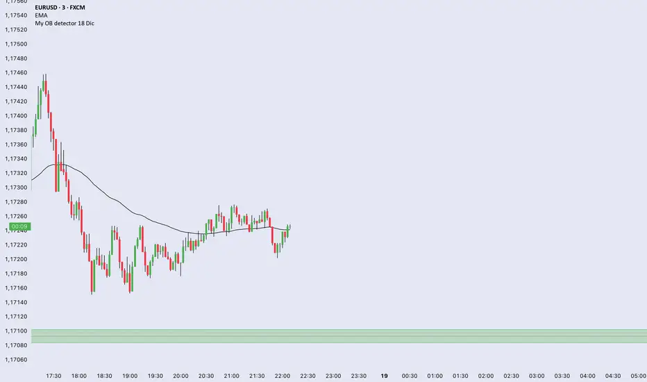
My OB detector 18 DicProfessional Order Block indicator optimized for M3 timeframe. It features automatic 50% entry detection, a strict 1:1 risk-to-reward ratio, and a 10-pip minimum profit filter. Strictly follows the Madrid session hours for Euro and US sessions.
USDT.D MA30 MA200 PRO ULTIME//@version=5
indicator("USDT.D MA30 MA200 PRO ULTIME", shorttitle="USDT.D Pro", overlay=false, max_labels_count=500, max_lines_count=500)
///// PARAMETRES COMPLETS /////
len30 = input.int(30, "MA30 Periode", minval=1, maxval=500)
len200 = input.int(200, "MA200 Periode", minval=1, maxval=1000)
tf = input.timeframe("1D", "Timeframe USDT.D")
normalize = input.bool(true, "Normaliser 0-100")
forceLive = input.bool(true, "Force Update Live")
showDebug = input.bool(false, "Tableau Debug")
showAlerts = input.bool(true, "Alertes Cross")
///// RECUPERATION MULTI-SOURCES + ANTI-PLAT /////
usdt1 = request.security("TVC:USDT.D", tf, close, ignore_invalid_symbol=true, lookahead=barmerge.lookahead_off)
usdt2 = request.security("CRYPTOCAP:USDT.D", tf, close, ignore_invalid_symbol=true, lookahead=barmerge.lookahead_off)
usdtD = na(usdt1) or (forceLive and barstate.isrealtime) ? usdt2 : usdt1
///// CALCULS MA + DETECTION PLATS CORRIGEE /////
ma30 = ta.sma(usdtD, len30)
ma200 = ta.sma(usdtD, len200)
// CORRECTION CRITIQUE : flat_bars safe
flat30_bars = na(ta.valuewhen(ta.change(ma30) != 0, bar_index, 0)) ? 0 : bar_index - ta.valuewhen(ta.change(ma30) != 0, bar_index, 0)
flat200_bars = na(ta.valuewhen(ta.change(ma200) != 0, bar_index, 0)) ? 0 : bar_index - ta.valuewhen(ta.change(ma200) != 0, bar_index, 0)
isFlat30 = flat30_bars > 10
isFlat200 = flat200_bars > 10
///// NORMALISATION INTELLIGENTE /////
lookback = 1000
ma30_norm = normalize and not na(ma30) ? (ma30 - ta.lowest(ma30, lookback)) / (ta.highest(ma30, lookback) - ta.lowest(ma30, lookback)) * 100 : ma30
ma200_norm = normalize and not na(ma200) ? (ma200 - ta.lowest(ma200, lookback)) / (ta.highest(ma200, lookback) - ta.lowest(ma200, lookback)) * 100 : ma200
///// PLOTS AVANCES /////
ma30_color = isFlat30 ? color.new(color.gray, 50) : (ma30 > ma200 ? color.new(color.lime, 0) : color.new(color.blue, 0))
ma200_color = isFlat200 ? color.new(color.gray, 50) : (ma30 > ma200 ? color.new(color.orange, 20) : color.new(color.red, 0))
p30 = plot(ma30_norm, "MA30", ma30_color, 4)
p200 = plot(ma200_norm, "MA200", ma200_color, 4)
fill(p30, p200, color=ma30_norm > ma200_norm ? color.new(color.green, 88) : color.new(color.red, 88), title="Trend Fill")
///// NIVEAUX REFERENCE /////
hline_level = normalize ? 50 : 5
hline_high = normalize ? 80 : 7
hline_low = normalize ? 20 : 3
hline(hline_high, "Surachat", color=color.red, linestyle=hline.style_dashed, linewidth=2)
hline(hline_low, "Survente", color=color.green, linestyle=hline.style_dashed, linewidth=2)
hline(hline_level, "Milieu", color=color.gray, linestyle=hline.style_solid)
///// SIGNAUX CROSS + PLATS /////
bullCross = ta.crossover(ma30, ma200)
bearCross = ta.crossunder(ma30, ma200)
plotshape(bullCross and showAlerts, "ACHAT", shape.triangleup, location.bottom, color.lime, size=size.normal)
plotshape(bearCross and showAlerts, "VENTE", shape.triangledown, location.top, color.red, size=size.normal)
plotshape(isFlat30, "Plat MA30", shape.xcross, location.top, color.new(color.gray, 0), size=size.tiny)
plotshape(isFlat200, "Plat MA200", shape.xcross, location.bottom, color.new(color.gray, 0), size=size.tiny)
bgcolor((isFlat30 or isFlat200) ? color.new(color.yellow, 92) : na, title="Plat Alert")
///// ALERTES PROFESSIONNELLES /////
alertcondition(bullCross, "USDT.D Bull Cross", "USDT.D: MA30 croise AU-DESSUS MA200")
alertcondition(bearCross, "USDT.D Bear Cross", "USDT.D: MA30 croise EN-DESSOUS MA200")
alertcondition(isFlat30 or isFlat200, "USDT.D Flat", "USDT.D: MA PLAT detecte")
///// TABLEAU DEBUG LIVE CORRIGE /////
if showDebug and barstate.islast
var table dashboard = table.new(position.top_right, 2, 8, bgcolor=color.new(color.white, 10), border_width=2)
table.cell(dashboard, 0, 0, "USDT.D", text_color=color.purple, text_size=size.normal, bgcolor=color.new(color.purple, 90))
table.cell(dashboard, 1, 0, str.tostring(usdtD, "#.###") + "%", text_color=color.white, text_size=size.normal, bgcolor=color.new(color.purple, 90))
table.cell(dashboard, 0, 1, "MA30", text_color=ma30_color, text_size=size.small)
table.cell(dashboard, 1, 1, str.tostring(ma30, "#.###"), text_color=ma30_color, text_size=size.small)
table.cell(dashboard, 0, 2, "MA200", text_color=ma200_color, text_size=size.small)
table.cell(dashboard, 1, 2, str.tostring(ma200, "#.###"), text_color=ma200_color, text_size=size.small)
table.cell(dashboard, 0, 3, "Flat30", text_color=color.gray, text_size=size.small)
table.cell(dashboard, 1, 3, str.tostring(flat30_bars) + "b", text_color=isFlat30 ? color.red : color.green, text_size=size.small)
table.cell(dashboard, 0, 4, "Flat200", text_color=color.gray, text_size=size.small)
table.cell(dashboard, 1, 4, str.tostring(flat200_bars) + "b", text_color=isFlat200 ? color.red : color.green, text_size=size.small)
table.cell(dashboard, 0, 5, "Trend", text_color=color.black, text_size=size.small, bgcolor=color.new(color.yellow, 80))
table.cell(dashboard, 1, 5, ma30 > ma200 ? "HAUSSIER" : "BAISSIER", text_color=ma30 > ma200 ? color.green : color.red, text_size=size.normal, bgcolor=color.new(color.yellow, 80))
table.cell(dashboard, 0, 6, "TF", text_color=color.blue, text_size=size.small)
table.cell(dashboard, 1, 6, tf, text_color=color.blue, text_size=size.small)
table.cell(dashboard, 0, 7, "Plan OK", text_color=not na(usdtD) ? color.green : color.red, text_size=size.small)
table.cell(dashboard, 1, 7, not na(usdtD) ? "OK" : "NO", text_color=not na(usdtD) ? color.green : color.red, text_size=size.normal)

Multi-Timeframe 5 Moving Averages//@version=5
indicator("Multi-Timeframe 5 Moving Averages", shorttitle="MTF MA x5", overlay=true)
// ============== MOVING AVERAGE 1 ==============
ma1_enabled = input(true, title="Enable MA1", group="Moving Average 1")
ma1_period = input.int(9, title="MA1 Period", minval=1, group="Moving Average 1")
ma1_type = input.string("EMA", title="MA1 Type", options= , group="Moving Average 1")
ma1_color = input(color.new(#FF6B35, 0), title="MA1 Color", group="Moving Average 1")
// ============== MOVING AVERAGE 2 ==============
ma2_enabled = input(true, title="Enable MA2", group="Moving Average 2")
ma2_period = input.int(20, title="MA2 Period", minval=1, group="Moving Average 2")
ma2_type = input.string("EMA", title="MA2 Type", options= , group="Moving Average 2")
ma2_color = input(color.new(#004E89, 0), title="MA2 Color", group="Moving Average 2")
// ============== MOVING AVERAGE 3 ==============
ma3_enabled = input(true, title="Enable MA3", group="Moving Average 3")
ma3_period = input.int(50, title="MA3 Period", minval=1, group="Moving Average 3")
ma3_type = input.string("SMA", title="MA3 Type", options= , group="Moving Average 3")
ma3_color = input(color.new(#F7931E, 0), title="MA3 Color", group="Moving Average 3")
// ============== MOVING AVERAGE 4 ==============
ma4_enabled = input(true, title="Enable MA4", group="Moving Average 4")
ma4_period = input.int(100, title="MA4 Period", minval=1, group="Moving Average 4")
ma4_type = input.string("SMA", title="MA4 Type", options= , group="Moving Average 4")
ma4_color = input(color.new(#1E88E5, 0), title="MA4 Color", group="Moving Average 4")
// ============== MOVING AVERAGE 5 ==============
ma5_enabled = input(true, title="Enable MA5", group="Moving Average 5")
ma5_period = input.int(200, title="MA5 Period", minval=1, group="Moving Average 5")
ma5_type = input.string("EMA", title="MA5 Type", options= , group="Moving Average 5")
ma5_color = input(color.new(#43A047, 0), title="MA5 Color", group="Moving Average 5")
// ============== FUNCTION TO CALCULATE MA ==============
calcMA(period, maType, source) =>
switch maType
"SMA" => ta.sma(source, period)
"EMA" => ta.ema(source, period)
"WMA" => ta.wma(source, period)
=> ta.sma(source, period)
// ============== CALCULATE MOVING AVERAGES (CHART TIMEFRAME ONLY) ==============
ma1_value = calcMA(ma1_period, ma1_type, close)
ma2_value = calcMA(ma2_period, ma2_type, close)
ma3_value = calcMA(ma3_period, ma3_type, close)
ma4_value = calcMA(ma4_period, ma4_type, close)
ma5_value = calcMA(ma5_period, ma5_type, close)
// ============== PLOT MOVING AVERAGES ==============
plot(ma1_enabled ? ma1_value : na, title="MA1", color=ma1_color, linewidth=2)
plot(ma2_enabled ? ma2_value : na, title="MA2", color=ma2_color, linewidth=2)
plot(ma3_enabled ? ma3_value : na, title="MA3", color=ma3_color, linewidth=2)
plot(ma4_enabled ? ma4_value : na, title="MA4", color=ma4_color, linewidth=2)
plot(ma5_enabled ? ma5_value : na, title="MA5", color=ma5_color, linewidth=2)
