INVITE-ONLY SCRIPT
Hersheys CoCo

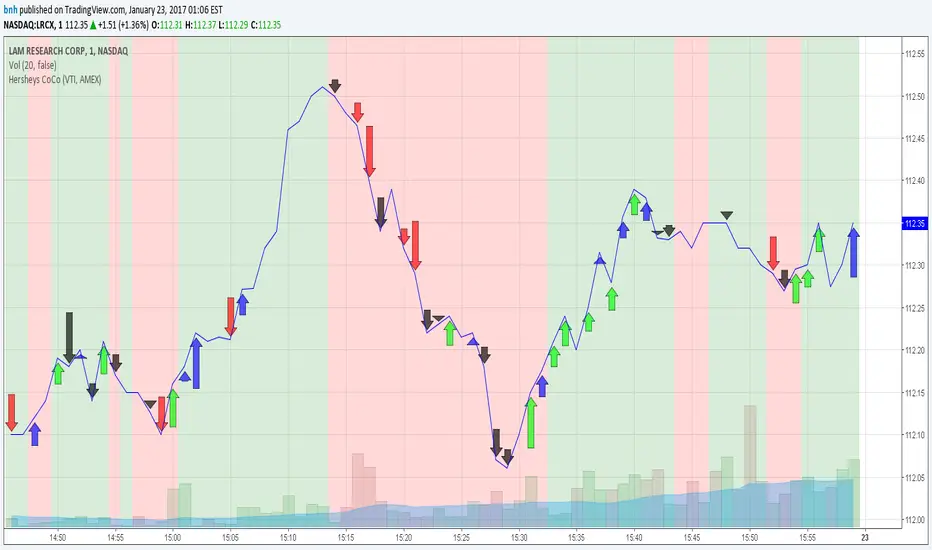
This is my variation of the Correlation Coefficient and I call it "Hershey's CoCo". The indicator identifies very specific Stock, Sector and Market pressures on whatever symbol you are evaluating.
If interested, follow me and send me requests to evaluate your stock or sector as I refine this tool.
***********************************************
Price movement does not happen in isolation.
Stocks are held by various "containers" that can be traded independently and can affect the price of each stock. The most important of those containers are Sector and Market, while others include Industry, MarketCap and others.
For example, Market is simply the top level representation of all stocks, or the sea that carries, or sinks, all ships. You can monitor this level by looking at various indexes, ETFs and/or Funds. I use "VTI", the Vanguard Total Stock Market ETF.
Sectors can be monitored using any number of containers, like Vanguard Sector Index Funds or ProShares Ultra Sector Indexes. I use the S&P SPDR Sector Funds. A list of those are listed below.
Most of the techniques and indicators that deal with correlation and sector/market comparisons are not very detailed. Many simply overlay one price series over another, while you tediously follow the price lines from left to right trying to judge movement.
Another critical piece missing from other compare tools is normalizing each data series. Hershey's CoCo does this, so you can have confidence that the alerts you see are based on accurate comparisons at every level.
***********************************************
So let's get to the details! Hershey's CoCo currently compares 2 containers, so for this discussion we'll do Stock to Sector. You'll see arrows above and below some ticks of the price chart, plus a faint red or green background color.
Very Bull = Blue Arrow = Stock and Sector prices are up, Stock price up more
Bull = Green Arrow = Stock and Sector prices are up, Sector price up more
Bear = Red Arrow = Stock and Sector prices are down, Sector price down more
Very Bear = Black Arrow = Stock and Sector prices are down, Stock price down more
Neutral = No Arrow = Stock and Sector price movement equal
Arrow Length = Strength (the longer the arrow the bigger the difference)
Green Background = Bull = Above zero Simple Moving Average of all arrow values
Red Background = Bear = Below zero Simple Moving Average of all arrow values
To review, the Blacks and Blues are the HEAVIEST pressure... the LONGER the STRONGER!
초대 전용 스크립트
이 스크립트에 대한 접근은 작성자가 승인한 사용자로 제한되며, 일반적으로 지불이 필요합니다. 즐겨찾기에 추가할 수 있지만 권한을 요청하고 작성자에게 권한을 받은 후에만 사용할 수 있습니다. 자세한 내용은 bnh에게 문의하거나 아래의 작성자의 지시사항을 따르십시오.
트레이딩뷰는 스크립트 작성자를 100% 신뢰하고 스크립트 작동 원리를 이해하지 않는 한 스크립트 비용을 지불하고 사용하는 것을 권장하지 않습니다. 대부분의 경우 커뮤니티 스크립트에서 무료로 좋은 오픈소스 대안을 찾을 수 있습니다.
작성자 지시 사항
″
차트에 이 스크립트를 사용하시겠습니까?
경고: 액세스를 요청하기 전에 읽어 보시기 바랍니다.
면책사항
이 정보와 게시물은 TradingView에서 제공하거나 보증하는 금융, 투자, 거래 또는 기타 유형의 조언이나 권고 사항을 의미하거나 구성하지 않습니다. 자세한 내용은 이용 약관을 참고하세요.