Clock&Flow: Elements of Cycle Analysis 1st partClock&Flow – Elements of Cycle Analysis (ECA) | Complete Suite
Elements of Cycle Analysis (ECA) is an advanced cyclic analysis suite designed to interpret the market through time, structure, strength, and energy, combining cycles, volatility, and participation into a single operational framework.
The suite consists of two complementary modules:
🔹 ECA 1 – Cycles, Structure, and Volatility (Overlay: True)
ECA 1 is dedicated to the structural and temporal analysis of the market.
Cyclic SMAs (Cyclic Ratio) Moving averages are calibrated according to nominal cycles and timeframes to monitor multiple cycles simultaneously (from the lower cycle to the upper cycles). Crossovers between fast and slow SMAs certify the closing or transition of the cycle related to the faster SMA. The specific cycle is identified in the Info Table at the bottom right (for 15m - 1h - 2h - 1D timeframes). You can select the number of cycles to observe and the asset type to apply them to:
Index: Standard quotes (e.g., Cash sessions).
Future: Extended quotes (24h).
50-200: Classic institutional references for the medium-long term.
ATR-based Dynamic Cyclic Channels The channels represent a lower cycle and its upper counterpart; their width is determined by the observed timeframe and calculated based on average volatility (ATR). Volatility is not treated as noise but as a structural component of the cycle, essential for contextualizing excesses, compressions, and expansions.
Info Table and Quick Guide Dynamic tables automatically link SMAs, timeframes, and time cycles, providing an immediate reading of the current cyclic context.
Time Bands (Weekly / Daily) Temporal visualization helps identify cyclic pivots and rhythm transitions.
🔹 ECA 2 – Market Excesses, Strength, and Energy
ECA 2 analyzes how the market moves within the cyclic structure.
Excesses and Divergences (Cyclic Stochastic) An oscillator calibrated on the same cyclic ratio as the suite. Crossovers between the lower cycle (blue) and upper cycle (red) signal potential phase changes. In areas of excess, divergences often confirm the closing and restart of a cycle.
Directional Movement System (DMS) The ADX measures the strength of the movement, while +DI and -DI indicate direction. A simultaneous crossover of ADX, +DI, and -DI signals imminent acceleration, even before the strength is fully expressed.
Market Pulse – Real Market Energy The Market Pulse measures the amount of real energy moving through the market by relating three factors:
Price Velocity
Normalized Volume
Volatility (ATR relative to price)
These three factors are combined multiplicatively: if one is missing, the impulse weakens. The zero line represents a state of energy equilibrium; values above or below indicate a real imbalance (bullish or bearish). Note: Market Pulse is not a classic oscillator and should not be interpreted as overbought or oversold; it is used to evaluate the energetic quality of a movement.
Operational Convergence
The maximum operational effectiveness of the ECA suite is achieved when all modules converge on the same market phase.
When cyclic timing, volatility, price structure, trend strength, and movement energy align, the context signals a high-probability operational phase. The system is applicable to any timeframe or asset because it is not bound by dogmatic or subjective interpretations of technical or fundamental analysis; instead, it leverages what is actually happening in the market. Major chart patterns and Volume Profile (technically not includable in this specific suite) provide further confirmation.
Under these conditions, the signal does not originate from a single indicator but from the consistency of the entire system: time, volatility, and energy moving in the same direction.
Entries should always be accompanied by proper risk management.
––––––––––––––––––––––––––––––––––––––––––––––––––––––––––––––––––––––––
Clock&Flow – Elements of Cycle Analysis (ECA) | Suite Completa
Elements of Cycle Analysis (ECA) è una suite avanzata di analisi ciclica progettata per leggere il mercato attraverso tempo, struttura, forza ed energia, combinando cicli, volatilità e partecipazione in un unico framework operativo.
La suite è composta da due moduli complementari:
🔹 ECA 1 – Cicli, Struttura e Volatilità (overlay true)
ECA 1 è dedicato all’analisi strutturale e temporale del mercato.
SMA cicliche (ratio ciclica)
Le medie mobili sono calibrate in funzione dei cicli nominali e del timeframe per monitorare più cicli simultaneamente (dal ciclo inferiore fino ai cicli superiori).
Gli incroci tra SMA veloci e lente certificano la chiusura o transizione del ciclo correlato alla SMA più veloce. Il ciclo in questione è segnalato nella info table in basso a destra (per i time frame 15’ - 1h - 2h - 1D) Puoi selezionare il numero dei cicli da osservare e su quali asset applicarle (Index = quotazioni standard / Future = quotazioni estese / 50-200 i classici riferimenti istituzionali per il medio-lungo periodo
Canali ciclici dinamici basati su ATR
I canali rappresentano un ciclo inferiore e il suo superiore, l’ampiezza è data dal time frame osservato e calcolata sulla volatilità media (ATR).
La volatilità non è trattata come rumore, ma come componente strutturale del ciclo, utile per contestualizzare eccessi, compressioni ed espansioni.
Info Table e Quick Guide
Tabelle dinamiche collegano automaticamente SMA, timeframe e cicli temporali, fornendo una lettura immediata del contesto ciclico in corso.
Time Bands (Weekly / Daily)
La visualizzazione temporale aiuta a individuare pivot ciclici e transizioni di ritmo.
––––––––––––––––––––––––––––––––––––––––––––––––––––––––––––––––––––––
🔹 ECA 2 – Eccessi, Forza ed Energia del Mercato
ECA 2 analizza come il mercato si muove all’interno della struttura ciclica.
Eccessi e divergenze (Stochastic ciclico)
Oscillatore calibrato sulla stessa ratio ciclica della suite.
Gli incroci tra ciclo inferiore (blu) e superiore (rosso) segnalano potenziali cambi di fase; in area di eccesso, le divergenze certificano spesso la chiusura e ripartenza del ciclo.
Directional Movement System (DMS)
L’ADX misura la forza del movimento, mentre +DI e –DI ne indicano la direzione.
L’incrocio simultaneo di ADX, +DI e –DI segnala un’accelerazione imminente, anche in assenza di forza già espressa.
Market Pulse – Energia reale del mercato
Il Market Pulse misura quanta energia reale sta attraversando il mercato mettendo in relazione:
velocità del prezzo
volume normalizzato
volatilità (ATR rapportato al prezzo)
I tre fattori sono combinati in modo moltiplicativo: se uno manca, l’impulso si indebolisce.
La linea dello zero rappresenta una condizione di equilibrio energetico; valori sopra o sotto indicano uno sbilanciamento reale, rialzista o ribassista.
Il Market Pulse non è un oscillatore classico e non va interpretato in termini di ipercomprato o ipervenduto: serve a valutare la qualità energetica del movimento.
La massima efficacia operativa della suite ECA si ottiene quando tutti i moduli convergono sulla stessa fase di mercato.
Quando tempi ciclici, volatilità, struttura del prezzo, forza del trend ed energia del movimento risultano allineati, il contesto segnala una fase ad alta probabilità operativa.
È applicabile su qualunque time frame o asset perché non è vincolato a dogmatiche e soggettive interpretazioni di analisi tecnica - fondamentale ma sfrutta ciò che realmente sta accadendo sul mercato.
I principali pattern grafici e il Volume Profile (in questa suite tecnicamente non inseribili) forniscono ulteriori conferme e/o indicazioni.
In queste condizioni il segnale non nasce da un singolo indicatore, ma dalla coerenza dell’intero sistema: tempo, volatilità ed energia si muovono nella stessa direzione.
Gli ingressi vanno sempre accompagnati da una corretta gestione del rischio.
볼래틸리티

Statistical Reversion FrameworkIntroduction and Core Philosophy
The Statistical Reversion Framework constitutes a sophisticated quantitative trading instrument designed to identify high-probability mean reversion opportunities across financial markets. Unlike traditional technical indicators that rely on a single dimension of market data, this framework adopts a multi-faceted approach, synthesizing statistical probability, volume profile analysis, institutional money flow proxies, and standard technical momentum into a singular composite score. The core philosophy driving this script is the concept of confluence through heterogeneity; by combining uncorrelated or loosely correlated market factors—such as price deviation (statistics), participant commitment (volume), and macro sentiment (intermarket data)—the algorithm aims to filter out the noise inherent in standard oscillators and isolate moments where market pricing has deviated unsustainably from its intrinsic equilibrium. This tool is specifically engineered to detect market extremes—tops and bottoms—where the probability of a counter-trend move or a snap-back to the mean is mathematically significant. It operates on the premise that while asset prices can remain irrational in the short term, they are bound by statistical variance and mean-reverting properties over longer horizons, particularly when institutional flows and volume exhaustion patterns align with those statistical extremes.
Methodology: The Composite Scoring Architecture
The underlying methodology of the framework relies on a weighted composite scoring system. Rather than generating binary buy or sell signals based on a threshold crossover, the script calculates a granular score ranging from zero to one hundred for various market dimensions. These dimension-specific scores are then weighted according to user-defined inputs to produce a final "Composite Score." This approach allows for a nuanced assessment of market conditions; a setup might have extreme statistical deviation but lack volume confirmation, resulting in a lower confidence score than a setup where price, volume, and macro factors all align. The algorithm normalizes all input data into a standardized scale, typically converting raw values—such as Z-Scores or volume ratios—into a zero-to-ten ranking before aggregating them. This normalization process is critical because it allows the algorithm to compare apples to oranges mathematically, treating a standard deviation of 3.0 and a Relative Strength Index (RSI) of 20 as compatible inputs within the same equation. By summing these normalized values and applying regime-based confidence adjustments, the framework produces a dynamic signal that adapts to the volatility and trend intensity of the current market environment.
Algorithmic Component I: Statistical Analysis via Multi-Timeframe Z-Scores
The backbone of the framework is the Statistical Component, which utilizes the Z-Score (or Standard Score) to quantify the degree of price deviation. The Z-Score measures how many standard deviations the current price is from its moving average. A crucial aspect of this algorithm is its fractal nature; it does not rely on a single lookback period. Instead, it computes Z-Scores across three distinct timeframes—Daily, Weekly, and Monthly—and within each timeframe, it calculates deviations for short, medium, and long-term periods. For instance, on the daily timeframe, it assesses deviation from 50-day, 200-day, and 500-day means simultaneously. This multi-timeframe approach is designed to filter out ephemeral noise. A price move that appears extreme on a 10-day basis but is normal on a 200-day basis is likely a trend pull-back rather than a reversal. Conversely, when the Z-Scores across daily, weekly, and monthly timeframes all register values beyond significant thresholds (such as 2.0 or 3.0 standard deviations), it indicates a rare fractal alignment where the asset is historically overextended on all relevant scales. The algorithm aggregates these nine distinct Z-Score data points to form the "Statistical Score," heavily rewarding scenarios where multiple timeframes show directional alignment, as these synchronized deviations often precede powerful mean-reversion events.
Algorithmic Component II: Volume Signature and Participation Analysis
While statistical deviation highlights where the price is, the Volume Component analyzes the conviction behind the move to determine if a reversal is imminent. This section of the code employs several sophisticated logic gates to identify specific volume signatures known as Capitulation and Exhaustion. The algorithm compares current volume against a 50-day moving average to generate a volume ratio. It then correlates this ratio with price action. For example, the script identifies "Capitulation" when price collapses significantly (more than 2%) on volume that is at least three times the average. This specific signature—panic selling—often marks the psychological wash-out necessary for a market bottom. Conversely, the script detects "Volume Exhaustion" when prices drift without conviction on extremely low volume, indicating a lack of participant interest in pushing the trend further. Furthermore, the algorithm integrates On-Balance Volume (OBV) analysis, specifically looking for divergences. It detects subtle shifts where the price makes a new low, but the OBV makes a higher low, signaling that smart money is accumulating positions despite the falling price. This divergence logic is automated using pivot-based high/low detection arrays, adding a layer of foreshadowing that price-only indicators often miss.
Algorithmic Component III: Institutional Proxy and Intermarket Correlations
The Institutional Component distinguishes this framework from standard retail indicators by incorporating intermarket data that serves as a proxy for macro sentiment and institutional flow. The script pulls data from extraneous tickers—specifically the VIX (Volatility Index), Government Bond Yields (10-year and 2-year), Copper, Gold, and the Dollar Index (DXY). The logic here is grounded in fundamental market mechanics. For instance, the script analyzes the VIX to gauge market fear; however, it applies a contrarian logic. An extremely high VIX (panic) coincident with a low equity price is scored as a bullish factor, while a complacently low VIX at market highs is viewed as bearish. Similarly, the algorithm analyzes the Yield Curve (the spread between 10-year and 2-year yields). A steepening or flattening curve provides context on economic expectations, influencing the score based on whether the environment is "risk-on" or "risk-off." The Copper/Gold ratio is utilized as a barometer for global economic health; rising copper relative to gold suggests industrial demand and growth, confirming bullish setups, whereas falling copper prices signal contraction. By integrating these non-price variables, the framework ensures that a trade signal is not just technically sound but is also supported by the broader macroeconomic undercurrents that drive institutional capital allocation.
Algorithmic Component IV: Technical Momentum and Structure
The final layer of input comes from standard Technical Analysis, which serves to fine-tune the timing of the entry. This component aggregates readings from the Relative Strength Index (RSI), Moving Average Convergence Divergence (MACD), Bollinger Bands, and Support/Resistance proximity. While Z-Scores measure linear distance from the mean, the RSI and Bollinger Bands measure the velocity and elasticity of that move. The algorithm assigns higher scores when RSI hits extreme levels (below 20 or above 80) and when price action pierces the outer bounds of the Bollinger Bands. Additionally, the MACD is monitored for histogram reversals and signal line crosses that align with the mean reversion bias. A unique feature of this component is the proximity logic, which calculates how close the current price is to a 50-period high or low. If a statistical extreme coincides with a retest of a major structural support level, the technical score is maximized. This ensures that the trader is not catching a falling knife in a void, but rather identifying a reversal at a location where technical structure provides a natural floor or ceiling for price.
Regime Detection and Confidence Adjustment
A critical vulnerability of mean reversion strategies is that they can suffer severe drawdowns during strong, unidirectional trending markets (momentum regimes). To mitigate this, the framework incorporates a Regime Detection module using the Average Directional Index (ADX) and volatility thresholds. The script calculates the ADX to measure trend strength regardless of direction. If the ADX is above a certain threshold (default 25), the market is classified as "Trending." The script then cross-references this with volatility data to classify the environment into regimes such as "Crisis," "Trending," "Range," or "Mean-Revert." This classification is not merely cosmetic; it actively influences the final output through a "Regime Confidence" multiplier. If the system detects a strong trending regime, it dampens the Composite Score, requiring extraordinary evidence from the other components to trigger a signal. Conversely, if the market is detected as "Mean-Revert" or "Low-Vol Range," the confidence multiplier boosts the score, making the system more sensitive to reversion signals. This adaptive logic helps protect the trader from fading strong breakouts while aggressively capitalizing on ranging markets.
Usage Instructions and Dashboard Interpretation
Traders utilizing this framework should primarily interact with the on-screen Dashboard, which provides a real-time summary of all computed metrics. The dashboard is organized hierarchically, with the "Composite Score" and "Signal Status" at the top. A Composite Score above 70 is generally considered actionable, with scores above 85 representing "Exceptional" setups. The Dashboard is color-coded: green hues indicate bullish/oversold conditions suitable for buying, while red hues indicate bearish/overbought conditions suitable for selling or shorting. Traders should look for "Confluence" across the rows. Ideally, a robust signal will show a high Statistical score (indicating price is cheap/expensive), a high Volume score (indicating capitulation or accumulation), and a supportive Institutional score. If the Composite Score is high but the Institutional score is low, the trader should proceed with caution, as the macro environment may not support the trade.
The chart visuals provide immediate entry triggers. "Strong Bottom" (Green Triangle) and "Strong Top" (Red Triangle) shapes appear when the Composite Score breaches the high threshold and Z-Scores are at extremes. These are the primary execution signals. Smaller "Potential" markers indicate developing setups that may require lower timeframe confirmation. Additionally, specific volume icons (Diamonds) will appear to denote Capitulation or Climax events. A trader should ideally wait for the candle to close to confirm these signals. The alerts configured in the script allow the trader to be notified of these events remotely. For risk management, because this is a mean reversion tool, stop-losses should typically be placed below the swing low of the capitulation candle (for longs) or above the swing high of the climax candle (for shorts), anticipating that the statistical extreme marks the distinct turning point. By systematically waiting for the Composite Score to align with the visual signals and verifying the regime context on the dashboard, the trader effectively filters out low-probability trades, engaging only when statistics, volume, and macro-economics align.

VIX Percentile OscillatorWhat is this script?
This is a trading tool that helps you decide when to buy or sell options based on market volatility. Think of it as a "fear meter" for the stock market.
What is VIX?
VIX = Volatility Index (also called the "fear index")
When VIX is HIGH → Market is scared/volatile → Options are EXPENSIVE
When VIX is LOW → Market is calm → Options are CHEAP
What does "Percentile" mean?
Instead of just showing VIX price, this script shows where VIX is compared to history.
Example: If VIX Percentile = 85%
This means VIX is higher than 85% of all past readings
Only 15% of the time was VIX higher than now
Translation: Volatility is unusually HIGH
The 5 Trading Zones
The script divides the market into 5 zones:
🔴 EXTREME SELLING ZONE (90-100%)
VIX is in the top 10% historically
Action: AGGRESSIVELY SELL OPTIONS (collect big premiums)
Market panic = expensive options = profit for sellers
🟠 SELLING ZONE (80-89%)
VIX is elevated but not extreme
Action: SELL OPTIONS (good premiums available)
⚪ NEUTRAL ZONE (20-79%)
VIX is normal
Action: WAIT or use other strategies
🟢 BUYING ZONE (10-19%)
VIX is low
Action: BUY OPTIONS (they're cheap)
🟢 EXTREME BUYING ZONE (0-9%)
VIX is in the bottom 10% historically
Action: AGGRESSIVELY BUY OPTIONS (bargain prices)
Market complacency = cheap options = opportunity
Understanding the Chart
Main Line (Blue/Red/Green):
Shows current VIX percentile
Color changes based on zone
Thick line = easy to see
Histogram (Background bars):
Red bars = above 50% (high volatility)
Green bars = below 50% (low volatility)
Purple Momentum Line:
Shows if VIX is rising or falling
Helps you catch trends early
Background Colors:
Light red/orange = Selling zones
Light green = Buying zones
Triangle Markers:
Appear when entering new zones
"EXTREME" label = strongest signals
The Statistics Table (Top Right)
VIX Price: Current VIX value (e.g., 16.50)
Percentile: Where VIX ranks (0-100%)
Z-Score: Statistical measure
Above +2 or below -2 = extreme
Red text = unusually high/low
Momentum: Rate of change
Red = rising (volatility increasing)
Green = falling (volatility decreasing)
Avg VIX: Average VIX over lookback period
Current Zone: Which zone you're in right now
Bars in Zone: How long you've been in this zone
Simple Trading Rules
FOR OPTION SELLERS (Premium Collectors):
✅ SELL when: Percentile > 80% (especially > 90%)
High premiums available
Examples: Sell covered calls, cash-secured puts, credit spreads
FOR OPTION BUYERS (Hedgers/Speculators):
✅ BUY when: Percentile < 20% (especially < 10%)
Cheap options available
Examples: Buy protective puts, long calls, debit spreads
Key Settings You Can Adjust
Lookback Period (default: 252)
How far back to compare (252 = 1 year of trading days)
Longer = smoother, more stable
Shorter = more sensitive to recent changes
Smoothing Period (default: 3)
Reduces noise/wiggling
Higher = smoother line
Lower = more responsive
Zone Thresholds:
Extreme Sell: 90%
Sell: 80%
Buy: 20%
Extreme Buy: 10%
You can customize these!
Real-World Example
Scenario: VIX Percentile jumps to 92%
What this means:
VIX is higher than 92% of all past readings
Market is in panic mode
Option premiums are INFLATED
Trading Action:
✅ Sell covered calls on stocks you own
✅ Sell cash-secured puts on stocks you want to buy
✅ Sell credit spreads
❌ DON'T buy expensive options right now
Why it works: When fear is extreme, it usually calms down eventually. You profit as premiums deflate.
Important Reminders
⚠️ This is a TIMING tool, not a crystal ball
It tells you WHEN premiums are expensive/cheap
It doesn't tell you WHICH options to trade
You still need proper risk management
⚠️ Works on ALL timeframes
Daily charts = swing trading
Weekly charts = position trading
Intraday charts = day trading volatility
⚠️ Best for:
Option sellers during high VIX (>80%)
Option buyers during low VIX (<20%)
Portfolio hedging decisions
Volatility trading strategies
Bottom Line: This script helps you buy options when they're cheap and sell options when they're expensive. It's like shopping for sales, but for volatility!
DISCLAIMER: This information is provided for educational purposes only and should not be considered financial, investment, or trading advice. Please do boost if you like it. Happy Trading.

TZ - India VIX Volatility ZonesTZ – India VIX Volatility Zones is a long-term volatility analysis indicator designed to visually map important India VIX regimes using clearly defined horizontal zones and labels.
The indicator highlights how market volatility cycles between complacency, normal conditions, elevated risk, and panic phases. These zones are based on historical behavior of India VIX and help traders understand when risk is underpriced or overstretched.
This tool is especially useful for:
Index traders
Options sellers and buyers
Risk management and regime filtering
Long-term volatility study
How It Works
The script plots static, historically significant volatility zones on the India VIX chart and visually separates them using shaded bands and labels.
Volatility Zones Explained
1.Extreme Low Volatility (VIX 8–10)
Indicates market complacency and underpriced risk. Often precedes volatility expansion.
2.Low Volatility (VIX 10–13)
Stable market conditions with controlled movement.
3.Normal Volatility (VIX 13–18)
Healthy market behavior and balanced risk.
4.High Volatility (VIX 18–25)
Rising uncertainty and increased intraday swings.
5.Panic Zone (VIX 25–35+)
High fear environment, usually during major events or crises.
How Traders Can Use This Indicator
Identify volatility regimes before choosing option strategies
Avoid aggressive short-volatility trades during extreme zones
Prepare for volatility expansion during low-VIX phases
Use as a market risk context tool alongside price action
This indicator does not provide buy/sell signals. It is designed for contextual analysis and decision support.
Best Usage
Apply on India VIX (NSE:INDIAVIX)
Works best on Weekly and Monthly timeframes
Can be combined with index charts for volatility-based risk assessment
Disclaimer
This indicator is for educational and analytical purposes only.
It does not constitute financial advice or trade recommendations.
Users should apply proper risk management and confirm signals using additional analysis.

Session Kill Zones 2026 - Sachin Thakare📌 INDICATOR DESCRIPTION (COPY–PASTE AS IS)
Session Kill Zones is a professional intraday session-mapping indicator designed to highlight the most active institutional trading windows across global markets.
This tool visually marks Asia, London, and New York sessions directly on the chart, helping traders understand when liquidity expands, volatility increases, and meaningful price moves are more likely to occur.
Built for price-action, ICT, and Smart Money Concept (SMC) traders, this indicator focuses purely on time-based market structure, not signals or predictions.
🔍 Key Features
Clear visual boxes for Asia, London, and New York sessions
Automatic session High / Low tracking
Optional extension of session High & Low levels
Timezone-aware (IANA standard for global accuracy)
Clean, lightweight, non-repainting logic
Informational session status & bias table
🎯 Who This Is For
Intraday & scalping traders
ICT / SMC traders
Index, Forex, Crypto, and Commodity markets
Traders who value timing, liquidity, and context over indicators
⚠️ This indicator does not generate buy/sell signals.
It is a context and session-mapping tool intended to support discretionary trading decisions.
👤 Author & Credits
Author: Sachin Thakare
Edition: 2026
Rights: © 2026 Sachin Yashwant Thakare — All Rights Reserved

Malama's DivergenceMalama's Divergence is a comprehensive momentum oscillator designed to filter noise and identify high-probability reversal points. It achieves this by unifying the Relative Strength Index (RSI) with advanced volatility and trend-following tools directly on the oscillator pane.
Why this is useful: Most traders look at RSI in isolation. Malama's Divergence adds context by applying tools normally reserved for price action (Bollinger Bands and Moving Averages) directly to the momentum line itself. This reveals "Momentum Squeezes" and "Momentum Trend Breaks" that standard RSI misses.
Key Features:
RSI Foundation: Dynamic color-coding highlights Overbought (>70) and Oversold (<30) conditions instantly.
Volatility Squeezes: Bollinger Bands wrapped around the RSI line turn orange when volatility compresses ("Squeeze"). This often precedes an explosive move in price.
Trend Confirmation: Fast and Slow Moving Averages on the RSI provide crossover signals to confirm if momentum is shifting, rather than just overextended.
Automated Divergence: The script automatically draws Regular Bullish and Bearish divergences, connecting price pivots with RSI pivots to spot market reversals.
How to Use:
Reversals: Look for "BULL DIV" or "BEAR DIV" labels. These indicate price is making a new extreme while momentum is failing to confirm it.
Breakouts: Watch for the Bollinger Bands on the RSI to squeeze (turn orange) and then expand as RSI breaks out of the bands.
Trend Entry: Use the MA Cross circles (Green/Red) as entry triggers in the direction of the dominant trend.
Settings:
MA Type: Select between EMA, Double EMA, or VIDYA (Adaptive) for the signal lines.
Divergence Lookback: Adjust the Pivot Left/Right bars to tune the sensitivity of divergence detection.
Disclaimer: Trading involves risk. This tool is for educational purposes only and should be used as part of a complete trading system.

EDMR Index (Event Driven Mean Reversion Index)EDMR Index is a market context and exhaustion indicator designed to identify short term instability, stretch, and mean reversion risk in fast intraday markets.
Rather than generating trade signals, EDMR provides a real time regime framework that helps traders understand when price action is statistically favorable and when it is not.
This is not a buy / sell indicator.
It is a context engine built to integrate seamlessly with existing strategies.
Key Features
Composite 0–100 exhaustion index
Measures:
- Price stretch from equilibrium
- Recency of extreme conditions
- Momentum deceleration
Regime-based background visualization:
- Neutral
- Developing
- Elevated
- Extreme
Thin, non-intrusive EDMR line for precise reading
Volume exhaustion markers highlighting abnormal participation
Color-coded status-line value for instant regime awareness
Fully protected, invite-only script
Why Event-Driven Context Matters
Most indicators react after conditions change.
EDMR focuses on market state, not signals — highlighting when price action is becoming unstable or statistically stretched before risk escalates.
This allows traders to:
Avoid entries during high-risk exhaustion regimes
Better time mean-reversion setups
Scale aggression up or down based on context
Stay out of overextended or unstable conditions
Intended Use
Intraday trade filtering
Mean-reversion context
Momentum exhaustion awareness
Risk modulation for discretionary strategies
Optimized for lower timeframes (1–3 minute charts).
On higher timeframes, regimes will naturally remain elevated more often. This is expected behavior with the current parameters set. Changing of parameters are available in the settings menu and individual settings may work for you on higher timeframes.
Who This Is For
✔ Traders who already have defined entries
✔ Active intraday traders and scalpers
✔ Traders who value context over signals
✖ Not a buy/sell signal
✖ Not a standalone strategy
✖ Not designed for higher-timeframe swing trading out of the box
Disclaimer
This indicator is provided for educational and informational purposes only.
It does not constitute financial advice or guarantee performance.
Trading involves risk.
EDMR Index on SPY (2-minute).Visualizes exhaustion, compression, and reversion context during high-liquidity market conditions:
EDMR applied to BTCUSD (2-minute). Designed to respond to event-driven volatility across asset classes:
Consistent behavior across index ETFs. EDMR highlights mean-reversion pressure without generating trade signals:
High-beta equity example (NVDA, 2-minute). EDMR adapts to rapid volatility expansion and contraction:

ACT Professional SuiteThis is a proprietary system architecture designed to calculate structural capacity in financial markets.
PAPER TRADING / TESTING IS RECOMMENDED BEFORE LIVE DEPLOYMENT.
█ WHAT IT IS - ONE SCRIPT; TWO ENGINES
1. TRD Engine (Macro Trend)
• BUY (Green)
• SELL (Red)
2. OPT Engine (Micro Timing)
• HOLD (Grey)
• GROWTH (Green)
• LIMIT (Orange)
• SURFING (Orange)
• SELL (Red)
█ HOW TO USE
MODE A: PASSIVE SCANNING (Default)
Use this to identify potential entries.
• WAIT: System is stable.
• LONG/SHORT: Momentum is building in a specific direction.
MODE B: ACTIVE TRADE MANAGEMENT (The Core Feature)
Once you have entered a position, check the "Activate Management Mode" box in settings. The system will now guide your exit strategy based on your defined risk parameters.
The Status Sequence:
1. HOLD: Price is moving within safe limits. (Safe)
2. STRONG GROWTH: Price movement is increasing. (Profitable)
3. LIMIT REACHED: Your defined % target is hit. (Decision Point)
4. SURFING...: The system is moving beyond the limit.
5. SELL / BREACH: The structural limit is reached. Probability of collapse is critical. Immediate exit recommended.
█ ACCESS & AUTHORIZATION
This is an Invite-Only script. Access is automated via our central hub.
whop.com
Disclaimer: This tool provides structural analysis, not financial advice. Use rationally.

POB-Purity of BreakoutThis indicator is a structure-based price framework designed to project objective market levels from a single, well-defined price range.
Unlike traditional trendlines or moving indicators, all levels produced by this tool are static, repeatable, and mathematically aligned, allowing traders to plan trades in advance rather than reacting after price moves.
This tool is not a signal generator.
It is a price framework.
Trendlines depend on how you draw them.
This framework depends on how the market is structured.
That difference is what makes it powerful.
Instruction
Update previous predmoninent high and low numbers manually of any stock/ index, and breakout levels are drawn automatically. It works in any time frame anywhere in the world.

RegimeLens [JOAT]RegimeLens — Market Regime Detection and Classification
RegimeLens identifies whether the market is in a Trending, Ranging, or Volatile state using a proprietary combination of trend strength analysis, volatility measurement, and percentile-based classification. Understanding the current market regime helps traders adapt their approach to current conditions—because the strategy that works in a trend will fail in a range.
Why This Script is Protected
This script is published as closed-source to protect the proprietary regime classification algorithm and the specific threshold calibration methodology from unauthorized republishing. The unique combination of ADX analysis, Bollinger Band width percentiles, ATR percentile ranking, and the transition zone logic represents original work that goes beyond standard regime detection approaches.
What Makes This Indicator Unique
Unlike simple trend indicators, RegimeLens:
Classifies markets into four distinct regimes, not just "trending" or "not trending"
Uses percentile-based volatility analysis for more adaptive classification
Includes a transition zone logic to prevent rapid regime flip-flopping
Tracks regime duration and strength for additional context
Provides visual regime changes with on-chart labels
What This Indicator Does
Classifies market into four regimes: Trend Up, Trend Down, Ranging, or Volatile
Displays Bollinger Bands colored according to current regime
Marks regime changes with on-chart labels
Colors price bars according to detected regime
Tracks regime duration and strength metrics
Provides comprehensive dashboard with all regime metrics
Core Methodology
The indicator analyzes multiple market dimensions to determine the current regime:
Trend Strength Analysis (ADX) — Measures directional movement strength regardless of direction. High ADX indicates trending; low ADX indicates ranging.
Directional Bias (DI+ vs DI-) — Determines whether bullish or bearish forces dominate when a trend is detected.
Volatility Expansion/Contraction (BB Width) — Tracks Bollinger Band width relative to historical norms using percentile ranking.
ATR Percentile Ranking — Compares current ATR to its historical distribution to identify abnormally high volatility conditions.
Regime Definitions
Trend Up (Green) — ADX above trending threshold with DI+ > DI- and price above basis. Strong directional movement with bullish bias confirmed.
Trend Down (Red) — ADX above trending threshold with DI- > DI+ and price below basis. Strong directional movement with bearish bias confirmed.
Ranging (Yellow) — ADX below ranging threshold indicating sideways consolidation. Low directional strength suggests mean-reversion strategies may work better.
Volatile (Purple) — Both ATR percentile AND BB width percentile above the high volatility threshold. Indicates unstable, potentially dangerous conditions where normal strategies may fail.
The classification uses a priority system where high volatility conditions take precedence, followed by trend strength evaluation, with ranging as the default state for low-activity periods.
Regime Strength Calculation
Each regime has an associated strength score (0-100%) that indicates how firmly the market is in that state:
For trends: Based on ADX relative to threshold plus BB percentile
For ranging: Based on inverse ADX plus inverse BB percentile
For volatile: Based on ATR percentile
This helps identify when regime transitions may be approaching—declining strength often precedes regime changes.
Visual Features
Regime-Colored Bollinger Bands — Upper, basis, and lower bands all colored by current regime
Band Fill — 85% transparent fill between bands in regime color
Background Highlighting — Optional 90% transparent background in regime color
Regime Change Labels — On-chart markers when regime changes (arrows for trends, diamond for range, X for volatile)
Bar Coloring — Optional price bar coloring by regime
Color Scheme
Trend Up Color — Default: #00C853 (bright green)
Trend Down Color — Default: #FF1744 (bright red)
Range Color — Default: #FFD600 (yellow)
Volatile Color — Default: #AA00FF (purple)
Dashboard Information
The on-chart table (top-right corner) displays:
Current regime name with color coding
ADX value (highlighted if above trend threshold)
DI+ / DI- comparison with directional coloring
Bollinger Band width percentage
Volatility percentile (highlighted if above volatile threshold)
Regime strength percentage
Duration in bars since last regime change
Inputs Overview
Detection Settings:
ADX Length — Period for ADX/DI calculation (default: 14, range: 5-50)
BB Length — Period for Bollinger Bands (default: 20, range: 10-100)
BB Multiplier — Standard deviation multiplier (default: 2.0, range: 1.0-4.0)
ATR Length — Period for ATR calculation (default: 14, range: 5-50)
Thresholds:
Trending ADX Threshold — ADX level above which market is considered trending (default: 25, range: 15-50)
Ranging ADX Threshold — ADX level below which market is considered ranging (default: 20, range: 10-40)
High Volatility Percentile — Percentile above which volatile regime is triggered (default: 75, range: 50-95)
Visual Settings:
Trend Up/Down/Range/Volatile Colors — Fully customizable color scheme
Show Background — Toggle regime-colored background
Show Regime Bands — Toggle Bollinger Bands display
Show Dashboard — Toggle the information table
Color Price Bars — Toggle bar coloring by regime
How to Use It
Strategy Selection:
Trend Up/Down — Use trend-following strategies (breakouts, pullbacks, moving average systems)
Ranging — Use mean-reversion strategies (support/resistance bounces, oscillator extremes)
Volatile — Reduce position size, widen stops, or stay flat until conditions stabilize
For Regime Change Trading:
Watch for regime change labels as potential entry points
Trend regime starting often signals breakout opportunity
Ranging regime starting after trend may signal consolidation before continuation
Volatile regime is a warning to be cautious
For Risk Management:
Increase position size during strong trend regimes
Decrease position size during volatile or ranging regimes
Use regime strength to gauge conviction
Monitor duration—very long regimes may be due for change
Alerts Available
MRD Trend Up — Market regime changed to trending bullish
MRD Trend Down — Market regime changed to trending bearish
MRD Ranging — Market regime changed to sideways consolidation
MRD Volatile — Market regime changed to high volatility state
MRD Any Change — Notification on any regime transition
Best Practices
Don't fight the regime—adapt your strategy to current conditions
Volatile regime is a warning sign, not a trading signal
Use regime strength to gauge how established the current state is
Combine with other indicators appropriate for the detected regime
This indicator is provided for educational purposes. It does not constitute financial advice. Past performance does not guarantee future results. Always conduct your own analysis and use proper risk management before making trading decisions.
— Made with passion by officialjackofalltrades

TradeAxis Trendlines [BTCUSD]TradeAxis Trendlines is a rule-based trendline analysis indicator for TradingView. It automatically detects and plots filtered trendlines to help you monitor evolving structure on BTCUSD without manual drawing.
What it plots
Automatically mapped trendlines (with filtering to reduce noise)
Optional higher-timeframe structure overlays (if enabled)
Optional Position Tools
Recommended baseline
Designed/tuned for BTCUSD on the 15-minute timeframe as the baseline setup
Alerts
Built-in alert conditions are provided (configured in TradingView), including:
New trendline created
Trendline touch / interaction
Additional structure/tool events (when enabled in settings)
Inputs
Line filtering controls (e.g., slope/steepness constraints)
Visibility toggles for structure overlays
Additional parameters to help adapt the display to your workflow

TradeAxis Trendlines [ETHUSD]TradeAxis Trendlines is a rule-based trendline analysis indicator for TradingView. It automatically detects and plots filtered trendlines to help you monitor evolving structure on ETHUSD without manual drawing.
What it plots
Automatically mapped trendlines (with filtering to reduce noise)
Optional higher-timeframe structure overlays (if enabled)
Optional Position Tools
Recommended baseline
Designed/tuned for ETHUSD the 30-minute timeframe as the baseline setup
Alerts
Built-in alert conditions are provided (configured in TradingView), including:
New trendline created
Trendline touch / interaction
Additional structure/tool events (when enabled in settings)
Inputs
Line filtering controls (e.g., slope/steepness constraints)
Visibility toggles for structure overlays
Additional parameters to help adapt the display to your workflow

TradeAxis Trendlines [UKOIL]TradeAxis Trendlines is a rule-based trendline analysis indicator for TradingView. It automatically detects and plots filtered trendlines to help you monitor evolving structure on UKOIL without manual drawing.
What it plots
Automatically mapped trendlines (with filtering to reduce noise)
Optional higher-timeframe structure overlays (if enabled)
Optional Position Tools
Recommended baseline
Designed/tuned for UKOIL on the 15-minute timeframe as the baseline setup
Alerts
Built-in alert conditions are provided (configured in TradingView), including:
New trendline created
Trendline touch / interaction
Additional structure/tool events (when enabled in settings)
Inputs
Line filtering controls (e.g., slope/steepness constraints)
Visibility toggles for structure overlays
Additional parameters to help adapt the display to your workflow

TradeAxis Trendlines [XAUUSD]TradeAxis Trendlines is a rule-based trendline analysis indicator for TradingView. It automatically detects and plots filtered trendlines to help you monitor evolving structure on XAUUSD without manual drawing.
What it plots
Automatically mapped trendlines (with filtering to reduce noise)
Optional higher-timeframe structure overlays (if enabled)
Optional Position Tools
Recommended baseline
Designed/tuned for XAUUSD on the 15-minute timeframe as the baseline setup
Alerts
Built-in alert conditions are provided (configured in TradingView), including:
New trendline created
Trendline touch / interaction
Additional structure/tool events (when enabled in settings)
Inputs
Line filtering controls (e.g., slope/steepness constraints)
Visibility toggles for structure overlays
Additional parameters to help adapt the display to your workflow

Hybrid Market Score Suite - Impulse Monitor🔬 HYBRID MARKET SCORE SUITE - Impulse Monitor — Algorithmic Imbalance Scoring & Compact 28-Indicator Dashboard
Monitoring regular divergences, OB/OS zones, statistical deviations, and 28 metrics simultaneously is impractical to do manually. HMSS - Impulse Monitor updates them every tick in one compact dashboard, with an optional scoring layer.
━━━━━━━━━━━━━━━━━━━━━━━━━━━━━━━━━
🎯 WHAT IS THIS
HMSS - Impulse Monitor
Performs **Real-Time Monitoring** of 28 technical metrics across 3 fixed timeframes ( 5m / 15m / 30m ) simultaneously.
It processes market data on a **tick-by-tick** basis without lookahead, designed to detect developing market imbalances and local exhaustion points as they happen.
Since the indicator analyzes fixed multi-timeframe streams, it is chart TF-independent : switching your main chart timeframe does not affect the internal logic or scoring.
━━━━━━━━━━━━━━━━━━━━━━━━━━━━━━━━━
🔧 "SWISS ARMY KNIFE" — Daily Monitoring Tool
A compact table with extensive data that you use every day :
28 indicators across 3 timeframes (5m / 15m / 30m):
Divergences (9): RSI DIV, MFI DIV, CCI DIV, CMF DIV, MACD DIV, CVD DIV, DELTA RSI (DRSI) DIV, Elder DIV, STOCH DIV
OB/OS (5): RSI OB/OS, MFI OB/OS, CCI OB/OS, DRSI OB/OS, STOCH OB/OS
Z-Score (8): RSI Z-Score, MFI Z-Score, CCI Z-Score, STOCH Z-Score, DRSI Z-Score, CMF Zone, CVD Z-Score, MACD Z-Score
Special (6): Elder Force, Volume Climax, ZMO EXT, (Nadaraya Watson Envelope) NW ENV, ATR Spikes, VWAP Dev
A few "Special" metrics may be less familiar than classic oscillators, so here are quick notes on what they flag (not "better" indicators — just more niche tools):
NW ENV (Nadaraya–Watson Envelope): A kernel-smoothed price envelope (period 8) with deviation multipliers 2.25 (inner) and 7.75 (extreme). Labels reflect band breaches: !! = price outside the inner band (strong extension), !!! = outside the upper extreme band (rare upside extension), !!!! = outside the lower extreme band (rare downside extension). These are context tags for extension/mean-reversion risk, not trade commands.
ATR Spikes: Compares the current candle range (High–Low) to the recent average ATR(14) over the last 10 bars. A spike triggers when the candle is ≥ 2.0× larger than the average — often seen during climax-like moments (sharp expansion), useful as a “caution marker” for late-move entries.
Volume Climax: A Z-Score of volume over 20 periods. Flags unusually high volume above about 1.9σ . In practice, it helps highlight “crowd intensity” moments: heavy volume on a down candle can resemble panic-like supply; heavy volume on an up candle can resemble aggressive chasing. Treat it as context, not a directional guarantee.
normalized via Z-Score over a 100 -bar history. It highlights statistically stretched momentum when it deviates beyond roughly 2.0σ from its mean — a way to spot overheated acceleration.
All of this — across multiple timeframes simultaneously, in one compact table, without cluttering your chart with a dozen oscillators below. Works on any chart TF — your timeframe selection does not affect calculations.
Each block can be toggled in settings:
Divergence Block — forming regular divergences across oscillators/flows
OB/OS Block — overbought/oversold zones (RSI/MFI/CCI/Stoch etc.)
Z-Score Block — statistical deviations in sigmas (σ)
Special Indicators Block — special indicators and regime filters
Scoring Block — Hybrid Engine (Score, Pattern, Breakdown, Attention, Trade Type, Veto)
Use it as a dashboard for quick market assessment — like a Geiger counter for market anomalies.
━━━━━━━━━━━━━━━━━━━━━━━━━━━━━━━━━
🧠 SCORING SYSTEM — For Extreme Imbalances
An innovative data-driven engine that activates during moments of extreme imbalance :
• Calibrated using 380,000+ historical market data records
• Compares current indicator combinations with historical patterns
• Assigns a Score when significant combinations are detected
Think of the scoring system as a Storm Radar — it doesn't predict volatility explosions, but it "lights up" during storms and shows when the turbulence reaches its peak and begins to subside.
It is designed to assist in identifying potential impulse reversals during liquidation events, if that aligns with your approach.
The system is calibrated on a multi-month historical dataset of 380,000+ records collected minute-by-minute from cryptocurrency markets (BTC, ETH, SOL). During this period, the market showed both multi-month lows and several ATH (All-Time High) events. Statistical dependencies and indicator combination patterns were identified from this data.
━━━━━━━━━━━━━━━━━━━━━━━━━━━━━━━━━
🧠 SCORING ENGINE ARCHITECTURE
Concept & Logic:
This system utilizes a hybrid approach, combining classical technical analysis with statistical profiling. Instead of simply summing up indicator signals, the algorithm compares the current market state against a proprietary database of historical patterns ("Profiles") collected for specific assets.
The calculation logic is layered:
1. Base Layer (Indicator Analysis):
The system monitors 28 metrics (RSI, MFI, Z-Scores, CVD, ATR Spikes, VWAP DEV, etc.).
Standard Deviation (25 pts, Dim Cell): Occurs when an indicator exceeds a standard volatility threshold (e.g., Z-Score > 1.5). This registers as a common local anomaly.
Profile Alignment (50 pts, Bright Cell): Occurs when a value hits specific historical thresholds recorded in the Asset Profile. These are values where impulses or structural shifts occurred in the past data samples.
2. The Core Pattern Recognition (compressed historical scenarios):
The system scans for ~14 compressed market scenarios (Patterns). A pattern becomes active only when its specific "Kernel" of indicators fires simultaneously with a Coverage Ratio > 70%.
3. Confluence & Weighting:
The final score reflects the density of these matches. It identifies the "Winning Side" (Long vs. Short bias) based on the accumulated weight of base and profile scores.
Score Breakdown (The "X-Ray" Row):
The dashboard displays a breakdown row ( L:… S:… C:… A:… K:… ) to visualize the components of the Total Score:
L / S (Baseline): Cumulative weight of active indicators for Long or Short bias.
C (Core Multiplier): A dynamic coefficient applied when the match with a historical pattern "Kernel" is high.
A (AddSig): Points for secondary confirming factors that reinforce the active pattern.
K (Key Features): Internal code for High-Impact Anomalies . These are rare statistical outliers (e.g., extreme Z-Scores > 3.0) that carry significant weight due to their historical correlation with volatility expansion.
System States (Dashboard Output):
The text labels on the UI represent the statistical context of the market, not direct trade commands:
NEUTRAL: Balanced market, no dominant patterns.
SIGNAL FORMING: Early detection of potential accumulation or distribution structures.
TREND — WAIT: Market is in a directional phase; algorithm is monitoring for exhaustion or pivot points.
ON WATCH: High statistical confluence detected.
MAYBE LONG/SHORT: Directional statistical bias is present.
MAX SCORE: Indicates an "Extreme Score" condition. Historically, such values appear during significant market extensions (Global Lows/Highs) where pattern coverage can approach 100% alongside statistical anomalies.
BREAKOUT: Context suggests impulse continuation or level breach.
Disclaimer: This tool provides a statistical context assessment based on historical pattern matching. "Global Lows/Highs" / "New Low/High" are dataset-derived pattern names, not a directional claim. "Max Score" and "Key Features" describe rarity levels, not guaranteed outcomes. Past market behavior is not indicative of future performance.
━━━━━━━━━━━━━━━━━━━━━━━━━━━━━━━━━
🛡️ DRSI VETO — SAFETY MECHANISM
Sometimes "the setup exists by score", but the market is overextended — which can make timing riskier. This is where DRSI Veto comes in:
If the system indicates LONG , but DRSI Z-Score shows extreme overbought conditions (or vice versa for SHORT), the VETO activates, significantly reducing the final Score.
This helps filter out overextended "exhaustion" setups — technically valid by score, but stretched enough to increase mean-reversion risk without proper context. A clear VETO label appears in the table.
━━━━━━━━━━━━━━━━━━━━━━━━━━━━━━━━━
🎯 USE CASES — WHEN IT WORKS BEST
Dual Purpose: Efficiency & Detection
While the Scoring Engine hunts for invisible imbalances, the dashboard serves as your primary daily workstation . It replaces the need for multiple oscillator panes, keeping your charts clean while providing a "Heads-Up Display" for Oscillators, Money Flow, and Statistical Anomalies across three timeframes at once.
Identifying Liquidation-Driven Reversals:
The scoring system is most effective during high-impulse market movements — large liquidation cascades, stop-loss hunts, sharp imbalances. HMSS - Impulse Monitor helps spot potential exhaustion points within seconds or minutes, highlighting reaction zones during high-impulse moves.
When NOT to expect detections:
Markets can and often WILL reverse without the indicator firing. This tool is designed for high-volatility moments with significant liquidations . Reversals in low-volatility, "quiet" markets will likely occur without elevated readings.
This is intentional: higher-score conditions are designed to be relatively rare, not a daily occurrence. If your approach values selectivity, it may help to treat elevated readings as “patient-wait” moments — markets often reward waiting for cleaner, high-confluence regimes rather than forcing a setup every session.
Think of the scoring system as an airbag — most of the time you don't need it, but when it activates, its informational value is high. It's your storm radar: particularly useful when markets enter rare and dangerous regimes.
━━━━━━━━━━━━━━━━━━━━━━━━━━━━━━━━━
💡 FORMING DIVERGENCES — Real-Time Monitoring
Important note for experienced traders:
The indicator shows divergences that are CURRENTLY FORMING , not confirmed ones. This is Real-Time Monitoring mode — scoring updates every tick , allowing you to see the situation as it develops.
⚠️ No lookahead / no future leak: This script strictly uses lookahead=barmerge.lookahead_off (no future data is used in calculations).
On historical data, scores are always displayed based on closed candles. For better historical detail, use candles down to 1-10 seconds.
If a "forming" pattern disappears — this is a normal part of real-time monitoring: the market changes, and the assessment/confluence recalculates accordingly.
━━━━━━━━━━━━━━━━━━━━━━━━━━━━━━━━━
📈 DIVERGENCE PERCENTAGES — WHAT THEY MEAN
Percentages next to divergences show "Divergence Intensity" — how strongly price and oscillator have diverged between points.
Note: The presence of a divergence itself is factored into the scoring system. However, the percentage values (intensity) are currently NOT included in Score calculation. We may add them in the future if we accumulate sufficient data confirming their statistical significance. For now, percentages serve as a visual hint for your own analysis — an additional confirmation filter.
Note: The indicator also draws forming divergence lines directly on the price chart — for 6 key oscillators (RSI, MACD, MFI, CCI, DRSI, CVD).
━━━━━━━━━━━━━━━━━━━━━━━━━━━━━━━━━
🔧 SCORING SYSTEM COMPATIBILITY
Statistical data profiles are available for: BTC, ETH, and SOL
- Default mode is AUTO : BTC/ETH/SOL detected automatically; all other assets use 'ALTS' (ETH-based) profile
- Manual Override: You can select a specific profile in settings if Bar Replay testing shows it tracks your asset's volatility better
- Indicator readings as tools work on ANY assets and markets
- For non-crypto instruments (Forex, Stocks): if alerts trigger too often or too rarely, adjust MAX SCORE Thresholds in settings
Note: Alert threshold settings (Base, Total, MAX SCORE) also affect "Attention Level" and "Trade Type" display in the UI.
━━━━━━━━━━━━━━━━━━━━━━━━━━━━━━━━━
🔔 ALERT SYSTEM (4-STEP)
The alert system is tiered (each step can be toggled on/off):
Step 1: Base Score — Triggers when mathematical confluence reaches base threshold
Step 2: Core Pattern — Triggers when algorithmic pattern is detected (Breakout/Formation)
Step 3: Total Score — Triggers when total Score reaches threshold
Step 4: MAX SCORE Alert — Final high-score alert (individual thresholds for BTC/ETH/SOL/ALT)
Important: Alert thresholds simultaneously calibrate Attention and Trade Type in the UI.
For automation (bots / webhook-based tools): use Webhook URL. Keep in mind that maximum score is often reached at the wick tip, not at candle close — backtesting on longer TFs may show delayed data.
━━━━━━━━━━━━━━━━━━━━━━━━━━━━━━━━━
🧩 HMSS ECOSYSTEM: HMSS - Impulse Monitor vs. HMSS - Context Engine
This script (HMSS - Impulse Monitor) is one half of a specialized two-module system. It is designed to work either as a standalone tool or alongside its companion, HMSS - Context Engine.
Why separate scripts? To maximize responsiveness and detail without hitting Pine Script resource limits (memory/execution time), the ecosystem is split into two specialized engines. Merging them would compromise real-time performance.
Note: HMSS - Context Engine is not a different preset of the same script — it is a separate engine with its own indicator set, pattern library, and calibration profiles designed for a different purpose and a different analytical scope.
Key Differences & Synergy:
Distinct Purpose (Micro vs. Macro): HMSS - Impulse Monitor (This Script): Designed for "Market Reaction." It monitors 5m/15m/30m specifically to detect local exhaustion, liquidation wicks, and immediate imbalances. HMSS - Context Engine (Companion): Designed for "Market Context." It analyzes 1h/4h/1D/1W structures to identify global trends and major structural pivots.
Distinct Indicator Sets: Each engine includes components better suited for its timeframe domain. HMSS - Impulse Monitor features VWAP Deviation and ATR Spikes — metrics more relevant for intraday dynamics. HMSS - Context Engine incorporates structure-oriented indicators not present here: ADX Exhaustion, OBV Divergence & Z-Score, Delta Histograms, VixFix (WVF), Basis, Williams A/D, and Pivot Distances.
Distinct Calibration Profiles: While both engines are developed using historical market observations, their pattern libraries and threshold values are calibrated independently for their respective metric sets and use-cases. The same market event may register as "Extreme" on HMSS - Impulse Monitor while appearing "Neutral" on HMSS - Context Engine if the broader trend structure remains intact — and vice versa.
💡 Synergy Scenarios (How to use them together): Experienced traders often combine both modules to refine market context and decision-making:
• Trend Pullback (Scalp): If HMSS - Context Engine indicates a strong Trend, but HMSS - Impulse Monitor shows "Extreme Overbought/Oversold" (correction against trend) — this often highlights a short-term counter-trend opportunity or a re-entry point.
• Major Reversal Risk: If BOTH HMSS - Impulse Monitor and HMSS - Context Engine indicate "Max Score" / "Extreme Imbalance" simultaneously — this is a rare statistical event (confluence of micro and macro exhaustion) that historically correlates with significant structural reversals.
━━━━━━━━━━━━━━━━━━━━━━━━━━━━━━━━━
⚙️ TECHNICAL NOTES
🕰️ Real-Time Monitor (No Past Labels):
Crucial Concept: This tool is a Real-Time Monitor , not a "signal painter." It shows the market state HERE AND NOW — it does NOT draw historical Buy/Sell arrows or preserve past dashboard states. The only elements drawn on the chart are currently forming divergence lines.
Calculation Heavy:
We utilize maximum Pine Script limits for calculations. Initial loading may take up to 12-15 seconds — this reflects the precision and volume of processed data. After loading, the indicator operates without noticeable delays, processing data every tick .
Chart TF Independence:
The indicator analyzes fixed MTF streams, so your chart timeframe selection does not affect results. For reduced load and faster response, 5-60 minute charts are preferred.
Recommended Chart Timeframe:
For speed and lower load: 5–60 minutes (optimal)
For super-detailed history, you can go down to second-level candles, but this is a performance/memory tradeoff
Bar Replay — How to See Past Performance:
To understand how the Scoring Engine reacted to specific market moves (e.g., a past crash or pump), use Bar Replay Mode :
1s to 30s: Best accuracy (precise tick-emulation)
1 min: Acceptable (if your plan lacks seconds-based intervals)
> 5 min: Not recommended — accuracy drops as intrabar price action is lost
⚠️ > 15 min: Not recommended — may exceed memory limits (TradingView constraint)
To manage the extensive database of pattern weights and profiles while maintaining high performance, this engine utilizes a custom optimized data structure. This ensures the script operates smoothly within Pine Script's resource limits without compromising the depth of historical analysis.
━━━━━━━━━━━━━━━━━━━━━━━━━━━━━━━━━
🔬 TECHNICAL APPROACH (for the curious)
The indicator uses a proprietary compact data encoding system that allows transmitting information about divergences, their type, length, and intensity in a single numeric value. This enables efficient aggregation of data from multiple timeframes without exceeding Pine Script limits.
The scoring system is built on the Statistical Pattern Matching principle: current indicator combinations are compared against a library of statistically significant patterns, each with its own weight and type (Formation/Breakout).
━━━━━━━━━━━━━━━━━━━━━━━━━━━━━━━━━
🚀 QUICK START
Add HYBRID MARKET SCORE SUITE - Impulse Monitor to your chart.
Position table (recommended: bottom-right ) and adjust Offset / Spacer so it doesn't overlap price action.
In settings, toggle blocks by groups: Divergences / OB-OS / Z-Score / Special / Scoring — to match your trading style and load preferences.
For comfortable operation, use chart TF 5–60m .
━━━━━━━━━━━━━━━━━━━━━━━━━━━━━━━━━
🔄 DEVELOPMENT
The indicator receives periodic updates, including statistical pattern refinements as new market data is accumulated, to maintain relevance with current market conditions. Update schedule is not guaranteed.
━━━━━━━━━━━━━━━━━━━━━━━━━━━━━━━━━
🛡️ DISCLAIMER
This script is provided for informational and educational purposes only and does NOT constitute financial advice, investment advice, or a recommendation to buy/sell any asset.
All examples, descriptions, and statistics are based on historical observations. Market conditions can change, patterns can fail, and signals/labels may disappear or update in real time. No results are guaranteed.
Use this tool as one input among many. Always apply your own judgment, risk management, and independent verification (DYOR). Trading — especially with leverage — involves substantial risk, including the risk of total loss. You are solely responsible for your decisions and outcomes.

Quantum Elasticity Overview: Quantum Elasticity is a sophisticated Mean Reversion Engine based on the law of statistical probability. It models market price action as an elastic system that revolves around a dynamic equilibrium point (Linear Regression).
The Core Logic: Markets are rarely efficient. When price deviates significantly from its historical mean, it creates "Statistical Tension." This script measures that tension using dynamic standard deviation envelopes (Sigma Bands).
Equilibrium: The center line represents the fair value of the asset.
Elasticity Zones: When price enters the "Extreme" bands, the probability of a snap-back towards the mean increases exponentially.
Unique Features:
Non-Lagging Linear Regression: Unlike SMA/EMA, our equilibrium line adapts to the slope of the trend without the heavy lag of traditional indicators.
Dynamic Tension Index: The built-in HUD displays the real-time elasticity of the market, helping traders identify exhaustion points.
Reversion Alerts: "REVERT" signals appear when the market reaches a 1.5x Sigma deviation, indicating a critical oversold/overbought state.
How to obtain access: This is an "Invite-only" script. To gain access, please visit my profile or send a private message for subscription details.

TradeAxis TrendlinesTradeAxis Trendlines is a rule-based trendline analysis indicator for TradingView. It automatically detects and plots filtered trendlines to help you monitor evolving structure without manual drawing.
What it plots
Automatically mapped trendlines (with filtering to reduce noise)
Optional higher-timeframe structure overlays (if enabled)
Optional Position Tools
Alerts
Built-in alert conditions are provided (configured in TradingView), including:
New trendline created
Trendline touch / interaction
Additional structure/tool events (when enabled in settings)
Inputs
Line filtering controls (e.g., slope/steepness constraints)
Visibility toggles for structure overlays
Additional parameters to help adapt the display to your workflow

ParetoCapital Volatility AlgorithmParetoCapital Volatility Algorithm — Strategy Description
This strategy is a volatility-driven breakout system designed to participate only in markets that exhibit sufficient price activity and structural clarity. All signals are evaluated on candle close to ensure stable, non-repainting behavior.
The strategy adapts its execution logic based on long-term market context while maintaining consistent risk exposure across changing volatility regimes.
Volatility Filter
Trades are taken only when current market volatility exceeds a defined baseline. This filter is intended to suppress signals during low-activity or range-bound conditions and to focus execution on periods where directional movement is more likely to persist.
Market Regime Assessment
A long-term reference is used to classify the prevailing market environment:
When price is positioned above the long-term reference, the market is treated as trend-favorable.
When price is below the reference, the market is treated as non-trend or transitional.
This classification determines how entries are structured but does not attempt to forecast direction.
Entry Logic
In trend-favorable conditions, the strategy seeks continuation trades in the direction of the prevailing trend. Entries are triggered only after price confirms strength through a breakout beyond recent levels.
In non-trend conditions, the strategy prepares for volatility expansion in either direction. Trades are initiated only when price breaks decisively beyond recent boundaries, allowing the market to determine direction.
All entries are confirmation-based and are not executed at market without prior price expansion.
Position Sizing and Risk Control
Position size is dynamically adjusted according to current market volatility. Risk per trade is kept proportional and consistent, while overall capital usage is constrained to prevent overexposure.
This approach allows the strategy to remain risk-controlled during both high- and low-volatility environments.
Exit Logic
Positions are exited when price action indicates a material loss of momentum relative to recent market structure. The exit logic is designed to tolerate minor counter-moves while responding decisively to structural weakness.
Key Characteristics
Candle-close confirmation
Non-repainting behavior
Volatility-adaptive execution
Regime-aware trade logic
Systematic risk management
Strategy Objective
The objective of this strategy is to capture a limited number of structurally strong price movements while minimizing exposure during non-productive market conditions. It prioritizes selectivity, confirmation, and risk discipline over trade frequency.
Usage Notes
The strategy is optimized for major cryptocurrencys, where volatility expansion and momentum continuation are more prevalent.
Best results have been observed on BTCUSD using the 15-minute and 30-minute timeframes.
Performance on other assets or timeframes may vary and should be evaluated through independent testing.

Volume-Based Candle ColoringDisable your Candle Borders, Body and Wicks from the Symbols Settings of your Chart to properly use this Indicator
You can Customize colors and use it to trade as per your Volume preference (Eg. You can turn all the other candles to white if you want to only Trade around breakout of Strong Volume Candles)
Comment Below to request changes
🐍🐢

kamonosukeThe stop loss is always set at the short-term resistance zone.
If there is no clear resistance level nearby, we zoom out to a higher timeframe and set the target at a key mid-to-long-term level.
Once the setup is complete, we simply wait to see if price moves as expected.
When the target is reached and broken, we take profit and close the trade.

DDDDD : EMA Pack (Matched Colors + MTF)📌 DDDDD : EMA Pack (Matched Colors + MTF)
🔹 Concept
DDDDD : EMA Pack is a clean and minimal Exponential Moving Average (EMA) overlay designed for trend structure analysis and multi-timeframe context.
This indicator focuses on visual clarity, consistent color mapping, and optional MTF EMA projection, allowing traders to read market structure without clutter or signal noise.
It is not an entry or signal generator, but a trend and regime visualization tool.
🔹 Logic
The script plots a fixed set of EMAs commonly used to define short-term momentum, intermediate trend, and long-term bias:
EMA 5
EMA 10
EMA 25
EMA 50
EMA 75
EMA 200
Each EMA is calculated using the standard exponential moving average formula.
If a higher timeframe is selected, the EMA is calculated on that timeframe and projected onto the current chart using request.security().
🔹 Methodology
Users may select:
Source price (default: close)
EMA timeframe
Empty = current chart timeframe
Any higher timeframe = true MTF EMA projection
All EMA colors are manually matched and fixed to maintain visual consistency across markets and timeframes.
Line thickness is kept uniform to avoid visual hierarchy bias.
This design ensures the indicator remains purely structural, without repainting logic, smoothing tricks, or adaptive parameters.
🔹 How to Use
Use EMA alignment and spacing to assess:
Trend direction
Trend strength
Compression vs expansion
Higher-timeframe EMA projection can be used as:
Dynamic support/resistance
Trend filter
Regime context for lower-timeframe execution
This indicator works best when combined with:
Price action
Market structure
Separate entry/exit logic of your own system
⚠️ This indicator does not provide buy/sell signals and should not be used alone for trade execution.
🔹 Notes
No repainting beyond standard MTF behavior
No performance or profitability claims
Designed for discretionary and systematic traders
Suitable for stocks, crypto, forex, and indices

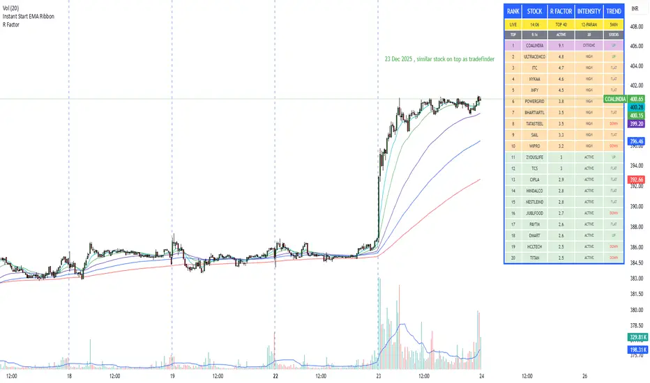
R Factor Advanced Stock Activity Ranking (Experimental) R Factor (relative factor) is a custom logic based 'momentum ranking' parameter, which measures intensity of intraday momentum and volatility. This parameter compared today's activity from last 20 days activity and ranks the stocks according to the intensity of the momentum.
Why momentum ranker?
Because traditional %change sorts intraday stock which show momentum in ascending order of value of % change, for example 3%, 2.5 %, 1% etc. But momentum ranker does not use % change as a sorting parameter for top gainers, or losers. It ranks the stocks, regardless of the direction, according to the intensity it is showing. The value of the momentum ranking has no meaning of itself, just understand that higher the value of momentum ranker, the more intensity the stock is showing.
In this indicator we can only scan 40 F&O stock of Indian Stock Market. This indicator is to be used only on 5 min timeframe.
Tip: Do not change any values in the settings otherwise, the indicator won't work as expected.
Also after applying the indicator, your canvas will shrink, manually fix it by stretching from Y axis, a table will appear showing top 20 stocks. Some times the indicator will glitch & show incorrect names of stocks, refresh the Tradingview website to fix this. Best used on a PC.
Disclaimer/Warning:
This parameter is inspired by TradeFinder and is an attempt to study the momentum of the stocks. This indicator in no way attempts to copy features of the TradeFinder software, this is purely an experimental Indicator, for the people who cannot afford to buy a trading software. This indicator does not provide Buy/Sell signals or nor is an investment advice. This indicator solely for the purpose of study of price and its momentum. Users are responsible for their own actions, profit/loss of the users is not the liability of author.
TCI Time Oracle - Intraday
🟢 Green Zone — Opening & Closing Liquidity Window
Time:
Opening Green: ~9:15 – 9:30 AM
Closing Green: ~3:15 – 3:30 PM
Market Character:
Highest liquidity of the day
Overnight positions unwind / fresh positions initiate
Strong directional intent often revealed
Smart money sets the day’s bias
Trading Insight:
Best zone for trend bias identification
Option premiums react fastest here
Not ideal for late entries, but excellent for confirmation
🔵 Blue Zone — Midday Compression / Algo Control
Time: ~11:15 AM – 12:00 PM
Market Character:
Volatility contraction
Algo-driven price control
Time decay dominates options
Fake breakouts and mean reversion
Trading Insight
Worst zone for aggressive option buying
Best for range scalping or staying flat
Institutions wait, retailers get chopped
🔴 Red Zone — Institutional Expansion / Trap Zone
Time: ~1:15 PM – 2:00 PM
Market Character:
Sudden volatility expansion
Institutional orders hit the market
Trend acceleration or sharp reversal
Options see rapid delta & gamma shift
Trading Insight:
High probability trend continuation or trap creation
Strong zone for directional option trades
Requires strict risk management
Big Picture Takeaway
Green sets the intent
Blue compresses and traps
Red expands and delivers the real move
This time-zone behavior is exactly why one strategy cannot work all day. Edge comes from trading the right setup in the right time window.
