SMC Academy [PhenLabs]📊 SMC Academy
Version: PineScript™ v6
📌 Description
The SMC Academy indicator is a comprehensive educational tool designed to demystify Smart Money Concepts (SMC) for traders of all levels. Unlike standard indicators that simply print signals, this script uses a “Learning Phase” system that allows users to toggle between individual concepts—such as Market Structure, Liquidity, Imbalances, and Order Blocks—or view them all simultaneously. It lets you focus on one piece of the puzzle at a time.
🚀 Points of Innovation
Progressive Learning Modes: Toggle between 5 distinct phases to master concepts individually before using the Full Strategy Mode.
Educational Tooltips: Hover over labels to read detailed explanations of why a BOS, MSS, or Liquidity zone was identified.
Smart Filtering: Uses ATR and Volume integration to filter out low-quality Fair Value Gaps and weak Order Blocks.
HTF Dashboard: A built-in panel analyzes Higher Timeframe (4H) data to ensure you are trading in alignment with the broader trend.
🔧 Core Components
Market Structure Engine: Automatically detects Swing Highs and Lows to map out market direction using configurable swing lengths.
Liquidity Manager: Identifies unmitigated swing points that serve as Buy-Side (BSL) and Sell-Side (SSL) liquidity magnets.
Imbalance Detector: Highlights Fair Value Gaps (FVG) where price inefficiencies exist, using ATR thresholds to ignore noise.
Order Block Identifier: Locates the specific candles responsible for structure breaks, validated by volume analysis.
🔥 Key Features
Break of Structure (BOS): Automatically marks trend continuation signals with solid lines and color-coded labels.
Market Structure Shift (MSS): Identifies potential trend reversals when significant swing points are breached.
Dashboard Context: Displays the current trend direction and the 4H context directly on your chart.
Custom Alerts: Built-in alert conditions for structure breaks and new Order Blocks allow for automated tracking.
🎨 Visualization
Structure Lines: Solid lines indicate confirmed breaks (Green for Bullish, Red for Bearish).
Liquidity Zones: Dotted lines extending rightward indicate resting liquidity levels that price may target.
FVG Boxes: Shaded boxes highlight imbalance zones, automatically extending for a user-defined number of bars.
Dashboard: A clean, non-intrusive table in the top-right corner displays trend status and active mode.
📖 Usage Guidelines
Setting Categories
Learning Mode: Select from ‘1. Market Structure’ through ‘5. Full Strategy Mode’ to filter what appears on the chart.
Swing Detection Length: Default (5). Determines the sensitivity of the swing high/low detection.
Structure Break Type: Options (Close/Wick). Choose whether a candle close or just a wick is required to confirm a break.
Min FVG Size: Default (0.5 ATR). Filters out gaps smaller than this multiplier to reduce noise.
Filter Weak OBs by Volume: Default (True). Only highlights Order Blocks where volume exceeds the 20-period average.
✅ Best Use Cases
Educational Study: Isolate “Phase 1: Market Structure” to practice identifying trend changes without distraction.
Trend Following: Use “Phase 3: Imbalances” to find entry points within an established trend.
Reversal Trading: Combine “Phase 2: Liquidity” and “Phase 4: Order Blocks” to catch reversals at key levels.
⚠️ Limitations
Subjectivity: Market structure can be interpreted differently depending on the swing length settings used.
Ranging Markets: Like all trend-following concepts, false BOS/MSS signals may generate during choppy, sideways price action.
Repainting: While the signals are non-repainting once confirmed, the live candle may flash a signal before the close if “Close” mode is selected.
💡 What Makes This Unique
Interactive Learning: The inclusion of tooltip explanations transforms this from a simple tool into an active mentor.
Phase-Based Workflow: The ability to strip the chart back to basics at the click of a button is unique to the PhenLabs ecosystem.
🔬 How It Works
Swing Analysis: The script calculates pivot highs and lows based on your length input to define the structural landscape.
Break Validation: It checks if price crosses these pivot points to trigger BOS (Continuation) or MSS (Reversal) logic.
Volume Confirmation: For Order Blocks, it looks back inside the swing leg to find the specific candle responsible for the move, verifying it has significant volume.
💡 Note:
For the best experience, start in Phase 1 to calibrate your Swing Detection Length to the specific volatility of the asset you are trading before enabling Full Strategy Mode.
서포트 앤 리지스턴스

Liquidity Levels Pro Tool - thewallranka
Liquidity Levels Pro Tool is a market-structure and liquidity-mapping indicator designed to help discretionary futures and index traders identify statistically relevant price levels where reactions, continuations, or liquidity sweeps are more likely to occur.
This script is a decision-support tool, not a signal generator. It does not issue buy/sell alerts or predict future price movement. Instead, it organizes and scores liquidity information so traders can make their own contextual decisions.
What this indicator does
The script continuously detects and maintains liquidity zones derived from price pivots, then evaluates those zones using multiple structural and contextual factors:
Repeated price interaction (touches)
Freshness (time since last interaction)
Confluence with key reference levels
Reaction behavior after contact
Session relevance (RTH vs overnight)
Market regime (trend vs mean reversion)
Time-of-day effects (open, midday, power hour)
Only the most relevant zones—based on a dynamic scoring system—are displayed to reduce chart clutter and focus attention on levels that have historically mattered.
Core components
1. Liquidity Zones
Zones are built from pivot highs and lows and expanded into areas using a configurable tick-based padding. Nearby zones are merged to avoid redundancy.
Each zone is continuously evaluated and assigned a score (0–100) reflecting its relative importance.
2. Zone Scoring (No Lookahead)
Zone scores are based on:
Number of confirmed interactions
Recency of the last touch
Confluence with prior day/week levels, VWAP, and Opening Range
Reaction quality after touches (speed and follow-through)
Session alignment (zones that “work” in the current session are favored)
Penalties after liquidity sweeps
Zones are not forward-looking and do not rely on future data.
3. Context Engine
The script classifies the current environment using VWAP slope and distance:
Trend (up or down)
Mean reversion
Mixed/transition
Time-of-day context (Open, Midday, Power Hour) is also tracked internally and influences zone scoring.
This context is displayed in the HUD to support situational awareness, not automated decisions.
4. Liquidity Sweeps
Optional sweep detection highlights situations where price trades beyond a zone and closes back inside, indicating potential stop runs or failed breakouts.
Sweeps are rate-limited and applied conservatively to avoid visual noise.
5. Trade Planning Levels (Optional)
When enabled, the script highlights the nearest high-quality liquidity level above and below price based on score thresholds.
These are intended as reference targets, not trade entries or exits.
HUD (Heads-Up Display)
The on-chart HUD summarizes:
Key reference levels (prior day/week, Opening Range)
Nearest strong liquidity above/below price
Market regime and time-of-day context
Distance to levels (ticks or points)
The HUD is fully optional, positionable, and includes resizable modes (Small / Medium / Large) to fit different chart layouts.
How to use this tool
This indicator is best used as part of a discretionary trading process, for example:
Identifying areas where price is more likely to react or pause
Framing trades around higher-quality structure instead of arbitrary levels
Filtering setups based on session and regime context
Managing expectations near known liquidity rather than chasing price
It is intentionally designed not to provide trade signals.
Limitations and important notes
This script does not predict outcomes or guarantee reactions
High-scoring zones can still fail
Liquidity behavior is context-dependent and probabilistic
No performance claims or backtested results are provided
The indicator should not be used in isolation
Past behavior does not imply future results.
Chart and usage notes
The script is intended for standard time-based charts
Recommended for liquid futures and index products
Use a clean chart for clarity when publishing or sharing
No external indicators are required
Final note
Liquidity Levels Pro (Tool) — v6 is designed to organize complex market structure into a clear, readable framework, allowing traders to focus on execution and risk management rather than raw level detection.
This script reflects an analytical approach to intraday liquidity and structure, not an automated trading system.

Elev8+ Impulse LevelsElev8+ Impulse Levels | Smart Support & Resistance
Ever notice price rejecting “empty” areas on the chart—like it remembered something that isn’t obvious?
That “something” is often Institutional Impulse : footprints left behind by large, aggressive moves that get defended again days or weeks later .
Elev8+ Impulse Levels automatically detects these moments and projects the most important prices forward so you can see the structure most traders miss.
— — —
🧠 How It Works (The Logic)
This is not a typical support/resistance tool. It does not hunt swing highs/lows.
It looks for Market Intent —the “Perfect Storm” when two conditions align:
Volume Spike — buying/selling pressure significantly exceeds average volume (multiplier-based).
Volatility Expansion — the candle body is unusually large relative to recent ATR.
When both occur, the script marks the event and treats the impulse close as a key “line in the sand” that can influence future reactions.
— — —
🎯 How to Use These Levels
The script includes a Smart Line behavior that changes level styling based on how price interacts with it—so you can quickly separate two core setups:
1) The Defense (Bounce)
Visual: 🟢 Solid line (Fresh / Untouched)
What it means: Price has not yet traded through or “invalidated” the level.
What to look for: First return to the level → rejection / bounce behavior.
Why it matters: Large players often defend prior entries; first tests can react sharply.
2) The Flip (Break & Retest)
Visual: ◌ Dotted line (Broken / Re-priced)
What it means: A candle has closed through the level.
What to look for: Price returns to the dotted level from the other side (“kiss”) → continuation.
Why it matters: Broken support can act as resistance (and vice versa), similar to a breaker concept.
— — —
✨ Key Features
Smart Visualization — levels automatically transition from solid → dotted when broken to reduce chart noise.
Impulse Candle Highlighting — see the exact candle that created the level (origin clarity).
Fully Customizable Sensitivity — tune volume + size thresholds for Crypto, Forex, Futures, or Stocks.
— — —
🚀 The Elev8+ Workflow
Think of Impulse Levels as your map : it shows where reactions are most likely.
For entry timing, pair it with Elev8+ Pro Reversal to confirm the moment price reacts at these high-value zones.
— — —
Disclaimer: Trading involves risk. This tool is for educational/technical analysis purposes only and does not guarantee future results.

Elev8+ Impulse Levels | Smart Support & ResistanceElev8+ Impulse Levels | Smart Support & Resistance
Ever notice price rejecting “empty” areas on the chart—like it remembered something that isn’t obvious?
That “something” is often Institutional Impulse : footprints left behind by large, aggressive moves that get defended again days or weeks later .
Elev8+ Impulse Levels automatically detects these moments and projects the most important prices forward so you can see the structure most traders miss.
— — —
🧠 How It Works (The Logic)
This is not a typical support/resistance tool. It does not hunt swing highs/lows.
It looks for Market Intent —the “Perfect Storm” when two conditions align:
Volume Spike — buying/selling pressure significantly exceeds average volume (multiplier-based).
Volatility Expansion — the candle body is unusually large relative to recent ATR.
When both occur, the script marks the event and treats the impulse close as a key “line in the sand” that can influence future reactions.
— — —
🎯 How to Use These Levels
The script includes a Smart Line behavior that changes level styling based on how price interacts with it—so you can quickly separate two core setups:
1) The Defense (Bounce)
Visual: 🟢 Solid line (Fresh / Untouched)
What it means: Price has not yet traded through or “invalidated” the level.
What to look for: First return to the level → rejection / bounce behavior.
Why it matters: Large players often defend prior entries; first tests can react sharply.
2) The Flip (Break & Retest)
Visual: ◌ Dotted line (Broken / Re-priced)
What it means: A candle has closed through the level.
What to look for: Price returns to the dotted level from the other side (“kiss”) → continuation.
Why it matters: Broken support can act as resistance (and vice versa), similar to a breaker concept.
— — —
✨ Key Features
Smart Visualization — levels automatically transition from solid → dotted when broken to reduce chart noise.
Impulse Candle Highlighting — see the exact candle that created the level (origin clarity).
Fully Customizable Sensitivity — tune volume + size thresholds for Crypto, Forex, Futures, or Stocks.
— — —
🚀 The Elev8+ Workflow
Think of Impulse Levels as your map : it shows where reactions are most likely.
For entry timing, pair it with Elev8+ Pro Reversal to confirm the moment price reacts at these high-value zones.
— — —
Disclaimer: Trading involves risk. This tool is for educational/technical analysis purposes only and does not guarantee future results.

Session ATR Progression Tracker📊 Session ATR Progression Tracker - SIYL Regression Trading Tool
Track how much of your instrument's 7-day Average True Range (ATR) has been covered during the current trading session. This indicator is specifically designed for regression traders who follow the "Stay In Your Lane" (SIYL) methodology, helping you identify when the probability of mean reversion significantly increases. If you are interested in more on that check out Rod Casselli and tradersdevgroup.com.
🎯 Key Features:
• Real-time ATR Coverage Percentage - See at a glance what percentage of the 7-day ATR has been covered in the current session
• SIYL-Optimized Thresholds - See at a glance when the instrument has achieved 80% and 100% ATR coverage, the proven thresholds where mean reversion probability increases (customizable)
• Flexible Session Modes:
- Daily: Resets at calendar day change
- Session: Uses exchange-defined trading sessions
- Custom Session: Set your exact session start/end times (perfect for futures traders and international markets)
• Visual Alerts - Color-coded display (gray → orange → red) and optional background highlighting
• Repositionable Display - Choose from 9 screen positions to avoid chart clutter
• Session Markers - Green triangles mark the start of each new session
• Detailed Stats - View current range, ATR value, session high/low, and session status
💡 Why Use This Indicator?
This tool is built around a proven concept: regression trading becomes significantly more effective once a session has achieved at least 80% of its 7-day ATR. At this threshold, the probability of price reverting to mean increases substantially, creating higher-probability trade setups for SIYL practitioners.
Benefits for regression traders:
- Identify optimal entry points when mean reversion probability is highest (≥80% ATR coverage)
- Avoid premature regression entries before adequate range has been established
- Recognize when daily moves have "earned their range" and are ripe for reversal
- Time fade-the-move and counter-trend strategies with statistical backing
- Improve win rates by trading only after proven probability thresholds are met
⚙️ Setup Instructions:
1. Add the indicator to your chart
2. Select your preferred "Reset Mode" (recommend "Custom Session" for futures/international markets)
3. If using Custom Session, enter your session times in 24-hour format (e.g., 0930-1600 for US stocks, 1700-1600 for CME futures)
4. Adjust alert thresholds if desired (default: 80% and 100% - proven SIYL thresholds)
5. Position the display where it's most visible on your chart
📈 Works Across All Markets:
Stocks • Futures • Forex • Indices • Crypto • Commodities
Perfect for regression traders, mean reversion specialists, and SIYL practitioners who want to trade with probability on their side by entering only after the session has "earned its range."
---
Tip: For futures contracts with overnight sessions that span calendar days (like MES, MNQ, MYM), use "Custom Session" mode with your exchange's official session times for accurate tracking.

Hybrid Strategy: Trend/ORB/MTFHybrid Strategy: Trend + ORB + Multi-Timeframe Matrix
This script is a comprehensive "Trading Manager" designed to filter out noise and identify high-probability breakout setups. It combines three powerful concepts into a single, clean chart interface: Trend Alignment, Opening Range Breakout (ORB), and Multi-Timeframe (MTF) Analysis.
It is designed to prevent "analysis paralysis" by providing a unified Dashboard that confirms if the trend is aligned across 5 different timeframes before you take a trade.
How it Works
The strategy relies on the "Golden Trio" of confluence:
1. Trend Definition (The Setup) Before looking for entries, the script analyzes the immediate trend. A bullish trend is defined as:
Price is above the Session VWAP.
The fast EMA (9) is above the slow EMA (21). (The inverse applies for bearish trends).
2. The Signal (The Trigger) The script draws the Opening Range (default: first 15 minutes of the session).
Buy Signal: Price breaks above the Opening Range High while the Trend is Bullish.
Sell Signal: Price breaks below the Opening Range Low while the Trend is Bearish.
3. The Confirmation (The Filter) A signal is only valid if the Higher Timeframe (default: 60m) agrees with the direction. If the 1m chart says "Buy" but the 60m chart is bearish, the signal is filtered out to prevent false breakouts.
Key Features
The Matrix Dashboard A zero-lag, real-time table in the corner of your screen that monitors 5 user-defined timeframes (e.g., 5m, 15m, 30m, 60m, 4H).
Trend: Checks if Price > EMA 21.
VWAP: Checks if Price > VWAP.
ORB: Checks if Price is currently above/below the Opening Range of that session.
D H/L: Warns if price is near the Daily High or Low.
PD H/L: Warns if price is near the Previous Daily High or Low.
Visual Order Blocks The script automatically identifies valid Order Blocks (sequences of consecutive candles followed by a strong explosive move).
Chart: Draws Green/Red zones extending to the right, showing where price may react.
Dashboard: Displays the exact High, Low, and Average price of the most recent Order Blocks for precision planning.
Risk Management (Trailing Stop) Once a trade is active, the script plots Chandelier Exit dots (ATR-based trailing stop) to help you manage the trade and lock in profits during trend runs.
Visual Guide (Chart Legend)
⬜ Gray Box: Represents the Opening Range (first 15 minutes). This is your "No Trade Zone." Wait for price to break out of this box.
🟢 Green Line: The Opening Range High. A break above this line signals potential Bullish momentum.
🔴 Red Line: The Opening Range Low. A break below this line signals potential Bearish momentum.
🟢 Green / 🔴 Red Zones (Boxes): These are Order Blocks.
🟢 Green Zone: A Bullish Order Block (Demand). Expect price to potentially bounce up from here.
🔴 Red Zone: A Bearish Order Block (Supply). Expect price to potentially reject down from here.
⚪ Dots (Trailing Stop):
🟢 Green Dots: These appear below price during a Bullish trend. They represent your suggested Stop Loss.
🔴 Red Dots: These appear above price during a Bearish trend.
🏷️ Buy / Sell Labels:
BUY: Triggers when Price breaks the Green Line + Trend is Bullish + HTF is Bullish.
SELL: Triggers when Price breaks the Red Line + Trend is Bearish + HTF is Bearish.
Settings
Session: Customizable RTH (Regular Trading Hours) to filter out pre-market noise.
Matrix Timeframes: 5 fixed slots to choose which timeframes you want to monitor.
Order Blocks: Adjust the sensitivity and lookback period for Order Block detection.
Risk: Customize the ATR multiplier for the trailing stop.
Disclaimer
This tool is for educational purposes only. Past performance does not guarantee future results. Always manage your risk properly.

Dynamic Multi-Timeframe SMAs (Brian Shannon Style)Overview : This indicator implements the logic of Brian Shannon's "Multi-Timeframe Analysis" on intraday charts. It automatically calculates the correct length for the 5-Day and 50-Day Simple Moving Averages (SMA), regardless of the timeframe (e.g., 5m, 15m, 1h) you are viewing.
How it works Standard SMAs only count bars. A "50 SMA" on a 5-minute chart only looks back ~4 hours. This script dynamically calculates how many bars represent full trading days.
Features:
Asset Class Selector : Choose between Crypto (24/7) and Stocks (6.5h US Session) to ensure correct minute-per-day calculations.
Info Table : Displays exactly how many bars are being used for the calculation in real-time.

Box Indicator - Auto Draw Previous Day's - High / Midline / LowThis indicator draws a box around the previous day’s high and low, calculates the midline, and displays them on the current day’s chart. It helps visualize key support/resistance levels from the prior trading day.
This script gives you a static reference box from the prior day’s trading range, including a midpoint. It’s useful for spotting potential reversal zones, breakout levels, or intraday targets based on yesterday’s price action.

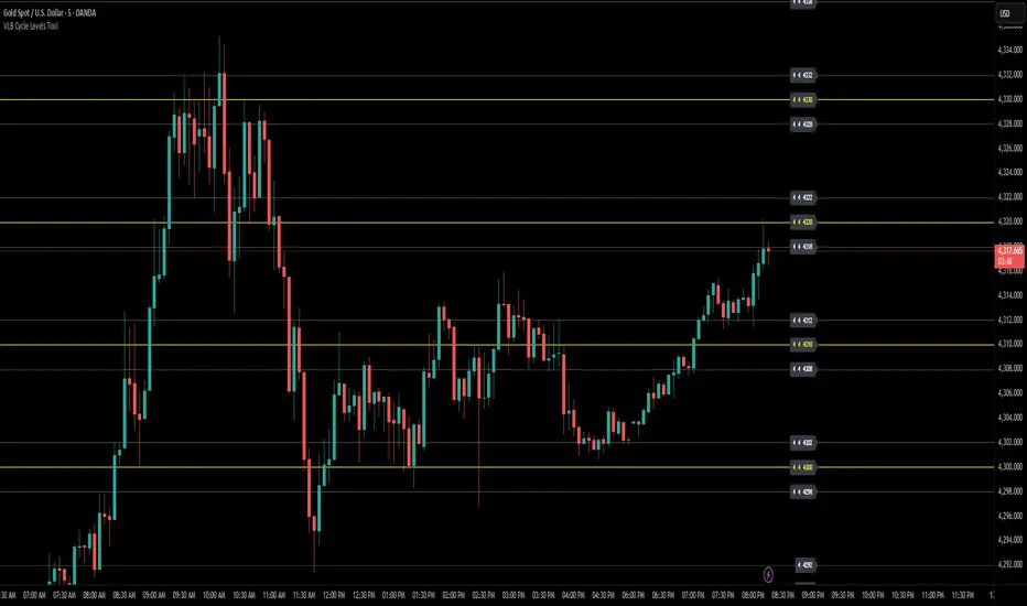
VLB Cycle Levels Tool Structural Cycle Mapping for XAUUSDThe VLB Cycle Levels Tool provides a visual framework for examining structural cycles on XAUUSD.
It displays automatically generated levels based on a rules-based approach, allowing traders to observe how price interacts with recurring structural areas over time.
The tool adapts as market structure evolves, updating its levels when new highs or lows form.
Its purpose is to offer a clear, consistent view of structural cycles so users can incorporate these reference points into their independent chart analysis.
Features:
Automatically generated structural cycle levels
Dynamic updates as market structure develops
Neutral, non-predictive visualization
Clear reference zones for studying price behavior
This tool does not generate trading signals, provide timing information, or offer predictive analysis.
It simply organizes price structure into visual reference points that may assist users in their own interpretation and decision-making process.
Users remain fully responsible for their analysis, timing, and risk management.
The VLB Cycle Levels Tool is intended for traders who prefer an objective way to observe structural cycles and level-based behavior on XAUUSD as market conditions change.
VLB Dynamic Levels Tool Structural Mapping for XAUUSDThe VLB Dynamic Levels Tool provides a visual framework for observing price structure on XAUUSD.
It displays automatically generated levels based on a rules-based approach, allowing traders to study how price interacts with important reference areas on the chart.
The tool updates dynamically as market structure evolves, reflecting changes in price movement without requiring manual redrawing.
Its purpose is to offer a clear, consistent layout of structural levels that users can incorporate into their own market analysis.
Features:
Automatically displayed structural reference levels
Dynamic recalculation as new highs and lows form
Neutral, non-predictive visual layout
A consistent framework for studying price behavior
This tool does not generate trading signals or provide predictive information.
It simply organizes price structure into visual reference points that may assist users in their independent chart analysis.
Traders remain fully responsible for their own interpretation, timing, and risk management.
The VLB Dynamic Levels Tool is intended for those who prefer a clean and adaptable way to observe XAUUSD structure throughout changing market conditions.

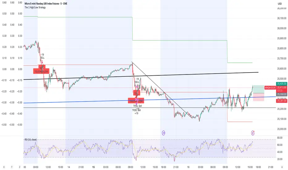
The 1 High/Low StrategyThis strategy takes advantage of price Support and Resistance at High and Low level points of the day to enter high Risk to Reward positions with a high win rate.
Malama's PRE-Market Box Overview
Malama's PM Box is a clean, professional pre-market range indicator that tracks the entire pre-market session (default 04:00–09:30 EST), draws a dynamic box during pre-market hours, and automatically extends clean high/low reference lines into the regular trading session. Upon breakout of these levels during regular hours, it optionally displays clear "BREAK" labels and fires alerts — making it ideal for day traders focusing on pre-market range breakouts.
Key Features
Dynamic Pre-Market Box: A real-time updating box that visually represents the developing pre-market high and low range, with customizable fill color, border, and transparency.
Extended Support & Resistance Lines: At the start of regular trading hours (09:30), the final pre-market high (resistance) and low (support) are locked in and extended as horizontal lines across the chart for the entire day.
Breakout Signals: Optional on-chart "BREAK" labels (green upward for bullish, red downward for bearish) when price closes beyond the pre-market high or low during regular hours.
Alerts: Built-in alert conditions for bullish breakouts (above PM high) and bearish breakdowns (below PM low).
Clean & Efficient Drawing: Uses Pine Script boxes and lines for smooth visuals and performance; lines extend automatically until the next trading day.
Major Differences & Improvements from the Older "Malama's KAYCAP Pre-Market Box"
The older script focused on isolating a single specific candle (default 4:00 AM) and plotting its body and wick levels separately. This new version represents a complete evolution into a full pre-market range tool with the following key upgrades:
Full Session Range vs. Single Candle:
Old: Captured only one user-defined minute/candle (e.g., exactly 4:00).
New: Tracks the entire pre-market session (default 04:00–09:30) and continuously updates the true session high/low.
Visual Presentation:
Old: Four separate plots (body top/bottom, high/low) with basic fill.
New: Single professional box with customizable fill/transparency/border during pre-market, plus clean extended horizontal lines after market open.
Extension & Persistence:
Old: Static plots that did not extend or update dynamically.
New: Lines automatically extend rightward throughout the regular session and reset cleanly each day.
Breakout Detection & Signaling:
Old: No breakout logic or alerts.
New: Detects true breakout/breakdown candles during regular hours, with optional visual labels and dedicated alert conditions.
User Experience:
Old: Required manual configuration of exact minute and separate pre-market session inputs (unused in logic).
New: Simplified session input using TradingView's built-in session string, fewer inputs overall, and more intuitive grouping.
In essence, the older version was a niche tool for analyzing one specific pre-market candle's structure, while PM Box (Visual Pro) is a modern, practical day-trading utility focused on the classic pre-market high/low range strategy with superior visuals, automation, and breakout signaling.
How to Use
Apply to 1-minute or 5-minute charts on US stocks or indices with pre-market data.
Default session (04:00–09:30) captures standard US pre-market; adjust if your broker uses a different timezone.
Watch the box develop live during pre-market.
Once regular hours begin, use the extended high (resistance) and low (support) lines as key levels.
Trade breakouts/breakdowns when price closes beyond these lines (confirmed by labels and alerts).
Combine with volume, trend filters, or other confluence for higher-probability setups.
Disclaimer
This indicator is for educational and informational purposes only. It is not financial advice. Past performance does not guarantee future results. Always use proper risk management and combine with your own analysis. Trading involves substantial risk of loss.

Price Action Ultimate LITE v2
PRICE ACTION ULTIMATE LITE v2
Structure First. Risk Defined. Results Measured.
Most traders don’t fail because they can’t find entries.
They fail because risk is unclear, reward is emotional, and results are never measured.
Price Action Ultimate LITE v2 was built to solve exactly this problem.
This is not a signal spam tool.
This is a price action framework that helps you understand when a trade makes sense, how much you risk, and whether your decisions are actually working over time.
🧠 CORE IDEA — PRICE ACTION ONLY
Price Action Ultimate LITE is built on pure price action logic.
No indicators fighting each other.
No clutter.
No emotional entries.
Every trade begins with structure.
When a valid Order Block forms and price reacts:
Market structure is confirmed
A trade scenario becomes valid
Risk and reward are calculated automatically
This is not prediction.
This is reaction to price.
🎯 AUTOMATIC RISK / REWARD BOXES
(The heart of the system)
Once an entry is triggered:
A Risk / Reward box is created automatically
Entry, Stop, and Target are clearly defined
The user controls the R:R ratio in advance
This changes everything.
Instead of asking
“Should I take this trade?”
you ask
“Is this risk worth the reward?”
You can:
Test different R:R values
Compare outcomes
Build your own trade model
📊 TRADE MANAGER — DATA, NOT OPINIONS
Every trade is tracked and measured.
The Trade Manager shows:
Floating PnL
Risk-based profit & loss
Last 10 / 25 / 50 / 100 trades performance
Trade reason & duration
Total trade count
This allows you to validate your settings with real data.
No guessing.
No assumptions.
🔵 ENTRY MARKERS & REPLAY MODE
(Learn from the past)
Each historical trade is marked on the chart:
Green circles → Long entries
Red circles → Short entries
Fully compatible with TradingView Replay Mode.
You can rewind, replay, and study:
Structure
Timing
R:R behavior
⚠️ Pro Tip:
If you disable Auto-Remove Broken Blocks, entry markers become even clearer for educational review.
🔔 SMART ALERT SYSTEM
(Designed for real traders)
Price Action Ultimate LITE includes a practical alert system:
Entry alerts (bar close)
Stop Loss alerts (instant)
Take Profit alerts (instant)
Timeout alerts
Optional PnL alerts
Alerts help you act on structure —
not chase price.
🌈 MA RIBBON — TREND CONTEXT (LITE)
The MA Ribbon provides:
Trend direction context
Visual candle coloring
Clean market bias awareness
⚠️ In LITE , the ribbon is intentionally visual and simplified.
👉 The PRO version expands this concept significantly with:
Advanced logic layers
Stronger filtering
More customization
(No action required — just awareness.)
🆓 FREE TO USE — PROTECTED SOURCE
✔ Free for everyone
✔ Protected code
✔ No limitations
You get a complete, usable system — not a crippled demo.
WHO THIS IS FOR
✔ Traders who value risk management
✔ Price action traders
✔ Traders who want structure + data
✔ Those who improve through review & statistics
WHO THIS IS NOT FOR
✖ Shortcut seekers
✖ “Holy grail” hunters
✖ Repainting signal fans
✖ Traders ignoring risk
User Advantages
For Beginners:
Learn price action concepts through visual examples
Understand institutional order flow without complex theory
Develop disciplined risk management habits
Build confidence with systematic, rule-based entries
For Experienced Traders:
Save hours on manual market structure analysis
Backtest different R:R ratios and risk amounts
Fine-tune parameters to match your trading style
Use as a confirmation tool for existing strategies
For All Traders:
Never Miss Entries: Alerts ensure timely execution
Objective Decisions: Remove emotion with clear rules
Continuous Improvement: Analyze past performance to refine settings
Flexible Adaptation: Works across all timeframes and instruments
Pro Version Preview
Note: The LITE version provides robust functionality with some limitations. The upcoming PRO version will feature:
Advanced Ribbon Settings: More MA types, adaptive periods, and multi-timeframe analysis
Enhanced Block Detection: Additional block types and confluence scoring
Advanced Statistics: Win rate by block type, time-of-day analysis, and correlation metrics
Custom Script Integration: Ability to add personal confirmation filters
Multi-instrument Analysis: Portfolio-level insights and correlations
Priority Support & Updates: Direct access to development team
Getting Started
Add indicator to your chart
Adjust theme to match your preference (Dark/Light/Custom)
Set your desired R:R ratio and risk amount
Enable alerts for your preferred notification
Review historical signals to understand system behavior
Start trading with clear visual guidance
Philosophy
"Price is the ultimate truth" – This indicator respects that philosophy by focusing exclusively on price action, without lagging indicators or predictive algorithms. It helps you see what institutions see: order flow, market structure, and high-probability supply/demand zones.
Price Action Ultimate LITE brings professional price action analysis to every trader. Whether you're learning market structure or seeking a systematic approach to order flow trading, this indicator provides the visual framework and risk management tools for more disciplined trading decisions.
The PRO version (coming soon) will expand these capabilities significantly, offering institutional-grade tools for serious traders seeking maximum advantage in the markets.
FINAL WORD
Price Action Ultimate LITE does not promise profits.
It gives you something far more valuable:
Clarity. Structure. Accountability.
If you respect risk,
if you study your trades,
and if you let data guide you —
this tool will grow with you.

NY ORB, VWAP & EMAsThis release introduces powerful new features focused on session analysis, trade alerts, and clear market visualization to help you better frame the trading day.
✨ New Features
1. Automated Trading Session Identification
The indicator now automatically identifies and highlights two key market periods:
Asian Session High/Low Tracking: Automatically tracks and plots the High and Low prices established during the Asian Trading Session (5:00 PM – 2:00 AM PST). These levels provide critical reference points for potential support and resistance during subsequent sessions.
Power Hour Visualization: A subtle green background highlight is now applied to the chart during the "Power Hour" (6:00 AM – 9:30 AM PST). This visually marks the high-volatility period immediately following the New York Open, helping traders focus on active price action.
⚙️ Technical Changes
Plot Style: The plots for the "Asian High" and "Asian Low" are now plotted using circles (plot.style_circles) for clear visibility and differentiation from standard lines.

Whale Flow PRO [Institutional Grade Trend System]Whale Flow PRO is an advanced market analysis algorithm designed to align retail traders with institutional liquidity cycles. Unlike standard lagging indicators, Whale Flow focuses on detecting the underlying phase of the market: Liquidity Building (Consolidation) vs. Institutional Expansion (Whale Runs).
This tool was engineered to solve the biggest problem in trading: getting trapped in choppy markets ("Whipsaws") and missing the true explosive moves.
⚙️ How It Works
The algorithm utilizes a proprietary volatility-adjusted volume model combined with dynamic price-action pivots. By analyzing the rate of change relative to historical volatility compression, the script identifies key "Pivot Lines" where liquidity is likely to flow.
Trend Filtering: It automatically filters out noise by calculating a custom "Consolidation Index". When the market is in a building phase, signals are suppressed to protect capital.
Whale Runs: When volatility expands beyond a specific threshold in the direction of the dominant trend, the system triggers a "Whale Run" mode, signaling high-probability entry zones.
📊 Key Features
Smart Dashboard (HUD): A real-time professional panel displaying the current Trend Direction, Market Phase (Run vs. Build), and active Pivot Levels.
Dynamic Heatmap: A visual ribbon at the bottom of the chart that tracks the historical strength of the trend flow.
Context-Aware Coloring:
Neon Green: Confirmed Bullish Flow (Whale Run).
Neon Red: Confirmed Bearish Flow (Dump).
Silver/Gray: Consolidation Zone (Safety Mode - No Trades).
Protection System: The "Liquidity Build" filter prevents entries during sideways movement, significantly increasing the win rate of the signals.
🔒 Access
This is an Invite-Only script dedicated to professional traders and community members. It is strictly protected to maintain the edge of its users.
To obtain access: Please visit the link in my signature or send me a private message (PM) here on TradingView for licensing details.
Disclaimer: This tool is for informational purposes only and does not constitute financial advice. Past performance (even of whales) is not indicative of future results.


Hitjo Zones TFTL;DR – READ THIS FIRST
This is a TWO-INDICATOR SYSTEM. Both indicators must be used together.
Hitjo Zones TF = WHERE you are allowed to trade
Hitjo Swing Trend = WHEN you are allowed to trade
Rules:
Only take BUY signals from Hitjo Swing Trend inside DEMAND zones from Hitjo Zones TF
Only take SELL signals from Hitjo Swing Trend inside SUPPLY zones from Hitjo Zones TF
Ignore signals when structure and timing do not align
Recommended setup: 1H chart with 4H or Daily zones.
Hitjo Swing Trading System
(Hitjo Zones TF + Hitjo Swing Trend)
This TradingView system combines higher-timeframe Supply & Demand zones with momentum-based swing entries to create a clean, rule-based swing trading framework.
It is designed for traders who want fewer but higher-quality trades, clear market structure, objective entry timing, and reduced overtrading.
Required Indicators
Hitjo Zones TF (Structure)
Automatically draws Supply & Demand zones using a selectable higher timeframe.
Displays SUPPLY and DEMAND labels when price enters key zones.
Defines where trades are allowed.
Do not trade based on zones alone.
Hitjo Swing Trend (Timing)
Displays BUY and SELL labels using EMA structure, momentum, and higher-timeframe trend.
Plots ATR-based stop loss and target levels.
Defines when to enter trades.
Do not take BUY or SELL signals outside zones.
Core Concept
Hitjo Zones TF tells you WHERE to trade.
Hitjo Swing Trend tells you WHEN to trade.
If both are not aligned, there is no trade.
Trading Rules
Long Trades
Take a BUY only when all conditions are true:
Price is inside or just above a DEMAND zone from Hitjo Zones TF
Higher-timeframe trend is bullish
A BUY label appears from Hitjo Swing Trend
There is room to target without immediately hitting resistance
Short Trades
Take a SELL only when all conditions are true:
Price is inside or just below a SUPPLY zone from Hitjo Zones TF
Higher-timeframe trend is bearish
A SELL label appears from Hitjo Swing Trend
There is room to target without immediately hitting support
Common Mistakes to Avoid
Buying just because DEMAND appears
Selling just because SUPPLY appears
Taking BUY or SELL signals in the middle of the chart
Counter-trend trading
Forcing trades on every signal
Stops and Targets
Hitjo Swing Trend plots:
Stop Loss using ATR (red)
Target using ATR (green)
These are visual guides only, not broker orders.
Recommended Setup
Chart timeframe: 1H
Zone timeframe (Hitjo Zones TF): 4H or Daily
Fast / Slow EMA: 8 / 21
ATR Stop / Target: 1.5 / 3.0
Remember This
DEMAND does not mean BUY
SUPPLY does not mean SELL
DEMAND + BUY = Long
SUPPLY + SELL = Short
Disclaimer
This system does not predict tops or bottoms and does not guarantee profits.
It is designed to help traders wait for alignment, reduce low-quality trades, and trade with structure.
Always manage risk appropriately.
TradingView Search Keywords
Supply Demand
Swing Trading
EMA Strategy
Multi Timeframe
Trend Following
Support Resistance
Momentum Trading
ATR Stop Loss
Crypto Trading
Stock Trading

Universe Structure & Trend Zone [All-in-One]**Overview**
The "Universe Structure & Trend Zone" is a comprehensive all-in-one trading toolkit designed to combine Institutional Trend Following with Smart Money Concepts (SMC/ICT). It helps traders identify the dominant trend direction while providing precise entry points based on Market Structure Breaks (MSB) and Order Blocks.
This script aims to filter out market noise by allowing trades only when Price Action aligns with the long-term trend (SMA Zone).
**Key Features**
1. **Market Structure Breaks (MSB) & ZigZag:**
- Detects structural shifts in price (Bullish/Bearish MSB).
- Uses a default Signal Length of 10 to filter out minor swings and focus on significant structural changes.
- Visualizes high and low pivot points.
2. **Smart Trend Zone (SMA 200 Filter):**
- Incorporates a 200-period SMA Zone (Institutional Level) to determine the macro trend.
- **Trend Filter Logic:** The indicator intelligently filters signals. It displays Bullish Order Blocks only when the price is trending *above* the SMA Zone, and Bearish Order Blocks only *below* it. This drastically reduces false signals in choppy markets.
3. **Order Blocks (OB) & Breaker Blocks (BB):**
- Automatically identifies high-probability Order Blocks and Breaker Blocks.
- Includes optional filters for Volume and Premium/Discount zones to validate the blocks.
- Features an auto-cleanup mechanism to remove invalid or broken boxes, keeping the chart clean.
4. **Hull Moving Average (HMA):**
- A fast-reacting 55-period HMA is included to visualize short-term momentum shifts (Green for Bullish, Red for Bearish).
5. **Smart Range (Support/Resistance):**
- Plots the dynamic Highest High and Lowest Low of the selected timeframe (default 4H) to show the current trading range and Equilibrium (EQ) level.
**How to Use**
* **Step 1:** Check the **SMA Zone** (Gray/Green/Red Band). If Price > Zone, look for Longs. If Price < Zone, look for Shorts.
* **Step 2:** Wait for a **Market Structure Break (MSB)** label in the direction of the trend.
* **Step 3:** Look for an entry at the retest of an **Order Block (OB)** or **Breaker Block (BB)**.
* **Step 4:** Use the HMA color change as a confirmation trigger or trailing stop guide.
**Settings**
* **Signal Length:** Default is 10 (Optimized for standard swings).
* **Trend Filter:** Enabled by default (Recommended to stay with the trend).
* **Display:** You can toggle MSB lines, Boxes, and Labels on/off to suit your visual preference.
**Disclaimer**
This indicator is for educational purposes only and does not constitute financial advice. Always use proper risk management.

Unmitigated Liquidity ZonesUnmitigated Liquidity Zones
Description:
Unmitigated Liquidity Zones is a professional-grade Smart Money Concepts (SMC) tool designed to visualize potential "draws on liquidity" automatically.
Unlike standard Support & Resistance indicators, this script focuses exclusively on unmitigated price levels — Swing Highs and Swing Lows that price has not yet revisited. These levels often harbor resting liquidity (Stop Losses, Buy/Sell Stops) and act as magnets for market makers.
How it works:
Detection: The script identifies significant Pivot Points based on your customizable length settings.
Visualization: It draws a line extending forward from the pivot, labeled with the exact Price and the Volume generated at that specific swing.
Mitigation Logic: The moment price "sweeps" or touches a level, the script treats the liquidity as "collected" and automatically removes the line and label from the chart. This keeps your workspace clean and focused only on active targets.
Key Features:
Dynamic Cleanup: Old levels are removed instantly upon testing. No chart clutter.
Volume Context: Displays the volume (formatted as K/M/B) of the pivot candle. This helps you distinguish between weak structure and strong institutional levels.
High Visibility: customizable bold lines and clear labels with backgrounds, designed to be visible on any chart theme.
Performance: Optimized using Pine Script v6 arrays to handle hundreds of levels without lag.
How to trade with this:
Targets: Use the opposing liquidity pools (Green lines for shorts, Red lines for longs) as high-probability Take Profit levels.
Reversals (Turtle Soup): Wait for price to sweep a bold liquidity line. If price aggressively reverses after taking the line, it indicates a "Liquidity Grab" setup.
Magnets: Price tends to gravitate toward "old" unmitigated levels.
Settings:
Pivot Length: Sensitivity of the swing detection (default: 20). Higher values find more significant/long-term levels.
Limit: Maximum number of active lines to prevent memory overload.
Visuals: Toggle Price/Volume labels, adjust line thickness and text size.

NVentures Liquidity Radar Pro**NVentures Institutional Liquidity Radar Pro (NV-ILR Pro)** is a comprehensive liquidity analysis tool engineered for traders who understand that price moves from liquidity to liquidity. This indicator reveals where stop orders cluster, where institutional players left their footprints, and where the next liquidity grab is likely to occur.
Unlike conventional support/resistance indicators, ILR Pro combines multiple institutional concepts into a unified confluence scoring system — helping you identify high-probability zones where significant price reactions are most likely.
⯌ **Multi-Layer Liquidity Detection**
> The core engine identifies swing-based liquidity pools where retail stop-losses typically cluster. Each zone is dynamically sized using ATR, ensuring relevance across all timeframes and instruments. Zones automatically fade over time through a freshness decay system, keeping your chart focused on what matters now.
⯌ **Institutional Order Block Detection**
> Order Blocks mark the last opposing candle before a strong institutional move — the footprint of smart money entering positions. ILR Pro automatically detects both bullish and bearish Order Blocks using volume confirmation and consecutive candle validation. When price returns to these zones, institutions often defend their positions.
⯌ **Fair Value Gap Integration (Optional)**
> FVGs represent price imbalances where aggressive orders created inefficiencies. These gaps often act as magnets for price or provide optimal entry zones for mean-reversion strategies. FVG detection is disabled by default for a cleaner chart experience — enable it in settings when you want the full picture.
⯌ **Smart Confluence Scoring**
> Each liquidity zone receives a confluence score based on multiple factors:
- Overlapping swing levels (+1 per overlap)
- Nearby Order Blocks (+1)
- Higher Timeframe alignment (+2 bonus)
Zones with scores of 4+ are highlighted as high-confluence areas where institutional activity is most concentrated.
⯌ **Higher Timeframe Confluence**
> A liquidity zone on your current timeframe gains significant weight when it aligns with HTF structure. ILR Pro automatically checks for HTF swing alignment and awards bonus confluence points — no manual multi-timeframe analysis required.
⯌ **Liquidity Sweep Detection**
> Not every break of a level is a true breakout. ILR Pro identifies sweep patterns where price penetrates a liquidity zone but closes back inside, indicating that liquidity was grabbed without genuine continuation. Swept zones are visually marked, helping you avoid false breakout traps.
⯌ **Mitigation & Test Tracking**
> The indicator tracks how many times price has tested each zone and automatically marks Order Blocks as mitigated once price fully trades through them. This helps you focus on fresh, untested levels with higher reaction probability.
⯌ **Volume-Weighted Significance**
> Zones formed on high relative volume carry more weight. The volume scoring system identifies where significant participation occurred, filtering out noise from low-volume price action.
**PRACTICAL APPLICATION**
**For Breakout Traders**
> Identify where liquidity pools cluster above/below current price. When price sweeps these zones and reverses, you have confirmation of a liquidity grab — often the precursor to the real move in the opposite direction.
**For Mean-Reversion Traders**
> Enable FVG detection and look for price returning to unfilled gaps within high-confluence liquidity zones. The combination of gap-fill tendency and institutional defense creates high-probability reversal setups.
**For Trend Traders**
> Use Order Blocks as pullback entry zones within established trends. When price retraces to a bullish OB in an uptrend (or bearish OB in a downtrend), institutions often step in to defend their positions.
**For Multi-Timeframe Analysts**
> The HTF confluence system does the work for you. Zones marked with "HTF" in the label align with higher timeframe structure — these are your highest conviction levels.
**CONFIGURATION GUIDE**
**Essential Settings**
- Swing Detection Length: 5-8 for intraday, 8-15 for swing trading
- HTF Timeframe: One or two timeframes above your trading TF (e.g., D for H4 charts)
- Min Confluence to Display: 2 for comprehensive view, 3-4 for only high-probability zones
**Visual Clarity**
- FVGs are disabled by default — enable under "Fair Value Gaps" section when needed
- Zone transparency adjustable from 50-95%
- Label size options: tiny, small, normal
**Performance Optimization**
- Reduce Max Zones/OBs/FVGs for faster loading on lower-end systems
- Decrease Lookback Period for intraday scalping
**WHAT MAKES THIS DIFFERENT**
Most liquidity indicators simply draw lines at swing highs and lows. ILR Pro goes further:
→ **Confluence over quantity** — Not all levels are equal. The scoring system highlights where multiple institutional concepts align.
→ **Dynamic relevance** — Freshness decay ensures old, tested levels fade while fresh zones remain prominent.
→ **Sweep intelligence** — Distinguishes between genuine breakouts and liquidity grabs through wick analysis.
→ **Institutional integration** — Combines retail liquidity pools with smart money concepts (OBs, FVGs) in one unified tool.
→ **HTF awareness** — Automatic higher timeframe validation without switching charts.
**STATISTICS PANEL**
The built-in statistics table displays:
- Active resistance/support zones
- High confluence zone count
- Swept zone count
- Active Order Blocks
- Active FVGs (when enabled)
- Current ATR value
- Selected HTF
**ALERTS INCLUDED**
- Price approaching high confluence zone
- Liquidity sweep detected
- Bullish/Bearish Order Block formed
- Bullish/Bearish FVG detected (when enabled)
**NOTES**
This indicator works on all markets and timeframes. For optimal results on Forex, consider using Daily as your HTF for H1-H4 trading. For indices and crypto, Weekly HTF often provides stronger confluence.
The indicator uses User-Defined Types (UDTs) for clean data management and respects Pine Script's drawing limits (500 boxes/labels/lines).
**DISCLAIMER**
This indicator is for educational and informational purposes only. It does not constitute financial advice. All trading decisions are solely your responsibility. Past performance of any trading system or methodology is not indicative of future results.

Gann High Low Strategy## Trend & Structure Strategy — Overview
This strategy is designed to follow directional market moves by using a **dynamic price reference** to identify transitions between strength and weakness.
### Core concept
* It visually highlights when the market shifts from a **favorable phase** to an **unfavorable phase**, and vice versa.
* Signals are generated only when price behavior shows **minimum structural consistency**, helping to avoid random or low-quality conditions.
### Entries & trade management
* Entries aim to align with moments where price shows a **renewed directional intent**.
* Trade management is based on **technical price references**, allowing risk and objectives to adapt naturally to the current market context.
* Key directional and operational areas are clearly displayed on the chart to keep decision-making simple and visual.
### Best use cases
* Performs best in markets with **clear directional movement** and readable transitions.
* In very tight or choppy conditions, a more selective approach may be required.
*This content is for educational purposes only. Always test on different markets and timeframes before live use.*

Malama's Quantum FusionOverview
Malama's Quantum Fusion is an advanced, unified trading indicator that builds upon and significantly extends the core concepts from "Malama's Quantum Swing Modulator" (MQSM). It intelligently fuses swing-based probability zones with a full reversal signal engine, multi-layered trend confirmation, regime detection, and optional multi-timeframe (MTF) alignment. Signals are generated only when multiple independent systems converge, resulting in higher-conviction setups with reduced false signals in ranging or choppy conditions.
The system combines:
Probability Zones — Swing pivots, ATR uncertainty bands, and weighted scoring from oscillators (RSI, MFI), volume, price deviation, and regime-adjusted momentum.
Reversal Signal Engine — Precise candle pattern detection requiring alignment with EMA structure and a dual Supertrend cloud, plus customizable filters.
Final qualified signals demand strict confluence: reversal pattern + high-probability zone proximity (optional) + trend cloud + filters + optional MTF trend confirmation.
Key Features
Uncertainty Zones: ATR-shaded bands around a central EMA wave for market context.
Trend Cloud: Dual Supertrend (fast/slow) fill visualizing bullish/bearish/mixed states.
Dynamic S/R Lines: Auto-drawn from EMA crosses, extending forward until price invalidation (close beyond level).
Comprehensive Dashboard: On-chart table displaying regime (Trending/Ranging/Choppy via ADX/DMI), cloud status, detailed support/resistance analysis (price, probability %, confidence %, action), MTF status, RSI/MFI, volume spike, ATR, and current signal.
Visual Signals: Diamond labels (◆ BUY / ◆ SELL), bar coloring, dynamic stop-loss lines (candle extremes), and 2:1 risk-reward target lines.
Multiple Alerts: For qualified/raw signals, high-probability zones, regime shifts, and cloud flips.
Differences from Malama's Quantum Swing Modulator (MQSM)
MQF incorporates the foundational probability zone and superposition scoring logic from MQSM but evolves it into a complete trading system:
Signal Generation: MQSM focuses solely on zone analysis and probability scoring (no actual BUY/SELL signals). MQF adds a dedicated reversal engine with candle patterns, strict filters (volume spike, ADX chop avoidance, max candle range), and requires zone alignment for signals.
Trend & Structure Enhancements: Adds fast/slow EMA structure, dual Supertrend cloud for visual trend bias, dynamic extending S/R lines from EMA crosses, and optional MTF Supertrend/ADX confirmation.
Expanded Dashboard: MQSM's table is simpler (support/resistance levels with prob/confidence/action). MQF's unified dashboard includes regime, cloud, MTF, oscillators, volume, ATR, and live signal status.
Additional Filters & Regime Handling: More granular ADX thresholds (trend/chop), volume spike integration into confidence scoring, and cloud alignment bonuses.
Visual & Risk Aids: MQF provides signal labels, bar colors, SL/target lines, and pivot plotting options not present in MQSM.
In essence, MQSM provides contextual zone analysis for manual decision-making, while MQF delivers automated, confluence-based entry signals with richer visuals and risk guides.
How to Use
Context First: Monitor regime, cloud, and zone probabilities to avoid low-quality environments.
Zone Setup: Look for price nearing high-probability support/resistance (ideally >60–75%).
Signal Execution: Wait for qualified ◆ BUY/SELL diamonds—only fired on full alignment. Use plotted SL and 2:1 targets as starting points.
Customization: Tune filters (e.g., enable MTF for higher timeframes, adjust zone probability threshold) to suit scalping, intraday, or swing trading.
Best on 15m–4H timeframes across stocks, forex, crypto, or futures.
Disclaimer
This indicator is for educational and informational purposes only. It is not financial advice. Past performance does not guarantee future results. Always use proper risk management and combine with your own analysis. Trading involves substantial risk of loss.

STM APEX Pro v2.0**STM APEX Pro v2.0 | Mobile-Optimized SMC & Volatility System**
**STM APEX Pro** is a comprehensive technical analysis tool designed for modern traders who require precision on both desktop and mobile devices. This script combines **Smart Money Concepts (SMC)**, **Trend Structure**, and **Volatility Modeling** to assist traders in identifying high-probability market contexts without chart clutter.
This indicator does not provide financial advice but offers objective technical levels based on statistical volatility (ATR) and market structure pivots.
---
### 🛠️ Key Features & Methodology
**1. Market Structure & Trend Bias**
The system automatically detects the underlying market flow using a dual-layer approach:
* **Structure Mapping:** Identifies Break of Structure (BOS) and Change of Character (CHoCH) based on adjustable pivot lookbacks to highlight potential reversals or trend continuations.
* **Market Bias:** Utilizes a dynamic EMA relationship (Fast 50 / Slow 200) to categorize the market state as BULLISH, BEARISH, or NEUTRAL.
**2. Supply & Demand Zones**
Algorithmically identifies significant buying and selling zones based on pivot strength. These zones are extended forward to serve as potential reaction areas for future price action.
**3. Setup Detection (Confluence Logic)**
The script highlights potential trade setups (marked with ●) when multiple technical factors align:
* Alignment of Market Structure (BOS/CHoCH).
* Agreement with the dominant Trend Bias (EMA Cloud).
* (Optional) Confirmation from Momentum (MACD) and proximity to Supply/Demand zones.
**4. Dynamic Reference Levels (4-Line System)**
Instead of static targets, the system projects dynamic volatility bands to assist with risk management:
* **Entry Level:** Based on the close or wick of the setup candle.
* **Invalidation Level (Line 2):** Calculated using an ATR multiplier (Average True Range) to determine where the structural setup becomes invalid. This adapts to current market volatility.
* **Projected Levels (P1, P2, P3):** These are expansion levels calculated derived from the Risk-to-Reward (R:R) ratio relative to the Invalidation distance. They serve as objective technical references for volatility expansion.
**5. Mobile-First Design**
Recognizing that many traders operate via mobile apps, this script features a "Clean UI" mode:
* Minimalist markers to prevent chart obstruction.
* Concise data tables showing only essential values (Entry, Invalidation, Risk Context).
* Option to toggle off text labels for a clutter-free experience.
---
### ⚙️ Settings Overview
* **Supply & Demand:** Toggle zones and adjust strength sensitivity.
* **Market Structure:** Customize lookback periods for BOS/CHoCH detection.
* **Reference Levels:**
* *Invalidation Distance (ATR):* Adjust how wide the structure validation room should be.
* *Projected Level R:R:* Define the multipliers for P1, P2, and P3 expansion levels.
* **Signal Sensitivity:** Choose between Low (more aggressive) or High (filtered) detection modes.
---
### ⚠️ Disclaimer
This script is for educational and technical analysis purposes only. The levels provided (Entry, Invalidation, Projected) are mathematical calculations based on past price action and volatility; they do not guarantee future performance. Trading carries significant risk. Always use proper risk management.
