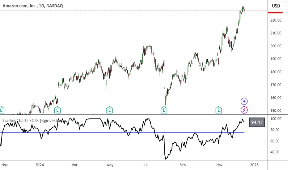
TradingCharts SCTR [Bginvestor]This indicator is replicating Tradingcharts, SCTR plot. If you know, you know.
Brief description: The StockCharts Technical Rank (SCTR), conceived by technical analyst John Murphy, emerges as a pivotal tool in evaluating a stock’s technical prowess. This numerical system, colloquially known as “scooter,” gauges a stock’s strength within various groups, employing six key technical indicators across different time frames.
How to use it:
Long-term indicators (30% weight each)
-Percent above/below the 200-day exponential moving average (EMA)
-125-day rate-of-change (ROC)
Medium-term indicators (15% weight each)
-percent above/below 50-day EMA
-20-day rate-of-change
Short-term indicators (5% weight each)
-Three-day slope of percentage price oscillator histogram divided by three
-Relative strength index
How to use SCTR:
Investors select a specific group for analysis, and the SCTR assigns rankings within that group. A score of 99.99 denotes robust technical performance, while zero signals pronounced underperformance. Traders leverage this data for strategic decision-making, identifying stocks with increasing SCTR for potential buying or spotting weak stocks for potential shorting.
Credit: I've made some modifications, but credit goes to GodziBear for back engineering the averaging / scaling of the equations.
Note: Not a perfect match to TradingCharts, but very, very close.
Statistics
Sector Relative Strength [Afnan]This indicator calculates and displays the relative strength (RS) of multiple sectors against a chosen benchmark. It allows you to quickly compare the performance of various sectors within any global stock market. While the default settings are configured for the Indian stock market , this tool is not limited to it; you can use it for any market by selecting the appropriate benchmark and sector indices.
📊 Key Features ⚙️
Customizable Benchmark: Select any symbol as your benchmark for relative strength calculation. The default benchmark is set to `NSE:CNX100`. This allows for global market analysis by selecting the appropriate benchmark index of any country.
Multiple Sectors: Analyze up to 23 different sector indices. The default settings include major NSE sector indices. This can be customized to any market by using the relevant sector indices of that country.
Individual Sector Control: Toggle the visibility of each sector's RS on the chart.
Color-Coded Plots: Each sector's RS is plotted with a distinct color for easy identification.
Adjustable Lookback Period: Customize the lookback period for RS calculation.
Interactive Table: A sortable table displays the current RS values for all visible sectors, allowing for quick ranking.
Table Customization: Adjust the table's position, text size, and visibility.
Zero Line: A horizontal line at zero provides a reference point for RS values.
🧭 How to Use 🗺️
Add the indicator to your TradingView chart.
Select your desired benchmark symbol. The default is `NSE:CNX100`. For example, use SPY for the US market, or DAX for the German market.
Adjust the lookback period as needed.
Enable/disable the sector indices you want to analyze. The default includes major NSE sector indices like `NSE:CNXIT`, `NSE:CNXAUTO`, etc.
Customize the table's appearance as needed.
Observe the RS plots and the table to identify sectors with relative strength or weakness.
📝 Note 💡
This indicator is designed for sectorial analysis. You can use it with any market by selecting the appropriate benchmark and sector indices.
The default settings are configured for the Indian stock market with `NSE:CNX100` as the benchmark and major NSE sector indices pre-selected.
The relative strength calculation is based on the price change of the sector index compared to the benchmark over the lookback period.
Positive RS values indicate relative outperformance, while negative values indicate relative underperformance.
👨💻 Developer 🛠️
Afnan Tajuddin

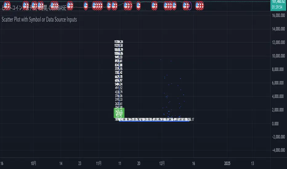
Scatter Plot with Symbol or Data Source InputsDescription of setting items
Use Symbol for X Data?
Type: Checkbox (input.bool)
Explanation: Selects whether the data used for the X axis is obtained from a “symbol” or a “data source”.
If true: data for the X axis will be taken from a symbol (e.g. stock ticker).
If false: X axis data will be taken from the specified data source (e.g., closing price or volume).
Use Symbol for Y Data?
type: checkbox (input.bool)
Explanation: Selects whether the data used for the Y axis is retrieved from a “symbol” or a “data source”.
If true: Y-axis data is obtained from symbols.
If false: Data for the Y axis is obtained from the specified data source.
Select Ticker Symbol for X Data
type: symbol input (input.symbol)
description: selects the symbol to be used for the X axis (default is “AAPL”).
If “Use Symbol for X Data?” is set to true, this symbol will be used as the data for the X axis.
Select Ticker Symbol for Y Data
Type: Symbol input (input.symbol)
description: selects the symbol to be used for the Y axis (default is “GOOG”).
If “Use Symbol for Y Data?” is set to true, this symbol will be used as the data for the Y axis.
X Data Source
type: data source input (input.source)
description: specifies the data source to be used for the X axis.
Default is “close” (closing price).
Other possible values include open, high, low, volume, etc.
Y Data Source
Type: data source input (input.source)
Description: Specifies the data source to be used for the Y axis.
Default is “volume” (volume).
Other possible values include open, high, low, close, etc.
X Offset
type: integer input (input.int)
description: sets the offset value of the X axis.
This shifts the position of the X axis on the grid. The range is from -500 to 500.
Y Offset
Type: Integer input (constant)
description: offset value for y-axis.
Defaults to 0, but can be changed to adjust the Y axis position.
grid_width
type: integer input (input.int)
description: sets the width of the grid.
The default is 200. Increasing the value results in a finer grid.
grid_height
type: integer input (input.int)
description: sets the height of the grid.
Defaults to 200. Increasing the value results in a finer grid.
Frequency of updates
type: integer input (input.int)
description: set frequency of updates.
The higher the frequency of updates, the more bars will be used to calculate minimum and maximum values.
X Tick Interval
type: integer input (input.int)
description: sets the tick interval for the X axis.
The default is 10. To increase the number of ticks, decrease the value.
Y Tick Interval
Box border color
type: select color (input.color)
description: select color for grid box border
Default is blue.
Explanation of usage
To use symbol data: Set Use Symbol for X Data?
When “Use Symbol for X Data?” and “Use Symbol for Y Data?” are set to true, the data of the specified symbol is displayed on each axis. For example, you can use “AAPL” (Apple's stock price data) for the X axis and “GOOG” (Google's stock price data) for the Y axis.
To set the symbol, select the desired ticker in Select Ticker Symbol for X Data and Select Ticker Symbol for Y Data.
To use a data source: select the
You can set Use Symbol for X Data? and Use Symbol for Y Data? to false and use the data source specified in X Data Source or Y Data Source instead (e.g., closing price or volume).
Change Grid Size:.
Set the width and height of the grid with grid_width and grid_height. Larger values allow for more detailed scatter plots.
Set Tick Intervals: Set the X Tick Interval and Y Tick Interval.
Adjust X Tick Interval and Y Tick Interval to change the tick spacing on the X and Y axes.
Data Range Adjustment: Adjust the Frequency of updates to change the frequency of updates.
The Frequency of updates can be changed to control how often the data range is updated. The higher this value, the more historical data is considered and displayed.
Box Color.
Box Border Color allows you to change the color of the box border.
This script is useful for visualizing different symbols and data sources, especially to show the relationship between financial data.
Caution.
Some data may exceed the memory size, but the scale is the same, so you will know most of the locations.
*I made it myself because I could not find anything to draw a scatter plot. You can also compare more than 3 pieces of data by displaying more than one scatter plot. Here is how to do it. Set X or Y as the reference data. Set the data you want to compare to the one that is not the standard. Next, set the same indicator and set the reference to another set of data you wish to compare. Now you can compare the three sets of data. It is effective to change the color of the display box to prevent the user from not knowing which is which. Thus, you should be able to compare more than 3 pieces of data, so give it a try.
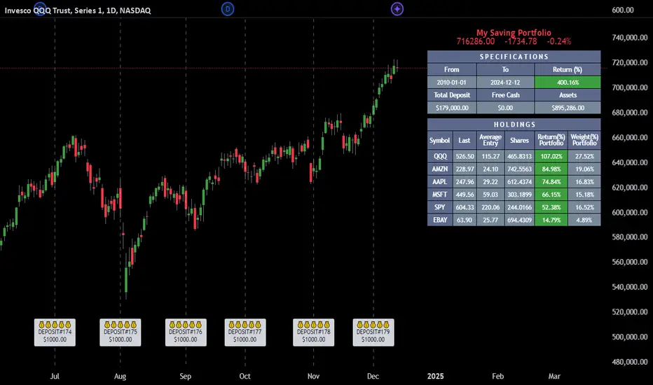
Employee Portfolio Generator [By MUQWISHI]▋ INTRODUCTION :
The “Employee Portfolio Generator” simplifies the process of building a long-term investment portfolio tailored for employees seeking to build wealth through investments rather than traditional bank savings. The tool empowers employees to set up recurring deposits at customizable intervals, enabling to make additional purchases in a list of preferred holdings, with the ability to define the purchasing investment weight for each security. The tool serves as a comprehensive solution for tracking portfolio performance, conducting research, and analyzing specific aspects of portfolio investments. The output includes an index value, a table of holdings, and chart plots, providing a deeper understanding of the portfolio's historical movements.
_______________________
▋ OVERVIEW:
● Scenario (The chart above can be taken as an example) :
Let say, in 2010, a newly employed individual committed to saving $1,000 each month. Rather than relying on a traditional savings account, chose to invest the majority of monthly savings in stable well-established stocks. Allocating 30% of monthly saving to AMEX:SPY and another 30% to NASDAQ:QQQ , recognizing these as reliable options for steady growth. Additionally, there was an admired toward innovative business models of NASDAQ:AAPL , NASDAQ:MSFT , NASDAQ:AMZN , and NASDAQ:EBAY , leading to invest 10% in each of those companies. By the end of 2024, after 15 years, the total monthly deposits amounted to $179,000, which would have been the result of traditional saving alone. However, by sticking into long term invest, the value of the portfolio assets grew, reaching nearly $900,000.
_______________________
▋ OUTPUTS:
The table can be displayed in three formats:
1. Portfolio Index Title: displays the index name at the top, and at the bottom, it shows the index value, along with the chart timeframe, e.g., daily change in points and percentage.
2. Specifications: displays the essential information on portfolio performance, including the investment date range, total deposits, free cash, returns, and assets.
3. Holdings: a list of the holding securities inside a table that contains the ticker, last price, entry price, return percentage of the portfolio's total deposits, and latest weighted percentage of the portfolio. Additionally, a tooltip appears when the user passes the cursor over a ticker's cell, showing brief information about the company, such as the company's name, exchange market, country, sector, and industry.
4. Indication of New Deposit: An indication of a new deposit added to the portfolio for additional purchasing.
5. Chart: The portfolio's historical movements can be visualized in a plot, displayed as a bar chart, candlestick chart, or line chart, depending on the preferred format, as shown below.
_______________________
▋ INDICATOR SETTINGS:
Section(1): Table Settings
(1) Naming the index.
(2) Table location on the chart and cell size.
(3) Sorting Holdings Table. By securities’ {Return(%) Portfolio, Weight(%) Portfolio, or Ticker Alphabetical} order.
(4) Choose the type of index: {Assets, Return, or Return (%)}, and the plot type for the portfolio index: {Candle, Bar, or Line}.
(5) Positive/Negative colors.
(6) Table Colors (Title, Cell, and Text).
(7) To show/hide any of selected indicator’s components.
Section(2): Recurring Deposit Settings
(1) From DateTime of starting the investment.
(2) To DateTime of ending the investment
(3) The amount of recurring deposit into portfolio and currency.
(4) The frequency of recurring deposits into the portfolio {Weekly, 2-Weeks, Monthly, Quarterly, Yearly}
(5) The Depositing Model:
● Fixed: The amount for recurring deposits remains constant throughout the entire investment period.
● Increased %: The recurring deposit amount increases at the selected frequency and percentage throughout the entire investment period.
(5B) If the user selects “ Depositing Model: Increased % ”, specify the growth model (linear or exponential) and define the rate of increase.
Section(3): Portfolio Holdings
(1) Enable a ticker in the investment portfolio.
(2) The selected deposit frequency weight for a ticker. For example, if the monthly deposit is $1,000 and the selected weight for XYZ stock is 30%, $300 will be used to purchase shares of XYZ stock.
(3) Select up to 6 tickers that the investor is interested in for long-term investment.
Please let me know if you have any questions
Calculate Order Entry Units based on set Dollar ValuesFUNCTIONS
- Calculate UNITS quantity based on user's input dollar values.
- Show Units in table
USAGE
- Enter 6 usual order $ values
- Use units value in order entry
Tradingview doesn't have order entry in dollar value for most connections/exchanges so it's really tedious to calculate Units some other way every time.
This gives you the Units based on your most used order value sizes in a quick way.
Possible future updates
- Allow user settings for number of values to display
- Allow user option to set titles for each row
Note:
Tradingview really need to get off their butts and give us a real DOM panel and working dollar value order entry for all exchanges among other order entry panel updates.
I hope everyone is suggesting this to them.

Salience Theory Crypto Returns (AiBitcoinTrend)The Salience Theory Crypto Returns Indicator is a sophisticated tool rooted in behavioral finance, designed to identify trading opportunities in the cryptocurrency market. Based on research by Bordalo et al. (2012) and extended by Cai and Zhao (2022), it leverages salience theory—the tendency of investors, particularly retail traders, to overemphasize standout returns.
In the crypto market, dominated by sentiment-driven retail investors, salience effects are amplified. Attention disproportionately focused on certain cryptocurrencies often leads to temporary price surges, followed by reversals as the market stabilizes. This indicator quantifies these effects using a relative return salience measure, enabling traders to capitalize on price reversals and trends, offering a clear edge in navigating the volatile crypto landscape.
👽 How the Indicator Works
Salience Measure Calculation :
👾 The indicator calculates how much each cryptocurrency's return deviates from the average return of all cryptos over the selected ranking period (e.g., 21 days).
👾 This deviation is the salience measure.
👾 The more a return stands out (salient outcome), the higher the salience measure.
Ranking:
👾 Cryptos are ranked in ascending order based on their salience measures.
👾 Rank 1 (lowest salience) means the crypto is closer to the average return and is more predictable.
👾 Higher ranks indicate greater deviation and unpredictability.
Color Interpretation:
👾 Green: Low salience (closer to average) – Trending or Predictable.
👾 Red/Orange: High salience (far from average) – Overpriced/Unpredictable.
👾 Text Gradient (Teal to Light Blue): Helps visualize potential opportunities for mean reversion trades (i.e., cryptos that may return to equilibrium).
👽 Core Features
Salience Measure Calculation
The indicator calculates the salience measure for each cryptocurrency by evaluating how much its return deviates from the average market return over a user-defined ranking period. This measure helps identify which assets are trending predictably and which are likely to experience a reversal.
Dynamic Ranking System
Cryptocurrencies are dynamically ranked based on their salience measures. The ranking helps differentiate between:
Low Salience Cryptos (Green): These are trending or predictable assets.
High Salience Cryptos (Red): These are overpriced or deviating significantly from the average, signaling potential reversals.
👽 Deep Dive into the Core Mathematics
Salience Theory in Action
Salience theory explains how investors, particularly in the crypto market, tend to prefer assets with standout returns (salient outcomes). This behavior often leads to overpricing of assets with high positive returns and underpricing of those with standout negative returns. The indicator captures these deviations to anticipate mean reversions or trend continuations.
Salience Measure Calculation
// Calculate the average return
avgReturn = array.avg(returns)
// Calculate salience measure for each symbol
salienceMeasures = array.new_float()
for i = 0 to array.size(returns) - 1
ret = array.get(returns, i)
salienceMeasure = math.abs(ret - avgReturn) / (math.abs(ret) + math.abs(avgReturn) + 0.1)
array.push(salienceMeasures, salienceMeasure)
Dynamic Ranking
Cryptos are ranked in ascending order based on their salience measures:
Low Ranks: Cryptos with low salience (predictable, trending).
High Ranks: Cryptos with high salience (unpredictable, likely to revert).
👽 Applications
👾 Trend Identification
Identify cryptocurrencies that are currently trending with low salience measures (green). These assets are likely to continue their current direction, making them good candidates for trend-following strategies.
👾 Mean Reversion Trading
Cryptos with high salience measures (red to light blue) may be poised for a mean reversion. These assets are likely to correct back towards the market average.
👾 Reversal Signals
Anticipate potential reversals by focusing on high-ranked cryptos (red). These assets exhibit significant deviation and are prone to price corrections.
👽 Why It Works in Crypto
The cryptocurrency market is dominated by retail investors prone to sentiment-driven behavior. This leads to exaggerated price movements, making the salience effect a powerful predictor of reversals.
👽 Indicator Settings
👾 Ranking Period : Number of bars used to calculate the average return and salience measure.
Higher Values: Smooth out short-term volatility.
Lower Values: Make the ranking more sensitive to recent price movements.
👾 Number of Quantiles : Divide ranked assets into quantile groups (e.g., quintiles).
Higher Values: More detailed segmentation (deciles, percentiles).
Lower Values: Broader grouping (quintiles, quartiles).
👾 Portfolio Percentage : Percentage of the portfolio allocated to each selected asset.
Enter a percentage (e.g., 20 for 20%), automatically converted to a decimal (e.g., 0.20).
Disclaimer: This information is for entertainment purposes only and does not constitute financial advice. Please consult with a qualified financial advisor before making any investment decisions.

Psychological Levels- Rounding Numbers Psychological Levels Indicator
Overview:
The Psychological Levels Indicator automatically identifies and plots significant price levels based on psychological thresholds, which are key areas where market participants often focus their attention. These levels act as potential support or resistance zones due to human behavioral tendencies to round off numbers. This indicator dynamically adjusts the levels based on the stock's price range and ensures seamless visibility across the chart.
Key Features:
Dynamic Step Sizes:
The indicator adjusts the levels dynamically based on the stock price:
For prices below 500: Levels are spaced at 10.
For prices between 500 and 3000: Levels are spaced at 50, 100, and 1000.
For prices between 3000 and 10,000: Levels are spaced at 100 and 1000.
For prices above 10,000: Levels are spaced at 500 and 1000.
Extended Visibility:
The plotted levels are extended across the entire chart for improved visualization, ensuring traders can easily monitor these critical zones over time.
Customization Options:
Line Color: Choose the color for the levels to suit your charting style.
Line Style: Select from solid, dashed, or dotted lines.
Line Width: Adjust the thickness of the lines for better clarity.
Clean and Efficient Design:
The indicator only plots levels relevant to the visible chart range, avoiding unnecessary clutter and ensuring a clean workspace.
How It Works:
It calculates the relevant step sizes based on the price:
Smaller step sizes for lower-priced stocks.
Larger step sizes for higher-priced stocks.
Primary, secondary, and (if applicable) tertiary levels are plotted dynamically:
Primary Levels: The most granular levels based on the stock price.
Secondary Levels: Higher-order levels for broader significance.
Tertiary Levels: Additional levels for lower-priced stocks to enhance detail.
These levels are plotted across the chart, allowing traders to visualize key psychological areas effortlessly.
Use Cases:
Day Trading: Identify potential intraday support and resistance levels.
Swing Trading: Recognize key price zones where trends may pause or reverse.
Long-Term Investing: Gain insights into significant price zones for entry or exit strategies.
AiTrend Pattern Matrix for kNN Forecasting (AiBitcoinTrend)The AiTrend Pattern Matrix for kNN Forecasting (AiBitcoinTrend) is a cutting-edge indicator that combines advanced mathematical modeling, AI-driven analytics, and segment-based pattern recognition to forecast price movements with precision. This tool is designed to provide traders with deep insights into market dynamics by leveraging multivariate pattern detection and sophisticated predictive algorithms.
👽 Core Features
Segment-Based Pattern Recognition
At its heart, the indicator divides price data into discrete segments, capturing key elements like candle bodies, high-low ranges, and wicks. These segments are normalized using ATR-based volatility adjustments to ensure robustness across varying market conditions.
AI-Powered k-Nearest Neighbors (kNN) Prediction
The predictive engine uses the kNN algorithm to identify the closest historical patterns in a multivariate dictionary. By calculating the distance between current and historical segments, the algorithm determines the most likely outcomes, weighting predictions based on either proximity (distance) or averages.
Dynamic Dictionary of Historical Patterns
The indicator maintains a rolling dictionary of historical patterns, storing multivariate data for:
Candle body ranges, High-low ranges, Wick highs and lows.
This dynamic approach ensures the model adapts continuously to evolving market conditions.
Volatility-Normalized Forecasting
Using ATR bands, the indicator normalizes patterns, reducing noise and enhancing the reliability of predictions in high-volatility environments.
AI-Driven Trend Detection
The indicator not only predicts price levels but also identifies market regimes by comparing current conditions to historically significant highs, lows, and midpoints. This allows for clear visualizations of trend shifts and momentum changes.
👽 Deep Dive into the Core Mathematics
👾 Segment-Based Multivariate Pattern Analysis
The indicator analyzes price data by dividing each bar into distinct segments, isolating key components such as:
Body Ranges: Differences between the open and close prices.
High-Low Ranges: Capturing the full volatility of a bar.
Wick Extremes: Quantifying deviations beyond the body, both above and below.
Each segment contributes uniquely to the predictive model, ensuring a rich, multidimensional understanding of price action. These segments are stored in a rolling dictionary of patterns, enabling the indicator to reference historical behavior dynamically.
👾 Volatility Normalization Using ATR
To ensure robustness across varying market conditions, the indicator normalizes patterns using Average True Range (ATR). This process scales each component to account for the prevailing market volatility, allowing the algorithm to compare patterns on a level playing field regardless of differing price scales or fluctuations.
👾 k-Nearest Neighbors (kNN) Algorithm
The AI core employs the kNN algorithm, a machine-learning technique that evaluates the similarity between the current pattern and a library of historical patterns.
Euclidean Distance Calculation:
The indicator computes the multivariate distance across four distinct dimensions: body range, high-low range, wick low, and wick high. This ensures a comprehensive and precise comparison between patterns.
Weighting Schemes: The contribution of each pattern to the forecast is either weighted by its proximity (distance) or averaged, based on user settings.
👾 Prediction Horizon and Refinement
The indicator forecasts future price movements (Y_hat) by predicting logarithmic changes in the price and projecting them forward using exponential scaling. This forecast is smoothed using a user-defined EMA filter to reduce noise and enhance actionable clarity.
👽 AI-Driven Pattern Recognition
Dynamic Dictionary of Patterns: The indicator maintains a rolling dictionary of N multivariate patterns, continuously updated to reflect the latest market data. This ensures it adapts seamlessly to changing market conditions.
Nearest Neighbor Matching: At each bar, the algorithm identifies the most similar historical pattern. The prediction is based on the aggregated outcomes of the closest neighbors, providing confidence levels and directional bias.
Multivariate Synthesis: By combining multiple dimensions of price action into a unified prediction, the indicator achieves a level of depth and accuracy unattainable by single-variable models.
Visual Outputs
Forecast Line (Y_hat_line):
A smoothed projection of the expected price trend, based on the weighted contribution of similar historical patterns.
Trend Regime Bands:
Dynamic high, low, and midlines highlight the current market regime, providing actionable insights into momentum and range.
Historical Pattern Matching:
The nearest historical pattern is displayed, allowing traders to visualize similarities
👽 Applications
Trend Identification:
Detect and follow emerging trends early using dynamic trend regime analysis.
Reversal Signals:
Anticipate market reversals with high-confidence predictions based on historically similar scenarios.
Range and Momentum Trading:
Leverage multivariate analysis to understand price ranges and momentum, making it suitable for both breakout and mean-reversion strategies.
Disclaimer: This information is for entertainment purposes only and does not constitute financial advice. Please consult with a qualified financial advisor before making any investment decisions.

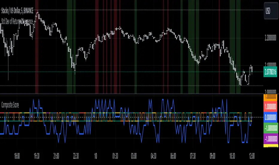
Standard Deviation of Returns: DivergencePurpose:
The "Standard Deviation of Returns: Divergence" indicator is designed to help traders identify potential trend reversals or continuation signals by analyzing divergences between price action and the statistical volatility of returns. Divergences can signal weakening momentum in the prevailing trend, offering insight into potential buying or selling opportunities.
Key Components
1. Returns Calculation:
* The indicator uses logarithmic returns (log(close / close )) to measure relative price changes in a normalized manner.
* Log returns are more effective than simple price differences when analyzing data across varying price levels, as they account for percentage-based changes.
2. Standard Deviation of Returns:
* The script computes the standard deviation of returns over a user-defined lookback period (ta.stdev(returns, lookback)).
* Standard deviation measures the dispersion of returns around their average, effectively quantifying market volatility.
* A higher standard deviation indicates increased volatility, while lower standard deviation reflects a calmer market.
3. Price Action:
* Detects higher highs (new peaks in price) and lower lows (new troughs in price) over the lookback period.
* Price trends are compared to the behavior of the standard deviation.
4. Divergence Detection:
A divergence occurs when price action (higher highs or lower lows) is not confirmed by a corresponding movement in standard deviation:
Bullish Divergence: Price makes a lower low, but the standard deviation does not, signaling potential upward momentum.
Bearish Divergence: Price makes a higher high, but the standard deviation does not, signaling potential downward momentum.
5. Visual Cues:
The script highlights divergence regions directly on the chart:
Green Background: Indicates a bullish divergence (potential buy signal).
Red Background: Indicates a bearish divergence (potential sell signal).
How It Works
Inputs:
* The user specifies the lookback period (lookback) for calculating the standard deviation and detecting divergences.
Calculation:
* Each bar’s returns are computed and used to calculate the standard deviation over the specified lookback period.
* The indicator evaluates price highs/lows and compares these with the highest and lowest values of the standard deviation within the same lookback period.
Highlight of Divergences:
When divergences are detected:
Bullish Divergence: The background of the chart is shaded green.
Bearish Divergence: The background of the chart is shaded red.
Trading Application
Bullish Divergence:
* Occurs when the market is oversold, or downward momentum is weakening.
* Suggests a potential reversal to an uptrend, signaling a buying opportunity.
Bearish Divergence:
* Occurs when the market is overbought, or upward momentum is weakening.
* Suggests a potential reversal to a downtrend, signaling a selling opportunity.
Contextual Use:
* Use this indicator in conjunction with other technical tools like RSI, MACD, or moving averages to confirm signals.
* Effective in volatile or ranging markets to help anticipate shifts in momentum.
Summary
The "Standard Deviation of Returns: Divergence" indicator is a robust tool for spotting divergences that can signal weakening market trends. It combines statistical volatility with price action analysis to highlight key areas of potential reversals. By integrating this tool into your trading strategy, you can gain additional confirmation for entries or exits while keeping a close watch on momentum shifts.
Disclaimer: This is not a financial advise; please consult your financial advisor for personalized advice.
Crypto Sectors Performance [Daveatt]IMPORTANT
⚠️ This script must be used on the Daily timeframe only.
OVERVIEW
This indicator brings the powerful sector analysis capabilities from velo.xyz/market's
Sector Performance chart to TradingView.
It enables traders to track and compare performance across the crypto market's major sectors, providing essential insights for sector rotation strategies and market analysis.
CALCULATION METHOD
The indicator calculates performance across six key crypto sectors: DeFi, Gaming, Layer 1s, Layer 2s, AI, and Memecoins.
For each sector, it computes a rolling percentage performance by averaging the performance of multiple representative tokens.
All sector performances are rebased to 0% at the start of each period, making relative comparisons clear and intuitive.
VISUALIZATION MODES
The script features two distinct visualization methods:
Plots Mode:
Displays continuous performance lines for each sector over time, ideal for tracking relative strength trends and sector momentum. Each sector has its own color-coded line with performance values clearly marked.
Bars Mode:
Presents current sector performance as vertical bars, offering an immediate visual comparison of sector gains and losses.
The bars are color-coded and labeled with exact percentage values for precise analysis.
For the "Bars Mode", I used the box.new() function
SECTOR COMPOSITION
Each sector comprises carefully selected representative tokens:
- DeFi: AAVE, 1INCH, JUP, MKR, UNI
- Gaming: GALA, AXS, RONIN, SAND
- Layer 1: BTC, ETH, AVAX, APT, SOL, BNB, SUI
- Layer 2: ARB, OP, ZK, POL, STRK, MNT
- AI: FET, NEAR, RENDER, TAO
- Memecoins: PEPE, BONK, SHIB, DOGE, WIFU, POPCAT
PERFORMANCE TRACKING
The indicator implements a rolling window approach for performance calculations.
Starting from 0% at the beginning of each period, it tracks relative performance with positive values indicating outperformance and negative values showing underperformance.
Multiple timeframe options (1W, 1M, 3M, 6M, and 1Y) allow for both short-term and long-term analysis.
APPLICATIONS
This tool proves invaluable for:
- Sector rotation analysis
- Identifying trending sectors
- Comparing relative strength
- Gauging market sentiment
- Understanding market structure through sector performance
Thanks for reading and for the support
Daveatt

ATR SL Band (No-Repaint, Multi-Timeframe) + Risk per ContractThis indicator draws a non-repainting band for ATR-based Stoploss placement.
If used on Futures, it shows the distance + risk from the previous candle close, as well as from the current price.
The risk value is automatically calculated for the following symbols:
(Micro) ES (S&P 500)
(Micro) NQ (NASDAQ 100)
(Micro) YM (Dow Jones Industrial Average / US30)
The timeframe can be set individually. It is not recommended to use a lower timeframe than the chart timeframe as values differ from the actual timeframe's ATR SL in this case.

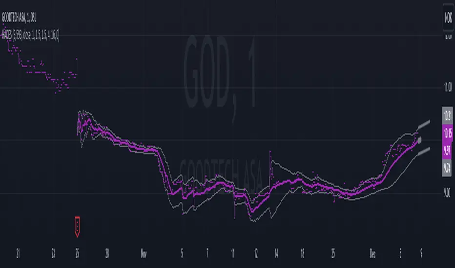
Hybrid Adaptive Double Exponential Smoothing🙏🏻 This is HADES (Hybrid Adaptive Double Exponential Smoothing) : fully data-driven & adaptive exponential smoothing method, that gains all the necessary info directly from data in the most natural way and needs no subjective parameters & no optimizations. It gets applied to data itself -> to fit residuals & one-point forecast errors, all at O(1) algo complexity. I designed it for streaming high-frequency univariate time series data, such as medical sensor readings, orderbook data, tick charts, requests generated by a backend, etc.
The HADES method is:
fit & forecast = a + b * (1 / alpha + T - 1)
T = 0 provides in-sample fit for the current datum, and T + n provides forecast for n datapoints.
y = input time series
a = y, if no previous data exists
b = 0, if no previous data exists
otherwise:
a = alpha * y + (1 - alpha) * a
b = alpha * (a - a ) + (1 - alpha) * b
alpha = 1 / sqrt(len * 4)
len = min(ceil(exp(1 / sig)), available data)
sig = sqrt(Absolute net change in y / Sum of absolute changes in y)
For the start datapoint when both numerator and denominator are zeros, we define 0 / 0 = 1
...
The same set of operations gets applied to the data first, then to resulting fit absolute residuals to build prediction interval, and finally to absolute forecasting errors (from one-point ahead forecast) to build forecasting interval:
prediction interval = data fit +- resoduals fit * k
forecasting interval = data opf +- errors fit * k
where k = multiplier regulating intervals width, and opf = one-point forecasts calculated at each time t
...
How-to:
0) Apply to your data where it makes sense, eg. tick data;
1) Use power transform to compensate for multiplicative behavior in case it's there;
2) If you have complete data or only the data you need, like the full history of adjusted close prices: go to the next step; otherwise, guided by your goal & analysis, adjust the 'start index' setting so the calculations will start from this point;
3) Use prediction interval to detect significant deviations from the process core & make decisions according to your strategy;
4) Use one-point forecast for nowcasting;
5) Use forecasting intervals to ~ understand where the next datapoints will emerge, given the data-generating process will stay the same & lack structural breaks.
I advise k = 1 or 1.5 or 4 depending on your goal, but 1 is the most natural one.
...
Why exponential smoothing at all? Why the double one? Why adaptive? Why not Holt's method?
1) It's O(1) algo complexity & recursive nature allows it to be applied in an online fashion to high-frequency streaming data; otherwise, it makes more sense to use other methods;
2) Double exponential smoothing ensures we are taking trends into account; also, in order to model more complex time series patterns such as seasonality, we need detrended data, and this method can be used to do it;
3) The goal of adaptivity is to eliminate the window size question, in cases where it doesn't make sense to use cumulative moving typical value;
4) Holt's method creates a certain interaction between level and trend components, so its results lack symmetry and similarity with other non-recursive methods such as quantile regression or linear regression. Instead, I decided to base my work on the original double exponential smoothing method published by Rob Brown in 1956, here's the original source , it's really hard to find it online. This cool dude is considered the one who've dropped exponential smoothing to open access for the first time🤘🏻
R&D; log & explanations
If you wanna read this, you gotta know, you're taking a great responsability for this long journey, and it gonna be one hell of a trip hehe
Machine learning, apprentissage automatique, машинное обучение, digital signal processing, statistical learning, data mining, deep learning, etc., etc., etc.: all these are just artificial categories created by the local population of this wonderful world, but what really separates entities globally in the Universe is solution complexity / algorithmic complexity.
In order to get the game a lil better, it's gonna be useful to read the HTES script description first. Secondly, let me guide you through the whole R&D; process.
To discover (not to invent) the fundamental universal principle of what exponential smoothing really IS, it required the review of the whole concept, understanding that many things don't add up and don't make much sense in currently available mainstream info, and building it all from the beginning while avoiding these very basic logical & implementation flaws.
Given a complete time t, and yet, always growing time series population that can't be logically separated into subpopulations, the very first question is, 'What amount of data do we need to utilize at time t?'. Two answers: 1 and all. You can't really gain much info from 1 datum, so go for the second answer: we need the whole dataset.
So, given the sequential & incremental nature of time series, the very first and basic thing we can do on the whole dataset is to calculate a cumulative , such as cumulative moving mean or cumulative moving median.
Now we need to extend this logic to exponential smoothing, which doesn't use dataset length info directly, but all cool it can be done via a formula that quantifies the relationship between alpha (smoothing parameter) and length. The popular formulas used in mainstream are:
alpha = 1 / length
alpha = 2 / (length + 1)
The funny part starts when you realize that Cumulative Exponential Moving Averages with these 2 alpha formulas Exactly match Cumulative Moving Average and Cumulative (Linearly) Weighted Moving Average, and the same logic goes on:
alpha = 3 / (length + 1.5) , matches Cumulative Weighted Moving Average with quadratic weights, and
alpha = 4 / (length + 2) , matches Cumulative Weighted Moving Average with cubic weghts, and so on...
It all just cries in your shoulder that we need to discover another, native length->alpha formula that leverages the recursive nature of exponential smoothing, because otherwise, it doesn't make sense to use it at all, since the usual CMA and CMWA can be computed incrementally at O(1) algo complexity just as exponential smoothing.
From now on I will not mention 'cumulative' or 'linearly weighted / weighted' anymore, it's gonna be implied all the time unless stated otherwise.
What we can do is to approach the thing logically and model the response with a little help from synthetic data, a sine wave would suffice. Then we can think of relationships: Based on algo complexity from lower to higher, we have this sequence: exponential smoothing @ O(1) -> parametric statistics (mean) @ O(n) -> non-parametric statistics (50th percentile / median) @ O(n log n). Based on Initial response from slow to fast: mean -> median Based on convergence with the real expected value from slow to fast: mean (infinitely approaches it) -> median (gets it quite fast).
Based on these inputs, we need to discover such a length->alpha formula so the resulting fit will have the slowest initial response out of all 3, and have the slowest convergence with expected value out of all 3. In order to do it, we need to have some non-linear transformer in our formula (like a square root) and a couple of factors to modify the response the way we need. I ended up with this formula to meet all our requirements:
alpha = sqrt(1 / length * 2) / 2
which simplifies to:
alpha = 1 / sqrt(len * 8)
^^ as you can see on the screenshot; where the red line is median, the blue line is the mean, and the purple line is exponential smoothing with the formulas you've just seen, we've met all the requirements.
Now we just have to do the same procedure to discover the length->alpha formula but for double exponential smoothing, which models trends as well, not just level as in single exponential smoothing. For this comparison, we need to use linear regression and quantile regression instead of the mean and median.
Quantile regression requires a non-closed form solution to be solved that you can't really implement in Pine Script, but that's ok, so I made the tests using Python & sklearn:
paste.pics
^^ on this screenshot, you can see the same relationship as on the previous screenshot, but now between the responses of quantile regression & linear regression.
I followed the same logic as before for designing alpha for double exponential smoothing (also considered the initial overshoots, but that's a little detail), and ended up with this formula:
alpha = sqrt(1 / length) / 2
which simplifies to:
alpha = 1 / sqrt(len * 4)
Btw, given the pattern you see in the resulting formulas for single and double exponential smoothing, if you ever want to do triple (not Holt & Winters) exponential smoothing, you'll need len * 2 , and just len * 1 for quadruple exponential smoothing. I hope that based on this sequence, you see the hint that Maybe 4 rounds is enough.
Now since we've dealt with the length->alpha formula, we can deal with the adaptivity part.
Logically, it doesn't make sense to use a slower-than-O(1) method to generate input for an O(1) method, so it must be something universal and minimalistic: something that will help us measure consistency in our data, yet something far away from statistics and close enough to topology.
There's one perfect entity that can help us, this is fractal efficiency. The way I define fractal efficiency can be checked at the very beginning of the post, what matters is that I add a square root to the formula that is not typically added.
As explained in the description of my metric QSFS , one of the reasons for SQRT-transformed values of fractal efficiency applied in moving window mode is because they start to closely resemble normal distribution, yet with support of (0, 1). Data with this interesting property (normally distributed yet with finite support) can be modeled with the beta distribution.
Another reason is, in infinitely expanding window mode, fractal efficiency of every time series that exhibits randomness tends to infinitely approach zero, sqrt-transform kind of partially neutralizes this effect.
Yet another reason is, the square root might better reflect the dimensional inefficiency or degree of fractal complexity, since it could balance the influence of extreme deviations from the net paths.
And finally, fractals exhibit power-law scaling -> measures like length, area, or volume scale in a non-linear way. Adding a square root acknowledges this intrinsic property, while connecting our metric with the nature of fractals.
---
I suspect that, given analogies and connections with other topics in geometry, topology, fractals and most importantly positive test results of the metric, it might be that the sqrt transform is the fundamental part of fractal efficiency that should be applied by default.
Now the last part of the ballet is to convert our fractal efficiency to length value. The part about inverse proportionality is obvious: high fractal efficiency aka high consistency -> lower window size, to utilize only the last data that contain brand new information that seems to be highly reliable since we have consistency in the first place.
The non-obvious part is now we need to neutralize the side effect created by previous sqrt transform: our length values are too low, and exponentiation is the perfect candidate to fix it since translating fractal efficiency into window sizes requires something non-linear to reflect the fractal dynamics. More importantly, using exp() was the last piece that let the metric shine, any other transformations & formulas alike I've tried always had some weird results on certain data.
That exp() in the len formula was the last piece that made it all work both on synthetic and on real data.
^^ a standalone script calculating optimal dynamic window size
Omg, THAT took time to write. Comment and/or text me if you need
...
"Versace Pip-Boy, I'm a young gun coming up with no bankroll" 👻
∞
Historical High/Lows Statistical Analysis(More Timeframe interval options coming in the future)
Indicator Description
The Hourly and Weekly High/Low (H/L) Analysis indicator provides a powerful tool for tracking the most frequent high and low points during different periods, specifically on an hourly basis and a weekly basis, broken down by the days of the week (DOTW). This indicator is particularly useful for traders seeking to understand historical behavior and patterns of high/low occurrences across both hourly intervals and weekly days, helping them make more informed decisions based on historical data.
With its customizable options, this indicator is versatile and applicable to a variety of trading strategies, ranging from intraday to swing trading. It is designed to meet the needs of both novice and experienced traders.
Key Features
Hourly High/Low Analysis:
Tracks and displays the frequency of hourly high and low occurrences across a user-defined date range.
Enables traders to identify which hours of the day are historically more likely to set highs or lows, offering valuable insights into intraday price action.
Customizable options for:
Hourly session start and end times.
22-hour session support for futures traders.
Hourly label formatting (e.g., 12-hour or 24-hour format).
Table position, size, and design flexibility.
Weekly High/Low Analysis by Day of the Week (DOTW):
Captures weekly high and low occurrences for each day of the week.
Allows traders to evaluate which days are most likely to produce highs or lows during the week, providing insights into weekly price movement tendencies.
Displays the aggregated counts of highs and lows for each day in a clean, customizable table format.
Options for hiding specific days (e.g., weekends) and customizing table appearance.
User-Friendly Table Display:
Both hourly and weekly data are displayed in separate tables, ensuring clarity and non-interference.
Tables can be positioned on the chart according to user preferences and are designed to be visually appealing yet highly informative.
Customizable Date Range:
Users can specify a start and end date for the analysis, allowing them to focus on specific periods of interest.
Possible Uses
Intraday Traders (Hourly Analysis):
Analyze hourly price action to determine which hours are more likely to produce highs or lows.
Identify intraday trading opportunities during statistically significant time intervals.
Use hourly insights to time entries and exits more effectively.
Swing Traders (Weekly DOTW Analysis):
Evaluate weekly price patterns by identifying which days of the week are more likely to set highs or lows.
Plan trades around days that historically exhibit strong movements or price reversals.
Futures and Forex Traders:
Use the 22-hour session feature to exclude the CME break or other session-specific gaps from analysis.
Combine hourly and DOTW insights to optimize strategies for continuous markets.
Data-Driven Trading Strategies:
Use historical high/low data to test and refine trading strategies.
Quantify market tendencies and evaluate whether observed patterns align with your strategy's assumptions.
How the Indicator Works
Hourly H/L Analysis:
The indicator calculates the highest and lowest prices for each hour in the specified date range.
Each hourly high and low occurrence is recorded and aggregated into a table, with counts displayed for all 24 hours.
Users can toggle the visibility of empty cells (hours with no high/low occurrences) and adjust the table's design to suit their preferences.
Supports both 12-hour (AM/PM) and 24-hour formats.
Weekly H/L DOTW Analysis:
The indicator tracks the highest and lowest prices for each day of the week during the user-specified date range.
Highs and lows are identified for the entire week, and the specific days when they occur are recorded.
Counts for each day are aggregated and displayed in a table, with a "Totals" column summarizing the overall occurrences.
The analysis resets weekly, ensuring accurate tracking of high/low days.
Code Breakdown:
Data Aggregation:
The script uses arrays to store counts of high/low occurrences for both hourly and weekly intervals.
Daily data is fetched using the request.security() function, ensuring consistent results regardless of the chart's timeframe.
Weekly Reset Mechanism:
Weekly high/low values are reset at the start of a new week (Monday) to ensure accurate weekly tracking.
A processing flag ensures that weekly data is counted only once at the end of the week (Sunday).
Table Visualization:
Tables are created using the table.new() function, with customizable styles and positions.
Header rows, data rows, and totals are dynamically populated based on the aggregated data.
User Inputs:
Customization options include text colors, background colors, table positioning, label formatting, and date ranges.
Code Explanation
The script is structured into two main sections:
Hourly H/L Analysis:
This section captures and aggregates high/low occurrences for each hour of the day.
The logic is session-aware, allowing users to define custom session times (e.g., 22-hour futures sessions).
Data is displayed in a clean table format with hourly labels.
Weekly H/L DOTW Analysis:
This section tracks weekly highs and lows by day of the week.
Highs and lows are identified for each week, and counts are updated only once per week to prevent duplication.
A user-friendly table displays the counts for each day of the week, along with totals.
Both sections are completely independent of each other to avoid interference. This ensures that enabling or disabling one section does not impact the functionality of the other.
Customization Options
For Hourly Analysis:
Toggle hourly table visibility.
Choose session start and end times.
Select hourly label format (12-hour or 24-hour).
Customize table appearance (colors, position, text size).
For Weekly DOTW Analysis:
Toggle DOTW table visibility.
Choose which days to include (e.g., hide weekends).
Customize table appearance (colors, position, text size).
Select values format (percentages or occurrences).
Conclusion
The Hourly and Weekly H/L Analysis indicator is a versatile tool designed to empower traders with data-driven insights into intraday and weekly market tendencies. Its highly customizable design ensures compatibility with various trading styles and instruments, making it an essential addition to any trader's toolkit.
With its focus on accuracy, clarity, and customization, this indicator adheres to TradingView's guidelines, ensuring a robust and valuable user experience.

CauchyTrend [InvestorUnknown]The CauchyTrend is an experimental tool that leverages a Cauchy-weighted moving average combined with a modified Supertrend calculation. This unique approach provides traders with insight into trend direction, while also offering an optional ATR-based range analysis to understand how often the market closes within, above, or below a defined volatility band.
Core Concepts
Cauchy Distribution and Gamma Parameter
The Cauchy distribution is a probability distribution known for its heavy tails and lack of a defined mean or variance. It is characterized by two parameters: a location parameter (x0, often 0 in our usage) and a scale parameter (γ, "gamma").
Gamma (γ): Determines the "width" or scale of the distribution. Smaller gamma values produce a distribution more concentrated near the center, giving more weight to recent data points, while larger gamma values spread the weight more evenly across the sample.
In this indicator, gamma influences how much emphasis is placed on values closer to the current price versus those further away in time. This makes the resulting weighted average either more reactive or smoother, depending on gamma’s value.
// Cauchy PDF formula used for weighting:
// f(x; γ) = (1/(π*γ)) *
f_cauchyPDF(offset, gamma) =>
numerator = gamma * gamma
denominator = (offset * offset) + (gamma * gamma)
pdf = (1 / (math.pi * gamma)) * (numerator / denominator)
pdf
A chart showing different Cauchy PDFs with various gamma values, illustrating how gamma affects the weight distribution.
Cauchy-Weighted Moving Average (CWMA)
Using the Cauchy PDF, we calculate normalized weights to create a custom Weighted Moving Average. Each bar in the lookback period receives a weight according to the Cauchy PDF. The result is a Cauchy Weighted Average (cwm_avg) that differs from typical moving averages, potentially offering unique sensitivity to price movements.
// Summation of weighted prices using Cauchy distribution weights
cwm_avg = 0.0
for i = 0 to length - 1
w_norm = array.get(weights, i) / sum_w
cwm_avg += array.get(values, i) * w_norm
Supertrend with a Cauchy Twist
The indicator integrates a modified Supertrend calculation using the cwm_avg as its reference point. The Supertrend logic typically sets upper and lower bands based on volatility (ATR), and flips direction when price crosses these bands.
In this case, the Cauchy-based average replaces the usual baseline, aiming to capture trend direction via a different weighting mechanism.
When price closes above the upper band, the trend is considered bullish; closing below the lower band signals a bearish trend.
ATR Stats Range (Optional)
Beyond the fundamental trend detection, the indicator optionally computes ATR-based stats to understand price distribution relative to a volatility corridor centered on the cwm_avg line:
Volatility Range:
Defined as cwm_avg ± (ATR * atr_mult), this range creates upper and lower bands. Turning on atr_stats computes how often the daily close falls: Within the range, Above the upper ATR boundary, Below the lower ATR boundary, Within the range but above cwm_avg, Within the range but below cwm_avg
These statistics can help traders gauge how the market behaves relative to this volatility envelope and possibly identify if the market tends to revert to the mean or break out more often.
Backtesting and Performance Metrics
The code is integrated with a backtesting library that allows users to assess strategy performance historically:
Equity Curve Calculation: Compares CauchyTrend-based signals against the underlying asset.
Performance Metrics Table: Once enabled, displays key metrics such as mean returns, Sharpe Ratio, Sortino Ratio, and more, comparing the strategy to a simple Buy & Hold approach.
Alerts and Notifications
The indicator provides Alerts for key events:
Long Alert: Triggered when the trend flips bullish.
Short Alert: Triggered when the trend flips bearish.
Customization and Calibration
Important: The default parameters are not optimized for any specific instrument or time frame. Traders should:
Adjust the length and gamma parameters to influence how sharply or broadly the cwm_avg reacts to price changes.
Tune the atr_len and atr_mult for the Supertrend logic to better match the asset’s volatility characteristics.
Experiment with atr_stats on/off to see if that additional volatility distribution information provides helpful insights.
Traders may find certain sets of parameters that align better with their preferred trading style, risk tolerance, or asset volatility profile.
Disclaimer: This indicator is for educational and informational purposes only. Past performance in backtesting does not guarantee future results. Always perform due diligence, and consider consulting a qualified financial advisor before trading.

Scatter PlotThe Price Volume Scatter Plot publication aims to provide intrabar detail as a Scatter Plot .
🔶 USAGE
A dot is drawn at every intrabar close price and its corresponding volume , as can seen in the following example:
Price is placed against the white y-axis, where volume is represented on the orange x-axis.
🔹 More detail
A Scatter Plot can be beneficial because it shows more detail compared with a Volume Profile (seen at the right of the Scatter Plot).
The Scatter Plot is accompanied by a "Line of Best Fit" (linear regression line) to help identify the underlying direction, which can be helpful in interpretation/evaluation.
It can be set as a screener by putting multiple layouts together.
🔹 Easier Interpretation
Instead of analysing the 1-minute chart together with volume, this can be visualised in the Scatter Plot, giving a straightforward and easy-to-interpret image of intrabar volume per price level.
One of the scatter plot's advantages is that volumes at the same price level are added to each other.
A dot on the scatter plot represents the cumulated amount of volume at that particular price level, regardless of whether the price closed one or more times at that price level.
Depending on the setting "Direction" , which sets the direction of the Volume-axis, users can hoover to see the corresponding price/volume.
🔹 Highest Intrabar Volume Values
Users can display up to 5 last maximum intrabar volume values, together with the intrabar timeframe (Res)
🔹 Practical Examples
When we divide the recent bar into three parts, the following can be noticed:
Price spends most of its time in the upper part, with relative medium-low volume, since the intrabar close prices are mostly situated in the upper left quadrant.
Price spends a shorter time in the middle part, with relative medium-low volume.
Price moved rarely below 61800 (the lowest part), but it was associated with high volume. None of the intrabar close prices reached the lowest area, and the price bounced back.
In the following example, the latest weekly candle shows a rejection of the 45.8 - 48.5K area, with the highest volume at the 45.8K level.
The next three successive candles show a declining maximum intrabar volume, after which the price broke through the 45.8K area.
🔹 Visual Options
There are many visual options available.
🔹 Change Direction
The Scatter Plot can be set in 4 different directions.
🔶 NOTES
🔹 Notes
The script uses the maximum available resources to draw the price/volume dots, which are 500 boxes and 500 labels. When the population size exceeds 1000, a warning is provided ( Not all data is shown ); otherwise, only the population size is displayed.
The Scatter Plot ideally needs a chart which contains at least 100 bars. When it contains less, a warning will be shown: bars < 100, not all data is shown
🔹 LTF Settings
When 'Auto' is enabled ( Settings , LTF ), the LTF will be the nearest possible x times smaller TF than the current TF. When 'Premium' is disabled, the minimum TF will always be 1 minute to ensure TradingView plans lower than Premium don't get an error.
Examples with current Daily TF (when Premium is enabled):
500 : 3 minute LTF
1500 (default): 1 minute LTF
5000: 30 seconds LTF (1 minute if Premium is disabled)
🔶 SETTINGS
Direction: Direction of Volume-axis; Left, Right, Up or Down
🔹 LTF
LTF: LTF setting
Auto + multiple: Adjusts the initial set LTF
Premium: Enable when your TradingView plan is Premium or higher
🔹 Character
Character: Style of Price/Volume dot
Fade: Increasing this number fades dots at lower price/volume
Color
🔹 Linear Regression
Toggle (enable/disable), color, linestyle
Center Cross: Toggle, color
🔹 Background Color
Fade: Increasing this number fades the background color near lower values
Volume: Background color that intensifies as the volume value on the volume-axis increases
Price: Background color that intensifies as the price value on the price-axis increases
🔹 Labels
Size: Size of price/volume labels
Volume: Color for volume labels/axis
Price: Color for price labels/axis
Display Population Size: Show the population size + warning if it exceeds 1000
🔹 Dashboard
Location: Location of dashboard
Size: Text size
Display LTF: Display the intrabar Lower Timeframe used
Highest IB volume: Display up to 5 previous highest Intrabar Volume values

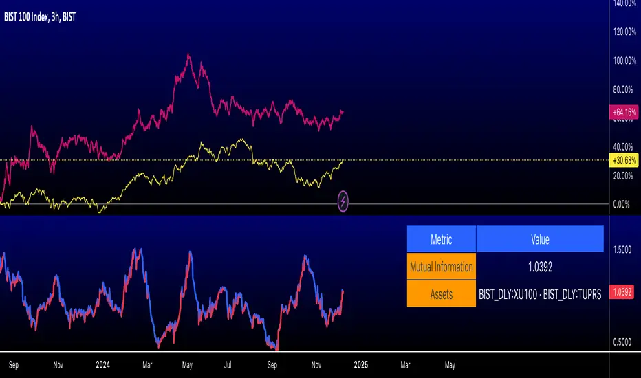
Romantic Information CoefficientThis script calculates the Mutual Information (MI) between the closing prices of two assets over a defined lookback period. Mutual Information is a measure of the shared information between two time-series datasets. A higher MI indicates a stronger relationship between the two assets.
Key Features:
Ticker Inputs: You can select the tickers for two assets. For example, SPY (S&P 500 ETF) and AAPL (Apple stock) can be compared.
Lookback Period: Choose the number of bars to look back and calculate the Mutual Information. A larger lookback period incorporates more data, but may be less responsive to recent price changes.
Bins for Discretization: Control the level of granularity for discretizing the asset prices. More bins result in a more detailed MI calculation but can also reduce the signal-to-noise ratio.
Color Coded MI: The MI plot dynamically changes color to provide visual feedback on whether the relationship between the two assets is strengthening (red) or weakening (blue).
Only for educational purposes. Not in anyway, investment advice.
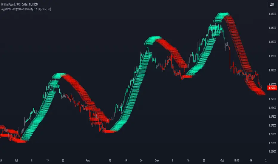
Linear Regression Intensity [AlgoAlpha]Introducing the Linear Regression Intensity indicator by AlgoAlpha, a sophisticated tool designed to measure and visualize the strength of market trends using linear regression analysis. This indicator not only identifies bullish and bearish trends with precision but also quantifies their intensity, providing traders with deeper insights into market dynamics. Whether you’re a novice trader seeking clearer trend signals or an experienced analyst looking for nuanced trend strength indicators, Linear Regression Intensity offers the clarity and detail you need to make informed trading decisions.
Key Features:
📊 Comprehensive Trend Analysis: Utilizes linear regression over customizable periods to assess and quantify trend strength.
🎨 Customizable Appearance: Choose your preferred colors for bullish and bearish trends to align with your trading style.
🔧 Flexible Parameters: Adjust the lookback period, range tolerance, and regression length to tailor the indicator to your specific strategy.
📉 Dynamic Bar Coloring: Instantly visualize trend states with color-coded bars—green for bullish, red for bearish, and gray for neutral.
🏷️ Intensity Labels: Displays dynamic labels that represent the intensity of the current trend, helping you gauge market momentum at a glance.
🔔 Alert Conditions: Set up alerts for strong bullish or bearish trends and trend neutrality to stay ahead of market movements without constant monitoring.
Quick Guide to Using Linear Regression Intensity:
🛠 Add the Indicator: Simply add Linear Regression Intensity to your TradingView chart from your favorites. Customize the settings such as lookback period, range tolerance, and regression length to fit your trading approach.
📈 Market Analysis: Observe the color-coded bars to quickly identify the current trend state. Use the intensity labels to understand the strength behind each trend, allowing for more strategic entry and exit points.
🔔 Set Up Alerts: Enable alerts for when strong bullish or bearish trends are detected or when the trend reaches a neutral zone. This ensures you never miss critical market movements, even when you’re away from the chart.
How It Works:
The Linear Regression Intensity indicator leverages linear regression to calculate the underlying trend of a selected price source over a specified length. By analyzing the consistency of the regression values within a defined lookback period, it determines the trend’s intensity based on a percentage tolerance. The indicator aggregates pairwise comparisons of regression values to assess whether the trend is predominantly upward or downward, assigning a state of bullish, bearish, or neutral accordingly. This state is then visually represented through dynamic bar colors and intensity labels, offering a clear and immediate understanding of market conditions. Additionally, the inclusion of Average True Range (ATR) ensures that the intensity visualization accounts for market volatility, providing a more robust and reliable trend assessment. With customizable settings and alert conditions, Linear Regression Intensity empowers traders to fine-tune their strategies and respond swiftly to evolving market trends.
Elevate your trading strategy with Linear Regression Intensity and gain unparalleled insights into market trends! 🌟📊
IU VaR (Value at Risk) Historical MethodThis Pine Script indicator calculates the **Value at Risk (VaR)** using the **Historical Method** to help traders understand potential losses during a given period( Chart Timeframe) with a specific level of confidence.
What is Value at Risk (VaR) ?
Value at Risk (VaR) is a measure used in finance to estimate the potential loss in value of an asset, portfolio, or investment over a specific time period, given normal market conditions, and at a certain confidence level.
Example:
Suppose you invest ₹1,00,000 in stocks. A VaR of 5% at a 95% confidence level means:
- There is a **95% chance** that you won’t lose more than **₹5,000** in a day.
- Conversely, there is a **5% chance** that your loss could exceed ₹5,000 in a day.
VaR is a helpful tool for understanding risk and making informed investment decisions!
How It Works:
1. The indicator calculates the percentage difference between consecutive bars.
2. The differences are sorted, and the VaR is determined based on the assurance level you specify.
3. A label displays the VaR value on the chart, indicating the potential maximum loss with the selected assurance level within one period eg - ( 1h, 4h , 1D, 1W, 1M etc as per your chart timeframe )
Key Features:
- Customizable Assurance Level:
Set the confidence level (e.g., 95%) to determine the probability of loss.
-Historical Approach:
Uses the past percentage changes in price to calculate the risk.
-Clear Insights:
Displays the calculated VaR value on the chart with an informative tooltip explaining the risk.
Use this tool to better understand your market exposure and manage risk!

ATR HEMA [SeerQuant]What is the ATR Holt Moving Average (HEMA)?
The ATR Holt Moving Average (HEMA) is an advanced smoothing technique that incorporates the Holt exponential smoothing method. Unlike traditional moving averages, HEMA uses two smoothing factors (alpha and gamma) to forecast both the current trend and the trend change rate. This dual-layer approach improves the responsiveness of the moving average to both stable trends and volatile price swings.
When paired with the Average True Range (ATR), the HEMA becomes even more powerful. The ATR acts as a volatility filter, defining a "neutral zone" where minor price fluctuations are ignored. This allows traders to focus on significant market movements while reducing the impact of noise.
⚙️ How the Code Works
The ATR Holt Moving Average (HEMA) combines trend smoothing with volatility filtering to provide traders with dynamic signals. Here's how it functions step by step:
User Inputs and Customization:
Traders can customize the lengths for HEMA's smoothing factors (alphaL and gammaL), the ATR calculation length, and the neutral zone multiplier (atrMult).
The src input allows users to choose the price source for calculations (e.g., hl2), while the col input offers various color themes (Default, Modern, Warm, Cool).
Holt Exponential Moving Average (HEMA) Calculation:
Alpha and Gamma Smoothing Factors:
alpha controls how much weight is given to the current price versus past prices.
gamma smooths the trend change rate, reducing noise. The HEMA formula combines the current price, the previous HEMA value, and a trend adjustment (via the b variable) to create a smooth yet responsive average. The b variable tracks the rate of change in the HEMA over time, further refining the trend detection.
ATR-Based Neutral Zone:
If the change in HEMA (hemaChange) falls within the neutral zone, it is considered insignificant, and the trend color remains unchanged.
Color and Signal Detection:
Bullish Trend: The color is set to bull when HEMA rises above the neutral zone.
Bearish Trend: The color is set to bear when HEMA falls below the neutral zone.
Neutral Zone: The color remains unchanged, signalling no significant trend.
🚀 Summary
This indicator enhances traditional moving averages by combining the Holt smoothing method with ATR-based volatility filtering. The HEMA adapts to market conditions, detecting trends and transitions while filtering out insignificant price changes. The result is a versatile tool for:
The ATR Holt Moving Average (HEMA) is ideal for traders seeking a balance between responsiveness and stability, offering precise signals in both trending and volatile markets.
📜 Disclaimer
The information provided by this script is for educational and informational purposes only and does not constitute financial, investment, or trading advice. Past performance of any trading system or indicator, including this one, is not indicative of future results. Trading and investing in financial markets involve risk, and it is possible to lose your entire investment.
Users are advised to perform their own due diligence and consult with a licensed financial advisor before making any trading or investment decisions. The creator of this script is not responsible for any trading or investment decisions made based on the use of this script.
This script complies with TradingView's guidelines and is provided as-is, without any guarantee of accuracy, reliability, or performance. Use at your own risk.
Levy Flight Relative Strength Index [SeerQuant]Lévy Flight Relative Strength Index
A nuanced improvement on the classic RSI, the Lévy Flight RSI leverages the Lévy Flight model to calculate dynamic weighted gains and losses, offering improved responsiveness and smoothness in trend detection compared to the regular RSI. Ideal for traders seeking a balance between precision and adaptability, the Lévy Flight RSI is packed with customizable features and a sleek, modern aesthetic.
-----------------------------------------------------------------
🧠 What is Lévy Flight Modelling?
Lévy Flight modelling is a concept derived from probability theory and fractal mathematics, widely applied in fields such as finance and physics. In trading, Lévy Flights describe a random walk process characterized by small, frequent movements interspersed with larger, less frequent movements. This behaviour reflects real-world price dynamics, where markets often exhibit periods of relative calm followed by sharp, volatile movements. The Lévy Flight model introduces a weighting mechanism that amplifies extreme price changes while smoothing smaller ones, providing a more nuanced view of market trends.
In the context of the Lévy Flight RSI, this model enhances traditional RSI calculations by dynamically weighting price changes (gains and losses) based on their magnitude. This results in an RSI that is more responsive to significant price movements, making it ideal for detecting shifts in momentum and market direction.
-----------------------------------------------------------------
🌟 Key Features:
- Dynamic Lévy Flight Modelling: Adjust alpha (1 to 2) for responsive or smooth signals, making it perfect for varying market conditions.
- Custom RSI Smoothing: Choose from multiple moving average types, including TEMA, DEMA, HMA, ALMA, and more, to match your trading style.
- Visually Intuitive: Neon-inspired gradient colours and centered histogram provide instant insights into market conditions.
- Customizable Overbought/Oversold Levels: Clearly defined thresholds, with additional shaded regions for strength identification.
-----------------------------------------------------------------
⚙️ How the Code Works
The Lévy Flight RSI enhances the traditional RSI calculation by incorporating two primary elements:
Dynamic Weighting Using Lévy Flight:
The code calculates the price change (change) on each bar and applies a power function (alpha) to these changes. Gains are raised to the power of alpha (for positive price changes), and losses are similarly transformed (for negative price changes).
The parameter alpha (ranging from 1 to 2) determines the sensitivity of the weighting. Lower values emphasize responsiveness, while higher values smooth out signals.
Enhanced Moving Averages:
The weighted gains and losses are smoothed using a customizable moving average. Options include traditional averages like SMA and EMA, and more advanced ones like TEMA, HMA, and ALMA. These smoothed values are used to calculate the final RSI value.
-----------------------------------------------------------------
📈 Why Use Lévy Flight RSI?
This unique RSI indicator captures price momentum with enhanced sensitivity to market dynamics. Whether you’re trend-following, scalping, or identifying reversals, the Lévy Flight RSI provides robust insights to refine your trading decisions.
-----------------------------------------------------------------
🔧 Inputs:
RSI Settings: Control RSI length, calculation source, and smoothing type.
Lévy Flight Settings: Adjust alpha to tune the indicator's responsiveness.
Style Customization: Tailor the appearance with different colour themes and gradients.
-----------------------------------------------------------------

Global Market Strength IndicatorThe Global Market Strength Indicator is a powerful tool for traders and investors. It helps compare the strength of various global markets and indices. This indicator uses the True Strength Index (TSI) to measure market strength.
The indicator retrieves price data for different markets and calculates their TSI values. These values are then plotted on a chart. Each market is represented by a different colored line, making it easy to distinguish between them.
One of the main benefits of this indicator is its comprehensive global view. It covers major indices and country-specific ETFs, giving users a broad perspective on global market trends. This wide coverage allows for easy comparison between different markets and regions.
The indicator is highly customizable. Users can adjust the TSI smoothing period to suit their preferences. They can also toggle the visibility of individual markets. This feature helps reduce chart clutter and allows for more focused analysis.
To use the indicator, apply it to your chart in TradingView. Adjust the settings as needed, and observe the relative positions and movements of the TSI lines. Lines moving higher indicate increasing strength in that market, while lines moving lower suggest weakening markets.
The chart includes reference lines at 0.5 and -0.5. These help identify potential overbought and oversold conditions. Markets with TSI values above 0.5 may be considered strong or potentially overbought. Those below -0.5 may be weak or potentially oversold.
By comparing the movements of different markets, users can identify which markets are leading or lagging. They can also spot potential divergences between related markets. This information can be valuable for identifying sector rotations or shifts in global market sentiment.
A dynamic legend automatically updates to show only the visible markets. This feature improves chart readability and makes it easier to interpret the data.
The Global Market Strength Indicator is a versatile tool that provides valuable insights into global market performance. It helps traders and investors identify trends, compare market performances, and make more informed decisions. Whether you're looking to spot emerging global trends or identify potential trading opportunities, this indicator offers a comprehensive solution for global market analysis.
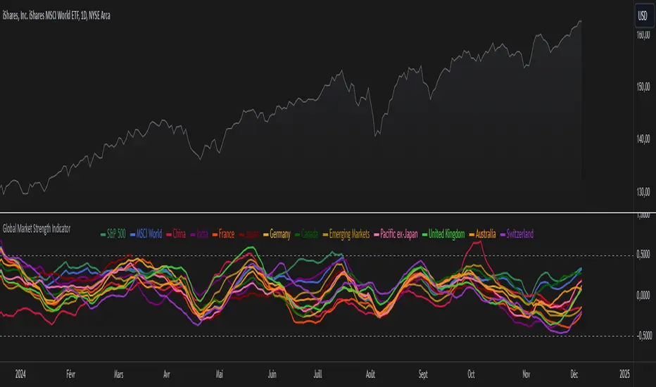
S&P 500 Sector StrengthsThe "S&P 500 Sector Strengths" indicator is a sophisticated tool designed to provide traders and investors with a comprehensive view of the relative performance of various sectors within the S&P 500 index. This indicator utilizes the True Strength Index (TSI) to measure and compare the strength of different sectors, offering valuable insights into market trends and sector rotations.
At its core, the indicator calculates the TSI for each sector using price data obtained through the request.security() function. The TSI, a momentum oscillator, is computed using a user-defined smoothing period, allowing for customization based on individual preferences and trading styles. The resulting TSI values for each sector are then plotted on the chart, creating a visual representation of sector strengths.
To use this indicator effectively, traders should focus on comparing the movements of different sector lines. Sectors with lines moving higher are showing increasing strength, while those with descending lines are exhibiting weakness. This comparative analysis can help identify potential investment opportunities and sector rotations. Additionally, when multiple sector lines move in tandem, it may signal a broader market trend.
The indicator includes dashed lines at 0.5 and -0.5, serving as reference points for overbought and oversold conditions. Sectors with TSI values above 0.5 might be considered overbought, suggesting caution, while those below -0.5 could be viewed as oversold, potentially indicating buying opportunities.
One of the key advantages of this indicator is its flexibility. Users can toggle the visibility of individual sectors and customize their colors, allowing for a tailored analysis experience. This feature is particularly useful when focusing on specific sectors or reducing chart clutter for clearer visualization.
The indicator's ability to provide a comprehensive overview of all major S&P 500 sectors in a single chart is a significant benefit. This consolidated view enables quick comparisons and helps in identifying relative strengths and weaknesses across sectors. Such insights can be invaluable for portfolio allocation decisions and in spotting emerging market trends.
Moreover, the dynamic legend feature enhances the indicator's usability. It automatically updates to display only the visible sectors, improving chart readability and interpretation.
By leveraging this indicator, market participants can gain a deeper understanding of sector dynamics within the S&P 500. This enhanced perspective can lead to more informed decision-making in sector allocation strategies and individual stock selection. The indicator's ability to potentially detect early trends by comparing sector strengths adds another layer of value, allowing users to position themselves ahead of broader market movements.
In conclusion, the "S&P 500 Sector Strengths" indicator is a powerful tool that combines technical analysis with sector comparison. Its user-friendly interface, customizable features, and comprehensive sector coverage make it an valuable asset for traders and investors seeking to navigate the complexities of the S&P 500 market with greater confidence and insight.
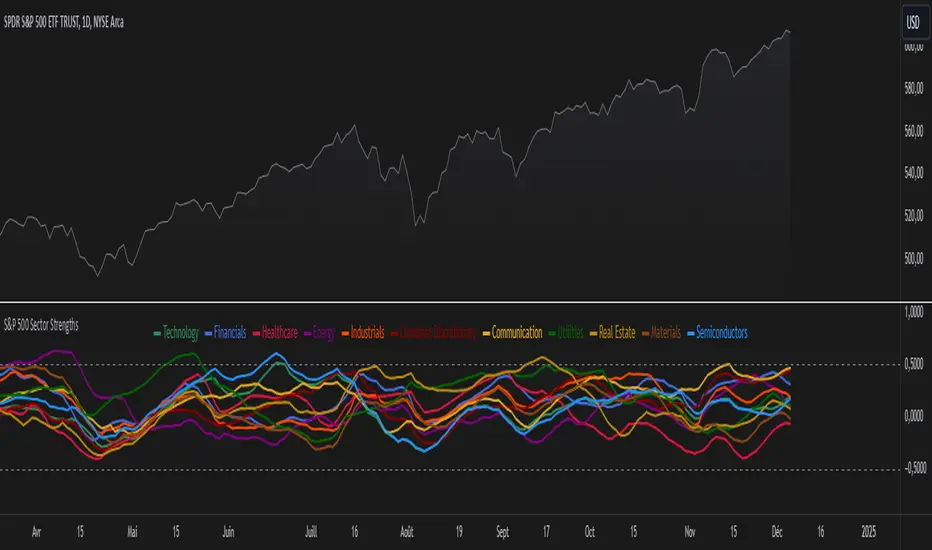
ETF-Benchmark AnalyzerHave you ever wondered which ETF performs the best? Which one is the most volatile, or which one has the smallest drawdown?
This Pine Script™ "ETF-Benchmark Analyzer" compares the performance of an ETF (such as SPY, the S&P 500 ETF) against a benchmark, which can also be adjusted by the user. It provides several key financial metrics, such as:
Performance (%): Displays the total return over a specified lookback period (e.g., 1 year). It compares the performance of the ETF against the benchmark and shows the difference.
Alpha (%): Measures the excess return of the ETF over the expected return, which is calculated using the benchmark’s return. Positive alpha indicates that the ETF has outperformed the benchmark, while negative alpha suggests underperformance. This metric is important because it isolates performance that cannot be explained by exposure to the benchmark's movements.
Sharpe Ratio: A risk-adjusted measure of return. It is calculated by dividing the excess return of the ETF (above the risk-free rate) by its standard deviation (volatility). A higher Sharpe ratio indicates better risk-adjusted returns. The Sharpe ratio is calculated for both the ETF and the benchmark, and their difference is displayed as well.
Drawdown: The percentage decrease from the highest price to the lowest price over the lookback period. This is a critical measure of risk, as it shows the largest potential loss an investor might face during a specific period.
Beta: Measures the ETF’s sensitivity to movements in the benchmark. A beta of 1 means the ETF moves in line with the benchmark; greater than 1 means it is more volatile, while less than 1 means it is less volatile.
These metrics provide a holistic view of the ETF’s performance compared to the benchmark, allowing traders to assess the risk and return profile more effectively.
Scientific Sources
Sharpe Ratio: Sharpe, W. F. (1994). The Sharpe Ratio. Journal of Portfolio Management, 21(1), 49-58. This paper defines and develops the Sharpe ratio as a measure of risk-adjusted return.
Alpha and Beta: Jensen, M. C. (1968). The Performance of Mutual Funds in the Period 1945–1964. The Journal of Finance, 23(2), 389-416. This paper discusses the concepts of alpha and beta in the context of mutual fund performance.
