Trendline365 Delta V2025 (Fixa)The Trendline365 Delta is an advanced structural-reading indicator that combines multiple layers of fixed moving averages, organized by color, to reveal the real dynamics of the trend across different time horizons. It does not attempt to predict the market — instead, it accurately describes how the trend is behaving right now, allowing traders to identify acceleration, weakness, transitions, and decision points that usually go unnoticed.
The indicator is divided into color-coded bands:
Red Series → Represents ultra-short-term momentum. It serves as an immediate thermometer of strength or weakness, ideal for validating early moves and shallow pullbacks.
Yellow Series → Captures the intermediate trend. This zone acts as a powerful filter to avoid rushed entries and highlights deeper corrections within a larger trend.
Green Series → Shows the macro structure of the trend. When price consistently stays above or below this band, a clear primary direction is established.
Blue Series → The classic institutional axis, the most widely used global reference to evaluate bull markets and bear markets.
Long Blue Series → Represents the extreme long-term trend. A “gravitational floor” that only shifts when entire market cycles reverse.
In addition to the moving averages, the indicator includes a 20-period Volume Moving Average, allowing the trader to evaluate the strength behind price movements. The combination of structure (moving averages) and energy (volume) provides a clear reading of continuation, exhaustion, true breakouts, and fake breakouts.
How to use it in practice
Strong trend: price above the red/yellow bands, upward alignment, and sustained volume.
Transition: when price begins crossing from one colored band to another, especially if volume divergence is present.
Healthy corrections: low-volume pullbacks into the red/yellow zones.
Cycle change: breakouts of the green band or the 200-period level with increasing volume.
The Trendline365 Delta simplifies trend analysis and transforms the chart into an intuitive visual map, ideal for swing traders, position traders, and content creators who want to explain the market with clarity and authority.
스크립트에서 "trendline"에 대해 찾기

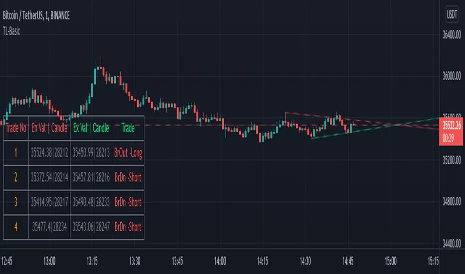
TrendLine ScythesTrendline Scythes is a script designed to automatically detect and draw special curved trendlines, resembling scythes or blades, based on pivotal points in price action. These trendlines adapt to the volatility of the market, providing a unique perspective on trend dynamics.
🔲 Methodology
Traditional trendlines connect consecutive pivot points on a price chart, providing a linear representation of trend direction. However, this script employs a distinctive methodology by automatically detecting price pivots and then calculating special curved trendlines based on the Average True Range (ATR) of the price. This introduces a curvature to the trendlines, resembling scythes, offering a unique way to interpret market trends.
🔲 Auto Breakout and Target Detection
Trendline Scythes includes features for automatic breakout detection, signaling potential trend changes. Additionally, the script assists in target detection, helping traders set realistic and data-driven profit-taking levels based on market volatility and user adjustment.
🔲 Utility
Trend Confirmation - Use Trendline Scythes to confirm existing trends by observing how price interacts with the curved trendlines.
Breakout Signals - Auto-detection of breakouts adds a proactive element to your trading strategy, helping you stay ahead of potential trend reversals.
Target Setting - Utilize the script to set profit-taking targets based on volatility, aligning with the current market conditions.
🔲 Settings
Pivot Length - Swing detection length
Scythe Length - Adjusts the length of the scythes blade
Sensitivity - Controls how restrained the target calculation is, higher values will result in tighter targets.
🔲 Alerts
Breakout
Breakdown
Target Reached
Target Invalidated
As well as the option to trigger 'any alert' call.
Trendline Scythes is a versatile tool combining the benefits of traditional trendlines with the dynamic adaptability of curved lines for a unique approach to trend analysis.

Trendline Breakouts With Volume Strength [TradeDots]Trendline Breakouts With Volume Strength is an innovative indicator designed to identify potential market turning points using pivot-based trendline detection and volume confirmation. By merging dynamic trendline analysis with multi-tiered volume filters, this tool helps traders quickly spot breakouts or breakdowns that may signal significant shifts in price action.
📝 HOW IT WORKS
1. Pivot-Based Trendline Detection
The script automatically scans for recent pivot highs and lows over a user-defined lookback period.
When it finds higher pivot lows, it plots green uptrend lines; when it finds lower pivot highs, it plots red downtrend lines.
These dynamic lines update as new pivots form, providing continuously refreshed trend guidance.
2. Volume Ratio Analysis
A moving average of volume is compared against the current bar’s volume to calculate a ratio (e.g., 1.5×, 2×).
Higher ratios suggest above-average volume, often interpreted as stronger participation.
The script applies color-coded cues to highlight the intensity of volume surges.
3. Breakout & Breakdown Detection
Each trendline is monitored for a defined “break threshold,” which helps avoid minor penetrations that can trigger premature signals.
When price closes beyond a threshold below an uptrend line, the indicator labels it a “BREAKDOWN.” If it closes above a threshold on a downtrend line, it labels it a “BREAKOUT.”
Volume surges accompanying these breaks are highlighted with contextual emojis and distinct color gradients for quick visual reference.
4. Trend Direction Table
A small on-chart table provides a snapshot of the current market trend—Uptrend, Downtrend, or Sideways—based on a simple moving average slope and the number of active uptrend or downtrend lines.
This table also displays quick stats on how many lines are actively tracked, helping traders assess the broader market posture at a glance.
🛠️ HOW TO USE
1. Choose a Timeframe
This script works on multiple timeframes. Intraday traders can monitor minute or hourly charts for frequent pivot updates, while swing and position traders may prefer daily or weekly intervals to reduce noise.
2. Observe Trendlines & Labels
Watch for newly drawn green/red lines connecting pivots.
When you see a “BREAKOUT” or “BREAKDOWN” label, confirm whether volume was abnormally high based on the ratio or color-coded bars.
3. Consult the Trend Table
Use the table in the bottom-right corner to quickly check if the market is trending or range-bound.
Look at the count of active uptrend vs. downtrend lines to gauge broader sentiment.
4. Employ Additional Analysis
Combine these signals with other tools (e.g., candlestick patterns, oscillators, or fundamental analysis).
Validate potential breakouts using standard techniques like retests or support/resistance checks.
❗️LIMITATIONS
Delayed Pivots: Trendlines only adjust once new pivot highs or lows form, which can introduce a slight lag in highly volatile environments.
Choppy Markets: Rapid, back-and-forth price moves may produce conflicting trendline signals and frequent breakouts/breakdowns.
Volume Data Reliability: Gaps in volume data or unusual market conditions (holidays, low-liquidity sessions) can skew ratio readings.
RISK DISCLAIMER
Trading any financial instrument involves substantial risk, and this indicator does not guarantee profits or prevent losses. All signals and visual cues are for educational and informational purposes only; past performance does not assure future outcomes. You retain full responsibility for your trading decisions, including proper risk management, position sizing, and the use of additional confirmation methods. Always consider the possibility of losing some or all of your original investment.

TrendlinesDowntrend lines are one of the most important tools in technical analysis. A downtrend line is created by connecting a series of lower highs which forms a clear visual line where price repeatedly finds resistance. Traders use these lines to understand trend direction, time entries, plan exits, and quickly recognize when momentum is shifting.
This indicator automatically finds and maintains the strongest downtrend lines on any timeframe. It removes the guesswork and inconsistency that comes with manually drawing trendlines.
Unlike most other trendline indicators that just draw lines from swing highs to the current high, this indicator actively scans for new pivot highs, tests each potential line against live price action and only promotes a line to valid status once it has proven itself as a true trendline by price touching or respecting the line a user defined number of times, with the default set to three. This filters out noise and leaves only the most meaningful and reliable trendlines on your chart.
When price eventually breaks a respected downtrend line the indicator highlights the breakout immediately. Traders often use these moments for entries confirmation signals or to prepare for a potential shift in market behavior. The breakout alert is built directly into the indicator so you never miss an important move.
This indicator also works with the Pine Screener to find tickers with current valid trendlines.
How are trendlines determined?
The indicator begins by anchoring to the most recent pivot high. From there it draws a temporary line to the current bar and evaluates every bar between the two points.
Each time a high comes within a user selected buffer zone around that line it is counted as a touch. Once the required number of touches is confirmed and price has never exceeded the buffer to the upside the trendline becomes valid and is displayed on the chart as an active downtrend line.
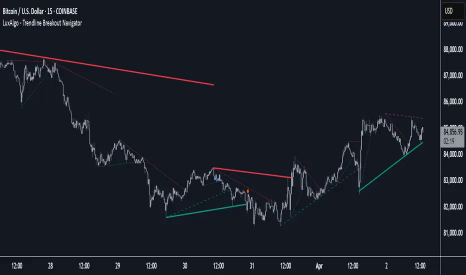
Trendline Breakout Navigator [LuxAlgo]The Trendline Breakout Navigator indicator shows three trendlines, representing trends of different significance between Swing Points.
Dots highlight a Higher Low (HL) or Lower High (LH) that pierces through the Trendline without the closing price breaking the Trendline.
A bar color and background color option is included, which offers insights into the price against the trendlines.
🔶 USAGE
Trendlines (TL) are drawn, starting as a horizontal line from a Swing Point.
When an HL (in the case of a bullish TL) or an LH (bearish TL) is found, this Swing Point is connected to the first Swing Point. In both cases, the TL can be optimized when one or more historical close prices breach the TL (see DETAILS).
A solid-styled long-term trendline represents the overall market direction, while a dashed-styled medium-term trendline captures medium-term movements within the long-term trend. Finally, a dotted-styled short-term trendline tracks short-term fluctuations.
🔹 Swing Points vs. Trend
A "Higher High" (HH) or "Lower Low" (LL) will initialize a new trendline, respectively, starting from the previous "Swing Low" or Swing High".
To spot the trend shift, "HH/LL" labels and an optional background color are included. They can be enabled/disabled or set at "Long, Medium, or Short" term TL (Settings—"MS", "HH/LL" and "Background Color").
These features are linked to one Trendline of choice only.
Where the "HH/LL" labels can show a potential trend shift, the background color is:
Green from the moment the close price breaks above a bearish trendline or when an HH occurs
Red from the moment the close price breaks below a bullish trendline or when an LL occurs
🔹 Bar Color
The bar color will depend on the location of the closing price against the three trendlines. When a trendline is unavailable (for example, if the close price breaks the TL and there is no HH/LL), the last known trendline value will be considered.
All three trendlines influence the bar color.
If the close price is above the "Long Term" TL, the bar color will show a gradient of green, darker when the close price is below the "Medium Term" and/or "Short Term" TLs.
On the other hand, when the close price is below the "Long Term" TL, the bar color will show a gradient of red, which becomes darker when the close price is above the "Medium Term" and/or "Short Term" TLs.
To keep the above example simple, only the "Long Term" TL is considered. The white line (not included in the script) resembles the actual value of the TL at each bar, where you can see the effect on the bar color.
Combined with the trendlines and dots, the bar color can provide extra depth and insights into the underlying trends.
🔹 Tested Trendlines
If a new HL/LH pierces the Trendline without the close price breaking the Trendline, the Trendline will be updated.
The exact location where the price exceeded the Trendline is visualized by a dot, colored blue on a bullish trendline and orange when bearish.
These dots can be indicative of a potential trend continuation or reversal.
🔹 Higher TimeFrame Option
The "Period" setting enables users to visualize higher-timeframe trendlines as long as the line length doesn't exceed 5000 bars.
🔶 DETAILS
When a new trendline is drawn, the script first draws a preliminary line and then checks whether a historical close price exceeded this line above (in the case of a bearish TL) or below (in a bullish case).
Subsequently, the most valid point in between is chosen as the starting point of the Trendline.
🔶 SETTINGS
Period: Choose "chart" for trendlines from the current chart timeframe, or choose a higher timeframe
🔹 Swing Length
Toggle and Swing Length for three trendlines: Period used for the swing detection, with higher values returning longer-term Swing Levels.
🔹 Style
Trendline: color for bullish/bearish Trendline
Wick Dot: color for bullish/bearish trendline test
Term: Long-, medium- or short-term
HH/LL: Show HH/LL labels (with or without previous Swing High/Low) of chosen Term
Background Color: Green when the closing price is above the trendline of choice, red otherwise
Bar Color
TrendLines MTF [Cometreon]TrendLines MTF is a next-generation indicator designed to automatically detect and plot all relevant trendlines across any symbol and timeframe—including higher ones. Using advanced algorithms, it constantly scans price action and updates the chart in real-time, offering a fast, precise, and dynamic view of market structure.
This tool streamlines market analysis and boosts decision-making by eliminating the need for manual trendline drawing.
🔷 Key Features
🟩 Automatic Plotting
The indicator automatically draws and updates trendlines, providing a real-time overview of market trends.
🟩 Breakout and Bounce Signaling
Provides immediate notifications when a trendline is broken or the price bounces off it, allowing traders to react promptly to market changes.
🟩 Customization
Offers the ability to modify length, touches, colors, and line style to suit individual preferences.
🟩 Information Table
Includes a detailed table showing the values of all active trendlines, facilitating the monitoring of key market points.
🟩 Configurable Alerts
Allows setting custom alerts for breakouts, bounces, or creation of new trendlines.
🔷 Technical Details and Customizable Inputs
Trendline offers a range of customizable inputs that allow adapting the indicator to specific needs:
1️⃣ Trendline Type - Select between active trendlines, broken ones, both, or none.
2️⃣ Left and Right Length - Defines the extension of maximum and minimum points to identify Trendlines.
3️⃣ Timeframe - You can also modify the timeframe of Trendlines to display a higher timeframe.
4️⃣ Confirm at Timeframe - Allows you to confirm the Trendlines using the chart's timeframe instead of the selected one. This checks whether a candle has already broken the line previously.
5️⃣ Delete at Timeframe - Input to remove trendlines based on breakouts with chart candles, instead of using candles of a higher timeframe.
6️⃣ Touch Need - Sets the number of touches needed to confirm a Trendline.
7️⃣ Max Trend Line for Level - Limits the maximum number of Trendlines in a single level.
8️⃣ Extended Line After Break - Option to extend broken Trendlines by a specific value.
9️⃣ Session Range - The "Session Range" offers two options: select a specific date or a period relative to the last candle. The input allows choosing between "Choose" and "Pick Up".
With "Choose", you select a relative period, with two modes:
Last : shows the trendlines of the selected period, compatible with Replay.
Real Time : displays all TrendLines, searching from the last selected period.
Example: "1 Month" with "Last" shows the TrendLines from the previous month, while "Real Time" searches without time limits but uses the values from the last month. This allows defining the search depth of the indicator, crucial for computing power. In case of issues, use "Auto".
1️⃣0️⃣ Trendlines Style - Modify the style for each type of Trendlines (Valid, Break) including color, style, and line thickness.
1️⃣1️⃣ Trends Trendlines - Enable/disable two different trends:
Trend Bar Color : based on TrendLines breakouts. Breaking a bearish TrendLine results in a bullish trend, vice versa for breaking a bullish TrendLine.
Trend Background : based on the number of active TrendLines. For example, if the number of bullish TrendLines is greater than the "Strength", the trend will be bullish.
1️⃣2️⃣ Signal Style - You can enable or disable breakout and bounce signals, with customizable colors for each signal type.
1️⃣3️⃣ Alert - Set notifications for breakouts, bounces, or formation of new Trendlines.
1️⃣4️⃣ Table - Customize the table showing the values of all active trendlines, facilitating the monitoring of key market points. You can modify the appearance of the table, changing the color of cells and text.
These options allow you to optimize the indicator for different trading styles and market conditions, ensuring precise and personalized technical analysis.
🔍 How to Use Trendlines MTF
📌 Market Analysis
Use the displayed Trendlines as critical indicators of market dynamics to make informed trading decisions.
📈 Signal Interpretation
Leverage Trendline breakouts and bounces to identify potential trend changes and trading opportunities.
🛠 Strategy Integration
Use Trendlines and generated signals as a basis for creating personalized and innovative trading strategies.
☄️ With Trendlines, you can simplify your market analysis, saving time and improving the accuracy of your decisions with clearly visualized and customizable Trendlines.
Don't waste any more time and visit the link to get access to all Cometreon indicators.

Trendline and SR System [BullByte]TRENDLINE AND SR SYSTEM
From Manual Drawing to Intelligent Automation
═════════════════════════════════════════════════════════════
OVERVIEW
This indicator automates years of manual chart work: detecting trendlines, forming support/resistance zones, tracking zone lifecycles, and scoring touches by quality. Instead of counting touches equally, the system weights them by precision, reaction type and volume so a high-volume wick rejection gets more influence than a low-volume consolidation.
The core philosophy is simple: not all touches are equal. A wick rejection at high volume carries more weight than a body consolidation at low volume. A zone that held three times deserves more attention than one that just formed. This indicator captures that nuanced approach through a quality-weighted touch scoring system.
═════════════════════════════════════════════════════════════
THE PROBLEM THIS SOLVES
Manual technical analysis presents several challenges:
1. Time Consumption - Drawing and updating trendlines across multiple assets and timeframes is labor-intensive
2. Subjectivity - Two traders often draw different lines on the same chart
3. Inconsistency - Fatigue leads to missed levels or inconsistent criteria
4. Delayed Updates - Manually tracking when zones break, get retested, or flip takes constant attention
This system addresses each challenge by applying consistent mathematical criteria to every potential level, updating in real-time, and tracking zone lifecycle automatically.
═════════════════════════════════════════════════════════════
HOW IT WORKS
--- TRENDLINE DETECTION ---
The system identifies trendlines through a multi-step process:
Step 1: Pivot Detection
The indicator scans for significant swing highs and swing lows using a sensitivity parameter that automatically scales based on your chart timeframe. Shorter timeframes use faster detection, while daily charts use slower, more significant pivots.
Step 2: Line Validation
For each pair of pivots, the system calculates:
- Slope direction (upward for bullish, downward for bearish)
- Current relevance (is the projected line near current price?)
- Minimum touch requirements
Step 3: Touch Quality Scoring
This is where the system differs from simple trendline indicators. Each touch is scored based on:
Precision: How close did price get to the line? A touch at the exact line scores 1.0, while a touch at the edge of tolerance scores lower.
Reaction Type: The system classifies touches into categories:
* Wick Rejection (1.0) - Wick touched but body stayed outside
* Body Rejection (0.8) - Body touched but closed with reaction
* False Break (1.2) - Price broke through then recovered (strongest signal)
* Consolidation (0.5) - Price lingered without clear rejection
Volume Weight: When volume integration is enabled, high-volume touches receive a boost (up to 1.5x), while low-volume touches are discounted (down to 0.5x).
Step 4: Display Filtering
Only trendlines meeting minimum touch count AND minimum average precision are displayed. This eliminates weak, coincidental alignments.
--- SUPPORT AND RESISTANCE ZONES ---
Zones are detected from pivot points and horizontal level clustering:
Pivot-Based Zones:
When a significant pivot forms, a zone is created around that price level. Zone height is calculated as an ATR multiple, automatically scaling with volatility.
Cluster-Based Zones:
The system scans historical bars to find where multiple highs or lows align within tolerance. These horizontal rejection clusters often mark institutional interest levels.
Zone Merging:
When two zones are within a configurable distance, they merge into one stronger zone rather than cluttering the chart.
--- ZONE LIFECYCLE MANAGEMENT ---
This is the core innovation. Zones progress through states:
ACTIVE: Newly formed zone, not yet validated
TESTED: Zone has received 3+ quality touches, proving its relevance
BROKEN: Price closed through the zone
RETESTED: Price returned to test the broken zone
FLIPPED: Former support now acts as resistance (or vice versa)
Each state is visually distinct:
- Active zones show in standard support/resistance colors
- Tested zones show in blue with thicker borders
- Broken zones fade to gray
- Retested zones show in orange
- Flipped zones show in purple
Zone Decay:
Zones that price ignores gradually lose strength. The decay rate is configurable (default 0.997 per bar). This means a zone loses roughly half its strength after 230 bars of no interaction. This prevents old, irrelevant levels from cluttering your chart.
Zone Reactivation:
If price returns to a decayed zone, it receives a strength boost, recognizing that the level remains relevant.
═════════════════════════════════════════════════════════════
READING THE VISUAL ELEMENTS
--- TRENDLINES ---
Label Format:
Examples :
- B3 = Bullish trendline with 3 touches (active)
- B5x = Bullish trendline with 5 touches (broken)
- R4 = Bearish/Resistance trendline with 4 touches (active)
Line Thickness:
- Thin lines = 2-3 touches
- Thick lines = 4+ touches (higher significance)
Line Style:
- Solid = Active trendline
- Dotted = Broken trendline
--- ZONES ---
Label Format :
Examples :
- S2 = Support zone with 2 touches (active)
- S4+ = Support zone with 4 touches (tested/validated)
- R3x = Resistance zone with 3 touches (broken)
- S5r = Support zone retested after break
- R4f = Resistance zone that flipped to support
Border Thickness:
- Thin border = Standard zone
- Thick border = Validated zone (3+ touches or high volume)
Zone Colors by State:
- Teal/Green shades = Support zones
- Red shades = Resistance zones
- Blue = Tested/validated zones
- Gray = Broken zones
- Orange = Retested zones
- Purple = Flipped zones
--- DAILY AND WEEKLY LEVELS ---
PDH = Previous Day High
PDL = Previous Day Low
PWH = Previous Week High
PWL = Previous Week Low
HTF R = Higher Timeframe Resistance
HTF S = Higher Timeframe Support
These levels use dashed lines by default and extend from the period open.
--- BREAKOUT MARKERS ---
When a trendline breaks, the system places a "BRK" label at the breakout point.
Marker Size (when volume integration enabled):
- Tiny = Normal volume breakout
- Small = Above-average volume breakout
- Normal = High volume breakout (1.5x+ average)
Recent breakouts show full labels; older breakouts show as dots.
═════════════════════════════════════════════════════════════
THE DASHBOARD EXPLAINED
The information panel displays real-time metrics organized in sections:
--- TRENDLINES SECTION ---
Bull TL: Count of active bullish trendlines
Bear TL: Count of active bearish trendlines
Near B: Price level of nearest bullish trendline
Near R: Price level of nearest bearish trendline
--- S/R ZONES SECTION ---
Support: Nearest support zone price
Resist: Nearest resistance zone price
Dist: Percentage distance to each zone
Touches: Touch count of nearest zones
Quality: Quality score of nearest zones (higher = stronger)
--- DAILY LEVELS SECTION ---
PDH/PDL: Previous day high and low prices
Dist : Percentage distance from current price
Green percentage = price is above the level
Red percentage = price is below the level
--- WEEKLY LEVELS SECTION ---
PWH/PWL: Previous week high and low prices
Dist: Percentage distance from current price
--- ANALYSIS SECTION ---
R:R: Risk-to-Reward ratio based on distance to nearest support (risk) and resistance (reward). Ratios of 2:1 or higher show in green.
Bias: Market direction assessment based on:
- Trendline count comparison
- Distance to support vs resistance
- Zone quality comparison
- Price position relative to 50 SMA
Sup Zones / Res Zones: Count of active zones
Flipped / Retested: Count of zones in these states
Trend: Trend strength based on moving average alignment (Strong Bull to Strong Bear)
Volatility: Current ATR relative to 50-period average (High/Normal/Low)
Vol Ratio: Current volume relative to 20-period average
Vol Wgt: Volume weighting status (ON/OFF)
═════════════════════════════════════════════════════════════
TIMEFRAME ADAPTATION
The indicator automatically adjusts its parameters based on your chart timeframe:
SCALP MODE (Under 15 minutes)
- Faster pivot detection
- Tighter zone heights
- More responsive to recent price action
- Dashboard shows tag
INTRADAY MODE (15 minutes to 1 hour)
- Standard parameters
- Balanced sensitivity
- Dashboard shows tag
SWING MODE (1 hour to 4 hours)
- Slower pivot detection
- Wider zone heights
- Focus on more significant levels
- Dashboard shows tag
POSITION MODE (Daily and above)
- Slowest detection for major levels only
- Widest zones for higher timeframe context
- Dashboard shows tag
This means you can use the same settings across all timeframes, and the indicator adapts appropriately.
═════════════════════════════════════════════════════════════
SETTINGS GUIDE
--- TRENDLINE SETTINGS ---
Show Trendlines: Master toggle for all trendline visibility
Base Pivot Sensitivity: Controls how many bars the system looks back to identify pivots. Lower values find more pivots; higher values find only significant ones. Default 10 works well for most cases.
Minimum Touches: How many touches a trendline needs before displaying. Default 3 filters out weak lines.
Minimum Precision Score: Average touch quality required. Range 0.3 to 0.95. Default 0.6 provides good balance. Higher values show only the most precise trendlines.
Max Bullish/Bearish Trendlines: Limits how many lines display to prevent clutter.
Touch Tolerance ATR Mult: How close price must get to count as a touch, measured in ATR. Default 0.5 ATR works for most markets.
Extend Lines Right: Whether trendlines project into the future.
--- SUPPORT RESISTANCE SETTINGS ---
Show SR Zones: Master toggle for zone visibility
Base Zone Detection Length: Pivot lookback for zone creation. Similar to trendline sensitivity.
Base Zone Height ATR Mult: How tall zones are, as ATR multiple. Default 0.5 ATR. Increase for volatile markets.
Max Support/Resistance Zones: Limits displayed zones.
Zone Merge Distance ATR: Zones within this distance combine. Prevents duplicate zones at similar prices.
Zone Decay Rate: How quickly ignored zones fade. Default 0.997 means ~50% strength after 230 bars. Lower values mean faster decay.
Reactivation Boost: Strength multiplier when price returns to a zone. Default 1.3 (30% boost).
Detect Rejection Levels: Enables horizontal cluster detection.
Min Rejections for Level: How many aligned highs/lows needed to form a horizontal level.
Rejection Lookback Bars: How far back to scan for clusters. Lower values improve performance.
--- VOLUME INTEGRATION ---
Enable Volume Weighting: When on, volume affects touch quality and breakout significance.
High Volume Threshold: Volume ratio above this is considered significant. Default 1.5 (50% above average).
Low Volume Threshold: Volume ratio below this is considered weak. Default 0.7 (30% below average).
Volume Average Lookback: Bars used for average volume calculation.
--- DAILY LEVELS ---
Show PDH/PDL: Toggle previous day levels
Show Weekly H/L: Toggle previous week levels
Line Style: Solid, Dashed, or Dotted
--- MULTI-TIMEFRAME ---
Show HTF Levels: Toggle higher timeframe reference levels
Higher Timeframe: Select the reference timeframe
HTF Lookback Period: How many HTF bars to scan for high/low
--- LABEL SETTINGS ---
Label Mode:
- Compact: Shows type, touch count, and status (S3+)
- Minimal: Shows type only (S)
- None: Hides all labels
Hide Labels Beyond ATR Threshold: Reduces label clutter for distant levels
Max Labels to Display: Limits total labels to prevent overcrowding
--- DASHBOARD ---
Show Dashboard: Toggle the information panel
Position: Choose corner or center placement
Size: Tiny, Small, Normal, or Large text
--- THEME ---
Color Theme: Choose from Dark, Light, Neon, Classic, or Ocean presets. Each theme adjusts all colors for consistency.
--- VISUAL SETTINGS ---
Major/Minor Line Width: Thickness for significant vs standard lines
Show Breakout Markers: Toggle breakout event labels
═════════════════════════════════════════════════════════════
PRACTICAL USAGE
--- FOR TREND FOLLOWING ---
Watch for price respecting bullish trendlines in uptrends. Multiple touches with clean rejections indicate strong trend structure. A break below a well-tested trendline (4+ touches, high precision) often signals trend weakness.
--- FOR REVERSAL TRADING ---
Look for flipped zones (purple). A former resistance that now acts as support represents a genuine shift in market structure. Retested zones (orange) offer potential entry points as price confirms the level.
--- FOR BREAKOUT TRADING ---
Monitor tested zones (blue, 3+ touches). These validated levels, when broken with high volume (large BRK marker), often lead to significant moves. The R:R ratio in the dashboard helps assess if the breakout offers favorable risk-reward.
--- FOR MULTI-TIMEFRAME ANALYSIS ---
The HTF levels provide context. When an intraday support zone aligns with a daily support level (HTF S), that confluence adds significance. The dashboard shows distances to help identify these alignments.
--- FOR RISK MANAGEMENT ---
Use zone levels for stop placement. The dashboard R:R calculation shows reward-to-risk based on distance to nearest zones. Zones with higher quality scores have historically held better.
═════════════════════════════════════════════════════════════
WHAT MAKES THIS ORIGINAL
This is not a simple combination of existing indicators. The originality lies in:
1. Quality-Weighted Touch Scoring
Most trendline indicators count touches equally. This system scores each touch based on precision, reaction type, and volume, then filters by average quality. This eliminates many false positives that plague simple touch-counting approaches.
2. Zone Lifecycle State Machine
Rather than static boxes, zones evolve through states (active, tested, broken, retested, flipped) with distinct visual treatment and strength adjustments. This mirrors how experienced traders mentally track levels.
3. Decay and Reactivation System
Zones that price ignores fade naturally, while zones that price returns to strengthen. This creates a self-cleaning chart where only relevant levels remain prominent.
4. Timeframe-Adaptive Parameters
Instead of requiring different settings for each timeframe, the system automatically scales its detection parameters. The same configuration works from 1-minute to monthly charts.
5. Volume-Integrated Significance
When enabled, volume affects every calculation: touch quality, zone strength, and breakout marker prominence. High-volume events receive appropriate emphasis.
6. Synergistic Component Integration
Trendlines, zones, daily levels, and HTF reference work together. The dashboard synthesizes all components into actionable metrics like R:R ratio and market bias.
═════════════════════════════════════════════════════════════
ALERTS AVAILABLE
- Bullish Trendline Break: Triggers when price breaks below a bullish trendline
- Bearish Trendline Break: Triggers when price breaks above a bearish trendline
- Approaching Support: Triggers when price nears a support zone
- Approaching Resistance: Triggers when price nears a resistance zone
- PDH Test: Triggers when price tests previous day high
- PDL Test: Triggers when price tests previous day low
- Zone Retest: Triggers when price returns to a broken zone
- Zone Flip: Triggers when a broken zone confirms as flipped
═════════════════════════════════════════════════════════════
BACKGROUND COLOR INDICATOR
The chart background subtly changes color when price approaches key levels:
- Green tint: Price near support zone
- Red tint: Price near resistance zone
- Yellow tint: Price near both support and resistance (compression)
- No color: Price in open space between levels
This provides at-a-glance awareness without requiring constant dashboard monitoring.
═════════════════════════════════════════════════════════════
PERFORMANCE NOTES
The indicator is optimized for performance through:
- Calculation throttling for intensive operations
- Capped loop iterations to prevent script timeout
- Efficient array management
- Sampling techniques for historical scanning
If you experience slow loading on very long charts, consider reducing:
- Rejection Lookback Bars
- Max Zones settings
- Disabling Detect Rejection Levels temporarily
═════════════════════════════════════════════════════════════
NON-REPAINTING CONFIRMATION
This indicator uses confirmed bar data:
- Pivots are detected using historical lookback (not current bar)
- Zone states change only on bar close
- Trendline breaks are confirmed on bar close
- Alerts trigger only after bar confirmation
The only real-time updates occur on the current forming bar for visual purposes. All historical drawings remain fixed once their bar closes.
═════════════════════════════════════════════════════════════
DISCLAIMER
This indicator is for educational and informational purposes only. It does not constitute financial advice, investment recommendations, or trading signals.
Trading involves substantial risk of loss. Past performance of any trading system or methodology is not necessarily indicative of future results. You should not trade with money you cannot afford to lose.
The author makes no guarantees regarding the accuracy or completeness of any information provided. All trading decisions are your own responsibility.
Always conduct your own research and consider consulting with a qualified financial advisor before making any investment decisions.
═════════════════════════════════════════════════════════════
CREDITS AND ACKNOWLEDGMENTS
This indicator was developed to solve the manual charting experience, observing how price interacts with technical levels, and translating those observations into systematic rules.
Thank you to the TradingView community for the platform and Pine Script language that makes this automation possible.
═════════════════════════════════════════════════════════════
VERSION HISTORY
v1.0.0 - Initial Release
- Automatic trendline detection with quality-weighted touches
- Dynamic support/resistance zones with lifecycle management
- Volume integration for touch and breakout significance
- Multi-timeframe daily/weekly/HTF levels
- Comprehensive dashboard with real-time metrics
- Timeframe-adaptive parameter scaling
- Multiple theme options
- Complete alert system
═════════════════════════════════════════════════════════════

TrendLine Toolkit w/ Breaks (Real-Time)The TrendLine Toolkit script introduces an innovating capability by extending the conventional use of trendlines beyond price action to include oscillators and other technical indicators. This tool allows traders to automatically detect and display trendlines on any TradingView built-in oscillator or community-built script, offering a versatile approach to trend analysis. With breakout detection and real-time alerts, this script enhances the way traders interpret trends in various indicators.
🔲 Methodology
Trendlines are a fundamental tool in technical analysis used to identify and visualize the direction and strength of a price trend. They are drawn by connecting two or more significant points on a price chart, typically the highs or lows of consecutive price movements (pivots).
Drawing Trendlines:
Uptrend Line - Connects a series of higher lows. It signals an upward price trend.
Downtrend Line - Connects a series of lower highs. It indicates a downward price trend.
Support and Resistance:
Support Line - A trendline drawn under rising prices, indicating a level where buying interest is historically strong.
Resistance Line - A trendline drawn above falling prices, showing a level where selling interest historically prevails.
Identification of Trends:
Uptrend - Prices making higher highs and higher lows.
Downtrend - Prices making lower highs and lower lows.
Sideways (or Range-bound) - Prices moving within a horizontal range.
A trendline helps confirm the existence and direction of a trend, providing guidance in aligning with the prevailing market sentiment. Additionally, they are usually paired with breakout analysis, a breakout occurs when the price breaches a trendline. This signals a potential change in trend direction or an acceleration of the existing trend.
The script adapts this methodology to oscillators and other indicators. Instead of relying on price pivots, which can only be detected in retrospect, the script utilizes a trailing stop on the oscillator to identify potential swings in real-time, you may find more info about it here (SuperTrend toolkit) . We detect swings or pivots simply by testing for crosses between the indicator and its trailing stop.
type oscillator
float o = Oscillator Value
float s = Trailing Stop Value
oscillator osc = oscillator.new()
bool l = ta.crossunder(osc.o, osc.s) => Utilized as a formed high
bool h = ta.crossover (osc.o, osc.s) => Utilized as a formed low
This approach enables the algorithm to detect trendlines between consecutive pivot highs or lows on the oscillator itself, providing a dynamic and immediate representation of trend dynamics.
🔲 Breakout Detection
The script goes beyond trendline creation by incorporating breakout detection directly within the oscillator. After identifying a trendline, the algorithm continuously monitors the oscillator for potential breakouts, signaling shifts in market sentiment.
🔲 Setup Guide
A simple example on one of my public scripts, Z-Score Heikin-Ashi Transformed
🔲 Settings
Source - Choose an oscillator source of which to base the Toolkit on.
Zeroing - The Mid-Line value of the oscillator, for example RSI & MFI use 50.
Sensitivity - Calibrates the Sensitivity of which TrendLines are detected, higher values result in more detections.
🔲 Alerts
Bearish TrendLine
Bullish TrendLine
Bearish Breakout
Bullish Breakout
As well as the option to trigger 'any alert' call.
By integrating trendline analysis into oscillators, this Toolkit enhances the capabilities of technical analysis, bringing a dynamic and comprehensive approach to identifying trends, support/resistance levels, and breakout signals across various indicators.
Trendline Pivots [QuantVue]Trendline Pivots
The Trend Line Pivot Indicator works by automatically drawing and recognizing downward trendlines originating from and connecting pivot highs or upward trendlines originating from and connecting pivot lows.
These trendlines serve as reference points of potential resistance and support within the market.
Once identified, the trend line will continue to be drawn and progress with price until one of two conditions is met: either the price closes(default setting) above or below the trend line, or the line reaches a user-defined maximum length.
If the price closes(default setting) above a down trend line or below an up trend line, an "x" is displayed, indicating the resistance or support has been broken. At the same time, the trend line transforms into a dashed format, enabling clear differentiation from active non-breached trend lines.
This indicator is fully customizable from line colors, pivot length, the number lines you wish to see on your chart and works on any time frame and any market.
Don't hesitate to reach out with any questions or concerns.
We hope you enjoy!
Cheers.

Trendlines with Breaks Oscillator [LuxAlgo]The Trendlines with Breaks Oscillator is an oscillator based on the Trendlines with Breaks indicator, and tracks the maximum distance on price from bullish and bearish trendline breakouts.
The oscillator features divergences and trendline breakout detection.
🔶 USAGE
This tool is based on our Trendlines with Breaks indicator, which detects bullish and bearish trendlines and highlights the breaks on the chart. Now, we bring you this tool as an oscillator.
The oscillator calculates the maximum distance between the price and the break of each trendline, for both bullish and bearish cases, then calculates the delta between both.
When the oscillator is above 0, the market is in an uptrend; when it is below 0, it is in a downtrend. An ascending slope indicates positive momentum, and a descending slope indicates negative momentum.
Trendline breaks are displayed as green and red dots on the oscillator. A green dot corresponds to a bullish break of a descending trendline, and a red dot corresponds to a bearish break of an ascending trendline.
The oscillator calculation depends on two parameters from the settings panel: short and long alpha length. These parameters are used to calculate a synthetic EMA with a variable alpha for both bullish and bearish breaks. The final result is the difference between the two averages.
As shown in the image, using the same trend detection parameters but different alphas can produce very different results. The larger the alphas, the smoother the oscillator becomes, detecting bigger trends but making it less reactive.
This tool features the same trendline detection system as the Trendlines with Breaks indicator, which is based on three main parameters: swing length, slope, and calculation method.
As we can see in the image above, the data collected for the oscillator calculation will be different when using different parameters. A larger length detects larger trends. A larger slope or a different calculation method also impacts the final result.
🔹 Signal Line
The signal line is a smoothed version of the oscillator; traders can choose the smoothing method and length used from the settings panel.
In the image, the signal line crossings are displayed as vertical lines. As we can see, the market usually corrects downward after a bearish crossing and corrects upward after a bullish crossing.
Traders can choose among 10 different smoothing methods for the signal line. In the image, we can see how different methods and lengths give different outputs.
🔹 Divergences
The tool features a divergence detector that helps traders understand the strength behind price movements. Traders can adjust the detection length from the settings panel.
As shown in the image, a bearish divergence occurs when the price prints higher highs, but the momentum on the histogram prints lower highs. A bullish divergence occurs when the price prints lower lows, but the histogram prints higher lows.
By adjusting the length of the divergence detector, traders can filter out smaller divergences, allowing the tool to only detect more significant ones.
The image above depicts divergences detected with different lengths; the larger the length, the bigger the divergences are detected.
🔶 SETTINGS
🔹 Trendlines
Swing Detection Lookback: The size of the market structure used for trendline detection.
Slope: Slope steepness, a value of 0 gives horizontal levels, values larger than 1 give a steeper slope
Slope Calculation Method: Choose how the slope is calculated
🔹 Oscillator
Short Alpha Length: Synthetic EMA short period
Long Alpha Length: Synthetic EMA long period
Smoothing Signal: Choose the smoothing method and period
Divergences: Enable or disable divergences and select the detection length.
🔹 Style
Bullish: Select bullish color.
Bearish: Select bearish color.

Trendline Cross CountThe Trendline Cross Count indicator is an innovative technical analysis tool that revolutionizes the way traders interact with trendlines. This cutting-edge indicator doesn't just identify trendlines - it quantifies their impact on price action in real-time, providing traders with unprecedented insight into market structure.
Core Functionality:
Trendline Cross Quantification:
At the heart of this indicator is its ability to display the actual number of trendlines being crossed by the current price. The algorithm doesn't just count intersections; it evaluates the significance of each trendline, weighing factors such as trendline duration, number of touch points, and historical reliability.
Dynamic Trendline Generation:
The indicator employs an advanced pivot-based trendline detection system. It continuously scans the chart for significant pivot points and constructs trendlines based on these pivots. The innovation lies in its ability to adapt to changing market conditions, constantly updating its trendline library.
Confluence Analysis:
By tracking multiple trendlines simultaneously, the indicator provides a real-time measure of trendline confluence. This allows traders to identify areas where multiple significant trendlines converge, potentially signaling powerful support or resistance levels.
Key Inputs and Their Significance:
Trendline Source:
This input allows traders to select the price data used for trendline analysis. While the default is the closing price, the flexibility to choose other price points enables traders to tailor the analysis to their specific trading style or market preferences.
Pivot Size:
This crucial parameter defines the lookback period for identifying pivot points. The default value of 3 strikes a balance between sensitivity and reliability, but adjusting this value can dramatically alter the indicator's behavior. Lower values increase sensitivity but may introduce noise, while higher values provide more stable, long-term trendlines.
Pivot Sequence:
This innovative feature allows traders to focus on specific market structures. Options include:
"LL" (Lower Lows): Focuses on downtrends
"HH" (Higher Highs): Emphasizes uptrends
"Any": Provides a comprehensive view of all trendlines
What Makes It Unique:
The Trendline Cross Count indicator stands out due to several groundbreaking features:
Quantitative Trendline Analysis:
While most indicators simply draw trendlines, this tool quantifies their impact, providing a numerical representation of market structure complexity.
Adaptive Pivot Detection:
The indicator's ability to dynamically adjust its pivot detection based on market volatility ensures relevance across all market conditions.
Sequence-Based Filtering:
The unique pivot sequence option allows traders to focus on specific trend types, a feature not found in conventional trendline tools.
Real-Time Confluence Measurement:
By providing a live count of intersecting trendlines, traders gain instant insight into potential support and resistance strength.
Significance Algorithm:
Not all trendlines are created equal. This indicator employs an algorithm to weigh the importance of each trendline, ensuring that the cross count reflects truly significant levels.
This indicator represents a significant advancement in trendline analysis, offering insights that are not readily available through traditional methods. Its ability to quantify trendline interactions in real-time provides traders with a unique edge in understanding market structure and potential price movements. The Trendline Cross Count indicator is not just a tool, but a gateway to a new dimension of technical analysis.

Trendline Breaks with Multi Fibonacci Supertrend StrategyTMFS Strategy: Advanced Trendline Breakouts with Multi-Fibonacci Supertrend
Elevate your algorithmic trading with institutional-grade signal confluence
Strategy Genesis & Evolution
This advanced trading system represents the culmination of a personal research journey, evolving from my custom " Multi Fibonacci Supertrend with Signals " indicator into a comprehensive trading strategy. Built upon the exceptional trendline detection methodology pioneered by LuxAlgo in their " Trendlines with Breaks " indicator, I've engineered a systematic framework that integrates multiple technical factors into a cohesive trading system.
Core Fibonacci Principles
At the heart of this strategy lies the Fibonacci sequence application to volatility measurement:
// Fibonacci-based factors for multiple Supertrend calculations
factor1 = input.float(0.618, 'Factor 1 (Weak/Fibonacci)', minval = 0.01, step = 0.01)
factor2 = input.float(1.618, 'Factor 2 (Medium/Golden Ratio)', minval = 0.01, step = 0.01)
factor3 = input.float(2.618, 'Factor 3 (Strong/Extended Fib)', minval = 0.01, step = 0.01)
These precise Fibonacci ratios create a dynamic volatility envelope that adapts to changing market conditions while maintaining mathematical harmony with natural price movements.
Dynamic Trendline Detection
The strategy incorporates LuxAlgo's pioneering approach to trendline detection:
// Pivotal swing detection (inspired by LuxAlgo)
pivot_high = ta.pivothigh(swing_length, swing_length)
pivot_low = ta.pivotlow(swing_length, swing_length)
// Dynamic slope calculation using ATR
slope = atr_value / swing_length * atr_multiplier
// Update trendlines based on pivot detection
if bool(pivot_high)
upper_slope := slope
upper_trendline := pivot_high
else
upper_trendline := nz(upper_trendline) - nz(upper_slope)
This adaptive trendline approach automatically identifies key structural market boundaries, adjusting in real-time to evolving chart patterns.
Breakout State Management
The strategy implements sophisticated state tracking for breakout detection:
// Track breakouts with state variables
var int upper_breakout_state = 0
var int lower_breakout_state = 0
// Update breakout state when price crosses trendlines
upper_breakout_state := bool(pivot_high) ? 0 : close > upper_trendline ? 1 : upper_breakout_state
lower_breakout_state := bool(pivot_low) ? 0 : close < lower_trendline ? 1 : lower_breakout_state
// Detect new breakouts (state transitions)
bool new_upper_breakout = upper_breakout_state > upper_breakout_state
bool new_lower_breakout = lower_breakout_state > lower_breakout_state
This state-based approach enables precise identification of the exact moment when price breaks through a significant trendline.
Multi-Factor Signal Confluence
Entry signals require confirmation from multiple technical factors:
// Define entry conditions with multi-factor confluence
long_entry_condition = enable_long_positions and
upper_breakout_state > upper_breakout_state and // New trendline breakout
di_plus > di_minus and // Bullish DMI confirmation
close > smoothed_trend // Price above Supertrend envelope
// Execute trades only with full confirmation
if long_entry_condition
strategy.entry('L', strategy.long, comment = "LONG")
This strict requirement for confluence significantly reduces false signals and improves the quality of trade entries.
Advanced Risk Management
The strategy includes sophisticated risk controls with multiple methodologies:
// Calculate stop loss based on selected method
get_long_stop_loss_price(base_price) =>
switch stop_loss_method
'PERC' => base_price * (1 - long_stop_loss_percent)
'ATR' => base_price - long_stop_loss_atr_multiplier * entry_atr
'RR' => base_price - (get_long_take_profit_price() - base_price) / long_risk_reward_ratio
=> na
// Implement trailing functionality
strategy.exit(
id = 'Long Take Profit / Stop Loss',
from_entry = 'L',
qty_percent = take_profit_quantity_percent,
limit = trailing_take_profit_enabled ? na : long_take_profit_price,
stop = long_stop_loss_price,
trail_price = trailing_take_profit_enabled ? long_take_profit_price : na,
trail_offset = trailing_take_profit_enabled ? long_trailing_tp_step_ticks : na,
comment = "TP/SL Triggered"
)
This flexible approach adapts to varying market conditions while providing comprehensive downside protection.
Performance Characteristics
Rigorous backtesting demonstrates exceptional capital appreciation potential with impressive risk-adjusted metrics:
Remarkable total return profile (1,517%+)
Strong Sortino ratio (3.691) indicating superior downside risk control
Profit factor of 1.924 across all trades (2.153 for long positions)
Win rate exceeding 35% with balanced distribution across varied market conditions
Institutional Considerations
The strategy architecture addresses execution complexities faced by institutional participants with temporal filtering and date-range capabilities:
// Time Filter settings with flexible timezone support
import jason5480/time_filters/5 as time_filter
src_timezone = input.string(defval = 'Exchange', title = 'Source Timezone')
dst_timezone = input.string(defval = 'Exchange', title = 'Destination Timezone')
// Date range filtering for precise execution windows
use_from_date = input.bool(defval = true, title = 'Enable Start Date')
from_date = input.time(defval = timestamp('01 Jan 2022 00:00'), title = 'Start Date')
// Validate trading permission based on temporal constraints
date_filter_approved = time_filter.is_in_date_range(
use_from_date, from_date, use_to_date, to_date, src_timezone, dst_timezone
)
These capabilities enable precise execution timing and market session optimization critical for larger market participants.
Acknowledgments
Special thanks to LuxAlgo for the pioneering work on trendline detection and breakout identification that inspired elements of this strategy. Their innovative approach to technical analysis provided a valuable foundation upon which I could build my Fibonacci-based methodology.
This strategy is shared under the same Attribution-NonCommercial-ShareAlike 4.0 International (CC BY-NC-SA 4.0) license as LuxAlgo's original work.
Past performance is not indicative of future results. Conduct thorough analysis before implementing any algorithmic strategy.

TrendLine CrossThis indicator "TrendLine Cross", is designed to plot trend lines so you can spot potential trend reversal points on the charts. The main function is to draw several lines on the chart and identify the crossings between these lines, which can be significant indicators for trading. The lines are based on different periods which can be changed in the settings tabs.
Let's see the characteristics of the trend lines:
_Low Line Color(Green Line): This line connects the lowest point of low prices in the "low_time" period with the lowest point of low prices in the "high_time" period. Indicates a possible short-term support level on the chart.
_Liquidity Up Line Color (Golden Line): This line connects the lowest point of low prices in the "low_time" period with the highest point of low prices in the same period. It represents a liquidity zone and an important resistance in the chart.
_Lower Line Color (Blue Line): This horizontal line connects the lowest point of low prices in the "LowerLine_period" with the lowest point of low prices in the "high_time" period. Indicates a possible long-term support level.
_Upper Line Colorr: This line represents a connection between the highest points of the "high_time" period and the lowest point of the "LowerLine_period". Indicates a possible long-term resistance level.
_Up Line Color (Red Line): This line connects the highest point of high prices in the "high_time" period with the highest point of high prices in the "LowerLine_period". It represents a possible long-term resistance level.
_Liquidity Down Line Color(Golden Line): This line connects the highest point of high prices in the "high_time" period with the highest point of low prices in the "low_time" period. It represents a liquidity point and an important support zone.
The indicator becomes particularly interesting when the lines make crossings. These crossovers could suggest a potential trend change in the market. For example:
Change from Bearish to Bullish: If the "long-term" line (black) crosses the "short- or long-term" line (green or blue) from top to bottom, it could indicate a shift from a bearish to a bullish market , suggesting the opportunity for long positions.
_Changing from Bullish to Bearish: If the "long-term" line (blue) crosses the "short-term" line (red or black) from bottom to top, it could indicate a shift from a bullish to a bearish market, suggesting the opportunity for short positions.
Generally speaking, crossings between these lines can be key points of interest for traders, as they can signal significant changes in price direction.

Trendlines_Pro[vn]- This is an indicator for trendline traders
-Pine Script strategy draws pivot points and trendlines on the chart.
-This strategy allows the user to specify the interval to calculate the pivot points and the number of pivot points used to generate the trend lines.
-when an up (or down) trendline is drawn according to the settings in the indicator's settings, that line is support and resistance so we can proceed to make BUY or SELL points according to the support strategy. and resistance
-when the price line breaks above or below the trendline, the price has reversed to the nearest trendline (like the examples in the pictures below.)
-The horizontal lines of the trend line, after being broken, it will form a support or resistance area, and it is likely that the price will retest that area to continue following the broken trend.
Vietnamese
-Đây là chỉ báo dành cho các trader thuộc trường phái phân tích đường xu hướng
-Chiến lược Pine Script vẽ các điểm trục và đường xu hướng trên biểu đồ.
-Chiến lược này cho phép người dùng chỉ định khoảng thời gian tính toán các điểm xoay và số điểm xoay được sử dụng để tạo các đường xu hướng .
-khi đường xu hướng tăng(hoặc giảm) được vẽ ra theo các thiết lập trong cài đặt của chỉ báo,thì đường đó là hỗ trợ,kháng cự để ta có thể tiến hành thực hiện điểm BUY hoặc SELL theo chiến lược hỗ trợ và kháng cự
-khi đường giá mà phá vỡ lên trên hoặc xuống dưới đường xu hướng thì giá đã đảo chiều ngược với đường xu hướng gần nhất (như các ví dụ trong các hình dưới đây.)
-Những đường nằm ngang của đường xu hướng sau khi bị phá vỡ nó sẽ hình thành cho ta là vùng hỗ trợ hoặc kháng cự mà rất có thể giá sẽ kiểm tra lại vùng đó để tiếp tục theo xu hướng bị phá vỡ.
TrendLineScalping-BasicDear Traders,
Here is the thought which came to my mind on the trendline break scalping. sometimes during the trade we do plot trendlines and we do anticipate for the line to break and take a trade. with the same thing in mind I had created this basic script to help you and other to create based on the logic used in the script.
This is just a logic based script and doesn't do any kind of wonders. Hence you may use it as necessary.
Regards....
TrendLine ChannelsAbstract
This script provides a set of Trendline Channels which can be tighter than Donchian Channels.
This script computes the most suitable active upper and lower trendlines and updates them as soon as possible.
We can use it for breakout signals earlier than Donchian Channels.
Introduction
Channels are tools which can mark area of values of ranging markets.
Once the price leaves the original region, range traders may start admitting they are wrong and trigger trend.
Donchian Channels (misheard as Dungeon Channels) use the highest and the lowest price to define area of values.
When the price breakouts, it just like it got released from a dungeon.
However, waiting for the price making even higher or lower may be too late and risk reward ratio may be lower.
Trendlines can make the channels tighter and we can find earlier breakout signals.
Computing Trendline Channels
(1) Find the most active trendlines
In this script, a valid trendline connects two high values or two low values.
A high value means the highest value in a trading day.
A low value means the lowest value in a trading day.
In this script, every trendline does not crossover any bar but can exactly touch them.
The most flat trendline is taken. (one for upper and one for lower)
(2) Continue to use or Change a trendline
If there is a tighter trendline available, this script changes to use it.
If the previous active trendline is broken, this script re-computes the trendline available.
When this case happens, this script display with an another color.
Otherwise, this script continues using the previous trendline.
(3) Middle line
The middle line indicates the middle value between the upper and the lower.
Parameters
Length : how many days are used for computation. The default value is 16 just because 16=4*4, using binary characteristic.
x_go_on : If the previous trendline is not breakout and there are no tighter trendlines available, we continue use it.
Color Options
(1) Upper trendline (no update or tighter)
(2) Upper trendline (changed due to breakout)
(3) Middle line
(4) Lower trendline (no update or tighter)
(5) Lower trendline (changed due to breakout)
Conclusion
Trendline Channels can be tighter than Donchian Channels and evaluate earlier breakout signals.
Comparing to known auto trendline scripts, Trendline Channels is continuous.
Once a trendline is broken, Trendline Channels can instantly point out the next available one.
If you think the price movement is boring or you cannot have good risk reward ratio, you can go to an another timeframe.
Reference
How to trade with Donchian Channels
How to trade with Trendlines
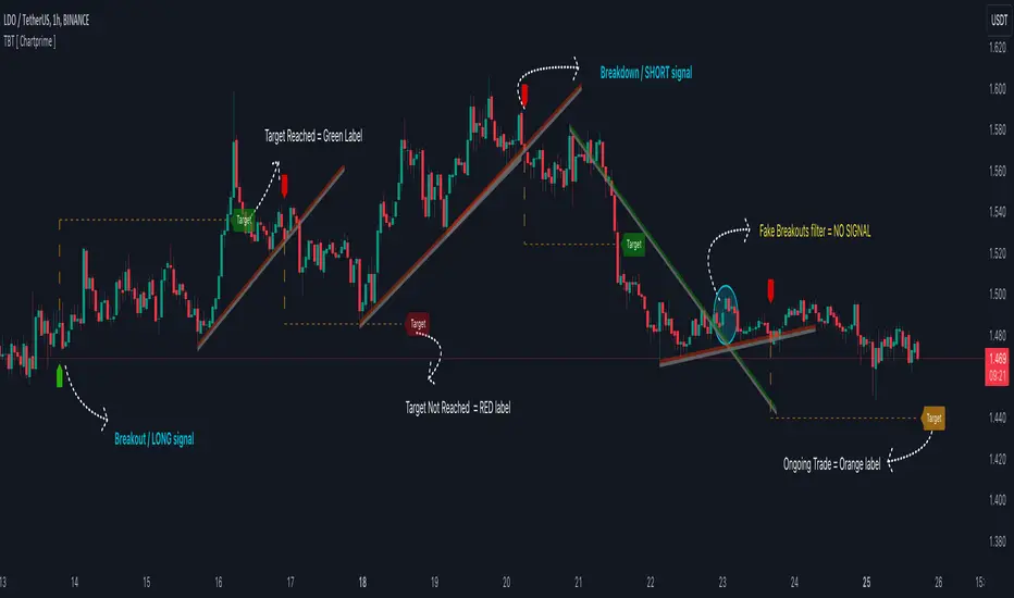
Trendline Breakouts With Targets [ChartPrime]The Trendline Breakouts With Targets indicator is meticulously crafted to improve trading decision-making by pinpointing trendline breakouts and breakdowns through pivot point analysis.
Here's a comprehensive look at its primary functionalities:
Upon the occurrence of a breakout or breakdown, a signal is meticulously assessed against a false signal condition/filter, after which the indicator promptly generates a trading signal. Additionally, it conducts precise calculations to determine potential target levels and then exhibits them graphically on the price chart.
🔷 Key Features:
🔸 Trendline Drawing: The indicator automatically plots trendlines based on significant pivot points and wick data, visually representing the prevailing trend.
🔸 Breakout and Breakdown Signals : It triggers trading signals when a breakout (price moves above the trendline) or a breakdown (price moves below the trendline) is detected, helping traders identify potential entry points.
🔸 False Breakout/ Breakdown Filter ✔️: To enhance accuracy, the indicator incorporates a filter to reduce false breakout and breakdown signals, helping traders avoid premature entries.
🔸 Target Calculation: The indicator performs target-level calculations, a critical aspect of trade management.
These calculated target levels are visually displayed on the price chart, helping traders set precise profit targets and make well-informed trading decisions.
🔸 Color-Change Labels: The indicator features label color changes to provide quick visual cues. Labels are initially displayed in orange. When a take profit (TP) level is reached, the label changes to green, indicating a successful trade. Conversely, if a stop-loss (SL) level is hit, the label turns red, signaling a losing trade.
🔸 Settings :
This indicator combines technical analysis, trendline identification, breakout/breakdown signals, and risk management tools to assist traders in making more informed and efficient trading decisions. It can be a valuable addition to any trader's toolkit, helping them identify potential trade opportunities and manage risk effectively.
Trendlines Oscillator [LuxAlgo]The Trendlines Oscillator helps traders identify trends and momentum based on the normalized distances between the current price and the most recently detected bullish and bearish trend lines.
The indicator features bullish and bearish momentum, a signal line with crossings, and multiple smoothing options.
🔶 USAGE
The indicator displays three lines: two for momentum and one for the signal. When one of the momentum lines (bullish or bearish) crosses the signal line, the tool displays a dot to indicate which momentum is gaining strength.
As a general rule, when the green bullish momentum line is above the red bearish momentum line, it indicates buyer strength. This means that the actual prices are farther from the support trend lines than the resistance trend lines. The opposite is true for seller strength.
To calculate bullish momentum, the tool first identifies bullish trend lines acting as support below the price. Then, it measures the delta between the price and those trend lines and normalizes the reading into the displayed momentum values.
The same process is used for bearish momentum, but with bearish trendlines acting as resistance above the price.
🔹 Length & Memory
Modifying the Length and Memory values will cause the tool to display different momentum values.
Traders can adjust the length to detect larger trendlines and adjust the memory to indicate how many trendlines the tool should consider.
As the chart above shows, smaller values make the tool more responsive, while larger values are useful for detecting larger trends.
🔹 Smoothing
By default, the data is not smoothed, and the signal uses a triangular moving average with a length of 10. Traders can smooth both the data and the signal line.
Traders can choose from up to ten different methods, or none. Some examples are shown on the chart above.
🔶 DETAILS
The steps for the calculations are as follows:
1. Gather the pivots, highs, and lows.
ph = fixnan(ta.pivothigh(lengthInput, lengthInput))
pl = fixnan(ta.pivotlow(lengthInput, lengthInput))
2. Calculate the slope and y-intercept for each trendline between contiguous lower highs (resistance) or higher lows (support).
if ph < ph
slope = (ph - ph )/(n-lengthInput - phx1)
res.unshift(l.new(ph - slope * phx1, slope))
if pl > pl
slope = (pl - pl )/(n-lengthInput - plx1)
sup.unshift(l.new(pl - slope * plx1, slope))
3. Calculate the value of each trendline on the current bar, then calculate the difference with the current price (delta). To calculate the relative sum of deltas, only consider trendlines below the price for support or above the price for resistance.
method get_point(l id, x)=>
id.slope * x + id.intercept
for element in sup
point = element.get_point(n)
if sourceInput > point
sup_sum += sourceInput - point
sup_den += math.abs(sourceInput - point)
for element in res
point = element.get_point(n)
if sourceInput < point
res_sum += point - sourceInput
res_den += math.abs(point - sourceInput)
4. Normalize the value from 0 to 100 by taking the sum of the relative values of the deltas divided by the sum of the absolute values of the deltas.
float supportLine = sup_sum / sup_den * 100
float resistanceLine = res_sum / res_den * 100
5. Smooth both values, then calculate the signal line as the difference between them.
float smoothSupport = smooth(supportLine,dataSmoothingInput,dataSmoothingLengthInput)
float smoothResistance = smooth(resistanceLine,dataSmoothingInput,dataSmoothingLengthInput)
float signal = math.abs(smoothSupport - smoothResistance)
float signalLine = smooth(signal,smoothingInput,smoothingLengthInput)
6. Calculate the crossing signals against the signal line, using only the first signal from each series of bullish or bearish crossings.
bullSignal = smoothSupport > signalLine and smoothSupport < signalLine
bearSignal = smoothResistance > signalLine and smoothResistance < signalLine
lastSignal := bullSignal and lastSignal == BEAR ? BULL : bearSignal and lastSignal == BULL ? BEAR : lastSignal
firstBull = ta.change(lastSignal) > 0
firstBear = ta.change(lastSignal) < 0
🔶 SETTINGS
Length: The size of the market structure used for trendline detection.
Memory: The number of trendlines used in calculations.
Source: The source for the calculations is closing prices by default.
🔹 Smoothing
Data Smoothing: Choose the smoothing method and length
Signal Smoothing: Choose the smoothing method and length
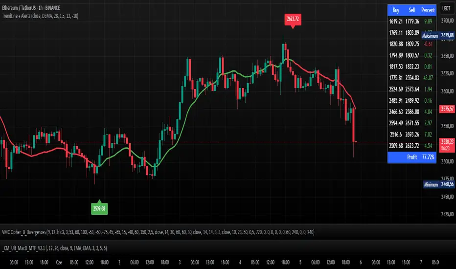
TrendLine + AlertsThe TrendLine + Alerts indicator is an advanced technical analysis tool designed to quickly identify trend direction using various moving averages and RMSD deviation. It dynamically generates buy and sell signals and visually marks entry points with price labels on the chart. Additionally, an optional transaction table can be toggled on or off, displaying buy and sell prices along with the percentage returns of individual trades and an aggregated summary row, facilitating the evaluation of trading strategy performance.
🔧 Key Features:
- Supports multiple moving average types: SMA, EMA, HMA, DEMA, TEMA, RMA, FRAMA
- Dynamic trend analysis based on RMSD deviation, adaptable to current market conditions
- Color-coded trend indication: green for uptrends, red for downtrends
- Alert generation: real-time buy and sell signals (TrendLine BUY / SELL)
- Price labels on the chart for better visualization of entry/exit points
- Interactive settings panel allowing selection of data source (open, close, high, low etc.), adjustable moving average length, and RMSD deviation multiplier
- Optionally displays a dynamic transaction table (toggleable via chart settings) that shows:
- Buy: entry prices
- Sell: exit prices
- Percent: percentage return of each trade, displayed as a number
- A summary row that aggregates the percentage returns, offering a quick evaluation of trading performance
⚙️ Settings:
- Ability to select the data source: open, close, high, low, oc2, hl2, occ3, hlc3, ohlc4, hlcc4
- Adjustable moving average length
- Customizable RMSD deviation multiplier
- Toggle switch to enable or disable the transaction table
🚀 Application:
Ideal for traders seeking an effective method to identify trends and turning points in the market. It is suitable for both short-term day trading and long-term trend analysis, with adjustable settings to suit individual trading strategies.
Tetra Trendline Indicator 2.0This script is designed to help traders visualize and identify potential overbought and oversold conditions in a financial instrument's price chart using four customizable trendlines. It also provides the option to set alerts for these conditions. Users can adjust the input parameters to tailor the indicator's behavior to their trading preferences.
Input Parameters: The script allows users to configure various input parameters to customize the behavior of the indicator. These parameters include:
showTrendlineX: Boolean inputs to control whether to show each of the four trendlines (Trendline 1, Trendline 2, Trendline 3, and Trendline 4).
trendlineColorX: Color inputs to specify the color of each trendline.
trendlineWidthX: Numeric inputs to set the width of each trendline.
trendlineLengthX: Numeric inputs to determine the length of each trendline.
alertOnTrendlineXBreak: Boolean inputs to enable or disable alerts for each trendline when they are breached.
Trendline Calculations: The script calculates the coordinates for each of the four trendlines. It does this by identifying the starting and ending points of each trendline based on user-defined parameters and the highest or lowest price levels within a specified length.
Plotting Trendlines: The script uses the plot function to display the calculated trendlines on the price chart. It also fills the area between the trendlines to visually emphasize the region.
Alert Conditions: The script defines alert conditions for each trendline. Alerts are triggered when certain price conditions are met:
Trendline 1: An alert is triggered when the price crosses above the Trendline 1 (indicating overbought conditions).
Trendline 2: An alert is triggered when the price crosses below the Trendline 2 (indicating oversold conditions).
Trendline 3: Similar to Trendline 1, an alert is triggered when the price crosses above Trendline 3 (overbought).
Trendline 4: Similar to Trendline 2, an alert is triggered when the price crosses below Trendline 4 (oversold).

BE-TrendLines & Price SentimentsOverview
The trendline is one of the most potent and flexible tools in trading. A rising trendline indicates an upward trend, a falling trendline indicates a downward trend, and a flat trendline indicates a range-bound bond market.
Breakouts, price bounces, and reversal / Retest tactics are all types of trades that may be made using a trendline. Additionally, stop-loss and profit-trailing orders can be based on trendlines as support and resistance levels, appropriately.
Technical Calculations for Trendlines & Price Sentiments:
Pivot points for a specified time frame and the Prevailing High/Low for the most recent bars are used to derive trendlines. While Pivot Points alert us to price movements, High/Low tells us where Bulls and Bears find a middle ground. This provides a remarkable set of conditions from which to extrapolate the efficacy of the Trendlines.
The term "price sensitivity" refers to how much a change in the price of a product causes consumers to alter their purchase habits. It's the relationship between price shifts and shifts in consumer demand. So, for example, if a 30% jump in the cost of a product leads to a 10% drop in purchases, we can conclude that the item has a price sensitivity of 0.33%.
Basis the above theoretical statement, If the underlying asset's price drops, the indicator shall compute data on the amount of volume being pumped (Inflow vs Outflow) into the market (if available), or the percentage by which the price has changed. This will be compared to the recent drop rate to see if the behavior has changed at the similar value zone and non similar value zone. similar calculation shall be done if the price of the underlying rises.
Traders may benefit from hearing about Trendlines in their "Story Telling" form, which we now present. To help you comprehend it better, candles are divided into three Sentiment groups based on their color. Colors: Green (with its shades), Silver, and Red (including its shades). Green signifies a Bullish Trend, Silver a neutral trend, and Red a Brearish Trend.
Bullish Trend
Bearish Trend
Neutral Trend
Sentiment Price Cycle in Trending Market: Green (Directional Bullish), Dark Green (Bullish Trend Loosing its Strength), Silver (Neutral Trend), Red (Directional Bearish), Dark Red (Bearish Trend Loosing its Strength)
Sentiment Price Cycle in RangeBound Market: Green (Over Brought), Silver (Neutral) & Red (Over Sold)
How to Initiate Trade when price is within TL:
Fake Break Out Trade:
BreakDown Trade:
BreakOut Trade:
Couple of Other Features in the Indicator:
Single Alerts = These are the alerts where in, as and when the Event happens Alerts shall the trigerred. like On BreakOut, BreakDown, TouchOf Up TrendLine, TouchOf DownTrendLine, Retest Of Up TrendLine, Retest of DownTrendLine.
Conditional Alerts = These are those type of Alerts where in you can combine 2 or 3 conditions to trigger an Alert. Like
Sample 1 - After Down TL is tested for 3 times, If BreakOut happens and the setiment turns Bullish within 5 Candles.
Sample 2 - After Up TL is tested for 2 times, If Price Bounces backUp from TL and the setiment turns Bullish within 5 Candles.
Similarly you can customize the combination of events for getting the alert.
DISCLAIMER: No sharing, copying, reselling, modifying, or any other forms of use are authorized for our documents, script / strategy, and the information published with them. This informational planning script / strategy is strictly for individual use and educational purposes only. This is not financial or investment advice. Investments are always made at your own risk and are based on your personal judgement. I am not responsible for any losses you may incur. Please invest wisely.
Happy to receive suggestions and feedback in order to improve the performance of the indicator better.
MTF Trendlines on chart_Pro[vn]Hello Traders .
👉This is an indicator of the trendlines in the analysis series with my trendlines.
- It statistics the upper and lower trend lines of the current Time Frame.
- Pine Script strategy draws pivot points and trendlines on the chart.
- This strategy allows the user to specify the interval to calculate the pivot points and the number of pivot points used to generate the trend lines.
- In the process of trading with the trendline, I see different timeframes showing each trendline differently, many times the trendline in the 15m frame has been broken but I don't know where the price is going, and it takes a lot of time to find support points, resistance to entry or take profit, So I came up with the idea of drawing different timeframes on the same chart in a specified timeframe, and I found it shortened the time to find support and resistance points in trading without having to switch back and forth between timeframes.
- For example, when the H1 trendline breaks downwards, we can determine a high probability that the price will be supported by the trendlines below it. for us to find entry points or exit orders effectively. Or when the price breaks the H1 trendline to go up, the chart shows us the trend lines above that broken H1 line so that we have a more effective entry or take profit point because it is a resistance zone....
- It can shows 7 pairs of trendlines during different times in the chart.
- each timeframe will display two trendlines, one up, and one down.When the price crosses a trendline, only one valid trendline is displayed, while the line crossed is not displayed.
- The upper trendline (down trend) is a red horizontal line, with the timeframe name and the value of its trendline, for example 4H(1.234) means timeframe = H4, the current value of the trendline is 1.234.
- The trendline below (up trend) is the blue horizontal line that also represents the same value as the line above.
- In the Settings section, up to 6 different timeframes can be selected to display those trendlines on the chart.
- Small timeframes such as m1, m3, m5 or D1 I leave the default (cannot be changed) in the 'Length' setting = 50, timeframe is H6, H8, H12 'Length' = 30, the rest of the time can be changed, the default is 20 ...
- Some cases I have applied with this indicator to look for entry points and take profit ...
Xin chào Trader Việt nam.
- Đây là chỉ báo về các đường xu hướng trendline trong chuỗi phân tích với đường xu hướng của tôi. Chỉ báo này là muti trendlines trên biểu đồ , nó hiển thị được tối da 7 cặp đường xu hướng trong các thời gian khác nhau trên 1 biểu đồ.Dựa vào đó các trader có cái nhìn trực quan nhất không phải thay đổi qua lại các thời gian để tìm các đường trendlines, và có thể tìm được những cú hồi hoặc phá ngưỡng để vào lệnh hoặc chốt lời .
- Thực ra trong quá trình giao dịch với đường xu hướng, tôi thấy các khung thời gian khác nhau thì hiển thị mỗi đường xu hướng khác nhau, nhiều khi đường xu hướng trong khung 15m đã bị phá nhưng không biết giá đi đến đâu, và mất rất nhiều thời gian để tìm các điểm hỗ trợ, kháng cự để vào lệnh hoặc chốt lời, nên tôi nảy ra ý tưởng vẽ ra các khung thời gian khác nhau trên cùng 1 biểu đồ trong một khung thời gian được chỉ định, và tôi thấy rút ngắn được thời gian để tìm các điểm hõ trợ , kháng cự trong giao dịch mà không cần phải chuyển qua lại giữa các khung thời gian .
- Chẳng hạn ,khi đường xu hướng H1 bị phá vỡ xuống dưới thì ta có thể xác định được khả năng cao giá sẽ được hỗ trợ bởi những đường xu hướng bên dưới nó. để ta tìm điểm vào lệnh hoặc thoát lệnh cho hiệu quả.Hoặc khi giá phá vỡ đường xu hướng H1 để đi lên , thì trên biểu đồ đã hiện cho ta các đường trendline bên trên đường H1 bị phá vỡ đó để ta có điểm vào hoặc chốt lời hiệu quả hơn vì đó là vùng kháng cự....
- Đường xu hướng bên trên(down trend) là đường kẻ ngang màu đỏ ,có kèm tên timeframe và giá trị của đường xu hướng của nó,ví dụ 4H(1.234) nghĩa là timeframe=4H, giá trị hiện tại đường trendline là 1.234.
- Đường xu hướng bên dưới (up trend) là đường ngang màu xanh cũng thể hiện giá trị như đường bên trên.
- Các timeframe nhỏ như 1m, 3m, 5m hoặc 1D tôi để mặc định (không thay đổi được) trong setting mục 'Length' = 50, timeframe là 6H,8H,12H 'Length' = 30, các thời gian còn lại có thể thay đổi được ,mặc định là 20
- Để điều chỉnh có thể vào setting để thiết lập các thời gian theo nhu cầu.
Dynamic Touch Trendlines [QuantVue]The Dynamic Touch Trendlines (DTT) indicator automatically draws and manages trendlines on your chart, helping traders identify key support and resistance levels.
What sets the DTT indicator apart from other trendline indicators is its ability to let traders customize the number of touches required to validate a trendline. This flexibility allows you to fine-tune the indicator for different markets or trading styles, ensuring only strong trendlines with the specified number of touches are considered valid.
This indicator features both uptrend lines (drawn from pivot lows) and downtrend lines (drawn from pivot highs), making it suitable for detecting bullish and bearish trends.
An uptrend line connects three (default setting) or more significant lows, showing where price has historically found support. Traders often look for price to bounce off this line during pullbacks in an uptrend.
When price breaks below an uptrend line, it suggests a weakening of the bullish trend. This could mean that buyers are losing strength, and the market may be transitioning into a bearish phase, providing a potential opportunity for traders to enter short positions or exit long positions.
Conversely, a downtrend line connects three (default setting) or more significant highs, indicating potential resistance in a downtrend. Price action below this line can signal continued bearish momentum.
When price breaks above a downtrend line, it indicates a potential reversal of the bearish trend. This can signal the end of selling pressure and the beginning of a new bullish phase, offering traders a potential opportunity to enter long positions.
Key settings:
Minimum Touches: This sets the number of price touches required to validate a trendline. Increasing the minimum touches filters out weaker trends, ensuring that only more reliable trendlines are drawn.
Buffer: The buffer is used to account for minor price overshoots or near misses relative to the trendline. It creates a margin around the trendline, allowing price to come close to the line—whether it overshoots slightly or falls just short—and still count as a valid touch. This helps ensure that small price fluctuations or market noise don’t prevent valid trendline touches from being recognized, making the trendlines more reliable.
Trendline Break Source: Allows traders to define how a trendline is considered broken—either based on the close of the price bar or the wicks (highs and lows) of the price action.
The DTT indicator also features alerts whenever a new trendline is detected or an existing trendline is broken!
