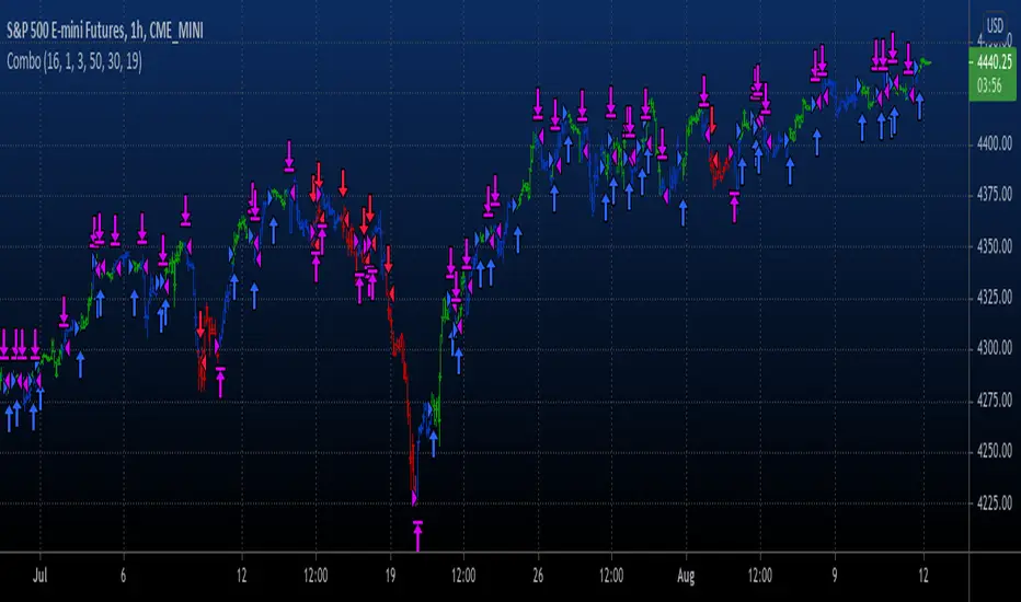
TASC 2023.06 Stochastic Distance Oscillator█ OVERVIEW
This script implements the stochastic distance oscillator (SDO) , a momentum indicator introduced by Vitali Apirine in an article featured in TASC's June 2023 edition of Traders' Tips . The SDO is a variation of the classic stochastic oscillator and is designed to identify overbought and oversold levels, as well as detect bull and bear trend changes.
█ CONCEPTS
Unlike the classic stochastic oscillator, which compares an asset's price to its past price range, the SDO measures the size of the current distance relative to the maximum-minimum distance range over a set number of periods. The current distance is defined as the distance between the current price and the price n periods ago.
The readings of the SDO can be used to identify the following states of the asset price:
Uptrend state: the oscillator crosses over 50 from a non-uptrend state.
Downtrend state: the oscillator crosses under -50 from a non-downtrend state.
Overbought state: the oscillator is in an uptrend and crosses -50 for the first time.
Oversold state: the oscillator is in a downtrend and crosses 50 for the first time.
Trend continuity: the oscillator crosses 0 in the direction of the current trend.
The script indicates these five conditions using on-chart signals and background coloring.
█ CALCULATIONS
The SDO is calculated as follows:
1. Calculate the distance between the current price and the price n periods ago, as well as the maximum and minimum distances for the selected lookback period. The author recommends using one of two values of n , 14 or 40 bars.
2. Calculate the time series % D that represents the relation between the asset's current distance and its distance range over a loockback period:
% D = (Abs(current distance) − Abs(minimum distance)) / (Abs(maximum distance) − Abs(minimum distance)) * 100
3. Use the calculated % D to obtain the SDO:
If the closing price is above the close n periods ago, SDO = % D
If the closing price is below the close n periods ago, SDO = −% D
If the closing price equals the close n periods ago or the current distance equals the minimum distance, SDO = 0
4. Smooth the SDO using an exponential moving average (EMA). The author recommends using an EMA in the range from 3 to 6 .
Adjustable input parameters include the number of periods n , the lookback period for calculating % D , the smoothing EMA length, and the overbought/oversold threshold level.
스크립트에서 "oscillator"에 대해 찾기

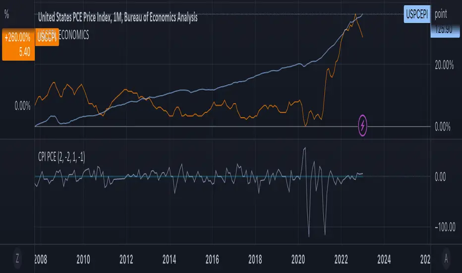
Consumption OscillatorOVERVIEW
The Consumption Oscillator combines Core Consumer Price Index (USCCPI) and Personal Consumption Expenditure (USPCEPI). It can be a useful tool for understanding inflationary and deflationary pressure in the economy.
CONCEPTS
Defining some thresholds may aid in interpreting the oscillator but interpretation needs context. Also, the thresholds may need adjusting. Overall, using this oscillator in combination with other economic indicators may provide some insights into macroeconomic conditions.
Strong positive signal: If the oscillator rises above a threshold value of +2, it may be considered a strong positive signal. This could suggest that the CCPI is growing faster than the PCE, indicating stronger inflationary pressure and potentially higher levels of economic growth.
Weak positive signal: If the oscillator rises above a threshold value of +1, it may be considered a weak positive signal. This could suggest that the CCPI is growing slightly faster than the PCE, which may still indicate some level of inflationary pressure and moderate economic growth.
No signal: If the oscillator is between -1 and +1, it may be considered a neutral signal. This indicates that the CCPI and PCE are growing at roughly the same rate, and there may be no significant inflationary or deflationary pressure in the economy.
Weak negative signal: If the oscillator falls below a threshold value of -1, it may be considered a weak negative signal. This could suggest that the PCE is growing slightly faster than the CCPI, which may indicate some level of deflationary pressure and slower economic growth.
Strong negative signal: If the oscillator falls below a threshold value of -2, it may be considered a strong negative signal. This could suggest that the PCE is growing much faster than the CCPI, indicating stronger deflationary pressure and potentially lower levels of economic growth
Distance Oscillator - Support and Resistance by DGT
Prices high above the Moving Average (MA) or low below it are likely to be remedied in the future by a reverse price movement as stated in the article by Denis Alajbeg, Zoran Bubas and Dina Vasic published in International Journal of Economics, Commerce and Management
This study is the third variant that aims to present this idea, and the output of the study is presented as lines that serve as possible support and resistance levels in the future.
1st variant of the idea is presented as an centered oscillator, link to Price Distance to its MA Study , within its description you may find more about the idea and some statistical observations. Also some derivatives with MACD-X, More Than MACD and P-MACD
2nd variant of the idea are presented as colored triangle line (Volatility Colored Price/MA Line), using the same calculation methods and presented in the bottom of price chart.
Link to studies where it is included : Colored Directional Movement and Bollinger Band's Cloud , SuperTrendRange and Pivot Points vX
3rd variant (this study) as stated earlier aims to present the same idea as support and resistance levels.
Options
The users can adjust source and length of the moving average that is used as base for the distance oscillator
Signal triggering options includes length for the deviation bands, multiplier as well as smoothing of the oscillator
Line customization settings
Additionally an alert can be configured to be warned earlier to watch out for probable pullbacks or reversals
Technical details for whom interested
Calculating the price distance to the MA results in a centered oscillator lets call it Distance Oscillator (quite similar to the RSI), as shown in the blow chart
Unlike RSI, oscillations with the distance oscillator are not limited within a specific range, hence identifying overbought and oversold is not as straight forward as it is with RSI. To determine overbought and oversold levels, standard deviation of distance oscillator is calculated and bands generated with the same approach applied with Bollinger Bands.
Once we have the threshold bands then crossing those bands we may assume as important levels and draw a line, if oscillator values keeps above the threshold bands (deviation bands) the logic behind the code will update the line drawing accordingly.
To reduce noise a smoothing can be applied
Alerts :
Please note that the implementation applied here can be applied to any oscillator such as RSI, Stochastic, MFI etc even Volume (if bear candle volumes are multiplied by -1)
Disclaimer :
Trading success is all about following your trading strategy and the indicators should fit within your trading strategy, and not to be traded upon solely
The script is for informational and educational purposes only. Use of the script does not constitute professional and/or financial advice. You alone have the sole responsibility of evaluating the script output and risks associated with the use of the script. In exchange for using the script, you agree not to hold dgtrd TradingView user liable for any possible claim for damages arising from any decision you make based on use of the script
[SK] Custom Klinger OscillatorThis Custom Klinger Oscillator allows you to change the time frames for the Force Volume and Signal calculations to use instead of it's default values. Although the default Fibonacci values ( 34, 55 and 13 ) provide exceptional signals, you can now explore using lower Fibonacci numbers and get faster signals for your own adventures in the market.
This indicator adds conditional coloring of the Klinger line when over / under the signal along with a transparent fill cloud between both lines colored by the same condition. You can change colors to your preference on the style configurations.
--
Below is more information on the KIinger Oscillator from investopedia:
Interpretations for Price Direction
The Klinger Oscillator is fairly complex to calculate, but it's based on the idea of force volume, which accounts for volume, trend (positive or negative), and temp (based on multiple inputs and if/then statements). Using this data, the oscillator is created by looking at the difference between two exponential moving averages of force volume involving different time frames (typically 34 and 55). The idea is to show how the volume flowing through the securities is impacting its long-term and short-term price direction.
The Signal Line
A signal line (13-period moving average) is used to trigger buy or sell signals. This technique is very similar to signals that are created with other indicators such as the moving average convergence divergence (MACD). While these are the basic signals generated by these indicators, it's important to note that these techniques may generate a lot of trading signals that may not be as effective in sideways markets.
The Uptrend
When an asset is in an overall uptrend—such as when it is above its 100-period moving average and the Klinger is above zero or moving above zero—traders could buy when the Klinger oscillator moves above the signal line from below.
Klinger noted that when a stock was in an uptrend, and then dropped to unusually low levels below zero, and then moved above its signal line, this was a favorable long position to take.
The Downtrend
When an asset is in an overall downtrend, traders could sell or short-sell when the Klinger oscillator moves below the signal line from above. Klinger noted this was especially noteworthy when the indicator had seen an uncharacteristic spike above zero.
The zero line is also used by some traders to mark the transition from an uptrend to downtrend, or vice versa. While such signals won't always agree with price movements, a move above zero helps confirm a rising price, while a drop below zero helps confirm a falling price.
Klinger Oscillator and Divergence
The Klinger oscillator also uses divergence to identify when the indicator's inputs are not confirming the direction of the price move. It's a bullish sign when the value of the indicator is heading upward while the price of the security continues to fall. It is a bearish signal when the price is rising but the indicator is falling. Divergence can be coupled with signal line crossovers to generate trades. For example, if a bearish divergence forms, a sell or short-sell could be initiated the next time the Klinger crosses below the signal line.

(JS) Tip-and-Dip Oscillator 2.0I am going to start taking requests to open source my indicators and this is the first one I decided to do. They will also be updated to Version 4 of Pinescript.
I went through and added notes on what each area of the code is, and in this particular case I added color schemes as a way to improve upon the original code.
Link to original:
Original Description:
"Let me start by saying I know that the name is goofy lol
This is an oscillator that that looks at price action vs. standard deviation in order to illustrate the trend. This thing looks like an Awesome Oscillator but the math behind this and the Awesome Oscillator are totally different (which is pretty interesting, given they look a lot alike). I included the Awesome Oscillator on the chart here so you can look at them and see where they are different.
So the Tip-and Dip Oscillator is meant to help you pinpoint tops and bottoms. I even added arrows where the top and bottom signals are given.
The oscillator itself has 3 colors, an up, down, and neutral color that come as green, red, and yellow. Since the readings given by the oscillator can greatly vary depending on the chart resolution, I included an option to edit the range to fit your chart.
Also - I have 4 different smoothing options that you can use depending on what your preference is. The default setting is the most sensitive so it will identify tops and bottoms more frequently, but it is the most accurate when pinpointing the correct reversal candle. As you smooth it out, the arrows will appear less, but my be slightly delayed and give a later reading. I personally prefer the default, but going up to the second setting in smoothing works nicely as well.
Enjoy!"
BB Oscillator - Price Relative to Bollinger BandsThis Bollinger Band Oscillator visualizes where the current price sits relative to its Bollinger Bands, scaled between 0 and 100. It helps identify overbought and oversold conditions based on the price’s position within the bands and provides dynamic signals when momentum shifts occur.
Features
Price Relative to Bollinger Bands
The main oscillator plots the price’s relative position within the Bollinger Bands on a scale from 0 (lower band) to 100 (upper band), giving an intuitive view of where price stands.
Customizable Moving Average Overlay
An optional moving average (SMA or EMA) smooths the oscillator for trend analysis, with adjustable length and color options.
Crossover & Crossunder Signals
Alerts and background highlights trigger when the oscillator crosses over or under its moving average, signaling potential momentum shifts or trend changes.
Fully Customizable Colors
Choose your preferred colors for the oscillator line, moving average and crossover signals to match your charting style.
This tool offers a unique oscillator view of Bollinger Bands, combining volatility context with momentum signals for clearer decision-making.

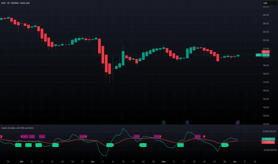
Chaikin Oscillator with EMA and AlertsOverview
This indicator plots the classic Chaikin Oscillator along with an EMA overlay to help identify changes in accumulation or distribution momentum. It includes visual markers and built-in alerts for key crossover events such as crossing the zero line and crossing above or below the Chaikin EMA.
Concepts
The Chaikin Oscillator is calculated as the difference between two EMAs of Accumulation/Distribution (A/D) volume. It is used to measure the momentum behind buying and selling pressure. An EMA is applied to the oscillator itself to smooth out signals and provide an additional layer of trend confirmation. Crossovers above or below zero, and above or below the EMA, are interpreted as potential signals of market sentiment shifts.
How to Use the Indicator
Apply the indicator to any chart and select your preferred short, long, and EMA lengths. The script will plot the Chaikin Oscillator in teal and its EMA in red. Triangles and labels will appear on the chart when the oscillator crosses above or below the zero line, or when it crosses its EMA. Green triangles indicate bullish zero-line crossovers, while red triangles indicate bearish ones. Lime and maroon labels signal EMA crossovers. Use these signals to assess momentum shifts and potential entry or exit points.
Interpretation
When the Chaikin Oscillator is above zero and rising, it suggests strong buying pressure. When it is below zero and falling, it suggests strong selling pressure. A crossover above the EMA may indicate an emerging bullish trend, while a crossover below the EMA may suggest increasing bearish momentum. Using both the zero line and EMA crossover together helps filter noise and improves reliability of momentum-based signals.
Notes
The indicator includes four alert conditions that can be enabled in TradingView to notify you of Chaikin Oscillator crossovers. It works across all asset classes and timeframes. This tool is especially useful for identifying momentum shifts ahead of price moves and for confirming volume-based signals in trend continuation or reversal scenarios. Adjust input lengths to suit your trading style or the volatility of the instrument you are analyzing.
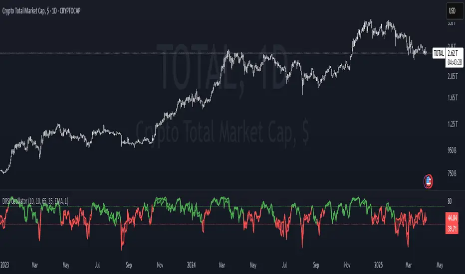
Double RSI OscillatorThe Double RSI Oscillator
Hello Gs,
I came back from the dead and tried to see what a little tweak to RSI could do, and I think it is quite interesting and might be worth checking out.
Warning:
This indicator has lots of false signals unfortunatly
How does the DRSI Oscillator work?
Very simple, the DRSI oscillator at the very base is just 2 RSIs that should smooth each other out, making a smoother trend signal generation for trend analysis. One RSI is set to have lower values, by considering the lowest point of the price, and one RSI is set to have higher values using pretty much the same thing. The trend changes from positive to negative if RSI with higher values crosses negative treshhold, and from negative to positive if RSI with lower value crosses positive treshhold. On top of this I added some additional settings to smooth or speed it further, if these were a good idea, I guess only time will tell :D.
Settings
Here is a guide of what setting changes what and how it might be suitable for you:
RSI Optimism length: length of the RSI with higher values (higher values will be better for longer term, lower for medium term)
RSI Pesimism length: length of the RSI with lower values (higher values will be better for longer term, lower for medium term)
Positive treshhold: The value RSI pesimism needs to pass in order to change trends (in case of using RSI avg. the value the average needs to pass), making this higher can give you faster signals, but expect more false ones
Negative treshholds: The value RSI optimism needs to pass in order to change trends (in case of using RSI avg. the value the average needs to pass), lowering this can give you faster signals, but expect more false ones
Smoothing type: Select the type of smoothing (or none) to smooth your signals as you want, this one you need to play around with.
Smoothing length: The length of your smoothing method (if none is selected it wont change anything)
Use RSI average instead: self-explanatory, go figure
Above/Below Mean Trend: Changes the way trend logic works
Why consider using this indicator?
The DRSI Oscillator is a tool that has huge flexibility (due to tons of settings that base RSI doesnt, like trend treshholds), and is smoother allowing traders and investors to get high quality or high speed signals, allowing great entries and exits
Pearson OscillatorThe Pearson Oscillator is a custom TradingView indicator that leverages statistical correlation analysis to gauge the trend strength of a given price series. By calculating the Pearson correlation coefficient between time (as an index) and price over a user-defined period, the indicator provides traders with an insight into how strongly the market is trending or oscillating.
──────────────────────────────
Key Features
- User-Defined Parameters:
– Set the calculation length, price source, and smoothing period.
– Adjust upper and lower threshold levels to suit your trading strategy.
– Customize color settings for increasing, decreasing, and neutral conditions.
- Dynamic Trend Analysis:
– Computes the Pearson correlation coefficient to measure the relationship between time and price.
– Applies a simple moving average to smooth out fluctuations in the coefficient, offering a more stable reading.
- Visual Representation:
– Plots the smoothed Pearson coefficient as a continuous line.
– Displays a histogram showing the variation (first derivative) of the coefficient to highlight changes in trend strength.
– Draws horizontal reference lines at the specified upper and lower thresholds as well as at the zero level for quick visual assessment.
- Alerts and Dynamic Labeling:
– Automatically triggers alerts when the smoothed Pearson coefficient crosses the predefined threshold levels, so you never miss a potential market turning point.
– Generates a dynamic label on the last bar that displays important statistical information, including:
- The current Pearson coefficient (rounded to three decimals).
- A classification of correlation strength (e.g., STRONG, MEDIUM, WEAK, NEUTRAL) based on the absolute value of the coefficient.
- The trend direction (Upward, Downward, or Stable).
- The delta of the coefficient, offering insight into how quickly the trend is evolving.
──────────────────────────────
How It Works
1. Calculation of the Pearson Coefficient:
- A custom function iterates over a specified number of price bars, summing time indices, price values, and their squared and cross-products.
- Using the Pearson correlation formula, it computes a coefficient that ranges between -1 and 1—values close to ±1 indicate a strong trend or linear relationship, while values near 0 suggest a weak or non-existent trend.
2. Smoothing Process:
- The raw Pearson coefficient is then smoothed using a simple moving average (SMA) to reduce noise and provide a clearer view of the underlying trend.
3. Delta (Variation) Computation:
- The script calculates the change (delta) between the current smoothed coefficient and its value on the previous bar.
- This derivative is plotted as a histogram, signaling the speed at which the correlation (and thus the trend) is changing.
4. Visual and Alert Mechanisms:
- The smoothed coefficient and its delta are plotted with colors that dynamically update to reflect increasing or decreasing trends.
- Horizontal lines set at user-defined thresholds help to quickly identify overbought or oversold (or extreme correlation) scenarios.
- Alerts are defined to notify you when the smoothed coefficient crosses these key levels, ensuring timely trade decisions.
5. Dynamic Label:
- At the last bar, a dynamic label is created displaying the current Pearson value, its strength, the direction of the trend, and the delta.
- This quick snapshot helps traders assess the market condition at a glance without diving into detailed analysis.
──────────────────────────────
Why Use the Pearson Oscillator?
This indicator is particularly useful for traders who need a quantitative measure of trend strength that goes beyond traditional moving averages. By integrating statistical correlation directly into market analysis, the Pearson Oscillator helps you:
- Identify periods of strong trending behavior or potential reversals.
- Enhance your risk management through early alerts.
- Visualize the rate of change in market sentiment, enabling more informed entry and exit decisions.
Whether you are a technical analyst or a systematic trader, this indicator provides a robust tool to complement your existing trading toolkit.
──────────────────────────────
The Pearson Oscillator merges statistical insights with technical charting, creating an intuitive yet powerful tool for market analysis. With its adjustable parameters, visual cues, dynamic labeling, and automated alerts, it assists traders in monitoring and responding to evolving market conditions efficiently. This makes it a valuable addition to any TradingView chart, particularly for those looking to quantify the strength and evolution of market trends.
Feel free to adapt the parameters and visual settings to best align the indicator with your trading strategy. Happy trading!
Kalman Filter Oscillator v4The Kalman Filter Oscillator v4 is an advanced tool designed to help traders and investors identify trends more effectively while reducing the impact of market noise. As the latest iteration in its development, this version integrates improvements that make it more adaptive and precise, catering to the challenges of today’s financial markets.
This indicator operates on the principle of the Kalman filter, a well-regarded mathematical approach used for estimating the state of a dynamic system. By filtering out random fluctuations, it smooths price data to provide clearer insights into underlying trends. Unlike traditional methods such as moving averages, which often lag and can miss rapid shifts, the Kalman Filter Oscillator is reactive in real time, making it particularly suited for dynamic markets.
Version v4 builds on earlier versions by offering a refined combination of short-term and long-term trend analysis. Through adjustable parameters, traders can balance sensitivity to immediate price changes with a broader perspective of the market direction. Additionally, the oscillator incorporates a unique feature that tracks a price’s position relative to its recent highs and lows, which enhances its ability to pinpoint potential turning points or key market conditions.
The indicator’s value lies in its adaptability and practicality. Traders can use it to confirm trends, identify overbought or oversold conditions, or smooth out erratic price movements, reducing the likelihood of false signals. By presenting information in a clear and actionable format, it allows users to make better-informed decisions with greater confidence.
As of late 2024, the Kalman Filter Oscillator v4 represents a sophisticated yet user-friendly advancement in trend analysis. While not a one-size-fits-all solution, it serves as a valuable component in a trader’s toolkit, complementing other strategies and enhancing overall market understanding.

Relative Strength Price Oscillator Indicator (RS PPO)Percentage Price Oscillator (PPO)
The Percentage Price Oscillator (PPO) is a momentum oscillator that measures the difference between two moving averages as a percentage of the larger moving average. As with its cousin, MACD, the Percentage Price Oscillator is shown with a signal line, a histogram and a centerline. Signals are generated with signal line crossovers, centerline crossovers, and divergences.
PPO readings are not subject to the price level of the security and the PPO values for different securities can be compared, regardless of the price of the security.
Relative Strength (RS)
Relative strength is a strategy used in momentum investing and focuses on investing in stocks or other securities that have performed well relative to the market as a whole or to a relevant benchmark.
Chart
In the chart, Microsoft stock (MSFT) is plotted against the VanEck Semiconductor ETF (SMH).
In the example on the left, from the negative values of the RS PPO it can be seen that MSFT, although trending upward, is losing out in negative terms to the SMH etf.
In the example on the right, during a correction phase with a downward price trend, Microsoft held up relatively well compared to the Van Eck Semiconductor etf.

Adaptive SuperTrend Oscillator [AlgoAlpha]Adaptive SuperTrend Oscillator 🤖📈
Introducing the Adaptive SuperTrend Oscillator , an innovative blend of volatility clustering and SuperTrend logic designed to identify market trends with precision! 🚀 This indicator uses K-Means clustering to dynamically adjust volatility levels, helping traders spot bullish and bearish trends. The oscillator smoothly tracks price movements, adapting to market conditions for reliable signals. Whether you're scalping or riding long-term trends, this tool has got you covered! 💹✨
🔑 Key Features:
📊 Volatility Clustering with K-Means: Segments volatility into three levels (high, medium, low) using a K-Means algorithm for precise trend detection.
📈 Normalized Oscillator : Allows for customizable smoothing and normalization, ensuring the oscillator remains within a fixed range for easy interpretation.
🔄 Heiken Ashi Candles : Optionally visualize smoothed trends with Heiken Ashi-style candlesticks to better capture market momentum.
🔔 Alert System : Get notified when key conditions like trend shifts or volatility changes occur.
🎨 Customizable Appearance : Fully customizable colors for bullish/bearish signals, along with adjustable smoothing methods and lengths.
📚 How to Use:
⭐ Add the indicator to favorites by pressing the star icon. Customize settings to your preference:
👀 Watch the chart for trend signals and reversals. The oscillator will change color when trends shift, offering visual confirmation.
🔔 Enable alerts to be notified of critical trend changes or volatility conditions
⚙️ How It Works:
This script integrates SuperTrend with volatility clustering by analyzing ATR (Average True Range) to dynamically identify high, medium, and low volatility clusters using a K-Means algorithm . The SuperTrend logic adjusts based on the assigned volatility level, creating adaptive trend signals. These signals are then smoothed and optionally normalized for clearer visual interpretation. The Heiken Ashi transformation adds an additional layer of smoothing, helping traders better identify the market's true momentum. Alerts are set to notify users of key trend shifts and volatility changes, allowing traders to react promptly.

Advanced Awesome Oscillator [CryptoSea]Advanced AO Analysis Indicator
The Advanced AO Analysis indicator is a sophisticated tool designed to evaluate the Awesome Oscillator (AO) in search of regular and hidden divergences that signal potential price reversals. By tracking the intensity and duration of the AO's movements, this indicator aids traders in pinpointing critical points in price action.
Key Features
Divergence Detection: Identifies both regular and hidden bullish and bearish divergences, providing early signs of potential market reversals.
Customizable Lookback Periods: Allows users to set specific lookback windows to define the strength and relevance of detected divergences.
Adaptive Oscillator Display: Features customizable display options for the AO, enabling users to view data in different modes suited to their analysis needs.
Alert System: Includes configurable alerts to notify users of potential divergence formations, helping traders respond promptly.
How it Works
AO Calculation: Computes the AO as the difference between short-term and long-term moving averages of the midpoints of bars, highlighting momentum shifts.
Pivot Point Analysis: Utilizes advanced algorithms to find low and high pivot points based on the oscillator values, crucial for spotting trend reversals.
Range Validation: Verifies that divergences occur within a predefined range from pivot points, ensuring their validity and strength.
Visualisation: Plots AO values and potential divergences directly on the chart, aiding in quick visual analysis.
Application
Strategic Decision-Making: Assists traders in making informed decisions by providing detailed analysis of AO movements and divergence.
Trend Confirmation: Reinforces trading strategies by confirming potential reversals with pivot point detection and divergence analysis.
Behavioural Insight: Offers insights into market dynamics and sentiment by analyzing the depth and duration of AO cycles above and below zero.
The Advanced AO Analysis indicator equips traders with a powerful analytical tool for studying the Awesome Oscillator in-depth, enhancing their ability to spot and act on divergence-based trading opportunities in the cryptocurrency markets.
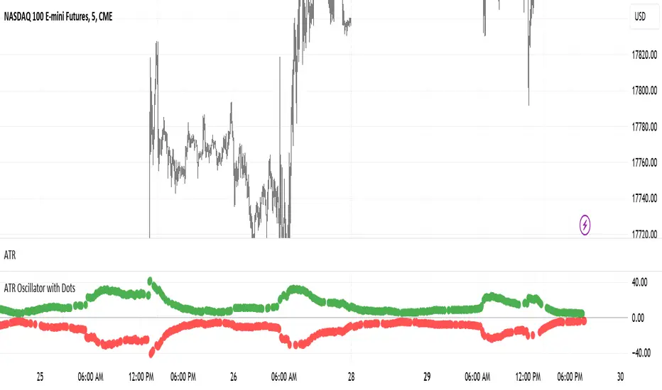
ATR Oscillator with DotsThe ATR Oscillator with Dots utilizes the Average True Range (ATR), a traditional measure that captures the extent of an asset's price movements within a given timeframe. Rather than depicting these values in a continuous line, the ATR Oscillator represents them as discrete dots, colored according to the price movement direction: green for upward movements when the current close is higher than the previous, and red for downward movements when the current close is lower.
In terms of functionality, the key feature of this oscillator is how it visualizes volatility through the spacing of the dots. During periods of high market volatility, the shifts between red and green dots tend to occur more frequently and with greater disparity in their positioning along the oscillator’s axis. This indicates sharp price changes and high trading activity. Conversely, periods of market consolidation are characterized by fewer color changes and a more clustered arrangement of dots, reflecting less price movement and lower volatility.
Traders can leverage the insights from the ATR Oscillator with Dots to better understand the market's behavior. For instance, a tight clustering of dots around the zero line suggests a consolidation phase, where the price is relatively stable and may be preparing for a breakout. On the other hand, widely spaced dots alternating between red and green signify strong price movements, offering opportunities for traders to capitalize on trends or prepare for potential reversals.
Imagine a scenario where a trader is monitoring a currency pair in a fluctuating forex market. An observed increase in the frequency and gap of alternating red and green dots would suggest a rise in volatility, possibly triggered by economic news or events. This could be an optimal time for the trader to seek entry or exit points, aligning their strategy with the increased activity. Conversely, a reduction in the frequency and gap of dot changes could signal an impending consolidation phase, prompting the trader to adopt a more cautious approach or explore range-bound trading strategies.
Therefore, the ATR Oscillator with Dots not only simplifies the interpretation of volatility and price momentum through visual cues but also enriches the trader’s strategy by highlighting periods of high activity and consolidation. This tool can be crucial for making informed decisions, particularly in fast-moving or uncertain market conditions, and can be effectively paired with other indicators to confirm trends and refine trading tactics.
Supertrend Volume OscillatorThe Supertrend Volume Oscillator is an innovative tool that integrates volume analysis with the established Supertrend indicator to offer a unique perspective on market conditions. By comparing directional volume against the aggregate volume over a designated lookback period, this oscillator adeptly signals overbought and oversold states through a volume-weighted methodology. Key settings such as the lookback period, Supertrend factor, and ATR period are adjustable, allowing traders to tailor the trend detection sensitivity to their preference.
Crucially, the oscillator delineates overbought and oversold zones via a channel parameter, with its value represented as a percentage ratio of directional to total volume, visually enhanced by a color gradient shifting from red to green based on oscillator readings. Background coloring further highlights market extremes for easy identification. A continuous line tracks the oscillator's value, anchored by a horizontal zero line as a neutral benchmark.
Additionally, the oscillator is equipped with alert conditions that notify traders when entering critical zones, facilitating informed trading decisions. This fusion of price trend analysis with volume metrics provides traders with a comprehensive tool for gauging market sentiment and trend strength, making the Supertrend Volume Oscillator a valuable addition to any trader's arsenal.

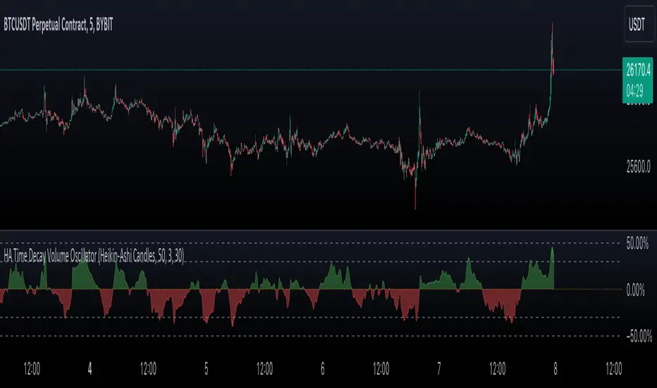
Heikin-Ashi Rolling Time Decay Volume OscillatorThe indicator calculates a time-decayed moving sum of volume data for both bullish (green) and bearish (red) candles. It then generates a volume share oscillator as a smoothed and weighted (time-decayed) moving sum of bullish volume (positive share) or bearish volume (negative share) relative to the total volume.
The volume share is displayed as an area chart with gradient fills representing overbought and oversold regions. Additionally, an Arnaud Legoux Moving Average (ALMA) of the volume oscillator is plotted on the chart.
Trend Momentum and Price Control :
This indicator serves as a powerful tool for traders to gauge trend momentum and identify which side, bulls or bears, is controlling price movements. When the volume oscillator trends strongly in the green territory, it suggests that bulls are in control of price movements, indicating a potential uptrend. Conversely, when the oscillator tilts into the red, it indicates bearish dominance and a potential downtrend. With the incorporation of ALMA for smoothing, this indicator becomes an essential tool for traders and analysts navigating the dynamics of traded assets.
Source Candles :
This indicator is designed to work with Heiken Ashi or Japanese candlesticks to discern candle bias, whether it's red or green. Heiken Ashi tends to produce red candles during downtrends and green candles during uptrends, providing a clearer trend indication. In contrast, traditional candlesticks alternate colors regardless of the dominant price direction. Users can select between "Heikin-Ashi Candles" and regular "Japanese Candles" as the source for price direction."
A time decay cumulative sum, also known as a weighted moving sum or exponentially weighted moving sum, offers several advantages when it comes to determining market dynamics compared to other methods:
Responsive to Recent Data: Time decay cumulative sum gives more weight to recent data points and gradually reduces the impact of older data. This responsiveness is crucial in rapidly changing market conditions where recent price and volume information is more relevant for analysis.
Adaptive to Market Volatility : It adapts to changes in market volatility. When markets are highly volatile, it places more emphasis on recent data to reflect the current market environment accurately. Conversely, during calmer periods, it considers older data less important.
Effective for Identifying Turning Points : Time decay cumulative sums are particularly effective at identifying turning points in market dynamics. They can indicate shifts from bullish to bearish sentiment and vice versa, providing early signals of potential trend reversals.
Reduces Lag : Traditional cumulative sums or simple moving averages can lag behind actual market changes, making them less effective for real-time decision-making. Time decay cumulative sums reduce this lag by giving more weight to recent events.
Dynamic Weighting: The weighting scheme can be adjusted to fit specific market dynamics or trading strategies. Traders can customize the decay rate or smoothing factor to align with their analysis goals and timeframes.
Improved Signal Clarity : The time decay cumulative sum can provide clearer and more precise signals for overbought and oversold conditions, as well as trend strength, due to its ability to emphasize recent relevant data.
In summary, a time decay cumulative sum is a valuable tool in determining market dynamics because it adapts to changing market conditions, reduces noise, and provides timely and accurate insights into trends, turning points, and the relative strength of bullish and bearish forces. Its responsiveness and adaptability make it an essential component of many technical analysis and trading strategies.
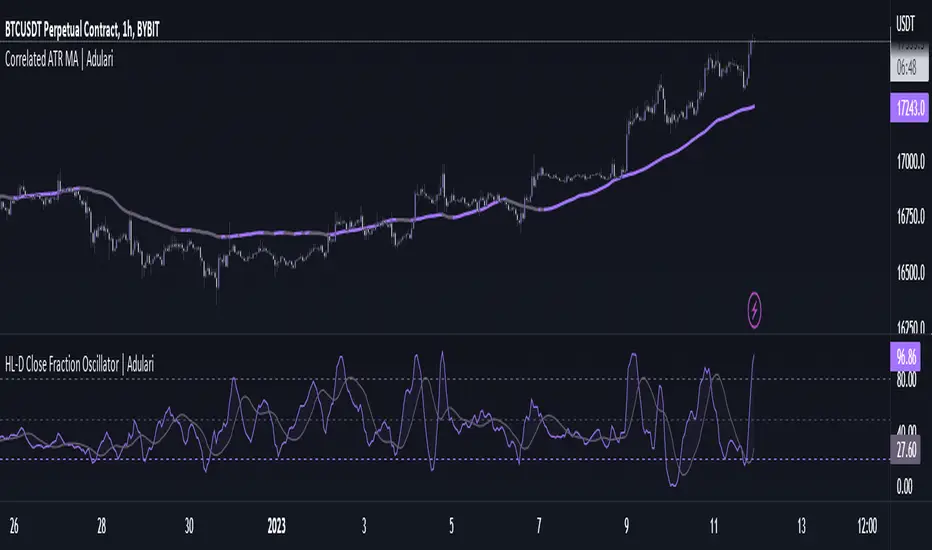
HL-D Close Fraction Oscillator | AdulariDescription:
This indicator calculates the difference between price high's and low's, and fractions it by the close price. If it calculates the difference between a high and low or low and high is defined by whether the current close is higher than the previous close. It is then also rescaled to ensure the value is always appropriate compared to the last set amount of bars.
This indicator can be used to determine whether a market is trending or ranging, and if so in which direction it is trending.
How do I use it?
Never use this indicator as standalone trading signal, it should be used as confluence.
When the value is above the middle line this shows the bullish trend is strong.
When the value is below the middle line this shows the bearish trend is strong.
When the value crosses above the upper line this indicates the trend may reverse downwards.
When the value crosses below the lower line this indicates the trend may reverse upwards.
When the value crosses above the signal this indicates the current bearish trend is getting weak and may reverse upwards.
When the value crosses below the signal this indicates the current bullish trend is getting weak and may reverse downwards.
Features:
Oscillator value indicating the difference between highs and lows fractioned by the close price.
Signal indicating a clear trend and base line value.
Horizontal lines such as oversold, overbought and middle lines, indicating possible interest zones.
How does it work?
1 — Define trend by checking if current close is above or below previous close.
2 — If the current close is above the previous close, calculate the oscillator's value using this formula:
(high - low) / close
2 — If the current close is below the previous close, calculate the oscillator's value using this formula:
(low - high) / close
3 — Smooth the original value using a specified moving average.
4 — Rescale the value using this formula:
newMin + (newMax - newMin) * (value - oldMin) / math.max(oldMax - oldMin, 10e-10)
5 — Calculate signal value by applying smoothing to the oscillator's value.
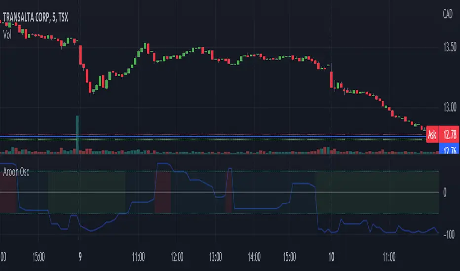
Aroon Oscillator [bkeevil]The Aroon Oscillator is intended to highlight short-term trend changes by comparing the number of periods since the last high with the number of periods since the last low.
Since the crossover rules for this oscillator frequently give false signals, I have opted for a more general approach: When the oscillator passes above the 50 line, the background of the indicator will turn green, indicating a general short term buy condition. When the oscillator passes below the -50 line, the background of the indicator will turn red, indicating a general short term sell condition. Use this indicator in combination with other indicators and price signals to identify short term trend changes.
This version improves on existing versions by:
Adding background colors to indicate general buy/sell conditions
More visually appealing
Uses the latest version 5 features
Well documented source code that conforms to the style guide
[Sextan] M-Oscillator BacktestLevel: 1
NOTE: This is a request by @scantor516 to backtest M-Oscillator by Mango2Juice with my Sextan framework. I ONLY take 5 minutes to perform it and how much time would you cost for this work?
Courtesy of Mango2Juice for M-Oscillator script.
You can backtest many of my indicators in minutes now! Of course,you can define your own indicator in the highlighted area in compliance with the uniform format, which guarantee when you use "Indicator on Indicator" function, it would not produce any error.
Background
Backtesting of technical indicators and strategies is the most common way to understand a quantitative strategy. However, the complicated configuration and adaptation work of backtesting many quantitative tools makes many traders who do not understand the code daunted. Moreover, although I have written a lot of strategies, I am still not very satisfied with the backtest configuration and writing efficiency. Therefore, I have been thinking about how to build a backtesting framework that can quickly and easily evaluate the backtesting performance of any indicator with a "long/short entry" indicator, that is, a "simple backtesting tool for dummies". The performance requirements should be stable, and the operation should be simple and convenient. It is best to "copy", "paste", and "a few mouse clicks" to complete the quick backtest and evaluation of a new indicator.
Luckily, I recently realized that TradingView provides an "Indicator on Indicator" feature, which is the perfect foundation for doing "hot swap" backtesting. My basic idea is to use a two-layer design. The first layer is the technical indicator signal source that needs to be embedded, which is only used to provide buy and sell signals of custom strategies; the second layer is the trading system, which is used to receive the output signals of the first layer, and filter the signals according to the agreed specifications. , Take Profit, Stop Loss, draw buy and sell signals and cost lines, define and send custom buy and sell alert messages to mobile phones, social software or trading interfaces. In general, this two-layer design is a flexible combination of "death and alive", which can meet the needs of most traders to quickly evaluate the performance of a certain technical indicator. The first layer here is flexible. Users can insert their own strategy codes according to my template, and they can draw buy and sell signals and output them to the second layer. The second layer is fixed, and the overall framework is solidified to ensure the stability and unity of the trading system. It is convenient to compare different or similar strategies under the same conditions. Finally, all trading signals are drawn on the chart, and the output strategy returns. test report.
The main function:
The first layer: "{Sextan} Your Indicator Source", the script provides a template for personalized strategy input, and the signal and definition interfaces ensure full compatibility with the second layer. Backtesting is performed stably in the backtesting framework of the layer. The first layer of this script is also relatively simple: enter your script in the highlighted custom script area, and after ensuring the final buy and sell signals long = bool condition, short = bool condition, the design of the first layer is considered complete. Input it into the PINE script editor of TradingView, save it and add it to the chart, you can see the pulse sequence in yellow (buy) and purple (sell) on the sub-picture, corresponding to the main picture, you can subjectively judge that the quality of the trading point of the strategy is good Bad.
The second layer: "{Sextan} PINEv4 Sextans Backtest Framework". This script is the standardized trading system strategy execution and alarm, used to generate the final report of the strategy backtest and some key indicators that I have customized that I find useful, such as: winning rate , Odds, Winning Surface, Kelly Ratio, Take Profit and Stop Loss Thresholds, Trading Frequency, etc. are evaluated according to the Kelly formula. To use the second layer, first load it into the TrainingView chart, no markers will appear on the chart, since you have not specified any strategy source signals, click on the gear-shaped setting next to the "{Sextan} PINEv4 Sextans BTFW" header button, you can open the backtest settings, the first item is to select your custom strategy source. Because we have added the strategy source to the chart in the previous step, you can easily find an option "{Sextan} Your Indicator Source: Signal" at the bottom of the list, this is the strategy source input we need, select and confirm , you can see various markers on the main graph, and quickly generate a backtesting profit graph and a list of backtesting reports. You can generate files and download the backtesting reports locally. You can also click the gear on the backtest chart interface to customize some conditions of the backtest, including: initial capital amount, currency type, percentage of each order placed, amount of pyramid additions, commission fees, slippage, etc. configuration. Note: The configuration in the interface dialog overrides the same configuration implemented by the code in the backtest script.
How to output charts:
The first layer: "{Sextan} Your Indicator Source", the output of this script is the pulse value of yellow and purple, yellow +1 means buy, purple -1 means sell.
The second layer: PINEv4 Sextans Backtest Framework". The output of this script is a bit complicated. After all, it is the entire trading system with a lot of information:
1. Blue and red arrows. The blue upward arrow indicates long position, the red downward arrow indicates short position, and the horizontal bar at the end of the purple arrow indicates take profit or stop loss exit.
2. Red and green lines. This is the holding cost line of the strategy, green represents the cost of holding a long position, and red represents the cost of holding a short position. The cost line is a continuous solid line and the price action is relatively close.
3. Green and yellow long take profit and stop loss area and green and yellow long take profit and stop loss fork. Once a long position is held, there is a conditional order for take profit and stop loss. The green horizontal line is the long take profit ratio line, and the yellow is the long stop loss ratio line; the green cross indicates the long take profit price, and the yellow cross indicates the long position. Stop loss price. It's worth noting that the prongs and wires don't necessarily go together. Because of the optimization of the algorithm, for a strong market, the take profit will occur after breaking the take profit line, and the profit will not be taken until the price falls.
4. The purple and red short take profit and stop loss area and the purple red short stop loss fork. Once a short position is held, there will be a take profit and stop loss conditional order, the red is the short take profit ratio line, and the purple is the short stop loss ratio line; the red cross indicates the short take profit price, and the purple cross indicates the short stop loss price.
5. In addition to the above signs, there are also text and numbers indicating the profit and loss values of long and short positions. "L" means long; "S" means short; "XL" means close long; "XS" means close short.
TradingView Strategy Tester Panel:
The overview graph is an intuitive graph that plots the blue (gain) and red (loss) curves of all backtest periods together, and notes: the absolute value and percentage of net profit, the number of all closed positions, the winning percentage, the profit factor, The maximum trading loss, the absolute value and ratio of the average trading profit and loss, and the average number of K-lines held in all trades.
Another is the performance summary. This is to display all long and short statistical indicators of backtesting in the form of a list, such as: net profit, gross profit, Sharpe ratio, maximum position, commission, times of profit and loss, etc.
Finally, the transaction list is a table indexed by the transaction serial number, showing the signal direction, date and time, price, profit and loss, accumulated profit and loss, maximum transaction profit, transaction loss and other values.
Remarks
Finally, I will explain that this is just the beginning of this model. I will continue to optimize the trading system of the second layer. Various optimization feedback and suggestions are welcome. For valuable feedback, I am willing to provide some L4/L5 technical indicators as rewards for free subscription rights.

Combo Backtest 123 Reversal & Awesome Oscillator (AO) This is combo strategies for get a cumulative signal.
First strategy
This System was created from the Book "How I Tripled My Money In The
Futures Market" by Ulf Jensen, Page 183. This is reverse type of strategies.
The strategy buys at market, if close price is higher than the previous close
during 2 days and the meaning of 9-days Stochastic Slow Oscillator is lower than 50.
The strategy sells at market, if close price is lower than the previous close price
during 2 days and the meaning of 9-days Stochastic Fast Oscillator is higher than 50.
Second strategy
This indicator is based on Bill Williams` recommendations from his book
"New Trading Dimensions". We recommend this book to you as most useful reading.
The wisdom, technical expertise, and skillful teaching style of Williams make
it a truly revolutionary-level source. A must-have new book for stock and
commodity traders.
The 1st 2 chapters are somewhat of ramble where the author describes the
"metaphysics" of trading. Still some good ideas are offered. The book references
chaos theory, and leaves it up to the reader to believe whether "supercomputers"
were used in formulating the various trading methods (the author wants to come across
as an applied mathemetician, but he sure looks like a stock trader). There isn't any
obvious connection with Chaos Theory - despite of the weak link between the title and
content, the trading methodologies do work. Most readers think the author's systems to
be a perfect filter and trigger for a short term trading system. He states a goal of
10%/month, but when these filters & axioms are correctly combined with a good momentum
system, much more is a probable result.
There's better written & more informative books out there for less money, but this author
does have the "Holy Grail" of stock trading. A set of filters, axioms, and methods which are
the "missing link" for any trading system which is based upon conventional indicators.
This indicator plots the oscillator as a histogram where periods fit for buying are marked
as blue, and periods fit for selling as red. If the current value of AC (Awesome Oscillator)
is over the previous, the period is deemed fit for buying and the indicator is marked blue.
If the AC values is not over the previous, the period is deemed fir for selling and the indicator
is marked red.
WARNING:
- For purpose educate only
- This script to change bars colors.
Combo Backtest 123 Reversal & Awesome Oscillator (AC) This is combo strategies for get a cumulative signal.
First strategy
This System was created from the Book "How I Tripled My Money In The
Futures Market" by Ulf Jensen, Page 183. This is reverse type of strategies.
The strategy buys at market, if close price is higher than the previous close
during 2 days and the meaning of 9-days Stochastic Slow Oscillator is lower than 50.
The strategy sells at market, if close price is lower than the previous close price
during 2 days and the meaning of 9-days Stochastic Fast Oscillator is higher than 50.
Second strategy
This indicator plots the oscillator as a histogram where blue denotes
periods suited for buying and red . for selling. If the current value
of AO (Awesome Oscillator) is above previous, the period is considered
suited for buying and the period is marked blue. If the AO value is not
above previous, the period is considered suited for selling and the
indicator marks it as red.
WARNING:
- For purpose educate only
- This script to change bars colors.
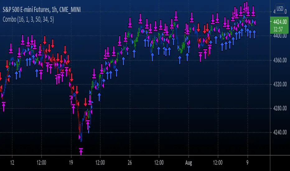
Chart OscillatorI present you the chart oscillator where an oscillator (Stoch or RSI) is plotted
on the chart itself (instead of below the chart)
It is inspired on an idea of @Kablamicus
Instead of having the lines between 0 and 100, here the '0-100' are
- lowest(low, len)
- highest(high, len)
An overbought/oversold and a middle line is derived from these lines
and the oscillator goes in between.
It resembles very much the 'normal' oscillator, with a few extra's:
- you can see the movement of the candles against the oscillator
- S/R levels of oscillator, 50 line, overbought/oversold line, 0-100 line
Stoch:
RSI:
Also a table is included with the Stoch/RSI values
Cheers!

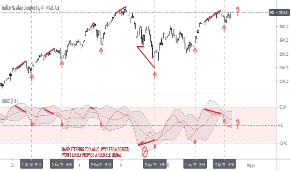
Bollinger on Bollinger OscillatorThis study is a user-friendly workaround to the BBOE+ (attached at the bottom).
I applied Bollinger Bands on BB Oscillator which spend his time bouncing between +100 -100 levels both representing extremes market conditions. You can use it to spot reliable entries/exits opportunities.
During an uptrend when the oscillator tends to -100 and the lower BB turn up you should consider a BUY. Do the same thing when the oscillator pushes under the lower BB nearby the Zero Line.
Make the opposite during a downtrend.
Also look for divergencies that occurs nearby the borders and BB squeezes too.
You can vary both the lenght for the Oscillator and BB.
Use “Upper Multiplier” and “Lower Multiplier” to set two different StDev from the basis (if you need).
You may also consider to apply an offset to the BB.
Is up to you to match the configuration that better-fits your market and time frame.
Default settings could well fits this IXIC 4H Chart.
So that this is basically a price-based indicator you would better consider to pair it with a volume-based or an absolute-momentum-based one.
SHARING IS INTENDED FOR EDUCATIONAL PURPOSE ONLY. NOT FOR PROFESSIONAL USE.
WILL APPRECIATE ANY FEEDBACK, QUESTION, SUGGESTION. (*)
(*) Please don’t ask me for “magic-setting” that do not exit, nor for “kaleidoscopic effects” cause I’m a big fan of such a minimalistic yet profession layouts.
FOLLOW UP TO CHECK UPDATES!