Leading Indicator by Parag RautBreakdown of the Leading Indicator:
Linear Regression (LRC):
A linear regression line is used to estimate the current trend direction. When the price is above or below the regression line, it indicates whether the price is deviating from its mean, signaling potential reversals.
Rate of Change (ROC):
ROC measures the momentum of the price over a set period. By using thresholds (positive or negative), we predict that the price will continue in the same direction if momentum is strong enough.
Leading Indicator Calculation:
We calculate the difference between the price and the linear regression line. This is normalized using the standard deviation of price over the same period, giving us a leading signal based on price divergence from the mean trend.
The leading indicator is used to forecast changes in price behavior by identifying when the price is either stretched too far from the mean (indicating a potential reversal) or showing strong momentum in a particular direction (predicting trend continuation).
Buy and Sell Signals:
Buy Signal: Generated when ROC is above a threshold and the leading indicator shows the price is above the regression line.
Sell Signal: Generated when ROC is below a negative threshold and the leading indicator shows the price is below the regression line.
Visual Representation:
The indicator oscillates around zero. Values above zero signal potential upward price movements, while values below zero signal potential downward movements.
Background colors highlight potential buy (green) and sell (red) areas based on our conditions.
How It Works as a Leading Indicator:
This indicator attempts to predict price movements before they happen by combining the trend (via linear regression) and momentum (via ROC).
When the price significantly diverges from the trendline and momentum supports a continuation, it signals a potential entry point (either buy or sell).
It is leading in that it anticipates price movement before it becomes fully apparent in the market.
Next Steps:
You can adjust the length of the linear regression and ROC to fine-tune the indicator’s sensitivity to your trading style.
This can be combined with other indicators or used as part of a larger strategy
Regressions

Aurous - Horizontal Rays Define Pip Size:
Since 1 pip for XAUUSD is usually considered as 0.1, the pip Size is set to 0.1. A 50-pip interval is therefore 50 * 0.1 = 5.0.
Nearest Pip Level Calculation:
We find the nearest 50-pip level based on the current price of XAUUSD. The formula nearestPipLevel = round(close / pipInterval) * pipInterval rounds the current price to the nearest multiple of the 50-pip interval.
Loop for Multiple Lines:
We use a loop that runs from -20 to 20 to plot horizontal ray lines 50 pips above and below the current price. The range (-20 to 20) ensures there are enough lines plotted both above and below the price.
Horizontal Ray Lines:
The line.new function is used to draw the horizontal rays, extending to the right.
Plot Current Price:
We also plot the closing price with a blue line to make it easier to track the price against the horizontal rays.

Connors RSI with Down GapThe Connors RSI with Down Gap indicator is a technical tool designed to support Larry Connors' Terror Gap Strategy, which is part of his broader framework outlined in the book "Buy the Fear, Sell the Greed: 7 Behavioral Quant Strategies for Traders." This specific indicator integrates the ConnorsRSI calculation with a focus on detecting down gaps in price, providing insights into moments when panic selling may occur.
The ConnorsRSI
ConnorsRSI is a composite indicator developed by Larry Connors that combines three core components:
RSI: A short-term relative strength index measuring the speed and magnitude of price changes.
Streak RSI: Tracks consecutive up or down closes to assess momentum.
Percent Rank: Evaluates how the current close ranks in relation to past prices.
When combined, these three elements provide a nuanced view of short-term overbought or oversold conditions. ConnorsRSI readings below a certain threshold (commonly 30 or lower) suggest that the asset has been heavily sold, indicating potential exhaustion of selling pressure.
Behavioral Finance Insights
The Terror Gap Strategy is grounded in principles from behavioral finance, which studies how psychological factors affect market participants' decision-making. Specifically, the indicator exploits the fear and irrational behavior that often arise when traders face persistent losses, especially after a down gap. According to behavioral finance theories like prospect theory (Kahneman & Tversky, 1979), people tend to overreact to losses, leading to panic selling. This creates opportunities for contrarian traders who understand the psychology behind these market movements.
The ConnorsRSI with Down Gap indicator works because it identifies:
Overextended selling through the ConnorsRSI, where persistent price declines result in low RSI values (indicating panic).
Gap down days, where the opening price is below the previous day’s close, typically amplifying the sense of loss and fear for traders already in losing positions.
Why This Indicator Works
The psychology of losses makes traders more prone to selling during periods of fear, especially when confronted with a gap down after sustained price declines. This indicator, by combining ConnorsRSI with down gaps, offers a quantitative way to spot these moments of panic. Traders can take advantage of these signals to enter positions when the market is in a state of fear, often when there is potential for a reversion to the mean.
Indicator Mechanics
In the current implementation:
The ConnorsRSI is calculated using three components: a short-term RSI, streak RSI, and percent rank.
When the ConnorsRSI drops below a user-defined lower threshold, the indicator highlights oversold conditions.
If there is a down gap (open price lower than the previous close) and the ConnorsRSI is below the threshold, a label is displayed, signaling a potential opportunity to buy.
Practical Use and Application
For traders looking to implement the Terror Gap Strategy, this indicator provides a clear visual cue (via background coloring and labels) when conditions are ripe for a contrarian trade. It can be particularly useful for traders who thrive on taking advantage of fear-driven sell-offs.
However, to fully understand and apply this strategy effectively, it is recommended to purchase Larry Connors' book "Buy the Fear, Sell the Greed." The book provides detailed explanations of how to execute the strategy with precision, including insights into exit conditions, scaling into positions, and managing risk.
Conclusion
The ConnorsRSI with Down Gap indicator combines quantitative analysis with behavioral finance principles to exploit fear-driven market behavior. By utilizing this tool within a disciplined trading strategy, traders can potentially profit from temporary market inefficiencies caused by panic selling.
References
Kahneman, D., & Tversky, A. (1979). Prospect theory: An analysis of decision under risk. Econometrica, 47(2), 263-291.
Connors, L. (2013). Buy the Fear, Sell the Greed: 7 Behavioral Quant Strategies for Traders.
This indicator can be a valuable asset, but understanding its proper use within a broader strategy framework is essential. Purchasing Connors' book is a recommended step toward mastering the approach.

Stationarity Test: Dickey-Fuller & KPSS [Pinescriptlabs]
📊 Kwiatkowski-Phillips-Schmidt-Shin Model Indicator & Dickey-Fuller Test 📈
This algorithm performs two statistical tests on the price spread between two selected instruments: the first from the current chart and the second determined in the settings. The purpose is to determine if their relationship is stationary. It then uses this information to generate **visual signals** based on how far the current relationship deviates from its historical average.
⚙️ Key Components:
• 🧪 ADF Test (Augmented Dickey-Fuller):** Checks if the spread between the two instruments is stationary.
• 🔬 KPSS Test (Kwiatkowski-Phillips-Schmidt-Shin):** Another test for stationarity, complementing the ADF test.
• 📏 Z-Score Calculation:** Measures how many standard deviations the current spread is from its historical mean.
• 📊 Dynamic Threshold:** Adjusts the trading signal threshold based on recent market volatility.
🔍 What the Values Mean:
The indicator displays several key values in a table:
• 📈 ADF Stationarity:** Shows "Stationary" or "Non-Stationary" based on the ADF test result.
• 📉 KPSS Stationarity:** Shows "Stationary" or "Non-Stationary" based on the KPSS test result.
• 📏 Current Z-Score:** The current Z-score of the spread.
• 🔗 Hedge Ratio:** The relationship coefficient between the two instruments.
• 🌐 Market State:** Describes the current market condition based on the Z-score.
📊 How to Interpret the Chart:
• The main chart displays the Z-score of the spread over time.
• The green and red lines represent the upper and lower thresholds for trading signals.
• The area between the **Z-score** and the thresholds is filled when a trading signal is active.
• Additional charts show the **statistics of the ADF and KPSS tests** and their critical values.
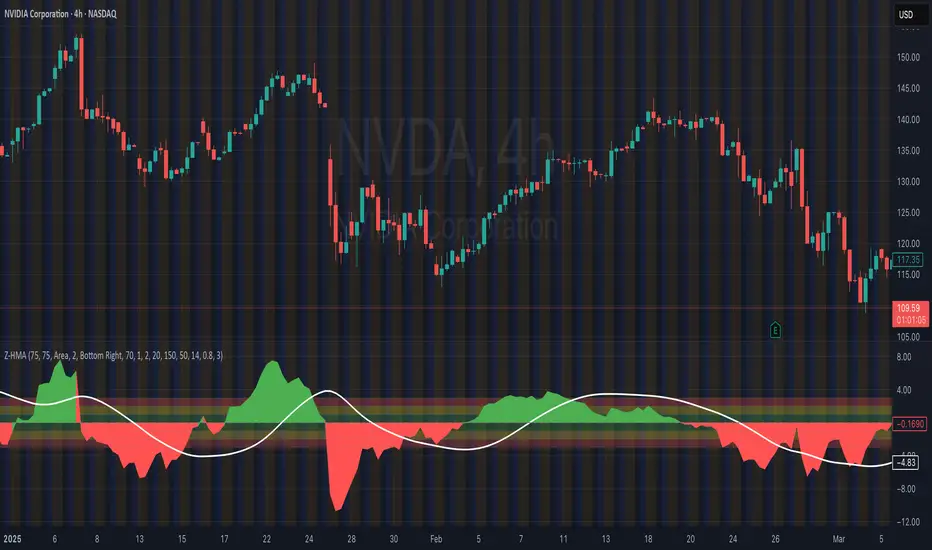
**📉 Practical Example: NVIDIA Corporation (NVDA)**
Looking at the chart for **NVIDIA Corporation (NVDA)**, we can see how the indicator applies in a real case:
1. **Main Chart (Top):**
• Shows the **historical price** of NVIDIA on a weekly scale.
• A general **uptrend** is observed with periods of consolidation.
2. **KPSS & ADF Indicator (Bottom):**
• The lower chart shows the KPSS & ADF Model indicator applied to NVIDIA.
• The **green line** represents the Z-score of the spread.
• The **green shaded areas** indicate periods where the Z-score exceeded the thresholds, generating trading signals.
3. **📋 Current Values in the Table:**
• **ADF Stationarity:** Non-Stationary
• **KPSS Stationarity:** Non-Stationary
• **Current Z-Score:** 3.45
• **Hedge Ratio:** -164.8557
• **Market State:** Moderate Volatility
4. **🔍 Interpretation:**
• A Z-score of **3.45** suggests that NVIDIA’s price is significantly above its historical average relative to **EURUSD**.
• Both the **ADF** and **KPSS** tests indicate **non-stationarity**, suggesting **caution** when using mean reversion signals at this moment.
• The market state "Moderate Volatility" indicates noticeable deviation, but not extreme.
---
**💡 Usage:**
• **When Both Tests Show Stationarity:**
• **🔼 If Z-score > Upper Threshold:** Consider **buying the first instrument** and **selling the second**.
• **🔽 If Z-score < Lower Threshold:** Consider **selling the first instrument** and **buying the second**.
• **When Either Test Shows Non-Stationarity:**
• Wait for the relationship to become **stationary** before trading.
• **Market State:**
• Use this information to evaluate **general market conditions** and adjust your trading strategy accordingly.
**Mirror Comparison of the Same as Symbol 2 🔄📊**
**📊 Table Values:**
• **Extreme Volatility Threshold:** This value is displayed when the **Z-score** exceeds **100%**, indicating **extreme deviation**. It signals a potential **trading opportunity**, as the spread has reached unusually high or low levels, suggesting a **reversion or correction** in the market.
• **Mean Reversion Threshold:** Appears when the **Z-score** begins returning towards the mean after a period of **high or extreme volatility**. It indicates that the spread between the assets is returning to normal levels, suggesting a phase of **stabilization**.
• **Neutral Zone:** Displayed when the **Z-score** is near **zero**, signaling that the spread between assets is within expected limits. This indicates a **balanced market** with no significant volatility or clear trading opportunities.
• **Low Volatility Threshold:** Appears when the **Z-score** is below **70%** of the dynamic threshold, reflecting a period of **low volatility** and market stability, indicating fewer trading opportunities.
Español:
📊 Indicador del Modelo Kwiatkowski-Phillips-Schmidt-Shin & Prueba de Dickey-Fuller 📈
Este algoritmo realiza dos pruebas estadísticas sobre la diferencia de precios (spread) entre dos instrumentos seleccionados: el primero en el gráfico actual y el segundo determinado en la configuración. El objetivo es determinar si su relación es estacionaria. Luego utiliza esta información para generar señales visuales basadas en cuánto se desvía la relación actual de su promedio histórico.
⚙️ Componentes Clave:
• 🧪 Prueba ADF (Dickey-Fuller Aumentada): Verifica si el spread entre los dos instrumentos es estacionario.
• 🔬 Prueba KPSS (Kwiatkowski-Phillips-Schmidt-Shin): Otra prueba para la estacionariedad, complementando la prueba ADF.
• 📏 Cálculo del Z-Score: Mide cuántas desviaciones estándar se encuentra el spread actual de su media histórica.
• 📊 Umbral Dinámico: Ajusta el umbral de la señal de trading en función de la volatilidad reciente del mercado.
🔍 Qué Significan los Valores:
El indicador muestra varios valores clave en una tabla:
• 📈 Estacionariedad ADF: Muestra "Estacionario" o "No Estacionario" basado en el resultado de la prueba ADF.
• 📉 Estacionariedad KPSS: Muestra "Estacionario" o "No Estacionario" basado en el resultado de la prueba KPSS.
• 📏 Z-Score Actual: El Z-score actual del spread.
• 🔗 Ratio de Cobertura: El coeficiente de relación entre los dos instrumentos.
• 🌐 Estado del Mercado: Describe la condición actual del mercado basado en el Z-score.
📊 Cómo Interpretar el Gráfico:
• El gráfico principal muestra el Z-score del spread a lo largo del tiempo.
• Las líneas verdes y rojas representan los umbrales superior e inferior para las señales de trading.
• El área entre el Z-score y los umbrales se llena cuando una señal de trading está activa.
• Los gráficos adicionales muestran las estadísticas de las pruebas ADF y KPSS y sus valores críticos.
📉 Ejemplo Práctico: NVIDIA Corporation (NVDA)
Observando el gráfico para NVIDIA Corporation (NVDA), podemos ver cómo se aplica el indicador en un caso real:
Gráfico Principal (Superior): • Muestra el precio histórico de NVIDIA en escala semanal. • Se observa una tendencia alcista general con períodos de consolidación.
Indicador KPSS & ADF (Inferior): • El gráfico inferior muestra el indicador Modelo KPSS & ADF aplicado a NVIDIA. • La línea verde representa el Z-score del spread. • Las áreas sombreadas en verde indican períodos donde el Z-score superó los umbrales, generando señales de trading.
📋 Valores Actuales en la Tabla: • Estacionariedad ADF: No Estacionario • Estacionariedad KPSS: No Estacionario • Z-Score Actual: 3.45 • Ratio de Cobertura: -164.8557 • Estado del Mercado: Volatilidad Moderada
🔍 Interpretación: • Un Z-score de 3.45 sugiere que el precio de NVIDIA está significativamente por encima de su promedio histórico en relación con EURUSD. • Tanto la prueba ADF como la KPSS indican no estacionariedad, lo que sugiere precaución al usar señales de reversión a la media en este momento. • El estado del mercado "Volatilidad Moderada" indica una desviación notable, pero no extrema.
💡 Uso:
• Cuando Ambas Pruebas Muestran Estacionariedad:
• 🔼 Si Z-score > Umbral Superior: Considera comprar el primer instrumento y vender el segundo.
• 🔽 Si Z-score < Umbral Inferior: Considera vender el primer instrumento y comprar el segundo.
• Cuando Alguna Prueba Muestra No Estacionariedad:
• Espera a que la relación se vuelva estacionaria antes de operar.
• Estado del Mercado:
• Usa esta información para evaluar las condiciones generales del mercado y ajustar tu estrategia de trading en consecuencia.
Comparativo en Espejo del Mismo Como Símbolo 2 🔄📊
📊 Valores de la Tabla:
• Umbral de Volatilidad Extrema: Este valor se muestra cuando el Z-score supera el 100%, indicando desviación extrema. Señala una posible oportunidad de trading, ya que el spread entre los activos ha alcanzado niveles inusualmente altos o bajos, lo que podría indicar una reversión o corrección en el mercado.
• Umbral de Reversión a la Media: Aparece cuando el Z-score comienza a volver hacia la media tras un período de alta o extrema volatilidad. Indica que el spread entre los activos está regresando a niveles normales, sugiriendo una fase de estabilización.
• Zona Neutral: Se muestra cuando el Z-score está cerca de cero, señalando que el spread entre activos está dentro de lo esperado. Esto indica un mercado equilibrado con ninguna volatilidad significativa ni oportunidades claras de trading.
• Umbral de Baja Volatilidad: Aparece cuando el Z-score está por debajo del 70% del umbral dinámico, reflejando un período de baja volatilidad y estabilidad del mercado, indicando menos oportunidades de trading.

Enhanced Local Polynomial Regression [Yosiet]Local Polynomial Regression (LPR) is an advanced statistical method that offers a flexible approach to estimating the underlying trend in financial time series data.
The Mathematical Explanation
The core idea of LPR is to fit a polynomial of degree p at each point x using weighted least squares. The weight of each data point decreases with its distance from x, controlled by a kernel function and a bandwidth parameter.
The general form of the local polynomial estimator is:
β̂(x) = argmin Σ K((Xi - x) / h) (Yi - β0 - β1(Xi - x) - ... - βp(Xi - x)^p)^2
Where:
β̂(x) is the vector of estimated coefficients
K is the kernel function
h is the bandwidth
Xi and Yi are the predictor and response variables
p is the degree of the polynomial
Our implementation uses the Epanechnikov kernel:
K(u) = 3/4 * (1 - u^2) for |u| ≤ 1, 0 otherwise
The Implementation
This script implements LPR for the easier way to interpret its values with the following key components:
Input Parameters: Can adjust the lookback period, bandwidth, and polynomial degree.
Kernel Function: The Epanechnikov kernel is used for weighting.
LPR Function: Implements the core algorithm using matrix operations.
Signal Generation: Generates buy/sell signals based on crossovers of smoothed price and LPR results.
How to Use
Apply the indicator to your chart in TradingView.
Adjust the input parameters:
Lookback Period: Controls how many past bars are considered.
Bandwidth: Affects the smoothness of the regression line.
Polynomial Degree: Determines the complexity of the local fit.
Signal Smoothing Length: Adjusts the responsiveness of buy/sell signals.
Monitor buy/sell signals for potential trade entries.
Limitations
Sensitivity to Parameters: The choice of bandwidth and polynomial degree significantly impacts the results.
Lag: Like all trend-following indicators, LPR may lag behind rapid price movements.
Edge Effects: The indicator may be less reliable at the edges of the data (recent bars).
Recommendations
Parameter Optimization: Experiment with different lookback periods, bandwidths, and polynomial degrees to find the best fit for your trading style and timeframe.
Combine with Other Indicators: Use LPR in conjunction with momentum oscillators or volume indicators for confirmation.
Multiple Timeframes: Apply LPR on different timeframes to gain a more comprehensive view of the trend.
Avoid Overfitting: Be cautious of using high polynomial degrees, as they may lead to overfitting on historical data.
Consider Market Conditions: LPR works best in trending markets; be aware of its limitations in ranging or highly volatile conditions.
Backtest Thoroughly: Always backtest strategies based on LPR across different market conditions before live trading.
Conclusion
Local Polynomial Regression offers a sophisticated approach to trend analysis in financial markets. By providing a flexible, adaptive trend line, it can help traders identify potential entry and exit points with greater precision than traditional moving averages. However, like all technical indicators, it should be used as part of a comprehensive trading strategy that includes proper risk management and consideration of fundamental factors.
if you have an strategy or idea and need to make it real through an indicator or trading bot, you can DM or comment

Viking Fun PredictОсобая благодарность за оригинальную идею Александру Горчакову
Индикатор предсказывает вырастет или упадет цена на следующей свече
Индикатор отображает красные или зеленые кружки над каждой из свечей
Зеленый кружок прогноз роста
Красный кружок прогноз падения
Индикатор выдает прогноз для шестой свечи на основе пяти свечей
Индикатор берет цены максимумов и минимумов пяти свечей и усредняет их, получая 5 значений. На основе полученных 5 значений строится линейная регрессия
Если линия линейной регрессии возрастает, то индикатор прогнозирует рост (зеленый кружок)
Если линия линейной регрессии возрастает, то индикатор прогнозирует падение (красный кружок)
Компания Викинг предоставляет профессиональный сервис, позволяющий реализовать арбитражные стратегии и маркет-мейкинг, осуществляет обучение трейдеров-арбитражеров.
---------------------------
Special thanks for the original idea to Alexander Gorchakov
The indicator predicts whether the price will rise or fall on the next candle
The indicator displays red or green circles above each of the candles
Green circle growth forecast
Red circle forecast of the fall
The indicator gives a forecast for the sixth candle based on five candles
The indicator takes the prices of the highs and lows of five candles and averages them, getting 5 values. Based on the obtained 5 values, a linear regression is constructed
If the linear regression line increases, the indicator predicts growth (green circle)
If the linear regression line increases, the indicator predicts a fall (red circle)
Viking provides a professional service that allows you to implement arbitrage strategies and market making, and provides training for arbitrage traders.

Points of InterestIndicator for displaying a timed, intraday Range of Price as a Point of Interest (POI) that you may want to track when trading as a potential magnet for price. Quite often you will see Price return to prior days price range before continuing to move. This enables you to track specific portions of a Days Trading session to see what has been revisited and what has not yet been re traded to.
The range is tracked for each trading day between the times that you specify in the Inputs ‘POI Time’ parameter You can also set the Time zone of the Range.
It will mark the Range High and Low for the timed range with lines that can be optionally extended and can be customised in terms of colour, style and width.
It will also Plot a line showing the Equilibrium of the range which is 50% from the High to the Low point of price during the time window that you specified in the ‘POI Time’ Parameter. This can also be customised in terms of visibility, colour, style and width.
You can control an optional Label for the POI Equilibrium Line to include a combination of a user defined prefix, the Date that the POI Equilibrium Line’s range is from and the Price Level of the Equilibrium Line. The colour and size of the label is also configurable
This indicator will also track when a POI Equilibrium Line has been traded to or ‘Tapped’. The tracking can be started after a configurable number of minutes have elapsed from the end of the POI Time window. This can also be customised in terms of visibility, colour, style, extended toggle and width.
Optionally Taps of the POI Equilibrium Level can be counted as valid during specific time windows or session of the day - for example only count taps during New York Morning Trading session.
The indicator uses Lower Time Frame data to compute the Range and 50% / Equilibrium Level so will work accurately on Chart Timeframes up to and including Daily with The POI Time specified down to a Minute resolution.

Key Times & Opening Prices [Olitrades]This indicator plots key time's (opening prices) with the possibility of vertical separators. It was initially created to utilize on the indices futures market, utilizing ICT logic.
These opening prices are often utilized to determine if price is currently at a premium or a discounted value.
The default times include:
Daily Open (18:00 PM)
Midnight (00:00 AM)
Settlement (15:00 PM)
7:30 AM
8:30 AM
9:30 AM (Equities Open)
10:00 AM (Morning 4h Candle Open)
14:00 PM (Afternoon 4h Candle Open)
Along with up to three custom time slots.
All times used in the indicator are Eastern Standard time (New York local time) and will automatically adjust no matter your time zone.
Historical
When in historical mode, the indicator will keep the previous levels so you can easily visualize them and their relation to price.
You can also choose how many past levels you want to see. This allows you to back test only specific days/weeks.
Other Inputs
The indicator contains an adjustable offset, to modify how far the line extends depending on the current timeframe.
Each one of the above-mentioned levels can be turned on and off, including the custom times. You can also choose between plotting just the opening price, a vertical line separator, or both! All of these lines have adjustable styles (dotted, dashed or solid) and width.
They also have custom cut offs. You may choose specific cut off times for custom time slots (when to stop extending the lines), as well as for AM (before noon) default levels and PM (after noon) default levels.
The indicator also allows to show text labels next to these lines, which is set by default but can be turned off. Custom times also include custom text options.

HMA Z-Score Probability Indicator by Erika BarkerThis indicator is a modified version of SteverSteves's original work, enhanced by Erika Barker. It visually represents asset price movements in terms of standard deviations from a Hull Moving Average (HMA), commonly known as a Z-Score.
Key Features:
Z-Score Calculation: Measures how many standard deviations the current price is from its HMA.
Hull Moving Average (HMA): This moving average provides a more responsive baseline for Z-Score calculations.
Flexible Display: Offers both area and candlestick visualization options for the Z-Score.
Probability Zones: Color-coded areas showing the statistical likelihood of prices based on their Z-Score.
Dynamic Price Level Labels: Displays actual price levels corresponding to Z-Score values.
Z-Table: An optional table showing the probability of occurrence for different Z-Score ranges.
Standard Deviation Lines: Horizontal lines at each standard deviation level for easy reference.
How It Works:
The indicator calculates the Z-Score by comparing the current price to its HMA and dividing by the standard deviation. This Z-Score is then plotted on a separate pane below the main chart.
Green areas/candles: Indicate prices above the HMA (positive Z-Score)
Red areas/candles: Indicate prices below the HMA (negative Z-Score)
Color-coded zones:
Green: Within 1 standard deviation (high probability)
Yellow: Between 1 and 2 standard deviations (medium probability)
Red: Beyond 2 standard deviations (low probability)
The HMA line (white) shows the trend of the Z-Score itself, offering insight into whether the asset is becoming more or less volatile over time.
Customization Options:
Adjust lookback periods for Z-Score and HMA calculations
Toggle between area and candlestick display
Show/hide probability fills, Z-Table, HMA line, and standard deviation bands
Customize text color and decimal rounding for price levels
Interpretation:
This indicator helps traders identify potential overbought or oversold conditions based on statistical probabilities. Extreme Z-Score values (beyond ±2 or ±3) often suggest a higher likelihood of mean reversion, while consistent Z-Scores in one direction may indicate a strong trend.
By combining the Z-Score with the HMA and probability zones, traders can gain a nuanced understanding of price movements relative to recent trends and their statistical significance.
Correlation Clusters [LuxAlgo]The Correlation Clusters is a machine learning tool that allows traders to group sets of tickers with a similar correlation coefficient to a user-set reference ticker.
The tool calculates the correlation coefficients between 10 user-set tickers and a user-set reference ticker, with the possibility of forming up to 10 clusters.
🔶 USAGE
Applying clustering methods to correlation analysis allows traders to quickly identify which set of tickers are correlated with a reference ticker, rather than having to look at them one by one or using a more tedious approach such as correlation matrices.
Tickers belonging to a cluster may also be more likely to have a higher mutual correlation. The image above shows the detailed parts of the Correlation Clusters tool.
The correlation coefficient between two assets allows traders to see how these assets behave in relation to each other. It can take values between +1.0 and -1.0 with the following meaning
Value near +1.0: Both assets behave in a similar way, moving up or down at the same time
Value close to 0.0: No correlation, both assets behave independently
Value near -1.0: Both assets have opposite behavior when one moves up the other moves down, and vice versa
There is a wide range of trading strategies that make use of correlation coefficients between assets, some examples are:
Pair Trading: Traders may wish to take advantage of divergences in the price movements of highly positively correlated assets; even highly positively correlated assets do not always move in the same direction; when assets with a correlation close to +1.0 diverge in their behavior, traders may see this as an opportunity to buy one and sell the other in the expectation that the assets will return to the likely same price behavior.
Sector rotation: Traders may want to favor some sectors that are expected to perform in the next cycle, tracking the correlation between different sectors and between the sector and the overall market.
Diversification: Traders can aim to have a diversified portfolio of uncorrelated assets. From a risk management perspective, it is useful to know the correlation between the assets in your portfolio, if you hold equal positions in positively correlated assets, your risk is tilted in the same direction, so if the assets move against you, your risk is doubled. You can avoid this increased risk by choosing uncorrelated assets so that they move independently.
Hedging: Traders may want to hedge positions with correlated assets, from a hedging perspective, if you are long an asset, you can hedge going long a negatively correlated asset or going short a positively correlated asset.
Grouping different assets with similar behavior can be very helpful to traders to avoid over-exposure to those assets, traders may have multiple long positions on different assets as a way of minimizing overall risk when in reality if those assets are part of the same cluster traders are maximizing their risk by taking positions on assets with the same behavior.
As a rule of thumb, a trader can minimize risk via diversification by taking positions on assets with no correlations, the proposed tool can effectively show a set of uncorrelated candidates from the reference ticker if one or more clusters centroids are located near 0.
🔶 DETAILS
K-means clustering is a popular machine-learning algorithm that finds observations in a data set that are similar to each other and places them in a group.
The process starts by randomly assigning each data point to an initial group and calculating the centroid for each. A centroid is the center of the group. K-means clustering forms the groups in such a way that the variances between the data points and the centroid of the cluster are minimized.
It's an unsupervised method because it starts without labels and then forms and labels groups itself.
🔹 Execution Window
In the image above we can see how different execution windows provide different correlation coefficients, informing traders of the different behavior of the same assets over different time periods.
Users can filter the data used to calculate correlations by number of bars, by time, or not at all, using all available data. For example, if the chart timeframe is 15m, traders may want to know how different assets behave over the last 7 days (one week), or for an hourly chart set an execution window of one month, or one year for a daily chart. The default setting is to use data from the last 50 bars.
🔹 Clusters
On this graph, we can see different clusters for the same data. The clusters are identified by different colors and the dotted lines show the centroids of each cluster.
Traders can select up to 10 clusters, however, do note that selecting 10 clusters can lead to only 4 or 5 returned clusters, this is caused by the machine learning algorithm not detecting any more data points deviating from already detected clusters.
Traders can fine-tune the algorithm by changing the 'Cluster Threshold' and 'Max Iterations' settings, but if you are not familiar with them we advise you not to change these settings, the defaults can work fine for the application of this tool.
🔹 Correlations
Different correlations mean different behaviors respecting the same asset, as we can see in the chart above.
All correlations are found against the same asset, traders can use the chart ticker or manually set one of their choices from the settings panel. Then they can select the 10 tickers to be used to find the correlation coefficients, which can be useful to analyze how different types of assets behave against the same asset.
🔶 SETTINGS
Execution Window Mode: Choose how the tool collects data, filter data by number of bars, time, or no filtering at all, using all available data.
Execute on Last X Bars: Number of bars for data collection when the 'Bars' execution window mode is active.
Execute on Last: Time window for data collection when the `Time` execution window mode is active. These are full periods, so `Day` means the last 24 hours, `Week` means the last 7 days, and so on.
🔹 Clusters
Number of Clusters: Number of clusters to detect up to 10. Only clusters with data points are displayed.
Cluster Threshold: Number used to compare a new centroid within the same cluster. The lower the number, the more accurate the centroid will be.
Max Iterations: Maximum number of calculations to detect a cluster. A high value may lead to a timeout runtime error (loop takes too long).
🔹 Ticker of Reference
Use Chart Ticker as Reference: Enable/disable the use of the current chart ticker to get the correlation against all other tickers selected by the user.
Custom Ticker: Custom ticker to get the correlation against all the other tickers selected by the user.
🔹 Correlation Tickers
Select the 10 tickers for which you wish to obtain the correlation against the reference ticker.
🔹 Style
Text Size: Select the size of the text to be displayed.
Display Size: Select the size of the correlation chart to be displayed, up to 500 bars.
Box Height: Select the height of the boxes to be displayed. A high height will cause overlapping if the boxes are close together.
Clusters Colors: Choose a custom colour for each cluster.

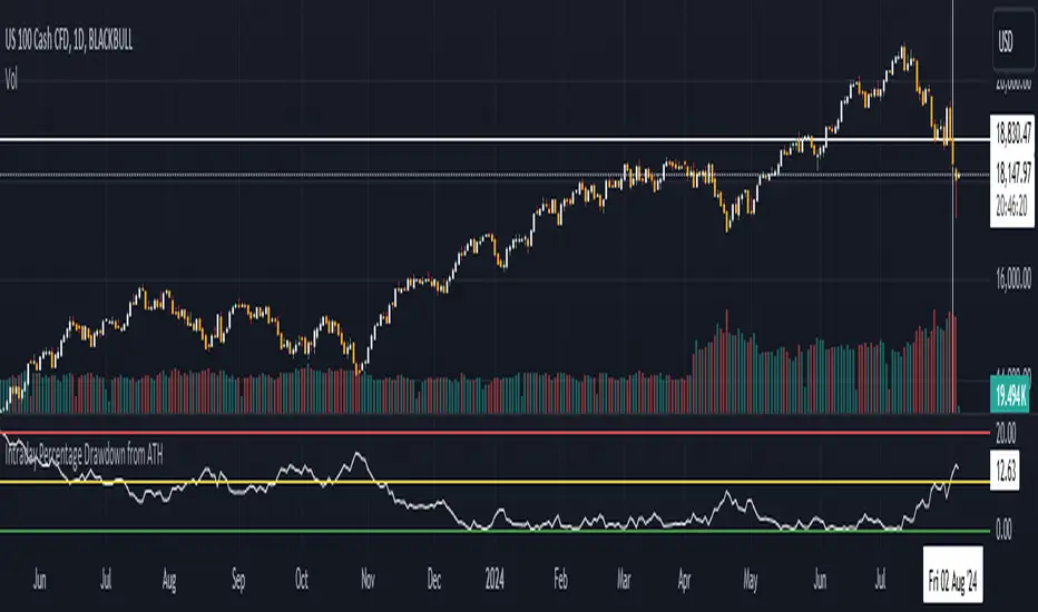
Intraday Percentage Drawdown from ATHTrack Intraday ATH:
The script maintains an intradayATH variable to track the highest price reached during the trading day up to the current point.
This variable is updated whenever a new high is reached.
Calculate Drawdown and Percentage Drawdown:
The drawdown is calculated as the difference between the intradayATH and the current closing price (close).
The percentage drawdown is calculated by dividing the drawdown by the intradayATH and multiplying by 100.
Plot Percentage Drawdown:
The percentageDrawdown is plotted on the chart with a red line to visually represent the drawdown from the intraday all-time high.
Draw Recession Line:
A horizontal red line is drawn at the 20.00 level, labeled "Recession". The line is styled as dotted and has a width of 2 for better visibility.
Draw Correction Line:
A horizontal yellow line is drawn at the 10.00 level, labeled "Correction". The line is styled as dotted and has a width of 2 for better visibility.
Draw All Time High Line:
A horizontal green line is drawn at the 0.0 level to represent the all-time high, labeled "All Time High". The line is styled as dotted and has a width of 2 for better visibility.
This script will display the percentage drawdown along with reference lines at 20% (recession), 10% (correction), and 0% (all-time high).
Linear Regression ChannelLinear Regression Channel with Logarithmic Scale Option
This advanced Linear Regression Channel indicator offers traders a powerful tool for technical analysis, with unique features that set it apart from standard implementations.
Key Features:
Logarithmic Scale Option: One of the most distinctive aspects of this indicator is the ability to switch between classic and logarithmic scales. This feature is particularly valuable for long-term analysis, as it ensures that equal percentage changes are represented equally, regardless of the price level.
Flexible Start Date: Unlike many indicators that rely on a fixed number of periods, this tool allows users to set a specific start date and time. This feature provides precise control over the regression analysis timeframe, enhancing its adaptability to various trading strategies.
Customizable Channel Settings: Users can adjust the upper and lower deviation multipliers, allowing for fine-tuning of the channel width to suit different market conditions and trading styles.
Trend Strength Indicator: An optional feature that displays the strength of the trend based on the Pearson correlation coefficient, offering additional insight into the reliability of the current trend.
Comprehensive Visual Customization: The indicator offers extensive color and style options for the regression line, upper and lower channel lines, and fill areas, allowing traders to create a visually appealing and easy-to-read chart setup.
Extended Line Options: Users can choose to extend the regression lines to the left, right, or both, facilitating projection and analysis of future price movements.
Multiple Alert Conditions: The indicator includes four alert conditions for crossing the upper deviation, lower deviation, and the main regression line in both directions, enhancing its utility for active traders.
Why Choose This Indicator:
The combination of logarithmic scale option and flexible start date setting makes this Linear Regression Channel uniquely suited for both short-term and long-term analysis. The logarithmic scale is particularly beneficial for analyzing assets with significant price changes over time, as it normalizes percentage moves across different price levels. This feature, coupled with the ability to set a precise start date, allows traders to perform more accurate and relevant regression analyses, especially when studying specific market cycles or events.
Moreover, the trend strength indicator and customizable visual elements provide traders with a comprehensive tool that not only identifies potential support and resistance levels but also offers insight into the reliability and strength of the current trend.
In summary, this Linear Regression Channel indicator combines flexibility, precision, and insightful analytics, making it an invaluable tool for traders seeking to enhance their technical analysis capabilities on TradingView.

Regression Indicator [BigBeluga]Regression Indicator
Indicator Overview:
The Regression Indicator is designed to help traders identify trends and potential reversals in price movements. By calculating a regression line and a normalized regression indicator, it provides clear visual signals for market direction, aiding in making informed trading decisions. The indicator dynamically updates with the latest market data, ensuring timely and relevant signals.
Key Features:
⦾ Calculations
Regression Indicator: Calculates the linear regression coefficients (slope and intercept) and derives the normalized distance close from the regression line.
// @function regression_indicator is a Normalized Ratio of Regression Lines with close
regression_indicator(src, length) =>
sum_x = 0.0
sum_y = 0.0
sum_xy = 0.0
sum_x_sq = 0.0
distance = 0.0
// Calculate Sum
for i = 0 to length - 1 by 1
sum_x += i + 1
sum_y += src
sum_xy += (i + 1) * src
sum_x_sq += math.pow(i + 1, 2)
// Calculate linear regression coefficients
slope = (length * sum_xy - sum_x * sum_y)
/ (length * sum_x_sq - math.pow(sum_x, 2))
intercept = (sum_y - slope * sum_x) / length
// Calculate Regression Indicator
y1 = intercept + slope
distance := (close - y1)
distance_n = ta.sma((distance - ta.sma(distance, length1))
/ ta.stdev(distance, length1), 10)
⦿ Reversion Signals:
Marks potential trend reversal points.
⦿ Trend Identification:
Highlights when the regression indicator crosses above or below the zero line, signaling potential trend changes.
⦿ Color-Coded Candles:
Changes candle colors based on the regression indicator's value.
⦿ Arrow Markers:
Indicate trend directions on the chart.
⦿ User Inputs
Regression Length: Defines the period for calculating the regression line.
Normalization Length: Period used to normalize the regression indicator.
Signal Line: Length for averaging the regression indicator to generate signals.
Main Color: Color used for plotting the regression line and signals.
The Regression Indicator is a powerful tool for analyzing market trends and identifying potential reversal points. With customizable inputs and clear visual aids, it enhances the trader's ability to make data-driven decisions. The dynamic nature of the indicator ensures it remains relevant with up-to-date market information, making it a valuable addition to any trading strategy."

Market Cycle Phases IndicatorOverview
The Market Cycle Phases Indicator is a powerful tool designed to help traders identify and visualize the different phases of market cycles. By distinguishing between Accumulation, Uptrend, Distribution, and Downtrend phases, this indicator provides a clear and color-coded representation of market conditions, aiding in better decision-making and strategy development. It is especially useful for long-term investors to observe and understand market cycles over extended periods. The phases are color-coded for easy identification: Green for Accumulation, Blue for Uptrend, Yellow for Distribution, and Red for Downtrend.
Key Features
Identifies four key market phases: Accumulation, Uptrend, Distribution, and Downtrend
Uses a combination of moving averages and volatility measures
Color-coded background for easy visualization of market phases
Adjustable parameters for moving average length, volatility length, and volatility threshold
Plots the moving average and Average True Range (ATR) for reference
Suitable for both short-term trading and long-term investing
Concepts Underlying the Calculations
The calculations behind the Market Cycle Phases Indicator are straightforward, combining the principles of moving averages and volatility measures:
Moving Average (MA): A simple moving average is used to determine the overall trend direction.
Average True Range (ATR): This measures market volatility over a specified period.
Volatility Threshold: A multiplier is applied to the ATR to distinguish between high and low volatility conditions.
How It Works
The indicator first calculates a moving average (MA) of the closing prices and the Average True Range (ATR) to measure market volatility. Based on the position of the price relative to the MA and the current volatility level, the indicator determines the current market phase:
Accumulation Phase: Price is below the MA, and volatility is low (Green background). This phase often indicates a period of consolidation and potential buying interest before an uptrend.
Uptrend Phase: Price is above the MA, and volatility is high (Blue background). This phase represents a strong upward movement in price, often driven by increased buying activity.
Distribution Phase: Price is above the MA, and volatility is low (Yellow background). This phase suggests a period of consolidation at the top of an uptrend, where selling interest may start to increase.
Downtrend Phase: Price is below the MA, and volatility is high (Red background). This phase indicates a strong downward movement in price, often driven by increased selling activity.
How Traders Can Use It
Traders can use the Market Cycle Phases Indicator to:
Identify potential entry and exit points based on market phase transitions.
Confirm trends and avoid false signals by considering both trend direction and volatility.
Develop and refine trading strategies tailored to specific market conditions.
Enhance risk management by recognizing periods of high and low volatility.
Observe long-term market cycles to make informed investment decisions.
Example Usage Instructions
Add the Market Cycle Phases Indicator to your chart.
Adjust the input parameters as needed:
Base Length: Default is 50.
Volatility Length: Default is 14.
Volatility Threshold: Default is 1.5.
Observe the color-coded background to identify the current market phase
Use the identified phases to inform your trading decisions:
Consider buying during the Accumulation or Uptrend phases.
Consider selling or shorting during the Distribution or Downtrend phases.
Combine with other indicators and analysis techniques for comprehensive market insights.
By incorporating the Market Cycle Phases Indicator into your trading toolkit, you can gain a clearer understanding of market dynamics and enhance your ability to navigate different market conditions, making it a valuable asset for long-term investing.

Double Top, Double Bottom & Head and Shoulders Patterns [ST]Double Top, Double Bottom & Head and Shoulders Patterns
Description in English:
This indicator identifies double top, double bottom, head and shoulders, and inverse head and shoulders patterns on a 4-hour timeframe. It marks the pivot points with circles and outlines the structures with lines, providing clear visual signals of these important reversal patterns.
The colors are customizable for each pattern type.
Detailed Explanation:
Configuration:
Pivot Length: This input defines the period over which pivot points are calculated. The default value is 10.
Circle Color: This input sets the color of the circles that mark the identified double top and double bottom patterns. The default color is blue.
Line Color: This input sets the color of the lines that circle the identified structures of double top and double bottom patterns. The default color is red.
Head and Shoulders Color: This input sets the color of the circles and lines that mark the head and shoulders patterns. The default color is orange.
Inverse Head and Shoulders Color: This input sets the color of the circles and lines that mark the inverse head and shoulders patterns. The default color is purple.
Pattern Identification:
Pivot High and Low: The script uses the pivothigh and pivotlow functions to identify local maxima and minima, essential for detecting the patterns.
Double Top: Identified when there are two pivot highs within the pivot length, and the second high is equal to the first. This pattern typically indicates a potential reversal from an uptrend to a downtrend.
Double Bottom: Identified when there are two pivot lows within the pivot length, and the second low is equal to the first. This pattern typically indicates a potential reversal from a downtrend to an uptrend.
Head and Shoulders: Identified when there is a higher pivot high (head) between two lower pivot highs (shoulders), indicating a potential reversal from an uptrend to a downtrend.
Inverse Head and Shoulders: Identified when there is a lower pivot low (head) between two higher pivot lows (shoulders), indicating a potential reversal from a downtrend to an uptrend.
Drawing Circles and Lines:
Double Top: Marked with blue circles and red lines.
Double Bottom: Marked with blue circles and red lines.
Head and Shoulders: Marked with orange circles and lines.
Inverse Head and Shoulders: Marked with purple circles and lines.
Indicator Benefits:
Pattern Identification: Helps traders identify key reversal patterns (double top, double bottom, head and shoulders, and inverse head and shoulders) on the 4-hour timeframe.
Visual Cues: Provides clear visual signals for these patterns, aiding in making informed trading decisions.
Customizable Parameters: Allows traders to adjust the pivot length, circle color, line color, head and shoulders color, and inverse head and shoulders color to suit different trading strategies and market conditions.
Justification of Component Combination:
Combining pivot point identification with pattern recognition provides a robust method for detecting significant reversal patterns. The visual cues enhance the trader's ability to quickly spot these patterns on the chart.
How Components Work Together:
The script first identifies pivot points based on the specified pivot length.
It then checks for the presence of double top, double bottom, head and shoulders, and inverse head and shoulders patterns using these pivot points.
When a pattern is identified, it is marked with a circle on the chart, and lines are drawn around the structure to provide a clear visual indication of the pattern's presence.
Título: Padrões de Morro Duplo, Fundo Duplo e Ombro-Cabeça-Ombro
Descrição em Português:
Este indicador identifica padrões de morro duplo, fundo duplo, ombro-cabeça-ombro e ombro-cabeça-ombro invertido no gráfico de 4 horas.
Ele marca os pontos de pivô com círculos e contorna as estruturas com linhas, fornecendo sinais visuais claros desses importantes padrões de reversão. As cores são personalizáveis para cada tipo de padrão.
Explicação Detalhada:
Configuração:
Comprimento do Pivô: Este input define o período sobre o qual os pontos de pivô são calculados. O valor padrão é 10.
Cor do Círculo: Este input define a cor dos círculos que marcam os padrões identificados de morro duplo e fundo duplo. A cor padrão é azul.
Cor da Linha: Este input define a cor das linhas que contornam as estruturas identificadas de morro duplo e fundo duplo. A cor padrão é vermelha.
Cor de Ombro-Cabeça-Ombro: Este input define a cor dos círculos e linhas que marcam os padrões de ombro-cabeça-ombro. A cor padrão é laranja.
Cor de Ombro-Cabeça-Ombro Invertido: Este input define a cor dos círculos e linhas que marcam os padrões de ombro-cabeça-ombro invertido. A cor padrão é lilás.
Identificação de Padrões:
Pivô Alto e Baixo: O script usa as funções pivothigh e pivotlow para identificar máximas e mínimas locais, essenciais para detectar os padrões.
Morro Duplo: Identificado quando há duas máximas de pivô dentro do comprimento do pivô, e a segunda máxima é igual à primeira. Este padrão geralmente indica uma reversão potencial de uma tendência de alta para uma tendência de baixa.
Fundo Duplo: Identificado quando há duas mínimas de pivô dentro do comprimento do pivô, e a segunda mínima é igual à primeira. Este padrão geralmente indica uma reversão potencial de uma tendência de baixa para uma tendência de alta.
Ombro-Cabeça-Ombro: Identificado quando há uma máxima de pivô mais alta (cabeça) entre duas máximas de pivô mais baixas (ombros), indicando uma reversão potencial de uma tendência de alta para uma tendência de baixa.
Ombro-Cabeça-Ombro Invertido: Identificado quando há uma mínima de pivô mais baixa (cabeça) entre duas mínimas de pivô mais altas (ombros), indicando uma reversão potencial de uma tendência de baixa para uma tendência de alta.
Desenho de Círculos e Linhas:
Morro Duplo: Marcado com círculos azuis e linhas vermelhas.
Fundo Duplo: Marcado com círculos azuis e linhas vermelhas.
Ombro-Cabeça-Ombro: Marcado com círculos e linhas laranjas.
Ombro-Cabeça-Ombro Invertido: Marcado com círculos e linhas lilás.
Benefícios do Indicador:
Identificação de Padrões: Ajuda os traders a identificar padrões-chave de reversão (morro duplo, fundo duplo, ombro-cabeça-ombro e ombro-cabeça-ombro invertido) no gráfico de 4 horas.
Sinais Visuais: Fornece sinais visuais claros para esses padrões, auxiliando na tomada de decisões informadas.
Parâmetros Personalizáveis: Permite que os traders ajustem o comprimento do pivô, a cor do círculo, a cor da linha, a cor de ombro-cabeça-ombro e a cor de ombro-cabeça-ombro invertido para se adequar a diferentes estratégias de negociação e condições de mercado.
Justificação da Combinação de Componentes:
Combinar a identificação de pontos de pivô com o reconhecimento de padrões fornece um método robusto para detectar padrões de reversão significativos. Os sinais visuais melhoram a capacidade do trader de identificar rapidamente esses padrões no gráfico.
Como os Componentes Funcionam Juntos:
O script primeiro identifica os pontos de pivô com base no comprimento do pivô especificado.
Em seguida, verifica a presença de padrões de morro duplo, fundo duplo, ombro-cabeça-ombro e ombro-cabeça-ombro invertido usando esses pontos de pivô.
Quando um padrão é identificado, ele é marcado com um círculo no gráfico, e linhas são desenhadas ao redor da estrutura para fornecer uma indicação visual clara da presença do padrão.

Moving avg with regMoving avg with reg
A Moving avg with reg is a series of moving averages plotted on the same chart, each with different time periods. This visual tool helps traders identify the underlying trend and potential reversal points in the market. By observing the interaction and spacing between the moving averages, traders can gauge the market's strength and momentum.
Key Points:
Trend Identification: Multiple moving averages help confirm the direction of the trend. If the shorter-period moving averages are above the longer-period ones, it indicates an uptrend, and vice versa.
Reversal Signals: When shorter-period moving averages cross longer-period ones, it may signal a potential trend reversal.
Market Strength: The spacing between the moving averages indicates the strength of the trend. Wider spacing suggests a strong trend, while narrow spacing may indicate a weakening trend.
Regression Line
A Regression Line, specifically the Linear Regression Indicator (LRI), is a statistical tool used to determine the direction and strength of a trend by fitting a straight line to the price data over a specified period. This line minimizes the distance between itself and the actual price points, providing a clear visual representation of the trend.
Key Points:
Trend Direction: The slope of the regression line indicates the direction of the trend. A positive slope suggests an uptrend, while a negative slope indicates a downtrend.
Price Deviations: The distance between the actual price and the regression line can highlight overbought or oversold conditions. Large deviations may suggest a potential correction.
Predictive Power: By extending the regression line, traders can make predictions about future price movements based on the current trend.

Super IndicatorOverview of the Combined Indicator
This combined indicator leverages three major technical analysis tools:
Bollinger Bands
Linear Regression Channels
Scalping Strategy Indicators (RSI, MACD, SMA)
Each of these tools provides unique insights into market conditions, and their integration offers a comprehensive view of price movements, trends, and potential trading signals.
1. Bollinger Bands
Purpose:
Bollinger Bands are used to measure market volatility and identify overbought or oversold conditions.
Components:
Basis (Middle Band): Typically a 20-period Simple Moving Average (SMA).
Upper Band: Basis + (2 * Standard Deviation).
Lower Band: Basis - (2 * Standard Deviation).
Why They Complement:
Bollinger Bands expand and contract based on market volatility. When the bands are narrow, it indicates low volatility and potential for a significant move. Wide bands indicate high volatility. This helps traders gauge the strength of market moves and potential reversals.
2. Linear Regression Channels
Purpose:
Linear Regression Channels identify the overall trend direction and measure deviation from the mean price over a specific period.
Components:
Middle Line (Linear Regression Line): The line of best fit through the price data over a specified period.
Upper and Lower Lines: Channels created by adding/subtracting a multiple of the standard deviation or another deviation measure from the regression line.
Why They Complement:
Linear Regression Channels provide a clear visual representation of the trend direction and the range within which prices typically fluctuate. This can help traders identify trend continuations and reversals, making it easier to spot entry and exit points.
3. Scalping Strategy Indicators
Purpose:
The RSI, MACD, and SMA are used to generate short-term buy and sell signals, which are essential for scalping strategies aimed at capturing quick profits from small price movements.
Components:
RSI (Relative Strength Index): Measures the speed and change of price movements, typically over 14 periods. It helps identify overbought and oversold conditions.
MACD (Moving Average Convergence Divergence): Consists of the MACD line, Signal line, and histogram. It helps identify changes in the strength, direction, momentum, and duration of a trend.
SMA (Simple Moving Average): The average price over a specified period, used to smooth out price data and identify trends.
Why They Complement:
These indicators provide short-term signals that can confirm or refute the signals given by Bollinger Bands and Linear Regression Channels. For example, a buy signal might be more reliable if the price is near the lower Bollinger Band and the MACD crosses above its signal line.
How They Work Together
Scenario 1: Confirming Trend Continuations
Bollinger Bands: Price staying near the upper band suggests a strong uptrend.
Linear Regression Channels: Price staying above the middle line confirms the uptrend.
5-Minute Scalping Strategy: RSI not in overbought territory, and MACD showing bullish momentum confirms continuation.
Scenario 2: Identifying Reversals
Bollinger Bands: Price touching or moving outside the lower band suggests oversold conditions.
Linear Regression Channels: Price at the lower channel line indicates potential support.
5-Minute Scalping Strategy: RSI in oversold territory, and MACD showing a bullish crossover indicates a reversal.
Scenario 3: Volatility Breakouts
Bollinger Bands: Bands contracting indicates low volatility and potential breakout.
Linear Regression Channels: Price moving away from the middle line signals potential breakout direction.
Scalping Strategy: MACD and RSI confirming the breakout direction for entry.
Input Parameters:
Define settings for Bollinger Bands, Linear Regression Channels, and the scalping strategy.
Allow users to customize lengths, multipliers, and colors.
Bollinger Bands Calculation:
Calculate the basis (SMA) and standard deviation.
Derive the upper and lower bands from the basis and standard deviation.
Linear Regression Channel Calculation:
Compute the slope, average, and intercept of the linear regression line.
Calculate deviations to plot upper and lower channel lines.
5-Minute Scalping Strategy:
Calculate RSI, MACD, and SMA for short-term trend analysis.
Define buy and sell conditions based on these indicators.
Plotting and Alerts:
Plot Bollinger Bands and Linear Regression Channels on the chart.
Plot buy and sell signals with shapes.
Set alerts for key conditions like exiting the regression channel bounds and trend switches.
Conclusion
By combining Bollinger Bands, Linear Regression Channels, and a 5-minute scalping strategy, this indicator offers a robust tool for traders. Bollinger Bands provide volatility insights, Linear Regression Channels highlight trend direction and potential reversals, and the scalping strategy offers precise entry and exit points. Together, these tools can enhance a trader's ability to make informed decisions in various market conditions.
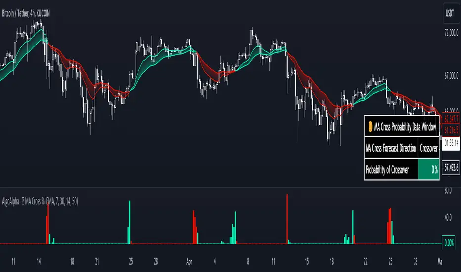
Moving Average Cross Probability [AlgoAlpha]Moving Average Cross Probability 📈✨
The Moving Average Cross Probability by AlgoAlpha calculates the probability of a cross-over or cross-under between the fast and slow values of a user defined Moving Average type before it happens, allowing users to benefit by front running the market.
✨ Key Features:
📊 Probability Histogram: Displays the Probability of MA cross in the form of a histogram.
🔄 Data Table: Displays forecast information for quick analysis.
🎨 Customizable MAs: Choose from various moving averages and customize their length.
🚀 How to Use:
🛠 Add Indicator: Add the indicator to favorites, and customize the settings to suite your trading style.
📊 Analyze Market: Watch the indicator to look for trend shifts early or for trend continuations.
🔔 Set Alerts: Get notified of bullish/bearish points.
✨ How It Works:
The Moving Average Cross Probability Indicator by AlgoAlpha determines the probability by looking at a probable range of values that the price can take in the next bar and finds out what percentage of those possibilities result in the user defined moving average crossing each other. This is done by first using the HMA to predict what the next price value will be, a standard deviation based range is then calculated. The range is divided by the user defined resolution and is split into multiple levels, each of these levels represent a possible value for price in the next bar. These possible predicted values are used to calculate the possible MA values for both the fast and slow MAs that may occur in the next bar and are then compared to see how many of those possible MA results end up crossing each other.
Stay ahead of the market with the Moving Average Cross Probability Indicator AlgoAlpha! 📈💡
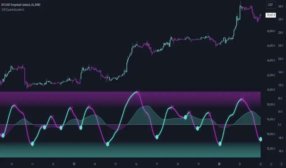
Cosine Kernel Regressions [QuantraSystems]Cosine Kernel Regressions
Introduction
The Cosine Kernel Regressions indicator (CKR) uses mathematical concepts to offer a unique approach to market analysis. This indicator employs Kernel Regressions using bespoke tunable Cosine functions in order to smoothly interpret a variety of market data, providing traders with incredibly clean insights into market trends.
The CKR is particularly useful for traders looking to understand underlying trends without the 'noise' typical in raw price movements. It can serve as a standalone trend analysis tool or be combined with other indicators for more robust trading strategies.
Legend
Fast Trend Signal Line - This is the foreground oscillator, it is colored upon the earliest confirmation of a change in trend direction.
Slow Trend Signal Line - This oscillator is calculated in a similar manner. However, it utilizes a lower frequency within the cosine tuning function, allowing it to capture longer and broader trends in one signal. This allows for tactical trading; the user can trade smaller moves without losing sight of the broader trend.
Case Study
In this case study, the CKR was used alongside the Triple Confirmation Kernel Regression Oscillator (KRO)
Initially, the KRO indicated an oversold condition, which could be interpreted as a signal to enter a long position in anticipation of a price rebound. However, the CKR’s fast trend signal line had not yet confirmed a positive trend direction - suggesting that entering a trade too early and without confirmation could be a mistake.
Waiting for a confirmed positive trend from the CKR proved beneficial for this trade. A few candles after the oversold signal, the CKR's fast trend signal line shifted upwards, indicating a strong upward momentum. This was the optimal entry point suggested by the CKR, occurring after the confirmation of the trend change, which significantly reduced the likelihood of entering during a false recovery or continuation of the downtrend.
This is one of the many uses of the CKR - by timing entries using the fast signal line , traders could avoid unnecessary losses by preventing premature entries.
Methodology
The methodology behind CKR is a multi-layered approach and utilizes many ‘base’ indicators.
Relative Strength Index
Stochastic Oscillator
Bollinger Band Percent
Chande Momentum Oscillator
Commodity Channel Index
Fisher Transform
Volume Zone Oscillator
The calculated output from each indicator is standardized and scaled before being averaged. This prevents any single indicator from overpowering the resulting signal.
// ╔════════════════════════════════╗ //
// ║ Scaling/Range Adjustment ║ //
// ╚════════════════════════════════╝ //
RSI_ReScale (_res ) => ( _res - 50 ) * 2.8
STOCH_ReScale (_stoch ) => ( _stoch - 50 ) * 2
BBPCT_ReScale (_bbpct ) => ( _bbpct - 0.5 ) * 120
CMO_ReScale (_chandeMO ) => ( _chandeMO * 1.15 )
CCI_ReScale (_cci ) => ( _cci / 2 )
FISH_ReScale (_fish1 ) => ( _fish1 * 30 )
VZO_ReScale (_VP, _TV ) => (_VP / _TV) * 110
These outputs are then fed into a customized cosine kernel regression function, which smooths the data, and combines all inputs into a single coherent output.
// ╔════════════════════════════════╗ //
// ║ COSINE KERNEL REGRESSIONS ║ //
// ╚════════════════════════════════╝ //
// Define a function to compute the cosine of an input scaled by a frequency tuner
cosine(x, z) =>
// Where x = source input
// y = function output
// z = frequency tuner
var y = 0.
y := math.cos(z * x)
Y
// Define a kernel that utilizes the cosine function
kernel(x, z) =>
var y = 0.
y := cosine(x, z)
math.abs(x) <= math.pi/(2 * z) ? math.abs(y) : 0. // cos(zx) = 0
// The above restricts the wave to positive values // when x = π / 2z
The tuning of the regression is adjustable, allowing users to fine-tune the sensitivity and responsiveness of the indicator to match specific trading strategies or market conditions. This robust methodology ensures that CKR provides a reliable and adaptable tool for market analysis.
Linear Regression InterceptLinear Regression Intercept (LRI) is a statistical method used to forecast future values based on past data. Financial markets frequently employ it to identify the underlying trend and determine when prices are overextended. Linear regression utilizes the least squares method to create a trendline by minimizing the distance between observed price data and the line. The LRI indicator calculates the intercept of this trendline for each data point, providing insights into price trends and potential trading opportunities.
Calculation and Interpretation of the LRI
The linear regression intercept is calculated using the following formula:
LRI = Y - (b * X)
Where Y represents the dependent variable (price), b is the slope of the regression line, and X is the independent variable (time). To determine the slope b, you can use the formula:
b = Σ / Σ(X - X_mean)^2
Once you have computed the LRI, it can be interpreted as the point at which the regression line intersects the Y-axis (price) when the independent variable (time) is zero. A positive LRI value indicates an upward trend, while a negative value suggests a downward trend. Traders can adjust the parameters of the LRI by modifying the period over which the linear regression is computed, which can impact the indicator’s sensitivity to recent price changes.
How to Use the LRI in Trading
To effectively use the LRI in trading, traders should consider the following:
Understanding the signals generated by the technical indicator: A rising LRI suggests an upward trend, whereas a falling LRI indicates a downward trend. Traders may use this information to help determine the market’s direction and identify reversals.
Combining the technical indicator with other indicators: The LRI can be used in conjunction with other technical indicators, such as moving averages, the Relative Strength Index (RSI), or traditional linear regression lines, to obtain a more comprehensive view of the market. In the case of traditional linear regression lines, the LRI helps traders identify the starting point of the trend, providing additional context to the overall trend direction.
Using the technical indicator for entry and exit signals: When the LRI crosses above or below a specific threshold, traders may consider it a potential entry or exit point. For example, if the LRI crosses above zero, it might signal a possible buying opportunity.
Support and Resistance Polynomial Regressions | Flux ChartsOverview
This script is a dynamic form of support and resistance. Support and resistance plots areas where price commonly reverses its direction or “pivots”. A resistance line for instance is typically found by locating a price point where multiple high pivots occur. A high pivot is where a price increases for a number of bars then decreases for a number of bars creating a local maximum. This script takes the high pivots points but rather than using a horizontal line a polynomial regressed line is used.
It is common to see consecutive higher highs or lower lows or a mixed pattern of both so a classical support or resistance line can be insufficient. This script lets users find a polynomial of best fit for high pivots and low pivots creating a resistance and support line respectively.
Here are the same two sets of high and low pivots the first using linear regressed support and resistance lines the second using quadratic.
Here are the predicted results:
The Quadratic regression gives a much more accurate prediction of future pivot areas and the increase in variance of the data.
Quick Start
Add the script to the chart. Then select a left point and right point on the chart. This will be the data the script uses to calculate a best fit resistance line. Then select another left and right point that will be for the support line.
Now you can confirm your basic settings like the type of regression: Linear Regression, Quadratic Regression, Cubic Regression or Custom Regression.
After confirming the lines will be plotted on the graph.
Custom Polynomial Regression Setting
Polynomials follow the form:
The degree of a polynomial is the highest exponent in the equation. For example the polynomial ax^2 + bx + c has a degree of 2.
Here are the default polynomial options and their equivalent custom polynomial entry:
This allows us to create regressions with a custom number of inflection points. An inflection point is a point where the graph changes from concave up to concave down or vice versa. The maximum number of inflection points a polynomial can have is the degree - 2. Having multiple inflection points in our regression allows for having a closer fit minimizing error.
It should be noted that having a closer fit is not inherently better; this can cause overfitting. Overfitting is when a model is too closely fit to the training data and not generalizable to the population data.

Kaspa Power LawSimple Power Law Indicator for Kaspa with addition of adjustable bands above and below the Power Law Price. Best used on Logarithmic view on Daily Time Frame.

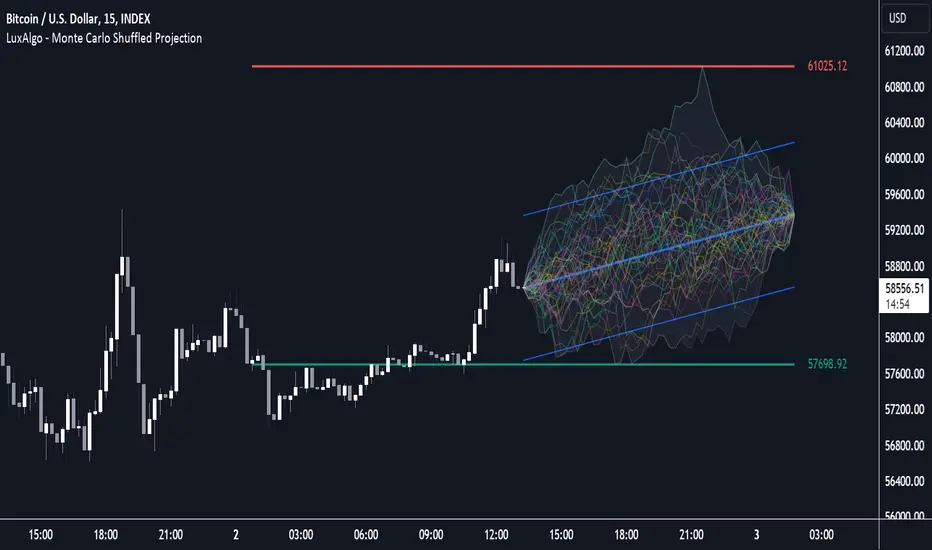
Monte Carlo Shuffled Projection [LuxAlgo]The Monte Carlo Shuffled Projection tool randomly simulates future price points based on historical bar movements made within a user-selected window.
The tool shows potential paths price might take in the future, as well as highlighting potential support/resistance levels.
Note that simulations and their resulting elements are subject to slight changes over time.
🔶 USAGE
By randomly simulating bar movements, a range is developed of potential price action which could be utilized to locate future price development as well as potential support/resistance levels.
Performing a large number of simulations and taking the average at each step will converge toward the result highlighted by the "Average Line", and can point out where the price might develop assuming the trend and amount of volatility persist.
Current closing price + Sum of changes in the calculation window)
This constraint will cause the simulations to always display an endpoint consistent with the current lookback's slope.
While this may be helpful to some traders, this indicator includes an option to produce a less biased range as seen below:
🔶 DETAILS
The Monte Carlo Shuffled Projection tool creates simulations based on the most recent prices within a user-set window. Simulations are done as follows:
Collect each bar's price changes in the user-set window.
Randomize the order of each change in the window.
Project the cumulative sum of the shuffled changes from the current closing price.
Collect data on each point along the way.
This is the process for the Default calculation, for the 'Randomize Direction' calculation, when added onto the front for every other change, the value is inverted, creating the randomized endpoints for each simulation.
The script contains each simulation's data for that bar with a maximum of 1000 simulations.
To get a glimpse behind the scenes each simulation (up to 99) can be viewed using the 'Visualize Simulations' Options as seen below.
Because the script holds the full simulation data, the script can also do calculations on this data, such as calculating standard deviations.
In this script the Standard deviation lines are the average of all standard deviations across the vertical data groups, this provides a singular value that can be displayed a distance away from the simulation center line.
🔶 SETTINGS
Color and Toggle Options are Provided throughout.
Lookback: Sets the number of Bars to include in calculations.
Simulation Count: Sets the number of randomized simulations to calculate. (Max 1000)
Randomize Direction: See Details Above. Creates a more 'Normalized' Distribution
Visualize Simulations: See Details Above. Turns on Visualizations, and colors are randomly generated. Visualized max does not cap the calculated max. If 1000 simulations are used, the data will be from 1000 simulations, however only the last 99 simulations will be visualized.
Standard Deviation Multiplier: Sets the multiplier to use for the Standard Deviation distance away from the center line.