ADX Volatility Waves [BOSWaves]ADX Volatility Waves - Trend-Weighted Volatility Mapping with State-Based Wave Transitions
Overview
ADX Volatility Waves is a regime-aware volatility framework designed to map statistically significant price extremes through adaptive wave structures driven by trend strength.
Rather than treating volatility as a static dispersion metric, this indicator conditions all volatility expansion, contraction, and zone placement on ADX-derived trend intensity. Price behavior is interpreted through wave-like transitions between balance, expansion, and exhaustion states rather than isolated band interactions.
The result is a dynamic, gradient-based wave system that visually encodes volatility cycles and regime shifts in real time, allowing traders to contextualize price movement within trend-weighted volatility waves.
Price is evaluated not by static thresholds, but by its position and progression within adaptive volatility waves shaped by directional strength.
Conceptual Framework
ADX Volatility Waves is built on the premise that volatility unfolds in waves, not straight lines.
Traditional volatility tools identify dispersion but fail to account for how volatility behaves differently across trend regimes. By embedding ADX directly into volatility construction, this indicator ensures that volatility waves expand during strong directional phases and compress during weak or transitioning regimes.
Three guiding principles define the framework:
Volatility must be conditioned on trend strength
Extremes occur within zones, not at lines
Signals should emerge from completed wave transitions, not instantaneous touches
This reframes analysis from reactive mean-reversion toward regime-aware wave interpretation.
Theoretical Foundation
The indicator fuses directional movement theory with statistical volatility modeling.
Bollinger-derived dispersion provides the structural base, while ADX normalization controls the amplitude of volatility waves. As ADX increases, volatility waves widen and deepen; as ADX weakens, waves compress and tighten around equilibrium.
From this foundation, extended upper and lower wave zones are constructed and smoothed to represent statistically significant expansion and contraction phases.
At its core are three interacting systems:
ADX-Controlled Volatility Engine : Standard deviation is dynamically scaled using normalized ADX values, producing trend-weighted volatility waves.
Wave Zone Construction : Smoothed volatility boundaries are offset and expanded to form upper and lower wave zones, defining overextension and compression regions.
State-Based Wave Transition Logic : Signals occur only after price completes a full wave cycle: expansion into an extreme wave zone followed by a confirmed return to equilibrium.
This structure ensures that signals reflect completed volatility waves, not transient noise.
How It Works
ADX Volatility Waves processes price action through layered wave mechanics:
Trend-Weighted Volatility Calculation : Volatility boundaries are dynamically adjusted using ADX influence, allowing wave amplitude to scale with trend strength.
Structural Smoothing : Volatility boundaries are smoothed to stabilize wave geometry and reduce short-term distortions.
Wave Offset & Expansion : Upper and lower wave zones are positioned beyond equilibrium and expanded proportionally to volatility range, forming clearly defined expansion waves.
Gradient Wave Depth Mapping : Each wave zone is subdivided into multiple gradient layers, visually encoding increasing extremity as price moves deeper into a wave.
Wave State Tracking & Cooldown Control : The system tracks prior wave occupancy, enforces neutral stabilization periods, and applies cooldowns to prevent overlapping wave signals.
Compression Detection : Volatility width monitoring identifies compression phases, highlighting conditions where new volatility waves are likely to form.
Together, these processes create a continuous, adaptive wave map of volatility behavior.
Interpretation
ADX Volatility Waves reframes market reading around volatility cycles:
Upper Volatility Waves (Red Gradient) : Represent upside expansion phases. Deeper wave penetration indicates increased overextension relative to trend-adjusted volatility.
Lower Volatility Waves (Green Gradient) : Represent downside expansion phases. Sustained presence signals pressure, while exits toward balance suggest wave completion.
Equilibrium Zone : The neutral region between volatility waves. Confirmed re-entry into this zone marks the completion of a wave cycle and forms the basis for BUY and SELL signals.
Regime Context via ADX : Strong ADX regimes widen waves, reducing premature reversal signals. Weak ADX regimes compress waves, increasing sensitivity to reversion.
Wave progression and completion matter more than single-bar interactions.
Signal Logic & Visual Cues
ADX Volatility Waves produces single-entry BUY and SELL labels as its visual cues, plotted only when price first enters a volatility wave zone after the defined cooldown period.
Buy Signal (Bottom Zone Entry) : A BUY label appears when price enters the lower volatility wave (oversold zone). This highlights potential expansion into undervalued extremes, providing visual context for trend assessment rather than a guaranteed execution trigger.
Sell Signal (Top Zone Entry) : A SELL label appears when price enters the upper volatility wave (overbought zone). This marks potential overextension into upper volatility extremes, serving as a contextual indicator of trend stress.
All labels respect cooldown tracking to prevent clustering. Alerts are tied directly to these zone-entry signals, and a separate alert monitors volatility squeezes for awareness of compression periods.
Strategy Integration
ADX Volatility Waves integrates cleanly into volatility-aware trading frameworks:
Wave Context Mapping : Use wave depth to assess expansion and exhaustion risk rather than forcing immediate entries.
Transition-Based Execution : Prioritize BUY and SELL signals formed after confirmed wave completion.
Trend-Regime Filtering : In strong ADX regimes, treat waves as continuation pressure. In weak regimes, favor completed wave reversions.
Volatility Cycle Awareness : Monitor compression phases to anticipate the emergence of new volatility waves.
Multi-Timeframe Alignment : Apply higher-timeframe ADX regimes to contextualize lower-timeframe wave behavior.
Technical Implementation Details
Core Engine : ADX-normalized volatility expansion
Wave System : Smoothed, offset, expanded volatility waves
Visualization : Multi-layer gradient wave zones
Signal Logic : State-based wave transitions with cooldown enforcement
Alerts : Wave entry, wave completion, volatility compression
Performance Profile : Lightweight, real-time optimized overlay
Optimal Application Parameters
Timeframe Guidance:
1 - 5 min : Short-term volatility waves and intraday transitions
15 - 60 min : Structured intraday wave cycles
4H - Daily : Macro volatility regimes and expansion phases
Suggested Baseline Configuration:
BB Length : 20
BB StdDev : 1.5
ADX Length : 14
ADX Influence : 0.8
Wave Offset : 1.0
Wave Width : 1.0
Neutral Confirmation : 5 bars
These suggested parameters should be used as a baseline; their effectiveness depends on the asset volatility, liquidity, and preferred entry frequency, so fine-tuning is expected for optimal performance.
Performance Characteristics
High Effectiveness:
Markets exhibiting rhythmic volatility expansion and contraction
Assets with responsive ADX regime behavior
Reduced Effectiveness:
Erratic, news-driven price action
Illiquid markets with distorted volatility metrics
Integration Guidelines
Confluence : Combine with BOSWaves structure or trend tools
Discipline : Respect wave completion and cooldown logic
Risk Framing : Interpret wave depth probabilistically, not predictively
Regime Awareness : Always contextualize waves within ADX strength
Disclaimer
ADX Volatility Waves is a professional-grade volatility and regime-mapping tool. It does not predict price and does not guarantee profitability. Performance depends on market conditions, parameter calibration, and disciplined execution. BOSWaves recommends using this indicator as part of a comprehensive analytical framework incorporating trend, volatility, and structural context.
지표 및 전략

CoreHedge: Structure Channels + Pivot S/R (v6, Perfect Parallel)
Main Support and Resistance
- You Can adjust on any timeframe

SIDD EMA RSI Supertrend Signal Table🔥 SIDD EMA RSI SuperTrend Multi-Timeframe Signal Table
**SIDD EMA RSI SuperTrend Signal Table** is a **clean, powerful multi-timeframe trend confirmation dashboard** designed for traders who want **clarity, confluence, and speed** — all in one glance.
This indicator **does NOT repaint** and uses **industry-standard trend logic** combining **EMA structure, RSI momentum, and SuperTrend direction** across **6 different timeframes**.
---
## 🧠 Core Logic Behind the Indicator
This script works on **three independent trend engines**, displayed together in a compact table:
### ✅ 1️⃣ EMA Trend (Structure Based)
* Uses **EMA 50 vs EMA 200**
* **Bullish** → EMA 50 above EMA 200
* **Bearish** → EMA 50 below EMA 200
* Captures **primary market structure**
### ✅ 2️⃣ RSI Trend (Momentum Based)
* RSI Length: **14**
* **Bullish** → RSI > **55**
* **Bearish** → RSI ≤ **55**
* Helps confirm **trend strength & momentum**
### ✅ 3️⃣ SuperTrend (Price Action Based)
* ATR Length: **10**
* Factor: **3.0**
* Clearly defines **trend direction & trailing bias**
* Excellent for **entry & exit alignment**
---
## ⏱️ Multi-Timeframe Coverage
The table analyzes trends across **6 configurable timeframes**:
* Intraday → **5m, 15m, 1H**
* Swing → **4H, Daily**
* Positional → **Weekly**
Each timeframe shows:
* 📈 EMA Trend
* 📊 RSI Trend
* 🔁 SuperTrend Direction
Color-coded for instant readability:
* 🟢 Bullish
* 🔴 Bearish
* ⚪ Neutral
---
## 🎯 How to Use This Indicator
✔ **Trend Trading**
Trade only when **EMA + RSI + SuperTrend align** across higher & lower timeframes.
✔ **Intraday Confirmation**
Use higher TF (1H / 4H) bias and take entries on lower TF.
✔ **Avoid Chop & False Signals**
If signals are mixed → market is likely **sideways or risky**.
✔ **Swing & Positional Trades**
Daily + Weekly alignment gives **high-probability setups**.
---
## ⚙️ Customization Options
* Adjustable **timeframes**
* Table **position** (Top/Bottom – Left/Right)
* Table **size** (Extra Small / Small / Normal)
* Custom **colors, borders & text**
* Optimized for **minimal chart clutter**
---
## ⚠️ Disclaimer
This indicator is a **trend confirmation & decision-support tool**.
Always combine with **price action, support/resistance, and proper risk management**.

Option Chain Pro+ [Max Pain + PCR]
# 📊 Option Chain Pro+ - Complete Options Trading System
## 🎯 Overview
**Option Chain Pro+** is the most comprehensive options analysis indicator for Indian indices (NIFTY, BANKNIFTY, FINNIFTY, MIDCAP, SENSEX, BANKEX). This professional-grade tool combines real-time option chain data, Greeks calculation, Max Pain analysis, Put-Call Ratio (PCR), and intelligent trading signals - all in one powerful indicator.
Perfect for both **premium sellers** and **directional option buyers**, this indicator provides actionable trading signals with specific strike recommendations and entry prices.
---
## ✨ KEY FEATURES
### 📈 **Complete Option Chain Display**
- **Real-time option prices** for Calls and Puts across multiple strikes
- **All 5 Greeks**: Delta (Δ), Gamma (Γ), Theta (θ), Vega (ν), Rho (ρ)
- **Implied Volatility (IV)** for each strike
- **Put-Call Ratio (PCR)** column showing sentiment at each strike level
- **Configurable strikes** (5-15 strikes, default: 9)
- **Color-coded highlighting** for easy identification:
- 🟠 Orange: ATM (At-The-Money) strike
- 🔴 Red: Max Pain strike (💀MP)
- 🟢 Green: Recommended Call buy (🚀)
- 🟣 Magenta: Recommended Put buy (🔻)
### 💀 **Max Pain Analysis**
- **Automatic calculation** of Max Pain point (where option buyers lose most)
- **Visual highlighting** in option chain table
- **Chart level** plotting (red dashed line)
- **Trading signals** based on distance from Max Pain
- **Most effective** in expiry week (last 3-5 days)
### 📊 **Put-Call Ratio (PCR) Analysis**
- **Overall PCR**: Total Put premium / Total Call premium
- **Strike-wise PCR**: Individual PCR at each strike level
- **Color-coded signals**:
- 🔴 Red (PCR > 1.5): Bearish - Heavy put buying
- 🟠 Orange (PCR 0.7-1.5): Neutral - Balanced
- 🟢 Green (PCR < 0.7): Bullish - Heavy call buying
- **Support/Resistance identification** from PCR levels
### 🎯 **Intelligent Trading Signals**
#### **Greek-Based Analysis (7 Indicators)**
1. **DELTA**: Direction bias (Bullish/Bearish/Neutral)
2. **GAMMA**: Risk assessment (High/Moderate/Low)
3. **THETA**: Time decay speed (Fast/Moderate/Slow)
4. **VEGA**: Volatility environment (High/Moderate/Low)
5. **VIX**: Fear gauge (High/Moderate/Low fear)
6. **PCR**: Market sentiment (Bearish/Neutral/Bullish)
7. **MAX PAIN**: Price magnet effect (Below/At/Above)
#### **💰 Premium Selling Signals**
- **Automated recommendations** for credit strategies
- Signals: SELL PREMIUM / HEDGE/PROTECT / NEUTRAL STRATEGY
- Perfect for Iron Condors, Credit Spreads, and premium collection
#### **🚀 Option Buying Signals**
- **Specific strike recommendations** for directional trades
- **Entry prices** displayed in real-time
- **Risk/Reward assessment**: FAVORABLE / MODERATE / UNFAVORABLE
- **Visual highlighting** in option chain for recommended strikes
- Separate signals for Calls (🚀) and Puts (🔻)
### 📐 **Advanced Greeks Calculation**
- **Black-Scholes model** implementation in Pine Script
- **Real-time calculation** for all strikes
- **Accurate pricing** using current market data
- **Configurable risk-free rate** (default: 6.5%)
- **IV estimation** from India VIX with multiplier option
---
## 🔧 HOW IT WORKS
### **Data Collection**
1. Fetches real-time spot/futures price
2. Calculates ATM (At-The-Money) strike automatically
3. Retrieves option prices for configured number of strikes
4. Pulls India VIX for volatility estimation
### **Greeks Calculation**
- Implements Black-Scholes model for European options
- Calculates Delta, Gamma, Theta, Vega, Rho for each strike
- Uses 3 days to expiry (configurable via expiry date input)
- Adjusts for Indian market conventions
### **Max Pain Calculation**
- Simulates price settlement at each strike
- Calculates total option buyer losses (Calls + Puts)
- Identifies strike with maximum buyer loss
- Updates in real-time as prices change
### **PCR Analysis**
- Computes Put/Call premium ratio at each strike
- Aggregates overall PCR across all strikes
- Color-codes based on sentiment thresholds
- Identifies support/resistance from extreme PCR values
### **Signal Generation**
Combines multiple factors:
- Greek values (especially Delta, Gamma, Theta)
- VIX level (volatility environment)
- PCR sentiment (fear/greed gauge)
- Max Pain distance (price magnet)
- Generates BUY or SELL recommendations with specific strikes
---
## 🎨 VISUAL COMPONENTS
### **Main Option Chain Table (17 Columns)**
Left to Right:
1. **Call Greeks**: Rho, Gamma, Theta, Vega, Delta
2. **Call IV**: Implied Volatility
3. **Call Price**: Premium
4. **Strike**: Strike price with markers (*ATM, 💀MP, 🚀, 🔻)
5. **PCR**: Put-Call Ratio (color-coded)
6. **Put Price**: Premium
7. **Put IV**: Implied Volatility
8. **Put Greeks**: Delta, Vega, Theta, Gamma, Rho
**Footer**: ATM IV | Overall PCR | Max Pain | VIX | VWAP
### **Trading Signals Table (16 Rows)**
1. **Header**: Indicator | Value | Signal | Action
2. **7 Analysis Rows**: Delta, Gamma, Theta, Vega, VIX, PCR, Max Pain
3. **Sell Strategy**: Recommendation for premium selling
4. **Buy Opportunity**: Recommendation for directional buying
5. **Buy Details**: Specific strike + Entry price
6. **Risk/Reward**: Assessment of buy opportunity
### **Chart Elements**
- **Price plot**: Underlying price (white line)
- **ATM line**: Orange dashed horizontal line
- **Max Pain line**: Red dashed horizontal line
---
## ⚙️ SETTINGS & CUSTOMIZATION
### **Plot Settings**
- **Spot Symbol**: NIFTY, BANKNIFTY, MIDCAP, FINNIFTY, SENSEX, BANKEX
- **Ref Strike**: Manual strike reference (used when Auto Tracking = NONE)
- **Expiry Date**: Format YYYY-MM-DD (e.g., 2025-12-19)
- **Auto Tracking**: SPOT / FUTURES / NONE
- FUTURES (recommended): Uses futures price for ATM calculation
- SPOT: Uses spot index price
- NONE: Uses manual Ref Strike
- **Dashboard Location**: Position of option chain table (9 positions)
- **Signals Location**: Position of trading signals table (9 positions)
### **Display Settings**
- **Number of Strikes**: 5-15 (default: 9)
- More strikes = Better Max Pain accuracy
- Fewer strikes = Faster loading
- **Color Scheme**: Dark / Light
- **Show Trading Signals**: Toggle signals table ON/OFF
- **Show Symbols (Debug)**: Display option symbols instead of prices
### **Strike Difference**
Configure strike intervals for each index:
- NIFTY: 50 (default)
- BANKNIFTY: 100 (default)
- MIDCAP: 25 (default)
- FINNIFTY: 50 (default)
- SENSEX: 100 (default)
- BANKEX: 100 (default)
### **Advanced Settings**
- **Risk Free Rate**: 6.5% (default) - Used in Greeks calculation
- **IV Multiplier**: 1.0 (default) - Adjust VIX-based IV estimation
### **Buy Strategy**
- **Buy Strike Distance (OTM)**: 1-5 strikes (default: 2)
- 1 = Closer to ATM (higher probability, lower leverage)
- 2 = Balanced (recommended)
- 3-5 = Further OTM (lower probability, higher leverage)
---
## 📚 TRADING STRATEGIES SUPPORTED
### **1. Premium Selling Strategies**
**When to use**: High Theta + Low VIX + High IV Rank
- Iron Condors
- Credit Spreads (Bull/Bear)
- Naked Put selling (cash-secured)
- Ratio spreads
**Signals to watch**:
- SELL STRATEGY = "SELL PREMIUM"
- Theta > -15 (fast decay)
- VIX > 15 (high premiums)
- Gamma < 0.002 (low risk)
### **2. Directional Buying**
**When to use**: Low VIX + High Gamma + Strong trend
- ATM/OTM Call buying (bullish)
- ATM/OTM Put buying (bearish)
- Debit spreads
**Signals to watch**:
- BUY OPPORTUNITY = "🚀 BUY CALL" or "🔻 BUY PUT"
- RISK/REWARD = "FAVORABLE"
- VIX < 13 (cheap options)
- Clear directional bias from Delta
### **3. Max Pain Trading (Expiry Week)**
**When to use**: Last 3 days before expiry
- Price gravitates toward Max Pain
- Fade extremes, buy toward Max Pain
**Example**:
- Max Pain: 26000
- Current: 25850 (below)
- Action: Buy 25900 CE, target 26000
### **4. PCR Contrarian**
**When to use**: Extreme PCR readings
- PCR > 1.5: Excessive fear → Sell Puts
- PCR < 0.7: Excessive greed → Sell Calls
### **5. Support/Resistance from PCR**
**When to use**: Identify key levels
- High PCR at strike = Strong support (Put wall)
- Low PCR at strike = Strong resistance (Call wall)
---
## 💡 HOW TO USE
### **Step 1: Setup**
1. Add indicator to NIFTY/BANKNIFTY chart
2. Set expiry date (Thursday for weekly, last Thursday for monthly)
3. Choose number of strikes (9 recommended)
4. Select Auto Tracking = FUTURES
5. Position tables (Option Chain: top_right, Signals: bottom_right)
### **Step 2: Analyze Greeks**
Check the **Trading Signals Table**:
- **Delta**: Market direction bias
- **Gamma**: Risk of sudden moves
- **Theta**: Speed of time decay
- **Vega**: Volatility environment
- **VIX**: Overall fear/greed
- **PCR**: Put/Call sentiment
- **Max Pain**: Price magnet
### **Step 3: Identify Opportunities**
**For Premium Selling**:
- Check "💰 SELL STRATEGY" row
- If "SELL PREMIUM" → Look for credit spread setups
- High Theta + Low Gamma = Ideal for selling
**For Option Buying**:
- Check "🎯 BUY OPPORTUNITY" row
- If "🚀 BUY CALL" or "🔻 BUY PUT" appears
- Note the recommended STRIKE and PRICE
- Check RISK/REWARD assessment
- FAVORABLE = Full position size
- MODERATE = Half position size
- UNFAVORABLE = Wait
### **Step 4: Execute**
1. Locate highlighted strike in option chain (🚀 green or 🔻 magenta)
2. Verify price matches recommendation
3. Execute trade with proper position sizing
4. Set stop loss: 50% of premium paid for buyers
5. Target: 100-150% profit (2-2.5x)
### **Step 5: Monitor**
- **Max Pain line**: Price tends to gravitate here near expiry
- **PCR values**: Watch for shifts in sentiment
- **Greeks changes**: Delta/Gamma shifts indicate trend changes
- **VIX spikes**: Exit short premium positions if VIX > 20
---
## 🎓 INTERPRETATION GUIDE
### **Delta Signals**
- **> 0.6**: Bullish bias → Sell Puts / Buy Calls
- **0.4-0.6**: Neutral → Iron Condor / Range strategies
- **< 0.4**: Bearish bias → Sell Calls / Buy Puts
### **Gamma Signals**
- **> 0.002**: High risk → Avoid selling, spreads only
- **0.001-0.002**: Moderate risk → Use defined risk strategies
- **< 0.001**: Low risk → Safe to sell premium
### **Theta Signals**
- **|θ| > 20**: Fast decay → Aggressive premium selling
- **|θ| 10-20**: Moderate decay → Credit spreads
- **|θ| < 10**: Slow decay → Buy options (cheaper)
### **Vega Signals**
- **> 12**: High volatility → Sell volatility (straddles/strangles)
- **8-12**: Moderate → Neutral strategies
- **< 8**: Low volatility → Buy options (underpriced)
### **VIX Signals**
- **> 15**: High fear → Sell premium (expensive options)
- **12-15**: Moderate → Neutral
- **< 12**: Low fear → Buy protection / Long options
### **PCR Signals**
- **> 1.5**: Bearish (Put heavy) → Contrarian: Sell Puts
- **0.7-1.5**: Neutral (Balanced) → Range strategies
- **< 0.7**: Bullish (Call heavy) → Contrarian: Sell Calls
### **Max Pain Signals**
- **Below Max Pain**: Upside bias → Buy Calls / Sell Puts
- **At Max Pain**: Consolidation → Iron Condor
- **Above Max Pain**: Downside bias → Buy Puts / Sell Calls
---
## 📊 EXAMPLE SCENARIOS
### **Scenario 1: Premium Selling Setup**
```
Greeks Analysis:
- Delta: 0.52 (Neutral)
- Gamma: 0.0010 (Low Risk)
- Theta: -18 (Fast Decay)
- Vega: 13.5 (High Vol)
- VIX: 16.5 (High Fear)
- PCR: 1.4 (Neutral)
Signal: SELL PREMIUM ✅
Action: Sell Iron Condor
Setup: Sell 26050 CE + 25850 PE, Buy wings
```
### **Scenario 2: Bullish Buy Setup**
```
Greeks Analysis:
- Delta: 0.58 (Bullish)
- Gamma: 0.0018 (High - Big moves expected)
- Theta: -12 (Moderate)
- Vega: 8.5 (Moderate)
- VIX: 11.2 (Low - Cheap options)
- PCR: 1.6 (Bearish - Contrarian opportunity)
- Max Pain: 26000, Current: 25850
Signal: 🚀 BUY CALL
Strike: 26050 CE
Price: 12.50
Risk/Reward: FAVORABLE ✅
Action: Buy 26050 CE at ₹12.50
Target: ₹25-30 (2x)
Stop: ₹6 (50% loss)
```
### **Scenario 3: Max Pain Trade**
```
Max Pain: 26000
Current Price: 25850 (150 points below)
Days to Expiry: 2
PCR: 1.2 (Neutral)
Signal: BELOW MAX PAIN → Upside Likely
Action: Buy 25900 CE
Reason: Price likely to move toward Max Pain
Target: 26000 (Max Pain level)
```
---
## ⚠️ IMPORTANT NOTES
### **Data Limitations**
- Uses **simplified Greeks** calculation (assumes 3 DTE by default)
- Option prices may have slight delays (TradingView data refresh)
- Max Pain calculation is **approximation** based on current premiums
- Not all option symbols may be available on TradingView
### **Best Practices**
1. **Verify prices** on your broker platform before trading
2. **Use during market hours** (9:15 AM - 3:30 PM IST) for accurate data
3. **Most effective** 3-5 days before expiry
4. **Combine with price action** and trend analysis
5. **Risk management**: Never risk more than 2% per trade
### **Optimization Tips**
- **Increase strikes** to 9-11 for better Max Pain accuracy
- **Use FUTURES** tracking for liquid indices (NIFTY, BANKNIFTY)
- **Enable debug mode** initially to verify symbols are correct
- **Adjust IV Multiplier** if VIX seems over/underestimated
---
## 🔄 UPDATES & SUPPORT
### **Version 1.0 Features**
✅ Complete option chain display (17 columns)
✅ All 5 Greeks calculation
✅ Max Pain analysis
✅ Put-Call Ratio (PCR) - Overall + Strike-wise
✅ Trading signals (Buy + Sell)
✅ Specific strike recommendations
✅ Risk/Reward assessment
✅ Support for 6 Indian indices
✅ Configurable strikes (5-15)
✅ Dark/Light color schemes
✅ Auto ATM tracking
### **Planned Updates**
🔜 OI (Open Interest) data integration
🔜 Historical Max Pain tracking
🔜 PCR trends and momentum
🔜 Custom alerts for signals
🔜 Multi-expiry analysis
🔜 Volatility smile/skew display
---
## 📖 EDUCATIONAL RESOURCES
### **Understanding Greeks**
- **Delta**: Rate of change in option price vs underlying (0-1 for calls, -1-0 for puts)
- **Gamma**: Rate of change of Delta (highest at ATM)
- **Theta**: Time decay per day (always negative for buyers)
- **Vega**: Sensitivity to volatility changes
- **Rho**: Sensitivity to interest rate changes (less important for short-term)
### **Max Pain Theory**
Max Pain suggests that market makers manipulate prices toward the strike where option buyers lose the most money. While controversial, it has statistical validity in expiry week when:
1. Volume is high
2. Market makers hedge positions
3. Pin risk causes clustering at certain strikes
### **PCR as Sentiment Indicator**
- PCR > 1: More put buying than call buying (bearish)
- PCR < 1: More call buying than put buying (bullish)
- **Contrarian use**: Extreme readings often precede reversals
- **Confirmation use**: With trend for continuation trades
---
## 🎯 WHO IS THIS FOR?
### ✅ **Perfect For:**
- Options traders (all experience levels)
- Premium sellers (credit strategies)
- Directional option buyers
- Intraday option traders
- Swing traders in options
- Risk managers
- Market makers
- Professional traders
### ✅ **Use Cases:**
- Daily options trading on NIFTY/BANKNIFTY
- Weekly expiry strategies
- Monthly expiry positioning
- Volatility trading
- Hedging portfolios
- Greeks-based strategies
- Statistical arbitrage
---
## ⚖️ DISCLAIMER
**This indicator is for educational and informational purposes only.**
- NOT financial advice or recommendation to buy/sell
- Past performance does not guarantee future results
- Options trading involves substantial risk of loss
- Greeks calculations are theoretical models
- Max Pain is not guaranteed to be reached
- Always verify data with your broker
- Use proper risk management and position sizing
- Consult a financial advisor before trading
**The author is not responsible for any trading losses.**
---
## 📞 SUPPORT
For questions, issues, or feature requests:
- Comment below this indicator
- Check TradingView documentation for Pine Script basics
- Review NSE option chain for symbol verification
---
## 🏆 WHY CHOOSE THIS INDICATOR?
### **Comprehensive**
- Most complete options analysis tool on TradingView
- Combines Greeks + Max Pain + PCR + Signals in one
### **Professional**
- Used by professional traders
- Based on proven Black-Scholes model
- Real-time calculations
### **Actionable**
- Specific strike recommendations
- Entry prices displayed
- Clear Buy/Sell signals
- Risk/Reward assessment
### **Customizable**
- Multiple indices supported
- Configurable strikes
- Adjustable parameters
- Flexible positioning
### **Visual**
- Color-coded for easy reading
- Highlighted opportunities
- Chart levels for reference
- Professional table layouts
---
## 🚀 GET STARTED
1. **Add to chart**: Click "Add to favorites" ⭐
2. **Apply to NIFTY or BANKNIFTY** chart
3. **Set expiry date** in settings
4. **Configure strikes** (9 recommended)
5. **Start trading** with professional insights!
---
**Happy Trading! 📊💰**
*If you find this indicator useful, please like, comment, and share!*
*Your feedback helps improve future versions.*
---
**Tags**: #options #greeks #nifty #banknifty #maxpain #pcr #delta #gamma #theta #vega #optionchain #india #nse #trading #signals

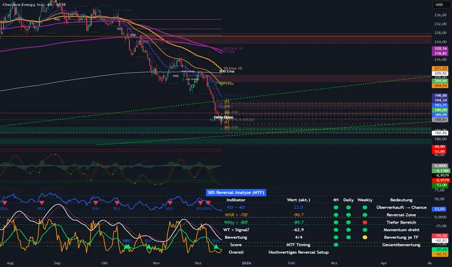
SBS Reversal Engine MTFSBS Reversal Engine (MTF) is a professional multi-timeframe indicator designed to identify high-quality reversal zones across stocks, crypto, and indices.
It combines RSI, Williams %R, a smoothed Williams oscillator ("Willy"), and a proprietary WaveTrend momentum filter to evaluate market conditions across 4H, Daily, and Weekly timeframes.
A visual traffic-light system provides a clear overview of oversold conditions, momentum shifts, and multi-timeframe alignment.
The integrated MTF Score System helps traders focus on high-quality setups where market structure, context, and timing align.
This indicator is an analytical tool and does not constitute financial advice.
© Step Buy Step 2025 – All rights reserved
PDH/PDL (Personal)This TradingView indicator is a technical analysis tool designed to plot the Previous Day High (PDH) and Previous Day Low (PDL) levels with high accuracy. It is specifically engineered for traders who require market boundaries calculated based on the Indian Standard Time (IST) session, ensuring that day breaks are identified precisely at 12:00 AM IST regardless of the exchange's native timezone.

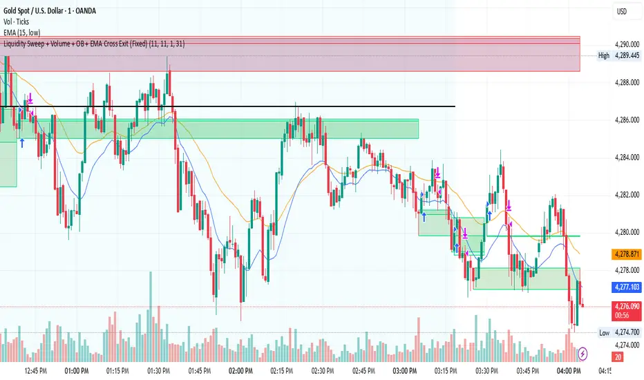
Liquidity Sweep + Volume + OB + EMA Cross Exit This strategy is a smart-money–inspired trading system designed to capture high-probability reversals after liquidity is taken from the market.
It combines liquidity sweeps, volume confirmation, order block validation, and a dynamic EMA-based exit to control risk and let profits run.
Core Concept
Institutions first take liquidity, then move price in the real direction.
This strategy aims to enter after liquidity is swept and price shows confirmation.
1️⃣ Liquidity Sweep Detection
2️⃣ Volume Confirmation
3️⃣ Order Block Identification
4️⃣ EMA Trend Filter (Optional Entry Bias)
5️⃣ Trade Entry Logic
6️⃣ Exit Strategy – EMA Cross Exit
Benefits:
Lets strong trends run
Exits automatically when momentum weakens
Adapts to different market conditions
🛡 Risk & Trade Management
One trade at a time (anti-overtrading logic)
Early exit if trade moves against position after a few bars
Opposite signal forces exit
EMA cross provides trend-based exit
GOLD 5m PA ScalperXAUUSD 5-Minute Price Action Scalper with HTF Confirmation
This Pine Script is a trend-following scalping strategy designed specifically for XAUUSD (Gold) on the 1,3,5-minute timeframe.
Its main goal is to reduce noise and false signals by combining lower-timeframe price action with higher-timeframe (15-minute) structure.
CORE IDEA
Trade only in the direction of the dominant trend and only when price reacts from a strong higher-timeframe Order Block.

Trend + Liquidity Master Trend & Liquidity Master
A Professional All-in-One Trading System combining Dynamic Trend Analysis with Smart Money Liquidity Zones
---
## 🎯 Overview
The Trend & Liquidity Master is a comprehensive trading indicator that merges institutional-grade trend detection with smart money liquidity mapping. Designed for traders who want to align with market structure while identifying high-probability entry zones, this system provides clear visual signals backed by multi-layered confirmation filters.
## ⚡ Core Features
### 📊 **Adaptive Trend Cloud**
- Multi-Algorithm Support: Choose between EMA, SMA, HMA, or RMA for trend calculation
- Volatility-Based Bands: Dynamic ATR bands that expand/contract with market conditions
- Anti-Chop Filter: Maintains trend state during consolidation to reduce false signals
- Visual Clarity: Color-coded cloud system (Green = Bullish, Red = Bearish - customisable)
### 🧱 **Smart Liquidity Zones**
- Supply & Demand Boxes: Automatically identifies institutional support/resistance levels
- Pivot-Based Detection: Uses swing high/low analysis to map liquidity pools
- Dynamic Mitigation: Zones auto-delete when price invalidates them
- Clean Visual Design: Semi-transparent boxes that don't clutter your chart
### 🎯 **Multi-Filter Signal System**
- Volume Confirmation: Optional filter to ensure signals occur on above-average volume
- RSI Screening: Avoid overbought buys and oversold sells (toggleable)
- Trend Alignment: Signals only trigger on confirmed trend changes
- Clear Entry Labels: BUY/SELL markers appear directly on the chart
### 🖥️ **Professional HUD Dashboard**
Real-time market intelligence display showing:
- Trend Bias: Current market direction (Bullish/Bearish)
- Momentum Status: Strength classification (Strong/Neutral/Weak)
- Volume State: Current volume relative to average (High/Low)
- Customizable Position & Styling: Place anywhere on your chart
---
## 🛠️ Customization Options
### **Trend Engine**
- Adjustable MA type and length
- Volatility multiplier for band sensitivity
- Source selection (Close, Open, HL2, etc.)
### **Liquidity Detection**
- Pivot lookback period (sensitivity control)
- Zone extension bars
- Toggle zones on/off independently
### **Signal Filters**
- Enable/disable volume filter
- Enable/disable RSI filter
- Fine-tune to match your trading style
### **Visual Design**
- Custom colors for bullish/bearish/neutral states
- Candle coloring option
- Dashboard styling and positioning
- Adjustable text and UI sizing
---
## 📈 How to Use
1. Identify the Trend: Wait for price to break above the upper band (Bullish) or below the lower band (Bearish)
2. Watch for Signals: BUY labels appear when trend turns bullish with confirmation; SELL labels for bearish turns
3. Confirm with Liquidity: Use Supply/Demand zones as potential entry refinement or profit targets
4. Monitor the HUD: Check momentum and volume states for additional confluence
5. Set Alerts: Built-in alert conditions for automated notifications
---
## 💡 Best Practices
- **Higher Timeframes**: Works best on 15m+ charts for reduced noise
- **Trend Following**: This is a trend-following system—avoid counter-trend trades
- **Multiple Confirmations**: Combine signals with liquidity zones for highest probability setups
- **Risk Management**: Always use proper position sizing and stop losses
---
## 🔔 Alert System
Pre-configured alerts for:
- Long entry signals (Apex Buy Alert)
- Short entry signals (Apex Sell Alert)
- Automatic ticker symbol insertion
---
## 📝 Notes
- Maximum 50 boxes and lines for optimal performance
- Liquidity zones automatically manage themselves (old zones removed)
- All components can be toggled independently
- Compatible with all markets (Forex, Crypto, Stocks, Indices)
---
## 🎨 What Makes This Different?
You get the best of both worlds: smart money zones that show where liquidity sits, combined with clear trend signals that tell you when to act.
---
Ready to trade with institutional-grade market intelligence? Add the Trend & Liquidity Master to your chart today.
---
*Disclaimer: This indicator is for educational and informational purposes only. Past performance does not guarantee future results. Always conduct your own analysis and practice proper risk management.*

Kozmik Belirme v1.3: Ontolojik Bulut (Mizan Refined)### 🌌 Cosmic Manifestation: The Ontological Cloud (Psi_U v1.3)
**"The market is not a random walk; it is a manifestation of collective consciousness bending spacetime."**
This indicator, part of the **Mizan Refined** architecture, moves beyond traditional technical analysis. It treats price action as a physical event subject to **Quantum Mechanics** and **General Relativity**.
Instead of simple moving averages, it visualizes the **Probabilistic Cloud** of the asset's future path.
---
### 🧠 The Mathematical Core (How It Works)
The script operates on three proprietary engines designed by Murat Kavak:
#### 1. The Psi_U Field (Market Consciousness)
Calculates the "Intent" of the market by fusing Momentum, Volatility Compression, and Money Flow.
* **High Psi:** The market has "Crystallized" (Decided on a direction).
* **Low Psi:** The market is in "Superposition" (Chaos/Uncertainty).
#### 2. Gravitational Engine ( CAPITALCOM:G_M $)
Based on Einstein's curvature of spacetime:
* **Mass:** Calculated via Volume intensity relative to price range.
* **Spacetime:** Represented by the VWAP anchor.
* **Result:** The indicator calculates a gravitational force ( CAPITALCOM:G_M $) that pulls the price. The stronger the gravity, the brighter the cloud colors becomes (Dynamic Gradients).
#### 3. Heisenberg Cloud Geometry
The width of the cloud is not static; it obeys the **Uncertainty Principle**.
* If Market Consciousness (Psi_U) drops, the cloud expands (Entropy increases), showing high risk.
* If Consciousness rises, the cloud narrows, revealing a precise path.
---
### 🎨 Visual Language
* **Turquoise/Green Glow:** Strong Bullish Gravity (Future projection).
* **Red/Maroon Glow:** Strong Bearish Gravity (Heavy resistance).
* **The Cloud:** Represents the "Event Horizon" where price is most likely to manifest.
### ⚠️ Disclaimer
This tool is an experimental model of market physics and ontology. It is intended for analytical visualization of trends and volatility, not as financial advice. Trading involves significant risk.
---
**ACCESS:**
This is a proprietary **Invite-Only** script. The source code is closed to protect the underlying algorithm. To request access, please contact the author via private message.

PDH/PDL by ShreyanshThis TradingView indicator is a technical analysis tool designed to plot the Previous Day High (PDH) and Previous Day Low (PDL) levels with high accuracy. It is specifically engineered for traders who require market boundaries calculated based on the Indian Standard Time (IST) session, ensuring that day breaks are identified precisely at 12:00 AM IST regardless of the exchange's native timezone.
Daily & Pre-Market Key Levels (v5)Plots:
- Today's high/low
- Pre-market High/Low
- Yesterday's high/low/close
- Day before yesterday high/low

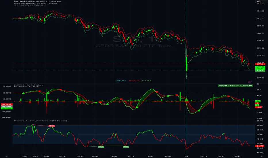
SCOTTGO - RSI Divergence IndicatorRSI Divergence Indicator
This indicator combines the Relative Strength Index (RSI) with an automatic divergence detection system.
It is designed to help traders spot potential trend changes by:
Color-Coded RSI: The main RSI line dynamically changes color (e.g., green/red) above and below a user-defined threshold (default 50) to highlight strong or weak momentum instantly.
Divergence Signals: It automatically identifies and plots four types of RSI divergences (Regular Bullish, Hidden Bullish, Regular Bearish, and Hidden Bearish) between the price and the oscillator.
Custom Alerts: Includes alerts for all divergence types so you can be notified when a new signal is found.
This tool helps visualize momentum shifts and potential reversals in the market.
Opposite Candle Break Finder version 1 This is a simple indicator which detects last candle that was engulfed by the close of the opposite color candle - Bear in mind you need to wait till the candle is closed
feel free to ask me for the code since I am not a professional coder at all any coder wants update it they feel free to contact me. at Adel4traders@gmail.com

SCOTTGO - Buy Sell Volume📊 SCOTTGO - Buy Sell Volume Bars - Delta - Up Down Volume Bars
This indicator disaggregates the total volume traded on each bar into estimated Buying Volume and Selling Volume to visualize market pressure and dominance directly in a dedicated sub-pane.
Key Features:
Volume Disaggregation: Uses a standard formula to estimate how much of a bar's total volume was associated with upward (buying) pressure and how much was associated with downward (selling) pressure.
Visual Clarity: Plots the Buy Volume (teal, upward) and Sell Volume (red, downward) as separate columns against a transparent total volume background, allowing for quick assessment of pressure balance.
Real-Time Badge: A dynamic badge is fixed to the corner of the chart (default: Top Right) providing a numeric summary of the latest bar:
Buy %: Percentage of the bar's total volume estimated as Buying Volume.
Sell %: Percentage of the bar's total volume estimated as Selling Volume.
Delta %: The magnitude of the volume difference (Delta) as a percentage of total volume, indicating the strength of the dominant side.
Dominance Indicator: The background color of the badge changes dynamically to immediately signal whether Buying (customizable color, default: Teal) or Selling (customizable color, default: Red) pressure was dominant on the current bar.
Usage:
Traders can use this tool to identify periods of heavy accumulation (high Buy Volume) or distribution (high Sell Volume), providing insight into the conviction behind price movements.

225 SMA CrossoverWell-known strategy from Zahlengraf from the Mauerstrassenwetten subreddit for you to test yourself.
You can change the length of the SMA and whether to trade long, short or both directions.

Pivot Points High LowGaneshA Pivot Points High/Low indicator that:
Detects swing highs (ta.pivothigh) and swing lows (ta.pivotlow) using configurable left/right bar lengths.
Draws labels at the confirmed pivot points:
Down labels at pivot highs (potential resistance).
Up labels at pivot lows (potential support).
Lets you customize text color and label fill color separately for highs and lows.
It’s designed for overlay (on-price chart), with max_labels_count=500 to allow many labels.
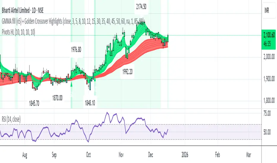
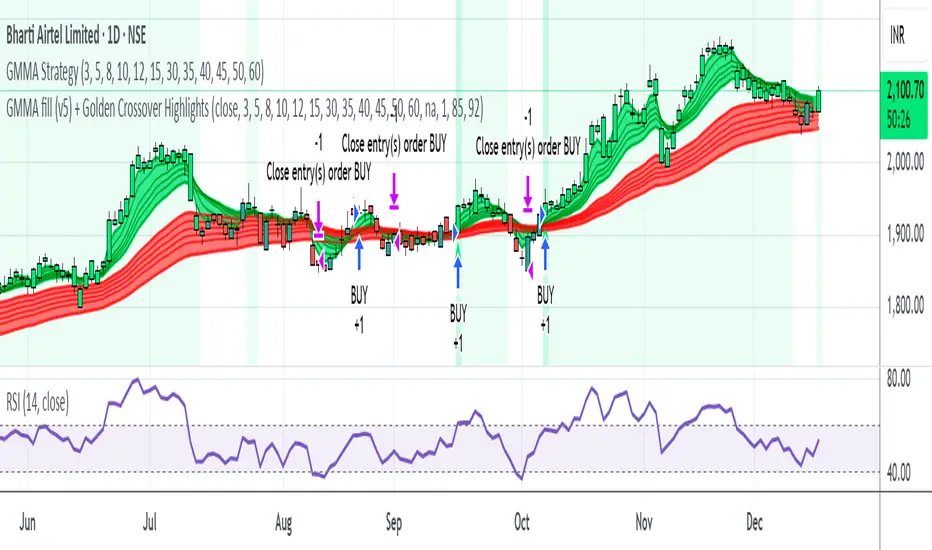
GMMA fill (v5) + Golden Crossover HighlightsGMMA Fill (v5) + Golden Crossover Highlights
This setup combines the Guppy Multiple Moving Average (GMMA) Fill version 5 with Golden Crossover signals to identify strong trend continuation and potential breakout points. GMMA provides layered moving averages for short- and long-term trend analysis, while the Golden Crossover highlights bullish momentum shifts, making it ideal for spotting entry opportunities in trending markets.
All-in-One Momentum Composite The Four Components (and Why They're Chosen)
RSI (Relative Strength Index) – Classic overbought/oversold oscillator (14-period default). Measures speed and change of price movements.
Stochastic (%D line) – Smoothened momentum indicator that compares closing price to the price range over a period. Excellent at spotting reversals in ranging markets.
WaveTrend – Very popular in crypto and forex communities (originally by LazyBear). It’s essentially a momentum oscillator based on overbought/oversold channels, similar to a faster, smoother RSI/Stochastic hybrid. Known for early divergence signals and clean crossovers.
MACD Histogram – Captures momentum changes and trend strength via the difference between fast and slow EMAs. The histogram shows acceleration/deceleration.

H1 Bias Rhythmic Lite Public V1.0 by SRTH1 Bias Rhythmic Lite Public V1.0 by SRT
Version: 1.0 (Public Lite)
Author: SRT
Platform: TradingView / Pine Script v6
Overlay: Yes (works directly on price chart)
Purpose: Provide H1 directional bias with D1 alignment and basic rhythm signals. Perfect for traders looking for clean bias visualization without clutter.
💡 Key Features
H1 Bias (Primary Engine)
Uses EMA7, EMA40, SMA150, and SMA200 for H1 directional bias.
Clearly identifies bullish, bearish, and neutral conditions.
Stack-based logic ensures consistency and reliability.
D1 Bias Alignment
Pulls higher timeframe (daily) EMA40, SMA150, SMA200.
Confirms H1 bias alignment with daily trend.
Helps filter trades in the direction of the larger trend.
Flush Detection
H1 flushes: Price fully “flushed” beyond EMA7 for bullish/bearish setups.
D+H1 flush: Aligns H1 flush with D1 bias for stronger context.
Visual dots with configurable sizes and colors indicate flush levels.
Price Action Signals
Engulfing (EB) detection with ATR filtering and body % thresholds.
Long Tail Body (LTB) detection with optional body % filter for precise swing points.
Both EB and LTB signals show clear labels above/below the candle for instant recognition.
ATR-Based Dynamic Offsets
Uses ATR (configurable length) to scale labels and flush dot offsets dynamically.
Ensures signals are proportionate to volatility.
Daily Pivot & Session Lines
Daily pivot plotted automatically.
Option to show daily session high-low lines and day labels.
Easily configurable label sizes and colors.
Bias Summary Table
Top-right table shows:
D1 bias
H1 bias
LTB allowed (Yes/No)
Color-coded for easy reference: green = Bull, red = Bear, gray = Neutral.
Alerts
H1 flush and D+H1 flush alerts.
LTB active alerts when bias is aligned.
Perfect for keeping an eye on actionable swings.
⚙️ User Inputs
Moving Average Lengths: EMA7, EMA40, SMA150, SMA200
Show/Hide MAs: Toggle to declutter the chart
ATR Settings: Length and % threshold for EB/LTB sizing
Signal Toggles: Show/Hide EBull, EBear, LTB Bull, LTB Bear, Flush Dots
Daily Pivot & Label Settings: Toggle visibility, label size, line/text colors
✅ Advantages for Users
Lightweight and fast — minimal lag on H1 charts.
Clear visualization of market bias and swing points.
Free access to core H1 Bias Rhythmic methodology.
Serves as a learning tool for traders who want to upgrade later.
⚠️ Limitations
No automatic entries, stops, or take profits (manual trade execution required).
Lite version only offers simplified signals and bias visualization.
Advanced rhythm and multi-timeframe alerts are reserved for the Premium version.
📢 Short Promo for Premium
For traders who want full power, check out H1 Bias Rhythmic Premium V1.0 by SRT — complete multi-phase alerts, advanced LTB & EB filters, EMA/SMA flip confirmations, and professional-level rhythm signals. Upgrade to premium for the full H1 trading experience.

Opposite Candle Zone Identifier (v6) - Extended🔍 Opposite Candle Zone Identifier (Extended)
Opposite Candle Zone Identifier is a price-action based indicator designed to identify potential reversal or absorption zones by detecting candles that move against the surrounding trend.
The indicator highlights a central opposite candle (or group of candles) that is surrounded by candles moving in the opposite direction, both before and after the central candle.
This structure often represents areas where institutional activity, absorption, or supply/demand imbalance may occur.
📌 How the Indicator Works
The indicator analyzes price action using three configurable blocks:
1️⃣ Candles Before (Backward)
A user-defined number of candles before the central candle(s) must follow a consistent trend:
Bullish candles for a bearish zone
Bearish candles for a bullish zone
2️⃣ Central Candle(s)
The core of the pattern:
Default: 1 opposite candle
Can be increased (up to 5) to adapt the indicator to lower timeframes or noisier markets
This central block must move against the previous trend, signaling a potential shift or absorption area.
3️⃣ Candles After (Forward)
A user-defined number of candles after the central candle(s) must resume the original trend, confirming the pattern.
⚠️ The signal is confirmed only after the “after” candles are completed.
This avoids repainting and ensures structural confirmation.
📐 Zone Concept
The highlighted central candle (or candles) can be used to define a price zone:
The high and low of the central candle(s) represent a potential supply or demand zone
These zones can be used for:
Reversal areas
Reaction zones
Entry refinement
Stop placement
⚙️ Inputs & Customization
Number of candles before
Controls how many candles must follow the initial trend.
Number of candles after
Defines how many candles are required for confirmation.
Central candles count
Default is 1, but can be increased (e.g. 2) for:
Lower timeframes
More reliable structure
Reduced noise
ATR-based offset
Labels are positioned using a dynamic ATR offset to improve chart readability across different markets and timeframes.
📈 Bullish & Bearish Zones
🟢 Bullish Zone
Bearish candles before
Bullish central candle(s)
Bearish candles after
Indicates potential demand or accumulation zone
🔴 Bearish Zone
Bullish candles before
Bearish central candle(s)
Bullish candles after
Indicates potential supply or distribution zone
🧠 Best Use Cases
Works best on 15m and higher timeframes
Effective on:
Indices
Forex majors
Liquid cryptocurrencies
Can be combined with:
Trend filters (EMA, VWAP)
Support & resistance
Market structure analysis
⚠️ Notes
This indicator is confirmation-based, not predictive
Signals appear only after pattern completion
It does not repaint
Best used as a confluence tool, not as a standalone trading system
🎯 Summary
Opposite Candle Zone Identifier helps traders:
Detect opposite-direction candles within strong trends
Identify potential supply and demand zones
Adapt the pattern to different timeframes
Improve price-action based decision making

FMT_TRENDFOLLOWiNGThis indicator is developed based on the Average Directional Index (ADX) , which is used to measure the strength of a trend, regardless of price direction. It has been custom-modified and optimized specifically for the FCPO market, with the following usage structure:
• 30-Minute Timeframe (HTF)
Used to identify the major market movement.
When the ADX value is above 25, it indicates that the market is entering a strong trending phase.
• 5-Minute Timeframe (LTF)
Acts as a confirmation for trend change or continuation, indicated by color changes (Green/Red) and the appearance of a Reconnect Dot when momentum becomes active again.
• 1-Minute Timeframe
Used for Buy or Sell entries at the nearest trading zones, aligned with the trend direction and strength from higher timeframes.
This indicator is suitable for Day Trading and Momentum Trading strategies, especially for FCPO traders who focus on market structure and momentum confirmation.
⚠️ DISCLAIMER: This indicator is provided for educational and technical analysis purposes only and does not constitute financial advice or a trading recommendation. All signals are derived from technical calculations and may produce false signals depending on market conditions. Users are fully responsible for their trading decisions, including risk management and position sizing. Past performance does not guarantee future results, and users are encouraged to conduct paper trading or backtesting before using it in live trading.
