HTF Hi-Lo Zones [CHE]HTF Hi-Lo Zones Indicator
The HTF Hi-Lo Zones Indicator is a Pine Script tool designed to highlight important high and low values from a selected higher timeframe. It provides traders with clear visual zones where price activity has reached significant points, helping in decision-making by identifying potential support and resistance levels. This indicator is customizable, allowing users to select the resolution type, control the visualization of session ranges, and even display detailed information about the chosen timeframe.
Key Functionalities
1. Timeframe Resolution Selection:
- The indicator offers three modes to determine the resolution:
- Automatic: Dynamically calculates the higher timeframe based on the current chart's resolution.
- Multiplier: Allows users to apply a multiplier to the current chart's timeframe.
- Manual: Enables manual input for custom resolution settings.
- Each resolution type ensures flexibility to suit different trading styles and strategies.
2. Data Fetching for High and Low Values:
- The indicator retrieves the current high and low values for the selected higher timeframe using `request.security`.
- It also calculates the lowest and highest values over a configurable lookback period, providing insights into significant price movements within the chosen timeframe.
3. Session High and Low Detection:
- The indicator detects whether the current value represents a new session high or low by comparing the highest and lowest values with the current data.
- This is crucial for identifying breakouts or significant turning points during a session.
4. Visual Representation:
- When a new session high or low is detected:
- Range Zones: A colored box marks the session's high-to-low range.
- Labels: Optional labels indicate "New High" or "New Low" for clarity.
- Users can customize colors, transparency, and whether range outlines or labels should be displayed.
5. Information Box:
- An optional dashboard displays details about the chosen timeframe resolution and current session activity.
- The box's size, position, and colors are fully customizable.
6. Session Tracking:
- Tracks session boundaries, updating the visualization dynamically as the session progresses.
- Displays session-specific maximum and minimum values if enabled.
7. Additional Features:
- Configurable dividers for session or daily boundaries.
- Transparency and styling options for the displayed zones.
- A dashboard for advanced visualization and information overlay.
Key Code Sections Explained
1. Resolution Determination:
- Depending on the user's input (Auto, Multiplier, or Manual), the script determines the appropriate timeframe resolution for higher timeframe analysis.
- The resolution adapts dynamically based on intraday, daily, or higher-period charts.
2. Fetching Security Data:
- Using the `getSecurityDataFunction`, the script fetches high and low values for the chosen timeframe, including historical and real-time data management to avoid repainting issues.
3. Session High/Low Logic:
- By comparing the highest and lowest values over a lookback period, the script identifies whether the current value is a new session high or low, updating session boundaries and initiating visual indicators.
4. Visualization:
- The script creates visual representations using `box.new` for range zones and `label.new` for session labels.
- These elements update dynamically to reflect the most recent data.
5. Customization Options:
- Users can configure the appearance, behavior, and displayed data through multiple input options, ensuring adaptability to individual trading preferences.
This indicator is a robust tool for tracking higher timeframe activity, offering a blend of automation, customization, and visual clarity to enhance trading strategies.
Disclaimer
The content provided, including all code and materials, is strictly for educational and informational purposes only. It is not intended as, and should not be interpreted as, financial advice, a recommendation to buy or sell any financial instrument, or an offer of any financial product or service. All strategies, tools, and examples discussed are provided for illustrative purposes to demonstrate coding techniques and the functionality of Pine Script within a trading context.
Any results from strategies or tools provided are hypothetical, and past performance is not indicative of future results. Trading and investing involve high risk, including the potential loss of principal, and may not be suitable for all individuals. Before making any trading decisions, please consult with a qualified financial professional to understand the risks involved.
By using this script, you acknowledge and agree that any trading decisions are made solely at your discretion and risk.
Best regards and happy trading
Chervolino
하이-로우 인덱스

Fair Value Gap DetectorHow this indicator works:
It detects two types of FVGs:
Bullish FVG: Occurs when the low of the current candle is higher than the high of the candle from 2 bars ago (creates an upward gap)
Bearish FVG: Occurs when the high of the current candle is lower than the low of the candle from 2 bars ago (creates a downward gap)
Features:
Allows users to toggle both bullish and bearish FVG detection independently
Customizable colors for both bullish (default green) and bearish (default red) FVGs
Visualizes FVGs using:
Boxes that highlight the gap area (with 80% transparency)
Labels that mark each FVG ("Bull FVG" or "Bear FVG")
Visual representation:
Bullish FVGs are marked with green boxes and downward-pointing labels
Bearish FVGs are marked with red boxes and upward-pointing labels
This indicator can be useful for :
Identifying potential areas where price might return to
Finding potential support and resistance zones
Understanding market structure and momentum shifts

Alert Kabi Family Unlimited Alarm indicator for any time frame and any type of currency, stock and index
اندییکاتور آلارم نامحدود برای هر تایم فریم و هر شاخص و ارز و سهام
Settings :
1- Before starting, clear all alarms in the trading view alarm section
2- Specify your alarm areas and currency pairs in the indicator settings section
3- Go to the trading view alarm section, click create alert, select the name of the indicator and click OK
4- Good Luck
T e L : @Ar3781
1- قبل از شروع تمام آلارم های تریدینگ ویو را پاک کنید
2- در قسمت تنظیمات اندیکاتور نواحی آلارم و جفت ارز خود را مشخص کنید
3- به قسمت الارم تریدینگ ویو رفته ایجاد هشدار را زده و اسم اندیکاتور را انتخاب کنید و اوکی کنید
4- مـــــــوفق بــــــاشـید

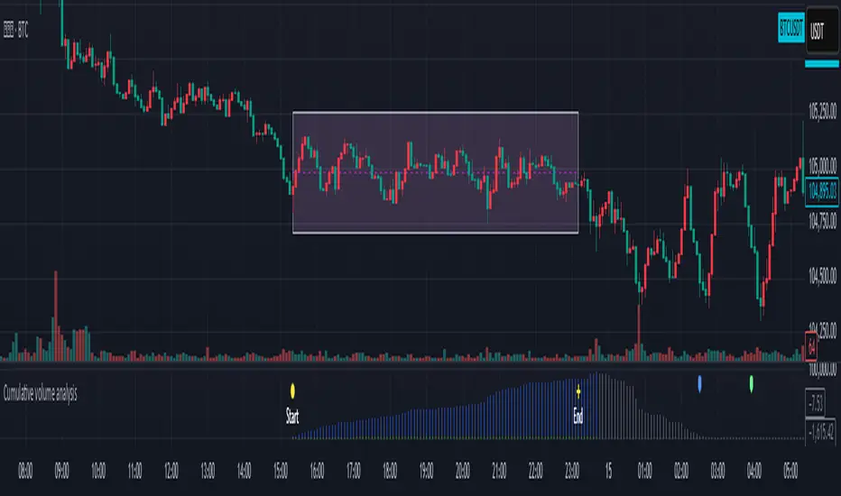
Cumulative volume analysisAfter user define the ragion area. While break out the region area, you can try this indicator to notice when the power is ended and maybe reverse the trend.
1. The user enters the start time, and end time
2. The indicator will record the highest, lowest price, and cumulative amount during this period.
The cumulative amount is calculated by adding up the amount of each K bar, regardless of whether it rises or falls.
3. When the cumulative amount is reduced to less than or equal to 0, make a plotshape arrow
4.There are two diferent method to record the volume. Try the better way to different product.
Dynamic RSI with Overbought/Oversold LinesDynamic RSI with Overbought/Oversold Lines
This indicator enhances the traditional RSI (Relative Strength Index) by dynamically adjusting the overbought and oversold levels based on the highest and lowest RSI values over a user-defined period. The indicator plots these levels as horizontal lines, allowing traders to visually identify when the market is "overbought" or "oversold."
Features:
Dynamic Overbought/Oversold Levels: Automatically adjusts the overbought and oversold levels based on the highest and lowest RSI values within the defined period, ensuring more accurate signals tailored to the current market conditions.
Customizable RSI Period: Choose your preferred RSI period to suit your trading strategy.
Signal Alerts: Visual signals are displayed when the RSI crosses into the overbought or oversold zone, indicating potential reversal points.
Background Color Alerts: The background changes color when the RSI exceeds overbought or oversold levels, making it easier to spot these important zones at a glance.
Clean and Simple: A minimalist design focusing on the key elements, making it suitable for all traders.
How to Use:
Overbought Zone: When the RSI moves above the overbought line (red), it may indicate that the asset is overbought, signaling a potential price reversal or pullback.
Oversold Zone: When the RSI moves below the oversold line (green), it may indicate that the asset is oversold, signaling a potential price bounce or reversal.
This dynamic RSI indicator is perfect for those looking to capture market extremes and improve their trading decisions. It's especially useful for timeframes like 30-minute and 1-hour charts, where market conditions tend to shift more rapidly.

Volume Index (0-100)Volume Index (0-100) Indicator
The Volume Index (0-100) indicator is a powerful tool designed to help traders understand current volume levels in relation to past activity over a specified period. By normalizing volume data to a scale from 0 to 100, this indicator makes it easy to compare today's volume against recent history and gauge the strength of market movements.
Key Features:
Normalized Volume Index: The indicator indexes volume between 0 and 100, allowing traders to easily determine if the current volume is unusually high or low compared to recent trends.
Colored Visualization: The line graph is colored green for positive volume (increasing activity) and red for negative volume (decreasing activity). This helps traders quickly grasp the market sentiment and volume direction.
User-Defined Lookback Period: Traders can customize the lookback period to best fit their trading strategy, providing flexibility for different market conditions.
How Traders Can Use It:
Identifying Volume Extremes: The Volume Index helps identify periods of unusually high or low volume. Values approaching 100 indicate high volume, while values close to 0 indicate low volume.
Confirmation Tool: During price movements, high volume (near 100) can act as a confirmation signal for the strength of the trend. For instance, a high volume during an uptrend may indicate strong buying interest.
Divergence Analysis: Traders can look for divergences between volume and price. For example, if the price is consolidating while the Volume Index remains high, it could signal an impending breakout.
Volume Alerts: The indicator includes an alert feature when the Volume Index exceeds 80, helping traders stay informed about potential shifts in market volatility.
AlgoMaxx Prev OHLCThe AlgoMaxx Prev OHLC indicator provides a clear visualization of the previous day's Open, High, Low, and Close (OHLC) levels. These levels are crucial for understanding market structure, identifying support and resistance zones, and making informed trading decisions. The indicator is fully customizable and dynamically updates to ensure accuracy and clarity.
Key Features:
Prev. Day High/Low and Open/Close Levels:
Plots previous day's High/Low and Open/Close levels.
Toggle each level (lines and labels) on/off independently.
Customizable Lines and Labels:
Adjust line colors, styles (Solid, Dashed, Dotted), and widths.
Enable or disable labels for each level with customizable label colors.
Dynamic Updates:
Automatically updates levels daily.
Deletes old lines and labels to maintain a clean chart.
Efficient and Intuitive:
Designed to integrate seamlessly into any trading strategy with user-friendly customization options.
Indicator Logic:
Previous Day Levels Calculation:
The indicator uses Pine Script’s request.security function to fetch the previous day’s OHLC data from the daily timeframe ('D').
Dynamic Line and Label Management:
Persistent variables (var) store line and label references.
Old lines and labels are deleted and recreated at the start of each new day, ensuring a clutter-free chart.
Customizable Line Styles and Colors:
A mapping function (f_map_line_style) dynamically assigns line styles based on user input (Solid, Dashed, Dotted).
Separate inputs allow users to define distinct colors and styles for each level.
Independent Toggles:
Separate ON/OFF controls for High/Low and Open/Close lines and labels for maximum flexibility.
Clean Design:
The script ensures all plotted elements are dynamically adjusted to keep the chart clean and focused on actionable data.
How to Use:
Add the indicator to your chart.
Customize levels, colors, and styles via the "Inputs" and "Style" settings.
Analyze the plotted levels to identify key price zones for potential support, resistance, or breakout areas.

Advanced Supply and Demand Indicator# Advanced Supply and Demand Indicator
This Pine Script™ indicator helps traders identify potential supply and demand zones in financial markets. It uses price action, volume, and historical data to plot these zones on your chart, providing valuable insights for trading decisions.
## Key Features:
- Automatically detects and plots supply and demand zones
- Customizable lookback period for zone identification
- Adjustable strength multiplier for more precise zone detection
- User-defined opacity for visual clarity
- Combines price action and volume analysis for improved accuracy
## How It Works:
1. Identifies significant price levels using a specified lookback period
2. Analyzes volume data to confirm potential supply and demand zones
3. Plots supply zones in red and demand zones in green
4. Displays the current price for easy reference
## Customization Options:
- Lookback Period: Adjust the historical data range (1-100 bars)
- Zone Strength Multiplier: Fine-tune the sensitivity of zone detection (1.0-3.0)
- Zone Opacity: Set the transparency of plotted zones (10-100%)
This indicator is designed to help traders identify potential areas of support and resistance, allowing for more informed entry and exit decisions in their trading strategies.

Triple VWAP# Triple VWAP Indicator
## Description
The Triple VWAP Indicator is a powerful tool for traders who rely on Volume Weighted Average Price (VWAP) in their analysis. This indicator displays three VWAP lines on a single chart, each representing a different time frame: Session, Weekly, and Monthly.
## Features
- Session VWAP (Blue Line): Resets daily, providing intraday volume-weighted average price.
- Weekly VWAP (Green Line): Resets weekly, offering a medium-term perspective.
- Monthly VWAP (Red Line): Resets monthly, giving a longer-term view of price action relative to volume.
## How It Works
The indicator calculates the VWAP for each time frame separately, using the specified price source (default is HLC3). It then plots these values on your chart, allowing you to see how the current price compares to the volume-weighted average across different time periods.
## Use Cases
- Multi-timeframe Analysis: Compare short-term price movements against longer-term trends.
- Support and Resistance: VWAP lines often act as dynamic support/resistance levels.
- Mean Reversion: Identify potential overbought or oversold conditions when price deviates significantly from VWAP.
- Trend Confirmation: Use multiple VWAP lines to confirm trend strength and potential reversals.
## Customization
Users can customize the indicator by changing the price source and offset in the settings. The color and thickness of each VWAP line can also be adjusted in the code for personal preference.
## Note
This indicator is most effective on intraday charts but can provide valuable insights on any time frame. Remember that VWAP is typically most relevant for institutional traders on a session-by-session basis.
Enhance your trading strategy with the Triple VWAP Indicator – a versatile tool for comprehensive price-volume analysis across multiple time frames.

CUSTOM SESSION PublicThis Pine Script code creates a custom indicator that allows users to visualize different trading sessions (New York, London, Tokyo, Sydney) on a chart and customize various features such as line style, color, label text, and more. Here are the key user-end features:
Session Visualization:
Users can choose to display session ranges for New York, London, Tokyo, and Sydney trading sessions.
Each session can be highlighted with customizable colors for the label, background, and border.
Line styles for session outlines (solid, dashed, dotted) are adjustable.
Custom Session Time:
Users can input custom time ranges for each session and control the display of the range on the chart.
Label Customization:
The label for each session (e.g., “New York”, “London”) can be customized with specific text and color.
Users can toggle the visibility of these labels.
Range Highlighting:
Each session can display the high and low price ranges, with an option to control the transparency of the highlighted area.
Users can choose to outline the range with customizable styles.
Timezone Adjustment:
Users can adjust the timezone to their preference or use the exchange’s default timezone for accurate session mapping.
Daily and Weekly High/Low Lines:
The indicator plots the previous day's and previous week's high and low points.
These lines are customizable with different colors and styles.
Users can enable or disable shorthand text for these labels (e.g., “Prev DH” for Previous Day High).
Global Customization Options:
Users can enable global coloring to apply one color across all elements.
Global text shorthand is available to abbreviate labels throughout the chart.
Overall, the script provides extensive customization options for traders to visually manage multiple sessions and key price levels on their charts.
[MAD] Fibonacci Bands with SmoothingHi, this is just an easy script, nothing special, it was a request from a community member and was finished in just 40 minutes :D
This indicator offers a approach to tracking market price movements by utilizing Fibonacci-based levels combined with customizable smoothing options for both the bands and the high/low values.
Key Features:
Customizable Moving Averages: Choose from a variety of smoothing methods, including SMA, EMA, WMA, HMA, VWMA, and advanced Ehlers-based methods.
This allows for flexible adaptation to different assets.
Multiple Fibonacci Band Multipliers: The user can define six different multipliers for both the upper and lower Fibonacci bands, allowing for granular customization of the indicator. The middle line serves as the central reference, and the multipliers extend the bands outward based on price range dynamics.
High/Low Smoothing: In addition to smoothing the Fibonacci bands, users can apply smoothing to the high and low prices that form the basis for calculating the Fibonacci bands. This ensures that the indicator responds smoothly to market movements, reducing noise while capturing key trends.
Forward Shift Option: Allows for projecting the bands into the future by shifting the calculated levels forward by a user-specified number of periods. This feature is particularly useful for those interested in anticipating price actions and future trends.
Visual Enhancements: The indicator features filled regions between bands to clearly visualize the zones of price movement. The fills between the bands offer insight into potential support and resistance zones, based on price levels defined by the Fibonacci ratios.
How It Works:
The indicator uses the highest and lowest closing prices over a specified lookback period to establish a price range. Based on this range, it calculates the middle line (0.5 level) and applies user-defined Fibonacci multipliers to generate both upper and lower bands. Users have control over the smoothing method for both the high/low prices and the bands themselves, allowing for an adaptive experience that can be tailored to different timeframes or market conditions.
For visualization, areas between the upper and lower bands are filled with distinct colors, providing an intuitive view of the potential price zones where the market might react or consolidate.
These fills highlight the zones created by the Fibonacci bands, helping users identify critical market levels with ease.
have fun
p.s.: @frankchef hope that suits your needs & expectations ;-)
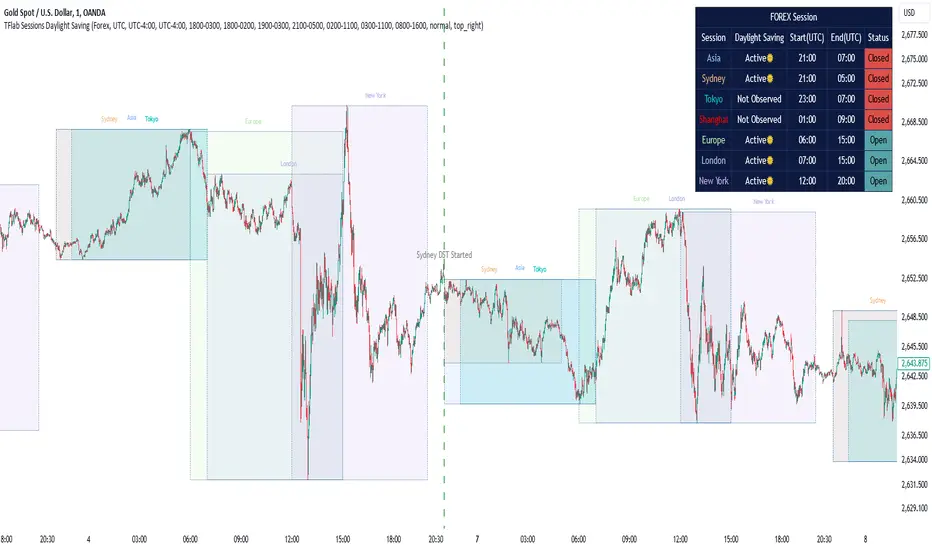
Sessions Full Markets [TradingFinder] Forex Stocks Index 7 Time🔵 Introduction
In global financial markets, particularly in FOREX and stocks, precise timing of trading sessions plays a crucial role in the success of traders. Each trading session—Asian, European, and American—has its own unique characteristics in terms of volatility and trading volume.
The Asian session (Tokyo), Sydney session, Shanghai session, European session (London and Frankfurt), and American session (New York AM and New York PM) are examples of these trading sessions, each of which opens and closes at specific times.
This session indicator also includes a Time Convertor, enabling users to view FOREX market hours based on GMT, UTC, EST, and local time. Another valuable feature of this indicator is the automatic detection of Daylight Saving Time (DST), which automatically applies time changes for the New York, London, and Sydney sessions.
🔵 How to Use
The indicator also displays session times based on the exact opening and closing times for each geographic region. Users can utilize this indicator to view trading hours either locally or in UTC time, and if needed, set their own custom trading times.
Additionally, the session information table includes the start and end times of each session and whether they are open or closed. This functionality helps traders make better trading decisions by using accurate and precise time data.
Key Features of the Session Indicator
The session indicator is a versatile and advanced tool that provides several unique features for traders.
Some of these features are :
• Automatic Daylight Saving Time (DST) Detection : This indicator dynamically detects Daylight Saving Time (DST) changes for various trading sessions, including New York, London, and Sydney, without requiring manual adjustments. This feature allows traders to manage their trades without worrying about time changes.
Below are the start and end dates for DST in the New York, London, and Sydney trading sessions :
1. New York :
Start of DST: Second Sunday of March, at 2:00 AM.
End of DST: First Sunday of November, at 2:00 AM
2. London :
Start of DST: Last Sunday of March, at 1:00 AM.
End of DST: Last Sunday of October, at 2:00 AM.
3. Sydney :
Start of DST: First Sunday of October, at 2:00 AM.
End of DST: First Sunday of April, at 3:00 AM.
• Session Display Based on Different Time Zones : The session indicator allows users to view trading times based on different time zones, such as UTC, the local time of each market, or the user’s local time. This feature is especially useful for traders operating in diverse geographic regions.
• Custom Trading Time Setup : Another notable feature of this indicator is the ability to set custom trading times. Traders can adjust their own trading times according to their personal strategies and benefit from this flexibility.
• Session Information Table : The session indicator provides a complete information table that includes the exact start and end times of each trading session and whether they are open or closed. This table helps users simultaneously and accurately monitor the status of all trading sessions and make better trading decisions.
🟣 Session Trading Hours Based on Market Mode and Time Zones
The session indicator provides precise information on the start and end times of trading sessions.
These times are adjusted based on different market modes (FOREX, stocks, and TFlab suggestions) and time zones (UTC and local time) :
🟣 (FOREX Session Time) Forex Market Mode
• Sessions in UTC (DST inactive) :
Sydney: 22:00 - 06:00
Tokyo: 23:00 - 07:00
Shanghai: 01:00 - 09:00
Asia: 22:00 - 07:00
Europe: 07:00 - 16:00
London: 08:00 - 16:00
New York: 13:00 - 21:00
• Sessions in UTC (DST active) :
Sydney: 21:00 - 05:00
Tokyo: 23:00 - 07:00
Shanghai: 01:00 - 09:00
Asia: 21:00 - 07:00
Europe: 06:00 - 15:00
London: 07:00 - 15:00
New York: 12:00 - 20:00
• Sessions in Local Time :
Sydney: 08:00 - 16:00
Tokyo: 08:00 - 16:00
Shanghai: 09:00 - 17:00
Asia: 22:00 - 07:00
Europe: 07:00 - 16:00
London: 08:00 - 16:00
New York: 08:00 - 16:00
🟣 Stock Market Trading Hours (Stock Market Mode)
• Sessions in UTC (DST inactive) :
Sydney: 00:00 - 06:00
Asia: 00:00 - 06:00
Europe: 07:00 - 16:30
London: 08:00 - 16:30
New York: 14:30 - 21:00
Tokyo: 00:00 - 06:00
Shanghai: 01:30 - 07:00
• Sessions in UTC (DST active) :
Sydney: 23:00 - 05:00
Asia: 23:00 - 06:00
Europe: 06:00 - 15:30
London: 07:00 - 15:30
New York: 13:30 - 20:00
Tokyo: 00:00 - 06:00
Shanghai: 01:30 - 07:00
• Sessions in Local Time:
Sydney: 10:00 - 16:00
Tokyo: 09:00 - 15:00
Shanghai: 09:30 - 15:00
Asia: 00:00 - 06:00
Europe: 07:00 - 16:30
London: 08:00 - 16:30
New York: 09:30 - 16:00
🟣 TFlab Suggestion Mode
• Sessions in UTC (DST inactive) :
Sydney: 23:00 - 05:00
Tokyo: 00:00 - 06:00
Shanghai: 01:00 - 09:00
Asia: 23:00 - 06:00
Europe: 07:00 - 16:00
London: 08:00 - 16:00
New York: 13:00 - 21:00
• Sessions in UTC (DST active) :
Sydney: 22:00 - 04:00
Tokyo: 00:00 - 06:00
Shanghai: 01:00 - 09:00
Asia: 22:00 - 06:00
Europe: 06:00 - 15:00
London: 07:00 - 15:00
New York: 12:00 - 20:00
• Sessions in Local Time :
Sydney: 09:00 - 16:00
Tokyo: 09:00 - 15:00
Shanghai: 09:00 - 17:00
Asia: 23:00 - 06:00
Europe: 07:00 - 16:00
London: 08:00 - 16:00
New York: 08:00 - 16:00
🔵 Setting
Using the session indicator is straightforward and practical. Users can add this indicator to their trading chart and take advantage of its features.
The usage steps are as follows :
Selecting Market Mode : The user can choose one of the three main modes.
Forex Market Mode: Displays the forex market trading hours.
oStock Market Mode: Displays the trading hours of stock exchanges.
Custom Mode: Allows the user to set trading hours based on their needs.
TFlab Suggestion Mode: Displays the higher volume hours of the forex market in Asia.
Setting the Time Zone : The indicator allows displaying sessions based on various time zones. The user can select one of the following options:
UTC (Coordinated Universal Time)
Local Time of the Session
User’s Local Time
Displaying Comprehensive Session Information : The session information table includes the opening and closing times of each session and whether they are open or closed. This table helps users monitor all sessions at a glance and precisely set the best time for entering and exiting trades.
🔵Conclusion
The session indicator is a highly efficient and essential tool for active traders in the FOREX and stock markets. With its unique features, such as automatic DST detection and the ability to display sessions based on different time zones, the session indicator helps traders to precisely and efficiently adjust their trading activities.
This indicator not only shows users the exact opening and closing times of sessions, but by providing a session status table, it helps traders identify the best times to enter and exit trades. Moreover, the ability to set custom trading times allows traders to easily personalize their trading schedules according to their strategies.
In conclusion, using the session indicator ensures that traders are continuously and accurately informed of time changes and the opening and closing hours of markets, eliminating the need for manual updates to align with DST changes. These features enable traders to optimize their trading strategies with greater confidence and up-to-date information, allowing them to capitalize on opportunities in the market.
Entry Weight Indicator(Dual Labels)이 지표는 트레이더가 동적으로 진입 비중을 결정할 수 있도록 도와주는 도구입니다. 이전 캔들의 종가를 기준으로 두 가지 다른 진입 비중을 계산하여 표시합니다.
주요 특징:
1. 두 가지 진입 비중 계산:
- 저점 기준 (EW Long): 이전 캔들 종가와 룩백 기간 내 최저가 사이의 거리를 기준으로 계산
- 고점 기준 (EW Short): 이전 캔들 종가와 룩백 기간 내 최고가 사이의 거리를 기준으로 계산
2. 시각적 표시:
- 초록색 라벨 (EW Long): 캔들 위에 표시
- 빨간색 라벨 (EW Short): 캔들 아래에 표시
- 룩백 기간 내 최고가와 최저가를 녹색과 빨간색 선으로 표시
3. 사용자 정의 파라미터:
- 원하는 손실 비율 (Desired Loss Percentage)
- 레버리지 (Leverage)
- 룩백 기간 (Lookback Period)
4. 추가 정보 표시:
- 차트 우측 상단에 이전 종가, 최고가, 최저가, 손실 비율 등의 정보를 표시
사용 방법:
1. 원하는 손실 비율, 레버리지, 룩백 기간을 설정합니다.
2. 차트에 표시되는 라벨을 통해 각 캔들에 대한 두 가지 진입 비중을 확인합니다.
3. EW Long (초록색)은 Long 진입 시 비중을, EW Short (빨간색)는 Short 진입 시 비중을 나타냅니다.
주의: 이 지표는 투자 시 직접적인 성과를 가져다주는 지표가 아니며, 실제 거래 결정 시에는 다른 분석 도구와 함께 사용하는 것이 좋습니다.
This indicator is a tool that helps traders dynamically determine their entry weight. It calculates and displays two different entry weights based on the closing price of the previous candle.
Key features:
1. Calculation of two entry weights:
- Low-based (EW Long): Calculated based on the distance between the previous candle's close and the lowest price within the lookback period
- High-based (EW Short): Calculated based on the distance between the previous candle's close and the highest price within the lookback period
2. Visual display:
- Green label (EW Long): Displayed above the candle
- Red label (EW Short): Displayed below the candle
- Highest and lowest prices within the lookback period are shown as green and red lines
3. User-defined parameters:
- Desired Loss Percentage
- Leverage
- Lookback Period
4. Additional information display:
- Information such as previous close, highest price, lowest price, and loss percentage is displayed in the upper right corner of the chart
How to use:
1. Set the desired loss percentage, leverage, and lookback period.
2. Check the two entry weights for each candle through the labels displayed on the chart.
3. EW Long (green) represents the entry weight for long positions, while EW Short (red) represents the entry weight for short positions.
Caution: This indicator does not directly lead to investment performance. When making actual trading decisions, it is advisable to use it in conjunction with other analytical tools.

Last Candle OHLC (Ticks or Points)What the Code Does
1. **Draws Lines and Labels**:
- It draws lines on your chart to show the high, low, open, and close prices from the previous period (like the previous day or week).
- It also labels these lines with numbers that tell you how far the current price is from these levels.
2. **Shows Price Movement**:
- You can see how far the price has moved from these levels in terms of small price changes (ticks) or larger units (points).
- This helps you understand price movements and potential levels of support or resistance.
3. **Customizable**:
- You can choose whether to show these lines and labels, and you can select if you want to see the movement in ticks or points.
- The lines can extend into the future on your chart to help you anticipate where prices might be in the coming days.
### How It’s Useful:
1. **Identify Key Levels**:
- It helps you spot important price levels from past periods, which can act as support or resistance.
2. **Understand Price Movement**:
- You get a visual sense of how much the price has moved from key levels, which can help you gauge market volatility.
3. **Plan Trades**:
- By seeing where the price has been and how it has moved, you can better plan your trades, like deciding where to enter or exit based on these levels.
4. **Flexible for Different Markets**:
- It works across various markets, like stocks, futures, and forex, adjusting to the specific characteristics of each instrument.
In short, this tool helps you visualize and understand past price movements and levels on your chart, aiding in your trading decisions.

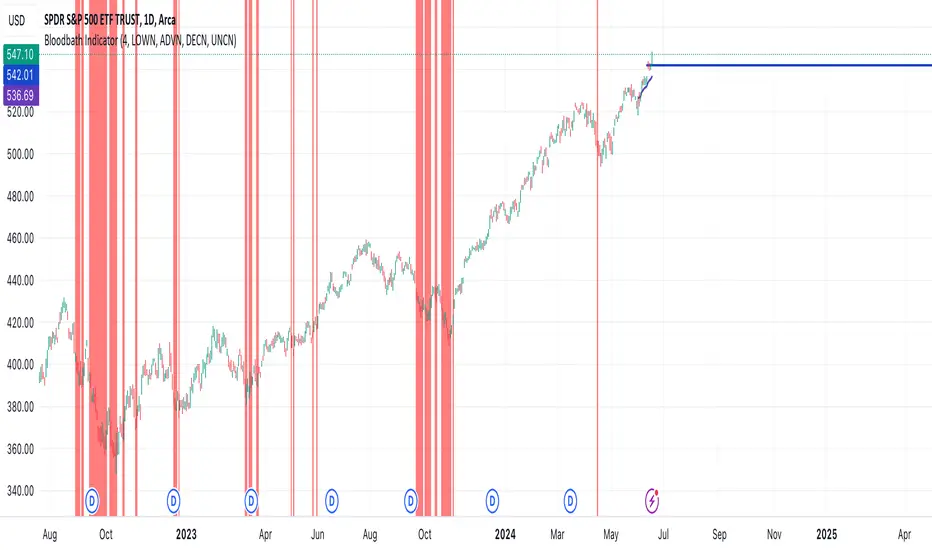
Bloodbath IndicatorThis indicator identifies days where the number of new 52-week lows for all issues exceeds a user-defined threshold (default 4%), potentially signaling a market downturn. The background of the chart turns red on such days, providing a visual alert to traders following the "Bloodbath Sidestepping" strategy.
Based on: "THE RIPPLE EFFECT OF DAILY NEW LOWS," By Ralph Vince and Larry Williams, 2024 Charles H. Dow Award Winner
threshold: Percentage of issues making new 52-week lows to trigger the indicator (default: 4.0).
Usage:
The chart background will turn red on days exceeding the threshold of new 52-week lows.
Limitations:
This indicator relies on historical data and doesn't guarantee future performance.
It focuses solely on new 52-week lows and may miss other market signals.
The strategy may generate false positives and requires further analysis before trading decisions.
Disclaimer:
This script is for informational purposes only and should not be considered financial advice. Always conduct your own research before making any trading decisions.
Previous Day High Low Close By Anil ChawraHow Users Can Make Profit Using This Script:
1. Calculate the difference between the previous day's high and low prices to determine the price range.
2. Identify if today's close price is significantly higher or lower than the previous day's close price.
3. If today's close price is at least 10 points higher than the previous close, consider a potential buy signal.
4. If today's close price is at least 10 points lower than the previous close, consider a potential sell signal.
5. These signals indicate potential profit opportunities based on significant price movements.
6. Users should verify market conditions and perform additional analysis before executing trades.
7. Monitoring price action and volume can help confirm the validity of these signals.
8. Implementing stop-loss orders can help mitigate risks associated with trading based on price movements.
9. Regularly reviewing and adjusting trading strategies based on market conditions is essential for long-term success.
10. Exercise caution and discipline when trading, and consider seeking advice from financial professionals if needed.
How the Script Works:
1. The strategy analyzes the high, low, and close prices of the previous trading day.
2. It calculates the range of prices by subtracting the low from the high.
3. The close price of the current trading day is compared to the previous day's close.
4. If today's close is significantly higher than yesterday's close, it could indicate bullish sentiment.
5. Conversely, if today's close is significantly lower, it could suggest bearish sentiment.
6. A threshold, typically 10 points, is set to identify significant price movements.
7. If today's close is at least 10 points higher, it triggers a potential buy signal.
8. If it's at least 10 points lower, it triggers a potential sell signal.
9. Users can act on these signals to enter or exit trades for potential profit.
10. Regular monitoring, risk management, and market analysis are essential for effective implementation of this strategy.

Stock WatchOverview
Watch list are very common in trading, but most of them simply provide the means of tracking a list of symbols and their current price. Then, you click through the list and perform some additional analysis individually from a chart setup. What this indicator is designed to do is provide a watch list that employs a high/low price range analysis in a table view across multiple time ranges for a much faster analysis of the symbols you are watching.
Discussion
The concept of this Stock Watch indicator is best understood when you think in terms of a 52 Week Range indication on many financial web sites. Taken a given symbol, what is the high and the low over a 52 week range and then determine where current price is within that range from a percentage perspective between 0% and 100%.
With this concept in mind, let's see how this Stock Watch indicator is meant to benefit.
There are four different H/L ranges relative to the chart's setting and a Scope property. Let's use a three month (3M) chart as our example and set the indicator's Scope = 4. A 3M chart provides three months of data in a single candle, now when we set the Scope = 4 we are stating that 1X is going to look over four candles for the high/low range.
The Scope property is used to determine how many candles it is to scan to determine the high/low range for the corresponding 1X, 3X, 5X and 10X periods. This is how different time ranges are put into perspective. Using a 3M chart with Scope = 4 would represent the following time windows:
- 1X = 3M * 4 is a 12 Months or 1 Year High/Low Range
- 3X = 3M * 4 * 3 is a 36 Months or 3 Years High/Low Range
- 5X = 3M * 4 * 5 is a 60 Months or 5 Years High/Low Range
- 10X = 3M * 4 * 10 is a 120 Months or 10 Years High/Low Range.
With these calculations, the indicator then determines where current price is within each of these High/Low ranges from a percentage perspective between 0% and 100%.
Once the 0% to 100% value is calculated, it then will shade the value according to a color gradient from red to green (or any other two colors you set the indictor to). This color shading really helps to interpret current price quickly.
The greater power to this range and color shading comes when you are able to see where price is according to price history across the multiple time windows. In this example, there is quick analysis across 1 Year, 3 Year, 5 Year and 10 Year windows.
Now let's further improve this quick analysis over 15 different stocks for which the indicator allows you to watch up to at any one time.
For value traders this is huge, because we're always looking for the bargains and we wait for price to be in the value range. Using this indicator helps to instantly see if price has entered a value range before we decide to do further analysis with other charting and fundamental tools.
The Code
The heart of all this is really very simple as you can see in the following code snippet. We're simply looking for the highest high and lowest low across the different scopes and calculating the percentage of the range where current price is for each symbol being watched.
scope = baseScope
watch1X = math.round(((watchClose - ta.lowest(watchLow, scope)) / (ta.highest(watchHigh, scope) - ta.lowest(watchLow, scope))) * 100, 0)
table.cell(tblWatch, columnId, 2, str.format("{0, number, #}%", watch1X), text_size = size.small, text_color = colorText, bgcolor = getBackColor(watch1X))
//3X Lookback
scope := baseScope * 3
watch3X = math.round(((watchClose - ta.lowest(watchLow, scope)) / (ta.highest(watchHigh, scope) - ta.lowest(watchLow, scope))) * 100, 0)
table.cell(tblWatch, columnId, 3, str.format("{0, number, #}%", watch3X), text_size = size.small, text_color = colorText, bgcolor = getBackColor(watch3X))
Conclusion
The example I've laid out here are for large time windows, because I'm a long term investor. However, keep in mind that this can work on any chart setting, you just need to remember that your chart's time period and scope work together to determine what 1X, 3X, 5X and 10X represent.
Let me try and give you one last scenario on this. Consider your chart is set for a 60 minute chart, meaning each candle represents 60 minutes of time and you set the Stock Watch indicator to a scope = 4. These settings would now represent the following and you would be watching up to 15 different stocks across these windows at one time.
1X = 60 minutes * 4 is 240 minutes or 4 hours of time.
3X = 60 minutes * 4 * 3 = 720 minutes or 12 hours of time.
5X = 60 minutes * 4 * 5 = 1200 minutes or 20 hours of time.
10X = 60 minutes * 4 * 10 = 2400 minutes or 40 hours of time.
I hope you find value in my contribution to the cause of trading, and if you have any comments or critiques, I would love to here from you in the comments.

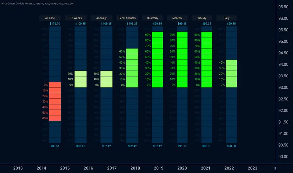
Hi-Lo-GaugesIntroducing the 'Hi-Lo-Gauges' indicator, a powerful tool designed to provide a comprehensive visual representation of key price metrics. This indicator leverages up to 8 preset gauges, each catering to a specific aspect of market data:
All-time high and low
Current 52 Weeks high and low
Current Annual High and Low
Current Semi-Annual High and Low
Current Quarterly High and Low
Current Monthly High and Low
Current Weekly High and Low
Current Daily High and Low
Users have the flexibility to choose all 8 or selectively display specific gauges. For each metric, the gauge dynamically adapts, with the low value set as the minimum and the high value as the maximum. Measurement options include utilizing the highest and lowest closes or the literal highest and lowest prices.
The active price of the underlying asset serves as the reference point, allowing users to gauge the percentage move on the scale between the chosen minimum and maximum. Complete customization is at the users' fingertips, enabling them to tailor the indicator's appearance to suit their preferences.
With 'Hi-Lo-Gauges,' traders and analysts can intuitively monitor and interpret diverse price metrics, fostering a deeper understanding of market dynamics and supporting more informed decision-making.
Note: 'Hi-Lo-Gauges' is visible and applicable exclusively on the daily timeframe due to the nature of the metrics used.
Cumulative New Highs - New LowsIndicator that plots the cumulative number of 52-Week New Highs minus New Lows with an added moving average. Settings allow the choice between S&P 500, Nasdaq 100 or the Overall Market as Index. You can also customize the length of the moving average.

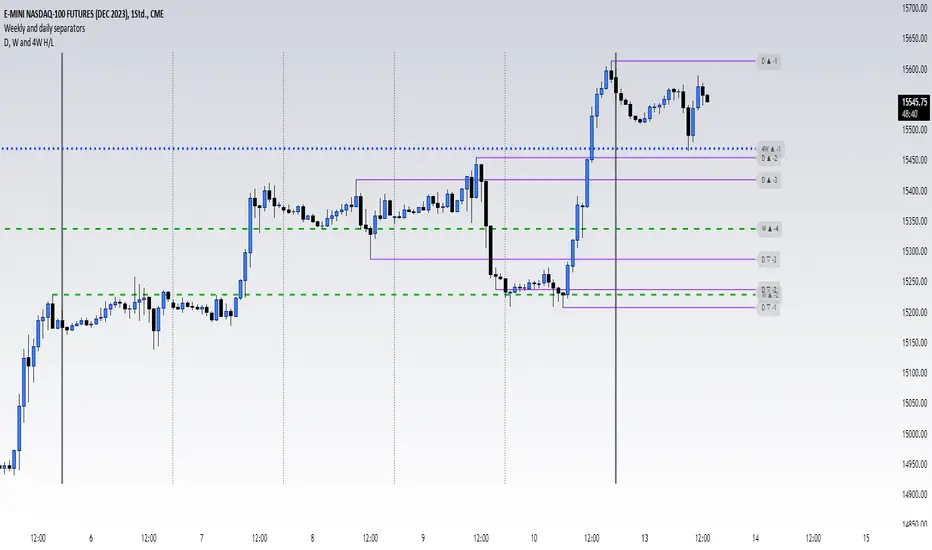
High and low of last D, W, 4W and quaterThis script shows you the Highs and Lows from multiple candels from some different timeframes. They are the 1D, 1W, 4W (a month basically), and 3M (a quater). The indicator offery you many customization option to make it look how you like it best
Previous Day High and Low + Separators Daily/WeeklyPrevious Day High and Low + Separators Daily/Weekly is an indicator based on separators of days and weeks and at the same time points out the previous highs and lows, everything is marked by lines, it consists of creating a clean graph and separated by the different trading days, referring to the extreme points created the previous day.
USEAGE
Point to each day of the week at the top of the chart to get a time location in your trading week and day sparation determined by 00:00 of any timezone.
The reference of the previous day's higs and LOWS is vitally important to understand which direction is most likely for the next day, either continuation or reversal.
DETAILS
As you can see you will be able to adapt these lines according to your chart design and with the desired intensity of appearance.
SETTINGS
UTC OFFSET: Determine your TIMEZONE in this section.
DAILY SEPARATOR: You have the option to change the color, style, width and text color.
WEEKLY SEPARATOR: You have the option to change the color, style, width and text color.
PREVIOUS HIGS & LOWS: You have the option to change the color, style, width and text color.

Cumulative Net Highs-Lows (4 Week)Plots the cumulative total of net new highs minus lows over the past 4 weeks and the 10 ema of the calculation. Settings allow choice of NYSE and Nasdaq. Signal shading for when the indicator is above the 10 ema, showing a rising trend of net highs-lows. Similar to the TC2000 T2123 indicator.

Dynamic Day Lines-1Dynamic Day Lines. These lines are dynamic and they detect high, low and mid of the day. Above midline, day is bullish and below mid line day is bearish. If price is at high of the day, and starts to move down, I wont be bearish until it breaks the midline and wait patiently.
