Fish OrbThis indicator marks and tracks the first 15-minute range of the New York session open (default 9:30–9:45 AM ET) — a critical volatility period for futures like NQ (Nasdaq).
It helps you visually anchor intraday price action to that initial opening range.
Core Functionality
1. Opening Range Calculation
It measures the High, Low, and Midpoint of the first 15 minutes after the NY market opens (default 09:30–09:45 ET).
You can change the window or timezone in the inputs.
2. Visual Overlays
During the 15-minute window:
A teal shaded box highlights the open range period.
Live white lines mark the current High and Low.
A red line marks the midpoint (mid-range).
These update in real-time as each bar forms.
3. Post-Window Behavior
When the 15-minute window ends:
The High, Low, and Midpoint are locked in.
The indicator draws persistent horizontal lines for those values.
4. Historical Days
You can keep today + a set number of previous days (configurable via “Previous Days to Keep”).
Older days automatically delete to keep charts clean.
5. Line Extension Control
Each day’s lines extend to the right after they form.
You can toggle “Stop Lines at Next NY Open”:
ON: Yesterday’s lines stop exactly at the next NY session open (09:30 ET).
OFF: Lines extend indefinitely across the chart.
하이-로우 인덱스

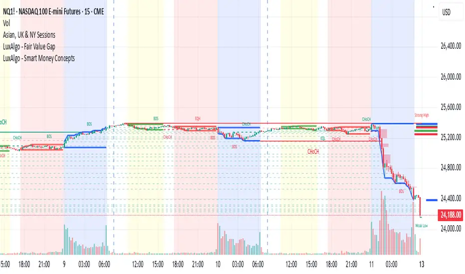
Asian, UK & NY SessionTimes and Day Highs and LowsWhat It Does
The Asian, UK & NY Sessions indicator automatically identifies and highlights the three major global trading sessions on your chart.
For each session, it:
Detects session time in its local timezone.
Tracks the session’s highest and lowest prices.
Plots colored horizontal lines to show those levels throughout the trading day.
Optionally shades each session’s background in its signature color for instant visual context:
🟡 Asian Session: Yellow background
🔴 London Session: Red background
🔵 New York Session: Blue background
This helps traders see how price reacts within and between sessions — spotting overlaps, liquidity zones, and daily ranges.
⚙️ Inputs and Variables
Input Description
Extend lines until next session start (extendLines) Extends each session’s high/low lines forward until the next session begins.
Show prices in scale column (showScaleValues) Controls whether the price labels for session highs/lows appear on the chart’s right-hand price scale.
Show All Session Highs & Lows (showAllHighsLows) Master switch — turn this off to hide all session lines instantly, keeping the chart clean.
Show Session Backgrounds (showBackgrounds) Turns all background shading on or off. When off, all session colors disappear.
Background Opacity (bgOpacityAll) Adjusts the transparency for all session backgrounds (0 = solid, 100 = fully transparent).
🎨 Visual Color Scheme
Session Background High/Low Line
Asian Yellow Green
London Red Red
New York Blue Blue
Each color has a consistent role — making it easy to distinguish sessions even in replay or live view.
Price Tracking:
For each session, the indicator resets High and Low when the new session starts, then updates them as bars print.
Display Control:
If lines or backgrounds are disabled via settings, they’re completely hidden (no clutter, no partial transparency).
💡 How Traders Use It
Identify daily ranges in each global session.
Compare volatility between markets.
Align entries or exits with session transitions.
Observe how price respects previous session highs/lows.
ATH Line with Date (Editable)Overview:
This indicator draws a continuous horizontal line at the instrument’s All-Time High (ATH) and annotates it with a label that shows the date the ATH was set in dd-mmm-yyyy format. The label is fully configurable (text prefix, side, position, colors, vertical offset), and you can optionally append the ATH price formatted as $ 1.234,56. Built for Pine Script™ v6 and works on any symbol or timeframe.
How it works
• Maintains a running maximum of high.
• Detects the bar where the current ATH occurred and extracts its date.
• Renders a horizontal line extended both sides at the ATH level.
• Places an optional label on the last bar or on the ATH bar.
• Triggers an optional alert when a new ATH is printed.
Inputs
• Line color / width / style – customize the ATH line appearance.
• Show label – toggle label on/off.
• Label text (prefix) – default ATH ►.
• Label text color / background – visual customization for the tag.
• Label side – left or right-anchored label.
• X location – Last bar or ATH bar.
• Label vertical offset (%) – moves the label above/below the line.
• Show price – appends the ATH price in the format $ 1.234,56
Notes & behavior:
• Repainting: The ATH level is stable until a higher high appears. When a new ATH is set, the line and date update accordingly—this is expected behavior.
• The ATH is computed from the chart’s current timeframe/history. If the symbol has limited history on your chart, the ATH reflects only the available data.
• No external libraries; no user data is collected.
Alerts:
• Includes New ATH alert condition. Fire it to be notified when price sets a new all-time high.
Tips:
• Use Last bar placement to keep the label visible at the right edge while scrolling.
• If the label overlaps candles or drawings, add a small positive vertical offset.
Version:
• Pine Script™ v6. Indicator only; no trading signals or orders.
Disclaimer:
For educational purposes only. This script does not constitute financial advice or a recommendation to buy or sell any security. Always do your own research and manage risk appropriately.

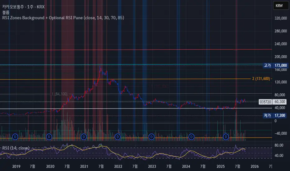
RSI Zones Background + Optional RSI PaneOverview
This Pine Script indicator does two things at once:
Colors the background of the main price chart whenever the RSI value is below a lower threshold (default 30) or above an upper threshold (default 70). This highlights oversold and overbought zones directly on the price chart itself.
Optionally displays a separate RSI panel with the RSI line and shaded region between the two threshold levels for reference.
The indicator is fully customizable through the settings panel—color choices, transparency, and whether to show the separate RSI pane can all be adjusted.
Key Parts of the Code
1. Inputs
src: The source price series for RSI calculation.
len: RSI lookback length (default 14).
lowerThr and upperThr: The lower and upper thresholds (defaults: 30 and 70).
lowColor and highColor: Colors for the background when RSI is below or above the thresholds.
bgTrans: Transparency level for the background shading.
showRSI: Boolean to toggle the optional RSI pane on or off.
2. RSI Calculation
rsi = ta.rsi(src, len)
This computes the RSI from the chosen price source.
3. Background Coloring on the Price Chart
bgCol = rsi <= lowerThr ? color.new(lowColor,bgTrans) :
rsi >= upperThr ? color.new(highColor,bgTrans) :
na
bgcolor(bgCol)
If RSI ≤ lower threshold: background turns lowColor (oversold zone).
If RSI ≥ upper threshold: background turns highColor (overbought zone).
Otherwise, no background color.
4. Optional RSI Pane
plot(showRSI ? rsi : na, display=display.pane)
Plots the RSI line in a separate pane when showRSI is true; otherwise hides it.
5. Horizontal Lines for Thresholds
hLower = hline(lowerThr, ...)
hUpper = hline(upperThr, ...)
Two horizontal lines at the lower and upper thresholds.
Because hline() can’t be wrapped inside if blocks, the script always creates them but makes them transparent (using na color) when the pane is hidden.
6. Filling Between Threshold Lines
fill(hLower, hUpper, color=showRSI ? color.new(color.gray,95) : na)
When the RSI pane is visible, the area between the two threshold lines is shaded in gray to create a “mid-zone” effect. This fill also switches off (becomes na) if the pane is hidden.
7. Alerts
The script also includes two alert conditions:
When RSI crosses below the lower threshold.
When RSI crosses above the upper threshold.
How It Works in Practice
On the price chart, you’ll see the background turn blue (or your chosen color) when RSI is ≤30, and red when RSI is ≥70.
If you enable “Show RSI” in the settings, a separate RSI pane will appear below the price chart, plotting the RSI line with two threshold lines and a shaded region in between.
You can fully adjust transparency and colors to suit your chart style.
Benefits
Quickly visualize overbought and oversold conditions without opening a separate RSI window.
Optional RSI pane provides context when needed.
Customizable colors and transparency make it easy to integrate with any chart theme.
Alerts give you automatic notifications when RSI crosses key levels.
------------------------------------------------------------------------------------------------------------------
개요
이 지표는 두 가지 기능을 동시에 수행합니다.
가격 차트 뒤 배경에 색상 표시
RSI 값이 설정한 하단 임계값(기본 30) 이하이거나 상단 임계값(기본 70) 이상일 때, 가격 차트 뒤쪽에 과매도·과매수 구간을 색으로 표시해줍니다.
선택적으로 RSI 보조창 표시
옵션을 켜면 별도의 RSI 패널이 나타나서 RSI 라인과 두 임계값(30, 70)을 연결한 구간을 음영 처리하여 보여줍니다.
설정 창에서 색상·투명도·보조창 표시 여부를 전부 조정할 수 있습니다.
코드 핵심 설명
1. 입력값
src: RSI 계산에 사용할 가격 소스(기본 종가).
len: RSI 기간(기본 14).
lowerThr / upperThr: RSI 하단·상단 임계값(기본 30, 70).
lowColor / highColor: RSI가 각각 하단 이하·상단 이상일 때 배경 색상.
bgTrans: 배경 투명도(0=불투명, 100=투명).
showRSI: RSI 보조창을 켜고 끌 수 있는 스위치.
2. RSI 계산
rsi = ta.rsi(src, len)
지정한 가격 소스를 기반으로 RSI를 계산합니다.
3. 가격 차트 배경 색칠
bgCol = rsi <= lowerThr ? color.new(lowColor,bgTrans) :
rsi >= upperThr ? color.new(highColor,bgTrans) :
na
bgcolor(bgCol)
RSI ≤ 하단 임계값 → lowColor(과매도 색)
RSI ≥ 상단 임계값 → highColor(과매수 색)
나머지 구간은 색상 없음.
4. 선택적 RSI 보조창
plot(showRSI ? rsi : na, display=display.pane)
showRSI가 켜져 있으면 RSI 라인을 보조창에 표시하고, 꺼져 있으면 숨깁니다.
5. 임계값 가로선
hLower = hline(lowerThr, ...)
hUpper = hline(upperThr, ...)
하단·상단 임계값을 가로선으로 표시합니다.
hline은 if 블록 안에서 쓸 수 없기 때문에 항상 그려지지만, 보조창이 꺼지면 색을 na로 처리해 안 보이게 합니다.
6. 임계값 사이 영역 음영 처리
fill(hLower, hUpper, color=showRSI ? color.new(color.gray,95) : na)
보조창이 켜져 있을 때만 두 가로선 사이를 회색으로 채워 “중립 구간”을 강조합니다.
7. 알림 조건
RSI가 하단 임계값을 아래로 돌파할 때 알림.
RSI가 상단 임계값을 위로 돌파할 때 알림.
실제 작동 모습
가격 차트 뒤쪽에 RSI ≤30이면 파란색, RSI ≥70이면 빨간색 배경이 나타납니다(색상은 설정에서 변경 가능).
RSI 보조창을 켜면, RSI 라인과 임계값 가로선, 그리고 그 사이 음영 영역이 함께 나타납니다.
투명도를 높이거나 낮추어 강조 정도를 조절할 수 있습니다.
장점
별도의 RSI창을 열지 않고도 가격 차트 배경만으로 과매수·과매도 상태를 직관적으로 확인 가능.
필요하면 보조창으로 RSI를 직접 확인하면서 임계값 가이드와 음영 영역을 함께 볼 수 있음.
색상·투명도를 자유롭게 조절할 수 있어 차트 스타일에 맞게 커스터마이징 가능.
RSI가 임계값을 돌파할 때 자동 알림을 받을 수 있음.
Bullish Breakout - SBStep 1 – Chart Setup
Timeframe: 5-minute
Studies to add:
VWAP (Session VWAP)
EMA 9 & EMA 20 (trend filter)
Bullish Breakout – Clean v6.1
⚙️ Step 2 – Indicator Settings (scalping mode)
Resistance lookback: 15
Volume confirmation: ON, multiplier = 1.2–1.3 (lighter requirement, more signals).
RSI filter: ON, threshold = 55 (looser than intraday swing).
MACD filter: ON
HTF filter: ON → timeframe = 15m, EMA = 50 (so trades align with short-term trend).
Retest check: ON (safer signals).
ATR stop/targets: ON → ATR length 14, Stop = 1.0×ATR, T1 = 0.7×ATR, T2 = 1.4×ATR.
Visuals: Stealth Mode ON (just arrows + compact label).
🎯 Step 3 – Entry Rules
Wait for a green breakout arrow under a 5m bar.
Confirm conditions:
Price is above VWAP.
EMA 9 > EMA 20 (micro trend bullish).
Optional: RSI > 55 and volume above SMA×1.2.
Enter at close of breakout bar.
Aggressive: enter right on arrow.
Conservative: enter only if teal retest dot confirms.
🛡️ Step 4 – Risk/Exit Plan
Stop loss: red ATR line (~1×ATR below entry).
Target 1 (T1): yellow ATR line (~0.7×ATR above entry).
Target 2 (T2): green ATR line (~1.4×ATR above entry).
Management:
Sell 70% at T1, move stop to entry.
Let 30% run to T2 or trail with EMA 9.
🔔 Step 5 – Alerts
Set TradingView alerts for:
Bullish Breakout (green arrow)
Breakout Retest Confirmed (teal dot)
So you don’t miss quick setups during the session.
⚡ Extra Scalping Tips
Focus on liquid tickers (ORCL, MSFT, AAPL, NVDA, etc.) — tight spreads, good volume.
Trade first 2–3 hours after market open for best volatility.
Avoid scalping right before big news (FOMC, earnings).
Don’t overstay: average 10–30 minutes per trade.

Dizzy HOLO🚀 Dizzy HOLO is an all-in-one professional trading suite designed for serious traders.
It combines Pivot Points, Opening Range Breakout (ORB), HOLO (High of Low / Low of High), Weekly Levels, SMA Thresholds, and Real-Time Alerts into a single lightweight indicator.
🔑 Key Features:
✅ Pivot Points (Fibonacci & Camarilla) – Automatic support & resistance with labels.
✅ Opening Range Breakout (ORB) – Custom session ORB with historical data and breakout alerts.
✅ HOLO Strategy – Daily High/Low, Highest H1 Open, Lowest H1 Close with dynamic buy/sell zones.
✅ Weekly Levels – Previous Week High/Low/Open/Close with extended dotted projections.
✅ SMA Threshold Zones – Dynamic SMA with gray zone filter and trend-based candle coloring.
✅ Multi-Timeframe Analysis – Auto-switching pivots & real-time confirmation.
✅ Smart Alerts – Pivot breakouts, ORB levels, HOLO crosses, and Weekly breaks.
🎯 Why Use Dizzy HOLO?
This indicator is built for breakout, reversal, and trend traders. It provides clear market structure, liquidity zones, and actionable alerts so you never miss important setups.
🛠️ Best Suited For:
Intraday scalpers
Swing traders
Breakout traders
HOLO strategy followers
Multi-timeframe traders

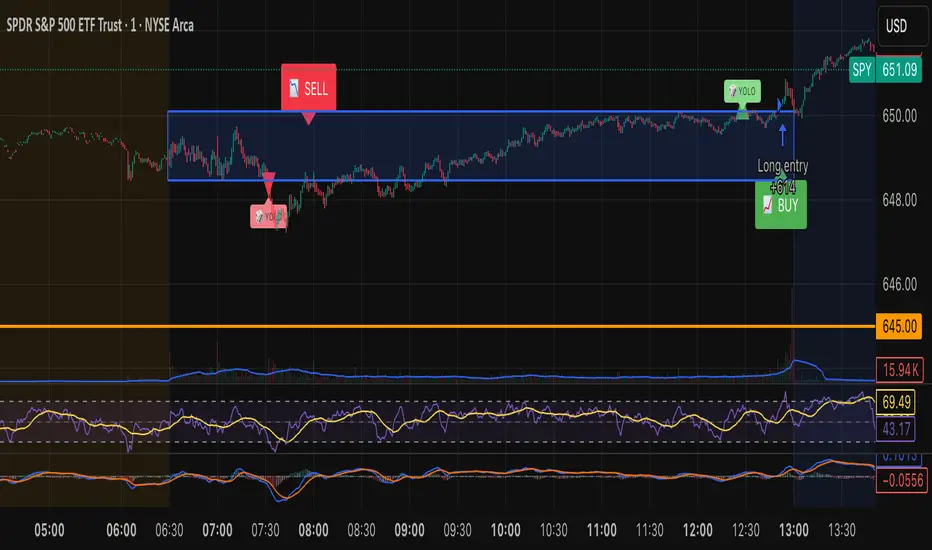
Tristan's Box: Pre-Market Range Breakout + RetestMarket Context:
This is designed for U.S. stocks, focusing on pre-market price action (4:00–9:30 AM ET) to identify key support/resistance levels before the regular session opens.
Built for 1 min and 5 min timelines, and is intended for day trading / scalping.
Core Idea:
Pre-market range (high/low) often acts as a magnet for price during regular hours.
The first breakout outside this range signals potential strong momentum in that direction.
Retest of the breakout level confirms whether the breakout is valid, avoiding false moves.
Step-by-Step Logic:
Pre-Market Range Identification:
Track high and low from 4:00–9:30 AM ET.
Draw a box spanning this range for visual reference and calculation.
Breakout Detection:
When the first candle closes above the pre-market high → long breakout.
When the first candle closes below the pre-market low → short breakout.
The first breakout candle is highlighted with a “YOLO” label for visual confirmation.
Retest Confirmation:
Identify the first candle whose wick touches the pre-market box (high touches top for short, low touches bottom for long).
Wait for the next candle: if it closes outside the box, it confirms the breakout.
Entry Execution:
Long entry: on the confirming candle after a wick-touch above the pre-market high.
Short entry: on the confirming candle after a wick-touch below the pre-market low.
Only the first valid entry per direction per day is taken.
Visuals & Alerts:
Box represents pre-market high/low.
Top/bottom box border lines show the pre-market high / low levels cleanly.
BUY/SELL markers are pinned to the confirming candle.
Added a "YOLO" marker on breakout candle.
Alert conditions trigger when a breakout is confirmed by the retest.
Strategy Type:
Momentum breakout strategy with confirmation retest.
Combines pre-market structure and risk-managed entries.
Designed to filter false breakouts by requiring confirmation on the candle after the wick-touch.
In short, it’s a pre-market breakout momentum strategy: it uses the pre-market high/low as reference, waits for a breakout, and then enters only after a confirmation retest, reducing the chance of entering on a false spike.
Always use good risk management.
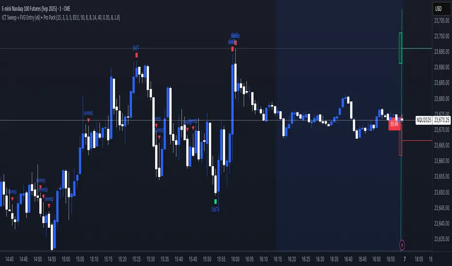
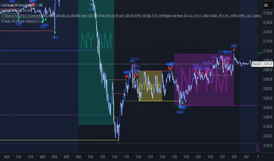
ICT Sweep + FVG Entry (v6) • Pro Pack 📌 ICT Sweep + FVG Entry Pro Pack
This indicator combines key ICT price action concepts with practical execution tools to help traders spot high-probability setups faster and more objectively. It’s designed for scalpers and intraday traders who want to keep their chart clean but never miss critical market structure events.
🔑 Features
Liquidity Pools (HTF)
• Auto-detects recent swing highs/lows from higher timeframes (5m/15m).
• Draws both lines and optional rectangles/zones for clear liquidity areas.
Liquidity Sweeps (BSL/SSL)
• Identifies when price sweeps above/below liquidity pools and rejects back.
• Optional Grade-A sweep filter (wick size + strong re-entry).
Fair Value Gaps (FVGs)
• Highlights bullish/bearish imbalances.
• Optional midline (50%) entry for precision.
• Auto-invalidation when price fully closes inside the gap.
Killzones (New York)
• Highlights AM (9:30–11:30) and PM (14:00–15:30) killzones.
• Option to block signals outside killzones for higher strike rate.
Bias Badge (DR50)
• Displays if price is trading in a Bull, Bear, or Range context based on displacement range midpoint.
SMT Assist (NQ vs ES)
• Detects simple divergences between indices:
Bearish SMT → NQ makes HH while ES doesn’t.
Bullish SMT → NQ makes LL while ES doesn’t.
SL/TP Helper & R:R Label
• Automatically draws stop loss (at sweep extreme) and target (opposite pool or recent swing).
• Displays expected Risk:Reward ratio and blocks entries if below your chosen minimum.
Filters
• ATR filter ensures signals only appear in sufficient volatility.
• Sweep quality filter avoids weak wicks and fake-outs.
🎯 How to Use
Start on HTF (5m/15m) → Identify liquidity zones and bias.
Drop to LTF (1m) → Wait for a liquidity sweep confirmation.
Check for FVG in the sweep’s direction → Look for retest entry.
Use the SL/TP helper to validate your risk/reward before taking the trade.
Focus entries during NY Killzones for maximum effectiveness.
✅ Why this helps
This tool reduces screen time and hesitation by automating repetitive ICT concepts:
Liquidity pools, sweeps, and FVGs are marked automatically.
Killzone timing and SMT divergence are simplified.
Clear visual signals for entries with built-in RR filter help keep your trading mechanical.
⚠️ Disclaimer: This script is for educational purposes only. It does not provide financial advice or guarantee results. Always use proper risk management.
ICT Sweep + FVG Entry (v6) • Antoine📌 ICT Sweep + FVG Entry (Antoine)
This indicator is designed for price action traders who follow ICT concepts and want a mechanical tool to spot liquidity sweeps, fair value gaps (FVGs), and precise entry signals.
🔎 Key Features
Liquidity Pools (HTF)
• Automatically plots recent swing highs/lows from a higher timeframe (5m/15m).
• These act as Buy Side Liquidity (BSL) and Sell Side Liquidity (SSL) levels where stop orders accumulate.
Sweep Detection
• Identifies when price breaks a pool (BSL/SSL) but closes back inside → a classic liquidity grab.
• Plots a triangle on the chart when a sweep is confirmed.
Fair Value Gap (FVG) Highlighting
• Detects bullish and bearish FVGs on the execution timeframe (ideal for 1m).
• Option to display active FVG zones with shaded boxes.
Entry Signals
• A signal (cross) appears when:
A liquidity sweep occurs.
An FVG forms in the direction of the rejection.
Price retests the FVG (entry at the 50% mid-level or edge).
Alerts Ready
• Get alerted for sweeps (bullish/bearish) and for entry confirmations (long/short FVG retests).
🎯 How to Use
Choose your HTF (5m or 15m) → The indicator maps major liquidity pools.
Drop to LTF (1m) → Wait for a sweep signal at one of the pools.
Confirm with FVG → If an FVG appears in the sweep’s direction, the indicator waits for a retest.
Entry → Enter on the retest of the FVG (edge or 50%).
Risk Management
Stop loss: just beyond the sweep’s wick.
Target: opposite liquidity pool.
Minimum recommended R:R: 1:2.
✅ Why this helps
This tool makes it easier to trade ICT-style setups without missing opportunities:
No need to manually draw every swing high/low.
Automatic FVG detection saves time.
Clear sweep + FVG + retest logic keeps your entries mechanical and disciplined.
⚠️ Disclaimer: This script is for educational purposes only. It does not guarantee profits. Always use proper risk management.
Higher Low : Price levelsClick twice on the chart to add S/R level then you can copy-paste the values.
Hitu - MTF High/Low Marker
This indicator is a powerful tool for traders, designed to display the high and low levels from multiple significant timeframes directly on your chart. It helps you quickly identify key support, resistance, and liquidity levels at a glance, improving your understanding of the market structure.
Key Features:
* Multi-Timeframe Support: Visualize high and low levels from Monthly, Weekly, Daily, 4H, 1H, 15M, and 5M timeframes.
* Full Customization: Each timeframe's line can be customized with your preferred color and style (Solid, Dashed, or Dotted) directly from the settings.
* Toggle On/Off: You have complete control to enable or disable any timeframe level to match your specific trading strategy.
How It Helps:
The MTF High/Low Marker simplifies the process of finding crucial price zones. By seeing key highs and lows from higher timeframes on your current chart, you can make more informed decisions about your entries, exits, and overall risk management.
Institutional Interest DisplayIndicator Overview:
This dashboard helps evaluate stocks quickly based on Market Cap, 52-week positioning, and liquidity metrics. It combines price strength with volume demand signals for breakout or institutional interest.
Logic Implemented:
1. Market Cap Classification:
- Market Cap = close × shares_outstanding (built-in value if available)
- Large-cap: ≥ ₹20,000 Cr
- Mid-cap: ₹5,000 – 20,000 Cr
- Small-cap: < ₹5,000 Cr
2. 52-Week Range (% from High/Low):
- 52W High = ta.highest(high, 252)
- 52W Low = ta.lowest(low, 252)
- % from 52W High = (Close ÷ 52W High – 1) × 100
- % from 52W Low = (Close ÷ 52W Low – 1) × 100
- CANSLIM logic → Prefer stocks near highs, avoid near lows
3. Average Daily Volume (ADV):
- ADV = ta.sma(volume, 50)
- Chosen 50D (more reliable than 20/30D, smooths anomalies)
4. Breakout Volume Confirmation:
- Volume Signal = Current Volume ÷ ADV
- Breakout Threshold = >1.5 × ADV
- Helps detect demand-driven price breakouts
5. % Change in Volume vs ADV:
- %Chg = ((Current Vol ÷ ADV) – 1) × 100
- Indicates abnormal activity vs typical trading
6. Up/Down Volume Ratio (U/D Ratio):
- Defined as: (Sum of volume on up days ÷ Sum of volume on down days)
- 50-day window
- U/D > 1 = net buying pressure
- U/D > 1.2 = stronger institutional demand
7. Up Days with Volume ≥ 1.5 × ADV:
- Counts number of up days (Close > Previous Close) in last 50 days where Volume ≥ 1.5 × ADV
8. Average Turnover:
- AvgTurnover = Avg Volume × Price
- Thresholds:
- Large-cap ≥ 1000M
- Mid-cap ≥ 200M
- Small-cap ≥ 50M
Table Layout:
- 4 Columns:
- Col 1 → Category, Market Cap, % from 52W Low, % from 52W High
- Col 2 → Values for above
- Col 3 → Avg Volume, Vol Today, %Chg Vol, U/D Ratio
- Col 4 → Values for above + Up Days >1.5 × ADV, Avg Turnover
Color Coding:
- Value cells have distinct background colors
- Labels = black text, grey background
- Green highlights signify thresholds met

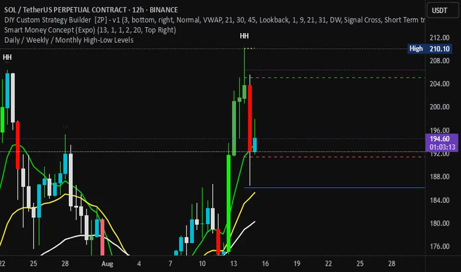
Daily / Weekly / Monthly High-Low Levels (Arindam )How it works:
Daily levels are taken from the previous day.
Weekly levels are from the previous week.
Monthly levels are from the previous month.
They extend across the chart for visual reference.
You can customize colors, line styles, or whether they reset each session.
Do you want me to also add labels on the right side (e.g., “Daily High”, “Weekly Low”) so the lines are clearly marked?
Trading bot gridsGuide: Price Lines – Arithmetic vs. Geometric
This script draws horizontal price lines (grids) between a start price and an end price.
You can choose whether the lines are distributed evenly (arithmetic) or by percentage (geometric).
🔧 Inputs
Start Price → Lower or upper boundary of the price range.
End Price → Opposite boundary of the price range.
Number of Lines → Total number of lines to be drawn between the start and end prices.
Distribution →
Arithmetic: Fixed USDT distance between each line.
Geometric: Fixed percentage distance between each line.
Grid Color → Color of the drawn lines.
📈 How it Works
The script calculates the lower (lo) and upper (hi) boundaries, regardless of which is entered first.
Arithmetic distribution: Each line is spaced by a fixed amount in USDT.
Geometric distribution: Each line is spaced by the same percentage difference from the previous one.
Lines are created only once at the first bar and remain on the chart.
All lines are extended across the entire visible chart.
💡 Tips
Useful for Grid Bot backtesting or visualizing price zones.
Works for both long and short price ranges.
In geometric mode, lines appear closer together near the lower price range and farther apart toward the upper range.


Intraday High/Low BandPlots an intraday high low band showing when the stock hits a new daily high/low.
Band can be defined as percentage of the daily range.

THF Crossover and Trend Signals Golden & Death Cross with VolumeScript Overview:
This Pine Script is designed to assist traders in identifying key buy/sell signals and major trend changes on the chart using Exponential Moving Averages (EMA) and Simple Moving Averages (SMA), as well as visualizing Golden Cross and Death Cross events. The script also includes a volume indicator to highlight the volume trading activity in relation to the price movements.
Key Features:
1. Moving Averages:
EMA 21: Exponential Moving Average over a 21-period, shown in green.
EMA 50: Exponential Moving Average over a 50-period, shown in yellow.
SMA 50: Simple Moving Average over a 50-period, shown in red.
SMA 200: Simple Moving Average over a 200-period, shown in blue.
2. Signals:
Buy Signal: Generated when EMA 21 crosses above SMA 50, indicating a potential upward trend. Displayed with a green label below the price bar.
Sell Signal: Generated when EMA 21 crosses below SMA 50, indicating a potential downward trend. Displayed with a red label above the price bar.
3. Golden Cross (Bullish Trend):
A Golden Cross occurs when EMA 50 crosses above SMA 200, which often signals the start of a long-term upward trend. The signal is displayed with a yellow label below the price bar.
4. Death Cross (Bearish Trend):
A Death Cross occurs when EMA 50 crosses below SMA 200, which often signals the start of a long-term downward trend. The signal is displayed with a blue label above the price bar.
5. Volume Indicator:
The volume is plotted as colored columns. Green indicates higher volume than the 20-period moving average, and red indicates lower volume.
A Volume Moving Average (SMA 20) is also plotted to compare volume changes over time.
How the Script Works:
1. The EMA and SMA lines are plotted on the chart, providing a visual representation of the short- and long-term trends.
2. Buy/Sell signals are triggered based on the crossover between EMA 21 and SMA 50, helping to identify potential entry and exit points.
3. The Golden Cross and Death Cross indicators highlight major trend reversals based on the crossover between EMA 50 and SMA 200, providing clear visual cues for long-term trend changes.
4. Volume is displayed alongside price movements, offering insight into the strength or weakness of a trend.
Key Customizations:
Moving Average Periods: Users can modify the lengths of the EMAs and SMAs for customized analysis.
Volume Moving Average Period: The script allows for adjustment of the volume moving average period to suit different market conditions.
Signal Visibility: The size and color of the buy, sell, Golden Cross, and Death Cross signals can be easily customized to make them more prominent on the chart.
Conclusion:
This script is ideal for traders looking to combine price action with volume analysis, using key technical indicators such as EMA, SMA, Golden Cross, and Death Cross to make informed decisions in trending markets.
---
This explanation covers all aspects of the script and provides a clear understanding of its functionality, which is helpful for sharing the script or using it as an educational resource.

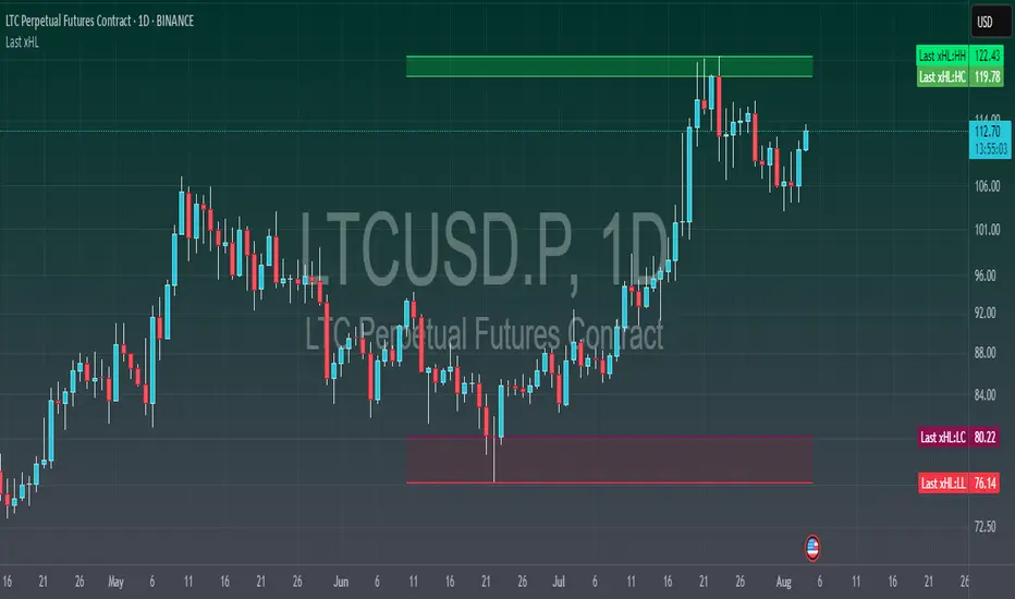
Last xHL📈 Last xHL – Visualize Key Highs and Lows
This script highlights the most recent significant highs and lows over a user-defined period, helping traders quickly identify key support and resistance zones.
🔍 Features:
Highest High (HH) and Highest Close/Open (HC) lines
Lowest Low (LL) and Lowest Close/Open (LC) lines
Dynamic updates with each new bar
Gradient-filled zones between HH–HC and LL–LC for visual clarity
⚙️ Customization:
Adjustable lookback period (_length) to suit your trading style
Color-coded lines and fills for quick interpretation
🧠 Use Case:
This tool is ideal for traders who want to:
Spot potential breakout or reversal zones
Identify price compression or expansion areas
Enhance their technical analysis with visual cues
This script is for educational and informational purposes only. It does not constitute financial advice. Always do your own research before making trading decisions.
Candle box - All SessionsCandle Box – All Sessions + Weekday Filter
This indicator automatically draws boxes on your chart, highlighting custom sessions based on user-defined start and end times.
For each selected session, it visually marks the high and low of the opening candle from your chosen timeframe, making it easy to analyze volatility, breakouts, and ranges.
Key Features:
Full Time Customization: Choose the start and end hour/minute for your session boxes.
Reference Candle Timeframe: Select which timeframe’s high/low to use (e.g., 5min, 15min, etc).
Weekday Selection: Display boxes only on the days of the week you want—any combination of weekdays and weekends.
Session History: All previous session boxes remain visible on the chart, allowing easy review of price behavior across multiple days.
Visual Customization: Adjust border color, background color, and border width for each box.
Typical Uses:
Highlight volatility during key market sessions (e.g., NY Open, London, Close, etc.).
Mark opening ranges for daily or any custom time window.
Identify breakout and consolidation patterns across sessions.
How to Use:
Add the indicator to your chart.
Configure your preferred start/end time, reference candle timeframe, visual style, and select the days of the week.
The indicator will automatically draw all session boxes for both current and past days, making market structure and session dynamics instantly clear.
Liquidity Zones (JTS)Title: Liquidity Zones (JTS)
Description:
This script marks out key liquidity zones using pivot highs and lows. It includes:
Buy-Side Liquidity (Highs): Shown in red lines
Sell-Side Liquidity (Lows): Shown in green lines
Sweep Protection: Zones will only be removed after a defined number of bars AND a true sweep beyond the level
Toggle Controls: Enable/disable highs or lows individually
Adjustable Settings: Pivot length, sweep delay, max lines, and colors
Perfect for traders looking to track untapped or recently swept liquidity.
Created by JTS
For educational and strategic use

[FS] Time & Cycles Time & Cycles
A comprehensive trading session indicator that helps traders identify and track key market sessions and their price levels. This tool is particularly useful for forex and futures traders who need to monitor multiple trading sessions.
Key Features:
• Multiple Session Support:
- London Session
- New York Session
- Sydney Session
- Asia Session
- Customizable TBD Session
• Session Visualization:
- Clear session boxes with customizable colors
- Session labels with adjustable visibility
- Support for sessions crossing midnight
- Timezone-aware calculations
• Price Level Tracking:
- Daily High/Low levels
- Weekly High/Low levels
- Previous session High/Low levels
- Customizable history depth for each level type
• Customization Options:
- Adjustable colors for each session
- Customizable border styles
- Label visibility controls
- Timezone selection
- History level depth settings
• Technical Features:
- High-performance calculation engine
- Support for multiple timeframes
- Efficient memory usage
- Clean and intuitive visual display
Perfect for:
• Forex traders monitoring multiple sessions
• Futures traders tracking market hours
• Swing traders identifying key session levels
• Day traders planning their trading hours
• Market analysts studying session patterns
The indicator helps traders:
- Identify active trading sessions
- Track session-specific price levels
- Monitor market activity across different time zones
- Plan trades based on session boundaries
- Analyze price action within specific sessions
Note: This indicator is designed to work across all timeframes and is optimized for performance with minimal impact on chart loading times.

Sessions High/LowIndicator lines to show the prior days NY high/low, overnight Asian high/low, and recent London high/low. Time frame variables are included as well as the option to change colors for both the high and low. Good luck.

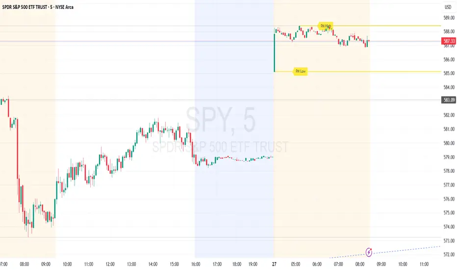
Premarket High/Low (Horizontal Rays)=== Script Description ===
This TradingView script automatically detects and displays the high and low prices
during the premarket session (04:00–09:30 Eastern Time) for the current trading day.
It draws horizontal rays that extend across the chart and labels them as "PM High" and "PM Low".
These markers are refreshed daily and only apply to today's session.
The script also provides full customization for:
- Line color, width, and style (solid, dotted, dashed)
- Label text color, background color, size, and style (left, right, up, down)
Time note: This script assumes data aligned with U.S. market hours.