Educational

SignalViper Recon [Lite]SignalViper Recon Lite — Confluence-Based Market State Summary
Recon Lite is a streamlined market analysis tool that evaluates momentum and trend conditions to identify alignment between key analytical factors. It provides a real-time dashboard summarizing market state, helping traders quickly assess whether conditions favor directional moves or suggest caution.
Core Concepts & Logic
Recon Lite evaluates two primary analytical dimensions:
Momentum Analysis (RSI-Based)
- Evaluates price momentum strength and direction
- Identifies acceleration, deceleration, and reversal potential
- Detects overbought/oversold extremes
Trend Analysis (ADX/DMI-Based)
- Measures trend strength regardless of direction
- Determines whether bulls or bears control directional movement
- Identifies weak, ranging, or strong trending conditions
When both dimensions align in the same direction, Recon Lite identifies confluence — a state where momentum and trend agree, historically associated with higher-probability directional moves.
Narrative Interpretation Layer
Rather than displaying raw indicator values, Recon Lite translates conditions into contextual descriptions:
- "RISING - Accelerating" — Momentum gaining strength
- "BEARISH - but weakening" — Trend losing steam
- "OVERBOUGHT" / "OVERSOLD" — Extreme conditions detected
- "Trend losing steam" — Warning of potential reversal
Signal Tracking & Target Awareness
When confluence is detected, Recon Lite can track the signal with ATR-based target levels:
- Stop Loss — Risk-defined exit level
- TP1 / TP2 — Reward targets at configurable R:R ratios
The dashboard displays real-time proximity to these levels, including warnings when approaching key thresholds.
Visual Outputs
Summary Dashboard
- Momentum state with directional context
- Trend state with strength assessment
- Active warnings when conditions conflict
- Confluence or tracking status
- Target proximity and outcome tracking
Chart Signals
- Visual markers when full confluence is detected
- Optional TP/SL level lines
How to Use Recon Lite
Recon Lite serves as a market context tool. Traders commonly use it to:
- Identify when momentum and trend align
- Understand current market state at a glance
- Track signal outcomes with defined risk levels
- Avoid entries during conflicting or weak conditions
About the Full SignalViper Suite
Recon Lite demonstrates the confluence-based approach used across the SignalViper indicator suite. The full Recon indicator evaluates seven proprietary analytical dimensions — including volume participation, structural proximity, divergence detection, and multi-timeframe alignment — for comprehensive market state analysis.
This free indicator represents only the most basic example of our patent-pending Recon technology. Experience the full power of multi-factor confluence analysis with the complete SignalViper suite.
Learn more at signalviper.com

SignalViper Recon LiteSignalViper Recon Lite — Confluence-Based Market State Summary
Recon Lite is a streamlined market analysis tool that evaluates momentum and trend conditions to identify alignment between key analytical factors. It provides a real-time dashboard summarizing market state, helping traders quickly assess whether conditions favor directional moves or suggest caution.
Core Concepts & Logic
Recon Lite evaluates two primary analytical dimensions:
Momentum Analysis (RSI-Based)
- Evaluates price momentum strength and direction
- Identifies acceleration, deceleration, and reversal potential
- Detects overbought/oversold extremes
Trend Analysis (ADX/DMI-Based)
- Measures trend strength regardless of direction
- Determines whether bulls or bears control directional movement
- Identifies weak, ranging, or strong trending conditions
When both dimensions align in the same direction, Recon Lite identifies confluence — a state where momentum and trend agree, historically associated with higher-probability directional moves.
Narrative Interpretation Layer
Rather than displaying raw indicator values, Recon Lite translates conditions into contextual descriptions:
- "RISING - Accelerating" — Momentum gaining strength
- "BEARISH - but weakening" — Trend losing steam
- "OVERBOUGHT" / "OVERSOLD" — Extreme conditions detected
- "Trend losing steam" — Warning of potential reversal
Signal Tracking & Target Awareness
When confluence is detected, Recon Lite can track the signal with ATR-based target levels:
- Stop Loss — Risk-defined exit level
- TP1 / TP2 — Reward targets at configurable R:R ratios
The dashboard displays real-time proximity to these levels, including warnings when approaching key thresholds.
Visual Outputs
Summary Dashboard
- Momentum state with directional context
- Trend state with strength assessment
- Active warnings when conditions conflict
- Confluence or tracking status
- Target proximity and outcome tracking
Chart Signals
- Visual markers when full confluence is detected
- Optional TP/SL level lines
How to Use Recon Lite
Recon Lite serves as a market context tool. Traders commonly use it to:
- Identify when momentum and trend align
- Understand current market state at a glance
- Track signal outcomes with defined risk levels
- Avoid entries during conflicting or weak conditions
About the Full SignalViper Suite
Recon Lite demonstrates the confluence-based approach used across the SignalViper indicator suite. The full Recon indicator evaluates seven proprietary analytical dimensions — including volume participation, structural proximity, divergence detection, and multi-timeframe alignment — for comprehensive market state analysis.
This free indicator represents only the most basic example of our patent-pending Recon technology. Experience the full power of multi-factor confluence analysis with the complete SignalViper suite.
Learn more at signalviper.com

Risk Adjusted Geometric Exponent [VynthraQuant]RAGE Index (Risk-Adjusted Geometric Exponent)
Overview
The RAGE Index is a quantitative momentum oscillator that measures the efficiency and quality of an asset's price trend. Standing for Risk-Adjusted Geometric Exponent , this indicator goes beyond simple price action by evaluating the average logarithmic growth rate relative to the asset's volatility.
In institutional finance, it is not just about how much an asset moves, but how it moves. RAGE identifies trends that exhibit high compounding growth with minimal "noise" or volatility.
The Logic Behind RAGE
The indicator is built on two core quantitative pillars:
1. Geometric Exponent (GE): Instead of simple percentage changes, we calculate the geometric mean of log-returns. This represents the true compounding "velocity" of the price.
2. Volatility Normalization: We divide the GE by the standard deviation of returns (Volatility) over a specific lookback period.
How to Interpret the RAGE Index
* The Zero Line: The most critical level. When RAGE crosses above 0, the asset has entered a state of positive geometric growth. Below 0, the asset is in a state of efficient decay.
* Trend Quality: A rising RAGE value indicates that the trend is becoming more "efficient", growth is increasing while volatility is staying low or decreasing.
* Color-Coded Candles: The script features a `force_overlay` function that colors the candles on your main chart.
* Bullish Color: Efficient growth detected (Long bias).
* Bearish Color: Efficient decay detected (Short bias).
Key Features
* Logarithmic Accuracy: Uses log-returns to ensure time-additivity and eliminate the bias found in standard percentage calculations.
* Adaptive to Volatility: Unlike a standard RSI or MACD, RAGE penalizes "choppy" price action, helping you stay out of sideways markets.
* Optimized Performance: Written in Pine Script v6 with high-efficiency math to ensure fast loading even on lower timeframes.
Settings
* GE Lookback: The window used to calculate the average growth rate.
* Volatility Lookback: The window used to measure the "risk" or noise of the price action.
General Disclaimer
This indicator is for informational and educational purposes only. It does not constitute financial advice. The creator bears no responsibility for any financial decisions or losses resulting from its use. Past performance is not indicative of future results.
Islamic Disclaimer
All trading activity should be approached with awareness of halal and haram principles. Ensure your investments, instruments, and methods align with Islamic ethical standards. This tool does not promote speculative or impermissible practices.

Gold Asia Session Highlighter [IST]Here is a polished description and guide for your Gold Asia Session Highlighter. You can use this text for a YouTube description, a Telegram post, or a PDF guide to explain the tool to others.
Gold Asia Session Highlighter (IST) | Visual Indicator
This is a custom TradingView indicator designed to simplify the Gold Asia Strategy. Instead of automating trades, this tool purely handles the visuals. It automatically highlights the correct Asia Session time window (adjusting for Winter/Summer hours) and marks the exact points where you should draw your Fixed Range Volume Profile (FRVP) tool.
Perfect for: Traders who prefer to draw their own FRVP levels manually but want to ensure they are using the exact, error-free time range every single day.
Features
✅ Automatic Time Zone: Strictly calculated using IST (Indian Standard Time), so you don't need to convert time zones manually.
✅ Smart Season Detection: Automatically switches between Winter Session (04:30 – 06:25) and Summer Session (03:30 – 05:25) based on the current month.
✅ Visual Guidance: Highlights the session background and places "START" and "END" labels on the exact candles.
✅ Zero Clutter: Clean visuals with no moving averages or strategy lines—just the session box.
How to Use It
Add to Chart: Apply the script to your Gold (XAUUSD) 5-minute chart. You will see a blue highlighted box appear during the Asia session.
Locate the Labels:
Look for the blue START label (bottom of the candle).
Look for the red END label (top of the candle).
Draw Your FRVP:
Select the Fixed Range Volume Profile tool from your TradingView toolbar.
Click exactly on the START candle.
Drag and release exactly on the END candle.
Trade: You now have the exact Value Area High (VAH), Value Area Low (VAL), and Point of Control (POC) for the day. Use your breakout strategy as usual!


Market time opens @NeoNztime opens marked out new york session , london session, asia session and highs and lows of each one

Sector Flow AnalysisSector Flow Analysis - Track market leadership and rotation across 11 major sector ETFs with real-time performance rankings.
Key Features:
Monitors all 11 S&P sector ETFs (XLK, XLF, XLI, XLU, XLV, XLP, XLY, XLB, XLRE, XLC, XLE)
Configurable lookback period (5-60 days) for performance calculation
Color-coded risk indicators: 🟢 Risk-On sectors leading (bullish), 🟠 Risk-Off sectors leading (defensive), 🟡 Neutral sectors
Display top N sectors (1-11) to declutter your chart
Fully customizable positioning, text size, and color
Clean, minimal table overlay that won't obstruct your chart
Use Cases:
Identify sector rotation patterns and market leadership changes
Gauge market sentiment (risk-on vs risk-off behavior)
Find opportunities by tracking which sectors are gaining/losing momentum
Confirm trend strength when your stock's sector is leading
Perfect companion to comprehensive market analysis tools for a complete picture of sector dynamics.

SMC Alpha Sentiment Pro [Binance Futures Data]The SMC Alpha Sentiment Pro is an advanced decision-support tool developed for the Crypto Trade community. Unlike traditional lagging indicators, this script focuses on Market Sentiment and Smart Money Concepts (SMC) by analyzing real-time data from Binance Futures.
🔍 Key Data Points:
Open Interest (OI): Tracks new capital entering the market to confirm trend strength.
Long/Short Ratio (LSR): Identifies retail positioning. We look for "Smart Money" opportunities when retail (LSR > 1) is trapped or providing liquidity for institutional moves.
RSI & ATR: Used to identify exhaustion levels and ensure sufficient volatility for the trade.
Volume Filter: A built-in security layer that validates signals only when current volume exceeds the 20-period average.
🚥 Signal Logic:
SMC LONG: Triggered when OI is rising, LSR is below 1 and falling (retail selling), RSI is showing extreme strength (>= 68), and volume is surging.
SMC SHORT: Triggered when OI is rising, LSR is above 1 and rising (retail buying), RSI is showing extreme weakness (<= 32), and volume is surging.
📈 Best Practices:
Timeframe: Optimized for 15-minute (15M) charts.
Exchange: Specifically designed to pull ticker data from Binance Futures.
Disclaimer: This script is for educational purposes only. Trading involves significant risk.

Bhuvana Retrace Predictor (ATR + RSI Dive + St Break)It’s a “retracement warning + confirmation” tool. Nothing more.
Concept in simple words
Price runs too far too fast
The script uses EMA + ATR bands to detect when price is “stretched” (far from normal).
The run is losing power
It checks RSI divergence:
Price makes a new high but RSI doesn’t → buyers are getting weaker.
Price makes a new low but RSI doesn’t → sellers are getting weaker.
It waits for proof the pullback started
It then waits for a small structure break:
For a drop: price closes below a recent minor low.
For a bounce: price closes above a recent minor high.
What each label means
SETUP = “Retracement is likely soon” (don’t chase).
CONFIRM = “Retracement probably started” (now it’s tradable).
Brutal truth
This doesn’t predict perfectly. It just stacks 3 common signs:
overextended + weakening momentum + structure break.

Bhuvana Retrace Predictor It’s a “retracement warning + confirmation” tool. Nothing more.
Concept in simple words
Price runs too far too fast
The script uses EMA + ATR bands to detect when price is “stretched” (far from normal).
The run is losing power
It checks RSI divergence:
Price makes a new high but RSI doesn’t → buyers are getting weaker.
Price makes a new low but RSI doesn’t → sellers are getting weaker.
It waits for proof the pullback started
It then waits for a small structure break:
For a drop: price closes below a recent minor low.
For a bounce: price closes above a recent minor high.
What each label means
SETUP = “Retracement is likely soon” (don’t chase).
CONFIRM = “Retracement probably started” (now it’s tradable).
Brutal truth
This doesn’t predict perfectly. It just stacks 3 common signs:
overextended + weakening momentum + structure break.

InCrypto WatermarkInCrypto Watermark
A customizable overlay indicator that displays essential trading information directly on your TradingView charts. This tool helps traders quickly access key market data without cluttering the chart interface.
KEY FEATURES:
• Symbol Information: Displays current trading pair and active timeframe
• Price Display: Optional current price with smart precision formatting
• Price Change: Optional price change percentage over 24 bars with color-coded indicators
• Date & Time: Multiple format options for date (DD/MM/YYYY, MM/DD/YYYY, YYYY-MM-DD, DD.MM.YYYY) and time (HH:MM, HH:MM:SS)
• Custom Text: Customizable title and subtitle text
• Full Customization: Adjustable positioning, colors, sizes, alignment, and opacity for all elements
• Visibility Controls: Show/hide individual elements independently
• Background Options: Customizable background color, opacity, and optional borders
SETTINGS:
The indicator is organized into logical groups:
- Text Content: Title and subtitle customization
- Visibility: Individual show/hide controls for each element
- Watermark Position: Flexible placement options
- Symbol Info Position: Separate positioning controls
- Cell Size: Width and height adjustments
- Title/Subtitle/Symbol Info Settings: Color, size, alignment, and opacity controls
- Background Settings: Background color, opacity, and border options
USE CASES:
• Chart branding for trading groups or channels
• Quick reference for essential trading information
• Professional-looking charts for screenshots
• Multi-timeframe analysis assistance
TECHNICAL DETAILS:
• Pine Script v6
• Overlay indicator
• Works on all TradingView-supported markets and timeframes
• Real-time updates
HOW TO USE:
1. Add the indicator to your chart
2. Customize title and subtitle in Text Content settings
3. Adjust positioning for watermark and symbol info sections
4. Enable/disable individual information elements as needed
5. Fine-tune colors, sizes, and opacity to match your chart style
The indicator automatically adjusts price precision based on the asset's price level. Price change is calculated over 24 bars of the current timeframe (not 24 hours).
DISCLAIMER:
This indicator is for informational purposes only. It does not constitute investment advice, financial advice, trading advice, or any other type of advice. Past performance does not guarantee future results. Always conduct your own research and risk management before making trading decisions. Trading involves substantial risk of loss and is not suitable for every investor.


VIX Percentile OscillatorWhat is this script?
This is a trading tool that helps you decide when to buy or sell options based on market volatility. Think of it as a "fear meter" for the stock market.
What is VIX?
VIX = Volatility Index (also called the "fear index")
When VIX is HIGH → Market is scared/volatile → Options are EXPENSIVE
When VIX is LOW → Market is calm → Options are CHEAP
What does "Percentile" mean?
Instead of just showing VIX price, this script shows where VIX is compared to history.
Example: If VIX Percentile = 85%
This means VIX is higher than 85% of all past readings
Only 15% of the time was VIX higher than now
Translation: Volatility is unusually HIGH
The 5 Trading Zones
The script divides the market into 5 zones:
🔴 EXTREME SELLING ZONE (90-100%)
VIX is in the top 10% historically
Action: AGGRESSIVELY SELL OPTIONS (collect big premiums)
Market panic = expensive options = profit for sellers
🟠 SELLING ZONE (80-89%)
VIX is elevated but not extreme
Action: SELL OPTIONS (good premiums available)
⚪ NEUTRAL ZONE (20-79%)
VIX is normal
Action: WAIT or use other strategies
🟢 BUYING ZONE (10-19%)
VIX is low
Action: BUY OPTIONS (they're cheap)
🟢 EXTREME BUYING ZONE (0-9%)
VIX is in the bottom 10% historically
Action: AGGRESSIVELY BUY OPTIONS (bargain prices)
Market complacency = cheap options = opportunity
Understanding the Chart
Main Line (Blue/Red/Green):
Shows current VIX percentile
Color changes based on zone
Thick line = easy to see
Histogram (Background bars):
Red bars = above 50% (high volatility)
Green bars = below 50% (low volatility)
Purple Momentum Line:
Shows if VIX is rising or falling
Helps you catch trends early
Background Colors:
Light red/orange = Selling zones
Light green = Buying zones
Triangle Markers:
Appear when entering new zones
"EXTREME" label = strongest signals
The Statistics Table (Top Right)
VIX Price: Current VIX value (e.g., 16.50)
Percentile: Where VIX ranks (0-100%)
Z-Score: Statistical measure
Above +2 or below -2 = extreme
Red text = unusually high/low
Momentum: Rate of change
Red = rising (volatility increasing)
Green = falling (volatility decreasing)
Avg VIX: Average VIX over lookback period
Current Zone: Which zone you're in right now
Bars in Zone: How long you've been in this zone
Simple Trading Rules
FOR OPTION SELLERS (Premium Collectors):
✅ SELL when: Percentile > 80% (especially > 90%)
High premiums available
Examples: Sell covered calls, cash-secured puts, credit spreads
FOR OPTION BUYERS (Hedgers/Speculators):
✅ BUY when: Percentile < 20% (especially < 10%)
Cheap options available
Examples: Buy protective puts, long calls, debit spreads
Key Settings You Can Adjust
Lookback Period (default: 252)
How far back to compare (252 = 1 year of trading days)
Longer = smoother, more stable
Shorter = more sensitive to recent changes
Smoothing Period (default: 3)
Reduces noise/wiggling
Higher = smoother line
Lower = more responsive
Zone Thresholds:
Extreme Sell: 90%
Sell: 80%
Buy: 20%
Extreme Buy: 10%
You can customize these!
Real-World Example
Scenario: VIX Percentile jumps to 92%
What this means:
VIX is higher than 92% of all past readings
Market is in panic mode
Option premiums are INFLATED
Trading Action:
✅ Sell covered calls on stocks you own
✅ Sell cash-secured puts on stocks you want to buy
✅ Sell credit spreads
❌ DON'T buy expensive options right now
Why it works: When fear is extreme, it usually calms down eventually. You profit as premiums deflate.
Important Reminders
⚠️ This is a TIMING tool, not a crystal ball
It tells you WHEN premiums are expensive/cheap
It doesn't tell you WHICH options to trade
You still need proper risk management
⚠️ Works on ALL timeframes
Daily charts = swing trading
Weekly charts = position trading
Intraday charts = day trading volatility
⚠️ Best for:
Option sellers during high VIX (>80%)
Option buyers during low VIX (<20%)
Portfolio hedging decisions
Volatility trading strategies
Bottom Line: This script helps you buy options when they're cheap and sell options when they're expensive. It's like shopping for sales, but for volatility!
DISCLAIMER: This information is provided for educational purposes only and should not be considered financial, investment, or trading advice. Please do boost if you like it. Happy Trading.

52-Week Range Dashboardthis shows the diff in % between the 52 week high and low
this is called coiling method, you may observe whenever the diff in % between 52 week high and low price is 30% or below, that's the time the script will show a move.
Thank you
have a great day

Position Avg Line + P/L Table - SightLine LabsPosition Avg – SLL is a lightweight position-tracking indicator designed to display a persistent average price level on the chart along with a real-time position summary table.
This script is non-trading and does not generate signals, entries, or exits. It is intended strictly for position awareness and visual reference.
What this indicator does:
Plots a persistent horizontal average price line (dashed by default)
Displays a live position statistics table showing:
Shares owned
Average price
Current price
Unrealized profit/loss in dollars
Unrealized profit/loss in percent
Updates automatically as price changes
Works across all timeframes
Does not depend on broker integration or strategy logic
Key features:
Average Price Line:
User-defined average price input
Persistent across the entire chart
Adjustable color and width
Visibility toggle
Position Table:
Six selectable table positions:
Top Left, Top Center, Top Right, Bottom Left, Bottom Center, Bottom Right
Adjustable text size (Tiny through Huge)
Optional table background fill
Optional inner grid lines
Optional outer frame border
Independent color control for:
Header background
Header text
Value text
Positive and negative P/L values
Chart Overlay Options:
Optional chart background tint
Does not modify the global chart theme
Inputs overview:
Position Settings:
Shares Owned
Average Price
Visual Settings:
Show or hide average price line
Line color and width
Table Settings:
Table position
Table text size
Color Settings:
Header background and text colors
Value text color
Positive and negative P/L colors
Optional table background, grid, and frame colors
How to use:
Add the indicator to a chart
Open the settings panel
Enter the number of shares and the average price
Adjust table position, size, and colors as desired
Use the average price line and table as a visual reference for trade and risk management
Notes and limitations:
This indicator does not place trades
It does not connect to any broker
All values are manually entered
Unrealized P/L is calculated using the chart’s current price
Commissions, fees, and slippage are not included
Disclaimer:
This script is provided for educational and informational purposes only. It does not constitute financial advice, investment recommendations, or trade signals. All trading decisions are the sole responsibility of the user.
Developed by SightLine Labs.

XAU Seasonality + Setup Quality + Month Strength | WarRoomXYZXAU Seasonality Engine is a technical analysis indicator developed for the study of recurring, calendar-based behavior on XAUUSD (Gold).
The tool blends month-of-year seasonality statistics with higher-timeframe context and a setup-quality gate to help users observe when market conditions historically lean strong, weak, or neutral — and how strict trade selection should be during each regime.
Indicator Concept
An indicator for XAUUSD that combines:
1. Seasonality Regime (Month-of-Year Bias)
► Classifies the current month as Strong / Weak / Neutral based on either:
• Preset months (user-defined)
or
• Auto mode (computed from historical monthly performance)
► Strong months suggest a bullish tailwind (not a signal).
► Weak months suggest headwind / caution and require stricter setup quality.
2. Monthly Performance Engine (Under the Hood)
► Uses the symbol’s monthly timeframe data to compute, per calendar month:
• Average monthly return (%)
• Win rate (%) — how often that month closes positive
• Month Strength Score (0–100) — a blended score derived from performance data
► The score is designed to provide a relative strength snapshot of seasonality by month.
3. Month Strength Histogram
► Plots a histogram (0–100) of the current month’s strength score.
• Higher bars = historically stronger month tendency
• Lower bars = historically weaker month tendency
► Optional horizontal reference lines mark “strong” and “weak” zones to make regimes obvious at a glance.
4. Setup Quality Meter (Confluence Filter)
► The indicator calculates a Setup Quality Score (0–100) using market structure and momentum components, such as:
• EMA trend alignment
• Momentum confirmation (EMA fast vs slow)
• Structure break confirmation (BOS)
• Liquidity sweep behavior
• Candle confirmation logic
► This score is intended as a trade-selectivity filter , not a trade executor.
5. Adaptive Rules for Weak Months (Strict Mode)
► When the indicator detects a weak seasonal regime, conditions automatically tighten:
• The A+ threshold increases (adaptive thresholding)
• Optional rule: Weak months require BOS + Sweep + FVG simultaneously before any A+ condition is considered valid
This forces the user into “higher-quality-only” behavior during historically weaker seasonal periods.
🔹1 Visual Components Included
• Seasonality regime label (Strong / Weak / Neutral)
• Optional background shading based on regime
• Month Strength Score histogram (0–100)
• Current month stats: Avg return + win rate
• Setup Quality Meter value (0–100)
• Adaptive A+ threshold display
• Weak-month confluence gate status (BOS / Sweep / FVG pass/fail)
• Optional alerts when strict criteria are met
➣What Means in the XAU Indicator
🔹 Definition (in THIS indicator)
Win Rate = the percentage of historical months that closed positive for the same calendar month.
It is NOT:
trade win rate ❌
signal accuracy ❌
It is a s tatistical seasonality metric .
How It’s Calculated
For each calendar month (January, February, etc.), the indicator:
1.Looks at historical monthly candles (Monthly timeframe).
2. Counts how many times that month:
•Closed higher than it opened (or higher than previous month close).
3. Divides:
Number of positive months
÷
Total number of observed months
× 100
Example: September
If over the last 20 years:
September closed green 14 times
September closed red 6 times
Then:
Win Rate = (14 / 20) × 100 = 70%
That’s what you see as in the dashboard.
What the Win Rate Is Used For
1️⃣ Part of the Month Strength Score
The indicator blends:
•Average Monthly Return (%) → measures magnitude
•Win Rate (%) → measures consistency
Combined into:
Month Strength Score (0–100)
This avoids a common trap:
•A month with 1 huge rally but many losses ≠ reliable
•A month with steady positive closes = higher quality environment
What Win Rate Tells You
High Win Rate (e.g. 65–75%)
•Gold more often closes higher in this month
•Continuation is statistically more likely
•Pullbacks are more likely to resolve in trend direction
Low Win Rate (e.g. 35–45%)
•Gold more often fails to close higher
•More chop, deeper retracements, false breakouts
•Continuation trades statistically struggle
What It Does NOT Tell You
🚫 It does NOT mean:
•“You will win 70% of your trades”
•“Every setup in this month works”
•“Direction is guaranteed”
Seasonality is context, not prediction.
Why This Is Powerful When Combined With Your System
On its own, win rate is just data.
But in your indicator, it’s used to:
•🔒 Raise the A+ threshold in weak months
•🧠 Force BOS + Sweep + FVG confluence
•❌ Block marginal setups automatically
So instead of guessing:
-“Why is gold so choppy this month?”
You know:
-“This month historically underperforms SO I must be stricter.”
➣What Means in the XAU Seasonality Indicator
🔹 Definition (in THIS indicator)
Avg Monthly Return = the average percentage gain or loss of XAUUSD for a specific calendar month, calculated across many years.
It measures magnitude , not frequency.
It is NOT:
•trade profit ❌
•expected return for the next month ❌
•guaranteed performance ❌
It is a historical seasonality tendency.
How It’s Calculated
For each calendar month (January, February, etc.), the indicator:
1.Takes every historical occurrence of that month.
2.Calculates the percentage change of the monthly candle:
(Monthly Close − Previous Monthly Close)
÷ Previous Monthly Close × 100
3. Adds all those percentage changes together.
4. Divides by the total number of observations.
Example: September
Assume over 20 years:
+2.4%, +1.1%, −0.6%, +3.0%, +1.8%, ...
If the sum of all September returns = +28% across 20 years:
Avg Monthly Return = +1.40%
That’s the number displayed in the indicator.
What Avg Monthly Return Is Used For
1️⃣ Measuring Strength of Movement
•Win Rate → “How often does it close green?”
•Avg Monthly Return → “How big are the moves when it works?”
Both are needed.
A month can:
•Win often but move very little
•Move a lot but only occasionally
The indicator combines both to avoid misleading conclusions.
How to Interpret Avg Monthly Return
Positive Avg Return (e.g. +0.8% to +2.0%)
•Gold tends to expand during this month
•Continuation phases are more likely
•Pullbacks are often absorbed
Near-Zero Avg Return (e.g. −0.2% to +0.2%)
•Market is statistically balanced
•Expect chop, rotations, false breaks
•Continuation is less reliable
Negative Avg Return (e.g. −0.5% or worse)
•Downward pressure or heavy mean reversion
•Rallies often fade
•Risk of aggressive stop hunts
What Avg Monthly Return Does NOT Mean
🚫 It does NOT mean:
•“Price will move +1.4% this month”
•“You should buy because the number is positive”
•“This is a guaranteed edge”
It describes historical behavior, not future certainty.
Why Avg Monthly Return Matters More Than People Think
Two months can have the same win rate but behave very differently:
Example:
Month Win Rate Avg Return Reality
Month A 65% +0.2% Small, choppy wins
Month B 55% +1.6% Fewer wins, but strong expansions
Your indicator would rank Month B as stronger, which is correct for continuation-based strategies.
How It Feeds the Month Strength Score
The indicator blends:
•60% Avg Monthly Return (normalized)
•40% Win Rate
This means:
•Big moves matter more than small consistency
•But consistency still matters enough to prevent distortion
Result:
Month Strength Score (0–100)
Which is then used to:
•tighten or relax A+ thresholds
•activate weak-month strict rules
•control trade frequency
🔹2. Intended Use
The indicator is designed as a discretionary analysis tool to support study of:
• seasonal bias and calendar tendencies
• relative strength/weakness across months
• how strict trade selection should be across different regimes
• confluence behavior when seasonal conditions are unfavorable
The tool does not generate forecasts, does not guarantee outcomes, and should not be relied upon as a stand-alone decision mechanism.
🔹3.How to Use XAU Seasonality Engine
Recommended charts: XAUUSD, intraday (5m–15m) with a HTF context (1H–4H).
1. Identify the Seasonal Regime
• Strong month → you can allow more continuation bias (still require structure).
• Neutral month → trade normally, standard criteria.
• Weak month → tighten selection, demand clean A+ conditions only.
2. Read the Month Strength Histogram
• If the score is high (e.g., 70+), the month has historically shown stronger tendency.
• If the score is low (e.g., 40 and below), expect slower conditions, deeper pullbacks, or more chop — and reduce marginal trades.
3. Use the Setup Quality Meter as the Gate
► In normal/strong months:
• A+ threshold is moderate (e.g., 70)
► In weak months:
• A+ threshold is higher (e.g., 80+)
• Optional strict mode: must also pass BOS + Sweep + FVG alignment
4. Example Trade Logic (Framework, Not Signals)
► Bullish framework in a Strong Month:
• Seasonal regime = Strong (tailwind)
• Structure supports bullish continuation (trend alignment)
• Sweep occurs into demand / liquidity grab
• Setup Quality reaches A+ threshold
• Entry: confirmation candle or retrace to key level
• SL: beyond sweep low / invalidation
• TP: nearest liquidity / prior highs / HTF level
► Weak Month rule-set (Strict Mode):
• Seasonal regime = Weak (headwind)
• Only consider trades if:
✅ BOS confirms direction
✅ Sweep occurs and rejects cleanly
✅ FVG exists recently (or is mitigated if you choose that model)
✅ Setup Quality exceeds the elevated adaptive threshold
If any one is missing → no trade
This is not meant to “predict” gold — it’s meant to enforce discipline when seasonality historically underperforms.
🔹4.Limitations and User Responsibility
► The indicator does not represent financial advice or imply performance expectations.
► Seasonality is statistical tendency, not certainty — macro conditions can override it.
► Results vary by broker feed, timeframe, and settings.
► Users should test thoroughly in simulation before applying to live markets.
► All trading decisions, risk management, and execution remain solely the responsibility of the user.
🔹5. Alerts
Optional alerts can notify when:
• a new month begins and the seasonal regime changes
• A+ criteria are met
• weak-month strict conditions pass (BOS + Sweep + FVG)
Alerts are informational only and do not constitute actionable recommendations.
Disclaimer
This script is provided for informational and educational purposes only . It does not provide financial, investment, or trading advice, and it does not guarantee profits or future performance. All decisions made based on this script are solely the responsibility of the user.
This script does not execute trades, manage risk, or replace the need for trader discretion. Market behavior can change quickly, and past behavior detected by the script does not ensure similar future outcomes.
Users should test the script on demo or simulation environments before applying it to live markets and must maintain full responsibility for their own risk management, position sizing, and trade execution.
Trading involves risk, and losses can exceed deposits. By using this script, you acknowledge that you understand and accept all associated risks.

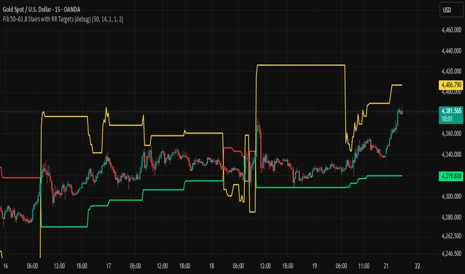
BHUVANA Fib 50/61.8 Stairs with RR Targets Fib 50–61.8 Stairs with RR Targets (debug) automatically tracks the latest swing and draws a 50%–61.8% Fibonacci pullback zone as step-like “stairs.” From that zone it plots a planned trade framework: entry reference, stop/invalidation, and multiple Risk:Reward targets (e.g., 1R/1.5R/2R/3R).
What it’s for
Visualize the “buy/sell pullback” area (50–61.8) in trending moves
Standardize exits with RR targets instead of guessing
Quickly see when the swing/zone updates as structure changes
How to use (simple)
Wait for a clear impulse swing to form.
Let price retrace into the 50–61.8 zone.
Take entries only with your own trigger (reclaim / rejection / BOS).
Use the plotted stop and RR targets for management.
Inputs
Swing detection / lookback
RR multiples and target count
Show/hide stairs, labels, debug visuals
Important
This is a mapping tool, not a standalone signal. If you trade every touch of 50–61.8 without confirmation, you’ll get chopped. Debug version may show extra visuals and can repaint on swing updates. Not financial advice.
Weekly Bullish Engulfing ScreenerThis is a weekly Bullish engulfing screener to find the stocks ready to breakout

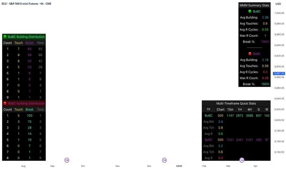
Body Close Continuity & failure Backtesting @MaxMaseratiThis indicator, is a highly advanced institutional-grade tool designed to track the "lifespan" of a trend based on Body Close (BC) sequences.
Unlike basic indicators that just show direction, this script analyzes the structural integrity of a trend by monitoring how many candles continue the move before a "Touch" (retest) or a "Break" (failure) occurs.
The Continuity & Failure Stats indicator tracks sequences of Bullish Body Closes (BuBC) and Bearish Body Closes (BeBC). It measures three critical phases: Building (pure momentum), Touching (price retesting the low/high of the sequence), and Resumption (price continuing the trend after a retest). It provides a statistical distribution of how long these "buildings" typically last before failing, allowing traders to know exactly when a trend is overextended.
This comprehensive analysis blends the statistical breakdown of the Continuity & Failure Stats indicator to provide a deep understanding of the structural momentum for the S&P 500 E-mini (ES1!) on a 4-hour timeframe.
1. Extensive Table Breakdown
A. Building Distribution (Left Table): The Fatigue Gauge
This table acts as a histogram of momentum, tracking the "Building Count"—the number of consecutive candles closing in a trend without price returning to its origin.
Count Column: Represents the streak length (e.g., 1, 2, or 3 candles).
Touch Column: Shows how many times a streak was interrupted by a retest ("touch") but remained structurally intact.
Break Column: Counts total structural failures where price closed beyond the sequence's anchor.
Data Insight: For BuBC, 92 sequences reached Count 1, but only 28 remained by Count 4. This reveals a steep momentum decay after the 3rd candle, establishing a "Statistical Wall" where only 2 sequences in history reached a count of 9.
B. MMM Summary Stats (Top Right): The Mathematical DNA
This table provides the "Expected Value" and behavior of a trend over the lookback period.
Avg Building (2.39 for BuBC): On average, a bullish move lasts ~2.4 candles of pure momentum before a retest or reversal occurs.
Avg Touches (0.8): This low number indicates "clean" trends that rarely wobble back to retest levels multiple times before reaching a conclusion.
Avg R Cycles (0.55): This suggests that once a bullish trend is interrupted, it only successfully resumes its momentum about half the time.
Max R Count (1): Typically, once a trend is "touched," it only manages one more push before failing.
C. Multi-Timeframe (MTF) Quick Stats (Bottom Right): Trend Weight
This compares the 4H chart against other layers of the market to identify "global" alignment.
Sample Comparison: There are 3,594 tracked BuBC sequences on the 4H compared to only 142 on the Weekly chart.
Fractal Law: The Avg Building (2.4) is consistent across several timeframes, implying that the "Rule of Three" (momentum fading after 3 candles) is a fractal characteristic of this asset.
2. Table Comparison: Synthesizing the Data
To trade effectively, you must compare Distribution (timing) against Summary Stats (averages):
Continuity vs. Failure: The Summary Stats show an average building of 2.39. When checking the Distribution table at Count 2, the "Break" count (58) is already high relative to the "Total". This confirms that the risk of failure increases exponentially the moment you exceed the average.
Momentum vs. Mean Reversion: Distribution tells you when a trend is "tired". If the 4H is at a "Building Count 4" (statistically overextended) while the Weekly chart is at "Building Count 1" (fresh momentum), you may choose to prioritize the higher timeframe's strength despite the local overextension.
3. Strategic Summary & Application
This indicator proves that market momentum follows a predictable "Building" cycle rather than an infinite streak.
The "Rule of Three" for ES1! 4H:
The Entry Zone (Momentum Start): The most profitable entries occur at Building Count 1. Statistically, you have a high probability of reaching a count of 2 or 3.
The Exit Zone (Momentum Limit): Take profits or tighten stops at Count 3. The data shows the sample size drops by nearly 50% between Count 3 and Count 4.
The "Touch" Rule (Retest Reliability): If price returns to the sequence low (a "Touch"), do not expect a massive continuation. The Max R Count of 1 tells us that resumptions are usually short-lived.
Danger Zone: Entering at Building Count 4 or higher is statistically dangerous, as the "Break" probability significantly outweighs the "Touch" or continuation probability.
Long Short Trading System With TableSmart Trading System Pro is an advanced TradingView indicator designed for precision and clarity.
It combines Order Blocks, Liquidity Zones, EMA trend alignment, MACD, RSI, Volume, and ATR-based risk management to generate high-quality LONG / SHORT signals.
🔹 Clear trade direction
🔹 Smart entry, stop-loss & multi-level take-profit
🔹 Automatic risk/reward & leverage calculation
🔹 Clean visual dashboard for fast decision-making
Built for traders who value structure, confirmation, and risk control.
Best suited for crypto, forex, and indices on all timeframes.
Disclaimer:
This indicator is for educational and informational purposes only and does not constitute financial advice.
Trading involves risk, and past performance does not guarantee future results.
You are solely responsible for your trading decisions and outcomes.

Long Position (Manual Setup)BINANCE:BTCUSDT
This script is for long position setup manually....
Just enter the following data ......
1. higher entry price
2. lower entry price
3. stop loss price
4. targets ( up to 5 targets)
5- extra targets ( up to 3 extra targets)
then you will have the long position draw in the chart with the trade summary including risk and reward percentage.

Michael Mor - ATRMichael Mor -ATR is a clean, lightweight chart watermark that gives you key stock context at a glance — without cluttering your chart or covering price action.
It’s designed for traders who want essential fundamentals + recent performance visible directly on the chart, in a subtle, professional style.
What it shows
You can toggle each line on or off:
Company name (optional market cap: M / B / T)
Symbol & timeframe
Sector & industry
ATR (14) with percentage of price and a quick volatility indicator
🟢 low volatility
🟡 medium volatility
🔴 high volatility
