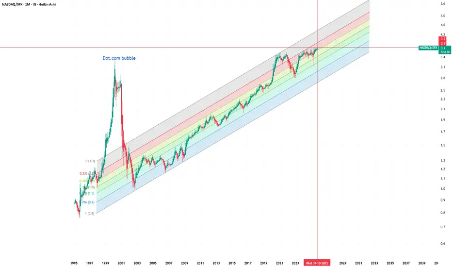
This chart compares NASDAQ to the S&P 500 (NASDAQ/SPX) on a monthly timeframe, visualized with Heikin Ashi candles and a logarithmic regression channel for long-term context. It highlights the dot-com bubble, where the ratio reached extreme overvaluation levels far above the regression mean.
Recently, many investors have been calling the current market an “AI bubble.” However, when viewed through this historical lens, the ratio still remains within the long-term growth channel and far below the excesses of the early 2000s. This perspective suggests that, at least relative to the broader market, tech doesn’t appear to be in bubble territory yet.
It would still be valuable to compare the composition of the NASDAQ today versus in 2000, as the market structure has changed dramatically — with more diversified revenue streams, profitability, and balance sheet strength. Without this data, one can only speculate. But visually, this ratio helps challenge the popular narrative of an ongoing bubble and invites a more nuanced discussion about valuation, innovation cycles, and sector dominance.
#NASDAQ #SPX #Macro #Tech #AIbubble #DotCom #LongTerm #RatioAnalysis #HeikinAshi #MarketCycle
면책사항
이 정보와 게시물은 TradingView에서 제공하거나 보증하는 금융, 투자, 거래 또는 기타 유형의 조언이나 권고 사항을 의미하거나 구성하지 않습니다. 자세한 내용은 이용 약관을 참고하세요.
면책사항
이 정보와 게시물은 TradingView에서 제공하거나 보증하는 금융, 투자, 거래 또는 기타 유형의 조언이나 권고 사항을 의미하거나 구성하지 않습니다. 자세한 내용은 이용 약관을 참고하세요.