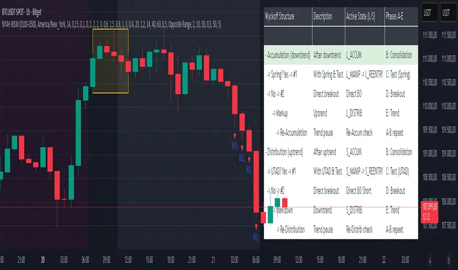
NY 4H Wyckoff State Machine [CHE] NY 4H Wyckoff State Machine — Full (Re-Entry, Breakout, Wick, Re-Accum/Distrib, Dynamic Table) — One-Candle Wyckoff Re-Entry (OCWR)
Summary
OCWR operationalizes a one-candle session workflow: mark the first four-hour New York candle, fix its high and low as the session range when the window closes, and drive entries through a Wyckoff-style state machine on intraday bars. The script adds an ATR-scaled buffer around the range and requires multi-bar acceptance before treating breaks or re-entries as valid. Optional wick-cluster evidence, a proximity retest, and simple volume or RSI gates increase selectivity. Background tints expose regimes, shapes mark events, a dynamic table explains the current state, and hidden plots supply alert payloads. The design reduces random flips and makes state transitions auditable without higher-timeframe calls.
Origin and name
Method name: One-Candle Wyckoff Re-Entry (OCWR)
Transcript origin: The source idea is a “stupid simple one-candle scalping” routine: mark the first New York four-hour candle (commonly between one and five in the morning New York time), drop to five minutes, observe accumulation inside, wait for a manipulation move outside, then trade the re-entry back inside. Stops go beyond the excursion extreme; targets are either a fixed reward multiple or the opposite side of the range. Preference is given to several manipulation candles. This indicator codifies that workflow with explicit states, acceptance counters, buffers, and optional quality filters. Any external performance claims are not part of the code.
Motivation: Why this design?
Session levels are widely respected, yet single-bar breaches around them are noisy. OCWR separates range discovery from trade logic. It locks the range at the end of the window, applies an ATR-scaled buffer to ignore marginal oversteps, and requires acceptance over several bars for breaks and re-entries. Wick evidence and optional retest proximity help confirm that an excursion likely cleared liquidity rather than launched a trend. This yields cleaner transitions from test to commitment.
What’s different vs. standard approaches?
Baseline: Static session lines or one-shot Wyckoff tags without process control.
Architecture: Dual long and short state machines; ATR-buffered edges; multi-bar acceptance for breaks and re-entries; optional wick dominance and cluster checks; optional retest tolerance; direct and opposite breakout paths; cooldown after fires; distribution timeout; dynamic table with highlighted row.
Practical effect: Fewer single-bar head-fakes, clearer hand-offs, and on-chart explanations of the machine’s view.
Wyckoff structure by example — OCWR on five minutes
One-candle setup:
On the four-hour chart, mark the first New York candle’s high and low, then switch to five minutes. Solid lines show the fixed range; dashed lines show ATR-buffered edges.
Long path (verbal mapping):
Phase A, Stopping Action: Price stabilizes inside the range.
Phase B, Consolidation: Sustained balance while the window is closed and after the range is fixed.
Phase C, Test (Spring): Excursion below the buffered low with preference for several outside bars and dominant lower wicks, then a return inside.
Re-entry acceptance: A required run of inside bars validates the test.
Phase D, Breakout to Markup: Long signal fires; stop beyond the excursion extreme; objective is the opposite range or a fixed reward multiple.
Phase E, Trend (Markup) and Re-Accumulation: Advance continues until target, stop, confirmation back against the box, or timeout. A pause inside trend may register as re-accumulation.
Short path mirrors the above: A UTAD-style move forms above the buffered high, then re-entry leads to Markdown and possible re-distribution.
Variant map (verbal):
Accumulation after a downtrend: with Spring and Test, or without Spring; both proceed to Markup and may pause in Re-Accumulation.
Distribution after an uptrend: with UTAD and Test, or without UTAD; both proceed to Markdown and may pause in Re-Distribution.
Note: Phases A through E occur within each variant and are not separate variants.
How it works (technical)
Session window: A configurable four-hour New York window records its high and low. At window end, the bounds are fixed for the session.
ATR buffer: A margin above and below the fixed range discourages triggers from tiny oversteps.
Inside and outside: Users choose close-based or wick-based detection. Overshoot requirements are expressed verbally as a fraction of the range with an optional absolute minimum.
Manipulation tracking: The machine counts bars spent outside and records the side extreme.
Re-entry acceptance: After a return inside, a specified number of inside bars must print before acceptance.
Direct and opposite breakouts: Direct breakouts from accumulation and opposite breakouts after manipulation are supported, subject to acceptance and optional filters.
Targets and exits: Choose the opposite boundary or a fixed reward multiple. Distribution ends on target, stop, confirmation back against the range, or timeout.
Context filters (optional): Volume above a scaled SMA, RSI thresholds, and a trend SMA for simple regime context.
Diagnostics: Background tints for regimes; arrows for re-entries; triangles for breakouts; table with row highlights; hidden plots for alert values.
Central table (Wyckoff console)
The table sits top-right and explains the machine’s stance. Columns: Structure label, plain-English description, active state pair for long and short, and human phase tags. Rows: Start and range building; accumulation branch with Spring and Test as well as direct breakout; Markup and re-accumulation; distribution branch with UTAD and Test as well as direct short breakout; Markdown and re-distribution. Only the active state cell is rewritten each last bar, for example “L_ACCUM slash S_ACCUM”. Row highlighting is context-aware: accumulation, Spring or UTAD, breakout, Markup or Markdown, and re-accumulation or re-distribution checks can highlight independently so users see simultaneous conditions. The table is created once, updated only on the last bar for efficiency, and functions as a read-only console to audit why a signal fired and where the path currently sits.
Parameter Guide
Session window and time zone: First four hours of New York by default; time zone “America/New_York”.
ATR length and buffer factor: Control buffer size; larger reduces sensitivity, smaller reacts faster.
Minimum overshoot (fraction and absolute): Demand meaningful extension beyond the buffer.
Break mode: Close-based is stricter; wick-based is more reactive.
Acceptance counts: Separate counts for break, re-entry, and opposite breakout; higher values reduce noise.
Minimum bars outside: Ensures manipulation is not a single spike.
Wick detection and clusters (optional): Dominance thresholds and cluster size within a short window.
Retest required and tolerance (optional): Gate re-entry by proximity to the buffered edge.
Volume and RSI filters (optional): Simple gates on activity and momentum.
TP mode and reward multiple: Opposite range or fixed multiple.
Cooldown and distribution timeout: Rate-limit signals and prevent endless distribution.
Visualization toggles: Background phases, labels, table, and helper lines.
Reading & Interpretation
Solid lines are the fixed session bounds; dashed lines are buffers. Backgrounds tint accumulation, manipulation, and distribution. Arrows show accepted re-entries; triangles show direct or opposite breakouts. Labels can summarize entry, stop, target, and risk. The table highlights the active row and the current state pair.
Practical Workflows & Combinations
OCWR baseline: Each morning, mark the New York four-hour candle, move to five minutes, prefer multi-bar manipulation outside, then wait for a qualified re-entry inside. Stop beyond the excursion extreme. Target the opposite range for conservative management or a fixed multiple for uniform sizing.
Trend following: Favor direct breakouts with trend alignment and no contradictory wick evidence.
Quality control: When noise rises, increase acceptance, raise the buffer factor, enable retest, and require wick clusters.
Discretionary confluences: Fair-value gaps and trend lines can be added by the user; they are not computed by this script.
Behavior, Constraints & Performance
Closed-bar confirmation is recommended when you require finality; live-bar conditions can change until close. The script does not call higher-timeframe data. It uses arrays, lines, labels, boxes, and a table; maximum bars back is five thousand; table updates are last-bar only. Known limits include compressed buffers in quiet sessions, unreliable wick evidence in thin markets, and session misalignment if the platform time zone is not New York.
Sensible Defaults & Quick Tuning
Start with ATR length fourteen, buffer factor near zero point fifteen, overshoot fraction near zero point ten, acceptance counts of two, minimum outside duration three, retest required on.
Too many flips: increase acceptance, raise buffer, enable retest, and tighten wick thresholds.
Too slow: reduce acceptance, lower buffer, switch to wick-based breaks, disable retest.
Noisy wicks: increase minimum wick ratio and cluster size, or disable wick detection.
What this indicator is—and isn’t
A session-anchored visualization and signal layer that formalizes a Wyckoff-style re-entry and breakout workflow derived from a single four-hour New York candle. It is not predictive and not a complete trading system. Use with structure analysis, risk controls, and position management.
Disclaimer
The content provided, including all code and materials, is strictly for educational and informational purposes only. It is not intended as, and should not be interpreted as, financial advice, a recommendation to buy or sell any financial instrument, or an offer of any financial product or service. All strategies, tools, and examples discussed are provided for illustrative purposes to demonstrate coding techniques and the functionality of Pine Script within a trading context.
Any results from strategies or tools provided are hypothetical, and past performance is not indicative of future results. Trading and investing involve high risk, including the potential loss of principal, and may not be suitable for all individuals. Before making any trading decisions, please consult with a qualified financial professional to understand the risks involved.
By using this script, you acknowledge and agree that any trading decisions are made solely at your discretion and risk.
Do not use this indicator on Heikin-Ashi, Renko, Kagi, Point-and-Figure, or Range charts, as these chart types can produce unrealistic results for signal markers and alerts.
Best regards and happy trading
Chervolino
Wyckoffdistribution
[AlbaTherium] Wabi-Sabi Wyckoff Flow Structure Map MTF[1.0.42] Wabi-Sabi Wyckoff Flow Structure Map
Master the Hidden Geometry of Market Campaigns – Accumulation, Distribution, and the Laws That Govern Them
Introduction
The Wabi-Sabi Wyckoff Flow Structure Map is a software-engineered analytical framework that visualizes the flow of institutional market behavior through the lens of the Wyckoff Method. This tool automates the detection of trading ranges, maps the phases of accumulation/distribution, and extrapolates price objectives .
The Wabi-Sabi Wyckoff Flow Structure Map is a meticulous implementation of the principles of Richard D. Wyckoff , interpreted through the lens of market structure and volume dynamics. This tool aims to identify, contextualize, and map out accumulation and distribution zones by interpreting the composite operator's intended path in financial markets.
It is not merely an indicator-it is a structural compass, guiding you through the architecture of smart money campaigns.
Chapter 1: The Architecture of Market Campaigns
1.1 From Noise to Narrative
Markets do not move randomly. They are orchestrated campaigns-methodically executed by informed operators. The identifies these campaigns as they unfold across:
Accumulation
Markup
Distribution
Markdown
Each is grounded in Wyckoff’s structural logic and revealed in real time.
1.2 Who Is the Composite Operator, Composite Man?
The Composite Operator (CO), Composite Man (CM) represents dominant market participants-institutions with the capacity to engineer price movement. By dissecting trading ranges, the script deciphers their behavior through:
Event-based mapping (SC, ST, Spring, AR, UTAD, etc.)
Phase progression (Phase A to E)
PnF-based directional forecasting
The CO leaves footprints. This script reads them.
Chapter 2: Wyckoff’s Core Laws, Brought to Life
2.1 The Law of Supply and Demand
Every price bar reflects this law. The tool highlights where supply is absorbed and demand emerges, revealing the true balance of power behind the chart.
2.2 The Law of Cause and Effect
Accumulation and distribution ranges are not noise-they are preparation. By measuring their width, the script calculates PnF-based targets for the post-breakout phase, offering traders quantified projections rooted in structure.
2.3 The Law of Effort vs. Result
Effort = volume.
Result = price movement.
Discrepancies between the two-expose market turning points.
This script captures those moments within Wyckoff's structural context, not isolated volume spikes.
Chapter 3: Real-Time Interpretation of Trading Ranges
3.1 Automatic Schematic Mapping
The tool auto-generates Wyckoff structures:
Detects and maps Trading Ranges dynamically
Labels Wyckoff events (SC, ST, AR, Spring, UT, LPS, etc.)
Identifies current phase (Phase B, C, D, E) via real-time bias detection
3.1.1.Core Components
a. Structural Framing
The script autonomously detects the boundaries of a trading range (TR), guided by pivot highs and lows derived from Volume Spread Analysis (VSA) dynamics and price behavior.
b. Automatic Rally (AR) & Selling Climax (SC)
These foundational events are systematically computed and highlighted using volume-weighted price interaction. The Selling Climax defines the lower bound of the TR, while the Automatic Rally sets the resistance zone.
c. Secondary Tests (ST)
The algorithm traces the STs to validate demand/supply balance and the structural integrity of the TR. These are tagged with precision to avoid false positives.
d. Spring / Upthrust Actions
Wyckoffian springs and upthrusts are flagged using deviations below support (spring) or above resistance (upthrust) coupled with volume exhaustion or climax events.
e. Creek & Ice Visualization
Inspired by Wyckoff’s narrative metaphor, the script maps the 'Creek' (High of the Range flow) and 'Ice' (Low of the Range flow), guiding the observer through breakout or breakdown conditions.
f. Sign of Strength (SOS) / Sign of Weakness (SOW)
These turning points are confirmed via expansion in spread and volume. SOS is a bullish confirmation of accumulation resolution, while SOW indicates bearish continuation.
g. LPS & LPSY
The Last Point of Support (LPS) and Last Point of Supply (LPSY) are precisely mapped post-confirmation of breakout or breakdown. Their presence strengthens the bias of the ongoing structural phase.
h. Phase Annotation
Each zone within the TR is annotated based on Wyckoff’s five-phase logic (A to E). This includes climactic action in Phase A, testing in Phase B, spring/UTAD in Phase C, confirmation in Phase D, and exit in Phase E.
3.2 Multi-Timeframe Tracking
Observe the interplay of nested structures across several timeframes. Whether you’re tracking a micro accumulation on 1-min or macro distribution on the 1H, the script integrates both for a full-spectrum view.
3.3 Point-and-Figure Price Targeting
Using Wyckoff’s Law of Cause and Effect, the tool projects price targets based on the range width. Outputs are displayed directly on the chart, aiding in:
Profit-taking zones
Invalidations
R/R planning with structure-based confidence
Chapter 4: Applying Like a Wyckoffian
4.1 Configuration Best Practices
Timeframes: 1–5min for tactical intraday, 15min–4H for swing campaigns
Detection Radius: Control how deep the script searches for structural pivots
Modes: Choose between Delta (volume shifts) and Normal (price formations)
4.2 Dashboard & Event Tracker
The Bias Dashboard displays:
The current dominant phase (e.g. “Phase C Test” or “Late Phase D”)
Key events (AR, ST, Spring, LPS)
Whether current price action supports a continuation or Climax
4.3 Alerts and Customization
Configure alerts to monitor:
New TR detection across up to 6 timeframes
Key structural events like Spring, UTAD, or SOS
Completion of cause zones with target projection triggered
Chapter 5: Use Cases and Strategic Implementation
5.1 Spotting Reversals Before the Breakout
Use the script to:
Enter near Springs (accumulation) or UTADs (distribution)
Identify retests as Last Points of Support/Resistance
Confirm or invalidate breakout attempts using the schematic context
5.2 Confirming Institutional Engagement
Recognize institutional footprints through:
Multiple STs (Testing for supply)
Strong SOS, SOW / LPS combinations
Absence of follow-through = Absorption
The Flow Map helps distinguish retail chase from professional intent.
Conclusion
The Wabi-Sabi Wyckoff Flow Structure Map is an elite market structure decoder for traders who operate on logic, not emotion. Grounded in Wyckoff’s time-tested methodology and enhanced with modern automation, it transforms the invisible structure of price action into a readable, tradeable roadmap.
“Structure precedes movement. Those who read structure, anticipate motion. Those who chase motion, miss the meaning .
”
- A Wyckoffian Principle
This tool is for traders who understand that preparation is where profits are born-not during the move, but before it."

Wyckoff Springs [QuantVue]The Wyckoff Springs indicator is designed to identify potential bullish reversal patterns known as "springs" in the Wyckoff Method. A Wyckoff spring occurs when the price temporarily dips below a support level, then quickly rebounds, suggesting a false breakdown and a
potential buying opportunity.
How it works:
Pivot detection:
The indicator identifies pivot lows based on the specified pivot length.
These pivot points are stored and analyzed for potential spring patterns.
Volume and Range Checks:
If volume confirmation is enabled, the indicator checks if the current volume exceeds a threshold based on the average volume over the specified period.
The indicator ensures that the price undercuts the defined trading range before confirming a spring pattern.
Spring Identification
The indicator checks for price conditions indicative of a Wyckoff spring: a temporary dip below a pivot low followed by a close above it. The recovery must take place within 3 bars.
If these conditions are met, a spring label is placed below the bar.
Features:
Pivot Length:
The user can set the pivot length to match any style of trading.
Volume Confirmation:
An optional feature where the user can specify if volume confirmation is required for a spring signal.
Volume threshold can be set to determine what constitutes significant volume compared to the average volume over a specified period. By default it is set to 1.5
How to Trade a Spring:
Give this indicator a BOOST and COMMENT your thoughts below!
We hope you enjoy.
Cheers!

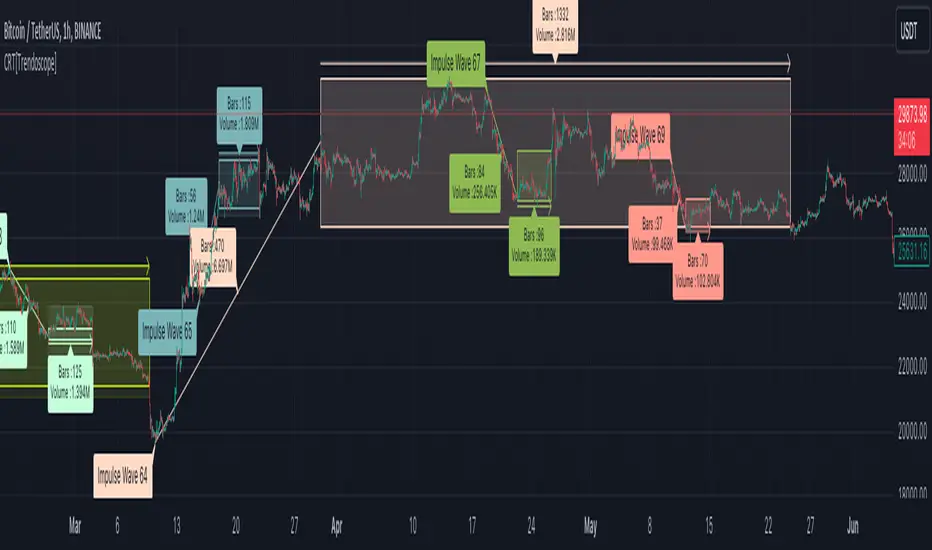
Consolidation Range Tracker[Trendoscope]🎲 Introducing Consolidation Range Tracker: Visualising Price Consolidation after Impulsive Moves
ConsolidationRangeTracker is an innovative indicator designed to assist traders in identifying and tracking price consolidation zones following impulsive market moves. This indicator is built on Auto Motive Wave indicator and Interactive Motive Wave indicator. This is also an attempt to plot Wyckoff Distribution pattern. But, instead of implying the price movement after consolidation, we are just leaving it to the interpretation of the users.
🎲 Process
Find impulse wave using the methods defined in Auto Motive Wave indicator and Interactive Motive Wave indicator
Define the range of consolidation based on predefined ratio (available as input settings)
Track the price movement within range along with number of bars and cumulative volume.
When price breaks out of the range, check if price ranged long enough to consider it as consolidation.
Retain the drawings and visualisation if the consolidation is confirmed before the breakout. Or else, remove them from the chart to keep it clean.
Overall output can be visualised as
Note : Patterns will not be there on the chart every time. It is normal for indicator not to show any drawings or patterns on the chart.
🎲 Stages of the Indicator
🎯 When an Impulse is formed
When an impulse wave is detected, wave is drawn on the chart along with details such as number of bars and volume spawning the impulse wave and the calculated range based on the input value. An alert of new impulse is also triggered if configured for alerts.
🎯 When an Impulse is updated
When price extends further without consolidating, the impulse wave is also updated to consider the latest values. This repaint is expected and as designed. We will also trigger an alert related to update of an impulse wave.
🎯 Update of range as and when it happens
Range is not bound and it keeps moving based on the highest and lowest price. Value of range is constant and it is calculated based on certain ratio of impulse as configured in settings. But, this range can move up and down based on which direction the price moves.
For example, this is the initial range when the impulse wave is formed.
But, after certain bars, we can see that the range shift slightly up because, price has more upward movement than downward.
No alerts are triggered during this phase.
🎯 Confirmed consolidation
Consolidation range is confirmed after price range through certain bars with respect to number of bars involved in the impulse wave. The default setting of 1 for range bar ratio means that range is confirmed when price ranges for same number of bars as that of impulse.
An alert is triggered when consolidation range is confirmed.
🎯 Breakout
Breakout happen if the price exceeds the range bracket. Breakout may happen either before or after confirmation of consolidation. In either case, an alert is triggered.
Patterns are removed from the chart if the consolidation is not confirmed. In other words, the price did not stay in range for long time.
🎲 Settings
Simple settings to define the zigzag base and few pattern related configuration.
🎲 Alerts
Alerts are configured using alert function and are triggered in following scenarios.
A new impulse created
An impulse wave is updated
Consolidation range confirmed
Breakout with/without confirmed consolidation.
🎲 Use Cases
Indicator can be used for identifying few types of patterns on the chart. But, they may involve user's discretion. Major patterns that can be identified are:
🎯 Flag Formation Consolidation after an impulse can be termed as flag and is a sign of trend continuation after consolidation.
🎯 Wyckoff Distribution Long consolidation with high volume after an impulse can be a sign of wyckoff distribution formation. This pattern is trend reversal pattern.
J1 - Wyckoff SchematicsMy approach to Wyckoff In A Box
The main idea of this script is purely an overlay of the Wyckoff schematics (Accumulation/Distribution) on top of your chart, which can help you to analyse trends or potential future market structures.
Setup
The Setup is quite easy. Once you open the script for the first time it will ask you to click on the specific side to create your box that will plot your schematic inside, Make sure you read them to avoid confusion .
Once you have your Measurement Box is created, click on the bar located at the Right side of the measurement box, this will allow you to extend or contract the overlay. You can change all of the settings after this.
* You can adjust each section (left, right and center) of each phase to your liking.
* You can adjust the styling
* This is not an indicator/oscillator for Buy/Sell signals
Notes of first release:
* I have left the empty spaces for the next schematics (it takes time and patience).
* Still working on a healthier way to resize the overlay
Ideas and suggestions more than welcome :)

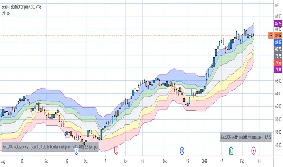
Keltner Center Of Gravity Channel ( KeltCOG )I have the ambition to create a ‘landscape’ which enables the user to see the ‘mood’ of the market about the price of an instrument, simply by looking where the candles go. Prices are a simple phenomenon , they go up or down or stay the same. This is represented quite well for the short term by a candle. I recommend to study candle patterns. Prices not only fluctuate but also trend up, down or go sideways. The user should analyze this by determining the COG (Center Of Gravity) and the ‘normal’ current range by using the historical data in a lookback period.
As a COG the center line of a Donchian Channel is often used. I.m.o. a COG should be a zone, in this channel I use the gray zone of my Donchian Fibonacci Channel, The ‘normal’ range is a multiple of Average True Range, as used in a Keltner Channel. Combining the two can give a cumbersome result, as one can see in my Keltner Fibonacci Channel. In this KeltCOG channel I solved this by not using all Fibonacci levels and by making the Keltner lines strictly parallel to the nearest COG line. To do this, I use the fact that the COG lines have horizontal stretches, there I make the Keltner lines horizontal too. Only where the COG lines change value, the Keltner lines are recalculated. This way the channel gets a very regular shape with three clear zones.
Interpretation of a chart by using the KeltCOG channel.
Overbought: If the candles go higher then the blue zone, the market is hyper enthusiast, creating an overbought situation. This is often followed by a reversion to the COG.
Uptrend: If the candles form in the blue zone, the market is enthusiast and willing to pay more.
Hopeful: If the candles form in or near the upper uncolored zone, the market is hopeful and is thinking about paying more. Sometimes prices go a little up.
Content: If the candles form in the gray zone, which represents COG, the market is happy with the current prices, so these move sideways
Disappointed: If the candles form in or near the lower uncolored zone, the market is disappointed and contemplates paying less, sometimes prices go a little down.
Downtrend: If the candles form in red zone, the market doesn’t like the instrument at all, rejects the current price and is only prepared to pay less.
Oversold: If the candles form below the red zone, the market overdoes its disgust, creating an oversold situation, often followed by a reversion to the COG.