Supply and Demand Zones [BigBeluga]🔵 OVERVIEW
The Supply and Demand Zones indicator automatically identifies institutional order zones formed by high-volume price movements. It detects aggressive buying or selling events and marks the origin of these moves as demand or supply zones. Untested zones are plotted with thick solid borders, while tested zones become dashed, signaling reduced strength.
🔵 CONCEPTS
Supply Zones: Identified when 3 or more bearish candles form consecutively with above-average volume. The script then searches up to 5 bars back to find the last bullish candle and plots a supply zone from that candle’s low to its low plus ATR.
Demand Zones: Detected when 3 or more bullish candles appear with above-average volume. The script looks up to 5 bars back for a bearish candle and plots a demand zone from its high to its high minus ATR.
Volume Weighting: Each zone displays the cumulative bullish or bearish volume within the move leading to the zone.
Tested Zones: If price re-enters a zone and touches its boundary after being extended for 15 bars, the zone becomes dashed , indicating a potential weakening of that level.
Overlap Logic: Older overlapping zones are removed automatically to keep the chart clean and only show the most relevant supply/demand levels.
Zone Expiry: Zones are also deleted after they’re fully broken by price (i.e., price closes above supply or below demand).
🔵 FEATURES
Auto-detects supply and demand using volume and candle structure.
Extends valid zones to the right side of the chart.
Solid borders for fresh untested zones.
Dashed borders for tested zones (after 15 bars and contact).
Prevents overlapping zones of the same type.
Labels each zone with volume delta collected during zone formation.
Limits to 5 zones of each type for clarity.
Fully customizable supply and demand zone colors.
🔵 HOW TO USE
Use supply zones as potential resistance levels where sell-side pressure could emerge.
Use demand zones as potential support areas where buyers might step in again.
Pay attention to whether a zone is solid (untested) or dashed (tested).
Combine with other confluences like volume spikes, trend direction, or candlestick patterns.
Ideal for swing traders and scalpers identifying key reaction levels.
🔵 CONCLUSION
Supply and Demand Zones is a clean and logic-driven tool that visualizes critical liquidity zones formed by institutional moves. It tracks untested and tested levels, giving traders a visual edge to recognize where price might bounce or reverse due to historical order flow.
볼륨

Liquidity Levels Pro Tool - thewallranka
Liquidity Levels Pro Tool is a market-structure and liquidity-mapping indicator designed to help discretionary futures and index traders identify statistically relevant price levels where reactions, continuations, or liquidity sweeps are more likely to occur.
This script is a decision-support tool, not a signal generator. It does not issue buy/sell alerts or predict future price movement. Instead, it organizes and scores liquidity information so traders can make their own contextual decisions.
What this indicator does
The script continuously detects and maintains liquidity zones derived from price pivots, then evaluates those zones using multiple structural and contextual factors:
Repeated price interaction (touches)
Freshness (time since last interaction)
Confluence with key reference levels
Reaction behavior after contact
Session relevance (RTH vs overnight)
Market regime (trend vs mean reversion)
Time-of-day effects (open, midday, power hour)
Only the most relevant zones—based on a dynamic scoring system—are displayed to reduce chart clutter and focus attention on levels that have historically mattered.
Core components
1. Liquidity Zones
Zones are built from pivot highs and lows and expanded into areas using a configurable tick-based padding. Nearby zones are merged to avoid redundancy.
Each zone is continuously evaluated and assigned a score (0–100) reflecting its relative importance.
2. Zone Scoring (No Lookahead)
Zone scores are based on:
Number of confirmed interactions
Recency of the last touch
Confluence with prior day/week levels, VWAP, and Opening Range
Reaction quality after touches (speed and follow-through)
Session alignment (zones that “work” in the current session are favored)
Penalties after liquidity sweeps
Zones are not forward-looking and do not rely on future data.
3. Context Engine
The script classifies the current environment using VWAP slope and distance:
Trend (up or down)
Mean reversion
Mixed/transition
Time-of-day context (Open, Midday, Power Hour) is also tracked internally and influences zone scoring.
This context is displayed in the HUD to support situational awareness, not automated decisions.
4. Liquidity Sweeps
Optional sweep detection highlights situations where price trades beyond a zone and closes back inside, indicating potential stop runs or failed breakouts.
Sweeps are rate-limited and applied conservatively to avoid visual noise.
5. Trade Planning Levels (Optional)
When enabled, the script highlights the nearest high-quality liquidity level above and below price based on score thresholds.
These are intended as reference targets, not trade entries or exits.
HUD (Heads-Up Display)
The on-chart HUD summarizes:
Key reference levels (prior day/week, Opening Range)
Nearest strong liquidity above/below price
Market regime and time-of-day context
Distance to levels (ticks or points)
The HUD is fully optional, positionable, and includes resizable modes (Small / Medium / Large) to fit different chart layouts.
How to use this tool
This indicator is best used as part of a discretionary trading process, for example:
Identifying areas where price is more likely to react or pause
Framing trades around higher-quality structure instead of arbitrary levels
Filtering setups based on session and regime context
Managing expectations near known liquidity rather than chasing price
It is intentionally designed not to provide trade signals.
Limitations and important notes
This script does not predict outcomes or guarantee reactions
High-scoring zones can still fail
Liquidity behavior is context-dependent and probabilistic
No performance claims or backtested results are provided
The indicator should not be used in isolation
Past behavior does not imply future results.
Chart and usage notes
The script is intended for standard time-based charts
Recommended for liquid futures and index products
Use a clean chart for clarity when publishing or sharing
No external indicators are required
Final note
Liquidity Levels Pro (Tool) — v6 is designed to organize complex market structure into a clear, readable framework, allowing traders to focus on execution and risk management rather than raw level detection.
This script reflects an analytical approach to intraday liquidity and structure, not an automated trading system.

Big Trades Whale Detector [Volume Anomalies] By HKOverview The "Big Trade Detector" helps you spot institutional footprints by identifying volume anomalies that act as outliers compared to recent history. It uses statistical analysis (Standard Deviation) to filter out noise and highlight only significant buying or selling pressure.
Features:
Volume Decomposition: Approximates buy/sell volume based on price action within the candle (Close vs. Range).
3-Tier Detection: Uses dynamic thresholds to categorize volume spikes into Small, Medium, and Extreme events.
Smart Calculation: Compares current volume against the previous average to detect sudden shifts in momentum.
Visuals:
Green Circles (Below Bar): Unusual Buying Pressure (Support defense or Breakout).
Red Circles (Above Bar): Unusual Selling Pressure (Resistance defense or Dump).
Size Matters: The larger the circle, the higher the standard deviation (Sigma) of that volume event.

Elev8+ Impulse LevelsElev8+ Impulse Levels | Smart Support & Resistance
Ever notice price rejecting “empty” areas on the chart—like it remembered something that isn’t obvious?
That “something” is often Institutional Impulse : footprints left behind by large, aggressive moves that get defended again days or weeks later .
Elev8+ Impulse Levels automatically detects these moments and projects the most important prices forward so you can see the structure most traders miss.
— — —
🧠 How It Works (The Logic)
This is not a typical support/resistance tool. It does not hunt swing highs/lows.
It looks for Market Intent —the “Perfect Storm” when two conditions align:
Volume Spike — buying/selling pressure significantly exceeds average volume (multiplier-based).
Volatility Expansion — the candle body is unusually large relative to recent ATR.
When both occur, the script marks the event and treats the impulse close as a key “line in the sand” that can influence future reactions.
— — —
🎯 How to Use These Levels
The script includes a Smart Line behavior that changes level styling based on how price interacts with it—so you can quickly separate two core setups:
1) The Defense (Bounce)
Visual: 🟢 Solid line (Fresh / Untouched)
What it means: Price has not yet traded through or “invalidated” the level.
What to look for: First return to the level → rejection / bounce behavior.
Why it matters: Large players often defend prior entries; first tests can react sharply.
2) The Flip (Break & Retest)
Visual: ◌ Dotted line (Broken / Re-priced)
What it means: A candle has closed through the level.
What to look for: Price returns to the dotted level from the other side (“kiss”) → continuation.
Why it matters: Broken support can act as resistance (and vice versa), similar to a breaker concept.
— — —
✨ Key Features
Smart Visualization — levels automatically transition from solid → dotted when broken to reduce chart noise.
Impulse Candle Highlighting — see the exact candle that created the level (origin clarity).
Fully Customizable Sensitivity — tune volume + size thresholds for Crypto, Forex, Futures, or Stocks.
— — —
🚀 The Elev8+ Workflow
Think of Impulse Levels as your map : it shows where reactions are most likely.
For entry timing, pair it with Elev8+ Pro Reversal to confirm the moment price reacts at these high-value zones.
— — —
Disclaimer: Trading involves risk. This tool is for educational/technical analysis purposes only and does not guarantee future results.

SCOTTGO - Buy Sell Volume📊 SCOTTGO - Buy Sell Volume Bars - Delta - Up Down Volume Bars
This indicator disaggregates the total volume traded on each bar into estimated Buying Volume and Selling Volume to visualize market pressure and dominance directly in a dedicated sub-pane.
Key Features:
Volume Disaggregation: Uses a standard formula to estimate how much of a bar's total volume was associated with upward (buying) pressure and how much was associated with downward (selling) pressure.
Visual Clarity: Plots the Buy Volume (teal, upward) and Sell Volume (red, downward) as separate columns against a transparent total volume background, allowing for quick assessment of pressure balance.
Real-Time Badge: A dynamic badge is fixed to the corner of the chart (default: Top Right) providing a numeric summary of the latest bar:
Buy %: Percentage of the bar's total volume estimated as Buying Volume.
Sell %: Percentage of the bar's total volume estimated as Selling Volume.
Delta %: The magnitude of the volume difference (Delta) as a percentage of total volume, indicating the strength of the dominant side.
Dominance Indicator: The background color of the badge changes dynamically to immediately signal whether Buying (customizable color, default: Teal) or Selling (customizable color, default: Red) pressure was dominant on the current bar.
Usage:
Traders can use this tool to identify periods of heavy accumulation (high Buy Volume) or distribution (high Sell Volume), providing insight into the conviction behind price movements.

VR Volume Ratio + Divergence (Pro)成交量比率 (Volume Ratio, VR) 是一項通過分析股價上漲與下跌日的成交量,來研判市場資金氣氛的技術指標。本腳本基於傳統 VR 公式進行了優化,增加了**「趨勢變色」與「自動背離偵測」**功能,幫助交易者更精準地捕捉量價轉折點。
Introduction
Volume Ratio (VR) is a technical indicator that measures the strength of a trend by comparing the volume on up-days versus down-days. This script enhances the classic VR formula with "Trend Color Coding" and "Auto-Divergence Detection", helping traders identify volume-price reversals more accurately.
核心功能與參數
公式原理: VR = (Qu + Qf/2) / (Qd + Qf/2) * 100
Qu: 上漲日成交量 (Up volume)
Qd: 下跌日成交量 (Down volume)
Qf: 平盤日成交量 (Flat volume)
參數 (Length):預設為 26 日,這是市場公認最有效的短中線參數。
關鍵水位線 (Key Levels):
< 40% (底部區):量縮極致,市場情緒冰點,常對應股價底部,適合尋找買點。
100% (中軸):多空分界線。
> 260% (多頭警戒):進入強勢多頭行情,但需注意過熱。
> 450% (頭部區):成交量過大,市場情緒亢奮,通常為頭部訊號。
視覺優化 (Visuals):
紅漲綠跌:當 VR 數值大於前一日顯示為紅色(動能增強);小於前一日顯示為綠色(動能退潮)。
背離訊號 (Divergence):自動標記量價背離。
▲ 底背離 (Bullish):股價創新低,但 VR 指標墊高(主力吸籌)。
▼ 頂背離 (Bearish):股價創新高,但 VR 指標走弱(買氣衰竭)。
Features & Settings
Formula Logic: Calculated as VR = (Qu + Qf/2) / (Qd + Qf/2) * 100.
Default Length: 26, widely regarded as the optimal setting for short-to-medium term analysis.
Key Zones:
< 40% (Oversold/Bottom): Extreme low volume, often indicating a market bottom and potential buying opportunity.
100% (Neutral): The balance point between bulls and bears.
> 260% (Bullish Zone): Strong uptrend, volume is expanding.
> 450% (Overbought/Top): Extreme high volume, often indicating a market top and potential reversal.
Visual Enhancements:
Color Coding: Line turns Red when VR rises (Momentum Up) and Green when VR falls (Momentum Down).
Divergence Signals: Automatically marks divergence points on the chart.
▲ Bullish Divergence: Price makes a lower low, but VR makes a higher low (Accumulation).
▼ Bearish Divergence: Price makes a higher high, but VR makes a lower high (Distribution).
應用策略建議
抄底策略:當 VR 跌破 40% 後,指標線由綠翻紅,或出現「▲底背離」訊號時,為極佳的波段進場點。
逃頂策略:當 VR 衝過 450% 進入高檔區,一旦指標線由紅翻綠,或出現「▼頂背離」訊號時,建議分批獲利了結。
Strategy Guide
Bottom Fishing: Look for entries when VR drops below 40% and turns red, or when a "▲ Bullish Divergence" label appears.
Taking Profit: Consider selling when VR exceeds 450% and turns green, or when a "▼ Bearish Divergence" label appears.
Disclaimer: This tool is for informational purposes only and does not constitute financial advice. / 本腳本僅供參考,不構成投資建議。

Raeinex Momentum Liquidity IndexEntry arrow signals with volumetric momentum (buying and selling pressure) and the possibility to use all entry signals as liquidity area for price retest.

Jin#10 HMA/OBV Pro Trader System (15m)HMA/OBV Pro Trader System Overview (15m Timeframe)
This system is designed to identify high-probability entry and exit points on the 15-minute chart by integrating multiple indicators for confirmation.
1. Trend and Confirmation
HMA Lines (Solid Lines): These are two Hull Moving Averages (HMA 8 and HMA 15).
Green/Red HMA 8 (Line 1): The faster HMA, showing short-term momentum.
Blue/Red HMA 15 (Line 3): The slower HMA, indicating the medium-term trend direction.
Trend Alignment: A strong trend requires the fast HMA (8) to be above the slow HMA (15) and both to be sloping favorably.
MTF Background Color (Candle Background): This represents the 30-minute trend filter.
Light Green/Teal: The 30-minute trend is upward and strong.
Light Orange/Red: The 30-minute trend is downward and strong.
This acts as a major confirmation filter for entries.
2. Trading Signals (Shapes)
🚀 BUY / 🔻 SELL: These are the Final Confirmation Signals. They appear when all conditions (HMA alignment, Stochastic, MACD, and the 30m MTF filter) are met.
⚠️ Pre-BUY / Pre-SELL: These are Warning/Early Signals indicating that most conditions on the 15m chart are aligned, but the 30m filter has not yet confirmed the trend direction.
🔥 Volatility Spike / 🧊 Volatility Crash (Small Circle): Alerts the user to an unusually large candle (ATR spike), signaling extreme volatility or a potential reversal.
3. Exit and Risk Management
ATR Trailing Stop (Dashed Line): This dynamic line serves as a Soft Exit or Stop-Loss Guide.
❌ Exit Long / Exit Short (X-Cross): This shape appears when the price crosses the ATR Trailing Stop, suggesting the existing position (Long or Short) should be closed immediately.
Dashed TP/SL Lines (Green/Red): These lines mark a calculated Take Profit (TP) and Stop Loss (SL) based on the entry price and the defined Risk-Reward Ratio (e.g., 1:1.5).

ORB Pro - NY Opening Range Breakout by Elev8+ORB Pro - NY Opening Range Breakout | Smart Support & Resistance
ORB Pro is a comprehensive, professional-grade toolkit designed for intraday traders who rely on the Opening Range Breakout (ORB) strategy.
Unlike standard ORB indicators that simply draw lines, this suite offers a complete dashboard-driven system that monitors four distinct sessions simultaneously, providing real-time status updates and precision alerts.
— — —
🎯 What is the Opening Range Breakout (ORB)?
The Opening Range is the price range established during the first period of the trading session (e.g., the first 15 or 30 minutes). This period represents the initial balance between buyers and sellers. A breakout from this range often signals the likely trend direction for the remainder of the session.
— — —
🚀 Key Features
1. Multi-ORB Monitoring
Stop switching settings constantly. This suite monitors four key ranges at once:
Pre-Market 15m (08:00 – 08:15 ET)
Pre-Market 30m (08:00 – 08:30 ET)
NY Cash Open 15m (09:30 – 09:45 ET)
NY Cash Open 30m (09:30 – 10:00 ET)
2. Smart Status Dashboard
A compact panel in the bottom-right corner gives you the live state of every session:
⏳ Waiting: The session has not started yet.
⚡ Forming: The range is currently being built.
↔️ Range: The range has formed, but price is still contained within the range.
🚀 BULL / 📉 BEAR: A confirmed breakout has occurred.
⛔ OFF: The session is disabled in settings.
3. "Dynamic Resolution" Technology
This is a unique pro feature.
Precision: The script always calculates the High/Low levels using 1-minute data , ensuring your support/resistance lines are pixel-perfect regardless of your chart timeframe.
Flexibility: Breakout signals (Alerts/Labels) are triggered based on your current chart timeframe. This allows you to trade a 5m or 15m breakout strategy while keeping 1m-level precision on your levels.
4. Visual Clarity
Breakout Labels: Automatically plots "BULL" or "BEAR" labels on the exact candle that confirms a breakout.
Profit Targets: Optional toggle to show 1x and 2x profit targets projected from the breakout level.
Time-Bound Signals: Signals are strictly time-bound to the active window to prevent late, low-quality alerts.
— — —
🛠️ How to Use
Add to Chart: Works best on intraday timeframes (1m, 5m, 15m).
Configure: Enable the sessions you trade (e.g., NY 15m) in the settings.
Wait for Forming: Watch the box form live. The dashboard will show "⚡ Forming".
Trade the Break: Wait for a candle Close outside the range. The dashboard will flip to "BULL" or "BEAR" and a label will appear.
Manage Risk: Use the opposite side of the range or the midline as your stop loss.
— — —
⚙️ Settings Overview
Global Settings: Toggle forming boxes, dashboard, and label visibility.
Breakout Method: Choose between Close (safer) or Wick (aggressive) for signal triggers.
Session Groups: Individually enable/disable the 4 distinct sessions and customize their colors/styles.
— — —
📝 Update Notes (Recent)
New PDH/PDL Levels: Added the ability to display Previous Day High and Previous Day Low lines on the chart.
Auto-Update & Cleanup: The PDH/PDL lines now automatically update daily and erase historical lines, ensuring only the current day's levels are visible to keep the chart clean.
Dashboard Positioning: Added a new setting to move the Status Dashboard to any corner of the screen.
Enhanced Customization: Added full styling options in settings for PDH/PDL lines and Dashboard positioning.
— — —
Disclaimer: This tool is for educational and analytical purposes only. Past performance of a strategy does not guarantee future results. Always manage your risk.

15min Candle > 20% of Daily ATRThis Pine Script® (v6) indicator, titled "15min Candle > 20% of Daily ATR", detects unusually large 15-minute candles by comparing their size (full range or body) to a user-defined percentage (default 20%) of the previous day's Average True Range (ATR, default 14-period).

Current and Previous Period Anchored VWAPanchored VVWAPS and previous month VWAP extend out into the following month. Includes 1SD for both

Intraday Volume Pulse GSK-VIZAG-AP-INDIA📊 Intraday Volume Pulse — by GSK-VIZAG-AP-INDIA
Overview:
This indicator displays a simple and effective intraday volume summary in table format, starting from a user-defined session time. It provides an approximate breakdown of buy volume, sell volume, cumulative delta, and total volume — all updated in real-time.
🧠 Key Features
✅ Session Start Control
Choose the session start hour and minute (default is 09:15 for NSE).
🌐 Timezone Selector
View volume data in your preferred timezone: IST, GMT, EST, CST, etc.
📈 Buy/Sell Volume Estimation Logic
Buy Volume: When candle closes above open
Sell Volume: When candle closes below open
Equal: Volume split equally if Open == Close
🔄 Daily Auto-Reset
All volume metrics reset at the start of a new trading day.
🎨 Color-Coded Volume Insights
Buy Volume: Green shade if positive
Sell Volume: Red shade if positive
Cumulative Delta: Dynamic red/green based on net pressure
Total Volume: Neutral gray with emphasis text
🧾 Readable Number Formatting
Volumes are displayed in "K", "L", and "Cr" units for easier readability.
📌 Table Positioning
Choose from top/bottom corners to best fit your layout.
⚠️ Note
All data shown is approximate and based on candle structure — it does not reflect actual order book or tick-level data. This is a visual estimation tool to guide real-time intraday decisions.
✍️ Signature
GSK-VIZAG-AP-INDIA
Creator of practical TradingView tools focused on volume dynamics and trader psychology.

HTF Indicator with VolumeThis indicator tracks up to 6 higher-timeframes displayed to the right of the chart, along with the volume of those HTF candles. It is designed to be customizable in terms of number of candlesticks per timeframe, color of candle sticks, volume moving average period, and much more.

Elev8+ Impulse Levels | Smart Support & ResistanceElev8+ Impulse Levels | Smart Support & Resistance
Ever notice price rejecting “empty” areas on the chart—like it remembered something that isn’t obvious?
That “something” is often Institutional Impulse : footprints left behind by large, aggressive moves that get defended again days or weeks later .
Elev8+ Impulse Levels automatically detects these moments and projects the most important prices forward so you can see the structure most traders miss.
— — —
🧠 How It Works (The Logic)
This is not a typical support/resistance tool. It does not hunt swing highs/lows.
It looks for Market Intent —the “Perfect Storm” when two conditions align:
Volume Spike — buying/selling pressure significantly exceeds average volume (multiplier-based).
Volatility Expansion — the candle body is unusually large relative to recent ATR.
When both occur, the script marks the event and treats the impulse close as a key “line in the sand” that can influence future reactions.
— — —
🎯 How to Use These Levels
The script includes a Smart Line behavior that changes level styling based on how price interacts with it—so you can quickly separate two core setups:
1) The Defense (Bounce)
Visual: 🟢 Solid line (Fresh / Untouched)
What it means: Price has not yet traded through or “invalidated” the level.
What to look for: First return to the level → rejection / bounce behavior.
Why it matters: Large players often defend prior entries; first tests can react sharply.
2) The Flip (Break & Retest)
Visual: ◌ Dotted line (Broken / Re-priced)
What it means: A candle has closed through the level.
What to look for: Price returns to the dotted level from the other side (“kiss”) → continuation.
Why it matters: Broken support can act as resistance (and vice versa), similar to a breaker concept.
— — —
✨ Key Features
Smart Visualization — levels automatically transition from solid → dotted when broken to reduce chart noise.
Impulse Candle Highlighting — see the exact candle that created the level (origin clarity).
Fully Customizable Sensitivity — tune volume + size thresholds for Crypto, Forex, Futures, or Stocks.
— — —
🚀 The Elev8+ Workflow
Think of Impulse Levels as your map : it shows where reactions are most likely.
For entry timing, pair it with Elev8+ Pro Reversal to confirm the moment price reacts at these high-value zones.
— — —
Disclaimer: Trading involves risk. This tool is for educational/technical analysis purposes only and does not guarantee future results.

Session HeatmapIntraday Seasonality
Overview
Analyzes historical patterns by time of day. Identifies when volatility, volume, and open interest changes tend to be highest or lowest.
Features
Multiple Metrics: TR (volatility), Volume, and Open Interest changes
Flexible Grouping: View patterns by weekday or month to spot day-of-week or seasonal effects
Heatmap Visualization: Blue (low) to Red (high) color scale for quick pattern recognition
Percentile Mode: Reduces outlier impact by using 5th-95th percentile range
Timezone Support: Display in UTC alongside your local time
Metrics Explained
TR: Volatility - when markets move most
Volume: Liquidity - when participation is highest
OI Increase: When new positions are opened
OI Decrease: When positions are closed
OI Net: Net open interest change
Usage
Set your timezone and preferred slot size (30min/1H)
Choose a date range (relative or custom)
Select a metric to analyze
Use "Group By" to see weekday or monthly patterns
Switch to Percentile color scale if outliers dominate
Notes
Chart timeframe should be equal to or smaller than Slot Size
OI metrics require Binance Perpetual symbols
DST is not automatically adjusted; consider seasonal shifts for US/EU sessions

UNDETECTED FX - 250 Pip LevelsIndicator Description – UNDETECTED FX: 250-Pip Psychological Levels
This indicator automatically plots major 250-pip psychological levels on XAUUSD and highlights the price zones around them. These levels act as strong reaction points where liquidity, reversals, and institutional activity commonly occur.
What the Indicator Does
✔ Plots every 250-pip level starting from a user-defined base (e.g., 4050 → 4075 → 4100 → 4125 → …)
✔ Each level is represented by a thick black horizontal line for maximum visual clarity
✔ Around every 250-pip level, the indicator draws a liquidity zone
Top of zone: +200 pips
Bottom of zone: –200 pips
(configured as ± zoneHalf in settings)
✔ Uses extend: both, so levels stretch across the entire chart and stay fixed, no matter how far you scroll
✔ Zones are filled with a customizable color for clear premium/discount visualization
✔ The indicator never repaints and requires no updates after drawing — all levels are fixed on their price coordinates
Why It’s Useful
🔹 Helps quickly identify institutional levels where gold often reacts
🔹 Acts as a framework for scalping, intraday trading, and swing bias
🔹 Makes it easy to spot liquidity sweeps, rejections, and premium/discount areas
🔹 Clearly shows market structure breaks around key psychological levels
🔹 Forces discipline by creating predefined, fixed levels for trading decisions
Best Use Case
XAUUSD scalpers
Intraday traders who rely on precision entries
Traders who use psychological levels, liquidity grabs, or smart-money concepts
Anyone wanting a clean, non-cluttered chart with high-impact levels only

Colby Cheese VWAP Setup [v2.0]🔧 Core Refactors
• Imbalance function fixed:
• Removed invalid usage.
• Now uses for past bar references.
• Bias checks are handled outside the function with proper series indexing.
• Bias alignment:
• Added and so CHoCH signals only fire when price change agrees with EMA bias.
• Swing reset:
• After a valid CHoCH, and reset to so stale levels don’t keep firing.
• Line/label management:
• CHoCH lines and labels now reuse persistent IDs (, ) instead of spamming new objects every trigger.
✨ New Features
• Anticipation mode:
• Blue “Anticipate” lines/labels drawn when delta + bias align before CHoCH confirmation.
• Helps you see potential setups earlier.
• Entry zone lines:
• Solid green/red lines drawn at entry levels when is enabled.
• Separate from FRVP dashed zones.
• Stop‑loss lines:
• Orange dotted lines drawn opposite the entry zone when is enabled.
• Gives a visual risk marker.
🎨 Visual Consistency
• Candle coloring simplified: white candles only when CHoCH triggers.
• FRVP zones remain dashed lines with “Enter” labels.
• Anticipation zones are blue solid lines.
• Entry zones are solid green/red.
• Stop‑loss lines are orange dotted.

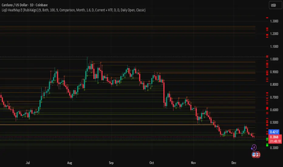
LiqD HeatMap [RubiXalgo]LiqD HeatMap 👑 – Advanced Liquidation & Liquidity Visualizer
Discover potential liquidation zones with this powerful AI-enhanced heatmap indicator. It visualizes high-volume liquidity pools where price may attract or reverse, using dynamic bubbles, horizontal levels, and gradient colors for intuitive signals.
Key Features:
• Liquidation Heatmap Bubbles — Circles plotted above/below bars indicate potential long/short liquidation clusters. Larger/darker bubbles highlight stronger volume-based zones.
• Multi-Timeframe Liquidity Levels — Horizontal lines from 30min to Monthly timeframes (thicker/brighter for higher TFs) mark key support/resistance where liquidations often occur.
• Dynamic Color Gradients — Green/teal for bullish bias, red/purple for bearish, yellow/orange for max-volume hotspots. Adjustable intensity for clearer signals.
• Additional Tools:
- Customizable VWAP with ATR bands for directional bias.
- A.I. Volume Profit-Trend polyline predictions.
- Stochastic Money Flow & Bollinger Band Width percentages.
- Daily 0.618 Fibonacci Range Expansion projections.
• Filters & Customization — Market bias (Long/Short/Both), leverage scaling, dynamic lookback, and color themes (Classic or Crypto).
How to Trade with It:
Long Signals: Look for dark green bubbles below price or price bouncing/breaking thick green MTF levels → strong bullish liquidation potential.
Short Signals: Dark red bubbles above price or breakdowns of thick red levels → bearish liquidation zones.
Yellow/orange highlights max-volume areas often acting as magnets or reversal points.
Perfect for crypto, forex, or futures traders seeking volume-driven edge without clutter. 👑 Powered by RubiXalgo logic.
[Algo/Fract] Quant+Built for traders ready to Level Up.
Combine algorithmic strength tracking with fractal structure to deliver quant-style clarity on a live chart.
You trade with intuition. Quant trades with Data.
Together, you read the Unseen.
Quant+ is the second component of the AlgoFract Quant Suite.
Features included are:
Quant Cycles & Ghost Cycle (QC)
Custom Volume Spread (VS)
Volume Flow (VF)
Gain Access at: www.algofract.com
or by visiting our Whop Marketplace: whop.com

Session VWAPsOVERVIEW
------------
This indicator automatically anchors VWAP lines at key trading session openings. By default, it calculates separate VWAPs starting at the London Open (03:00 EST) and New York Open (09:30 EST), allowing traders to track institutional price levels from these critical market sessions.
KEY FEATURES
------------
✓ Dual Session VWAPs - London and New York opens
✓ Fully Customizable Times - Set any session opening time
✓ Timezone Support - Choose from UTC-12 to UTC+14
✓ Color Customization - Personalize each VWAP line color
✓ Adjustable Line Width - Set line thickness (1-5)
✓ Visual Session Markers - Labels show "LDN" and "NY" at session starts
✓ Clean Chart Display - Minimal, professional appearance
HOW IT WORKS
------------
The indicator anchors a new VWAP calculation at the specified session opening times. Each VWAP continues to calculate throughout the day until the next session opening the following day, when it resets and starts fresh.
VWAP (Volume Weighted Average Price) is calculated using the typical price (HLC3) weighted by volume, providing dynamic support/resistance levels that reflect institutional trading activity.
DEFAULT SETTINGS
------------
• London Session: 03:00 UTC-5 (Blue line)
• New York Session: 09:30 UTC-5 (Red line)
• Timezone: UTC-5 / EST (adjustable)
CUSTOMIZATION
------------
All parameters are fully adjustable in the indicator settings:
- Session opening hours and minutes
- VWAP line colors
- Line width/thickness
- Timezone offset
USE CASES
------------
• Identify key institutional price levels
• Track session-specific support/resistance
• Monitor price action relative to session opens
• Combine with other strategies for confluence
• Observe how price reacts to VWAP during different sessions
IDEAL FOR
------------
• Intraday traders
• Scalpers
• Day traders focusing on London/New York sessions
• Traders using VWAP strategies
• Anyone tracking institutional order flow
NOTES
------------
- Works on all timeframes (recommended: 1min to 1hour)
- Best used on liquid instruments
- VWAPs reset daily at the specified session times
- Can be used standalone or combined with other indicators
SETTINGS GUIDE
------------
London Session Group:
- Hour: Session opening hour (0-23)
- Minute: Session opening minute (0-59)
- Color: VWAP line color
- Line Width: Thickness of the line
New York Session Group:
- Hour: Session opening hour (0-23)
- Minute: Session opening minute (0-59)
- Color: VWAP line color
- Line Width: Thickness of the line
Timezone:
- Select your local timezone (UTC-12 to UTC+14)
- Default: UTC-5 (EST)

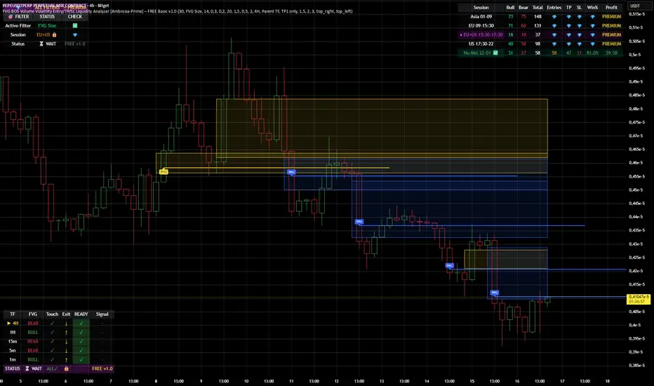
FVG BOS SMC Liquidity Analyzer - Ambrosia-Prime - Basic v1.0# 📘 USER GUIDE
# FVG BOS Volume Volatility Entry/TP/SL Liquidity Analyzer
## 🆓 FREE Basic v1.0 | by Ambrosia-Prime
---
## 📋 TABLE OF CONTENTS
1. (#what-is-this-indicator)
2. (#settings-explained)
3. (#understanding-the-tables)
4. (#your-first-trade)
5. (#free-vs-premium)
6. (#faq)
---
## 🎯 WHAT IS THIS INDICATOR?
The **FVG Analyzer** is a professional trading tool based on **Smart Money Concepts (SMC)** and **ICT strategies**. It automatically detects:
✅ **Fair Value Gaps (FVG)** - Market imbalances
✅ **Break of Structure (BOS)** - Trend confirmations
✅ **Multi-Timeframe Analysis** - 4H, 1H, 15m, 5m, 1m
✅ **Entry, Stop-Loss & Take-Profit** - Automatic level calculation
### The Debug Table shows you everything:
| TF | FVG | Touch | Exit | READY | Signal |
|-----|------|-------|------|-------|--------|
| ► 4H| BULL | ✓ | ↑ | ✓ | LONG |
| 1H | BULL | ✓ | ↑ | ✓ | LONG |
| 15m | BULL | ✓ | ↑ | ✓ | LONG |
When all timeframes show **READY** → **ENTRY SIGNAL!**
---
## ⚙️ SETTINGS EXPLAINED
### 👁 DISPLAY SETTINGS
| Setting | Description |
|---------|-------------|
| Show Bullish FVG | Display yellow FVG boxes |
| Show Bearish FVG | Display blue FVG boxes |
| Show BOS lines | Break of Structure lines |
| Show Session Stats | Statistics table (top right) |
| Show Debug Table | Cascade status (bottom left) |
| Show Entry/SL/TP | Entry lines on signals |
### 🎯 BASIC FILTER (Choose ONE)
In the **FREE Version** you can only activate **1 filter** at a time:
| Filter | What it does |
|--------|--------------|
| **None** | No filter active |
| **FVG Size** | Only FVGs larger than X × ATR |
| **Volume** | Only on above-average volume |
| **Volatility** | Only on normal volatility (not too wild) |
| **BOS only with FVG** | BOS only when open FVG exists |
| **Fill Delete** | FVG disappears when completely filled |
> 💎 **PREMIUM:** Use all 15+ filters simultaneously!
### 🔄 TOUCH + EXIT CASCADE
| Setting | Options | Recommendation |
|---------|---------|----------------|
| Cascade Parent TF | 4H, 1H, 15m | **4H** for Swing |
| Confirm EXIT by WICK | ON/OFF | **ON** for more signals |
| Entry Trigger Level | Lowest/Middle/Parent | **Parent TF** |
| Require ALL TFs | ON/OFF | **ON** for quality |
### 📊 TP SETTINGS
| Setting | Description |
|---------|-------------|
| TP Mode | TP1 only / TP1+TP2 / TP1+TP2+TP3 |
| TP1 Risk:Reward | e.g. 1.5 = 1.5× your risk |
| TP2 Multiplier | e.g. 2.0 = 2× TP1 |
| TP3 Multiplier | e.g. 3.0 = 3× TP1 |
---
## 📈 UNDERSTANDING THE TABLES
### 📍 Filter Status (Top Left)
```
┌─────────────────────────────────────┐
│ 💎 │ ALL FILTERS │ = PREMIUM │
├─────────────────────────────────────┤
│ Active Filter │ FVG Size │ ✅ │
│ Session │ EU 🔒 │ 💎 │
│ Status │ ⏳ WAIT │FREE v1.0│
└─────────────────────────────────────┘
```
- **Active Filter:** Your selected filter
- **Session:** Current trading session
- 🔒 = Locked (PREMIUM only)
- ✅ = Unlocked (No Market 22-01 CET)
- **Status:** WAIT / 🟢 LONG / 🔴 SHORT
### 📊 Session Stats (Top Right)
```
┌──────────────────────────────────────────────────────────┐
│ Session │Bull│Bear│Total│Entries│TP│SL│Win%│Profit│
├──────────────────────────────────────────────────────────┤
│ Asia 01-09 │173 │161 │ 334 │ 💎 │💎│💎│ 💎 │PREMIUM│
│ EU 09-15:30 │131 │146 │ 277 │ 💎 │💎│💎│ 💎 │PREMIUM│
│ EU+US 15:30-17:30│ 37 │ 42 │ 79 │ 💎 │💎│💎│ 💎 │PREMIUM│
│ US 17:30-22 │ 95 │106 │ 201 │ 💎 │💎│💎│ 💎 │PREMIUM│
│ No Mkt 22-01 ✅ │ 42 │ 52 │ 94 │ 14 │14│ 0│100%│ 9.8R │
└──────────────────────────────────────────────────────────┘
```
**In FREE you see:**
- ✅ Bull/Bear/Total FVGs for **ALL** sessions
- ✅ Complete stats only for **No Market (22-01 CET)**
- 💎 Other sessions = **PREMIUM**
### 🔍 Debug Table (Bottom Left)
Shows the **live status** of the cascade:
| Symbol | Meaning |
|--------|---------|
| ► | Parent timeframe (selected) |
| BULL/BEAR | FVG direction |
| ✓ (Touch) | Price touched the zone |
| ↑/↓ (Exit) | Price exited the zone |
| ✓ (READY) | Timeframe is ready |
| LONG/SHORT | Signal direction |
---
## 🚀 YOUR FIRST TRADE
### Preface - Why this Indicator is Different
This indicator can filter so **aggressively** that you receive few or almost no signals. **That was exactly my goal!**
I don't need 500 entries per day staring at a chart all day long.
**I only need 1-3 signals per day - and they should work.**
That was the goal. Quality over quantity.
---
### Step-by-Step Guide:
**1. Create a Watchlist**
- Create a watchlist in TradingView
- Add as many charts as your account allows
- Add the indicator to all charts
**2. Set up Alerts**
- Go to the **4H chart**
- Set up the alert:
- **FREE:** Only "No Market" session (22-01 CET)
- **PREMIUM:** All sessions available
- Select "Any Entry Signal"
**3. React to Alert Signal**
- When an alert comes → Switch to the chart
- Check the **Session Stats Table** (top right)
- There you see: Entry, TP, SL, Win%, Profit
**4. Optimize Entry**
- Open the **Settings** (gear icon)
- Adjust the **TP** until you win all trades
- *(Sometimes profit is higher when you lose one trade but have a higher TP)*
- When you've found the best profit result:
- **Take the set TP minus 10-20%**
- *(We don't want to be greedy, but we want to win!)*
**5. Manage Trade**
- The **SL price** is already provided
- The **TP price** adjusts to your settings
- Set your trade accordingly
**6. Done!**
- Start the trade
- Wait for the next signal on another chart
- Repeat!
---
### ⚠️ Important Note
> Remember: A trade can always hit SL!
> Only trade with money you can afford to lose.
>
> I wish you great success and let me know how successful you were.
> **I will read every comment and answer to the best of my ability.**
---
## 💎 FREE vs PREMIUM
### *Coming soon - Currently in Release Testing*
### What you get with FREE:
| Feature | FREE 🆓 |
|---------|---------|
| FVG Detection (all TFs) | ✅ |
| BOS Detection | ✅ |
| Cascade Logic | ✅ |
| Debug Table | ✅ |
| Session Stats Table | ✅ |
| Entry/SL/TP Lines | ✅ |
| Filters | **1 at a time** |
| Trading Sessions | **Only No Market (22-01)** |
| Alerts | **Only No Market** |
### What you get with PREMIUM:
| Feature | PREMIUM 💎 |
|---------|------------|
| Everything from FREE | ✅ |
| **15+ filters simultaneously** | ✅ |
| **All sessions unlocked** | ✅ |
| → Asia (01-09) | ✅ |
| → EU (09-15:30) | ✅ |
| → EU+US Overlap (15:30-17:30) | ✅ |
| → US (17:30-22) | ✅ |
| **Alerts for all sessions** | ✅ |
| **Session-based TP optimization** | ✅ |
| **HTF Zone Confluence Filter** | ✅ |
| **Structure Filter (HH/HL/LH/LL)** | ✅ |
| **RR Filter** | ✅ |
| **Trend EMA Filter** | ✅ |
| **Candle Quality Filter** | ✅ |
| **Cooldown Filter** | ✅ |
| **FVG Age Filter** | ✅ |
### 🚀 PREMIUM EDITION (Exclusive!)
The Premium version has **two different entry logics** - that's why the testing phase is still ongoing.
Finds setups with **10-100% potential!**
---
## ❓ FAQ
### "Why don't I see any entries?"
**Possible reasons:**
1. **Wrong session:** FREE only works 22:00 - 01:00 CET
2. **Cascade not READY:** All TFs must show ✓
3. **Filter blocking:** Check your active filter
4. **Already in trade:** "Single Trade" allows only 1 trade
### "What do the colors mean?"
| Color | Meaning |
|-------|---------|
| 🟡 Yellow | Bullish FVG / Entry line |
| 🔵 Blue | Bearish FVG |
| 🟢 Green | TP line / Positive |
| 🔴 Red | SL line / Negative |
| 🟣 Purple | EU+US Overlap Session |
### "Which timeframe should I use?"
| Your Style | Chart TF | Cascade Parent |
|------------|----------|----------------|
| Scalping | 1m - 5m | 15m |
| Daytrading | 5m - 15m | 1H |
| Swing | 15m - 1H | 4H |
### "Can I change the sessions?"
- **FREE:** No, only No Market (22-01) is available.
- **PREMIUM:** Yes, all sessions + session-based TP values!
---
## 📞 WANT MORE?
### Unlock PREMIUM:
- ✅ All Sessions
- ✅ All Filters
- ✅ 2 Entry Logics
- ✅ Priority Support
### Contact & Support:
📊 **TradingView:** (www.tradingview.com)
---
## 📜 CHANGELOG
### v1.0 FREE (December 2024)
- Initial Release
- Multi-TF FVG Detection
- BOS Detection
- Cascade Logic
- 1 Filter (Dropdown)
- No Market Session (22-01)
- Session Statistics
- Debug Table
---
## ⚠️ DISCLAIMER
This indicator is an **analysis tool** and not financial advice.
Trading involves risks. Past results do not guarantee future profits.
Only trade with capital you can afford to lose.
---
**Good luck with your trading! 🚀**
*Your Ambrosia-Prime*
---
*© 2024 Ambrosia-Prime. All rights reserved.*
Student Wyckoff Tick Volume Proxy ## STUDENT WYCKOFF Tick Volume Proxy (v6) — “Activity Volume” When Real Volume Is Missing
Many instruments (especially **indices, synthetic composites, and custom baskets**) do **not** provide real exchange volume. This indicator solves that problem by building a **Tick Activity Proxy** — a simple, visual “how active was this bar” measure — using **lower timeframe price movements inside each bar**.
### What this indicator is (in plain words)
Think of one candle on your chart as a **big box** (for example, a 1-hour candle). Inside that box there are many smaller candles (for example, 1-minute or 1-second).
This script “looks inside the box” and measures **how much the price moved and how often it changed**, then plots the result as a histogram — similar to volume bars, but based on **price activity** instead of real traded volume.
> Important: This is **NOT real trade volume**.
> It is a **proxy** (an approximation) of market activity when volume is unavailable.
---
## How it works
The proxy is computed from **lower timeframe (LTF)** data using intrabar changes:
1. The script requests lower timeframe values inside each current bar.
2. It sums the intrabar movement or counts intrabar price changes (depending on your mode).
3. The result is plotted as a column histogram.
---
## Settings explained (step-by-step)
### 1) Source
* **Auto**
Uses real `volume` if the instrument has it. If volume is missing/zero (typical for indices), it automatically switches to the proxy.
* **Exchange Volume**
Always uses real volume (only useful on instruments where volume exists).
* **Proxy (Tick Activity)**
Always uses the proxy (best for indices and composites).
### 2) Proxy Method (How to calculate)
You can choose one of three proxy styles:
* **Ticks (count)**
Counts how many times the LTF close changed inside the bar.
Think: “How many small steps did price take?”
* **Movement (abs change)**
Sums the absolute intrabar price changes: `sum(|Δclose|)` on the LTF.
Think: “How much total distance did price walk, even if it went back and forth?”
* **Movement (in ticks)**
Same as “abs change”, but converted into **minimum price steps** using the instrument’s tick size (`mintick`).
Think: “How many minimal price steps (ticks) were walked in total?”
**Practical tip:**
* If you only care about “busy vs quiet” → try **Ticks (count)**.
* If you care about “how strong the internal movement was” → try **Movement (in ticks)**.
### 3) LTF for Proxy (Lower timeframe microscope)
This is your “zoom level” for looking inside each bar.
* Smaller LTF (e.g., **1S**) = more detail, more accurate intrabar picture, but heavier on performance.
* Larger LTF (e.g., **1m / 5m**) = smoother and lighter, but less detail.
**Rule:** LTF must be **lower** than your chart timeframe.
Example setups:
* Chart **H1** → LTF **1S / 5S / 15S / 1m**
* Chart **H4** → LTF **15S / 1m / 5m**
* Chart **D1** → LTF **15m / 1h** (avoid 1S on D1 unless you really know what you’re doing)
### 4) LTF Elements Limit (Performance protection)
If you use a very small LTF on a large chart timeframe, the intrabar array can become huge.
This limit prevents slowdowns by processing only the most recent N intrabar points per bar.
**Tip:** On H1 with 1S (3600 points) you are typically fine.
On D1 with 1S (86,400 points) this becomes heavy and may get truncated by the limit.
### 5) Non-repaint mode (Fix on bar close)
When enabled, the histogram value is **locked only when the bar closes**.
This prevents the “moving target” effect during the current forming candle.
---
## How to read the histogram
* **Higher bar** = higher intrabar activity (price moved more / changed more often)
* **Lower bar** = calmer, quieter bar (less internal movement)
This is especially useful on:
* indices with missing volume
* synthetic composites/baskets
* custom-built market proxies
---
## Limitations (honest and important)
* This is **not real traded volume** and cannot replicate actual exchange volume.
* Results depend heavily on your chosen **LTF** and the availability/quality of LTF data.
* Very small LTF (like 1S) on large chart timeframes can cause performance issues or truncation due to the safety limit.
---
## Suggested starting presets
* **Composite index on H1:** Source=Auto, Proxy=Movement (in ticks), LTF=1S or 15S
* **Composite index on D1:** Source=Auto, Proxy=Movement (in ticks), LTF=15m or 1h
* **If you want maximum simplicity:** Proxy=Ticks (count), LTF=1m

[iQ]PRO Volume Frequency Profile+++🌟 The Adaptive Volume Profile Analyst (AVPA) 📊
Unveiling the Hidden Architecture of Market Flow
This indicator is a highly advanced, proprietary volume analysis tool engineered to dissect and visualize the intricate interplay between price action and trading volume with unparalleled precision. The Adaptive Volume Profile Analyst transcends conventional volume-based indicators by constructing a dynamic, highly-tuned visualization of volume distribution across specific price levels. This provides traders with a profound, instantaneous understanding of market structure and liquidity pools that often remain opaque in standard charting.
Core Functionality & Key Features (Intrigue Without Exposure)
1. Hyper-Responsive Volume Distribution Mapping
At its heart, the AVPA utilizes a sophisticated, custom-engineered algorithm to process raw volume data and map it onto the price axis.
Custom Volume Visualization: The proprietary rendering logic generates a visually rich and highly informative profile using a color-graded gradient that dynamically shifts based on the relative volume magnitude within each price bin. This unique aesthetic is not merely for display; it is a critical component for instantly identifying areas of high-interest and low-interest volume concentration. (See the line: col = color.from_gradient(...))
Adaptive Sizing: The width of the visualized volume bars is meticulously calculated based on a normalized volume factor, ensuring that the profile accurately reflects the relative significance of volume activity at each level without cluttering the chart. The maximum display width is controlled by an internal scaling factor. (See the lines: width_px = math.round(norm * vol_max_width) and the x1, x2 coordinate calculations)
2. Strategic Node & Interaction Point Identification
The AVPA is designed to isolate and highlight key structural components within the volume profile that signify crucial market junctures.
High-Impact Structural Nodes: The indicator employs a closed-source methodology to identify and flag significant Volume Profile Nodes ('X'). These nodes represent major price levels where volume accumulation or distribution has established a clear, lasting structural imprint on the market.
Confirmed Interaction Points: A separate, proprietary process identifies and labels Interaction Nodes ('✓'). These points highlight areas where price action has recently confirmed the relevance of the established volume structure, often indicating potential support, resistance, or critical inflection zones.
3. Clean, Adjustable Visualization for Optimal Edge
The presentation of the data is optimized for real-time decision-making.
Customizable Profile Orientation: The user has the flexibility to display the volume profile extending from the left or right of the price bar, offering a clean, non-obtrusive integration with existing charting setups. (See the conditional logic on x1 and x2 based on plot_vol_bins_left)
Non-Repainting and Real-Time: The indicator's drawing mechanisms utilize Pine Script's robust box.new and label.new functions, ensuring that the profile and its critical nodes are rendered precisely on the historical bar index, providing a reliable and non-repainting depiction of volume structure.
Why Choose AVPA?
The Adaptive Volume Profile Analyst provides a quantifiable, visual edge by transforming chaotic volume data into actionable intelligence. This is not just a tool for seeing where volume was; it is a sophisticated system for understanding why it was there and how that structure will influence future price movement. It is an indispensable resource for traders who demand precision and a deeper understanding of market mechanics.
Access to this tool is often restricted, offered only to select members who are committed to leveraging this advanced level of market insight.
