AI Bot Regime Feed (v6) — stableThis indicator generates real-time, structured JSON alerts for external trading bots or automation systems.
It combines multiple technical layers to identify market regimes and high-probability buy/sell events, and sends them to any webhook endpoint (e.g., a FastAPI or Zapier listener).
볼래틸리티
Mean Reverting Suite [OmegaTools]Overview
The Mean Reverting Suits (MR Suite) by OmegaTools is an advanced analytical and visualization framework designed to identify directional exhaustion, statistical overextensions, and conditions consistent with mean-reversion dynamics. It integrates three pillars into a single display: a composite momentum-normalized oscillator, a percentile-based extension model with volume contextualization, and a dynamic structural mapping engine built on confirmed pivots. The indicator does not generate signals or prescribe trade actions; it provides objective context so users can evaluate market balance and the likelihood that price is departing from its recent statistical baseline.
Core logic
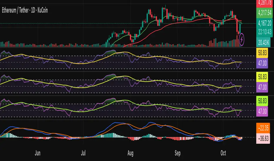
The composite oscillator blends MFI on two horizons and RSI on HL2, then averages them to produce a stabilized mean-reversion gauge. Candle and bar colors are mapped by a dual gradient centered at 50. Readings above 50 progressively shift from neutral gray toward the bearish accent color to reflect increasing momentum saturation; readings below 50 shift from the bullish accent color toward gray to reflect potential accumulation or temporary undervaluation. This continuous mapping avoids rigid thresholds and conveys the strength and decay of momentum as a smooth spectrum.
The percentile-based extension model measures the persistence of directional bias by tracking how many bars have elapsed since the last opposing condition. These rolling counts are compared to the 80th percentile of their own historical distributions stored in arrays. When a current streak exceeds its respective percentile, the environment is labeled as statistically extended in that direction. Background shading communicates this information and is modulated by relative volume, computed as live volume divided by a blended average of SMA(30) and EMA(11). Higher opacity implies greater liquidity participation during the extension.
The structural mapping module uses confirmed pivot highs and lows at the chosen length to create persistent horizontal levels that extend forward and automatically maintain themselves until price invalidates or refreshes them. These levels represent market memory zones and assist in reading where reactions previously formed. The engine updates in real time, ensuring the framework continuously reflects the prevailing structure.
Standard deviation and z-score overlay
The updated version introduces a mean and dispersion layer. A simple moving average of HL2 over twice the length provides the reference mean. Dispersion is estimated as the moving average of the absolute deviation between close and the mean over five times the length. The z-score is computed as the distance of price from the mean divided by this dispersion proxy. Visual arrows highlight observations where the absolute z-score exceeds two standard deviations, offering a concise view of statistically unusual departures from the local mean. This layer complements the percentile extension model by adding an orthogonal measure of extremity based on distributional distance rather than run length.
Visualization
Candle bodies and borders inherit the oscillator’s gradient color, creating an immediate sense of directional pressure and potential momentum fatigue. The chart background activates when the extension model detects a statistically rare streak, using blue tones for bearish extension and red tones for bullish extension, with intensity scaling by relative volume. Horizontal lines denote active pivot-based levels, automatically extending, truncating, and refreshing as structure evolves. The z-score arrows appear only when deviations exceed the ±2 threshold, keeping the display focused on noteworthy statistical events.
Inputs and configuration
Length controls the sensitivity of all modules. Lower values make the oscillator and pivot detection more reactive; higher values smooth readings and widen structural context. Bullish and Bearish colors are user-selectable to match platform themes or accessibility requirements.
Interpretation guidance
A strong red background indicates an unusually extended bullish run in the presence of meaningful volume; a strong blue background indicates an unusually extended bearish run in the presence of meaningful volume. Candle gradients near deep bearish tones suggest oscillator readings well above 50; gradients near deep bullish tones suggest oscillator readings well below 50. Pivot lines mark the most recently confirmed structural levels that the market has reacted to. Z-score arrows denote points where price has moved beyond approximately two standard deviations of its local mean, signaling statistically uncommon distance rather than directional persistence. None of these elements are directives; they are objective descriptors designed to improve situational awareness.
Advantages
The framework is adaptive by design and self-normalizes to each instrument’s volatility and rhythm through percentile logic and dispersion-based distance. It is volume-aware, visually encoding liquidity pressure so that users can distinguish thin extensions from structurally significant ones. It reduces chart clutter by unifying momentum state, statistical extension, standard deviation distance, and structural levels into a single coherent view. It is asset- and timeframe-agnostic, suitable for intraday through swing horizons across futures, equities, FX, and digital assets.
Usage notes
MR Suite is intended for analytical and educational purposes. It does not provide trading signals, risk parameters, or strategy instructions. Users may employ its context alongside their own methodologies, risk frameworks, and execution rules. The indicator’s value derives from quantifying how unusual a move is, showing how much liquidity supports it, and anchoring that information to evolving structural references, thereby improving the clarity and consistency of discretionary assessment without prescribing actions.

Parabolic SAR MTF LinesThe indicator shows the Parabolic SAR sign (price above or below the indicator) for several timeframes at once. You can see at a glance how the price is trending across higher and lower timeframes.
Note that, for lower timeframes, the line becomes yellow to the left because history is limited and there are not enough bars to calculate.
Other features (can be enabled in settings):
* each line can be enabled or disabled individually, so that unused ones can be hidden.
* simple trend detection based on the number of bullish and bearish timeframes; threshold can be changed in Settings.
* "Score" output: counting the net number of bullish and bearish timeframes
* "Trend" output: changes to bullish or bearish as the score goes over or under the threshold
* background color (green or red according to trend).
* alert for trend change.
* another alert with a separate threshold score for flexibility.
* score weights for further customization of trend detection and alerts. Input parameters are set in terms of score values instead of number of lines.
* input options to choose alert modes for trend and extra alerts. The options are "once per bar close" (default), "once per bar", "every time".
This indicator was based on MACD MTF Lines where all the logic and features came from.

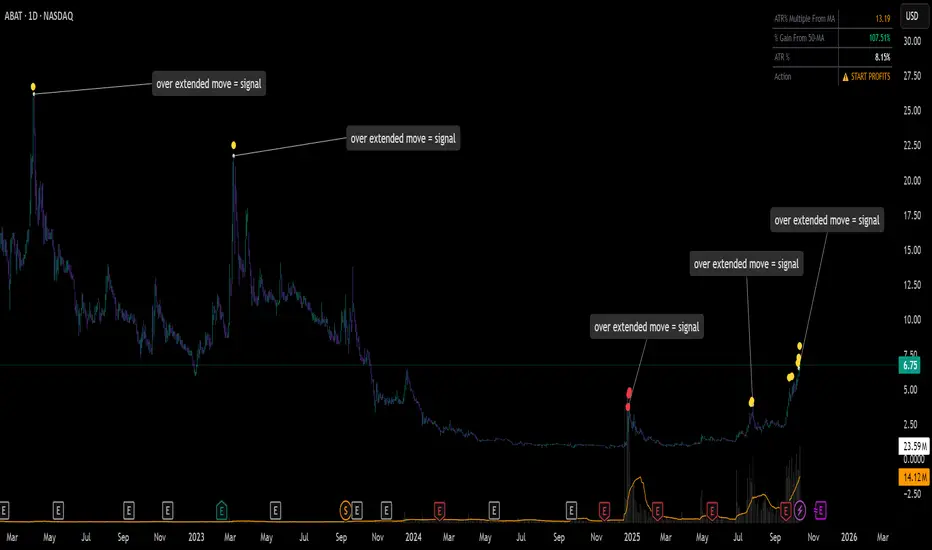
ATR% Multiple From MA - Overextensions trackingATR% Multiple From MA - Quantifiable Profit Taking Indicator
This overlay indicator identifies overextended price moves by calculating how many ATR% multiples price is away from a moving average, providing objective profit-taking signals.
Formula:
A = ATR% = (ATR / Price) × 100
B = % Gain from MA = ((Price - MA) / MA) × 100
ATR% Multiple = B / A
Signals:
Yellow circle at 7x: Start scaling out partial profits
Red circle at 10x+: Heavily overextended, aggressive profit taking recommended
Stats table: Real-time ATR% Multiple, % Gain from MA, ATR%, and action status
For very volatile markets I usually go for 10x and 15x extension instead of 7x and 10x.
This method normalizes moves across different volatility environments, eliminating emotional decision-making. Historical examples include PLTR, SOFI, TSLA, NVDA which stalled after exceeding 10x.
Customizable Settings:
ATR Length (default: 14)
MA Length (default: 50)
Profit Zone thresholds (7x, 10x)
Toggle circles and MA display
Squeeze Hour Frequency [CHE]Squeeze Hour Frequency (ATR-PR) — Standalone — Tracks daily squeeze occurrences by hour to reveal time-based volatility patterns
Summary
This indicator identifies periods of unusually low volatility, defined as squeezes, and tallies their frequency across each hour of the day over historical trading sessions. By aggregating counts into a sortable table, it helps users spot hours prone to these conditions, enabling better scheduling of trading activity to avoid or target specific intraday regimes. Signals gain robustness through percentile-based detection that adapts to recent volatility history, differing from fixed-threshold methods by focusing on relative lowness rather than absolute levels, which reduces false positives in varying market environments.
Motivation: Why this design?
Traders often face uneven intraday volatility, with certain hours showing clustered low-activity phases that precede or follow breakouts, leading to mistimed entries or overlooked calm periods. The core idea of hourly squeeze frequency addresses this by binning low-volatility events into 24 hourly slots and counting distinct daily occurrences, providing a historical profile of when squeezes cluster. This reveals time-of-day biases without relying on real-time alerts, allowing proactive adjustments to session focus.
What’s different vs. standard approaches?
- Reference baseline: Classical volatility tools like simple moving average crossovers or fixed ATR thresholds, which flag squeezes uniformly across the day.
- Architecture differences:
- Uses persistent arrays to track one squeeze per hour per day, preventing overcounting within sessions.
- Employs custom sorting on ratio arrays for dynamic table display, prioritizing top or bottom performers.
- Handles timezones explicitly to ensure consistent binning across global assets.
- Practical effect: Charts show a persistent table ranking hours by squeeze share, making intraday patterns immediately visible—such as a top hour capturing over 20 percent of total events—unlike static overlays that ignore temporal distribution, which matters for avoiding low-liquidity traps in crypto or forex.
How it works (technical)
The indicator first computes a rolling volatility measure over a specified lookback period. It then derives a relative ranking of the current value against recent history within a window of bars. A squeeze is flagged when this ranking falls below a user-defined cutoff, indicating the value is among the lowest in the recent sample.
On each bar, the local hour is extracted using the selected timezone. If a squeeze occurs and the bar has price data, the count for that hour increments only if no prior mark exists for the current day, using a persistent array to store the last marked day per hour. This ensures one tally per unique trading day per slot.
At the final bar, arrays compile counts and ratios for all 24 hours, where the ratio represents each hour's share of total squeezes observed. These are sorted ascending or descending based on display mode, and the top or bottom subset populates the table. Background shading highlights live squeezes in red for visual confirmation. Initialization uses zero-filled arrays for counts and negative seeds for day tracking, with state persisting across bars via variable declarations.
No higher timeframe data is pulled, so there is no repaint risk from external fetches; all logic runs on confirmed bars.
Parameter Guide
ATR Length — Controls the lookback for the volatility measure, influencing sensitivity to short-term fluctuations; shorter values increase responsiveness but add noise, longer ones smooth for stability — Default: 14 — Trade-offs/Tips: Use 10-20 for intraday charts to balance quick detection with fewer false squeezes; test on historical data to avoid over-smoothing in trending markets.
Percentile Window (bars) — Sets the history depth for ranking the current volatility value, affecting how "low" is defined relative to past; wider windows emphasize long-term norms — Default: 252 — Trade-offs/Tips: 100-300 bars suit daily cycles; narrower for fast assets like crypto to catch recent regimes, but risks instability in sparse data.
Squeeze threshold (PR < x) — Defines the cutoff for flagging low relative volatility, where values below this mark a squeeze; lower thresholds tighten detection for rarer events — Default: 10.0 — Trade-offs/Tips: 5-15 percent for conservative signals reducing false positives; raise to 20 for more frequent highlights in high-vol environments, monitoring for increased noise.
Timezone — Specifies the reference for hourly binning, ensuring alignment with market sessions — Default: Exchange — Trade-offs/Tips: Set to "America/New_York" for US assets; mismatches can skew counts, so verify against chart timezone.
Show Table — Toggles the results display, essential for reviewing frequencies — Default: true — Trade-offs/Tips: Disable on mobile for performance; pair with position tweaks for clean overlays.
Pos — Places the table on the chart pane — Default: Top Right — Trade-offs/Tips: Bottom Left avoids candle occlusion on volatile charts.
Font — Adjusts text readability in the table — Default: normal — Trade-offs/Tips: Tiny for dense views, large for emphasis on key hours.
Dark — Applies high-contrast colors for visibility — Default: true — Trade-offs/Tips: Toggle false in light themes to prevent washout.
Display — Filters table rows to focus on extremes or full list — Default: All — Trade-offs/Tips: Top 3 for quick scans of risky hours; Bottom 3 highlights safe low-squeeze periods.
Reading & Interpretation
Red background shading appears on bars meeting the squeeze condition, signaling current low relative volatility. The table lists hours as "H0" to "H23", with columns for daily squeeze counts, percentage share of total squeezes (summing to 100 percent across hours), and an arrow marker on the top hour. A summary row above details the peak count, its share, and the leading hour. A label at the last bar recaps total days observed, data-valid days, and top hour stats. Rising shares indicate clustering, suggesting regime persistence in that slot.
Practical Workflows & Combinations
- Trend following: Scan for hours with low squeeze shares to enter during stable regimes; confirm with higher highs or lower lows on the 15-minute chart, avoiding top-share hours post-news like tariff announcements.
- Exits/Stops: Tighten stops in high-share hours to guard against sudden vol spikes; use the table to shift to conservative sizing outside peak squeeze times.
- Multi-asset/Multi-TF: Defaults work across crypto pairs on 5-60 minute timeframes; for stocks, widen percentile window to 500 bars. Combine with volume oscillators—enter only if squeeze count is below average for the asset.
Behavior, Constraints & Performance
Logic executes on closed bars, with live bars updating counts provisionally but finalizing on confirmation; table refreshes only at the last bar, avoiding intrabar flicker. No security calls or higher timeframes, so no repaint from external data. Resources include a 5000-bar history limit, loops up to 24 iterations for sorting and totals, and arrays sized to 24 elements; labels and table are capped at 500 each for efficiency. Known limits: Skips hours without bars (e.g., weekends), assumes uniform data availability, and may undercount in sparse sessions; timezone shifts can alter profiles without warning.
Sensible Defaults & Quick Tuning
Start with ATR Length at 14, Percentile Window at 252, and threshold at 10.0 for broad crypto use. If too many squeezes flag (noisy table), raise threshold to 15.0 and narrow window to 100 for stricter relative lowness. For sluggish detection in calm markets, drop ATR Length to 10 and threshold to 5.0 to capture subtler dips. In high-vol assets, widen window to 500 and threshold to 20.0 for stability.
What this indicator is—and isn’t
This is a historical frequency tracker and visualization layer for intraday volatility patterns, best as a filter in multi-tool setups. It is not a standalone signal generator, predictive model, or risk manager—pair it with price action, news filters, and position sizing rules.
Disclaimer
The content provided, including all code and materials, is strictly for educational and informational purposes only. It is not intended as, and should not be interpreted as, financial advice, a recommendation to buy or sell any financial instrument, or an offer of any financial product or service. All strategies, tools, and examples discussed are provided for illustrative purposes to demonstrate coding techniques and the functionality of Pine Script within a trading context.
Any results from strategies or tools provided are hypothetical, and past performance is not indicative of future results. Trading and investing involve high risk, including the potential loss of principal, and may not be suitable for all individuals. Before making any trading decisions, please consult with a qualified financial professional to understand the risks involved.
By using this script, you acknowledge and agree that any trading decisions are made solely at your discretion and risk.
Do not use this indicator on Heikin-Ashi, Renko, Kagi, Point-and-Figure, or Range charts, as these chart types can produce unrealistic results for signal markers and alerts.
Best regards and happy trading
Chervolino
Thanks to Duyck
for the ma sorter

Volume BubblesVolume Bubbles Indicator
Introduction
The Volume Bubbles indicator is a powerful tool designed to visually highlight significant volume spikes on your TradingView charts. It helps traders identify potential areas of whale accumulation (large buying activity) or dumping (large selling activity) by displaying colored bubbles on candles where volume exceeds a customizable threshold. Green bubbles indicate bullish (buy) volume on up candles, suggesting possible accumulation, while red bubbles signal bearish (sell) volume on down candles, indicating potential dumping. The bubble size scales with the volume magnitude, making it easy to spot major market moves at a glance.
This indicator is particularly useful for crypto, forex, and stock traders looking to gauge market sentiment and large player involvement without cluttering the chart. It's built in Pine Script v5 and overlays directly on your price action.
How It Works
The indicator calculates a moving average of volume (default: 20-period SMA) and detects spikes when current volume exceeds this average by a multiplier (default: 2x).
Buy Bubbles (Green): Appear on bullish candles (close >= open) at the low wick, representing potential whale buying or accumulation zones.
Sell Bubbles (Red): Appear on bearish candles (close < open) at the high wick, indicating potential whale selling or dumping zones.
Bubble Size: Dynamically sized based on volume thresholds – huge for >1M, large for 500K-1M, normal for <500K.
Transparency: Increases with volume ratio for better visibility on extreme spikes.
Tooltip:
Hover over a bubble to see detailed info like total volume, average volume, and ratio.
By focusing on these high-volume events, traders can spot key support/resistance levels where whales might be active.
How to Use for Whale Accumulation and Dumping
Whales (large holders) often move markets with high-volume trades. This indicator helps spot them:
Accumulation (Buying): Look for clusters of large green bubbles at price lows or during consolidations. This suggests whales are buying dips, potentially signaling a reversal or uptrend start. Combine with support levels for confirmation.
Dumping (Selling): Watch for big red bubbles at price highs or after rallies. This indicates whales unloading positions, which could lead to downtrends or corrections. Pair with resistance levels.
Tips:
Use on higher timeframes (e.g., 1H+) for reliable signals.
Confirm with other indicators like RSI or MACD to avoid false positives.
In trending markets, buy bubbles in uptrends confirm strength; sell bubbles in downtrends signal continuation.
Credits and Disclaimer
Inspired by volume analysis techniques. This is free to use; feedback welcome! Not financial advice – trade at your own risk.

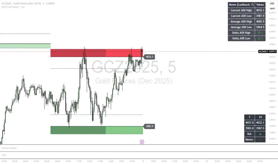
ASR - Average Session Range [KasTrades]This indicator displays the Average Session Range based on the session of your choice.
You can turn the tables off if you don't want to see a table version of the ASR levels. There is also a momentum table showing the current momentum, which you can also turn off.
Stochastic %K Colored by VolumeDescription:
"Stochastic %K Colored by Volume is a technical indicator that combines the traditional Stochastic %K oscillator with volume-based coloring. It highlights periods of high, low, and neutral trading volume by changing the color of the %K line. Additionally, it identifies bullish and bearish divergences between price and the %K oscillator, helping traders spot potential reversals and trend changes. The indicator also includes key levels for overbought, oversold, and extreme zones to guide trading decisions."

Wilder's ADX/DIワイルダー氏が作ったトレンドの強弱を計るインジケーターです。証券会社のものは微妙に計算式が違うため、ワイルダー氏のオリジナルの計算式で作りました。
It’s an indicator created by Mr. Wilder to measure the strength of a trend.
Since the calculation formulas used by brokerage firms vary slightly, this version is built using Mr. Wilder’s original formula.

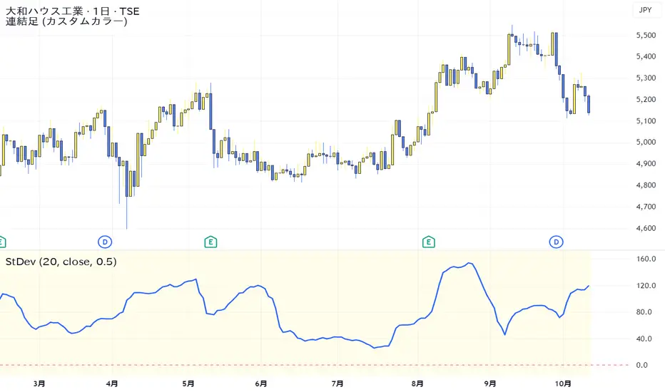
Standard Deviation VolatilityThe Standard Deviation (StDev) measures the volatility or dispersion of price from its historical average. Higher values suggest greater price fluctuation and potentially a trending market. Lower values indicate lower volatility, often found during consolidation or ranging markets.
標準偏差(Standard Deviation)は、価格の過去の平均からの**ばらつき(ボラティリティ)**を測る指標です。値が高いほど価格変動が激しく、トレンド相場であることを示唆します。値が低いほど、レンジ相場または保ち合いであることを示します。
Smart Dip & Spike Finder v6Dip and Spike Finder
What This Adds
✅ Finds dips (for buying)
✅ Finds spikes (for selling)
✅ Works with your existing RSI & MA filters
✅ Shows BUY and SELL labels on the chart
✅ Triggers separate alerts for dip and spike conditions

Opening Range Fibonacci Extensions (ATR Adjusted)this script displays daily, weekly, or monthly range extensions as a function of ATR in a Fibonacci retracement

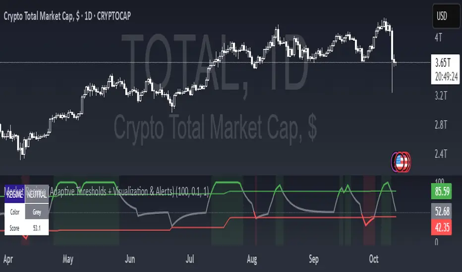
Market Regime (w/ Adaptive Thresholds)Logic Behind This Indicator
This indicator identifies market regimes (trending vs. mean-reverting) using adaptive thresholds that adjust to recent market conditions.
Core Components
1. Regime Score Calculation (0-100 scale)
Starts at 50 (neutral) and adjusts based on two factors:
A. Trend Strength
Compares fast EMA (5) vs. slow EMA (10)
If fast > slow by >1% → +60 points (strong uptrend)
If fast < slow by >1% → -60 points (strong downtrend)
B. RSI Momentum
Uses 7-period RSI smoothed with 3-period EMA
RSI > 70 → +20 points (overbought/trending)
RSI < 30 → -20 points (oversold/mean-reverting)
The score is then smoothed and clamped between 0-100.
2. Adaptive Thresholds
Instead of fixed levels, thresholds adjust to recent market behavior:
Looks back 100 bars to find the min/max regime score
High threshold = 80% of the range (trending regime)
Low threshold = 20% of the range (mean-reverting regime)
This prevents false signals in different volatility environments.
3. Regime Classification
Regime Score Classification Meaning
Above high threshold STRONG TREND Market is trending strongly (follow momentum)
Below low threshold STRONG MEAN REVERSION Market is choppy/oversold (fade moves)
Between thresholds NEUTRAL No clear regime (stay out or wait)
4. Regime Persistence Filter
Requires the regime to hold for a minimum number of bars (default: 1) before confirming
Prevents whipsaws from brief score fluctuations
What It Aims to Detect
When to use trend-following strategies (green = buy breakouts, ride momentum)
When to use mean-reversion strategies (red = buy dips, sell rallies)
When to stay out (gray = unclear conditions, high risk of false signals)
Visual Cues
Green background = Strong trend (momentum strategies work)
Red background = Strong mean reversion (contrarian strategies work)
Table = Shows current regime, color, and score
Alerts = Notifies when regime changes
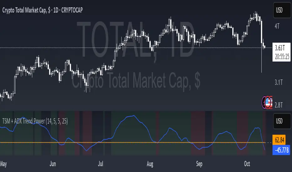
TSM + ADX Trend PowerLogic Behind This Indicator
This indicator combines two momentum/trend tools to identify strong, reliable trends in price movement:
1. TSM (Time Series Momentum)
What it does: Measures the difference between the current price and a smoothed average of past prices.
Formula: EMA(close - EMA(close, 14), 14)
Logic:
If TSM > 0 → Price is above its recent average = upward momentum
If TSM < 0 → Price is below its recent average = downward momentum
2. ADX (Average Directional Index)
What it does: Measures trend strength (not direction).
Logic:
ADX > 25 → Strong trend (either up or down)
ADX < 25 → Weak or no trend (choppy/sideways market)
Combined Logic (TSM + ADX)
The indicator only signals a trend when both conditions are met:
Condition Meaning
Uptrend TSM > 0 AND ADX > 25 → Strong upward momentum
Downtrend TSM < 0 AND ADX > 25 → Strong downward momentum
No signal ADX < 25 → Trend is too weak to trust
What It Aims to Detect
Strong, sustained trends (not just noise or small moves)
Filters out weak/choppy markets where momentum indicators often give false signals
Entry/exit points:
Green background = Strong uptrend (consider buying/holding)
Red background = Strong downtrend (consider selling/shorting)
No color = Weak trend (stay out or wait)
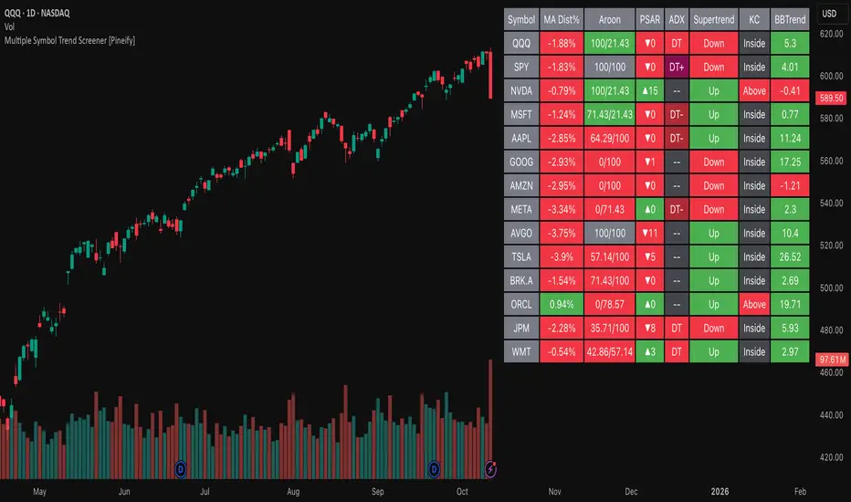
Multiple Symbol Trend Screener [Pineify]Multiple Symbol Trend Screener Pineify – Ultimate Multi-Indicator Scanner for TradingView
Empower your trading with deep market insights across multiple symbols using this feature-rich Pine Script screener. The Multiple Symbol Trend Screener Pineify enables traders to monitor and compare trends, reversals, and consolidations in real-time across the biggest equity symbols on TradingView, through a synergistic blend of popular technical indicators.
Key Features
Monitor up to 15 symbols and their trends simultaneously
Integrates 7 professional-grade indicators: MA Distance, Aroon, Parabolic SAR (PSAR), ADX, Supertrend, Keltner Channel, and BBTrend
Color-coded table display for instant visual assessment
Customizable lookback periods, indicator types, and calculation methods
SEO optimized for multi-symbol trend detection, screener, and advanced TradingView indicator
How It Works
This indicator leverages TradingView’s Pine Script v6 and request.security() to process multiple symbols across selected timeframes. Data populates a dynamic table, updating each cell based on the calculated value of every underlying indicator. MA Distance highlights deviation from moving averages; Aroon flags emerging trend strength; PSAR marks potential trend reversals; ADX assesses trend momentum; Supertrend detects bullish/bearish phases; Keltner Channel and BBTrend offer volatility and power insights.
Set up your preferred symbols and timeframes
Each indicator runs its calculation per symbol using its parameter group
All results are displayed in a table for a comprehensive dashboard view
Trading Ideas and Insights
Traders can use this screener for cross-market comparison, directional bias, entry/exit filtering, and comprehensive trend evaluation. The screener is excellent for swing trading, day trading, and portfolio tracking. It enables confirmation across multiple frameworks — for example, spotting momentum with ADX before confirming direction with Supertrend and PSAR.
Identify correlated movements or divergences across selected assets
Spot synchronized trend changes for basket trading ideas
Filter symbols by volatility, strength, or trend status for precise trade selection
How Multiple Indicators Work Together
The screener’s edge lies in its intelligent correlation of popular indicators. MA Distance measures the proximity to chosen moving averages, ideal for spotting overbought/oversold conditions. Aroon reveals the strength of new price trends, PSAR indicates reversal signals, and ADX quantifies the momentum of these trends. Supertrend provides a directional phase, while Keltner Channel & BBTrend analyze volatility shifts and band compressions. This amalgamation allows for a robust, multi-dimensional market snapshot, capturing details missed by single-indicator tools.
By displaying all key metrics side-by-side, the screener enables holistic decision-making, revealing confluence zones and contradiction areas across multiple tickers and timeframes.
Unique Aspects
Original implementation combining seven independent trend and momentum indicators for each symbol
Rich customization for symbols, timeframes, and all indicator parameters
Intuitive color-coding for quick reading of bullish/bearish/neutral signals
Comprehensive dashboard for instant actionable insights
How to Use
Load the indicator onto your TradingView chart
Go to the script’s settings and input your preferred symbols and relevant timeframes
Set your desired parameters for each indicator group: Moving Average type, Aroon length, PSAR values, ADX smoothing, etc.
Observe the results in the top-right table, then use it to filter candidates and validate trade setups
The screener is suitable for all timeframes and asset classes available on TradingView. Make sure your chart’s timeframe matches the one used in the scanner for optimal accuracy.
Customization
Choose up to 15 symbols to monitor in a single dashboard
Customize lookback periods, indicator types, colors, and display settings
Configure alerting options and thresholds for advanced trade automation
Conclusion
The Multiple Symbol Trend Screener Pineify sets a new standard for multi-asset screening on TradingView. By elegantly merging seven proven technical indicators, the screener delivers powerful trend detection, reversal analysis, and volatility monitoring — all in one dashboard. Take your trading to new heights with in-depth, customizable market surveillance.
ADR - Average Daily Range [KasTrades]This is an Average Daily Range (ADR) indicator.
There are two settings for ADR:
Two Look back period ADR range (e.g. 7 and 14 days)
One Look back period ADR (e.g. 5 days only)
Two day ADR ranges are typically used in equities and index futures whereas one day ADR is typically used in forex.
The opening time by default is 17:00 New York (Eastern) time. The ranges are always calculated from the opening price of the first bar on the respected timeframe.
