[edward_Z]Data tableThe purpose of this script is educational!
Create table with different inputs, various conditions, color changes, text format...
Tables
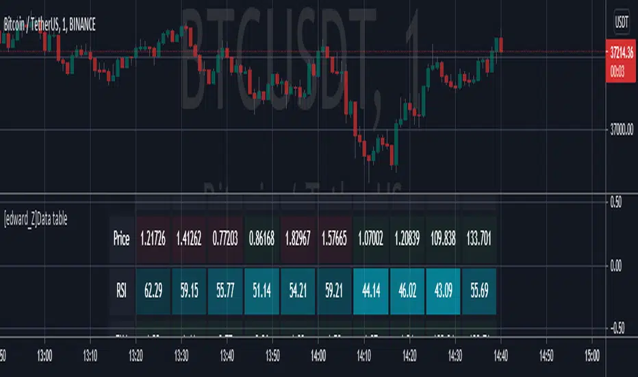
Table: EMA SurveillanceThis script will show information of interest about Moving Averages from the selected timeframe.
The idea is to provide data from higher timeframes (Daily preferably).
The information provided includes:
• selected length and calculation
• a relative position of the close to the average (above, below, and how much)
• how many periods passed since the moving average has been tested - any break counts as a test, it doesn't have to close on the opposite side
Global Settings:
• Timeframe of the moving averages
• Choose to see simple words such as "Above" / "Below" OR the specific percentage OR how much percentage % it moved from the moving average?
• EMA or SMA
Moving Average Settings:
• Up to 6 different lengths
• You can deactivate the averages you don't need
I hope it will be useful. Good luck!
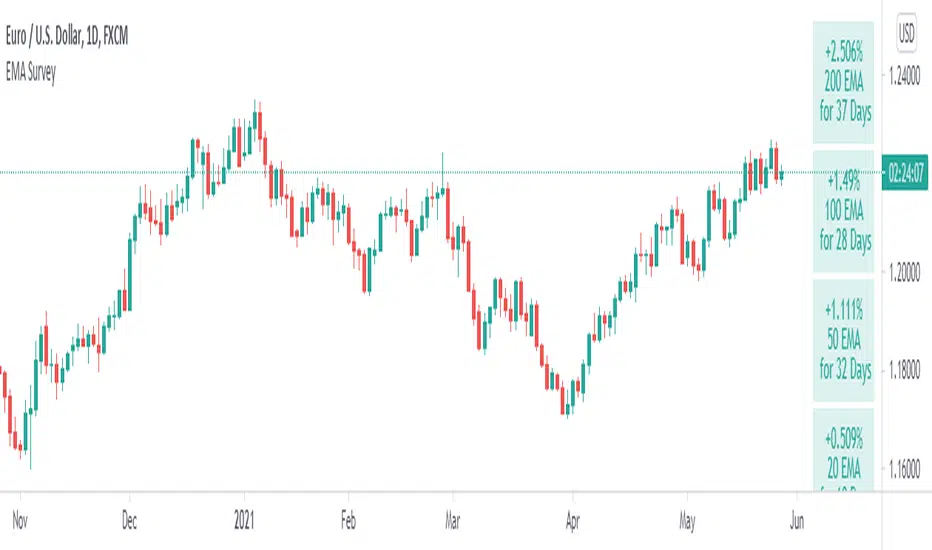
Table: Trendingness of Days and WeeksI really love the new Pinescript creation --- tables . This one is designed to remind you of DAILY and WEEKLY data when you drop to lower timeframe charts.
Weekly and Daily HIGHS and LOWS are completely objective pieces of information. Good for declaring characteristics of a trading day.
► If any week or day is considered BULLISH, it means the CLOSING price is ABOVE PREVIOUS week's or day's HIGH. The tile will be colored green.
► If any week or day is considered BEARISH, it means the CLOSING price is BELOW PREVIOUS week's or day's LOW. The tile will be colored red.
► When none of the above happens, I do not consider the week or day to be trending. Thereby, the week or day will be colored gray.
There is also a number that represents the strength of the trend. I am not interested in open, instead, the number represents a distance from PREVIOUS HIGH to the CLOSE.
This way, I ditch open and only consider how much the price moved after the breakout. An increasing momentum between the weeks or days signifies a strength. An opposite means weakness.
Obviously, the distance is always a positive number. If an instrument moves to the downside, you know that from the color of the tile.
Lastly, there are two different DAILY EXPONENTIAL MOVING AVERAGES. It is 200 and 20. My table reports back to you last time the price was above the moving average or below it. A period of 200 is often watched by long-term investors, whereas 20 seems to be frequently favored among short-term traders.
Have a good day!

Distance High-Low, Open-Close 8 DaysPinescript tables are a nice addition to the language. This one shows a complete distance from daily low to daily high and/or from the daily open to the daily close.
► You can show the distance between low and high
► You can show the distance between open and close
► Have this data for 8 last days
► Flip a table if you need to
I used the original TradingView's code in their news blog.
Have a nice day!

Indicator PanelHello All,
This script shows Indicator panel in a Table. Table.new() is a new feature and released today! Thanks a lot to Pine Team to add this new great feature! This new feature is a game changer!
The script shows indicator values for each symbol and changes background color of each cell by using current and last values of the indicators for each symbol. if current value is greater than last value then backgroung color is green, if lower than last value then red, if they are equals then gray.
You can choose the indicators to display. Number of columns in the table is dynamic and is changed by number of the indicators.
You can choose 5 different Symbols, 6 Indicators and 2 Simple or Exponential Moving averages, you can set type of moving averages and the lengths. You can also set the lengths for each Indicators.
Indicators:
- RSI
- MACD ( MACD and Signal and Histogram )
- DMI ( +DI and -DI + and ADX )
- CCI
- MFI
- Momentum
- MA with Length 50 (length can be set)
- MA with Length 200 (length can be set)
In this example RSI, MACD and MA 200 were chosen, you can see how table size changes dynamically:
Enjoy!
