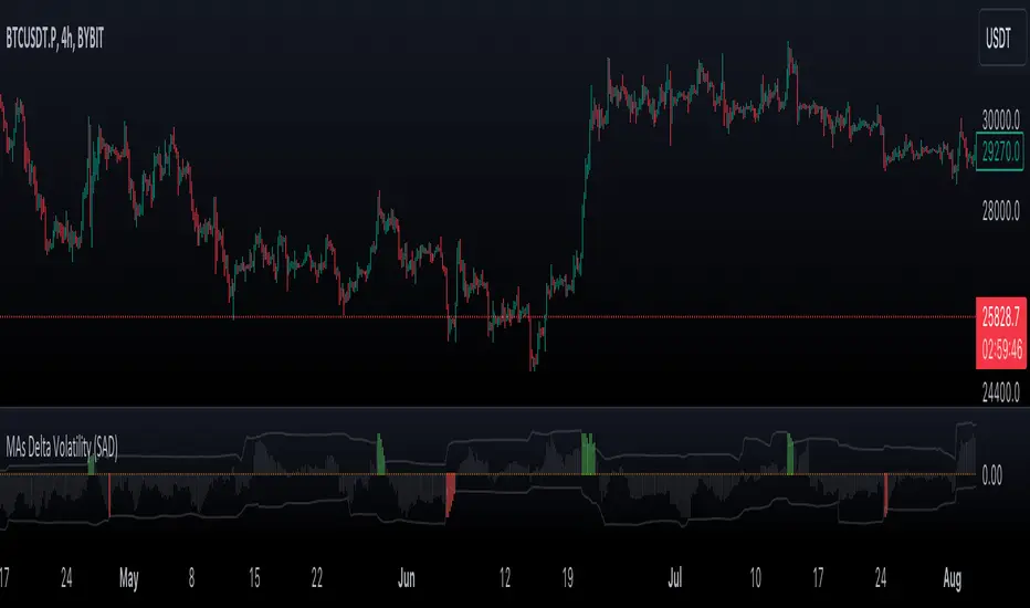
VWMA/SMA Delta Volatility (Statistical Anomaly Detector)The "VWMA/SMA Delta Volatility (Statistical Anomaly Detector)" indicator is a tool designed to detect and visualize volatility in a financial market's price data. The indicator calculates the difference (delta) between two moving averages (VWMA/SMA) and uses statistical analysis to identify anomalies or extreme price movements. Here's a breakdown of its components:
Hypothesis:
The hypothesis behind this indicator is that extreme price movements or anomalies in the market can be detected by analyzing the difference between two moving averages and comparing it to a statistically derived normal distribution. When the MA delta (the difference between two MAs: VWMA/SMA) exceeds a certain threshold based on standard deviation and the Z-score coefficient, it may indicate increased market volatility or potential trading opportunities.
Calculation of MA Delta:
The indicator calculates the MA delta by subtracting a simple moving average (SMA) from a volume-weighted moving average (VWMA) of a selected price source. This calculation represents the difference in the market's short-term and long-term trends.
Statistical Analysis:
To detect anomalies, the indicator performs statistical analysis on the MA delta. It calculates a moving average (MA) of the MA delta and its standard deviation over a specified sample size. This MA acts as a baseline, and the standard deviation is used to measure how much the MA delta deviates from the mean.
Delta Normalization:
The MA delta, lower filter, and upper filter are normalized using a function that scales them to a specific range, typically from -100 to 100. Normalization helps in comparing these values on a consistent scale and enhances their visual representation.
Visual Representation:
The indicator visualizes the results through histograms and channels:
The histogram bars represent the normalized MA delta. Red bars indicate negative and below-lower-filter values, green bars indicate positive and above-upper-filter values, and silver bars indicate values within the normal range.
It also displays a Z-score channel, which represents the upper and lower filters after normalization. This channel helps traders identify price levels that are statistically significant and potentially indicative of market volatility.
In summary, the "MA Delta Volatility (Statistical Anomaly Detector)" indicator aims to help traders identify abnormal price movements in the market by analyzing the difference between two moving averages and applying statistical measures. It can be a valuable tool for traders looking to spot potential opportunities during periods of increased volatility or to identify potential market anomalies.
Statisticalprobability
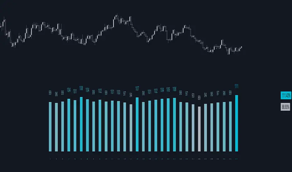
Normal Distribution CurveThis Normal Distribution Curve is designed to overlay a simple normal distribution curve on top of any TradingView indicator. This curve represents a probability distribution for a given dataset and can be used to gain insights into the likelihood of various data levels occurring within a specified range, providing traders and investors with a clear visualization of the distribution of values within a specific dataset. With the only inputs being the variable source and plot colour, I think this is by far the simplest and most intuitive iteration of any statistical analysis based indicator I've seen here!
Traders can quickly assess how data clusters around the mean in a bell curve and easily see the percentile frequency of the data; or perhaps with both and upper and lower peaks identify likely periods of upcoming volatility or mean reversion. Facilitating the identification of outliers was my main purpose when creating this tool, I believed fixed values for upper/lower bounds within most indicators are too static and do not dynamically fit the vastly different movements of all assets and timeframes - and being able to easily understand the spread of information simplifies the process of identifying key regions to take action.
The curve's tails, representing the extreme percentiles, can help identify outliers and potential areas of price reversal or trend acceleration. For example using the RSI which typically has static levels of 70 and 30, which will be breached considerably more on a less liquid or more volatile asset and therefore reduce the actionable effectiveness of the indicator, likewise for an asset with little to no directional volatility failing to ever reach this overbought/oversold areas. It makes considerably more sense to look for the top/bottom 5% or 10% levels of outlying data which are automatically calculated with this indicator, and may be a noticeable distance from the 70 and 30 values, as regions to be observing for your investing.
This normal distribution curve employs percentile linear interpolation to calculate the distribution. This interpolation technique considers the nearest data points and calculates the price values between them. This process ensures a smooth curve that accurately represents the probability distribution, even for percentiles not directly present in the original dataset; and applicable to any asset regardless of timeframe. The lookback period is set to a value of 5000 which should ensure ample data is taken into calculation and consideration without surpassing any TradingView constraints and limitations, for datasets smaller than this the indicator will adjust the length to just include all data. The labels providing the percentile and average levels can also be removed in the style tab if preferred.
Additionally, as an unplanned benefit is its applicability to the underlying price data as well as any derived indicators. Turning it into something comparable to a volume profile indicator but based on the time an assets price was within a specific range as opposed to the volume. This can therefore be used as a tool for identifying potential support and resistance zones, as well as areas that mark market inefficiencies as price rapidly accelerated through. This may then give a cleaner outlook as it eliminates the potential drawbacks of volume based profiles that maybe don't collate all exchange data or are misrepresented due to large unforeseen increases/decreases underlying capital inflows/outflows.
Thanks to @ALifeToMake, @Bjorgum, vgladkov on stackoverflow (and possibly some chatGPT!) for all the assistance in bringing this indicator to life. I really hope every user can find some use from this and help bring a unique and data driven perspective to their decision making. And make sure to please share any original implementaions of this tool too! If you've managed to apply this to the average price change once you've entered your position to better manage your trade management, or maybe overlaying on an implied volatility indicator to identify potential options arbitrage opportunities; let me know! And of course if anyone has any issues, questions, queries or requests please feel free to reach out! Thanks and enjoy.

Day of Month - Volatility Report█ OVERVIEW
The indicator analyses the volatility and reports the statistics by the days of the month.
█ CONCEPTS
The markets move every day. But how does a market move during a month?
Here are some ideas to explore:
Does the volatility kick in with the start of a new month?
Do the markets slow down at the end of the month?
Which period of the month is the most volatile?
How does this relate to your best and worst trades?
When should you take a break?
DAX
EURGBP
Binance Coin
█ FEATURES
Comparison modes
Compare how each day moves relative to the monthly volatility or the average daily volatility.
Configurable outputs
Output the report statistics as mean or median.
Range filter
Select the period to report from.
█ HOW TO USE
Plot the indicator and visit the 1D, 24H, or 1440 minutes timeframe.
█ NOTES
Gaps
The indicator includes the volatility from gaps.
Trading session
The indicator analyses each day from the daily chart, defined by the exchange trading session (see Symbol Info).
Extended trading session
The indicator can include the extended hours when activated on the chart, using the 24H or 1440 minutes timeframe.
Overnight session
The indicator supports overnight sessions (open and close on different calendar days). For example, EURUSD will report Monday’s volatility from Sunday open at 17:00 to Monday close at 17:00.
This is a PREMIUM indicator. In complement, you might find useful my free Time of Day - Volatility Report .
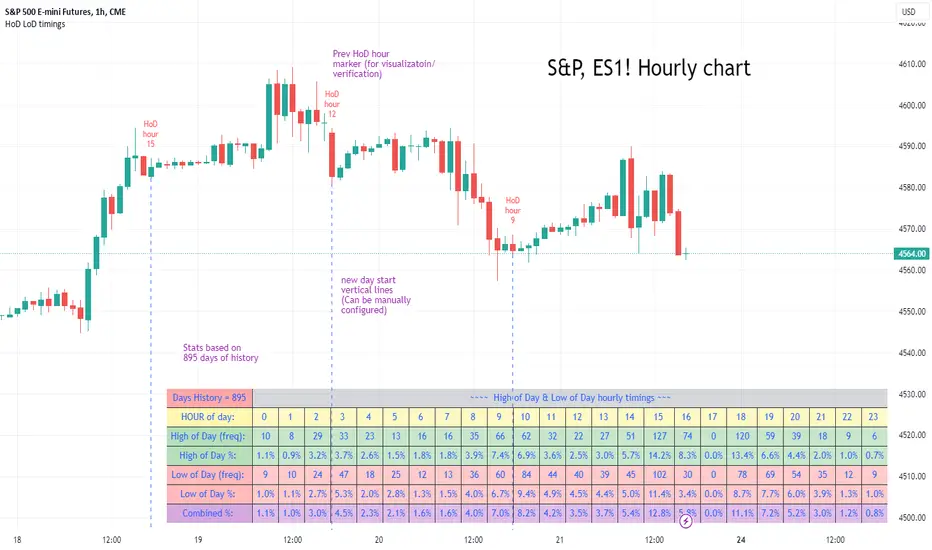
High of Day Low of Day hourly timings: Statistics. Time of day %High of Day (HoD) & Low of Day (LoD) hourly timings: Statistics. Time of day % likelihood for high and low.
//Purpose:
To collect stats on the hourly occurrences of HoD and LoD in an asset, to see which times of day price is more likely to form its highest and lowest prices.
//How it works:
Each day, HoD and LoD are calculated and placed in hourly 'buckets' from 0-23. Frequencies and Percentages are then calculated and printed/tabulated based on the full asset history available.
//User Inputs:
-Timezone (default is New York); important to make sure this matches your chart's timezone
-Day start time: (default is Tradingview's standard). Toggle Custom input box to input your own custom day start time.
-Show/hide day-start vertical lines; show/hide previous day's 'HoD hour' label (default toggled on). To be used as visual aid for setting up & verifying timezone settings are correct and table is populating correctly).
-Use historical start date (default toggled off): Use this along with bar-replay to backtest specific periods in price (i.e. consolidated vs trending, dull vs volatile).
-Standard formatting options (text color/size, table position, etc).
-Option to show ONLY on hourly chart (default toggled off): since this indicator is of most use by far on the hourly chart (most history, max precision).
// Notes & Tips:
-Make sure Timezone settings match (input setting & chart timezone).
-Play around with custom input day start time. Choose a 'dead' time (overnight) so as to ensure stats are their most meaningful (if you set a day start time when price is likely to be volatile or trending, you may get a biased / misleadingly high readout for the start-of-day/ end-of-day hour, due to price's tendency for continuation through that time.
-If you find a time of day with significantly higher % and it falls either side of your day start time. Try adjusting day start time to 'isolate' this reading and thereby filter out potential 'continuation bias' from the stats.
-Custom input start hour may not match to your chart at first, but this is not a concern: simply increment/decrement your input until you get the desired start time line on the chart; assuming your timezone settings for chart and indicator are matching, all will then work properly as designed.
-Use the the lines and labels along with bar-replay to verify HoD/LoD hours are printing correctly and table is populating correctly.
-Hour 'buckets' represent the start of said hour. i.e. hour 14 would be populated if HoD or LoD formed between 14:00 and 15:00.
-Combined % is simply the average of HoD % and LoD %. So it is the % likelihood of 'extreme of day' occurring in that hour.
-Best results from using this on Hourly charts (sub-hourly => less history; above hourly => less precision).
-Note that lower tier Tradingview subscriptions will get less data history. Premium acounts get 20k bars history => circa 900 days history on hourly chart for ES1!
-Works nicely on Btc/Usd too: any 24hr assets this will give meaningful data (whereas some commodities, such as Lean Hogs which only trade 5hrs in a day, will yield less meaningful data).
Example usage on S&P (ES1! 1hr chart): manual day start time of 11pm; New York timezone; Visual aid lines and labels toggled on. HoD LoD hour timings with 920 days history:
Price Legs: Average Heights; 'Smart ATR'Price Legs: Average Heights; 'Smart ATR'. Consol Range Gauge
~~ Indicator to show small and large price legs (based on short and long input pivot lengths), and calculating the average heights of these price legs; counting legs from user-input start time ~~
//Premise: Wanted to use this as something like a 'Smart ATR': where the average/typical range of a distinct & dynamic price leg could be calculated based on a user-input time interval (as opposed to standard ATR, which is simply the average range over a consistent repeating period, with no regard to market structure). My instinct is that this would be most useful for consolidated periods & range trading: giving the trader an idea of what the typical size of a price leg might be in the current market state (hence in the title, Consol Range gauge)
//Features & User inputs:
-Start time: confirm input when loading indicator by clicking on the chart. Then drag the vertical line to change start time easily.
-Large Legs (toggle on/off) and user-input pivot lookback/lookforward length (larger => larger legs)
-Small Legs (toggle on/off) and user-input pivot lookback/lookforward length (smaller => smaller legs)
-Display Stats table: toggle on/off: simple view- shows the averages of large (up & down), small (up & down), and combined (for each).
-Extended stats table: toggle on/off option to show the averages of the last 3 legs of each category (up/down/large/small/combined)
-Toggle on/off Time & Price chart text labels of price legs (time in mins/hours/days; price in $ or pips; auto assigned based on asset)
-Table position: user choice.
//Notes & tips:
-Using custom start time along with replay mode, you can select any arbitrary chunk of price for the purpose of backtesting.
-Play around with the pivot lookback lengths to find price legs most suitable to the current market regime (consolidating/trending; high volatility/ low volatility)
-Single bar price legs will never be counted: they must be at least 2 bars from H>>L or L>>H.
//Credits: Thanks to @crypto_juju for the idea of applying statistics to this simple price leg indicator.
Simple View: showing only the full averages (counting from Start time):
View showing ONLY the large legs, with Time & Price labels toggled ON:

*ATR Levels*This script is an enhanced version of "Saty's ATR Levels". With the help of SimpleCryptoLife, he reimagined the script to include these differences:
-view the ATR levels easily with labels and know where the price action is in relation to a specific level
-the included "price follow line" extends across the screen and through the ATR levels label to allow you to easily identify which level you're in or about to enter either on an upswing or downswing
- a +/- 4 and 5 ATR level created that can be turned on for those crazy runners, occasionally a stock will run >5 ATR if you're lucky
Select levels are standard when firing up the indicator but you can click on the appropriate levels to suit your needs and save it from there.
There are several modes to choose from >> Day, Multiday, Swing, Position and Long-Term - Try them out and see what works best for your trading style. For instance:
-Day mode is great for, you guessed it, day trades whether long or shot and ideally paired with 1h or less timeframes
-Multiday is similar to Swing mode and is great for trades less than a week and generally paired with 30m to 1 day timeframe
-Swing mode is great for 1-3 week trades and can be used on higher timeframe such as 30m to 1 day
-Position & long term are of course for longer term trades and ideally paired with 4 hour to 1 month timeframes
ATR length of 14 is standard (look up "Wilder's 14")
Trend indicator based off of the 9-21-34 EMAs // - Range against ATR for each period // - Put and call trigger levels table was created by Saty, located in upper right
Generally, once a candle hits the 23.6% level, look to "go long" but be sure to wait for confluences that support your strategy. Maybe you can wait till the 38.2 level or even higher, dependent on your risk tolerance (stop loss recommended). A candle could come back and retest a certain level that you're eyeing and then continue upwards. As each level is hit, the greater the chance to hit 1 ATR (or higher!). You can start to scale out of a trade at any level but any of the main ATR levels like +1, +2 and so on would be ideal places to take some profit. Keep in mind that a stock can make a run in the pre-market and once the opening bell hits the stock might already be above the +1 ATR level or higher. Conversely the aforementioned is true for stocks to short. The -23.6% level would a "trigger" level but you can use -38.2 etc
Regarding the "use current close" check box: if you're in after or pre-market hours, the ATR levels will remain from the previous day so you'll want to check this box to see what the new levels will be for the current day. But you'll want to uncheck it and leave it unchecked throughout the trading day.
If you find this indicator invaluable and it helps you become a more consistent and profitable trader, feel free to give it a boost and leave a comment if you so desire. As always, trade at your own risk and never use more money than you afford to lose.

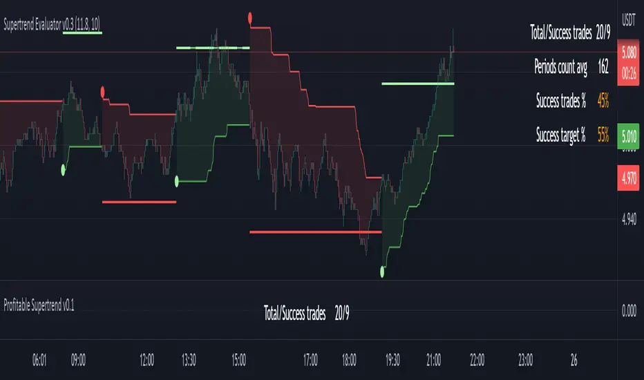
Profitable Supertrend v0.1 - AlphaThis a script to try detect the best combination of supertrend parameters in a space of time. Sadly the script is slow. Evaluate all possibilities params is hard for a pinescript and my knowledge too. In some cases, when you want evaluate many time could be the script fails for timeout. Perhaps with time I could enhance. For this problem of speed the calculate of combinatios it's not complete: In factor use a increment of 0.2 in each param (0.1, 0.3, 0.5 ...) in period the increment for each value is 3. The range for factor it's from 3.0 to 12.0. The range of period it's from 10 to 43
My knowledge don't let me go more far. Perhaps with time I can enhance the script.
Probabilities Module - The Quant Science This module can be integrate in your code strategy or indicator and will help you to calculate the percentage probability on specific event inside your strategy. The main goal is improve and simplify the workflow if you are trying to build a quantitative strategy or indicator based on statistics or reinforcement model.
Logic
The script made a simulation inside your code based on a single event. For single event mean a trading logic composed by three different objects: entry, take profit, stop loss.
The script scrape in the past through a look back function and return the positive percentage probability about the positive event inside the data sample. In this way you are able to understand and calculate how many time (in percentage term) the conditions inside the single event are positive, helping to create your statistical edge.
You can adjust the look back period in you user interface.
How can set up the module for your use case
At the top of the script you can find:
1. entry_condition : replace the default condition with your specific entry condition.
2. TPcondition_exit : replace the default condition with your specific take profit condition.
3. SLcondition_exit : replace the default condition with your specific stop loss condition.

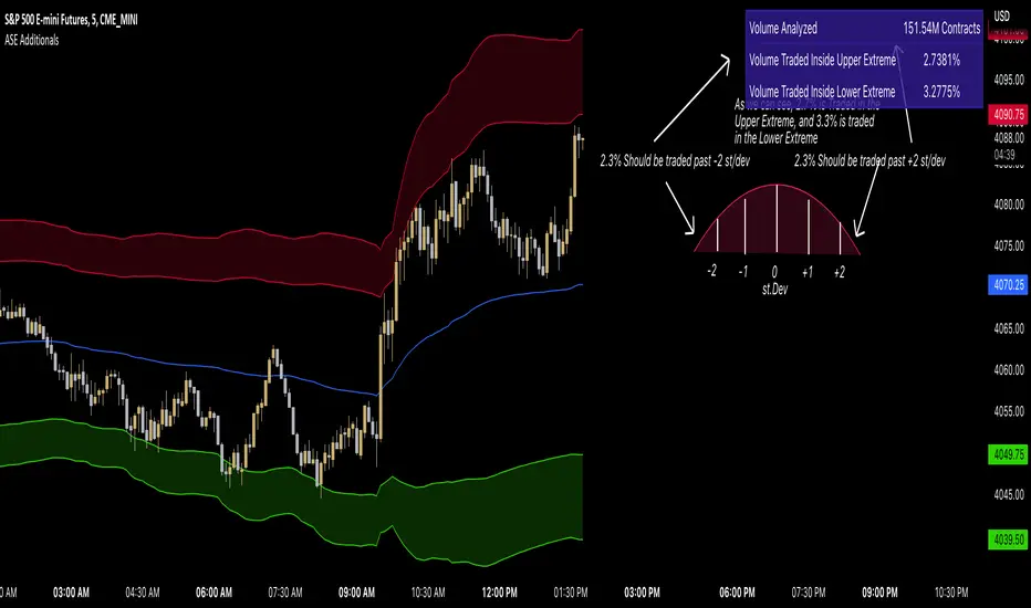
ASE Additionals v1ASE Additionals is a statistics-driven indicator that combines multiple features to provide traders with valuable statistics to help their trading. This indicator offers a customizable table that includes statistics for VWAP with customizable standard deviation waves.
Per the empirical rule, the following is a schedule for what percent of volume should be traded between the standard deviation range:
+/- 1 standard deviation: 68.26% of volume should be trading within this range
+/- 2 standard deviation: 95.44% of volume should be trading within this range
+/- 3 standard deviation: 99.73% of volume should be trading within this range
+/- 4 standard deviation: 99.9937% of volume should be trading within this range
+/- 5 standard deviation: 99.999943% of volume should be trading within this range
+/- 6 standard deviation: 99.9999998% of volume should be trading within this range
The statistics table presents five different pieces of data
Volume Analyzed: Amount of contracts analyzed for the statistics
Volume Traded Inside Upper Extreme: Calculated by taking the amount of volume traded inside the Upper Extreme band divided by the total amount of contracts analyzed
Volume Traded Inside Lower Extreme: Calculated by taking the amount of volume traded inside the Lower Extreme band divided by the total amount of contracts analyzed
Given the user’s inputs, they will see the upper and lower extremes of the day. For example, if the user changed the inner st. dev input to 2, 95.44% of the volume should be traded within the inner band. If the user changed the outer st. dev input to 3, 99.73% of the volume should be traded within the outer band. Thus, statistically, 2.145% ((99.73%-95.44%)/2) of volume should be traded between the upper and lower band fill.
In the chart above, the bands are the 2nd and 3rd standard deviation inputs. We notice that out of the 151 Million Contracts , the actual percentage of volume traded in the upper extreme was 2.7% , and the actual percentage of the volume traded in the lower extreme was 3.3% . Given the empirical rule, about 2.145% of the volume should be traded in the upper extreme band, and 2.145% of the volume should be traded in the lower extreme band. Based on the statistics table, the empirical rule is true when applied to the volume-weighted average price.
The trader should recognize that statistics is all about probability and there is a margin for error, so the bands should be used as a bias, not an entry. For example, given the +/-2 and 3 standard deviations, statistically, if 2.145% of the volume is traded within the upper band extreme, you shouldn’t look for a long trade if the current price is in the band. Likewise, if 2.145% of the volume is traded within the lower band extreme, you shouldn’t look for a short trade if the current price is in the band.
Additionally, we provide traders with the Daily, Weekly, and Monthly OHLC levels. Open, High, Low, and Close are significant levels, especially on major timeframes. Once price has touched the level, the line changes from dashed/dotted to solid.
Features
VWAP Price line and standard deviation waves to analyze the equilibrium and extremes of the sessions trend
Previous Day/WEEK/Month OHLC levels provide Major timeframe key levels
Settings
VWAP Equilibrium: Turn on the VWAP line
VWAP Waves: Turn on the VWAP standard deviation waves
Inner St. Dev: Changes the inner band standard deviation to show the percentage of volume traded within
Outer St. Dev: Changes the outer band standard deviation to show the percentage of volume traded within
Upper Extreme: Change the color of the upper VWAP wave
Lower Extreme: Change the color of the lower VWAP wave
Wave Opacity: Change the opacity of the waves (0= completely transparent, 100=completely solid)
Statistics Table: Turn on or off the statistics table
Statistics Table Settings: Change the Table Color, Text Color, Text Size, and Table Position
Previous Day/Week/Month OHLC: Choose; All, Open, Close, High, Low, and the color of the levels
OHLC Level Settings: Change the OHLC label color, line style, and line width
How to Use
The VWAP price line acts as the 'Fair Value' or the 'Equilibrium' of the price session. Just as the VWAP Waves show the session's upper and lower extreme possibilities. While we can find entries from VWAP , our analysis uses it more as confirmation. OHLC levels are to be used as support and resistance levels. These levels provide us with great entry and target opportunities as they are essential and can show pivots in price action.
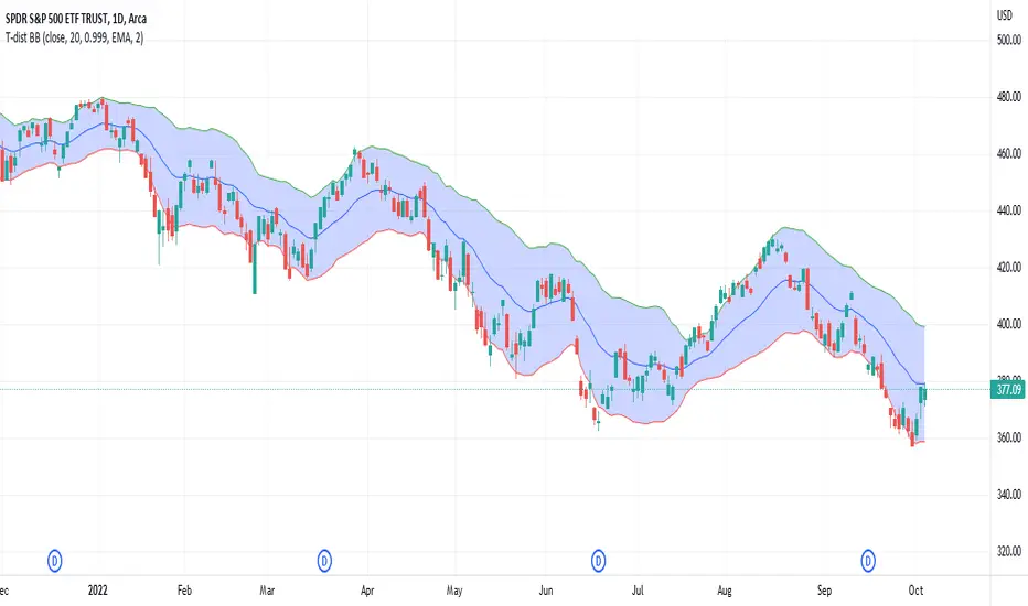
Student's T-Distribution Bollinger BandsThis study shows the prediction interval as Bollinger Bands using Student's T-distribution. This means that the bands will be wider when the data features higher variation, as well as when the sample size (in the form of length) is smaller. The bands will also be wider when the confidence level is lower. The opposite is also true. Assuming we set a confidence level of 0.99 and a source set to the close price, we could reasonably expect that 99% of the time the close price would fall between the upper and lower bounds. Because this is a general statistical method which requires a lot of math, the script has a tendency to be relatively slow, but should be eligible to be used in a wide variety of situations.
Probability Effort Scalper [PES]Probability Effort Scalper
Indicator is made of Two Basic Component
1. Probability Distribution Filter
2. Cumulative Effort Volumes
What is a Probability Distribution Filter ?
A filter which segregate the outcomes of any experiment into binary score of momentum based probabilities, so the filter is actually acting as a classifier to classify the probability of future occurrence of any event { in this case Stock prices going up / going down } { Long/ Short / Exit } by Binomial fitting method.
So the script uses Predictive Differential Filter, for filtering out the probability distribution, it actually uses differential calculations on binomial models.
Basic Assumptions:
That the Stock prices are in semi-strong efficiency
That the Stock prices follow up the Binomial Distribution
What is Cumulative Effort Volume
Effort Volume estimation is the process of predicting the most realistic amount of Volume Required to Push the Prices up or down, Its a group estimation model,
works on law of effort vs results and estimates the flow of the prices, (same as fluid dynamics), it's basically used to justify the harmony and Divergence occurrence in probability distribution.
How to use the Indicator
Simple Concept :
{ Signal candle = candle with a Triangle mark }
Long on the High of the Long Signal Candle,
Short on the Low of the Short Signal Candle
Exit on the Candle where "X" is present
For Long / Buy Signals {refer image below}
For Short / Sell Signals {refer image below}
Provisions for Alerts
Listed below are the Types of Alerts :
BUY SIGNAL
SELL SIGNAL
BOTH BUY/SELL SIGNAL
ALL STOP / EXIT SIGNALS
EXIT FROM LONG
EXIT FROM SHORT
What Securities will it work upon ?
The indicator works on every liquid security : stocks, futures, futures of indexes, forex, crypto : Having a Volume Informations provided by tradingview
Since the Indicator uses Volume Effort Estimation, The securities that you can apply the indicator on should be liquid
How to Get Access
Just Private Message me, would be happy to help you out !
Do not use comment box for asking for access, use it only for constructive feedbacks

Saty ATR LevelsThis indicator uses the previous period close and +/- 1 ATR to display significant day, multiday, swing, and position trading levels including:
- Trigger clouds for possibly going long/short @ 23.6 fib
- Mid-range level at 61.8 fib
- Full range level at +/- 1 ATR (from previous close)
- Extension level at 161.8 fib
Additionally, a convenient info table is provided that shows trend, range utilization, and numerical long/short values.
This indicator is most beneficial when you combine it with price, volume, and trend analysis. For educational content please check out the indicator website at atrlevels.com.
I am constantly improving this indicator, please use this one if you want to continue to get new features, bug fixes, and support.

ATR Report & Tool█ OVERVIEW
This indicator reports the historical probabilities of the price trading past its Average True Range (ATR).
█ CONCEPTS
It is common knowledge that the market is not likely to trade past 1x ATR. Is this true? How much unlikely exactly? The indicator reports the data in a table and tells you precisely how often the price made it past x times ATR.
You have identified two plausible entries at different price structures or two targets at significant projections; which one should you choose? While is it possible to reach them, is this indeed probable? The indicator complements your analysis for making sounds trading decisions.
█ FEATURES
Price Selection Tool
The indicator has a price selection tool embedded. You can select a price on the chart and it will show the distance relative to the ATR so you can easily refer to the historical probability table.
Multi-Timeframe
By default, the indicator uses the daily timeframe for analyzing how much price moves compared to its average volatility during a day. To the same extent, you can set it to any other timeframe.
Configurable ATR
• Pick your preferred smoothing between the Simple Moving Average (SMA) or the Relative Moving Average (RMA).
• Set the length for getting the average price movement. For example, you can set it to 20 for the daily ATR (20 trading days in a month), 12 for the weekly ATR (3 months), or 6 for the monthly ATR.
• Select the reference between “previous” or “current” ATR value (default set on previous).
Data Window
The indicator provides additional volatility-related values and reporting data.
Others
Automatically hides the indicator when the chart’s timeframe is higher than the indicator’s one.
█ NOTES
Calculation
The volatility is calculated from the selected period's low to high. It may use the previous close when the market gaps up/down.

Bar StatisticsThis script calculates and displays some bar statistics.
For the bar length statistics, it takes every length of upper or lower movements and calculates their average (with SD), median, and max. That way, you can see whether there is a bias in the market or not.
Eg.: If for 10 bars, the market moved 2 up, then 1 down, then 3 up, then 2 down, and 2 up, the average up bars length would be at 2.33, while the average for the down length would be at 1.5, showing that upper movements last longer than down movements.
For the range statistics, it takes the true range of each bar and calculates where the close of the bar is in relation to the true low of it. So if the closing of the bar is at 10.0, the low is at 9.0, and the high is at 10.2, the candle closed in the upper third of the bar. This process is calculated for every bar and for both closing prices and open prices. It is very useful to locate biasses, and they can you a better view of the market, since for most of the time a bar will open on an extreme and close on another extreme.
Eg.: Here on the DJI, we can see that for most of the time, a month opens at the lower third (near the low) and closes at the upper third (near the high). We can also see that it is very difficult for a month to open or close on the middle of the candle, showing how important the first and the last day are for determining the trend of the rest of the month.

Bayes Probability Index by DGTWhat is Probability?
It is a measure for calculating the chances or the possibilities of the occurrence of a random event. In simple words, it calculates the chance of the favorable outcome amongst the entire possible outcomes. Mathematically, if you want to answer what is probability, it is defined as the ratio of the number of favorable events to the total number of possible outcomes of a random events.
Is this enough? May be or may be not
Let’s consider an example,
A simple probability question may ask: "What is the probability of Amazon.com's stock price falling?"
How about if we extend our question a step further by asking: "What is the probability of AMZN stock price falling given that the Dow Jones Industrial Average (DJIA) index fell earlier?"
Now we are ready to consider conditional probability and Bayes' Theorem is where we could find answer to this question
Bayes' Theorem
Bayes' theorem, named after 18th-century British mathematician Thomas Bayes, is a mathematical formula for determining conditional probability. Conditional probability is the likelihood of an outcome occurring, based on prior knowledge of conditions or another related event occurring. Bayes' theorem provides a way to revise existing predictions or theories (update probabilities) given new or additional evidence. Bayes' theorem thus gives the probability of an event based on new information that is, or may be related, to that event
Formula For Bayes' Theorem
P(A|B) = P(B∣A) * P(A) /P(B)
= P(B∣A) * P(A) / (P(B∣A)* P(A) + P(B∣A’)* P(A’) )
where
A and B are events and P is probability
P(A|B) is the posterior probability, the probability of A after taking into account B
P(A) is the prior probability, the probability of A belief
P(A’) is the prior probability, the probability of A disbelief : P(A’)=1- P(A)
P(B) is the prior probability, the probability of B belief
P(B∣A) is the conditional probability or likelihood, the degree of belief in B given that proposition of A belief (A true)
P(B∣A’) is the conditional probability or likelihood, the degree of belief in B given that proposition of A disbelief (A false)
Bitcoin was the first-ever cryptocurrency, designed by Satoshi Nakamoto. In its likeness, all other cryptocurrencies were then created. The relationship between Bitcoin and altcoins remains something crypto analyst watch closely. This study aims to display the likelihood of bullish movement for ALTS-USDT pairs taking into consideration of bullish move probability of BTC-USDT pair
What to look for:
Percentage Value of the Conditional Probability and/or Simple Probability. When value is above %50 than bullish move is more probable, conversely when the value is below %50 bearish move is more likely
Limitations : Conditional Probability Line will be shown for daily time frame only, Simply Probability Line would be available for all time frames
Conditional Probability is calculated with the condition of BTC-USDT pair so using Conditional Probability is suggested with ALTS-USDT pairs.
Indicators aim to generate a potential signal/indication of an upcoming opportunity, but, the Indicators themselves do not guarantee the future movement of a given financial instrument, and are most useful when used in combination with other techniques.
Trading success is all about following your trading strategy and the indicators should fit within your trading strategy, and not to be traded upon solely
Disclaimer : The script is for informational and educational purposes only. Use of the script does not constitutes professional and/or financial advice. You alone the sole responsibility of evaluating the script output and risks associated with the use of the script. In exchange for using the script, you agree not to hold dgtrd TradingView user liable for any possible claim for damages arising from any decision you make based on use of the script
