스크립트에서 "马斯克+100万"에 대해 찾기
Philakone 4EMAs + 3MAs (200+100+50)Hi guys ^^
This script combine all Philakone EMAs plus i added death and golden cross MAs which is ( 200 MA + 50 MA ) plus 100 MA
You can fully customize all moving averages MA EMA show or hide or change color or thickness and ofc 0.79% play with source code :)
BTC tip :
3BMEXA9mJMhMBJR9MR3t7othh7BijxUNW7
Thanks ^^

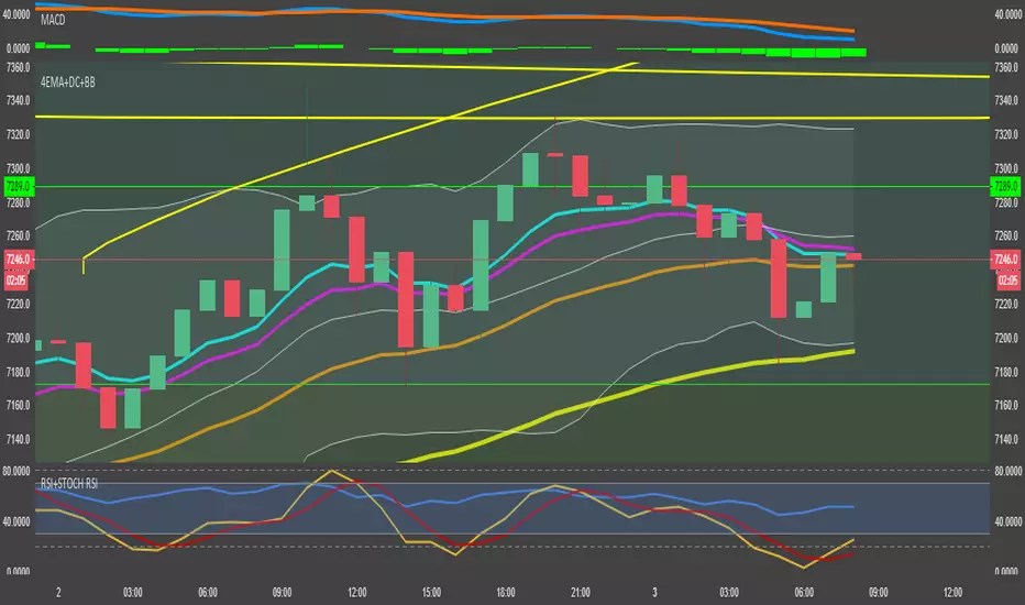
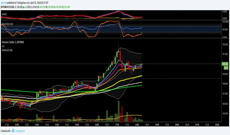
4EMA (8,12,26,55) + Death Cross (100,200) + Bollinger BandsThree indicators in one.
4 Exponential moving averages : 8, 12, 26, 55
Exponential moving average - Death cross: 100, 200
Bollinger Bands

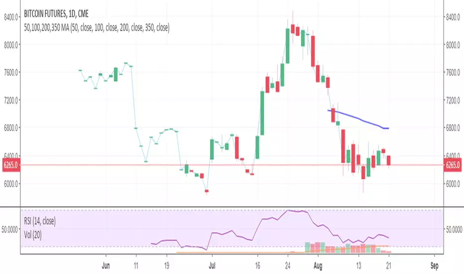
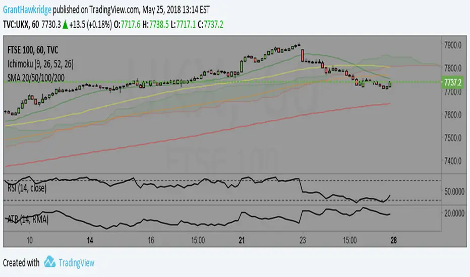
50,100,200,350 MAThis is the 50,100 & 200 day simple moving average plus the 350 day which is equivalent to the 50 week moving average. GL Simon McCabe


Volume Accumulation Percentage Indicator (0-100)This indicator is the same as LazyBear's indicator with the same title. I simplified it and changed the range to 0-100 so that it can be stacked with RSI indicator. 50 cross is the equivalent of zero cross in the original indicator.
PS: Drag and drop the indicator on RSI for stacking. Go to the settings and scale it to right.
More explanation on the original indicator:
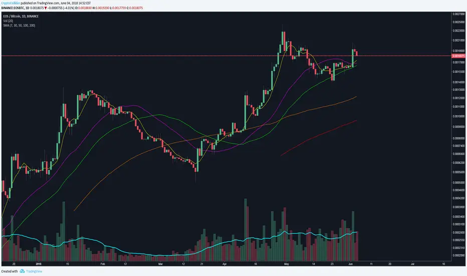
Simple Moving Averages (7, 30, 50, 100, 200)7, 30, 50, 100, 200 simple moving averages, bundled in one indicator (for users who are using the free TradingView service and can only load limited number of indicators at any given time).
You can turn each moving average on or off at will and change the colors.
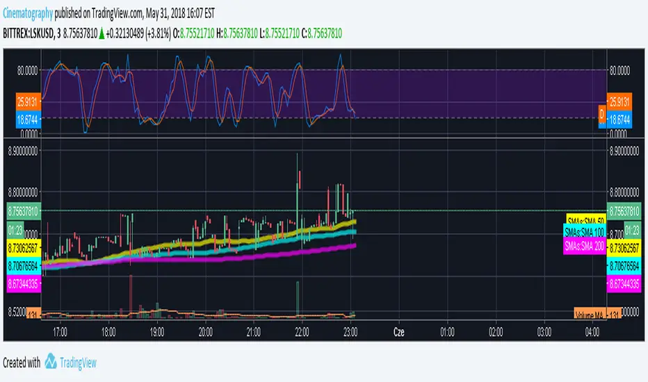


SMA 50/100 / 200Couldn't find a simple moving average that combined the three i was looking for so I made it. Nothing special.

4EMA (8,13,21,55) + Death Cross (100,200) + Bollinger BandsUnited three indicators in one.
4 Moving Average Exponential: 8, 13, 21, 55 - as per @Philakone strategy
Moving Average Exponential - Death Cross: 100, 200
Bollinger Bands
Check out my other script for RSI and Stoch RSI all in one.
30, 50, 100 and 200 Day Simple Moving AveragesEasy to Use to see 30, 50, 100 and 200 Day Simple Moving Averages.
3xEMA 55 100 and 200the 55 blue 100 white and the 200 yellow EMA in one indicator uses current resolution time frame by default

Moving Averages (10, 55, 100 EMAs, 200 SMA close)10, 55, 100 EMAs, 200 SMA close. Increasing line stroke, standard colors.