Pivot Points Daily - bitcoin by Simon-RoseDaily Version:
I have written 3 Indicators because i couldn't find what i was looking for in the library, so you can turn each one on and off individually for better visibility.
This are Daily, Weekly and Monthly Pivot Points with their Resistance and Support Points
and also on the Daily with the range between them.
I will also publish some Ideas to show you how to use them if you are not familiar with the traditional pivot points strategy already.
Unlike the usually 3 support & resistances i added 4 of them, specifically for trading bitcoin (on traditional markets this level of volatility usually never gets touched)
Here you can see which lines are what for reference, as the Feature to label lines is missing in Pinescript (if you have a workaround pls tell me ;) )
This is the basic calculation used :
PP = (xHigh+xLow+xClose) / 3
R1 = vPP+(vPP-Low)
R2 = vPP + (High - Low)
R3 = xHigh + 2 * (vPP - Low)
R4 = xHigh + 3 * (vPP - Low)
S1 = vPP-(High - vPP)
S2 = vPP - (High - Low)
S3 = xLow - 2 * (High - PP)
S4 = xLow - 3 * (High - PP)
If you have any questions or suggestions pls write me :)
Happy trading
Cheers
Weekly Version:
Monthly Version:
스크립트에서 "weekly"에 대해 찾기

Overlay Higher Timeframe EMA 10Plot the daily and weekly EMA 10 on any timeframe.
The Daily EMA 10 is useful for helping a trader decide whether the price is overextended without switching back to the daily timeframe and losing focus. It will change colour to indicate which order the EMA 10 and EMA 20 is in.
The Weekly EMA 10 is useful for helping a trader decide whether to take a trade based on long term momentum. If it is over the current price then the market has more momentum to the downside and if it is under then the market has more momentum to the upside. It will also change colour depending on which order the EMA 10 and EMA 20 is in. The weekly is often forgotten in trade planning.
You can switch the Daily and the Weekly on and off independently and change styles if you wish.

Multi-Timeframe VWAPShows the Daily, Weekly, Monthly, Quarterly, and Yearly VWAP.
Also shows the previous closing VWAP, which is usually very near the HLC3 standard pivot for the previous time frame. i.e. The previous daily VWAP closing price is usually near the current Daily Pivot. Tickers interact well with the previous Daily and Weekly closing VWAP.
Enabling the STDEV bands shows 3 separate standard deviation levels, defaulted at 1, 2, and 3. The lookback period for the bands is always changing with each new bar, since the standard deviation is calculated from the current bar to the beginning of the period. This is different from bollinger bands, as the lookback is constant (usually 20 periods is the textbook default).
The STDEV bands interval of interest can be changed from Day (D), Week (W), Month (M), Quarter (Q), Year (Y).
Tickers tend to bounce very well on Daily, Weekly, and Yearly VWAP (Yes... Year). Use this code and observe the Year VWAP on several major symbols through the past few years and eyes will be opened.
Relative Strength of 2 securities - Jayy This is an update of the Relative Strength to index as used by Leaf_West.. 4th from the top. my original RS script is 3rd from the top.
In this use of the term " Relative Strength" (RS) what is meant is a ratio of one security to another.
The RS can be inerpreted in a fashion similar to price action on a regual security chart.
If you follow his methods be aware of the different moving averages for the different time periods.
From Leaf_West: "on my weekly and monthly R/S charts, I include a 13 EMA of the R/S (brown dash line) and
an 8 SMA of the 13 EMA (pink solid line). The indicator on the bottom of the weekly/monthly charts is an
8 period momentum indicator of the R/S line. The red horizontal line is drawn at the zero line.
For daily or 130-minute time periods (or shorter), my R/S charts are slightly different
- the moving averages of the R/S line include a 20EMA (brown dash line), a 50 EMA (blue dash line) and
an 8 SMA of the20 EMA (pink solid line). The momentum indicator is also slightly different from the weekly/monthly
charts – here I use a 12 period calculation (vs 8 SMA period for the weekly/monthly charts)."
Leaf's website has gone but I if you are interested in his methods message me.
What is different from my previous RS: The RS now displays RS candles. So if you prefer to watch price action of candles to
a line chart which only plots the ratio of closes then this will be more interesting to you.
I have also thrown in a few options to have fun with.
Jayy
SuperTrend Oscillator v3Version 3: Improved aesthetically, complete turnaround for the strategy with which to use this indicator.
Once again, thanks to BlindFreddy and ChrisMoody for the bits of code that were assembled into this indicator.
Make the chart yours using the share button for the indicator with barcolors functionality.
Changes from v2 and looking forward: Indicator now uses a 14 length SuperTrend with no ATR multiplier. This my preferred use and I'd be grateful to hear your case for a different length/multiplier. Removed the Bollinger Bands and retracement dots due to these being gimmicky and marginally useful. There may be a version 4 should a similar concept using a rate of change analysis turn out to be useful. I have also tried -in vain- to plot internal trend peaks as horizontal S/R levels. Please pm if you are willing to help in that respect.
Strategy: The indicator will display the trend as a red/green area. It measures the spread between the closing price and the SuperTrend line, much like a CCI (close and ma). When the area contracts warning bars of the opposite trend color will warn of a reversal. When this happens, these areas will either be defended, reviving the trend, or will break, causing a trend flip. SuperTrend is unique in that breaks are typically large candles, and that its levels, especially on Weekly, Daily, Hourly, Minute timeframes, these levels will be defended (think similar to a 200sma or a 21ema). The STO making new highs within (internal) a trend is an overextension sign.
CVX Example: This is not a full analysis of CVX's stock , just an example potential trades. On the posted chart I used a weekly and a daily STO.
Long 1:The weekly showed warnings and then flipped. The daily made a double bottom, showed warnings and then flipped the daily STO at trendline support.
Long 2:The weekly still shows an uptrend, the daily made a weak break to downtrend and reversed back upwards at trendline support, forming a double bottom. Note the conservative exit when the STO made an internal new high.
Long 3: looking forward on CVX stock , the current downtrend made a weak break and is showing sings of reversal (pin bar) at horizontal support. Go long on flip of the daily (conservative) or flip of the hourly (aggressive).
SuperTrend OscillatorVersion 3: Improved aesthetically, complete turnaround for the strategy with which to use this indicator.
Once again, thanks to BlindFreddy and ChrisMoody for the bits of code that were assembled into this indicator.
Make the chart yours using the share button for the indicator with barcolors functionality.
Changes from v2 and looking forward: Indicator now uses a 14 length SuperTrend with no ATR multiplier. This my preferred use and I'd be grateful to hear your case for a different length/multiplier. Removed the Bollinger Bands and retracement dots due to these being gimmicky and marginally useful. There may be a version 4 should a similar concept using a rate of change analysis turn out to be useful. I have also tried -in vain- to plot internal trend peaks as horizontal S/R levels. Please pm if you are willing to help in that respect.
Strategy: The indicator will display the trend as a red/green area. It measures the spread between the closing price and the SuperTrend line, much like a CCI (close and ma). When the area contracts warning bars of the opposite trend color will warn of a reversal. When this happens, these areas will either be defended, reviving the trend, or will break, causing a trend flip. SuperTrend is unique in that breaks are typically large candles, and that its levels, especially on Weekly, Daily, Hourly, Minute timeframes, these levels will be defended (think similar to a 200sma or a 21ema). The STO making new highs within (internal) a trend is an overextension sign.
CVX Example: This is not a full analysis of CVX's stock, just an example potential trades. On the posted chart I used a weekly and a daily STO.
Long 1:The weekly showed warnings and then flipped. The daily made a double bottom, showed warnings and then flipped the daily STO at trendline support.
Long 2:The weekly still shows an uptrend, the daily made a weak break to downtrend and reversed back upwards at trendline support, forming a double bottom. Note the conservative exit when the STO made an internal new high.
Long 3: looking forward on CVX stock, the current downtrend made a weak break and is showing sings of reversal (pin bar) at horizontal support. Go long on flip of the daily (conservative) or flip of the hourly (aggressive).

Momentum of Relative strength to Index Leaf_West styleMomentum of Relative Strength to index as used by Leaf_West. This is to be used with the companion Relative Strength to Index indicator Leaf_West Style. Make sure you use the same index for comparison. If you follow his methods be aware of the different moving averages for the different time periods. From Leaf_West: "on my weekly and monthly R/S charts, I include a 13 EMA of the R/S (brown dash line) and an 8 SMA of the 13 EMA (pink solid line). The indicator on the bottom of the weekly/monthly charts is an 8 period momentum indicator of the R/S line. The red horizontal line is drawn at the zero line.
For daily or 130-minute time periods (or shorter), my R/S charts are slightly different - the moving averages of the R/S line include a 20EMA (brown dash line), a 50 EMA (blue dash line) and an 8 SMA of the20 EMA (pink solid line). The momentum indicator is also slightly different from the weekly/monthly charts – here I use a 12 period calculation (vs 8 SMA period for the weekly/monthly charts)." Leaf's methods do evolve and so watch for any changes to the preferred MAs etc..
Relative strength to Index set up as per Leaf_WestRelative Strength to index as used by Leaf_West. If you follow his methods be aware of the different moving averages for the different time periods. From Leaf_West: "on my weekly and monthly R/S charts, I include a 13 EMA of the R/S (brown dash line) and an 8 SMA of the 13 EMA (pink solid line). The indicator on the bottom of the weekly/monthly charts is an 8 period momentum indicator of the R/S line. The red horizontal line is drawn at the zero line.
For daily or 130-minute time periods (or shorter), my R/S charts are slightly different - the moving averages of the R/S line include a 20EMA (brown dash line), a 50 EMA (blue dash line) and an 8 SMA of the20 EMA (pink solid line). The momentum indicator is also slightly different from the weekly/monthly charts – here I use a 12 period calculation (vs 8 SMA period for the weekly/monthly charts)." Leaf's methods do evolve and so watch for any changes to the preferred MAs etc..

CM_Pivot Points Daily To IntradayNew Pivots Indicator With Options for Daily, 4 Hour, 2 Hour, 1 Hour, 30 Minute Pivot Levels!
Great for Forex Traders! - Take a Look at Chart with Weekly, Daily, and 4 Hour levels. Weekly Pivots Indicator is separate - Link is Below.
Plot one Pivot Level or Multiple at the Same Time via Check Boxes in the Inputs tab.
Defaults to 4 Hour Pivot Levels - Adjust in Inputs Tab.
S3 and R3 are turned off by Default - You can Activate Them In The Inputs Tab.
These Intraday Options were Requested By Users Using My CM_ Pivots Point Custom Indicator that Plots Daily, Weekly, Monthly, Quarterly, and Yearly Pivot Levels. Link is Below.
Now Both Longer-Term Traders and Shorter Term Traders Have All The Pivot Levels They Need. From Yearly Levels All The Way Down to 30 Minute Levels!
***The Candles On The Chart Are Custom Heikin-Ashi Paint Bars. Link is Below
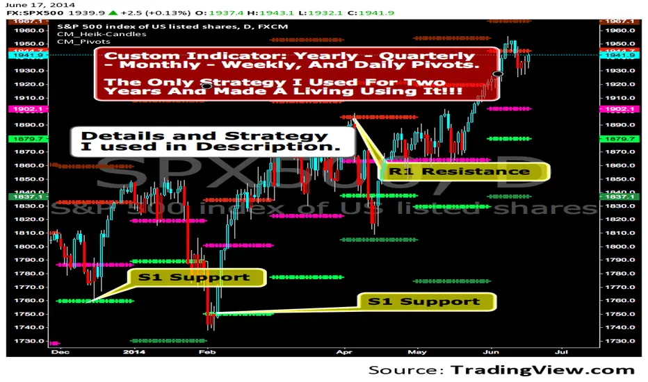
CM_ Pivot Points Custom
Daily, Weekly, Monthly, Quarterly, Yearly Pivot Levels
Heikin-Ashi Paint Bars

CM_Pivot Points_CustomCustom Pivots Indicator - Plots Yearly, Quarterly, Monthly, Weekly, and Daily Levels.
I created this indicator because when you have multiple Pivots on one chart (For Example The Monthly, Weekly, And Daily Pivots), the only way to know exactly what pivot level your looking at is to color ALL S1 Pivots the same color, but create the plot types to look different. For example S1 = Bright Green with Daily being small circles, weekly being bigger circles, and monthly being even bigger crosses for example. This allows you to visually know exactly what pivot levels your looking at…Instantly without thinking. This indicator allows you to Choose any clor you want for any Pivot Level, and Choose The Plot Type.
Apex Wallet - Bitcoin Halving Cycle & Profit ProjectionOverview The Apex Wallet Bitcoin Halving Cycle Profit is a strategic macro-analysis tool designed for Bitcoin investors and long-term holders. It provides a visual framework of Bitcoin's 4-year cycles by identifying past halving dates and projecting future ones automatically. The script highlights key accumulation and profit-taking windows based on historical cycle performance.
Dynamic Cycle Intelligence
Halving Milestones: Automatically detects and marks all major halving events (2012, 2016, 2020, 2024) with precise timestamps.
Predictive Projections: Using an estimated 1,460-day cycle, the script projects up to 30 future halving events to help plan long-term investment horizons.
Timeframe Optimization: Built specifically for Weekly (W) and Monthly (M) charts to provide a clean, high-level perspective of market structure.
Key Strategy Visuals
Profit Windows: Visualizes "Start" and "End" profit zones with automated vertical lines and color-coded labels based on user-defined offsets from the halving.
DCA Chain Signals: Identifies strategic Dollar Cost Averaging (DCA) points throughout the cycle to assist in disciplined accumulation.
Heatmap Shading: Features dynamic background shading that intensifies as the cycle progresses toward historical peak performance periods.
How to Use:
Switch to a Weekly or Monthly Bitcoin chart.
Use the Green Labels (Profit START) to identify early cycle strength.
Monitor the Red Labels (Profit END) for historical cycle exhaustion zones.

Stock ScreenerMissing great trade opportunities is annoying, and unless you have 12 screens or only trade one market, you are missing a lot of trades. To fix that, we created this stock screener so you get notified instantly of potential great trading conditions in real time, right on your chart.
You get notified of trading benchmarks being met by the value being displayed on the scanner as well as a color change so that it grabs your attention and makes you aware that you should take a look at the other market and look for a potential trade. It also has built in alerts so you can have an alert notification go off when any of your trading conditions are met instead of needing to watch the scanner for color changes.
The screener will change the ticker symbol background color to red green when price is above or below the previous daily range and above or below both VWAPs. This signals that the ticker is trending, which typically means it is a great time to trade that market and follow the trend.
This stock screener allows you to scan up to 10 different markets at the same time for various different conditions so you always know what is going on with your favorite trading symbols. If you want to scan more tickers, just add the indicator to your chart again and change the table position to the other side of the screen and update the tickers on the 2nd screener, allowing you to have 20 tickers at a time.
The scanner can be fully customized by changing the markets that it screens and turning on or off as many of them as you would like. You can also turn on or off any of the different data sets so that you only get information about trading conditions that matter to you.
The screener can provide data on any type of market, such as stocks, crypto, futures, forex and more. Each ticker can be adjusted to whatever market you would like it to scan for data in the settings panel, the only limitation is that it will not provide data for the VWAP and volume trend score if the ticker you are screening does not provide volume data.
Screener Features
The scanner will provide the following types of data for each ticker that is turned on:
Volume - Provides a volume score compared to the average volume and notifies you of higher than normal volume and volume spikes on individual bars by changing colors.
Volatility - Provides a volatility score compared to the average volatility and notifies you of higher than normal volatility by changing colors.
Oscillator - Choose between the RSI or CCI. The value of that oscillator will be displayed and will notify you when values are in extreme ranges such as overbought or oversold conditions according to the threshold values you enter in the settings panel. When those thresholds have been breached, you will be notified by it changing color.
Big Candles - Compares the current candle to average previous candle sizes, and changes color to notify you of big candles including a big top wick, big bottom wick, big candle body and big candle high to low range.
Daily Level Touches & Trends - Calculates and displays various daily candle and intraday open price levels that act as support and resistance. Notifies you when price is touching any of the daily levels that are turned on. The levels you can have on are as follows: previous day high, previous day low or previous day open. It also will notify you when price is touching the current day’s open, NY 930am open, Asia 8pm open, London 2am open and NY midnight 12am open. It will also say “Above” if price is above the previous day’s high or it will say “Below” if price is below the previous day’s low. The color of the cell will also change when a level touch is happening or price is above the previous day high or below the previous day low.
VWAP - Choose from 2 different VWAP lengths, default settings are daily and weekly VWAPs. You will get notified if price touches either of the VWAPs and they will also say “Above” or “Below” if price is currently above or below each VWAP.
How To Use The Screener To Help You Trade
The main purpose of the screener is to scan other markets and notify you of potential good trading opportunities such as price bouncing off of the daily levels or VWAPs. It can also be used to know when price is trending according to the VWAPs and daily levels. Lastly, you can use it to know how the volume and volatility trends are currently which gives you more confidence in taking a trade with this data when volume and volatility are present.
Volume Score
When volume is high, this represents a good time to trade because there are many market participants and price is likely to be volatile while there is high volume which can present a lot of good trade setups for you to take.
The volume score shown on the screener measures the current volume trend compared to previous volume trends and calculates that into a score based on 100 being the same as the previous volume trend. So any value above 100 means it is high volume and any value less than 100 means it is lower volume than normal.
In the settings panel, you can adjust the volume threshold that needs to be met for a volume notification to show up. The default setting is at 120, so you will get notified when the current volume trend score is 120 or higher or you can adjust that threshold value to whatever value you prefer.
It also will notify you when there is a volume spike on the current bar. This is determined by calculating an average of the recent volume totals and then checking to see if the current bar is greater than or equal to that average multiplied by 3. So if a single bar has volume that is greater than 3 times what the average volume is, then you will get a notification that says “Spike” to make you aware of that volume spike.
The volume trend threshold, volume spike multiplier and lookback length for the average volume used in volume spike calculations can all be adjusted in the settings panel to fit your desired preferences.
Volatility Score
High volatility can mean it is a great time to trade because the market is moving quickly and providing large enough movements that you can get in and out in a short amount of time, while still accruing decent sized trade PnL.
The volatility score will calculate the current volatility for each market compared to previous conditions and then divide the current volatility by the average volatility to give you a volatility score. Anything over 100 means the market is decently volatile and you should look at that market to find potential trade setups to execute on. Anything below 100 means the market is not very volatile and it is usually best to just wait until volatility returns before you start trading again.
The screener will notify you when the volatility score is above the threshold you set. The default value is set to 90, but can be adjusted to your preference. Pay attention to any market that shows an alert and take a look at that chart because the high volatility may present a good trade setup for you in the near future.
Oscillator Score
The oscillator data can be switched between Relative Strength Index(RSI) and Commodity Channel Index(CCI).
The RSI provides a value between 0 and 100 that indicates the momentum and strength of the recent price action. Many traders use the extremes of the 0-100 range to signal overbought or oversold conditions and use that as a sign to look for price to reverse in the near future. The typical values used for this and the default settings to provide notifications are: 70 for overbought and 30 for oversold. The scanner will notify you when the RSI value is considered overbought or oversold so you know to take a look at the chart and analyze if it is ready for a trade to be taken.
The CCI provides a value that can be used to determine the trend strength of the underlying asset when the oscillator moves above 100 or below -100. These extreme values are outside of the normal accumulation range and signify that price is moving strongly in that direction so it may be a good time to take a trade in the direction of the trend. The scanner will show you the value of the CCI for each market and notify you if that value is above 100 or below -100.
Both RSI and CCI settings can be adjusted in the settings panel to your desired settings so you have the exact oscillator settings you prefer to use as well as the exact values that you want to use for being notified.
Big Candles
Big candles can mean that many traders are buying or selling at the same time and many times indicate a good signal to trade in that same direction. That is why we included this calculation in the screener, so you are always aware when a large candle prints.
It calculates the average size of the recent candles and then uses that average as the benchmark to determine if the current candle is considered big and worthy of notifying you to take a look at that chart.
You can adjust the multiplier used for the big candle threshold to whatever you desire, but the default setting is 3 which means the candle will be considered big and notify you if it is 3 times as large as an average candle.
The big candles data will track the following candle values and notify you with these labels:
High to Low candle size = HL
Candle Body from open to close candle size = OC
Top Wick size = TW
Bottom Wick size = BW
Daily Level Touches & Trend
Daily level touches are excellent levels to watch for price to bounce because they often act as support and resistance levels for intraday trading. The scanner will track each market and notify you when the current candle is touching any of the daily levels that you have turned on in the settings panel.
The main levels that are turned on by default and are useful for all markets and how they will be labeled on the scanner are as follows:
Previous Day High = High
Previous Day Low = Low
Previous Day Open = < Open
Previous Day Close = Close
Current Day Open = Open
We also included some extra levels that are useful for futures traders. They are as follows:
NY 930am Open = 930am
NY 12am Midnight Open = 12am
Asia Open at 8pm NY time = Asia
London Open at 2am NY Time = London
Watch how price reacts to these levels and then trade the bounces off of these levels if the price action confirms that it is going to respect that level.
When price is currently above the previous day high, the scanner will say “Above” and show a green color, indicating a bullish trend and that price is above the previous daily candle’s high.
When price is currently below the previous day low, the scanner will say “Below” and show a red color, indicating a bearish trend and that price is below the previous daily candle’s low.
Pay attention to when price is trending above or below the previous daily candle as those trends can provide excellent trend trading opportunities.
The daily levels that you have turned on in the settings will also show as lines on the chart and include a label next to them, identifying each level so you know what each line represents. You can turn on or off all of the lines shown on the chart in the main settings or turn them off one by one in the style panel of the settings. Labels can also be turned on or off for all of the lines in the main settings panel. You can adjust the label positioning in the Label Offset section of the settings panel.
VWAP Touches & Trend
VWAP stands for volume weighted average price and is a very popular tool that traders use to determine trend direction based on volume as well as an excellent level to trade price bounces off of.
The typical VWAP time period used is Daily, which means the volume weighted average price will reset at the beginning of a new day. We set the first VWAP to be the daily VWAP by default and the second one to be the weekly VWAP. You can adjust both of the time periods to be any of the provided time lengths that you choose.
The screener will show “Above” with a green background color when price is above the VWAP, indicating a bullish trend. It will show “Below” with a red background color when price is below the VWAP, indicating a bearish trend. When both VWAPs are showing Above or Below, you can expect price to trend in that direction, so look for pullbacks you can trade in the direction of the trend. If the VWAPs are showing different directions, then you should expect to bounce back and forth between the VWAPs, but be careful and watch out for price to break beyond either one and start a trend.
When the current candle is touching the VWAP, the scanner will change colors and say VWAP to notify you that price is touching the VWAP and you should look at that chart and analyze the market for a potential bounce off of the VWAP to trade.
Trending Market Signals
Strong trends are excellent markets to trade and can many times provide excellent trading opportunities that don’t require expert price action reading skills to be able to take winning trades from. That is why we included a signal to notify you of a strong trending market.
The strong trending market will show up as a green or red background color for the ticker name. If the color of the ticker name is green, it is notifying you that the price is above the previous daily high, above VWAP 1 and above VWAP 2 and is a good market to look for bullish trend trades. If the color of the ticker name is red, it is notifying you that the price is below the previous daily low, below VWAP 1 and below VWAP 2 and is a good market to look for bearish trend trades.
Changing The Tickers It Scans
To change the tickers that the indicator scans, scroll near the bottom of the settings panel and select the ticker symbol you want to update and then search for the exact symbol you want to use. If you want to scan less tickers, then just turn some of the tickers off that you don’t need.
Scanning More Than 10 Tickers
If you want to scan more than 10 tickers, you can add the scanner to your chart again and then just change the table position to the other side of the screen. This will allow you to scan 10 more tickers that will show up separately. Then if you want even more, just add the indicator to your chart again and update the table position until you have as many markets as you want. The table position setting can be found at the bottom of the main settings panel.
Alerts
The screener has alerts that can be used to notify you when any of the data set thresholds have been met or if price is touching one of the levels. You can set alerts for the following events:
Bullish Trend Alert - Price is above the previous daily high and above both VWAPs.
Bearish Trend Alert - Price is below the previous daily low and below both VWAPs.
High Volume Alert - Volume is higher than the threshold or a volume spike is detected.
High Volatility Alert - Volatility is higher than the threshold.
Oscillator Is Extended Alert - Oscillator value has exceeded the upper or lower threshold.
Big Candle Alert - A big candle has been detected.
Daily Level Touch Alert - One of the daily levels that is turned on is being touched.
VWAP Touch Alert - One of the 2 VWAPs are being touched.
An alert will trigger when any one of tickers on your scanner meets the alert conditions, so when you see the alert, you will need to go to your chart and look at the scanner to see which ticker it was and then navigate to that chart to look for potential trade setups.
The alerts will use the exact same settings you have configured in the settings panel to send you alert notifications. With normal settings, this could give you a lot of alerts, so if you only want alerts to fire when abnormal conditions are being met, try setting up a second screener on your chart that has very high threshold values and only has the most important level touches on. Then turn the setting "Do Not Show The Screener On The Chart" to off so the calculations will still run and fire alerts, but won't clog up your charts. This way you can only get alert notifications when major events happen but still have your normal screener settings available on your chart.
Markets This Can Be Used On
This screener uses the price action and volume data so you can use it to scan any type of market you would like as long as the ticker you are scanning has price and volume data feeds. If a market does not have volume data, then it will just show NaN in the volume row and the VWAP rows will not show anything.

Trend-Based Fibs: Static Labels at StartThis indicator automatically projects Fibonacci extension levels and "Golden Zones" starting from the opening price of a new period (Daily or Weekly). By using the previous period’s range (High-Low) as the basis for volatility, it provides objective price targets and reversal zones for the current session.
How it Works Unlike standard Fibonacci Retracements that require manual drawing from swing highs to lows, this tool uses a fixed anchor method: The Range: It calculates the total range of the previous day or week.
The Anchor: It sets the current period's opening price as the "Zero Line."The Projection: It applies Fibonacci ratios ($0.236$, $0.5$, $0.786$, $1.0$, and $1.618$) upward and downward from that opening price.
Key Features Automated Levels: No more manual drawing. Levels reset and recalculate automatically at the start of every Daily or Weekly candle. Bullish & Bearish Zones: Instantly see extensions for both directions. The "Golden Zones": Highlighted boxes represent the high-probability $0.236$ to $0.5$ zones for both long and short continuations. Previous Period Levels: Optional toggles to show the previous High and Low, which often act as major support or resistance.
Integrated EMAs: Includes two customizable Exponential Moving Averages (default 20 and 100) to help you stay on the right side of the trend.
Clean Visuals: Labels are pinned to the start of the period to keep your charts uncluttered while lines extend dynamically as time progresses.
How to Trade with it Trend Continuation: If price opens and holds above the $0.236$ bullish level, look for the $0.618$ and $1.0$ levels as targets.
Reversals: Watch for price exhaustion at the $1.618$ extension, especially if it aligns with an EMA or a Previous High/Low.
Gap Plays: Excellent for "Opening Range" strategies where you use the first close of the day as the pivot point for the extensions.

[LJ] RSIM + ICT KillzonesIndicator Summary
This Pine Script indicator is a comprehensive, all-in-one toolkit designed for traders utilizing Inner Circle Trader (ICT) concepts. It visually maps out crucial time-based trading sessions, killzones, and key opening price levels directly on the chart. Alongside the time and price tools, it features a real-time "RSIM" (MTF RSI Monitor) dashboard to track market momentum across multiple timeframes, all while maintaining a lag-free chart through automated drawing cleanup.
Core Functionalities
ICT Killzones & Silver Bullets:
Visually demarcates specific high-probability trading windows—including the Asian, London, and New York (AM & PM) killzones, as well as the UK and US "Silver Bullet" times—using vertical lines and colored background highlights.
Key Opening Price Levels:
Automatically plots horizontal lines for significant opening prices, such as the New York Midnight Open (often used as true day open), CME Open, and NY AM/PM Opens. It also includes Higher Time Frame (HTF) levels for Weekly and Monthly opens.
Session High/Low Tracking:
Actively tracks and draws horizontal price levels for the High and Low of the current day, previous day, and individual Globex, Asian, London, and NY sessions.
Multi-Timeframe RSI Dashboard (RSIM):
An on-chart table that displays the current Relative Strength Index (RSI) values and a live countdown timer ("time to close") for the 5-minute, 15-minute, 1-hour, 4-hour, Daily, and Weekly timeframes.
Lunch "No-Trade-Zone":
Specifically highlights the New York Lunch period, visually warning traders of potential low-volume or erratic price action.
Automated Housekeeping:
A built-in memory management system that automatically deletes drawings (lines and labels) older than a user-defined number of days to prevent chart clutter and performance lag.
Built-in Debug Logger:
An optional on-chart logging table that tracks session triggers and script events, helping traders verify that times and levels are plotting correctly for their selected asset.

cephxs + fadi / Previous Time Based Dealing RangesPREVIOUS TIME BASED DEALING RANGES
Visualize previous and current higher timeframe dealing ranges with dual-box OHLC representation, extending reference lines, and HTF candle displays.
Open Source Fork of @fadizeidan 's HTF Candles Indicator
OVERVIEW
This indicator displays time-based dealing ranges from higher timeframes directly on your chart. It shows the complete price action structure of previous (or current/forming) periods using a dual-box system: one box for the full High-Low range and another for the Open-Close body. Reference lines extend from key levels to help identify potential support, resistance, and mean reversion zones.
Perfect for traders who use ICT concepts, market structure analysis, or any methodology that relies on understanding where price has been relative to previous dealing ranges.
KEY FEATURES
Dual-Box Range Visualization: Each range displays two boxes - the full H-L range (outer) and the O-C body (inner) - giving immediate visual context of candle structure
Multiple Timeframes: Support for 90m, 4H, 6H, 1D, 1W, 1M, and 3M ranges
Previous/Current Mode: View completed ranges (Previous) or the forming range (Current) with real-time updates
Auto Mode: Automatically selects the appropriate range based on your chart timeframe
Reference Lines: Extending lines from High, Mid, Low (or Quadrants: H/75/M/25/L) with trade-into detection
HTF Candle Display: Visual HTF candles positioned to the right of price for context
6H Session Support: Session-aware ranges for Asia, London, NY AM, and NY PM with labeled names
Open Line: Vertical line marking the range's opening price/time
Imbalance Detection: Fair Value Gaps and Volume Imbalances highlighted on HTF candles
MODE OPTIONS
Previous/Current: Previous shows the last completed range. Current shows the forming range with dynamic H/L/C updates
Auto/Manual: Auto selects range by chart TF. Manual lets you choose specific ranges
Extend Box (Current): In Current mode, extends the box's right edge as price develops
AUTO MODE TIMEFRAME LOGIC
Auto mode now selects up to 3 ranges automatically based on chart timeframe, providing multi-timeframe context:
Chart ≤ 3m → 90m + 6H + 1D
Chart 4m-14m → 6H + 1D + 1W
Chart 15m-59m → 1D + 1W (+ 1M available)
Chart 1H-3H → 1D + 1W + 1M
Chart 4H-23H → 1W + 1M + 3M
Chart ≥ 1D → 1M + 3M
INPUTS
Mode
Mode: Previous/Current - Choose completed or forming range
Auto/Manual: Auto selects range by chart TF, Manual lets you choose
Extend Box (Current): Extends box right edge with price (Current mode only)
Show Range Boxes: Toggle box visibility (lines remain visible when off)
Filter Lines by Distance: When boxes are hidden, hide reference lines that are too far from current price (Really Close / Balanced / Slightly Far)
Previous Ranges
Range 1: Enable/disable, select timeframe (90m/4H/6H/1D/1W/1M/3M), max display count (1-2)
Range 2: Second range layer for multi-timeframe analysis
Range 3: Third range layer for additional context
Reference Lines
Line Mode: Levels (H/M/L) or Quadrants (H/75/M/25/L)
Line Style: Solid, dashed, or dotted
Line Thickness: 1-4 pixels
Show Labels: Toggle reference line labels
Label Offset: Distance of labels from current price (1-20 bars)
HTF Candle Levels: Show mini H/M/L lines on HTF candles
Open Line: Vertical line at range open with customizable style
Range Boxes & Colors
Per-Range Colors: Customize box and line colors for each timeframe (90m, 4H, 6H, 1D, 1W, 1M, 3M)
HTF Candle Styling
Show HTF Candles: Toggle HTF candle display
Body/Border/Wick Colors: Customize bull and bear candle appearance
Padding/Buffer/Width: Control candle spacing and size
Labels
HTF Label: Show timeframe label above/below candles
Remaining Time: Countdown timer to candle close
Label Position: Top, Bottom, or Both
Label Alignment: Align across timeframes or follow individual candles
Imbalance
Fair Value Gap: Highlight FVGs on HTF candles
Volume Imbalance: Highlight VIs on HTF candles
HOW TO USE
Add the indicator to your chart
Choose Previous or Current mode based on your analysis preference
Use Auto mode for intelligent range selection, or Manual to select specific timeframes
Reference lines extend from range levels - watch for price reactions at H/M/L
In Current mode, observe how the range develops with real-time updates
Use the HTF candles on the right for quick multi-timeframe context
REFERENCE LINE LABELS
Labels follow this format:
Previous mode: pD-H (previous Daily High), pW-M (previous Weekly Mid), p6H-London-L (previous 6H London Low)
Current mode: D-H (Daily High), W-M (Weekly Mid), 6H-Asia-L (6H Asia Low)
6H SESSION NAMES
Asia: 18:00-00:00 ET
London: 00:00-06:00 ET
NYAM: 06:00-12:00 ET
NYPM: 12:00-18:00 ET
RECOMMENDED TIMEFRAMES
Tick/Second charts: 90m ranges
1-5 minute charts: 6H or 1D ranges
15-60 minute charts: 1D or 1W ranges
4H charts: 1W or 1M ranges
Daily charts: 1M or 3M ranges
Or simply use Auto mode to let the indicator choose the optimal range.
TIPS
The Mid (M) level often acts as equilibrium - watch for mean reversion plays
High and Low levels are natural support/resistance zones
In Current mode, watch how price interacts with the forming range boundaries
Combine with your existing analysis for confluence
The Open Line helps identify the "true open" of each range for gap analysis
DISCLAIMER
This indicator is for educational and informational purposes only.
Past performance does not guarantee future results.
Always use proper risk management and never risk more than you can afford to lose.
Trading involves substantial risk of loss and is not suitable for all investors.
CREDITS
Original indicator by @fadizeidan.
Enhanced by cephxs/fstarcapital
CHANGELOG
Pro + v1.1: Reupload + Added 90m ranges for ultra-low timeframe analysis, distance-based line filtering (lines-only mode), third range slot.
Open sourced so users can add more slots.
Enjoy 🤙

Key levels by Chav3zNY-Time Anchored Sessions
Visualizes the Asia, London, and New York sessions using customizable boxes or high/low lines. Unlike standard session indicators, this tool uses the America/New York time zone to ensure your session start and end times remain accurate throughout Daylight Savings changes.
2. Dynamic HTF Key Levels (PDH/PDL, PWH/PWL, PMH/PML)
Automatically plots the Previous Daily, Weekly, and Monthly Highs and Lows.
Clean Intraday Origin: To prevent "chart clutter," these lines do not drag across the entire historical data. They originate at the start of the current day (NY Midnight), providing a clean horizontal reference for the current trading session.
Lookback Control: Choose how many days of historical key levels you want to remain visible on your chart.
3. Custom Time-Anchored Levels
Includes two fully customizable "Price Anchors" (e.g., Midnight Open, 09:30 AM NY Open).
Origin Point Precision: Lines start exactly at the candle of the specified time (e.g., 09:30) and extend forward, rather than drawing through the pre-market.
Price Capture: Choose to anchor to the Open, High, or Low of that specific timestamp.
4. Full Aesthetic Customization
Every level (Daily, Weekly, Monthly, and Custom) can be individually styled:
Color & Visibility: Set each level to your preferred color (Defaulted to Black for a clean look).
Line Style: Toggle between Solid, Dashed, or Dotted lines.
Thickness: Adjust the line width (1px, 2px, etc.) for better visibility on high-resolution screens.
How to Use
Midnight Open: Set Level 1 to 0000 to track the Daily Open, a crucial level for determining daily bias.
NY Open: Set Level 2 to 0930 to mark the "Opening Range" anchor for the New York session.
Liquidity Targets: Use the PDH/PDL and PWH/PWL levels to identify draw-on-liquidity areas for intraday scalp or swing setups.

Universal Auto CPR + R1-R5 S1-S5 +Smoothed Heikin AshiWhat this script is doing :
✅ Part A: Smoothed Heikin Ashi candles (visual overlay)
It calculates Heikin Ashi OHLC
Then applies EMA smoothing to HA values (shaLen)
Finally plots the HA candles using plotcandle()
👉 Important: This HA overlay is ONLY for view.
It does not change CPR / pivot levels,
✅ Part B : Auto CPR timeframe selection
It automatically decides which higher timeframe to use for CPR based on chart timeframe:
Rule inside autoTF:
Chart timeframe CPR timeframe used
seconds or minutes < 60 Daily (D)
minutes ≥ 60 Weekly (W)
daily Monthly (M)
weekly/monthly Yearly (12M)
✅ Recommendation : Add colors + widths to make CPR readable
Currently all plots are default color.
You can set:
Pivot as yellow
TC/BC as blue
R levels red
S levels green
Midlines faded
(only visual improvement)
Happy trading

Multi-Timeframe Continuity Detector (4-Symbol FTFC)═══════════════════════════════════════════════════════════════════════════
📊 Multi-Timeframe Continuity Detector (4-Symbol FTFC)
═══════════════════════════════════════════════════════════════════════════
Detects when ALL 4 major market symbols show Full Time Frame Continuity (FTFC) across ALL selected timeframes simultaneously - a powerful signal of market-wide trend alignment.
Based on Rob Smith's "The Strat" methodology, this indicator helps traders identify periods of strong directional consensus across the entire market basket.
─────────────────────────────────────────────────────────────────────────
🎯 WHAT IT DETECTS
Full Time Frame Continuity occurs when a symbol's candles are all the same color (all green or all red) across multiple timeframes. This indicator takes it further by requiring ALL 4 symbols to be in FTFC simultaneously.
Default Configuration:
- Symbols: SPY, QQQ, DIA, IWM (customizable)
- Timeframes: 5min, 15min, 30min, 60min (intraday pack)
INTRADAY MODE (5/15/30/60):
🟢 When ALL 4 symbols show green candles across ALL 4 timeframes = I-FTFC UP
🔴 When ALL 4 symbols show red candles across ALL 4 timeframes = I-FTFC DOWN
CUSTOM MODE (60/D/W/M or any timeframes):
🟢 When ALL 4 symbols show green candles across ALL 4 timeframes = FTFC UP
🔴 When ALL 4 symbols show red candles across ALL 4 timeframes = FTFC DOWN
─────────────────────────────────────────────────────────────────────────
✨ KEY FEATURES
✅ Continuous Visual Display
Labels appear on EVERY bar where the condition is true - showing you the duration and strength of market alignment, not just when it starts.
✅ Intraday Pack Mode (Default: ON)
Automatically uses 5/15/30/60 minute timeframes optimized for intraday trading. Toggle OFF to use fully custom timeframes per symbol.
✅ Live vs Confirmed Mode
- Live Mode (ON): Shows forming higher-timeframe bars in real-time (repainting)
- Confirmed Mode (OFF): Waits for bar close (no repaint, cleaner historical view)
✅ Symbol Picker
Use the dropdown to easily select any 4 symbols - not limited to indices. Try sector ETFs, currencies, or crypto pairs.
✅ Dynamic Label Text
- "I-FTFC" when using Intraday Pack (5/15/30/60)
- "FTFC" when using custom longer timeframes (hourly/daily/weekly/monthly)
✅ Alert-Ready
Built-in alertconditions fire only when FTFC STARTS (edge detection), preventing alert spam while labels continuously display.
─────────────────────────────────────────────────────────────────────────
📈 HOW TO USE
1. Add indicator to any chart (works on any timeframe)
2. Labels plot continuously when all 4 symbols are in FTFC
3. Use as a filter: Only take trades in the direction of FTFC
4. Watch for reversals: FTFC flipping from green to red (or vice versa) shows market-wide momentum shift
VISUAL READING:
- Multiple consecutive labels = sustained market-wide trend
- Labels suddenly disappear = FTFC broke, alignment lost
- Color flip (green→red or red→green) = potential market reversal
─────────────────────────────────────────────────────────────────────────
💡 PRO TIP: DUAL VIEW SETUP
Want to see BOTH intraday and higher timeframe continuity simultaneously?
1. Add this indicator to your chart (Intraday Pack: ON) → Shows "I-FTFC" labels
2. Add it AGAIN to the same chart (Intraday Pack: OFF, set to D/W/M) → Shows "FTFC" labels
3. Now you'll see both intraday (5/15/30/60) and higher timeframe (D/W/M) continuity together
4. This lets you spot when BOTH short-term and long-term alignment occur - extremely powerful!
You can differentiate them by:
- The label text itself (I-FTFC vs FTFC)
- Adjusting colors per instance if desired
- Placing one instance above bars, one below (via settings)
─────────────────────────────────────────────────────────────────────────
⚙️ CUSTOMIZATION OPTIONS
Symbol Selection:
- Default: SPY, QQQ, DIA, IWM (US major indices)
- Customize to any 4 symbols via symbol picker
Timeframe Modes:
- Intraday Pack (Default): 5/15/30/60 minutes
- Custom Mode: Set any 4 timeframes per symbol (hourly, daily, weekly, monthly, etc.)
Display Modes:
- Live Intrabar: See forming bars in real-time (may repaint historically)
- Confirmed: Only show after bar close (no repaint, but slightly delayed)
─────────────────────────────────────────────────────────────────────────
⚠️ IMPORTANT NOTES
- This indicator shows CONTINUOUS display (not just edges) - this is intentional for visual strength assessment
- In Live Mode, historical bars may "repaint" as higher-timeframe bars develop - this is expected behavior
- Confirmed Mode eliminates repainting but signals appear slightly later
- Works on any chart timeframe (5min chart recommended for intraday pack)
- NA-safe: Won't trigger false signals on missing data
- Label text automatically changes: "I-FTFC" for intraday, "FTFC" for custom timeframes
─────────────────────────────────────────────────────────────────────────
🎓 ABOUT THE STRAT & FTFC
Full Time Frame Continuity is a concept from Rob Smith's "The Strat" - a price action methodology focused on timeframe alignment and actionable signals. FTFC indicates all higher timeframes are trending in the same direction, suggesting strong directional conviction.
This indicator extends the concept to multi-symbol baskets, showing when the ENTIRE market (or your selected basket) is in alignment.
─────────────────────────────────────────────────────────────────────────
💡 TRADING IDEAS
- Overlay on a 5-minute chart for best intraday visibility
- Use as a confirmation filter for other trading strategies
- Watch for FTFC breaking at key support/resistance levels
- Combine with your own entry signals for higher probability trades
- Set TradingView alerts to "Once Per Bar Close" for clean notifications
- Add indicator twice (intraday + higher TF) to spot multi-timeframe alignment
- Look for sustained runs of consecutive labels as high-conviction trend periods
─────────────────────────────────────────────────────────────────────────
📊 Free Tool from a Strat Trader
This indicator is provided free to the trading community. If you find it useful, please like, comment, and share!
For questions or feedback, reach out via TradingView messages.
Happy trading! 📈
═══════════════════════════════════════════════════════════════════════════

N Option Selling 1
**NIFTY Weekly Option Seller – Regime & Risk Framework (HTF + RSI)**
This indicator is a **decision-support tool for NIFTY option sellers**, designed to identify whether current market conditions favor:
* **Iron Condor (IC)** – range / mean-reversion
* **Put Credit Spread (PCS)** – bullish bias
* **Call Credit Spread (CCS)** – bearish bias
The script focuses on **structure selection and risk management**, not trade execution.
---
## Core logic
### 1) Multi-timeframe context
* Signals are calculated on the **active chart timeframe** (commonly 4H).
* **Daily (HTF) EMA trend and Daily ADX** are used as **gating conditions**, ensuring strong directional scores are not allowed against the higher-timeframe context.
This prevents aggressive trend selling when the daily structure does not support it.
---
### 2) Three independent regime scores (0–5)
The script computes three capped and smoothed scores:
* **IC score (Range quality)**
Based on low ADX, price inside CPR, proximity to VWAP, Camarilla H3–L3, daily range confirmation, and mid-band RSI.
* **PCS score (Bullish structure)**
Based on EMA up-stack, trend strength (ADX), price relative to CPR/VWAP, with RSI and Daily trend acting as **brakes**, not entry signals.
* **CCS score (Bearish structure)**
Based on EMA down-stack, trend strength (ADX), price relative to CPR/VWAP, with RSI and Daily trend acting as **brakes**, not entry signals.
RSI is used only to **cap aggressiveness at extremes**, not to predict reversals.
---
### 3) Cross-penalty & smoothing
* When multiple regimes score high simultaneously, **cross-penalties reduce conflicting scores** so only one regime dominates.
* Final scores are **smoothed across bars** to avoid frequent regime flips and unstable sizing decisions.
---
### 4) Regime selection
The script selects **one primary regime** (IC / PCS / CCS) based on the highest adjusted score, with tie-break logic that prefers trend regimes only when ADX confirms strength; otherwise it defaults to IC.
---
### 5) Non-repainting reference levels
The indicator plots key **previous-day, non-repainting levels**:
* CPR (Low / High with Narrow–Wide classification)
* Camarilla H3, L3, H4, L4
* VWAP
These are contextual reference levels for structure and risk placement.
---
### 6) DEFEND / HARVEST prompts
Using ATR-based proximity logic, the script provides:
* **DEFEND** alerts when price approaches modeled risk zones
* **HARVEST** alerts when sufficient cushion exists
* **REGIME** alerts on confirmed regime changes
These are **risk-management prompts**, not buy/sell signals.
---
### 7) Visual dashboard
A compact panel displays:
* Active regime and score
* ADX / RSI
* CPR width classification
* EMA structure and tightness
* VWAP proximity
* IC / PCS / CCS scores
* Key level snapshot
---
## Intended use
* Designed for **weekly option selling**
* Best used on **4H charts with Daily context**
* Suitable for traders who manage positions **once per day**
* Encourages **structure-first thinking** (IC base with controlled directional bias)
---
## Disclaimer
This indicator does **not place trades** and does not calculate position size or P&L.
It is a **market regime and risk-awareness tool** and must be used with proper capital management and execution discipline.

Advanced Market Structure [Rogman]Rogman's Advanced Market Structure Indicator
The Ultimate All-in-One Market Structure Analysis Tool for TradingView
Take your technical analysis to the next level with a comprehensive, professional-grade tool designed for traders who demand precision and clarity in their charts.
🎯 Who Is This For?
ICT/SMC Traders seeking liquidity zones and market structure analysis
Day Traders monitoring session-based price action and kill zones
Swing Traders identifying key higher timeframe levels
Price Action Traders analyzing structure breaks and trend changes
Any Serious Trader wanting a clean, comprehensive market structure overlay
✨ Key Features
📊 Market Sessions Visualization
Track the three major trading sessions with our unique bracket-style display:
Asia, London, and New York sessions are clearly marked
Sessions display as SESSION ════════════ below price action
Smart vertical stacking prevents overlapping when sessions have similar lows
Fully customizable session times for any timezone
Perfect for identifying session highs/lows and optimal kill zone timing
📈 Higher Timeframe (HTF) Levels
Never miss a key level again:
Display Daily and Weekly Open, High, and Low levels
Instant visual reference for HTF support and resistance
Separate color controls for lines and labels
Choose from Solid, Dashed, or Dotted line styles
Essential for determining HTF bias and key decision points
🔄 Automatic Swing Detection
Let the indicator do the heavy lifting:
Auto-detection of swing highs (▼) and swing lows (▲)
Configurable lookback period for sensitivity adjustment
Optional horizontal level lines extending from swing points
Customizable colors, widths, and line styles
Identify potential reversal points and structure levels instantly
💧 Liquidity Zone Mapping
See where the money is hiding:
Automatic identification of buy-side liquidity (above swing highs)
Automatic identification of sell-side liquidity (below swing lows)
Visual zones show where stop losses are clustered
Real-time tracking when liquidity gets swept
Swept zones change color — know when liquidity has been taken
📉 Multi-Method Trend Detection
Three powerful methods to confirm trend direction:
Swing Structure — Based on higher highs/lows or lower highs/lows
EMA — Trend based on price position relative to EMA
Supertrend — Uses the popular Supertrend indicator
Features include:
Optional background coloring for at-a-glance trend identification
Real-time trend status label (UPTREND/DOWNTREND/NEUTRAL)
Customizable colors and transparency
🏷️ HH/HL/LH/LL Labels
Automatic market structure labeling:
HH (Higher High) — Bullish continuation signal
HL (Higher Low) — Bullish continuation signal
LH (Lower High) — Bearish continuation signal
LL (Lower Low) — Bearish continuation signal
Color-coded for instant visual recognition
📋 Information Dashboard
All critical data at a glance:
Current ticker symbol
Trend direction and status
Daily and Weekly bias
Last swing high and low prices
Active liquidity zone count
Positionable in any corner of your chart
🔔 Built-in Alerts
Never miss a key event:
Trend change alerts (Bullish/Bearish)
Swing high/low formation alerts
Set up notifications for critical market structure changes
🎨 Fully Customizable
Every feature can be:
Toggled on/off individually via the Feature Toggles menu
Color customized to match your chart theme
Size adjusted for optimal visibility
Fine-tuned with sensitivity parameters
Organized settings groups make configuration intuitive and fast.
🚀 Why Choose This Indicator?
Feature: Benefit: All-in-One Solution. Replace multiple indicators with one comprehensive tool. Clean Design and Thoughtful visual hierarchy keep charts readable. Smart Overlap Prevention. Session bars automatically stack to avoid visual clutter. Real-Time Updates: All elements update dynamically as the price moves. Professional Quality-Built with best practices in Pine Script v6. Extensive Documentation, clear code comments, and an organized structure
📖 How to Use
Add the indicator to your TradingView chart
Enable/disable features using the Feature Toggles menu
Customize colors and settings to match your preferences
Adjust session times for your timezone
Set up alerts for trend changes and swing formations
Pro Tips:
Use session times to identify optimal entry windows during kill zones
Watch for price sweeping liquidity zones before looking for reversals
Combine HTF bias with lower timeframe entries for higher probability trades
Use swing levels as potential support/resistance for entries and targets
Monitor the dashboard for a quick market assessment before trading
⚠️ Disclaimer
This indicator is provided for educational and informational purposes only. It does not constitute financial advice. Trading involves substantial risk and is not suitable for all investors. Past performance is not indicative of future results. Always conduct your own analysis and consider your financial situation before making trading decisions.

StO Price Action - Level ReactionShort-Summary
- Multi-timeframe reaction indicator for M5, M15, M30, H1, H4
- Monitors price interaction with higher timeframe levels (Daily, Weekly, H4)
- Detects whether price touches or breaks choosen levels
- Fully configurable colors, visibility and alerts per timeframe and level type
Full Description
Overview
- Tracks market reaction on significant levels across multiple timeframes
- Designed to identify intraday reactions to higher timeframe structure
- Supports both bullish and bearish reactions, with separate visual cues
- Alerts can be enabled to notify traders of touches or breaks
Core Logic
- Choice between detecting a touch or a break of the level
- Configurable reference level: Open, High or Low
- Lookback period can be set to target specific levels from previous candles
Timeframe Reactions
- Supported intraday reaction timeframes: M5, M15, M30, H1, H4, Daily, Weekly
- Each reaction type can be individually toggled for display
- Bullish and bearish reactions have separate color settings
- Alerts configurable per timeframe and reaction type
Alerting
- Alerts can be triggered for touches or breaks
- Supports separate alerts for each timeframe and each direction (bull/bear)
- Useful for real-time monitoring of key level interactions
Notes
- Intended as a market reaction tool not a standalone entry signal
- Helps traders confirm if price respects or violates higher timeframe levels

RS Score (1-100) vs NQ/ES/YM - TP# RS Score (1–100) vs NQ/ES/YM — How to Use & Interpret
## What this indicator is doing
It gives you a **single score from 1 to 100** that tells you whether a stock is acting like a **leader** or a **laggard** compared to the **overall U.S. market** (Nasdaq + S&P + Dow), using about **1 year of data**.
---
## The core idea: “Is this stock beating the market?”
This script compares your stock to a blended benchmark of:
* **Nasdaq futures (NQ)**
* **S&P futures (ES)**
* **Dow futures (YM)**
### Why that matters
A stock can be going up, but if the market is going up faster, the stock is **not a leader**.
This tool answers:
* “Is this stock outperforming the big market?”
* “Is it doing it consistently, or is it just wild and noisy?”
---
## What the 1–100 score means
Think of **50** as the “middle line.”
### The most important rule
* **Above 50 = outperforming the market blend**
* **Below 50 = underperforming**
* **Around 50 = roughly market-like**
### Easy interpretation bands
* **80–100 (Strong Leader):** stock is outperforming the market clearly and consistently
* **60–80 (Healthy):** generally outperforming, decent leadership
* **45–60 (Neutral-ish):** not special, close to market performance
* **30–45 (Weak):** lagging the market
* **1–30 (Very Weak):** strong underperformance
**Think “leaders live above 50,” and “real leaders tend to stay 70+.”**
---
## Why this score is “smarter” than just comparing returns
This script doesn’t just ask *“did it outperform?”*
It also asks *“did it outperform in a clean, steady way?”*
So it penalizes:
* choppy, unstable performance
* “one lucky spike” moves
That’s why it’s great for finding **higher-quality leadership**.
---
## Timeframe consistency: why it works on Daily, Weekly, Monthly
You added **Lock to last completed Daily bar**.
That means:
* it uses the **same daily reference point** no matter what chart timeframe you switch to
* your RS score won’t “walk around” just because the current day/week/month is still forming
**Practical meaning:**
If your score says 72, it should be 72 whether you’re looking at Daily, Weekly, or Monthly (as of the last completed day).
---
## The “RS New High” marker (NH) — what it’s telling you
The marker shows when your RS score hits a **new high** over your chosen lookback period (default ~252 trading days).
### In plain terms:
> “This stock is now showing its strongest relative performance vs the market (in about a year).”
### Why it’s powerful
A lot of the best leaders:
* show RS new highs **before** price breaks out
* or show RS new highs **during** breakouts
**So NH is a “leadership confirmation” signal.**
### How to use NH in real life
* **Best case:** RS hits a new high **while price is near breakout levels**
→ this often means institutions are accumulating and the stock is acting like a leader
* **Okay case:** price makes new highs but RS does not
→ stock is rising, but it’s not leading (could still work, but less attractive)
---
## Divergences: when RS and price disagree
This is one of the most useful ways to use RS.
### Bearish divergence (warning)
**Price makes a higher high, but RS makes a lower high.**
In simple terms:
> “The stock is still going up, but it’s losing leadership versus the market.”
This often shows up before:
* pullbacks
* breakout failures
* trend weakening
* rotation into stronger names
**It’s a caution sign, not an automatic sell.**
### Bullish divergence (early strength)
**Price makes a lower low, but RS makes a higher low.**
In simple terms:
> “The stock is holding up better than the market — strength is building underneath.”
This can happen before:
* reversals
* strong bounce setups
* early leadership emergence
---
## How to use this indicator in a simple trading workflow
### 1) Screening (finding leaders)
When scanning charts:
* Prefer stocks **above 50**
* Strong candidates are typically **70+**
* Bonus points if you see **NH markers** recently
**Quick rule:**
If RS < 50, it’s usually not worth your time unless you’re hunting deep value turnarounds.
---
### 2) Breakouts (confirming quality)
When a stock is near a breakout point:
* You want RS to be **rising**
* Ideally RS is near highs or prints **NH**
If price breaks out but RS is weak:
* it’s more likely to be a “meh breakout”
* sometimes it works, but it’s less “leader-like”
---
### 3) Managing positions (leadership health check)
If you’re already holding:
* RS staying high and rising = healthy leadership
* RS rolling over while price still rises = **possible early warning**
* RS plunging under 50 = the stock is now **lagging the market** (big red flag)
---
## Common “mistakes” and how to avoid them
### Mistake 1: Thinking RS > 50 means “guaranteed winner”
No — it means it’s acting **stronger than the market**, but price action still matters.
Use it with:
* trend structure
* volume/accumulation
* breakout levels
### Mistake 2: Overreacting to one divergence
One divergence is a warning.
You want confirmation like:
* failed breakout
* heavy sell volume
* loss of key moving averages
* repeated RS lower highs
### Mistake 3: Comparing RS values across totally different markets without context
RS works best when:
* comparing stocks within the same broad market environment
* keeping the same benchmark blend and same lookback
---
## Simple cheat sheet
* **RS > 50:** outperforming market (good)
* **RS 70–100:** leader zone
* **NH marker:** strongest relative strength in lookback window (leadership confirmation)
* **Price HH + RS LH:** bearish divergence (leadership weakening)
* **Price LL + RS HL:** bullish divergence (strength building)
Thank you!

ARPAKET_FLOW_CRYPTOArpaket_FLOW - TradingView Script
---
## 📝 Short Description (for subtitle)
```
Advanced Money Flow Indicator with Multi-Asset Support, Whale Detection & Multi-Timeframe Analysis
```
---
## 📄 Full Description (copy below this line)
---
### 🌊 ARPAKET_FLOW - Smart Money Flow Indicator
**Arpaket_FLOW** is a comprehensive money flow indicator designed to help traders visualize whether smart money is flowing INTO or OUT of the market, along with the intensity of that flow. This indicator combines multiple proven technical analysis methods into a single, easy-to-read tool for making informed buy/sell decisions.
---
### 🎯 What Does This Indicator Do?
This indicator answers the most critical question in trading: **"Is money flowing into or out of this asset?"**
By combining volume analysis with price action, Arpaket_FLOW calculates a **Flow Score (0-100)** that tells you:
- **Above 70**: Strong money inflow → Bullish bias
- **50-70**: Moderate inflow → Cautiously bullish
- **30-50**: Neutral zone → Wait for confirmation
- **Below 30**: Strong money outflow → Bearish bias
---
### 🔬 How It Works
Arpaket_FLOW combines **6 powerful indicators** into one unified score:
| Component | Weight | Purpose |
|-----------|--------|---------|
| **Volume Ratio** | 25% | Detects unusual volume activity |
| **Money Flow Index (MFI)** | 20% | Measures buying/selling pressure with volume |
| **Chaikin Money Flow (CMF)** | 20% | Identifies accumulation/distribution |
| **On-Balance Volume (OBV)** | 15% | Tracks volume flow direction |
| **RSI Momentum** | 10% | Confirms price momentum |
| **VWAP Deviation** | 10% | Institutional price reference |
---
### ✨ Key Features
#### 🎛️ Multi-Asset Adaptation
- **Crypto Mode**: Higher volatility thresholds + Whale detection
- **Low Liquidity Stocks**: Adjusted sensitivity for thin markets (SET Index, Small Caps)
- **High Liquidity Markets**: Standard settings for Forex, Major Indices
#### ⏱️ Multiple Trading Styles
- **Scalping** (1-5 min): Ultra-fast signals with noise filtering
- **Day Trading** (15min-1H): Balanced speed and reliability
- **Swing Trading** (4H-Daily): Multi-timeframe confirmation
- **Position Trading** (Weekly+): Long-term flow analysis
#### 🐋 Whale Detection (Crypto)
Automatically detects unusual large-volume activity that may indicate whale accumulation or distribution. When volume exceeds 3x the average, a whale marker (🐋) appears on the chart.
#### 📊 Multi-Timeframe Panel
For Swing and Position traders, view flow direction across 4 timeframes (1H, 4H, Daily, Weekly) simultaneously to ensure alignment before entering trades.
#### 📋 Real-Time Dashboard
A clean dashboard displaying:
- Flow Direction (Inflow/Outflow/Neutral)
- Flow Score (0-100)
- Flow Strength (Weak/Moderate/Strong/Extreme)
- Volume Status (Normal/Surge/Whale)
- MFI & CMF readings
- Overall Signal (Buy/Sell/Neutral)
#### ⚠️ Divergence Detection
Automatically identifies bullish and bearish divergences between price and money flow, providing early reversal warnings.
---
### 📖 How To Use
#### Basic Usage:
1. **Select your Market Type** in settings (Crypto/Low Liquidity/High Liquidity)
2. **Select your Trading Style** (Scalping/Day Trading/Swing/Position)
3. **Watch the histogram**:
- Green bars = Money flowing IN (bullish)
- Red bars = Money flowing OUT (bearish)
- Bar height = Flow intensity
#### Signal Interpretation:
| Signal | Meaning | Suggested Action |
|--------|---------|------------------|
| 🟢 Green Triangle | Strong buy signal | Consider long entry |
| 🔴 Red Triangle | Strong sell signal | Consider short/exit |
| 🐋 Whale Icon | Large player activity | Watch for direction |
| DIV Label | Divergence detected | Potential reversal |
#### Best Practices:
- Use **higher timeframes** for trend direction
- Use **lower timeframes** for entry timing
- Wait for **MTF alignment** (3+ timeframes agreeing) for higher probability trades
- Combine with support/resistance levels for optimal entries
---
### ⚙️ Settings Guide
#### General Settings
- **Market Type**: Match to your traded asset
- **Trading Style**: Match to your timeframe
- **Sensitivity**: Conservative (fewer signals) → Aggressive (more signals)
#### Period Settings
- **Fast Period**: Short-term calculation (default: 7)
- **Slow Period**: Long-term calculation (default: 21)
- **Signal Smoothing**: Reduces noise (default: 5)
#### Alert Settings
- **Buy Threshold**: Score level for buy signals (default: 70)
- **Sell Threshold**: Score level for sell signals (default: 30)
- **Volume Surge Multiplier**: Volume spike detection (default: 2.0x)
- **Whale Multiplier**: Whale detection threshold (default: 3.0x)
---
### 🔔 Available Alerts
1. **Strong Buy/Sell Signal** - When confirmed signals trigger
2. **Enter Buy/Sell Zone** - When score crosses thresholds
3. **Whale Activity** - Accumulation or distribution detected
4. **Bullish/Bearish Divergence** - Price/flow divergence
5. **Volume Surge** - Unusual volume spike
6. **MTF Alignment** - Multiple timeframes agree
7. **Extreme Conditions** - Score above 90 or below 10
8. **Flow Reversal** - Direction change confirmed
---
### 📈 Recommended Combinations
This indicator works best when combined with:
- **Support/Resistance levels** for entry points
- **Trend lines** for direction confirmation
- **Moving Averages** (EMA 20/50/200) for trend context
- **Price Action patterns** for timing
---
### ⚠️ Disclaimer
This indicator is a tool to assist in trading decisions, not a guarantee of profits. Always:
- Use proper risk management
- Never risk more than you can afford to lose
- Backtest before live trading
- Consider multiple factors before entering trades
Past performance does not guarantee future results. Trading involves substantial risk of loss.
---
### 🙏 Credits & Acknowledgments
This indicator combines concepts from:
- Money Flow Index (Gene Quong & Avrum Soudack)
- Chaikin Money Flow (Marc Chaikin)
- On-Balance Volume (Joe Granville)
- Volume-Weighted Average Price (Institutional standard)
---
### 💬 Feedback
If you find this indicator helpful, please leave a comment or like! Your feedback helps improve future updates.
For questions or suggestions, feel free to comment below.
**Happy Trading!** 🚀
---
## 🏷️ Suggested Tags (for TradingView)
```
moneyflow, volume, smartmoney, whaledetection, crypto, stocks, forex, mfi, cmf, obv, vwap, multitimeframe, buysellindicator, flowanalysis, accumulation, distribution
```
---
## 📸 Suggested Screenshots to Include
1. **Main Chart View** - Show the indicator with histogram and dashboard
2. **Buy Signal Example** - Zoom in on a successful buy signal
3. **Whale Detection** - Show crypto chart with whale markers
4. **MTF Panel** - Display multi-timeframe alignment
5. **Settings Panel** - Show available customization options
