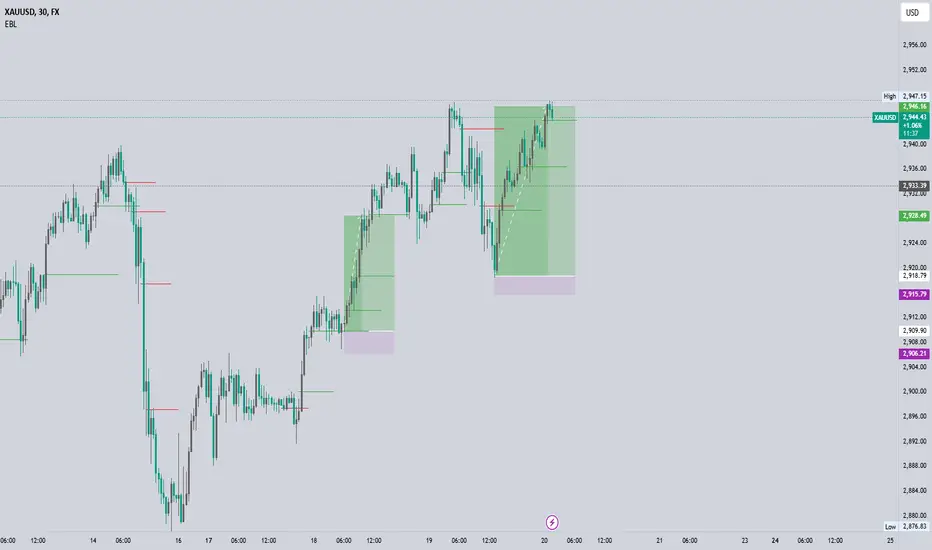
EBL - Enhanced BOS LogicEBL - Enhanced BOS Logic
The EBL (Enhanced Break of Structure Logic) script is a powerful tool for traders who want to identify and act on key structural shifts in the market. By combining visual cues, such as horizontal lines and dynamic arrows, the script highlights critical points of interest where market behavior may indicate significant bullish or bearish momentum.
What Makes EBL Unique?
Break of Structure (BOS) Identification:
The script dynamically detects when price breaks above or below significant highs and lows, marking these levels as key BOS points.
Once a BOS level is confirmed, it is displayed on the chart as a horizontal line, allowing traders to easily identify areas of potential support and resistance.
Real-Time Validation and Invalidations:
Bullish BOS levels remain active until a bearish candle closes below the initiating bullish candle.
Similarly, bearish BOS levels remain active until a bullish candle closes above the initiating bearish candle.
If a BOS level is invalidated, both the corresponding line and its arrow are automatically removed to maintain chart clarity.
Visual Clarity with Arrows and Lines:
Customizable triangle arrows (green for bullish and red for bearish) appear alongside lines to signal entry opportunities.
Traders can adjust line length, colors, and visibility of arrows to fit their charting style.
Alerts for Confirmation:
Receive alerts when bullish or bearish structures are confirmed, ensuring you never miss a signal even when away from your chart.
How the Script Works
Detection of Bullish and Bearish Structures:
The script identifies a "Bullish Break" when the price closes above the high of a bullish candle followed by a bearish one.
A "Bearish Break" is detected when the price closes below the low of a bearish candle followed by a bullish one.
Line and Arrow Placement:
Horizontal lines are drawn at the high or low of the respective BOS level.
Triangular arrows are plotted just below or above the respective levels to indicate potential trade opportunities.
Automatic Cleanup:
When a line is invalidated by opposing market movement, both the line and its connected arrow are automatically removed from the chart.
How to Use EBL
Settings:
Adjust line colors (green for bullish, red for bearish) to suit your charting theme.
Customize arrow visibility or hide lines if you prefer a less cluttered chart.
Set the horizontal line length to match your desired timeframe and analysis depth.
Trading Concepts:
Trend Reversal Zones: Use invalidated BOS levels as signals for possible trend reversals.
Momentum Trading: Follow confirmed BOS levels to identify areas where price momentum is likely to continue.
Dynamic Support and Resistance: Leverage the lines to identify evolving support and resistance zones.
Alerts:
Enable alerts to receive notifications when bullish or bearish trends are confirmed, allowing you to stay informed without constant monitoring.
Conceptual Basis
This script is based on the widely used market structure concept, which is fundamental to price action trading. By tracking the highs and lows created by bullish and bearish movements, the EBL script provides an objective and systematic approach to identifying and trading key structural points in the market.
With the EBL - Enhanced BOS Logic, traders can visually and systematically track market structure, identify potential trade setups, and maintain a cleaner chart with automated line and arrow management. This script is ideal for trend-following, scalping, and swing trading strategies across all markets and timeframes.
스크립트에서 "swing trading"에 대해 찾기
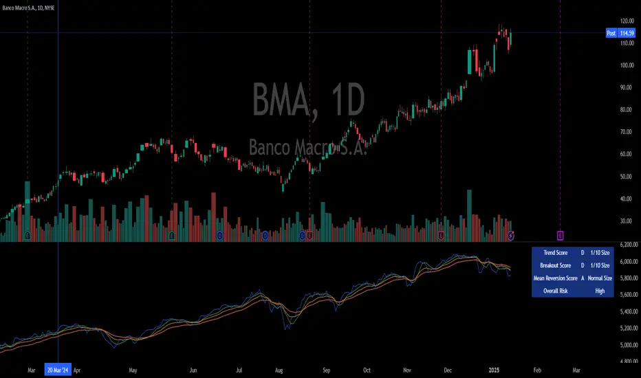
Integrated Market Analysis IndicatorThe Integrated Market Analysis Indicator is designed to provide traders with a macro perspective on market conditions, focusing on the S&P 500 (SPX) and market volatility (VIX), to assist in swing trading decisions. This script integrates various technical indicators and market health metrics to generate scores that help in assessing the overall market trend, potential breakout opportunities, and mean reversion scenarios. It is tailored for traders who wish to align their individual stock or index trades with broader market movements.
Functionality:
Trend Analysis: The script analyzes the trend of the S&P 500 using moving averages (5-day SMA, 10-day EMA, 20-day EMA) to determine whether the market is in an uptrend, downtrend, or neutral state. This provides a foundation for understanding the general market direction.
Volatility Assessment: It uses the VIX to gauge market volatility, which is crucial for risk management. The script calculates thresholds based on the 20-day SMA of the VIX to categorize the market volatility into low, medium, or high.
Market Breadth: The advance/decline ratio (A/D ratio) from the USI:ADVQ and USI:DECLQ indices gives an indication of market participation, helping to understand if the market movement is broad-based or led by a few stocks.
Scoring System: Three scores are calculated:
Trend Score: Evaluates the market trend in conjunction with volume, market breadth, and VIX to assign a grade from 'A' to 'D'.
Breakout Score: Assesses potential breakout conditions by looking at price action relative to dynamic support/resistance levels, short-term momentum, and volume.
Mean Reversion Score: Identifies conditions where mean reversion might occur, based on price movement, volume, and high VIX levels, indicating potential overbought or oversold conditions.
Risk Management: Position sizing recommendations are provided based on VIX levels and the calculated scores, aiming to adjust exposure according to market conditions.
How to Use the Script:
Application: Apply this indicator on any stock or index chart in TradingView. Since it uses data from SPX and VIX, the scores will reflect the macro environment regardless of the underlying chart.
Interpreting Scores:
Trend Score: Use this to gauge the overall market direction. An 'A' score might suggest a strong uptrend, making it a good time for bullish trades, while a 'D' could indicate a bearish environment.
Breakout Score: Look for 'A' scores when considering trades that aim to capitalize on breakouts. A 'B' might suggest a less certain breakout, requiring more caution.
Mean Reversion Score: A 'B' or 'A' here might be a signal to look for trades where you expect the price to revert to the mean after an extreme move.
Risk Management: Use the suggested position sizes ('Normal Size', '1/3 Size', '1/4 Size', '1/10 Size') to manage your risk exposure. Higher VIX levels or lower scores suggest reducing position sizes to mitigate risk.
Visual Cues: The script plots various SMAs, EMAs, and dynamic support/resistance levels, providing visual indicators of where the market might find support or resistance, aiding in entry and exit decisions.
How NOT to Use the Script:
Not for Intraday Trading: This indicator is designed for swing trading, focusing on daily or longer timeframes. Using it for intraday trading might not provide the intended insights due to its macro focus.
Avoid Over-reliance: While the script provides valuable insights, do not rely solely on it for trading decisions. Always consider additional analysis, news, and fundamental data.
Do Not Ignore Individual Stock Analysis: Although the script gives a macro view, individual stock analysis is crucial. The macro conditions might suggest a trend, but stock-specific factors could contradict this.
Not for High-Frequency Trading: The script's logic and the data it uses are not optimized for high-frequency trading strategies where microsecond decisions are made.
Misinterpretation of Scores: Do not misinterpret the scores as absolute signals. They are guidelines that should be part of a broader trading strategy.
Logic Explanation:
Moving Averages: The script uses different types of moving averages to smooth out price data, providing a clearer view of the trend over short to medium-term periods.
ATR for Volatility: The Average True Range (ATR) is used to calculate dynamic support and resistance levels, giving a sense of how much price movement can be expected, which helps in setting realistic expectations for price action.
VIX for Risk: By comparing current VIX levels to its 20-day SMA, the script assesses market fear or complacency, adjusting risk exposure accordingly.
Market Breadth: The A/D ratio helps to understand if the market movement is supported by a broad base of stocks or if it's narrow, which can influence the reliability of the trend.
This indicator should be used as part of a comprehensive trading strategy, providing a macro overlay to your trading decisions, ensuring you're not fighting against the broader market trends or volatility conditions. Remember, while it can guide your trading, always integrate it with other forms of analysis for a well-rounded approach.
EBL - Enigma BOS Logic Select Higher Time FrameThe "EBL – Enigma BOS Logic" is a unique multi-timeframe trading indicator designed for traders who rely on structured price action and key level retests to find high-probability trade opportunities. This indicator automates the identification of significant price levels on a higher timeframe, plots them across all lower timeframes, and provides actionable signals (buy/sell) when price retests those levels. It is ideal for traders who focus on lower timeframes for precise entries while using higher timeframe structure for trend confirmation.
How the Indicator Works
Key Level Detection:
The indicator allows the user to select a key level timeframe (e.g., 1H, 4H, Daily, Weekly). It then identifies Break of Structure (BOS) levels on the selected timeframe.
When a bullish-to-bearish or bearish-to-bullish reversal is detected on the selected timeframe, the corresponding high or low of the reversal candle is stored as a key level.
These key levels are plotted as horizontal lines on all lower timeframes, helping the trader visualize critical support and resistance zones across multiple timeframes.
Retest Confirmation:
Once a key level is established, the indicator continuously monitors the price action on lower timeframes.
If the price touches or crosses a key level, it is considered a retest, and an alert is generated.
The indicator plots a retest marker (customizable as a circle or diamond) at the exact price level where the retest occurred, providing a clear visual cue for the trader.
Trading Signals:
When a retest is detected, a table is displayed on the chart with the following information:
The trading pair.
The signal direction (Buy/Sell).
The price at which the retest occurred.
This table gives traders instant insight into actionable opportunities, making it easier to focus on live market conditions without missing critical retests.
Key Features
Multi-Timeframe Analysis: The indicator focuses on a higher timeframe selected by the user, ensuring that only the most relevant key levels are plotted for lower timeframe trading.
Dynamic Retest Signals: It dynamically identifies when price retests a key level and provides both visual markers and real-time alerts.
Customizable Retest Markers: Users can customize the retest marker's shape (circle/diamond) and color to suit their preferences.
Signal Table: A built-in table displays clear buy or sell signals when retests occur, ensuring that traders have all the necessary information at a glance.
Alerts: The indicator supports real-time alerts for retests, helping traders stay informed even when they are not actively monitoring the chart.
How to Use the Indicator
Select a Key Level Timeframe:
In the input settings, choose a higher timeframe (e.g., 4H or Daily) to define key levels.
The indicator will calculate Break of Structure (BOS) levels on the selected timeframe and plot them as horizontal lines across all lower timeframes.
Monitor Lower Timeframes for Retests:
Switch to a lower timeframe (e.g., 15m, 5m) to wait for price to approach the key levels plotted by the indicator.
When a retest occurs, observe the signal table and retest marker for actionable trade signals.
Act on Buy/Sell Signals:
Use the information provided by the signal table to make trading decisions.
For a buy signal, wait for bullish confirmation (e.g., price holding above the retested level).
For a sell signal, wait for bearish confirmation (e.g., price holding below the retested level).
Trading Concepts and Underlying Logic
The indicator is based on the Break of Structure (BOS) concept, a core principle in price action trading. BOS levels represent points where the market shifts its trend direction, making them critical zones for potential reversals or continuations.
By focusing on higher timeframe BOS levels, the indicator helps traders align their lower timeframe entries with the overall market trend.
The concept of retests is used to confirm the validity of a key level. A retest occurs when the price returns to a previously identified BOS level, offering a high-probability entry point.
Use Cases
Scalping: Traders who prefer lower timeframe scalping can use the indicator to align their trades with higher timeframe key levels, increasing the likelihood of successful trades.
Swing Trading: Swing traders can use the indicator to identify key reversal zones on higher timeframes and plan their trades accordingly.
Intraday Trading: Intraday traders can benefit from the real-time alerts and signals generated by the indicator, ensuring they never miss critical retests during active trading hours.
Conclusion
The "EBL – Enigma BOS Logic" is a powerful tool for traders who want to enhance their price action trading by focusing on key levels and retests across multiple timeframes. By automating the identification of BOS levels and providing clear retest signals, it helps traders make more informed and confident trading decisions. Whether you are a scalper, intraday trader, or swing trader, this indicator offers valuable insights to improve your trading performance.

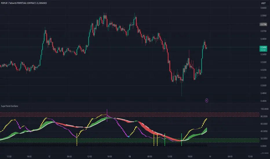
SuperTrend Oscillator# SuperTrend Oscillator - User Guide
## Chapter 1: Introduction
The SuperTrend Oscillator is a versatile and powerful indicator designed to assist traders in identifying market trends, reversals, and momentum. This indicator leverages complex calculations and smoothing techniques to provide actionable signals. The SuperTrend Oscillator can be used for intraday, swing, and positional trading, making it suitable for various market conditions and trading styles.
## Chapter 2: Calculations Overview
The SuperTrend Oscillator relies on a combination of:
Trend Strength : Calculated using a weighted summation of price deviations over short and long periods.
Bull and Bear Lines : Derived from the typical price and smoothed using EMA to highlight underlying market trends.
Signal Lines : The crossing of trend lines and EMAs identifies potential entry and exit points.
### Key Elements:
- Typical Price : An average of open, high, low, and close prices.
- Lowest Low and Highest High **: Identified over specific periods to normalize the oscillator values.
- Exponential Moving Averages (EMA) : Smoothing techniques to reduce noise and improve trend clarity.
- Threshold Levels : Critical levels (e.g., 25, 75) are used to identify oversold and overbought conditions.
## Chapter 3: Oscillator Visualization
The SuperTrend Oscillator plots two main components:
Bull and Bear Lines : Represent short-term and long-term trends.
EMA Crossovers : Highlight shifts in market momentum.
### Candle Width and Color:
- Yellow Candles : Indicate a bullish phase in the short-term trend.
- Fuchsia Candles : Indicate a bearish phase in the short-term trend.
- Green Candles : Signal an uptrend in the long-term trend.
- Red Candles : Signal a downtrend in the long-term trend.
NB: The width of the oscillator candles reflects the strength of the trend, with wider candles indicating stronger trends.
## Chapter 4: Signal Generation
### Entry Signals:
- ** Fast Buy Signal **: Occurs when:
- The short-term trend transitions from bearish (fuchsia) to bullish (yellow).
- The short-term bull line is below 40.
- The long-term bull line is above 50.
- Accumulation/distribution signals are positive.
- ** Fast Sell Signal **: Occurs when:
- The short-term trend transitions from bullish (yellow) to bearish (fuchsia).
- The short-term bull line is above 60.
- The long-term bull line is below 45.
- Accumulation/distribution signals are negative.
### Exit Signals:
- ** Super Long Exit / Short Entry **: Triggered when:
- Both the short-term and long-term trends indicate overbought conditions (bull line > 75).
- Crossunder between trend and bull lines.
- ** Super Short Exit / Long Entry **: Triggered when:
- Both the short-term and long-term trends indicate oversold conditions (bull line < 25).
- Crossover between trend and bull lines.
## Chapter 5 : Trading Strategies
### Trend Following:
1. ** Identify the Trend **:
- Use the color and slope of the oscillator candles.
- Green and yellow candles indicate an uptrend; red and fuchsia candles indicate a downtrend.
2. ** Enter Trades **:
- Look for fast buy signals in an uptrend and fast sell signals in a downtrend.
3. ** Exit Trades **:
- Use super exit signals to close positions.
### Range Trading:
1. ** Identify Ranges **:
- Monitor bull and bear lines oscillating within 25 to 75.
2. ** Enter Trades **:
- Buy near oversold conditions (bull line < 25).
- Sell near overbought conditions (bull line > 75).
### Divergence Trading:
1. ** Identify Divergence **:
- Compare the oscillator with price action.
2. ** Enter Trades **:
- Buy when the price makes a lower low, but the oscillator makes a higher low.
- Sell when the price makes a higher high, but the oscillator makes a lower high.
## Chapter 6: Alerts
The SuperTrend Oscillator includes built-in alerts for:
1. **Super Long**: When both short-term and long-term entry signals align.
2. **BankEntry Long**: When either short-term or long-term entry signals are triggered.
3. **Super Short**: When both short-term and long-term exit signals align.
4. **BankExit Short**: When either short-term or long-term exit signals are triggered.
### Setting Alerts:
To enable alerts, use the alert messages included in the script. These alerts provide timely notifications for trade entries and exits.
## Chapter 7: How to Use
1. **Add the Indicator**:
- Apply the SuperTrend Oscillator to your chart.
2. **Monitor Signals**:
- Use visual cues (colors and shapes) to identify trade opportunities.
3. **Set Alerts**:
- Configure alerts to receive notifications.
### Example Use Case:
- For intraday trading, set the oscillator to shorter periods for quicker signals.
- For swing trading, use longer periods to reduce noise and capture broader trends.
## Chapter 8: Disclaimer
The SuperTrend Oscillator is a tool to aid trading decisions and does not guarantee profits. Always combine it with risk management and other analysis techniques to ensure a comprehensive trading strategy.
Channel Breakout by NatXateThe Channel Breakout by NatXate is a multi-channel technical indicator designed to identify potential breakout opportunities based on a combination of Keltner Channels, Donchian Channels, and Bollinger Bands.
This indicator helps traders pinpoint buy and sell signals by analyzing price behavior around key channel boundaries, while filtering out false signals using volatility and momentum criteria such as the Average True Range (ATR) and Bollinger Bands Width (BBW).
Key Features:
Keltner Channel:
The Keltner Channel is calculated using an Exponential Moving Average (EMA) and ATR to define upper and lower boundaries.
The upper and lower Keltner boundaries serve as potential breakout levels.
Donchian Channel:
The Donchian Channel tracks the highest high and lowest low over a user-defined period.
Price breaking above or below these boundaries indicates a potential long or short opportunity.
Bollinger Bands:
Bollinger Bands use a Simple Moving Average (SMA) and standard deviation to define dynamic support and resistance levels.
The upper and lower Bollinger boundaries provide an additional layer of confirmation for breakouts.
Bollinger Bands Width (BBW) Filter:
Measures the width of the Bollinger Bands, which reflects market volatility.
A minimum BBW threshold (minBBW) ensures signals are only generated during periods of sufficient volatility, helping to avoid false signals in consolidating markets.
ATR Filter:
The ATR is used to measure market volatility.
Only signals with ATR exceeding a user-defined percentage of the current price (atrThresholdPercent) are considered valid.
Buy and Sell Conditions:
Buy Signal:
Price breaks above the upper boundary of any of the three channels (Keltner, Donchian, or Bollinger Bands).
ATR is above its threshold, indicating sufficient volatility.
BBW is above the minBBW threshold.
Sell Signal:
Price breaks below the lower boundary of any of the three channels.
ATR is above its threshold.
BBW is above the minBBW threshold.
Non-Repainting Logic:
Signals are confirmed only after the bar closes (barstate.isconfirmed), preventing repainting and ensuring reliable signal generation.
Visual Signals:
Buy signals are marked with a green "B" label below the bar.
Sell signals are marked with a red "S" label above the bar.
The upper and lower boundaries of the Keltner Channel, Donchian Channel, and Bollinger Bands are plotted for visual clarity.
Alerts:
Separate alerts are available for Buy and Sell signals:
Buy Signal: "Channel Breakout Buy Signal by NatXate detected!"
Sell Signal: "Channel Breakout Sell Signal by NatXate detected!"
Alerts trigger once per bar close, making it suitable for real-time trading or monitoring.
How It Works:
Trend Identification:
The indicator identifies trends based on price breakouts above or below the channel boundaries.
Volatility Filtering:
Both ATR and BBW filters ensure that only high-probability breakout signals are shown, reducing noise in low-volatility environments.
Signal Confirmation:
Signals are confirmed after the bar closes to prevent false positives or premature triggers.
Parameters:
Keltner Channel Parameters:
lengthKC: Period for the Keltner Channel's EMA.
multKC: ATR multiplier for Keltner Channel boundaries.
Donchian Channel Parameters:
lengthDC: Period for calculating the highest high and lowest low.
Bollinger Bands Parameters:
lengthBB: Period for the Bollinger Bands' SMA.
multBB: Standard deviation multiplier for Bollinger Bands boundaries.
ATR Filter:
atrLength: Period for calculating ATR.
atrThresholdPercent: Minimum ATR as a percentage of the price for valid signals.
BBW Filter:
minBBW: Minimum Bollinger Bands Width required for signal generation.
Use Cases:
Breakout Trading:
Detect potential buy and sell opportunities when price breaks key channel boundaries during high volatility.
Trend Following:
Use the indicator to confirm trends and enter trades in the direction of the breakout.
Avoiding Low-Volatility Periods:
The BBW and ATR filters help avoid false signals in consolidating or choppy markets.
Recommended Usage:
Combine this indicator with additional tools such as volume analysis or momentum oscillators (e.g., MACD, RSI) for further confirmation.
Suitable for various timeframes, from intraday to swing trading.
Backtest thoroughly to adjust parameters for the specific market and timeframe you trade.

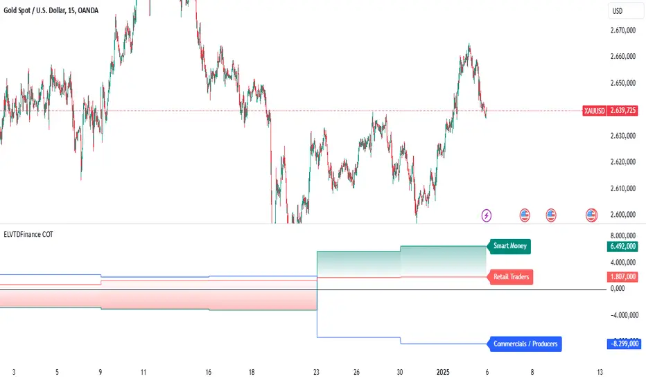
ELVTDFinance COTELVTDFinance COT Indicator:
The ELVTDFinance COT Indicator is a sophisticated tool designed for traders seeking to gain deeper insights into market dynamics through Commitment of Traders (COT) data. This indicator visually represents the net positions of three distinct market participant groups: Commercials, Non-Commercials (Smart Money), and Retail Traders, enabling traders to interpret sentiment and potential market direction.
Key Features:
COT Data Integration:
Pulls weekly COT data from TradingView's LibraryCOT.
Distinguishes between long and short positions for each participant type:
Commercials: Producers or hedgers with vested interest in stabilizing market conditions.
Non-Commercials (Smart Money): Speculative traders often driving trends.
Retail Traders: Non-reportable positions, typically indicative of retail sentiment.
Net Position Calculations:
The indicator calculates and plots the net position (long - short) for each group.
Provides a clear visual distinction of market positioning trends over time.
Dynamic Plot Styles:
Adapts to the timeframe:
Weekly/Monthly: Line plots for a smoother view of trends.
Other Timeframes: Step-line plots for precise position changes.
Color Coding:
Blue: Commercials (Producers/Hedgers).
Teal: Non-Commercials (Smart Money).
Red: Retail Traders.
Highlights Market Sentiment:
Uses a color-shift mechanism based on the relative strength of Smart Money vs. Retail Traders.
Turns green when Smart Money positions dominate retail sentiment, signaling potential trend reversals or continuations.
Labels and Visual Aids:
Displays labels with net positions for each participant group on the chart.
Ensures clarity in understanding which group is leading the market at any point in time.
Advanced Visual Fill:
Shaded regions between Smart Money and Retail Traders provide an intuitive visual cue for sentiment alignment or divergence.
Support for Scalping and Swing Trading:
Offers utility for both short-term scalping strategies and longer-term swing trades by identifying the actions of dominant market forces.
How It Works:
The indicator retrieves and processes COT data weekly.
Net positions are calculated and compared across participant groups.
Plots are dynamically updated to reflect market sentiment.
A zero-line acts as a reference to gauge whether the group is net long or net short.
Use Case Examples:
Trend Reversal Signals:
If Smart Money positions increase while Retail Traders are heavily short, it may signal a potential bullish reversal.
Trend Confirmation:
Alignments between Smart Money and Retail Trader trends can confirm a strong directional move.
Hedging Insights:
Commercials often hedge against price movements. Their actions can hint at supply-side expectations.
By leveraging the ELVTDFinance COT Indicator, traders can better understand the driving forces behind market moves and incorporate this into their decision-making processes. This tool is particularly valuable for analyzing sentiment shifts and gauging market momentum.
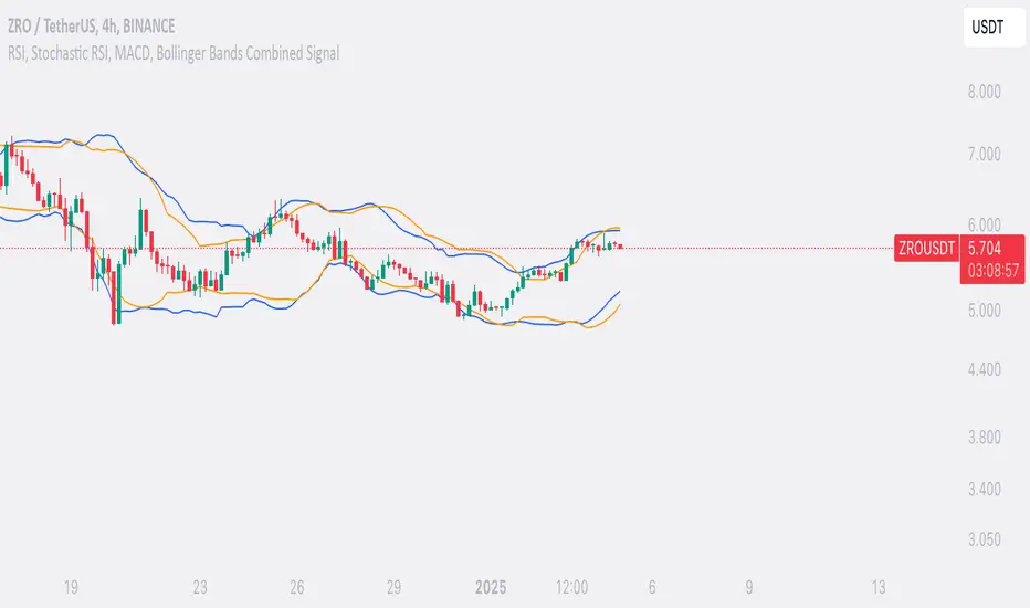
SufinBDThis TradingView script combines RSI, Stochastic RSI, MACD, and Bollinger Bands to generate Buy and Sell signals on two different timeframes: 4-hour (4H) and Daily (1D). The strategy aims to provide entry and exit points based on a multi-indicator confirmation approach, helping traders make more informed decisions.
Features:
RSI (Relative Strength Index):
Measures the speed and change of price movements.
The script looks for oversold conditions (RSI below 30) for buy signals and overbought conditions (RSI above 70) for sell signals.
Stochastic RSI:
Measures the level of RSI relative to its high-low range over a given period.
A Stochastic RSI below 0.2 indicates oversold conditions, and a value above 0.8 indicates overbought conditions.
It helps identify overbought and oversold conditions in a more precise manner than regular RSI.
MACD (Moving Average Convergence Divergence):
A trend-following momentum indicator that shows the relationship between two moving averages of a security's price.
The MACD line crossing above the Signal line generates bullish signals, and vice versa for bearish signals.
Bollinger Bands:
A volatility indicator that consists of a middle band (SMA of price), an upper band, and a lower band.
When the price is below the lower band, it signals potential buy opportunities, while prices above the upper band signal potential sell opportunities.
Timeframe Usage:
The script calculates indicators for both the 4-hour (4H) and Daily (1D) timeframes.
The combined signals from these two timeframes are used to generate Buy and Sell alerts.
Buy Signal:
A Buy signal is generated when all of the following conditions are met:
RSI on both 4H and 1D is below 30 (oversold conditions).
Stochastic RSI on both timeframes is below 0.2.
The MACD line is above the Signal line on both timeframes.
The price is below the lower Bollinger Band on both the 4H and 1D charts.
Sell Signal:
A Sell signal is generated when all of the following conditions are met:
RSI on both 4H and 1D is above 70 (overbought conditions).
Stochastic RSI on both timeframes is above 0.8.
The MACD line is below the Signal line on both timeframes.
The price is above the upper Bollinger Band on both the 4H and 1D charts.
Visuals:
Buy signals are marked with green labels below the bars.
Sell signals are marked with red labels above the bars.
Bollinger Bands are displayed on the chart with the upper and lower bands marked in blue (for 4H) and orange (for 1D).
Purpose:
This script aims to provide more reliable buy/sell signals by combining indicators across multiple timeframes. It is ideal for traders who want to use multiple confirmation points before entering or exiting a trade.
How to Use:
Apply the script to any chart on TradingView.
Look for Buy and Sell signals that meet the conditions above.
You can adjust the timeframe (e.g., 4H or 1D) based on your trading strategy.
This script can be used for intraday trading, swing trading, or position trading depending on your preferred timeframes.
Example of Signal Interpretation:
Buy Signal:
If all conditions are met (e.g., RSI is under 30, Stochastic RSI is under 0.2, MACD is bullish, and price is below the lower Bollinger Band on both the 4-hour and daily charts), the script will show a green "BUY" label below the price bar.
Sell Signal:
If all conditions are met (e.g., RSI is over 70, Stochastic RSI is over 0.8, MACD is bearish, and price is above the upper Bollinger Band on both timeframes), the script will show a red "SELL" label above the price bar.
This combination of indicators offers a multi-layered confirmation approach, which aims to reduce the risk of false signals and increase the reliability of your trading decisions.
Dual Spectrum RSI [CHE]Dual Spectrum RSI Indicator
Introduction
The Dual Spectrum RSI Indicator is an innovative and robust tool designed for traders aiming to enhance their market analysis and trading precision. This script leverages multi-timeframe analysis, advanced RSI configurations, and customizable visualization options to provide actionable insights for both trend-following and contrarian strategies.
Key Features
1. Dynamic Timeframe Selection
- Automatically adapts the resolution based on the current chart's timeframe.
- Options to switch between Auto Timeframe, Multiplier-based Timeframe, or Manual Resolution for complete control.
2. Advanced RSI Calculations
- Dual RSI setup for multi-layered analysis:
- Primary RSI for trend identification on the higher timeframe (HTF).
- Secondary RSI for entry signals with oversold/overbought crossovers on the current chart timeframe.
3. EMA Integration on Higher Timeframe (HTF)
- The Exponential Moving Average (EMA) acts as a robust trend filter, calculated on the Higher Timeframe (HTF).
- This ensures that trade signals align with the broader market trend, providing a strategic edge and reducing noise from lower timeframes.
4. Signal Clarity
- Visual labels for Buy and Sell signals directly on the chart.
- Dynamic stop-loss suggestions that adjust based on EMA crossovers and trend changes.
5. Customizable Visualization
- Gradient fills for overbought/oversold zones provide intuitive visual cues.
- User-friendly inputs for adjusting separator lines, color schemes, and label styles.
6. Comprehensive Data Display
- Real-time updates in an Info Box, showing active timeframe settings and resolution.
- Easy-to-understand trend conditions, making it accessible for both novice and professional traders.
Benefits for Traders
1. Precision in Decision-Making
The multi-timeframe capability ensures that traders always have the broader market context, minimizing false signals and enhancing trade accuracy.
2. Flexibility and Customization
Fully adjustable parameters allow traders to tailor the indicator to their unique trading style, whether scalping, day trading, or swing trading.
3. Enhanced Market Insights
By combining HTF trend filters, RSI dynamics, and EMA thresholds, this indicator provides a holistic view of market conditions.
4. User-Friendly Interface
The clean layout and intuitive options make it easy to integrate this tool into any TradingView setup.
5. Increased Confidence in Trades
With visual aids such as labels, gradients, and a trend-detection mechanism, traders can make decisions with greater confidence and less emotional bias.
Example Use Cases
1. Trend-Following Strategy
- Utilize the HTF EMA filter to confirm bullish or bearish trends.
- Enter trades when the secondary RSI crosses oversold/overbought levels in the direction of the trend.
2. Reversal Strategy
- Identify overextended trends using RSI crossovers.
- Look for counter-trend opportunities with precise stop-loss placements.
3. Scalping Setup
- Switch to intraday timeframes and use the multiplier-based resolution to capture short-term market movements.
How to Use
1. Add the script to your TradingView chart by pasting the provided Pine Script code into the Pine Editor.
2. Adjust the Timeframe Type, RSI parameters, and EMA length to align with your trading goals.
3. Monitor the generated signals and use them in conjunction with your broader trading strategy.
Disclaimer
The content provided, including all code and materials, is strictly for educational and informational purposes only. It is not intended as, and should not be interpreted as, financial advice, a recommendation to buy or sell any financial instrument, or an offer of any financial product or service. All strategies, tools, and examples discussed are provided for illustrative purposes to demonstrate coding techniques and the functionality of Pine Script within a trading context.
Any results from strategies or tools provided are hypothetical, and past performance is not indicative of future results. Trading and investing involve high risk, including the potential loss of principal, and may not be suitable for all individuals. Before making any trading decisions, please consult with a qualified financial professional to understand the risks involved.
By using this script, you acknowledge and agree that any trading decisions are made solely at your discretion and risk.
Conclusion
The Dual Spectrum RSI Indicator is not just another technical tool—it's a comprehensive trading companion that adapts to your needs, simplifies market analysis, and boosts your trading performance. Whether you're a beginner or a seasoned trader, this indicator provides the edge you need to succeed in today's dynamic markets.
Try It Today!
Experience the power of multi-timeframe analysis and take your trading to the next level. Add the Dual Spectrum RSI Indicator to your TradingView arsenal now!
Best regards
Chervolino

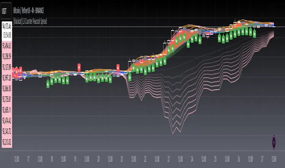
[blackcat] L3 Counter Peacock Spread█ OVERVIEW
The script titled " L3 Counter Peacock Spread" is an indicator designed for use in TradingView. It calculates and plots various moving averages, K lines derived from these moving averages, additional simple moving averages (SMAs), weighted moving averages (WMAs), and other technical indicators like slope calculations. The primary function of the script is to provide a comprehensive set of visual tools that traders can use to identify trends, potential support/resistance levels, and crossover signals.
█ LOGICAL FRAMEWORK
Input Parameters:
There are no explicit input parameters defined; all variables are hardcoded or calculated within the script.
Calculations:
• Moving Averages: Calculates Simple Moving Averages (SMA) using ta.sma.
• Slope Calculation: Computes the slope of a given series over a specified period using linear regression (ta.linreg).
• K Lines: Defines multiple exponentially adjusted SMAs based on a 30-period MA and a 1-period MA.
• Weighted Moving Average (WMA): Custom function to compute WMAs by iterating through price data points.
• Other Indicators: Includes Exponential Moving Average (EMA) for momentum calculation.
Plotting:
Various elements such as MAs, K lines, conditional bands, additional SMAs, and WMAs are plotted on the chart overlaying the main price action.
No loops control the behavior beyond those used in custom functions for calculating WMAs. Conditional statements determine the coloring of certain plot lines based on specific criteria.
█ CUSTOM FUNCTIONS
calculate_slope(src, length) :
• Purpose: To calculate the slope of a time-series data point over a specified number of periods.
• Functionality: Uses linear regression to find the current and previous slopes and computes their difference scaled by the timeframe multiplier.
• Parameters:
– src: Source of the input data (e.g., closing prices).
– length: Periodicity of the linreg calculation.
• Return Value: Computed slope value.
calculate_ma(source, length) :
• Purpose: To calculate the Simple Moving Average (SMA) of a given source over a specified period.
• Functionality: Utilizes TradingView’s built-in ta.sma function.
• Parameters:
– source: Input data series (e.g., closing prices).
– length: Number of bars considered for the SMA calculation.
• Return Value: Calculated SMA value.
calculate_k_lines(ma30, ma1) :
• Purpose: Generates multiple exponentially adjusted versions of a 30-period MA relative to a 1-period MA.
• Functionality: Multiplies the 30-period MA by coefficients ranging from 1.1 to 3 and subtracts multiples of the 1-period MA accordingly.
• Parameters:
– ma30: 30-period Simple Moving Average.
– ma1: 1-period Simple Moving Average.
• Return Value: Returns an array containing ten different \u2003\u2022 "K line" values.
calculate_wma(source, length) :
• Purpose: Computes the Weighted Moving Average (WMA) of a provided series over a defined period.
• Functionality: Iterates backward through the last 'n' bars, weights each bar according to its position, sums them up, and divides by the total weight.
• Parameters:
– source: Price series to average.
– length: Length of the lookback window.
• Return Value: Calculated WMA value.
█ KEY POINTS AND TECHNIQUES
• Advanced Pine Script Features: Utilization of custom functions for encapsulating complex logic, leveraging TradingView’s library functions (ta.sma, ta.linreg, ta.ema) for efficient computations.
• Optimization Techniques: Efficient computation of K lines via pre-calculated components (multiples of MA30 and MA1). Use of arrays to store intermediate results which simplifies plotting.
• Best Practices: Clear separation between calculation and visualization sections enhances readability and maintainability. Usage of color.new() allows dynamic adjustments without hardcoding colors directly into plot commands.
• Unique Approaches: Introduction of K lines provides an alternative representation of trend strength compared to traditional MAs. Implementation of conditional band coloring adds real-time context to existing visual cues.
█ EXTENDED KNOWLEDGE AND APPLICATIONS
Potential Modifications/Extensions:
• Adding more user-defined inputs for lengths of MAs, K lines, etc., would make the script more flexible.
• Incorporating alert conditions based on crossovers between key lines could enhance automated trading strategies.
Application Scenarios:
• Useful for both intraday and swing trading due to the combination of short-term and long-term MAs along with trend analysis via slopes and K lines.
• Can be integrated into larger systems combining this indicator with others like oscillators or volume-based metrics.
Related Concepts:
• Understanding how linear regression works internally aids in grasping the slope calculation.
• Familiarity with WMA versus SMA helps appreciate why different types of averaging might be necessary depending on market dynamics.
• Knowledge of candlestick patterns can complement insights gained from this indicator.
Prev Week & Day High/Low LinesTitle:
Advanced Weekly & Daily High/Low Levels with Alerts and Customization
Description:
This indicator automatically plots the high and low levels of the previous week and day, featuring advanced customization options and configurable alerts. It’s a powerful tool for traders who want to identify key support and resistance zones on any timeframe below weekly.
What Does This Indicator Do?
1. Identifies historical levels: Calculates and plots the highs and lows of the previous week and day, helping traders spot reversal points, zones of interest, and decision-making levels.
2. Real-time alerts: Notifies traders when the price approaches or crosses these key levels, allowing them to make decisions without constantly monitoring the chart.
3. Dynamic colors: Changes the color of the levels based on the price proximity, providing a clear visual signal about the immediate importance of each level.
Key Features
1. Total Customization:
• Fully adjustable line colors, styles (solid or dotted), and thicknesses.
• Optional labels for each level with customizable text, size, and position.
• Adaptable configurations to suit different trading styles (scalping, swing trading, intraday).
2. Smart Alerts:
• Set alerts when the price touches or approaches the plotted levels.
• Instant notifications, ideal for trading breakouts or pullbacks at key levels.
3. Optimization and Efficiency:
• Works on all timeframes below weekly, avoiding unnecessary calculations.
• Real-time updates to ensure levels are always accurate.
4. Clear Visualization:
• Dynamic colors for levels close to the current price.
• Projected lines extending into the future to help plan trades.
• Advanced label options, including customizable text and different chart positions.
How It Works
The indicator uses advanced logic to automatically detect day and week transitions based on market time. It calculates and updates the high and low levels efficiently, ensuring that the data reflects the active timeframe. The levels can be projected forward and highlighted with customizable colors and labels.
Additionally, with configurable alerts, traders can receive real-time notifications when the price interacts with these levels, enabling them to respond quickly to market changes.
How to Use It
1. Add the indicator: Apply it to your chart in TradingView.
2. Set up the options:
• Customize the colors, thicknesses, and styles of the lines.
• Adjust the label text and position to suit your preferences.
• Enable alerts for key levels.
3. Utilize the levels: Watch the indicator automatically plot the high and low levels, and use the visual signals and alerts to make informed trading decisions.
Benefits for Traders
• Saves time: No need to manually calculate historical support and resistance levels.
• Improves accuracy: Levels are automatically recalculated and updated in real-time.
• Versatility: Perfect for any trading style (scalping, swing, intraday).
• Real-time alerts: Stay informed about key levels even when not watching the chart.
• Intuitive visualization: Dynamic colors and adjustable labels make technical analysis easier.
Note:
This indicator is unique due to its configurable alerts, advanced customization options, and dynamic colors, setting it apart from similar scripts available on TradingView. It is designed for traders seeking a clear and functional visual tool to make quick and accurate market decisions.

TCSE24TCSE24 or Trendband Cycle Special Edition is designed to help create a simple trading plan by identifying potential Entry, Exit, Target Price, and Stop Loss. I use TCSE24 as a guide for short-term swing trading!
Please note, TCSE24 is not a directional indicator but fits better in Trend Following Strategy.
Only work with chart that have volume by default
Signals for Bullish Trade
1. Trendband Below Candlestick
Filled Red with a Purple Line.
2. Cycle Begin
Bar Color: Vivid Green.
Green Circle Above Candlestick: Target Price.
Green Circle Below Candlestick: Pullback Entry.
Red Circle Below Candlestick: Stop Loss.
3. Breakout
Bar Color: Lemon Green.
Green Circle Below Candlestick: Pullback Entry.
Red Circle Below Candlestick: Stop Loss.
4. Broken Minor Support
Bar Color: Yellow.
Price closes below the lowest low of the last 4 candles.
5. Volume Test
Green Triangle-Up below Candlestick.
Current bar shows 3 consecutive falling volumes.
6. Inside Bar
Orange Triangle-Up below Candlestick.
High and low are within the high and low of the previous candlestick.
7. Box Trading
Purple Diamond
8. Cycle End
Bar Color: Red.
Red Triangle-Up below Candlestick.
9. Info Panel
Background Green, turning Yellow after 20 bars from Cycle Begin.
Background Red when Cycle Ends.
Displays info such as Current Price, Target Price, Pullback Price, Stop Loss.
________________________________________
Signals for Bearish Trade
1. Trendband Above Candlestick
Filled with Blue.
2.Short Selling Begin
Bar Color: Blue.
Blue Circle Above Candlestick: Stop Loss.
Blue Circle Below Candlestick: Target Price.
3. Breakdown
Blue Circle Above Candlestick: Stop Loss.
4. Short Selling End
Bar Color: White.
Blue Triangle-Down above Candlestick.
5. Info Panel
Background Blue throughout the trade.
________________________________________
Bullish Trade Entry Suggestions
1. Ensure Cycle Begin is confirmed:
Buy near the closing price.
Use a Buy Stop 2 ticks higher than Cycle Begin's highest price.
Use a Buy Limit at the pullback price.
Wait for a signal candlestick, then Buy the next day if the price rises above the signal candlestick’s high.
2. Ensure Breakout is confirmed:
Buy near the closing price.
Use a Buy Stop 2 ticks higher than Breakout’s highest price.
Use a Buy Limit at the pullback price.
3. Box Trading:
Buy on the third day (T3).
Buy above the Box Trading line.
4. Candlestick Signal:
Ensure the signal candlestick is confirmed:
Look for Doji, Spinning Top, or Hammer patterns.
Buy the next day if the price rises above the signal candle's high.
________________________________________
Bullish Trade Exit Suggestions
1. Target Sell
Sell when the Target Price (TP) is reached or hold as long as Stop Loss isn’t hit.
Sell if the price doesn’t move, doesn’t reach the target, or doesn’t hit the Stop Loss after 20 candles from Cycle Begin.
Sell if the price closes below the Stop Loss.
2. Candlestick Signal
Look for Doji, Spinning Top, or Hammer patterns.
Sell the next day if the price drops below the signal candle's low.
________________________________________
Bearish Trade Suggestions
Ensure Short Selling Signal or Breakdown is confirmed:
Sell near the closing price.
Close the position at Target 1, Target 2, Target 3.
Close the position if Stop Loss is hit or when Short Selling End appears.
________________________________________
Any alert() function call freq
Once_per_bar_close
Cycle Begin, Inside Bar, Doji, Hammer, Spinning Top, Box Trading, Volume Test, Short Selling
Once_per_bar
Breakout, Cycle End
For educational purposes only and should not be taken as advice on how to invest your capital. Always speak with a professional financial planner or advisor before making any investment decisions.

MERCURY by DrAbhiramSivprasad"MERCURY by DrAbhiramSivprasad"
Developed from over 10 years of personal trading experience, the Mercury Indicator is a strategic tool designed to enhance accuracy in trading decisions. Think of it as a guiding light—a supportive tool that helps traders refine and build more robust strategies by integrating multiple powerful elements into a single indicator. I’ll be sharing some examples to illustrate how I use this indicator in my own trading journey, highlighting its potential to improve strategy accuracy.
Reason behind the combination of emas , cpr and vwap is it provides very good support and resistance in my trading carrier so now i brought them together in one plate
How It Works:
Mercury combines three essential elements—EMA, VWAP, and CPR—each of which plays a vital role in detecting support and resistance:
Exponential Moving Averages (EMAs): Known for their strength in providing dynamic support and resistance levels, EMAs help in identifying trends and shifts in momentum. This indicator includes a dashboard with up to nine customizable EMAs, showing whether each is acting as support or resistance based on real-time price movement.
Volume Weighted Average Price (VWAP): VWAP also provides valuable support and resistance, often regarded as a fair price level by institutional traders. Paired with EMAs, it forms a dual-layered support/resistance system, adding an additional level of confirmation.
Central Pivot Range (CPR): By combining CPR with EMAs and VWAP, Mercury highlights “traffic blocks” in your target journey. This means it identifies zones where price is likely to stall or reverse, providing additional guidance for navigating entries and exits.
Why This Combination Matters:
Using these three tools together gives you a more complete view of the market. VWAP and EMAs offer dynamic trend direction and support/resistance, while CPR pinpoints critical price zones. This combination helps you find high-probability trades, adding clarity to complex market situations and enabling stronger confirmation on trend or reversal decisions.
How to Use:
Trend Confirmation: Check if all EMAs are aligned (green for uptrend, red for downtrend), which is visible in the EMA dashboard. An alignment across VWAP, CPR, and EMAs signifies high confidence in trend direction.
Breakouts & Breakdowns: Mercury has an alert system to signal when a price breakout or breakdown occurs across VWAP, EMA1, and EMA2. This can help in spotting strong directional moves.
Example Application: In my trading, I use Mercury to identify support/resistance zones, confirming trends with EMA/VWAP alignment and using CPR as a checkpoint. I find this especially useful for day trading and swing setups.
Recommended Timeframes:
Day Trading: 5 to 15-minute charts for swift, actionable insights.
Swing Trading: 1-hour or 4-hour charts for broader trend analysis.
Note:
The Mercury Indicator should be used as a supportive tool rather than a standalone strategy, guiding you toward informed decisions in line with your trading style and goals.
EXAMPLE OF TRADE
you can see the cart of XAUUSD on 11th nov 2024
1.SHORT POSITION - TIME FRAME 15 MIN
So here for a short position you need to wait for a breakdown candle which will print in orange post the candle you need to check ema dashboard is completly red that indicates no traffic blocks in your journey to destiny target from ema's and you can take the target from nearest cpr support line
TAKEN IN XAUUSD you can see in chart of XAUUSD on 7th nov
2.LONG POSITION - TIME FRAME 15 MIN -
So here for long position you need to wait for a breakout candle from indicator thats here is blue and check all ema boxes are green and candle body should close above all the 3 lines here it is the both ema 1 and 2 and the vwap line then you can take and entry and your target will be the nearest resistance from the daily cpr
3. STOP LOSS CRITERIA
After the entry any candle close below any of the last line from entry for example we have 3 lines vwap and ema 1 and 2 lines and u have made an entry and the last line before the entry is vwap then if any candle closes below vwap can be considered as stoploss like wise in any lines
The MERCURY indicator is a comprehensive trading tool designed to enhance traders' ability to identify trends, breakouts, and reversals effectively. Created by Dr. Abhiram Sivprasad, this indicator integrates several technical elements, including Central Pivot Range (CPR), EMA crossovers, VWAP levels, and a table-based EMA dashboard, to offer a holistic trading view.
Core Components and Functionality:
Central Pivot Range (CPR):
The CPR in MERCURY provides a central pivot level along with Below Central (BC) and Top Central (TC) pivots. These levels act as potential support and resistance, useful for identifying reversal points and zones where price may consolidate.
Exponential Moving Averages (EMAs):
MERCURY includes up to nine EMAs, with a customizable EMA crossover alert system. This feature enables traders to see shifts in trend direction, especially when shorter EMAs cross longer ones.
VWAP (Volume-Weighted Average Price):
VWAP is incorporated as a dynamic support/resistance level and, combined with EMA crossovers, helps refine entry and exit points for higher probability trades.
Breakout and Breakdown Alerts:
MERCURY monitors conditions for upside and downside breakouts. For an upside breakout, all EMAs turn green and a candle closes above VWAP, EMA1, and EMA2. Similarly, all EMAs turning red, combined with a close below VWAP and EMA1/EMA2, signals a downside breakdown. Continuous alerts are available until the trend shifts.
Real-Time EMA Dashboard:
A table displays each EMA’s relative position (Above or Below), helping traders quickly gauge trend direction. Colors in the table adjust to long/short conditions based on EMA alignment.
Usage Recommendations:
Trend Confirmation:
Use the CPR, EMA alignments, and VWAP to confirm uptrends and downtrends. The table highlights trends, making it easy to spot long or short setups at a glance.
Breakout and Breakdown Alerts:
The alert system is customizable for continuous notifications on critical price levels. When all EMAs align in one direction (green for long, red for short) and the close is above or below VWAP and key EMAs, the indicator confirms a breakout/breakdown.
Adaptable for Different Styles:
Day Trading: Traders can set shorter EMAs for quick insights.
Swing Trading: Longer EMAs combined with CPR offer insights into sustained trends.
Recommended Settings:
Timeframes: MERCURY is suitable for timeframes as low as 5 minutes for intraday traders, up to daily charts for trend analysis.
Symbols: Works across forex, stocks, and crypto. Adjust EMA lengths for asset volatility.
Example Strategy:
Long Entry: When the price crosses above CPR and closes above both EMA1 and EMA2.
Short Entry: When the price falls below CPR with a close below both EMA1 and EMA2.

Dynamic Buy/Sell VisualizationDynamic Trend Visualization Indicator
Description:
This simple and easy to use indicator has helped me stay in trades longer.
This indicator is designed to visually represent potential buy and sell signals based on the crossover of two Simple Moving Averages (SMA). It's crafted to assist traders in identifying trend directions in a straightforward manner, making it an excellent tool for both beginners and experienced traders.
Features:
Customizable Moving Averages: Users can adjust the period length for both short-term (default: 10) and long-term (default: 50) SMAs to suit their trading strategy.
Visual Signals: Dynamic lines appear at the points of SMA crossover, with labels to indicate 'BUY' or 'SELL' opportunities.
Color and Style Customization: Customize the appearance of the buy and sell lines for better chart readability.
Alert Functionality: Alerts are set up to notify users when a crossover indicating a buy or sell condition occurs.
How It Works:
A 'BUY' signal is generated when the short-term SMA crosses above the long-term SMA, suggesting an upward trend.
A 'SELL' signal is indicated when the short-term SMA crosses below the long-term SMA, pointing to a potential downward trend.
Use Cases:
Trend Following: Ideal for markets with clear trends. For example, if trading EUR/USD on a daily chart, setting the short SMA to 10 days and the long SMA to 50 days might help in capturing longer-term trends.
Scalping: In a volatile market, setting shorter periods (e.g., 5 for short SMA and 20 for long SMA) might catch quicker trend changes, suitable for scalping.
Examples of how to use
* Short-term for Quick Trades:
SMA 5 and SMA 21:
Purpose: This combination is tailored for day traders or those looking to engage in scalping. The 5 SMA will react rapidly to price changes, providing early signals for buy or sell opportunities. The 21 SMA, being a Fibonacci number, offers a slightly longer-term view to confirm the short-term trend, helping to filter out minor fluctuations that might lead to false signals.
* Middle-term for Swing Trading:
SMA 10 and SMA 50:
Purpose: Suited for swing traders who aim to capitalize on medium-term trends. The 10 SMA picks up on immediate market movements, while the 50 SMA gives insight into the medium-term direction. This setup helps in identifying when a short-term trend aligns with a longer-term trend, providing a good balance for trades that might last several days to a couple of weeks.
* Long-term Trading:
SMA 50 and SMA 200:
Purpose: Investors focusing on long-term trends would benefit from this pair. The crossover of the 50 SMA over the 200 SMA can indicate the beginning or end of major market trends, ideal for making decisions about long-term holdings that might span months or years.
Example Strategy if not using the Buy / Sell Label Alerts:
Entry Signal: Enter a long position when the shorter SMA crosses above the longer SMA. For example:
SMA 10 crosses above SMA 50 for a medium-term bullish signal.
Exit Signal: Consider exiting or initiating a short position when:
SMA 10 crosses below SMA 50, suggesting a bearish turn in the medium-term trend.
Confirmation: Use these crossovers in conjunction with other indicators like volume or momentum indicators for better confirmation. For instance, if you're using the 5/21 combination, look for volume spikes on crossovers to confirm the move's strength.
When Not to Use:
Sideways or Range-Bound Markets: The indicator might generate many false signals in a non-trending market, leading to potential losses.
High Volatility Without Clear Trends: Rapid price movements without a consistent direction can result in misleading crossovers.
As a Standalone Tool: It should not be used in isolation. Combining with other indicators like RSI or MACD for confirmation can enhance trading decisions.
Practical Example:
Buy Signal: If you're watching Apple Inc. (AAPL) on a weekly chart, a crossover where the 10-week SMA moves above the 50-week SMA could suggest a buying opportunity, especially if confirmed by volume increase or other technical indicators.
Sell Signal: Conversely, if the 10-week SMA dips below the 50-week SMA, it might be time to consider selling, particularly if other bearish signals are present.
Conclusion:
The "Dynamic Trend Visualization" indicator provides a visual aid for trend-following strategies, offering customization and alert features to streamline the trading process. However, it's crucial to use this in conjunction with other analysis methods to mitigate the risks of false signals or market anomalies.
Legal Disclaimer:
This indicator is for educational purposes only. It does not guarantee profits or provide investment advice. Trading involves risk; please conduct thorough or consult with a financial advisor. The creator is not responsible for any losses incurred. By using this indicator, you agree to these terms.

SimpleChart Indicator V1copyThe SimpleChart Indicator V1 is a technical analysis tool designed to facilitate trading decisions by providing clear buy and sell signals based on the relationship between the price and a Simple Moving Average (SMA). This indicator is especially useful for traders who prefer a straightforward, rule-based approach to market analysis.
Key Features:
Simple Moving Average (SMA): The core of the indicator is the SMA, which smooths price data over a specified period (default is 14 periods). This helps to identify the overall trend direction by filtering out short-term fluctuations.
Buy Signal: A buy signal is generated when the price crosses above the SMA. This indicates a potential upward trend, suggesting that it may be a good time to enter a long position.
Sell Signal: Conversely, a sell signal is triggered when the price crosses below the SMA. This suggests a potential downward trend, indicating that it may be time to exit a long position or consider a short position.
Visual Representation: The indicator provides clear visual cues on the chart:
Buy signals are marked with green labels below the bars.
Sell signals are marked with red labels above the bars.
The SMA line is plotted in blue, making it easy to identify the trend.
Benefits of Using SimpleChart Indicator V1:
User-Friendly: The indicator is easy to understand and implement, making it suitable for both novice and experienced traders.
Clarity in Decision Making: By providing distinct signals, the indicator helps traders make quick decisions based on the market's behavior concerning the moving average.
Trend Following: The SimpleChart Indicator V1 is particularly effective in trending markets, allowing traders to capture significant price movements.
Use Cases:
Day Trading: Traders can use the indicator for short-term trades by reacting quickly to buy and sell signals.
Swing Trading: The SMA helps identify trends over a longer period, making it suitable for swing traders looking to capitalize on price movements.
In summary, the SimpleChart Indicator V1 is a valuable tool for traders seeking a straightforward and effective way to analyze market trends and make informed trading decisions.

HMA Fibonacci Rainbow Waves[FibonacciFlux]HMA Fibonacci Rainbow Waves
Overview
The HMA Fibonacci Rainbow Waves script is designed for traders who strive for simplicity in their trading strategies while navigating the complexities of chart analysis. By utilizing the Hull Moving Average (HMA) for smoothing, this indicator provides a refined view of price action. However, over-smoothing can sometimes filter out essential market noise. To address this, the indicator incorporates a unique approach by applying Fibonacci weighting to seven HMA200 calculations. This enables traders to capture noise while effectively following market trends.
BTCUSDT 4hour
Key Features
1. Hull Moving Average (HMA)
- The HMA is known for its responsiveness and ability to filter out noise, providing a clear view of the underlying trend.
- The indicator balances smoothness with responsiveness, making it suitable for various trading styles, from day trading to swing trading and scalping.
2. Fibonacci Weighting
- By applying Fibonacci numbers to the HMA calculations, the indicator enhances its ability to adapt to market dynamics.
- This unique approach allows traders to maintain clarity while accommodating fluctuations in price action, ensuring they do not miss critical entry points.
3. Multi-Timeframe Functionality
- The HMA Fibonacci Rainbow Waves indicator operates effectively across multiple timeframes, including daily, 4-hour, 5-minute, and 1-minute charts.
- This adaptability makes it a valuable tool for traders, regardless of their preferred trading style, facilitating seamless transitions between different market conditions.
4. Noise Capture and Trend Following
- The indicator is designed to capture essential market movements while filtering out excessive noise.
- It helps traders follow trends without being overwhelmed by market fluctuations, allowing them to act on advantageous entry conditions that might otherwise be obscured.
Signal Generation and Alerts
- The indicator generates buy and sell signals based on the relationship between the HMAs, providing clear entry and exit points.
- Customizable alerts keep traders informed of significant changes in market conditions, enabling timely decisions that reflect the nuances of market behavior.
BTCUSDT 15min
Benefits
1. Simplified Trading Approach
- Traders can focus on core market movements without being distracted by excessive noise, enhancing decision-making efficiency and minimizing emotional trading.
2. Flexibility Across Timeframes
- The ability to function across different timeframes allows traders to apply the same principles in various trading scenarios, from quick scalps to strategic swing trades.
3. Enhanced Market Insights
- The combination of HMA smoothing and Fibonacci weighting offers a comprehensive view of market trends, aiding traders in identifying potential opportunities, including those that institutional investors might exploit.
4. Resolving Complexity with Simplicity
- This indicator elegantly bridges the gap between simplicity and complexity, providing a single tool that addresses the inherent contradictions in trading psychology. It allows traders to simplify their strategies while still capturing the dynamic nature of the market.
BTCUSDT 1min
Conclusion
The HMA Fibonacci Rainbow Waves script is a powerful tool for traders seeking to streamline their analysis while effectively capturing market dynamics. By integrating advanced smoothing techniques with Fibonacci weighting, this indicator empowers traders to follow market trends confidently across various timeframes. Its design makes it an essential asset for both novice and experienced traders alike, offering insights that can reveal entry points often missed by traditional indicators.
Open Source Collaboration
This script is released as an open-source project on TradingView, inviting the global trading community to contribute and enhance its functionality. By collaborating on this project, traders can help improve its capabilities, ensuring it remains a valuable resource for market participants around the world.
Important Note
As with any trading tool, it is crucial to conduct thorough analysis and risk management when using this indicator. Past performance does not guarantee future results, and traders should always be prepared for potential market fluctuations.

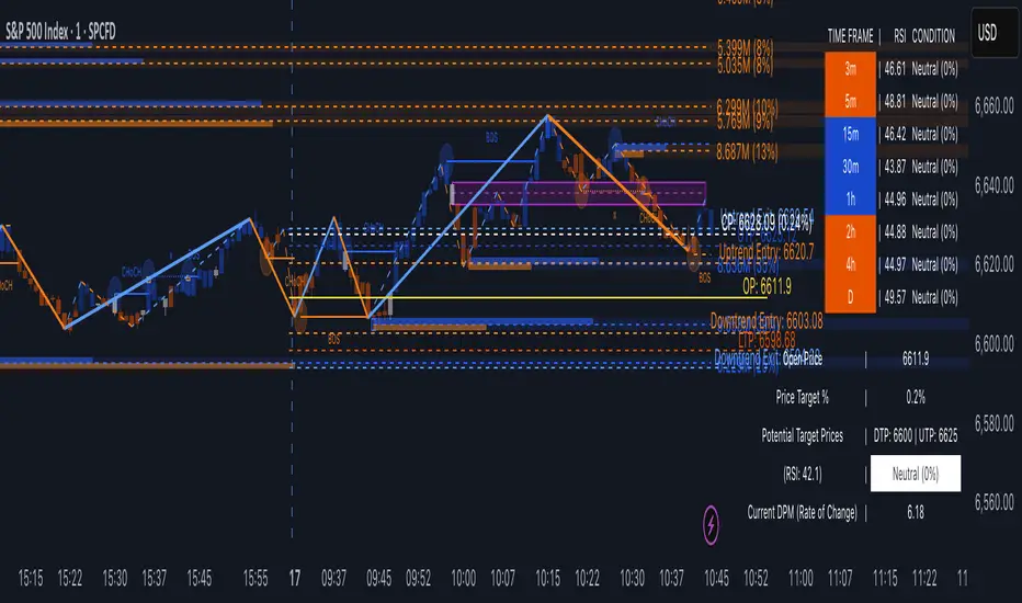
TrendVizPro (BETA)The provided script is a Pine Script code designed for TradingView that creates a sophisticated technical indicator known as “TrendVizPro (BETA).” This script performs advanced trend analysis using various tools, including candle patterns, RSI (Relative Strength Index), simple moving averages (SMA), previous-day price levels, and multi-timeframe analysis.
Key Features:
Candle Style Selection: Users can choose between traditional candlesticks or Heiken Ashi candlesticks for better visualization of trends.
Trend Identification:
Uptrend, Downtrend, and Neutral Trend conditions are determined using smoothed Heiken Ashi candles and the relationship between short and long SMAs.
The script highlights trends using customizable colors (green for uptrend, red for downtrend, white for neutral).
RSI Calculation:
Calculates the RSI and indicates overbought/oversold market conditions with visual signals.
Customizable RSI lengths, overbought/oversold levels, and associated colors.
Price Targeting System:
Automatically calculates potential price targets based on historical volatility, which can be overridden manually.
Upper and lower target price lines can be plotted, showing where the price might move based on historical data or user-defined percentages.
Multi-Timeframe Analysis:
A table is displayed that shows the RSI, trend, and condition (overbought, oversold, or neutral) across various timeframes (3m, 5m, 15m, 30m, 1h, 2h, 4h, Daily).
The table adapts dynamically based on the data for each timeframe.
Previous Day’s High, Low, and Average:
Plots lines representing the previous day’s high, low, and average price levels.
The midpoint between these values is also plotted for additional context.
Trading Signals:
Long and short trading signals are generated based on the trend’s strength and direction.
Exit signals are plotted to indicate potential points to exit trades.
How to Use:
Input Settings:
Candle Style: Select “Traditional Candle” or “Super Trend Heiken Ashi Candle” to choose how price data is visualized.
Trend Colors: Customize the colors for different trend conditions (Uptrend, Neutral, Downtrend).
RSI Settings: Adjust the RSI length, overbought/oversold levels, and corresponding signal colors.
Price Target: Toggle the autopilot mode to use historical data to calculate potential price targets, or manually input a percentage for custom target prices.
Table and Signal Visibility: Decide whether to display the multi-timeframe analysis table, open price, previous day levels, and various trading signals (long, short, exit).
Analyzing the Chart:
When applied to a chart, the indicator plots different price levels (open price, previous day levels, target prices) using lines.
The current trend is displayed via candle colors, and uptrend/downtrend signals are shown on the chart using arrows (long or short positions).
The multi-timeframe table provides a quick overview of trend and RSI conditions for different timeframes.
Signal Use:
Long Signals: Indicated by green arrows below bars, suggesting a strong uptrend.
Short Signals: Indicated by red arrows above bars, signaling a strong downtrend.
Exit Signals: Marked with X symbols, indicating when to consider exiting a long or short position.
Trend Entry and Exit:
Trend Entry/Exit Lines: When activated, orange lines mark optimal trend entry points, and blue lines show potential trend exit points.
Customizable Visuals:
The background color and plot styles (dashed lines, solid lines, labels) are customizable to make the chart more visually distinct and easy to interpret.
Advanced Use Cases:
Multi-Timeframe Traders: Use the multi-timeframe analysis table to check how trends and RSI values behave across different intervals, helping to identify key support/resistance levels or trend continuation points.
Intraday Trading: The script is highly effective for day traders, as it allows visualization of important intraday levels, such as previous highs/lows and current trend conditions.
Swing Trading: Swing traders can leverage the autopilot price target feature to identify optimal exit points based on historical price behavior.
Conclusion:
This indicator is a comprehensive tool designed for traders seeking to automate their trend and signal analysis. With flexible settings, it can cater to multiple trading styles, from scalping to swing trading, all within the TradingView platform.
Savitzky Golay Median Filtered RSI [BackQuant]Savitzky Golay Median Filtered RSI
Introducing BackQuant's Savitzky Golay Median Filtered RSI, a cutting-edge indicator that enhances the classic Relative Strength Index (RSI) by applying both a Savitzky-Golay filter and a median filter to provide smoother and more reliable signals. This advanced approach helps reduce noise and captures true momentum trends with greater precision. Let’s break down how the indicator works, the features it offers, and how it can improve your trading strategy.
Core Concept: Relative Strength Index (RSI)
The Relative Strength Index (RSI) is a widely used momentum oscillator that measures the speed and change of price movements. It oscillates between 0 and 100, with levels above 70 typically indicating overbought conditions and levels below 30 indicating oversold conditions. However, the standard RSI can sometimes generate noisy signals, especially in volatile markets, making it challenging to identify reliable entry and exit points.
To improve upon the traditional RSI, this indicator introduces two powerful filters: the Savitzky-Golay filter and a median filter.
Savitzky-Golay Filter: Smoothing with Precision
The Savitzky-Golay filter is a digital filtering technique used to smooth data while preserving important features, such as peaks and trends. Unlike simple moving averages that can distort important price data, the Savitzky-Golay filter uses polynomial regression to fit the data, providing a more accurate and less lagging result.
In this script, the Savitzky-Golay filter is applied to the RSI values to smooth out short-term fluctuations and provide a more reliable signal. By using a window size of 5 and a polynomial degree of 2, the filter effectively reduces noise without compromising the integrity of the underlying price movements.
Median Filter: Reducing Outliers
After applying the Savitzky-Golay filter, the median filter is applied to the smoothed RSI values. The median filter is particularly effective at removing short-lived outliers, further enhancing the accuracy of the RSI by reducing the impact of sudden and temporary price spikes or drops. This combination of filters creates an ultra-smooth RSI that is better suited for detecting true market trends.
Long and Short Signals
The Savitzky Golay Median Filtered RSI generates long and short signals based on user-defined threshold levels:
Long Signals: A long signal is triggered when the filtered RSI exceeds the Long Threshold (default set at 176). This indicates that momentum is shifting upward, and it may present a good buying opportunity.
Short Signals: A short signal is generated when the filtered RSI falls below the Short Threshold (default set at 162). This suggests that momentum is weakening, potentially signaling a selling opportunity or exit from a long position.
These threshold levels can be adjusted to suit different market conditions and timeframes, allowing traders to fine-tune the sensitivity of the indicator.
Customization and Visualization Options
The Savitzky Golay Median Filtered RSI comes with several customization options, enabling traders to tailor the indicator to their specific needs:
Calculation Source: Select the price source for the RSI calculation (default is OHLC4, but it can be changed to close, open, high, or low prices).
RSI Period: Adjust the lookback period for the RSI calculation (default is 14).
Median Filter Length: Control the length of the median filter applied to the smoothed RSI, affecting how much noise is removed from the signal.
Threshold Levels: Customize the long and short thresholds to define the sensitivity for generating buy and sell signals.
UI Settings: Choose whether to display the RSI and thresholds on the chart, color the bars according to trend direction, and adjust the line width and colors used for long and short signals.
Visual Feedback: Color-Coded Signals and Thresholds
To make the signals easier to interpret, the indicator offers visual feedback by coloring the price bars and the RSI plot according to the current market trend:
Green Bars indicate long signals when momentum is bullish.
Red Bars indicate short signals when momentum is bearish.
Gray Bars indicate neutral or undecided conditions when no clear signal is present.
In addition, the Long and Short Thresholds can be plotted directly on the chart to provide a clear reference for when signals are triggered, allowing traders to visually gauge the strength of the RSI relative to its thresholds.
Alerts for Automation
For traders who prefer automated notifications, the Savitzky Golay Median Filtered RSI includes built-in alert conditions for long and short signals. You can configure these alerts to notify you when a buy or sell condition is met, ensuring you never miss a trading opportunity.
Trading Applications
This indicator is versatile and can be used in a variety of trading strategies:
Trend Following: The combination of Savitzky-Golay and median filtering makes this RSI particularly useful for identifying strong trends without being misled by short-term noise. Traders can use the long and short signals to enter trades in the direction of the prevailing trend.
Reversal Trading: By adjusting the threshold levels, traders can use this indicator to spot potential reversals. When the RSI moves from overbought to oversold levels (or vice versa), it may signal a shift in market direction.
Swing Trading: The smoothed RSI provides a clear signal for short to medium-term price movements, making it an excellent tool for swing traders looking to capitalize on momentum shifts.
Risk Management: The filtered RSI can be used as part of a broader risk management strategy, helping traders avoid false signals and stay in trades only when the momentum is strong.
Final Thoughts
The Savitzky Golay Median Filtered RSI takes the classic RSI to the next level by applying advanced smoothing techniques that reduce noise and improve signal reliability. Whether you’re a trend follower, swing trader, or reversal trader, this indicator provides a more refined approach to momentum analysis, helping you make better-informed trading decisions.
As with all indicators, it is important to backtest thoroughly and incorporate sound risk management strategies when using the Savitzky Golay Median Filtered RSI in your trading system.
Thus following all of the key points here are some sample backtests on the 1D Chart
Disclaimer: Backtests are based off past results, and are not indicative of the future.
INDEX:BTCUSD
INDEX:ETHUSD
BINANCE:SOLUSD

Options Series - Dynamic Support & Resistance
🌟 Key Features & How It Works:
⭐ Dynamic Support and Resistance Management:
The script dynamically calculates and draws support and resistance lines based on pivot highs and pivot lows. Unlike static levels that remain unchanged, these lines are updated in real-time. When a support or resistance level is breached, the corresponding line is automatically deleted, keeping the chart clean and relevant. This feature ensures that the trader is always looking at valid support and resistance levels based on the current price action.
⭐ Use of Arrays for Line Management:
The script utilizes arrays to store and manage support and resistance lines (array.new_line(0)). This is a more advanced feature of Pine Script v5, allowing for efficient handling of multiple lines on the chart. By using arrays, the script can easily track and manipulate multiple lines (adding, removing, updating), ensuring that the chart remains optimized for real-time analysis.
⭐ Customizable Inputs for Flexibility:
The script includes user inputs for the pivot length and the line width, making it adaptable to different trading styles and preferences. The pivot length determines how sensitive the indicator is to price changes, while the line width allows traders to customize the visual representation of support and resistance levels. These inputs add flexibility and make the script accessible to a broad range of traders.
⭐ Efficient Breach Detection Mechanism:
The isBreached function is a key part of the script. It checks whether the current price has breached any of the existing support or resistance levels. If a breach is detected (i.e., the price crosses below a support or above a resistance), the respective line is deleted, ensuring that only active and valid lines remain on the chart. This automatic update feature reduces the need for manual intervention, helping traders stay focused on key price levels.
⭐ Visual Clarity and Chart Cleanliness:
By deleting breached lines, the script ensures that the chart does not become cluttered with outdated or irrelevant lines. This visual clarity is crucial for traders who rely on clean, simple charts for decision-making. Removing unnecessary information helps traders make faster, more confident decisions based on the current market structure.
⭐ Scalability for Multiple Timeframes:
The use of pivot points makes the script adaptable to different timeframes, from intraday scalping to longer-term swing trading. By changing the pivot length, traders can optimize the indicator for different market environments, ensuring that it can be applied across various asset classes and timeframes.
⭐ Practical for Range-bound and Breakout Trading:
This script is particularly effective for traders who focus on range-bound markets or breakout strategies. It allows them to quickly identify areas where price is likely to reverse (support/resistance) or break out (when support/resistance is breached), providing real-time insight into market dynamics.
⭐ Simplification of Price Action Analysis:
By automating the calculation of pivots and management of support/resistance levels, the script simplifies price action analysis. Traders no longer need to manually draw or monitor these levels, which is a common task in technical analysis. This provides an edge, as it reduces the time spent on chart preparation and helps focus on executing trades.
⭐ Originality:
The script "Options Series - Pivot Based Support & Resistance" is an original approach to generating support and resistance levels using pivot points. Pivot-based techniques are popular, but the script introduces an automated dynamic way of drawing support and resistance lines, tracking breaches, and deleting lines when they are no longer valid. This aspect adds a refreshing layer of interactivity and functionality that sets it apart from basic pivot point scripts. The use of arrays to store and manage multiple support and resistance lines is also a good application of Pine Script’s newer array functionalities.
⭐ Uniqueness of the Script:
The script stands out due to its dynamic management of support and resistance lines. Unlike traditional scripts that simply plot static pivot points, this one evolves with the market by removing broken levels, ensuring only valid support and resistance lines are visible on the chart. This is particularly useful for traders who focus on clean charting. The use of arrays to store and manage the lines, alongside the efficient deletion of lines when breached, demonstrates a solid understanding of Pine Script v5's advanced features, such as array manipulation.
🚀 Conclusion:
This script stands out for its real-time adaptability, dynamic support/resistance management, and efficient use of Pine Script’s advanced features. It a powerful tool for both novice and advanced traders.
The script is an indicator designed to draw support and resistance levels based on pivot highs and lows, dynamically removing lines when they are breached. If a price crosses a support or resistance level, the respective line is deleted, ensuring the chart reflects the current state of support and resistance accurately.

BRT MACD CustomBRT MACD Custom — Adaptive and Flexible MACD for Multi-Timeframe Analysis
The BRT MACD Custom is an advanced version of the traditional MACD indicator, offering additional flexibility and adaptability for multi-timeframe trading. This custom script allows traders to adjust the calculation parameters for MACD to suit their specific trading strategy, timeframe, and market conditions.
Key Features
Multi-Timeframe Support
Unlike the standard MACD, this indicator lets you choose a specific timeframe (different from the chart timeframe) for calculating MACD values. This feature provides more flexibility in analyzing market trends on multiple timeframes without changing the main chart.
Example: You can analyze MACD on a 15-minute timeframe even when your chart is set to 1-minute, giving you broader market insights.
Customizable EMA and Signal Settings
Users can adjust the fast and slow EMA lengths as well as the signal smoothing to better align with their preferred trading strategies. The script allows switching between the two popular types of moving averages — SMA or EMA — for both the MACD and the signal line.
Volatility-Based Adaptive EMA
The script includes an adaptive mechanism for EMA calculation. When the selected timeframe closes, the indicator dynamically adjusts the calculation, ensuring the MACD values respond quickly to market volatility. This makes the indicator more reactive compared to static MACD implementations.
Shift Options for MACD, Signal, and Histogram
The indicator allows shifting the MACD, signal line, and histogram values by one or more bars. This can be useful for backtesting and simulating strategies where you anticipate future price movements.
Signal Alerts for Long and Short Trades
The script generates visual signals when certain conditions are met, indicating potential long or short trade opportunities. These signals are based on MACD and histogram crossovers:
Long Signal: Triggered when MACD is above the signal line and both are rising.
Short Signal: Triggered when MACD is below the signal line and both are falling.
Custom Plotting
The MACD line, signal line, and histogram are plotted on the chart for easy visualization. The histogram changes colors to reflect positive or negative momentum:
Green shades when MACD is above the signal line.
Red shades when MACD is below the signal line.
Applications in Trading
The BRT MACD Custom is ideal for traders who need flexibility in their technical analysis. Its multi-timeframe capabilities and customizable moving averages make it suitable for day trading, swing trading, and long-term investing across a variety of markets.
Scalping: Use the 1-minute or 5-minute timeframe to identify short-term trends while calculating MACD on a higher timeframe such as 15 or 30 minutes.
Swing Trading: Apply the indicator on 1-hour or 4-hour charts to detect mid-term trends.
Long-Term Investing: Analyze daily or weekly charts with longer EMA periods to confirm market direction before making large investments.

(Early Test) Weekly Seasonality with Dynamic Kelly Criterion# Enhancing Trading Strategies with the Weekly Seasonality Dynamic Kelly Criterion Indicator
Amidst this pursuit to chase price, a common pitfall emerges: an overemphasis on price movements without adequate attention to risk management, probabilistic analysis, and strategic position sizing. To address these challenges, I developed the **Weekly Seasonality with Dynamic Kelly Criterion Indicator**. It is designed to refocus traders on essential aspects of trading, such as risk management and probabilistic returns, thereby catering to both short-term swing traders and long-term investors aiming for tax-efficient positions.
## The Motivation Behind the Indicator
### Overemphasis on Price: A Common Trading Pitfall
Many traders concentrate heavily on price charts and technical indicators, often neglecting the underlying principles of risk management and probabilistic analysis. This overemphasis on price can lead to:
- **Overtrading:** Making frequent trades based solely on price movements without considering the associated risks.
- **Poor Risk Management:** Failing to set appropriate stop-loss levels or position sizes, increasing the potential for significant losses.
- **Emotional Trading:** Letting emotions drive trading decisions rather than objective analysis, which can result in impulsive and irrational trades.
### The Need for Balanced Focus
To achieve sustained trading success, it is crucial to balance price analysis with robust risk management and probabilistic strategies. Key areas of focus include:
1. **Risk Management:** Implementing strategies to protect capital, such as setting stop-loss orders and determining appropriate position sizes based on risk tolerance.
2. **Probabilistic Analysis:** Assessing the likelihood of various market outcomes to make informed trading decisions.
3. **Swing Trading Percent Returns:** Capitalizing on short- to medium-term price movements by buying assets below their average return and selling them above.
## Introducing the Weekly Seasonality with Dynamic Kelly Criterion Indicator
The **Weekly Seasonality with Dynamic Kelly Criterion Indicator** is designed to integrate these essential elements into a comprehensive tool that aids traders in making informed, risk-aware decisions. Below, we explore the key components and functionalities of this indicator.
### Key Components of the Indicator
1. **Average Return (%)**
- **Definition:** The mean percentage return for each week across multiple years.
- **Purpose:** Serves as a benchmark to identify weeks with above or below-average performance, guiding buy and sell decisions.
2. **Positive Percentage (%)**
- **Definition:** The proportion of weeks that yielded positive returns.
- **Purpose:** Indicates the consistency of positive returns, helping traders gauge the reliability of certain weeks for trading.
3. **Volatility (%)**
- **Definition:** The standard deviation of weekly returns.
- **Purpose:** Measures the variability of returns, providing insights into the risk associated with trading during specific weeks.
4. **Kelly Ratio**
- **Definition:** A mathematical formula used to determine the optimal size of a series of bets to maximize the logarithmic growth of capital.
- **Purpose:** Balances potential returns against risks, guiding traders on the appropriate position size to take.
5. **Adjusted Kelly Fraction**
- **Definition:** The Kelly Ratio adjusted based on user-defined risk tolerance and external factors like Federal Reserve (Fed) stance.
- **Purpose:** Personalizes the Kelly Criterion to align with individual risk preferences and market conditions, enhancing risk management.
6. **Position Size ($)**
- **Definition:** The calculated amount to invest based on the Adjusted Kelly Fraction.
- **Purpose:** Ensures that position sizes are aligned with risk management strategies, preventing overexposure to any single trade.
7. **Max Drawdown (%)**
- **Definition:** The maximum observed loss from a peak to a trough of a portfolio, before a new peak is attained.
- **Purpose:** Assesses the worst-case scenario for losses, crucial for understanding potential capital erosion.
### Functionality and Benefits
- **Weekly Data Aggregation:** Aggregates weekly returns across multiple years to provide a robust statistical foundation for decision-making.
- **Quarterly Filtering:** Allows users to filter weeks based on quarters, enabling seasonality analysis and tailored strategies aligned with specific timeframes.
- **Dynamic Risk Adjustment:** Incorporates the Dynamic Kelly Criterion to adjust position sizes in real-time based on changing risk profiles and market conditions.
- **User-Friendly Visualization:** Presents all essential metrics in an organized Summary Table, facilitating quick and informed decision-making.
## The Origin of the Kelly Criterion and Addressing Its Limitations
### Understanding the Kelly Criterion
The Kelly Criterion, developed by John L. Kelly Jr. in 1956, is a formula used to determine the optimal size of a series of bets to maximize the long-term growth of capital. The formula considers both the probability of winning and the payout ratio, balancing potential returns against the risk of loss.
**Kelly Formula:**
\
Where:
- \( b \) = the net odds received on the wager ("b to 1")
- \( p \) = probability of winning
- \( q \) = probability of losing ( \( q = 1 - p \) )
### The Risk of Ruin
While the Kelly Criterion is effective in optimizing growth, it carries inherent risks:
- **Overbetting:** If the input probabilities or payout ratios are misestimated, the Kelly Criterion can suggest overly aggressive position sizes, leading to significant losses.
- **Assumption of Constant Probabilities:** The criterion assumes that probabilities remain constant, which is rarely the case in dynamic markets.
- **Ignoring External Factors:** Traditional Kelly implementations do not account for external factors such as Federal Reserve rates, margin requirements, or market volatility, which can impact risk and returns.
### Addressing Traditional Limitations
Recognizing these limitations, the **Weekly Seasonality with Dynamic Kelly Criterion Indicator** introduces enhancements to the traditional Kelly approach:
- **Incorporation of Fed Stance:** Adjusts the Kelly Fraction based on the current stance of the Federal Reserve (neutral, dovish, or hawkish), reflecting broader economic conditions that influence market behavior.
- **Margin and Leverage Considerations:** Accounts for margin rates and leverage, ensuring that position sizes remain within manageable risk parameters.
- **Dynamic Adjustments:** Continuously updates position sizes based on real-time risk assessments and probabilistic analyses, mitigating the risk of ruin associated with static Kelly implementations.
## How the Indicator Aids Traders
### For Short-Term Swing Traders
Short-term swing traders thrive on capitalizing over weekly price movements. The indicator aids them by:
- **Identifying Favorable Weeks:** Highlights weeks with above-average returns and favorable volatility, guiding entry and exit points.
- **Optimal Position Sizing:** Utilizes the Adjusted Kelly Fraction to determine the optimal amount to invest, balancing potential returns with risk exposure.
- **Probabilistic Insights:** Provides metrics like Positive Percentage (%) and Kelly Ratio to assess the likelihood of favorable outcomes, enhancing decision-making.
### For Long-Term Tax-Free Investors
This is effectively a drop-in replacement for DCA which uses fixed position size that doesn't change based on market conditions, as a result, it's like catching multiple falling knifes by the blade and smiling with blood on your hand... I don't know about you, but I'd rather juggle by the hilt and look like an actual professional...
Long-term investors, especially those seeking tax-free positions (e.g., through retirement accounts), benefit from:
- **Consistent Risk Management:** Ensures that position sizes are aligned with long-term capital preservation strategies.
- **Seasonality Analysis:** Allows for strategic positioning based on historical performance trends across different weeks and quarters.
- **Dynamic Adjustments:** Adapts to changing market conditions, maintaining optimal risk profiles over extended investment horizons.
### Developers
Please double check the logic and functionality because I think there are a few issue and I need to crowd source solutions and be responsible about the code I publish. If you have corrections, please DM me or leave a respectful comment.
I want to publish this by the end of the year and include other things like highlighting triple witching weeks, adding columns for volume % stats, VaR and CVaR, alpha, beta (to see the seasonal alpha and beta based off a benchmark ticker and risk free rate ticker and other little goodies.

DMR Dynamic Market Range By ANTExplanation of the DMR Dynamic Market Range Script
a. What is This Script and How Is It Useful?
This Pine Script, named "DMR Dynamic Market Range by ANT," is designed for use on TradingView, focusing on dynamically assessing market conditions. It calculates key levels, specifically the high and low of the previous two days, to establish trading zones that assist traders in making informed decisions.
The script highlights:
Previous Day's High and Low : It captures the high and low prices from the previous two days to help set up trading ranges.
Trade Zones : It identifies whether the current price is in a 'tradeable' zone or 'non-tradeable' zone. The zones are determined based on the relationship between the current price, today's open price, and the calculated high and low levels.
Targets and Stop Losses : The script dynamically provides target and stop-loss levels based on user-defined input points, which can help manage risk effectively.
This script is beneficial for traders looking to enter (or avoid) trades based on defined price action criteria and can effectively streamline the analysis process in fast-moving markets.
Customize Input Parameters: (settings)
Adjust the target and stop-loss points based on your risk tolerance and trading style. The default values (30, 70, 100 for targets and 10 for stop-loss) may not suit every trader.
Experiment with different values to find what works best for your trading strategy.
b. How to Effectively Use This Script
The DMR script can be utilized across various trading instruments, including:
Indexes : Suitable for gauging market sentiment and overall trends; can assist in short-term trading strategies.
Options: Helps determine the likely movement of the underlying assets, providing insight into probable volatility and directional bias.
ETFs (Exchange-Traded Funds): Useful for trading diversified portfolios; traders can define entry and exit points relevant to the basket of stocks.
Stocks: Ideal for individual stock trading, as traders can analyze stock movements concerning broader market trends.
When utilizing this script, traders should:
Identify key trading levels before entering trades based on the calculated high and low ranges.
Use the dynamic targets and stop-loss levels to protect capital and maximize potential gains.
Continuously monitor the script's signals and adapt to ongoing market changes.
c. Best Time Frames for Different Instruments
The optimal time frames for using the DMR script can vary based on the trading instrument.
Here’s a summary in tabular format for clearer guidance:
Instrument Best Time Frames
Index 5-minute, 15-minute, 1-hour
Options 1-minute, 5-minute, 15-minute
ETF 5-minute, 15-minute, 1-hour
Stocks 5-minute, 15-minute, 1-hour, Daily
Indexes: Shorter time frames (5 to 15 minutes) can capture quick market movements, while 1-hour frames can provide a broader market overview.
Options Trading: Given the time sensitivity of options, using very short time frames (1-5 minutes) can be effective to seize rapid price movements before expiry.
ETFs: Similar to indices, shorter frames help in effectively tracking movements of the underlying assets.
Stocks: A mix of short (5-15 minutes) for day trading and daily charts for swing trading can provide balanced insights.
Conclusion
Utilizing the DMR Dynamic Market Range script can greatly enhance a trader's ability to analyze market conditions, identify opportunities, and manage risk effectively. By adapting the script through the different listed recommendations, traders can maximize their trading strategy’s effectiveness across various instruments.

Burst PowerThe Burst Power indicator is to be used for Indian markets where most stocks have a maximum price band limit of 20%.
This indicator is intended to identify stocks with high potential for significant price movements. By analysing historical price action over a user-defined lookback period, it calculates a Burst Power score that reflects the stock's propensity for rapid and substantial moves. This can be helpful for stock selection in strategies involving momentum bursts, swing trading, or identifying stocks with explosive potential.
Key Components
____________________
Significant Move Counts:
5% Moves: Counts the number of days within the lookback period where the stock had a positive close-to-close move between 5% and 10%.
10% Moves: Counts the number of days with a positive close-to-close move between 10% and 19%.
19% Moves: Counts the number of days with a positive close-to-close move of 19% or more.
Maximum Price Move (%):
Identifies the largest positive close-to-close percentage move within the lookback period, along with the date it occurred.
Burst Power Score:
A composite score calculated using the counts of significant moves: Burst Power =(Count5%/5) +(Count10%/2) + (Count19%/0.5)
The score is then rounded to the nearest whole number.
A higher Burst Power score indicates a higher frequency of significant price bursts.
Visual Indicators:
Table Display: Presents all the calculated data in a customisable table on the chart.
Markers on Chart: Plots markers on the chart where significant moves occurred, aiding visual analysis.
Using the Lookback Period
____________________________
The lookback period determines how much historical data the indicator analyses. Users can select from predefined options:
3 Months
6 Months
1 Year
3 Years
5 Years
A shorter lookback period focuses on recent price action, which may be more relevant for short-term trading strategies. A longer lookback period provides a broader historical context, useful for identifying long-term patterns and behaviors.
Interpreting the Burst Power Score
__________________________________
High Burst Power Score (≥15):
Indicates the stock frequently experiences significant price moves.
Suitable for traders seeking quick momentum bursts and swing trading opportunities.
Stocks with high scores may be more volatile but offer potential for rapid gains.
Moderate Burst Power Score (10 to 14):
Suggests occasional significant price movements.
May suit traders looking for a balance between volatility and stability.
Low Burst Power Score (<10):
Reflects fewer significant price bursts.
Stocks are more likely to exhibit longer, sustainable, but slower price trends.
May be preferred by traders focusing on steady growth or longer-term investments.
Note: Trading involves uncertainties, and the Burst Power score should be considered as one of many factors in a comprehensive trading strategy. It is essential to incorporate broader market analysis and risk management practices.
Customisation Options
_________________________
The indicator offers several customisation settings to tailor the display and functionality to individual preferences:
Display Mode:
Full Mode: Shows the detailed table with all components, including significant move counts, maximum price move, and the Burst Power score.
Mini Mode: Displays only the Burst Power score and its corresponding indicator (green, orange, or red circle).
Show Latest Date Column:
Toggle the display of the "Latest Date" column in the table, which shows the most recent occurrence of each significant move category.
Theme (Dark Mode):
Switch between Dark Mode and Light Mode for better visual integration with your chart's color scheme.
Table Position and Size:
Position: Place the table at various locations on the chart (top, middle, bottom; left, center, right).
Size: Adjust the table's text size (tiny, small, normal, large, huge, auto) for optimal readability.
Header Size: Customise the font size of the table headers (Small, Medium, Large).
Color Settings:
Disable Colors in Table: Option to display the table without background colors, which can be useful for printing or if colors are distracting.
Bullish Closing Filter:
Another customisation here is to count a move only when the closing for the day is strong. For this, we have an additional filter to see if close is within the chosen % of the range of the day. Closing within the top 1/3, for instance, indicates a way more bullish day tha, say, closing within the bottom 25%.
Move Markers on chart:
The indicator also marks out days with significant moves. You can choose to hide or show the markers on the candles/bars.
Practical Applications
________________________
Momentum Trading: High Burst Power scores can help identify stocks that are likely to experience rapid price movements, suitable for momentum traders.
Swing Trading: Traders looking for short- to medium-term opportunities may focus on stocks with moderate to high Burst Power scores.
Positional Trading: Lower Burst Power scores may indicate steadier stocks that are less prone to volatility, aligning with long-term investment strategies.
Risk Management: Understanding a stock's propensity for significant moves can aid in setting appropriate stop-loss and take-profit levels.
Disclaimer: Trading involves significant risk, and past performance is not indicative of future results. The Burst Power indicator is intended for educational purposes and should not be construed as financial advice. Always conduct thorough research and consult with a qualified financial professional before making investment decisions.

Trend Filtered Signals with Confidence LevelThe Trend Filtered Signals with Confidence Level is a powerful technical analysis tool designed for trend-following traders. It provides clear buy and sell signals, enhanced by a unique confidence level indicator, helping traders filter out market noise and focus on higher-probability trades. This indicator is built with advanced trend detection, volatility filtering, and volume confirmation, making it suitable for various markets such as stocks, forex, and cryptocurrencies.
Key Features:
Precise Trend Detection:
The indicator uses the Average Directional Index (ADX) to measure the strength of the trend, only generating signals when the trend is strong enough (above a user-defined threshold). This prevents false signals during sideways markets and ensures the system follows meaningful trends.
Buy and Sell Signals:
Buy signals are generated when the price crosses above the fast moving average, and the market is in a strong uptrend based on ADX and other filters. Conversely, sell signals are created when the price crosses below the fast moving average in a strong downtrend. These signals appear directly on the chart with visual markers, making them easy to spot in real-time trading.
Confidence Level for Signals:
Each buy and sell signal is given a confidence percentage, calculated from multiple factors:
The strength of the trend (ADX).
The price’s relationship to moving averages (fast MA and slow MA).
The current trading volume compared to its moving average.
The distance between the price and the moving averages, which is checked against the ATR (Average True Range).
A higher confidence percentage indicates a stronger, more reliable signal. Traders can choose to act only on signals that meet or exceed their preferred confidence level.
ATR-Based Volatility Filtering:
To avoid over-trading or receiving signals that are too close together, the ATR (Average True Range) is used as a volatility filter. This ensures that the signals are spaced out, and traders only receive alerts when the price has moved a meaningful distance, considering market volatility.
Volume Confirmation:
Volume plays a crucial role in signal accuracy. The indicator compares the current volume to its moving average, ensuring that signals are generated only when there is sufficient market participation. This feature helps traders avoid signals during low-volume or illiquid market conditions.
Exit Alerts for Trend Reversals:
The indicator doesn’t just help you enter trades; it also assists with exits. When the trend shows signs of weakening or reversing (such as price crossing back over the moving average or losing ADX strength), the indicator will issue an exit alert, helping traders lock in profits or minimize losses.
How to Use the Indicator:
Choosing Timeframes:
The Trend Filtered Signals with Confidence Level works on multiple timeframes. For intraday traders, it can be applied on 5-minute or 15-minute charts. Swing traders might prefer the 1-hour or daily timeframe to capture longer-term trends. Adjust the inputs based on the volatility of the asset you're trading and the timeframe.
Customizing Inputs:
ADX Length: Defines the length for calculating ADX. A typical setting is 14, but this can be adjusted based on how quickly or slowly you want the indicator to react to changes in trend strength.
ADX Threshold: Set this value to filter out weak trends. The default is 20, but for stronger trend signals, a threshold of 25 or 30 may be more suitable.
ATR Length & Multiplier: Used to calculate the average true range, helping to filter out signals that are too close to each other. The ATR multiplier increases the signal’s precision in volatile markets.
Fast and Slow Moving Averages: These moving averages help define the short- and long-term trend. The default fast MA is 9, and the slow MA is 21, but traders can adjust these based on their strategy.
Volume MA: Defines the length of the moving average applied to volume. A longer setting may be more appropriate for swing trading, while a shorter setting can work better for day trading.
Interpreting the Confidence Percentage:
Signals with a confidence level above 50% are generally considered reliable. However, traders can choose to filter trades based on their risk tolerance by only acting on signals above a certain confidence level (e.g., 70% or higher for conservative traders).
Use the confidence percentage as a guide to increase the likelihood of entering higher-probability trades.
Signal Alerts:
The indicator provides customizable alerts for both buy and sell signals. It also generates alerts when it's time to exit a position due to weakening trend conditions.
Alerts can be set up through TradingView’s alert system to notify you via mobile, email, or browser pop-up, so you never miss an opportunity.
Managing Entries and Exits:
Combine the buy and sell signals with the confidence level to time entries more effectively. After entering a position, keep an eye on the exit signals generated by the indicator to manage your trades.
For trend-following strategies, stay in the trade as long as the indicator shows a strong trend. When the confidence level drops significantly, or the exit alert triggers, it may be time to close the trade.
Inputs Overview:
ADX Length: Default 14, for trend strength.
ADX Threshold: Default 20, minimum trend strength for signal generation.
ATR Length & Multiplier: Adjust for volatility filtering.
Fast MA & Slow MA Lengths: Define the short-term and long-term trend.
Volume MA Length: Confirm signals with volume strength.
Minimum Signal Distance: Prevents excessive signal clustering.
Conclusion:
The Trend Filtered Signals with Confidence Level indicator by Danytradehit is a comprehensive tool that not only identifies trends and trend reversals but also helps you gauge the reliability of each signal through a confidence percentage. It simplifies decision-making for traders by filtering out weak or low-probability trades, ensuring you only act on the most promising market opportunities. This indicator is highly customizable and works across various timeframes and asset classes.
