RSI Candlestick Oscillator [LuxAlgo]The RSI Candlestick Oscillator displays a traditional Relative Strength Index (RSI) as candlesticks. This indicator references OHLC data to locate each candlestick point relative to the current RSI Value, leading to a more accurate representation of the Open, High, Low, and Close price of each candlestick in the context of RSI.
In addition to the candlestick display, Divergences are detected from the RSI candlestick highs and lows and can be displayed over price on the chart.
🔶 USAGE
Translating candlesticks into the RSI oscillator is not a new concept and has been attempted many times before. This indicator stands out because of the specific method used to determine the candlestick OHLC values. When compared to other RSI Candlestick indicators, you will find that this indicator clearly and definitively correlates better to the on-chart price action.
Traditionally, the RSI indicator is simply one running value based on (typically) the close price of the chart. By introducing high, low, and open values into the oscillator, we can better gauge the specific price action throughout the intrabar movements.
Interactions with the RSI levels can now take multiple forms, whether it be a full-bodied breakthrough or simply a wick test. Both can provide a new analysis of price action alongside RSI.
An example of wick interactions and full-bodied interactions can be seen below.
As a result of the candlestick display, divergences become simpler to spot. Since the candlesticks on the RSI closely resemble the candlesticks on the chart, when looking for divergence between the chart and RSI, it is more obvious when the RSI and price are diverging.
The divergences in this indicator not only show on the RSI oscillator, but also overlay on the price chart for clearer understanding.
🔹 Filtering Divergence
With the candlesticks generating high and low RSI values, we can better sense divergences from price, since these points are generally going to be more dramatic than the (close) RSI value.
This indicator displays each type of divergence:
Bullish Divergence
Bearish Divergence
Hidden Bullish Divergence
Hidden Bearish Divergence
From these, we get many less-than-useful indications, since every single divergence from price is not necessarily of great importance.
The Divergence Filter disregards any divergence detected that does not extend outside the RSI upper or lower values.
This does not replace good judgment, but this filter can be helpful in focusing attention towards the extremes of RSI for potential reversal spotting from divergence.
🔶 DETAILS
In order to get the desired results for a display that resembles price action while following RSI, we must scale. The scaling is the most important part of this indicator.
To summarize the process:
Identify a range on Price and RSI
Consider them as equal to create a scaling factor
Use the scaling factor to locate RSI's "Price equivalent" Upper, Lower, & Mid on the Chart
Use those prices (specifically the RSI Mid) to check how far each OHLC value lies from it
Use those differences to translate the price back to the RSI Oscillator, pinning the OHLC values at their relative location to our anchor (RSI Mid)
🔹 RSI Channel
To better understand, and for your convenience, the indicator includes the option to display the RSI Channel on the chart. This channel helps to visualize where the scaled RSI values are relative to price.
If you analyze the RSI channel, you are likely to notice that the price movement throughout the channel matches the same movement witnessed in the RSI Oscillator below. This makes sense since they are the exact same thing displayed on different scales.
🔹 Scaling the Open
While the scaling method used is important, and provides a very close view of the real price bar's relative locations on the RSI oscillator… It is designed for a single purpose.
The scaling does NOT make the price candles display perfectly on the RSI oscillator.
The largest place where this is noticeable is with the opening of each candle.
For this reason, we have included a setting that modifies the opening of each RSI candle to be more accurate to the chart's price candles.
This setting positions the current bar's opening RSI candlestick value accurately relative to the price's open location to the previous closing price. As seen below.
🔶 SETTINGS
🔹 RSI Candles
RSI Length: Sets the Length for the RSI Oscillator.
Overbought/Oversold Levels: Sets the Overbought and Oversold levels for the RSI Oscillator.
Scale Open for Chart Accuracy: As described above, scales the open of each candlestick bar to more accurately portray the chart candlesticks.
🔹 Divergence
Show on Chart: Choose to display divergence line on the chart as well as on the Oscillator.
Divergence Length: Sets the pivot width for divergence detection. Normal Fractal Pivot Detection is used.
Divergence Style: Change color and line style for Regular and Hidden divergences, as well as toggle their display.
Divergence Filter: As described above, toggle on or off divergence filtering.
🔹 RSI Channel
Toggle: Display RSI Channel on Chart.
Color: Change RSI Channel Color
스크립트에서 "rsi"에 대해 찾기

RSI Plus +
Description:
RSI Plus + is an enhanced Relative Strength Index (RSI) indicator that provides a multi-timeframe view of RSI values across various timeframes. It highlights overbought and oversold conditions for a more comprehensive analysis, with additional focus on the Relative RSI (RRSI), which compares the current RSI to the average RSI. This provides insight into relative market strength or weakness, giving traders a clear view of how the current market conditions compare to historical averages. The indicator is ideal for spotting potential market reversals, pullbacks, or trend continuations.
Overview
RSI Plus + offers a multi-timeframe RSI display across the following timeframes:
- 2m (2 minutes)
- 5m (5 minutes)
- 15m(15 minutes)
- 30m (30 minutes)
- 1h (1 hour)
- 4h (4 hours)
- 12h (12 hours)
- Daily (1 Day)
- Weekly (1 Week)
- Monthly (1 Month)
The indicator displays a table with RSI, Average RSI, and Relative RSI (RRSI) values for each selected timeframe. The table is color-coded to indicate overbought (RSI > 70) or oversold (RSI < 30) conditions. Additionally, visual triangle alerts are plotted on the chart to signal potential trade opportunities when all selected timeframes show either overbought or oversold conditions. The RRSI provides insight into the current market’s relative strength or weakness by comparing the current RSI to its historical average.
How to Use
1. Setting Up the Indicator:
- Add RSI Plus + to your TradingView chart.
- Enable or disable timeframes using the checkboxes (e.g., 2m, 5m, 15m, Daily, Weekly, etc.) to customise the timeframes you want to analyse.
2. Understanding the Table Layout:
The indicator displays a table in the top-right corner of the chart with the following columns:
- Row 0 Timeframes (2m, 5m, 15m, 30m, 1h, 4h, 12h, Daily, Weekly, Monthly).
- Row 1 RRSI (Relative RSI: the current RSI compared to the average RSI).
- Row 2 Average RSI (The average RSI for each timeframe).
- Row 3 Current RSI (The current RSI value for each timeframe).
The RRSI (Relative RSI) row compares the current RSI with the average RSI, offering insight into the current relative strength or weakness. This allows traders to gauge whether the market is stronger or weaker compared to its historical performance within the selected timeframe.
3. Interpreting the Relative RSI (RRSI)
- RRSI > 1: If the Relative RSI (RRSI)is greater than 1, it means the current RSI is stronger than its historical average, indicating stronger market strength. This could be a sign of momentum in the direction of the trend.
- RRSI < 1: If the RRSI is below 1, it means the current RSI is weaker than its historical average, signalling relative market weakness. This may indicate the possibility of a reversal or pullback before the trend resumes.
- RRSI ~ 1: When the RRSI is around 1, it indicates that the current RSI is in line with its historical average, suggesting neutral market conditions.
4. Using the Visual Cues (Triangle Shapes):
- Green Triangle: Plotted above the price bars when all selected timeframes show RSI values above 70 (overbought), signalling potential exhaustion and a short signal or a pullback before continuation.
- Red Triangle: Plotted below the price bars when all selected timeframes show RSI values below 30*(oversold), signalling potential market reversal and long signal or a pullback before continuation*
These triangle shapes are clear visual alerts for traders to act upon when all timeframes signal extreme conditions.
5. Overbought/Oversold Conditions as Signals:
Overbought Conditions: If all selected timeframes show RSI values above 70 (green triangles appear), it suggests that the market may be overbought, signalling a potential short trade opportunity or a pullback before continuation.
Oversold Conditions: If all selected timeframes show RSI values below 30 (red triangles appear), it suggests that the market may be oversold, signalling a potential long trade or short term bounce opportunity or a pullback before continuation.
6. Set alerts for when all selected timeframes turn overbought (green triangles) or all turn oversold (red triangles). This alert condition will notify you when all selected timeframes signal extreme market conditions, which could indicate a strong reversal or continuation in price.
Notes:
RRSI provides an additional layer of analysis by showing the current relative strength or weakness of the market. A higher RRSI indicates strength relative to historical performance, while a lower RRSI signals weakness.
RSI Plus + is best used alongside other technical tools to confirm trade setups.
RRSI can help traders determine whether the market is likely to continue its trend or if a correction or reversal is imminent.
Customisable Timeframes: The RSI Plus + indicator is fully customisable, allowing you to select RSI length (RSI Period), which timeframes to analyse, from as short as 2 minutes up to monthly intervals, a personally chosen selection This gives traders the flexibility to tailor the indicator to their preferred trading style and time horizon.

RSI and CMF V 1.0
Introduction: RSI and CMF
The Relative Strength Index (RSI) and Chaikin Money Flow (CMF) are two powerful tools for analyzing market behavior. Each serves a unique purpose and provides insights into different aspects of price action.
The RSI measures the speed and magnitude of price movements. By comparing recent gains to losses over a chosen period, it identifies overbought and oversold conditions in the market. RSI focuses solely on price and offers traders a quick glance at whether an asset is trending too high or too low relative to its recent performance.
On the other hand, the CMF evaluates market behavior by integrating both price and volume. It measures money flow to determine whether an asset is being accumulated (bullish) or distributed (bearish). Positive CMF values indicate buying pressure, while negative values signal selling pressure, making it an essential tool for volume-based analysis.
Our Innovation
Traditionally, indicators like the RSI and CMF are analyzed in separate panels, limiting their connection to the price chart itself. We’ve developed an innovative solution that combines the power of these two indicators, enabling traders to simultaneously measure both price movements and volume flow in a unified visualization. By mapping the RSI and CMF directly onto the price chart, our indicator provides a seamless way to observe and analyze how price momentum and money flow interact with the actual price action.
This integration of volume, price, and momentum into a single chart offers traders a comprehensive tool for deeper market insights and faster decision-making.
__________________________________________________________________________
Simple Settings Panel with Tooltips
Our indicator comes with an intuitive and user-friendly settings panel, designed for ease of use and full customization. Each input is accompanied by a tooltip to guide users through the settings and ensure clear understanding of their purpose.
Settings Overview
1. Enable RSI over Price:
Tooltip: "Toggle this option to enable or disable the RSI plotted on the price chart."
This setting allows users to control whether the RSI is displayed directly over the price chart.
2. RSI Length:
Default Value: 14
Tooltip: "Set the period for RSI calculation. Typical value is 14."
Adjusts the time period used for RSI calculations, affecting its sensitivity to price changes.
3. RSI Source:
Default Value: Close
Tooltip: "Choose the data source for RSI calculation, usually the closing price."
Allows users to specify which price data (e.g., close, open, high, low) is used in the RSI calculation.
4. Enable CMF over Price:
Tooltip: "Toggle this option to enable or disable the CMF mapped onto the price chart."
Controls the visibility of the CMF line on the price chart.
5. CMF Length:
Default Value: 20
Tooltip: "Set the period for CMF calculation. Typical value is 20."
Adjusts the time period used to compute the CMF, determining the volume-weighted money flow sensitivity.
Description of RSI and CMF Settings
RSI Settings:
The RSI Length determines how many periods are included in the RSI calculation. Shorter lengths make the RSI more reactive to price changes, while longer lengths smooth out fluctuations. The RSI Source provides flexibility in selecting the price input for calculation, which is typically the closing price by default.
CMF Settings:
The CMF Length defines how many periods are used to calculate the Chaikin Money Flow, enabling users to focus on short-term or long-term trends in money flow. Enabling the CMF over price ensures the relationship between volume and price action is visually evident on the price chart.
The Style Settings
panel allows users to customize the visual appearance of the indicator, ensuring clarity and alignment with their preferences. Users can independently adjust the line colors for RSI and CMF, with default settings of green for RSI and red for CMF, enabling a clear distinction between the two.
Additionally, the Fill between RSI and CMF option provides two customizable colors (Color 0 and Color 1) to represent the dynamic fill. This fill visually highlights the relationship between the RSI and CMF, enhancing the interpretability of their interaction on the price chart. The settings also include options to toggle precision, labels on the price scale, and values in the status line for added flexibility.
_______________________________________________________________________________
How to Analyze with RSI and CMF V 1.0
The RSI and CMF V 1.0 indicator provides an intuitive and integrated approach to analyzing market trends, combining momentum and volume dynamics directly on the price chart. Its innovative mapping of RSI and CMF makes it easy to spot key trends and reversals with unmatched clarity.
Key Insights:
1. Dynamic Relationship Between RSI and CMF:
The indicator maps RSI (momentum-based) and CMF (volume-based) values onto the price chart. This makes it easier to analyze how price momentum aligns with money flow.
The color-coded fill highlights the strength of their relationship:
- Blue Fill: RSI is stronger than CMF, indicating price momentum leads the movement.
- Red Fill: CMF dominates RSI, reflecting the strength of volume flow.
2. Spotting Trends:
Uptrends: Consistent blue fills paired with RSI and CMF rising together suggest bullish momentum backed by strong volume.
Downtrends: Red fills with declining RSI and CMF signal bearish pressure driven by selling volume.
3. Reversals and Divergences:
Divergences between price action and the mapped RSI/CMF lines can signal potential reversals.
For instance, if price is rising but RSI and CMF are both falling, it could indicate weakening bullish momentum.
Ease of Use:
Color Coding: The dynamic fills (blue and red) allow for immediate visual identification of trend strength and direction, reducing analysis time.
Overlay on Price: By plotting directly on the price chart, traders don’t need to switch between multiple panels, ensuring the context remains clear.
Customizable Settings: Inputs for length, source, and enable/disable toggles make it adaptable for all trading styles and timeframes.
In conclusion, this indicator offers a visually clear and easy-to-understand way to combine momentum and volume analysis, empowering traders with actionable insights at a glance.

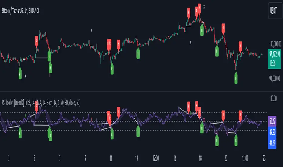
RSI Divergence + Sweep + Signal + Alerts Toolkit [TrendX_]The RSI Toolkit is a powerful set of tools designed to enhance the functionality of the traditional Relative Strength Index (RSI) indicator. By integrating advanced features such as Moving Averages, Divergences, and Sweeps, it helps traders identify key market dynamics, potential reversals, and newly-approach trading stragies.
The toolkit expands on standard RSI usage by incorporating features from smart money concepts (Just try to be creative 🤣 Hope you like it), providing a deeper understanding of momentum, liquidity sweeps, and trend reversals. It is suitable for RSI traders who want to make more informed and effective trading decisions.
💎 FEATURES
RSI Moving Average
The RSI Moving Average (RSI MA) is the moving average of the RSI itself. It can be customized to use various types of moving averages, including Simple Moving Average (SMA), Exponential Moving Average (EMA), Relative Moving Average (RMA), and Volume-Weighted Moving Average (VWMA).
The RSI MA smooths out the RSI fluctuations, making it easier to identify trends and crossovers. It helps traders spot momentum shifts and potential entry/exit points by observing when the RSI crosses above or below its moving average.
RSI Divergence
RSI Divergence identifies discrepancies between price action and RSI momentum. There are two types of divergences: Regular Divergence - Indicates a potential trend reversal; Hidden Divergence - Suggests the continuation of the current trend.
Divergence is a critical signal for spotting weakness or strength in a trend. Regular divergence highlights potential trend reversals, while hidden divergence confirms trend continuation, offering traders valuable insights into market momentum and possible trade setups.
RSI Sweep
RSI Sweep detects moments when the RSI removes liquidity from a trend structure by sweeping above or below the price at key momentum level crossing. These sweeps are overlaid on the RSI chart for easier visualized.
RSI Sweeps are significant because they indicate potential turning points in the market. When RSI sweeps occur: In an uptrend - they suggest buyers' momentum has peaked, possibly leading to a reversal; In a downtrend - they indicate sellers’ momentum has peaked, also hinting at a reversal.
(Note: This feature incorporates Liquidity Sweep concepts from Smart Money Concepts into RSI analysis, helping RSI traders identify areas where liquidity has been removed, which often precedes a trend reversal)
🔎 BREAKDOWN
RSI Moving Average
How MA created: The RSI value is calculated first using the standard RSI formula. The MA is then applied to the RSI values using the trader’s chosen type of MA (SMA, EMA, RMA, or VWMA). The flexibility to choose the type of MA allows traders to adjust the smoothing effect based on their trading style.
Why use MA: RSI by itself can be noisy and difficult to interpret in volatile markets. Applying moving average would provide a smoother, more reliable view of RSI trends.
RSI Divergence
How Regular Divergence created: Regular Divergence is detected when price forms HIGHER highs while RSI forms LOWER highs (bearish divergence) or when price forms LOWER lows while RSI forms HIGHER lows (bullish divergence).
How Hidden Divergence created: Hidden Divergence is identified when price forms HIGHER lows while RSI forms LOWER lows (bullish hidden divergence) or when price forms LOWER highs while RSI forms HIGHER highs (bearish hidden divergence).
Why use Divergence: Divergences provide early warning signals of a potential trend change. Regular divergence helps traders anticipate reversals, while hidden divergence supports trend continuation, enabling traders to align their trades with market momentum.
RSI Sweep
How Sweep created: Trend Structure Shift are identified based on the RSI crossing key momentum level of 50. To track these sweeps, the indicator pinpoints moments when liquidity is removed from the Trend Structure Shift. This is a direct application of Liquidity Sweep concepts used in Smart Money theories, adapted to RSI.
Why use Sweep: RSI Sweeps are created to help traders detect potential trend reversals. By identifying areas where momentum has exhausted during a certain trend direction, the indicator highlights opportunities for traders to enter trades early in a reversal or continuation phase.
⚙️ USAGES
Divergence + Sweep
This is an example of combining Devergence & Sweep in BTCUSDT (1 hour)
Wait for a divergence (regular or hidden) to form on the RSI. After the divergence is complete, look for a sweep to occur. A potential entry might be formed at the end of the sweep.
Divergences indicate a potential trend change, but confirmation is required to ensure the setup is valid. The RSI Sweep provides that confirmation by signaling a liquidity event, increasing the likelihood of a successful trade.
Sweep + MA Cross
This is an example of combining Devergence & Sweep in BTCUSDT (1 hour)
Wait for an RSI Sweep to form then a potential entry might be formed when the RSI crosses its MA.
The RSI Sweep highlights a potential turning point in the market. The MA cross serves as additional confirmation that momentum has shifted, providing a more reliable and more potential entry signal for trend continuations.
DISCLAIMER
This indicator is not financial advice, it can only help traders make better decisions. There are many factors and uncertainties that can affect the outcome of any endeavor, and no one can guarantee or predict with certainty what will occur. Therefore, one should always exercise caution and judgment when making decisions based on past performance.
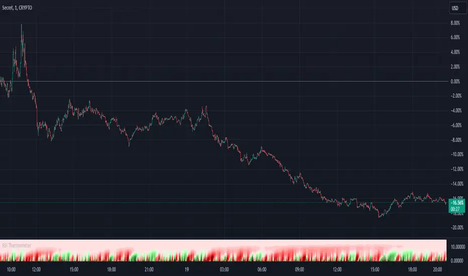
RSI ThermometerOverview:
The RSI Thermometer Indicator is a custom tool designed to help traders quickly gauge relative strength and potential overbought/oversold conditions across multiple timeframes. This indicator employs a series of color-coded RSI values to provide a visual representation of trend momentum, with a gradient ranging from deep red (indicating lower RSI values) to white (neutral around RSI 50) and up to deep green (indicating higher RSI values). By using this color-coding scheme, traders can easily identify shifts in market sentiment and momentum as they develop from shorter to longer timeframes.
Key Features:
Linear Color Gradient for RSI Levels (0-100): The indicator uses 41 distinct colors to visually represent RSI values. Lower RSI values are shown in darker reds, signaling potential oversold conditions, while higher RSI values appear in darker greens, suggesting potential overbought levels. Mid-range RSI values around 50 are shown in white, representing a neutral state. This color progression allows traders to evaluate trend conditions at a glance.
Multi-Timeframe Momentum Visualization: By observing color transitions across a sequence of RSI values from short to long timeframes, traders can assess how market momentum develops across different periods. This feature provides insight into the depth and potential strength of current trends.
Incremental RSI Periods: The RSI Thermometer applies RSI calculations across a range of periods (starting from 8 and increasing incrementally up to 488). This structure allows traders to capture both short-term fluctuations and longer-term trends, providing a balanced view of momentum across multiple timeframes.
Sequential Color Analysis: Each RSI value is represented by a unique color, offering a sequential analysis tool to easily observe trend direction. Consistent colors across the RSI periods indicate momentum in a particular direction, while mixed colors suggest consolidation or transitional phases.
Example Interpretations:
Bullish Momentum: When shorter-period RSI values (e.g., RSI 8, 24, 40) turn green and this color shift extends through to longer-period RSIs (up to RSI 488), it suggests that buying strength is present across timeframes. This pattern can help identify areas where bullish sentiment may be building.
Bearish Momentum: If shorter-period RSI values turn red and this trend continues through longer-period RSIs, it suggests that selling pressure is permeating across multiple timeframes, indicating potential bearish momentum.
How to Use the RSI Thermometer Indicator:
Observe Color Progression: Watch for consistent shifts in color across the RSI periods to determine the direction of momentum. Unified red or green colors across half or more of the periods indicate a stronger trend, while white or mixed colors may suggest a neutral or transitional phase.
Identify Potential Entry/Exit Zones: Look for green hues across multiple RSI periods to identify bullish momentum for potential entry points. Red hues, especially when consistent across several periods, may indicate selling pressure, signaling possible exit points.
Monitor for Reversals: Diverging colors across the RSI periods (e.g., shorter RSIs turning green while longer RSIs remain red) may indicate a trend reversal, providing an early warning for potential market shifts.
Application in Trading Strategy:
The RSI Thermometer Indicator is useful for both intraday and swing traders seeking to align trades with multi-timeframe momentum. By showing trend depth and the potential strength of momentum across timeframes, this tool simplifies market analysis and supports more informed decision-making.
Unlock deeper insights into market momentum with the RSI Thermometer Indicator—an intuitive tool that enhances your trading precision by visualizing trend strength and direction across multiple timeframes.
RSI based MAGot it! Here’s some information in English specifically about the **RSI-based Moving Average (RSI-based MA)** that we wrote the Pine Script code for:
### RSI-Based Moving Average (RSI-based MA)
An **RSI-based Moving Average (RSI-based MA)** is a technical analysis tool that combines the Relative Strength Index (RSI) with moving averages to provide more insight into market trends and potential reversals. This indicator can be particularly useful for identifying the beginning and end of trends, allowing traders to make more informed decisions.
### How RSI-based MA Works
The RSI-based MA indicator calculates the moving average of the RSI values rather than the asset's price itself. In the script you asked for, we implemented two RSI-based moving averages: one for a 1-minute timeframe and another for a 5-minute timeframe. This dual timeframe approach can help traders spot trends more accurately and identify shifts in momentum across different time periods.
#### Key Features of RSI-based MA:
1. **Dual Timeframe Analysis**:
- The script plots two RSI-based moving averages on the same chart:
- **1-minute RSI-based MA**: A moving average calculated based on RSI values over a 1-minute interval.
- **5-minute RSI-based MA**: A moving average calculated based on RSI values over a 5-minute interval.
- Using different timeframes helps traders see both short-term and longer-term trends simultaneously.
2. **RSI Levels**:
- The RSI-based MA plots values between 0 and 100, similar to the RSI itself. Traders can use typical RSI levels, such as 70 (overbought) and 30 (oversold), to identify potential entry and exit points.
- **Overbought condition**: When the RSI-based MA moves above 70, it indicates the asset might be overbought, suggesting a potential for price to drop.
- **Oversold condition**: When the RSI-based MA drops below 30, it signals that the asset might be oversold, indicating a potential price increase.
3. **Crossovers**:
- **Bullish signal**: If the shorter 1-minute RSI-based MA crosses above the longer 5-minute RSI-based MA, this could indicate a new upward trend beginning.
- **Bearish signal**: Conversely, if the 1-minute RSI-based MA crosses below the 5-minute RSI-based MA, it could suggest the beginning of a downward trend.
### Potential Advantages
- **Smoother Trend Identification**: By applying moving averages to RSI, you can smooth out the short-term fluctuations in RSI values, making it easier to identify the underlying trend.
- **Versatility**: The indicator can be customized for different timeframes and settings, allowing it to be tailored to various trading strategies and asset classes.
- **Enhanced Signals**: Combining RSI and moving averages helps filter out noise, providing more reliable signals for potential trend changes or continuations.
### Potential Limitations
- **Lagging Indicator**: Like most moving averages, RSI-based MAs are lagging indicators. They tend to react after price movements have already begun, which could result in delayed signals.
- **False Signals**: In ranging or highly volatile markets, RSI-based MA may give false signals, indicating a trend reversal or continuation that does not occur.
- **Should Not Be Used Alone**: It's often recommended to use RSI-based MA alongside other technical indicators (like MACD, Bollinger Bands, or moving average crossovers) to confirm signals and reduce the risk of false readings.
### Conclusion
The RSI-based MA can be a powerful tool for traders looking to enhance their understanding of market trends and momentum. By combining RSI with moving averages, traders can smooth out RSI readings and gain a clearer view of the market’s direction. However, as with any indicator, it should be used in conjunction with other tools and strategies to maximize its effectiveness and reduce risk.

RSI Multiple TimeFrame, Version 1.0RSI Multiple TimeFrame, Version 1.0
Overview
The RSI Multiple TimeFrame script is designed to enhance trading decisions by providing a comprehensive view of the Relative Strength Index (RSI) across multiple timeframes. This tool helps traders identify overbought and oversold conditions more accurately by analyzing RSI values on different intervals simultaneously. This is particularly useful for traders who employ multi-timeframe analysis to confirm signals and make more informed trading decisions.
Unique Feature of the new script (described in detail below)
Multi-Timeframe RSI Analysis
Customizable Timeframes
Visual Signal Indicators (dots)
Overbought and Oversold Layers with gradual Background Fill
Enhanced Trend Confirmation
Originality and Usefulness
This script combines the RSI indicator across three distinct timeframes into a single view, providing traders with a multi-dimensional perspective of market momentum. It also provides associated signals to better time dips and peaks. Unlike standard RSI indicators that focus on a single timeframe, this script allows users to observe RSI trends across short, medium, and long-term intervals, thereby improving the accuracy of entry and exit signals. This is particularly valuable for traders looking to align their short-term strategies with longer-term market trends.
Signal Description
The script also includes a unique signal feature that plots green and red dots on the chart to highlight potential buy and sell opportunities:
Green Dots : These appear when all three RSI values are under specific thresholds (RSI of the shortest timeframe < 30, the medium timeframe < 40, and the longest timeframe < 50) and the RSI of the shortest timeframe is showing an upward trend (current value is greater than the previous value, and the value two periods ago is greater than the previous value). This indicates a potential buying opportunity as the market may be shifting from an oversold condition.
Red Dots : These appear when all three RSI values are above specific thresholds (RSI of the shortest timeframe > 70, the medium timeframe > 60, and the longest timeframe > 50) and the RSI of the shortest timeframe is showing a downward trend (current value is less than the previous value, and the value two periods ago is less than the previous value). This indicates a potential selling opportunity as the market may be shifting from an overbought condition.
These signals help traders identify high-probability turning points in the market by ensuring that momentum is aligned across multiple timeframes.
Detailed Description
Input Variables
RSI Period (`len`) : The number of periods to calculate the RSI. Default is 14.
RSI Source (`src`) : The price source for RSI calculation, defaulting to the average of the high and low prices (`hl2`).
Timeframes (`tf1`, `tf2`, `tf3`) : The different timeframes for which the RSI is calculated, defaulting to 5 minutes, 1 hour, and 8 hours respectively.
Functionality
RSI Calculations : The script calculates the RSI for each of the three specified timeframes using the `request.security` function. This allows the RSI to be plotted for multiple intervals, providing a layered view of market momentum.
```pine
rsi_tf1 = request.security(syminfo.tickerid, tf1, ta.rsi(src, len))
rsi_tf2 = request.security(syminfo.tickerid, tf2, ta.rsi(src, len))
rsi_tf3 = request.security(syminfo.tickerid, tf3, ta.rsi(src, len))
```
Plotting : The RSI values for the three timeframes are plotted with different colors and line widths for clear visual distinction. This makes it easy to compare RSI values across different intervals.
```pine
p1 = plot(rsi_tf1, title="RSI 5m", color=color.rgb(200, 200, 255), linewidth=2)
p2 = plot(rsi_tf2, title="RSI 1h", color=color.rgb(125, 125, 255), linewidth=2)
p3 = plot(rsi_tf3, title="RSI 8h", color=color.rgb(0, 0, 255), linewidth=2)
```
Overbought and Oversold Levels : Horizontal lines are plotted at standard RSI levels (20, 30, 40, 50, 60, 70, 80) to visually identify overbought and oversold conditions. The areas between these levels are filled with varying shades of blue for better visualization.
```pine
h80 = hline(80, title="RSI threshold 80", color=color.gray, linestyle=hline.style_dotted, linewidth=1)
h70 = hline(70, title="RSI threshold 70", color=color.gray, linestyle=hline.style_dotted, linewidth=1)
...
fill(h70, h80, color=color.rgb(33, 150, 243, 95), title="Background")
```
Signal Plotting : The script adds green and red dots to indicate potential buy and sell signals, respectively. A green dot is plotted when all RSI values are under specific thresholds and the RSI of the shortest timeframe is rising. Conversely, a red dot is plotted when all RSI values are above specific thresholds and the RSI of the shortest timeframe is falling.
```pine
plotshape(series=(rsi_tf1 < 30 and rsi_tf2 < 40 and rsi_tf3 < 50 and (rsi_tf1 > rsi_tf1 ) and (rsi_tf1 > rsi_tf1 )) ? 1 : na, location=location.bottom, color=color.green, style=shape.circle, size=size.tiny)
plotshape(series=(rsi_tf1 > 70 and rsi_tf2 > 60 and rsi_tf3 > 50 and (rsi_tf1 < rsi_tf1 ) and (rsi_tf1 < rsi_tf1 )) ? 1 : na, location=location.top, color=color.red, style=shape.circle, size=size.tiny)
```
How to Use
Configuring Inputs : Adjust the RSI period and source as needed. Modify the timeframes to suit your trading strategy.
Interpreting the Indicator : Use the plotted RSI values to gauge momentum across different timeframes. Look for overbought conditions (RSI above 70, 60 and 50) and oversold conditions (RSI below 30, 40 and 50) across multiple intervals to confirm trade signals.
Signal Confirmation : Pay attention to the green and red dots that provide signals to better time dips and peaks. dots are printed when the lower timeframe (5mn by default) shows sign of reversal.
These signals are more reliable when confirmed across all three timeframes.
This script provides a nuanced view of RSI, helping traders make more informed decisions by considering multiple timeframes simultaneously. By combining short, medium, and long-term RSI values, traders can better align their strategies with overarching market trends, thus improving the precision of their trading actions.

RSI PRECISION v.3RSI PRECISION v.3 (MACD, StochRSI, SMA Signals)
Developed by Giorgos Protonotarios (2021-2023)
RSI PRECISION is an alternative to the classic Relative Strength Index (RSI). The indicator aims to enhance the classic RSI and make it more accurate on longer timeframes. Additionally, the indicator works as an advanced signaling machine, offering five different categories of leading trading signals. RSI PRECISION is an ideal tool for analyzing highly volatile markets, such as cryptocurrency and small-cap stocks.
In this 3rd version, the core formula remains the same, however, there are new trading signals and a great number of new parameters. Traders have the opportunity to fully customize the indicator according to their needs.
What is new ?
The RSI formula remains the same, however, there are additional features:
• Selected StochRSI signals
• Low-timeframe SMA signal (<60 minutes)
• High-timeframe SMA signal (>60 minutes)
• SMA on the RSI PRECISION readings
• Ability to customize everything in settings (tooltips added)
Note: You can turn off any trading signal by unselecting it in Settings>Style.
□ NEW TRADING SIGNALS (v.3)
■ SELECTED STOCHRSI SIGNALS
The selected StochRSI signals are visualized by a cross (+) on the top and bottom of the indicator. The settings for StochRSI are the classic 8.5.3 (customizable). By default, the crossover is generated when StochRSI crosses above 25, and the crossunder when StochRSI crosses below 75.
(i) Bullish StochRSI cross
• Symbol: Cross (+) on the Top
• Event: StochRSI crosses above level 25
(ii) Bearish StochRSI cross
• Symbol: Cross (+) on the Bottom
• Event: StochRSI crosses below level 75
■ SMA CROSSOVERS (LOW/HIGH TIMEFRAMES)
These trading signals are generated when the price of an asset crosses above or below a preset SMA.
There are two different SMAs, one shown on low timeframes, and one on high timeframes. You can adjust the periods for both, by default 200 periods.
(i) Low-Timeframe SMA Cross (<60 minutes)
• Symbol: Bullish (↥) on the top of the indicator and bearish (↧) on the bottom
• Event: The price crosses above or below the selected SMA on low timeframes
(ii) High-Timeframe SMA Cross (>60 minutes)
• Symbol: Bullish (↥) on the top of the indicator and bearish (↧) on the bottom
• Event: The price crosses above or below the selected SMA on high timeframes
■ SMA LINE ON RSI PRECISION
This is just a simple SMA line on the RSI PRECISION readings. By default, it is set at 50 periods.
• SMA Line (blue-dashed)
You can turn it off by unselecting it in Settings>Style.
□ OLDER TRADING SIGNALS
The 3rd version of RSI PRECISION also includes all previous signals.
■ RSI PRECISION CROSSES
This signal corresponds to a bullish/bearish RSI PRECISION cross. By default, it is 5 for a bullish crossover and 100 for a bearish crossunder. These numbers are indicative and can be customized.
(i) Bullish RSI PRECISION Cross
• Symbol: Green arrow (▲) on the Top
• Event: RSI PRECISION crosses above level 5
(ii) Bearish RSI PRECISION Cross
• Symbol: Red arrow (▼) on the Bottom
• Event: RSI PRECISION crosses below level 100
■ MACD CROSSOVER SIGNALS
The MACD signals are visualized by a green/red dot (•). The default settings are the standard MACD settings (12,6,9).
(i) Bullish MACD cross
• Symbol: Green Dot (•) on the Top
• Event: MACD crosses above its signal line
(ii) Bearish MACD cross
• Symbol: Red Dot (•) on the Bottom
• Event: MACD crosses below its signal line
NOTE: In lower timeframes, MACD generates too many signals. You can switch off “MACD BULLISH & BEARISH CROSSOVERS” by clicking on ‘SETTINGS’, then ‘STYLE’, and then unselecting ‘Bullish MACD Cross’ and ‘Bearish MACD Cross’.
■ GOLDEN/DEATH CROSSES (SMA CROSSOVERS)
The cross of the 50-day moving average above the 200-day moving average is called a golden cross, and it is considered a bullish signal. The cross of the 50-day moving average below the 200-day moving average is called a death cross, and it is considered a bearish signal.
The Golden/Death crosses are visualized by (X). By default, 50 periods for the fast SMA and 200 periods for the slow SMA (both are customizable).
(i) Bullish SMA Cross
• Symbol: (X) on the Top
• Event: The fast SMA crosses above the Slow SMA
(ii) Bearish RSI Cross
• Symbol: (X) on the Bottom
• Event: The fast SMA crosses below the Slow SMA
□ More about the Indicator
■ MISSION
Enhancing the classic Relative Strength Index (RSI) and making it more accurate on longer timeframes, during choppy market conditions, and especially near market tops/bottoms.
■ OBJECTIVES
(1) Creating a better RSI that works as an “All-in-one” indicator
(2) Identifying overbought/oversold market levels in a simple and user-friendly manner
(3) Making precise calculations near market tops and bottoms, where price volatility is always booming
(4) Making precise calculations on longer timeframes (weekly, monthly) where the classic RSI readings are hardly readable
(5) Offering five different categories of trading signals (RSI, StochRSI, MACD, Golden/Death Crosses, SMAs) in a single indicator
■ RSI PRECISION CALCULATIONS
The RSI PRECISION formula consists of three (3) different components:
(a) Relative Strength Index component (the classic RSI)
(b) Periodic Price Volatility component (PPV, essential)
(c) RSI Volatility component (less important)
RSI PRECISION FORMULA ADJUSTMENTS
(i) CLASSIC RSI
This measurement corresponds to the classic RSI. If the other two components of the formula are set to zero (0%), then by entering 100% here, the RSI PRECISION becomes identical to the classic RSI.
-By default, 100%
(ii) PERIODIC PRICE VOLATILITY -PPV
The Periodic Price Volatility (PPV) is an advanced measurement of price volatility and an essential component of the core RSI PRECISION formula. You can easily adjust the weight of PPV in the formula.
-By default, 100%
(iii) RSI VOLATILITY
This is an extra measurement of volatility. This time the focus is exclusively on periodic RSI volatility, not on price volatility.
-By default, 5%
■ FINAL THOUGHTS
RSI PRECISION v.3 is an improved RSI indicator offering five leading trading signals. Everything is combined in one place to create an all-in-one TA tool. I have been using it as my only indicator for quite some time.
As always, happy trading, and remember, if you want to rule the world, create code, not war.
□ Giorgos Protonotarios,
Financial Analyst, Building Web
(October 5th 2023)

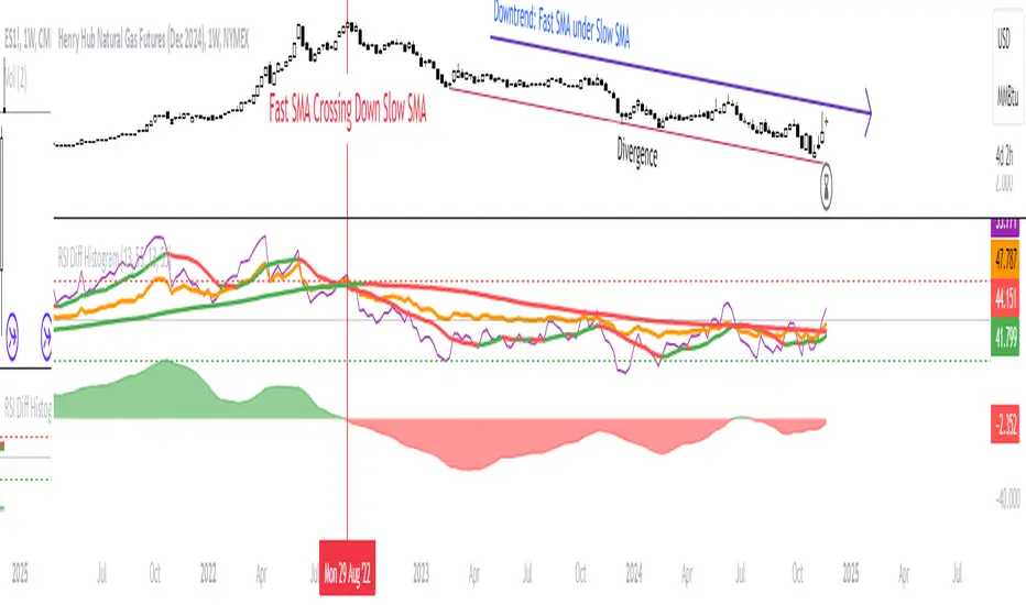
RSI - trendlines - div[vn]This is an indicator for traders of trendline analysis with RSI (the formula for calculating RSI I don't mention here anymore because every trader knows it)
-
The Pine Script strategy plots pivot points and trendlines on the RSI chart.
This strategy allows the user to specify the interval for calculating the pivot points and the number of pivot points used to generate the RSI trendlines.
As all traders know, the RSI line closely follows the actual price line, it is an indicator of momentum, the RSI often tells us the direction of the price line in advance, it often precedes and goes along with the price.
RSI is one of the indicators that predicts price trends very well when it crosses its trendline (except in case of divergence).
On the chart of the RSI indicator, I only show 2 trendlines closest to the RSI (1 increase, 1 decrease) and the trend lines far away from me are hidden so that traders can focus on observing better.
When an uptrend line of RSI (or a decrease of RSI) is drawn according to the settings in the settings of the indicator, then that line is support and resistance so that we can proceed to make a BUY or SELL point according to the indicator. RSI support and resistance strategy
When the RSI line breaks above the definitive uptrend line or breaks below the trendline definitively, the price signals a reversal to the nearest trendline.
When the RSI breaks the downtrend line of the RSI (definitively), it signals that the price has a high probability of reversing or approaching the nearest resistance area or possibly reversing from bearish to bullish.
When the RSI breaks the uptrend line of the RSI (definitively), it signals that the price is likely to reverse or reach the nearest resistance area or it may reverse from bullish to bearish.
In addition, I have integrated the normal divergence function of RSI for traders to use in case of divergence - combined with trendline to identify trend reversal more clearly.
-------------------------------------------------------------------------------------------------------
Vietnamese
-Đây là chỉ báo dành cho các trader thuộc trường phái phân tích đường xu hướng với RSI(công thức tính RSI tôi không nhắc ở đây nữa vì mọi trader đều biết)
-Chiến lược Pine Script vẽ các điểm trục và đường xu hướng trên biểu đồ RSI.
-Chiến lược này cho phép người dùng chỉ định khoảng thời gian tính toán các điểm xoay và số điểm xoay được sử dụng để tạo các đường xu hướng của RSI.
-Như các Trader đều biết đường RSI bám sát thực tế với đường giá, nó là chỉ báo về động lượng ,RSI nhiều khi cho chúng ta "biết trước" được hướng đi của đường giá, nó thường đi trước và đi cùng với giá
-RSI là một trong những chỉ báo dự đoán xu hướng giá rất tốt khi cắt đường xu hướng của nó (chỉ trừ trường hợp phân kì)
-Trên biểu đồ của chỉ báo RSI tôi chỉ đưa ra 2 đường trendline gần với đường RSI nhất (1 tăng , 1 giảm)còn các đường xu hướng cách xa tôi đều để ẩn để các Trader tập chung quan sát tốt hơn
-Khi đường xu hướng tăng của RSI (hoặc giảm của RSI) được vẽ ra theo các thiết lập trong cài đặt của chỉ báo,thì đường đó là hỗ trợ,kháng cự để ta có thể tiến hành thực hiện điểm BUY hoặc SELL theo chiến lược hỗ trợ và kháng cự của RSI
-Khi đường RSI mà phá vỡ lên trên đường xu hướng tăng dứt khoát hoặc phá xuống dưới đường xu hướng cách dứt khoát thì giá báo hiệu sắp đảo chiều ngược với đường xu hướng gần nhất
-Khi RSI phá vỡ đường xu hướng giảm của RSI (cách dứt khoát) thì báo hiệu sắp tới giá có khả năng cao sẽ đảo chiều hay tiến tới vùng kháng cự gần nhất hay có thể đảo chiều từ giảm thành tăng
-Khi RSI phá vỡ đường xu hướng tăng của RSI (cách dứt khoát) thì báo hiệu sắp tới giá có khả năng cao sẽ đảo chiều hay tiến tới vùng kháng cự gần nhất hay có thể đảo chiều từ tăng thành giảm
-ngoài ra tôi có tích hợp thêm vào công cụ chức năng phân kì thường của RSI để trader dùng trong trường hợp phân kì - kết hợp với đường trendline để xác định xu hướng đảo chiều rõ ràng hơn

RSI Integral by Hawkeye Charting**** German Description below ****
This is the RSI Integral indicator.
Basically, it's a normal RSI but improves the visualization of the strength in the market.
The upper shown RSI display the integral of the RSI (f(x)) and the neutral RSI level (50) (g(x)).
The blue background coloring visualizes the area as the integration of both the mentioned functions --> H(x) = F(x) - G(x) and indicates, how strong and directed the market currently is.
Markets regulate and bring them back to the mean by themselve; by that fact, the consideration is that remaining a longer time in e.g. the upper zone requires to "unleash" the collected energy from the upper levels to the downside and vice versa.
So the major advantage of this indicator is to monitor and compare the given areas above and below the neutral level and making imbalances visible.
Furthermore, the lower shown RSI shows the complete displaying of the indicators functions, as it displays possible long and short entry and exit areas.
Read the chart to understand the system. Please note that the program waits on interval after the actual cross event before it changes the background color. This is to avoid false signals that last only 1 candle.
The last components are the overbought and oversold zones. They are equal to the standard RSI overbought and oversold levels.
You have the following setting options:
--> Timeframe selection
--> Generally Displaying the RSI yes/ no
--> Changing source, length and color of the RSI itself
--> turning on/ off the neutral RSI level (50), changing the neutral level value and changing the background color. (Note: Undisplaying the neutral level will remove the background coloring as well).
--> turning on/ off the upper RSI zone, changing the zone-border-values and -colors and changing the background color. (Note: same as neutral RSI level)
--> turning on/ off the lower RSI zone, changing the zone-border-values and -colors and changing the background color. (Note: same as neutral RSI level)
--> turning on/ off the RSI average, changing the Moving Average type, length and color.
--> turning on/ off the Moving Average Long/ Short Background and changing the colors for long and short direction.
--> smoothing of the rsi itself. Note: it will affect the alert events as well, if the rsi smoothing function is selected.
Last but not least, you can set alerts:
--> Alert for overbought/ oversold area (cross in/ cross out, message: Check for divergences)
--> Alerts for open and close long
--> Alerts for open and close short
A complete "Alert-Set" requires 6 Alerts.
I'd like to know what you think! Please leave a comment, I will answer ASAP .
Please leave a like and a follow if you like this work and don't forget to check out my major work, the Market Maker Volatility Diameter, see the link below.
Enjoy and always happy trades.
Yours
Markus aka Hawkeye Waver from Hawkeye Charting
-------------------------------------------------------------------------------------
**** Deutsche Beschreibung ****
Das ist der RSI Integral Indikator.
Im Grunde handelt es sich hierbei um einen normalen RSI , allerdings verbessert er die Visualisierung der Stärke im Markt.
Der obere RSI im Beispielbild zeigt das Integral des RSI , bezogen auf den RSI f(x) selber sowie seines neutralen Levels beim Wert 50 = g(x).
Der blaue Hintergrund visualisiert die Flächenfunktion des Integrals der beiden genannten Funktionen --> H(x) = F(x) - G(x) und indiziert, wie stark und nach wohin der Markt gerade gerichtet ist.
Märkte regulieren sich selber und bringen sich auch immer wieder selber zum Durchschnitt und zur Balance zurück. Dieser Fakt führt zu der Überlegung, dass ein langes Aufhalten in z.B. der oberen Zone unweigerlich eine "Freisetzung" der gesammelten Energie der oberen Levels nach unten nach sich ziehen wird und umgekehrt.
Die Hauptvorteil dieses Indikators ist also, dass die entstandenen Flächen über und unter dem Neutralen RSI Level einfach beobachtet und verglichen werden können, um so Ungleichgewichte im Chart zu erkennen.
Desweiteren zeigt der unten im Chart abgebildete RSI die vollständige Anzeige der Indikatorfunktionen. Es ist nämlich auch möglich, Long und Short Signale für Einstieg und Ausstieg anzuzeigen.
Bitte lest den Chart, um das System zu verstehen. Beachtet: das Programm wartet 1 Intervall zur Bestätigung, bevor es einen Traderichtungswechsel auch anzeigt. Diese Maßnahme wurde getroffen, um falsche Signale zu reduzieren.
Die letzten Komponenten sind die Überkauft- und Überverkauftzonen. Sie sind gleich wie die Standard RSI überkauft und überverkauft Levels zu interpretieren.
Der Indikator bietet die folgenden Einstellmöglichkeiten:
--> Timeframe Auswahl
--> RSI generell anzeigen ja/ nein
--> Quelle, Länge und Farbe des RSI selber verändern
--> Neutrales RSI Level an- und ausschalten, Level-Wert verändern und die Hintergrund-Farbe ändern. (Anmerkung: Das Abschalten des Neutralen RSI Levels wird auch die Hintergrundfärbung abschalten.)
--> An- und Ausschalten der oberen RSI Zone, Zonengrenzwerte und -farben verändern und Hintergrundfarbe verändern. (Anmerkung: s. Neutrales RSI Level)
--> An- und Ausschalten der unteren RSI Zone, Zonengrenzwerte und -farben verändern und Hintergrundfarbe verändern. (Anmerkung: s. Neutrales RSI Level)
--> An- und Ausschalten des RSI Durchschnitts, verändern des Durchschnitt-Typs, der Länge und der Farbe
--> An- und Ausschalten der Durchschnitt Long und Short Hintergrundfärbung sowie Änderung der Hintergrund Farben für Long und Short Richtung
--> Glättung des RSI. Anmerkung: Die Alarme werden sich auf den geglätteten RSI und nicht auf den RSI selber beziehen, wenn die Funktion selektiert ist.
Zu guter Letzt, der Indikator bietet die Funktion, Alarme einzustellen:
--> Alarm für Überkauft/ Überverkauft Zonen (Einkreuzen/ Auskreuzen, Nachricht: Auf Divergenzen prüfen)
--> Alarme für Long Öffnen & Schließen
--> Alarme für Short Öffnen & Schließen
Ein vollständiges "Alarm-Set" benötigt 6 Alarme.
Ich möchte gerne wissen, was ihr über den Indikator denkt! Bitte hinterlasst eure Kommentare, ich werde asap antworten.
Bitte hinterlasst ein Like und ein Follow wenn euch diese Arbeit gefällt und vergesst nicht, meine Hauptarbeit, den Market Maker Volatility Diameter auszuchecken, s. Link unten.
Viel Spaß mit dem Indikator und allzeit gute Trades
Euer
Markus aka Hawkeye Waver von Hawkeye Charting

RSI PRECISION (MACD & SMA Signals)RSI PRECISION (Plus MACD & SMA Signals)
Codded by Giorgos Protonotarios, March 2022
This is an enhanced version of RSI PRECISION that incorporates RSI readings and key TA signals into a single oscillator.
■ RSI PRECISION SHORT DESCRIPTION & WHAT IS NEW
RSI PRECISION is an oscillator designed to enhance the classic RSI with price volatility and make it more accurate at longer time frames and during choppy market conditions. The oscillator is ideal for analyzing volatile markets, such as the cryptocurrency market.
In this second version, the RSI Precision formula remains the same, however, there are additional features.
The new oscillator now includes three different trading signals:
• MACD Crossovers (•) -New
• SMA Death/Golden Crosses (x) -New
• RSI Crossovers/Crossunders (▲▼)
■ MACD BULLISH & BEARISH CROSSOVERS
The MACD signals are visualized by a green/red dot (•). The default settings are the standard MACD settings (12,6,9).
NOTE: In lower timeframes, MACD generates too many signals. You can switch off “MACD BULLISH & BEARISH CROSSOVERS” by clicking on ‘SETTINGS’, then ‘STYLE’, and then unselecting ‘Bullish MACD Cross’ and ‘Bearish MACD Cross’.
(i) Bullish MACD cross
• Symbol: Green Dot (•) on the Top
• Event: MACD crosses above its signal line
(ii) Bearish MACD cross
• Symbol: Red Dot (•) on the Bottom
• Event: MACD crosses below its signal line
■ SMA CROSSOVERS
The SMA crossovers are visualized by (X). By default, 50 periods for the fast SMA and 200 periods for the slow SMA (both are customizable).
NOTE: If you change the fast SMA to 1 period, the fast SMA becomes the closing price. Therefore, you can receive signals when the price crosses a key MA, for example, SMA(200).
(i) Bullish SMA Cross
• Symbol: Green (X) on the Top
• Event: The fast SMA crosses above the Slow SMA
(ii) Bearish RSI Cross
• Symbol: Red (X) on the Bottom
• Event: The fast SMA crosses below the Slow SMA
You can adjust the periods for both SMAs (Settings).
■ RSI CROSSOVER/CROSSUNDER
This signal corresponds to a bullish/bearish RSI Precision cross. By default, it is 5 for a bullish crossover and 100 for a bearish crossunder. Of course, these numbers are indicative and can be customized.
(i) Bullish RSI Precision Cross
• Symbol: Green arrow (▲) on the Top
• Event: The RSI Precision crosses above level 5
(ii) Bearish RSI Precision Cross
• Symbol: Red arrow (▼) on the Bottom
• Event: The RSI Precision crosses below level 100
■ RSI PRECISION MISSION
To enhance RSI and make it more accurate on longer time frames, choppy market conditions, and especially during market tops/bottoms.
■ RSI PRECISION OBJECTIVES
(1) identify overbought/oversold market levels in a simple and user-friendly manner
(2) make precise calculations near market tops and bottoms, where price volatility is always booming
(3) make precise calculations on longer time frames (monthly, weekly) where RSI readings are hardly readable
(4) offer three types of trading signals (RSI, MACD, SMA)
■ RSI PRECISION CALCULATIONS
The RSI PRECISION formula consists of 3 different modules:
(a) Relative Strength Index readings
(b) Price Volatility module
(c) RSI Volatility module (optional)
■ BASIC SETTINGS
--RSI PERIODS: -By default, 14.
---RSI PRECISION FORMULA
(i) RSI FACTOR (%)
-You can adjust the weight of RSI readings in the formula.
-By default, 100%.
(ii) PERIODIC PRICE VOLATILITY (%)
-You can adjust the weight of Periodic Price Volatility in the formula.
-By default, 100%.
(iii) RSI VOLATILITY (%)
-This is an extra measurement of volatility. This time the focus is exclusively on periodic RSI volatility, not on price volatility.
-By default, 5%.
--RSI CROSSOVER/CROSSUNDER LEVELS
You can adjust the levels for an RSI PRECISION crossover/crossunder.
- By default, 5 for a bullish crossover and 100 for a bearish crossunder.
--PERIODS FOR SMA CROSSOVERS
You can adjust the periods for the two SMAs.
-By default, 50 periods for the fast SMA and 200 periods for the slow SMA. Some traders describe the crossing of these two SMAs (50/200) as the “Golden/Death Crosses”.
■ FINAL THOUGHTS
The new RSI Precision combines everything in one place. I have been using this enhanced version, myself, as my only oscillator.
As always, happy trading... and remember to make charts, not war.
□ Giorgos Protonotarios,
Financial Analyst, Building Web
(March 2022)

RSI Multi-Timeframe TableHow the RSI Multi-Timeframe Table Indicator Works
This indicator displays a table showing the RSI (14) from multiple timeframes at the same time.
It helps you quickly see whether the RSI is in overbought or oversold zones across different periods (1m, 5m, 15m, 30m, 1h, 4h, and 1D).
Below is a clear explanation of how each part works:
1) Timeframes Used
The indicator analyzes the RSI from the following timeframes:
1 minute (1m)
5 minutes (5m)
15 minutes (15m)
30 minutes (30m)
1 hour (1h)
4 hours (4h)
1 day (1D)
Each row of the table represents one of these timeframes.
2) How the RSI Is Retrieved
For each timeframe, the script uses the request.security() function to fetch the RSI(14) value from that specific timeframe, even if your current chart is set to a different one.
Example: On a 1h chart, you can still see the RSI from 1m, 5m, 30m, etc.
3) Table Structure
The table appears in the top-right corner and contains 8 columns:
TF – shows the timeframe name
RSI – shows the RSI value with two decimal places
10 – marks if RSI is ≤ 10
20 – marks if RSI is ≤ 20
30 – marks if RSI is ≤ 30
70 – marks if RSI is ≥ 70
80 – marks if RSI is ≥ 80
90 – marks if RSI is ≥ 90
The extreme levels (10, 20, 80, 90) help identify possible reversal zones.
4) Markings in the Table
When a condition is true, a ● circle appears in the corresponding cell.
Examples:
If the 5m RSI is ≤ 20, a circle appears in the 20 column for the 5m row.
If the 1H RSI is ≥ 80, a circle appears in the 80 column for the 1H row.
Colors also help interpretation:
Red for strong oversold levels (≤10)
Orange and yellow for intermediate levels
Green, teal, and blue for overbought levels
5) Alerts
The indicator includes four built-in alerts:
RSI ≤ 10
RSI ≤ 20
RSI ≥ 80
RSI ≥ 90
These alerts use the RSI from the current chart timeframe.
To enable them:
Open Alerts in TradingView
Click Create Alert
Select the indicator
Choose the alert you want
Confirm
6) Purpose of This Indicator
It is useful for:
Quickly checking market strength across multiple timeframes
Identifying when several periods are overbought or oversold
Avoiding trades against market momentum
Helping confirm potential reversal points
Summary
This indicator creates a table that shows RSI values from multiple timeframes and visually highlights overbought or oversold conditions in each one.
It also includes ready-to-use alerts for the most extreme RSI levels.

RSI Crypto Strength (Asset vs BTC)The "RSI Crypto Strength" is an advanced analysis tool built on a fundamental pillar of the cryptocurrency market: for an altcoin to achieve exponential bullish performance, it must invariably be and remain stronger than Bitcoin itself.
The primary objective of this indicator is to quantify and reinforce this thesis. It provides a clear and immediate view of the relative strength of any cryptocurrency in direct comparison with the market leader, Bitcoin. This relative strength can be identified on any timeframe. This also reinforces a scenario where a cryptocurrency that is weaker than Bitcoin is prone to sideways movements and downturns.
Key Features
This indicator combines multiple tools into a single solution:
> Dual RSI Plot: Simultaneously visualizes the RSI of the asset on the chart (dynamic) and the RSI of Bitcoin (blue line).
> Strength Delta (Asset vs. BTC): The heart of the indicator. A panel displays the exact difference (Asset RSI - Bitcoin RSI).
- Green: The asset has more RSI strength than Bitcoin.
- Red: The asset has less RSI strength than Bitcoin.
> Dynamic Coloring and Area Fill: The asset's RSI line and the background area automatically change color to highlight critical zones:
- Green (Overbought): RSI above 70.
- Red (Oversold): RSI below 30.
- Orange (Neutral): RSI between 30 and 70.
> Integrated Moving Average: A Moving Average line (gray) is plotted directly on the asset's RSI, serving as a signal line or to smooth momentum. The type (SMA, EMA, WMA, etc.) and period are fully customizable.
> Multi-Timeframe (MTF) Support: You can configure the indicator to display data from a higher timeframe (e.g., "1H") while analyzing a lower timeframe chart (e.g., "5m").
> Customizable Panel and Labels:
- A Delta Panel that can be enabled/disabled and moved to any of the four corners of the indicator.
- Labels at the end of the lines (Asset, BTC, MA) for easy identification, which can also be enabled/disabled.
> Alert-Ready: The indicator exposes the 4 main data sources for creating alerts.
How to Use
> Thesis Validation (Higher Timeframes): This is the primary use. Before looking for entries, use the indicator on timeframes like the H4, Daily, or Weekly. Confirm that the Asset (orange/green line) is consistently above Bitcoin (blue line) and that the Delta is positive. This is your structural strength validation, confirming the asset has potential for an exponential rally.
> Delta Analysis: The "Delta (Asset - BTC)" panel is your immediate strength metric. A positive and rising value indicates the asset is outperforming Bitcoin. A negative and falling value indicates relative weakness.
> Line Crossovers (Timing): On lower timeframes, watch for crossovers between the Asset line and the Bitcoin line. A cross of the Asset line above the Bitcoin line is a clear sign that the asset's momentum is gaining strength.
> Signal Confluence: Look for high-probability scenarios. For example: The Asset's RSI crosses above the Bitcoin RSI while the Delta also crosses above 0.
> Market Extremes: Use the area fill to quickly identify when the asset reaches extreme overbought (>70) or oversold (<30) levels, regardless of what Bitcoin is doing.
Alerts
This indicator is fully prepared for alert creation. When setting up an alert in TradingView, you can select the following data sources from this indicator:
> RSI Asset: Alerts on the RSI value of the asset on the chart.
> RSI Bitcoin: Alerts on the RSI value of Bitcoin.
> Moving Average: Alerts on the value of the Moving Average.
> RSI Delta: Allows creating alerts based on the difference between the two. (e.g., "Alert if RSI Delta crosses above Value 0").
Settings (Inputs)
The indicator offers full customization:
> RSI Length: The calculation period for both RSIs (default 14).
> Indicator Timeframe: Enables Multi-Timeframe functionality.
> Bitcoin Ticker: Allows changing the Bitcoin reference ticker.
> MA Settings: Choose the MA Type (SMA, EMA, WMA, VWMA, etc.) and its period.
> Panels and Labels: Toggles to enable/disable the Delta Panel and Line Labels, plus a selector for the panel's location.
> Colors: All line and highlight colors are fully customizable in the settings.
DISCLAIMER: This script is an analysis tool and does not provide financial advice. All trades carry risk. Use this tool as part of a broader trading strategy and always practice good risk management.

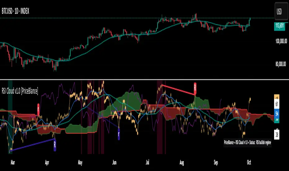
RSI Cloud v1.0 [PriceBlance] RSI Cloud v1.0 — Ichimoku-style Cloud on RSI(14), not on price.
Recalibrated baselines: EMA9 (Tenkan) for speed, WMA45 (Kijun) for stability.
Plus ADX-on-RSI to grade strength so you know when momentum persists or fades.
1. Introduction
RSI Cloud v1.0 applies an Ichimoku Cloud directly on RSI(14) to reveal momentum regimes earlier and cleaner than price-based views. We replaced Tenkan with EMA9 (faster, more responsive) and Kijun with WMA45 (slower, more stable) to fit a bounded oscillator (0–100). Forward spans (+26) and a lagging line (−26) provide a clear framework for trend bias and transitions.
To qualify signals, the indicator adds ADX computed on RSI—highlighting whether strength is weak, strong, or very strong, so you can decide when to follow, fade, or stand aside.
2. Core Mapping (Hook + Bullets)
At a glance: Ichimoku on RSI(14) with recalibrated baselines for a bounded oscillator.
Source: RSI(14)
Tenkan → EMA9(RSI) (fast, responsive)
Kijun → WMA45(RSI) (slow, stable)
Span A: classic Ichimoku midline, displaced +26
Span B: classic Ichimoku baseline, displaced +26
Lagging line: RSI shifted −26
3. Key Benefits (Why traders care)
Momentum regimes on RSI: position vs. Cloud = bull / bear / transition at a glance.
Cleaner confirmations: EMA9/WMA45 pairing cuts noise vs. raw 30/70 flips.
Earlier warnings: Cloud breaks on RSI often lead price-based confirmations.
4. ADX on RSI (Enhanced Strength Normalization)
Grade strength inside the RSI domain using ADX from ΔRSI:
ADX ≤ 20 → Weak (transparency = 60)
ADX ≤ 40 → Strong (transparency = 15)
ADX > 40 → Very strong (transparency = 0)
Use these tiers to decide when to trust, fade, or ignore a signal.
5. How to Read (Quick rules)
Bias / Regime
Bullish: RSI above Cloud and RSI > WMA45
Bearish: RSI below Cloud and RSI < WMA45
Neutral / Transition: all other cases
6. Settings (Copy & use)
RSI Length: 14 (default)
Tenkan: EMA9 on RSI · Kijun: WMA45 on RSI
Displacement: +26 (Span A/B) · −26 (Lagging)
Theme: PriceBlance Dark/Light
Visibility toggles: Cloud, Baselines, Lagging, labels/panel, Overbought/Oversold, Divergence, ADX-on-RSI (via transparency coloring)
7. Credits & License
Author/Brand: PriceBlance
Version: v1.0 (Free)
Watermark: PriceBlance • RSI Cloud v1.0
Disclaimer: Educational content; not financial advice.
8. CTA
If this helps, please ⭐ Star and Follow for updates & new tools.
Feedback is welcome—comment what you’d like added next (alerts, presets, visuals).
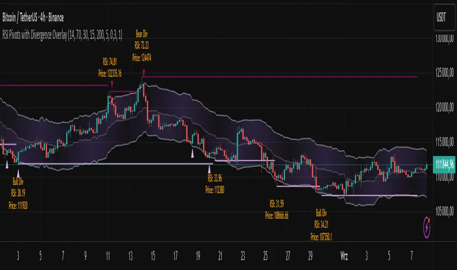
RSI Pivots with Divergence Overlay█ OVERVIEW
The RSI Pivots with Divergence Overlay indicator is an advanced tool based on RSI, displaying dynamic bands on the price chart to simplify the identification of overbought and oversold conditions. Pivot points and divergences between them are derived from these bands, providing a comprehensive view of the market and enabling the creation of various trading strategies based on this single indicator.
█ CONCEPTS
Areas where RSI exits the bands are often reversal points in the market. The concept of this indicator is to highlight places where the probability of a trend reversal increases. Therefore, pivots and divergences have been added to better identify these key moments. Additionally, the bands allow viewing the market context in relation to the RSI indicator, facilitating analysis of momentum and volatility.
█ KEY FEATURES
Dynamic Bands and RSI Signals: The bands are calculated based on the closing price and RSI value, with dynamic scaling adjusted to market volatility. The upper band corresponds to overbought levels, the lower to oversold, and the midline is their average. The price level relative to the bands serves as a visual RSI signal, indicating potential overbought or oversold conditions.
Pivot Points: The indicator identifies local price highs and lows in relation to RSI levels. The pivot level is taken from the high/low of the candle. A high pivot is detected when the high of the candle reaches a local maximum after crossing the upper RSI level (overbought), signaling a potential reversal. A low pivot appears after a local price minimum following a drop below the lower RSI level (oversold), indicating a possible uptrend reversal. The pivot length (default 2 bars) defines the search range for these extremes, meaning that with a length of 2, a potential divergence signal will appear with a 2-candle delay, as this is the minimum time required to confirm a local pivot. Pivot lines are drawn on the chart, and labels display the RSI value (from the close of the candle) and price at the detection moment. Pivot lines disappear after the detection of the next low pivot for lower lines and high pivot for upper lines, but unbreached lines or those with high volume may still serve as support or resistance levels.
Divergence Detection: The indicator automatically detects divergences to predict trend changes. Bearish divergence occurs when the price forms a higher high pivot, but the RSI (from the close of the candle) is lower than in the previous pivot, indicating weakening upward momentum and a potential bearish reversal. Bullish divergence appears when the price forms a lower low pivot, but the RSI is higher, suggesting building momentum and a possible bullish reversal. Divergences are marked in pivot labels (e.g., "Bear Div" or "Bull Div") and supported by alerts upon detection.
Return Signals: The indicator generates buy and sell signals based on RSI (price) returning to the bands after extreme conditions, independently of pivots and divergences. A buy signal is triggered when RSI (price) crosses above the lower level (exiting oversold), suggesting a potential price rise toward the midline or upper band. A sell signal occurs when RSI (price) falls below the upper level (exiting overbought), indicating a possible price drop toward the lower band. Signals are visualized as arrows (up/down triangles) on the chart, with customizable colors.
█ CONFIGURATION
The indicator offers extensive customization options:
RSI Length (rsiLength): Sets the number of periods used to calculate RSI (default 14).
RSI Upper Level (rsiUpper): Defines the overbought threshold (default 70).
RSI Lower Level (rsiLower): Defines the oversold threshold (default 30).
Band Scaling (scale): Determines the scaling multiplier for bands based on market volatility (default 15.0).
SMA Length for Candle Midpoint (length): Number of periods for calculating the moving average of candle midpoints (default 200). This parameter is used to smooth price data, enabling more accurate volatility assessment and band width adjustment to market dynamics.
Pivot Length (pivotLength): Sets the range (in bars) for detecting local price extremes (default 2).
Pivot Label Offset (pivotLabelOffset): Multiplier for the candle range to position pivot labels (default 0.3).
Show Bands (showBands): Enables/disables the display of bands on the chart.
Show Fill (showFill): Enables/disables the fill between bands and the midline.
Show Pivot Lines (showPivotLines): Enables/disables pivot lines on the chart.
Show Pivot Labels (showPivotLabels): Enables/disables labels with RSI and price values at pivots.
Show Return Signals (showReturnSignals): Enables/disables the display of buy and sell signals.
Colors and Style: Customizable colors for bands, fills, pivot lines, labels, and line widths (default 1).
█ USAGE
The indicator performs best when combined with other technical analysis tools, such as Fibonacci levels, moving averages, or trendlines, to confirm pivot, divergence, and return signals. It enables traders to identify key reversal points, detect hidden trend weaknesses through divergences, and confirm trade entries with return signals.
Usage Examples:
Price bounces off a previous pivot with high volume – this increases the probability of a trend change or correction.
A similar situation when RSI is outside the bands strengthens the signal.
If divergence occurs in addition, we have further confirmation.
This can be combined with Fibonacci levels to check if Fibo zones overlap with pivot lines – this may increase the chance of a strong price reaction.
█ ALERTS
The indicator supports alerts for:
Buy and sell signals (RSI returning to bands).
Detection of bearish and bullish divergences.
RSI ADX Bollinger Analysis High-level purpose and design philosophy
This indicator — RSI-ADX-Bollinger Analysis — is a compact, educational market-analysis toolkit that blends momentum (RSI), trend strength (ADX), volatility structure (Bollinger Bands) and simple volumetrics to provide traders a snapshot of market condition and trade idea quality. The design philosophy is explicit and layered: use each component to answer a different question about price action (momentum, conviction, volatility, participation), then combine answers to form a more robust, explainable signal. The mashup is intended for analysis and learning, not automatic execution: it surfaces the why behind signals so traders can test, learn and apply rules with risk management.
________________________________________
What each indicator contributes (component-by-component)
RSI (Relative Strength Index) — role and behavior: RSI measures short-term momentum by comparing recent gains to recent losses. A high RSI (near or above the overbought threshold) indicates strong recent buying pressure and potential exhaustion if price is extended. A low RSI (near or below the oversold threshold) indicates strong recent selling pressure and potential exhaustion or a value area for mean-reversion. In this dashboard RSI is used as the primary momentum trigger: it helps identify whether price is locally over-extended on the buy or sell side.
ADX (Average Directional Index) — role and behavior: ADX measures trend strength independently of direction. When ADX rises above a chosen threshold (e.g., 25), it signals that the market is trending with conviction; ADX below the threshold suggests range or weak trend. Because patterns and momentum signals perform differently in trending vs. ranging markets, ADX is used here as a filter: only when ADX indicates sufficient directional strength does the system treat RSI+BB breakouts as meaningful trade candidates.
Bollinger Bands — role and behavior: Bollinger Bands (20-period basis ± N standard deviations) show volatility envelope and relative price position vs. a volatility-adjusted mean. Price outside the upper band suggests pronounced extension relative to recent volatility; price outside the lower band suggests extended weakness. A band expansion (increasing width) signals volatility breakout potential; contraction signals range-bound conditions and potential squeeze. In this dashboard, Bollinger Bands provide the volatility/structural context: RSI extremes plus price beyond the band imply a stronger, volatility-backed move.
Volume split & basic MA trend — role and behavior: Buy-like and sell-like volume (simple heuristic using close>open or closeopen) or sell-like (close1.2 for validation and compare win rate and expectancy.
4. TF alignment: Accept signals only when higher timeframe (e.g., 4h) trend agrees — compare results.
5. Parameter sensitivity: Vary RSI threshold (70/30 vs 80/20), Bollinger stddev (2 vs 2.5), and ADX threshold (25 vs 30) and measure stability of results.
These exercises teach both statistical thinking and the specific failure modes of the mashup.
________________________________________
Limitations, failure modes and caveats (explicit & teachable)
• ADX and Bollinger measures lag during fast-moving news events — signals can be late or wrong during earnings, macro shocks, or illiquid sessions.
• Volume classification by open/close is a heuristic; it does not equal TAPEDATA, footprint or signed volume. Use it as supportive evidence, not definitive proof.
• RSI can remain overbought or oversold for extended stretches in persistent trends — relying solely on RSI extremes without ADX or BB context invites large drawdowns.
• Small-cap or low-liquidity instruments yield noisy band behavior and unreliable volume ratios.
Being explicit about these limitations is a strong point in a TradingView description — it demonstrates transparency and educational intent.
________________________________________
Originality & mashup justification (text you can paste)
This script intentionally combines classical momentum (RSI), volatility envelope (Bollinger Bands) and trend-strength (ADX) because each indicator answers a different and complementary question: RSI answers is price locally extreme?, Bollinger answers is price outside normal volatility?, and ADX answers is the market moving with conviction?. Volume participation then acts as a practical check for real market involvement. This combination is not a simple “indicator mashup”; it is a designed ensemble where each element reduces the others’ failure modes and together produce a teachable, testable signal framework. The script’s purpose is educational and analytical — to show traders how to interpret the interplay of momentum, volatility, and trend strength.
________________________________________
TradingView publication guidance & compliance checklist
To satisfy TradingView rules about mashups and descriptions, include the following items in your script description (without exposing source code):
1. Purpose statement: One or two lines describing the script’s objective (educational multi-indicator market overview and idea filter).
2. Component list: Name the major modules (RSI, Bollinger Bands, ADX, volume heuristic, SMA trend checks, signal tracking) and one-sentence reason for each.
3. How they interact: A succinct non-code explanation: “RSI finds momentum extremes; Bollinger confirms volatility expansion; ADX confirms trend strength; all three must align for a BUY/SELL.”
4. Inputs: List adjustable inputs (RSI length and thresholds, BB length & stddev, ADX threshold & smoothing, volume MA, table position/size).
5. Usage instructions: Short workflow (check TF alignment → confirm participation → define stop & R:R → backtest).
6. Limitations & assumptions: Explicitly state volume is approximated, ADX has lag, and avoid promising guaranteed profits.
7. Non-promotional language: No external contact info, ads, claims of exclusivity or guaranteed outcomes.
8. Trademark clause: If you used trademark symbols, remove or provide registration proof.
9. Risk disclaimer: Add the copy-ready disclaimer below.
This matches TradingView’s request for meaningful descriptions that explain originality and inter-component reasoning.
________________________________________
Copy-ready short publication description (paste into TradingView)
Advanced RSI-ADX-Bollinger Market Overview — educational multi-indicator dashboard. This script combines RSI (momentum extremes), Bollinger Bands (volatility envelope and band expansion), ADX (trend strength), simple SMA trend bias and a basic buy/sell volume heuristic to surface high-quality idea candidates. Signals require alignment of momentum, volatility expansion and rising ADX; volume participation is displayed to support signal confidence. Inputs are configurable (RSI length/levels, BB length/stddev, ADX length/threshold, volume MA, display options). This tool is intended for analysis and learning — not for automated execution. Users should back test and apply robust risk management. Limitations: volume classification here is a heuristic (close>open), ADX and BB measures lag in fast news events, and results vary by instrument liquidity.
________________________________________
Copy-ready risk & misuse disclaimer (paste into description or help file)
This script is provided for educational and analytical purposes only and does not constitute financial or investment advice. It does not guarantee profits. Indicators are heuristics and may give false or late signals; always back test and paper-trade before using real capital. The author is not responsible for trading losses resulting from the use or misuse of this indicator. Use proper position sizing and risk controls.
________________________________________
Risk Disclaimer: This tool is provided for education and analysis only. It is not financial advice and does not guarantee returns. Users assume all risk for trades made based on this script. Back test thoroughly and use proper risk management.

RSI WMA VWMA Divergence Indicator//@version=6
indicator(title="RSI WMA VWMA Divergence Indicator", shorttitle="Osc Div", format=format.price, precision=2)
oscType = input.string("RSI", "Oscillator Type", options = , group="General Settings")
// RSI Settings
rsiGroup = "RSI Settings"
rsiLengthInput = input.int(14, minval=1, title="RSI Length", group=rsiGroup)
rsiSourceInput = input.source(close, "Source", group=rsiGroup)
// WMA VWMA
wma9 = ta.wma(close, 9)
vwma3 = ta.vwma(close, 3)
useVWMA = input.bool(true, "Use VWMA3 for Divergence (when WMA9 + VWMA3 mode)", group="WMA Settings")
// Oscillator selection
rsi = ta.rsi(rsiSourceInput, rsiLengthInput) // Calculate RSI always, but use conditionally
osc = oscType == "RSI" ? rsi : useVWMA ? vwma3 : wma9
// RSI plots (conditional)
isRSI = oscType == "RSI"
rsiPlot = plot(isRSI ? rsi : na, "RSI", color=isRSI ? #7E57C2 : na)
rsiUpperBand = hline(isRSI ? 70 : na, "RSI Upper Band", color=isRSI ? #787B86 : na)
midline = hline(isRSI ? 50 : na, "RSI Middle Band", color=isRSI ? color.new(#787B86, 50) : na)
rsiLowerBand = hline(isRSI ? 30 : na, "RSI Lower Band", color=isRSI ? #787B86 : na)
fill(rsiUpperBand, rsiLowerBand, color=isRSI ? color.rgb(126, 87, 194, 90) : na, title="RSI Background Fill")
midLinePlot = plot(isRSI ? 50 : na, color = na, editable = false, display = display.none)
fill(rsiPlot, midLinePlot, 100, 70, top_color = isRSI ? color.new(color.green, 0) : na, bottom_color = isRSI ? color.new(color.green, 100) : na, title = "Overbought Gradient Fill")
fill(rsiPlot, midLinePlot, 30, 0, top_color = isRSI ? color.new(color.red, 100) : na, bottom_color = isRSI ? color.new(color.red, 0) : na, title = "Oversold Gradient Fill")
// WMA VWMA plots
plot(oscType != "RSI" ? wma9 : na, "WMA9", color=oscType != "RSI" ? color.blue : na)
plot(oscType != "RSI" ? vwma3 : na, "VWMA3", color=oscType != "RSI" ? color.orange : na)
// Smoothing MA inputs (only for RSI)
GRP = "Smoothing (RSI only)"
TT_BB = "Only applies when 'SMA + Bollinger Bands' is selected. Determines the distance between the SMA and the bands."
maTypeInput = input.string("SMA", "Type", options = , group = GRP, display = display.data_window)
maLengthInput = input.int(14, "Length", group = GRP, display = display.data_window)
bbMultInput = input.float(2.0, "BB StdDev", minval = 0.001, maxval = 50, step = 0.5, tooltip = TT_BB, group = GRP, display = display.data_window)
enableMA = maTypeInput != "None" and oscType == "RSI"
isBB = maTypeInput == "SMA + Bollinger Bands" and oscType == "RSI"
// Smoothing MA Calculation
ma(source, length, MAtype) =>
switch MAtype
"SMA" => ta.sma(source, length)
"SMA + Bollinger Bands" => ta.sma(source, length)
"EMA" => ta.ema(source, length)
"SMMA (RMA)" => ta.rma(source, length)
"WMA" => ta.wma(source, length)
"VWMA" => ta.vwma(source, length)
// Smoothing MA plots
smoothingMA = enableMA ? ma(rsi, maLengthInput, maTypeInput) : na
smoothingStDev = isBB ? ta.stdev(rsi, maLengthInput) * bbMultInput : na
plot(smoothingMA, "RSI-based MA", color=enableMA ? color.yellow : na, display = enableMA ? display.all : display.none, editable = enableMA)
bbUpperBand = plot(isBB ? smoothingMA + smoothingStDev : na, title = "Upper Bollinger Band", color=isBB ? color.green : na, display = isBB ? display.all : display.none, editable = isBB)
bbLowerBand = plot(isBB ? smoothingMA - smoothingStDev : na, title = "Lower Bollinger Band", color=isBB ? color.green : na, display = isBB ? display.all : display.none, editable = isBB)
fill(bbUpperBand, bbLowerBand, color= isBB ? color.new(color.green, 90) : na, title="Bollinger Bands Background Fill", display = isBB ? display.all : display.none, editable = isBB)
// Divergence Settings
divGroup = "Divergence Settings"
calculateDivergence = input.bool(true, title="Calculate Divergence", group=divGroup, tooltip = "Calculating divergences is needed in order for divergence alerts to fire.")
lookbackLeft = input.int(5, "Pivot Lookback Left", minval=1, group=divGroup)
lookbackRight = input.int(5, "Pivot Lookback Right", minval=1, group=divGroup)
rangeLower = input.int(5, "Min Range for Divergence", minval=0, group=divGroup)
rangeUpper = input.int(60, "Max Range for Divergence", minval=1, group=divGroup)
showHidden = input.bool(true, "Show Hidden Divergences", group=divGroup)
bearColor = color.red
bullColor = color.green
textColor = color.white
noneColor = color.new(color.white, 100)
_inRange(cond) =>
bars = ta.barssince(cond)
rangeLower <= bars and bars <= rangeUpper
bool plFound = false
bool phFound = false
bool bullCond = false
bool bearCond = false
bool hiddenBullCond = false
bool hiddenBearCond = false
float oscLBR = na
float lowLBR = na
float highLBR = na
float prevPlOsc = na
float prevPlLow = na
float prevPhOsc = na
float prevPhHigh = na
if calculateDivergence
plFound := not na(ta.pivotlow(osc, lookbackLeft, lookbackRight))
phFound := not na(ta.pivothigh(osc, lookbackLeft, lookbackRight))
oscLBR := osc
lowLBR := low
highLBR := high
prevPlOsc := ta.valuewhen(plFound, oscLBR, 1)
prevPlLow := ta.valuewhen(plFound, lowLBR, 1)
prevPhOsc := ta.valuewhen(phFound, oscLBR, 1)
prevPhHigh := ta.valuewhen(phFound, highLBR, 1)
// Regular Bullish
oscHL = oscLBR > prevPlOsc and _inRange(plFound )
priceLL = lowLBR < prevPlLow
bullCond := priceLL and oscHL and plFound
// Regular Bearish
oscLL = oscLBR < prevPhOsc and _inRange(phFound )
priceHH = highLBR > prevPhHigh
bearCond := priceHH and oscLL and phFound
// Hidden Bullish
oscLL_hidden = oscLBR < prevPlOsc and _inRange(plFound )
priceHL = lowLBR > prevPlLow
hiddenBullCond := priceHL and oscLL_hidden and plFound and showHidden
// Hidden Bearish
oscHH_hidden = oscLBR > prevPhOsc and _inRange(phFound )
priceLH = highLBR < prevPhHigh
hiddenBearCond := priceLH and oscHH_hidden and phFound and showHidden
// Plot divergences (lines and labels on pane)
if bullCond
leftBar = ta.valuewhen(plFound, bar_index , 1)
line.new(leftBar, prevPlOsc, bar_index , oscLBR, xloc=xloc.bar_index, color=bullColor, width=2)
label.new(bar_index , oscLBR, "R Bull", style=label.style_label_up, color=noneColor, textcolor=textColor)
if bearCond
leftBar = ta.valuewhen(phFound, bar_index , 1)
line.new(leftBar, prevPhOsc, bar_index , oscLBR, xloc=xloc.bar_index, color=bearColor, width=2)
label.new(bar_index , oscLBR, "R Bear", style=label.style_label_down, color=noneColor, textcolor=textColor)
if hiddenBullCond
leftBar = ta.valuewhen(plFound, bar_index , 1)
line.new(leftBar, prevPlOsc, bar_index , oscLBR, xloc=xloc.bar_index, color=bullColor, width=2, style=line.style_dashed)
label.new(bar_index , oscLBR, "H Bull", style=label.style_label_up, color=noneColor, textcolor=textColor)
if hiddenBearCond
leftBar = ta.valuewhen(phFound, bar_index , 1)
line.new(leftBar, prevPhOsc, bar_index , oscLBR, xloc=xloc.bar_index, color=bearColor, width=2, style=line.style_dashed)
label.new(bar_index , oscLBR, "H Bear", style=label.style_label_down, color=noneColor, textcolor=textColor)
// Alert conditions
alertcondition(bullCond, title="Regular Bullish Divergence", message="Found a new Regular Bullish Divergence, Pivot Lookback Right number of bars to the left of the current bar.")
alertcondition(bearCond, title="Regular Bearish Divergence", message="Found a new Regular Bearish Divergence, Pivot Lookback Right number of bars to the left of the current bar.")
alertcondition(hiddenBullCond, title="Hidden Bullish Divergence", message="Found a new Hidden Bullish Divergence, Pivot Lookback Right number of bars to the left of the current bar.")
alertcondition(hiddenBearCond, title="Hidden Bearish Divergence", message="Found a new Hidden Bearish Divergence, Pivot Lookback Right number of bars to the left of the current bar.")

RSI For LoopTitle: RSI For Loop
SurgeQuant’s RSI with Threshold Colors and Bar Coloring indicator is a sophisticated tool designed to identify overbought and oversold conditions using a customizable Relative Strength Index (RSI). By averaging RSI over a user-defined lookback period, this indicator provides clear visual signals for bullish and bearish market conditions. The RSI line and price bars are dynamically colored to highlight momentum, making it easier for traders to spot potential trading opportunities.
How It Works
RSI Calculation:
Computes RSI based on a user-selected price source (Close, High, Low, or Open) with a configurable length (default: 5). Optional moving average smoothing refines the RSI signal for smoother analysis.
Lookback Averaging:
Averages the RSI over a user-defined lookback period (default: 5) to generate a stable momentum indicator, reducing noise and enhancing signal reliability.
Threshold-Based Signals:
Long Signal: Triggered when the averaged RSI exceeds the upper threshold (default: 52), indicating overbought conditions.
Short Signal: Triggered when the averaged RSI falls below the lower threshold (default: 48), indicating oversold conditions.
Visual Representation
The indicator provides a clear and customizable visual interface: Green RSI Line and Bars: Indicate overbought conditions when the averaged RSI surpasses the upper threshold, signaling potential long opportunities.
Red RSI Line and Bars: Indicate oversold conditions when the averaged RSI drops below the lower threshold, signaling potential short opportunities.
Neutral Gray RSI Line: Represents RSI values between thresholds for neutral market conditions.
Threshold Lines: Dashed gray lines mark the upper and lower thresholds on the RSI panel for easy reference.
Customization & Parameters
The RSI with Threshold Colors and Bar Coloring indicator offers flexible parameters to suit
various trading styles: Source: Select the input price (default: Close; options: Close, High, Low, Open).
RSI Length: Adjust the RSI calculation period (default: 5).
Smoothing: Enable/disable moving average smoothing (default: enabled) and set the smoothing length (default: 10).
Moving Average Type: Choose from multiple types (SMA, EMA, DEMA, TEMA, WMA, VWMA, SMMA, HMA, LSMA, ALMA; default: ALMA).
ALMA Sigma: Configure the ALMA smoothing parameter (default: 5).
Lookback Period: Set the period for averaging RSI (default: 5).
Thresholds: Customize the upper (default: 52) and lower (default: 48) thresholds for signal generation.
Color Settings: Transparent green and red colors (70% transparency) for bullish and bearish signals, with gray for neutral states.
Trading Applications
This indicator is versatile and can be applied across various markets and strategies: Momentum Trading: Highlights strong overbought or oversold conditions for potential entry or exit points.
Trend Confirmation: Use bar coloring to confirm RSI-based signals with price action on the main chart.
Reversal Detection: Identify potential reversals when RSI crosses the customizable thresholds.
Scalping and Swing Trading: Adjust parameters (e.g., RSI length, lookback) to suit short-term or longer-term strategies.
Final Note
SurgeQuant’s RSI with Threshold Colors and Bar Coloring indicator is a powerful tool for traders seeking to leverage RSI for momentum and reversal opportunities. Its combination of lookback-averaged RSI, dynamic threshold signals, and synchronized RSI and bar coloring offers a robust framework for informed trading decisions. As with all indicators, backtest thoroughly and integrate into a comprehensive trading strategy for optimal results.

RSI MSB | QuantMAC📊 RSI MSB | QuantMAC
🎯 Overview
The RSI MSB (Momentum Shifting Bands) represents a groundbreaking fusion of traditional RSI analysis with advanced momentum dynamics and adaptive volatility bands. This sophisticated indicator combines RSI smoothing , relative momentum calculations , and dynamic standard deviation bands to create a powerful oscillator that automatically adapts to changing market conditions, providing superior signal accuracy across different trading environments.
🔧 Key Features
Hybrid RSI-Momentum Engine : Proprietary combination of smoothed RSI with relative momentum analysis
Dynamic Adaptive Bands : Self-adjusting volatility bands that respond to indicator strength
Dual Trading Modes : Flexible Long/Short or Long/Cash strategies for different risk preferences
Advanced Performance Analytics : Comprehensive metrics including Sharpe, Sortino, and Omega ratios
Smart Visual System : Dynamic color coding with 9 professional color schemes
Precision Backtesting : Date range filtering with detailed historical performance analysis
Real-time Signal Generation : Clear entry/exit signals with customizable threshold sensitivity
Position Sizing Intelligence : Half Kelly criterion for optimal risk management
📈 How The MSB Technology Work
The Momentum Shifting Bands technology is built on a revolutionary approach that combines multiple signal sources into one cohesive system:
RSI Foundation : 💪
Calculate traditional RSI using customizable length and source
Apply exponential smoothing to reduce noise and false signals
Normalize values for consistent performance across different timeframes
Momentum Analysis Engine : ⚡
Compute fast and slow momentum using rate of change calculations
Calculate relative momentum by comparing fast vs slow momentum
Normalize momentum values to 0-100 scale for consistency
Apply smoothing to create stable momentum readings
Dynamic Combination : 🔄
The genius of MSB lies in its weighted combination of RSI and momentum signals. The momentum weight parameter allows traders to adjust the balance between RSI stability and momentum responsiveness, creating a hybrid indicator that captures both trend continuation and reversal signals.
Adaptive Band System : 🎯
Calculate dynamic standard deviation multiplier based on indicator strength
Generate upper and lower bands that expand during high volatility periods
Create normalized oscillator that scales between band boundaries
Provide visual reference for overbought/oversold conditions
⚙️ Comprehensive Parameter Control
RSI Settings : 📊
RSI Length: Controls the period for RSI calculation (default: 21)
Source: Price input selection (close, open, high, low, etc.)
RSI Smoothing: Reduces noise in RSI calculations (default: 20)
Momentum Settings : 🔥
Fast Momentum Length: Short-term momentum period (default: 19)
Slow Momentum Length: Long-term momentum period (default: 21)
Momentum Weight: Balance between RSI and momentum (default: 0.6)
Oscillator Settings : ⚙️
Base Length: Foundation moving average for band calculations (default: 40)
Standard Deviation Length: Period for volatility measurement (default: 53)
SD Multiplier: Base band width adjustment (default: 0.7)
Oscillator Multiplier: Scaling factor for oscillator values (default: 100)
Signal Thresholds : 🎯
Long Threshold: Bullish signal trigger level (default: 93)
Short Threshold: Bearish signal trigger level (default: 53)
🎨 Advanced Visual System
Main Chart Elements : 📈
Dynamic Shifting Bands: Upper and lower bands with intelligent transparency
Adaptive Fill Zone: Color-coded area between bands showing current market state
Basis Line: Moving average foundation displayed as subtle reference points
Smart Bar Coloring: Candles change color based on oscillator state for instant visual feedback
Oscillator Pane : 📊
Normalized MSB Oscillator: Main signal line with dynamic coloring based on market state
Threshold Lines: Horizontal reference lines for entry/exit levels
Zero Line: Central reference for oscillator neutrality
Color State Indication: Line colors change based on bullish/bearish conditions
📊 Professional Performance Metrics
The built-in analytics suite provides institutional-grade performance measurement:
Net Profit % : Total strategy return percentage
Maximum Drawdown % : Worst peak-to-trough decline
Win Rate % : Percentage of profitable trades
Profit Factor : Ratio of gross profits to gross losses
Sharpe Ratio : Risk-adjusted return measurement
Sortino Ratio : Downside-focused risk adjustment
Omega Ratio : Probability-weighted performance ratio
Half Kelly % : Optimal position sizing recommendation
Total Trades : Complete transaction count
🎯 Strategic Trading Applications
Long/Short Mode : ⚡
Maximizes profit potential by capturing both upward and downward price movements. The MSB technology helps identify when momentum is building in either direction, allowing for optimal position switches between long and short positions.
Long/Cash Mode : 🛡️
Conservative approach ideal for retirement accounts or risk-averse traders. The indicator's adaptive nature helps identify the best times to be invested versus sitting in cash, protecting capital during adverse market conditions.
🚀 Unique Advantages
Traditional Indicators vs RSI MSB :
Static vs Dynamic: While most indicators use fixed parameters, MSB bands adapt based on indicator strength
Single Signal vs Multi-Signal: Combines RSI reliability with momentum responsiveness
Lagging vs Balanced: Optimized balance between signal speed and accuracy
Simple vs Intelligent: Advanced momentum analysis provides superior market insight
💡 Professional Setup Guide
For Day Trading (Short-term) : 📱
RSI Length: 14-18
RSI Smoothing: 12-15
Momentum Weight: 0.7-0.8
Thresholds: Long 90, Short 55
For Swing Trading (Medium-term) : 📊
RSI Length: 21-25 (default range)
RSI Smoothing: 18-22
Momentum Weight: 0.5-0.7
Thresholds: Long 93, Short 53 (defaults)
For Position Trading (Long-term) : 📈
RSI Length: 25-30
RSI Smoothing: 25-30
Momentum Weight: 0.4-0.6
Thresholds: Long 95, Short 50
🧠 Advanced Trading Techniques
MSB Divergence Analysis : 🔍
Watch for divergences between price action and MSB readings. When price makes new highs/lows but the oscillator doesn't confirm, it often signals upcoming reversals or momentum shifts.
Band Width Interpretation : 📏
Expanding Bands: Increasing volatility, expect larger price moves
Contracting Bands: Decreasing volatility, prepare for potential breakouts
Band Touches: Price touching outer bands often signals reversal opportunities
Multi-Timeframe Analysis : ⏰
Use MSB on higher timeframes for trend direction and lower timeframes for precise entry timing. The momentum component makes it particularly effective for timing entries within established trends.
⚠️ Important Risk Disclaimers
Critical Risk Factors :
Market Conditions: No indicator performs equally well in all market environments
Backtesting Limitations: Historical performance may not reflect future market behavior
Parameter Sensitivity: Different settings may produce significantly different results
Volatility Risk: Momentum-based indicators can be sensitive to extreme market conditions
Capital Risk: Always use appropriate position sizing and stop-loss protection
📚 Educational Benefits
This indicator provides exceptional learning opportunities for understanding:
Advanced RSI analysis and momentum integration techniques
Adaptive indicator design and dynamic band calculations
The relationship between momentum shifts and price movements
Professional risk management using Kelly Criterion principles
Modern oscillator interpretation and multi-signal analysis
🔍 Market Applications
The RSI MSB works effectively across various markets:
Forex : Excellent for currency pair momentum analysis
Stocks : Individual equity and index trading with momentum confirmation
Commodities : Adaptive to commodity market momentum cycles
Cryptocurrencies : Handles extreme volatility with momentum filtering
Futures : Professional derivatives trading applications
🔧 Technical Innovation
The RSI MSB represents advanced research into multi-signal technical analysis. The proprietary momentum-RSI combination has been optimized for:
Computational Efficiency : Fast calculation even on high-frequency data
Signal Clarity : Clear, actionable trading signals with reduced noise
Market Adaptability : Automatic adjustment to changing momentum conditions
Parameter Flexibility : Wide range of customization options for different trading styles
🔔 Updates and Evolution
The RSI MSB | QuantMAC continues to evolve with regular updates incorporating the latest research in momentum-based technical analysis. The comprehensive parameter set allows for extensive customization and optimization across different market conditions.
Past Performance Disclaimer : Past performance results shown by this indicator are hypothetical and not indicative of future results. Market conditions change continuously, and no trading system or methodology can guarantee profits or prevent losses. Historical backtesting may not reflect actual trading conditions including market liquidity, slippage, and fees that would affect real trading results.
Master The Markets With Multi-Signal Intelligence! 🎯📈
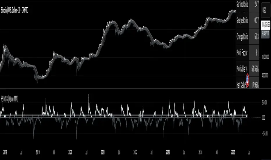
RSI Signal Pro[UgurTash]Introducing RSI Signal Pro for TradingView
RSI Signal Pro is a refined version of the standard Relative Strength Index (RSI) , designed to improve signal accuracy by generating alerts in real-time instead of waiting for multiple candle confirmations. This enhancement allows traders to react faster to market movements while maintaining the familiar RSI structure.
What Makes RSI Signal Pro Unique?
✅ Real-Time RSI Signals: Unlike the traditional RSI, which waits for candle confirmations, this version provides immediate buy and sell signals upon key level crossovers.
✅ Dual Trading Modes: Choose between Simple Mode (standard RSI crossovers) and Advanced Mode (momentum-adjusted signals with price validation).
✅ Customizable RSI-Based Moving Average (MA): Optionally apply SMA, EMA, WMA, or VWMA to smooth RSI fluctuations and identify longer-term trends.
✅ Adaptive Signal Filtering: The Advanced Mode reduces false signals by filtering RSI movements with a momentum threshold and historical RSI validation.
✅ User-Friendly Interface: Simple ON/OFF toggles allow easy customization of the indicator's behavior.
How This Indicator Works
🔹 Simple Mode: Identical to traditional RSI, triggering signals when RSI crosses 30 (bullish) or 70 (bearish).
🔹 Advanced Mode: Uses historical RSI pivots, momentum verification, and price confirmation to refine signal accuracy—ideal for traders looking for more precise entries.
🔹 RSI-Based MA: Optionally overlay moving averages onto the RSI, providing additional trend confirmation.
How to Use RSI Signal Pro
1️⃣ Select a mode: Use Simple Mode for frequent alerts or Advanced Mode for refined signals.
2️⃣ Enable RSI-Based MA: Apply SMA, EMA, WMA, or VWMA to smooth RSI fluctuations.
3️⃣ Set alerts: TradingView notifications allow you to react to real-time RSI movements instantly.
4️⃣ Apply to multiple markets: Effective for crypto, forex, stocks, and commodities.
Why Use RSI Signal Pro Instead of Standard RSI?
While RSI Signal Pro maintains the core functionality of the standard RSI, its real-time signal generation allows traders to make faster decisions without the typical delay caused by waiting for candle confirmations. Additionally, the optional momentum filtering and moving average smoothing ensure fewer false signals and better trade accuracy.
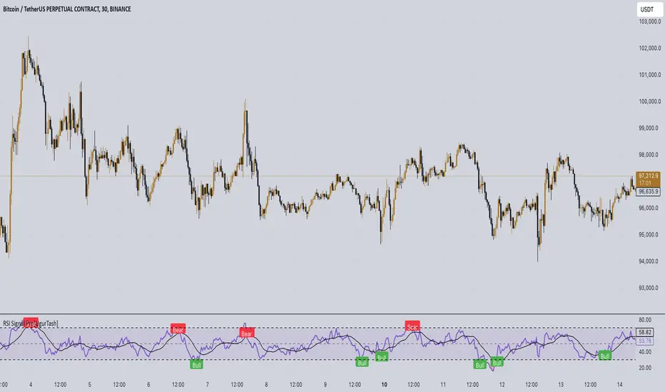
RSI and Bollinger Bands Screener [deepakks444]Indicator Overview
The indicator is designed to help traders identify potential long signals by combining the Relative Strength Index (RSI) and Bollinger Bands across multiple timeframes. This combination allows traders to leverage the strengths of both indicators to make more informed trading decisions.
Understanding RSI
What is RSI?
The Relative Strength Index (RSI) is a momentum oscillator that measures the speed and change of price movements. Developed by J. Welles Wilder Jr. for stocks and forex trading, the RSI is primarily used to identify overbought or oversold conditions in an asset.
How RSI Works:
Calculation: The RSI is calculated using the average gains and losses over a specified period, typically 14 periods.
Range: The RSI oscillates between 0 and 100.
Interpretation:
Key Features of RSI:
Momentum Indicator: RSI helps identify the momentum of price movements.
Divergences: RSI can show divergences, where the price makes a higher high, but the RSI makes a lower high, indicating potential reversals.
Trend Identification: RSI can also help identify trends. In an uptrend, the RSI tends to stay above 50, and in a downtrend, it tends to stay below 50.
Understanding Bollinger Bands
What is Bollinger Bands?
Bollinger Bands are a type of trading band or envelope plotted two standard deviations (positively and negatively) away from a simple moving average (SMA) of a price. Developed by financial analyst John Bollinger, Bollinger Bands consist of three lines:
Upper Band: SMA + (Standard Deviation × Multiplier)
Middle Band (Basis): SMA
Lower Band: SMA - (Standard Deviation × Multiplier)
How Bollinger Bands Work:
Volatility Measure: Bollinger Bands measure the volatility of the market. When the bands are wide, it indicates high volatility, and when the bands are narrow, it indicates low volatility.
Price Movement: The price tends to revert to the mean (middle band) after touching the upper or lower bands.
Support and Resistance: The upper and lower bands can act as dynamic support and resistance levels.
Key Features of Bollinger Bands:
Volatility Indicator: Bollinger Bands help traders understand the volatility of the market.
Mean Reversion: Prices tend to revert to the mean (middle band) after touching the bands.
Squeeze: A Bollinger Band Squeeze occurs when the bands narrow significantly, indicating low volatility and a potential breakout.
Combining RSI and Bollinger Bands
Strategy Overview:
The strategy aims to identify potential long signals by combining RSI and Bollinger Bands across multiple timeframes. The key conditions are:
RSI Crossing Above 60: The RSI should cross above 60 on the 15-minute timeframe.
RSI Above 60 on Higher Timeframes: The RSI should already be above 60 on the hourly and daily timeframes.
Price Above 20MA or Walking on Upper Bollinger Band: The price should be above the 20-period moving average of the Bollinger Bands or walking on the upper Bollinger Band.
Strategy Details:
RSI Calculation:
Calculate the RSI for the 15-minute, 1-hour, and 1-day timeframes.
Check if the RSI crosses above 60 on the 15-minute timeframe.
Ensure the RSI is above 60 on the 1-hour and 1-day timeframes.
Bollinger Bands Calculation:
Calculate the Bollinger Bands using a 20-period moving average and 2 standard deviations.
Check if the price is above the 20-period moving average or walking on the upper Bollinger Band.
Entry and Exit Signals:
Long Signal: When all the above conditions are met, consider a long entry.
Exit: Exit the trade when the price crosses below the 20-period moving average or the stop-loss is hit.
Example Usage
Setup:
Add the indicator to your TradingView chart.
Configure the inputs as per your requirements.
Monitoring:
Look for the long signal on the chart.
Ensure that the RSI is above 60 on the 15-minute, 1-hour, and 1-day timeframes.
Check that the price is above the 20-period moving average or walking on the upper Bollinger Band.
Trading:
Enter a long position when the criteria are met.
Set a stop-loss below the low of the recent 15-minute candle or based on your risk management rules.
Monitor the trade and exit when the RSI returns below 60 on any of the timeframes or when the price crosses below the 20-period moving average.
House Rules Compliance
No Financial Advice: This strategy is for educational purposes only and should not be construed as financial advice.
Risk Management: Always use proper risk management techniques, including stop-loss orders and position sizing.
Past Performance: Past performance is not indicative of future results. Always conduct your own research and analysis.
TradingView Guidelines: Ensure that any shared scripts or strategies comply with TradingView's terms of service and community guidelines.
Conclusion
This strategy combines RSI and Bollinger Bands across multiple timeframes to identify potential long signals. By ensuring that the RSI is above 60 on higher timeframes and that the price is above the 20-period moving average or walking on the upper Bollinger Band, traders can make more informed decisions. Always remember to conduct thorough research and use proper risk management techniques.
RSI BandsOverview
The RSI Bands indicator is a tool designed to calculate and display overbought, oversold, and middle bands based on the Relative Strength Index (RSI).
Its primary purpose is to provide traders with a clue on whether to place limit buy or limit sell orders, or to set stop-loss orders effectively. The bands represent the price levels the asset must reach for the RSI to align with specific thresholds:
Overbought Band: Displays the upper band representing the price level the asset must reach for the RSI to become overbought.
Oversold Band: Displays the lower band representing the price level the asset must reach for the RSI to become oversold.
Middle Band: Displays the middle band representing the price level the asset must reach for the RSI to hit the middle level. It uses both traditional RSI calculations and a dynamic period adjustment mechanism for improved adaptability to market conditions. The script also offers smoothing options for the bands.
Features
Calculates overbought, oversold, and middle bands using RSI values.
Dynamically adjusts the RSI period based on pivot points if enabled.
Offers smoothing options for the bands: EMA, SMA, or None.
Customizable input parameters for flexibility.
Inputs
Source Value: Selects the data source (e.g., close price) for RSI calculation.
Period: Sets the static RSI calculation period. Used if dynamic period is disabled.
Use Dynamic Period?: Toggles the use of a dynamic RSI period.
Pivot Left/Right Length: Determines the range of bars for pivot detection when using dynamic periods.
Dynamic Period Multiplier: Scales the dynamically calculated RSI period.
Overbought Level: RSI level that marks the overbought threshold.
Oversold Level: RSI level that marks the oversold threshold.
Middle Level: RSI level used as a midpoint reference.
Smoothing Type: Specifies the smoothing method for the bands (EMA, SMA, or None).
Smoothing Length: Length used for the selected smoothing method.
Key Calculations
RSI Calculation:
Computes RSI using gains and losses over the specified period (dynamic or static).
Incorporates a custom function for calculating RSI with dynamic periods.
Dynamic Period Adjustment:
Uses pivot points to determine an adaptive RSI period.
Multiplies the base dynamic period by the Dynamic Period Multiplier.
Band Calculation:
Calculates price changes (deltas) required to achieve the overbought, oversold, and middle RSI levels.
The price changes (deltas) are determined using an iterative approximation technique. For each target RSI level (overbought, oversold, or middle), the script estimates the required change in price by adjusting a hypothetical delta value until the calculated RSI aligns with the target RSI. This approximation ensures precise calculation of the price levels necessary for the RSI to reach the specified thresholds.
Computes the upper (overbought), lower (oversold), and middle bands by adding these deltas to the source price.
Smoothing:
Applies the selected smoothing method (EMA or SMA) to the calculated bands.
Plots
Overbought Band: Displays the upper band representing the price level the asset must reach for the RSI to become overbought.
Oversold Band: Displays the lower band representing the price level the asset must reach for the RSI to become oversold.
Middle Band: Displays the middle band representing the price level the asset must reach for the RSI to hit the middle level.
Usage
Choose the source value (e.g., close price).
Select whether to use a dynamic RSI period or a static one.
Adjust pivot lengths and multipliers for dynamic period calculation as needed.
Set the overbought, oversold, and middle RSI levels based on your analysis.
Configure smoothing options for the bands.
Observe the plotted bands and use them to identify potential overbought and oversold market conditions.

RSI Difference (Fast and Slow)Introduction
Oscillators like the RSI are fundamental tools for identifying trends in financial markets. Their ability to measure price momentum allows traders to detect overbought, oversold levels, and divergences, anticipating trend changes. Are there ways to improve the use of traditional RSI? How can we obtain more detailed information about current trends? This indicator answers these questions by expanding the functionalities of the traditional RSI and offering an additional tool for analysis.
How does it work?
This indicator provides a framework for trend analysis based on the following setup:
Fast RSI
Slow RSI
SMA of the fast RSI
SMA of the slow RSI
Histogram
Custom Indicator Settings
My preferred configuration is based on the 13 and 55 moving averages. The rest of the setup is as follows:
I typically use the 13 and 55 moving averages to configure both the RSI and short- and long-term moving averages.
Interpretation and Signals: Including a Long-Period RSI
Including a long-period RSI helps identify key patterns in market behavior. Crossovers between the two can be used to establish entry patterns:
If the fast RSI crosses above the slow RSI, this could indicate a long-entry pattern.
If the fast RSI crosses below the slow RSI, this could indicate a short-entry pattern.
Interpretation and Signals: Including Moving Averages
Including moving averages for both the short- and long-period RSI can help identify the base trend of the movement and, consequently:
Avoid false signals.
Trade in favor of the trend.
A simple way to start working with these is to use the crossover of the moving averages to identify the current trend:
If the short-period SMA is above the long-period SMA, the trend is bullish.
If the short-period SMA is below the long-period SMA, the trend is bearish.
Interpretation and Signals: The Histogram
The histogram represents the difference between the moving averages. If the histogram is positive, the short average is above the long average. If the histogram is below zero, the short average is below the long average. Divergences with price provide signals of potential exhaustion in the movement, indicating a possible reversal.
Indicator Details
This indicator builds upon the traditional RSI by integrating additional features that enhance its utility for traders. Here’s how each component is calculated and how they contribute to the originality of the script:
Fast RSI and Slow RSI: The fast RSI is calculated using a shorter lookback period, allowing it to capture rapid changes in momentum. The slow RSI uses a longer period to smooth out fluctuations and provide a broader view of the trend. These two RSIs work together to identify significant momentum shifts.
SMA of RSI values: The simple moving averages (SMA) of the fast and slow RSI help filter out noise and provide clear crossover signals. The SMAs are calculated using standard formulas but applied to the RSI values rather than price data, which adds a layer of insight into momentum trends.
Histogram calculation: The histogram represents the difference between the SMA of the fast RSI and the SMA of the slow RSI. This value gives a visual representation of the convergence or divergence of momentum. When the histogram crosses zero, it signifies a potential shift in the underlying trend.
This indicator combines multiple layers of analysis: fast and slow momentum, trend confirmation through SMAs, and divergence detection via the histogram. This multi-dimensional approach provides traders with a more comprehensive tool for trend analysis and decision-making.
Conclusion
This article has explored how to use this indicator to identify trends, leverage entry patterns, and analyze divergences by combining the fast RSI, slow RSI, their moving averages, and a histogram. Additionally, I’ve detailed how I usually interpret this indicator:
Identifying RSI patterns to anticipate momentum changes.
Using SMAs to confirm base trends.
Leveraging the histogram to detect divergences and potential price reversals.