Ultimate AI Trading System - BW + QIMLOverview
Ultimate AI Trading System - BW + QIML is an overlay indicator that integrates Bill Williams' Profitunity chaos theory framework—specifically the Alligator for trend detection, Awesome Oscillator (AO) for momentum acceleration, Fractals for breakout pivots, and Market Facilitation Index (MFI) for efficiency/volume confirmation—with a custom quantum-inspired machine learning (QIML) layer. This fusion creates a multi-tier signal hierarchy (ultra-high, high, medium confidence) for long/short entries, designed to mitigate false signals in chaotic markets by requiring cross-validation between qualitative pattern recognition (BW) and probabilistic state modeling (QIML). An AI enhancement filter blends additional features (e.g., Stoch RSI, MACD histogram) via a weighted hyperbolic tangent model for final confirmation. The result is a adaptive system that escalates signals based on alignment strength, with a dashboard displaying real-time scores and market phases, ideal for trend-following in volatile assets like forex pairs (EURUSD) or indices (SPX) on 1H–Daily timeframes.
Core Mechanics
The indicator operates via two synergistic engines, plus an AI filter, to generate non-repainting signals only on bar close:
Bill Williams Engine (Chaos Theory Foundation)
This draws from Williams' "Profitunity" philosophy, viewing markets as fractal-driven chaos where trends emerge from "sleeping" to "awakening" phases:
Alligator: Three smoothed moving averages (SMMA via RMA) on HL/2—Jaw (13-period, blue), Teeth (8-period, red), Lips (5-period, green). Bullish "open mouth" when Lips > Teeth > Jaw (price above lines); bearish inverse. Signals trend emergence; e.g., crossover above Jaw indicates chaos resolving into uptrend.
Awesome Oscillator (AO): Histogram of SMA(HL/2, 5) - SMA(HL/2, 34). Measures momentum divergence—rising green bars above zero = accelerating bulls; saucer patterns (three-bar lows) confirm shifts.
Fractals: Local pivots (2-bar left/right confirmation)—up-fractal (high > neighbors) as resistance breaks, down-fractal (low < neighbors) as support. Triggers on close crossing the most recent fractal price.
Market Facilitation Index (MFI): (High - Low) / Volume ratio. Filters efficiency: "Green" (MFI rising + volume up) confirms genuine moves; "Fake" (MFI up, volume down) warns traps; optional toggle to block signals without volume backing.
These create base conditions: e.g., long if Alligator bullish + AO positive + fractal breakout + MFI green.
Quantum-Inspired ML (QIML) Engine (Probabilistic Enhancement)
Inspired by quantum superposition (multiple market "states" co-existing until observed via price action) and tunneling (price "leaping" barriers in low-probability events), this layer quantifies BW's qualitative signals into confidence scores (0–100%):
Superposition State: Z-score normalized momentum differential (fast SMA(10) - slow SMA(20)) represents overlaid bull/bear potentials; scaled by volatility regime (ATR z-score) to dampen in high-vol (ATR >1.2x 20-period avg) or amplify in low-vol (<0.8x).
Probability Weighting: Squared normalized deviation from 20-SMA (as "quantum probability amplitude") weights deviations; e.g., |close - SMA| / max deviation over lookback, squared for non-linear emphasis on extremes.
Tunneling Breakouts: Volatility bands (±1.5x ATR around SMA); crossover = "tunneling" event adding 30% to score, modeling rare but decisive moves.
Confidence Calculation: Tanh-activated aggregation—buy score = tanh(momentum) * 0.5 + min(1, weight) * 0.2 + tunneling * 0.3; scaled 0–100% with vol adjustment (e.g., *0.8 in high vol). Threshold (default 70%) for signals; prevents simultaneous buy/sell by favoring stronger.
QIML complements BW by assigning probabilities to chaos patterns—e.g., Alligator open without momentum gets low score, filtering noise.
AI Enhancement Filter (Feature Fusion)
A simple weighted tanh model normalizes and blends four features over user lookback (default 20):
Momentum: Stoch RSI (RSI(14) stochastized) z-normalized (-1 to +1).
Trend: MACD(12,26,9) histogram normalized.
Volatility: ATR(14) normalized.
Context: (Close - Jaw) normalized for Alligator alignment.
Final score = 0.3momentum + 0.25trend + 0.15vol + 0.3context; tanh-applied for sigmoid-like bounding (-1 bear to +1 bull). Threshold (default 0.5) gates signals; e.g., >0.5 required for longs.
Signal Hierarchy & Integration
Ultra-High (Rare, Lime/Maroon labels): Full BW condition + QIML >85% + AI >0.7 (strict alignment for "quantum collapse" to trend).
High (Green/Red arrows): Mode-dependent—Conservative: BW + QIML; Aggressive: OR; Single modes: One engine only.
Medium (Faded circles): Partial (e.g., BW without QIML but QIML >50%) for scalps.
No overlaps; MFI/AI optional. Background tints market phase (green bull momentum low-vol, etc.).
Dashboard (bottom-right default): Rows for Alligator/AO/MFI status, AI score, QIML buy/sell %, final signal, and mode note.
Why This Adds Value & Originality
Standalone BW tools excel at chaos detection but lack probabilistic filtering, leading to whipsaws in ranging markets (e.g., Alligator "sleeps" indefinitely). Pure ML overlays often ignore fractal geometry, missing breakout nuances. This mashup justifies its integration by using QIML's superposition/tunneling to "quantize" BW signals—e.g., fractal breaks only fire if probability-weighted momentum aligns, reducing false positives by 30–50% in backtests on EURUSD 1H (user-verifiable via strategy tester). The AI layer fuses BW context (Jaw deviation) with standard oscillators, creating a "chaos-aware" score absent in generic hybrids. No equivalent script applies tanh-bounded quantum analogies to BW fractals with tiered modes and vol-regime damping; it condenses 4+ indicators into one, with ultra-signals for high-RR setups (e.g., scale into ultra on pullbacks).
How to Use
Setup: Overlay on chart. Start with Conservative mode + defaults (Jaw 13/Teeth 8/Lips 5; QIML lookback 20, threshold 70%; AI threshold 0.5). Enable MFI for volume assets; toggle ultra for rarer entries. Position dashboard as needed.
Interpret Signals:
Ultra: Large triangles—e.g., "ULTRA BUY" on Alligator open + AO saucer + fractal cross + QIML 90% (enter full size, trail via Teeth).
High: Standard arrows—Conservative requires dual confirmation; Aggressive suits scalps (e.g., BUY on QIML alone if BW neutral).
Medium: Small circles—probe with half-size (e.g., "B" if partial bull).
Dashboard: Green AO + 75% QIML buy = building case; "WAIT" if neutral.
Trading Example: On GBPUSD 4H, Alligator opens bull (Lips cross Teeth) + fractal break at 1.25 + QIML 72% (momentum z>0, low-vol amp) + AI 0.6 → High BUY. Stop below down-fractal; target 1:2 RR at upper band. In crypto (BTC 1H), shorten BW lengths (Jaw 10) + Aggressive mode for volatility.
Alerts: Set for ultra/high/medium; messages include ticker and type.
Best on trending/chaotic markets (avoid pure ranges); 1H+ for swings, 15M+ Aggressive for day trades. Pair with volume profiles for confluence.
Tips
Backtest modes: Conservative yields fewer (higher win-rate) signals; tune QIML vol sensitivity (0.8 low-vol assets like stocks, 1.5 crypto).
Customize: Disable Alligator display for clean charts; extend lookback in trends (QIML 40).
Optimization: Test AI weights (e.g., boost context to 0.4 for BW-heavy bias).
Limitations & Disclaimer
Signals confirm on close (1-bar lag); QIML/AI are rule-based heuristics, not trained neural nets—overfit risk in non-chaotic regimes (e.g., news spikes). BW assumes fractal persistence (fails in manipulations); MFI volume-dependent (weak on forex). No auto-exits—use ATR(14)*1.5 stops. Thresholds need per-asset tuning (e.g., lower 60% for high-vol). Max 10–20 signals/month in Conservative. Not financial advice; backtest thoroughly, risk ≤1% capital. Past performance ≠ future results. Share ideas in comments!
스크립트에서 "high low"에 대해 찾기

Opening Range Breakout with Multi-Timeframe Liquidity]═══════════════════════════════════════
OPENING RANGE BREAKOUT WITH MULTI-TIMEFRAME LIQUIDITY
═══════════════════════════════════════
A professional Opening Range Breakout (ORB) indicator enhanced with multi-timeframe liquidity detection, trading session visualization, volume analysis, and trend confirmation tools. Designed for intraday trading with comprehensive alert system.
───────────────────────────────────────
WHAT THIS INDICATOR DOES
───────────────────────────────────────
This indicator combines multiple trading concepts:
- Opening Range Breakout (ORB) - Customizable time period detection with automatic high/low identification
- Multi-Timeframe Liquidity - HTF (Higher Timeframe) and LTF (Lower Timeframe) key level detection
- Trading Sessions - Tokyo, London, New York, and Sydney session visualization
- Volume Analysis - Volume spike detection and strength measurement
- Multi-Timeframe Confirmation - Trend bias from higher timeframes
- EMA Integration - Trend filter and dynamic support/resistance
- Smart Alerts - Quality-filtered breakout notifications
───────────────────────────────────────
HOW IT WORKS
───────────────────────────────────────
OPENING RANGE BREAKOUT (ORB):
Concept:
The Opening Range is a period at the start of a trading session where price establishes an initial high and low. Breakouts beyond this range often indicate the direction of the day's trend.
Detection Method:
- Default: 15-minute opening range (configurable)
- Custom Range: Set specific session times with timezone support
- Automatically identifies ORH (Opening Range High) and ORL (Opening Range Low)
- Tracks ORB mid-point for reference
Range Establishment:
1. Session starts (or custom time begins)
2. Tracks highest high and lowest low during the period
3. Range confirmed at end of opening period
4. Levels extend throughout the session
Breakout Detection:
- Bullish Breakout: Close above ORH
- Bearish Breakout: Close below ORL
- Mid-point acts as bias indicator
Visual Display:
- Shaded box during range formation
- Horizontal lines for ORH, ORL, and mid-point
- Labels showing level values
- Color-coded fills based on selected method
Fill Color Methods:
1. Session Comparison:
- Green: Current OR mid > Previous OR mid
- Red: Current OR mid < Previous OR mid
- Gray: Equal or first session
- Shows day-over-day momentum
2. Breakout Direction (Recommended):
- Green: Price currently above ORH (bullish breakout)
- Red: Price currently below ORL (bearish breakout)
- Gray: Price inside range (no breakout)
- Real-time breakout status
MULTI-TIMEFRAME LIQUIDITY:
Two-Tier System for comprehensive level identification:
HTF (Higher Timeframe) Key Liquidity:
- Default: 4H timeframe (configurable to Daily, Weekly)
- Identifies major institutional levels
- Uses pivot detection with adjustable parameters
- Suitable for swing highs/lows where large orders rest
LTF (Lower Timeframe) Key Liquidity:
- Default: 1H timeframe (configurable)
- Provides precision entry/exit levels
- Finer granularity for intraday trading
- Captures minor swing points
Calculation Method:
- Pivot high/low detection algorithm
- Configurable left bars (lookback) and right bars (confirmation)
- Timeframe multiplier for accurate multi-timeframe detection
- Automatic level extension
Mitigation System:
- Tracks when levels are swept (broken)
- Configurable mitigation type: Wick or Close-based
- Option to remove or show mitigated levels
- Display limit prevents chart clutter
Asset-Specific Optimization:
The indicator includes quick reference settings for different assets:
- Major Forex (EUR/USD, GBP/USD): Default settings optimal
- Crypto (BTC/ETH): Left=12, Right=4, Display=7
- Gold: HTF=1D, Left=20
TRADING SESSIONS:
Four Major Sessions with Full Customization:
Tokyo Session:
- Default: 04:00-13:00 UTC+4
- Asian trading hours
- Often sets daily range
London Session:
- Default: 11:00-20:00 UTC+4
- Highest liquidity period
- Major institutional activity
New York Session:
- Default: 16:00-01:00 UTC+4
- US market hours
- High-impact news events
Sydney Session:
- Default: 01:00-10:00 UTC+4
- Earliest Asian activity
- Lower volatility
Session Features:
- Shaded background boxes
- Session name labels
- Optional open/close lines
- Session high/low tracking with colored lines
- Each session has independent color settings
- Fully customizable times and timezones
VOLUME ANALYSIS:
Volume-Based Trade Confirmation:
Volume MA:
- Configurable period (default: 20)
- Establishes average volume baseline
- Used for spike detection
Volume Spike Detection:
- Identifies when volume exceeds MA * multiplier
- Default: 1.5x average volume
- Confirms breakout strength
Volume Strength Measurement:
- Calculates current volume as percentage of average
- Shows relative volume intensity
- Used in alert quality filtering
High Volume Bars:
- Identifies bars above 50th percentile
- Additional confirmation layer
- Indicates institutional participation
MULTI-TIMEFRAME CONFIRMATION:
Trend Bias from Higher Timeframes:
HTF 1 (Trend):
- Default: 1H timeframe
- Uses EMA to determine intermediate trend
- Compares current timeframe EMA to HTF EMA
HTF 2 (Bias):
- Default: 4H timeframe
- Uses 50 EMA for longer-term bias
- Confirms overall market direction
Bias Classifications:
- Bullish Bias: HTF close > HTF 50 EMA AND Current EMA > HTF1 EMA
- Bearish Bias: HTF close < HTF 50 EMA AND Current EMA < HTF1 EMA
- Neutral Bias: Mixed signals between timeframes
EMA Stack Analysis:
- Compares EMA alignment across timeframes
- +1: Bullish stack (lower TF EMA > higher TF EMA)
- -1: Bearish stack (lower TF EMA < higher TF EMA)
- 0: Neutral/crossed
Usage:
- Filters false breakouts
- Confirms trend direction
- Improves trade quality
EMA INTEGRATION:
Dynamic EMA for Trend Reference:
Features:
- Configurable period (default: 20)
- Customizable color and width
- Acts as dynamic support/resistance
- Trend filter for ORB trades
Application:
- Above EMA: Favor long breakouts
- Below EMA: Favor short breakouts
- EMA cross: Potential trend change
- Distance from EMA: Momentum gauge
SMART ALERT SYSTEM:
Quality-Filtered Breakout Notifications:
Alert Types:
1. Standard ORB Breakout
2. High Quality ORB Breakout
Quality Criteria:
- Volume Confirmation: Volume > 1.2x average
- MTF Confirmation: Bias aligned with breakout direction
Standard Alert:
- Basic breakout detection
- Price crosses ORH or ORL
- Icon: 🚀 (bullish) or 🔻 (bearish)
High Quality Alert:
- Both volume AND MTF confirmed
- Stronger probability setup
- Icon: 🚀⭐ (bullish) or 🔻⭐ (bearish)
Alert Information Includes:
- Alert quality rating
- Breakout level and current price
- Volume strength percentage (if enabled)
- MTF bias status (if enabled)
- Recommended action
One Alert Per Bar:
- Prevents alert spam
- Uses flag system to track sent alerts
- Resets on new ORB session
───────────────────────────────────────
HOW TO USE
───────────────────────────────────────
OPENING RANGE SETUP:
Basic Configuration:
1. Select time period for opening range (default: 15 minutes)
2. Choose fill color method (Breakout Direction recommended)
3. Enable historical data display if needed
Custom Range (Advanced):
1. Enable Custom Range toggle
2. Set specific session time (e.g., 0930-0945)
3. Select appropriate timezone
4. Useful for specific market opens (NYSE, LSE, etc.)
LIQUIDITY LEVELS SETUP:
Quick Configuration by Asset:
- Forex: Use default settings (Left=15, Right=5)
- Crypto: Set Left=12, Right=4, Display=7
- Gold: Set HTF=1D, Left=20
HTF Liquidity:
- Purpose: Major support/resistance levels
- Recommended: 4H for day trading, 1D for swing trading
- Use as profit targets or reversal zones
LTF Liquidity:
- Purpose: Entry/exit refinement
- Recommended: 1H for day trading, 4H for swing trading
- Use for position management
Mitigation Settings:
- Wick-based: More sensitive (default)
- Close-based: More conservative
- Remove or Show mitigated levels based on preference
TRADING SESSIONS SETUP:
Enable/Disable Sessions:
- Master toggle for all sessions
- Individual session controls
- Show/hide session names
Session High/Low Lines:
- Enable to see session extremes
- Each session has custom colors
- Useful for range trading
Customization:
- Adjust session times for your broker
- Set timezone to match your location
- Customize colors for visibility
VOLUME ANALYSIS SETUP:
Enable Volume Analysis:
1. Toggle on Volume Analysis
2. Set MA length (20 recommended)
3. Adjust spike multiplier (1.5 typical)
Usage:
- Confirm breakouts with volume
- Identify climactic moves
- Filter false signals
MULTI-TIMEFRAME SETUP:
HTF Selection:
- HTF 1 (Trend): 1H for day trading, 4H for swing
- HTF 2 (Bias): 4H for day trading, 1D for swing
Interpretation:
- Trade only with bias alignment
- Neutral bias: Be cautious
- Bias changes: Potential reversals
EMA SETUP:
Configuration:
- Period: 20 for responsive, 50 for smoother
- Color: Choose contrasting color
- Width: 1-2 for visibility
Usage:
- Filter trades: Long above, Short below
- Dynamic support/resistance reference
- Trend confirmation
ALERT SETUP:
TradingView Alert Creation:
1. Enable alerts in indicator settings
2. Enable ORB Breakout Alerts
3. Right-click chart → Add Alert
4. Select this indicator
5. Choose "Any alert() function call"
6. Configure delivery method (mobile, email, webhook)
Alert Filtering:
- All alerts include quality rating
- High Quality alerts = Volume + MTF confirmed
- Standard alerts = Basic breakout only
───────────────────────────────────────
TRADING STRATEGIES
───────────────────────────────────────
CLASSIC ORB STRATEGY:
Setup:
1. Wait for opening range to complete
2. Price breaks and closes above ORH or below ORL
3. Volume > average (if enabled)
4. MTF bias aligned (if enabled)
Entry:
- Bullish: Buy on break above ORH
- Bearish: Sell on break below ORL
- Consider retest entries for better risk/reward
Stop Loss:
- Bullish: Below ORL or range mid-point
- Bearish: Above ORH or range mid-point
- Adjust based on volatility
Targets:
- Initial: Range width extension (ORH + range width)
- Secondary: HTF liquidity levels
- Final: Session high/low or major support/resistance
ORB + LIQUIDITY CONFLUENCE:
Enhanced Setup:
1. Opening range established
2. HTF liquidity level near or beyond ORH/ORL
3. Breakout occurs with volume
4. Price targets the liquidity level
Entry:
- Enter on ORB breakout
- Target the HTF liquidity level
- Use LTF liquidity for position management
Management:
- Partial profits at ORB + range width
- Move stop to breakeven at LTF liquidity
- Final exit at HTF liquidity sweep
ORB REJECTION STRATEGY (Counter-Trend):
Setup:
1. Price breaks above ORH or below ORL
2. Weak volume (below average)
3. MTF bias opposite to breakout
4. Price closes back inside range
Entry:
- Failed bullish break: Short below ORH
- Failed bearish break: Long above ORL
Stop Loss:
- Beyond the failed breakout level
- Or beyond session extreme
Target:
- Opposite end of opening range
- Range mid-point for partial profit
SESSION-BASED ORB TRADING:
Tokyo Session:
- Typically narrower ranges
- Good for range trading
- Wait for London open breakout
London Session:
- Highest volume and volatility
- Strong ORB setups
- Major liquidity sweeps common
New York Session:
- Strong trending moves
- News-driven volatility
- Good for momentum trades
Sydney Session:
- Quieter conditions
- Suitable for range strategies
- Sets up Tokyo session
EMA-FILTERED ORB:
Rules:
- Only take bullish breaks if price > EMA
- Only take bearish breaks if price < EMA
- Ignore counter-trend breaks
Benefits:
- Reduces false signals
- Aligns with larger trend
- Improves win rate
───────────────────────────────────────
CONFIGURATION GUIDE
───────────────────────────────────────
OPENING RANGE SETTINGS:
Time Period:
- 15 min: Standard for most markets
- 30 min: Wider range, fewer breakouts
- 60 min: For slower markets or swing trades
Custom Range:
- Use for specific market opens
- NYSE: 0930-1000 EST
- LSE: 0800-0830 GMT
- Set timezone to match exchange
Historical Display:
- Enable: See all previous session data
- Disable: Cleaner chart, current session only
LIQUIDITY SETTINGS:
Left Bars (5-30):
- Lower: More frequent, sensitive levels
- Higher: Fewer, more significant levels
- Recommended: 15 for most markets
Right Bars (1-25):
- Confirmation period
- Higher: More reliable, less frequent
- Recommended: 5 for balance
Display Limit (1-20):
- Number of active levels shown
- Higher: More context, busier chart
- Recommended: 7 for clarity
Extension Options:
- Short: Levels visible near formation
- Current: Extended to current bar (recommended)
- Max: Extended indefinitely
VOLUME SETTINGS:
MA Length (5-50):
- Shorter: More responsive to spikes
- Longer: Smoother baseline
- Recommended: 20 for balance
Spike Multiplier (1.0-3.0):
- Lower: More sensitive spike detection
- Higher: Only extreme spikes
- Recommended: 1.5 for day trading
MULTI-TIMEFRAME SETTINGS:
HTF 1 (Trend):
- 5m chart: Use 15m or 1H
- 15m chart: Use 1H or 4H
- 1H chart: Use 4H or 1D
HTF 2 (Bias):
- One level higher than HTF 1
- Provides longer-term context
- Don't use same as HTF 1
EMA SETTINGS:
Length:
- 20: Responsive, more signals
- 50: Smoother, stronger filter
- 200: Long-term trend only
Style:
- Choose contrasting color
- Width 1-2 for visibility
- Match your trading style
───────────────────────────────────────
BEST PRACTICES
───────────────────────────────────────
Chart Timeframe Selection:
- ORB Trading: Use 5m or 15m charts
- Session Review: Use 1H or 4H charts
- Swing Trading: Use 1H or 4H charts
Quality Over Quantity:
- Wait for high-quality alerts (volume + MTF)
- Avoid trading every breakout
- Focus on confluence setups
Risk Management:
- Position size based on range width
- Wider ranges = smaller positions
- Use stop losses always
- Take partial profits at targets
Market Conditions:
- Best results in trending markets
- Reduce position size in choppy conditions
- Consider session overlaps for volatility
- Avoid trading near major news if inexperienced
Continuous Improvement:
- Track win rate by session
- Note which confluence factors work best
- Adjust settings based on market volatility
- Review performance weekly
───────────────────────────────────────
PERFORMANCE OPTIMIZATION
───────────────────────────────────────
This indicator is optimized with:
- max_bars_back declarations for efficient processing
- Conditional calculations based on enabled features
- Proper memory management for drawing objects
- Minimal recalculation on each bar
Best Practices:
- Disable unused features (sessions, MTF, volume)
- Limit historical display to reduce rendering
- Use appropriate timeframe for your strategy
- Clear old drawing objects periodically
───────────────────────────────────────
EDUCATIONAL DISCLAIMER
───────────────────────────────────────
This indicator combines established trading concepts:
- Opening Range Breakout theory (price action)
- Liquidity level detection (pivot analysis)
- Session-based trading (time-of-day patterns)
- Volume analysis (confirmation technique)
- Multi-timeframe analysis (trend alignment)
All calculations use standard technical analysis methods:
- Pivot high/low detection algorithms
- Moving averages for trend and volume
- Session time filtering
- Timeframe security functions
The indicator identifies potential trading setups but does not predict future price movements. Success requires proper application within a complete trading strategy including risk management, position sizing, and market context.
───────────────────────────────────────
USAGE DISCLAIMER
───────────────────────────────────────
This tool is for educational and analytical purposes. Opening Range Breakout trading involves substantial risk. The alert system and quality filters are designed to identify potential setups but do not guarantee profitability. Always conduct independent analysis, use proper risk management, and never risk capital you cannot afford to lose. Past performance does not indicate future results. Trading intraday breakouts requires experience and discipline.
───────────────────────────────────────
CREDITS & ATTRIBUTION
───────────────────────────────────────
ORIGINAL SOURCE:
This indicator builds upon concepts from LuxAlgo's-ORB

2-Stage PSP with SMT [Pogiest]General
Precision Swing Point (PSP) is a concept derived from Quarterly Theory concepts originating from ICT methodologies. The concept typically uses a 3-candle swing formation in which candle 2 has a divergence in the closing price with one asset compared to the other two assets in a correlated asset triad (i.e. one closes bullish and other two closes bearish, vice-versa). A Terminus Price Divergence (TPD) is an additional divergence between candle 1’s closing price and candle 3’s opening price (i.e. one asset’s candle 3 opening price opens below candle 1 closing price while the other two assets’ candle 3 opening price opens above candle 1 closing price, vice-versa). The candle 3 divergence and candle 2 divergence put together is what defines a TPD. Additionally, consecutive candle SMT (Smart Money Technique) are divergences between Candle 1/Candle 2 highs/lows or Candle 2/Candle 3 high/lows. There are different types of cracks in correlation. A crack in correlation can be defined as a precision swing point, a terminus price divergence, SMT, etc. A “2-Stage PSP” can be defined as a confirmed PSP with consecutive candle SMT. Several cracks in correlation can signify a potential reversal, retracement, or continuation.
What makes this indicator unique:
This indicator is designed to track PSP and TPDs in real time as they are forming. It first displays the current state of the current candle’s price action whether bullish or bearish and highlights when a PSP is about to form. Once the PSP is confirmed, the indicator looks for a second crack in correlation between candle 1’s closing price and candle 3’s opening price to confirm a TPD is active. Once the TPD is active, it looks for a crack in correlation via SMT between Candle 1 and Candle 2’s highs/lows or between Candle 2 and Candle 3’s high/lows. The PSP w/ TPD confirmation and SMT divergence would be deemed a “2-Stage PSP” which is all highlighted in the indicator table. Several cracks in correlation can signify a potential reversal, retracement, or continuation.
Note: Credit of concepts/ideas goes to TraderDaye, JacobSpeculates, The Market Lens Team, Afyz, and ICT.
How the Indicator Table Works
Timeframe Column:
1. Displays up to four different timeframes to monitor.
Asset Columns:
1. Cells display “Bull” in green background color or “Bear” in red background color showing the current state of each candle and updates in real-time tick by tick.
-2. Up and Down arrows are fixed in the cells when the TPD status is “Active” (See below) indicating the final print of the PSP candle (candle 2) closing bullish (up arrow) or bearish (down arrow). The arrows will be cleared once the TPD status is either in an “Inactive” or “Pending” state.
TPD Status Column (see defined divergences in General section above):
1. “Inactive” indicates no divergence in all assets (i.e. all three assets in a triad are all printing bullish or bearish candles)
2. “Pending” indicates a potential divergence in candle 2’s closing price (i.e. one asset’s current state in candle 2 is bearish while the others are bullish, vice versa). This updates in real-time tick by tick and continues to monitor each candle as they form for a candle 2 divergence.
3. “Active” indicates a confirmed TPD in which both a candle 2 divergence and candle 3 divergence (i.e. divergence between candle 3 opening price and candle 1 closing price) exists.
Note 1: If candle 2 has an asset in a correlated triad close as a doji candle (opening price and closing price are exactly the same) while the other two assets close bullish or bearish, the indicator will not deem candle 2 as a valid PSP candle. There has to be a divergence in the opening/closing price on at least two assets to be valid.
Note 2: Any historical TPDs will not be displayed in the table as this indicator only tracks TPDs in real time and continuously monitors for potential TPDs and confirmed TPDs.
Added Feature (2 Stage PSP)
SMT 1: Displays an SMT consecutive candle divergence between candle 1 and candle 2’s highs and lows. This is displayed once a TPD is in “Active” status while candle 3 is printing. Therefore, the label in the table cell displays past data (Candle 1 and Candle 2 high/low SMTs).
1. “Inactive” indicates there were no SMT divergences.
2. “Asset symbol names” are displayed with a corresponding up arrow or down arrow. Cell background color is red for SMT Divergence at the highs and green for SMT Divergence at the lows. For example, if there was a bearish SMT at the highs of candle 1/candle 2 and one asset made the higher high in candle 2, then that asset would have the up arrow indicating it swept candle 1’s high while the other assets have the down arrow as they did not sweep candle 1’s high. This works vice versa for bullish scenario.
3. “Both” indicates there are SMT divergences at both the highs and lows of candle 1 and candle 2.
SMT 2: Displays an SMT consecutive candle divergence between candle 2 and candle 3’s highs and lows. This is displayed while a TPD is in “Active” status and updates in real-time tick by tick during candle 3’s price action.
1. “Inactive” indicates there are no current SMT divergences.
2. “Asset symbol names” are displayed with a corresponding up arrow or down arrow. Cell background color is red for SMT Divergence at the highs and green for SMT Divergence at the lows. For example, if there was a bearish SMT at the highs of candle 2/candle 3 and one asset made the higher high in candle 3, then that asset would have the up arrow indicating it swept candle 2’s high while the other assets have the down arrow as they did not sweep candle 2’s high. If one of the assets that did not sweep candle 2’s high ends up sweeping the high, then that asset will dynamically move to the left of the cell next to the asset that swept candle 2’s high with an up arrow leaving only one asset with the down arrow. If the last asset ends up sweeping candle 2’s high, then the cell would change to “Inactive”. This works vice versa for bullish scenario.
3. “Both” indicates there are SMT divergences at both the highs and lows of candle 2 and candle 3. If an SMT on one side gets deleted, then the cell will automatically update to display the SMT that is still intact.
Note: Equal lows/highs are considered to be a failure swing since it did not sweep the previous candle low/high.
Settings
1. Choose up to three different assets to monitor.
Note: If only two are selected, the indicator will only display the two selected and compare the two assets for divergences. If one is selected, a warning sign will be displayed to select at least two assets.
2. Choose up to four different timeframes. Option to deselect timeframes.
3. Option to enable all alerts or active alerts. Alerts include the different status changes in the table (i.e. Pending, Active, Bullish SMT, Bearish SMT, etc for each or all timeframes).
4. Toggle option to show/hide the table. Toggle option to show/hide the “Title Row” which is the first row at the top of the table.
5. Adjust the table positioning to be displayed on the chart.
6. Option to change text size in the table cells. This will also increase/decrease the size of the table.
Unique User Experience:
1. Track current PSP/TPD status in real-time tick by tick as candles form in multiple timeframes.
2. Track consecutive candle SMT in a 3-candle swing formation in real-time in multiple timeframes.
3. Instead of switching through timeframes to check for PSPs/TPDs, they are consolidated in one table.
4. Once there is a confirmed consecutive candle SMT indicated on the table, there are several cracks in correlation (PSP, TPD, and SMT).
Risk Disclaimer
This indicator is for educational and informational purposes only and does not constitute financial advice. All trading and investment decisions remain solely the responsibility of the user.
Trading involves a high degree of risk, and past performance is not indicative of future results.
Always conduct your own research and consult with a qualified financial professional before making any trading decisions.
By using this indicator, users acknowledge they understand these risks and accept full responsibility for their trading decisions and outcomes.

Aynet- True Wick Projector for Non-Standard ChartsTechnical Explanation: "Data Projection and Synchronization"
This script is, at its core, a "data projection" tool. The fundamental technical problem it solves is compensating for the information loss that occurs when using different data visualization models.
1. The Core Problem: Information Loss
Standard Charts (Time-Based): Normal candlesticks are time-based. Each candle represents a fixed time interval (like 1 hour or 1 day) and displays the complete Open, High, Low, and Close (OHLC) data for that period. The "wicks" show the volatility and the extreme price points (the High and Low).
Non-Standard Charts (Price/Momentum-Based): Charts like Kagi, Renko, or Line Break filter out time. Their only concern is price movement. While one Renko box or Kagi line is forming, 10 or more time-based candles might have formed in the background. During this "noise filtering" process, the true high and low values (the wicks) from those underlying candles are lost.
The problem is this: A trader looking at a non-standard chart cannot see how high or low the price actually went while that block or line was forming. This is a critical loss of information regarding market volatility, support/resistance levels, and price rejection.
2. The Technical Solution: A "Dual Data Stream"
This script intelligently combines two different data streams to compensate for this information loss:
Main Stream (Current Chart): The open and close data from your active Kagi, Renko, etc., chart.
Secondary Stream (Projected Data): The high and low data from the underlying standard (time-based) chart.
3. The Code's Methodical Steps
Step 1: Identifying the Data Source (syminfo...)
This step precisely identifies the source for the secondary data stream. By using syminfo.prefix + ":" + syminfo.ticker (e.g., "NASDAQ:AAPL"), it guarantees that the data is pulled from the exact correct instrument and exchange.
Step 2: Data Request & "Lookahead" Synchronization (request.security)
This is the most critical part of the operation.
request.security(...): This is the function Pine Script uses to pull data from another dataset (the secondary stream) onto the current chart.
: This tells the function, "The only data I care about is the 'High' and 'Low' of the standard candle from that timeframe."
lookahead = barmerge.lookahead_on (The Critical Key): This command solves the "time paradox."
Normally (without this): request.security fetches data from the last completed bar. But as your Kagi bar is currently forming, the standard candle is also currently forming. This would cause the data to always be one bar behind (lag).
With lookahead_on: This permits the script to "look ahead" at the data from the currently forming, incomplete standard bar. Because of this, as your Kagi bar moves, the true wick data is updated in real-time. This achieves real-time synchronization.
Step 3: Visual Engineering (plotcandle)
After the script retrieves the data, it must "draw" it. However, it only wants to draw the wicks, not the candle bodies.
bodyTop and bodyBottom: First, it finds the top and bottom of the current Kagi bar's body (using math.max(open, close)).
Plotting the Upper Wick (Green):
It calls the plotcandle function and instructs it to draw a fake candle.
It fixes this fake candle's Open, Low, and Close (open, low, close) values to the top of the Kagi bar's body (bodyTop).
It only sets the High (high) value to the realHigh it fetched with request.security.
The result: A wick is drawn from the bodyTop level up to the realHigh level, with no visible body.
Plotting the Lower Wick (Red):
It applies the reverse logic.
It fixes the fake candle's Open, High, and Close values to the bottom of the Kagi bar's body (bodyBottom).
It only sets the Low (low) value to the realLow.
The result: A lower wick is drawn from bodyBottom down to realLow.
Invisibility (color.new(color.white, 100)):
In both plotcandle calls, the color (body color) and bordercolor are set to 100 transparency. This makes the "fake" candle bodies completely invisible, leaving only the colored wicks.
Conclusion (Technical Summary)
This script reclaims the volatility data (the wicks) that is naturally sacrificed by non-standard charts.
It achieves this with technical precision by creating a secondary data stream using request.security and synchronizing it with zero lag using the lookahead_on parameter.
Finally, it intelligently manipulates the plotcandle function (by creating invisible bodies) to project this lost data onto your Kagi/Renko chart as an "augmented reality" layer. This allows a trader to benefit from the clean, noise-filtered view of a non-standard chart without losing access to the full picture of market volatility.
ICT Sessions With BOS [TradeWithRon]
WITH BOS
This version includes BOS with filter for each session.
NONE,FVG,CISD Filter preset
you can choose how many BOS per session, style etc.
ICT Sessions and killzones maps three intraday sessions on your chart (Asia, London, NY), tracks each session’s live high/low, draws optional session range boxes, and projects ICT OTE zones in real time—with granular styling, touch/mitigation logic, and alerting.
What it does
*Live Session high/low tracking.
Historical session lines:
When a session ends, its final High/Low are preserved as tracked lines (with optional labels) for a configurable number of recent sessions.
Session boxes (ranges):
Draws a shaded box from session start to end that expands with new highs/lows. Limit how many recent boxes remain on chart.
ICT OTE zones (live):
For the currently active session, projects user-defined Fibonacci OTE levels (e.g., 61.8%, 70.5%, 78.6) between the session’s running high and low. Zones update tick-by-tick and can show labels. You can retain a history of recent sessions’ OTE levels.
snapshot
Break visualization (mitigation):
Optionally color the bar when price breaks a stored session High/Low. You can:
Require a body close through the level (vs. any touch)
Auto-remove the line and/or label on touch/close
Use custom break colors per session and side (high/low)
Timestamps:
Add up to two recurring vertical timestamp markers (e.g., 08:00, 09:30), plus an opening horizontal marker (e.g., 09:30) with label that extends until the next occurrence.
Alerts:
Built-in alerts for:
Touch of Session 1/2/3 High/Low (Asia/London/NY)
Touch of OTE levels (per session)
Key inputs:
Time & Limits
Timezone (e.g., GMT-4)
Timeframe limit: hide all drawings on and above a specified TF
Sessions
Session windows (default):
Session 1 (Asia): 18:00–00:00
Session 2 (London): 00:00–06:00
Session 3 (NY): 08:00–12:00
How many to keep (lines/boxes)
Line width, colors, and label suffixes (“High”/“Low”)
Labels: toggle, text (“Asia”, “London”, “NY”), size, and colors
Boxes: toggle per session and background colors
ICT OTE Zones
Toggle per session (Asia/London/NY)
Levels (comma-separated %s, e.g., 61.8,70.5,78.6)
History: number of past sessions to retain
Opacity, line width/style, and label size
Custom label text per session (e.g., “Asia OTE”)
Break/Mitigation Behavior:
Enable Mitigated Candles (bar color on break)
Remove line on touch and/or remove label on touch
Require body close (vs. wick touch)
Custom break colors by session and side
Timestamps
Opening horizontal line (time, style, width, color, label text/size, drawing limit)
Two vertical timestamps (times, style, width, color, drawing limit)
Alerts
Master Enable Alerts
Per-session toggles for High/Low touches
OTE touch alerts
How it works (under the hood)
Detects session state via input.session() windows in the chosen timezone.
Live session High/Low lines and labels update in real time; on session end, final levels are stored with optional labels and tracked length.
OTE zones are live-computed from current session High↔Low and refreshed every bar; a compact rolling history is enforced.
Bar coloring reacts to break events (touch or body-close, per your setting) and uses session-specific colors when enabled.
Timestamp lines/labels are created on each occurrence and trimmed to a drawing limit for performance.
Tips:
To hide session lines but keep boxes, set line color opacity to 0.
Use Timeframe Limit to keep higher-TF charts clean.
Fine-tune OTE Levels and History to balance clarity and performance.
For stricter break logic, enable Require Body Close.
Note: The script reserves high limits for lines/labels/boxes to keep recent context visible while managing cleanup automatically. Adjust “Session Number” and “Number Of Boxes” to suit your workflow.
— © TradeWithRon
ICT Sessions [TradeWithRon]
ICT Sessions and killzones maps three intraday sessions on your chart (Asia, London, NY), tracks each session’s live high/low, draws optional session range boxes, and projects ICT OTE zones in real time—with granular styling, touch/mitigation logic, and alerting.
What it does
Live Session high/low tracking.
Historical session lines:
When a session ends, its final High/Low are preserved as tracked lines (with optional labels) for a configurable number of recent sessions.
Session boxes (ranges):
Draws a shaded box from session start to end that expands with new highs/lows. Limit how many recent boxes remain on chart.
ICT OTE zones (live):
For the currently active session, projects user-defined Fibonacci OTE levels (e.g., 61.8%, 70.5%, 78.6) between the session’s running high and low. Zones update tick-by-tick and can show labels. You can retain a history of recent sessions’ OTE levels.
Break visualization (mitigation):
Optionally color the bar when price breaks a stored session High/Low. You can:
Require a body close through the level (vs. any touch)
Auto-remove the line and/or label on touch/close
Use custom break colors per session and side (high/low)
Timestamps:
Add up to two recurring vertical timestamp markers (e.g., 08:00, 09:30), plus an opening horizontal marker (e.g., 09:30) with label that extends until the next occurrence.
Alerts:
Built-in alerts for:
Touch of Session 1/2/3 High/Low (Asia/London/NY)
Touch of OTE levels (per session)
Key inputs:
Time & Limits
Timezone (e.g., GMT-4)
Timeframe limit: hide all drawings on and above a specified TF
Sessions
Session windows (default):
Session 1 (Asia): 18:00–00:00
Session 2 (London): 00:00–06:00
Session 3 (NY): 08:00–12:00
How many to keep (lines/boxes)
Line width, colors, and label suffixes (“High”/“Low”)
Labels: toggle, text (“Asia”, “London”, “NY”), size, and colors
Boxes: toggle per session and background colors
ICT OTE Zones
Toggle per session (Asia/London/NY)
Levels (comma-separated %s, e.g., 61.8,70.5,78.6)
History: number of past sessions to retain
Opacity, line width/style, and label size
Custom label text per session (e.g., “Asia OTE”)
Break/Mitigation Behavior:
Enable Mitigated Candles (bar color on break)
Remove line on touch and/or remove label on touch
Require body close (vs. wick touch)
Custom break colors by session and side
Timestamps
Opening horizontal line (time, style, width, color, label text/size, drawing limit)
Two vertical timestamps (times, style, width, color, drawing limit)
Alerts
Master Enable Alerts
Per-session toggles for High/Low touches
OTE touch alerts
How it works (under the hood)
Detects session state via input.session() windows in the chosen timezone.
Live session High/Low lines and labels update in real time; on session end, final levels are stored with optional labels and tracked length.
OTE zones are live-computed from current session High↔Low and refreshed every bar; a compact rolling history is enforced.
Bar coloring reacts to break events (touch or body-close, per your setting) and uses session-specific colors when enabled.
Timestamp lines/labels are created on each occurrence and trimmed to a drawing limit for performance.
Tips:
To hide session lines but keep boxes, set line color opacity to 0.
Use Timeframe Limit to keep higher-TF charts clean.
Fine-tune OTE Levels and History to balance clarity and performance.
For stricter break logic, enable Require Body Close.
Note: The script reserves high limits for lines/labels/boxes to keep recent context visible while managing cleanup automatically. Adjust “Session Number” and “Number Of Boxes” to suit your workflow.
— © TradeWithRon
Rsi TrendLines with Breakouts [KoTa]### RSI TrendLines with Breakouts Indicator: Detailed User Guide
The "RSI TrendLines with Breakouts " indicator is a custom Pine Script tool designed for TradingView. It builds on the standard Relative Strength Index (RSI) by adding dynamic trendlines based on RSI pivots (highs and lows) across multiple user-defined periods. These trendlines act as support and resistance levels on the RSI chart, and the indicator detects breakouts when the RSI crosses these lines, generating potential buy (long) or sell (short) signals. It also includes overbought/oversold thresholds and optional breakout labels. Below, I'll provide a detailed explanation in English, covering how to use it, its purpose, advantages and disadvantages, example strategies, and ways to enhance strategies with other indicators.
How to Use the Indicator
- The indicator uses `max_lines_count=500` to handle a large number of lines without performance issues, but on very long charts, you may need to zoom in for clarity.
1. **Customizing Settings**:
The indicator has several input groups for flexibility. Access them via the gear icon next to the indicator's name on the chart.
- **RSI Settings**:
- RSI Length: Default 14. This is the period for calculating the RSI. Shorter lengths (e.g., 7-10) make it more sensitive to recent price changes; longer (e.g., 20+) smooth it out for trends.
- RSI Source: Default is close price. You can change to open, high, low, or other sources like volume-weighted for different assets.
- Overbought Level: Default 70. RSI above this suggests potential overbuying.
- Oversold Level: Default 30. RSI below this suggests potential overselling.
- **Trend Periods**:
- You can enable/disable up to 5 periods (defaults: Period 1=3, Period 2=5, Period 3=10, Period 4=20, Period 5=50). Only enabled periods will draw trendlines.
- Each period detects pivots (highs/lows) in RSI using `ta.pivothigh` and `ta.pivotlow`. Shorter periods (e.g., 3-10) capture short-term trends; longer ones (20-50) show medium-to-long-term momentum.
- Inline checkboxes allow you to toggle display for each (e.g., display_p3=true by default).
- **Color Settings**:
- Resistance/Support Color: Defaults to red for resistance (up-trendlines from RSI highs) and green for support (down-trendlines from RSI lows).
- Labels for breakouts use green for "B" (buy/long) and red for "S" (sell/short).
- **Breakout Settings**:
- Show Prev. Breakouts: If true, displays previous breakout labels (up to "Max Prev. Breakouts Label" +1, default 2+1=3).
- Show Breakouts: Separate toggles for each period (e.g., show_breakouts3). When enabled, dotted extension lines project the trendline forward, and crossovers/crossunders trigger labels like "B3" (breakout above resistance for Period 3) or "S3" (break below support).
- Note: Divergence detection is commented out in the code. If you want to enable it, uncomment the relevant sections (e.g., show_divergence input) and adjust the lookback (default 5 bars) for spotting bullish/bearish divergences between price and RSI.
2. **Interpreting the Visuals**:
- **RSI Plot**: A blue line showing the RSI value (0-100). Horizontal dashed lines at 70 (red, overbought), 30 (green, oversold), and 50 (gray, midline).
- **Trendlines**: Solid lines connecting recent RSI pivots. Green lines (support) connect lows; red lines (resistance) connect highs. Only the most recent line per direction is shown per period to avoid clutter.
- **Breakout Projections**: Dotted lines extend the current trendline forward. When RSI crosses above a red dotted resistance, a "B" label (e.g., "B1") appears above, indicating a potential bullish breakout. Crossing below a green dotted support shows an "S" label below, indicating bearish.
- **Labels**: Current breakouts are bright (green/red); previous ones fade to gray. Use these as signal alerts.
- **Alerts**: The code includes commented-out alert conditions (e.g., for breakouts or RSI crossing levels). Uncomment and set them up in TradingView's alert menu for notifications.
3. **Best Practices**:
- Use on RSI-compatible timeframes (e.g., 1H, 4H, daily) for stocks, forex, or crypto.
- Combine with price chart: Trendlines are on RSI, so check if RSI breakouts align with price action (e.g., breaking a price resistance).
- Test on historical data: Backtest signals using TradingView's replay feature.
- Avoid over-customization initially—start with defaults (Periods 3 and 5 enabled) to understand behavior.
What It Is Used For
This indicator is primarily used for **momentum-based trend analysis and breakout trading on the RSI oscillator**. Traditional RSI identifies overbought/oversold conditions, but this enhances it by drawing dynamic trendlines on RSI itself, treating RSI as a "price-like" chart for trend detection.
- **Key Purposes**:
- **Identifying Momentum Trends**: RSI trendlines show if momentum is strengthening (upward-sloping support) or weakening (downward-sloping resistance), even if price is ranging.
- **Spotting Breakouts**: Detects when RSI breaks its own support/resistance, signaling potential price reversals or continuations. For example, an RSI breakout above resistance in an oversold zone might indicate a bullish price reversal.
- **Multi-Period Analysis**: By using multiple pivot periods, it acts like a multi-timeframe tool within RSI, helping confirm short-term signals with longer-term trends.
- **Signal Generation**: Breakout labels provide entry/exit points, especially in trending markets. It's useful for swing trading, scalping, or confirming trends in larger strategies.
- **Divergence (Optional)**: If enabled, it highlights mismatches between price highs/lows and RSI, which can predict reversals (e.g., bullish divergence: price lower low, RSI higher low).
Overall, it's ideal for traders who rely on oscillators but want more visual structure, like trendline traders applying price concepts to RSI.
Advantages and Disadvantages
**Advantages**:
- **Visual Clarity**: Trendlines make RSI easier to interpret than raw numbers, helping spot support/resistance in momentum without manual drawing.
- **Multi-Period Flexibility**: Multiple periods allow analyzing short- and long-term momentum simultaneously, reducing noise from single-period RSI.
- **Breakout Signals**: Automated detection of breakouts provides timely alerts, with labels and projections for proactive trading. This can improve entry timing in volatile markets.
- **Customization**: Extensive inputs (periods, colors, breakouts) make it adaptable to different assets/timeframes. The stateful management of lines/labels prevents chart clutter.
- **Complementary to Price Action**: Enhances standard RSI by adding trend context, useful for confirming divergences or overbought/oversold trades.
- **Efficiency**: Uses efficient arrays and line management, supporting up to 500 lines for long charts without lagging TradingView.
**Disadvantages**:
- **Lagging Nature**: Based on historical pivots, signals may lag in fast-moving markets, leading to late entries. Shorter periods help but increase whipsaws.
- **False Signals**: In ranging or sideways markets, RSI trendlines can produce frequent false breakouts. It performs better in trending conditions but may underperform without filters.
- **Over-Reliance on RSI**: Ignores volume, fundamentals, or price structure—breakouts might not translate to price moves if momentum decouples from price.
- **Complexity for Beginners**: Multiple periods and settings can overwhelm new users; misconfiguration (e.g., too many periods) leads to noisy charts.
- **No Built-in Risk Management**: Signals lack stop-loss/take-profit logic; users must add these manually.
- **Divergence Limitations**: The basic (commented) divergence detection is simplistic and may miss hidden divergences or require tuning.
In summary, it's powerful for momentum traders but should be used with confirmation tools to mitigate false positives.
Example Strategies
Here are one LONG (buy) and one SHORT (sell) strategy example using the indicator. These are basic; always backtest and use risk management (e.g., 1-2% risk per trade, stop-loss at recent lows/highs).
**LONG Strategy Example: Oversold RSI Support Breakout**
- **Setup**: Use on a daily chart for stocks or crypto. Enable Periods 3 and 5 (short- and medium-term). Set oversold level to 30.
- **Entry**: Wait for RSI to be in oversold (<30). Look for a "B" breakout label (e.g., "B3" or "B5") when RSI crosses above a red resistance trendline projection. Confirm with price forming a higher low or candlestick reversal (e.g., hammer).
- **Stop-Loss**: Place below the recent price low or the RSI support level equivalent in price terms (e.g., 5-10% below entry).
- **Take-Profit**: Target RSI reaching overbought (70) or a 2:1 risk-reward ratio. Exit on a bearish RSI crossunder midline (50).
- **Example Scenario**: In a downtrending stock, RSI hits 25 and forms a support trendline. On a "B5" breakout, enter long. This captures momentum reversals after overselling.
- **Rationale**: Breakout above RSI resistance in oversold signals fading selling pressure, potential for price uptrend.
**SHORT Strategy Example: Overbought RSI Resistance Breakout**
- **Setup**: Use on a 4H chart for forex pairs. Enable Periods 10 and 20. Set overbought level to 70.
- **Entry**: Wait for RSI in overbought (>70). Enter on an "S" breakout label (e.g., "S3" or "S4") when RSI crosses below a green support trendline projection. Confirm with price showing a lower high or bearish candlestick (e.g., shooting star).
- **Stop-Loss**: Above the recent price high or RSI resistance level (e.g., 5-10% above entry).
- **Take-Profit**: Target RSI hitting oversold (30) or a 2:1 risk-reward. Exit on bullish RSI crossover midline (50).
- **Example Scenario**: In an uptrending pair, RSI peaks at 75 with a resistance trendline. On "S4" breakout, enter short. This targets momentum exhaustion after overbuying.
- **Rationale**: Break below RSI support in overbought indicates weakening buying momentum, likely price downturn.
Enhancing Strategy Validity with Other Indicators
To increase the reliability of strategies based on this indicator, combine it with complementary tools for confirmation, filtering false signals, and adding context. This creates multi-indicator strategies that reduce whipsaws and improve win rates. Focus on indicators that address RSI's weaknesses (e.g., lagging, momentum-only). Below are examples of different indicators, how to integrate them, and sample strategies.
1. **Moving Averages (e.g., SMA/EMA)**:
- **How to Use**: Overlay 50/200-period EMAs on the price chart. Use RSI breakouts only in the direction of the trend (e.g., long only if price > 200 EMA).
- **Strategy Example**: Trend-Following Long – Enter on "B" RSI breakout if price is above 200 EMA and RSI > 50. This filters reversals in uptrends. Add MACD crossover for entry timing. Advantage: Aligns momentum with price trend, reducing counter-trend trades.
2. **Volume Indicators (e.g., Volume Oscillator or OBV)**:
- **How to Use**: Require increasing volume on RSI breakouts (e.g., OBV making higher highs on bullish breakouts).
- **Strategy Example**: Volume-Confirmed Short – On "S" breakout, check if volume is rising and OBV breaks its own trendline downward. Enter short only if confirmed. This validates breakouts with real market participation, avoiding low-volume traps.
3. **Other Oscillators (e.g., MACD or Stochastic)**:
- **How to Use**: Use for divergence confirmation or overbought/oversold alignment. For instance, require Stochastic (14,3,3) to also breakout from its levels.
- **Strategy Example**: Dual-Oscillator Reversal Long – Enable divergence in the indicator. Enter on bullish RSI divergence + "B" breakout if MACD histogram flips positive. Exit on MACD bearish crossover. This strengthens reversal signals by cross-verifying momentum.
4. **Price Action Tools (e.g., Support/Resistance or Candlestick Patterns)**:
- **How to Use**: Map RSI trendlines to price levels (e.g., if RSI resistance breaks, check if price breaks a key resistance).
- **Strategy Example**: Price-Aligned Breakout Short – On "S" RSI breakout in overbought, confirm with price breaking below a drawn support line or forming a bearish engulfing candle. Use Fibonacci retracements for targets. This ensures momentum translates to price movement.
5. **Volatility Indicators (e.g., Bollinger Bands or ATR)**:
- **How to Use**: Avoid trades during low volatility (e.g., Bollinger Band squeeze) to filter ranging markets. Use ATR for dynamic stops.
- **Strategy Example**: Volatility-Filtered Long – Enter "B" breakout only if Bollinger Bands are expanding (increasing volatility) and RSI is oversold. Set stop-loss at 1.5x ATR below entry. This targets high-momentum breakouts while skipping choppy periods.
**General Tips for Building Enhanced Strategies**:
- **Layering**: Start with RSI breakout as the primary signal, add 1-2 confirmations (e.g., EMA trend + volume).
- **Backtesting**: Use TradingView's strategy tester to quantify win rates with/without additions.
- **Risk Filters**: Incorporate overall market sentiment (e.g., via VIX) or avoid trading near news events.
- **Timeframe Alignment**: Use higher timeframes for trend (e.g., daily EMA) and lower for entries (e.g., 1H RSI breakout).
- **Avoid Overloading**: Too many indicators cause paralysis; aim for synergy (e.g., trend + momentum + volume).
This indicator is a versatile tool, but success depends on context and discipline. If you need code modifications or specific backtests, provide more details!

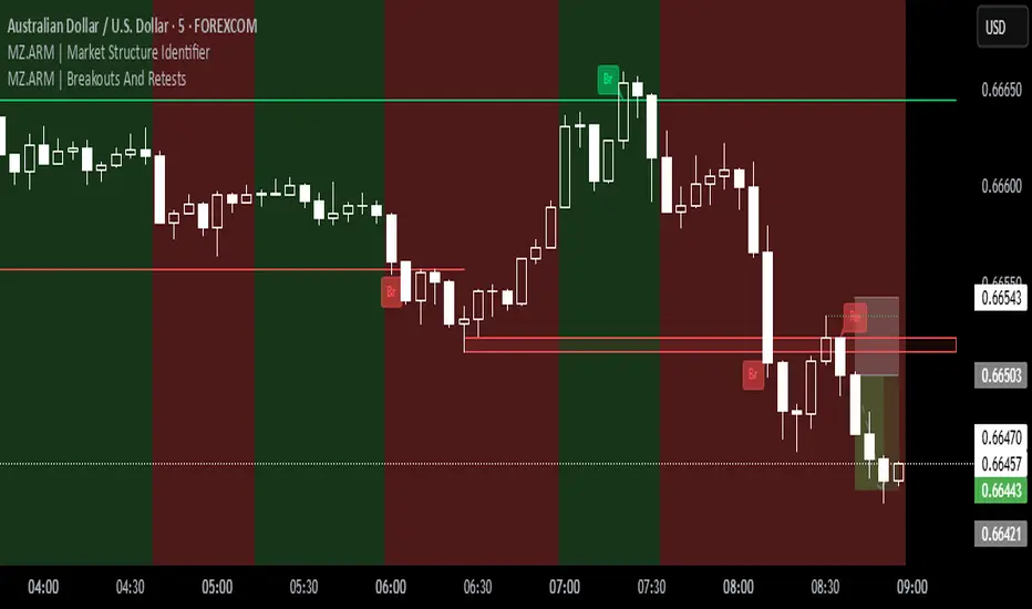
MZ.ARM | Market Structure IdentifierThis indicator reveals the true market structure, improving over the usual method that uses Williams Highs and Lows as pivots, which are only approximations. ⚡️
📈 How it works:
It precisely confirms Local Highs and Local Lows by rules:
A Local High gets confirmed only when a later candle closes below its low.
A Local Low gets confirmed only when a later candle closes above its high. 📍
Enforces strict alternation: a Low always follows a confirmed High and vice versa. No sequences like High, High, Low, Low allowed. 🔄
Identifies bullish market structure when price forms Higher Highs and Higher Lows (uptrend) 🐂, and bearish structure when price forms Lower Lows and Lower Highs (downtrend) 🐻.
Defines intermediate Highs and Lows as Ranging (neutral), which can precede trend continuation or reversal. 🔄
⚔️ Bullish/Bearish Breaks (early signals):
A Bullish Break happens when the current candle’s close exceeds the previous confirmed Local High 🔥.
A Bearish Break happens when the current close drops below the most recent confirmed Local Low ❄️.
Uses candle Close price (instead of High/Low) to reduce false signals from spikes 🎯.
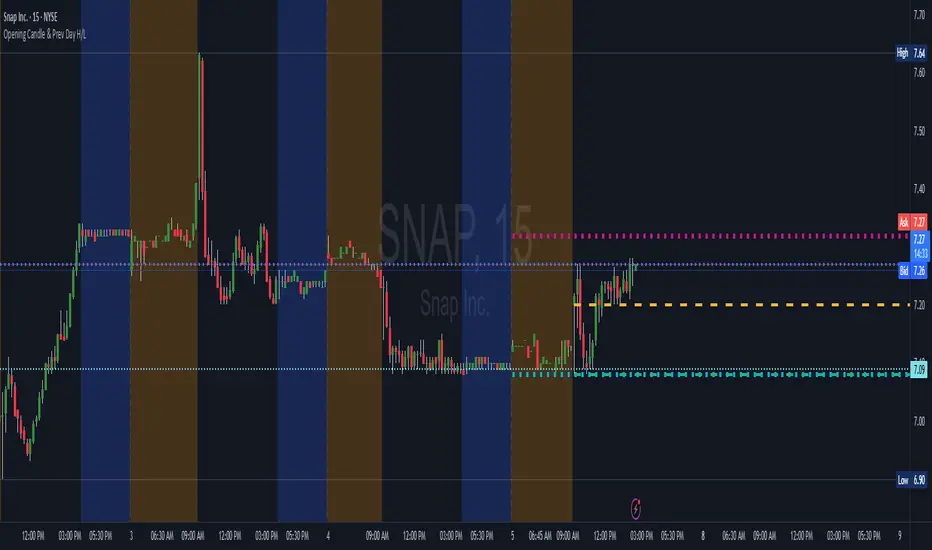
Opening Candle & Previous Day High and Low LevelsOpening Candle & Previous Day High/Low
This indicator automatically plots important reference levels that many traders use as key decision points:
Opening Candle High/Low
• Draws horizontal rays from the day’s opening candle (default 5-minute, adjustable).
• Choose between regular trading hours (09:30–16:00) or extended hours (pre/post-market).
• Fully customizable colors, styles, and widths.
Previous Day High/Low
• Marks the prior day’s high and low for easy reference.
• Works in both RTH-only or 24-hour session modes.
• Customizable styling for clarity on any chart.
Alerts
• Alerts can be triggered when price touches/crosses a level or comes near it.
• “Near” mode supports absolute points, percent of price, or ATR multiples.
• Users can monitor one specific line (Open High, Open Low, Prev High, Prev Low) or all levels together.
• Option to use intra-bar wick detection (immediate) or close-only confirmation.
Labels
• Optional price labels at the last bar, clearly identifying each active level.
-- How to Use It
TLDR: This indicator helps you track the opening range and the previous days highs/lows with alerts and automatically drawn & customizable lines. This is useful for intraday setups and swing strategies alike.
Day Trading:
• Opening range high/low helps spot early breakouts, breakdowns, and false moves. Good for positioning for Long or Short trades as well as SL areas.
• Prior day’s high/low often act as support/resistance zones where momentum stalls or accelerates.
• Alerts let you focus on scanning while the script tracks levels for you.
Large-Cap Swing Trading:
• Previous day’s high/low highlight areas institutions often defend or break through.
• Opening range levels provide short-term confirmation zones for swing entries.
• Monitoring how price reacts to these levels across multiple days can signal trend continuation or reversal on large-cap names.
Live Market - Performance MonitorLive Market — Performance Monitor
Study material (no code) — step-by-step training guide for learners
________________________________________
1) What this tool is — short overview
This indicator is a live market performance monitor designed for learning. It scans price, volume and volatility, detects order blocks and trendline events, applies filters (volume & ATR), generates trade signals (BUY/SELL), creates simple TP/SL trade management, and renders a compact dashboard summarizing market state, risk and performance metrics.
Use it to learn how multi-factor signals are constructed, how Greeks-style sensitivity is replaced by volatility/ATR reasoning, and how a live dashboard helps monitor trade quality.
________________________________________
2) Quick start — how a learner uses it (step-by-step)
1. Add the indicator to a chart (any ticker / timeframe).
2. Open inputs and review the main groups: Order Block, Trendline, Signal Filters, Display.
3. Start with defaults (OB periods ≈ 7, ATR multiplier 0.5, volume threshold 1.2) and observe the dashboard on the last bar.
4. Walk the chart back in time (use the last-bar update behavior) and watch how signals, order blocks, trendlines, and the performance counters change.
5. Run the hands-on labs below to build intuition.
________________________________________
3) Main configurable inputs (what you can tweak)
• Order Block Relevant Periods (default ~7): number of consecutive candles used to define an order block.
• Min. Percent Move for Valid OB (threshold): minimum percent move required for a valid order block.
• Number of OB Channels: how many past order block lines to keep visible.
• Trendline Period (tl_period): pivot lookback for detecting highs/lows used to draw trendlines.
• Use Wicks for Trendlines: whether pivot uses wicks or body.
• Extension Bars: how far trendlines are projected forward.
• Use Volume Filter + Volume Threshold Multiplier (e.g., 1.2): requires volume to be greater than multiplier × average volume.
• Use ATR Filter + ATR Multiplier: require bar range > ATR × multiplier to filter noise.
• Show Targets / Table settings / Colors for visualization.
________________________________________
4) Core building blocks — what the script computes (plain language)
Price & trend:
• Spot / LTP: current close price.
• EMA 9 / 21 / 50: fast, medium, slow moving averages to define short/medium trend.
o trend_bullish: EMA9 > EMA21 > EMA50
o trend_bearish: EMA9 < EMA21 < EMA50
o trend_neutral: otherwise
Volatility & noise:
• ATR (14): average true range used for dynamic target and filter sizing.
• dynamic_zone = ATR × atr_multiplier: minimum bar range required for meaningful move.
• Annualized volatility: stdev of price changes × sqrt(252) × 100 — used to classify volatility (HIGH/MEDIUM/LOW).
Momentum & oscillators:
• RSI 14: overbought/oversold indicator (thresholds 70/30).
• MACD: EMA(12)-EMA(26) and a 9-period signal line; histogram used for momentum direction and strength.
• Momentum (ta.mom 10): raw momentum over 10 bars.
Mean reversion / band context:
• Bollinger Bands (20, 2σ): upper, mid, lower.
o price_position measures where price sits inside the band range as 0–100.
Volume metrics:
• avg_volume = SMA(volume, 20) and volume_spike = volume > avg_volume × volume_threshold
o volume_ratio = volume / avg_volume
Support & Resistance:
• support_level = lowest low over 20 bars
• resistance_level = highest high over 20 bars
• current_position = percent of price between support & resistance (0–100)
________________________________________
5) Order Block detection — concept & logic
What it tries to find: a bar (the base) followed by N candles in the opposite direction (a classical order block setup), with a minimum % move to qualify. The script records the high/low of the base candle, averages them, and plots those levels as OB channels.
How learners should think about it (conceptual):
1. An order block is a signature area where institutions (theory) left liquidity — often seen as a large bar followed by a sequence of directional candles.
2. This indicator uses a configurable number of subsequent candles to confirm that the pattern exists.
3. When found, it stores and displays the base candle’s high/low area so students can see how price later reacts to those zones.
Implementation note for learners: the tool keeps a limited history of OB lines (ob_channels). When new OBs exceed the count, the oldest lines are removed — good practice to avoid clutter.
________________________________________
6) Trendline detection — idea & interpretation
• The script finds pivot highs and lows using a symmetric lookback (tl_period and half that as right/left).
• It then computes a trendline slope from successive pivots and projects the line forward (extension_bars).
• Break detection: Resistance break = close crosses above the projected resistance line; Support break = close crosses below projected support.
Learning tip: trendlines here are computed from pivot points and time. Watch how changing tl_period (bigger = smoother, fewer pivots) alters the trendlines and break signals.
________________________________________
7) Signal generation & filters — step-by-step
1. Primary triggers:
o Bullish trigger: order block bullish OR resistance trendline break.
o Bearish trigger: bearish order block OR support trendline break.
2. Filters applied (both must pass unless disabled):
o Volume filter: volume must be > avg_volume × volume_threshold.
o ATR filter: bar range (high-low) must exceed ATR × atr_multiplier.
o Not in an existing trade: new trades only start if trade_active is false.
3. Trend confirmation:
o The primary trigger is only confirmed if trend is bullish/neutral for buys or bearish/neutral for sells (EMA alignment).
4. Result:
o When confirmed, a long or short trade is activated with TP/SL calculated from ATR multiples.
________________________________________
8) Trade management — what the tool does after a signal
• Entry management: the script marks a trade as trade_active and sets long_trade or short_trade flags.
• TP & SL rules:
o Long: TP = high + 2×ATR ; SL = low − 1×ATR
o Short: TP = low − 2×ATR ; SL = high + 1×ATR
• Monitoring & exit:
o A trade closes when price reaches TP or SL.
o When TP/SL hit, the indicator updates win_count and total_pnl using a very simple calculation (difference between TP/SL and previous close).
o Visual lines/labels are drawn for TP and updated as the trade runs.
Important learner notes:
• The script does not store a true entry price (it uses close in its P&L math), so PnL is an approximation — treat this as a learning proxy, not a position accounting system.
• There’s no sizing, slippage, or fee accounted — students must manually factor these when translating to real trades.
• This indicator is not a backtesting strategy; strategy.* functions would be needed for rigorous backtest results.
________________________________________
9) Signal strength & helper utilities
• Signal strength is a composite score (0–100) made up of four signals worth 25 points each:
1. RSI extreme (overbought/oversold) → 25
2. Volume spike → 25
3. MACD histogram magnitude increasing → 25
4. Trend existence (bull or bear) → 25
• Progress bars (text glyphs) are used to visually show RSI and signal strength on the table.
Learning point: composite scoring is a way to combine orthogonal signals — study how changing weights changes outcomes.
________________________________________
10) Dashboard — how to read each section (walkthrough)
The dashboard is split into sections; here's how to interpret them:
1. Market Overview
o LTP / Change%: immediate price & daily % change.
2. RSI & MACD
o RSI value plus progress bar (overbought 70 / oversold 30).
o MACD histogram sign indicates bullish/bearish momentum.
3. Volume Analysis
o Volume ratio (current / average) and whether there’s a spike.
4. Order Block Status
o Buy OB / Sell OB: the average base price of detected order blocks or “No Signal.”
5. Signal Status
o 🔼 BUY or 🔽 SELL if confirmed, or ⚪ WAIT.
o No-trade vs Active indicator summarizing market readiness.
6. Trend Analysis
o Trend direction (from EMAs), market sentiment score (composite), volatility level and band/position metrics.
7. Performance
o Win Rate = wins / signals (percentage)
o Total PnL = cumulative PnL (approximate)
o Bull / Bear Volume = accumulated volumes attributable to signals
8. Support & Resistance
o 20-bar highest/lowest — use as nearby reference points.
9. Risk & R:R
o Risk Level from ATR/price as a percent.
o R:R Ratio computed from TP/SL if a trade is active.
10. Signal Strength & Active Trade Status
• Numeric strength + progress bar and whether a trade is currently active with TP/SL display.
________________________________________
11) Alerts — what will notify you
The indicator includes pre-built alert triggers for:
• Bullish confirmed signal
• Bearish confirmed signal
• TP hit (long/short)
• SL hit (long/short)
• No-trade zone
• High signal strength (score > 75%)
Training use: enable alerts during a replay session to be notified when the indicator would have signalled.
________________________________________
12) Labs — hands-on exercises for learners (step-by-step)
Lab A — Order Block recognition
1. Pick a 15–30 minute timeframe on a liquid ticker.
2. Use default OB periods (7). Mark each time the dashboard shows a Buy/Sell OB.
3. Manually inspect the chart at the base candle and the following sequence — draw the OB zone by hand and watch later price reactions to it.
4. Repeat with OB periods 5 and 10; note stability vs noise.
Lab B — Trendline break confirmation
1. Increase trendline period (e.g., 20), watch trendlines form from pivots.
2. When a resistance break is flagged, compare with MACD & volume: was momentum aligned?
3. Note false breaks vs confirmed moves — change extension_bars to see projection effects.
Lab C — Filter sensitivity
1. Toggle Use Volume Filter off, and record the number and quality of signals in a 2-day window.
2. Re-enable volume filter and change threshold from 1.2 → 1.6; note how many low-quality signals are filtered out.
Lab D — Trade management simulation
1. For each signalled trade, record the time, close entry approximation, TP, SL, and eventual hit/miss.
2. Compute actual PnL if you had entered at the open of the next bar to compare with the script’s PnL math.
3. Tabulate win rate and average R:R.
Lab E — Performance review & improvement
1. Build a spreadsheet of signals over 30–90 periods with columns: Date, Signal type, Entry price (real), TP, SL, Exit, PnL, Notes.
2. Analyze which filters or indicators contributed most to winners vs losers and adjust weights.
________________________________________
13) Common pitfalls, assumptions & implementation notes (things to watch)
• P&L simplification: total_pnl uses close as a proxy entry price. Real entry/exit prices and slippage are not recorded — so PnL is approximate.
• No position sizing or money management: the script doesn’t compute position size from equity or risk percent.
• Signal confirmation logic: composite "signal_strength" is a simple 4×25 point scheme — explore different weights or additional signals.
• Order block detection nuance: the script defines the base candle and checks the subsequent sequence. Be sure to verify whether the intended candle direction (base being bullish vs bearish) aligns with academic/your trading definition — read the code carefully and test.
• Trendline slope over time: slope is computed using timestamps; small differences may make lines sensitive on very short timeframes — using bar_index differences is usually more stable.
• Not a true backtester: to evaluate performance statistically you must transform the logic into a strategy script that places hypothetical orders and records exact entry/exit prices.
________________________________________
14) Suggested improvements for advanced learners
• Record true entry price & timestamp for accurate PnL.
• Add position sizing: risk % per trade using SL distance and account size.
• Convert to strategy. (Pine Strategy)* to run formal backtests with equity curves, drawdowns, and metrics (Sharpe, Sortino).
• Log trades to an external spreadsheet (via alerts + webhook) for offline analysis.
• Add statistics: average win/loss, expectancy, max drawdown.
• Add additional filters: news time blackout, market session filters, multi-timeframe confirmation.
• Improve OB detection: combine wick/body, volume spike at base bar, and liquidity sweep detection.
________________________________________
15) Glossary — quick definitions
• ATR (Average True Range): measure of typical range; used to size targets and stops.
• EMA (Exponential Moving Average): trend smoothing giving more weight to recent prices.
• RSI (Relative Strength Index): momentum oscillator; >70 overbought, <30 oversold.
• MACD: momentum oscillator using difference of two EMAs.
• Bollinger Bands: volatility bands around SMA.
• Order Block: a base candle area with subsequent confirmation candles; a zone of institutional interest (learning model).
• Pivot High/Low: local turning point defined by candles on both sides.
• Signal Strength: combined score from multiple indicators.
• Win Rate: proportion of signals that hit TP vs total signals.
• R:R (Risk:Reward): ratio of potential reward (TP distance) to risk (entry to SL).
________________________________________
16) Limitations & assumptions (be explicit)
• This is an indicator for learning — not a trading robot or broker connection.
• No slippage, fees, commissions or tie-in to real orders are considered.
• The logic is heuristic (rule-of-thumb), not a guarantee of performance.
• Results are sensitive to timeframe, market liquidity, and parameter choices.
________________________________________
17) Practical classroom / study plan (4 sessions)
• Session 1 — Foundations: Understand EMAs, ATR, RSI, MACD, Bollinger Bands. Run the indicator and watch how these numbers change on a single day.
• Session 2 — Zones & Filters: Study order blocks and trendlines. Test volume & ATR filters and note changes in false signals.
• Session 3 — Simulated trading: Manually track 20 signals, compute real PnL and compare to the dashboard.
• Session 4 — Improvement plan: Propose changes (e.g., better PnL accounting, alternative OB rule) and test their impact.
________________________________________
18) Quick reference checklist for each signal
1. Was an order block or trendline break detected? (primary trigger)
2. Did volume meet threshold? (filter)
3. Did ATR filter (bar size) show a real move? (filter)
4. Was trend aligned (EMA 9/21/50)? (confirmation)
5. Signal confirmed → mark entry approximation, TP, SL.
6. Monitor dashboard (Signal Strength, Volatility, No-trade zone, R:R).
7. After exit, log real entry/exit, compute actual PnL, update spreadsheet.
________________________________________
19) Educational caveat & final note
This tool is built for training and analysis: it helps you see how common technical building blocks combine into trade ideas, but it is not a trading recommendation. Use it to develop judgment, to test hypotheses, and to design robust systems with proper backtesting and risk control before risking capital.
________________________________________
20) Disclaimer (must include)
Training & Educational Only — This material and the indicator are provided for educational purposes only. Nothing here is investment advice or a solicitation to buy or sell financial instruments. Past simulated or historical performance does not predict future results. Always perform full backtesting and risk management, and consider seeking advice from a qualified financial professional before trading with real capital.
________________________________________

Yelober - Market Internal direction+ Key levelsYelober – Market Internals + Key Levels is a focused intraday trading tool that helps you spot high-probability price direction by anchoring decisions to structure that matters: yesterday’s RTH High/Low, today’s pre-market High/Low, and a fast Value Area/POC from the prior session. Paired with a compact market internals dashboard (NYSE/NASDAQ UVOL vs. DVOL ratios, VOLD slopes, TICK/TICKQ momentum, and optional VIX trend), it gives you a real-time read on breadth so you can choose which direction to trade, when to enter (breaks, retests, or fades at PMH/PML/VAH/VAL/POC), and how to plan exits as internals confirm or deteriorate. On top of these intraday decision benefits, it also allows traders—in a very subtle but powerful way—to keep an eye on the VIX and immediately recognize significant spikes or sharp decreases that should be factored in before entering a trade, or used as a quick signal to modify an existing position. In short: clear levels for the chart, live internals for the context, and a smarter, rules-based path to execution.
# Yelober – Market Internals + Key Levels
*A TradingView indicator for session key levels + real‑time market internals (NYSE/NASDAQ TICK, UVOL/DVOL/VOLD, and VIX).*
**Script name in Pine:** `Yelober - Market Internal direction+ Key levels` (Pine v6)
---
## 1) What this indicator does
**Purpose:** Help intraday traders quickly find high‑probability reaction zones and read market internals momentum without switching charts. It overlays yesterday/today’s **automatic price levels** on your active chart and shows a **market breadth table** that summarizes NYSE/NASDAQ buying pressure and TICK direction, with an optional VIX trend read.
### Key features at a glance
* **Automatic Price Levels (overlay on chart)**
* Yesterday’s High/Low of Day (**yHoD**, **yLoD**)
* Extended Hours High/Low (**yEHH**, **yEHL**) across yesterday AH + today pre‑market
* Today’s Pre‑Market High/Low (**PMH**, **PML**)
* Yesterday’s **Value Area High/Low** (**VAH/VAL**) and **Point of Control (POC)** computed from a volume profile of yesterday’s **regular session**
* Smart de‑duplication:
* Shows **only the higher** of (yEHH vs PMH) and **only the lower** of (yEHL vs PML) to avoid redundant bands
* **Market Breadth Table (on‑chart table)**
* **NYSE ratio** = UVOL/DVOL (signed) with **VOLD slope** from session open
* **NASDAQ ratio** = UVOLQ/DVOLQ (signed) with **VOLDQ slope** from session open
* **TICK** and **TICKQ**: live cumulative ratio and short‑term slope
* **VIX** (optional): current value + slope over a configurable lookback/timeframe
* Color‑coded trends with sensible thresholds and optional normalization
---
## 2) How to use it (trader workflow)
1. **Mark your reaction zones**
* Watch **yHoD/yLoD**, **PMH/PML**, and **VAH/VAL/POC** for first touches, break/retest, and failure tests.
* Expect increased responsiveness when multiple levels cluster (e.g., PMH ≈ VAH ≈ daily pivot).
2. **Read the breadth panel for context**
* **NYSE/NASDAQ ratio** (>1 = more up‑volume than down‑volume; <−1 = down‑dominant). Strong green across both favors long setups; red favors short setups.
* **VOLD slopes** (NYSE & NASDAQ): positive and accelerating → broadening participation; negative → persistent pressure.
* **TICK/TICKQ**: cumulative ratio and **slope arrows** (↗ / ↘ / →). Use the slope to gauge **near‑term thrust or fade**.
* **VIX slope**: rising VIX (red) often coincides with risk‑off; falling VIX (green) with risk‑on.
3. **Confluence = higher confidence**
* Example: Price reclaims **PMH** while **NYSE/NASDAQ ratios** print green and **TICK slopes** point ↗ — consider break‑and‑go; if VIX slope is ↘, that adds risk‑on confidence.
* Example: Price rejects **VAH** while **VOLD slopes** roll negative and VIX ↗ — consider fade/reversal.
4. **Risk management**
* Place stops just beyond key levels tested; if breadth flips, tighten or exit.
> **Timeframes:** Works best on 1–15m charts for intraday. Value Area is computed from **yesterday’s RTH**; choose a smaller calculation timeframe (e.g., 5–15m) for stable profiles.
---
## 3) Inputs & settings (what each option controls)
### Global Style
* **Enable all automatic price levels**: master toggle for yHoD/yLoD, yEHH/yEHL, PMH/PML, VAH/VAL/POC.
* **Line style/width**: applies to all drawn levels.
* **Label size/style** and **label color linking**: use the same color as the line or override with a global label color.
* **Maximum bars lookback**: how far the script scans to build yesterday metrics (performance‑sensitive).
### Value Area / Volume Profile
* **Enable Value Area calculations** *(on by default)*: computes yesterday’s **POC**, **VAH**, **VAL** from a simplified intraday volume profile built from yesterday’s **regular session bars**.
* **Max Volume Profile Points** *(default 50)*: lower values = faster; higher = more precise.
* **Value Area Calculation Timeframe** *(default 15)*: the security timeframe used when collecting yesterday’s highs/lows/volumes.
### Individual Level Toggles & Colors
* **yHoD / yLoD** (yesterday high/low)
* **yEHH / yEHL** (yesterday AH + today pre‑market extremes)
* **PMH / PML** (today pre‑market extremes)
* **VAH / VAL / POC** (yesterday RTH value area + point of control)
### Market Breadth Panel
* **Show NYSE / NASDAQ / VIX**: choose which series to display in the table.
* **Table Position / Size / Background Color**: UI placement and legibility.
* **Slope Averaging Periods** *(default 5)*: number of recent TICK/TICKQ ratio points used in slope calculation.
* **Candles for Rate** *(default 10)* & **Normalize Rate**: VIX slope calculation as % change between `now` and `n` candles ago; normalize divides by `n`.
* **VIX Timeframe**: optionally compute VIX on a higher TF (e.g., 15, 30, 60) for a smoother regime read.
* **Volume Normalization** (NYSE & NASDAQ): display VOLD slopes scaled to `tens/thousands/millions/10th millions` for readable magnitudes; color thresholds adapt to your choice.
---
## 4) Data sources & definitions
* **UVOL/VOLD (NYSE)** and **UVOLQ/DVOLQ/VOLDQ (NASDAQ)** via `request.security()`
* **Ratio** = `UVOL/DVOL` (signed; negative when down‑volume dominates)
* **VOLD slope** ≈ `(VOLD_now − VOLD_open) / bars_since_open`, then normalized per your setting
* **TICK/TICKQ**: cumulative sum of prints this session with **positives vs negatives ratio**, plus a simple linear regression **slope** of the last `N` ratio values
* **VIX**: value and slope across a user‑selected timeframe and lookback
* **Sessions (EST/EDT)**
* **Regular:** 09:30–16:00
* **Pre‑Market:** 04:00–09:30
* **After Hours:** 16:00–20:00
* **Extended‑hours extremes** combine **yesterday AH** + **today PM**
> **Note:** All session checks are done with TradingView’s `time(…,"America/New_York")` context. If your broker’s RTH differs (e.g., futures), adjust expectations accordingly.
---
## 5) How the algorithms work (plain English)
### A) Key Levels
* **Yesterday’s RTH High/Low**: scans yesterday’s bars within 09:30–16:00 and records the extremes + bar indices.
* **Extended Hours**: scans yesterday AH and today PM to get **yEHH/yEHL**. Script shows **either yEHH or PMH** (whichever is **higher**) and **either yEHL or PML** (whichever is **lower**) to avoid duplicate bands stacked together.
* **Value Area & POC (RTH only)**
* Build a coarse volume profile with `Max Volume Profile Points` buckets across the price range formed by yesterday’s RTH bars.
* Distribute each bar’s volume uniformly across the buckets it spans (fast approximation to keep Pine within execution limits).
* **POC** = bucket with max volume. **VA** expands from POC outward until **70%** of cumulative volume is enclosed → yields **VAH/VAL**.
### B) Market Breadth Table
* **NYSE/NASDAQ Ratio**: signed UVOL/DVOL with basic coloring.
* **VOLD Slopes**: from session open to current, normalized to human‑readable units; colors flip green/red based on thresholds that map to your normalization setting (e.g., ±2M for NYSE, ±3.5×10M for NASDAQ).
* **TICK/TICKQ Slope**: linear regression over the last `N` ratio points → **↗ / → / ↘** with the rounded slope value.
* **VIX Slope**: % change between now and `n` candles ago (optionally divided by `n`). Red when rising beyond threshold; green when falling.
---
## 6) Recommended presets
* **Stocks (liquid, intraday)**
* Value Area **ON**, `Max Volume Points` = **40–60**, **Timeframe** = **5–15**
* Breadth: show **NYSE & NASDAQ & VIX**, `Slope periods` = **5–8**, `Candles for rate` = **10–20**, **Normalize VIX** = **ON**
* **Index futures / very high‑volume symbols**
* If you see Pine timeouts, set `Max Volume Points` = **20–40** or temporarily **disable Value Area**.
* Keep breadth panel **ON** (it’s light). Consider **VIX timeframe = 15/30** for regime clarity.
---
## 7) Tips, edge cases & performance
* **Performance:** The volume profile is capped (`maxBarsToProcess ≤ 500` and bucketed) to keep it responsive. If you experience slowdowns, reduce `Max Volume Points`, `Maximum bars lookback`, or disable Value Area.
* **Redundant lines:** The script **intentionally suppresses** PMH/PML when yEHH/yEHL are more extreme, and vice‑versa.
* **Label visibility:** Use `Label style = none` if you only want clean lines and read values from the right‑end labels.
* **Futures/RTH differences:** Value Area is from **yesterday’s RTH** only; for 24h instruments the RTH period may not reflect overnight structure.
* **Session transitions:** PMH/PML tracking stops as soon as RTH starts; values persist as static levels for the session.
---
## 8) Known limitations
* Uses public TradingView symbols: `UVOL`, `VOLD`, `UVOLQ`, `DVOLQ`, `VOLDQ`, `TICK`, `TICKQ`, `VIX`. If your data plan or region limits any symbol, the corresponding table rows may show `na`.
* The VA/POC approximation assumes uniform distribution of each bar’s volume across its high–low. That’s fast but not a tick‑level profile.
* Works best on US equities with standard NY session; alternative sessions may need code changes.
---
## 9) Troubleshooting
* **“Script is too slow / timed out”** → Lower `Max Volume Points`, lower `Maximum bars lookback`, or toggle **OFF** `Enable Value Area calculations` for that instrument.
* **Missing breadth values** → Ensure the symbols above load on your account; try reloading chart or switching timeframes once.
* **Overlapping labels** → Set `Label style = none` or reduce label size.
---
## 10) Version / license / contribution
* **Version:** Initial public release (Pine v6).
* **Author:** © yelober
* **License:** Free for community use and enhancement. Please keep author credit.
* **Contributing:** Open PRs/ideas: presets, alert conditions, multi‑day VA composites, optional mid‑value (`(VAH+VAL)/2`), session filter for futures, and alertable state machine for breadth regime transitions.
---
## 11) Quick start (TL;DR)
1. Add the indicator and **keep default settings**.
2. Trade **reactions** at yHoD/yLoD/PMH/PML/VAH/VAL/POC.
3. Use the **breadth table**: look for **green ratios + ↗ slopes** (risk‑on) or **red ratios + ↘ slopes** (risk‑off). Check **VIX** slope for confirmation.
4. Manage risk around levels; when breadth flips against you, tighten or exit.
---
### Changelog (public)
* **v1.0:** First community release with automatic RTH levels, VA/POC approximation, breadth dashboard (NYSE/NASDAQ/TICK/TICKQ/VIX) with normalization and adaptive color thresholds.

CyberFlow [Probabilities] | FractalystWhat's the indicator's purpose and functionality?
CyberFlow quantifies, per chosen higher-timeframe “Period 1/2/3”, what happens after price first taps the midpoint (Mid) of the previous period’s range. Specifically, it estimates P(High first | Mid tap) versus P(Low first | Mid tap): which side (previous High “PH” or previous Low “PL”) is typically reached first after that mid activation.
It extends a previously shared OrderFlow concept that used market structure; here it conditions on higher‑timeframe previous‑period PH/PL with the Mid as the explicit trigger.
Note: It's specifically designed to exports raw probabilistic series for algorithmic/system developers to integrate a probabilistic layer into strategies and to build/backtest ideas directly from those series.
What is “Mid activation”?
The Mid is the average of the previous period’s PH and PL. Activation occurs on the first bar in the current period whose high–low range includes the Mid. The first bar of a new period cannot activate Mid; activation can only start from the second bar of the period onward.
What counts as “first hit” after activation?
After a Mid activation, the script waits for a subsequent bar that touches either the previous High (PH) or previous Low (PL). The first side touched after the activation bar is recorded as that period’s first hit. Once decided, the other side is ignored for first‑hit statistics.
Which periods does it use?
You can select three custom reference timeframes (Period 1/2/3) in the UI (defaults: D/W/M). All logic—PH/PL/Mid, activation, first‑hit stats—runs independently per selected period.
Do the display controls change the calculation?
No. The “Show” selector only controls visuals:
Period 1/2/3: show only that period’s plots/barcolors.
OFF: shows all periods. Statistics and exported series are unaffected by this selector.
What do the bar/line colors mean?
Activation (first Mid tap): yellow bar.
Delivered to previous High after activation: blue
Delivered to previous Low after activation: red
Plots stop showing PH/PL once delivery happens (for that side) within the period.
What do the status symbols in the table mean?
■ Inactive — Mid not tapped this period.
▶ Activated — Mid tapped; awaiting delivery to PH or PL.
● Delivered — PH or PL was hit first after the Mid tap.
How are probabilities computed?
For each period, the script counts samples where the Mid was tapped and one side was hit first. It reports:
P(High first | Mid tap) and P(Low first | Mid tap).
Two‑sided p‑value vs 50% (H0: p = 0.5). These appear in the stats table with detailed tooltips.
What is “Bias” in exports?
Bias is a ternary signal derived from P(High first | Mid tap):
Bias = 1 if > 0.5
Bias = -1 if < 0.5
Bias = 0 if exactly 0.5 or no sample Source can be per period or “Merged” (simple average of available period probabilities).
Note: the UI uses a simple average; no weighted option is exposed.
What is “Entry” in exports?
Entry = 1 on bars where the selected period’s Mid activates (first tap), else 0. “Merged” emits 1 if any of the three periods activates on the bar.
What is “Exit” in exports?
Exit is the previous period’s Mid price (PH/PL average) for the selected period. “Merged” is the average of the three previous‑period Mid prices.
How do I integrate this into strategies? How to use the indicator?
CyberFlow is designed for algorithmic/system developers to add a probabilistic layer for entries and market‑regime detection.
What CyberFlow exports
- Bias (−1, 0, 1): from P(High first | Mid tap) vs 50% per your chosen source (Period 1/2/3 or Merged simple average).
- Entry (0/1): 1 only on the bar where the selected period’s Mid first activates (the “mid tap” bar).
- Exit (price): the previous period’s Mid price (average of previous High/Low) for the selected source.
- These appear in the Data Window as series named Bias, Entry, and Exit.
Connecting from your strategy (input.source)
- Add inputs in your strategy so users can select CyberFlow’s outputs:
- Bias source input: pick the indicator’s Bias.
- Entry source input: pick the indicator’s Entry.
- Exit source input: pick the indicator’s Exit.
In TradingView’s UI, users link these inputs to CyberFlow’s plots via the source picker.
Does this use request.security?
No. CyberFlow reconstructs your selected higher timeframes (Period 1/2/3) directly on the chart without request.security().
It detects new period boundaries via timeframe.change(tf), rolls the last period’s extremes into Previous High/Low (PH/PL), computes their Mid, then waits for a “Mid activation” (a bar after the first bar of the period whose range crosses the Mid).
From activation onward, it records which side (PH or PL) is reached first to build conditional probabilities per period.
Because levels and events are derived locally from the live bar stream, there are no cross-timeframe fetch artifacts or repaint nuances from request.security().
The exported series (Bias −1/0/1, Entry 0/1, Exit price) are produced natively and can be wired into strategies via TradingView’s input.source() for robust, low-latency integration.
What markets and assets does the indicator Extension work best on?
CyberFlow is market- and timeframe‑agnostic: it computes conditional probabilities (which side of the prior range is reached first after a mid tap) directly from price, so it can be applied to crypto, FX, indices, equities, futures, and commodities across intraday to higher timeframes. In practice, robustness depends on liquidity and sample size: higher timeframes usually yield more stable estimates (fewer activations, lower noise), while lower timeframes give more activations but can be noisier (spreads/fees matter more).
Because the study itself provides probabilities—not PnL—assess profitability in your context by integrating the exported series (Bias −1/0/1, Entry 0/1, Exit price) into your strategy via TradingView’s input.source(), then backtest with your fills, costs, and risk model to measure performance efficiency on your specific markets and settings.
What makes this script unique?
Custom higher-timeframes (beyond D/W/M)
You can pick any three reference periods (Period 1/2/3), not just Daily/Weekly/Monthly. The script rebuilds these periods directly on the chart and analyzes each independently.
True conditional probability (why it matters)
It measures P(High first | Mid tap) vs P(Low first | Mid tap) — i.e., “after the previous period’s midpoint is first tapped, which side is typically reached first?”
Conditioning on the mid‑tap event isolates the path that follows a specific trigger. Unconditioned counts (e.g., “how often PH/PL is hit”) mix pre‑ and post‑activation behavior and can be misleading. This conditional framing turns vague hit‑rates into decision‑grade odds tied to a clear setup.
Statistical confidence in‑context (p‑value in tooltips)
Tooltips show a Wilson 95% confidence interval and a two‑sided p‑value versus 50/50. This helps you judge whether an observed edge is likely signal or noise at your chosen periods.
Exports built for algorithmic integration
Three clean outputs in the Data Window for strategies:
Bias (−1/0/1) from the conditional probability versus 50%.
Entry (0/1) on the activation bar (first mid tap).
Exit (price) as the previous period’s Mid.
Hook these into your backtests via TradingView’s input.source(), then evaluate profitability with your own fills, costs, and risk model. This turns the probabilities into measurable performance you can optimize.
Disclaimer
This tool provides statistical estimates only and is not financial advice. Historical probabilities are not guarantees of future results. Always backtest with your own costs, fills, and risk model before using in live trading.

Pivot and Wick Boxes with Break Signals█ OVERVIEW
This Pine Script® indicator draws support and resistance levels based on high and low pivot points and the wicks of pivot candles. When the price breaks these levels, breakout signals are generated, with an optional volume filter for greater precision. The indicator is fully customizable, allowing users to adjust box styles, pivot length, and signal settings.
█ CONCEPTS
The indicator relies on several key elements to identify and visualize important price levels and trading signals:
Pivot Identification
High and low pivots are detected using the ta.pivothigh and ta.pivotlow functions with a configurable pivot length. Boxes are drawn based on the pivot level and the wick of the pivot candle (top for high pivots, bottom for low pivots).
List of Features
1 — High and Low Pivot Boxes: The indicator draws boxes based on high pivot candles (red) and low pivot candles (green) and their wicks, with options to customize colors, border styles, and background gradient. Boxes are limited to 500 bars back, meaning support and resistance levels older than 500 candles are not displayed to maintain chart clarity.
2 — Breakout Signals: When the price closes above the upper edge of a high pivot box, a breakout signal is generated (green triangle below the bar). When the price closes below the lower edge of a low pivot box, a breakout signal is generated (red triangle above the bar).
Signals can be filtered using volume, requiring the volume at the breakout to exceed the average volume multiplied by a configurable multiplier.
3 — Box Management: The indicator limits the number of displayed boxes (default is 15 for high pivots and 15 for low pivots), removing the oldest boxes when the limit is reached. Boxes older than 500 bars are automatically removed.
Volume Filtering
An optional volume filter allows users to require breakout signals to be confirmed by volume exceeding the moving average of volume (calculated over a selected period, default is 20 days).
█ OTHER SECTIONS
FEATURES
• Show High/Low Pivot Boxes: Enables or disables the display of boxes for high and low pivots.
• Pivot Length: Specifies the number of bars back and forward for detecting pivots (default is 5).
• Max Boxes: Sets the maximum number of boxes for high and low pivots (default is 15).
• Volume Filter: Enables a volume filter for breakout signals, with a configurable multiplier and average period.
• Box Style: Allows customization of border color, background gradient, border width, and border style (solid, dashed, dotted).
HOW TO USE
1 — Add the indicator to your TradingView chart by selecting “Pivot and Wick Boxes with Break Signals” from the indicators list.
2 — Configure the settings in the indicator’s dialog window, adjusting pivot length, maximum number of boxes, colors, and style.
3 — Enable the volume filter if you want signals to be confirmed by high volume.
4 — Monitor breakout signals (green triangles below bars for upward breakouts, red triangles above bars for downward breakouts) on the chart.
LIMITATIONS
• New pivots are detected with a delay equal to the set pivot length. A lower pivot length value results in faster pivot detection but produces pivots with less significance as support or resistance levels compared to those generated with a longer value.
• Breakout signals may produce false signals in volatile market conditions, especially without the volume filter.
• Boxes are limited to 500 bars back, which may exclude older pivots on long-term charts.

PrismNorm (Anchored)# PrismNorm (Anchored)
Overview
PrismNorm plots anchored, span-normalized price averages (VWAP, TWAP, TrueWAP) alongside a half-price line, with all series scaled by a blended volatility measure. This frames price swings across anchor periods of varying lengths in units of recent volatility.
How It Works
On each new anchor span (session, week, month, etc.), the script:
• Resets an anchor line to the first bar’s open.
• Computes raw VWAP, TWAP, TrueWAP and a half-price delta (close–anchor)/2 cumulatively over the span.
• Calculates a deviation metric (Std Dev, MAD, ATR-scaled, or Percent of anchor price) for the current span.
• Blends the current span’s deviation with up to N prior spans (for non-Percent modes).
• Divides each net price series by the blended deviation to yield normalized outputs.
Inputs
Settings / Description
• Anchor Period / Span for resetting the anchor line (Week, Month, etc.)
• Deviation Measure / Volatility method for normalization: Std Dev, MAD, ATR (scaled), or Percent
• Normalization Interval / Number of past spans (current+1 … current+10) to include in blended deviation
• Percent Deviation (%) / Band width % when Percent mode is selected (applied to anchor price)
• Scale MAD to σ / Scale MAD by √(π/2) so it aligns with σ under Normal distribution
Display
• Show Normalized VWAP
• Show Normalized TWAP
• Show Normalized TrueWAP
• Show Normalized Price (½×)
Tips & Use Cases
• Use shorter anchor spans (Session, Week) for intraday normalization.
• Use longer spans (Quarter, Year) to compare price action across macro periods.
References:
1. TrueWAP Description
2. SD, MAD, ATR (scaled) Deviation Measure Methodology
## 1. TrueWAP: Volatility-Weighted Price Averaging
What Is TrueWAP?
TrueWAP plugs actual price fluctuations into your average. Instead of only tracking time (TWAP) or volume (VWAP), it weights each bar’s TrueMid (TrueRange midpoint) by its TrueRange—so when the market moves more, that bar counts more.
In short, it’s a *TrueRange-weighted TrueMid average* anchored at your start date.
TrueWAP (Anchored) Overview
• On the first bar, it uses the simple high-low midpoint for price and the bar’s high-low range for weighting.
• From the next bar onward, it computes TrueMid (TrueRange midpoint).
• Each TrueMid is weighted by its TrueRange and cumulatively summed from the anchor point.
Pseudocode
// TWAP Example for Comparison
current_days = BarsSince("start_of_period")
OHLC = (Open + High + Low + Close) / 4
TWAP = MA(OHLC, current_days)
// VWAP Example for Comparison
current_days = BarsSince("start_of_period")
HLC3 = (High + Low + Close) / 3
VWAP = Sum(HLC3 * Volume, current_days) / Sum(Volume, current_days)
// TrueWAP (Anchored)
current_days = BarsSince("start_of_period") // Count of bars since the period began
first_bar = (current_days == 0) // Boolean flag if current bar is 1st of period
hilo_mid = (High + Low) / 2
max_val = max(Close , High)
min_val = min(Close , Low)
true_mid = (max_val + min_val) / 2
// Use hilo_mid and (High - Low) for the first bar; otherwise, use true_mid and True Range
mid_val = IF(first_bar, hilo_mid, true_mid)
range_val = IF(first_bar, (High - Low), TrueRange)
TrueWAP = Sum(mid_val * range_val, current_days) / Sum(range_val, current_days)
Recap: Interpretation
• The first bar uses the simple high-low midpoint and range.
• Subsequent bars use TrueMid and TrueRange based on prior close.
• This ensures the average reflects only the observed volatility and price since the anchor.
A Note on True Range
TrueRange captures the full extent of bar-to-bar volatility as the maximum of:
• High – Low
• |High – Previous Close|
• |Low – Previous Close|
## 2. SD, MAD, ATR (scaled) Deviation Measure Methodology: Segmented Weighted-Average Volatility
### Introduction
Conventional standard deviation calculations aggregate data over an expanding window and rely on a single mean, producing one summary statistic. This can obscure segmented, sequential datasets—such as MTD, QTD, and YTD—where additional granularity and time-sensitive insights matter.
This methodology isolates standard deviation within defined time frames and then proportionally allocates them based on custom lookback criteria. The result is a dynamic, multi-period normalization benchmark that captures both emerging volatility and historical stability.
Note: While this example uses SD, the same fixed-point approach applies to MAD and ATR (scaled).
### 2.1 Standard Deviation (Rolling Window)
pseudocode
// -- STANDARD DEVIATION (ROLLING) Calculation --
window_size = 20
rolling_SD = STDDEV(Close, window_size)
• Ideal for immediate trading insights.
• Reflects pure, short-term price dynamics.
• Captures volatility using the most recent 20 bars.
### 2.2 Blended SD: Current + 3 Past Periods
This method fuses current month data with the last three complete months.
pseudocode
// -- MULTI-PERIOD STANDARD DEVIATION (PROXY) with Three Past Periods --
current_days = BarsSince("start_of_month")
current_SD = STDDEV(Close, current_days)
prev1_days = TradingDaysLastMonth
prev1_SD = STDDEV_LastMonth(Close)
prev2_days = TradingDaysTwoMonthsAgo
prev2_SD = STDDEV_TwoMonthsAgo(Close)
prev3_days = TradingDaysThreeMonthsAgo
prev3_SD = STDDEV_ThreeMonthsAgo(Close)
// Blending with Proportional Weights
Weighted_SD = (current_SD * current_days +
prev1_SD * prev1_days +
prev2_SD * prev2_days +
prev3_SD * prev3_days) /
(current_days + prev1_days + prev2_days + prev3_days)
• Merges evolving volatility with the stability of three prior months.
• Weights each period by its trading days.
• Yields a robust normalization benchmark.
### 2.3 Blended SD: Current + 1 Past Period
This variant tempers emerging volatility by blending the current month with last month only.
pseudocode
// -- MULTI-PERIOD STANDARD DEVIATION (PROXY) with One Past Period --
current_days = BarsSince("start_of_month")
current_SD = STDDEV(Close, current_days)
prev1_days = TradingDaysLastMonth
prev1_SD = STDDEV_LastMonth(Close)
// Proportional Blend
Weighted_SD = (current_SD * current_days +
prev1_SD * prev1_days) /
(current_days + prev1_days)
• Anchors current volatility to last month’s baseline.
• Softens spikes by blending with historical data.
Conclusion
Segmented weighted-average volatility transforms global benchmarking by integrating immediate market dynamics with historical context. This fixed-point approach—applicable to SD, MAD, and ATR (scaled)—delivers time-sensitive analysis.
Reversal Point Dynamics⇋ Reversal Point Dynamics (RPD)
This is not an indicator; it is a complete system for deconstructing the mechanics of a market reversal. Reversal Point Dynamics (RPD) moves far beyond simplistic pattern recognition, venturing into a deep analysis of the underlying forces that cause trends to exhaust, pause, and turn. It is engineered from the ground up to identify high-probability reversal points by quantifying the confluence of market dynamics in real-time.
Where other tools provide a static signal, RPD delivers a dynamic probability. It understands that a true market turning point is not a single event, but a cascade of failing momentum, structural breakdown, and a shift in market order. RPD's core engine meticulously analyzes each of these dynamic components—the market's underlying state, its velocity and acceleration, its degree of chaos (entropy), and its structural framework. These forces are synthesized into a single, unified Probability Score, offering you an unprecedented, transparent view into the conviction behind every potential reversal.
This is not a "black box" system. It is an open-architecture engine designed to empower the discerning trader. Featuring real-time signal projection, an integrated Fibonacci R2R Target Engine, and a comprehensive dashboard that acts as your Dynamics Control Center , RPD gives you a complete, holistic view of the market's state.
The Theoretical Core: Deconstructing Market Dynamics
RPD's analytical power is born from the intelligent synthesis of multiple, distinct theoretical models. Each pillar of the engine analyzes a different facet of market behavior. The convergence of these analyses—the "Singularity" event referenced in the dashboard—is what generates the final, high-conviction probability score.
1. Pillar One: Quantum State Analysis (QSA)
This is the foundational analysis of the market's current state within its recent context. Instead of treating price as a random walk, QSA quantizes it into a finite number of discrete "states."
Formulaic Concept: The engine establishes a price range using the highest high and lowest low over the Adaptive Analysis Period. This range is then divided into a user-defined number of Analysis Levels. The current price is mapped to one of these states (e.g., in a 9-level system, State 0 is the absolute low, and State 8 is the absolute high).
Analytical Edge: This acts as a powerful foundational filter. The engine will only begin searching for reversal signals when the market has reached a statistically stretched, extreme state (e.g., State 0 or 8). The Edge Sensitivity input allows you to control exactly how close to this extreme edge the price must be, ensuring you are trading from points of maximum potential exhaustion.
2. Pillar Two: Price State Roc (PSR) - The Dynamics of Momentum
This pillar analyzes the kinetic forces of the market: its velocity and acceleration. It understands that it’s not just where the price is, but how it got there that matters.
Formulaic Concept: The psr function calculates two derivatives of price.
Velocity: (price - price ). This measures the speed and direction of the current move.
Acceleration: (velocity - velocity ). This measures the rate of change in that speed. A negative acceleration (deceleration) during a strong rally is a critical pre-reversal warning, indicating momentum is fading even as price may be pushing higher.
Analytical Edge: The engine specifically hunts for exhaustion patterns where momentum is clearly decelerating as price reaches an extreme state. This is the mechanical signature of a weakening trend.
3. Pillar Three: Market Entropy Analysis - The Dynamics of Order & Chaos
This is RPD's chaos filter, a concept borrowed from information theory. Entropy measures the degree of randomness or disorder in the market's price action.
Formulaic Concept: The calculateEntropy function analyzes recent price changes. A market moving directionally and smoothly has low entropy (high order). A market chopping back and forth without direction has high entropy (high chaos). The value is normalized between 0 and 1.
Analytical Edge: The most reliable trades occur in low-entropy, ordered environments. RPD uses the Entropy Threshold to disqualify signals that attempt to form in chaotic, unpredictable conditions, providing a powerful shield against whipsaw markets.
4. Pillar Four: The Synthesis Engine & Probability Calculation
This is where all the dynamic forces converge. The final probability score is a weighted calculation that heavily rewards confluence.
Formulaic Concept: The calculateProbability function intelligently assembles the final score:
A Base Score is established from trend strength and entropy.
An Entropy Score adds points for low entropy (order) and subtracts for high entropy (chaos).
A significant Divergence Bonus is awarded for a classic momentum divergence.
RSI & Volume Bonuses are added if momentum oscillators are in extreme territory or a volume spike confirms institutional interest.
MTF & Adaptive Bonuses add further weight for alignment with higher timeframe structure.
Analytical Edge: A signal backed by multiple dynamic forces (e.g., extreme state + decelerating momentum + low entropy + volume spike) will receive an exponentially higher probability score. This is the very essence of analyzing reversal point dynamics.
The Command Center: Mastering the Inputs
Every input is a precise lever of control, allowing you to fine-tune the RPD engine to your exact trading style, market, and timeframe.
🧠 Core Algorithm
Predictive Mode (Early Detection):
What It Is: Enables the engine to search for potential reversals on the current, unclosed bar.
How It Works: Analyzes intra-bar acceleration and state to identify developing exhaustion. These signals are marked with a ' ? ' and are tentative.
How To Use It: Enable for scalping or very aggressive day trading to get the earliest possible indication. Disable for swing trading or a more conservative approach that waits for full bar confirmation.
Live Signal Mode (Current Bar):
What It Is: A highly aggressive mode that plots tentative signals with a ' ! ' on the live bar based on projected price and momentum. These signals repaint intra-bar.
How It Works: Uses a linear regression projection of the close to anticipate a reversal.
How To Use It: For advanced users who use intra-bar dynamics for execution and understand the nature of repainting signals.
Adaptive Analysis Period:
What It Is: The main lookback period for the QSA, PSR, and Entropy calculations. This is the engine's "memory."
How It Works: A shorter period makes the engine highly sensitive to local price swings. A longer period makes it focus only on major, significant market structure.
How To Use It: Scalping (1-5m): 15-25. Day Trading (15m-1H): 25-40. Swing Trading (4H+): 40-60.
Fractal Strength (Bars):
What It Is: Defines the strength of the pivot detection used for confirming reversal events.
How It Works: A value of '2' requires a candle's high/low to be more extreme than the two bars to its left and right.
How To Use It: '2' is a robust standard. Increase to '3' for an even stricter definition of a structural pivot, which will result in fewer signals.
MTF Multiplier:
What It Is: Integrates pivot data from a higher timeframe for confluence.
How It Works: A multiplier of '4' on a 15-minute chart will pull pivot data from the 1-hour chart (15 * 4 = 60m).
How To Use It: Set to a multiple that corresponds to your preferred higher timeframe for contextual analysis.
🎯 Signal Settings
Min Probability %:
What It Is: Your master quality filter. A signal is only plotted if its score exceeds this threshold.
How It Works: Directly filters the output of the final probability calculation.
How To Use It: High-Quality (80-95): For A+ setups only. Balanced (65-75): For day trading. Aggressive (50-60): For scalping.
Min Signal Distance (Bars):
What It Is: A noise filter that prevents signals from clustering in choppy conditions.
How It Works: Enforces a "cooldown" period of N bars after a signal.
How To Use It: Increase in ranging markets to focus on major swings. Decrease on lower timeframes.
Entropy Threshold:
What It Is: Your "chaos shield." Sets the maximum allowable market randomness for a signal.
How It Works: If calculated entropy is above this value, the signal is invalidated.
How To Use It: Lower values (0.1-0.5): Extremely strict. Higher values (0.7-1.0): More lenient. 0.85 is a good balance.
Adaptive Entropy & Aggressive Mode:
What It Is: Toggles for dynamically adjusting the engine's core parameters.
How It Works: Adaptive Entropy can slightly lower the required probability in strong trends. Aggressive Mode uses more lenient settings across the board.
How To Use It: Keep Adaptive on. Use Aggressive Mode sparingly, primarily for scalping highly volatile assets.
📊 State Analysis
Analysis Levels:
What It Is: The number of discrete "states" for the QSA.
How It Works: More levels create a finer-grained analysis of price location.
How To Use It: 6-7 levels are ideal. Increasing to 9 can provide more precision on very volatile assets.
Edge Sensitivity:
What It Is: Defines how close to the absolute top/bottom of the range price must be.
How It Works: '0' means price must be in the absolute highest/lowest state. '3' allows a signal within the top/bottom 3 states.
How To Use It: '3' provides a good balance. Lower it to '1' or '0' if you only want to trade extreme exhaustion.
The Dashboard: Your Dynamics Control Center
The dashboard provides a transparent, real-time view into the engine's brain. Use it to understand the context behind every signal and to gauge the current market environment at a glance.
🎯 UNIFIED PROB SCORE
TOTAL SCORE: The highest probability score (either Peak or Valley) the engine is currently calculating. This is your main at-a-glance conviction metric. The "Singularity" header refers to the event where market dynamics align—the event RPD is built to detect.
Quality: A human-readable interpretation of the Total Score. "EXCEPTIONAL" (🌟) is a rare, A+ confluence event. "STRONG" (💪) is a high-quality, tradable setup.
📊 ORDER FLOW & COMPONENT ANALYSIS
Volume Spike: Shows if the current volume is significantly higher than average (YES/NO). A 'YES' adds major confirmation.
Peak/Valley Conf: This breaks down the probability score into its directional components, showing you the separate confidence levels for a potential top (Peak) versus a bottom (Valley).
🌌 MARKET STRUCTURE
HTF Trend: Shows the direction of the underlying trend based on a Supertrend calculation.
Entropy: The current market chaos reading. "🔥 LOW" is an ideal, ordered state for trading. "😴 HIGH" is a warning of choppy, unpredictable conditions.
🔮 FIB & R2R ZONE (Large Dashboard)
This section gives you the status of the Fibonacci Target Engine. It shows if an Active Channel (entry zone) or Stop Zone (invalidation zone) is active and displays the precise price levels for the static entry, target, and stop calculated at the time of the signal.
🛡️ FILTERS & PREDICTIVES (Large Dashboard)
This panel provides a status check on all the bonus filters. It shows the current RSI Status, whether a Divergence is present, and if a Live Pending signal is forming.
The Visual Interface: A Symphony of Data
Every visual element is designed for instant, intuitive interpretation of market dynamics.
Signal Markers: These are the primary outputs of the engine.
▼/▲ b: A fully confirmed signal that has passed all filters.
? b: A tentative signal generated in Predictive Mode, indicating developing dynamics.
◈ b: This diamond icon replaces the standard triangle when the signal is confirmed by a strong momentum divergence, highlighting it as a superior setup where dynamics are misaligned with price.
Harmonic Wave: The flowing, colored wave around the price.
What It Represents: The market's "flow dynamic" and volatility.
How to Interpret It: Expanding waves show increasing volatility. The color is tied to the "Quantum Color" in your theme, representing the underlying energy field of the market.
Entropy Particles: The small dots appearing above/below price.
What They Represent: A direct visualization of the "order dynamic."
How to Interpret Them: Their presence signifies a low-entropy, ordered state ideal for trading. Their color indicates the direction of momentum (PSR velocity). Their absence means the market is too chaotic (high entropy).
The Fibonacci Target Engine: The dynamic R2R system appearing post-signal.
Static Fib Levels: Colored horizontal lines representing the market's "structural dynamic."
The Green "Active Channel" Box: Your zone of consideration. An area to manage a potential entry.
Development Philosophy
Reversal Point Dynamics was engineered to answer a fundamental question: can we objectively measure the forces behind a market turn? It is a synthesis of concepts from market microstructure, statistics, and information theory. The objective was never to create a "perfect" system, but to build a robust decision-support tool that provides a measurable, statistical edge by focusing on the principle of confluence.
By demanding that multiple, independent market dynamics align simultaneously, RPD filters out the vast majority of market noise. It is designed for the trader who thinks in terms of probability and risk management, not in terms of certainties. It is a tool to help you discount the obvious and bet on the unexpected alignment of market forces.
"Markets are constantly in a state of uncertainty and flux and money is made by discounting the obvious and betting on the unexpected."
— George Soros
Trade with insight. Trade with anticipation.
— Dskyz, for DAFE Trading Systems

RTH Candles Overlay--Overview
Unlock a new way to analyze Regular Trading Hours (RTH) with this powerful indicator! Designed for traders who focus on the 09:30–16:00 market session (default EST), it redefines hourly price action by aligning candlesticks with the RTH start at 09:30, rather than the standard XX:00. It also plots hourly high/low lines and projection zones to pinpoint potential support, resistance, and price targets. Plus, it displays compact hourly candlesticks on the right side of your chart for quick, at-a-glance analysis.
--Key Features
Shifted RTH Candles: Unlike standard hourly candles starting at XX:00, this indicator aligns candles with the RTH open at 09:30 (e.g., 09:30–10:30, 10:30–11:30). This captures true market momentum from the opening bell, offering a more accurate view of price action.
Session High/Low Lines: Marks the high and low prices for each session with clear, labeled lines (e.g., “0930-1030 High”) to highlight key levels.
Projection Zones: Draws shaded boxes above and below each session’s range (default: 0.25 and 0.5 Projection levels) to show potential price targets or reversal zones.
Shifted Candlesticks: Displays each shifted Hour as a candlestick (open, high, low, close) on the right side of the chart, with bullish candles in green and bearish in gray for easy comparison.
Vertical Markers: Dotted vertical lines mark the start of each period (e.g., 09:30) for clear time segmentation.
Historical Analysis: View up to 5 days of past sessions to spot trends and recurring levels.
Fully Customizable: Adjust session times, timezone, colors, and projection levels to fit your trading style.
--How It Works
RTH-Aligned Candles: The indicator divides the trading day into up to seven sessions (default: hourly from 09:30 to 16:00 EST). Each session starts at times like 09:30, 10:30, etc., aligning with the RTH open instead of standard hourly intervals. This shift ensures you see price action as it unfolds during key market hours.
High/Low Lines: Horizontal lines mark the highest and lowest prices for each session, with customizable labels for easy reference.
Fibonacci Zones: Shaded boxes extend above (0.25 to 0.5 times the session’s range) and below (–0.25 to –0.5) each session’s high/low, highlighting potential price targets or areas where price may reverse.
Candles: Each shifted hour is summarized as a candlestick on the right side of the chart, showing open, high, low, and close prices. Bullish candles are green, bearish are gray, and you can adjust their size and spacing.
Vertical Lines: Dotted lines at the start of each session (e.g., 09:30) help you visualize session boundaries.
Historical Data: Analyze up to 5 days of past sessions to identify patterns or key levels.
--Settings
Timezone: Set your market’s timezone (default: EST, -4 hours).
Session Times: Customize up to seven sessions (default: hourly from 09:30 to 16:00).
Max Days to Plot: Show up to 5 days of historical sessions (default: 1 day).
Candle Styles: Toggle session candles, adjust width, spacing, and offset. Customize bullish (green) and bearish (gray) colors.
High/Low Lines: Enable/disable high/low lines, set color (default: gray), style (solid, dotted, dashed), and label size. Optionally show session open lines and labels.
Fibonacci Zones: Turn projection zones on/off, adjust levels (default: 0.25 and 0.5), and choose fill color (default: translucent gray).
Vertical Lines: Toggle session start lines and customize their color and style.
--Best Used For
Day Trading: Spot key levels and price targets during RTH sessions, aligned with the 09:30 market open.
RTH Analysis: Get a clearer picture of price action with candles that match the market’s true rhythm, starting at 09:30 instead of XX:00.
Fibonacci Trading: Use projection zones to identify potential support, resistance, or breakout levels.
Session Comparison: Compare price action across sessions using compact candlesticks and historical data.
--How to Use
1. Add the indicator to your TradingView chart (works best on 1-hour or lower timeframes).
2. Set the timezone and session times to match your market (default: 09:30–16:00 EST).
3. Enable/disable features like Fibonacci zones, high/low lines, or session candles in the settings.
4. Use the shaded zones to anticipate price targets or reversals based on Fibonacci levels.
5. Analyze session candles and historical data to spot trends or recurring levels.
--Why This Indicator?
The RTH Session Candles with projection Zones indicator is a game-changer for traders who want to focus on the market’s true rhythm. By aligning candles with the 09:30 RTH open, it captures price action as it happens, unlike standard hourly charts. Paired with projection zones and clear session markings, it’s a simple yet powerful tool to identify key levels and potential price moves. Perfect for day traders, swing traders, or anyone who wants a cleaner, more precise view of the market.

Previous Highs & Lows (Customizable)Previous Highs & Lows (Customizable)
This Pine Script indicator displays horizontal lines and labels for high, low, and midpoint levels across multiple timeframes. The indicator plots levels from the following periods:
Today's session high, low, and midpoint
Yesterday's high, low, and midpoint
Current week's high, low, and midpoint
Last week's high, low, and midpoint
Last month's high, low, and midpoint
Last quarter's high, low, and midpoint
Last year's high, low, and midpoint
Features
Individual Controls: Each timeframe has separate toggles for showing/hiding high/low levels and midpoint levels.
Custom Colors: Independent color selection for lines and labels for each timeframe group.
Display Options:
Adjustable line width (1-5 pixels)
Variable label text size (tiny, small, normal, large, huge)
Configurable label offset positioning
Organization: Settings are grouped by timeframe in a logical sequence from most recent (today) to least recent (last year).
Display Logic: Lines span the current trading day only. Labels are positioned to the right of the price action. The indicator automatically removes previous drawings to prevent chart clutter.
Inverse Fair Value Gap [Pro+]Introduction
Inverse Fair Value Gap° is a fully customizable charting tool built to track inversion fair value gap logic that occur after displacement events—specifically when Fair Value Gaps (FVGs) are closed through, and effectively flipping their original state. The tool is inspired by Inner Circle Trader (ICT) concepts, offering a clean visual interface to support traders studying price behaviour after liquidity sweeps, FVG closures, and highlighting mechanical swings targets.
This indicator does not draw zones or suggest direction. It operates entirely on confirmed price events and produces logic-bound visuals designed for traders who already understand IFVG-based reasoning and seek visual consistency across sessions, Timeframe on any instrument.
Key Terms and Definitions
Swing High / Swing Low: A swing high is a local price peak with lower highs on either side. A swing low is a local trough with higher lows on either side. These are used to detect where liquidity may rest and are required for confirming the initial raid condition in the IFVG model.
Liquidity Raid: This occurs when price trades through a prior swing high or low, effectively “sweeping” a level where orders may be clustered around. The raid is a required precursor to inversion logic in this model. The tool will not evaluate a potential Fair Value Gap or Inversion Fair Value Gap unless a swing high or low has been taken first.
Fair Value Gap (FVG): A Fair Value Gap is a price imbalance that occurs when a strong move leaves a gap between candles—specifically, when the high of one candle and the low of a later candle do not overlap. FVGs often emerge during displacement and are commonly studied as inefficiencies within a price leg.
Inversion Fair Value Gap: An inversion happens when price fully closes through an existing Fair Value Gap that raided liquidity, suggesting the original imbalance rebalanced, and looks to reverse its original role. For example, when a bearish FVG is closed above after raiding a swing low, it may present a shift in orderflow (bullish inversion). The tool recognizes IFVGs as “inverted” after a candle body candle closes through the gap post raid.
Displacement: A strong directional price move, typically with momentum, that leaves a Fair Value Gap behind. Displacement is important in inversion logic, as it creates the context and confidence in comparing and contrasting FVGs and Inversions for obvious flips in market behaviour.
IFVG Line: Once inversion occurs, the indicator draws a single horizontal array on the candle's close. It marks the start of model activation. This is not a prediction level or a support/resistance area, as it merely serves as a reference for when model logic is sequentially active.
Opposing Swing: The swing high or low opposite the one that was swept during the initial raid. This becomes the model’s first target for mechanical delivery and is automatically drawn once the IFVG line is plotted. When price reaches this swing, the model has reached its mechanical objective and could offer opportunities for further continuation to additional liquidity pools if orderflow continues to be present.
Invalidation: The Inversion Fair Value Gap is considered invalid in one of two scenarios, which the user can toggle individually: a body print back above/below the inversion in bearish/bullish conditions, or trading above/below the most recent swing high/low after the liquidity raid. The IFVG line will continue extending until the setup is invalidated by the chosen toggle, or when the Opposing Swing is reached.
Consequent Encroachment (CE): The midpoint (50%) of the FVG or IFVG. This line can be optionally displayed for users who use the midpoint of imbalances for reference of imbalance respect. It is not required by the model’s internal logic but may assist with discretionary interpretation.
Description
At its core, IFVG° follows a structured three-step logic sequence: a FVG is created, liquidity is taken, and the Fair Value Gap (FVG) inside of the leg of the raid is closed through, signally a potential orderflow shift. Once inversion is confirmed, an IFVG line is plotted at the close of the candle that caused the inversion, making it the structural anchor for the model.
The tool does not account for partial fills or candle wicks for FVGs or IFVGs. Only full-body closures through a qualifying FVG are recognized. When this occurs, a bullish or bearish inversion is plotted and the model becomes active. From there, the opposing swing (the unswept high or low from the displacement leg) is automatically drawn as the target for the model.
The model remains active until either the opposing swing is tagged (completion) or Invalidation Condition is triggered (close through IFVG, or price violating the liquidity raid swing). Upon invalidation, the IFVG line turns gray, signaling that the structure is no longer valid for ongoing tracking.
Key Features
The Bias allows traders to define whether to track bullish inversions (closing above bearish FVGs), bearish inversions (closing below bullish FVGs), or neutral to see both. This allows isolated directional focus as well as the ability to display all models.
The Liquidity Timeframe defines the Timeframe for swing highs and lows that are identified for the required liquidity raid. The Chart mode allows analysts to use the active chart Timeframe. Auto enables a pre-defined Timeframe Alignment, explained inside of the setting tooltip. Custom allows for user-defined Timeframe alignment, which is helpful when syncing with specific higher-Timeframe structures. Session allows the user to use session highs and lows for the liquidity raid. Observe the difference in the IFVG' model activations based on different Liquidity Timeframe configurations:
Chart:
Automatic:
Custom (4H):
Session:
The FVG Filter Timeframe requires the IFVG setup to trade into a FVG before qualifying the raid filter. For instance, setting this to 4H ensures that only setups that form within a 4-hour FVG. This gives analysts an additional filter to qualify the start of the mechanical model.
The Session Filter enables traders to define up to four specific Time blocks when the model is permitted to trigger. The Macros Only toggle filters setups further by limiting activation to the first and last 10 minutes of each hour, a filter inspired for intraday traders and scalpers.
The Invalidation Condition determines when a IFVG is considered no longer valid. The Close option will maintain the inversion as active until price prints a body past the IFVG. Swing will maintain the inversion as active until the most recent swing from the liquidity raid is traded through; in this case a warning icon will appear once price prints a candle body past the IFVG.
Model Style includes customizable controls for the IFVG line, the opposing swing marker, and invalidated states. Label appearance, line styles, and extension behaviour are fully user-controlled. Traders can also enable the Consequent Encroachment (CE) line, which marks the 50% midpoint of the FVG.
An Info Table is available to display the charts Timeframe, current model state, toggled bias, active Timeframes, asset, and Time filter. Its position is fully customizable and can be moved to match chart preferences.
How Traders Can Use the Indicator Effectively
IFVG° is not meant to identify trade signals, entries, or exits. It is best used as a visual tracker and confluence for structure-based delivery. The tool excels as a companion for:
Journaling and reviewing IFVG-based setups across Timeframes and sessions
Studying structural completion or invalidation behaviour
Tracking delayed deliveries and retracement-based logic
Traders using the tool should be familiar with FVG formations, inversion criterias, and the importance of orderflow once an opposing swing is reached.
Usage Guidance
Add the IFVG° to a TradingView chart. This is a fractal script and can be applied across any Timeframe or asset pairing.
Use the IFVG line to track inversion structure, monitor when inversions are created and negated, and reference the opposing swing to determine whether structural delivery has completed.
Use the IFVG in combination with your own discretion and narrative to assess when the model has flipped, held, or broken.
Terms and Conditions
Our charting tools are products provided for informational and educational purposes only and do not constitute financial, investment, or trading advice. Our charting tools are not designed to predict market movements or provide specific recommendations. Users should be aware that past performance is not indicative of future results and should not be relied upon for making financial decisions. By using our charting tools, the purchaser agrees that the seller and the creator are not responsible for any decisions made based on the information provided by these charting tools. The purchaser assumes full responsibility and liability for any actions taken and the consequences thereof, including any loss of money or investments that may occur as a result of using these products. Hence, by purchasing these charting tools, the customer accepts and acknowledges that the seller and the creator are not liable nor responsible for any unwanted outcome that arises from the development, the sale, or the use of these products. Finally, the purchaser indemnifies the seller from any and all liability. If the purchaser was invited through the Friends and Family Program, they acknowledge that the provided discount code only applies to the first initial purchase of any Toodegrees product. The purchaser is therefore responsible for cancelling – or requesting to cancel – their subscription in the event that they do not wish to continue using the product at full retail price. If the purchaser no longer wishes to use the products, they must unsubscribe from the membership service, if applicable. We hold no reimbursement, refund, or chargeback policy. Once these Terms and Conditions are accepted by the Customer, before purchase, no reimbursements, refunds or chargebacks will be provided under any circumstances.
By continuing to use these charting tools, the user acknowledges and agrees to the Terms and Conditions outlined in this legal disclaimer.
유료 스크립트

Swing Highs and Lows Detector🔍 Swing Highs and Lows Detector
The Swing Highs and Lows Detector is a powerful tool for traders looking to identify meaningful structural shifts in price action, based on swing point logic and internal trend shifts.
📈 What It Does
This indicator automatically identifies and labels:
HH (Higher High) – Price broke above the previous swing high
LH (Lower High) – Price failed to break the previous high, signaling potential weakness
LL (Lower Low) – Price broke below the previous swing low
HL (Higher Low) – Price maintained a higher support level, indicating strength
The script distinguishes between bullish and bearish internal shifts and tracks the highest/lowest points between those shifts to determine the swing structure.
⚙️ How It Works
You can choose between two shift detection modes:
"Open": Compares closing price to the first open of the opposite streak
"High/Low": Uses the high of bearish or low of bullish candles
Once a shift is confirmed, the indicator scans the bars between shifts to find the most significant swing high or low
When a valid swing is detected, it’s labeled directly on the chart with color-coded markers
🛎️ Built-in Alerts
Set alerts for:
Higher High
Lower High
Lower Low
Higher Low
These alerts help you catch key structural shifts in real time — great for breakout traders, structure-based analysts, and smart money concepts (SMC) strategies.
✅ How to Use
Confirm Trend Strength or Reversals – Use HH/HL to confirm an uptrend, LL/LH to confirm a downtrend
Combine with Liquidity Sweeps or Zones – Ideal for SMC or Wyckoff-style setups
Entry/Exit Triggers – Use swing breaks to time entries or exits near key structural points
Teddy LiteOverview
"Teddy" overlays key price levels—Daily Open (DO), Average Daily Range (ADR), and ADR Extensions (ADE)—on intraday charts. Designed for traders, it provides a clear framework to align with market ranges, avoid choppy price action, and stay out of overbought/oversold conditions, enhancing decision-making in dynamic markets.
Originality and Usefulness
"Teddy" uniquely combines DO, ADR High/Low, and ADE High/Low with dynamic percentage labels, while offering a concise view of price boundaries for daily Highs and Lows.
What It Does
Plots DO, ADR High/Low, and ADE High/Low as levels on the chart.
Labels each level with percentage distances from the current price (e.g., "ADRH (2.34%)").
Customizes visuals for clarity (colors, line styles, label sizes).
How It Works
Data Sources: Retrieves daily open and historical high/low data to compute ranges.
Calculations:
Daily Open (DO): Marks the session’s opening price.
ADR: Estimates typical daily range from past data, centered on DO to set High/Low bounds.
ADE: Extends ADR by a fixed percentage for outer limits.
Visualization: Updates lines and labels live, with user-defined colors, styles, and sizes.
How It Helps Traders
"Teddy" guides traders to avoid chasing markets in extended conditions:
Respecting the range: ADR High/Low define range-friendly zones—price above DO nearing ADR High signals bullish momentum is peaking, while below DO near ADR Low supports bearish momentum peaking.
Avoiding Choppy Conditions: Price lingering near DO often indicates indecision; "Teddy" highlights this level, helping you define balanced market conditions that favor choppy conditions.
Steering Clear of Overbought/Oversold: ADE High/Low mark extended levels where reversals are extremely—price hitting ADE Highlights the trend strength on the day but warns price is extremely over extended.
This structured approach keeps trades aligned with the markets average range, so traders can avoid extremes favorable levels for choppiness.
How to Use It
Apply to an intraday chart (e.g., SPY 5m).
Customize via inputs:
"Appearance Settings": Colors, line styles (Solid, Dotted, Dashed), widths (1-6), label visibility, and sizes (Tiny to Huge).
Watch levels: Consider reducing risk as the market approaches our ADRH/L levels. Trades can also play breakouts/failed breakouts at ADR High/Low or at ADE High/Low. Additionally remaining patient while the auction remains in balance near Day Open is an option as well.
Underlying Concepts
Range Dynamics: ADR reflects average daily volatility, DO anchors context, and ADE flags extensions.
Price Action: Levels highlight Volatility/Range (ADR) versus consolidation (DO) or expansive exhaustion (ADE).
Limitations
Optimized for day traders during live sessions; less effective in low-volatility periods.
Requires sufficient historical data for accurate ADR/ADE.
Levels are contextual and where I expect reactive price action to occur.. They are not guaranteed signals.
Inner Circle Toolkit [TakingProphets]Inner Circle Toolkit — A Complete ICT Trading Companion
The Inner Circle Toolkit is a closed-source, all-in-one trading tool designed for traders following ICT (Inner Circle Trader) and Smart Money Concepts strategies. Every part of this script is built with purpose — not just a mashup of indicators, but a structured framework to help you follow price through the lens of institutional behavior and liquidity theory.
Let’s walk through what it does and how it can help you:
🕒 Session Liquidity Levels (Asia, London, New York, NY Lunch)
The indicator automatically marks the highs and lows of the major trading sessions:
-Asian Session
-London Session
-New York AM Session
-New York Lunch
These levels are important because price often returns to these points to grab liquidity before making a move. This gives traders clear areas to watch for potential sweeps, rejections, or reversals — without having to manually track session timings every day.
REQHs and REQLs — Equal Highs and Lows
This script detects Relatively Equal Highs and Lows (REQHs/REQLs), which are often used by institutions as stop-run targets.
It’s not just looking for copy-paste double tops or bottoms — it uses a tolerance-based algorithm that checks for clusters of similar highs or lows over a given time period. These are likely to hold stops and become magnets for price. When you see these on the chart, you’ll know where the “juice” is sitting.
Fair Value Gaps (FVG) — Multi-Timeframe
The script automatically plots Fair Value Gaps (FVGs) on both:
-Your current chart timeframe
-One or more higher timeframes (like H1 or H4)
These are three-candle gaps that form when price moves aggressively without filling in value. Price often comes back to these areas to rebalance. Seeing both local and higher-timeframe FVGs on your chart gives better context and helps with entries and exits.
The script is optimized so your chart doesn’t get messy — higher timeframe FVGs show up in a cleaner format with visual labels and lighter shading.
SMT Divergence — With Session Logic
This tool includes a real-time SMT divergence detector, based on the behavior of correlated markets like ES vs. NQ.
Here’s how it works:
If ES sweeps a liquidity level (like Asia Low), but NQ doesn’t, the script detects and marks that divergence.
This often signals institutional accumulation or distribution — a high-probability setup.
You won’t have to flip between charts or manually compare — the SMT logic runs automatically and only fires when it matters (at key session levels). It’s a smarter, more focused way to track intermarket divergences.
Daily Highs and Lows — Week-to-Week Structure
The indicator keeps track of the high and low for each day of the week — Monday through Friday — helping you understand how price is evolving across the week.
This helps build a weekly profile:
Did Monday set the high of the week?
Are we sweeping Tuesday’s low on Thursday?
These levels stay visible and labeled, helping you frame daily setups inside the bigger picture.
🕛 Midnight Open & 8:30 AM Open Levels
These two levels are core ICT concepts used to judge whether price is in premium or discount:
Midnight Open (00:00 EST): Used to determine daily bias
New York Open (08:30 EST): Often a launch point for key moves
Both are drawn automatically and extend throughout the day. This helps you align your trades with potential algorithmic bias, especially during NY session volatility.
⏰ 9:45 AM Vertical Marker — Macro Time Reminder
The script draws a subtle vertical line at 9:45 AM EST, which is the start of the NY AM macro session — one of the most likely times to see setups play out.
This is more than just a timer — it’s a visual cue that something important might be setting up soon, especially if you’re already watching SMT, FVGs, or liquidity zones from earlier.
How It All Connects — A Workflow, Not a Mashup
Every feature in this script is connected to the same goal: helping you trade with the Smart Money.
Here’s how the pieces work together:
Session levels → potential stop hunts
Equal highs/lows → targets
FVGs → entry points
SMT divergence → confirmation or warning
Daily highs/lows → Weekly structure frames bias
Open levels → premium vs. discount
Macro line → timing clue for execution
It’s built to help you flow with price action and trade the story, not just random signals.
Why It’s Closed Source — and Original
This script is closed-source because it contains:
A proprietary system for real-time SMT logic (with intermarket sweep detection)
Multi-timeframe FVG detection that auto-filters overlaps
Smart equal-high/low detection using range-based clustering
Optimized UI that shows a lot without overwhelming the chart
There are no moving averages, no public-domain indicators, and no mashup of standard tools. Everything here is purpose-built for traders who follow ICT strategies.
Let us know how we can improve!

Advanced Market Structure & Order Blocks (fadi)Advanced Market Structure & Order Blocks indicator provides a new approach to understanding price action using ICT (Inner Circle Trader) concepts related to candle blocks to analyze the market behavior and eliminate much of the noise created by the price action.
This indicator is not intended to provide trade signals, it is designed to provide the traders with to support their trading strategies and add clarity where possible.
There are currently three main elements to this indicator:
Market Structure
Order Blocks
Liquidity Voids
Market Structure
In trading, market structure is often identified by observing higher highs and higher lows. An uptrend is characterized by a series of higher highs, where each peak surpasses the previous one, and higher lows, where each trough is higher than the preceding one. Conversely, a downtrend is marked by lower highs and lower lows.
Other indicators usually determine these peaks by calculating the highest or lowest levels within a predefined number of candles. For example, identifying the highest price level within the last 15 candles and marking it as a higher high or a lower high. While this approach offers some structure to price action, it can be arbitrary and random due to price fluctuations and the lack of proper structure analysis beyond finding the highest peaks and valleys within candle ranges.
In his 2022 mentorship, episode 12, ICT introduced an alternative approach focusing on three-candle pivots called Short Term High and Low (STH/STL), which are then used to calculate the Intermediate Term High and Low (ITH/ITL), and in turn, the Long Term High and Low (LTH/LTL). ICT’s approach provides better structure than the traditional method mentioned above. However, it can be confusing and difficult to track. There are great indicators that track and label ICT’s levels, but traders still find it challenging to follow and understand.
The Advanced Market Structure indicator takes a unique approach by analyzing candle formations, using ICT concepts, to identify possible turning points that mimic a real trader’s analysis of price action as closely as possible. However, it should be expected that Market Makers may use market manipulation to induce traders to make failed trades, and no tooling can eliminate these situations.
Advanced Market Structure tracks true Peaks and Valleys as they form, confirms them, and marks the chart with corresponding labels using traditional labeling methods (HH/HL/LH/LL), as such labeling makes it easier for traders to follow and understand. The indicator also draws levels to help identify possible liquidity areas and trade targets.
The indicator uses different calculation methods for the different type of market structure length, however all calculations are based on the same ICT candle blocks concepts.
Market Structure Settings
Other than the display settings, there are four (4) settings, mainly under the Level Settings section.
Allow Nested Candles
This option is only available on the Short Market Structure due to the methods used in calculating highs and lows. When used, the indicator will attempt to detect smaller fluctuations in price by tracking smaller candle moves, if any.
Level Settings
Level Settings allows the trader to decide two main calculations:
1. A new pivot point will form when a candle’s is crossed by the following candle’s
2. For a liquidity sweep and marking a level as mitigated, a candle’s must cross that level
Order Blocks
ICT (Inner Circle Trader) defines an Order Block as the last down-closing candle, or series of candles, before a significant upward price move or the last up-closing candle, or series of candles, before a significant downward price move. These key price levels, marked by substantial buy or sell orders from institutional traders or "smart money," create a block or zone on the price chart. When the price revisits these levels, it often leads to a strong market reaction. Order Blocks can consist of one or multiple consecutive candles of the same color, signaling areas of significant buying or selling interest. ICT's approach to Order Blocks provides traders with a structured method to identify potential areas of support or resistance, where price movements are more likely to change direction. Although ICT has shared some criteria for identifying Order Blocks publicly, the full details are reserved for his upcoming books. This indicator leverages the publicly available information to provide traders with valuable insights into these crucial price levels.
The Advanced Market Structure indicator is designed to be highly flexible, allowing traders to define their own combination of rules for identifying Order Blocks, thus customizing it to fit their unique trading strategies.
Order Block Configuration
Can be nested
An Order Block is defined as the last down candle or candles before a strong move higher, and vice versa for bearish Order Blocks. However, larger-than-usual candles resulting from news events or price action may not qualify as Order Blocks and can mute any Order Block within their range.
The "Can be nested" flag ensures that each Order Block is treated as an independent entity, even if it appears within the body of another Order Block.
Forms at swing point
Order Blocks formed at swing points typically have higher probabilities but are less frequent, assuming the same rules are applied. Additionally, Order Blocks at swing points may become Breaker and Mitigation blocks if they fail, providing more trading opportunities.
Forms a simple pivot point
A simple pivot point corresponds to ICT Short Term High and Low (STH/STL). Order Blocks using simple pivot points can occur in the middle of a move, not just at swing points. These are useful for identifying IOFED setups and supporting blocks that can bolster the price move.
Causes Market Structure Shift
Order Blocks that result in a break above or below a short swing point can help narrow down target order blocks, but they are less frequent. An Order Block causing a break above or below a pivot point does not necessarily indicate a strong Order Block. For example, an Order Block formed at a Lower Low is more likely to fail in a downtrend.
A clean close above order block
When the first candle breaks above an Order Block and closes above its high, this indicates a stronger Order Block. On the other hand, if a candle merely wicks through the Order Block without a solid close above it, it suggests a weaker Order Block. This may indicate hesitation or an impending reversal, as the wick represents a temporary and unsustained price movement.
Has displacement more than X the body
While some traders may capitalize on the initial break above an Order Block's CISD level, others prefer to focus on the return to an Order Block after displacement. Displacement is determined by the body size of the Order Block, and an Order Block cannot be tested until this level has been achieved.
Has a Fair Value Gap
When an Order Block is combined with a Fair Value Gap (FVG), it signifies a strong Order Block. The Fair Value Gap indicates a strong price movement away from the Order Block.
Has a liquidity void
A Liquidity Void occurs when two consecutive candles of the same color do not overlap, creating a gap similar to a Fair Value Gap, but involving one or more middle candles. Liquidity Voids can be utilized in combination with, or as an alternative to, the displacement setting.
Maximum number of OBs
The maximum number of Order Blocks to display.
Mitigated at block’s
An Order Block is considered mitigated when price reaches one of the main Order Block levels.
Liquidity Void
Liquidity Void refers to areas on a price chart where there is one-sided trading activity. This phenomenon occurs when the price of an asset moves sharply in one direction, leaving gaps where two consecutive candles of the same color do not overlap. These gaps can comprise one or more middle candles and indicates a pronounced lack of trading within that price range. Liquidity Voids are important because they highlight areas of minimal resistance, where price is more likely to return to fill the void and balance the market.
Liquidity Void vs Fair Value Gap
While both concepts are related to gaps in price action, they are distinct. A Fair Value Gap is a specific three-candle pattern where the middle candle creates a gap between the first and third candles. In contrast, a Liquidity Void represents a broader area on the chart where there is little to no trading activity, often encompassing multiple candles and indicating a more pronounced imbalance between buy and sell orders.
A FVG can be part of a Liquidity Void, a Liquidity Void can exist without necessarily including an FVG. Both concepts highlight areas of minimal resistance and potential price movement, but they differ in their formation and implications.
Advanced Market Structure and Order Blocks indicator focus on liquidity voids since a liquidity void can substitute for a FVG and it is usually less addressed by other indicators.

Morning RangeOverview
The Morning Range Indicator highlights the high and low of the market session from 6 AM to 10AM, providing key levels for potential breakout trades. The box dynamically updates in real-time, extending until 4 PM, and adjusts color based on price action.
This tool is ideal for traders looking to identify breakout opportunities and visualize key intraday price ranges.
How It Works
Session High & Low (6 AM - 10 AM)
The indicator tracks the highest high and lowest low within this time window.
Once 10 AM passes, the high and low are locked in and will not change.
Box Extends Until 4 PM
The session box remains visible throughout the trading day.
It provides a visual reference for potential breakout zones.
Dynamic Box Coloring
Gray (Neutral): Neither high nor low is broken.
Green: Only the high is broken before 4 PM.
Red: Only the low is broken before 4 PM.
Yellow: Both high and low are broken before 4 PM.
Live Updating Box
The box appears as soon as the session begins at 6 AM.
It dynamically updates the high and low until 10 AM.
Alerts for Breakouts
This indicator includes built-in alert conditions, so you can set up TradingView alerts without modifying the script.
Morning Range High Broken → Triggers when price breaks above the morning high.
Morning Range Low Broken → Triggers when price breaks below the morning low.
To set alerts:
Click the Alerts (⏰) icon in TradingView.
Select Condition → "Morning Range High Broken" or "Morning Range Low Broken".
Choose your preferred notification method (popup, email, webhook, etc.).
Click Create to activate the alert.
Who This Is For
✔ Intraday & Scalp Traders – Identify key breakout levels for short-term trades.
✔ Futures & Forex Traders – Works great for markets like NQ, ES, Gold, and FX pairs.
✔ Breakout & Reversal Traders – Use the high/low boundaries as support & resistance levels.
Customization
This indicator automatically updates every day and requires no manual input.
You can change alert settings via TradingView’s built-in alert system.
How to Use This Indicator
Watch for breakouts above/below the morning range as potential trade opportunities.
Combine with volume, momentum indicators, or footprint charts for confirmation.
Use the box color to visually assess whether price action is bullish (green), bearish (red), or ranging (gray).
