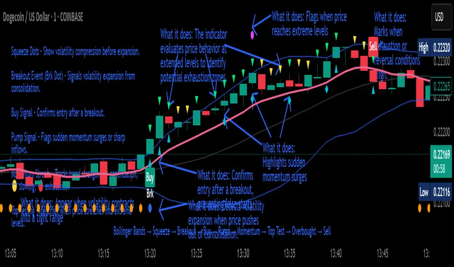
Crypto Breakout Buy/Sell Sequence
⚙️ Components & Sequence Multiple Timeframe (What It Does)
1. Bollinger Bands – Form the foundation by measuring volatility and creating the dynamic range where squeezes and breakouts occur.
2. Squeeze Dots – Show when price compresses inside the bands, signaling reduced volatility before expansion.
3. Breakout Event (Brk Dot) – Fires when price expands beyond the squeeze zone, confirming volatility expansion. (This paints Intra, before candle close)
4. Buy Signal – Confirms entry after a breakout is validated. (This paints at candle close)
5. Pump Signal – Flags sudden surges that extend sharply from the bands, often linked to strong inflows.
6. Momentum Stream – Tracks the strength of movement following the breakout, from continuation (🟢) to slowing (🟡) to exhaustion (🔴). (Resets at Pump Signal)
7. Overbought Indicator – Confirms when momentum has reached overheated conditions, often aligning with band extremes.
8. Sell Signal – Prints when exhaustion/reversal conditions are met, closing the trade cycle.
The Crypto Breakout Buy/Sell Sequence is a no-repaint event indicator that maps a full trade cycle using Bollinger-band-based volatility states: Bollinger Bands → Squeeze → Breakout → Buy → Pump → Momentum → Top Test → Overbought → Sell. Each stage is rule-based and designed to be read on standard candlesticks.
How It Works (System Logic)
Volatility framework: Bollinger Bands define dynamic range and compression/expansion.
Initiation: Squeeze → Breakout confirms expansion; Buy validates participation after expansion begins.
Management: Pump highlights unusual acceleration; Momentum stream tracks continuation → slowing → exhaustion.
Exhaustion/Exit: Top Testing + Overbought build the exhaustion case; Sell marks the sequence end.
How To Use (Quick Guide)
Wait for Squeeze → Breakout → Buy to establish a structured start.
Manage with Momentum:
🟢 continuation, 🟡 slowing, 🔴 exhaustion pressure.
Monitor extremes: Top Testing and/or Overbought = tighten risk.
Exit on Sell or on your risk rules when exhaustion builds.
Limitations & Good Practice
Signals reflect price/volatility behavior, not certainty.
Strong trends can remain extended; Overbought/Top Test ≠ instant reversal.
Always confirm with your own risk rules, position sizing, and market context.
Initial public release: integrated Squeeze/Breakout/Buy → Momentum → Exhaustion → Sell cycle; improved label clarity; cleaned defaults.
Disclaimer
For educational purposes only. Not financial advice. Past performance does not guarantee future results. Test before live use.
Thank You
스크립트에서 "breakout"에 대해 찾기
PDH/PDL Breakout—Anchored Ghost Targets + (Truth Table)What this does (integrated purpose—not a mashup):
This tool implements a “prove-it” breakout framework around prior-day levels. It (1) anchors Previous Day High/Low (PDH/PDL) to RTH, (2) reveals anchored ghost targets only after price proves itself beyond PDH/PDL, and (3) confirms direction using a 3-consecutive-closes rule. A compact Truth Table summarizes regime: Control Line, PDH/PDL position, and a microstructure-based composite trend score. Everything is designed to work together to filter fake breaks and provide objective upside/downside targets.
How it works (math/logic in plain English):
Prior-day levels (no repaint):
Pulls High, Low, Close of the previous day and extends PDH/PDL through today’s RTH session. (Daily values are read from the prior bar so signals don’t look ahead.)
Session scoping:
RTH is 09:30–16:00 ET. The script resets at 09:30, pre-creates all lines to the 16:00 session end, and confines triggers to RTH context.
Ghost target packs (original piece):
Compute classic pivot set from prior day:
P = (H+L+C) / 3, R1 = 2P − L, S1 = 2P−H
Create one full range-shift above and below the prior day:
range=H−L.
Add Fib overlays (0.382) around P/R1/S1 to form the pack.
Anchoring rule: packs are shifted so the upper pack never dips below PDH and the lower pack never rises above PDL. This prevents visual crossing with PDH/PDL and keeps targets clean after a confirmed break. Packs stay hidden until price proves itself (see next point).
Directional “prove-it” trigger:
You only get a signal after an actual cross of PDH/PDL followed by N consecutive RTH closes beyond that level (default 3; user input).
• Long: crossover above PDH → then 3 closes > PDH → one-bar pulse + optional alert.
• Short: crossunder below PDL → then 3 closes < PDL → one-bar pulse + optional alert.
After the first qualified trigger each session, bars beyond the level get a subtle Neo candle style so breakouts are visually distinct.
Truth Table (integration, not decoration):
Control Line = a smoothed multi-EMA control band (we expose a single “control line” derived from it),
PDH/PDL position (above, below, or inside),
Composite Trend = non-lag microstructure score combining: close-location value, thrust, wick imbalance, range-expansion direction, and HH/HL vs LL/LH structure (all summed over a short causal window).
Header colors use majority vote across those three rows so you see regime at a glance. This is used to interpret breaks and avoid chasing noise.
How to use it (practical workflow):
On equities during RTH, watch PDH/PDL.
When a break occurs, wait for the 3-close confirmation—that’s your “prove-it” trigger.
Upon trigger, the corresponding ghost pack becomes visible and provides objective intraday targets (pack lines + dashed Fib lines).
Use the Truth Table to sanity-check regime (e.g., bullish majority + PDH break = higher-confidence continuation).
Inputs & alerts:
Consecutive closes required (default 3).
Show Truth Table (on/off).
EMA ribbon/control line (on/off).
Alerts: “Bullish Trigger” and “Bearish Trigger” fire on the one-bar pulses right when confirmation completes.
Notes & limitations:
Designed for stocks using 09:30–16:00 ET. On 24/7 markets (e.g., crypto) RTH logic isn’t applicable.
Prior-day values are fixed from the daily timeframe, so the logic does not repaint.
The “Neo” candle styling is post-trigger only to keep earlier bars clean.
Why this is original/useful:
This is a single, integrated framework: anchored ghost targets (with a non-crossing constraint), prove-it confirmation (3-close rule), and a non-lag composite microstructure score summarized in a Truth Table. The components are purpose-built to work together to reduce false breakouts and supply clean, objective targets after confirmation—this is not a cosmetic mashup.
Educational note: Not financial advice. Test before use.

All Time High & All Time Low + 52-Week (ATH & ATL) | by Octopu$🚀 All Time High & All Time Low (ATH & ATL) + 52-Week with % and $ Info| by Octopu$
What is a 52-week, ATH or ATL?
52-Week High
The highest price a stock has traded at in the past 52 weeks (Approx. 1 year).
Acts like a “short-term ATH.” Many traders and investors use it as a momentum signal — breaking above it shows strength. Often used by screeners (“Stocks near 52-week high”).
IF a Ticker highest price in the last year is $500, and it’s currently trading at $555, it just made a new 52-week high (but not necessarily an all-time high).
52-Week Low
The lowest price a stock has traded at in the past 52 weeks (Approx. 1 year).
Acts like a “short-term ATL.” Traders watch it for breakdowns, and long-term investors watch it for potential bargains/buy the dip. Also important for risk management and Stop Losses.
IF a Ticker lowest price in the last year was $100, and it falls to $88, it just made a new 52-week low (but not necessarily an all-time low).
ATH (All-Time High)
The highest price a stock (or index, crypto, etc...) has EVER reached in its entire trading history.
Shows maximum bullish strength. When price breaks to a new ATH, there is no overhead resistance → often leads to strong momentum rallies. Also used as a psychological level in case of resistance/breakout.
ATL (All-Time Low)
The lowest price a stock (or asset) has EVER traded at since it began trading.
Reflects maximum bearish weakness. Breaking below the ATL is dangerous (no historical support below). Often associated with companies in crisis or risk of delisting. Or simply crashers or faders, whatever slang you may call it. Generally heavily shorted.
EXAMPLE:
AMEX:SPY
www.tradingview.com
This indicator however should not be used as a standalone tool.
(The combination of factors relies on your own knowledge about Confluence Factors along with your Due Diligence)
This indicator is not an advice to buy or sell securities in any form.
ANY Ticker. ANY Timeframe.
Features:
• 52-Week High
• 52-Week Low
• ALL Time High
• ALL Time Low
• $ Value Difference (of Current Price)
• % Percentage Difference (of Current Price)
Options:
• Customization
• Toggles
Notes:
v1.0
Indicator release.
Changes and updates can come in the future for additional functionalities or per requests. Follow and Stay Tuned!
Did you like it? Please Support and Shoot me a message! I'd appreciate if you dropped by to say thanks! Thank you.
- Octopu$
🐙

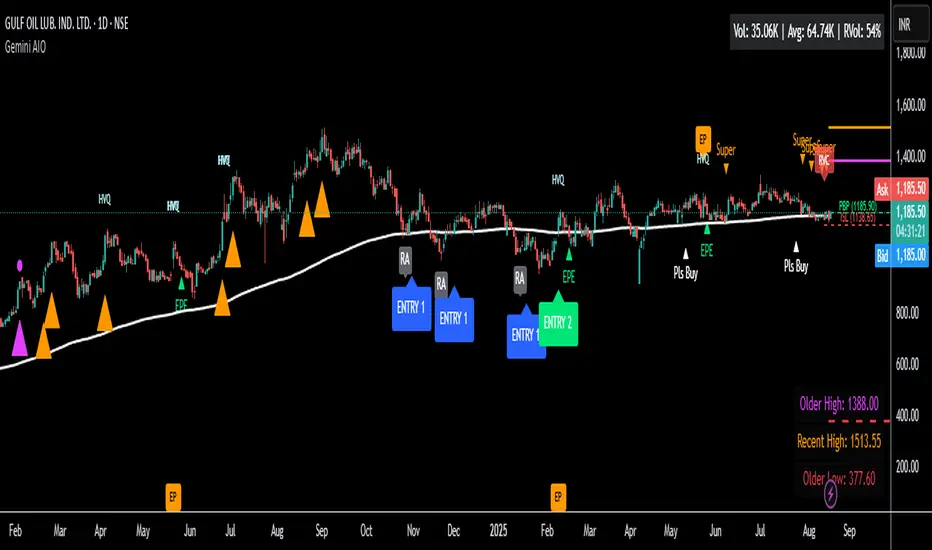
Gemini All-in-OneDescription
The Gemini AIO (All-in-One) is a comprehensive overlay indicator designed for swing and position traders. It merges three distinct and powerful trading strategies into a single, cohesive tool to identify high-probability setups in stocks that are in confirmed uptrends.
What the Indicator Does:
Combines Three Strategies: Integrates a multi-scanner breakout system, a mean-reversion model, and a multi-year breakout tool into one indicator.
Main Modules
Signals Module:
1. Features six unique scanner signals (CS1-CS6) to identify a variety of bullish consolidation patterns.
2. Includes a full trade management framework with RVC (Red Volume Candle), PBP (Post Breakout Pivot Entry), and ISL (Initial Stop Loss) levels.
3. Identifies powerful Episodic Pivot (EP) and EP Entry (EPE) signals for stocks showing exceptional strength.
Reversal Module:
1. A mean-reversion strategy that primarily uses Bollinger Bands to find oversold conditions.
2. Provides a three-stage signal process: RA (Reversal Setup), Entry 1, and Entry 2 to time entries from a potential bottom.
Multi-Year Breakout (MYBO) Module:
1. Automatically identifies and plots historical, multi-year resistance and support levels.
2. Generates a clear signal when the price breaks out above these significant long-term levels.
Advanced Alerts: Features a highly customizable alert system that can be timed to trigger either on the bar's close or at a specific time of day (e.g., 2:30 PM IST), allowing for end-of-day style notifications.
How to Best Use It:
This indicator is most powerful when used with a systematic, rules-based approach. The core principle is to use long-term moving averages to define the trend and then use the indicator's signals to time entries within that trend.
The Foundation (Trend Filter): The most important rule is to only consider long setups on stocks where the 150-day SMA is above the 200-day EMA, and the 150-day SMA is sloping upwards. This keeps you aligned with the primary uptrend.
Strategy 1: The Momentum Breakout (PBP Entry)
1. Confirm the stock meets the primary trend filter rules.
2. Wait for an AIO setup signal (Super, Pls Buy, etc.) to draw a PBP line.
3. Enter when the price crosses above the PBP line or wait for a pull back after the price has crossed the PBP line.
Strategy 2: The Mean Reversion (RA Entry)
1. Confirm the stock meets the primary trend filter rules.
2. Wait for an "RA" (Reversal Setup) signal to appear on the chart.
3. Enter on the "ENTRY 1" (Risky Entry) or "ENTRY 2" signal (Safer Entry) or wait for a pull back after "ENTRY 1" or "ENTRY 2" signal.
Strategy 3: Multi-Year Breakout (MYBO) :
1. A breakout triangle (orange or fuchsia) appears below the candle, signaling a close above the "Recent High" (Orange) or "Older High" (Fuchsia).
2. Recent High refers to the highest price the stock has reached in last 12 months. Breaking above the "Recent High" is a sign of strong current demand.
3. Older High refers to the highest price the stock reached in a more distant, historical period - the period between 5 years ago and 1 year ago. Breaking above the "Older High" is a sign of VERY strong demand as it has broken a historic high.
4. Wait for a breakout triangle to appear on the chart.
5. Enter on the high of the candle marked with a breakout triangle or wait for a pull back after that signal.
Customize Your View: Use the "Inputs" tab to enable/disable the modules you want to focus on and configure the alerts you want to receive. Use the "Style" tab to hide any visual elements you don't need to keep your chart clean.
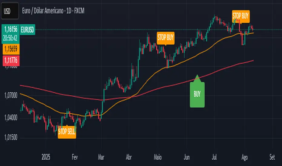
CTA-min D1 — Donchian 55/20 Trend Breakout (ATR Risk)What it is
A clean, daily trend-following breakout inspired by classic CTA/Turtle logic. It buys strength and sells weakness, then lets winners run with a channel-based trailing stop. No curve-fitting, no clutter—just rules.
How it trades
Timeframe: Daily (D1)
Entry: Close breaks the previous 55-bar Donchian channel (above for longs, below for shorts).
Exit/Trail: Trailing stop at the 20-bar Donchian channel on the opposite side (no fixed TP).
Risk: Initial stop = ATR(N) × stopMult (ATR is smoothed). Position size risks riskPct% of equity based on stop distance.
Labels: “BUY/SELL” only on the entry bar; “STOP BUY/STOP SELL” only on the exit bar.
Pyramiding: Off (one position at a time).
Regime Alignment with EMAs (recommended filter, not enforced by code)
Add EMA 50 and EMA 200 to the D1 chart.
Long bias: take BUY signals only when EMA50 > EMA200 (bullish regime).
Short bias: take SELL signals only when EMA50 < EMA200 (bearish regime).
Optional: for extra selectivity, require the H4 EMAs (50/200) to align with D1 before acting on a signal.
Inputs
entryN (55), exitN (20), atrLen (20), atrSmooth (10), stopMult (2.0), riskPct (0.5%–1.0% recommended).
Works well on (tested by user)
BTCUSD (Bitcoin), EURUSD, GBPJPY, NAS100/US100, USDJPY, AUDUSD, XAGUSD (Silver), US30 (Dow), JP225 (Nikkei), EURGBP, NZDUSD, EURCHF, USDCHF.
How to use
Apply to D1 charts. Review once per day after the daily close and execute next session open to mirror backtest assumptions. Best used as a portfolio strategy across multiple uncorrelated markets. Use the EMA alignment above as a discretionary regime filter to reduce false breakouts.
Notes
For educational use. Markets involve risk; past performance does not guarantee future results. Use responsible position sizing.
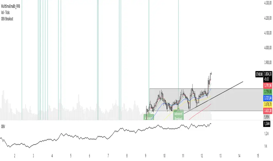
OBV Breakout Screener (By Tarso)1. Purpose of the Indicator
The "Advanced OBV Breakout Screener" is a specialized tool designed to find a powerful bullish signal. It scans for assets where buying pressure is increasing significantly, even though the price has not yet broken out.
The core strategy is to identify assets where:
Volume is leading Price: The On-Balance Volume (OBV) has already broken its recent high.
Price is still contained: The asset's price has not yet broken its recent high.
This setup helps you find potential trading opportunities right before a possible upward move.
2. How to Set Up the Indicator
First, you need to add the script to your TradingView account.
Open any chart on TradingView.
Click on the "Pine Editor" tab at the bottom of the screen.
Delete any existing code and paste the entire "Advanced OBV Breakout Screener" script into the editor.
Click "Add to chart". The indicator will now appear in a separate panel below your main price chart.
3. How to Use it with the Pine Screener (Step-by-Step)
This is the main purpose of the indicator. The script does all the complex analysis and provides a simple "1" (Signal is ON) or "0" (Signal is OFF). You only need to set up one filter.
Open the Stock Screener (or Crypto/Forex Screener).
Click the Filters button to open the settings panel.
Ensure you are on the Pine Screener tab (this allows you to filter using custom indicators).
In the indicator selection menu (it might say "Select Indicator..."), find and choose Advanced OBV Breakout Screener from your list.
Now, configure the single filter condition as follows:
In the first box, select Advanced Breakout Signal.
In the second box, select Equal to.
In the third box, select Number and type 1.
Your filter setup should look clean and simple, like this:
That's it! The screener will now display a list of all assets that currently meet the "Advanced Breakout" criteria for the timeframe you have selected (e.g., Daily, 4h, 1h).
4. Configuring the Lookback Period
By default, the indicator analyzes the last 20 periods. If you want to change this (for example, to scan for breakouts over 50 days), you must adjust it in the indicator's settings on your chart.
Go back to your chart view.
Find the "Advanced OBV Breakout Screener" panel.
Click the Settings icon (⚙️) next to the indicator's name.
In the "Inputs" tab, change the "Lookback Period (days)" to your desired value.
Click "OK".
The Pine Screener will automatically use this new setting for its market scan.
5. Understanding the On-Chart Visuals
When you add the indicator to your chart, you will see:
Blue Line: This is the On-Balance Volume (OBV).
Red Stepped Line: This represents the highest value the OBV has reached during the lookback period. A breakout happens when the blue line moves above this red line.
Green Triangle (▲): This symbol appears below a price candle whenever the full "Advanced Breakout" condition (OBV breakout + Price containment) is met, giving you a clear visual confirmation.
Range Breakout with Persistent Zone Bar Colors
// DESCRIPTION:
// The "Range Breakout with Persistent Zone Bar Colors" indicator identifies and visualizes
// periods of consolidation (boxes or channels) based on an ATR‑driven range and highlights
// directional breakouts, zone entries, and persistent zone trends.
//
// KEY FEATURES:
// 1. ATR‑Based Channel Construction:
// • Computes a rolling channel around the midpoint (HL2) using a historical ATR length,
// scaled by the "Channel Width" multiplier. This channel represents the box or range.
// • Automatically resets when price closes beyond the upper or lower boundary, or after
// a user‑defined maximum number of bars (Length) inside the range.
//
// 2. Persistent Zone Bar Coloring:
// • Colors bars within the current box uniformly—green for bullish zones after an
// upward breakout, red for bearish zones after a downward breakout—based on the last
// breakout direction (trend). Bars outside the box use a neutral color.
// • Provides an at‑a‑glance view of whether price remains in a bullish or bearish box.
//
// 3. Zone Entry & Breakout Signals:
// • "New Bull Box" / "New Bear Box" labels mark each new zone formation at the reset bar.
// • "Enter Bull Zone" and "Enter Bear Zone" tiny labels flag when price first crosses into
// the lower or upper half of the box, spotlighting momentum within the range.
// • Classic breakout symbols (▲ for buys, ▼ for sells) appear when price decisively crosses
// the box mid‑lines, with optional filtering by trend.
// • Optional X markers identify potential fakeout attempts beyond the box boundaries.
//
// 4. Customizable Inputs:
// • LENGTH: Maximum bars before auto‑reset if no breakout occurs.
// • CHANNEL WIDTH: ATR multiplier controlling box height.
// • Color settings for channel lines, fills, labels, and both inside/outside bar coloring.
// • Options to show fakeouts (X signals) and filter ▲/▼ by breakout trend.
//
// USE CASES:
// • Consolidation & Breakout Strategy: Clearly visualize ranges where price consolidates
// and prepare for directional entries on breakout or zone entry.
// • Trend Detection: Persistent bar colors provide quick confirmation of current zone bias.
// • Momentum Assessment: Mid‑zone entry labels highlight shifts in momentum within boxes.
// • Risk Management: Time‑based resets ensure the channel does not become stale if no
// breakout occurs.
//
// HOW TO READ:
// 1. Watch for the channel box formation (colored fills between upper and lower lines).
// 2. A label "New Bull Box" or "New Bear Box" indicates the start of a fresh zone.
// 3. Bars inside that zone remain uniformly colored until a new breakout resets the box.
// 4. "Enter Bull Zone" / "Enter Bear Zone" marks when price first enters each half.
// 5. ▲ / ▼ symbols on mid‑line crossovers signal potential entries.
// 6. Outside the box, bars turn neutral, highlighting no‑trade or transition periods.
// 7. Adjust inputs to fit the time frame and volatility of your market.
//
// By leveraging both visual zone coloring and precise labels, this indicator streamlines
// range analysis, breakout timing, and bias confirmation into a single, intuitive tool.
First Round Break TrackerA simple indicator that tracks the first-time breakouts of round number levels (psychological levels) on any chart. Clean interface with minimal configuration needed
First Breakout Only : Marks each round level only once when broken for the first time
Customizable Step Size : Adjustable round number intervals (e.g., 100, 1000, 10000 etc.)
Clean Visual Alerts : Green labels with "FIRST:" prefix appear exactly at breakout moments
Real-time Info Panel : Shows current price, next target level, and total breakouts count
[Teyo69] T1 ATR Standard Deviation Breakout Bands🧭 OVERVIEW
T1 ATR Standard Deviation Breakout Bands is a breakout tool designed to detect volatility-driven price expansion beyond statistically significant zones. It calculates real-time ATR-based standard deviation bands, dynamically tracking breakout conditions with adjustable smoothing. With flexible moving average types and the Kijun-sen as the default baseline, this indicator is built for traders who want to avoid fakeouts and only engage when volatility confirms conviction.
✨ FEATURES
Utilizes ATR standard deviation for real-time volatility band calculations
Supports multiple moving average types (EMA, SMA, WMA, etc.) including Kijun-sen by default
Adjustable ATR multiplier to fine-tune breakout sensitivity
Fully configurable length inputs and MA source types
Identifies long opportunities when price closes above the upper band
Identifies short opportunities when price closes below the lower band
Ideal for trend continuation, momentum breakouts, and volatility-based filtering
🎯 HOW TO USE
Apply the indicator on your preferred timeframe (works best on trending conditions).
Set your baseline MA to match your system (default: Kijun-sen).
Adjust the ATR period and multiplier to balance sensitivity vs. noise.
Go long when the close breaks above the upper standard deviation band.
Go short when the close breaks below the lower standard deviation band.
Use Markers signals to highlight breakout moments.
Can also be used to identify if price is ranging when it is in the gray area of the indicator
⚙️ CONFIGURATION
Length: Period for the moving average and ATR
MA Type: Choose from EMA, SMA, WMA, or Kijun-sen
ATR Multiplier: Controls how wide the breakout bands are
Source: Price type used for calculations (default: close)
⚠️ LIMITATIONS
Standard deviation assumes price is statistically normal — not always true during news spikes
Band expansion does not guarantee follow-through — use in conjunction with volume or trend filters
💡 ADVANCED TIPS
Combine with a trend filter (e.g., 200 EMA) to trade only in the direction of the dominant trend
Use wider ATR multipliers on lower timeframes to reduce noise
Pair with oscillators (e.g., RSI, MACD) for breakout + momentum confluence setups
For scalping, reduce the length but widen the multiplier slightly
📓 NOTES
The standard deviation of ATR is used to capture how volatile volatility itself is. This reveals when the market is entering statistically significant price expansion.
Why this matters: Standard deviation is a core statistical tool for understanding distribution outliers. When price exceeds the upper band, it is outside normal volatility expectations — signaling potential breakout strength.
This indicator applies breakout theory to volatility, not just price action, offering a unique edge over classic Bollinger or Keltner bands.

Monday Swing Box# Monday Swing Box Indicator - Trading Applications
This "Monday Swing Box" indicator can be very useful in trading for several strategic reasons:
## 1. **"Monday Effect" Analysis**
* **Concept**: Mondays often have particular characteristics in the markets (opening gaps, weekend catch-up, different volumes)
* **Utility**: Allows visualization and quantification of these Monday-specific movements
* **Application**: Helps identify recurring patterns in your strategy
## 2. **Relative Volatility Measurement with ATR**
* **The ATR percentage tells you**:
* **< 50%**: Low volatility Monday (possible consolidation)
* **50-100%**: Normal volatility
* **> 100%**: Very volatile Monday (important event, potential breakout)
* **Advantage**: Contextualizes the movement relative to historical volatility
## 3. **Practical Trading Applications**
### **For Day Trading**:
* **Entry**: A Monday with >150% ATR may signal a strong movement to follow
* **Stop Loss**: Adjust stop sizes according to Monday's volatility
* **Targets**: Calibrate targets according to the movement's magnitude
### **For Swing Trading**:
* **Support/Resistance**: Monday's high/low often become key levels
* **Breakout**: Breaking above/below Monday's box may signal continuation
* **Retracement**: Return to Monday's box = support/resistance zone
### **For Risk Management**:
* **Sizing**: Adapt position sizes according to measured volatility
* **Timing**: Avoid trading abnormally volatile Mondays if you prefer stability
## 4. **Specific Possible Strategies**
### **"Monday Breakout"**:
* Wait for a break above/below Monday's box
* Enter in the direction of the breakout
* Stop at the other end of the box
### **"Monday Reversal"**:
* If Monday shows >200% ATR, look for a reversal
* The box becomes a resistance/support zone
### **"Monday Range"**:
* Trade bounces off the box limits
* Particularly effective if ATR % is normal (50-100%)
## 5. **Visualization Advantages**
* **Historical**: See past patterns across multiple Mondays
* **Comparison**: Compare current volatility to previous Mondays
* **Anticipation**: Prepare your strategy according to the type of Monday observed
## 6. **Limitations to Consider**
* Monday patterns can vary according to markets and periods
* Don't trade solely on this indicator, but use it as a complement
* Consider macroeconomic context and news
This indicator is therefore particularly useful for traders who want to exploit Monday's specificities and have an objective measure of this day's relative volatility compared to normal market conditions.
MojoPivots Breakout Signals [DonnieMojo]The MojoPivots Breakout Indicator is a precision-engineered tool designed for traders seeking high-probability breakout opportunities using dynamic pivot structures and real-time volume imbalances.
Built on DonnieMojo’s breakout framework, this indicator analyzes market structure via custom MR (Major Resistance) and MS (Major Support) levels, dynamically derived from intraday volume profiles and statistical price expansion. It intelligently tracks and visualizes potential breakout zones, key "line-in-the-sand" levels, and take-profit targets (TP1, TP2, TP3) based on volatility-adjusted zones.
🔑 Core Features:
Breakout Signal Detection
Identifies potential bullish and bearish breakouts when price breaches predefined resistance (MR1) or support (MS1) levels with confirmation from volume dynamics.
Smart Take-Profit System
Targets are automatically mapped to MR2–MR4 and MS2–MS4, offering structured TP zones based on standard deviation thresholds.
Delta Zone Visuals
Color-coded fills display real-time buyer/seller dominance in each zone using an imbalance-weighted volume model.
VPOC "Sand Line"
The Volume Point of Control is plotted to show the session's key battle line for trend continuation or rejection.
Statistical Performance Panel
Live breakout stats with hit-rate bars (TP1/TP2/TP3) help you evaluate performance and adjust trade management.
🧪 Usage Tips:
Timeframe Sync: The default detection logic is based on 15-minute candles, but pivot zones are calculated from higher timeframes (2H by default). Adjust these in the settings to suit your strategy.
Entry Trigger: Wait for price to close below MS1 or above MR1 and breach it on the next bar to confirm a breakout signal.
TP Scaling: Use TP1 for conservative exits or scale out progressively at TP2 and TP3 for extended moves.
Volume Confirmation: Delta zone fills (green/red) help validate whether breakout levels are supported by buyer/seller strength — fade low-delta signals with caution.
Combine with Trend Filters: Enhance results by using MojoPivots alongside trend indicators like EMAs, ADX, or macro S/R.

volatility-adjusted breakout envelopethis indicator is designed to help traders visually identify potential entry and exit points based on volatility-adjusted price thresholds. it works by calculating a dynamic expected price move around the previous close using historical volatility data smoothed by exponential moving averages to reduce noise and present a clear range boundary on the chart.
the indicator first computes the logarithmic returns over a user-defined lookback period and calculates the standard deviation of these returns, which represents raw volatility. it annualizes this volatility according to the chart timeframe selected, then uses it to estimate an expected price movement for the current timeframe. this expected move is smoothed to avoid sudden spikes or drops that could cause confusing signals.
using this expected move, the indicator generates two key threshold lines: an upper threshold and a lower threshold. these lines create a volatility-based range around the smoothed previous close price. the thresholds themselves are further smoothed with exponential moving averages to produce smooth, easy-to-interpret lines that adapt to changing market conditions without being choppy.
the core trading signals are generated when the price closes outside of these smoothed threshold ranges. specifically, a long entry signal is indicated when the price closes above the upper threshold for the first time, signaling potential upward momentum beyond normal volatility expectations. a short entry signal occurs when the price closes below the lower threshold for the first time, indicating potential downward momentum.
once an entry signal is triggered, the indicator waits for the price to close back inside the threshold range before signaling an exit. when this occurs, an exit marker is displayed to indicate that the price has returned within normal volatility bounds, which may suggest that the previous trend is losing strength or the breakout has ended.
these signals are visually represented on the chart using small shapes: triangles pointing upwards mark the initial long entries, triangles pointing downwards mark short entries, and x shapes mark the exits for both long and short positions. the colors of these shapes are customizable to suit user preferences.
to use this indicator effectively, traders should watch for the first close outside the smoothed volatility range to consider entering a position in the breakout direction. the exit signals help identify when price action reverts back into the expected range, which can be used to close or reduce the position. this method emphasizes trading breakouts supported by statistically significant moves relative to recent volatility while providing a clear exit discipline.
this indicator is best applied to intraday or daily charts with consistent volatility and volume characteristics. users should adjust the volatility lookback period, smoothing factor, and trading session times to match their specific market and trading style. because it relies on price volatility rather than fixed price levels, it can adapt to changing market conditions but should be combined with other analysis tools and proper risk management.
overall, this indicator provides a smoothed, dynamic volatility envelope with clear visual entry and exit cues based on first closes outside and back inside these envelopes, making it a helpful assistant for manual traders seeking to capture statistically significant breakouts while maintaining disciplined exits.
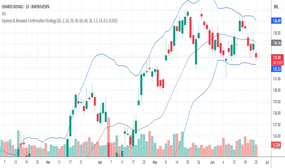
Squeeze & Breakout Confirmation StrategyThis strategy focuses on identifying periods of low volatility (Bollinger Band Squeeze) and then confirming the direction of the subsequent breakout with momentum, volume, and candle strength.
Concepts Applied: Bollinger Bands (Squeeze), RSI (Momentum), Market Volume (Conviction), Candle Size (Strength)
Buy Signal:
Bollinger Band Squeeze: Look for a period where the Bollinger Bands contract significantly, indicating low volatility and consolidation. The bands should be very close to the price action.
RSI Breakout: After the squeeze, wait for the price to break decisively above the upper Bollinger Band. Simultaneously, the RSI should break above 60 (or even 70), indicating strong bullish momentum.
Volume Surge: The breakout candle should be accompanied by a significant increase in trading volume, ideally above its recent average, confirming strong buying interest.
Strong Bullish Candle: The breakout candle itself should be a large, bullish candle (e.g., a strong green candle with a small upper wick or a bullish engulfing pattern), demonstrating buyer conviction.
Sell Signal (Short):
Bollinger Band Squeeze: Look for a period where the Bollinger Bands contract significantly.
RSI Breakdown: After the squeeze, wait for the price to break decisively below the lower Bollinger Band. Simultaneously, the RSI should break below 40 (or even 30), indicating strong bearish momentum.
Volume Surge: The breakdown candle should be accompanied by a significant increase in trading volume, ideally above its recent average, confirming strong selling interest.
Strong Bearish Candle: The breakdown candle itself should be a large, bearish candle (e.g., a strong red candle with a small lower wick or a bearish engulfing pattern), demonstrating seller conviction.
Low Volatility Breakout Detector)This indicator is designed to visually identify potential breakouts from consolidation during periods of low volatility. It is based on classic Bollinger Bands and relative volume. Its primary purpose is not to generate buy or sell signals but to assist in spotting moments when the market exits a stagnation phase.
Arrows appear only when the price breaks above the upper or below the lower Bollinger Band, the band width is below a specified threshold (expressed in percentage), and volume is above its moving average multiplied by a chosen multiplier (default is 1). This combination may indicate the start of a new impulse following a period of low activity.
The chart background during low volatility is colored based on volume strength—the lower the volume during stagnation, the less transparent the background. This helps quickly spot unusual market behavior under seemingly calm conditions. The background opacity is dynamically scaled relative to the range of volumes over a selected period, which can be set manually (default is 50 bars).
The indicator works best in classic horizontal consolidations, where price moves within a narrow range and volatility and volume clearly decline. It is not intended to detect breakouts from formations such as triangles or wedges, which may not always exhibit low volatility relative to Bollinger Bands.
Settings allow you to adjust:
Bollinger Band length and multiplier,
Volatility threshold (in %),
Background and arrow colors,
Volume moving average length and multiplier,
Bar range used for background opacity scaling.
Note: For reliable results, it’s advisable to tailor the volatility threshold and volume/background ranges to the specific market and timeframe, as different instruments have distinct dynamics. If you want the background color to closely match the color of breakout arrows, you should set the same volume analysis period as the volume moving average length.
Additional note: To achieve a cleaner chart and focus solely on breakout signals, you can disable the background and Bollinger Bands display in the settings. This will leave only the breakout arrows visible on the chart, providing a clearer and more readable market picture.

Smart Breakout with ATR Stop-LossThe Smart Breakout indicator combines a classic 20-day Donchian channel breakout with a tight trailing stop, drawing green lines and “ENTRY” labels at the bar after a valid breakout, and red lines and “EXIT” label at the bar after a stop-loss breach.
By default it uses the chart’s timeframe to compute ATR and stops, but you can flip on Daily lock to freeze both ATR and price reads at the daily resolution—so your stops stay the same whether you view at 1s, 15 m, 4h or lower frequency bars.
Key features:
20-day Donchian breakout: entry when price closes above the highest high of the previous 20 bars
2 × ATR(14) trailing stop: initialized at entry and raised only when the new (close – 2 × ATR) exceeds the prior stop
Daily lock option: Ensures all ATR and close values are calculated on the daily timeframe, keeping stop levels consistent across resolutions
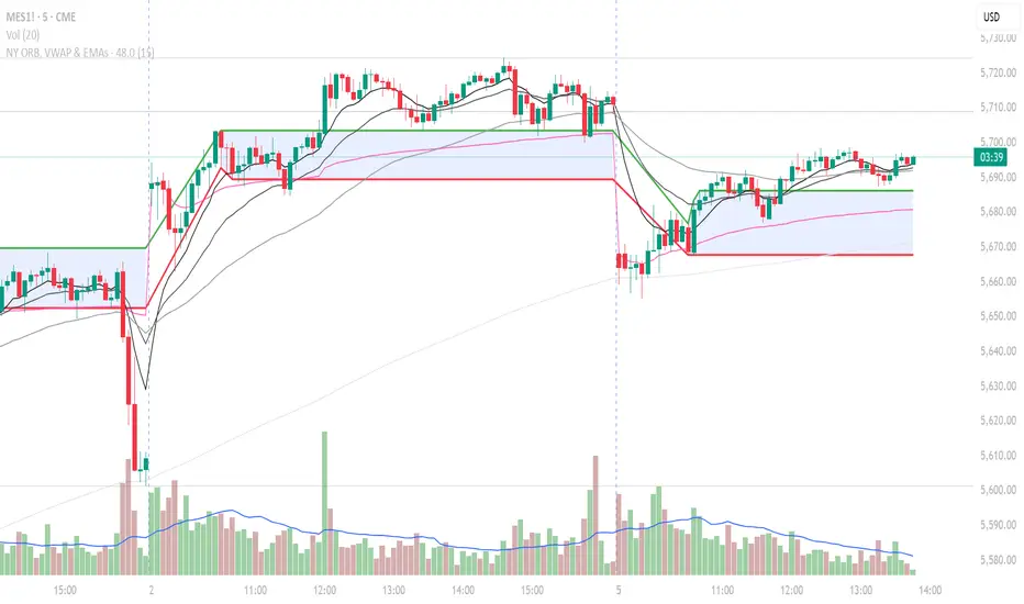
NY ORB, VWAP & EMAsIndicator is designed to display key technical analysis tools on your Trading View chart. It includes:
One of the key benefits of this indicator is that it allows Basic Trading View users to set VWAP, EMAs, and ORB in a single indicator. This is particularly useful for users who are limited to a single indicator on their Basic plan, as it provides a comprehensive view of market sentiment, trend, and potential breakouts without the need for multiple indicators.
Features
New York Opening Range Breakout (ORB): Plots the high and low of the first 15 minutes (configurable) of the New York trading session.
Volume Weighted Average Price (VWAP): Displays the VWAP line, which can be toggled on or off.
Exponential Moving Averages (EMAs): Plots four EMAs (9, 21, 50, and 200 periods), which can also be toggled on or off.
Customization
ORB Length: Choose from 5 or 15 minutes for the ORB calculation.
Show VWAP and EMAs: Toggle the visibility of the VWAP and EMA lines on or off.
Usage
This indicator is designed to help traders identify key market levels, trends, and potential breakouts during the New York trading session. The ORB can be used to gauge market sentiment, while the VWAP provides a benchmark for average price action. The EMAs offer additional trend analysis and can be used to identify potential support and resistance levels.
Failed Breakout DetectionThis indicator is a reverse-engineered copy of the FBD Detection indicator published by xfuturesgod. The original indicator aimed at detecting "Failed Breakdowns". This version tracks the opposite signals, "Failed Breakouts". It was coded with the ES Futures 15 minute chart in mind but may be useful on other instruments and time frames.
The original description, with terminology reversed to explain this version:
'Failed Breakouts' are a popular set up for short entries.
In short, the set up requires:
1) A significant high is made ('initial high')
2) Initial high is undercut with a new high
3) Price action then 'reclaims' the initial high by moving +8-10 points from the initial high
This script aims at detecting such set ups. It was coded with the ES Futures 15 minute chart in mind but may be useful on other instruments and time frames.
Business Logic:
1) Uses pivot highs to detect 'significant' initial highs
2) Uses amplitude threshold to detect a new high above the initial high; used /u/ben_zen script for this
3) Looks for a valid reclaim - a red candle that occurs within 10 bars of the new high
4) Price must reclaim at least 8 points for the set up to be valid
5) If a signal is detected, the initial high value (pivot high) is stored in array that prevents duplicate signals from being generated.
6) FBO Signal is plotted on the chart with "X"
7) Pivot high detection is plotted on the chart with "P" and a label
8) New highs are plotted on the chart with a red triangle
Notes:
User input
- My preference is to use the defaults as is, but as always feel free to experiment
- Can modify pivot length but in my experience 10/10 work best for pivot highs
- New high detection - 55 bars and 0.05 amplitude work well based on visual checks of signals
- Can modify the number of points needed to reclaim a high, and the # of bars limit over which this must occur.
Alerts:
- Alerts are available for detection of new highs and detection of failed breakouts
- Alerts are also available for these signals but only during 7:30PM-4PM EST - 'prime time' US trading hours
Limitations:
- Current version of the script only compares new highs to the most recent pivot high, does not look at anything prior to that
- Best used as a discretionary signal
Premarket High/Low Breakout AlertsPremarket High/Low Breakout Alerts
Description: This custom TradingView indicator helps you track premarket breakouts and breakdowns for a list of selected stocks. The indicator monitors the premarket session and sends an alert every time the stock's price breaks above the premarket high or below the premarket low.
Key Features:
Track Multiple Stocks: Easily monitor multiple stocks (e.g., AAPL, TSLA, NVDA, etc.) and get alerts when they break premarket levels.
Premarket Session Monitoring: The indicator checks for price movements during the premarket session (4:00 AM to 9:30 AM EST).
Customizable Ticker List: Modify the list of tickers directly from the TradingView settings to suit your daily trading needs.
Breakout and Breakdown Alerts: Receive instant alerts for both breakout (above premarket high) and breakdown (below premarket low) conditions.
Plot Premarket Levels: The premarket high and low levels are plotted on the chart for easy reference.
How to Use:
Add this indicator to your chart.
Go to the indicator settings and input your desired stock tickers (e.g., AAPL, TSLA, MSFT).
The indicator will automatically track the premarket levels and send alerts when those levels are broken.
Customize the tickers daily if needed.
Ideal For:
Day Traders who want to track premarket movements.
Swing Traders looking for strong breakouts from premarket levels.
Scalpers who need quick alerts to catch price action early.

MLB Momentum IndicatorMLB Momentum Indicator is a no‐lookahead technical indicator designed to signal intraday trend shifts and potential reversal points. It combines several well‐known technical components—Moving Averages, MACD, RSI, and optional ADX & Volume filters—to deliver high‐probability buy/sell signals on your chart.
Below is an overview of how it works and what each part does:
1. Moving Average Trend Filter
The script uses two moving averages (fast and slow) to determine the primary trend:
isUpTrend if Fast MA > Slow MA
isDownTrend if Fast MA < Slow MA
You can select the MA method—SMA, EMA, or WMA—and customize lengths.
Why it matters: The indicator only gives bullish signals if the trend is up, and bearish signals if the trend is down, helping avoid trades that go against the bigger flow.
2. MACD Confirmation (Momentum)
Uses MACD (with user‐defined Fast, Slow, and Signal lengths) to check momentum:
macdBuySignal if the MACD line crosses above its signal line (bullish)
macdSellSignal if the MACD line crosses below its signal line (bearish)
Why it matters: MACD crossovers confirm an emerging momentum shift, aligning signals with actual price acceleration rather than random fluctuation.
3. RSI Overbought/Oversold Filter
RSI (Relative Strength Index) is calculated with a chosen length, plus Overbought & Oversold thresholds:
For long signals: the RSI must be below the Overbought threshold (e.g. 70).
For short signals: the RSI must be above the Oversold threshold (e.g. 30).
Why it matters: Prevents buying when price is already overbought or shorting when price is too oversold, filtering out possible poor‐risk trades.
4. Optional ADX Filter (Trend Strength)
If enabled, ADX must exceed a chosen threshold (e.g., 20) for a signal to be valid:
This ensures you’re only taking trades in markets that have sufficient directional momentum.
Why it matters: It weeds out choppy, sideways conditions where signals are unreliable.
5. Optional Volume Filter (High‐Participation Moves)
If enabled, the indicator checks whether current volume is above a certain multiple of its moving average (e.g., 1.5× average volume).
Why it matters: High volume often indicates stronger institutional interest, validating potential breakouts or reversals.
6. ATR & Chandelier (Visual Reference)
For reference only, the script can display ATR‐based stop levels or a Chandelier Exit line:
ATR (Average True Range) helps gauge volatility and can inform stop‐loss distances.
Chandelier Exit is a trailing stop technique that adjusts automatically as price moves.
Why it matters: Though this version of the script doesn’t execute trades, these lines help you see how far to place stops or how to ride a trend.
7. Final Bullish / Bearish Signal
When all conditions (trend, MACD, RSI, optional ADX, optional Volume) line up for a long, a green “Long” arrow appears.
When all conditions line up for a short, a red “Short” arrow appears.
Why it matters: You get a clear, on‐chart signal for each potential entry, rather than needing to check multiple indicators manually.
8. Session & Date Filtering
The script allows choosing a start/end date and an optional session window (e.g. 09:30–16:00).
Why it matters: Helps limit signals to a specific historical backtest range or trading hours, which can be crucial for day traders (e.g., stock market hours only).
Putting It All Together
Primary Trend → ensures you trade in line with the bigger direction.
MACD & RSI → confirm momentum and avoid overbought/oversold extremes.
ADX & Volume → optional filters for strong trend strength & genuine interest.
Arrows → each potential buy (Long) or sell (Short) signal is clearly shown on your chart.
Use Cases
5‐Minute Scalping: Shorter RSI/MACD lengths to catch small, frequent intraday moves.
Swing Trading: Larger MAs, bigger RSI thresholds, and using ADX to filter only major trends.
Cautious Approach: Enable volume & ADX filters to reduce false signals in choppy markets.
Benefits & Limitations
Benefits:
Consolidates multiple indicators into one overlay.
Clear buy/sell signals with optional dynamic volatility references.
Flexible user inputs adapt to different trading styles/timeframes.
Limitations:
Like all technical indicators, it can produce false signals in sideways or news‐driven markets.
Success depends heavily on user settings and the particular market’s behavior.
Summary
The MLB Momentum Indicator combines a trend filter (MAs), momentum check (MACD), overbought/oversold gating (RSI), and optional ADX/Volume filters to create clear buy/sell arrows on your chart. This approach encourages trading in sync with both trend and momentum, and helps avoid suboptimal entries when volume or trend strength is lacking. It can be tailored to scalp micro‐moves on lower timeframes or used for higher‐timeframe swing trading by adjusting the input settings.

Accumulation & Breakout Detectorاستراتيجية كشف التجميع والاستعداد للانطلاق
الوصف العام:
تهدف هذه الاستراتيجية إلى اكتشاف الأصول المالية (الأسهم أو العملات الرقمية) التي تمر بمرحلة التجميع، حيث يتحرك السعر في نطاق ضيق مع انخفاض في حجم التداول، مما يشير إلى احتمال قرب حدوث انطلاق صعودي. بمجرد تحقق شروط معينة، تعطي الاستراتيجية إشارة تفيد بأن الأصل المالي جاهز للخروج من التجميع والانطلاق في اتجاه صاعد.
شروط التجميع (Accumulation Phase):
تشير مرحلة التجميع إلى فترة يتم فيها تكديس الأصول من قبل المستثمرين الكبار قبل التحرك الكبير. تحدث إشارات التجميع عندما تتحقق الشروط التالية:
السعر يتحرك داخل نطاق ضيق بين الحد العلوي والسفلي لمؤشر بولينجر باند.
السعر أقل من المتوسط المتحرك 50 والمتوسط المتحرك 200، مما يدل على وجود اتجاه هابط أو فترة تكديس.
مؤشر القوة النسبية (RSI) أقل من 40، مما يشير إلى التشبع البيعي واحتمالية حدوث انعكاس قريب.
حجم التداول أقل من متوسط حجم التداول (50 شمعة) بنسبة 1.2، مما يدل على انخفاض الاهتمام بالأصل قبل الحركة القوية.
عند تحقق هذه الشروط، يظهر نقطة زرقاء على المخطط، مما يشير إلى أن الأصل المالي قد يكون في مرحلة تجميع.
شروط قرب الانطلاق (Breakout Readiness Phase):
عند انتهاء مرحلة التجميع، يدخل الأصل المالي في مرحلة الاستعداد للانطلاق، والتي تحدث عند تحقق الشروط التالية:
السعر يخترق المتوسط المتحرك 50، مما يدل على بداية اتجاه صعودي.
حجم التداول يرتفع فوق متوسط حجم التداول (50 شمعة) بنسبة 1.5، مما يشير إلى دخول سيولة قوية.
مؤشر القوة النسبية (RSI) يتجاوز 50، مما يعكس تحسن الزخم الصعودي.
عند تحقق هذه الشروط، تظهر نقطة خضراء على المخطط، مما يشير إلى أن الأصل المالي جاهز للانطلاق.
كيفية استخدام الإشارات؟
النقاط الزرقاء تعني أن الأصل المالي في مرحلة تجميع محتملة، وقد يكون من المناسب مراقبته استعدادًا لحركة قادمة.
النقاط الخضراء تعني أن الأصل المالي جاهز للخروج من التجميع وقد يكون في طريقه للانطلاق الصعودي.
يمكن استخدام هذه الإشارات مع أدوات تحليل إضافية مثل مستويات الدعم والمقاومة، النماذج السعرية، أو المؤشرات الأخرى لتأكيد القرار قبل التداول.
🚀 هذه الاستراتيجية مفيدة للمتداولين الذين يبحثون عن فرص دخول مبكرة في الاتجاهات الصاعدة بعد انتهاء فترات التجميع.
Accumulation & Breakout Detection Strategy
General Description:
This strategy aims to identify financial assets (stocks or cryptocurrencies) that are in an accumulation phase, where price moves within a narrow range with low trading volume, signaling a potential breakout. Once certain conditions are met, the strategy provides an alert indicating that the asset is ready to break out and move upward.
Accumulation Phase Conditions:
The accumulation phase occurs when large investors accumulate assets before a significant price move. The strategy detects accumulation when the following conditions are met:
Price moves within a narrow range between the upper and lower Bollinger Bands.
Price is below both the 50-period and 200-period moving averages, indicating a downtrend or consolidation.
Relative Strength Index (RSI) is below 40, suggesting an oversold condition with a possible reversal.
Trading volume is less than 1.2 times the 50-period average volume, indicating weak activity before a strong move.
When these conditions are met, a blue dot appears on the chart, signaling a potential accumulation phase.
Breakout Readiness Phase Conditions:
Once the accumulation phase ends, the asset enters the breakout readiness phase, which occurs when the following conditions are met:
Price breaks above the 50-period moving average, signaling the start of an uptrend.
Trading volume increases above 1.5 times the 50-period average volume, indicating strong liquidity inflow.
RSI rises above 50, reflecting positive momentum and increasing bullish strength.
When these conditions are met, a green dot appears on the chart, indicating that the asset is ready for a breakout.
How to Use the Signals?
Blue dots indicate that the asset is in a potential accumulation phase, suggesting it may soon break out.
Green dots indicate that the asset is ready to break out and move upward.
These signals can be combined with additional technical analysis tools such as support/resistance levels, chart patterns, or other indicators for confirmation before making a trade.
🚀 This strategy is useful for traders looking for early entry points in uptrending markets following accumulation phases.
FVG Breakout/BreakdownThe FVG Breakout/Breakdown indicator is designed to identify potential breakout and breakdown opportunities in the market, based on the concept of Fair Value Gaps (FVGs). FVGs are areas where price moves too quickly, leaving behind gaps between candlesticks, often seen as areas of inefficiency or imbalance that the market tends to revisit.
Key Concepts:
Fair Value Gaps (FVG):
FVG occurs when a price gap is created between candlesticks, typically when the high of one candle is lower than the low of the previous candle (for a bearish FVG) or the low of one candle is higher than the high of the previous candle (for a bullish FVG).
These gaps represent an imbalance between buying and selling pressure, and the market often revisits them, making them valuable for identifying potential entry points.
Bullish FVG: This occurs when the low of the current candle is higher than the high of the previous candle.
Condition: low > high
Bearish FVG: This occurs when the high of the current candle is lower than the low of the previous candle.
Condition: high < low
Breakout/Breakdown Signals:
Breakout: A bullish breakout signal occurs when the price breaks above a defined resistance level after an FVG gap. This suggests that the market may continue moving higher.
Breakdown: A bearish breakdown signal occurs when the price breaks below a defined support level after an FVG gap. This suggests that the market may continue moving lower.
NWOG (New Week Opening Gap):
The NWOG can be used as an additional factor to confirm the FVG signal. The gap between Friday's close and Monday's open is a crucial level for identifying the start of a new move for the week.
NWOG helps to further refine the timing of breakout or breakdown signals, only triggering them when price moves relative to the Monday Open and shows a new direction.
[AlbaTherium] Volume Venturius Premium Volume Venturius Premium
Introduction
The Volume Venturius Premium is an advanced market analysis tool designed to deeply investigate the behavior of active market participants. By focusing exclusively on executed market orders, Volume Venturius offers traders a unique perspective on buy and sell volumes. Unlike traditional order books that track passive orders, this indicator isolates active orders, shedding light on real market dynamics.
Chapter 1: Understanding Market Participants
1.1 Categories of Market Participants
Market participants can be classified into several categories based on their:
Size : The volume of trades executed.
Influence : Their ability to initiate bull or bear campaigns.
Strategy : The trading methods employed, such as scalping, swing trading, or high-frequency trading.
Objectives : Whether their focus is on speculation, hedging, or arbitrage.
Time Horizon : Short-term versus long-term goals.
Behavioral Patterns : Their reaction to liquidity levels or price movements.
1.2 Objectives of Market Participants
Each category pursues specific objectives, such as profit-making or risk management. Regulatory reports like the Commitment of Traders (COT) provide weekly insights into the positions and intentions of major players.
Chapter 2: The Philosophy of Volume Analysis
2.1 Active Orders vs. Passive Orders
Unlike passive orders waiting to be filled at specific prices, active orders directly impact market prices. By focusing on these executed orders, Volume Venturius Premium provides traders with actionable insights into market trends and momentum.
2.2 Wyckoff’s Market Dynamics
According to Wyckoff, markets operate in two primary phases:
Manipulation: Where large participants accumulate or distribute positions to prepare for a move.
Expansion: The phase where price trends begin to unfold, either in a bullish or bearish direction.
Wyckoff’s theory emphasizes understanding how major players manipulate the market to identify accumulation or distribution zones. Volume Venturius Premium aids in pinpointing these manipulative actions by analyzing volume and order flow data.
Chapter 3: The Secrets of Order Flow and Volume
3.1 Unveiling Market Control
By studying the positioning and execution volumes of large players, traders can discern who holds control in the market. Volume Venturius Premium identifies the balance of power and tracks shifts that signal potential trend reversals.
3.2 Behavioral Patterns in Volume
Key metrics tracked by Volume Venturius Premium include:
Volume Clusters : Areas of concentrated buying or selling activity.
Directional Bias : Whether market participants are net buyers or sellers.
Momentum Shifts : Changes in execution speed and volume that may precede major moves.
3.2.1 Volume Clusters, Directional Bias and Directional Bias: Areas of Concentrated Buying or Selling Activity
Volume clusters play a crucial role in understanding market dynamics by highlighting areas where aggressive buying or selling activity is most concentrated. These clusters often serve as key decision zones, providing insights into potential reversals, breakouts, or continuations. To better visualize and interpret these zones, a distinct color-coding system has been implemented. Each color represents a specific market condition or level of activity, allowing for a more intuitive analysis of volume behavior and its influence on price movement.
Below is a detailed explanation of the color logic used to represent these clusters and their significance within the trading framework.
Color Interpretation and Meaning :
Extra Extreme Zones
These zones highlight areas where clusters of aggressive buyers or sellers are most heavily concentrated. They represent critical levels for identifying potential reversals or strong continuations.
Bright Red (#ff003c) : Represents extra-extreme sell zones, where aggressive sellers dominate.
Meaning: Indicates extreme selling pressure, often signaling potential exhaustion of sellers.
Bright Blue (#001eff) : Represents extra-extreme buy zones, where aggressive buyers are most active.
Meaning: Shows extreme buying pressure, possibly marking a saturation point for buyers.
Main Zones
These zones help identify key levels based on volume activity and well-defined clusters.
Dark Red (#d60033) : Represents strong selling pressure.
Orange (#ff8000) : Indicates significant selling pressure that begins to fade.
Yellow (#ffff00) : Represents moderate selling pressure, signaling a potential slowdown.
White (#ffffff) : Marks transition zones, which are interesting entry points for potential reversals or continuations.
Transition Zones (Frontier Zones)
These zones indicate intermediate movements and potential shifts in momentum.
Transparent Black (#000000, 50) : Represents transition areas, where the market tests boundaries between buyers and sellers.
Meaning: These are critical decision points.
Neutral Zone (Sea Zone)- Trend Zones
These zones represent more balanced market activity, where neither buyers nor sellers dominate clearly.
Transparent Green (#00e040, 25) : Indicates slight bullish activity in a neutral zone.
Transparent Red (#e01a00, 25) : Indicates slight bearish activity in a neutral zone.
This color logic allows you to pinpoint areas where volume clusters show a clear dominance, exhaustion, or optimal entry opportunities.
3.3 Divergences Between Price and Volume
Divergences between price and volume are critical for identifying key shifts in market sentiment. Volume Venturius Premium distinguishes two main types of divergences: Lack of Participation and Absorption, each offering valuable signals for potential reversals or continuations.
Lack of Participation
This divergence occurs when price movements are not supported by corresponding volume dynamics, signaling a reduction in activity from significant market participants.
1. Bullish Lack of Participation:
Characteristics : Price is making lower lows, but volume is making higher lows.
This indicates waning selling pressure as prices drop.
Inference : A potential bullish reversal may occur. Traders could consider looking for opportunities to go long.
2.Bearish Lack of Participation:
Characteristics : Price is making higher highs, but volume is making lower highs. This suggests diminishing buying pressure even as prices rise.
Inference : A potential bearish reversal might follow. Traders might position to go short.
Absorption
Absorption occurs when larger market participants neutralize the pressure from smaller participants, often leading to significant market moves.
1.Bullish Absorption:
Characteristics : Price is making higher bottoms, but volume is making lower bottoms.
This reflects sellers being trapped as their selling efforts are absorbed by larger buyers.
Inference : A potential upward breakout is likely. Traders may look for opportunities to go long.
2.Bearish Absorption:
Characteristics : Price is making lower tops, but volume is making higher tops. This indicates buyers being trapped as larger sellers absorb their buying activity.
Inference : A downward breakout is probable. Traders may consider positioning to go short.
Chapter 4: Practical Application and Trading Strategies
4.1 Leveraging Active Order Insights
Learn how to use Volume Venturius Premium to detect hidden accumulation or distribution phases. Strategies include identifying spikes in active volume that signal institutional participation.
4.2 Confirming Bull and Bear Campaigns
Gain confidence in detecting the early stages of bullish or bearish campaigns by analyzing the interplay between active orders and volume flow.
Chapter 5: Real-World Examples
5.1 Analyzing Market Manipulation
See how Volume Venturius Premium can reveal manipulation tactics employed by large players to trigger liquidity events.
5.2 Spotting Trends with Active Orders
Real-life scenarios demonstrate how the tool can be used to identify and ride the market’s dominant trend.
Conclusion
The Volume Venturius Premium is an indispensable tool for traders who seek to understand the underlying mechanics of market movement. By focusing on active order flows and drawing on Wyckoff’s principles, it provides unique insights into market manipulation and expansion phases. Whether you’re an intraday trader or a long-term strategist, this tool empowers you to anticipate market shifts and trade with confidence.
Stay tuned for updates as we continue to refine Volume Venturius Premium to further enhance your trading journey.

Consolidation Range Detector [Pt]█ Author's Note:
After extensively reviewing the existing consolidation detection tools in the TradingView library, I found that none fully met my expectations. Some tools were overly sensitive, producing too many invalid ranges, while others lacked the necessary sensitivity. Consequently, I decided to develop my own tool. I hope that you, fellow traders, find it valuable and enjoy using it.
█ Description:
The Consolidation Range Detector is a sophisticated TradingView tool designed to identify and visualize periods of price consolidation on any financial chart. This indicator employs advanced algorithms to detect ranges where price movements are confined, helping traders spot potential breakout zones and make informed trading decisions.
█ Key Features:
► Customizable Detection Sensitivity: Adjust the sensitivity of the detection algorithm to suit your trading strategy, ensuring a precise fit within the consolidation range.
► Dynamic Coloring: Choose between random or fixed colors for the consolidation ranges, with options to match different background color schemes (Dark, Light, Neutral).
► Visual Clarity: Highlight detected consolidation ranges directly on the chart with customizable color schemes to enhance visibility and provide clear visual cues.
► ATR-Based Validation: Ensures detected consolidation ranges are significant and reliable by using the Average True Range (ATR) for validation.
█ User-Defined Inputs:
► Minimum Detection Bars: Set the minimum number of bars required to detect a consolidation range.
► Max Range Multiplier: Define the maximum range for detection as a multiple of the ATR.
► Detection Sensitivity: Adjust the sensitivity of the detection algorithm. Higher values mean a tighter fit within the consolidation range.
► Color Options: Choose the color for the consolidation range boxes and decide whether to use random colors.
► Color Scheme (Background): Select a color scheme for the chart background (Dark, Light, Neutral).
█ How It Works:
► Range Detection: The indicator scans the chart for potential consolidation ranges based on user-defined parameters. It calculates the average price and ATR to determine the significance of the range.
► Validation: Each detected range is validated based on criteria such as ATR threshold, range validity, average price comparison, and the number of touches at the range boundaries.
► Visualization: Validated ranges are highlighted on the chart with colored boxes, providing a clear visual cue of potential consolidation zones.
█ Usage Examples:
► Example 1:
The image below showcases the Consolidation Range Detector in action on a chart of S&P 500 E-mini Futures. The indicator highlights several consolidation ranges with different colors, demonstrating its ability to adapt to varying market conditions and visually emphasize key areas of price consolidation. The annotations for breakouts and price reactions are manually marked to illustrate the practical application of the tool in identifying potential trading opportunities based on these key areas.
█ Practical Applications:
► Identify Breakout Zones: Use the detected consolidation ranges to identify potential breakout zones, helping to anticipate significant price movements.
► Identify Key Price Levels: The tool helps in pinpointing key price levels where there is a high probability of significant price reactions, providing crucial insights for trading strategies.
► Enhance Technical Analysis: Integrate the Consolidation Range Detector into your existing technical analysis toolkit to improve the accuracy of your trading decisions.
█ Conclusion:
The Consolidation Range Detector is a powerful tool for traders looking to identify periods of price consolidation and potential breakout zones. With its customizable settings and advanced detection algorithms, it provides a reliable and visual method to enhance your trading strategy. Whether you're a beginner or an experienced trader, this indicator can add significant value to your technical analysis.
█ Cautionary Note:
While the Consolidation Range Detector is a powerful tool, it's important to combine it with other indicators and analysis methods for comprehensive trading decisions. Always consider market context and external factors when interpreting detected consolidation ranges.
