스크립트에서 "bitcoin"에 대해 찾기


S3-ZMACDHere's a modified MACD which uses ZL calculation for the emas, phi adjustment to the fast signal and an optimized period set. It useful because it will give predictive signals for many setups.

BTC Fibonacci DMA350 TrendlinesAdapted from Tim Graham's Code.
See Original Inspiring Article from Phillip Swift at: @positivecrypto
When looking into BITSTAMP:BTCUSD 1D data in spreadsheet. Historically, BTC Highs Hit (Simple Daily Moving Average 350 Days) DMA350 in reverse Fibonacci Sequence Order
2013 Hit DMA350*8 before All Time High (ATH)
2017 Hit DMA350*5 before ATH
I expect 2021 to hit DMA350*3 ATH. When BTC hits DMA350*3 ATH, I suggest selling!

BTC Mass profit alarmThis is a modified version of my "BTC Mass profit" strategy so that you can add alerts when a signal is produced

MA Multiplier with FibonacciThis implementation of the "2-Year MA Multiplier" gives you some control over the indicator, you can change the multiplier from it's default of 5, you can change the lookback from it's default of 730 days and I've also added three fibonacci traces between the moving average and it's multiple that you can play with. Oh and you can also choose the data source ('close' or 'hl2' make most sense).
The formula for this indicator was created by Philip Swift.
Thanks to @Pladizow for pointing me to this indicator.

MAFIA CANDLESMafia Candles is a Exhaustion bar count and candle count indicator, Using the Leledc Candles and 1-3 counting candle play gives you a pretty good idea where a so called "top" will be or a so called "bottom" will be!
In this example, getting the transparent round circles ( either lime or red ) would mean that the move will be a good size move!
EXAMPLE=1 You see a down trend and then the Mafia Candles Flashes a Green Dot on the forming new red candle. This is where in theory you might want to consider going long on the market!
EXAMPLE=2 If you see a RED $ symbol, after a uptrend, this means in theory, there might be room for a short play or room for a small pullback in the price!
THE CIRCLES(RED OR LIME COLORED) ARE INDICATING BIGGER MOVES!
THE $ SYMBOLS (RED OR LIME COLORED) ARE INDICATING SMALLER PULLBACKS OR SMALLER PUMPS IN PRICE!
RED IS CONSIDERED TO BE A SELL!
LIME COLOR IS CONSIDERED TO BE A BUY!
AS MUCH IS BASED OF THE 1-3 CANDLE COUNT AND THE LEDLEC CANDLE DEVIATION STRATEGY, LET ME EXPLAIN THE THEORY ON BOTH THE 1-3 CANDLE COUNT AND THE LELEDC STRATEGY I COMBINE TO BRING YOU THIS ADDITION OF THE INDICATOR....
LELEDC THEORY USAGE...
An Exhaustion Bar is a bar which signals
the exhaustion of the trend in the current direction. In other words an
exhaustion bar is “A bar of last seller” in case of a downtrend and “A bar of
last buyer”in case of an uptrend.
Having said that when a party cannot take the price further in their direction,naturally the other party comes in , takes charge and reverses the direction of the trend.
TO EASIER UNDERSTAND I GIVE YOU A EASY EXAMPLE OF WHAT AN LELEDC EXHAUSTION BAR IS...
1. A wide range bar ( a bar with
long body!!!).
2. A long wick at the bottom of
the bar and no or negligible wick at the top of the bar in case of “Bear exhaustion bar” and
a long wick at the top and no or
negligible wick at the bottom of the bar in case of
“Bull exhuation bar”!!!
3. Extreme volume and.....
4. Bar forming at a key support or resistance
area including a Round Number (RN) and Big Round Number ( BRN ).THE PSYCHOLOGY BEHIND THIS!!!
Now let's assume that we have a group
of people,say 100 people who decides to go for a casual running. After running for few KM's few of
them will say “I am exhausted. I cannot run further”. They will quit running.
After running further, another bunch of runners will say “I am exhausted. I can’t run
further” and they also will quit running.
This goes on and on and then there will be a stage where only few will be left in the running. Now a stage will come where the last person left in the running will say “I
am exhausted” and he stops running. That means no one is left now in the
running.This means all are exhausted in the running.
The same way an exhaustion bar works and if we can figure out that
exhaustion bar with all the tools available on hand, we will be in a big trade
for sure!!.The reason is an exhaustion bar is formed at exact tops and bottoms most of the times.In forex with wide variety of pairs available at the counter ,one can trade this technique to make lifetime gains.
NOW LET ME EXPLAIN THE 1-3 CANDLE CORRECTION COUNT THEORY WHICH IS USED TO GET THE SUM UP SIGNALS FROM THIS INDICATOR FROM ITS INPUT LEVELS!!!
1-3 CANDLES....
The 1-3 Candlestick pattern is basically like sequential, aka a candle counting system!
1-3 CANDLE COUNT means you count the number of bullish=green candles or the bearish=red candles!
3 BULL/GREEN CANDLES in a row, each closing its close higher than the previous one before it is the 1-3 candle top count idea!
lets say you get 3 red bear candles, each candle after the first closes its body below the previous red candle before it, then you see 3 red candles with each closing lower bodies lower than the previous candle, THATS A POSSIBLE SIGN OF BEARISH EXHAUSTION, AND YOU MIGHT HAVE SOME BULLS STEP IN TO TAKE THE PRICE UP AFTER THE IMMEDIATE DOWNFALL OF THOSE 3 RED CANDLES!!
PLEASE IF ANYONE HAS QUESTIONS OR NEEDS ANY FURTHER EXPLANATION, DONT HESISITATE TO MESSAGE ME! CHALRES KNIGHT IS THE ORIGINAL AUTHOR OF THE 1-3 CANDLE COUNT AND THE LELEDC EXHAUSTION BAR INDICATOR ON METE-TRADER! R.IP CHARLES F KNIGHT!!! WE LOVE YOU AND MISS YOU BROTHER!
CHARLES KNIGHT PASSED DOWN ALL OF HIS INDICATORS AND SCRIPTS IN ORIGINAL CODE TO MYSELF WHEN HE PASSED AWAY AND I WILL CONTINUE TO HONOR HIS MEMORY BY ENHANCING HIS ORIGINAL SOURCE CODED SCRIPTS TO ENHANCE THE LIFE FOR ALL TRADERS!
CHARLIE LOVED WHEN I WOULD PUT MY OWN SWING ON HIS INDICATORS! HE TAUGHT ME EVERYTHING I KNOW AND I KNOW ONE DAY I WILL SEE HIM AGAIN!
TRADE IN PARADISE CHARLIE!!!
THE BEST TRADER IN THE WORLD!!!

Cryptolabs Global Liquidity Cycle Momentum IndicatorCryptolabs Global Liquidity Cycle Momentum Indicator (LMI-BTC)
This open-source indicator combines global central bank liquidity data with Bitcoin price movements to identify medium- to long-term market cycles and momentum phases. It is designed for traders who want to incorporate macroeconomic factors into their Bitcoin analysis.
How It Works
The script calculates a Liquidity Index using balance sheet data from four central banks (USA: ECONOMICS:USCBBS, Japan: FRED:JPNASSETS, China: ECONOMICS:CNCBBS, EU: FRED:ECBASSETSW), augmented by the Dollar Index (TVC:DXY) and Chinese 10-year bond yields (TVC:CN10Y). This index is:
- Logarithmically scaled (math.log) to better represent large values like central bank balances and Bitcoin prices.
- Normalized over a 50-period range to balance fluctuations between minimum and maximum values.
- Compared to prior-year values, with the number of bars dynamically adjusted based on the timeframe (e.g., 252 for 1D, 52 for 1W), to compute percentage changes.
The liquidity change is analyzed using a Chande Momentum Oscillator (CMO) (period: 24) to measure momentum trends. A Weighted Moving Average (WMA) (period: 10) acts as a signal line. The Bitcoin price is also plotted logarithmically to highlight parallels with liquidity cycles.
Usage
Traders can use the indicator to:
- Identify global liquidity cycles influencing Bitcoin price trends, such as expansive or restrictive monetary policies.
- Detect momentum phases: Values above 50 suggest overbought conditions, below -50 indicate oversold conditions.
- Anticipate trend reversals by observing CMO crossovers with the signal line.
It performs best on higher timeframes like daily (1D) or weekly (1W) charts. The visualization includes:
- CMO line (green > 50, red < -50, blue neutral), signal line (white), Bitcoin price (gray).
- Horizontal lines at 50, 0, and -50 for improved readability.
Originality
This indicator stands out from other momentum tools like RSI or basic price analysis due to:
- Unique Data Integration: Combines four central bank datasets, DXY, and CN10Y as macroeconomic proxies for Bitcoin.
- Dynamic Prior-Year Analysis: Calculates liquidity changes relative to historical values, adjustable by timeframe.
- Logarithmic Normalization: Enhances visibility of extreme values, critical for cryptocurrencies and macro data.
This combination offers a rare perspective on the interplay between global liquidity and Bitcoin, unavailable in other open-source scripts.
Settings
- CMO Period: Default 24, adjustable for faster/slower signals.
- Signal WMA: Default 10, for smoothing the CMO line.
- Normalization Window: Default 50 periods, customizable.
Users can modify these parameters in the Pine Editor to tailor the indicator to their strategy.
Note
This script is designed for medium- to long-term analysis, not scalping. For optimal results, combine it with additional analyses (e.g., on-chain data, support/resistance levels). It does not guarantee profits but supports informed decisions based on macroeconomic trends.
Data Sources
- Bitcoin: INDEX:BTCUSD
- Liquidity: ECONOMICS:USCBBS, FRED:JPNASSETS, ECONOMICS:CNCBBS, FRED:ECBASSETSW
- Additional: TVC:DXY, TVC:CN10Y
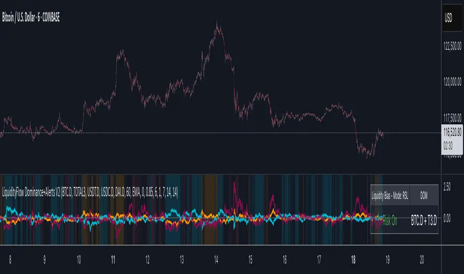
LiquidityFlow Dominance+Alerts (btc.d, T3, Stables)LiquidityFlow Dominance+Alerts: Overview & Usage Guide
Overview
The LiquidityFlow Dominance+Alerts indicator provides a dynamic view of liquidity flow across Bitcoin, Altcoins, and Stablecoins, helping track liquidity shifts and identify market sentiment. By integrating moving averages, custom alerts, and thresholds for extreme outliers, this indicator helps to anticipate bullish and bearish shifts in liquidity and alert market tops and bottoms.
Key features include:
1. Liquidity Flow Monitoring : Track liquidity flow across Bitcoin (BTC), Altcoins (TOTAL3), and Stablecoins (USDT, USDC, DAI).
2. Custom Alerts : Set alerts for key liquidity shifts and extreme conditions in Stablecoin dominance, both with static and moving average (MA)-based calculations.
3. Moving Averages : Use Simple, Exponential, or Weighted Moving Averages to smooth out market data for more reliable signals.
4. Outlier Detection : Identify potential tops and bottoms using thresholds for Stablecoin dominance, with alerts for extreme movements.
Functionality
Data Inputs and Key Metrics
- Symbols Monitored:
- Bitcoin Dominance (BTC.D)
- Altcoin Market Cap (TOTAL3)
- Stablecoins (USDT.D, USDC.D, DAI.D)
- Liquidity Flow Conditions:
- Track percentage changes in dominance across sectors to detect liquidity flow into Bitcoin, Altcoins, or Stablecoins.
- Custom Metrics:
- Liquidity Flow Index: BTC Dominance minus Stablecoin Dominance.
- Liquidity Flow Ratio: BTC Dominance divided by the combined dominance of Stablecoins and Altcoins.
Moving Average Integration
- Select from SMA, EMA, or WMA to apply moving averages to the dominance metrics. Moving averages help smooth out short-term volatility and provide more consistent signals.
- Moving averages are applied to each sector (BTC, Altcoins, and Stablecoins) and compared to their previous period values to determine shifts in liquidity.
Alerts and Thresholds
- % Change Lookback Period: Adjust the lookback period to align with the timeframe of your chart. Shorter timeframes may require a lower lookback period, while higher timeframes may benefit from longer periods.
- Stables Bull/Bear % for Alerts: Set a threshold for when Stablecoin dominance becomes a bullish or bearish signal relative to BTC and Altcoins. A higher threshold may be used in volatile markets to filter out noise.
- Extreme Outliers Detection: Use the **Stables Up/Down Extreme Threshold** to identify potential market tops or bottoms when Stablecoin dominance deviates significantly from historical trends. The **Extreme Lookback Period** controls the time window for detecting these anomalies.
How to Use the Indicator
Adjusting the % Change Lookback Period
- The `% Change Lookback Period` should be adjusted based on your chart’s timeframe. For example, a shorter period (e.g., 7) works well for intraday charts, while longer periods (e.g., 14) might be more suitable for daily or weekly charts.
Setting Thresholds for Alerts
- Stables Bull/Bear % for Alerts: Adjust this setting to define when Stablecoin dominance triggers bullish or bearish alerts. A value like 1% could be a good starting point for most market conditions but can be fine-tuned based on volatility.
- Extreme Lookback Period: Define the lookback period for detecting extreme moves in Stablecoin dominance. This will help identify major tops and bottoms in the market. For shorter-term trades, consider using a shorter extreme lookback (e.g., 7-10 periods).
Alerts for Liquidity Shifts
- The indicator supports alerts for key liquidity shifts, which are useful for staying ahead of market movements. Alerts can be set to notify you when liquidity moves into:
- Bitcoin: Indicating a potential bullish trend for Bitcoin.
- Altcoins: Signaling altcoins are bullish.
- Stablecoins: Suggesting a risk-off environment or market correction.
Extreme Alerts for Stables
- Extreme Up/Down Alerts: These are triggered when Stablecoin dominance crosses extreme thresholds. For example, if Stablecoin dominance rises more than 14% over a set period, it could signal a market top, while a significant drop could indicate a market bottom.
Moving Average Calculations
- In addition to static percentage changes, moving averages can be applied to smooth out dominance values. The type and length of the moving average can be customized:
- SMA (Simple Moving Average): Best for smoothing out volatility in a linear way.
- EMA (Exponential Moving Average): More responsive to recent data, making it useful in faster markets.
- WMA (Weighted Moving Average): Emphasizes more recent data, but less reactive than the EMA.
Additional Usage Tips:
- Background Colors: The indicator visually highlights the dominant liquidity flow:
- Orange: Liquidity is shifting toward Bitcoin.
- Aqua: Liquidity is flowing into Altcoins.
- Red: Liquidity is moving into Stablecoins.
HASHRATE and MINER REVENUEThis script uses daily data points from Quandl which measure Bitcoin mining hashrate, and miner revenue, and averages the two. The two data sets are fairly zigzaggy, so to smooth the data I am use a John Ehlers' filter to reduce the noise. Why did I combine the two? Both have correlation to BTC price action, and by combining hashrate and revenue, I believe it produces a stronger and more accurate signal. At times when the background is green (also displayed with a green square at the bottom), conditions are good in Bitcoinland with miner revenue/hashrate going up. No color in the background and no dot, means the combined miner revenue and hashrate indicator is dropping, but nothing to get worried about. Seeing red dots on the bottom along with a red background signals a rapidly dropping rate of hashrate/miner revenue, and with a fairly strong correlation to the Bitcoin price. Not every red zone foretells a drop in the Bitcoin price, but a significant number of them do. I wrote this script as an early warning system for when to move out of Bitcoin. Use at your own risk. Feel free to modify this code to suit your personal needs. Please only use on BTC /USD pairs with 1D bars. Since there is only one data point per day published by Quandl, it will not give accurate data for shorter timeframes. Enjoy.

GBTC holdings USD market valueThis script estimates GBTC bitcoins per share, rather than hardcoding as in other scripts. Its result is an estimate of GBTC holdings USD market value.
Per share bitcoin estimates are adjusted by 2.0% / 365 per day from 2019 year end holdings. Calendar year 2019 ending bitcoins and shares were 261,192 bitcoins and 269,445,300 shares. From the 2019 Form 10-K: 'The Trust’s only ordinary recurring expense is the Sponsor’s Fee. The Sponsor’s Fee accrues daily in U.S. dollars at an annual rate of 2.0% of the Bitcoin Holdings.. The Sponsor’s Fee is payable in Bitcoins to the Sponsor monthly in arrears.'
No attempt is made to account for leap years.
Per share bitcoin estimate is converted to USD market value by multiplying by the simple average BTCUSD price at Coinbase and Bitstamp. Grayscale uses the TradeBlock XBX index, a volume weighted average of Coinbase Pro, Kraken, LMAX Digital and Bitstamp prices.
Spot checks vs archive.org captures of daily bitcoins per share and the chart on Grayscale's site:
The estimate for market close January 22 2021 is 0.00094899 bitcoins per share, the published datum on Grayscale's web site was 0.00094898. The estimate matches at 20:30 rather than at 16:00.
The estimate for December 31 2018 is 0.000988965 vs a published 0.00098895.
The estimate for December 29 2017 market value is $14.58 vs $14.65.
The estimate for December 30 2016 market value is $0.99 vs $0.98.
The estimate for January 4 2016 market value is $0.46 vs $0.45.
No estimates before 2016.
The default style is to draw a blue line with two thirds transparency outside market hours and for first/last minutes of trading, switching to daily or greater periodicity hides this.
No warranty is expressed or implied , I am not a lawyer, etc etc etc.
This is not investing advice . Always do your own due diligence .

Blockchain Fundamentals - Difficulty Ribbon by CryptorhythmsBlockchain Fundamentals - Difficulty Ribbon by Cryptorhythms
Link to Instructions Page / Idea will be linked below.
Q: Why are we separating instructions from the indicator page?
A: Well Tradingview recently instituted a change that only open source script authors can gain rep for their efforts. Any script that is protected or invite only no longer gets points, even if its still free for anyone to use.
We feel that is unfair so we ask everyone to like the IDEA (linked below) for this script if you want to support our efforts to keep releasing free (but protected source) indicators.

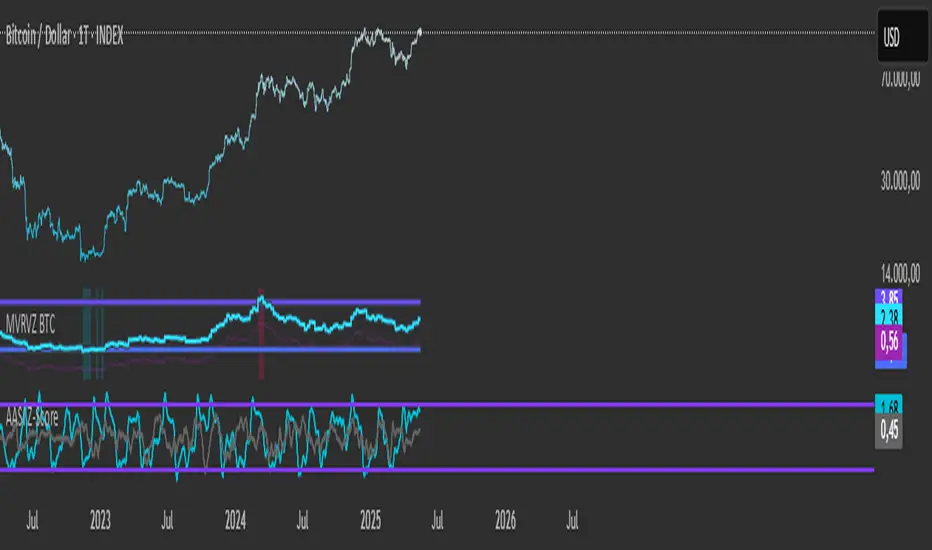
Active Addresses Z-ScoreActive Addresses Z-Score Indicator
The Active Addresses Z-Score Indicator is a fundamental analysis tool designed to evaluate the relationship between Bitcoin network activity and its price movements over a specified period. This indicator aims to provide insights into whether the market is showing signs of increasing or decreasing interest in Bitcoin, based on its network usage and activity.
How to Read the Indicator
Orange Line (Price Z-Score):
This line represents the Z-Score of the price change over a defined period (e.g., 28 days). The Z-Score normalizes the price change by comparing it to the historical mean and standard deviation, essentially measuring how far the current price change is from the average.
A positive Z-Score indicates that the price change is above the historical average (a bullish signal), while a negative Z-Score means the price change is below the historical average (a bearish signal).
Gray Line (Active Addresses Z-Score):
This line represents the Z-Score of the change in active addresses over the same period. The Z-Score here normalizes the change in the number of active Bitcoin addresses by comparing it to historical data.
A positive Z-Score suggests that the number of active addresses is increasing more than usual, which can be a sign of increased market activity and potential interest in Bitcoin.
A negative Z-Score suggests that active addresses are decreasing more than usual, which may indicate reduced interest or usage of Bitcoin.
Upper and Lower Threshold Lines:
The upper and lower threshold lines (set by the user) act as Z-Score boundaries. If either the price Z-Score or the active address Z-Score exceeds the upper threshold, it can signal an overbought or overactive condition. Similarly, if the Z-Score falls below the lower threshold, it could indicate an oversold or underactive condition.
These thresholds are customizable by the user, allowing for flexible interpretation based on market conditions.
Indicator Calculation
Price Change Calculation:
The percentage change in the Bitcoin price over a specified lookback period (e.g., 28 days) is calculated as:
Price Change
=
Close
−
Close
Close
Price Change=
Close
Close−Close
This shows the relative price movement during the specified period.
Active Address Change Calculation:
Similarly, the percentage change in active addresses is calculated as:
Active Address Change
=
Active Addresses
−
Active Addresses
Active Addresses
Active Address Change=
Active Addresses
Active Addresses−Active Addresses
This shows the relative change in the number of active Bitcoin addresses over the same period.
Z-Score Calculation:
The Z-Score for both the price and active address changes is calculated as:
𝑍
=
X
−
𝜇
𝜎
Z=
σ
X−μ
Where:
X is the current change (price or active addresses),
μ (mu) is the mean (average) of the historical data over the lookback period,
σ (sigma) is the standard deviation of the historical data.
This Z-Score tells you how far the current value deviates from its historical average, normalized by the volatility (standard deviation).
Smoothing (Optional):
A simple moving average (SMA) is applied to smooth out the Z-Score values to reduce noise and provide a clearer trend.
What the Indicator Does
Signals of Bullish or Bearish Market Behavior:
The Z-Score of Price tells you how strong or weak the price movement is relative to its past performance.
The Z-Score of Active Addresses reveals whether more users are interacting with the Bitcoin network, which can be an indication of growing interest or market activity.
When both the price and active address Z-Scores are high, it may indicate a strong bull market, while low Z-Scores may point to a bear market or decreasing interest.
Overbought/Oversold Conditions:
The upper and lower threshold lines help you visualize when the Z-Scores for either price or active addresses have reached extreme values, signaling potential overbought or oversold conditions.
For example, if the Price Z-Score exceeds the upper threshold (e.g., +2), it might indicate that the price has risen too quickly, and a correction may be due. Conversely, if it falls below the lower threshold (e.g., -2), it may indicate a potential buying opportunity.
Important Note on Activity and Price Movements:
After Rapid Price Increases:
A sharp increase in Bitcoin’s price followed by a spike in active addresses can be interpreted as a bearish signal. High network activity after a rapid price surge might indicate that investors are taking profits or that speculative interest is peaking, potentially signaling an upcoming correction or reversal.
After Extreme Price Declines:
Conversely, high network activity after a significant price drop may indicate a bottoming signal. A surge in active addresses during a price decline could suggest increased buying interest and potential accumulation, signaling that the market may be finding support and a reversal may be imminent.
Customization and Flexibility
The lookback period (default: 28 days) can be adjusted to suit different trading strategies or time horizons.
The smoothing length (default: 7 periods) allows for smoothing the Z-Score, making it easier to detect longer-term trends and reduce noise.
The upper and lower threshold values are fully customizable to adjust the indicator’s sensitivity to market conditions.
Conclusion
The Active Addresses Z-Score Indicator combines network activity with price data to give you a deeper understanding of the Bitcoin market. By analyzing the relationship between price changes and active address changes, this indicator helps you assess whether the market is experiencing unusual activity or if Bitcoin is trending in an extreme overbought or oversold condition.
It is a powerful tool for fundamental analysis and can complement traditional technical indicators for a more comprehensive trading strategy.
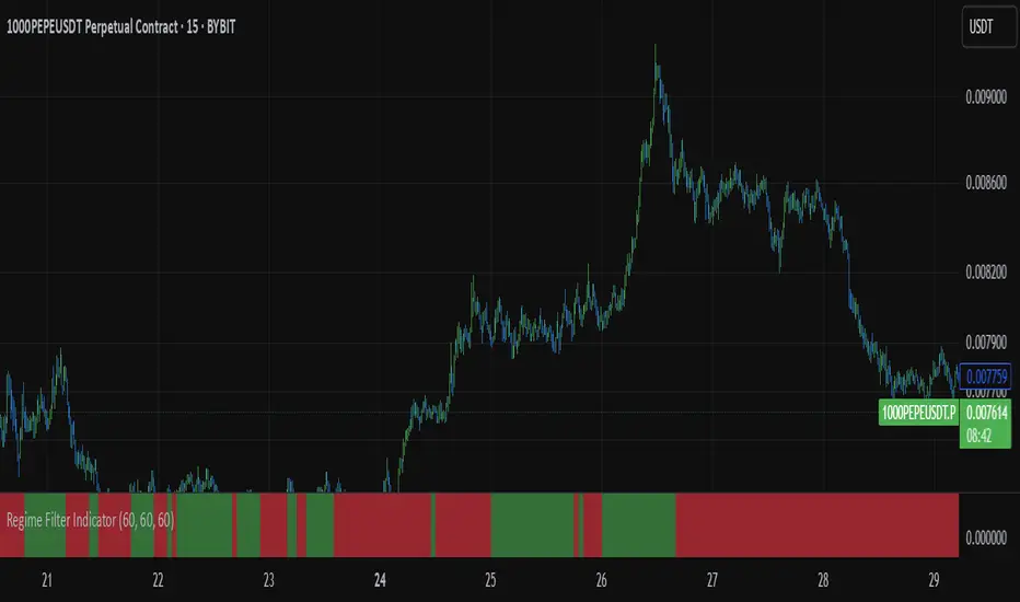
Regime Filter IndicatorRegime Filter – Crypto Market Trend Indicator
📊 Overview
The Regime Filter is a powerful market analysis indicator designed specifically for crypto trading. It helps traders identify whether the market is in a bullish or bearish phase by analyzing key assets in the cryptocurrency market, including Bitcoin (BTC), Bitcoin Dominance (BTC.D), and the Altcoin Market (TOTAL3). The indicator compares these assets against their respective Simple Moving Averages (SMA) to determine the overall market regime, allowing traders to make more informed decisions.
🔍 How It Works
The Regime Filter evaluates three main components to determine the market's sentiment:
1. BTC Dominance (BTC.D) vs. 40 SMA (Medium Timeframe)
The Bitcoin Dominance (BTC.D) is compared to its 40-period SMA on a mid-timeframe (e.g.,
1-hour). If BTC.D is below the 40 SMA, it indicates that altcoins are performing well relative
to Bitcoin, suggesting a bullish altcoin market. If BTC.D is above the 40 SMA, Bitcoin is
gaining dominance, indicating a potential bearish phase for altcoins.
2. TOTAL3 Market Cap vs. 100 SMA (Medium Timeframe)
The TOTAL3 index, which tracks the total market capitalization of all cryptocurrencies except
Bitcoin and Ethereum, is compared to its 100-period SMA. A bullish signal occurs when TOTAL3
is above the 100 SMA, indicating strength in altcoins, while a bearish signal occurs when
TOTAL3 is below the 100 SMA, signaling a potential weakness in the altcoin market.
3. BTC Price vs. 200 SMA (Higher Timeframe)
The current Bitcoin price is compared to its 200-period Simple Moving Average (SMA) on a
higher timeframe (e.g., 4-hour). A bullish signal is given when the BTC price is above the 200
SMA, and a bearish signal when it's below.
🟢 Bullish Market Conditions
The market is considered bullish when:
- BTC Dominance (BTC.D) is below the 40 SMA, suggesting altcoins are gaining momentum.
- TOTAL3 Market Cap is above the 100 SMA, signaling strength in the altcoin market.
- BTC price is above the 200 SMA, indicating an uptrend in Bitcoin.
In these conditions, the background turns green 🟢, and a "Bullish" label is displayed on the chart.
🔴 Bearish Market Conditions
The market is considered bearish when:
- BTC Dominance (BTC.D) is above the 40 SMA, indicating Bitcoin is outperforming altcoins.
- TOTAL3 Market Cap is below the 100 SMA, signaling weakness in altcoins.
- BTC price is below the 200 SMA, indicating a downtrend in Bitcoin.
In these conditions, the background turns red 🔴, and a "Bearish" label appears on the chart.
⚙ Customization Options
- The Regime Filter offers flexibility for traders:
- Enable or Disable Specific SMAs: Customize the indicator by enabling or disabling the 200 SMA for Bitcoin, the 40 SMA for BTC Dominance, and the 100 SMA for TOTAL3.
- Adjust Timeframes: Choose the timeframes for each of the moving averages to suit your preferred trading strategy.
- Real-Time Data Adjustments: The indicator updates in real-time to reflect current market conditions, ensuring timely analysis.
📈 Best Use Cases
- Trend Confirmation: The Regime Filter is ideal for confirming the market's overall trend,
helping traders to align their positions with the dominant market sentiment.
- Trade Entry/Exit Signals: Use the indicator to identify favorable entry or exit points based on
whether the market is in a bullish or bearish phase.
- Market Overview: Gain a quick understanding of the broader crypto market, with a focus on
Bitcoin and altcoins, to make more strategic decisions.
⚠️ Important Notes
Trend-Following Indicator: The Regime Filter is a trend-following tool, meaning it works best in strong trending markets. It may not perform well in choppy, sideways markets.
Risk Management: This indicator is designed to assist in identifying market trends, but it does not guarantee profits. Always apply sound risk management strategies and use additional indicators when making trading decisions.
Not a Profit Guarantee: While this indicator can help identify potential market trends, no trading tool or strategy guarantees profits. Please trade responsibly and ensure that your decisions are based on comprehensive analysis and risk tolerance.
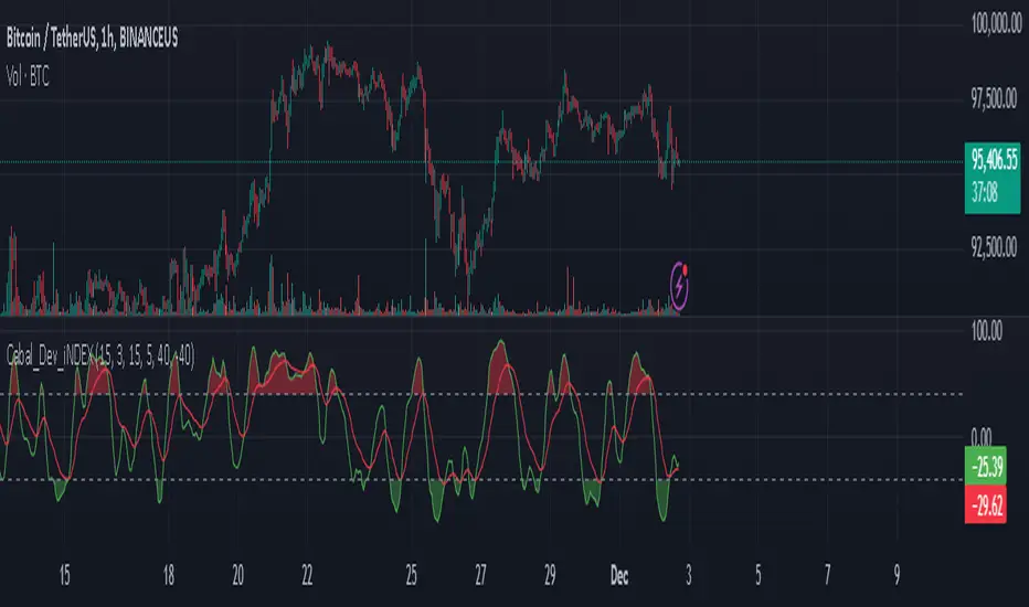
Cabal Dev IndicatorThis is a TradingView Pine Script (version 6) that creates a technical analysis indicator called the "Cabal Dev Indicator." Here's what it does:
1. Core Functionality:
- It calculates a modified version of the Stochastic Momentum Index (SMI), which is a momentum indicator that shows where the current close is relative to the high/low range over a period
- The indicator combines elements of stochastic oscillator calculations with exponential moving averages (EMA)
2. Key Components:
- Uses configurable input parameters for:
- Percent K Length (default 15)
- Percent D Length (default 3)
- EMA Signal Length (default 15)
- Smoothing Period (default 5)
- Overbought level (default 40)
- Oversold level (default -40)
3. Calculation Method:
- Calculates the highest high and lowest low over the specified period
- Finds the difference between current close and the midpoint of the high-low range
- Applies EMA smoothing to both the range and relative differences
- Generates an SMI value and further smooths it using a simple moving average (SMA)
- Creates an EMA signal line based on the smoothed SMI
4. Visual Output:
- Plots the smoothed SMI line in green
- Plots an EMA signal line in red
- Shows overbought and oversold levels as gray horizontal lines
- Fills the areas above the overbought level with light red
- Fills the areas below the oversold level with light green
This indicator appears designed to help traders identify potential overbought and oversold conditions in the market, as well as momentum shifts, which could be used for trading decisions.
Would you like me to explain any specific part of the indicator in more detail?
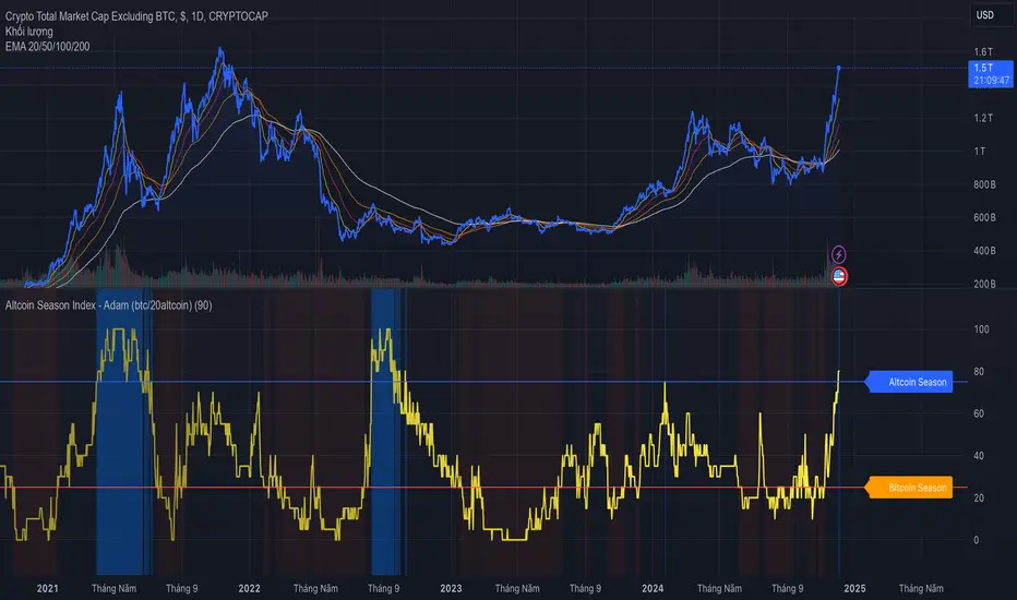
Altcoin Season Index - AdamThe "Altcoin Season Index" is a powerful tool for understanding market dynamics between Bitcoin and altcoins. This indicator helps traders identify whether the market is favoring Bitcoin or if it has shifted to favor altcoins. Understanding this can be crucial for making informed decisions about allocating your investments within the crypto market.
Overview of the Altcoin Season Index
The Altcoin Season Index calculates how well the top 10 altcoins are performing compared to Bitcoin over a given period. It helps traders determine if they are currently in an "Altcoin Season" or a "Bitcoin Season." The indicator gives a score from 0 to 100, representing the percentage of altcoins outperforming Bitcoin over a specific time window. When many altcoins are performing better than Bitcoin, it suggests a possible "Altcoin Season," whereas the opposite may indicate a period of Bitcoin dominance.
Key Features:
1. Top 10 Altcoin Performance Comparison: The indicator evaluates the performance of the top 10 altcoins compared to Bitcoin. It provides a clear view of how well altcoins are doing relative to the market leader, Bitcoin.
2. Customizable Performance Period: The period of analysis is adjustable, allowing users to set a specific timeframe, typically in days, to evaluate the relative performance of altcoins versus Bitcoin.
3. Dynamic Replacement of Altcoins: The indicator includes a feature to replace the last coin in the list, ensuring that the data stays relevant as market conditions change. For example, when a new altcoin enters the top 10 in terms of market cap, the indicator can replace an older coin that is falling out of the top ranks.
4. Threshold Indicators: The indicator uses predefined thresholds to determine and visualize whether it is an "Altcoin Season" or a "Bitcoin Season":
- A value above 75 indicates an Altcoin Season, suggesting that altcoins are outperforming Bitcoin.
- A value below 25 suggests Bitcoin dominance, where Bitcoin is outperforming the majority of altcoins.
How the Indicator Works:
1. Performance Calculation: The indicator calculates the percentage change in price for each of the top 10 altcoins and Bitcoin over a given number of days. The comparison is made by looking at how much each asset's price has changed over the specified period.
2. Altcoin Season Calculation: The indicator counts the number of altcoins that have outperformed Bitcoin during the given period. The result is then expressed as a percentage, known as the Altcoin Season Index. If 8 out of 10 altcoins are outperforming Bitcoin, the index will be 80%, signaling a strong altcoin season.
3. Visual Representation: The indicator is visualized on a separate panel within TradingView, showing the Altcoin Season Index over time. Additionally, thresholds are marked on the chart, and background colors are applied to provide visual cues:
- Red Background: When the Altcoin Season Index is above 75, indicating a strong altcoin season.
- Blue Background: When the Altcoin Season Index is below 25, indicating Bitcoin dominance.
Practical Use:
- Identify Market Cycles: Traders can use this indicator to identify when the market is moving into or out of an altcoin season. This can help traders decide whether to rotate capital into altcoins or Bitcoin.
- Investment Strategy Adjustment: During altcoin seasons, altcoins tend to outperform Bitcoin. Traders might allocate more of their portfolio to promising altcoins. Conversely, during Bitcoin-dominant periods, shifting investments towards Bitcoin could provide more stability.
- Support Technical Analysis: This indicator complements other forms of technical analysis by providing macro-level insights about market direction and which asset classes might be favored.
Example Usage:
Imagine that the Altcoin Season Index is currently at 80%. This means that 8 of the top 10 altcoins have performed better than Bitcoin over the selected period. This strong altcoin performance suggests that the market has entered an "Altcoin Season." A trader observing this might consider reallocating funds towards altcoins to capitalize on the positive momentum.
Alternatively, if the index is at 20%, only 2 out of the top 10 altcoins are outperforming Bitcoin, indicating that Bitcoin is currently the stronger player. In this scenario, traders may choose to prioritize Bitcoin or maintain a more conservative portfolio allocation.
Note:
This indicator includes a feature to replace the bottom-ranked altcoin (typically a coin that falls out of the top 10) with a new altcoin when market conditions change. This ensures that the analysis remains relevant by focusing on the top-performing assets by market capitalization.
Conclusion:
The Altcoin Season Index is a helpful tool for understanding broader trends in the cryptocurrency market and making strategic investment decisions. By monitoring which assets are performing better, traders can adapt their strategies and make more informed choices, particularly during shifts in market sentiment.
Please leave your feedback or contributions if there are any inaccuracies in my indicator. Thank you!
Altcoin Total Average Divergence (YavuzAkbay)The "Average Price and Divergence" indicator is a strong tool built exclusively for cryptocurrency traders who understand the significance of comparing altcoins to Bitcoin (BTC). While traditional research frequently focusses on the value of cryptocurrencies against fiat currencies such as the US dollar, this indicator switches the focus to the value of altcoins against Bitcoin itself, allowing you to detect potential market opportunities and divergences.
The indicator allows you to compare the price of an altcoin to Bitcoin (e.g., ETHBTC, SOLBTC), which is critical for determining how well an altcoin performs against the main cryptocurrency. This is especially important for investors who expect Bitcoin's price will continue to rise logarithmically and want to ensure that their altcoin holdings retain or expand in market capitalisation compared to Bitcoin.
The indicator computes the average price of the chosen cryptocurrency relative to Bitcoin over the viewable portion of the chart. This average acts as a benchmark, indicating the normal value around which the altcoin's price moves.
The primary objective of this indicator is to calculate and plot the divergence, which is the difference between the altcoin's current price relative to Bitcoin and its average value. This divergence can reveal probable overbought or oversold conditions, allowing traders to make better decisions about entry and exit points.
The divergence is represented as a histogram, with bars representing the magnitude of the difference between the current and average prices. Positive values indicate that the altcoin is trading above its average value in comparison to Bitcoin, whereas negative values indicate that it is trading below its average.
The indicator automatically adjusts to the chart's visible range, ensuring that the average price and divergence are always calculated using the most relevant data. This makes the indicator extremely sensitive to changes in the chart view and market conditions.
How to Use:
A significant positive divergence may imply that the cryptocurrency is overbought in comparison to Bitcoin and is headed for a correction. A significant negative divergence, on the other hand, may indicate that the cryptocurrency has been oversold and is cheap in comparison to Bitcoin.
Tracking how an altcoin's price deviates from its average relative to Bitcoin can provide insights about the market's opinion towards that altcoin. Persistent positive divergence may suggest high market confidence, whilst constant negative divergence may imply a lack of interest or eroding fundamentals.
Use divergence data to better time your trades, either by entering when a cryptocurrency is discounted in comparison to its average (negative divergence) or departing when it is overpriced (positive divergence). This allows you to capture value as the price returns to its mean.
Ideal For:
Cryptocurrency Traders who want to understand how altcoins are performing relative to Bitcoin rather than just against fiat currencies.
Long-term Investors looking to ensure their altcoin investments are maintaining or growing their value relative to Bitcoin.
Market Analysts interested in identifying potential reversals or continuations in altcoin prices based on divergence from their average value relative to Bitcoin.

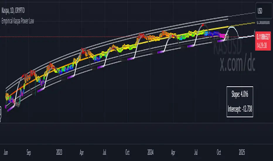
Empirical Kaspa Power Law Full Model v3.1🔶 First we need to understand what Power Laws are.
Power laws are mathematical relationships where one quantity varies as a power of another. They are prevalent in both natural and social systems, describing phenomena such as earthquake magnitudes, word frequencies, and wealth distributions. In a power-law relationship, a change in one quantity results in a proportional change in another, typically following a consistent and predictable mathematical pattern.
🔶 Why Do Power Laws work for Bitcoin and Kaspa?
Power laws work for Bitcoin and Kaspa due to the underlying principles of network dynamics and growth patterns that these cryptocurrencies exhibit. Here's how:
1. Network Growth and User Adoption:
Both Bitcoin and Kaspa grow as more users join their networks. The value of these networks often increases in a manner consistent with Metcalfe’s Law, which states that the value of a network is proportional to the square of its number of users. This relationship is a form of a power law, where network effects lead to exponential growth as more users participate.
2. Mining and Hash Rate:
The mining difficulty and hash rate in cryptocurrencies like Bitcoin and Kaspa adjust based on network activity. As more miners join, the difficulty increases to maintain a stable rate of block production. This self-adjusting mechanism creates feedback loops that can be described by power laws, ensuring the stability and security of the network over time.
3. Price Behavior:
Astrophysicist Giovanni Santostasi discovered that Bitcoin’s price follows a power-law distribution over time. This means that despite short-term volatility, Bitcoin’s long-term price behavior is predictable and adheres to specific mathematical patterns. Santostasi's model provides a framework for understanding Bitcoin’s price movements and forecasting future trends. He also discovered that Kaspa might be following a power-law aswell but it might be to early to tell because Kaspa hasn't been around for too long(2years).
4. Resource Allocation and System Stability:
As the price of Bitcoin or Kaspa increases, more resources are allocated to mining, leading to more sophisticated mining operations. This iterative process of investment and technological advancement follows a power-law pattern, driving the growth and stability of the network.
In summary, the application of power laws to Bitcoin and Kaspa offers a structured framework for understanding their price movements, network growth, and overall stability. These principles provide valuable predictive tools for long-term forecasting, helping to explain the dynamic behavior of these cryptocurrencies.
🔶 What does it look like on a chart?
Here is the Kaspa power law plotted on the KaspaUSD chart. Notice that the y-axis is in logarithmic scale. Unfortunately, TradingView does not allow the x-axis to be in logarithmic scale, which would otherwise make the power law appear as a straight line.
🔶 All the features of the Empirical Kaspa Power Law Full Model
This indicator includes a variety of scripts and tools, meticulously designed and developed to navigate the Kaspa market effectively.
🔹 Power Law & Deviation bands
The decision to use the lower two bands, marking an area between -40% to -50% below the power law, is based on historical analysis. Historically, this range has proven to be a great buying opportunity. In the case of Bitcoin, the bottom typically lies around -60% from the power law. However, for Kaspa, the bottom appears to be less distant from the power law. This discrepancy can be attributed to the differing supply dynamics of the two. Bitcoin undergoes a halving event approximately every four years, significantly reducing the rate at which new coins are introduced into circulation. This cyclical halving can lead to larger price fluctuations and a greater deviation from the power law. In contrast, Kaspa employs a more gradual reduction in its emission rate, with a 5% decrease each month. This consistent and incremental reduction helps Kaspa's price follow the power law more closely, resulting in less pronounced deviations. Consequently, the bottom for Kaspa tends to be closer to the power law, typically around -40% to -50%, rather than the -60% observed with Bitcoin.
The top two deviation bands are fitted to a few bubble data points, which are honestly not very reliable compared to the bottom bands that are based on a larger number of data points. When examining Bitcoin, we see that the bottoms are quite predictable due to the availability of thousands of data points, making it easier to identify patterns and trends.
However, predicting the tops is significantly more challenging because we lack a substantial amount of data for the peaks. This limited data makes it difficult to draw reliable conclusions about the upper deviation bands. As a result, while the bottom bands offer a robust framework for analysis, the top bands should be approached with caution due to their lesser reliability.
🔹 Alternating Sine wave
In observing the price behavior of Kaspa, an intriguing pattern emerges: it tends to follow a roughly four-month cycle. This cycle appears to alternate between smaller and larger waves. To capture this pattern, the sine wave in our indicator is designed to follow the power law, with both the top and bottom of the wave adjusting according to it.
Here's a simple explanation of how this works:
1. Four-Month Cycle: Empirically, Kaspa’s price seems to oscillate over approximately 120 days. This cycle includes periods of growth and decline, repeating every four months. Within these cycles, we observe alternating phases one smaller and one larger in amplitude.
2. Power Law Influence: The sine wave component of our indicator is not arbitrary; it follows a power law that predicts the general price trend of Kaspa. The power law essentially provides a baseline that reflects the longer-term price trajectory.
3. Diminishing Returns and Smoothing: To model diminishing returns, we adjust the amplitude of the sine wave over time, making it smaller as the cycle progresses. This helps to capture the natural tendency for price movements to become less volatile over longer periods. Additionally, the bottom of the sine wave adheres to the power law, ensuring it remains consistent with the overall trend.
🔹 Sine wave Cycle Start & End
Color transitions play a crucial role in visualizing different phases of the four-month cycle.
Based on empirical data, Kaspa experiences approximately 60 days of downward price action following each cycle peak, a period we refer to as the bear phase. This phase is followed by the bull phase, which also lasts around 60 days. To indicate the cycle peak, we have added a colored warning on the sine wave.
Cycle Start (Purple): The sine wave starts with a purple color, marking the beginning of a new cycle. This bull phase often represents a potential bottom or accumulation zone where prices are lower and stable, offering a strategic point for entering the market.
Cycle Top (Red): As the cycle progresses, the sine wave transitions through colors until it reaches red. This red phase indicates the top of the cycle, where the price is likely peaking. It's a critical area for investors to consider dollar-cost averaging (DCA) out of Kaspa, as it signifies a period of potential overvaluation and heightened risk.
These color transitions provide a visual guide to the market's cyclical nature, helping investors identify optimal entry and exit points. By following the sine wave's color changes, you can better time your investments, entering at the start of the cycle and considering exits as the cycle tops out.
🔹 Colored Deviation from the Power Law Bubbles
In trading, having a clear visual signal can significantly enhance decision-making, especially when dealing with complex models like power laws. This inspired the creation of the "deviation bubbles" in my indicator, which provides an intuitive, color-coded visual queue to help me, and other traders, better grasp market deviations and make timely trading decisions.
Here's a breakdown of how the deviation bubbles work:
1. Power Law Reference: The core of the indicator calculates a theoretical price level (the power law price) for Kaspa.
2. Deviation Calculation: For each day, the indicator computes the percentage deviation of the actual closing price from this power law price. This tells how much the market price diverges from the theoretically expected level.
3. Color-Coding Based on Deviation:
The deviation is categorized into various ranges (e.g., ≥ 100%, 90-100%, 80-90%, etc.).
Each range is assigned a distinct color, from red for extreme positive deviations to blue for extreme negative deviations.
This gradient helps in quickly identifying significant market deviations.
By integrating these bubbles into the chart, the indicator offers a simple yet powerful visual tool, aiding in recognizing critical market conditions without the need to delve into complex calculations manually. This approach not only enhances the ease of trading but also helps in overcoming the hesitation often faced when pulling the trigger on trades.
🔹 Projected Power Law Bands
Extends the current power law bands into the future using the same formula that defines the current power law.
Visual Representation: Dotted lines on the chart indicate the projected power law price and deviation bands.
Limitations: TradingView restricts how far these projections can extend, typically up to a reasonable future period.
These projected bands help anticipate future price movements, aiding in more informed trading decisions.
🔹 Projected Sine Wave
This projection continues to calculate the phase and amplitude, adjusting for diminishing returns and cycle transitions. It also estimates the future power law price, ensuring the projection reflects potential market dynamics.
Visual Representation: The projected sine wave is shown with dotted blue lines, providing a clear visual of the expected trend, aiding traders in their decision-making process.
Limitations: Again, TradingView restricts how far these projections can extend, typically up to a reasonable future period.
🔶 Why are all these different scripts made into one indicator?
As a trader and crypto analyst, I needed specific tools and customizations that no other indicator offered. Being a visual person, I rely heavily on visual triggers such as colors and patterns to make trading decisions. Initially, I developed this indicator for my personal use to enhance my market analysis with these visual cues. However, after sharing my insights, other traders expressed interest in using it. In response, I expanded the functionality and added various options to cater to a broader range of users.
This comprehensive indicator integrates multiple features into one tool, providing a powerful and flexible solution for analyzing market trends and making informed trading decisions. The use of colors and visual elements helps in quickly identifying key signals and market phases. The customizable options allow you to fine-tune the indicator to suit your specific needs, making it a versatile tool for both novice and experienced traders.
🔶 Usage & Settings:
This indicator is best used on the Daily chart for KASUSD - crypto because it uses a power law formula based on days.
🔹 Using the Indicator for 4-Month Cycles:
For traders interested in playing the 4-month cycles, this indicator provides a straightforward strategy. When the bubbles turn purple or the sine wave shows the purple start color, it signals a good time to dollar-cost average (DCA) into the market. Conversely, when the bubbles turn red or the cycle top is near, indicated by a red color, it’s time to DCA out of the Kaspa market. This visual approach helps traders make timely decisions based on color-coded signals, simplifying the trading process.
Historically, it was nearly impossible to accurately time all the 4-month cycle tops because they alternate each time. Without the combination of multiple scripts in this indicator, identifying these cyclical patterns and their respective peaks was extremely challenging. This integrated tool now provides a clear and reliable method for detecting these critical points, enhancing trading effectiveness.
🔹 Combining the visual queues for market extremes
The chart above illustrates the alignment of visual cues indicating market extremes. Notably, these visual cues—marked by red and purple boxes—historically pinpoint areas of extreme value or opportunities. When red aligns with red and purple aligns with purple, these zones have consistently indicated significant market extremes.
Understanding and recognizing these patterns provides a strategic advantage. By identifying these visual triggers, traders can plan and execute informed trades with greater confidence whenever similar scenarios unfold in the future.
Kaspa is perhaps one of the most cyclical and predictable cryptocurrencies in the market. Given its consistent behavior, traders might wonder why they would trade anything else. As long as there are no signs indicating a change in Kaspa's cyclical nature, there is no reason to make significant alterations to our predictions. This makes Kaspa an attractive option for traders seeking reliable and repeatable trading opportunities.
🔹 Settings & customization:
As a visually-oriented trader, it is essential to customize the appearance of indicators to effectively navigate the Kaspa market. The Indicator offers extensive customization options, allowing users to modify the colors of various elements to suit their preferences. For example, users can adjust the colors of the deviation bubbles, deviation bands, sine wave, and power law to enhance visual clarity and focus on specific data points. This level of personalization not only enhances the overall user experience but also ensures that the visual representation aligns with unique trading strategies, making it easier to interpret complex market data.
Additionally, users can change the power law inputs and other parameters as shown in the image. For instance, the Power Law Intercept and Power Law Slope can be manually adjusted, allowing traders to update these values. This flexibility is crucial as the future power law for Kaspa may evolve/change.
🔶 Limitations
Like any technical analysis tool, the Empirical Kaspa Power Law Full Model indicator has limitations. It's based on historical data, which may not always accurately predict future market movements.
🔶 Credits
I want to thank Dr. Giovanni Santostasi · Professor of physics and Mathematics.
He was one of the first who applied the concept of the power law to Bitcoin's price movements, which has been instrumental in providing insights into the long-term growth and potential future value of Bitcoin. Giovanni also offers coding classes on his Discord, which I attended. He personally taught me how to code specific things in Pine Editor and Python, sparking my interest in developing my own indicator.
Additionally, I would like to extend my gratitude to the following individuals for their invaluable contributions in terms of ideas, theories, formulas, testing, and guidance:
Forgowork, PlanC, Miko Genno, Chancellor, SavingFace, Kaspapero, JJ Venema.
MBY_Bitcoin miners' Revenue PowerThis indicator tracks the reward rate of Bitcoin miners.
In general, as the price of bitcoin increases, the difficulty of mining and the transfer fee increase.
Therefore, miners will need an index that they can refer to when selling stably mined bitcoins.
This indicator indicates when miners are focused on mining and when it is effective to sell.
How to use
After printing this indicator, you can use the same as above by dragging and dropping it on the main chart.
Notice*
This indicator can be used for free.

Altcoins capitalization histogram [peregringlk]This script superseeds "Other altcoins BTC capitalization histogram". The previous versions was a bit confusing in my opinion and lacked some generalization, so I'm now publishing this improved version.
It shows 6 pieces of info:
- Green columns: BTC price change for that day.
- Red bars: Altcoins capitalization change for that day, measured in bitcoins (altcoins_USD_capitalization / BTCUSD)
- Green/red background: green if that day the USD capitalization change was a gain, and red if it was a loss.
- Green line: accum BTC price change for the selected last days.
- Red line: accum altcoin capitalization change measured in BTC for the selected days.
- Dotted blue sequence: accum altcoin USD capitalization change for the selected days.
The base line of the histogram is 1 instead of 0, because I'm showing the price changes as multipliers (price change rates), so if there have been a +20% market movement, the calculated value will be 1.2, and if there have been a -20% market movement, then the value will be 0.8. 1 means no movement (preserved price/capitalization). Price and capitalization changes will be calculated using candle closes.
About the accumulated price changes, it will calculate the accumulated multiplication of the corresponding price change multipliers. For example, if you have set you want 3 days for the accumulation rates, and the last three days saw a -20%, +10% and +15% price/capitalization changes, the current value for the line will be 0.8*1.1*1.15 = 1.0120, or a +1.2% price change respect to the day before yesterday.
By default, if you are looking any ALTBTC market (for example, ETHBTC), instead of showing the USD and BTC capitalization of all alts, it will take the BTC and USD prices of the current market (the USD price will be calculated as ALTBTC * BTCUSD; and the BTCUSD price will be taken from BITSTAMP, the one with the longest BTC history I know in tradingview). If you are looking any other markets that is not paired with BTC, then it will take the USD capitalization of all altcoins, and the BTC capitalization will be calculated as altcoins_USD_capitalization / BTCUSD (from BITSTAMP as well).
Also, remember that, in both cases (alts capitalization or price), the graph will consistently respect the following rule:
- btc_usd_price_change * alt/capitalization_btc_price_change = alt_usd_price_change.
That applies for both the green/red bars respect to the background, and the green/red line respect to the blue dotted sequence.
Lastly, you may want to know if, in case btc price and altbtc price or capitalization go in opposite directions, who gain the battle? For example, if BTCUSD moved +20%, and an ALTBTC price moved -20%, the result is a loss, because 1.2*0.8 = 0.96, so the ALTUSD price or capitalization moved -4% (remember that, for preserving the USD value, if today's bitcoin change rate is x, the altbtc change rate must be 1/x; so for a -20% BTCUSD price movement, there must be at least a +25% ALTBTC price change to don't loss USD value, because 1/0.8 = 1.25). The background is what shows you that: if the background is green, it means that for that day there was a total USD gain of value, and when it's red, then it was a loss of USD value.
You can customize the following things:
- Accum change rate interval: the "selected days". By default 7.
- Take alts-capitalization?: By default unmarked. The effect when is unmarked is what I have explained in the previous paragraph. If you mark it, then it will use the USD_capitalization of all alts no matter what market you are looking right now.
- Which capitalization do you want? There are three options, that applies when "Take alts-capitalization?" is marked, or otherwise, when you are not looking a BTC-paired market.
- - - All-alts (default option): take CRYPTOCAP:TOTAL2 security as reference Alts-capitalization, which represents all altcoins.
- - - Other-alts: take CRYPTOCAP:OTHERS security as reference Alts-capitalization, which represents all altcoin except the 9 most capitalized alts.
- - - Big-alts: take CRYPTOCAP:TOTAL2 - CRYPTOCAP:OTHERS as reference Alts-capitalization, which represenst only the 9 most capitalized alts.
The idea of this script is:
A) Figuring out what is causing a USD value gain or loss, the alts market movements, or the BTC price change. So you can spot if some altcoin, or all altcoins combined, are gaining or loosing value by themselves or because of bitcoin.
B) Trying to spot or discover some patterns that allows you to identify altseasons. Once an altseason has been developed, the chart will show it in a pretty obvious way (massive red line bells and dotted blue lines with very high values during a period of various weeks). The hard problem is to spot it in advance, and maybe this graph can help.

Cracking Cryptocurrency - Bottom FeederThe Bottom Feeder
The Bottom Feeder is designed to algorithmically detect significantly oversold conditions in price that represent profitable buying opportunities. Combining this with it’s unique Stop and Target System, the Bottom Feeder is designed to return consistent return with minimal draw down. Whether used as a Market Bottom Detector or as a system for executing safe, profitable mean reversion trades, the Bottom Feeder is a powerful tool in any trader’s arsenal.
Bottom Feeder was designed to be used on BTCUSD , however it is also effective on other USD/USDT pairs. One will have to check the individual pair they wish to trade with the Strategy Tester to simulate performance.
Options
Let’s go through the input options one by one, so that you are able to comfortably navigate all that this indicator has to offer. The link below will display a picture of the layout of the settings for your convenience.
For the sake of simplicity, let’s note now that all settings marked **Conservative Mode** will not work in Aggressive Mode.
Mode: Determines how aggressively Bottom Feeder generates a buy signal. In Conservative Mode, trades can only be opened once per candle and the stop and target will update as new signals appear. In Aggressive Mode, a separate trade is opened each time Bottom Feeder signals, which may be multiple times within one Daily candle.
Plot Target and Stop Loss: Toggles on/off the visualized take profit and stop losses on the chart.
**Conservative Mode** TP Multiplier: This is an input box, it requires a float value. That is, it can accept either a whole number integer or a number with a decimal. This number will determine your Take Profit target. It will take whatever number is entered into this box and multiply the Average True Range against it to determine your Take Profit.
**Conservative Mode** SL Multiplier: See above - this will modify your Stop Loss Value.
**Conservative Mode** Average or Median True Range: This is a drop-down option, the two options are Average True Range or Median True Range. If Average True Range is selected, then this indicator will use the Average True Range calculation, that is, the average of a historical set of True Range values to determine the Average True Range value for Target and Stop Loss calculation. If Median True Range is selected, it will not take an average and will instead take the Median value of your historical look back period.
**Conservative Mode** True Range Length: This is an input that requires an integer. This will represent your historical look back period for Average/Median True Range calculation.
**Conservative Mode** True Range Smoothing: This is a drop-down with the following options: Exponential Moving Average ( EMA ), Simple Moving Average ( SMA ), Weighted Moving Average ( WMA ), Relative Moving Average (RMA). This will determine the smoothing type for calculating the Average True Range if it is selected. Note: if Median True Range is selected above, this option will not have any effect as there is no smoothing for a Median value.
**Conservative Mode** Custom True Range Value?: This is a true/false option that is false by default. If enabled, it will override the Average/Median True Range calculation in favor of a users custom True Range value to be input below.
**Conservative Mode** Custom True Range Value: This is an input box that requires a float value. If Custom True Range is enabled this is where a user will input their desired custom True Range value for Target and Stop Loss calculation.
Stop and Target Description
Because Bottom Feeder is designed only to scalp the various market bottoms that can appear over time in the market and not to identify trends or to trade ranges, it’s imperative that the indicator notify us not just to when to enter our trades, but when to exit! In the service of that, CC Bottom Feeder has a built in Stop and Target system that tracks and displays the stop loss and take profit levels of each individual open trade, whether in Aggressive or Conservative Mode.
Conservative Mode Targeting: In Conservative Mode, Bottom Feeder signals are aggregated into a compound trade. The signal will appear as a green label pointing up below a candle, and will appear upon a candle close. If Bottom Feeder then generates another signal the stop loss and target price will be updated. The process will continue until the aggregated trade completes in either direction. On a trade with multiple signals, a larger position is slowly entered into upon each buy signal.
Aggressive Mode Targeting: In Aggressive Mode, Bottom Feeder signals are individually displayed as they are generated, regardless of how many signals are generated on any single candle. If Bottom Feeder continues to signal, each individual open trade will have their own stop loss and target that will be displayed on the chart until the individual trade completes in either direction. As opposed to a large compound position, aggressive mode represents a higher number of independent signals with their own stop and target levels.
Stop losses and targets are designed to be hard, not soft. That is, they are intended to be stop market orders, not mental stop losses. If price wicks through the target or stop, it will activate.
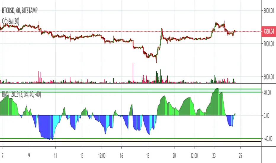
Bitok Magic Volume 2019 BMV[wozdux]Magic volume indicator (Bitok Magic Volume) BMV
Purchase volumes and sales volumes are separated
The percentage of purchases over total sales is calculated.
If the price rises and the volume increases, then green, the price falls and the volume falls, then light green. If the price falls and the volume increases, then blue, if the price increases and the volume falls, then light blue.
Thus, the dominant movement in trading volumes is tracked.
The indicator settings:
T1-period of initial volume averaging. The default is 3 bars. The volume moving average is calculated for 3 bars. If the moving average increases, then it means an increase in market volatility. And then the chart is colored either dark green or dark blue.If the moving average falls, the chart color is light green or light blue.
T2-the period of calculation of excess of purchases over sales. The chart is above zero if purchases dominate sales. And Vice versa, the graph is below zero, if sales dominate.
By default, the indicator uses net trading volume. If you study the graph of bitcoin to the dollar, the volume is the volume in bitcoins.
The BTC<<-->>USD button switches the indicator calculation from bitcoin volume to dollar volume.
Level max-upper level
Level min - lower level.
How to use it.
Trading volume is an important indicator of crowd sentiment. If volume rises on purchases and falls on sales, it is indicative of the mood of the crowd to buy more than sell. The indicator chart in this case is located above zero and the color is dark green on the ascents and light green on the descents.
If volume rises on sales and falls on purchases, then the mood of the crowd is to sell more. The indicator is then located below zero and the color on the falls is dark blue, and on the rises is light blue.
-----русское описание------
Магический индикатор объема (Bitok Magic Volume)
Разделяются объемы покупок и объемы продаж
Вычисляется процент покупок над суммарным объемом продаж.
Если цена поднимается и объем увеличивается, тогда зеленый, цена падает и объем падает , тогда светло зеленый. Если цена падает и объем увеличивается, тогда синий, если цена увеличивается И объем падает, то светло синий.
Таким образом, отслеживается доминирующее движение по объемам торгов.
Настройки индикатора:
T1-период первоначального усреднения объема. По умолчанию 3 бара. За 3 бара вычисляется скользящее среднее объема. Если скользящее среднее увеличивается, то это означает рост волатильности рынка. И тогда график окрашивается либо темно-зеленым либо темно-синим цветом.Если скользящее среднее падает, то цвет графика светло-зеленый или светло-голубой.
T2- Период вычисления превышения покупок над продажами. График выше нуля, если покупки доминируют над продажами. И наоборот, график ниже нуля, если продажи доминируют.
По умолчанию индикатор использует чистый объем торгов. Если исследуется график биткоина к доллару, то объем это объем в биткоинах.
Кнопка BTC<<-->>USD переключает вычисление индикатора с объема в биткоинах в объем в долларах.
Level max - верхний уровень
Level min - нижний уровень.
Как пользоваться.
Объем торгов - важный показатель настроения толпы. Если объем растет на покупках и падает на продажах, то это свидетельствует о настроении толпы больше покупать, чем продавать. Диаграмма индикатора в этом случае располагается выше нуля И цвет темно-зеленый на подъемах и светло-зеленый на спусках.
Если объем растет на продажах и падает на покупках, то настроение толпы больше продавать. Индикатор тогда располагается ниже нуля И цвет на падениях темно-синий, а на подъемах светло-голубой.