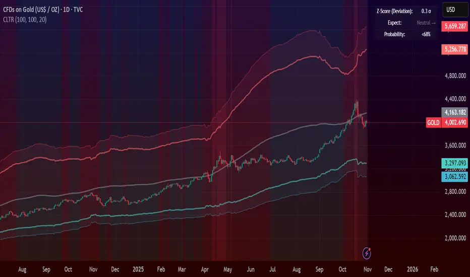
Central Limit Theorem Reversion IndicatorDear TV community, let me introduce you to the first-ever Central Limit Theorem indicator on TradingView.
The Central Limit Theorem is used in statistics and it can be quite useful in quant trading and understanding market behaviors.
In short, the CLT states: "When you take repeated samples from any population and calculate their averages, those averages will form a normal (bell curve) distribution—no matter what the original data looks like."
In this CLT indicator, I use statistical theory to identify high-probability mean reversion opportunities in the markets. It calculates statistical confidence bands and z-scores to identify when price movements deviate significantly from their expected distribution, signaling potential reversion opportunities with quantifiable probability levels.
Mathematical Foundation
The Central Limit Theorem (CLT) says that when you average many data points together, those averages will form a predictable bell-curve pattern, even if the original data is completely random and unpredictable (which often is in the markets). This works no matter what you're measuring, and it gets more reliable as you use more data points.
Why using it for trading?
Individual price movements seem random and chaotic, but when we look at the average of many price movements, we can actually predict how they should behave statistically. This lets us spot when prices have moved "too far" from what's normal—and those extreme moves tend to snap back (mean reversion).
Key Formula:
Z = (X̄ - μ) / (σ / √n)
Where:
- X̄ = Sample mean (average return over n periods)
- μ = Population mean (long-term expected return)
- σ = Population standard deviation (volatility)
- n = Sample size
- σ/√n = Standard error of the mean
How I Apply CLT
Step 1: Calculate Returns
Measures how much price changed from one bar to the next (using logarithms for better statistical properties)
Step 2: Average Recent Returns
Takes the average of the last n returns (e.g., last 100 bars). This is your "sample mean."
Step 3: Find What's "Normal"
Looks at historical data to determine: a) What the typical average return should be (the long-term mean) and b) How volatile the market usually is (standard deviation)
Step 4: Calculate Standard Error
Determines how much sample averages naturally vary. Larger samples = smaller expected variation.
Step 5: Calculate Z-Score
Measures how unusual the current situation is.
Step 6: Draw Confidence Bands
Converts these statistical boundaries into actual price levels on your chart, showing where price is statistically expected to stay 95% and 99% of the time.
Interpretation & Usage
The Z-Score:
The z-score tells you how statistically unusual the current price deviation is:
|Z| < 1.0 → Normal behavior, no action
|Z| = 1.0 to 1.96 → Moderate deviation, watch closely
|Z| = 1.96 to 2.58 → Significant deviation (95%+), consider entry
|Z| > 2.58 → Extreme deviation (99%+), high probability setup
The Confidence Bands
- Upper Red Bands: 95% and 99% overbought zones → Expect mean reversion downward as the price is not likely to cross these lines.
- Center Gray Line: Statistical expectation (fair value)
- Lower Blue Bands: 95% and 99% oversold zones → Expect mean reversion upward
Trading Logic:
- When price exceeds the upper 95% band (z-score > +1.96), there's only a 5% probability this is random noise → Strong sell/short signal
- When price falls below the lower 95% band (z-score < -1.96), there's a 95% statistical expectation of upward reversion → Strong buy/long signal
Background Gradient
The background color provides real-time visual feedback:
- Blue shades: Oversold conditions, expect upward reversion
- Red shades: Overbought conditions, expect downward reversion
- Intensity: Darker colors indicate stronger statistical significance
Trading Strategy Examples
Hypothetically, this is how the indicator could be used:
- Long: Z-score < -1.96 (below 95% confidence band)
- Short: Z-score > +1.96 (above 95% confidence band)
- Take profit when price returns to center line (Z ≈ 0)
Input Parameters
Sample Size (n) - Default: 100
Lookback Period (m) - Default: 100
You can also create alerts based on the indicator.
Final notes:
- The indicator uses logarithmic returns for better statistical properties
- Converts statistical bands back to price space for practical use
- Adaptive volatility: Bands automatically widen in high volatility, narrow in low volatility
- No repainting: yay! All calculations use historical data only
Feedback is more than welcome!
Henri
스크립트에서 "bands"에 대해 찾기
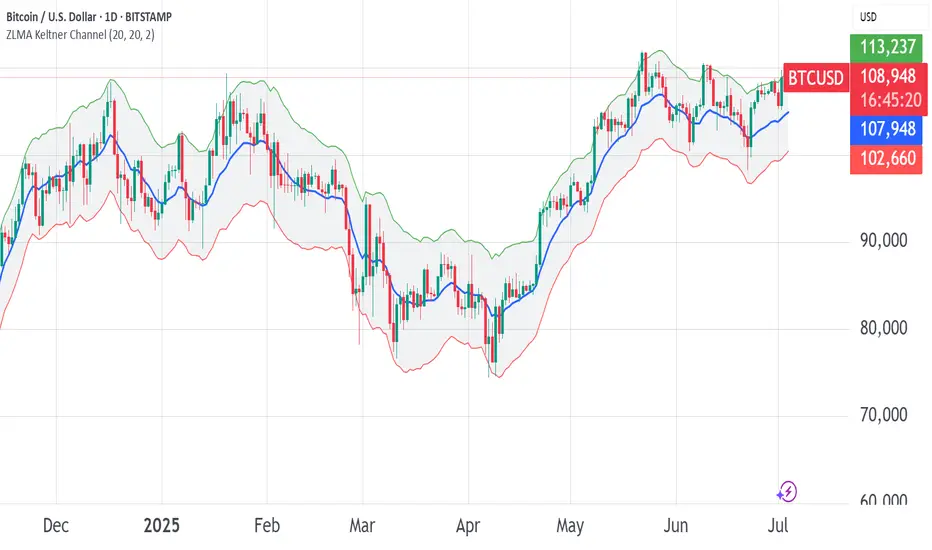
ZLMA Keltner ChannelThe ZLMA Keltner Channel uses a Zero-Lag Moving Average (ZLMA) as the centerline with ATR-based bands to track trends and volatility.
The ZLMA’s reduced lag enhances responsiveness for breakouts and reversals, i.e. it's more sensitive to pivots and trend reversals.
Unlike Bollinger Bands, which use standard deviation and are more sensitive to price spikes, this uses ATR for smoother volatility measurement.
Background:
Built on John Ehlers’ lag-reduction techniques, this indicator adapts the classic Keltner Channel for dynamic markets. It excels in trending (low-entropy) markets for breakouts and range-bound (high-entropy) markets for reversals.
How to Read:
ZLMA (Blue): Tracks price trends. Above = bullish, below = bearish.
Upper Band (Green): ZLMA + (Multiplier × ATR). Cross above signals breakout or overbought.
Lower Band (Red): ZLMA - (Multiplier × ATR). Cross below signals breakout or oversold.
Channel Fill (Gray): Shows volatility. Narrow = low volatility, wide = high volatility.
Signals (Optional): Enable to show “Buy” (green) on upper band crossovers, “Sell” (red) on lower band crossunders.
Strategies: Trade breakouts in trending markets, reversals in ranges, or use bands as trailing stops.
Settings:
ZLMA Period (20): Adjusts centerline responsiveness.
ATR Period (20): Sets volatility period.
Multiplier (2.0): Controls band width.
If you are still confused between the ZLMA Keltner Channels and Bollinger Bands:
Keltner Channel (ZLMA): Uses ATR for bands, which smooths volatility and is less reactive to sudden price spikes. The ZLMA centerline reduces lag for faster trend detection.
Bollinger Bands: Uses standard deviation for bands, making them more sensitive to price volatility and prone to wider swings in high-entropy markets. Typically uses an SMA centerline, which lags more than ZLMA.
Ehlers Instantaneous Trendline ATR LevelsOverview
This sophisticated technical analysis tool merges John Ehlers' cutting-edge Instantaneous Trendline methodology with a dynamic ATR-based bands system. The indicator is designed to provide traders with a comprehensive view of market trends while accounting for volatility, making it suitable for both trending and ranging markets. Works on all timeframes and chart types.
Key Features in Detail
1. Ehlers Instantaneous Trendline Implementation
- Advanced algorithm that reduces lag typically associated with moving averages
- Built-in volatility filtering system to minimize false signals
- Adaptive to market conditions through dynamic calculations
- Real-time trend direction identification
2. Multi-layered ATR Band System
- Hierarchical band structure with 18 total bands (9 upper, 9 lower)
- Color-coded visualization system:
Upper bands: Red gradient (darker = further from trendline)
Lower bands: Green gradient (darker = further from trendline)
Central trendline: Yellow for optimal visibility
- Customizable multipliers for each band level
- Independent visibility controls for each band
Configuration Options
Trendline Settings:
- Lower values: More responsive to price changes and faster reacting to break in ATR filter
- Higher values: Smoother trendline with less noise and slower reacting to break in ATR filter
ATR Configuration:
Period: Customizable from 1 to any positive integer
- Longer periods: More stable volatility measurement
- Shorter periods: More reactive to recent volatility changes
Filter Multiplier: Fine-tune volatility filtering
- Higher values: More filtered signals leading to less shift in bands
- Lower values: More sensitive to price movements leading to more band shifts
Practical Applications
1. Trend Analysis
Use the central trendline for primary trend direction
Monitor band crossovers for trend strength confirmation
Track price position relative to bands for trend context
2. Volatility Assessment
Band spacing indicates current market volatility
Width between bands helps identify consolidation vs. expansion phases
Price Extremes
3. Support and Resistance
Each band acts as a dynamic support/resistance level
Multiple timeframe analysis possible adjusting for different timeframe ATR

A-VWAP The Anchored VWAP (Volume-Weighted Average Price) is a powerful multi-functional tool that adapts to price action and volume dynamics to identify trend bias, support/resistance zones, and potential reversal points. This enhanced version integrates dynamic color-coded signals (green/red) to simplify decision-making for swing traders, intraday scalpers, and position managers.
Dynamic Trend Bias Identification
Green A-VWAP (Bullish Control): Activates when price sustains above the anchored VWAP. Highlights bullish momentum, suggesting institutional buying dominance and potential continuation setups.
Red aVWAP (Bearish Control): Triggers when price holds below the anchored VWAP. Signals bearish pressure, indicating distribution phases or downtrends.
Swing-Level Targeting
Green aVWAP serves as dynamic support for profit-taking on short positions during pullbacks and adding New long positions.
Red aVWAP becomes resistance for profit closure on Long trades. Price dipping far below red aVWAP may signal oversold conditions, with red aVWAP acting as a resistance target.
Strategic Applications
Swing Trading: Use green/red aVWAP to define trend alignment and position direction
Swing Short or Swing Long Target
Swing Long Entry or Swing Short Target
Intraday: nchored VWAP (aVWAP) with Standard Deviation (STDV) bands provides a powerful framework for identifying mean-reversion opportunities when price extends away from its volume-weighted fair value. Identifying Overextended Moves, Executing the Trade, Managing Risk
Institutional Flow Tracking: Monitor how price interacts with aVWAP to gauge institutional accumulation/distribution.
Standard Deviation Bands for Volatility Context
The indicator integrates ±1 and ±2 standard deviation bands around the Anchored VWAP. These bands quantify price dispersion, acting as dynamic boundaries for mean reversion or trend acceleration:
Tightening Bands: Signal low volatility, often preceding breakouts.
Expanding Bands: Reflect heightened volatility, indicating strong Resistance/Support.
Use these bands to identify overextended price levels.
Multi-Timeframe Anchoring Strategy
Lower Timeframe 15-Minute High/Low Focus:
For intraday scalping or short-term trades, anchor the VWAP to swing highs or lows on the 15-minute Low/High.
Higher Timeframe 1-Hour High/Low Focus:
For swing trading, anchor the VWAP to major swing points on the 1-hour Low/High. This aligns with broader market structure, offering clarity on institutional accumulation/distribution zones. A sustained green zone above the HTF VWAP signals alignment with the higher-timeframe trend.
Anchored VWAP Most Powerful tool
The enhanced VWAP with Anchoring empowers traders to harmonize short-term precision with higher-timeframe context. Whether scalping on the 15-minute chart or swing trading, this tool adapts to your strategy’s rhythm. By anchoring to critical highs/lows and layering volatility bands, it transforms raw price action into a structured roadmap—guiding entries, exits, and risk management with institutional-grade clarity.
Master the markets across timeframes with an indicator that scales with your ambition.

DTB
Dynamic Trendline Bands with Buy/Sell Pressure Detection
This indicator provides a comprehensive analysis of price movements by incorporating smoothed high and low bands, a midline, and the detection of buying and selling pressure. It is designed to help traders identify key support and resistance levels as well as potential buy and sell signals.
**Features:**
- **Smooth High and Low Bands:** Based on the highest high and lowest low over a specified period, smoothed using a simple moving average (SMA) to reduce noise and enhance clarity.
- **Midline:** The average of the smoothed high and low bands, providing a central reference point for price movements.
- **Buying and Selling Pressure Detection:** Highlights candles with significant buying or selling pressure, indicated by light green for buying pressure and light red for selling pressure. This is determined based on volume thresholds and price movement.
- **Trendlines:** Dynamic trendlines are drawn based on recent highs and lows, helping to visualize the current trend direction.
**How to Use:**
1. **High-Low Bands:** Use these bands to identify key support and resistance levels.
2. **Midline:** Monitor the midline for potential mean reversion trades.
3. **Buying/Selling Pressure Candles:** Look for candles highlighted in light green or red to identify potential buy or sell signals.
4. **Trendlines:** Follow the dynamic trendlines to understand the direction of the current trend.
**Inputs:**
- **Length:** Number of bars to consider for calculating the highest high and lowest low (default: 200).
- **Smooth Length:** Period for the simple moving average to smooth the high and low bands (default: 10).
- **Volume Threshold Multiplier:** Multiplier for the average volume to detect significant buying or selling pressure (default: 1.5).
This indicator is suitable for all timeframes and can be used in conjunction with other technical analysis tools to enhance your trading strategy.
Volume Candle bollinger band By Anil ChawraHow Users Can Make Profit Using This Script:
1.Volume Representation: Each candle on the chart represents a specific time period (e.g., 1 minute, 1 hour, 1 day) and includes information about both price movement and trading volume during that period.
2.Candlestick Anatomy: A volume candle has the same components as a regular candlestick: the body (which represents the opening and closing prices) and the wicks or shadows (which indicate the highest and lowest prices reached during the period).
3.Volume Bars: Instead of just the candlestick itself, volume candles also include a bar or histogram representing the trading volume during that period. The height or length of the volume bar indicates the amount of trading activity.
4.Interpreting Volume: High volume candles typically indicate increased market interest or activity during that period. This could be due to significant buying or selling pressure.
5.Confirmation: Traders often look for confirmation from other technical indicators or price action to validate the significance of a high volume candle. For example, a high volume candle breaking through a key support or resistance level may signal a strong market move.
6.Trend Strength: Volume candles can provide insights into the strength of a trend. A series of high volume candles in the direction of the trend suggests strong momentum, while decreasing volume may indicate weakening momentum or a potential reversal.
7.Volume Patterns: Traders also analyze volume patterns, such as volume spikes or divergences, to identify potential trading opportunities or reversals.
8.Combination with Price Action: Volume analysis is often used in conjunction with price action analysis and other technical indicators to make more informed trading decisions.
9.Confirmation and Validation: It's important to confirm the significance of volume candles with other indicators or price action signals to avoid false signals.
10.Risk Management: As with any trading strategy, proper risk management is crucial when using volume candles to make trading decisions. Set stop-loss orders and adhere to risk management principles to protect your capital.
How the Script Works:
1.Identify High Volume Candles: Look for candles with significantly higher volume compared to the surrounding candles. These can indicate increased market interest or activity.
2.Wait for Confirmation: Once you identify a high volume candle, wait for confirmation from subsequent candles to ensure the momentum is sustained.
3.Enter the Trade: After confirmation, consider entering a trade in the direction indicated by the high volume candle. For example, if it's a bullish candle, consider buying.
4.Set Stop Loss: Always set a stop loss to limit potential losses in case the trade goes against you.
5.Take Profit: Set a target for taking profits. This could be based on technical analysis, such as a resistance level or a certain percentage gain.
6.Monitor Volume: Continuously monitor volume to gauge the strength of the trend. Decreasing volume may signal weakening momentum and could be a sign to exit the trade.
7.Risk Management: Manage risk carefully by adjusting position sizes according to your risk tolerance and the size of your trading account.
8.Review and Adapt: Regularly review your trades and adapt your strategy based on what's working and what's not.
Remember, no trading strategy guarantees profits, and it's essential to practice proper risk management and have realistic expectations. Additionally, consider combining volume analysis with other technical indicators for a more comprehensive approach to trading.
How Users Can Make Profit Using this script :
Bollinger Bands are a technical analysis tool that helps traders identify potential trends and volatility in the market. Here's a simple strategy using Bollinger Bands with a 10-point range:
1. *Understanding Bollinger Bands*: Bollinger Bands consist of a simple moving average (typically 20 periods) and two standard deviations plotted above and below the moving average. The bands widen during periods of high volatility and contract during periods of low volatility.
2. *Identify Price Range*: Look for a stock or asset that has been trading within a relatively narrow range (around 10 points) for some time. This indicates low volatility.
3. *Wait for Squeeze*: When the Bollinger Bands contract, it suggests that volatility is low and a breakout may be imminent. This is often referred to as a "squeeze."
4. *Plan Entry and Exit Points*: When the price breaks out of the narrow range and closes above the upper Bollinger Band, consider entering a long position. Conversely, if the price breaks below the lower band, consider entering a short position.
5. *Set Stop-Loss and Take-Profit*: Set stop-loss orders to limit potential losses if the trade goes against you. Take-profit orders can be set at a predetermined level or based on the width of the Bollinger Bands.
6. *Monitor and Adjust*: Continuously monitor the trade and adjust your stop-loss and take-profit levels as the price moves.
7. *Risk Management*: Only risk a small percentage of your trading capital on each trade. This helps to mitigate potential losses.
8. *Practice and Refinement*: Practice this strategy on a demo account or with small position sizes until you are comfortable with it. Refine your approach based on your experience and market conditions.
Remember, no trading strategy guarantees profits, and it's essential to combine technical analysis with fundamental analysis and risk management principles for successful trading. Additionally, always stay informed about market news and events that could impact your trades.
How does script works:
Bollinger Bands work by providing a visual representation of the volatility and potential price movements of a financial instrument. Here's how they work with a 10-point range:
1. *Calculation of Bollinger Bands*: The bands consist of three lines: the middle line is a simple moving average (SMA) of the asset's price (typically calculated over 20 periods), and the upper and lower bands are calculated by adding and subtracting a multiple of the standard deviation (usually 2) from the SMA.
2. *Interpretation of the Bands*: The upper and lower bands represent the potential extremes of price movements. In a 10-point range scenario, these bands are positioned 10 points above and below the SMA.
3. *Volatility Measurement*: When the price is experiencing high volatility, the bands widen, indicating a wider potential range of price movement. Conversely, during periods of low volatility, the bands contract, suggesting a narrower potential range.
4. *Mean Reversion and Breakout Signals*: Traders often use Bollinger Bands to identify potential mean reversion or breakout opportunities. When the price touches or crosses the upper band, it may indicate overbought conditions, suggesting a potential reversal to the downside. Conversely, when the price touches or crosses the lower band, it may indicate oversold conditions and a potential reversal to the upside.
5. *10-Point Range Application*: In a scenario where the price range is limited to 10 points, traders can look for opportunities when the price approaches either the upper or lower band. If the price consistently bounces between the bands, traders may consider buying near the lower band and selling near the upper band.
6. *Confirmation and Risk Management*: Traders often use other technical indicators or price action patterns to confirm signals generated by Bollinger Bands. Additionally, it's crucial to implement proper risk management techniques, such as setting stop-loss orders, to protect against adverse price movements.
Overall, Bollinger Bands provide traders with valuable insights into market volatility and potential price movements, helping them make informed trading decisions. However, like any technical indicator, they are not foolproof and should be used in conjunction with other analysis methods.

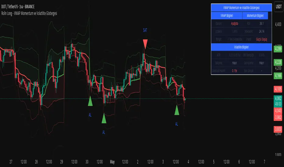
VWAP Momentum and Volatility IndicatorVWAP Momentum and Volatility Indicator
Merges VWAP trend, momentum oscillators (RSI & Stochastic), volatility measures (ATR & Bollinger Bands) and an optional volume filter into one overlay to generate more reliable buy/sell signals.
1) Components & Rationale
VWAP (Session/Day/Week/Month): Shows the volume-weighted average price trend with selectable reset periods.
VWAP ±1/±2/±3 StdDev Bands: Highlight volatility expansions or contractions—price moves outside these bands can signal breakouts or reversals.
RSI (14): Confirms overbought (>70) and oversold (<30) momentum, reducing false entries.
Stochastic (14, SlowK=3, SlowD=3): Captures momentum shifts; used alongside RSI for stronger confirmation.
ATR (14): Measures absolute price movement to aid in risk sizing and contextualizing band widths.
Bollinger Bands (20, 2σ): Identifies “squeeze” (low volatility) and “expansion” phases.
Volume Filter (optional): Ensures signals are backed by above-average volume.
2) Default Settings
VWAP Reset: Session
StdDev Multiplier: 2.0
VWAP Lookback: 20 bars
RSI: 14 period, Overbought = 70, Oversold = 30
Stochastic: 14 period, SlowK = 3, SlowD = 3
ATR: 14 period
Bollinger Bands: 20 period, Multiplier = 2
Volume Filter: 10-bar SMA threshold at 1.5× average
Visuals: VWAP bands, signal markers, and info table enabled; table positioned top-right at small size.
3) How to Use
Add to chart: Select “VWAP Momentum and Volatility Indicator.”
Adjust inputs: Set reset period, band multiplier, momentum thresholds and volume filter to match your asset and timeframe.
Buy signal: Price crosses above VWAP + (RSI < 50 or Stochastic in oversold) + volume filter pass.
Sell signal: Price crosses below VWAP + (RSI > 50 or Stochastic in overbought) + volume filter pass.
Info table: Review VWAP status, distance (%), band region, RSI, Stochastic, ATR%, Bollinger width, squeeze/expansion, relative volume, and the most recent signal.
4) Warnings & Disclaimer
This indicator is provided for educational purposes only. Always backtest with real funding and volume data, apply your own risk management, and recognize that past performance does not guarantee future results. Use the settings and signals as part of a broader trading plan.
MTF BB+KC Avg
Bollinger Bands (BB) are a widely used technical analysis created by John Bollinger in the early 1980’s. Bollinger Bands consist of a band of three lines which are plotted in relation to instrument prices. The line in the middle is usually a Simple Moving Average (SMA) set to a period of 20 days (The type of trend line and period can be changed by the trader; however a 20 day moving average is by far the most popular). This indicator does not plot the middle line. The Upper and Lower Bands are used as a way to measure volatility by observing the relationship between the Bands and price. Typically the Upper and Lower Bands are set to two standard deviations away from the middle line, however the number of standard deviations can also be adjusted in the indicator.
Keltner Channels (KC) are banded lines similar to Bollinger Bands and Moving Average Envelopes. They consist of an Upper Envelope above a Middle Line (not plotted in this indicator) as well as a Lower Envelope below the Middle Line. The Middle Line is a moving average of price over a user-defined time period. Either a simple moving average or an exponential moving average are typically used. The Upper and Lower Envelopes are set a (user-defined multiple) of a range away from the Middle Line. This can be a multiple of the daily high/low range, or more commonly a multiple of the Average True Range.
This indicator is built on AVERAGING the BB and KC values for each bar, so you have an efficient metric of AVERAGE volatility. The indicator visualizes changes in volatility which is of course dynamic.
What to look for
High/Low Prices
One thing that must be understood about this indicator's plots is that it averages by adding BB levels to KC levels and dividing by 2. So the plots provide a relative definition of high and low from two very popular indicators. Prices are almost always within the upper and lower bands. Therefore, when prices move up near the upper or lower bands or even break through the band, many traders would see that price action as OVER-EXTENDED (either overbought or oversold, as applicable). This would preset a possible selling or buying opportunity.
Cycling Between Expansion and Contraction
Volatility can generally be seen as a cycle. Typically periods of time with low volatility and steady or sideways prices (known as contraction) are followed by period of expansion. Expansion is a period of time characterized by high volatility and moving prices. Periods of expansion are then generally followed by periods of contraction. It is a cycle in which traders can be better prepared to navigate by using Bollinger Bands because of the indicators ability to monitor ever changing volatility.
Walking the Bands
Of course, just like with any indicator, there are exceptions to every rule and plenty of examples where what is expected to happen, does not happen. Previously, it was mentioned that price breaking above the Upper Band or breaking below the Lower band could signify a selling or buying opportunity respectively. However this is not always the case. “Walking the Bands” can occur in either a strong uptrend or a strong downtrend.
During a strong uptrend, there may be repeated instances of price touching or breaking through the Upper Band. Each time that this occurs, it is not a sell signal, it is a result of the overall strength of the move. Likewise during a strong downtrend there may be repeated instances of price touching or breaking through the Lower Band. Each time that this occurs, it is not a buy signal, it is a result of the overall strength of the move.
Keep in mind that instances of “Walking the Bands” will only occur in strong, defined uptrends or downtrends.
Inputs
TimeFrame
You can select any timeframe froom 1 minute to 12 months for the bar measured.
Length of the internal moving averages
You can select the period of time to be used in calculating the moving averages which create the base for the Upper and Lower Bands. 20 days is the default.
Basis MA Type
Determines the type of Moving Average that is applied to the basis plot line. Default is SMA and you can select EMA.
Source
Determines what data from each bar will be used in calculations. Close is the default.
StdDev/Multiplier
The number of Standard Deviations (for BB) or Multiplier (for KC) away from the moving averages that the Upper and Lower Bands should be. 2 is the default value for each indicator.

TrendSphere (Zeiierman)█ Overview
TrendSphere is designed to capture and visualize market trends and volatility effectively. It combines various volatility measures and trend analysis techniques, producing dynamic bands and a central trend line on the price chart. Its essence is to offer a real-time, reliable estimate of the underlying linear trend in the price.
█ How It Works
Real-Time Trend Estimation
At its core, TrendSphere is designed to offer instantaneous and accurate insights into the inherent linear trend of asset prices. By continually updating its estimations, it ensures traders are equipped with the most current data. This allows the construction of support and resistance bands around the estimated trend, providing trading opportunities.
Dynamic Bands and Trend Line
TrendSphere plots a central trend line and dynamic bands around it on the price chart. Influenced by volatility, the distance between these elements offers a clear view of market conditions and the strength or weakness of trends. These bands not only depict potential turning points but also offer traders valuable opportunities to trade within the confines of the overarching trend.
Volatility Measures
Traders can select their preferred volatility measure and adjust settings to best fit their analysis needs. The bands and trend line dynamically respond to these selections, offering a tailored view of market conditions.
ATR (Average True Range): Reflects market volatility by evaluating the range between high and low prices.
Historical Volatility: Computes price variability using the standard deviation of log returns.
Bollinger Band Width: Measures the distance between Bollinger Bands, providing another angle on market volatility.
Eliminating Common Complications
One of the standout features of TrendSphere is its ability to determine linear price trends without falling prey to challenges like backpainting or repainting. In layman's terms, this means traders get a more trustworthy and unaltered view of price movements, leading to enhanced decision-making in line with the genuine trajectory of price trends.
█ How to Use
Trend Analysis
Observe the central trend line; its direction indicates the prevailing trend. When the price is above the trend line, it suggests an upward trend, and when it's below, it indicates a downward trend.
Volatility Analysis
Wider bands imply higher market volatility, suggesting larger price swings, while narrower bands indicate lower volatility. Traders can use the bands to identify potential reversal points and overbought/oversold conditions.
Potential Trading Signals (Using Bollinger bandwidth as volatility measure)
Consider buying when the price is above the trend line with narrowing bands, suggesting a strong upward trend.
Consider selling when the price is below the trend line with narrowing bands, indicating a strong downward trend.
█ Settings
Select Volatility Measure
Choose the desired volatility measure: ATR, Historical Volatility, or Bollinger Band Width.
Volatility Scaling Factor
Adjusts the scale of the volatility measure, influencing the width of the bands.
Volatility Strength
Modifies the influence of volatility on the bands, adjusting their responsiveness to volatility changes.
Length
Defines the number of periods used in calculating the selected volatility measure, impacting the stability and responsiveness of the bands.
Trend Sensitivity
Adjusts the sensitivity of the trend component, affecting how quickly it reacts to price changes.
█ Related scripts with the same calculation philosophy
TrendCylinder
Predictive Trend and Structure
-----------------
Disclaimer
The information contained in my Scripts/Indicators/Ideas/Algos/Systems does not constitute financial advice or a solicitation to buy or sell any securities of any type. I will not accept liability for any loss or damage, including without limitation any loss of profit, which may arise directly or indirectly from the use of or reliance on such information.
All investments involve risk, and the past performance of a security, industry, sector, market, financial product, trading strategy, backtest, or individual's trading does not guarantee future results or returns. Investors are fully responsible for any investment decisions they make. Such decisions should be based solely on an evaluation of their financial circumstances, investment objectives, risk tolerance, and liquidity needs.
My Scripts/Indicators/Ideas/Algos/Systems are only for educational purposes!

Multi-Band Breakout IndicatorThe Multi-Band Breakout Indicator was created to help identify potential breakout opportunities in the market. It combines multiple bands (ATR-Based and Donchian) and moving averages to provide valuable insights into the underlying trend and potential breakouts. By understanding the calculations, interpretation, parameter adjustments, potential applications, and limitations of the indicator, traders can effectively incorporate it into their trading strategy.
Calculation:
The indicator utilizes several calculations to plot the bands and moving averages. The length parameter determines the period used for the Average True Range (ATR), which measures volatility. A higher length captures a longer-term view of price movement, while a lower length focuses on shorter-term volatility. The multiplier parameter adjusts the distance of the upper and lower bands from the ATR. A higher multiplier expands the bands, accommodating greater price volatility, while a lower multiplier tightens the bands, reflecting lower volatility. The MA Length parameter determines the period for the moving averages used to calculate the trend and trend moving average. A higher MA Length creates a smoother trend line, filtering out shorter-term fluctuations, while a lower MA Length provides a more sensitive trend line.
The Donchian calculations in the Multi-Band Breakout Indicator play a significant role in identifying potential breakout opportunities and providing additional confirmation for trading signals. In this indicator, the Donchian calculations are applied to the trend line, which represents the average of the upper and lower bands. To calculate the Donchian levels, the indicator uses the Donchian Length parameter, which determines the period over which the highest high and lowest low are calculated. A longer Donchian Length captures a broader price range, while a shorter length focuses on more recent price action. By incorporating the Donchian calculations into the Multi-Band Breakout Indicator, traders gain an additional layer of confirmation for breakout signals.
Interpretation:
The Multi-Band Breakout Indicator offers valuable interpretation for traders. The upper and lower bands represent dynamic levels of resistance and support, respectively. These bands reflect the potential price range within which the asset is expected to trade. The trend line is the average of these bands and provides a central reference point for the overall trend. When the price moves above the upper band, it suggests a potential overbought condition and a higher probability of a pullback. Conversely, when the price falls below the lower band, it indicates a potential oversold condition and an increased likelihood of a bounce. The trend moving average further smooths the trend line, making it easier to identify the prevailing direction.
The crossover of the trend line (representing the average of the upper and lower bands) and the trend moving average holds a significant benefit for traders. This crossover serves as a powerful signal for potential trend changes and breakout opportunities in the market. When the trend line crosses above the trend moving average, it suggests a shift in momentum towards the upside, indicating a potential bullish trend. This provides traders with an early indication of a possible upward movement in prices. Conversely, when the trend line crosses below the trend moving average, it indicates a shift in momentum towards the downside, signaling a potential bearish trend. This crossover acts as an early warning for potential downward price movement. By identifying these crossovers, traders can capture the initial stages of a new trend, enabling them to enter trades at favorable entry points and potentially maximize their profit potential.
Breakout Signals:
For bullish breakouts, the indicator looks for a bullish crossover between the trend line and the trend moving average. This crossover suggests a shift in momentum towards the upside. Additionally, it checks if the current price has broken above the upper band and the previous Donchian high. This confirms that the price is surpassing a previous resistance level, indicating further upward movement.
For bearish breakouts, the indicator looks for a bearish crossunder between the trend line and the trend moving average. This crossunder indicates a shift in momentum towards the downside. It also checks if the current price has broken below the lower band and the previous Donchian low. This confirms that the price is breaking through a previous support level, signaling potential downward movement.
When a bullish or bearish breakout is detected, it suggests a potential trading opportunity. Traders may consider initiating positions in the direction of the breakout, anticipating further price movement in that direction. However, it's important to remember that breakouts alone do not guarantee a successful trade. Other factors, such as market conditions, volume, and confirmation from additional indicators, should be taken into account. Risk management techniques should also be implemented to manage potential losses.
Coloration:
The coloration in the Multi-Band Breakout Indicator is used to visually represent different aspects of the indicator and provide valuable insights to traders. Let's break down the coloration components:
-- Trend/Basis Color : The tColor variable determines the color of the bars based on the relationship between the trend line (trend) and the closing price (close), as well as the relationship between the trend line and the trend moving average (trendMA). If the trend line is above the closing price and the trend moving average is also above the closing price, the bars are colored fuchsia, indicating a potential bullish trend. If the trend line is below the closing price and the trend moving average is also below the closing price, the bars are colored lime, indicating a potential bearish trend. If neither of these conditions is met, the bars are colored yellow, representing a neutral or indecisive market condition.
-- Moving Average Color : The maColor variable determines the color of the filled area between the trend line and the trend moving average. If the trend line is above the trend moving average, the area is filled with a lime color with 70% opacity, indicating a potential bullish trend. Conversely, if the trend line is below the trend moving average, the area is filled with a fuchsia color with 70% opacity, indicating a potential bearish trend. This coloration helps traders visually identify the relationship between the trend line and the trend moving average.
-- highColor and lowColor : The highColor and lowColor variables determine the colors of the high Donchian band (hhigh) and the low Donchian band (llow), respectively. These bands represent dynamic levels of resistance and support. If the highest point in the previous Donchian period (hhigh) is above the upper band, the highColor is set to olive with 90% opacity, indicating a potential resistance level. On the other hand, if the lowest point in the previous Donchian period (llow) is below the lower band, the lowColor is set to red with 90% opacity, suggesting a potential support level. These colorations help traders quickly identify important price levels and assess their significance in relation to the bands.
By incorporating coloration, the Multi-Band Breakout Indicator provides visual cues to traders, making it easier to interpret the relationships between various components and assisting in identifying potential trend changes and breakout opportunities. Traders can use these color cues to quickly assess the prevailing market conditions and make informed trading decisions.
Adjusting Parameters:
The Multi-Band Breakout Indicator offers flexibility through parameter adjustments. Traders can customize the indicator based on their preferences and trading style. The length parameter controls the sensitivity to price changes, with higher values capturing longer-term trends, while lower values focus on shorter-term price movements. By adjusting the parameters, such as the ATR length, multiplier, Donchian length, and MA length, traders can customize the indicator to suit different timeframes and trading strategies. For shorter timeframes, smaller values for these parameters may be more suitable, while longer timeframes may require larger values.
Potential Applications:
The Multi-Band Breakout Indicator can be applied in various trading strategies. It helps identify potential breakout opportunities, allowing traders to enter trades in the direction of the breakout. Traders can use the indicator to initiate trades when the price moves above the upper band or below the lower band, confirming a potential breakout and providing a signal to enter a trade. Additionally, the indicator can be combined with other technical analysis tools, such as support and resistance levels, candlestick patterns, or trend indicators, to increase the probability of successful trades. By incorporating the Multi-Band Breakout Indicator into their trading approach, traders can gain a better understanding of market trends and capture potential profit opportunities.
Limitations:
While the Multi-Band Breakout Indicator is a useful tool, it has some limitations that traders should consider. The indicator performs best in trending markets where price movements are relatively strong and sustained. During ranging or choppy market conditions, the indicator may generate false signals, leading to potential losses. It is crucial to use the indicator in conjunction with other analysis techniques and risk management strategies to enhance its effectiveness. Additionally, traders should consider external factors such as market news, economic events, and overall market sentiment when interpreting the signals generated by the indicator.
By combining multiple bands and moving averages, this indicator offers valuable insights into the underlying trend and helps traders make informed trading decisions. With customization options and careful interpretation, this indicator can be a valuable addition to any trader's toolkit, assisting in identifying potential breakouts, capturing profitable trades, and enhancing overall trading performance.

Technimentals RobotThis robot includes multiple trade signal algorithms and technical overlays. With tools for all markets and trading styles, access original and beautiful charting tools that work for you.
Flexible and robust trend detection & confirmation
Maverick mean reversion signals
Immensely customizable settings for all markets
Indicator prediction zones, perfect for options traders
The most beautiful bands in the world
As of this update, Technimentals Robot includes:
Queen Mary - A powerful mean reversion algorithm which compares the performance of the chart against the performance of a user-chosen benchmark. She uses short term mean reversion optionally combined with longer term trend following logic to detect possible deviations and thus unique pivot points which may lead to short term reversals or continuations of trend.
Brian - An agile and fully customizable trend following algorithm which uses various filtering systems to hone signals.
Prediction Zones - Projections of future price levels and indicator levels, currently featuring RSI and MFI.
Volume Weighted Filtered Bands - The most beautiful bands in the world.
...and much more! Check the change log below for new features.
Technimentals Robot is an all-in-one suite of indicators designed to be used as a standalone trading system. The backbone of this indicator is the trade signal generation. However, blindly following trade signals without context is unwise and that's where the supplementary bands and Prediction Zones come in. The signals are designed to be used primarily for entry signals; the bands can be used to determine whether or not a chart is overextended (and worth stopping out or profit taking) or not. The Prediction Zones are built in particular for those wishing to trade these signals via options due to the quantifiable nature of their predictions, but they too can be used to add an extra data point for knowing which areas of support & resistance to use when determining take profit and stop loss locations.
Sub-Component Descriptions:
Queen Mary
Queen Mary is a versatile trading signal generator which uses another symbol as a benchmark to build trading signals for your chart.
Queen Mary works by detecting whether or not there are sustained divergences and alerts the user via trade signals for when reversions to the mean are expected.
A typical use case for Queen Mary would be to set her to run on a technology stock with a technology ETF as the benchmark, but you use any pair of your choice.
Buy signals on the chart simultaneously indicate sell signals in the benchmark.
This can be used for pairs trading and long/short portfolio strategies.
Suppose the following; you’ve applied Queen Mary to a chart of AAPL and are using XLK as the benchmark. A buy signal for AAPL would also indicate a sell signal for the XLK. The user could then long AAPL and short XLK the same dollar amount, expecting a reversion to the mean.
Brian
Brian is a flexible trend following algorithm which uses multiple filtering techniques to hone entries and exits.
Brian has been designed to catch every major trend without fail. The inevitable problem all breakout or trend following algorithms face is their propensity to get chopped up during sideways market action. Brian addresses this problem via the ‘Risk’ setting which allows the user to determine the market conditions via a risk/reward standpoint.
During periods of sideways action, the risk setting should be increased. This will reduce the number of signals Brian gives and increase the odds of the breakout leading to a continuation.
Brian signals profit taking signals via blue flags. These always occur at a user defined risk to reward ratio. Partial profits should always be taken as soon as these flags occur. It is advised to use a user-defined trailing stop loss on the remaining position which suits the user’s own risk preferences.
Prediction Zones
Prediction Zones predict zones of indicator and price levels into the future.
Currently featuring the Relative Strength Index and the Money Flow Index, Prediction Zones will display at what future prices these indicators will reach user defined outputs.
A classic use-case example of this would be for options traders as these zones can be used as support and resistance areas. For example, if you believe the daily RSI won’t reach below 30 before the end of the week, you can use this zone as another data point for deciding where to put your short strike.
The zones can be shown into the past too so you can see how they behaved on historical data.
Volume Weighted Filtered Bands
These bands are built by firstly using a volatility and short term range detection algorithm and plugging this into three different lengths of smoothing filters. The output is then combined and filtered one last time before being coloured and plotted as multiple bands.
They can be customized to suit any trading style, but were built with scalp traders particularly in mind. It’s rare for prices to deviate from these bands for long.
A typical use case for these bands would be to trade with the trend while price is trading cleanly inside and in the same direction as the bands. Profit taking should typically be considered when price exceeds the bands, although this will depend on the settings chosen by the user.
The bands can also be used to gauge volatility (with an unusual increase in width) and volume (increased brightness).
The brightness of the bands are determined by volume, the brighter the bands are, the greater the volume.
Queen Mary
Brian
Most of the above images were carefully chosen, others were not. No indicator or strategy is perfect. Trend following algorithms will inevitably experience chop. Mean reversion algorithms will inevitably miss out on the big moves. Our tools aim to give you the data to help you determine which signals to act upon.
You are responsible for your own trading decisions. Trading signals are worthless if you do not have a clear plan, including exit targets and risk management. If you do not have these, you should study them seriously before considering fancy indicators. This indicator is probably unsuitable for beginners.

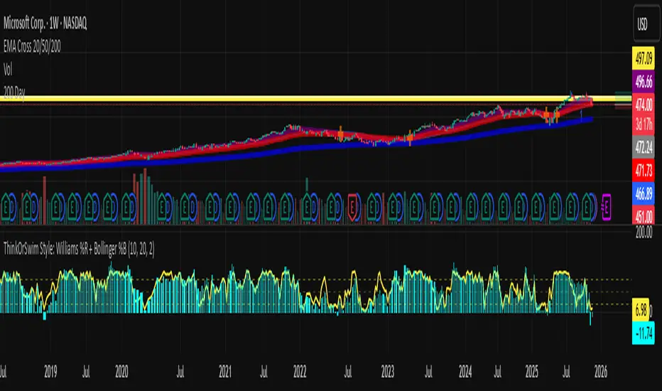
Abacus Community Williams %R + Bollinger %B📌 Indicator Description (Professional & Clear)
Williams %R + Bollinger %B Momentum Indicator (ThinkOrSwim Style)
This custom indicator combines Williams %R and Bollinger %B into a single, unified panel to provide a powerful momentum-and-positioning view of price action. Modeled after the ThinkOrSwim version used by professional traders, it displays:
✅ Williams %R (10-period) – Yellow Line
This oscillator measures the market's position relative to recent highs and lows.
It plots on a 0% to 100% scale, where:
80–100% → Overbought region
20–0% → Oversold region
50% → Momentum equilibrium
Williams %R helps identify exhaustion, trend strength, and potential reversal zones.
✅ Bollinger %B (20, 2.0) – Turquoise Histogram Bars
%B shows where price is trading relative to the Bollinger Bands:
Above 50% → Price is in the upper half of the band (bullish pressure)
Below 50% → Price is in the lower half (bearish pressure)
Near 100% → Price pushing upper band (possible breakout)
Near 0% → Price testing lower band (possible breakdown)
The histogram visually represents momentum shifts in real time, creating a clean profile of volatility and strength.
🎯 Why This Combination Works
Together, Williams %R and Bollinger %B reveal:
Momentum direction
Overbought/oversold conditions
Volatility compression & expansion
Trend continuation vs reversal zones
High-probability inflection points
Williams %R shows oscillation and exhaustion, while %B shows pressure inside volatility bands.
The combination helps identify whether momentum supports the current trend or is weakening.
🔍 Use Cases
Detect early trend reversals
Validate breakouts and breakdowns
Spot momentum failure in price extremes
Confirm pullbacks and continuation setups
Time entries and exits with higher precision
💡 Best For
Swing traders
Momentum traders
Trend-followers
Options traders (for timing premium decay or volatility expansion)
Peak Reversal v3# Peak Reversal v3
## Summary
Peak Reversal v3 adds new configurability, clearer visuals, and a faster trader workflow. The release introduces a new Squeeze Detector , expanded Keltner Channels , and streamlined Momentum signals , with no repaints and improved performance. The menus have been reorganized and simplified. Color swatches have been added for better customization. All other colors will be derived from these swatches.
## Highlights
New Squeeze Detector to mark low-volatility periods and prepare for breakouts.
New: Bands are now fully configurable with independent MA length, ATR length, and multipliers.
Five moving average bases for bands: EMA (from v2), SMA, RMA, VMA, HMA.
Simplified color system: three swatches drive candles, on-chart marks, and band fill.
Reorganized menu with focused sections and tooltips for each parameter making the entire trader experience more intuitive.
No repaints and faster performance across calculations.
## Overview
Configuration : Pick from three color swatches and apply them to candles, plotted characters, and band fill for consistent chart context. Use the reorganized menu to reach Keltner settings, momentum signals, and squeeze detection without extra clicks; tooltips clarify each input.
Bands and averages: Choose the band basis from EMA, SMA, RMA, VMA, or HMA to match your strategy. Configure two bands independently by setting MA length, ATR length, and band multipliers for the inner and outer envelopes.
Signals : Select the band responsible for momentum signals. Choose wick or close as the price source for entries and exits. Control the window for extreme momentum with “Max Momentum Bars,” a setting now exposed in v3 for direct tuning.
Squeeze detection : The Squeeze Detector normalizes band width and uses percentile ranking to highlight volatility compression. When the market falls below a user-defined threshold, the indicator colors the region with a gradient to signal potential expansion.
## Details about major features and changes
### New
Squeeze Detector to highlight low-volatility conditions.
Five MA bases for bands: EMA, SMA, RMA, VMA, HMA.
“Max Momentum Bars” to cap the bars used for extreme momentum.
### Keltner channel improvements
Refactored Keltner settings for flexible inner and outer band control.
MA type selection added; band calculations updated for consistency.
Removed the third Keltner band to reduce noise and simplify setup.
### Display and signals
Gradient fills for band breakouts, mean deviations, and squeeze periods.
“Show Mean EMA?” set to true and default “Signal Band” set to “Inner.”
Clearer tooltips and input descriptions.
### Reliability and performance
No more repaints. The indicator waits for confirmation before drawing occurs.
Faster execution through targeted refactors.
All algorithms have been reviewed and now use a consistent logic, naming, and structure.
True Range eXpansion🕯️ TRX — True Range eXpansion
Clean Candle Bodies · Volatility Bands · Adaptive Range Envelope System
Not your grandfather’s candles. Not your brokerage’s bands.
----------------------------------------------------
TRX begins with a simple concept: visualize the true range of every candle, without the noise of flickering wicks.
From there, it grows into a fully adaptive price visualization framework.
What started as a candle-only visualizer evolved into a modular, user-controlled price engine.
From wickless candle clarity to dynamic volatility envelopes, TRX adapts to you.
There are plenty of band and channel indicators out there — Bollinger, Keltner, Donchian, Envelope, the whole crew.
But none of them are built on the true candle range, adaptive ATR shaping, and full user control like TRX.
This isn’t just another indicator — it’s a new framework.
Most bands and channels are based on close price and statistical deviation — useful, but limited.
TRX uses the full true range of each candle as its foundation, then applies customizable smoothing and directional ATR scaling to form a dynamic, volatility-reactive envelope.
The result? Bands that breathe with the market — not lag behind it.
----------------------------------------------------
🔧 Core Features:
🕯️ True Range Candles — Each candle is plotted from low to high, body-only, colored by open/close.
📈 Adjustable High/Low Moving Averages — Select your smoothing style: SMA, EMA, WMA, RMA, or HMA.
🌬️ ATR-Based Expansion — Bands dynamically breathe based on market volatility.
🔀 Per-Band Multipliers — Fine-tune expansion individually for the upper and lower bands.
⚖️ Basis Line — Optional centerline between bands for structure tracking and equilibrium zones.
🎛️ Full Visual Control — Width, transparency, color, on/off toggles for each element.
----------------------------------------------------
🧠 Default Use Case:
With the included default settings, TRX behaves like an evolved Bollinger Band system — based on True Range candle structure, not just close price and standard deviation.
----------------------------------------------------
🔄 How to Zero Out the Bands (for Minimalist Use):
Want just candles? A clean MA? Single band? You got it.
➤ Use TRX like a clean moving average:
• Set ATR Multiplier to 0
• Set both Band ATR Adjustments to 0
• Leave the Basis Line ON or OFF — your call
➤ Show only candles (no bands at all):
• Turn off "Show High/Low MAs"
• Turn off Basis Line
➤ Single-line ceiling or floor tracking:
• Set one band’s Transparency to 100
• Use the remaining band as a price envelope or support/resistance guide
----------------------------------------------------
🧬 Notes:
TRX can be made:
• Spiky or silky (via smoothing & ATR)
• Wide or tight (via multipliers)
• Subtle or aggressive (via color/transparency)
• Clean as a compass or dirty as a chaos meter
Built by accident. Tuned with intention.
Released to the world as one of the most adaptable and expressive visual overlays ever made.
Created by Sherlock_MacGyver

STANDARD DEVIATION INDICATOR BY WISE TRADERWISE TRADER STANDARD DEVIATION SETUP: The Ultimate Volatility and Trend Analysis Tool
Unlock the power of STANDARD DEVIATIONS like never before with the this indicator, a versatile and comprehensive tool designed for traders who seek deeper insights into market volatility, trend strength, and price action. This advanced indicator simultaneously plots three sets of customizable Deviations, each with unique settings for moving average types, standard deviations, and periods. Whether you’re a swing trader, day trader, or long-term investor, the STANDARD DEVIATION indicator provides a dynamic way to spot potential reversals, breakouts, and trend-following opportunities.
Key Features:
STANDARD DEVIATIONS Configuration : Monitor three different Bollinger Bands at the same time, allowing for multi-timeframe analysis within a single chart.
Customizable Moving Average Types: Choose from SMA, EMA, SMMA (RMA), WMA, and VWMA to calculate the basis of each band according to your preferred method.
Dynamic Standard Deviations: Set different standard deviation multipliers for each band to fine-tune sensitivity for various market conditions.
Visual Clarity: Color-coded bands with adjustable thicknesses provide a clear view of upper and lower boundaries, along with fill backgrounds to highlight price ranges effectively.
Enhanced Trend Detection: Identify potential trend continuation, consolidation, or reversal zones based on the position and interaction of price with the three bands.
Offset Adjustment: Shift the bands forward or backward to analyze future or past price movements more effectively.
Why Use Triple STANDARD DEVIATIONS ?
STANDARD DEVIATIONS are a popular choice among traders for measuring volatility and anticipating potential price movements. This indicator takes STANDARD DEVIATIONS to the next level by allowing you to customize and analyze three distinct bands simultaneously, providing an unparalleled view of market dynamics. Use it to:
Spot Volatility Expansion and Contraction: Track periods of high and low volatility as prices move toward or away from the bands.
Identify Overbought or Oversold Conditions: Monitor when prices reach extreme levels compared to historical volatility to gauge potential reversal points.
Validate Breakouts: Confirm the strength of a breakout when prices move beyond the outer bands.
Optimize Risk Management: Enhance your strategy's risk-reward ratio by dynamically adjusting stop-loss and take-profit levels based on band positions.
Ideal For:
Forex, Stocks, Cryptocurrencies, and Commodities Traders looking to enhance their technical analysis.
Scalpers and Day Traders who need rapid insights into market conditions.
Swing Traders and Long-Term Investors seeking to confirm entry and exit points.
Trend Followers and Mean Reversion Traders interested in combining both strategies for maximum profitability.
Harness the full potential of STANDARD DEVIATIONS with this multi-dimensional approach. The "STANDARD DEVIATIONS " indicator by WISE TRADER will become an essential part of your trading arsenal, helping you make more informed decisions, reduce risks, and seize profitable opportunities.
Who is WISE TRADER ?
Wise Trader is a highly skilled trader who launched his channel in 2020 during the COVID-19 pandemic, quickly building a loyal following. With thousands of paid subscribed members and over 70,000 YouTube subscribers, Wise Trader has become a trusted authority in the trading world. He is known for his ability to navigate significant events, such as the Indian elections and stock market crashes, providing his audience with valuable insights into market movements and volatility. With a deep understanding of macroeconomics and its correlation to global stock markets, Wise Trader shares informed strategies that help traders make better decisions. His content covers technical analysis, trading setups, economic indicators, and market trends, offering a comprehensive approach to understanding financial markets. The channel serves as a go-to resource for traders who want to enhance their skills and stay informed about key market developments.
Empirical Kaspa Power Law Full Model v3.1🔶 First we need to understand what Power Laws are.
Power laws are mathematical relationships where one quantity varies as a power of another. They are prevalent in both natural and social systems, describing phenomena such as earthquake magnitudes, word frequencies, and wealth distributions. In a power-law relationship, a change in one quantity results in a proportional change in another, typically following a consistent and predictable mathematical pattern.
🔶 Why Do Power Laws work for Bitcoin and Kaspa?
Power laws work for Bitcoin and Kaspa due to the underlying principles of network dynamics and growth patterns that these cryptocurrencies exhibit. Here's how:
1. Network Growth and User Adoption:
Both Bitcoin and Kaspa grow as more users join their networks. The value of these networks often increases in a manner consistent with Metcalfe’s Law, which states that the value of a network is proportional to the square of its number of users. This relationship is a form of a power law, where network effects lead to exponential growth as more users participate.
2. Mining and Hash Rate:
The mining difficulty and hash rate in cryptocurrencies like Bitcoin and Kaspa adjust based on network activity. As more miners join, the difficulty increases to maintain a stable rate of block production. This self-adjusting mechanism creates feedback loops that can be described by power laws, ensuring the stability and security of the network over time.
3. Price Behavior:
Astrophysicist Giovanni Santostasi discovered that Bitcoin’s price follows a power-law distribution over time. This means that despite short-term volatility, Bitcoin’s long-term price behavior is predictable and adheres to specific mathematical patterns. Santostasi's model provides a framework for understanding Bitcoin’s price movements and forecasting future trends. He also discovered that Kaspa might be following a power-law aswell but it might be to early to tell because Kaspa hasn't been around for too long(2years).
4. Resource Allocation and System Stability:
As the price of Bitcoin or Kaspa increases, more resources are allocated to mining, leading to more sophisticated mining operations. This iterative process of investment and technological advancement follows a power-law pattern, driving the growth and stability of the network.
In summary, the application of power laws to Bitcoin and Kaspa offers a structured framework for understanding their price movements, network growth, and overall stability. These principles provide valuable predictive tools for long-term forecasting, helping to explain the dynamic behavior of these cryptocurrencies.
🔶 What does it look like on a chart?
Here is the Kaspa power law plotted on the KaspaUSD chart. Notice that the y-axis is in logarithmic scale. Unfortunately, TradingView does not allow the x-axis to be in logarithmic scale, which would otherwise make the power law appear as a straight line.
🔶 All the features of the Empirical Kaspa Power Law Full Model
This indicator includes a variety of scripts and tools, meticulously designed and developed to navigate the Kaspa market effectively.
🔹 Power Law & Deviation bands
The decision to use the lower two bands, marking an area between -40% to -50% below the power law, is based on historical analysis. Historically, this range has proven to be a great buying opportunity. In the case of Bitcoin, the bottom typically lies around -60% from the power law. However, for Kaspa, the bottom appears to be less distant from the power law. This discrepancy can be attributed to the differing supply dynamics of the two. Bitcoin undergoes a halving event approximately every four years, significantly reducing the rate at which new coins are introduced into circulation. This cyclical halving can lead to larger price fluctuations and a greater deviation from the power law. In contrast, Kaspa employs a more gradual reduction in its emission rate, with a 5% decrease each month. This consistent and incremental reduction helps Kaspa's price follow the power law more closely, resulting in less pronounced deviations. Consequently, the bottom for Kaspa tends to be closer to the power law, typically around -40% to -50%, rather than the -60% observed with Bitcoin.
The top two deviation bands are fitted to a few bubble data points, which are honestly not very reliable compared to the bottom bands that are based on a larger number of data points. When examining Bitcoin, we see that the bottoms are quite predictable due to the availability of thousands of data points, making it easier to identify patterns and trends.
However, predicting the tops is significantly more challenging because we lack a substantial amount of data for the peaks. This limited data makes it difficult to draw reliable conclusions about the upper deviation bands. As a result, while the bottom bands offer a robust framework for analysis, the top bands should be approached with caution due to their lesser reliability.
🔹 Alternating Sine wave
In observing the price behavior of Kaspa, an intriguing pattern emerges: it tends to follow a roughly four-month cycle. This cycle appears to alternate between smaller and larger waves. To capture this pattern, the sine wave in our indicator is designed to follow the power law, with both the top and bottom of the wave adjusting according to it.
Here's a simple explanation of how this works:
1. Four-Month Cycle: Empirically, Kaspa’s price seems to oscillate over approximately 120 days. This cycle includes periods of growth and decline, repeating every four months. Within these cycles, we observe alternating phases one smaller and one larger in amplitude.
2. Power Law Influence: The sine wave component of our indicator is not arbitrary; it follows a power law that predicts the general price trend of Kaspa. The power law essentially provides a baseline that reflects the longer-term price trajectory.
3. Diminishing Returns and Smoothing: To model diminishing returns, we adjust the amplitude of the sine wave over time, making it smaller as the cycle progresses. This helps to capture the natural tendency for price movements to become less volatile over longer periods. Additionally, the bottom of the sine wave adheres to the power law, ensuring it remains consistent with the overall trend.
🔹 Sine wave Cycle Start & End
Color transitions play a crucial role in visualizing different phases of the four-month cycle.
Based on empirical data, Kaspa experiences approximately 60 days of downward price action following each cycle peak, a period we refer to as the bear phase. This phase is followed by the bull phase, which also lasts around 60 days. To indicate the cycle peak, we have added a colored warning on the sine wave.
Cycle Start (Purple): The sine wave starts with a purple color, marking the beginning of a new cycle. This bull phase often represents a potential bottom or accumulation zone where prices are lower and stable, offering a strategic point for entering the market.
Cycle Top (Red): As the cycle progresses, the sine wave transitions through colors until it reaches red. This red phase indicates the top of the cycle, where the price is likely peaking. It's a critical area for investors to consider dollar-cost averaging (DCA) out of Kaspa, as it signifies a period of potential overvaluation and heightened risk.
These color transitions provide a visual guide to the market's cyclical nature, helping investors identify optimal entry and exit points. By following the sine wave's color changes, you can better time your investments, entering at the start of the cycle and considering exits as the cycle tops out.
🔹 Colored Deviation from the Power Law Bubbles
In trading, having a clear visual signal can significantly enhance decision-making, especially when dealing with complex models like power laws. This inspired the creation of the "deviation bubbles" in my indicator, which provides an intuitive, color-coded visual queue to help me, and other traders, better grasp market deviations and make timely trading decisions.
Here's a breakdown of how the deviation bubbles work:
1. Power Law Reference: The core of the indicator calculates a theoretical price level (the power law price) for Kaspa.
2. Deviation Calculation: For each day, the indicator computes the percentage deviation of the actual closing price from this power law price. This tells how much the market price diverges from the theoretically expected level.
3. Color-Coding Based on Deviation:
The deviation is categorized into various ranges (e.g., ≥ 100%, 90-100%, 80-90%, etc.).
Each range is assigned a distinct color, from red for extreme positive deviations to blue for extreme negative deviations.
This gradient helps in quickly identifying significant market deviations.
By integrating these bubbles into the chart, the indicator offers a simple yet powerful visual tool, aiding in recognizing critical market conditions without the need to delve into complex calculations manually. This approach not only enhances the ease of trading but also helps in overcoming the hesitation often faced when pulling the trigger on trades.
🔹 Projected Power Law Bands
Extends the current power law bands into the future using the same formula that defines the current power law.
Visual Representation: Dotted lines on the chart indicate the projected power law price and deviation bands.
Limitations: TradingView restricts how far these projections can extend, typically up to a reasonable future period.
These projected bands help anticipate future price movements, aiding in more informed trading decisions.
🔹 Projected Sine Wave
This projection continues to calculate the phase and amplitude, adjusting for diminishing returns and cycle transitions. It also estimates the future power law price, ensuring the projection reflects potential market dynamics.
Visual Representation: The projected sine wave is shown with dotted blue lines, providing a clear visual of the expected trend, aiding traders in their decision-making process.
Limitations: Again, TradingView restricts how far these projections can extend, typically up to a reasonable future period.
🔶 Why are all these different scripts made into one indicator?
As a trader and crypto analyst, I needed specific tools and customizations that no other indicator offered. Being a visual person, I rely heavily on visual triggers such as colors and patterns to make trading decisions. Initially, I developed this indicator for my personal use to enhance my market analysis with these visual cues. However, after sharing my insights, other traders expressed interest in using it. In response, I expanded the functionality and added various options to cater to a broader range of users.
This comprehensive indicator integrates multiple features into one tool, providing a powerful and flexible solution for analyzing market trends and making informed trading decisions. The use of colors and visual elements helps in quickly identifying key signals and market phases. The customizable options allow you to fine-tune the indicator to suit your specific needs, making it a versatile tool for both novice and experienced traders.
🔶 Usage & Settings:
This indicator is best used on the Daily chart for KASUSD - crypto because it uses a power law formula based on days.
🔹 Using the Indicator for 4-Month Cycles:
For traders interested in playing the 4-month cycles, this indicator provides a straightforward strategy. When the bubbles turn purple or the sine wave shows the purple start color, it signals a good time to dollar-cost average (DCA) into the market. Conversely, when the bubbles turn red or the cycle top is near, indicated by a red color, it’s time to DCA out of the Kaspa market. This visual approach helps traders make timely decisions based on color-coded signals, simplifying the trading process.
Historically, it was nearly impossible to accurately time all the 4-month cycle tops because they alternate each time. Without the combination of multiple scripts in this indicator, identifying these cyclical patterns and their respective peaks was extremely challenging. This integrated tool now provides a clear and reliable method for detecting these critical points, enhancing trading effectiveness.
🔹 Combining the visual queues for market extremes
The chart above illustrates the alignment of visual cues indicating market extremes. Notably, these visual cues—marked by red and purple boxes—historically pinpoint areas of extreme value or opportunities. When red aligns with red and purple aligns with purple, these zones have consistently indicated significant market extremes.
Understanding and recognizing these patterns provides a strategic advantage. By identifying these visual triggers, traders can plan and execute informed trades with greater confidence whenever similar scenarios unfold in the future.
Kaspa is perhaps one of the most cyclical and predictable cryptocurrencies in the market. Given its consistent behavior, traders might wonder why they would trade anything else. As long as there are no signs indicating a change in Kaspa's cyclical nature, there is no reason to make significant alterations to our predictions. This makes Kaspa an attractive option for traders seeking reliable and repeatable trading opportunities.
🔹 Settings & customization:
As a visually-oriented trader, it is essential to customize the appearance of indicators to effectively navigate the Kaspa market. The Indicator offers extensive customization options, allowing users to modify the colors of various elements to suit their preferences. For example, users can adjust the colors of the deviation bubbles, deviation bands, sine wave, and power law to enhance visual clarity and focus on specific data points. This level of personalization not only enhances the overall user experience but also ensures that the visual representation aligns with unique trading strategies, making it easier to interpret complex market data.
Additionally, users can change the power law inputs and other parameters as shown in the image. For instance, the Power Law Intercept and Power Law Slope can be manually adjusted, allowing traders to update these values. This flexibility is crucial as the future power law for Kaspa may evolve/change.
🔶 Limitations
Like any technical analysis tool, the Empirical Kaspa Power Law Full Model indicator has limitations. It's based on historical data, which may not always accurately predict future market movements.
🔶 Credits
I want to thank Dr. Giovanni Santostasi · Professor of physics and Mathematics.
He was one of the first who applied the concept of the power law to Bitcoin's price movements, which has been instrumental in providing insights into the long-term growth and potential future value of Bitcoin. Giovanni also offers coding classes on his Discord, which I attended. He personally taught me how to code specific things in Pine Editor and Python, sparking my interest in developing my own indicator.
Additionally, I would like to extend my gratitude to the following individuals for their invaluable contributions in terms of ideas, theories, formulas, testing, and guidance:
Forgowork, PlanC, Miko Genno, Chancellor, SavingFace, Kaspapero, JJ Venema.
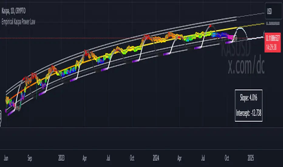
Median Volume Weighted Standard Deviation | QuantumResearchMedian Volume Weighted Standard Deviation (MVWSD) | QuantumResearch
The MVWSD Indicator is a powerful market analysis tool that integrates median-based volume-weighted calculations with standard deviation analysis to help traders identify trend shifts, volatility expansion, and breakout opportunities. This adaptive approach minimizes noise while enhancing the accuracy of support/resistance levels and trade signals. 🚀📊
🔍 Key Features
✅ Volume-Weighted Median Calculation – Uses a VWMA-based median to emphasize price points backed by high trading volume, reducing the impact of erratic price movements.
✅ Standard Deviation & ATR-Based Volatility Bands – Expands or contracts dynamically based on market volatility, providing adaptive support & resistance levels.
✅ Bullish/Bearish Trend Signals – Detects shifts in market momentum by analyzing price movements relative to the deviation bands.
✅ Customizable Visualization & Alerts – Traders can adjust sensitivity, choose color themes, and set alerts for breakout conditions.
✅ Multi-Asset Compatibility – Works across various markets, including Bitcoin, Altcoins, and cross-asset pairs.
📈 How It Works
1️⃣ Volume-Weighted Median Calculation
A VWMA-based median is applied to smooth price fluctuations and highlight dominant trends.
This method improves accuracy over simple moving averages by factoring in trade volume influence.
2️⃣ Adaptive Volatility Bands
Upper & Lower Bands adjust dynamically using standard deviation and ATR multipliers, expanding during high volatility and contracting during stable conditions.
These bands act as dynamic support/resistance levels, helping traders gauge potential trend breakouts or reversals.
3️⃣ Trade Signal Generation
🟢 Long Signal (Bullish): When the price breaks above the upper ATR-based band, signaling potential uptrend continuation.
🔴 Short Signal (Bearish): When the price drops below the lower ATR-based band, indicating possible downside movement.
⚪ Neutral (No Signal): When price fluctuates within the bands without a decisive breakout.
4️⃣ Trend Confirmation via Color-Coded Bars
Green bars = Bullish conditions 📈
Blue bars = Bearish conditions 📉
📊 Performance Across Different Markets
🔹 Solana (SOL/USD) Analysis:
🔹 Sui (SUI/USD) Analysis:
🔹 PancakeSwap (CAKE/USD) Analysis:
🔹 Solana vs. Bitcoin (SOL/BTC) Pair:
🔹 Solana vs. Ethereum (SOL/ETH) Pair:
🔹 Bitcoin (BTC/USD) Analysis:
🎯 Trading Applications
📌 Trend Identification – Helps traders determine whether the market is trending or ranging based on price interactions with the deviation bands.
📌 Volatility Breakouts – Expanding standard deviation bands indicate an increase in market volatility, often preceding large price movements.
📌 Dynamic Support & Resistance – Unlike static levels, these adaptive bands adjust to real-time market conditions, providing more accurate trading zones.
📌 Risk Management & Confluence – Works well when combined with other indicators to confirm trade setups and risk levels.
⚙️ Customization & Settings
🔧 Volume-Weighted Length – Adjust the VWMA period to emphasize short-term or long-term price movements.
🔧 Median Calculation Length – Fine-tune the median smoothing effect for optimal signal clarity.
🔧 ATR & Standard Deviation Multipliers – Modify sensitivity to capture early trend shifts or more confirmed moves.
🔧 Color Themes & Visibility Settings – Personalize the indicator’s appearance to match your preferred trading style.
🚀 Final Thoughts
The MVWSD Indicator provides a unique blend of volume analysis, standard deviation filtering, and trend confirmation, making it a powerful tool for traders.
While it effectively highlights volatility shifts and trend momentum, traders should always use additional confluence factors before making trade decisions.
Alerts & Visual Cues ensure that users receive real-time notifications when key trade signals emerge.
⚠️ Disclaimer: The content is for informational and educational purposes only. Nothing contained within should be considered financial, investment, legal, or other professional advice. Past performance does not guarantee future results. Trading cryptocurrencies involves substantial risk of loss and is not suitable for every investor.
📌 TradingView Alerts: Set alerts to get notified when a new long or short condition is detected.

High-Low Cloud Trend [ChartPrime]The High-Low Cloud Trend - ChartPrime indicator, combines the concepts of trend following and mean reversion into a dynamic cloud representation. This indicator constructs high and low bands based on lookback periods, which adjust dynamically to reflect market conditions. By highlighting the upper and lower extremes, it provides a visual gauge for potential reversals and continuation points.
◆ KEY FEATURES
Dynamic Cloud Bands : Uses high and low derived from user-defined lookback periods to create reactive bands that illustrate trend strength and potential reversal zones.
Color-coded Visualization : Applies distinct colors to the bands based on the trend direction, improving readability and decision-making speed.
Mean Reversion Detection : Identifies points where price extremes may revert to a mean, signaling potential entry or exit opportunities based on deviation from expected values.
Flexible Visualization : Offers options to display volume or price-based metrics within labels, enhancing analytical depth.
◆ FUNCTIONALITY DETAILS
Band Formation : Calculates two sets of bands; one based on a primary lookback period and another for a shorter period to capture mean reversion points.
◆ USAGE
Trend Confirmation : Use the main bands to confirm the prevailing market trend, with the cloud filling acting as a visual guide.
Breakout Identification : Monitor for price breaks through the cloud to identify strong momentum that may suggest a viable breakout.
Risk Management : Adjust positions based on the proximity of price to either band, using these as potential support or resistance areas.
Mean Reversion Strategies : Apply mean reversion techniques when price touches or crosses the bands, indicating a possible return to a central value.
⯁ USER INPUTS
Lookback Period : Sets the primary period for calculating high and low bands.
Mean Reversion Points : Toggles the identification of mean reversion opportunities within the bands.
Volume/Price Display : Chooses between displaying volume or price information in the indicator's labels for enhanced detail.
The High-Low Cloud Trend indicator is a versatile and powerful tool for traders who engage in both trend following and mean reversion strategies. It provides a clear visual representation of market dynamics, helping traders to make informed decisions based on established and emerging patterns. This indicator's dual approach ensures that it is suitable for various trading styles and market conditions.

MTF RSI Channel Smoothed (Linear Regression)The "MTF RSI Channel Smoothed (Linear Regression)" indicator is a momentum oscillator that displays smoothed RSI bands across multiple timeframes.
What sets this indicator apart is that it uses linear regression to smooth the RSI bands. Linear regression is a statistical technique that helps filter out the noise in the data, resulting in smoother and more precise RSI bands. This provides traders with a more advanced and reliable tool for monitoring the RSI bands across multiple timeframes.
One of the primary advantages of using linear regression to smooth the RSI bands is that it provides a more accurate and reliable way to identify overbought and oversold levels of the asset. The linear regression method smooths out the data by reducing the impact of temporary price fluctuations, allowing traders to see the underlying trend more clearly. This helps traders to make more informed trading decisions by identifying key levels of support and resistance, and spotting potential entry and exit points.
Another advantage of the "Multi-Timeframe Smoothed RSI Bands" indicator is that it allows traders to adjust the length of the smoothing period using the "Smooth Period" parameter. This flexibility gives traders the ability to fine-tune the indicator to their specific trading style and preferences, resulting in a more personalized and effective trading tool.
Overall, the "Multi-Timeframe Smoothed RSI Bands" indicator is a powerful tool for traders looking to monitor the RSI bands across multiple timeframes. By using linear regression to smooth the data, this indicator provides traders with a more accurate and reliable way to identify potential trading opportunities, and make more informed trading decisions.
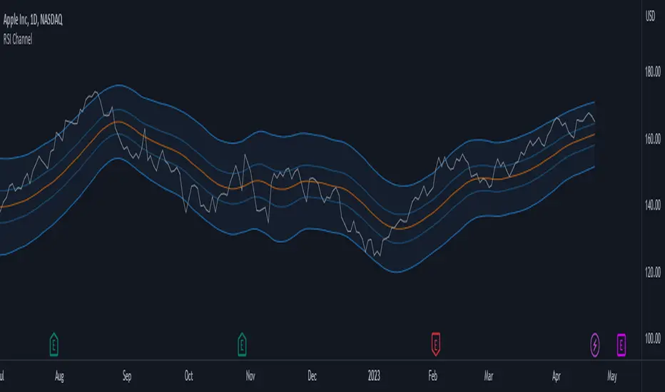
Bollinger Band PW PackageThis script creates a Bollinger Band Package with Bollinger Band Percent and Width displayed on chart. The indicator also prints signals when price closes above or below the Bollinger Bands using shapes (circles by default). Bollinger Bands were created by John Bollinger, and consist of three lines plotted on a chart: the basis line (typically a moving average, 20 sma by default), an upper line (equal to the basis plus a certain number of standard deviations of the price, 2), and a lower line (equal to the basis minus the same number of standard deviations, 2 by default).
The script calculates the Bollinger Bands for a given input parameters by taking the length of the moving average and the number of standard deviations to use for the upper and lower bands. It then calculates the Bollinger Bands using these input parameters.
The script defines two functions: get_bb_percent() and get_bb_width(). The get_bb_percent() function calculates the percentage distance between the closing price and the lower band, as a percentage of the total distance between the upper and lower bands. This value is commonly referred to as the "Bollinger Band Percent". The get_bb_width() function calculates the percentage distance between the upper and lower bands, as a percentage of the basis line. This value is commonly referred to as the "Bollinger Band Width".
The script creates a table at the middle right of the chart, where the Bollinger Band Percent and Width values are displayed. The table is designed with two rows, one for the Bollinger Band Percent value and the other for the Bollinger Band Width value.
The script plots the three Bollinger Bands lines on the chart. The basis line is plotted in blue, the upper band line in red, and the lower band line in green.
The script then plots the shapes that signify closures above and below the bands using plotshape. The shapes and colors are customizable in the settings menu.
This indicator is designed to have all three components and a visual aid to assist Bollinger Band technical analysis in one script which can be helpful in determining potential trading opportunities. We thank John Bollinger for his contribution to technical analysis and trading.
Please give feedback and modify to your liking.
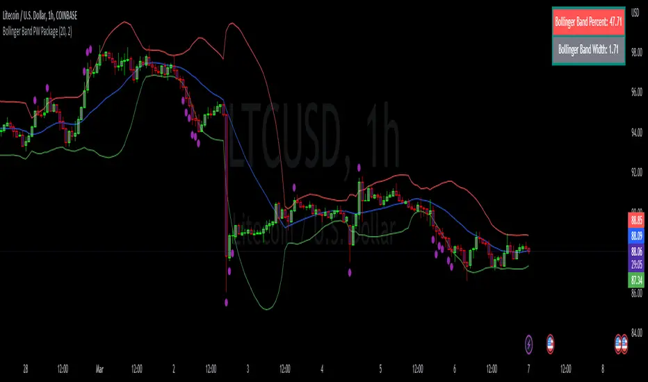
CNS - Multi-Timeframe Bollinger Band OscillatorMy hope is to optimize the settings for this indicator and reintroduce it as a "strategy" with suggested position entry and exit points shown in the price pane.
I’ve been having good results setting the “Bollinger Band MA Length” in the Input tab to between 5 and 10. You can use the standard 20 period, but your results will not be as granular.
This indicator has proven very good at finding local tops and bottoms by combining data from multiple timeframes. Use BB timeframes that are lower than the timeframe you are viewing in your price pane.
The default settings work best on the weekly timeframe, but can be adjusted for most timeframes including intraday.
Be cognizant that the indicator, like other oscillators, does occasionally produce divergences at tops and bottoms.
Any feedback is appreciated.
Overview
This indicator is an oscillator that measures the normalized position of the price relative to Bollinger Bands across multiple timeframes. It takes the price's position within the Bollinger Bands (calculated on different timeframes) and averages those positions to create a single value that oscillates between 0 and 1. This value is then plotted as the oscillator, with reference lines and colored regions to help interpret the price's relative strength or weakness.
How It Works
Bollinger Band Calculation:
The indicator uses a custom function f_getBBPosition() to calculate the position of the price within Bollinger Bands for a given timeframe.
Price Position Normalization:
For each timeframe, the function normalizes the price's position between the upper and lower Bollinger Bands.
It calculates three positions based on the high, low, and close prices of the requested timeframe:
pos_high = (High - Lower Band) / (Upper Band - Lower Band)
pos_low = (Low - Lower Band) / (Upper Band - Lower Band)
pos_close = (Close - Lower Band) / (Upper Band - Lower Band)
If the upper band is not greater than the lower band or if the data is invalid (e.g., na), it defaults to 0.5 (the midline).
The average of these three positions (avg_pos) represents the normalized position for that timeframe, ranging from 0 (at the lower band) to 1 (at the upper band).
Multi-Timeframe Averaging:
The indicator fetches Bollinger Band data from four customizable timeframes (default: 30min, 60min, 240min, daily) using request.security() with lookahead=barmerge.lookahead_on to get the latest available data.
It calculates the normalized position (pos1, pos2, pos3, pos4) for each timeframe using f_getBBPosition().
These four positions are then averaged to produce the final avg_position:avg_position = (pos1 + pos2 + pos3 + pos4) / 4
This average is the oscillator value, which is plotted and typically oscillates between 0 and 1.
Moving Averages:
Two optional moving averages (MA1 and MA2) of the avg_position can be enabled, calculated using simple moving averages (ta.sma) with customizable lengths (default: 5 and 10).
These can be potentially used for MA crossover strategies.
What Is Being Averaged?
The oscillator (avg_position) is the average of the normalized price positions within the Bollinger Bands across the four selected timeframes. Specifically:It averages the avg_pos values (pos1, pos2, pos3, pos4) calculated for each timeframe.
Each avg_pos is itself an average of the normalized positions of the high, low, and close prices relative to the Bollinger Bands for that timeframe.
This multi-timeframe averaging smooths out short-term fluctuations and provides a broader perspective on the price's position within the volatility bands.
Interpretation
0.0 The price is at or below the lower Bollinger Band across all timeframes (indicating potential oversold conditions).
0.15: A customizable level (green band) which can be used for exiting short positions or entering long positions.
0.5: The midline, where the price is at the average of the Bollinger Bands (neutral zone).
0.85: A customizable level (orange band) which can be used for exiting long positions or entering short positions.
1.0: The price is at or above the upper Bollinger Band across all timeframes (indicating potential overbought conditions).
The colored regions and moving averages (if enabled) help identify trends or crossovers for trading signals.
Example
If the 30min timeframe shows the close at the upper band (position = 1.0), the 60min at the midline (position = 0.5), the 240min at the lower band (position = 0.0), and the daily at the upper band (position = 1.0), the avg_position would be:(1.0 + 0.5 + 0.0 + 1.0) / 4 = 0.625
This value (0.625) would plot in the orange region (between 0.85 and 0.5), suggesting the price is relatively strong but not at an extreme.
Notes
The use of lookahead=barmerge.lookahead_on ensures the indicator uses the latest available data, making it more real-time, though its effectiveness depends on the chart timeframe and TradingView's data feed.
The indicator’s sensitivity can be adjusted by changing bb_length ("Bollinger Band MA Length" in the Input tab), bb_mult ("Bollinger Band Standard Deviation," also in the Input tab), or the selected timeframes.

Multi-Timeframe Bollinger Band PositionBeta version.
My hope is to optimize the settings for this indicator and reintroduce it as a "strategy" with suggested position entry and exit points shown in the price pane.
Any feedback is appreciated.
Overview
This indicator is an oscillator that measures the normalized position of the price relative to Bollinger Bands across multiple timeframes. It takes the price's position within the Bollinger Bands (calculated on different timeframes) and averages those positions to create a single value that oscillates between 0 and 1. This value is then plotted as the oscillator, with reference lines and colored regions to help interpret the price's relative strength or weakness.
How It Works
Bollinger Band Calculation:
The indicator uses a custom function f_getBBPosition() to calculate the position of the price within Bollinger Bands for a given timeframe.
Price Position Normalization:
For each timeframe, the function normalizes the price's position between the upper and lower Bollinger Bands.
It calculates three positions based on the high, low, and close prices of the requested timeframe:
pos_high = (High - Lower Band) / (Upper Band - Lower Band)
pos_low = (Low - Lower Band) / (Upper Band - Lower Band)
pos_close = (Close - Lower Band) / (Upper Band - Lower Band)
If the upper band is not greater than the lower band or if the data is invalid (e.g., na), it defaults to 0.5 (the midline).
The average of these three positions (avg_pos) represents the normalized position for that timeframe, ranging from 0 (at the lower band) to 1 (at the upper band).
Multi-Timeframe Averaging:
The indicator fetches Bollinger Band data from four customizable timeframes (default: 30min, 60min, 240min, daily) using request.security() with lookahead=barmerge.lookahead_on to get the latest available data.
It calculates the normalized position (pos1, pos2, pos3, pos4) for each timeframe using f_getBBPosition().
These four positions are then averaged to produce the final avg_position:avg_position = (pos1 + pos2 + pos3 + pos4) / 4
This average is the oscillator value, which is plotted and typically oscillates between 0 and 1.
Moving Averages:
Two optional moving averages (MA1 and MA2) of the avg_position can be enabled, calculated using simple moving averages (ta.sma) with customizable lengths (default: 5 and 10).
These can be potentially used for MA crossover strategies.
What Is Being Averaged?
The oscillator (avg_position) is the average of the normalized price positions within the Bollinger Bands across the four selected timeframes. Specifically:It averages the avg_pos values (pos1, pos2, pos3, pos4) calculated for each timeframe.
Each avg_pos is itself an average of the normalized positions of the high, low, and close prices relative to the Bollinger Bands for that timeframe.
This multi-timeframe averaging smooths out short-term fluctuations and provides a broader perspective on the price's position within the volatility bands.
Interpretation:
0.0 The price is at or below the lower Bollinger Band across all timeframes (indicating potential oversold conditions).
0.15: A customizable level (green band) which can be used for exiting short positions or entering long positions.
0.5: The midline, where the price is at the average of the Bollinger Bands (neutral zone).
0.85: A customizable level (orange band) which can be used for exiting long positions or entering short positions.
1.0: The price is at or above the upper Bollinger Band across all timeframes (indicating potential overbought conditions).
The colored regions and moving averages (if enabled) help identify trends or crossovers for trading signals.
Example:
If the 30min timeframe shows the close at the upper band (position = 1.0), the 60min at the midline (position = 0.5), the 240min at the lower band (position = 0.0), and the daily at the upper band (position = 1.0), the avg_position would be:(1.0 + 0.5 + 0.0 + 1.0) / 4 = 0.625
This value (0.625) would plot in the orange region (between 0.85 and 0.5), suggesting the price is relatively strong but not at an extreme.
Notes:
The use of lookahead=barmerge.lookahead_on ensures the indicator uses the latest available data, making it more real-time, though its effectiveness depends on the chart timeframe and TradingView's data feed.
The indicator’s sensitivity can be adjusted by changing bb_length ("Bollinger Band MA Length" in the Input tab), bb_mult ("Bollinger Band Standard Deviation," also in the Input tab), or the selected timeframes.
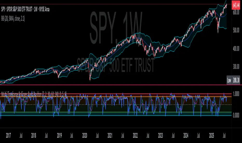
[MidasAlgo] Trend OscillatorThe Trend Oscillator indicator is a powerful tool that combines the strengths of Bollinger Bands and Keltner Channels to provide a comprehensive view of market trends and volatility. By integrating these two popular indicators, the Midas BB Trend offers a more nuanced and dynamic analysis of price movements, helping traders make more informed decisions.
Key Features:
Bollinger Bands and Keltner Channels Fusion:
The Midas BB Trend uses the middle bands of both Bollinger Bands and Keltner Channels to calculate upper and lower Midas Bands. This fusion captures the benefits of both indicators, providing a balanced view of market volatility and trend strength.
Dynamic Trend Analysis:
The indicator calculates the BBTrendMidas value by comparing the differences between the upper and lower Midas Bands. This value is then normalized by the short-term moving average, offering a clear and dynamic representation of market trends.
Customizable Parameters:
Users can adjust the lengths of the Bollinger Bands and Keltner Channels, the standard deviation multiplier, and the ATR length. This flexibility allows traders to tailor the indicator to their specific trading strategies and market conditions.
Filter Range Highlighting:
The Midas BB Trend includes a filter range feature, where users can set high and low thresholds. When the BBTrendMidas value falls within this range, the histogram bars are colored dark grey, indicating periods of low volatility or neutral market conditions.
Clear Visual Representation:
The indicator's histogram uses a color-coded system to signify trend strength and direction. Pink and blue colors represent positive and negative trends, respectively, with stronger colors indicating more significant trends.
How to Use:
Identify Trend Strength:
Look for histogram bars colored in strong pink or blue to identify robust positive or negative trends. These signals can help confirm trend direction and strength, aiding in entry and exit decisions.
Monitor Neutral Periods:
Pay attention to the dark grey bars within the filter range. These indicate periods of low volatility or indecisive market conditions, suggesting caution or potential sideways movement.
Customize for Optimal Performance:
Adjust the input parameters to fit your trading strategy and the specific asset you are analyzing. The default settings provide a balanced approach, but fine-tuning these values can enhance the indicator's effectiveness for your unique needs.
The Midas BB Trend is a versatile and insightful indicator, perfect for traders looking to combine the robust features of Bollinger Bands and Keltner Channels into a single, dynamic tool. Use it to enhance your market analysis, identify key trends, and make more informed trading decisions.
