Valid Pullbacks and Trend by kpt. GonzoThis script helps identify valid pullbacks. Based on the marked pullbacks, it can draw both internal and external structure trendlines.
A pullback is marked with a small triangle above or below the candle that created the local high or low.
A new local high is marked with a red triangle above the candle if at least one subsequent candle has a low lower than the low of the candle that created the new local high.
A new local low is marked with a green triangle below the candle if at least one subsequent candle has a high higher than the high of the candle that created the new local low.
Based on the marked local highs and lows, the internal structure trendline is created by simply connecting all highs and lows with a line.
The external structure is drawn in a similar way, but only highs and lows that have broken the previous structure are connected. This helps focus on important pivots and better understand the market structure.
스크립트에서 "TRENDLINES"에 대해 찾기
Farley's Accumulation-Distribution Accelerator (ADA)Farley's ADA (From The Master Swing Trader)
What it is :
ADA is designed to track volume oscillations in the market and reduce the impact of shock events.
It observes the supply-demand dynamics within the market, which can trigger natural levels of price reversals.
How It Works
Volume and Price Relationship: ADA measures the lag between price and volume movements. It highlights when volume leads or lags behind price changes, helping traders identify potential reversals or trends.
Signal Generation: ADA can generate faster and cleaner signals compared to traditional indicators like On-Balance Volume (OBV).
Usage
Support and Resistance: ADA formations can help identify support and resistance levels and trendlines.
detect natural levels where price reversals might occur.
Trend Identification: Look for significant divergences between ADA and price action to identify potential trend reversals.
Volume Analysis: Use ADA to anticipate pauses in price movements when volume leads, and expect dynamic trends when ADA significantly moves ahead of price action.

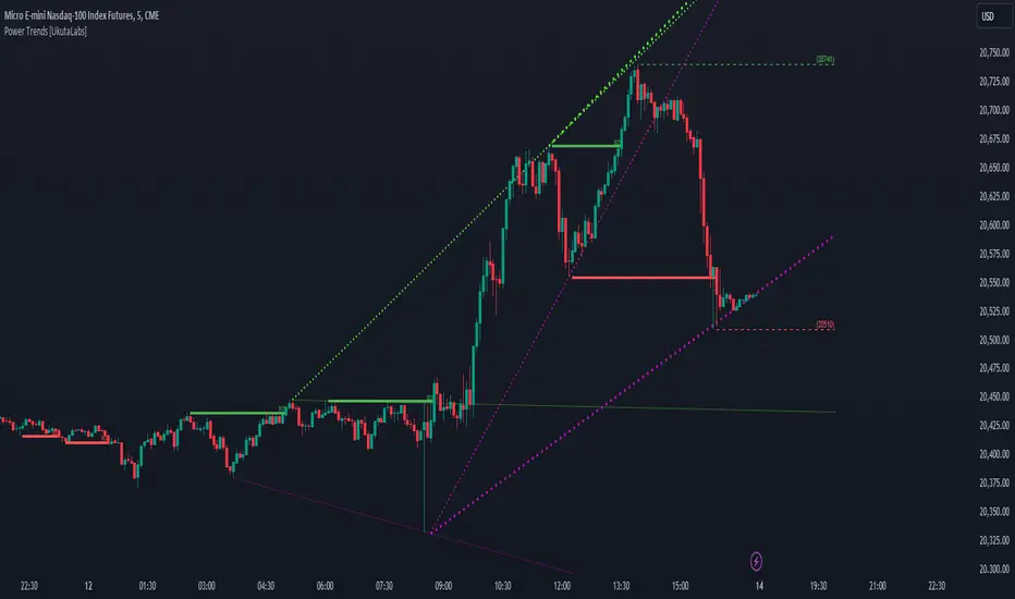
Power Trends [UkutaLabs]█ OVERVIEW
The Power Trends Indicator is a versatile trading toolkit that offers unique insight into key price levels in the market. This script uses currently relevant price-action information to automatically detect pivot levels and use them to create powerful trendlines.
The aim of this script is to improve the trading experience of users by offering a versatile toolkit that can be used in a wide variety of trading strategies to help simplify the complexities of the market.
█ USAGE
The Power Trends Indicator will automatically identify pivot points in real-time using recent price-action information to ensure that all points being identified are relevant. Using these pivot points, the script then draws powerful trend lines that can be used as levels of resistance and support.
To ensure that only the most relevant information is being presented, only the most recent trend lines will be displayed on the user’s charts. As new trend lines are being drawn, older trend lines will become thinner so that traders can identify the most relevant lines at a glance.
The price of the most recent high and low pivot points will also be displayed on the chart and can be used as further levels of resistance and support.
When a recent pivot level is broken, it will be identified as a Break of Structure. This signifies that there may have been a change in market strength.
The Power Trends Indicator also supports multiple time frame mapping, allowing you to mirror the trend lines that would be drawn on higher time frame charts onto lower time frame charts. This feature allows traders to be aware of the market structure of multiple charts at a glance from a single chart.
When mirroring some higher time frame trend lines, lines may appear to not align properly with current time frame bars. This is done intentionally to ensure lines are being drawn accurately to their position on the higher time frame charts.
█ SETTINGS
Current Time Frame
• Display (On/Off): Determines whether or not trend lines are drawn from the current time frame.
• High Color: Determines the color of trend lines drawn on high pivots.
• Low Color: Determines the color of trend lines drawn on low pivots.
5 Minute (Higher Time Frame)
• Display (On/Off): Determines whether or not trend lines are drawn from the 5 minute higher time frame.
• High Color: Determines the color of trend lines drawn on high pivots from the 5 minute higher time frame.
• Low Color: Determines the color of trend lines drawn on low pivots from the 5 minute higher time frame.
15 Minute (Higher Time Frame)
• Display (On/Off): Determines whether or not trend lines are drawn from the 15 minute higher time frame.
• High Color: Determines the color of trend lines drawn on high pivots from the 15 minute higher time frame.
• Low Color: Determines the color of trend lines drawn on low pivots from the 15 minute higher time frame.
30 Minute (Higher Time Frame)
• Display (On/Off): Determines whether or not trend lines are drawn from the 30 minute higher time frame.
• High Color: Determines the color of trend lines drawn on high pivots from the 30 minute higher time frame.
• Low Color: Determines the color of trend lines drawn on low pivots from the 30 minute higher time frame.
60 Minute (Higher Time Frame)
• Display (On/Off): Determines whether or not trend lines are drawn from the 60 minute higher time frame.
• High Color: Determines the color of trend lines drawn on high pivots from the 60 minute higher time frame.
• Low Color: Determines the color of trend lines drawn on low pivots from the 60 minute higher time frame.
240 Minute (Higher Time Frame)
• Display (On/Off): Determines whether or not trend lines are drawn from the 240 minute higher time frame.
• High Color: Determines the color of trend lines drawn on high pivots from the 240 minute higher time frame.
• Low Color: Determines the color of trend lines drawn on low pivots from the 240 minute higher time frame.
Daily (Higher Time Frame)
• Display (On/Off): Determines whether or not trend lines are drawn from the daily time frame.
• High Color: Determines the color of trend lines drawn on high pivots from the daily higher time frame.
• Low Color: Determines the color of trend lines drawn on low pivots from the daily higher time frame.
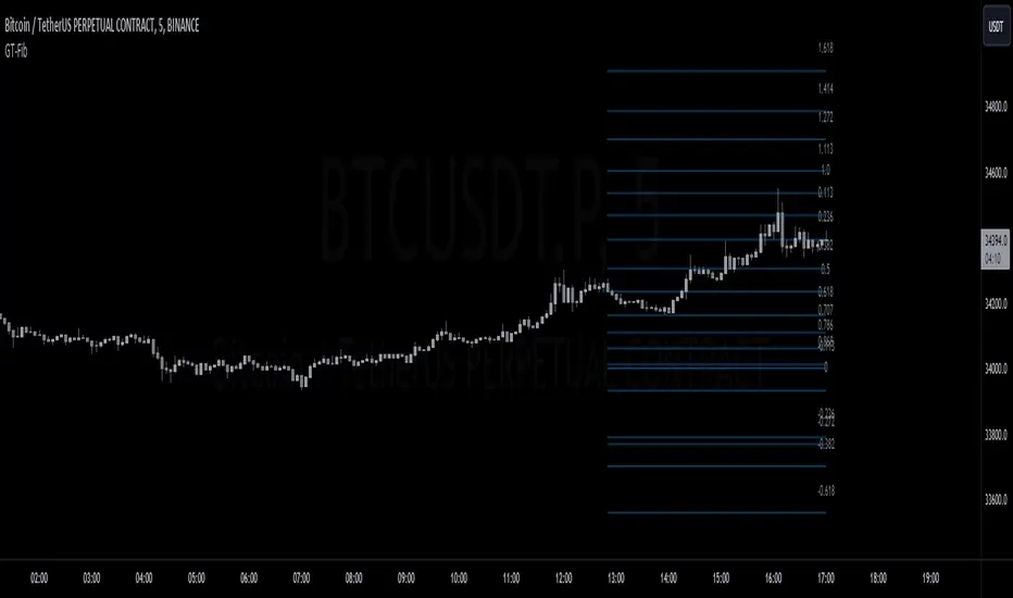
GT-FibThis code is declaring the script as an indicator named "GT-Fib" to be plotted on the main chart. The maximum number of lines it can create is limited to 500.
The indicator calculates Fibo using trend breaks. If the trend is not broken and the old trend continues, Fibo continues. However, sometimes you will witness that it does not draw Fibo. Indicates that there is no trend break yet. If current Fibo levels are behind us, it may be wise to wait for a trend change. For trend breaks, I partially benefited from the Lux team's trend lines with break indicator. For your information...
Settings:
A set of user inputs is defined to allow customization. These include lookback period, coefficient, calculation method, and an option to enable/disable backpainting. These inputs help the trader to adapt the script to different market conditions or trading strategies.
Style:
Colors and visual styles for the indicator are defined here, such as the colors for uptrends and downtrends.
Variables Initialization:
Various variables are initialized here. This section prepares the script for further calculations. Key concepts include the initialization of upper and lower boundaries, pivot highs (ph), pivot lows (pl), and a few other variables to track peaks and troughs for trendlines.
Trendline Peaks and Troughs:
The script identifies pivot highs and lows. Whenever a pivot high/low is found, it updates the trendline_top and trendline_bottom respectively.
Calculation Method:
Based on the user's choice, the script calculates a "cycle" value using one of three methods: ATR, Stdev, or Linreg.
Extended Lines:
These are dashed lines that get drawn when a pivot high or pivot low is identified. These lines can be used to visualize potential support or resistance areas.
plotFibRetracement Function:
This function is designed to draw Fibonacci retracement levels between the identified trendline top and bottom. The Fibonacci levels provide potential support and resistance levels that traders often use to make trading decisions.
Plotting Fibonacci using Trendline Peaks and Troughs:
If both trendline_top and trendline_bottom are not 'na' (not available), the script will draw the Fibonacci retracement using the defined function.
How to Use:
The script identifies and displays potential support and resistance zones using Fibonacci retracement levels based on the trendline peaks and troughs. Here's a suggested way to use it:
Adjust Settings: Depending on the instrument you're trading and the timeframe, you might want to adjust the lookback period, coefficient, and calculation method to fine-tune the script to your needs.
Identify Trends: Observe where the pivot highs and lows are formed. The presence of consecutive pivot highs or pivot lows can indicate a prevailing trend.
Use Fibonacci Levels: The Fibonacci retracement levels can act as potential support and resistance. For instance:
During an uptrend, if prices retract and approach a Fibonacci level, it might act as a support level where price could bounce back.
During a downtrend, Fibonacci levels might act as resistance where price could reverse downwards.
Combine with Other Indicators: For a more comprehensive analysis and to increase the reliability of trading signals, you can use this script in conjunction with other technical indicators.
Remember, like all trading tools and techniques, this script should be used in conjunction with proper risk management. It's also a good idea to test any strategy or tool in a demo environment before applying it to a live account.
TrendGuard Flag Finder - Strategy [presentTrading]
Introduction and How It Is Different
In the vast world of trading strategies, the TrendGuard Flag Finder stands out as a unique blend of traditional flag pattern detection and the renowned SuperTrend indicator.
- A significant portion of the Flag Pattern detection is inspired by the "Flag Finder" code by @Amphibiantrading, which serves as one of foundational element of this strategy.
- While many strategies focus on either trend-following or pattern recognition, this strategy harmoniously combines both, offering traders a more holistic view of the market.
- The integration of the SuperTrend indicator not only provides a clear direction of the prevailing trend but also offers potential stop-loss levels, enhancing the strategy's risk management capabilities.
AAPL 1D chart
ETHBTC 6hr chart
Strategy: How It Works
The TrendGuard Flag Finder is primarily built on two pillars:
1. Flag Pattern Detection : At its core, the strategy identifies flag patterns, which are continuation patterns suggesting that the prevailing trend will resume after a brief consolidation. The strategy meticulously detects both bullish and bearish flags, ensuring traders can capitalize on opportunities in both rising and falling markets.
What is a Flag Pattern? A flag pattern consists of two main components:
1.1 The Pole : This is the initial strong price move, which can be either upwards (for bullish flags) or downwards (for bearish flags). The pole represents a strong surge in price in a particular direction, driven by significant buying or selling momentum.
1.2 The Flag : Following the pole, the price starts consolidating, moving against the initial trend. This consolidation forms a rectangular shape and is characterized by parallel trendlines. In a bullish flag, the consolidation will have a slight downward tilt, while in a bearish flag, it will have a slight upward tilt.
How the Strategy Detects Flags:
Identifying the Pole: The strategy first identifies a strong price movement over a user-defined number of bars. This movement should meet a certain percentage change to qualify as a pole.
Spotting the Flag: After the pole is identified, the strategy looks for a consolidation phase. The consolidation should be counter to the prevailing trend and should be contained within parallel lines. The depth (for bullish flags) or rally (for bearish flags) of this consolidation is calculated to ensure it meets user-defined criteria.
2. SuperTrend Integration : The SuperTrend indicator, known for its simplicity and effectiveness, is integrated into the strategy. It provides a dynamic line on the chart, signaling the prevailing trend. When prices are above the SuperTrend line, it's an indication of an uptrend, and vice versa. This not only confirms the flag pattern's direction but also offers a potential stop-loss level for trades.
When combined, these components allow traders to identify potential breakout (for bullish flags) or breakdown (for bearish flags) scenarios, backed by the momentum indicated by the SuperTrend.
Usage
To use the SuperTrend Enhanced Flag Finder:
- Inputs : Begin by setting the desired parameters. The strategy offers a range of user-controlled settings, allowing for customization based on individual trading preferences and risk tolerance.
- Visualization : Once the parameters are set, the strategy will identify and visually represent flag patterns on the chart. Bullish flags are represented in green, while bearish flags are in red.
- Trade Execution : When a breakout or breakdown is identified, the strategy provides entry signals. It also offers exit signals based on the SuperTrend, ensuring that traders can capitalize on the momentum while managing risk.
Default Settings
The strategy comes with a set of default settings optimized for general use:
- SuperTrend Parameters: Length set to 10 and Factor set to 5.0.
- Bull Flag Criteria: Max Flag Depth at 7, Max Flag Length at 10 bars, Min Flag Length at 3 bars, Prior Uptrend Minimum at 9%, and Flag Pole Length between 7 to 13 bars.
- Bear Flag Criteria: Similar settings adjusted for bearish patterns.
- Display Options: By default, both bullish and bearish flags are displayed, with breakout and breakdown points highlighted.
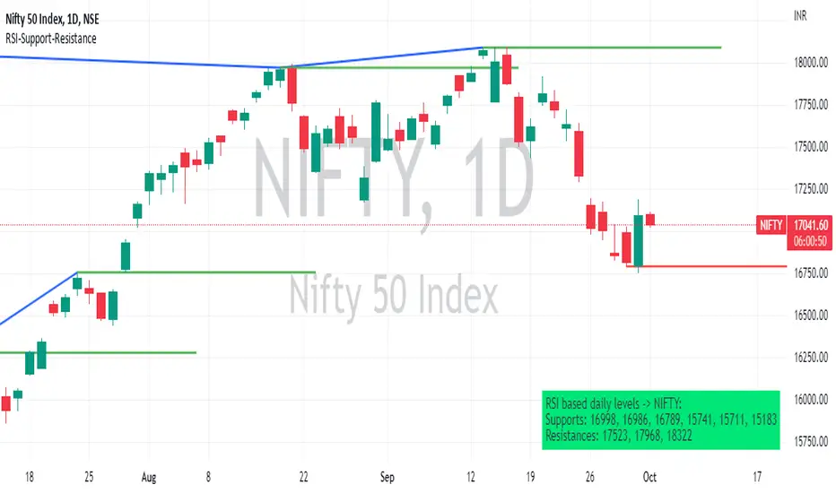
RSI based support resistance levelsThis indicator draws support line and resistance lines in the price chart.
How ?
For drawing the support/resistance line we need to first determine the demand and supply.
We are using too-familiar indicator RSI to determine when the script is oversold and overbought.
Now oversold (in RSI) is not a point, it’s a zone. The RSI indicator comes below 30, stays there and goes up above 30. Similarly for overbought.
Now if you carefully look at the oversold region – the lowest point of the oversold region is the place where the demand came (for surety) and push the indicator (and price) up.
Similarly: the highest point of overbought is the place where (for surety) the supply came and push the indicator (and price) down.
So that’ the supply / demand line (for surety).
In this indicator, based on the RSI we are just drawing support and resistance lines in the chat. That’s all.
What is unique ?
Trendline concept is not new. RSI is not new. RSI overbought/oversold is not new.
There are indicators exist to draw trendlines. Some of them works beautifully.
However, none of these, we are aware of, uses RSI to determine it. And, we believe, the most logical way to determine support/resistance is RSI.
Note: We are not responsible for any trading/investment decision you are taking out of the outcome of this indicator.
Pivot TrendLineThe simplest version of the indicator automatically draws trendLine on your charts, with build-in functions only.
You can change the looking back length settings to get more proper lines you want.
There is also a switch to turn off the historical trendlines.
You can use this to build more advanced indicators or strategies.
Pivot Point SupertrendHello All,
There are many types of SuperTrend around. Recently I thought about a Supertrend based on Pivot Points then I wrote "Pivot Point SuperTrend" script. It looks it has better performance on keeping you in the trend more.
The idea is behind this script is finding pivot point, calculating average of them and like in supertrend creating higher/lower bands by ATR. As you can see in the algorithm the script gives weigth to past pivot points, this is done for smoothing it a bit.
As I wrote above it may keep you in the trend more, lets see an example:
As an option the script can show main center line and I realized that when you are in a position, this line can be used as early exit points. (maybe half of the position size)
While using Pivot Points, I added support resistance lines by using Pivot Point, as an option the script can show S/R lines:
And also it can show Pivot Points:
When you changed Pivot Point Period you can see its reaction, in following example PP period is 4 (default value is 2). Smaller PP periods more sensitive trendlines.
Alerts added for Buy/Sell entries and Trend Reversals. (when you set alerts use the option " Once Per Bar Close ")
ENJOY!

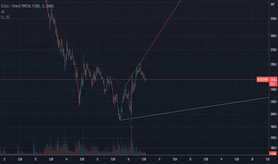
trendline function - JD!EXPERIMENTAL!
As TV doesn't provide a function to draw lines between points, I wrote a function to do this in one my own indicators.
The function itself however can be applied/modified for different use cases, eg. drawing trendlines.
In this (proof of concept) example I used it to draw lines based on past high/low pivot points.
The inputs required:
* an INPUT FUNCTION (in this form, its designed to work with functions that have occasional values and na-values between them, it then connects the non-zero values to form a line)
* a BOOL (to indicate if you want to draw only the rising or falling lines)
* a DELAY (in this case this is the lookback period for the pivot-points function, this is to compensate the calculation of the past and realtime points)
The function returns:
* the function to draw the extension from the BASE-LINE to the current time (here this is the connection of the last pivot-point to the current point to bridge the gap of the lookback period, this is NOT REALTIME!)
* the function to draw the extension for the current time (here this is the continuation of the line until a new pivot-point is valid, this is DRAWN IN REALTIME!!)
* the color of the lines (in this case the lines are only colored (lime or fuchsia) if they either go up or down, else they are invisible, this is to clean up the invalid lines)
these output functions can then simply be plotted using the 'plot' function.
JD.
[LAVA] Relative Price DifferenceThis script shows the relative price difference based off the last high and low, so many bars ago. Bollinger bands are also included by default for closer inspection on the intensity of the movement or the lack thereof. Bollinger bands will follow the smoothed line which will allow the reactionary line to cross the boundary during an intense movement. With the colors selected, a gray color will appear after the color to the zero line to announce a deep correction is possible. Buy/Sell indicators show up as crosses to indicate when the price is moving in a certain direction. Sideways stagnation will have several crosses due to the close proximity to the zero line.
I use 21 in the demo here without the bollinger bands or buy/sell indicators to show the power of the script to identify bottoms and tops using the tips and hand drawn trendlines.
(This script is actually the same script as before, but listed here as the final version. Hopefully this will be my last update with this script.)
If you use and enjoy this script, please like it!

BK AK-Warfare Formations👑 BK AK-Warfare Formations — Geometric Structure, Tactical Readability 👑
Built for traders who want validated structure (channels/wedges/triangles) without chart clutter — with compact tags, hover briefings, filtered alerts, and forward-projected battle lines.
🎖️ Full Credit — Foundation Engine (Trendoscope)
Original foundation (Trendoscope Auto Chart Patterns):
The entire pattern engine (multi-zigzag scanning, pivot logic, trendline-pair validation, geometric classification, overlap handling, pattern caps, and the base drawing framework) is by Trendoscope — one of the strongest Pine engineers on TradingView and the creator of the underlying detection architecture.
This script keeps that engine intact. My work is a tactical layer on top: readability + interaction + alerts + forward structure projection.
🧠 What This Script Does (User-Facing Output)
This indicator automatically detects and draws these geometric formations on price:
Channels
AC — Ascending Channel
DC — Descending Channel
RC — Ranging Channel
Wedges
RWE / FWE — Rising/Falling Wedge (Expanding)
RWC / FWC — Rising/Falling Wedge (Contracting)
Triangles
ATC / DTC — Ascending/Descending Triangle (Contracting)
ATE / DTE — Ascending/Descending Triangle (Expanding)
CT — Converging Triangle
DT — Diverging Triangle
You can display either the full pattern name or short tactical tags so structure stays visible without burying price.
🔍 How It Detects (So You Know It’s Not Random)
Trendoscope’s engine follows a strict geometric workflow:
1) Multi-Zigzag Sweep (micro → macro)
The script runs multiple zigzag configurations (up to 4) so it can detect the same market at different swing sensitivities — from tighter formations to broader ones.
2) Pivot Structure Validation (5 or 6 pivots)
A formation is only eligible when the swing sequence provides a valid pivot set (typically 5 or 6 pivots depending on your setting).
3) Trendline-Pair Validation + Geometry Classification
Two boundary trendlines are built and validated:
Upper boundary anchored to pivot highs
Lower boundary anchored to pivot lows
Then the engine measures geometry to classify:
Parallel → Channel
Converging / Diverging with same direction → Wedge
Converging / Diverging with opposing direction → Triangle
4) Quality Controls (optional but recommended)
Error threshold controls tolerance for line fit
Flat threshold controls what qualifies as “flat”
Bar ratio verification checks proportionality of swing spacing
Avoid overlap prevents stacking noisy patterns
Max pattern caps keeps chart readable
Net effect: You get validated geometry, not doodles.
🧩 BK Enhancements — Why This Publication Exists (Not a Mashup)
This publication is not “two indicators glued together.” It’s a single detection engine plus an execution-oriented interface layer built specifically to solve real pain points:
A) Tactical Labels (Clarity Under Pressure)
Short-form tags (AC/DC/RWE/CT…) to keep charts readable
Independent transparency controls (label text + background)
Optional hover tooltips that show full pattern name + directional bias (Bullish/Bearish/Neutral)
How it works together: Trendoscope detects/draws → BK label layer converts to short tags + applies transparency + tooltip overlay.
B) Alert System Upgrades (Signal Routing, Not Spam)
Alerts are filtered by:
Bias: Bullish / Bearish / Neutral
Category: Channel / Wedge / Triangle
So instead of “New Pattern!” noise, you can route only what you trade.
How it works together: When the engine confirms a pattern, BK’s alert router reads the pattern name → derives bias/category → checks your enabled filters → sends only approved alerts.
C) Pattern Border Extension (Forward Battlefield Edges)
Optional feature to extend only the two true boundary lines of the pattern forward by N bars so you can plan:
where price might react
where breaks/retests become obvious
where entries/invalidations belong
This extension logic is selective (it avoids extending zigzag legs/pivot scribbles) and attempts to extend the best-matching border pair only.
How it works together: After patterns are drawn, BK scans existing pattern lines → identifies the border pair → extends those borders forward.
⚙️ Core Controls (What You Actually Tune)
Scanning / Quality
Zigzag lengths & depths (swing sensitivity)
Pivots used: 5 vs 6
Error tolerance + flat threshold
Bar ratio verification
Overlap avoidance + repaint behavior
Max patterns displayed
Display / Readability
Theme colors or custom palette
Transparency for pattern lines/labels
Short labels ON/OFF
Tooltips ON/OFF
Border extension ON/OFF + extend bars
Alerts
Enable alerts overall
Filter by bias
Filter by category (Channel/Wedge/Triangle)
🗺️ How To Use It (Practical, Not Fantasy)
Channels: trade the lane — entries near the boundary, invalidation outside the structure
Wedges: watch compression/expansion and breaks + retests (distribution/accumulation behavior often shows here)
Triangles: plan edges, not the middle — compression → expansion is the whole point
This script gives structure. You still decide execution rules (entry trigger, invalidation, targets).
🧑🏫 BK / AK
AK is honor — my mentor’s standard: patience, clean execution, no gambling.
👑 King Solomon’s Standard
This is warfare—market warfare—so we move by wisdom, not emotion:
“By wise counsel you will wage your own war, and in a multitude of counselors there is safety.” — Proverbs 24:6
BK AK-Warfare Formations — where formation meets judgment, and judgment meets execution.
Gd bless. 🙏

Auto Liquidity Sweep Trendlines with automation feature by V JhaThis is not an ordinary trendline, in fact high impact ones, passing through liquidity points of huge significance.
In setting of indicator you can choose to have multiple consecutive buys or sells for delayed entry. For automation you can deselect this option so that you get single buy or sell.
What is more, for Green and Red lines you can choose different bars. For instance if htf trend is bearish choose 14 bars for red, so you need to sell on rise therefore make 1 bar for green. Similar for opposite.
You will have an awe feeling for sure. Enjoy Trading.

Liquidity Sweep Trendlines customise htf, bars and switchesThis is not an ordinary trendline, in fact high impact ones, passing through liquidity points of huge significance.
In setting of indicator you can choose to have multiple consecutive buys or sells for delayed entry. For automation you can deselect this option so that you get single buy or sell.
What is more, for Green and Red lines you can choose different bars. For instance if htf trend is bearish choose 14 bars for red, so you need to sell on rise therefore make 1 bar for green. Similar for opposite.
You can separately choose htf on current chart. For instance if on your htf is 5 min and trend is bearish on 5 min, on current chart 1 min(say) you can choose htf 5min for red and to short on every rise choose 1 bar for green and keep its htf of chart.
I think need for all other indicator should be over, You will have an awe feeling for sure. Enjoy

Wedge Green SquadWedge GS automatically detects confirmed swing highs and lows and draws clean wedge trendlines directly from the true pivot bars. The indicator uses non-repainting pivots and extends the lines forward to highlight contracting price structures, potential breakouts, and compression zones.
Designed for traders who value structure over noise, it works best on higher timeframes and pairs naturally with support, resistance, and volume analysis. This tool focuses on clarity and reliability, not prediction.

Quant-Action Pro: Triple Confluence EngineQuant-Action Pro: Triple Confluence Engine
Systematic Framework for Structural Price Action Analysis
Quant-Action Pro is a high-performance analytical engine designed to synchronize institutional liquidity flow with market geometry. Instead of traditional "signals," this framework identifies Structural States where three independent algorithmic layers align, providing a objective roadmap for the current price action context.
1. Core Algorithmic Matrix
The engine operates by monitoring the interaction between price and three proprietary logic layers:
A. Institutional Flow Node (SP2L) —
Logic: Monitors "Passive Liquidity Absorption" at the 20-period EMA.
Function: Identifies zones where institutional buyers/sellers are defending the trend's equilibrium. This is not a simple touch; it requires a validated "Touch-and-Hold" sequence.
B. Structural Flip Scanner (BTB) —
Logic: Detects the transition from old supply to new demand (S/R Flip).
Function: Uses a 3-phase Break-Test-Break verification to confirm that a structural breakout is backed by volume, reducing the risk of "Fake-outs."
C. Liquidity Compression Monitor (Micro Map) —
Logic: Statistical range-contraction analysis (Volatility Squeeze).
Function: Signals a High-Density State where price is coiling for an expansion move.
2. The Golden State: Triple Confluence Logic
The GOLD label represents the "Apex" of this engine. It is triggered only when the SP2L, BTB, and Micro Map layers synchronize on a single candle. In structural terms, this means:
Trend Defense (SP2L) is active.
Structural Breakout (BTB) is confirmed.
Volatility Expansion (MM) is imminent.
This Triple-Layer filtering ensures that Golden Signals only appear during periods of maximum market conviction.
3. Professional Implementation (Structural View)
MTF Trend Matrix: A built-in dashboard provides a 1H, 4H, and 1D diagnosis to ensure local setups align with the Macro Trend.
Smart Invalidation (Adaptive Trendlines): The engine draws dynamic geometry to define the current "Structural Floor/Ceiling." A decisive close beyond these lines acts as a clear Invalidation Point for the current thesis.
Mean Reversion: The system uses the 200-EMA as the primary directional filter, defining whether the market is in a "Bullish Expansion" or "Bearish Correction" state.
⚠️ Risk Disclaimer
Trading financial instruments involves significant risk. Quant-Action Pro is an educational tool designed for research and structural analysis. It does not provide financial advice. Past performance is not indicative of future results. Always use strict risk management.

4MA / 4MA[1] Forward Projection with 4 SD Forecast Bands4MA / 4MA Projection + 4 SD Bands + Cross Table is a forward-projection tool built around a simple moving average pair: the 4-period SMA (MA4) and its 1-bar lagged value (MA4 ). It takes a prior MA behavior pattern, projects that structure forward, and wraps the projected mean path with four Standard Deviation (SD) bands to visualize probable future price ranges.
This indicator is designed to help you anticipate:
Where the MA structure is likely to travel next
How wide the “expected” future price corridor may be
Where a future MA4 vs MA4 crossover is most likely to occur
When the real (live) crossover actually prints on the chart
What you see on the chart
1) Live moving averages (current market)
MA4 tracks the short-term mean of price.
MA4 is simply the previous bar’s MA4 value (a 1-bar lag).
Their relationship (MA4 above/below MA4 ) gives a clean, minimal read on trend alignment and directional bias.
2) Projected MA path (forward curve)
A forward “ghost” of the MA structure is drawn ahead of price. This projected curve represents the indicator’s best estimate of how the moving average structure may evolve if the market continues to rhyme with the selected historical behavior window.
3) 4 Standard Deviation bands (predictive future price ranges)
Surrounding the projected mean path are four SD envelopes. Think of these as forecast corridors:
Inner bands = tighter “expected” range
Outer bands = wider “stress / extreme” range
These bands are not a guarantee—rather, they’re a structured way to visualize “how far price can reasonably swing” around the projected mean based on observed volatility.
4) Vertical projection lines (most probable cross zone)
Within the projected region you’ll see vertical lines running through the bands. These lines mark the most probable zone where MA4 and MA4 are expected to cross in the projection.
In plain terms:
The projected MAs are two curves.
When those curves are forecasted to intersect, the script marks the intersection region with a vertical line.
This gives you a forward “timing window” for a potential MA shift.
5) Cross Table (top-right)
The table is your confirmation layer. It reports:
Current MA4 value
Current MA4 value
Whether MA4 is above or below MA4
The most recent BUY / SELL cross event
When a real, live crossover happens on the actual chart:
It registers as BUY (MA4 crosses above MA4 )
Or SELL (MA4 crosses below MA4 )
…and the table updates immediately so you can confirm the event without guessing.
How to use it
Practical workflow
Use the projected SD bands as future range context
If price is projected to sit comfortably inside inner bands, the market is behaving “normally.”
If price reaches outer bands, you’re in a higher-volatility / stretched scenario.
Use vertical lines as a “watch zone”
Vertical lines do not force a trade.
They act like a forward “heads-up”: this is the most likely window for an MA crossover to occur if the projection holds.
Use the table for confirmation
When the crossover happens for real, the table is your confirmation signal.
Combine it with structure (support/resistance, trendlines, market context) rather than trading it in isolation.
Notes and best practices
This is a projection tool: it helps visualize a structured forward hypothesis, not a certainty.
SD bands are best used as forecast corridors (risk framing, range planning, and expectation management).
The table is the execution/confirmation layer: it tells you what the MAs are doing now.

Williams %RDescription
This is a modified version of the classic Williams %R oscillator, adapted for markets with defined trading sessions (e.g., FTSEMIB, DAX, US stocks, etc.). It adjusts the lookback period based on the actual trading session length, making it more accurate on intraday timeframes.
Key Features
Session Adjustment:
Automatically scales the period to trading days (default: 8.5 hours for FTSEMIB, DAX, CAC; customizable for any market).
Formula (classic Williams %R):
%R = 100 × (Close - Highest High) / (Highest High - Lowest Low)
over a user-defined period (default 14 days).
Standard Levels:
-20 (overbought)
-50 (middle line)
-80 (oversold)
Visual Enhancements:
- Customizable colors for the line, levels, and background fill
- Shaded overbought/oversold zone
How to Use:
Overbought (above -20):
Potential sell signal or reversal (especially after a prolonged uptrend).
Oversold (below -80):
Potential buy signal or reversal (especially after a downtrend).
Divergences:
Look for bullish/bearish divergences between price and %R for early reversal warnings.
Best Markets:
Indices (FTSEMIB, DAX, SPX), stocks, futures. For 24/7 markets (crypto), set session duration to 24 hours.
Timeframes:
Works on intraday (15m, 1h, etc.) and daily charts.
Customization Tips:
- Adjust the period (shorter = more sensitive, longer = smoother).
- Change session duration for different markets.
- Customize colors to match your chart theme.
Note: Williams %R is a momentum oscillator and should be used in combination with other tools (trendlines, support/resistance, volume). Always practice proper risk management.

Trend Break Targets [MarkitTick]Trend Break Targets
Trend Break Targets is a technical analysis tool designed to assist traders in identifying trendline breakouts and projecting potential price targets based on market geometry. Unlike fully automated indicators that guess trendlines, this tool provides you with precise control by allowing you to manually Pivot Point the trendline to specific points in time, while automating the complex math of target projection and structure mapping.
Theoretical Basis & Concepts
This indicator is grounded in classic technical analysis principles found in foundational trading literature. It automates the following methodology:
Drawing a trend line between two key points to represent dynamic support or resistance.
Identifying a breakout when the price closes above or below this line, potentially signaling a change in trend.
Calculating a price target by measuring the vertical distance between the breakout line and the last high/low (pivot), then projecting that same distance in the direction of the breakout.
This concept is based on methods and "Measured Move" theories explained in classic books such as "Technical Analysis of Stock Trends" by Edwards & Magee, "Technical Analysis of the Financial Markets" by John Murphy, and in Thomas Bulkowski's Price Pattern Studies.
How It Works
Pivot Pointed Trendline Construction The script draws a trendline between two user-defined points in time (Start Date and End Date). It calculates the slope between these points and extends the line infinitely to the right, allowing you to define the exact structure (e.g., a resistance trendline on a wedge).
Breakout Detection The script monitors the "Price Source" (High, Low, or Close) relative to the extended trendline.
A Bullish Breakout (BC) occurs when the Close crosses above a bearish trendline.
A Bearish Breakout (BC) occurs when the Close crosses below a bullish trendline.
Dynamic Target Projection (The Math) Upon a confirmed breakout, the script automatically calculates three distinct targets by identifying the most significant "Swing Point" (Pivot) prior to the breakout.
Distance (D): The vertical distance between the Trendline and the Pivot Price at the specific bar where the pivot occurred.
Target 1 (T1): The Breakout Price +/- (Distance × 1.0). This represents a classic 1:1 measured move.
Target 2 (T2): The Breakout Price +/- (Distance × 1.618). Based on the Golden Ratio extension.
Target 3 (T3): The Breakout Price +/- (Distance × 2.618).
Market Structure (CHOCH) The script includes an optional Change of Character (CHOCH) module. This runs independently of the trendline logic, identifying local Swing Highs and Swing Lows based on the "Swing Detection Length." It plots dashed lines and labels to visualize immediate shifts in market structure.
How to Use This Tool
This is an interactive tool that requires user input to define the setup.
Identify a Setup: Locate a clear trend, wedge, or flag pattern on your chart.
Set Pivot Points: Go to the Indicator Settings. Input the exact Start Date and End Date corresponding to the two main touches of your trendline.
Monitor for Breakout: The script will extend the line. Wait for a "BC" label to appear.
Trade Management: Once "BC" prints, the T1, T2, and T3 lines will instantly render. These can be used as potential take-profit zones or areas to tighten stop-losses.
Settings & Configuration
Indicator Settings
Start/End Date: The timestamp Pivot Points for your trendline.
Price Source: Determines what price (High or Low) Pivot Points the line and triggers the breakout.
Pivot Left/Right: Adjusts the sensitivity for finding the "Pivot Before Break" used for target calculations.
Extend Target Line: How far forward the target lines are drawn.
Visual Style
Colors: Fully customizable colors for the Trendline, Breakout Labels, and each Target level (T1, T2, T3).
Gold Bullish Reversal
This analysis dissects a confirmed bullish reversal on Gold using a custom Trend Break system. The setup identifies a transition from a bearish corrective phase to bullish momentum, validated by a structural break and a geometric target projection.
Trend Identification (The Pivot Points) The descending white trendline serves as the primary dynamic resistance, defining the bearish correction.
Pivot Points: The line is drawn connecting two significant swing highs, marked by Label 1 and Label 2.
Logic: These points represent the "lower highs" characteristic of the previous downtrend. As long as price remained below this trajectory, the bearish bias was intact.
The Trigger: Breakout & Confirmation The transition occurs at the candle marked BC (Breakout Candle).
Breakout Criteria: The indicator logic dictates that a signal is only valid when the bar closes above the trendline. This filters out intraday wicks and ensures genuine buyer commitment.
CHOCH Confluence: Immediately following the breakout, a CHOCH (Change of Character) label appears. This signals a shift in market structure, indicating that the internal lower-high/lower-low sequence has been violated, adding probability to the reversal.
Target Projection: The Measured Move The vertical green lines (T1, T2) represent profit objectives derived from the depth of the prior move. The logic calculates the distance between the breakout line and the lowest pivot prior to the break.
T1 (Standard Target): This is a 1:1 projection of the pre-breakout volatility. We see price action initially stalling near this level, confirming it as a zone of interest.
T2 (Golden Ratio Extension): The second target is calculated as the initial distance multiplied by 1.618 (Fibonacci Golden Ratio). The chart shows the price rallying aggressively through T1 to tap the T2 zone, often considered an exhaustion or major take-profit level in harmonic extensions.
Conclusion Gold has successfully invalidated the 4-hour bearish trendline. The confluence of a confirmed close above resistance (BC) and a structural shift (CHOCH) provided a high-probability long setup. The price has now fulfilled the T2 (1.618) extension, suggesting traders should watch for consolidation or a reaction at this key Fibonacci resistance level.
Bearish Trendline Breakdown
The image displays a Bearish Trendline Breakdown on the Gold (XAUUSD) 4-hour chart. The indicator is actually functioning in "Low" mode here (connecting swing lows to form support), which triggers the bearish logic found in the code. Here is the step-by-step breakdown:
The Setup: Pivot Points & Trendline
Visual: The Blue Labels "1" and "2" connected by a white diagonal line.
Code Logic: These are the user-defined start and end points.
Pivot Point 1 (startDate): The starting pivot of the trendline.
Pivot Point 2 (endDate): The ending pivot.
Trendline: The code draws a line between these two points and extends it to the right (extend.right). In this specific image, the line acts as a Support Trendline.
The Trigger: Break Candle (BC)
Visual: The Red Label "BC" appearing just below the white trendline.
Code Logic: This is the execution signal. The code detects a "Down Break" (dnBreak) because the Price Source was likely set to "Low" and the candle's Close was lower than the Trendline Price at that specific bar (close < currLinePrice). This confirms the support level has been breached.
The Projection: Targets (T1 & T2)
Visual: The Green Labels "T1" and "T2" with dotted horizontal lines projected downward.
Code Logic: These are profit targets based on a "Measured Move."
Pivot Calculation: The script looks back for a recent "Pivot High" (the peak before the crash) to calculate the volatility/distance (dist) between that peak and the trendline.
T1 (Conservative): The price is projected downward by 1x that distance (currLinePrice - dist).
T2 (Extended): The price is projected downward by 1.618x that distance (Golden Ratio extension).
Market Context: CHOCH
Visual: The small Red/Orange "CHOCH" labels appearing above the price action.
Code Logic: This is a secondary confirmation system running independently of the trendline. It detects a Change of Character (structural shift). The red labels indicate a "Bearish CHOCH," meaning the price broke below a significant prior swing low (last_swing_low). This supports the bearish bias of the trendline break.
Disclaimer This tool is for educational and technical analysis purposes only. Breakouts can fail (fake-outs), and past geometric patterns do not guarantee future price action. Always manage risk and use this tool in conjunction with other forms of analysis.

LETHINH Pinbar📌 PinBar Minimal Detector — Description (English)
PinBar Minimal Detector is a clean and efficient tool designed to detect high-quality pin bars based purely on candle geometry.
This script focuses on the core characteristics of a true pin bar: a long rejection wick and a small candle body, without adding unnecessary complexity. It is ideal for traders who want fast, reliable signal detection without noise.
⸻
✨ Key Features
• Detects both bullish and bearish pin bars.
• Fully configurable wick/body ratio.
• Optional filter for maximum opposite wick size.
• Option to ignore candles with extremely small bodies.
• Clean chart display with simple labels (“PIN”).
• Includes alert conditions for automated notifications (webhook, popup, email, etc.).
• Lightweight and optimized for fast execution on any timeframe.
⸻
🔍 Detection Logic
A candle qualifies as a bullish pin bar when:
• The lower wick is at least X times larger than the body.
• The upper wick is relatively small (optional filter).
• The body is above the minimum body threshold.
A candle qualifies as a bearish pin bar when:
• The upper wick is at least X times larger than the body.
• The lower wick is relatively small.
• The body meets the minimum size requirement.
This ensures that only candles showing strong rejection are highlighted.
⸻
⚙️ Input Parameters
1. wick/body ratio
Defines how many times longer the main wick must be compared to the candle body.
For example:
• 3.0 → wick must be at least 3× the body
• 4.0–5.0 → only very strong pin bars
2. opposite wick max (factor)
The maximum allowed size of the wick on the opposite side, relative to the body.
Example:
• 0.5 → opposite wick ≤ 50% of body
• Lower values = stricter filtering
3. min body px
Filters out candles with bodies that are too small (low volatility candles).
4. show labels
Enable or disable the “PIN” labels on the chart.
⸻
🚨 Alerts
The script includes two built-in alert conditions:
• Bullish PinBar Detected
• Bearish PinBar Detected
These alerts can be paired with:
• TradingView notifications
• Webhooks (for bots / automation)
• Email or SMS alerts
⸻
🎯 Use Cases
• Identify high-probability reversal points
• Enhance price action strategies
• Combine with S/R zones, supply & demand, trendlines, or order blocks
• Filter entries on lower timeframes while following higher-timeframe trend bias
⸻
📘 Notes
This is a minimalistic version by design.
If you want a more advanced version (confirmation candle, volume filter, multi-timeframe filtering, trend direction filtering, etc.), this script can be expanded easily

Intermarket Swing Projection [LuxAlgo]The Intermarket Swing Projection allows traders to plot price movement swings from any user-selected asset directly onto the chart in the form of zigzags and/or horizontal support and resistance levels.
This tool rescale the external asset price on the user chart, enabling traders to make direct comparisons.
It answers the question of how different the price behavior is between two assets, accounting for each asset's volatility.
🔶 USAGE
This tool is based on swing detection of two different assets: the chart and a user-selected asset. It allows traders to compare two assets on an equal footing while accounting for volatility and price behavior.
Traders can customize the detection by selecting a custom ticker, timeframe, the number of swings and length for swing detection. This makes the tool a Swiss army knife for asset comparison.
As we can see in the image below, the Show Last, Pivot Length, and Spread parameters are key to defining the final output of the tool.
"Show Last" defines how many pivots are displayed. "Pivot Length" is used for pivot detection; a larger value will detect larger market structures. "Spread" defines how far apart the horizontal levels will be from their original location in terms of volatility.
🔹 Comparing different assets
This image shows the Nasdaq 100 futures contract compared to four other futures contracts: S&P 500, gold, bitcoin, and euro/U.S. dollar.
Plotting all of these assets in Nasdaq 100 terms makes it easy to compare and analyze price behaviors and identify key levels.
In the top left chart, we have NQ vs. ES. It's no surprise that they are practically an exact match; a large portion of the S&P 500 is technology.
In the top right chart, NQ vs. GC, we see totally different behaviors. We can clearly see the summer consolidation in gold and the resumption of the uptrend, which took gold above 29,200 NQ points, up from 21,200.
In the bottom right chart, we see bitcoin making new highs, way above the Nasdaq in May, July, and October. However, the last high was way below the Nasdaq prices on October 27—the first lower high in a while. Sellers are pushing down.
Finally, the bottom left chart is NQ vs. 6E. We can see large volatility in the uptrend since February, with NQ unable to catch up until now. The last swing low was almost a match, and 6E is in a range.
As we can see, this tool allows us to perform intermarket analysis properly by accounting for each asset's volatility and price behavior. Then, we plot them on the same scale on equal terms, which makes performing this kind of analysis easy.
As we can see in the chart above, the assets are the same as in the previous image, but the timeframe is 1H with different settings.
Note the horizontal levels acting as support and resistance, as well as how NQ prices react to the zones marked with white circles. These levels are derived from custom assets selected by the user.
🔹 Displaying Elements
Zig-zag allows traders to clearly see the path that the selected asset's price took, as well as its turning points.
Horizontal levels are displayed from those turning points to the present and can be used as support or resistance. Traders can adjust the spread parameter in the settings panel to expand or contract those levels' volatility.
There are two color modes for the levels: average and pivots. In the first mode, green is used for levels below the average and red for levels above the average. The second uses green for swing lows and red for swing highs.
The backpaint feature is enabled by default and allows the swings to be displayed in the correct location. With this feature disabled, the swings will be displayed in the current location when a new swing is detected.
🔶 DETAILS
On a more technical note, the rescaling is formed by calculating three main elements from all the swings detected on the custom and chart assets:
The chart asset's average of all swing points
The chart asset's standard deviation of all swing points
The custom asset's z-score for each swing point
Then, the re-scaled swing point is calculated as the average plus the z-score multiplied by the standard deviation. This makes it possible to plot AAPL swings on an NQ chart, for example.
Thanks to re-scaling, we can directly compare the price behavior of two assets with different price ranges and volatility on the same chart.
🔶 SETTINGS
🔹 Trendlines
Ticker: Select the custom ticker.
Timeframe: Select a custom timeframe.
Show Last: Select how many swing points to display.
Pivot Length: Select the size for swing point detection.
Spread: Volatility multiplier for horizontal levels. Larger values mean the levels are farther apart.
Backpaint: Enable or disable the backpaint feature. When enabled, the drawings will be displayed where they were detected. When disabled, the drawings will be displayed at the moment of detection.
🔹 Style
Show ZigZag: Enable or disable the ZigZag display and choose a line style.
Show Levels: Enable or disable the levels display and choose a line style.
Color Mode: Choose between Average Mode, which colors all levels below the average bullish and all levels above bearish, and Pivot Mode, which colors swing highs bearish and swing lows bullish.
Bullish: Select a bullish color.
Bearish: Select a bearish color.
ZigZag: Select the ZigZag color.

Momentum Structural AnalysisMomentum Structural Analysis (MSA‑style Oscillator)
This indicator implements a simple, MSA‑style momentum oscillator that measures how far price has moved above or below its own long‑term trend on the active timeframe, expressed in percentage terms. Instead of looking at raw price, it "oscillates" price around a timeframe‑appropriate simple moving average (SMA) and plots the percentage distance from that SMA as an orange line around a zero baseline. Zero means price is exactly at its structural trend; positive values mean price is extended above trend; negative values mean it is trading below trend.
The script automatically selects the SMA length based on the chart timeframe:
On daily charts it uses the configurable Daily SMA Length (default 252 trading days, roughly 1 year).
On weekly charts it uses Weekly SMA Length (default 208 weeks).
On monthly charts it uses Monthly SMA Length (default 120 months).
This approach is inspired by the ideas behind Momentum Structural Analysis (MSA), which studies where a market trades relative to long‑term moving averages and then treats the momentum line (the oscillator) as the primary object of analysis. The goal is to highlight structural overbought/oversold conditions and regime changes that are often clearer on momentum than on the raw price chart.
--------------------------------------------------
What the script computes and how it works
For each bar, the indicator:
Chooses an SMA length based on the current timeframe (daily/weekly/monthly).
Calculates the SMA of the close.
Computes the percentage distance:
\text{Diff %} = \frac{\text{Close} - \text{SMA}}{\text{SMA}} \times 100
Plots this Diff % as an orange line, with a dashed horizontal zero line as the base.
This produces a momentum oscillator that oscillates around zero and reflects the "structural" position of price versus its own long‑term mean.
--------------------------------------------------
How to use it on index charts (e.g., NIFTY50)
On indices like NIFTY50, use the indicator to see how stretched the index is versus its structural trend.
Typical uses:
Identify extremes: a). Historically high positive readings can signal euphoric, late‑stage conditions where risk is elevated. b). Deep negative readings can highlight panic/capitulation zones where downside may be exhausted.
Draw structural levels: a). Mark horizontal bands on the oscillator where past turns have occurred (e.g., +15%, −10%, etc. specific to NIFTY50). b). Watch how price behaves when the oscillator revisits these zones: repeated rejections can validate them as structural bounds; clean breaks can indicate a change of regime.
This is not a buy/sell signal generator by itself; it is a framework to understand where the index sits within its long‑term momentum structure and to support risk‑management decisions.
--------------------------------------------------
How to use it on ratio charts
Apply the same indicator to ratio symbols such as NIFTY50/GOLD, BANKNIFTY/NIFTY50, sector vs index, or any spread you plot as a ratio.
On a ratio chart:
The oscillator now measures relative momentum: how far that ratio is above or below its own long‑term mean.
High positive readings = strong outperformance of the numerator vs the denominator (e.g., equities strongly outperforming gold).
Deep negative readings = strong underperformance (e.g., equities structurally lagging gold).
This is very much in the spirit of MSA’s work on spreads between asset classes: it helps visualize major rotations (equities → gold, financials → commodities, etc.) and whether a relative‑performance trend is stretched, reverting, or breaking into a new phase.
--------------------------------------------------
Using multiple timeframes for better decisions
You can stack information across timeframes to get a more robust view:
Monthly : a). Use monthly charts to see secular/structural phases. b). Long multi‑year stretches above or below zero, and large bases or trendline breaks on the monthly oscillator, can mark major bull or bear cycles and big rotations between asset classes.
Weekly : a). Use weekly charts for the primary trend. b). Weekly structures (multi‑month highs/lows, channels, or trendlines on the oscillator) are useful for medium‑term positioning and for confirming or rejecting signals seen on the monthly view.
Daily : a). Use daily charts mainly for timing entries/exits once the higher‑timeframe direction is clear. b). Short‑term extremes on the daily oscillator that align with the larger weekly/monthly structure can offer better‑timed opportunities, while signals that contradict higher‑timeframe momentum are more likely to be noise.
--------------------------------------------------

Zig Zag & Trendlines with Dynamic Threshold ATRPercentage Zig Zag with Dynamic Threshold
This Pine Script indicator is an advanced Zig Zag tool that identifies and tracks price pivots based on a percentage move required for reversal, offering a clear visual representation of volatility-adjusted trends.
Core Functionality (The Reversal Threshold):
Unlike standard Zig Zag indicators that use a fixed price difference, this indicator calculates the required reversal size (%X) dynamically using the Average True Range (ATR).
It calculates the ATR as a percentage of the current price (ATR%).
The final threshold is this ATR% multiplied by a user-defined factor (default 3x).
This means the reversal threshold is wider during volatile periods and narrower during quiet periods, adapting automatically to market conditions. Users can optionally revert to a fixed percentage if desired.
Trend Extension Lines:
The indicator draws two unique, dynamic trend lines connecting the last two significant Highs and the last two significant Lows. Crucially, these lines do not wait for the entire Zig Zag leg to confirm:
If the price is actively forming a new up-leg, the High Extension Line connects the last confirmed High to the current extreme high of the active move.
The Low Extension Line functions similarly for the downtrend.
This feature allows the user to visualize dynamic support and resistance levels based on the current, active trend structure defined by the percentage threshold.

DarkPool's RSi DarkPool's RSi is an enhanced momentum oscillator designed to automatically detect structural discrepancies between price action and the Relative Strength Index. While retaining the standard RSI visualization, this script overlays advanced divergence recognition logic to identify potential trend reversals.
The tool identifies pivot points in real-time and compares recent peaks and valleys against historical data. When the momentum of the RSI contradicts the direction of price action, the indicator highlights these events using dynamic trendlines, shape markers, and background coloring. A built-in dashboard table provides an immediate status check of active divergence signals.
Key Features
Automated Divergence Detection: Automatically spots both Regular Bullish and Regular Bearish divergences based on pivot lookback settings.
Dynamic Visuals: Draws physical lines connecting RSI peaks or troughs to visualize the divergence angle, alongside triangle markers indicating the signal direction.
Active Status Dashboard: A data table located on the chart monitors the current state of the market, flagging signals as "Active" when detected.
Standard RSI Overlay: Includes standard Overbought (70) and Oversold (30) reference lines for traditional momentum trading.
How to Use
1. Reading the Standard RSI The black line represents the Relative Strength Index.
Overbought (Above 70): Suggests the asset may be overvalued and due for a pullback.
Oversold (Below 30): Suggests the asset may be undervalued and due for a bounce.
Midline (50): Acts as a trend filter; values above 50 indicate bullish momentum, while values below 50 indicate bearish momentum.
2. Trading Divergences The primary function of this tool is to identify reversal setups.
Bullish Divergence (Green Triangle/Line): Occurs when Price makes a Lower Low, but the RSI makes a Higher Low. This indicates that selling momentum is exhausting and a price increase may follow.
Bearish Divergence (Red Triangle/Line): Occurs when Price makes a Higher High, but the RSI makes a Lower High. This indicates that buying momentum is fading and a price decrease may follow.
3. Visual Aids
Lines: The script draws solid lines directly on the RSI pane connecting the relevant pivot points to confirm the divergence slope.
Background Color: When a divergence is detected, the background of the indicator pane will highlight briefly (Green for Bullish, Red for Bearish) to draw attention to the new signal.
4. The Dashboard A small table in the bottom right corner tracks the status of the signals.
Status: ACTIVE: A divergence has been detected within the last 10 bars.
Status: None: No recent divergence patterns have been identified.
Disclaimer This indicator is provided for educational and informational purposes only. It does not constitute financial advice, investment recommendations, or a guarantee of future results. Trading cryptocurrencies and financial markets involves a high level of risk. Always perform your own due diligence before making any trading decisions.
