Tick CVD [Kioseff Trading]Hello!
This script "Tick CVD" employs live tick data to calculate CVD and volume delta! No tick chart required.
Features
Live price ticks are recorded
CVD calculated using live ticks
Delta calculated using live ticks
Tick-based HMA, WMA, EMA, or SMA for CVD and price
Key tick levels (S/R CVD & price) are recorded and displayed
Price/CVD displayable as candles or lines
Polylines are used - data visuals are not limited to 500 points.
Efficiency mode - remove all the bells and whistles to capitalize on efficiently calculated/displayed tick CVD and price
How it works
While historical tick-data isn't available to non-professional subscribers, live tick data is programmatically accessible. Consequently, this indicator records live tick data to calculate CVD, delta, and other metrics for the user!
Generally, Pine Scripts use the following rules to calculate volume/price-related metrics:
Bullish Volume: When the close price is greater than the open price.
Bearish Volume: When the close price is less than the open price.
This script, however, improves on that logic by utilizing live ticks. Instead of relying on time-series charts, it records up ticks as buying volume and down ticks as selling volume. This allows the script to create a more accurate CVD, delta, or price tick chart by tracking real-time buying and selling activity.
Price can tick fast; therefore, tick aggregation can occur. While tick aggregation isn't necessarily "incorrect", if you prefer speed and efficiency it's advised to enable "efficiency mode" in a fast market.
The image above highlights the tick CVD and price tick graph!
Green price tick graph = price is greater than its origin point (first script load)
Red price tick graph = price is less than its origin point
Blue tick CVD graph = CVD, over the calculation period, is greater than 0.
Red tick CVD graph = CVD is less than 0 over the calculation period.
The image above explains the right-oriented scales. The upper scale is for the price graph and the lower scale for the CVD graph.
The image above explains the circles superimposed on the scale lines for the price graph and the CVD graph.
The image above explains the "wavy" lines shown by the indicator. The wavy lines correspond to tick delta - whether the recorded tick was an uptick or down tick and whether buy volume or sell volume transpired.
The image above explains the blue/red boxes displayed by the indicator. The boxes offer an alternative visualization of tick delta, including the magnitude of buying/selling volume for the recorded tick.
Blue boxes = buying volume
Red boxes = selling volume
Bright blue = high buying volume (relative)
Bright red = high selling volume (relative)
Dim blue = low buying volume (relative)
Dim red = low selling volume (relative)
The numbers displayed in the box show the numbered tick and the volume delta recorded for the tick.
The image above further explains visuals for the CVD graph.
Dotted red lines indicate key CVD peaks, while dotted blue lines indicate key CVD bottoms.
The white dotted line reflects the CVD average of your choice: HMA, WMA, EMA, SMA.
The image above offers a similar explanation of visuals for the price graph.
The image above offers an alternative view for the indicator!
The image above shows the indicator when efficiency mode is enabled. When trading a fast market, enabling efficiency mode is advised - the script will perform quicker.
Of course, thank you to @RicardoSantos for his awesome library I use in almost every script :D
Thank you for checking this out!
스크립트에서 "THE SCRIPT"에 대해 찾기

Three Drive Pattern Detector [LuxAlgo]The Three Drives Pattern Detector indicator focuses on detecting and displaying completed Three Drives patterns on the user chart. This harmonic pattern is characterized by successive higher highs / lower lows following specific ratios.
The script uses a multi-length swing detection approach, as well as adjusting ratios to ensure flexibility and a maximum number of visible Three Drives patterns.
🔶 USAGE
The bullish/bearish Three Drives pattern is commonly interpreted as a reversal pattern and is characterized by three extensions (drives) and two intermediary retracements creating consecutive higher lows (for a bullish case) or lower highs (for a bearish case).
The multi-length swing detection approach taken by the indicator allows for detecting shorter-term alongside medium/longer-term patterns simultaneously, allowing to increase in the amount of detected patterns.
Users can set a Minimum Swing length (for example 2) and a Maximum Swing length (for example 100) which defines the range of the swing point detection length, higher values for these settings will detect longer-term Three-Drives patterns, while a larger range will allow for the detection of a larger number of patterns.
Sometimes multiple dashed lines as the last segment can be observed. This means multiple Three Drives patterns sharing multiple swing points have formed, with only the last segment being different.
🔹 Retracement/Extension Ratios
The Three Drives pattern often associates the retracement/extension to Fibonacci ratios of respectively 0.618/1.272.
Some sources specify a maximum retracement/extension level of 0.786/1.618, which means the retracement should be within the 0.618-0.786 range and the extension between 1.272-1.618.
Since finding a pattern where the retracement/extension is precisely at the 0.618/1.272 levels, or even between 0.618-0.786/1.272-1.618 is rare, the script allows users to adjust those ratios, which ensures more flexibility. Depending on the widening/tightening of the ratios, allowing users to find more patterns (but potentially less valid) or more valid (but fewer patterns).
In the example above, " Show Ratios " is set to " Ratios With Margin ", showing the ideal retracement/extension level together with the margin, while in the example below, " Show Ratios " is set to " Ratios ", which shows only a line where the price should ideally reverse.
While setting the ratios wider will result in more frequent but less valid patterns, it can also create good trading opportunities.
🔹 Best Practices
The indicator doesn't include Stop Loss (SL) or Take Profit (TP) levels, however, the 1.618 Fibonacci Extension level of the last leg can commonly be used as stop loss.
Typical Take Profit areas include:
Starting point of the pattern
Each retracement level (2x)
The 0.618 retracement level of the complete pattern
In the above bullish examples, the price was lower than the lowest point of the pattern. The price reversed and attained all TP levels without hitting the SL level.
In the above bearish example, the price went above the highest point of the pattern but did not hit the SL level, after which two TP levels were hit. Then, the price quickly went up, just missing the SL level before it came back down again, hitting the last 2 TP levels.
This example shows that other Fibonacci levels an also be effective when combined with the Three Drives pattern, even in the longer term.
🔶 DETAILS
🔹 Multi Length
The core of this publication is the multi-length swing detection. To ensure the maximum amount of Three Drives patterns are found, up to 99 different swing length periods can be used to detect swing points which are then tested for valid patterns.
Using a wider variety of swing points also ensures that patterns visible only with specific Swing settings can be found on the same chart without the user needing to constantly adjust the Swing settings to find other patterns.
The user only needs to set the desired minimum and maximum Swing Length.
In this case, swing detection using swing Lengths from 3 to 100 (97 different) are computed and evaluated for patterns. Three different patterns were found on the same chart, with swing lengths 3, 4, and 6.
Note: The Maximum Swing length should be equal to or higher than the Minimum Swing Length . If the maximum value is lower than the minimum, the script will automatically take the minimum value as the maximum to prevent errors.
🔹 Width Margin %
Users can filter out patterns based on the duration of each extension/retracement segment. When the users want segments of the detected patterns to be of a similar duration, the width percentage should be set lower. When the focus is on detecting more patterns the width percentage can be set higher.
🔹 Retracement/Extension Settings
Show Ratios , set to Ratios , show the ideal Fibonacci retracement/extension level, while Ratios With Margin (example below) show the additional margins for retracement/extension.
The upper and lower limits can be visualized while hovering over the calculated ratio label.
The dashed line shows an older pattern, where the last leg has been updated.
🔹 Last Known Pattern
The included dashboard highlights the date of the most recently detected pattern; the text will show " None " if no pattern is found.
🔹 Calculated Bars
The "Calculated Bars" setting makes use of the recently introduced calc_bars_count parameter, making it possible to effectively reduce the number of historical bars during the computation of the script, which significantly improves the loading speed of the script.
Users wishing to see the most recent patterns can set this setting to 1000 for example, where only the most recent 1000 bars are used to find patterns. If every bar must be used for pattern detection, set " Calculated bars " at 0.
🔶 SETTINGS
Minimum Swing Length: Minimum length used for the swing detection.
Maximum Swing Length: Maximum length used for the swing detection.
Retracement: Range of required ratios used for testing retracements.
Extension: Range of required ratios used for testing extensions.
Width Margin: Influences the symmetry of the pattern; with a higher number allowing for less symmetry.
🔹 Style
Text Size: Text size of the ratio labels.
Show Ratios: Show the ideal ratio, upper/lower limit of ratios, or none.
🔹 Dashboard
Show Dashboard: Toggle dashboard which shows the date of the last found pattern.
Location: Location of the dashboard on the chart.
Size: Text size.
🔹 Calculation
Calculated Bars: Allows the usage of fewer bars for performance/speed improvement.

Supports & Resistances [UAlgo]The "Supports & Resistances " indicator is designed to identify and visualize key support and resistance levels on the price chart. It utilizes the Average True Range (ATR) and Pivot Points to define the boundaries of S & R zones and considers historical price action to assess the strength of these zones.
🔶 How to Obtain Zones
The script continuously analyzes the price action and identifies potential support and resistance zones based on the following criteria:
Zone Creation: For swing highs, a zone is created with the high price at the zone length as the top and the top minus the Average True Range (ATR) as the bottom. Conversely, for swing lows, the zone is created with the low price at the zone length as the bottom and the low plus the ATR as the top.
Zone Strength Calculation: The script iterates through historical bars within the zone and counts how many times the price (low for support, high for resistance) touched but failed to break entirely through the zone. This count is assigned as the zone's "strength".
Zone Display and Removal: It identifying zones by assigning a "strength" value based on how many times the price has approached but failed to break the zone. This helps prioritize stronger potential support/resistance levels. Only zones exceeding the defined "strength threshold" are visually displayed on the chart. Weaker zones or those broken by price are automatically removed.
🔶 Parameters
Zone Length: Traders can adjust S & R detection sensitivity, length to be used to find pivot points.
Strength Threshold: Set the minimum number of times the price needs to touch but fail to break a zone for it to be considered "strong" and displayed.
Visual Settings: Tailor the appearance of the support/resistance zones by defining separate colors and text size for borders, backgrounds, and zone text.
🔶 Disclaimer
The "Supports & Resistances " indicator is provided for educational and informational purposes only.
It should not be considered as financial advice or a recommendation to buy or sell any financial instrument.
The use of this indicator involves inherent risks, and users should employ their own judgment and conduct their own research before making any trading decisions. Past performance is not indicative of future results.
🔷 Related Scripts
Support and Resistance with Signals
ATR Based Support and Resistance Zones
Cumulative Volume Delta LineThis script is a refined version of TradingView's Cumulative Volume Delta (CVD) indicator. It features a CVD line for lower time frames and automatically switches to a Simple Moving Average (SMA) line on daily time frames and higher. This functionality makes it easier to spot Volume Delta divergences on daily charts while maintaining utility on intraday time frames.
Key Features:
Line Chart and Oscillator Configuration: Unlike TradingView's standard CVD, this script can be configured as a line chart or an oscillator, enhancing flexibility and usability.
Line chart for easier divergence spotting: The line chart format is preferred for spotting divergences, providing a clearer visual representation compared to other formats.
Accurate Calculations: Many older community CVD scripts use approximate calculations that can be inaccurate. This script leverages TradingView's own calculations, which are the most accurate available without tick data feeds.
Intraday and Daily Adaptation: The Traditional CVD script is a per bar volume delta on Daily and higher timeframes and cumulative volume delta for intraday session timeframes which makes it very hard to spot divergences on higher timeframes. This script resolves that by using an SMA on daily time frames and higher.
Auto-Switching Feature: The script intelligently switches between the CVD line and the SMA line based on the active time frame. This feature can be toggled off if you prefer to use the CVD on all time frames or the SMA on all time frames.
Customizable Settings: Building on TradingView's CVD script, this version includes all the same settings in addition to the new auto-switch, SMA length etc.
About Volume Delta and Cumulative Volume Delta:
Volume Delta is the difference between the buying and selling volume within a specified period. It helps traders understand the net buying or selling pressure in the market. A positive volume delta indicates more buying activity, while a negative volume delta indicates more selling activity.
Cumulative Volume Delta (CVD) aggregates the volume delta over time to provide a running total. This cumulative approach helps traders see the overall buying and selling pressure trends, making it easier to identify potential reversals or continuations in the market trend.

NVT Z-ScoreNVT Z-Score Script:
Data Source and Calculation: This script calculates the NVT ratio by dividing the market cap (assumed from QUANDL data) by a 90-day MA of the transaction volume (also from QUANDL), similar to the NVTS calculation. However, the adaptation lies in further analyzing the NVT ratio through a Z-score approach, not explicitly described in the original NVTS methodology.
Z-Score Analysis: The script calculates the mean and standard deviation of the NVT ratio over a user-defined period (daysForMean, defaulting to 180 days) and then computes the Z-score of the current NVT ratio relative to this historical data. This Z-score analysis introduces a standardized way of understanding the NVT ratio's deviation from its historical average, offering a nuanced view of market valuation states.
Visualization and Dynamic Zones: The visualization emphasizes Z-score-based dynamic zones (green, yellow, and red), determined by the stdDevMultiplier. These zones are plotted and filled on the chart, providing visual cues for interpreting the NVT ratio's current state in relation to its historical norm. This aspect significantly differs from the traditional NVTS approach by directly incorporating the concept of standard deviation and Z-scores into the analysis.

TrendLine Toolkit w/ Breaks (Real-Time)The TrendLine Toolkit script introduces an innovating capability by extending the conventional use of trendlines beyond price action to include oscillators and other technical indicators. This tool allows traders to automatically detect and display trendlines on any TradingView built-in oscillator or community-built script, offering a versatile approach to trend analysis. With breakout detection and real-time alerts, this script enhances the way traders interpret trends in various indicators.
🔲 Methodology
Trendlines are a fundamental tool in technical analysis used to identify and visualize the direction and strength of a price trend. They are drawn by connecting two or more significant points on a price chart, typically the highs or lows of consecutive price movements (pivots).
Drawing Trendlines:
Uptrend Line - Connects a series of higher lows. It signals an upward price trend.
Downtrend Line - Connects a series of lower highs. It indicates a downward price trend.
Support and Resistance:
Support Line - A trendline drawn under rising prices, indicating a level where buying interest is historically strong.
Resistance Line - A trendline drawn above falling prices, showing a level where selling interest historically prevails.
Identification of Trends:
Uptrend - Prices making higher highs and higher lows.
Downtrend - Prices making lower highs and lower lows.
Sideways (or Range-bound) - Prices moving within a horizontal range.
A trendline helps confirm the existence and direction of a trend, providing guidance in aligning with the prevailing market sentiment. Additionally, they are usually paired with breakout analysis, a breakout occurs when the price breaches a trendline. This signals a potential change in trend direction or an acceleration of the existing trend.
The script adapts this methodology to oscillators and other indicators. Instead of relying on price pivots, which can only be detected in retrospect, the script utilizes a trailing stop on the oscillator to identify potential swings in real-time, you may find more info about it here (SuperTrend toolkit) . We detect swings or pivots simply by testing for crosses between the indicator and its trailing stop.
type oscillator
float o = Oscillator Value
float s = Trailing Stop Value
oscillator osc = oscillator.new()
bool l = ta.crossunder(osc.o, osc.s) => Utilized as a formed high
bool h = ta.crossover (osc.o, osc.s) => Utilized as a formed low
This approach enables the algorithm to detect trendlines between consecutive pivot highs or lows on the oscillator itself, providing a dynamic and immediate representation of trend dynamics.
🔲 Breakout Detection
The script goes beyond trendline creation by incorporating breakout detection directly within the oscillator. After identifying a trendline, the algorithm continuously monitors the oscillator for potential breakouts, signaling shifts in market sentiment.
🔲 Setup Guide
A simple example on one of my public scripts, Z-Score Heikin-Ashi Transformed
🔲 Settings
Source - Choose an oscillator source of which to base the Toolkit on.
Zeroing - The Mid-Line value of the oscillator, for example RSI & MFI use 50.
Sensitivity - Calibrates the Sensitivity of which TrendLines are detected, higher values result in more detections.
🔲 Alerts
Bearish TrendLine
Bullish TrendLine
Bearish Breakout
Bullish Breakout
As well as the option to trigger 'any alert' call.
By integrating trendline analysis into oscillators, this Toolkit enhances the capabilities of technical analysis, bringing a dynamic and comprehensive approach to identifying trends, support/resistance levels, and breakout signals across various indicators.
Fractional Differentiation█ Description
This Pine Script indicator implements fractional differentiation, a mathematical operation that extends the concept of differentiation to non-integer orders. Fractional differentiation is particularly significant in financial analysis, as it enables analysts to uncover underlying patterns in price series that are not evident with traditional integer-order differentiation. The motivation behind fractional differencing lies in its ability to balance the trade-off between retaining data/feature memory and ensuring stationarity.
█ Significance
Fractional differentiation offers a nuanced view of market data, allowing for the adjustment of the differentiation order to balance between signal clarity and noise reduction. This is especially useful in financial markets, where the choice of differentiation order can highlight long-term trends or short-term price movements without completely smoothing out the valuable market noise.
█ Approximations Used
The implementation relies on the Gamma function for the computation of coefficients in the fractional differentiation formula. Given the complexity of the Gamma function, this script uses an approximation method based on the Lanczos approximation for the logarithm of the Gamma function, as detailed in "An Analysis Of The Lanczos Gamma Approximation" by Glendon Ralph Pugh (2004). This approximation strikes a balance between computational efficiency and accuracy, making it suitable for real-time market analysis in Pine Script.
█ Limitations
While this script opens new avenues for market analysis, it comes with inherent limitations:
- The approximation of the Gamma function, although accurate, is not exact. The precision of the fractional differentiation result may vary slightly, especially for higher-order differentiations.
- The script's performance is subject to Pine Script's execution environment, with a default loop limit set to 100 iterations for practicality. Users might need to adjust this limit based on their specific use case, balancing between computational load and the desired depth of historical data analysis.
█ Credits
This script makes use of the `MathSpecialFunctionsGamma` library, authored by Ricardo Santos . This library provides essential mathematical functions, including an approximation of the Gamma function, which is crucial for the fractional differentiation calculation.
I also extend my sincere gratitude to
Dr. Marcos López de Prado for his seminal work, Advances in Financial Machine Learning (2018). Dr. López de Prado's insights have significantly influenced our approach to developing sophisticated analytical tools.
Dr. Ernie Chan for his freely and generously sharing valuable insights via discourse on quantitative trading strategies through his talks and publications.
Fusion Traders - RSI Overbought/Oversold + Divergence IndicatorFusion Traders - RSI Overbought/Oversold + Divergence Indicator - new version
This indicator has lots of various add ons.
RSI overbought / oversold with changeable inputs
Divergence indicator
DESCRIPTION:
This script combines the Relative Strength Index ( RSI ), Moving Average and Divergence indicator to make a better decision when to enter or exit a trade.
- The Moving Average line (MA) has been made hidden by default but enhanced with an RSIMA cloud.
- When the RSI is above the selected MA it turns into green and when the RSI is below the select MA it turns into red.
- When the RSI is moving into the Overbought or Oversold area, some highlighted areas will appear.
- When some divergences or hidden divergences are detected an extra indication will be highlighted.
- When the divergence appear in the Overbought or Oversold area the more weight it give to make a decision.
- The same colour pallet has been used as the default candlestick colours so it looks familiar.
HOW TO USE:
The prerequisite is that we have some knowledge about the Elliot Wave Theory, the Fibonacci Retracement and the Fibonacci Extension tools.
We are hoping you like this indicator and added to your favourite indicators. If you have any question then comment below, and I'll do my best to help.
FEATURES:
• You can show/hide the RSI .
• You can show/hide the MA.
• You can show/hide the lRSIMA cloud.
• You can show/hide the Stoch RSI cloud.
• You can show/hide and adjust the Overbought and Oversold zones.
• You can show/hide and adjust the Overbought Extended and Oversold Extended zones.
• You can show/hide the Overbought and Oversold highlighted zones.
HOW TO GET ACCESS TO THE SCRIPT:
• Favorite the script and add it to your chart.
41-80 F&O MA ScreenerThis Pine Script is a TradingView indicator named "41-80-F&O EMA Screener." It calculates and displays four moving averages (MA1, MA2, MA3, and MA4) and the Relative Strength Index (RSI) on a chart. The script generates buy and short signals based on certain conditions involving the moving averages and RSI. Additionally, it includes a screener section that displays a table of symbols with buy and short signals.
Here's a breakdown of the key components:
Moving Averages (MAs):
MA1: Simple Moving Average with length len1 (green line).
MA2: Simple Moving Average with length len2 (red line).
MA3: Simple Moving Average with length len3 (orange line).
MA4: Simple Moving Average with length len4 (black line).
Relative Strength Index (RSI):
The RSI is calculated with a length of rsiLengthInput and a source specified by rsiSourceInput.
Conditions for Buy and Short Signals:
Buy Signal: When MA1 is above MA2 and MA3, and RSI is above 50.
Short Signal: When MA1 is below MA2 and MA3, and RSI is below 50.
Signal Plots:
Buy signals are plotted as "B" below the corresponding bars.
Short signals are plotted as "S" above the corresponding bars.
Background Coloring:
Bars are colored based on their opening and closing prices.
Screener Section:
The script defines a watchlist (gticker) with 40 predefined symbols.
It then calls the getSignal function for each symbol to identify buy and short signals.
The results are displayed in a table with long signals in green and short signals in red.
Table Theming:
The script allows customization of the table's background, frame, and text colors, as well as the text size.
The table's location on the chart can also be customized.
Please note that the script uses the Mozilla Public License 2.0. Make sure to review and comply with the terms of this license if you plan to use or modify the script.
Candle size in pipsDescription
Enhance your trading strategy with precision using this script, designed to measure the range of a candle from wick to wick in pips. Whether you're implementing a specific pip requirement within a candle for your strategy, or simply seeking to better understand market dynamics, this tool provides valuable insights. The script is calculating the amount of pips between the high and the low then compares it to the minimal size you declared. If the amount of pips is more or equal to minimal size it will show the label.
Features
Alert Functionality: Opt to receive alerts by checking the checkbox (default: false).
Customizable Pip Threshold: Tailor the script to your needs by setting the minimum required pips to display on the screen (default: 12).
Different shape: circle, triangle up, triangle down, none
How to Use
Personalize your trading approach by integrating this script with your preferred strategy. For instance, in my strategy involving a 3M continuation, I leverage this tool to determine the pip count of the M15 candle before making entry decisions.
Note: Ensure you understand your strategy's requirements and adjust the script settings accordingly for optimal result s.
Feel free to reach out if you have any questions or require further assistance in maximizing the utility of this script.
COT MCIThe COT MCI script is a market indicator based on the data from the Commitment of Traders Reports.
Integration of COT Report Data:
The script sources COT data from futures contracts, including:
Treasury Bonds (ZB), Dollar Index (DX), 10-Year Treasury Notes (ZN)
Commodities like Soybeans (ZS), Soy Meal (ZM), Soy Oil (ZL), Corn (ZC), Wheat (ZW), Kansas City Wheat (KE), Pork (HE), Cattle (LE)
Precious Metals such as Gold (GC), Silver (SI), Palladium (PA), Platinum (PL)
Industrial Metals like Copper (HG), Aluminum (AUP), Steel (HRC)
Energy Products like Crude Oil (CL), Heating Oil (HO), Gasoline (RB), Natural Gas (NG), Brent Crude (BB)
Currencies such as AUD (6A), GBP (6B), CAD (6C), EUR (6E), JPY (6J), CHF (6S), NZD (6N), BRL (6L), MXN (6M), RUB (6R), ZAR (6Z)
Others: Sugar (SB), Coffee (KC), Cocoa (CC), Cotton (CT), Ethanol (EH), Rice (ZR), Oats (ZO), Whey (DC), Orange Juice (OJ), Lumber (LBS), Livestock (GF), E-mini S&P 500 (ES), E-mini Russell 2000 (RTY), E-mini Dow Jones (YM), E-mini NASDAQ-100 (NQ), VIX Futures (VX), S&P 500 (SP), DJIA (DJIA)
Cryptocurrencies such as Bitcoin (BTC) and Ethereum (ETH)
Functions and Logic of the Script:
COT Calculation: Determines the net positions for commercial actors and large speculators. Also Available are short and long positions of commercials or large speculators.
Position Change Analysis: Analyzes the percentage changes in net positions and open interest data over a period of 6 weeks (Weekly Chart).
Average Value Calculation: Determines short-term and long-term trend averages.
Trend Analysis: Buy and sell signals (represented in colors) are based on linear regressions and average calculations.
Usage and Application Examples:
Ideal for traders looking for a detailed analysis of market dynamics and position changes in the futures market. Suitable for decision-making in transaction timing and assessing market sentiment.
Usage Notes:
Users should be familiar with the interpretation of COT data and basic concepts of futures trading. Particularly suitable for medium to long-term trading strategies.

Intersection Value FunctionsWinning entry for the first Pinefest contest. The challenge required providing three functions returning the intersection value between two series source1 and source2 in the event of a cross, crossunder, and crossover.
Feel free to use the code however you like.
🔶 CHALLENGE FUNCTIONS
🔹 crossValue()
//@function Finds intersection value of 2 lines/values if any cross occurs - First function of challenge -> crossValue(source1, source2)
//@param source1 (float) source value 1
//@param source2 (float) source value 2
//@returns Intersection value
example:
value = crossValue(close, close )
🔹 crossoverValue()
//@function Finds intersection value of 2 lines/values if crossover occurs - Second function of challenge -> crossoverValue(source1, source2)
//@param source1 (float) source value 1
//@param source2 (float) source value 2
//@returns Intersection value
example:
value = crossoverValue(close, close )
🔹 crossunderValue()
//@function Finds intersect of 2 lines/values if crossunder occurs - Third function of challenge -> crossunderValue(source1, source2)
//@param source1 (float) source value 1
//@param source2 (float) source value 2
//@returns Intersection value
example:
value = crossunderValue(close, close )
🔶 DETAILS
A series of values can be displayed as a series of points, where the point location highlights its value, however, it is more common to connect each point with a line to have a continuous aspect.
A line is a geometrical object connecting two points, each having y and x coordinates. A line has a slope controlling its steepness and an intercept indicating where the line crosses an axis. With these elements, we can describe a line as follows:
slope × x + intercept
A cross between two series of values occurs when one series is greater or lower than the other while its previous value isn't.
We are interested in finding the "intersection value", that is the value where two crossing lines are equal. This problem can be approached via linear interpolation.
A simple and direct approach to finding our intersection value is to find the common scaling factor of the slopes of the lines, that is the multiplicative factor that multiplies both lines slopes such that the resulting points are equal.
Given:
A = Point A1 + m1 × scaling_factor
B = Point B1 + m2 × scaling_factor
where scaling_factor is the common scaling factor, and m1 and m2 the slopes:
m1 = Point A2 - Point A1
m2 = Point B2 - Point B1
In our cases, since the horizontal distance between two points is simply 1, our lines slopes are equal to their vertical distance (rise).
Under the event of a cross, there exists a scaling_factor satisfying A = B , which allows us to directly compute our intersection value. The solution is given by:
scaling_factor = (B1 - A1)/(m1 - m2)
As such our intersection value can be given by the following equivalent calculations:
(1) A1 + m1 × (B1 - A1)/(m1 - m2)
(2) B1 + m2 × (B1 - A1)/(m1 - m2)
(3) A2 - m2 × (A2 - B2)/(m1 - m2)
(4) B2 - m2 × (A2 - B2)/(m1 - m2)
The proposed functions use the third calculation.
This approach is equivalent to expressions using the classical line equation, with:
slope1 × x + intercept1 = slope2 × x + intercept2
By solving for x , the intersection point is obtained by evaluating any of the line equations for the obtained x solution.
🔶 APPLICATIONS
The intersection point of two crossing lines might lead to interesting applications and creations, in this section various information/tools derived from the proposed calculations are presented.
This supplementary material is available within the script.
🔹 Intersections As Support/Resistances
The script allows extending the lines of the intersection value when a cross is detected, these extended lines could have applications as support/resistance lines.
🔹 Using The Scaling Factor
The core of the proposed calculation method is the common scaling factor, which can be used to return useful information, such as the position of the cross relative to the x coordinates of a line.
The above image highlights two moving averages (in green and red), the cross-interval areas are highlighted in blue, and the intersection point is highlighted as a blue line.
The pane below shows a bar plot displaying:
1 - scaling factor = 1 -
Values closer to 1 indicate that the cross location is closer to x2 (the right coordinate of the lines), while values closer to 0 indicate that the cross location is closer to x1 .
🔹 Intersection Matrix
The main proposed functions of this challenge focus on the crossings between two series of values, however, we might be interested in applying this over a collection of series.
We can see in the image above how the lines connecting two points intersect with each other, we can construct a matrix populated with the intersection value of two corresponding lines. If (X, Y) represents the intersection value between lines X and Y we have the following matrix:
| Line A | Line B | Line C | Line D |
-------|--------|--------|--------|--------|
Line A | | (A, B) | (A, C) | (A, D) |
Line B | (B, A) | | (B, C) | (B, D) |
Line C | (C, A) | (C, B) | | (C, D) |
Line D | (D, A) | (D, B) | (D, C) | |
We can see that the upper triangular part of this matrix is redundant, which is why the script does not compute it. This function is provided in the script as intersectionMatrix :
//@function Return the N * N intersection matrix from an array of values
//@param array_series (array) array of values, requires an array supporting historical referencing
//@returns (matrix) Intersection matrix showing intersection values between all array entries
In the script, we create an intersection matrix from an array containing the outputs of simple moving averages with a period in a specific user set range and can highlight if a simple moving average of a certain period crosses with another moving average with a different period, as well as the intersection value.
🔹 Magnification Glass
Crosses on a chart can be quite small and might require zooming in significantly to see a detailed picture of them. Using the obtained scaling factor allows reconstructing crossing events with an higher resolution.
A simple supplementary zoomIn function is provided to this effect:
//@function Display an higher resolution representation of intersecting lines
//@param source1 (float) source value 1
//@param source2 (float) source value 2
//@param css1 (color) color of source 1 line
//@param css2 (color) color of source 2 line
//@param intersec_css (color) color of intersection line
//@param area_css (color) color of box area
Users can obtain a higher resolution by modifying the provided "Resolution" setting.
The function returns a higher resolution representation of the most recent crosses between two input series, the intersection value is also provided.

New York Sessions Morning, Lunch and afternoon. AMKDescription
The script is designed to highlight the New York Stock Exchange's trading day, broken down into three specific sub-sessions: morning, lunchtime, and afternoon. Each sub-session is color-coded to provide an immediate visual cue about which portion of the trading day is currently active. Additionally, this script allows the user to adjust the time zone offset, making it adaptable for traders in different time zones around the world.
Originality
While there are scripts that highlight the entire trading day or specific market hours, this script adds granularity by breaking down the New York trading session into its typical behavioral parts: the morning rush, the lunchtime lull, and the afternoon action. The addition of an adjustable time zone offset is a unique feature that makes the tool more versatile and accommodating to a global user base.
Usefulness
The ability to visualize these different trading sessions can be valuable for various types of traders:
Day Traders: The script helps to immediately identify which session they are in, aiding in their trading strategy as market behavior can vary between these periods.
Swing Traders: They may use these sub-sessions to time their entries or exits, especially if they're based in different time zones.
Market Analysts: The color-coded sessions provide a quick way to analyze the historical performance and volatility of an asset during different trading periods.
Global Traders: The time zone adjustment feature makes it easy for traders outside of the Eastern Time Zone to customize the script according to their local time, increasing its utility across different markets.
Educational Purpose: For new traders, this could serve as an educational tool to understand the typical behavior of the stock market at different times of the day.
So, whether you're timing an intraday entry or looking for patterns tied to specific market sessions, this script offers a straightforward, visual way to keep track of where you are in the trading day.
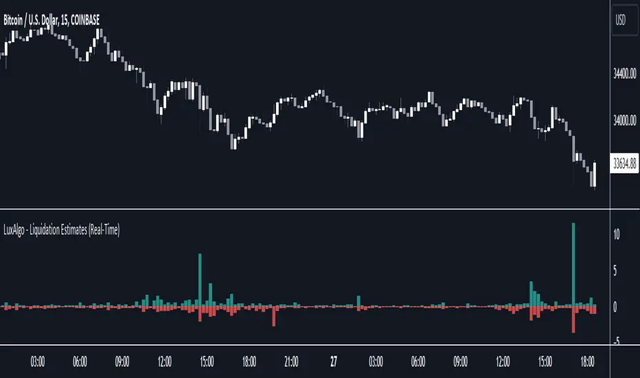
Liquidation Estimates (Real-Time) [LuxAlgo]The Liquidation Estimates (Real-Time) experimental indicator attempts to highlight real-time long and short liquidations on all timeframes. Here with liquidations, we refer to the process of forcibly closing a trader's position in the market.
By analyzing liquidation data, traders can gauge market sentiment, identify potential support and resistance levels, identify potential trend reversals, and make informed decisions about entry and exit points.
🔶 USAGE
Liquidation refers to the process of forcibly closing a trader's position. It occurs when a trader's margin account can no longer support their open positions due to significant losses or a lack of sufficient margin to meet the maintenance requirements.
Liquidations can be categorized as either a long liquidation or a short liquidation. A long liquidation is a situation where long positions are being liquidated, while short liquidation is a situation where short positions are being liquidated.
The green bars indicate long liquidations – meaning the number of long positions liquidated in the market. Typically, long liquidations occur when there is a sudden drop in the asset price that is being traded. This is because traders who were bullish on the asset and had opened long positions on the same will now face losses since the market has moved against them.
Similarly, the red bars indicate short liquidations – meaning the number of short positions liquidated in the futures market. Short liquidations occur when there is a sudden spike in the price of the asset that is being traded. This is because traders who were bearish on the asset and had opened short positions will now face losses since the market has moved against them.
Liquidation patterns or clusters of liquidations could indicate potential trend reversals.
🔹 Dominance
Liquidation dominance (Difference) displays the difference between long and short liquidations, aiming to help identify the dominant side.
🔹 Total Liquidations
Total liquidations display the sum of long and short liquidations.
🔹 Cumulative Liquidations
Cumulative liquidations are essentially the cumulative sum of the difference between short and long liquidations aiming to confirm the trend and the strength of the trend.
🔶 DETAILS
It's important to note that liquidation data is not provided on the Trading View's platform or can not be fetched from anywhere else.
Yet we know that the liquidation data is closely tied in with trading volumes in the market and the movement in the underlying asset’s price. As a result, this script analyzes available data sources extracts the required information, and presents an educated estimate of the liquidation data.
The data presented does not reflect the actual individual quantitative value of the liquidation data, traders and analysts shall look to the changes over time and the correlation between liquidation data and price movements.
The script's output with the default option values has been visually checked/compared with the liquidation chart presented on coinglass.com.
🔶 SETTINGS
🔹Liquidations Input
Mode: defines the presentation of the liquidations chart. Details are given in the tooltip of the option.
Longs Reference Price: defines the base price in calculating long liquidations.
Shorts Reference Price: defines the base price in calculating short liquidations.
🔶 RELATED SCRIPTS
Liquidation-Levels
Liquidity-Sentiment-Profile
Buyside-Sellside-Liquidity
Anchored Average Price by Atilla Yurtseven (AAP)Anchored Average Price indicator is designed to pinpoint a specific date and price in a given financial instrument's price chart. Once anchored to the desired date and price level, the script calculates and displays the average price from that anchor point to the current day.
Features
Customizable Source: Allows users to choose the source data for calculations. By default, it uses hlc3, which is the average of high, low, and close prices.
Start Date Input: The script includes a timestamp-based input that allows the user to specify the anchor date easily.
Customizable Color: Users can change the color of the plotted average line, adding an additional layer of customization to the visual representation.
Code Mechanics
Initialization: Declares the variables and arrays required for calculations and display. The array is used to store price data.
Condition Check: Only starts storing and calculating data if the chart's time is equal to or greater than the user-defined start date.
Data Storing: Once the condition is met, the script pushes the src price data into the array for future averaging.
Average Calculation: It calculates the average price of the values stored in the array.
Data Clearing: If the condition is not met, the array is cleared, and no average is plotted.
Plotting: The average price is plotted on the chart with the user-defined color.
By incorporating these features and mechanics, AAP provides traders and investors with a powerful tool for assessing average prices anchored to a specific date or swing.
Disclaimer:
This TradingView script is intended for educational and informational purposes only and should not be considered as investment or trading advice. Past performance is not indicative of future results. Trading and investing carry a high level of risk, and you should consult with a qualified financial advisor before making any financial decisions. The creator of this script, Atilla Yurtseven, is not responsible for any losses or damages incurred as a result of using this script.
Trade smart, stay safe
Atilla Yurtseven
VWAP (Any Anchor)Hello Traders,
Introduction:
The Volume Weighted Average Price (VWAP) is a powerful trading indicator used to gauge the average price at which an asset has traded, weighted by volume, over a specific period.
One of the key factors that can significantly impact the effectiveness of VWAP is the concept of "anchoring." In this TradingView indicator script description, we'll explore the concept of anchoring and how it's integrated into a customizable VWAP indicator.
Understanding Anchoring:
Anchoring in VWAP refers to selecting a specific point in time from which the VWAP calculation begins.
This "anchor point" serves as the starting reference for VWAP, and it can substantially impact the indicator's behavior and interpretation.
Anchoring allows traders to adapt VWAP to different trading strategies and scenarios.
Here are some common anchor points used in the script and their significance:
1. Time-Based Anchors: Traders often anchor VWAP to specific times of the trading day, such as the market open (e.g., 9:30 am EST) or close (e.g., 4:00 pm EST).
You could add in the script any time-based anchor you think is relevant for your trading.
2. Event-Based Anchors: Anchoring can also be based on specific market events.
For example, some traders anchor VWAP to events like "3 Consecutive Green Candles" or "Supertrend" direction changes.
Feel free to adapt the script here and add the relevant events-based anchor for your trading.
3. Multi-Timeframe Anchoring: Traders can anchor VWAP on different timeframes, allowing them to analyze price and volume interactions across various horizons.
This flexibility is especially valuable for swing traders adapting to longer-term trends.
Anchor Selection
Traders can choose from various anchor points, including time-based, event-based, and even an "External Connector" for flexibility in adapting VWAP to specific scenarios.
The External connector is the output from another script used in this VWAP script.
Your script may have a condition being “true” whenever a signal is printed - you can use this signal as the anchor for the VWAP.
Conclusion:
Understanding anchoring in VWAP is essential for traders using this indicator effectively.
Choosing and customizing anchor points empowers traders to adapt VWAP to their specific trading styles and strategies.
Whether focused on intraday precision or analyzing longer-term trends, a customizable VWAP indicator with flexible anchoring options can be valuable to your trading toolkit.
Tailor your VWAP to your unique needs and gain deeper insights into market trends and price action.
Made with love
Dave

Spot-Vol CorrelationSpot-Vol Correlation Script Guide
Purpose:
This TradingView script measures the correlation between percentage changes in the spot price (e.g., for SPY, an ETF that tracks the S&P 500 index) and the changes in volatility (e.g., as indicated by the VIX, the Volatility Index). Its primary objective is to discern whether the relationship between spot price and volatility behaves as expected ("normal" condition) or diverges from the expected pattern ("abnormal" condition).
Normal vs. Abnormal Correlation:
Normal Correlation: Historically, the VIX (or volatility) and the spot price of major indices like the S&P 500 have an inverse relationship. When the spot price of the index goes up, the VIX tends to go down, indicating lower volatility. Conversely, when the index drops, the VIX generally rises, signaling increased volatility.
Abnormal Correlation: There are instances when this inverse relationship doesn't hold, and both the spot price and the VIX move in the same direction. This is considered an "abnormal" condition and might indicate unusual market dynamics, potential uncertainty, or impending shifts in market sentiment.
Using the Script:
Inputs:
First Symbol: This is set by default to VIX, representing volatility. However, users can input any other volatility metric they prefer.
Second Symbol: This is set to SPY by default, representing the spot price of the S&P 500 index. Like the first symbol, users can substitute SPY with any other asset or index of their choice.
Length of Calculation Period: Users can define the lookback period for the correlation calculation. By default, it's set to 10 periods (e.g., days for a daily chart).
Upper & Lower Bounds of Normal Zone: These parameters define the range of correlation values that are considered "normal" or expected. By default, this is set between -0.60 and -1.00.
Visuals:
Correlation Line: The main line plot shows the correlation coefficient between the two input symbols. When this line is within the "normal zone", it indicates that the spot price and volatility are inversely correlated. If it's outside this zone, the correlation is considered "abnormal".
Green Color: Indicates a period when the spot price and VIX are behaving as traditionally expected (i.e., one rises while the other falls).
Red Color: Denotes a period when the spot price and VIX are both moving in the same direction, which is an abnormal condition.
Shaded Area (Normal Zone): The area between the user-defined upper and lower bounds is shaded in green, highlighting the range of "normal" correlation values.
Interpretation:
Monitor the color and position of the correlation line relative to the shaded area:
If the line is green and within the shaded area, the market dynamics are as traditionally expected.
If the line is red or outside the shaded area, users should exercise caution as this indicates a divergence from typical behavior, which can precede significant market moves or heightened uncertainty.

Intraday Volatility Bands [Honestcowboy]The Intraday Volatility Bands aims to provide a better alternative to ATR in the calculation of targets or reversal points.
How are they different from ATR based bands?
While ATR and other measures of volatility base their calculations on the previous bars on the chart (for example bars 1954 to 1968). The volatility used in these bands measure expected volatility during that time of the day.
Why would you take this approach?
Markets behave different during certain times of the day, also called sessions.
Here are a couple examples.
Asian Session (generally low volatility)
London Session (bigger volatility starts)
New York Session (overlap of New York with London creates huge volatility)
Generally when using bands or channel type indicators intraday they do not account for the upcoming sessions. On London open price will quickly spike through a bollinger band and it will take some time for the bands to adjust to new volatility.
This script will show expected volatility targets at the start of each new bar and will not adjust during the bar. It already knows what price is expected to do at this time of day.
Script also plots arrows when price breaches either the top or bottom of the bands. You can also set alerts for when this occurs. These are non repainting as the script knows the level at start of the bar and does not change.
🔷 CALCULATION
Think of this script like an ATR but instead it uses past days data instead of previous bars data. Charts below should visualise this more clearly:
The scripts measure of volatility is based on a simple high-low.
The script also counts the number of bars that exist in a day on your current timeframe chart. After knowing that number it creates the matrix used in it's calculations and data storage.
See how it works perfectly on a lower timeframe chart below:
Getting this right was the hardest part, check the coding if you are interested in this type of stuff. I commented every step in the coding process.
🔷 SETTINGS
Every setting of the script has a tooltip but I provided a breakdown here:
Some more examples of different charts:

Liquidity Sentiment Profile (Auto-Anchored) [LuxAlgo]
The Liquidity Sentiment Profile (Auto-Anchored) is an advanced charting tool that measures by combining PRICE and VOLUME data over specified anchored periods and highlights the distribution of the liquidity and the market sentiment at specific price levels. This version is a variation of the previously published Liquidity Sentiment Profile , wherewith this version allows users to select a variety of different anchoring periods, such as 'Auto', 'Fixed Range', 'Swing High', 'Swing Low', 'Session', 'Day', 'Week', 'Month', 'Quarter', and 'Year'
Liquidity refers to the availability of orders at specific price levels in the market, allowing transactions to occur smoothly.
🔶 USAGE
A Liquidity Sentiment Profile (Auto-Anchored) is a combination of liquidity and a sentiment profile, where the right side of the profile highlights the distribution of the traded activity at different price levels, and the left side of the profile highlights the market sentiment at those price levels
The liquidity profile is categorized by assigning different colors based on the significance of the traded activity of the specific price levels, allowing traders to reveal significant price levels, such as support and resistance levels, supply and demand zones, liquidity gaps, consolidation zones, etc
The Liquidity Sentiment Profiles aim to present Value Areas based on the significance of price levels, thus allowing users to identify value areas that can be formed more than once within the range of a single profile
Level of Significance Line - displays the changes in the price levels with the highest traded activity (developing POC)
Buyside & Sellside Liquidity Zones - displays Liquidity Levels, also known as Supply and Demand Zones
🔶 SETTINGS
The script takes into account user-defined parameters and plots the profiles, where detailed usage for each user-defined input parameter in indicator settings is provided with the related input's tooltip.
🔹 Liquidity Sentiment Profile
Anchor Period: The indicator resolution is set by the input of the Anchor Period.
Fixed Period: Applicable if the Anchor Period is set to 'Fixed Range' then the period of the profile is defined with this option
Swing Detection Length: Applicable if the Anchor Period is set to 'Swing High' or 'Swing Low' then the length required to detect the Swing Levels is defined with this option which is then used to determine the period of the profile
🔹 Liquidity Profile
Liquidity Profile: Toggles the visibility of the Liquidity Profiles
High Traded Nodes: Threshold and Color option for High Traded Nodes
Average Traded Nodes: Color option for Average Traded Nodes
Low Traded Nodes: Threshold and Color option for Low Traded Nodes
🔹 Sentiment Profile
Sentiment Profile: Toggles the visibility of the Sentiment Profiles
Bullish Nodes: Color option for Bullish Nodes
Bearish Nodes: Color option for Bearish Nodes
🔹 Buyside & Sellside Liquidity Zones
Buyside & Sellside Liquidity Zones: Toggles the visibility of the Liquidity Levels
Buyside Liquidity Nodes: Color option for Buyside Liquidity Nodes
Sellside Liquidity Nodes: Color option for Sellside Liquidity Nodes
🔹 Other Settings
Level of Significance: Toggles the visibility of the Level of Significance Line
Price Levels, Color: Toggles the visibility of the Profile Price Levels
Number of Rows: Specify how many rows each profile histogram will have. Caution, having it set to high values will quickly hit Pine Script™ drawing objects limit and fewer historical profiles will be displayed
Profile Width %: Alters the width of the rows in the histogram, relative to the profile length
Profile Range Background Fill: Toggles the visibility of the Profiles Range
🔶 RELATED SCRIPTS
Liquidity-Sentiment-Profile
Buyside-Sellside-Liquidity
ICT-Concepts

Liquidity Levels/Voids (VP) [LuxAlgo]The Liquidity Levels/Voids (VP) is a script designed to detect liquidity voids & levels by measuring traded volume at all price levels on the market between two swing points and highlighting the distribution of the liquidity voids & levels at specific price levels.
🔶 USAGE
Liquidity is a fundamental market force that shapes the trajectory of assets.
The creation of a liquidity level comes as a result of an initial imbalance of supply/demand, which forms what we know as a swing high or swing low. As more players take positions in the market, these are levels that market participants will use as a historical reference to place their stops. When the levels are then re-tested, a decision will be made. The binary outcome here can be a breakout of the level or a reversal back to the mean.
Liquidity voids are sudden price changes that occur in the market when the price jumps from one level to another with little trading activity (low volume), creating an imbalance in price. The price tends to fill or retest the liquidity voids area, and traders understand at which price level institutional players have been active.
Liquidity voids are a valuable concept in trading, as they provide insights about where many orders were injected, creating this inefficiency in the market. The price tends to restore the balance.
🔶 SETTINGS
The script takes into account user-defined parameters and detects the liquidity voids based on them, where detailed usage for each user-defined input parameter in indicator settings is provided with the related input's tooltip.
🔹 Liquidity Levels / Voids
Liquidity Levels/Voids: Color customization option for Unfilled Liquidity Levels/Voids.
Detection Length: Lookback period used for the calculation of Swing Levels.
Threshold %: Threshold used for the calculation of the Liquidity Levels & Voids.
Sensitivity: Adjusts the number of levels between two swing points, as a result, the height of a level is determined, and then based on the above-given threshold the level is checked if it matches the liquidity level/void conditions.
Filled Liquidity Levels/Voids: Toggles the visibility of the Filled Liquidity Levels/Voids and color customization option for Filled Liquidity Levels/Voids.
🔹 Other Features
Swing Highs/Lows: Toggles the visibility of the Swing Levels, where tooltips present statistical information, such as price, price change, and cumulative volume between the two swing levels detected based on the detection length specified above, Coloring options to customize swing low and swing high label colors, and Size option to adjust the size of the labels.
🔹 Display Options
Mode: Controls the lookback length of detection and visualization.
# Bars: Lookback length customization, in case Mode is set to Present.
🔶 RELATED SCRIPTS
Liquidity-Voids-FVG
Buyside-Sellside-Liquidity
Swing-Volume-Profiles

Filtered Volume Profile [ChartPrime]The "Filtered Volume Profile" is a powerful tool that offers insights into market activity. It's a technical analysis tool used to understand the behavior of financial markets. It uses a fixed range volume profile to provide a histogram representing how much volume occurred at distinct price levels.
Profile in action with various significant levels displayed
How to Use
The script is designed to analyze cumulative trading volumes in different price bins over a certain period, also known as `'lookback'`. This lookback period can be defined by the user and it represents the number of bars to look back for calculating levels of support and resistance.
The `'Smoothing'` input determines the degree to which the output is smoothed. Higher values lead to smoother results but may impede the responsiveness of the indicator to rapid changes in volatility.
The `'Peak Sensitivity'` input is used to adjust the sensitivity of the script's peak detection algorithm. Setting this to a lower value makes the algorithm more sensitive to local changes in trading volume and may result in "noisier" outputs.
The `'Peak Threshold'` input specifies the number of bins that the peak detection mechanism should account for. Larger numbers imply that more volume bins are taken into account, and the resultant peaks are based on wider intervals.
The `'Mean Score Length'` input is used for scaling the mean score range. This is particularly important in defining the length of lookback bars that will be used to calculate the average close price.
Sinc Filter
The application of the sinc-filter to the Filtered Volume Profile reduces the risk of viewing artefacts that may misrepresent the underlying market behavior. Sinc filtering is a high-quality and sharp filter that doesn't manifest any ringing effects, making it an optimal choice for such volume profiling.
Histogram
On the histogram, the volume profile is colored based on the balance of bullish to bearish volume. If a particular bar is more intense in color, it represents a larger than usual volume during a single price bar. This is a clear signal of a strong buying or selling pressure at a particular price level.
Threshold for Peaks
The `peak_thresh` input determines the number of bins the algorithm takes in account for the peak detection feature. The 'peak' represents the level where a significant amount of volume trading has occurred, and usually is of interest as an indicative of support or resistance level.
By increasing the `peak_thresh`, you're raising the bar for what the algorithm perceives as a peak. This could result in fewer, but more significant peaks being identified.
History of Volume Profiles and Evolution into Sinc Filtering
Volume profiling has a rich history in market analysis, dating back to the 1950s when Richard D. Wyckoff, a legendary trader, introduced the concept of volume studies. He understood the critical significance of volume and its relationship with market price movement. The core of Wyckoff's technical analysis suite was the relationship between prices and volume, often termed as "Effort vs Results".
Moving forward, in the early 1800s, the esteemed mathematician J. R. Carson made key improvements to the sinc function, which formed the basis for sinc filtering application in time series data. Following these contributions, trading studies continued to create and integrate more advanced statistical measures into market analysis.
This culminated in the 1980s with J. Peter Steidlmayer’s introduction of Market Profile. He suggested that markets were a function of continuous two-way auction processes thus introducing the concept of viewing markets in price/time continuum and price distribution forms. Steidlmayer's Market Profile was the first wide-scale operation of organized volume and price data.
However, despite the introduction of such features, challenges in the analysis persisted, especially due to noise that could misinform trading decisions. This gap has given rise to the need for smoothing functions to help eliminate the noise and better interpret the data. Among such techniques, the sinc filter has become widely recognized within the trading community.
The sinc filter, because of its properties of constructing a smooth passing through all data points precisely and its ability to eliminate high-frequency noise, has been considered a natural transition in the evolution of volume profile strategies. The superior ability of the sinc filter to reduce noise and shield against over-fitting makes it an ideal choice for smoothing purposes in trading scripts, particularly where volume profiling forms the crux of the market analysis strategy, such as in Filtered Volume Profile.
Moving ahead, the use of volume-based studies seems likely to remain a core part of technical analysis. As long as markets operate based on supply and demand principles, understanding volume will remain key to discerning the intent behind price movements. And with the incorporation of advanced methods like sinc filtering, the accuracy and insight provided by these methodologies will only improve.
Mean Score
The mean score in the Filtered Volume Profile script plays an important role in probabilistic inferences regarding future price direction. This score essentially characterizes the statistical likelihood of price trends based on historical data.
The mean score is calculated over a configurable `'Mean Score Length'`. This variable sets the window or the timeframe for calculation of the mean score of the closing prices.
Statistically, this score takes advantage of the concept of z-scores and probabilities associated with the t-distribution (a type of probability distribution that is symmetric and bell-shaped, just like the standard normal distribution, but has heavier tails).
The z-score represents how many standard deviations an element is from the mean. In this case, the "element" is the price level (Point of Control).
The mean score section of the script calculates standard errors for the root mean squared error (RMSE) and addresses the uncertainty in the prediction of the future value of a random variable.
The RMSE of a model prediction concerning observed values is used to measure the differences between values predicted by a model and the values observed.
The lower the RMSE, the better the model is able to predict. A zero RMSE means a perfect fit to the data. In essence, it's a measure of how concentrated the data is around the line of best fit.
Through the mean score, the script effectively predicts the likelihood of the future close price being above or below our identified price level.
Summary
Filtered Volume Profile is a comprehensive trading view indicator which utilizes volume profiling, peak detection, mean score computations, and sinc-filter smoothing, altogether providing the finer details of market behavior.
It offers a customizable look back period, smoothing options, and peak sensitivity setting along with a uniquely set peak threshold. The application of the Sinc Filter ensures a high level of accuracy and noise reduction in volume profiling, making this script a reliable tool for gaining market insights.
Furthermore, the use of mean score calculations provides probabilistic insights into price movements, thus providing traders with a statistically sound foundation for their trading decisions. As trading markets advance, the use of such methodologies plays a pivotal role in formulating effective trading strategies and the Filtered Volume Profile is a successful embodiment of such advancements in the field of market analysis.
Volume Delta Methods (Chart) [LuxAlgo]The Volume Delta Methods (Chart) aims at highlighting the relationship between Buying or Selling Pressure and Price by presenting Volume Delta , and multiple derivatives of volume delta such as Cumulative Volume Delta (CVD) , Buy/Sell Volume , Total Volume , etc on top of the Main Price Chart .
The script uses two different intrabar (chart bars at a lower timeframe than the chart's) analyses to achieve the most approximate calculation of the volume delta and offers fully customizable visualization features using various types of charts such as line, area, baseline, candles, and histograms.
The script allows traders to see "within" the price bar, provides more transparency over a traditional volume histogram, and also allows users to monitor price and volume activity together.
🔶 USAGE
Volume delta is the difference between the buying volume and the selling volume, in other words, it is the net demand at a given bar allowing traders a more detailed insight when analyzing the market sentiment. A volume delta greater than 0 indicates more buying than selling pressure, whereas a volume delta less than 0 indicates more selling than buying pressure.
Volume delta plus total volume (regular volume) adds additional insight, where the total volume represents all the recorded trades for security that occurs in a given time interval. It is a measurement of the participation, enthusiasm, and interest in a given security.
Divergences occur when the polarity of the volume delta does not match the polarity of the price bar.
The users can enable the display of the numerical values of the volume delta.
Cumulative Volume Delta (CVD) is a way of using Volume Delta to measure an asset’s mid-to-long-term buy and sell pressure. It compares buying and selling volume over time and offers insights into market behavior at specific price points. Cumulative Volume Delta is effectively a continuation of the principles of Volume Delta but involves longer time periods and offers different trading signals.
Like the Volume Delta, the Cumulative Volume Delta (CVD) indicator measures the relationship between buy and sell pressure but does not focus on one specific candle in particular. Rather, the Cumulative Volume Delta takes the relative differences and combines them all over an extended time period.
Users have the ability Cumulative Volume Delta in various types of charts along with an optional smoothing line.
Placed above price bars options.
Interacting with price bar options helps to better identify CVD Divergences.
CVD Divergences
CVD reveals buying and selling trends that may or may not complement the price trend of the asset itself. Sometimes, price trends can run in contrast to trading behavior — sell volume can be dominant while the spot price is rising, and vice versa.
🔶 DETAILS
Theoretically, volume delta is calculated by taking the difference between the volume that traded at the ask price and the volume that traded at the bid price. The most precise calculation method uses tick data but requires huge amounts of data on historical bars, which usually limits the historical depth of charts. This indicator uses two different intrabar analysis methods for the volume delta calculation, where intrabars are chart bars at a lower timeframe than the chart's timeframe:
The logic used to assign intrabar volume to the "up" or "down".
- Buying/Selling pressure of the intrabar option (default)
(close - low) > (high - close) => UP
(close - low) < (high - close) => DOWN
(close - low) = (high - close) => close - previous close is used
- Polarity of the intrabar option
close > open => UP
close < open => DOWN
close = open => close - previous close is used
🔶 SETTINGS
The script takes into account user-defined parameters and performs calculations and presentations based on them, where detailed usage for each user-defined input parameter in indicator settings is provided with the related input's tooltip.
🔹 Calculation Settings
Calculation Method: Calculation method selection, available options 'Intrabar Buying/Selling Pressure' or 'Intrabar Polarity'.
Lower Timeframe Precision: Sets indicator precision, default option is 'Auto'.
🔹 Presentation Settings
Volume Delta: Toggles the visibility of the Volume Delta
Cumulative Volume Delta: Toggles the visibility of the Cumulative Volume Delta
Volume Delta/Price Bar Divergences: Toggles the visibility of the Volume Delta Divergences
Volume Delta Numerical Values: Toggles the visibility of the Volume Delta Numerical Values
🔹 Other Features
Volume MA: Toggles the visibility of the Volume Moving Average
CVD Smoothing: Toggles the visibility of the Cumulative Volume Delta's Smoothing Line
🔹 Volume Delta, Others
Volume Delta: Positive, Negative: Volume Delta color customization options
Volume Histogram: Growing, Falling: Volume Histogram color customization options
Display Length: Length of the visual objects presented with this indicator
Volume Delta Height: Volume delta height customization options
Volume Histogram Height: Volume histogram height customization options
Vertical Offset: Volume delta and histogram vertical positioning customization options
🔹 Cumulative Volume Delta, Others
CVD Line, Width, and Color: Cumulative Volume Delta - Line Width and Color customization options
CVD Area/Baseline, Gradient Coloring: Cumulative Volume Delta - Area and Baseline background gradient coloring customization options
CVD Candles Color, Positive, and Negative: Cumulative Volume Delta - Candles coloring customization options
CVD/Smoothing Background: Highlights and adjusts the transparency of the area between the Cumulative Volume Delta Line and it's Smoothing Line
🔶 RELATED SCRIPTS
Liquidity-Sentiment-Profile
EquiVolume
Volume-Footprint
REVE Cohorts - Range Extension Volume Expansion CohortsREVE Cohorts stands for Range Extensions Volume Expansions Cohorts.
Volume is divided in four cohorts, these are depicted in the middle band with colors and histogram spikes.
0-80 percent i.e. low volumes; these get a green color and a narrow histogram bar
80-120 percent, normal volumes, these get a blue color and a narrow histogram bar
120-200 percent, high volume, these get an orange color and a wide histogram bar
200 and more percent is extreme volume, maroon color and wide bar.
All histogram bars have the same length. They point to the exact candle where the volume occurs.
Range is divided in two cohorts, these are depicted as candles above and below the middle band.
0-120 percent: small and normal range, depicted as single size, square candles
120 percent and more, wide range depicted as double size, rectangular candles.
The range candles are placed and colored according to the Advanced Price Algorithm (published script). If the trend is up, the candles are in the uptrend area, which is above the volume band, , downtrend candles below in the downtrend area. Dark blue candles depict a price movement which confirms the uptrend, these are of course in the uptrend area. In this area are also light red candles with a blue border, these depict a faltering price movement countering the uptrend. In the downtrend area, which is below the volume band, are red candles which depict a price movement confirming the downtrend and light blue candles with a red border depicting price movement countering the downtrend. A trend in the Advanced Price Algorithm is in equal to the direction of a simple moving average with the same lookback. The indicator has the same lagging.as this SMA.
Signals are placed in the vacated spaces, e.g. during an uptrend the downtrend area is vacated.
There are six signals, which arise as follows:
1 Two blue triangles up on top of each other: high or extreme volume in combination with wide range confirming uptrend. This indicates strong and effective up pressure in uptrend
2 Two pink tringles down on top of each other: high or extreme volume in combination with wide range down confirming downtrend. This indicates strong and effective down pressure in downtrend
3 Blue square above pink down triangle down: extreme volume in combination with wide range countering uptrend. This indicates a change of heart, down trend is imminent, e.g. during a reversal pattern. Down Pressure in uptrend
4 Pink square below blue triangle up: extreme volume in combination with wide range countering downtrend. This indicates a change of heart, reversal to uptrend is imminent. Up Pressure in downtrend
5 single blue square: a. extreme volume in combination with small range confirming uptrend, b. extreme volume in combination with small range countering downtrend, c. high volume in combination with wide range countering uptrend. This indicates halting upward price movement, occurs often at tops or during distribution periods. Unresolved pressure in uptrend
6 Single pink square: a extreme volume in combination with small range confirming downtrend, b extreme volume in combination with small range countering uptrend, c high volume in combination with wide range countering downtrend. This indicated halting downward price movement. Occurs often at bottoms or during accumulation periods. Unresolved pressure in downtrend.
The signals 5 and 6 are introduced to prevent flipping of signals into their opposite when the lookback is changed. Now signals may only change from unresolved in directional or vice versa. Signals 3 and 4 were introduced to make sure that all occurrences of extreme volume will result in a signal. Occurrences of wide volume only partly lead to a signal.
Use of REVE Cohorts.
This is the indicator for volume-range analyses that I always wanted to have. Now that I managed to create it, I put it in all my charts, it is often the first part I look at, In my momentum investment system I use it primarily in the layout for following open positions. It helps me a lot to decide whether to close or hold a position. The advantage over my previous attempts to create a REVE indicator (published scripts), is that this version is concise because it reports and classifies all possible volumes and ranges, you see periods of drying out of volume, sequences of falter candles, occurrences of high morning volume, warning and confirming signals.. The assessment by script whether some volume should be considered low, normal, high or extreme gives an edge over using the standard volume bars.
Settings of REVE Cohorts
The default setting for lookback is ‘script sets lookback’ I put this in my indicators because I want them harmonized, the script sets lookback according to timeframe. The tooltip informs which lookback will be set at which timeframe, you can enable a feedback label to show the current lookback. If you switch ‘script sets lookback’ off, you can set your own preferred user lookback. The script self-adapts its settings in such a way that it will show up from the very first bar of historical chart data, it adds volume starting at the fourth bar.
You can switch off volume cohorts, only range candles will show while the middle band disappears. Signals will remain if volume is present in the data. Some Instruments have no volume data, e.g. SPX-S&P 500 Index,, then only range candles will be shown.
Colors can be adapted in the inputs. Because the script calculates matching colors with more transparency it is advised to use 100 percent opacity in these settings.
Take care, Eykpunter
