BTC vs US2000 – Correlation (BarDai)📉 Bottom Panel — BTC vs US2000 Correlation
This panel measures how synchronized BTC and US2000 are moving right now.
Correlation range: +1.00 … -1.00
Correlation Value Meaning Market Behavior
+0.5 to +1.0 Strong Positive Correlation BTC and US2000 move together (same direction)
0.0 to +0.5 Weak/Neutral Positive Similar direction but unstable
0.0 to -0.5 Weak Negative Early decoupling — BTC may lead
-0.5 to -1.0 Strong Negative Correlation BTC and US2000 move opposite ways — risk divergence
🧠 Why this is important?
Correlation shows whether the ratio movement is reliable.
✔ Valid Risk Signal
If:
Ratio = Risk-ON
AND Correlation is positive
→ BTC rising with equities → strong confirmation
→ You can trust the Risk-ON regime
⚠️ Risk Divergence (Decoupling)
If:
Ratio = Risk-ON
BUT Correlation drops into negative
→ BTC is pumping alone, not backed by global risk
→ Breakout is weaker / can fail
This often happens before trend reversals.
🟡 Yellow “Decoupling Dots”
These appear when correlation is low but volatility is high.
They indicate:
Market tension
Possible rotation of capital
Early warning of shift
➡ Good for catching reversals early, but never alone — must confirm with the Ratio crossover.
🔍 Practical Usage Summary
What you see Interpretation Strategy
Ratio above EMA + Correlation > 0 Global Risk-ON Favor BTC longs
Ratio below EMA + Correlation > 0 Global Risk-OFF Protective mode
Ratio > EMA but Correlation < 0 Fake Risk-ON Reduce risk, wait
Strong negative correlation Markets diverging Look for reversal signals
🎯 Main Message
Correlation tells you how trustworthy the risk regime is.
The ratio tells who leads
The correlation tells whether the move is real
Together → a powerful institutional macro signal 🔥
스크립트에서 "BTC"에 대해 찾기

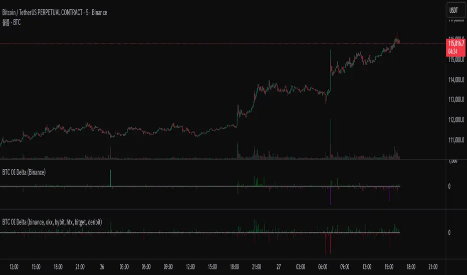
BTC OI Delta (binance, okx, bybit, htx, bitget, deribit)📊 BTC Open Interest (OI) Delta (Binance, OKX, Bybit, HTX, Bitget, Deribit)
📝 Overview
This Pine Script indicator tracks and visualizes the changes (delta) in Bitcoin (BTC) open interest (OI) for perpetual futures across multiple major crypto exchanges: Binance, OKX, Bybit, Bitget, HTX, and Deribit. It calculates the total net delta by summing the OI delta from each exchange and displays positive (OI increase) and negative (OI decrease) deltas as separate column charts. Users can choose which exchanges to include or exclude and utilize the spike highlight feature to differentiate delta intensity with color based on user-defined thresholds.
⚡ Key Features
🌐 Multi-exchange OI delta tracking
Fetches and calculates BTC perpetual futures OI delta individually from Binance, OKX, Bybit, Bitget, HTX, and Deribit.
📈 Total net delta calculation
Sums the OI delta from all selected exchanges to represent overall market open interest changes.
🎨 Visualization
Column plots: Displays net OI increases (positive delta) and decreases (negative delta) as separate column charts for intuitive trend analysis.
Spike highlights: Changes in OI delta are color-coded according to user-defined thresholds to make significant moves easily identifiable.
⚙️ User settings
Users can select which exchanges to display, enable/disable spike highlights, and set thresholds for “strong” and “very strong” OI delta changes.
🛠 Input Settings
Show Zero Line (bool, default: true): Show a zero baseline on the chart.
Highlight Spikes (bool, default: true): Enable color highlighting based on OI delta intensity.
Strong Threshold (int, default: 1000): Delta value considered a “strong” change (in BTC).
Very Strong Threshold (int, default: 2000): Delta value considered a “very strong” change (in BTC).
Show Binance (bool, default: true): Include Binance OI delta.
Show OKX (bool, default: true): Include OKX OI delta.
Show Bybit (bool, default: true): Include Bybit OI delta.
Show Bitget (bool, default: true): Include Bitget OI delta.
Show HTX (bool, default: true): Include HTX OI delta.
Show Deribit (bool, default: true): Include Deribit OI delta.
🔢 Calculation Method
🧮 Individual OI request
Uses request.security() to fetch OI data from each exchange.
➕ Delta calculation
Current bar OI minus previous bar OI (oi - oi ).
❌ Handling na values
If OI data is missing (exchange disabled or no data), the delta is treated as 0 to avoid sum errors.
🔗 Total net delta
Sums all selected exchange deltas as totalCombinedDelta.
↔️ Separate net increase/decrease
Positive (netIncreaseCombined) and negative (netDecreaseCombined) parts of total delta are split.
🎨 Color determination
getNetDeltaHighlightedColor function dynamically sets column colors based on highlightSpike and threshold settings.
🎨 Color Scheme
Highlight disabled:
Positive delta: teal shades
Negative delta: red shades
Highlight enabled:
Positive delta (normal): dark teal (#026628)
Positive delta (strong): bright teal (#00ff95)
Positive delta (very strong): yellow (#eeff00)
Negative delta (normal): dark red (#6b0d0d)
Negative delta (strong): bright red (#ff1044)
Negative delta (very strong): pink (#ff00ea)
📊 Usage
💹 Market sentiment analysis
Total net OI delta increase → capital inflow and position building
Total net OI delta decrease → capital outflow and position liquidation
⚖️ Position interpretation
BTC rising + positive OI delta → increasing long positions
BTC falling + negative OI delta → decreasing long positions
BTC falling + positive OI delta → increasing short positions
BTC rising + negative OI delta → decreasing short positions
📈 Trend confirmation
Sustained positive delta → bullish signal
Sustained negative delta → bearish signal
🌪 Volatility prediction
“Strong” or “very strong” spikes may indicate increased price volatility.
🏦 Exchange-specific impact
Enable/disable exchanges to analyze how each exchange’s OI changes affect the overall market.
BTC Parabolic Trend Lines v6 (jerikoo)📈 BTC Parabolic Trend Lines v6 - Power Law Regression Indicator
Description:
Advanced regression analysis tool that fits parabolic curves to Bitcoin's price history, revealing long-term growth patterns and future projections based on mathematical power laws.
This indicator implements three types of regression models optimized for Bitcoin's unique price behavior:
🎯 Key Features:
1. Power Law Regression (Recommended for BTC)
Fits the famous Bitcoin Power Law: Price = Offset + A × time^B
Captures BTC's diminishing growth rate over time
Provides the most accurate long-term fit with R² typically > 0.94
2. Multiple Regression Types
Power Law: Best for long-term BTC analysis
Exponential: For shorter timeframes and aggressive growth phases
Polynomial: Quadratic/cubic curves for alternative modeling
3. Dynamic Channel Bands
Upper band (red): Overvalued zone - potential resistance
Lower band (green): Undervalued zone - potential support
Adjustable deviation multipliers based on historical volatility
4. Starting Price Offset
Accounts for Bitcoin's non-zero starting price (~$5-10)
Provides more realistic lower bounds
Improves fit accuracy for early price data
📊 How to Use:
Settings:
Regression Length: 400 bars recommended for best fit
Starting Price Offset: 5-10 for BTC (it didn't start at $0)
Channel Deviation: 1.5 standard deviations default
Future Projection: Extends regression into future (100 bars default)
Interpretation:
Yellow line: Fair value according to the regression model
Above red band: Potentially overvalued (historical tops often here)
Below green band: Potentially undervalued (historical bottoms often here)
R² Value: Closer to 1 = better fit (>0.9 is excellent)
🔄 Timeframe Adaptability:
Automatically recalculates when switching timeframes
Each timeframe shows its own optimized regression
Works on all timeframes from daily to monthly
📈 Trading Applications:
Long-term Investment: Identify accumulation zones when price is below fair value
Cycle Analysis: Spot potential tops when price exceeds upper band
Risk Management: Use bands as dynamic support/resistance levels
Portfolio Allocation: Increase/decrease position based on valuation zones
⚙️ Technical Details:
Uses logarithmic price transformation for better BTC fitting
Implements least squares regression for coefficient calculation
RMSE-based channel bands adapt to volatility
Smooth polyline rendering for visual clarity
📝 Notes:
Best suited for BTC due to its unique power law characteristics
Longer regression periods (300-500 bars) provide more stable trends
The projection assumes historical patterns continue (not financial advice)
Works best on logarithmic price scale for visualization
🎨 Visual Indicators:
Background coloring: Red (overvalued) / Green (undervalued)
Statistics label: Shows R², equation, and current valuation
Smooth curves: No gaps or jumps at current date
Future projection: Seamlessly extends from current price
⚠️ Important:
This is a statistical analysis tool, not a prediction system. Bitcoin's price can deviate significantly from the regression line during bull/bear cycles. The power law provides a long-term growth framework, not short-term trading signals.
Version: 6.0 Author: Created with Pine Script v6 Best For: BTC long-term analysis, cycle identification, valuation assessment Timeframes: All (Daily to Monthly recommended) Markets: Optimized for Bitcoin, may work on other crypto with adjustments

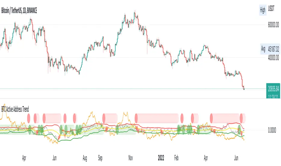
BTC Active Address Trend (On-chain)This indicator compares the % change in BTC price and the % change in BTC’s active addresses (BTC’s utility value).
1. % changes in BTC price & active addresses
- Orange line: BTC’s price change (%)
- Gray line: BTC’s active address change (%)
- Red/Yellow/Green lines: Bollinger bands for change in active address
2. Trend:
- Green circles: Bullish Sentiment Trend
Market sentiment is bullish and BTC price outgrows the increase in its utility value (overpricing)
- Red circles: Bearish Sentiment Trend
Market sentiment is bearish and BTC price drops more than the decrease in its utility value (underpricing)
3. Potential Re-Entries:
- Green/Red triangles: potential bullish/bearish entries
When % change of BTC price gets similar to that of active addresses
*Not financial advice.
BTC/Gold Power-Law Bands + Quantile OscillatorDescription
This indicator visualizes a set of statistically derived Power-Law bands for the BTC/Gold ratio.
The model is based on a log–log regression of the BTC/Gold ratio over time and a weighted quantile regression that captures the distributional structure of the ratio across several long-term quantiles.
It provides a historical context for where the ratio currently lies relative to these mathematically estimated zones.
This indicator does not perform any new model fitting; it only displays the pre-computed band structure derived from the full historical dataset.
How the model works
This indicator is based on a statistical Power-Law model of the BTC/Gold ratio.
A long-term trend was estimated using a log–log OLS regression, and the deviations from this trend were analyzed through a rolling multi-year volatility measure.
The inverse of this volatility served as the weight for several quantile regression fits, producing robust long-term bands at multiple distribution levels (0.1%, 12.5%, 50%, 80%, 95%, 99.5%).
These quantile curves represent the historical valuation zones of the BTC/Gold ratio.
All final regression coefficients are fixed and embedded into the Pine script, which reconstructs the bands directly on the chart.
The extension of the bands into the future is based solely on the mathematical form of each curve and does not use any future market data.
What the indicator displays
• Six Power-Law quantile bands (0.1%, 12.5%, 50%, 80%, 95%, 99.5%) displayed as stacked colored zones
• BTC/Gold Ratio line
• Future-offset projection curves (mathematical extrapolation of the fitted Power-Laws, not based on future prices)
• Quantile Oscillator: A normalized representation of where the current ratio lies relative to the quantile structure.
How to use it
This indicator is not a timing tool.
It provides a structural, long-term statistical context for the BTC/Gold ratio, showing:
• how extreme a current valuation is relative to long-term history
• where the ratio sits within the Power-Law quantile spectrum
• long-term distribution zones derived from the quantile regressions
• a volatility-weighted representation of historical deviations
It may be useful for long-term cycle studies or ratio-based valuation comparisons, but there is no guarantee that this historical relationship will persist.
Important notes
• This indicator does not repaint.
• All projections are non-predictive mathematical extrapolations.
• This script is designed only for the symbol: BTCUSD/TVC:GOLD (BTC/Gold Ratio)
• It does not provide trading signals, recommendations, or financial advice.
Why closed-source?
The underlying regression model, weighting logic, and quantile estimations were produced externally using Python and constitute the core intellectual component of the study. The Pine version contains only the pre-calculated parameters and the visualization logic.

BTC Confluence Score + Confirmed Signals (12m/1h)This script combines 7 different signals across multiple timeframes (12 min + 1 hour + BTC dominance), then only gives you a BUY or SELL when everything aligns.
It’s designed to filter out fake-outs and help you catch momentum reversals that stick.
WHAT IT’S DOING UNDER THE HOOD
Timeframes
12 min (fast) → short-term trigger (RSI, Stoch RSI, volatility)
1 hour (slow) → trend confirmation (EMA structure, RSI, MACD)
BTC Dominance (1 h) → strength/flow confirmation (is capital rotating into BTC or alts?)
This gives you a multi-timeframe confluence, which is what professional traders look for before entering a trade.
2. The 7 “Score” Ingredients
Each bar gets a “score” from –7 (super bearish) to +7 (super bullish) based on:
# Condition Bullish signal (+1) Bearish signal (–1)
1 RSI (12m) RSI > 50 RSI < 50
2 RSI (1h) RSI > 50 RSI < 50
3 MACD Histogram > 0 Histogram < 0
4 BTC Dominance level > 59.8 % < 59.8 %
5 BTC Dominance trend 3 EMA > 8 EMA 3 EMA < 8 EMA
6 1h EMAs trend 50 EMA > 200 EMA and price > 50 EMA 50 EMA < 200 EMA and price < 50 EMA
7 Volatility (ATR) Current ATR > average (momentum increasing) —
The Confluence Score bar at the bottom shows this numerically:
💚 +5 to +7 → Strong bullish conditions
❤️ –5 to –7 → Strong bearish conditions
🩶 Between –2 and +2 → Choppy / neutral
3️⃣ Confirmed Entry Logic (the clear triangles you see now)
You’ll now see only two real actionable markers:
✅ BUY (Green Triangle Up)
Triggered when:
Stoch RSI crosses upward on 12 min
RSI > 50 (momentum confirmation)
MACD histogram > 0 (trend shift)
Confluence score ≥ 4 (default threshold)
This means momentum + trend + structure + volume all agree on an upward move.
→ Ideal for going long or closing shorts.
🚨 SELL (Red Triangle Down)
Triggered when:
Stoch RSI crosses downward
RSI < 50
MACD histogram < 0
Confluence score ≥ 4 bearish
That’s your exit / short confirmation.
4️⃣ Color Bars (Score Strength)
At the bottom of the chart:
💚 Green Bars = full bullish confluence (+5 or more)
💛 Lime/Orange Bars = moderate bullish or early reversal
❤️ Red Bars = strong bearish confluence (–5 or less)
🩶 Gray Bars = chop/no edge
If you prefer visual simplicity, just use:
BUY = Green Triangle appears on green bars
SELL = Red Triangle appears on red bars
That’s your “double confirmation.”
🎯 HOW TO TRADE IT
⏱ Timeframes
Use 12 min for entries (fast scalps or 1–2 hr setups).
Confirm direction with the 1 hour timeframe — only trade in that direction.
💰 Entry Playbook
Signal What to Do
✅ Green Triangle appears Enter long or scale in. Set stop below recent swing low.
🚨 Red Triangle appears Exit long / enter short / scale out.
Bars gray or alternating Stay out — market is undecided.
🧮 Min Score Setting
Default = 4 (balanced).
Raise to 5 for cleaner, fewer signals.
Lower to 3 for more aggressive, frequent trades.
📲 Alerts
You can now create TradingView alerts using:
BUY Confirmed
SELL Confirmed
Set alert type:
“Once per bar close” — so you only get notified after confirmation, not mid-bar noise.
Y ou now have your own BTC AI Confluence System:
Filters all noise from RSI, MACD, EMAs, volatility, and BTC dominance
Waits for perfect alignment across multiple timeframes
Gives you one simple green (BUY) or red (SELL) signal
Lets you scalp 1–2 % moves safely or swing trade confirmations

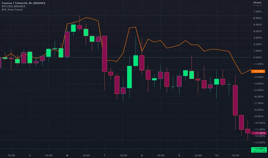
BTC Price TrendThe crypto market is reacting very quickly based on BTC price, thus monitoring the BTC price is very helpful.
This script will color the candles based on the BTC price trend. Set the timeframe and down/up percentage to monitor the BTC price trend, and the script should not repaint.
The indicator will monitor the BTC price in a high frame, for example, for 4 hours, if the price goes down the set percentage during one candle, will change the candle color. Thereafter, if the price goes up within a small timeframe (as you set) then the candle color will be changed.
So, in case the bar color is red, then it is recommended to avoid trading since the BTC price is down trending.
The indicator is requesting the BTC price as of now, and the previous closed price, then it will calculate the price difference, if it result is minus, then the price is in a downtrend, else it is in an uptrend.
BTC Active Address Momentum (On-chain)This indicator shows the difference between the % change in BTC price and the % change in BTC’s active addresses (BTC’s utility value).
- Dark red: Extreme overbought conditions
BTC price is increasing too fast and outgrows the increase in its utility value
(RSI of % change difference > 70)
- Light red: Overbought conditions
BTC price is increasing too fast and outgrows the increase in its utility value
(RSI of % change difference > 60)
- Dark green: Extreme oversold conditions
BTC price is dropping too fast and outruns the decrease in its utility value
(RSI of % change difference < 30)
- Light green: Oversold conditions
BTC price is dropping too fast and outruns the decrease in its utility value
(RSI of % change difference < 40)
*Not financial advice.

BTC(Sats Stacking) - CDC Action zone filterType: Indicator (Pine v6) • Category: Strategy Tools / DCA • Overlay: Yes
Overview
This indicator simulates fixed-amount Bitcoin DCA (dollar-cost averaging) and lets you apply a CDC Action Zone filter to only buy in specific market conditions. It plots EMA(12/26) lines with a shaded zone (green when fast > slow, red when slow > fast), shows buy markers on the chart when a DCA event actually executes, and displays a concise performance table.
The simulation tracks real invested capital (sum of your buys), not hypothetical equity injections, and reports PnL vs invested capital.
Key features
DCA frequency: Everyday, Every week, or Every month
CDC filter: Buy on all days, only when CDC is Green (trend-up above fast EMA), or only when Red (trend-down below fast EMA)
Execution price: Choose to buy at bar close or next bar open
Capital controls: Fixed DCA amount per event, optional max budget cap
Currency support: Portfolio currency label plus optional FX conversion (by symbol or manual rate)
Chart visuals: Buy markers on candles; EMA(12/26) lines with shaded “action zone”
Metrics table: Invested capital, buys executed, BTC accumulated, average price per BTC (quote), equity (portfolio), PnL% vs invested, and CAGR
How it works
CDC state:
Green = EMA(fast) > EMA(slow) and price ≥ EMA(fast)
Red = EMA(fast) < EMA(slow) and price < EMA(fast)
DCA trigger: Fires on new day/week/month boundaries (timeframe-agnostic).
Buy execution: When a DCA event occurs and passes the CDC filter and budget check, the script spends the fixed amount and adds the corresponding BTC at the chosen execution price.
Inputs (highlights)
Simulation
Symbol (blank = current chart), Buy at close/open, DCA amount, Max total invested
DCA Schedule
Everyday / Every week / Every month
CDC Action Zone
Filter mode (All / Green only / Red only), Price source, Fast/Slow EMA lengths (defaults 12/26)
Currency / Conversion
Portfolio currency label, Convert on/off, By symbol (e.g., OANDA:USDTHB) or Manual rate
Backtest Range
Optional start/end dates
Style
Show EMA lines and zone, colors and opacities, buy marker size and color
Display
Show qty/price labels on buys, show metrics table, number formatting
Metrics
Invested capital: Sum of all DCA spends in your portfolio currency
Equity (portfolio): BTC holdings marked to market and converted back if FX is enabled
PnL % vs invested: (Equity / Invested - 1) × 100
CAGR: Based on elapsed time from first in-range bar to the latest bar
Average price per BTC (quote): Spend in quote currency divided by BTC accumulated
Notes
This is an indicator, not a broker-connected strategy. It simulates buys and displays results without placing orders.
For more realistic fills, use Buy at next bar open.
If your portfolio currency differs from the symbol’s quote currency, enable Convert and supply a conversion symbol or manual rate.
EMA shading is purely visual; the filter logic uses the same EMA definitions.
Attribution & License
Inspired by the DCA idea and community simulations; CDC filtering implemented with standard EMA(12/26) logic.
License: MPL-2.0 (see code header).
Author: MiSuNoJo
Disclaimer
This tool is for research and education only and is not financial advice. Past performance does not guarantee future results. Use at your own risk.

BTC Fractal Momentum ExtremesDescription – BTC Fractal Momentum Extremes (BTCFME)
BTC Fractal Momentum Extremes (BTCFME) is a multi-factor, multi-method technical indicator designed to detect potential top and bottom reversal points in Bitcoin price action by integrating a confluence of unconventional signals. It combines fractals, adaptive momentum, volume dynamics, price velocity convergence, and market structure shifts — all filtered through real-time volatility and contextualized by temporal market conditions.
This tool is best used by traders looking to spot high-confidence turning points on intraday or swing timeframes, and works particularly well in volatile, momentum-driven environments.
Key Components & Methodology
BTCFME utilizes five independent signal-generation methods:
1. Fractal Volume Divergence
Detects reversal fractals in price (5-bar patterns) and validates them with volume anomalies:
Volume spikes (e.g., climax moves) or
Volume exhaustion (e.g., waning participation)
2. Adaptive Momentum Oscillator
Calculates momentum normalized by ATR-adjusted volatility, filtering out noise in choppy markets. It spots directional shifts when momentum inflects from extreme levels.
3. Market Structure Breaks
Identifies dynamic support and resistance using a configurable lookback, and flags potential breakouts or breakdowns from those levels.
4. Price Velocity Convergence
Analyzes the rate of change (velocity) and its acceleration. When both compress within a narrow volatility range, it signals a potential inflection zone.
5. Temporal Confluence Filter
Signals are only considered valid during active market hours (9 AM – 4 PM, excluding weekends) to reduce false positives during illiquid or inefficient trading periods.
Signal Logic & Sensitivity
Signals are generated when at least 3 out of 4 core methods agree, controlled by the Signal Sensitivity setting:
1 (High Sensitivity) = Trigger signals with fewer confirmations
5 (Low Sensitivity) = Require stronger multi-factor confluence
🔹 Buy (Bottom) Signals trigger when:
Bullish fractals appear
Momentum is deeply negative but improving
Price tests structure support
Velocity compresses below average
🔺 Sell (Top) Signals trigger when:
Bearish fractals with volume spikes appear
Momentum peaks and starts to decline
Price tests resistance
Velocity compresses near highs
Visual Features
Arrows: Buy signals = green arrow below candle. Sell signals = red arrow above candle.
Background Color: Indicates overall momentum regime (green = bullish bias, red = bearish, gray = neutral).
Dynamic Support & Resistance Lines: Based on recent swing highs/lows.
Signal Table (top-right): Shows real-time stats on:
Momentum value
Volatility factor
Volume strength (vs. 20-SMA)
Market structure status
Alerts
You can set alerts using the built-in conditions:
BTC Bottom Alert → Fires on potential market bottoms.
BTC Top Alert → Fires on potential market tops.
These alerts are filtered to avoid whipsaw conditions, by checking that opposite signals did not trigger in the last 2 candles.
How to Use
Timeframes: Best suited for 1H–4H and Daily BTC charts, but adaptable to others with parameter tuning.
Confirm with Price Action: Use BTCFME signals in conjunction with candlestick patterns or S/R zones for best results.
Adjust Sensitivity: Lower values catch more signals (good for scalping), higher values filter for stronger reversals (ideal for swing trades).
Use in Trending or Reversing Markets: BTCFME performs best during trending environments or volatile reversals — avoid during prolonged flat/ranging zones.
Notes & Recommendations
BTCFME is not a standalone buy/sell signal; combine it with risk management and trend confirmation tools.
Avoid using it during extremely low-volume sessions (e.g., late weekends).
Adjust parameters based on BTC's evolving volatility and your trading style.

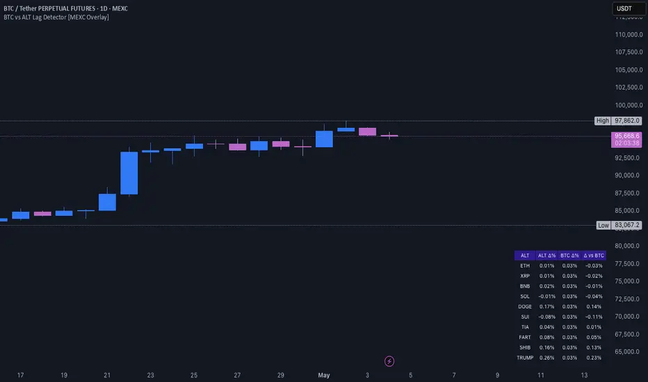
BTC vs ALT Lag Detector [MEXC Overlay]This indicator monitors the price movement of Bitcoin (BTC) and compares it in real time to a customizable list of major altcoins on the MEXC exchange.
It helps you identify lagging altcoins — tokens that are underperforming or overperforming BTC’s price action over a selected timeframe. These temporary deviations can offer profitable entry or rotation opportunities, especially for scalpers, day traders, and arbitrage-style strategies.
Key Features:
- Real-time deviation detection between BTC and altcoins
- Customizable comparison timeframe: 1m, 6m, 12m, 30m, 1h, 4h, or 1d
- Deviation threshold alert: Highlights coins that lag BTC by more than 0.5%, 1%, 2%, or 3%
- Compact stats table embedded in the price chart
- Fully adjustable layout: Table position (Top/Bottom/Center + Left/Right), Font size (Tiny, Small, Medium)
- Built-in alert system when deviation exceeds your chosen threshold
How to Use It:
Set your desired timeframe for comparison (e.g., 1 hour).
Select a deviation threshold (e.g., 1.0%).
The table will show:
Each altcoin’s % change
BTC’s % change
The delta (deviation) vs BTC
Red highlights indicate alts whose deviation exceeded the threshold.
When at least one alt lags beyond your threshold, the indicator can trigger an alert — helping you capitalize on potential catch-up trades.
Please provide any feedback on it.
BTC Price Percentage Difference( Bitfinex - Coinbase)Introduction:
The BTC Price Percentage Difference Histogram Indicator is a powerful tool designed to help traders visualize and capitalize on the price discrepancies of Bitcoin (BTC) between two major exchanges: Bitfinex and Coinbase. By calculating the real-time percentage difference of BTC-USD prices and displaying it as a color-coded histogram, this indicator enables you to quickly spot potential arbitrage opportunities and gain deeper insights into market dynamics.
Features:
• Real-Time Percentage Difference Calculation:
• Computes the percentage difference between BTC-USD prices on Bitfinex and Coinbase.
• Color-Coded Histogram Visualization:
• Green Bars: Indicate that the BTC price on Bitfinex is higher than on Coinbase.
• Red Bars: Indicate that the BTC price on Bitfinex is lower than on Coinbase.
• User-Friendly and Intuitive:
• Simple setup with no additional inputs required.
• Automatically adapts to the chart’s timeframe for seamless integration.
Why Bitfinex Whales Matter:
Bitfinex is renowned for hosting some of the largest Bitcoin traders, often referred to as “whales.” These influential players have the capacity to move the market, and historically, they’ve demonstrated a high success rate in buying at market bottoms and selling at market tops. By tracking the price discrepancies between Bitfinex and other exchanges like Coinbase, you can gain valuable insights into the sentiment and actions of these key market participants.

BTC Correlation PercentagePurpose
This indicator displays the correlation percentage between the current trading instrument and Bitcoin (BTC/USDT) as a text label on the chart. It helps traders quickly assess how closely an asset's price movements align with Bitcoin's fluctuations.
Key Features
Precise Calculation: Shows correlation as a percentage with one decimal place (e.g., 25.6%).
Customizable Appearance: Allows adjustment of colors, position, and calculation period.
Clean & Simple: Displays only essential information without cluttering the chart.
Universal Compatibility: Works on any timeframe and with any trading pair.
Input Settings
Core Parameters:
BTC Symbol – Ticker for Bitcoin (default: BINANCE:BTCUSDT).
Correlation Period – Number of bars used for calculation (default: 50 candles).
Show Correlation Label – Toggle visibility of the correlation label.
Visual Customization:
Text Color – Label text color (default: white).
Background Color – Label background color (default: semi-transparent blue).
Border Color – Border color around the label (default: gray).
Label Position – Where the label appears on the chart (default: top-right).
Interpreting Correlation Values
70% to 100% → Strong positive correlation (asset moves in sync with BTC).
30% to 70% → Moderate positive correlation.
-30% to 30% → Weak or no correlation.
-70% to -30% → Moderate negative correlation (asset moves opposite to BTC).
-100% to -70% → Strong negative correlation.
Practical Use Cases
For Altcoins: A correlation above 50% suggests high dependence on Bitcoin’s price action.
For Futures Trading: Helps assess systemic risks tied to BTC movements.
During High Volatility: Determines whether an asset’s price change is driven by its own factors or broader market trends.
How It Works
The indicator recalculates automatically with each new candle. For the most reliable results, it is recommended for use on daily or higher timeframes.
This tool provides traders with a quick, visual way to gauge Bitcoin’s influence on other assets, improving decision-making in crypto markets. 🚀
This response is AI-generated, for reference only.
New chat
BTC Daily DCA CalculatorThe BTC Daily DCA Calculator is an indicator that calculates how much Bitcoin (BTC) you would own today by investing a fixed dollar amount daily (Dollar-Cost Averaging) over a user-defined period. Simply input your start date, end date, and daily investment amount, and the indicator will display a table on the last candle showing your total BTC, total invested, portfolio value, and unrealized yield (in USD and percentage).
Features
Customizable Inputs: Set the start date, end date, and daily dollar amount to simulate your DCA strategy.
Results Table: Displays on the last candle (top-right of the chart) with:
Total BTC: The accumulated Bitcoin from daily purchases.
Total Invested ($): The total dollars invested.
Portfolio Value ($): The current value of your BTC holdings.
Unrealized Yield ($): Your profit/loss in USD.
Unrealized Yield (%): Your profit/loss as a percentage.
Visual Markers: Green triangles below the chart mark each daily investment.
Overlay on Chart: The table and markers appear directly on the BTCUSD price chart for easy reference.
Daily Timeframe: Designed for Daily (1D) charts to ensure accurate calculations.
How to Use
Add the Indicator: Apply the indicator to a BTCUSD chart (e.g., Coinbase:BTCUSD, Binance:BTCUSDT).
Set Daily Timeframe: Ensure your chart is on the Daily (1D) timeframe, or the script will display an error.
Configure Inputs: Open the indicator’s Settings > Inputs tab and set:
Start Date: When to begin the DCA strategy (e.g., 2024-01-01).
End Date: When to end the strategy (e.g., 2025-04-27 or earlier).
Daily Investment ($): The fixed dollar amount to invest daily (e.g., $100).
View Results: Scroll to the last candle in your date range to see the results table in the top-right corner of the chart. Green triangles below the bars indicate investment days.
Settings
Start Date: Choose the start date for your DCA strategy (default: 2024-01-01).
End Date: Choose the end date (default: 2025-04-27). Must be after the start date and within available chart data.
Daily Investment ($): Set the daily investment amount (default: $100). Minimum is $0.01.
Notes
Timeframe: The indicator requires a Daily (1D) chart. Other timeframes will trigger an error.
Data: Ensure your BTCUSD chart has historical data for the selected date range. Use reliable pairs like Coinbase:BTCUSD or Binance:BTCUSDT.
Limitations: Does not account for trading fees or slippage. Future dates (beyond the current date) will not display results.
Performance: Works best with historical data. Free TradingView accounts may have limited historical data; consider premium for longer ranges.

BTC Futures Divergence Monitor 1.0BITFINEX:BTCUSD
BTC Futures Divergence Monitor 1.0
=======
# Abstract
This script shows the divergence between BTC futures price and BTC actuals price of bitFlyer FX and BitMEX in percentage .
Usually, when people bought it or sold it too much on futures, the divergence between actuals and futures are getting expanding.
I believe this is really useful to find when the conversion of the trend happens.
Also supports ETH and USDT divergence too. If you wish to enable USDT mode, please check "Show only USDT divergence (Poloniex)" on the settings menu.
Enjoy :)
# Supports:
- bitFlyer FX (blue)
- BitMEX BTC Futures 3mo (orange)
- BitMEX BTC Futures 6mo (red)
- BitMEX ETH Futures (purple)
- USDTUSD (Poloniex)
# Disclaimer:
This is a free script. Feedbacks are welcome! But I don't have any responsibility when this script has broken or something went wrong.
BTC vs Russell2000Description
The BTC vs Russell2000 – Weekly Cycle Map compares Bitcoin’s performance against the Russell 2000 (IWM) to identify long-term risk-on and risk-off market regimes.
The indicator calculates the BTC/RUT ratio on a weekly timeframe and applies a moving average filter to highlight macro momentum shifts.
White line: BTC/RUT ratio (Bitcoin relative strength vs small-cap equities)
Yellow line: Weekly SMA of the ratio (trend filter)
Green background: BTC outperforming → macro bull regime
Red background: Russell 2000 outperforming → macro bear regime
Halving markers: Visual reference points for Bitcoin market cycles
This tool is designed to help traders understand capital rotation between crypto and traditional markets, improve timing of macro entries, and visualize where Bitcoin stands within its broader cycle.

BTC Kimchi Premium by alwc (KR Exchanges / BTCUSDT.P)This indicator visualizes the Kimchi Premium of BTC using Korean spot exchanges and global BTCUSDT perpetual futures.
How it works
Uses BTC/KRW from a selected Korean exchange (Upbit or Bithumb).
Uses BTCUSDT.P perpetual futures from a selected global exchange (Binance / Bybit / OKX).
Uses USDKRW (default: FX_IDC:USDKRW) to convert USD price into KRW.
Kimchi Premium is calculated as:
BTC_KRW / (BTCUSDT.P * USDKRW) - 1 and plotted in %.
Features
Inputs to select:
Domestic exchange: Upbit or Bithumb
Foreign futures exchange: Binance, Bybit, or OKX
Custom USDKRW symbol
Shows the latest Kimchi Premium value as a label on the indicator panel.
Displays a table in the top-right corner with real-time USDT(KRW) prices on Upbit and Bithumb, helping you monitor both BTC Kimchi Premium and the KRW-USDT premium at a glance.
Pine Script v6. Designed for BTC Kimchi Premium monitoring and KR/Global spread analysis.

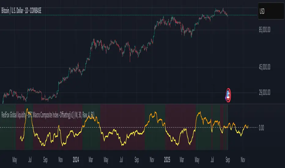
BTC Macro Composite Global liquidity Index -OffsetThis indicator is based on the thesis that Bitcoin price movements are heavily influenced by macro liquidity trends. It calculates a weighted composite index based on the following components:
• Global Liquidity (41%): Sum of central bank balance sheets (Fed , ECB , BoJ , and PBoC ), adjusted to USD.
• Investor Risk Appetite (22%): Derived from the Copper/Gold ratio, inverse VIX (as a risk-on signal), and the spread between High Yield and Investment Grade bonds (HY vs IG OAS).
• Gold Sensitivity (15–20%): Combines the XAUUSD price with BTC/Gold ratio to reflect the historical influence of gold on Bitcoin pricing.
Each component is normalized and then offset forward by 90 days to attempt predictive alignment with Bitcoin’s price.
The goal is to identify macro inflection points with high predictive value for BTC. It is not a trading signal generator but rather a macro trend context indicator.
❗ Important: This script should be used with caution. It does not account for geopolitical shocks, regulatory events, or internal BTC market structure (e.g., miner behavior, on-chain metrics).
💡 How to use:
• Use on the 1D timeframe.
• Look for divergences between BTC price and the macro index.
• Apply in confluence with other technical or fundamental frameworks.
🔍 Originality:
While similar components exist in macro dashboards, this script combines them uniquely using time-forward offsets and custom weighting specifically tailored for BTC behavior.
BTC/Dominance RSI by Sajad BagheriTitle: "BTC/Dominance RSI by Sajad Bagheri"
Description: "Combines BTC Price RSI (Red) and BTC Dominance RSI (Green) to detect trend conflicts and overbought/oversold conditions."
Category: Oscillators
Tags: #BTC, #Dominance, #RSI, #Bitcoin
Access: Public/Private

BTC/Dominance RSI by Sajad BagheriTitle: "BTC/Dominance RSI by Sajad Bagheri"
Description: "Combines BTC Price RSI (Red) and BTC Dominance RSI (Green) to detect trend conflicts and overbought/oversold conditions."
Category: Oscillators
Tags: #BTC, #Dominance, #RSI, #Bitcoin
Access: Public/Private
BTC/Fiat Divergence & Spread Monitor📄 BTC/Fiat Divergence & Spread Monitor
This indicator visualizes Bitcoin’s relative performance across multiple fiat currencies and highlights periods of unusual divergence. It helps traders assess which fiat pairs BTC has outperformed or underperformed over a configurable lookback period and monitor the dynamic spread between the strongest and weakest pairs.
Features:
Relative Performance Matrix:
Ranks BTC returns in 6 fiat pairs, displaying a color-coded table of percentage changes and ranks.
Divergence Spread Oscillator:
Calculates the spread between the top and bottom performing pairs and normalizes this using a Z-Score. The oscillator helps identify when fiat pricing divergence is unusually high or compressed.
Dynamic Smoothing:
Optional Hull Moving Average smoothing to reduce noise in the spread signal.
Customizable Inputs:
Lookback period for percent change.
Z-Score normalization window.
Smoothing length.
Symbol selection for each fiat pair.
Visual Mode Toggle:
Switch between relative performance lines and spread oscillator view.
Potential Use Cases:
Fiat Rotation:
Identify which fiat is relatively weak or strong to optimize your exit currency when taking BTC profits.
Volatility Detection:
Use the spread Z-Score to detect periods of high divergence across fiat pairs, signaling macro FX volatility or dislocations.
Regime Analysis:
Track when fiat spreads are converging or expanding, potentially signaling market regime shifts.
Risk Management:
When divergence is extreme (Z-Score > +1), consider reducing position sizing or waiting for reversion.
Disclaimer:
This indicator is provided for educational and informational purposes only. It does not constitute financial advice or a recommendation to buy or sell any security or asset. Always do your own research and consult a qualified financial professional before making trading decisions. Use at your own risk.
Tip:
Experiment with different lookback periods and smoothing settings to adapt the indicator to your timeframe and trading style.

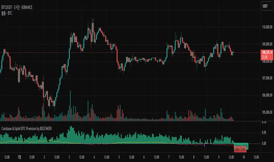
Coinbase BTC Premium by BIGTAKERBTC Premium Gap Analysis: Binance, Coinbase, Upbit
This indicator provides real-time analysis and visualization of the premium gap between the Binance BTCUSDT price and the BTC prices on Coinbase (BTCUSD) and Upbit (BTCKRW).
Key Features
Coinbase Premium Gap
Measures the price difference between Coinbase and Binance as a percentage.
To improve visibility, the Coinbase premium is visually amplified by 10x.
Upbit Premium Gap
Calculates the premium by comparing Upbit's BTCKRW price (converted into USD using the real-time USDKRW exchange rate) against Binance BTCUSDT.
Dynamic Color Coding
Premiums above 0% are displayed in lime green, indicating positive premiums.
Premiums below 0% are displayed in red, indicating discounts.
Real-Time Labels
Displays real-time premium values for both Coinbase and Upbit on the right side of the chart.
Additional Notes
Upbit premiums are adjusted for the USD/KRW exchange rate to ensure accurate USD-based comparison.
The Coinbase premium is magnified visually (10x) to better capture minor movements, while the actual premium value remains correctly displayed.
The indicator is optimized for traders who monitor global BTC market price disparities across major exchanges.
How to Use
Quickly track global BTC price discrepancies across Binance, Coinbase, and Upbit.
Detect "Kimchi Premium" conditions in the Korean market through Upbit premiums.
Analyze buying and selling pressure in North American markets through Coinbase premiums.
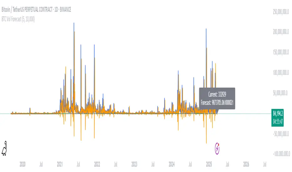
BTC Volatility ForecastThe "BTC Volatility Forecast" indicator is designed to help traders anticipate Bitcoin (BTC) price volatility by analyzing historical daily price ranges and projecting future fluctuations. Inspired by advanced volatility forecasting studies, it calculates an approximate realized variance using the squared difference between each day’s high and low prices. By applying a simple linear regression model over the past five days of variance data (customizable via the "Lag Period" input), the indicator provides a forecast for the next day’s volatility. This makes it a valuable tool for BTC traders looking to gauge potential market turbulence and adjust their strategies accordingly.
On the chart, the indicator displays two lines: a blue solid line representing the current realized variance and an orange line showing the forecasted volatility for the upcoming day. Traders can set a "Volatility Threshold" to trigger alerts when the forecast exceeds a specified level, aiding in risk management or trade planning. A debug label on the last bar also shows the exact current and forecasted values for quick reference. While this version uses daily data for simplicity, it captures the essence of volatility prediction and can be a starting point for understanding BTC market dynamics—perfect for both novice and experienced traders on TradingView.