RSI Info WindowRSI Info Window is a minimalist overlay utility that displays the current RSI value and a simple market state label (Overbought, Oversold, or Neutral) directly on the chart. The goal is to provide quick RSI context without using a separate oscillator pane, helping keep the chart clean for price-action, SMC, and structure-based trading.
How it works
Calculates RSI using the selected RSI Length (default 14).
Compares RSI to the Overbought and Oversold thresholds (default 70/30).
Displays a small label on the most recent candle showing:
RSI value
Current state: Overbought / Oversold / Neutral
The label updates in real time as the latest candle forms.
Inputs
RSI Length – Controls RSI sensitivity (default 14)
Overbought Level – RSI threshold for overbought (default 70)
Oversold Level – RSI threshold for oversold (default 30)
How to use
Overbought: RSI above the overbought level — may indicate momentum is extended; watch for continuation vs exhaustion based on your system.
Oversold: RSI below the oversold level — may indicate downside extension; watch for reversal conditions and structure confirmation.
Neutral: RSI between thresholds — often indicates balanced conditions or consolidation.
This indicator is designed as a compact reference tool, not a complete trading system.
Notes
The overlay label is anchored to the most recent candle and refreshes on the last bar.
Intended to save screen space vs. a full RSI subpanel.
Disclaimer
This script is for educational and informational purposes only and does not constitute financial advice. Always use risk management and confirm signals with your broader trading plan.
파인 유틸리티

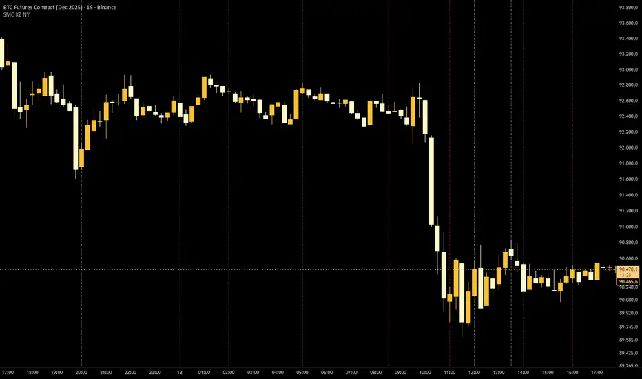
SMC KZ NYThis script plots vertical lines on the chart to highlight KZ opens and closes based on New York time.
Key characteristics:
The indicator is plotted on the price chart (overlay).
It draws thin, dotted vertical lines at specific kz.
Killzones are calculated using the America/New_York timezone to ensure correct alignment.
Only weekdays (Monday to Friday) are considered.
The script draws sessions for today and up to one week back (maximum 7 calendar days).
All drawings are created once on the last bar to avoid duplicates and performance issues.
Each session has its own color for clear visual distinction:
Asia KZ(open)
London KZ (open and close)
New York / KZ Morning (open and close)
Lunch (open and close)
New York / KZ Afternoon (open and close)
The Asia KZ open at 20:00 NY is intentionally excluded on Fridays, as there is no valid Asia KZ start on Friday evening.
The vertical lines extend across the entire visible price range of the chart.
The script is optimized to stay well within TradingView object limits.
Purpose:
The indicator is designed to give traders a clean, non-intrusive visual reference for key KZ transitions, helping to analyze price behavior around killzones opens and closes without cluttering the chart.
Swing Trading Indicator: RSI + EMA + MACD + BB Signals**Swing Trading Indicator: Multi-Indicator Confluence Signals**
This indicator identifies high-probability swing trading setups using RSI pullbacks, EMA trend filter, MACD momentum confirmation, and Bollinger Bands for volatility-based entries. Perfect for daily/4H charts on stocks like TSLA or SPY.
**Key Features:**
- **Long Signal (Green ↑ Arrow)**: Uptrend (above 200 EMA) + RSI crosses above oversold (default 30) + MACD bullish crossover + Price at/near BB lower band + Optional squeeze filter.
- **Short Signal (Red ↓ Arrow)**: Mirror for downtrends.
- **Real-Time Dashboard**: Top-right table shows condition status (✓/✗) and "LONG/SHORT READY" alerts.
- **Customizable**: Adjust RSI levels, BB multiplier, enable/disable shorts/squeeze/arrows.
- **Alerts**: Built-in for entry notifications.
**How to Use:**
1. Add to chart (daily timeframe recommended).
2. Watch for arrows + "READY" in dashboard.
3. Manual entry: Risk 1% per trade, target 1:2 reward (e.g., trail stops).
**Backtest Note**: Based on similar setups, ~55-65% win rate in trending markets (test yourself). Not financial advice—trading involves risk. Fork and improve!
#swingtrading #RSI #MACD #BollingerBands #PineScript

SMC Sessions NYThis script plots vertical session markers on the chart to highlight session opens and closes based on New York time.
Key characteristics:
The indicator is plotted on the price chart (overlay).
It draws thin, dotted vertical lines at specific session times.
Sessions are calculated using the America/New_York timezone to ensure correct alignment.
Only weekdays (Monday to Friday) are considered.
The script draws sessions for today and up to one week back (maximum 7 calendar days).
All drawings are created once on the last bar to avoid duplicates and performance issues.
Each session has its own color for clear visual distinction:
Asia session (open)
London session (open and close)
New York / Kill Zone Morning (open and close)
Lunch session (open and close)
New York / Kill Zone Afternoon (open and close)
The Asia session open at 20:00 NY is intentionally excluded on Fridays, as there is no valid Asia session start on Friday evening.
The vertical lines extend across the entire visible price range of the chart.
The script is optimized to stay well within TradingView object limits.
Purpose:
The indicator is designed to give traders a clean, non-intrusive visual reference for key session transitions, helping to analyze price behavior around session opens and closes without cluttering the chart.
This approach is suitable for intraday and session-based trading models, including SMC-style workflows.

Pardos Info DashboardThis indicator presents basic data in a concentrated form
Additions to the indicator are welcome by email to gshayp@gmail.com
RTH Yesterday & Today Premarket Levels## **RTH Yesterday & Today Premarket Levels**
This indicator plots the most commonly used **institutional reference levels** for intraday trading:
* **Yesterday’s Regular Trading Hours (RTH) High**
* **Yesterday’s Regular Trading Hours (RTH) Low**
* **Yesterday’s Regular Trading Hours (RTH) Close**
* **Today’s Premarket High**
* **Today’s Premarket Low**
All levels are drawn as **straight horizontal lines with labels** and remain fixed throughout the current session.
---
### **How Levels Are Calculated**
**Yesterday’s Levels (RTH only)**
* Computed strictly from **Regular Trading Hours (09:30–16:00 exchange time)**.
* Extended-hours data is **excluded** to avoid distortion.
* Captures true institutional highs, lows, and closing price.
**Today’s Premarket Levels (PM only)**
* Computed strictly from **today’s premarket session (04:00–09:29)**.
* Resets daily and does not include prior days.
* Levels finalize once premarket ends and extend across the regular session.
---
### **Key Features**
* Exactly **5 fixed reference levels**, no historical clutter
* **Non-repainting**: levels do not change once established
* **No zig-zags or plots**; only clean horizontal lines
* Customizable **line colors and thickness**
* Labels clearly identify each level:
* Y High
* Y Low
* Y Close
* PM High
* PM Low
---
### **Best Use Cases**
* Intraday trading (1m, 5m, 15m)
* VWAP and momentum strategies
* Gap-and-go or fade setups
* Support/resistance validation
* Options trading and scalping
These levels often act as **decision points, liquidity magnets, and rejection zones** during the regular session.
---
### **Required Settings**
* Use **intraday timeframes**
* Enable **Extended Hours** in TradingView’s symbol settings
* Designed for **US equities** using exchange time
---
### **Trader Notes**
This script is intentionally minimalist. It shows only the **most relevant prior-day and premarket price references** used by professional traders, avoiding noise from multi-day indicators or derived averages.

DV Master RSIDV Master RSI
Executive Summary
The Relative Strength Index (RSI) is one of the most foundational and widely utilized momentum oscillators in technical analysis. While traditionally used to gauge overbought and oversold conditions, its true power lies in identifying subtle shifts in market momentum and divergence from price action. The DV Master RSI Indicator is a sophisticated Pine Script tool designed to leverage the full strategic potential of the RSI by integrating multiple advanced signaling methods, comprehensive visual customization, and a robust anti-repainting feature. This indicator transforms the classic RSI into a complete, multi-signal trading system.
Key Advanced Features of the DV Master RSI
This indicator is engineered to provide traders with comprehensive momentum analysis and actionable signals through several integrated modules:
Features
Momentum Signaling:
RSI Midline Cross (50-line) Confirms shifts from bearish to bullish momentum and vice-versa.
RSI Moving Average Crossover:
Provides smoothed, less noisy trend confirmation and early entry/exit signals.
Trend Confirmation:
RSI MA Midline Cross uses the trend of the RSI's Moving Average to confirm the overall market bias.
Overbought/Oversold Signals
Visually highlights extreme momentum conditions for potential reversals.
Predictive Analysis
Bullish & Bearish Divergence identifies classic market turning points when price makes new highs/lows but RSI does not.
Hidden Divergence
Signals trend continuation, indicating strong internal momentum supporting the current trend.
Performance Assurance
Anti-Repainting Switch ensures signal integrity for backtesting and live trading by locking critical values on bar closure.
Visual Customization
10 Color Palettes & Background Painting enhances clarity and trading focus with custom colors and visual alerts on the chart and indicator panel.
Strategic Application for Traders
The integration of these features allows traders to employ strategies far beyond simple overbought/oversold monitoring.
Divergence Trading (Predictive Edge):
Divergence is often considered the most powerful signal from a momentum oscillator.
Regular Divergence (Reversal):
When the price makes a Lower Low but the RSI makes a Higher Low, it suggests the downward momentum is weakening, signaling a potential Bullish Reversal. The indicator plots this signal directly, giving traders an early warning to cover shorts or initiate long positions.
Hidden Divergence (Continuation):
This feature is crucial for trend-following. When the price makes a Higher Low but the RSI makes a Lower Low (during an uptrend), it signals that the trend is strong and likely to continue. Traders can use this for confident re-entry into established trends.
Signal Integrity and Backtesting Reliability:
The dedicated Anti-Repainting Switch is paramount for serious algorithmic and discretionary traders.
Problem: Indicators that use real-time price data (like close on the current bar) can change their signal retroactively as the current bar develops. This leads to illusory performance in backtesting.
Solution: By enabling the non-repainting mode, the indicator ensures that all crucial signals (MA Crosses, Midline Crosses, etc.) are only finalized and plotted upon the full confirmation of the bar's closure. This guarantees that your backtested results accurately reflect what would have been tradable in real-time.
Customizable Smoothing:
The inclusion of nine different Moving Average types (EMA, DEMA, TEMA, HMA, SMA, SMA + Bollinger Bands, SMMA, WMA, VWMA) for the RSI line allows a trader to fine-tune the indicator's responsiveness to market noise.
A trader expecting a fast reaction to short-term events might use an EMA.
A trader looking for robust, volume-weighted confirmation might select the VWMA.
Furthermore, the dedicated switches for background color on the chart and the indicator panel provide immediate, non-intrusive visual confirmation of extreme conditions, allowing traders to quickly manage multiple charts.
The DV Master RSI is an essential upgrade for any trader who relies on momentum analysis, providing the precision, assurance, and strategic versatility required for modern market navigation.

ONE Clear Multi‑Timeframe Synchronization (MTS) [Sync]**Script Profile — ONE Clear Multi‑Timeframe Synchronization (MTS) (Pine v6)**
* **Purpose:** Identifies a *multi‑timeframe “ignition”* pattern—strong daily upside confirmed by the next day and aligned with weekly & monthly structure—designed for pattern recognition and research (non‑financial advice).
* **Core Signals:**
* **MTS D1 (Ignition):** Day‑1 ≥ **+7%**, **close near high** (≥95%), **volume expansion** vs 20‑day average, and **prior‑day hammer** (stabilization).
* **MTS D2 (Confirmation):** Day‑2 ≥ **+5%** to validate D1.
* **Higher‑TF Alignment:** Confirms **weekly** (close above prior week’s high or green week) and **monthly** (close above prior month’s high or green month) conditions via `request.security`.
* **Context Overlays (optional):** Pivot‑based **Support/Resistance** with **“B” breaks** (green = resistance break; red = support break) gated by a **volume oscillator** (EMA5 vs EMA10).
* **Alerts:**
* **MTS Ignition Confirmed** (D1 + D2 + hammer + weekly/monthly + volume gate)
* **Support/Resistance Broken** (with volume gate)
* **Stability Fix:** Precomputes `ta.crossover`/`ta.crossunder` **once per bar** and reuses variables in conditions to avoid inconsistent historical evaluation—*no change in strategy logic or thresholds.*
* **Typical Read:** Use D1 (low/mid/high) as reference levels; D2 confirms regime shift; green “B” after D2 suggests continuation, red “B” warns of failure.

Ellipse Price Action Indicator v3Successful Trade Setup Using Ellipse Price Action Indicator (EPAI) 🔥
With the help of the Ellipse Price Action Indicator, this bearish trade setup played out perfectly.
EPAI generated a Sell Signal with a red arrow.
According to the EPAI method:
🔹 If price makes a new high on the next candle — add one more unit.
🔹 Every time a new high forms, add one more unit per candle.
🔹 Exit all units at the Moving Average (MA) — this is the core risk-controlled exit rule.
This is why EPAI consistently provides successful trade setups when followed with discipline.
⚠ Important Notice — Last Chance!
The Ellipse Price Action Indicator (EPAI) will soon become PRIVATE.
Access will be restricted only to Premium Members.
✅ First 25 subscribers can use this indicator absolutely FREE.
After that, it will not be available publicly.

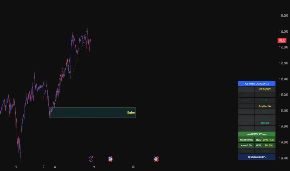
TRADE2GO CALCULATORMobile-Optimized Position Size Calculator with Intuitive Moveable Lines
Trading on mobile just got easier. Our TradingView calculator features drag-and-drop interactive lines designed specifically for touchscreen devices, eliminating the need for manual price input on small screens.
Key Features:
Easy Touch Controls - Simply drag the Entry, Stop Loss, and Take Profit lines directly on your chart. No more typing precise prices on tiny keyboards or struggling with number pads while analyzing the market.
Real-Time Calculations - As you move the lines, lot sizes and risk parameters update instantly. See your position size, potential profit, and risk amount change dynamically as you adjust your trade setup.
Perfect for Mobile Trading - Whether you're trading on-the-go or prefer mobile analysis, the moveable lines provide a seamless experience that works naturally with touch gestures. Pinch to zoom, drag to position, and your calculations follow your trade plan in real-time.
Visual Trade Planning - Place your lines where you see support/resistance levels, trend lines, key chart patterns, or using Pip Booster trading levels. Your position sizing adapts automatically to your technical analysis, keeping risk management front and center.
One-Glance Risk Assessment - All critical information displays clearly: lot size, risk and reward amounts in your account currency, and the calculated lot size to use—all updating as you refine your trade setup visually on the chart.
Trade smarter on mobile with a calculator that moves at the speed of your analysis.


Green Day or Red Day?What it is:
This simple indicator provides immediate visual context by tinting the background of your chart Green or Red based on the asset's daily performance.
Who's it for?
It is designed for day traders and scalpers who operate on lower timeframes (1m, 5m, 15m) but need to remain aware of the overall daily direction without switching charts. It can be used in combination with the ORB strategy as a helpful tool to "feel" the trend when you're way out of the ORB range. But this indicator can be used by anyone regardless of trading style.
How it works:
This script pulls data from the daily timeframe regardless of the chart interval you are currently viewing. It compares the current price to a user-selectable reference point (either Yesterday's Close or Today's Open) to determine the background color.
Good Luck. May you make good trades!


Volatility Aurora [The_lurker]█░░░░░░░░░░░░░░░░░░░ VOLATILITY AURORA ░░░░░░░░░░░░░░░░░░░░█
█░░░░░░░░░░░░░░░ Where Market Energy Meets Visual Poetry ░░░░░░░░░░░░░░░░█
📖 INTRODUCTION
━━━━━━━━━━━━━━━━━━━━━━━━━━━━━━━━━━━━━━━━━━━
The Aurora Borealis occurs when charged particles from the sun collide with gases in Earth's atmosphere, creating mesmerizing waves of colorful light.
𝗩𝗼𝗹𝗮𝘁𝗶𝗹𝗶𝘁𝘆 𝗔𝘂𝗿𝗼𝗿𝗮 applies this elegant concept to financial markets:
⚡ Price Momentum = Charged Particles
🌌 ATR Layers = Atmospheric Layers
🎨 Color Intensity = Energy Magnitude
📐 Layer Expansion = Volatility State
When momentum "collides" with volatility layers, the Aurora illuminates potential market regime changes — often before they fully manifest in price action.
🔬 THE SCIENCE BEHIND IT
━━━━━━━━━━━━━━━━━━━━━━━━━━━━━━━━━━━━━━━━━━━━━━━━━━━━━━━━━━━━━━━━━━━━━━━━━━━━━
Unlike traditional volatility indicators that provide a single value, Volatility Aurora creates a 𝗺𝘂𝗹𝘁𝗶-𝗱𝗶𝗺𝗲𝗻𝘀𝗶𝗼𝗻𝗮𝗹 𝘃𝗼𝗹𝗮𝘁𝗶𝗹𝗶𝘁𝘆 𝗳𝗶𝗲𝗹𝗱 using five distinct ATR layers based on Fibonacci periods:
│ Layer │ Period │ Atmospheric │ Function │
├──────────────────────┼─────────────────┼─────────────────┤
│ Layer 1 │ 5 │ Ionosphere │ Captures immediate vol shifts
│ Layer 2 │ 13 │ Mesosphere │ Medium-term vol response
│ Layer 3 │ 34 │ Stratosphere │ Intermediate vol structure
│ Layer 4 │ 55 │ Troposphere │ Foundational vol baseline
│ Layer 5 │ 89 │ Surface │ Structural, long-term vol
⚡ CORE CONCEPTS
━━━━━━━━━━━━━━━━━━━━━━━━━━━━━━━━━━━━━━━━━━━
𝟭. 𝗟𝗮𝘆𝗲𝗿 𝗘𝘅𝗽𝗮𝗻𝘀𝗶𝗼𝗻 & 𝗖𝗼𝗻𝘁𝗿𝗮𝗰𝘁𝗶𝗼𝗻
Each layer dynamically expands or contracts based on its normalized ATR value:
• 𝗘𝘅𝗽𝗮𝗻𝗱𝗶𝗻𝗴 𝗟𝗮𝘆𝗲𝗿𝘀 → Increasing volatility regime
• 𝗖𝗼𝗻𝘁𝗿𝗮𝗰𝘁𝗶𝗻𝗴 𝗟𝗮𝘆𝗲𝗿𝘀 → Decreasing volatility / Consolidation
• 𝗕𝗿𝗲𝗮𝘁𝗵𝗶𝗻𝗴 𝗘𝗳𝗳𝗲𝗰𝘁 → Natural market rhythm visualization
𝟮. 𝗛𝗮𝗿𝗺𝗼𝗻𝘆 𝗦𝗰𝗼𝗿𝗲
Measures alignment between all five layers:
• 𝗛𝗶𝗴𝗵 𝗛𝗮𝗿𝗺𝗼𝗻𝘆 (>70%) → All timeframes agree → Strong, reliable trends
• 𝗟𝗼𝘄 𝗛𝗮𝗿𝗺𝗼𝗻𝘆 (<30%) → Timeframe divergence → Choppy conditions
𝟯. 𝗘𝗻𝗲𝗿𝗴𝘆 𝗜𝗻𝘁𝗲𝗻𝘀𝗶𝘁𝘆
Quantifies how strongly momentum is "hitting" the volatility layers:
• 𝗛𝗶𝗴𝗵 𝗜𝗻𝘁𝗲𝗻𝘀𝗶𝘁𝘆 → Strong directional conviction
• 𝗟𝗼𝘄 𝗜𝗻𝘁𝗲𝗻𝘀𝗶𝘁𝘆 → Weak momentum, potential reversal
𝟰. 𝗥𝗲𝗴𝗶𝗺𝗲 𝗖𝗹𝗮𝘀𝘀𝗶𝗳𝗶𝗰𝗮𝘁𝗶𝗼𝗻
Based on aggregate layer states:
🟢 𝗖𝗔𝗟𝗠 → Low volatility across all layers
🟡 𝗡𝗢𝗥𝗠𝗔𝗟 → Balanced market conditions
🟠 𝗩𝗢𝗟𝗔𝗧𝗜𝗟𝗘 → Elevated activity
🔴 𝗘𝗫𝗧𝗥𝗘𝗠𝗘 → Maximum volatility state
🎨 VISUAL COMPONENTS
━━━━━━━━━━━━━━━━━━━━━━━━━━━━━━━━━━━━━━━━━━━
🌈 𝗔𝘂𝗿𝗼𝗿𝗮 𝗟𝗮𝘆𝗲𝗿𝘀 (𝗚𝗿𝗮𝗱𝗶𝗲𝗻𝘁 𝗕𝗮𝗻𝗱𝘀)
• Five pairs of symmetrical bands around the price core
• Color gradient from core (bright) to outer (dim)
• Expansion reflects current volatility state
💠 𝗖𝗼𝗿𝗲 𝗟𝗶𝗻𝗲
• Central EMA-based trend line
• Color changes with momentum direction:
🟢 Cyan/Teal = Bullish
🔴 Pink/Magenta = Bearish
🟣 Purple = Neutral
💫 𝗘𝗻𝗲𝗿𝗴𝘆 𝗣𝘂𝗹𝘀𝗲 𝗟𝗶𝗻𝗲𝘀
• Diagonal flow lines showing momentum trajectory
• Thicker lines = Higher energy
• Direction indicates momentum flow
🎵 𝗛𝗮𝗿𝗺𝗼𝗻𝘆 𝗪𝗮𝘃𝗲𝘀
• Vertical dotted lines appear when harmony exceeds 70%
• Signals timeframe alignment — high-probability zones
📊 HOW TO USE
━━━━━━━━━━━━━━━━━━━━━━━━━━━━━━━━━━━━━━━━━━━
📈 𝗧𝗿𝗲𝗻𝗱 𝗙𝗼𝗹𝗹𝗼𝘄𝗶𝗻𝗴
• Enter when Aurora expands in your direction
• Core line color confirms bias
• High harmony = Higher confidence
💥 𝗩𝗼𝗹𝗮𝘁𝗶𝗹𝗶𝘁𝘆 𝗕𝗿𝗲𝗮𝗸𝗼𝘂𝘁𝘀
• Watch for regime shift from CALM to VOLATILE
• Expanding layers signal incoming movement
• Intensity spike confirms breakout strength
↩️ 𝗠𝗲𝗮𝗻 𝗥𝗲𝘃𝗲𝗿𝘀𝗶𝗼𝗻
• EXTREME regime often precedes reversals
• Contracting layers after expansion = Potential pullback
• Low harmony during trends = Weakening momentum
🛡️ 𝗥𝗶𝘀𝗸 𝗠𝗮𝗻𝗮𝗴𝗲𝗺𝗲𝗻𝘁
• Use outer layers as dynamic support/resistance
• Wider Aurora = Wider stops required
• Contracting Aurora = Tighter risk parameters
⚙️ SETTINGS GUIDE
━━━━━━━━━━━━━━━━━━━━━━━━━━━━━━━━━━━━━━━━━━━
🌌 𝗔𝘂𝗿𝗼𝗿𝗮 𝗖𝗼𝗿𝗲
│ Setting │Default │ Description
│ Layer 1-5 │ Fib │ ATR periods (5,13,34,55,89)
│ Expansion Factor │ 2.5 │ Controls layer width multiplier
│ Smoothing │ 5 │ EMA smoothing for visual clarity
⚡ 𝗘𝗻𝗲𝗿𝗴𝘆 𝗙𝗶𝗲𝗹𝗱
│ Setting │ Default │ Description
│ Momentum Length │ 14 │ Period for momentum calculation
│ Energy Lookback │ 21 │ Normalization window
│ Energy Multiplier │ 1.5 │ Amplifies energy display
🎨 𝗩𝗶𝘀𝘂𝗮𝗹
│ Setting │ Default │ Description
│ Language │ EN │ Interface language (EN/AR)
│ Show Aurora │ ✓ │ Toggle layer visibility
│ Show Core Line │ ✓ │ Toggle center line
│ Show Energy Pulse │ ✓ │ Toggle flow lines
│ Show Harmony Waves │ ✓ │ Toggle alignment indicators
🔔 ALERTS
━━━━━━━━━━━━━━━━━━━━━━━━━━━━━━━━━━━━━━━━━━━
⚡ 𝗥𝗲𝗴𝗶𝗺𝗲 𝗦𝗵𝗶𝗳𝘁 — Volatility regime changed
🎵 𝗛𝗶𝗴𝗵 𝗛𝗮𝗿𝗺𝗼𝗻𝘆 — All layers aligned (>85%)
↕️ 𝗗𝗶𝗿𝗲𝗰𝘁𝗶𝗼𝗻 𝗖𝗵𝗮𝗻𝗴𝗲 — Momentum direction reversed
🔥 𝗜𝗻𝘁𝗲𝗻𝘀𝗶𝘁𝘆 𝗦𝗽𝗶𝗸𝗲 — Energy exceeded 80% threshold
💡 TIPS FOR BEST RESULTS
━━━━━━━━━━━━━━━━━━━━━━━━━━━━━━━━━━━━━━━━━━━
1️⃣ 𝗛𝗶𝗴𝗵𝗲𝗿 𝗧𝗶𝗺𝗲𝗳𝗿𝗮𝗺𝗲𝘀 — Aurora works best on 1H+ charts
2️⃣ 𝗖𝗼𝗺𝗯𝗶𝗻𝗲 𝘄𝗶𝘁𝗵 𝗣𝗔 — Use Aurora as context, not signals
3️⃣ 𝗪𝗮𝘁𝗰𝗵 𝗛𝗮𝗿𝗺𝗼𝗻𝘆 — High harmony setups win more
4️⃣ 𝗥𝗲𝘀𝗽𝗲𝗰𝘁 𝗥𝗲𝗴𝗶𝗺𝗲 — Don't fight EXTREME volatility
5️⃣ 𝗟𝗮𝘆𝗲𝗿 𝗖𝗼𝗻𝗳𝗹𝘂𝗲𝗻𝗰𝗲 — Multi-layer bounces = Strong S/R
⚠️ DISCLAIMER
━━━━━━━━━━━━━━━━━━━━━━━━━━━━━━━━━━━━━━━━━━━
This indicator is for educational purposes only. Past performance does not
guarantee future results. Always use proper risk management and conduct your
own analysis before making trading decisions.
█████████████████████████████████████████████████████████████
█░░░░░░░░░░░░░░░░░░░░░ شفق التقلب ░░░░░░░░░░░░░░░░░░░░░░█
█░░░░░░░░░░░░░░░ حيث تلتقي طاقة السوق بالشعور البصري ░░░░░░░░░░░░░░░░█
📖 المقدمة
━━━━━━━━━━━━━━━━━━━━━━━━━━━━━━━━━━━━━━━━━━━
يحدث الشفق القطبي عندما تصطدم الجسيمات المشحونة القادمة من الشمس بالغازات في الغلاف الجوي للأرض، مما يخلق موجات ساحرة من الضوء الملون.
يطبق نفس المفهوم الأنيق على الأسواق المالية
⚡ زخم السعر = الجسيمات المشحونة
🌌 طبقات ATR = طبقات الغلاف الجوي
🎨 شدة اللون = حجم الطاقة
📐 توسع الطبقات = حالة التقلب
عندما "يصطدم" الزخم بطبقات التقلب، يُضيء الشفق التغيرات المحتملة في نظام السوق — غالباً قبل أن تتجلى بالكامل في حركة السعر.
🔬 العلم وراء المؤشر
━━━━━━━━━━━━━━━━━━━━━━━━━━━━━━━━━━━━━━━━━━━
على عكس مؤشرات التقلب التقليدية التي تقدم قيمة واحدة، يُنشئ شفق التقلب 𝗽𝗮𝗾𝗹 𝘁𝗮𝗾𝗮𝗹𝗹𝘂𝗯 𝗺𝘂𝘁𝗮'𝗮𝗱𝗱𝗶𝗱 𝗮𝗹-𝗮𝗯'𝗮𝗱 باستخدام خمس طبقات ATR مميزة مبنية على أرقام فيبوناتشي:
│ الطبقة │ الفترة │ المعادل الجوي │ الوظيفة
│ الطبقة١ │ 5 │ الأيونوسفير │ تلتقط تحولات التقلب الفورية
│ الطبقة٢ │ 13 │ الميزوسفير │ استجابة التقلب متوسطة المدى
│ الطبقة٣ │ 34 │ الستراتوسفير │ هيكل التقلب المتوسط
│ الطبقة٤ │ 55 │ التروبوسفير │ خط الأساس للتقلب
│ الطبقة٥ │ 89 │ السطح │ التقلب الهيكلي طويل المدى
⚡ المفاهيم الأساسية
━━━━━━━━━━━━━━━━━━━━━━━━━━━━━━━━━━━━━━━━━━━
𝟭. توسع وانكماش الطبقات
تتوسع أو تنكمش كل طبقة ديناميكياً بناءً على قيمة ATR المعيارية:
• طبقات متوسعة ← نظام تقلب متزايد
• طبقات منكمشة ← تقلب متناقص / تجميع
• تأثير التنفس ← تصور إيقاع السوق الطبيعي
𝟮. درجة التناغم
تقيس التوافق بين جميع الطبقات الخمس:
• تناغم عالي (>٧٠٪) ← جميع الأطر متفقة ← اتجاهات قوية
• تناغم منخفض (<٣٠٪) ← تباين الأطر ← ظروف متقطعة
𝟯. شدة الطاقة
تحدد مدى قوة "اصطدام" الزخم بطبقات التقلب:
• شدة عالية ← قناعة اتجاهية قوية
• شدة منخفضة ← زخم ضعيف، احتمال انعكاس
𝟰. تصنيف النظام
بناءً على حالات الطبقات المجمعة:
🟢 هادئ ← تقلب منخفض عبر جميع الطبقات
🟡 طبيعي ← ظروف سوق متوازنة
🟠 متقلب ← نشاط مرتفع
🔴 متطرف ← حالة التقلب القصوى
🎨 المكونات البصرية
━━━━━━━━━━━━━━━━━━━━━━━━━━━━━━━━━━━━━━━━━━━
🌈 طبقات الشفق (النطاقات المتدرجة)
• خمسة أزواج من النطاقات المتماثلة حول نواة السعر
• تدرج لوني من النواة (ساطع) إلى الخارج (خافت)
• التوسع يعكس حالة التقلب الحالية
💠 خط النواة
• خط اتجاه مركزي قائم على EMA
• يتغير اللون مع اتجاه الزخم:
🟢 سماوي = صاعد
🔴 وردي = هابط
🟣 بنفسجي = محايد
💫 خطوط نبض الطاقة
• خطوط تدفق مائلة تُظهر مسار الزخم
• خطوط أسمك = طاقة أعلى
• الاتجاه يشير إلى تدفق الزخم
🎵 موجات التناغم
• خطوط عمودية منقطة تظهر عندما يتجاوز التناغم ٧٠٪
• تشير إلى توافق الأطر الزمنية — مناطق احتمالية عالية
📊 كيفية الاستخدام
━━━━━━━━━━━━━━━━━━━━━━━━━━━━━━━━━━━━━━━━━━━
📈 تتبع الاتجاه
• ادخل عندما يتوسع الشفق في اتجاهك
• لون خط النواة يؤكد التحيز
• تناغم عالي = ثقة أعلى
💥 اختراقات التقلب
• راقب تحول النظام من هادئ إلى متقلب
• الطبقات المتوسعة تشير إلى حركة قادمة
• ارتفاع الشدة يؤكد قوة الاختراق
↩️ الارتداد للمتوسط
• النظام المتطرف غالباً يسبق الانعكاسات
• طبقات منكمشة بعد التوسع = احتمال تراجع
• تناغم منخفض أثناء الاتجاهات = زخم ضعيف
🛡️ إدارة المخاطر
• استخدم الطبقات الخارجية كدعم/مقاومة ديناميكية
• شفق أوسع = وقف خسارة أوسع مطلوب
• شفق منكمش = معايير مخاطر أضيق
⚙️ دليل الإعدادات
━━━━━━━━━━━━━━━━━━━━━━━━━━━━━━━━━━━━━━━━━━━
🌌 نواة الشفق
│ الإعداد │الافتراضي│ الوصف
│ الطبقات ١-٥ │ Fib │ فترات ATR (5,13,34,55,89)
│ معامل التوسع │ 2.5 │ يتحكم في مضاعف عرض الطبقات
│ التنعيم │ 5 │ تنعيم EMA للوضوح البصري
⚡ مجال الطاقة
│ الإعداد │الافتراضي│ الوصف
│ فترة الزخم │ 14 │ فترة حساب الزخم
│ فترة الطاقة │ 21 │ نافذة التطبيع
│ مضاعف الطاقة │ 1.5 │ يضخم عرض الطاقة
🎨 العرض البصري
│ الإعداد │الافتراضي│ الوصف
│ اللغة │ EN │ لغة الواجهة (EN/AR)
│ إظهار الشفق │ ✓ │ تبديل ظهور الطبقات
│ خط النواة │ ✓ │ تبديل الخط المركزي
│ نبض الطاقة │ ✓ │ تبديل خطوط التدفق
│ موجات التناغم │ ✓ │ تبديل مؤشرات التوافق
🔔 التنبيهات
━━━━━━━━━━━━━━━━━━━━━━━━━━━━━━━━━━━━━━━━━━━
⚡ تحول النظام — تغير نظام التقلب
🎵 تناغم عالي — جميع الطبقات متوافقة (>٨٥٪)
↕️ تغير الاتجاه — انعكس اتجاه الزخم
🔥 ارتفاع الشدة — تجاوزت الطاقة عتبة ٨٠٪
💡 نصائح للحصول على أفضل النتائج
━━━━━━━━━━━━━━━━━━━━━━━━━━━━━━━━━━━━━━━━━━━
1️⃣ الأطر الزمنية الأعلى — الشفق يعمل بشكل أفضل على ساعة فأكثر
2️⃣ ادمج مع حركة السعر — استخدم الشفق كسياق وليس إشارات
3️⃣ راقب التناغم — إعدادات التناغم العالي تربح أكثر
4️⃣ احترم النظام — لا تحارب التقلب المتطرف
5️⃣ تقاطع الطبقات — ارتداد من طبقات متعددة = دعم/مقاومة قوية
⚠️ إخلاء المسؤولية
━━━━━━━━━━━━━━━━━━━━━━━━━━━━━━━━━━━━━━━━━━━
هذا المؤشر للأغراض التعليمية فقط. الأداء السابق لا يضمن النتائج المستقبلية.
استخدم دائماً إدارة مخاطر مناسبة وقم بتحليلك الخاص قبل اتخاذ قرارات التداول.
█████████████████████████████████████████████████████████████

Dual MA Crossover with Profit Targets + Stop-LossChatGPT script and is a dual moving average crossover script with profit targets and stop loss

Universal_Position Size Calculator_by PaulinusFTMO Position Size Calculator - Professional Risk Management Tool
The ultimate position sizing calculator designed specifically for FTMO traders and professional risk managers.
🎯 What Does This Indicator Do?
This powerful calculator automatically determines the exact lot size you should trade based on your account size, risk tolerance, and stop loss distance. No more manual calculations or guesswork - just enter your trade parameters and get instant, accurate position sizing.
✨ Key Features
📈 Two Calculation Methods:
Entry/Stop Price Method: Enter your exact entry and stop loss prices - perfect for planned trades
Stop Loss Pips Method: Simply enter your stop loss distance in pips - ideal for quick calculations
💰 Complete Risk Management:
Calculates precise position size in lots
Shows actual dollar risk amount
Displays potential profit based on your risk:reward ratio
Automatic risk percentage calculation
Real-time updates as you adjust parameters
🌍 Multi-Asset Support:
Cryptocurrencies: BTC, ETH, XRP, LTC, BCH, BNB, ADA
Forex Pairs: All major and cross pairs (EUR/USD, GBP/USD, USD/JPY, etc.)
Commodities: Gold (XAU/USD), Oil (USOIL)
Indices: US30, US100, SPX500
🎨 Professional Interface:
Clean, easy-to-read table display
Customizable position (9 locations on chart)
Adjustable text size (Tiny, Small, Normal, Large)
Toggle detailed breakdown on/off for simplified view
Visual entry, stop loss, and take profit lines on chart
🔧 FTMO-Optimized:
Pre-configured with accurate FTMO contract specifications
Built-in contract sizes for all supported instruments
Minimum lot size requirements automatically applied
Perfect for FTMO Challenge and Verification phases
📋 How To Use
Method 1: Entry/Stop Price
Select your trading pair
Enter your account balance
Set your risk percentage (typically 1-2% for FTMO)
Choose your risk:reward ratio (e.g., 1:2, 1:3)
Enter your planned entry price
Enter your stop loss price
Get instant position size in lots!
Method 2: Stop Loss Pips
Select your trading pair
Enter your account balance
Set your risk percentage
Choose your risk:reward ratio
Enter your stop loss distance in pips
Get instant position size in lots!
📊 What You'll See
Essential Information (Always Visible):
Trading Pair
Account Balance
Risk Percentage
Risk Amount in Dollars
Target Profit Ratio
POSITION SIZE IN LOTS ⬅️ Your main result
Detailed Breakdown (Optional):
Entry Price / Stop Loss / Take Profit
Stop Loss Distance in pips
Contract Size
Actual Risk Amount
Potential Profit in Dollars
🎓 Perfect For:
✅ FTMO Challenge traders
✅ Prop firm traders
✅ Professional risk managers
✅ Swing and day traders
✅ Anyone who wants consistent position sizing
✅ Traders working on passing funded accounts
💡 Why Use This Calculator?
Eliminate Calculation Errors: No more spreadsheets or manual math - get accurate results instantly.
Stay Consistent: Maintain proper risk management on every single trade.
Save Time: Calculate position sizes in seconds, not minutes.
Protect Your Capital: Never risk more than your intended percentage.
Maximize Efficiency: Focus on trading, not calculating.
⚠️ Important Notes
This calculator uses standard FTMO contract specifications
Always verify lot sizes with your broker before placing trades
Recommended risk per trade: 1-2% for FTMO accounts
The calculator rounds to minimum lot sizes automatically
Visual lines only appear when using Entry/Stop Price method
🔒 Professional Tool
This is a protected indicator with clean, optimized code designed for serious traders who value accuracy and efficiency.
📝 Settings Guide
Table Position: Choose where the calculator appears on your chart
Table Text Size: Adjust for your screen and preference
Calculation Method: Switch between price-based or pip-based calculations
Account Balance: Your total account size
Risk Per Trade: Percentage you're willing to risk (0.1% - 5%)
TP Risk:Reward Ratio: Your target profit ratio (e.g., 2 = 1:2 RR)
Show Detailed Breakdown: Toggle extra information on/off
🚀 Start Trading With Confidence
Stop guessing your position sizes. Start using professional risk management today.
⭐ If this indicator helps your trading, please leave a review and share it with fellow traders!
By Paulinus © 2025
ADX + ATR% Zonas (Overlay - Azul si ambos, si no Naranja)OVERLAY
ADX
ATR
Pintado de Zonas para Entradas Seguras

Quicksilver Recovery Overlay [Strict]The Quicksilver Recovery Overlay is a proprietary visual analysis tool designed to identify high-probability reversal points in volatile markets. Originally developed for internal use to stabilize Prop Firm drawdowns, this script translates complex algorithmic logic into simple, actionable visual signals on your chart.
🚫 The Problem:
Most traders lose capital trying to "catch a falling knife." They buy too early during a crash and get liquidated before the reversal happens.
✅ The Solution:
This overlay forces discipline. It will only print a "QS BUY" signal when three specific institutional criteria are met simultaneously. If the setup is not perfect, the chart remains clean, keeping you out of bad trades.
The Logic (The "Triple Confluence" Engine):
Deep Exhaustion: The Stochastic RSI must pierce the extreme oversold zone (< 20), indicating seller exhaustion.
Momentum Crossover: The Fast %K line must cross above the Slow %D line, confirming momentum has shifted.
Heikin Ashi Filter: The current Heikin Ashi candle must be GREEN (Bullish). This filters out "fake" reversals where price is still wicking down.
Features:
Visual Signal Labels: Green "QS BUY" and Red "QS SELL" tags appear directly on the bar.
Zero Repaint Logic: Signals are confirmed on candle close.
Status Dashboard: A built-in monitor in the top right corner confirms the algorithm is active.
Recommended Settings:
Assets: ETHUSD, BTCUSD, XAUUSD (Gold).
Timeframes:
1-Minute: For scalping and drawdown recovery.
15-Minute: For swing trading and trend reversals.
How to Get Access:
This is a Protected Script. Access is granted exclusively to members of the Quicksilver Algo Systems ecosystem.
Get your license key here: whop.com
Risk Disclosure: Trading involves substantial risk. Past performance is not indicative of future results.

Session Candle Hunter 🎯🎯 Session Candle Hunter — Precision Session Mapping for Smart Traders
Session Candle Hunter 🎯 is a powerful tool designed to help traders identify and track the most important session candle of the trading day—commonly used for liquidity grabs, range mapping, volatility zones, and breakout anticipation.
Whether you trade NY session, London session, or custom time windows, this indicator automatically detects the candle at your chosen New York Time, extracts its high and low, and visually projects these levels into the current session.
🔍 What This Indicator Does
1️⃣ Detects the Key Session Candle
You select:
Hour of the candle (NY Time)
Candle timeframe (1H, 4H, 15m, etc.)
The script automatically:
Identifies the candle when it forms
Stores its High/Low
Prepares levels for visual projection
🎨 2️⃣ Highlights the Candle Zone
Optionally displays a colored zone (box) between the candle’s high and low:
Helps visualize the liquidity pocket
Useful for session traps, expansion moves, and fair value interpretation
You can choose:
Zone color
Whether to show it or not
Whether it should update only for the latest candle
📈 3️⃣ Draws High/Low Lines With Extensions
High and Low of the detected candle can be plotted as:
Standard lines
Or infinitely extended to the right
Great for identifying:
Breakouts
Retests
Range boundaries
Session expansion models
Optional labels display exact price levels.
🕐 4️⃣ Delayed Display Logic
The indicator only shows levels after a user-defined NY time.
For example:
Show lines only after 8:30 NY — perfect for traders who want pre-session levels hidden until relevant.
🔄 5️⃣ “Show Only Last” Mode
A clean, uncluttered mode that removes all historical drawings and only displays:
The latest zone
The latest high/low lines
Latest labels
Perfect for minimal-chart traders.
⚠️ 6️⃣ Alert System
Receive alerts the moment the targeted session candle forms:
“New Candle Detected”
🧾 7️⃣ Info Panel (Top-Left Corner)
Displays:
Target session hour
Display start time
Candle timeframe
Stored High/Low
Indicator name
Always visible and automatically updates.
⭐ Why Traders Love This Tool
✔ Helps visualize major liquidity zones
✔ Works on all markets & timeframes
✔ Perfect for ICT-style session concepts
✔ Helps anticipate session expansion
✔ Automates manual level drawing
✔ Clean visuals with optional minimal mode

One Point Global Net Liquidity The "Fuel" Behind the MarketMost traders look at price action, but price is often just a reflection of the money supply available in the system. This indicator tracks Global Net Liquidity—the actual amount of fiat currency available to flow into risk assets like Crypto and Equities.
Unlike standard "Money Supply" (M2) charts, this indicator focuses on Central Bank Balance Sheets, which is a more direct proxy for "Quantitative Easing" (QE) and "Quantitative Tightening" (QT).
How It Works (The Formula)
This script aggregates the balance sheets of the "Big 4" Central Banks, which represent ~90% of global liquidity. It automatically converts all values to USD Trillions for a standardized view.
{Global Liquidity} = {US Net Liquidity} + {ECB} + {PBoC} + {BoJ}
1. US Net Liquidity (The "Trader's" Formula) We do not just use the Fed's Total Assets. We subtract the money that is "stuck" outside the private economy:
(+) Fed Balance Sheet: Total Assets.
(-) TGA (Treasury General Account): The government's checking account. When this goes up, liquidity is drained from markets.
(-) RRP (Reverse Repo): Money parked by banks at the Fed overnight. When this goes up, liquidity is removed from the system.
2. Global Additions
ECB (Eurozone): Converted to USD.
PBoC (China): Converted to USD.
BoJ (Japan): Converted to USD.
How to Use This Indicator This indicator is designed as an Overlay on the main chart (using the Left Scale).
Correlation: Generally, when the Orange Line (Liquidity) trends up, Bitcoin and the S&P 500 trend up. When Central Banks tighten (line down), risk assets struggle.
The "Divergence" Signal (Alpha):
Bullish: If Price makes a Lower Low but Liquidity makes a Higher Low, it often signals seller exhaustion and a potential bottom.
Bearish: If Price makes a New High but Liquidity fails to follow (or drops), the rally may be unsupported and prone to a reversal.
Settings
Scale: This indicator is pinned to the Scale Left to allow it to overlay price action without distortion.
Data: Uses daily data from ECONOMICS and FRED feeds.

XΩ — Trade Commander (Global)1. What is XΩ — Trade Commander?
XΩ — Trade Commander (Global) is a post‑entry position management system.
It does not tell you where to enter. Instead, it helps you manage a trade after you are already in:
Dynamic Trailing Stop based on volatility (ATR)
Visual Safe Zone under price
R‑Multiple targets (1R, 2R, 3R) for profit‑taking
A live Position Dashboard with PnL and suggested actions
Exit alert when price breaks the Trailing Stop
Plus a ZERO GENESIS brand signature on the chart
Think of it as a trade commander / position guardian that enforces your risk and trailing rules.
2. Basic setup (Inputs)
In the Active Position Settings group:
Position Active?
Turn ON when you have a live position you want to manage.
Turn OFF when flat (no position), to effectively disable the management logic.
Avg Entry Price
Enter your average entry price (if you scaled in, use your weighted average).
This is the reference for all PnL and R calculations.
Initial Stop Loss
Your original invalidation price (hard stop) when you planned the trade.
Used to define:
The size of 1R (initial risk unit)
The locations of 1R, 2R, 3R targets.
Position Size (Units)
Size of your current position (number of shares/coins/contracts, etc.).
Used to convert PnL into currency value.
In the Trailing Stop Engine group:
Trailing Width (xATR)
Controls how tight/loose the trailing stop is:
Smaller value → tighter, closer to price (protects faster, more likely to get stopped out early)
Larger value → looser, farther from price (lets winners run, accepts more swing)
Source
Price source for the trailing engine:
AVA → smoothed price (reduces noise and “random” stop‑outs)
Close → closing price
High/Low → mid of high & low
In the Take Profit Targets (R-Multiples) group:
Show R-Levels
Turn ON to draw 1R, 2R, 3R reference lines on the chart.
Turn OFF if you prefer a cleaner chart.
3. How to read the indicator on the chart
Once Position Active? is ON and you’ve filled Avg Entry Price / Initial Stop Loss / Position Size, you’ll see:
3.1. Trailing Stop line (“The Shield”)
A blue/gray line below price (for long trades):
It only moves up, never down (ratchet‑style trailing).
When price rises → the trailing stop is adjusted upward.
When price falls → the trailing stop stays in place, not lowered.
Color:
Blue → price is still above the trailing stop (protected, trade is “alive”).
Gray → price is below the trailing stop (trailing has been violated).
Visually, this line is your dynamic protective shield.
3.2. Safe Zone (blue fill)
Light blue fill between price (chosen source) and the Trailing Stop line.
Represents your current buffer:
Thick Safe Zone → good distance to the stop → room for normal volatility.
Thin Safe Zone → close to stop → trade is at risk of being closed.
3.3. Entry & Hard Stop lines
Horizontal lines:
Entry Price → gray dotted line
Initial Stop Loss → solid red line
Helps you always see:
Where the trade started
Where the original invalidation was (your planned “I’m wrong here” level)
3.4. R‑Multiple Targets (1R, 2R, 3R)
When Show R-Levels is ON and Initial Stop Loss is set:
1R: dashed green line, labeled 1R
2R: dashed green line, labeled 2R
3R: dashed green line, labeled 3R (Target)
Use these for:
Planning partial take‑profits
Knowing when it’s reasonable to move your stop (e.g., to breakeven at 1R)
Evaluating your trade in terms of reward vs initial risk
3.5. “POSITION GUARDIAN” Dashboard label
Near the current price, you’ll see a label like:
Title: 🛡️ POSITION GUARDIAN
Inside:
Size: your position size and entry price
PnL: current profit/loss percentage and value (auto‑formatted, e.g. 1.23M, 45K, etc.)
R-Multiple: your current R (e.g., 0.7R, 1.5R, 3.2R)
TRAILING STOP: the current trailing stop price
ACTION: a suggested action string, for example:
🚫 TRAILING HIT -> EXIT NOW!
🚀 RUNNING PROFIT (x.xR) -> Hold or Trim
✅ IN PROFIT (x.xR) -> Move SL to BE
⚠️ DRAWDOWN -> Watch Trailing Stop
🟢 BREAKEVEN -> Holding
The text color changes (red, green, yellow, orange, etc.) to match the situation, so you can read your trade status at a glance.
4. How to use it in practice
Step 1 – Right after entering a trade
Open a position using your own entry strategy (Commander does not give entries).
On the TradingView chart:
Set Position Active? = true
Fill:
Avg Entry Price = your actual entry
Initial Stop Loss = your planned hard stop
Position Size = the size of your position
Adjust:
Trailing Width (xATR):
Lower for tight, short‑term trades (scalp/intraday).
Higher for swing/position trades to avoid premature exits.
Turn Show R-Levels ON if you trade in terms of R.
Now the script will start drawing the Trailing Stop, Safe Zone, R levels, and Dashboard.
Step 2 – While the trade is running
When price moves in your favor:
Track:
Your current R-Multiple
How much Safe Zone you have
Typical logic:
Once you reach ≥ 1R, consider moving your hard stop to breakeven (BE).
Around 2R–3R, consider:
Taking partial profits
Tightening the trailing
Letting the remainder run with the Shield.
When price pulls back:
If price breaks below the Trailing Stop:
Dashboard shows the red warning: TRAILING HIT -> EXIT NOW!
The alert (if enabled) will also fire.
→ This is your disciplined exit condition according to Commander.
When price hovers near entry:
Dashboard shows BREAKEVEN or DRAWDOWN.
You can:
Give the setup more time
Or decide to scratch the trade if it no longer fits your plan
(The key is: you’re deciding based on a clear snapshot, not pure emotion.)
5. Alerts
The script contains one key alert:
XΩ EXIT SIGNAL
Triggers when price crosses under the Trailing Stop.
Message: "Price breached Trailing Stop. Exit position immediately!"
Use this alert to automate your exit discipline: you don’t need to stare at the chart to know when your trailing stop is hit.

FVG — Major Gaps OnlyA gap is an area on the price chart where no trading occurred, so the candle jumps from one level to another without filling the intermediate prices.
In traditional markets (stocks, indices), gaps often occur due to overnight trading halts.
