QuantLabs MASM Correlation TableThe Market is a graph. See the flows:
The QuantLabs MASM is not a standard correlation table. It is an Alpha-Grade Scanner architected to reveal the hidden "hydraulic" relationships between global macro assets in real-time.
Rebuilt from the ground up for Version 3, this engine pushes the absolute limits of the Pine Script™ runtime. It utilizes a proprietary Logarithmic Math Engine, Symmetric Compute Optimization, and a futuristic "Ghost Mode" interface to deliver a 15x15 real-time correlation matrix with zero lag.
Under the Hood: The Quant Architecture
We stripped away standard libraries to build a lean, high-performance engine designed for institutional-grade accuracy.
1. Alpha Math Engine (Logarithmic Returns) Most tools calculate correlation based on Price, which generates spurious signals (e.g., "Everything is correlated in a bull run").
The Solution: Our engine computes Logarithmic Returns (log(close/close )) by default. This measures the correlation of change (Velocity & Vector), not price levels.
The Result: A mathematically rigorous view of statistical relationships that filters out the noise of general market drift.
Dual-Core: Toggle seamlessly between "Alpha Mode" (Log Returns) for verified stats and "Visual Mode" (Price) for trend alignment.
Calculation Modes: Pearson (Standard), Euclidean (Distance), Cosine (Vector), Manhattan (Grid).
2. Symmetric Compute Optimization Calculating a 15x15 matrix requires evaluating 225 unique relationships per bar, which often crashes memory limits.
The Fix: The V3 Engine utilizes Symmetric Logic, recognizing that Correlation(A, B) == Correlation(B, A).
The Gain: By computing only the lower triangle of the matrix and mirroring pointers to the upper triangle, we reduced computational load by 50%, ensuring a lightning-fast data feed even on lower timeframes.
3. Context-Aware "Ghost Mode" The UI is designed for professional traders who need focus, not clutter.
Smart Detection: The matrix automatically detects your current chart's Ticker ID. If you are trading QQQ, the matrix will visually highlight the Nas100 row and column, making them opaque and bright while dimming the rest.
Dynamic Transparency: Irrelevant data ("Noise" < 0.3 correlation) fades into the background. Only significant "Alpha Signals" (> 0.7) glow with full Neon Saturation.
Key Features
Dominant Flow Scanner: The matrix scans all 105 unique pairs every tick and prints the #1 Strongest Correlation at the bottom of the pane (e.g., DOMINANT FLOW: Bitcoin ↔ Nas100 ).
Streak Counter: A "Stubbornness" metric that tracks how many consecutive days a strong correlation has persisted. Instantly identify if a move is a "flash event" or a "structural trend."
Neon Palette: Proprietary color mapping using Electric Blue (+1.0) for lockstep correlation and Deep Red (-1.0) for inverse hedging.
Usage Guide
Placement: Best viewed in a bottom pane (Footer).
Assets: Pre-loaded with the Essential 15 Macro Drivers (Indices, BTC, Gold, Oil, Rates, FX, Key Sectors). Fully editable via settings (Ticker|Name).
Reading the Grid:
🔵 Bright Blue: Assets moving in lockstep (Risk-On).
🔴 Bright Red: Assets moving perfectly opposite (Hedge/Risk-Off).
⚫ Faded/Black: No statistical relationship (Decoupled).
Key Improvements Made:
Formatting: Added clear bullet points and bolding to make it scannable.
Clarity: Clarified the "Logarithmic Returns" section to explain why it matters (Velocity vs. Price Levels).
Tone: Maintained the "high-tech/quant" vibe but removed slightly clunky phrases like "spurious signals" (unless you prefer that academic tone, in which case I left it in as it fits the persona).
Structure: Grouped the "Modes" under the Math Engine for better logic.
Created and designed by QuantLabs
지표 및 전략

BK AK-Flag Formations🏴☠️ BK AK-Flag Formations — Raise the standard. Drive the line. Continue the assault. 🏴☠️
Built for traders who exploit momentum with discipline: flagpoles, flags, and pennants detected, tagged, and briefed—so you press advantage instead of hesitating.
🎖️ Full Credit (Engine + Logic — Trendoscope)
Original foundation (Trendoscope Flags & Pennants):
The entire detection engine—multi-zigzag swing extraction, pivot logic, pattern validation, classification framework, and drawing architecture—is Trendoscope. He’s the architect of the core system.
I’m not claiming the engine. I’m shipping a cleaner, more tactical interface layer on top of his work.
🧩 BK Enhancements (on top of Trendoscope)
Purpose: read continuation faster with less chart noise.
Short-form pattern tags so structure stays obvious without burying price:
BF / BeF / BP / BeP / F / P / UF / DF / RF / FF / AF / DeF
Label transparency controls (text + background), plus separate transparency control for short labels
Hover tooltips (toggle): hover the tag to reveal full pattern name + bias (Bullish / Bearish / Neutral)
Upgraded alert system: filters by Bias (Bullish/Bearish/Neutral) and Type (Flag / Pennant), with clearer alert messages
Pattern border extension (optional): extends the two pattern boundary lines forward by N bars so your levels stay mapped for break/retest planning
Everything else is Trendoscope’s architecture and math.
🧠 What It Does (The Mission)
This script hunts continuation formations that form after a strong impulse move:
Detects the flagpole (impulse)
Validates a consolidation structure (flag or pennant)
Tags it cleanly with short codes
Optional hover-briefing gives the long name + bias exactly when you need it
You get continuation structure in real time, across multiple swing sensitivities.
🧭 How It Detects (So You Know It’s Not Random)
This isn’t “pattern art.” It’s rule-based geometry + swing logic:
1) Multi-Zigzag Sweep (micro → macro)
Runs up to 4 zigzag engines so it catches both tight and larger continuations.
(Default BK tuning uses 4 levels with different swing lengths/depths.)
2) Quality Filters (you control strictness)
Key scanning controls:
Error Threshold: tolerance used during trendline validation
Flat Threshold: what qualifies as “flat” vs sloped
Max Retracement (default 0.618): limits how deep the consolidation can retrace the impulse
Verify Bar Ratio (optional): checks proportion/spacing of pivots, not just price
Avoid Overlap: prevents stacking formations on top of each other
Repaint option: allows refinement if better coordinates form (for real-time users)
3) Classification (Flag vs Pennant)
Once the engine confirms an impulse + valid consolidation, it classifies:
Flag = orderly channel/wedge-style consolidation after the pole
Pennant = tighter triangle-style compression after the pole
Then it labels with bias based on direction and formation context.
🏳️ Read the Continuation (Short Codes that Actually Matter)
BF — Bull Flag: strong pole → controlled pullback; watch for break + continuation expansion
BP — Bull Pennant: thrust → tight compression; expansion confirms carry
BeF — Bear Flag: down impulse → weak rallies; breakdown favors continuation lower
BeP — Bear Pennant: pause beneath resistance; release favors trend continuation
F / P: generic flag / pennant tags when the system can’t (or shouldn’t) over-specify
Standards aren’t decoration—they’re orders.
🧑🏫 Mentor A.K.
A.K. is the discipline behind this release.
No chasing. No gambling. No emotional entries.
He drilled one rule into everything: structure first, then execution—never the reverse.
This indicator exists to make that possible under pressure.
🤝 Give Forward (The Code of the Crew)
If this tool sharpens your edge:
Teach one trader how to read continuation properly (pole → base → trigger → invalidation)
Share process, not just screenshots (entry logic, stop logic, management plan)
If you build on open work: credit loudly and contribute improvements back when you can
Tools multiply force. Character decides the outcome.
👑 Respect to King Solomon (Wisdom > Impulse)
“Plans are established by counsel; by wise guidance wage war.” — Proverbs 20:18
Continuation trading is the same: impulse → formation → execution.
BK AK-Flag Formations — when the standard rises, the line advances.
Gd bless. 🙏

Keltner Channels Re-entry when a candle closes outside of the outer channel that we show a dot and once price closes back in to the channel with a candle in the same direction we get in arrow.

BK AK-Warfare Formations👑 BK AK-Warfare Formations — Form the pride. Take the high ground. Strike with wisdom. 👑
Built for traders who think like commanders: see the formation, plan the maneuver, execute the strike.
🎖️ Full Credit (Engine + Logic — Trendoscope)
Original foundation (Trendoscope Auto Chart Patterns):
The entire pattern engine (multi-zigzag scanning, pivot logic, trendline-pair validation, geometric classification, drawing framework, overlap handling, and pattern caps) is by Trendoscope—one of the best coders on TradingView and the creator of this indicator’s core.
I’m not rewriting his war machine. I’m upgrading the interface and tactical readability so you can see structure faster and act cleaner.
🧩 BK Enhancements (on top of Trendoscope)
Built for clarity under pressure:
Short-form formation tags so your chart stays readable (AC/DC/RC/RWE/FWE/CT/DT/etc.)
Label transparency controls (text + background), including separate controls for short labels
Hover tooltips (toggle): hover a label to see the full pattern name + bias (Bullish/Bearish/Neutral)
Alerts upgraded with bias + category filtering (Channel / Wedge / Triangle)
Pattern border extension (optional): extends the two boundary lines forward by N bars so the battlefield edges stay visible (not extending random zigzag legs)
Everything else remains Trendoscope’s architecture and detection logic.
🧠 What It Does
Auto-detects and labels:
Channels
AC — Ascending Channel
DC — Descending Channel
RC — Ranging Channel
Wedges
RWE / FWE — Rising/Falling Wedge (Expanding)
RWC / FWC — Rising/Falling Wedge (Contracting)
Triangles
ATC / DTC — Asc/Desc Triangle (Contracting)
ATE / DTE — Asc/Desc Triangle (Expanding)
CT — Converging Triangle
DT — Diverging Triangle
You get clean battlefield tags (short codes) and optional hover briefings (full name + bias) without clutter.
🧭 How It Detects (So You Know It’s Not Random)
Trendoscope’s engine does this in a disciplined sequence:
Multi-Zigzag Sweep
Multiple zigzag levels scan the same market from different swing sensitivities.
Pivot Structure Validation (5 or 6 pivots)
A formation is only valid when pivot sequencing produces a legit trendline pair.
Trendline-Pair Rules
Upper boundary anchors to pivot highs
Lower boundary anchors to pivot lows
Geometry is measured (parallel / converging / diverging) to classify channel vs wedge vs triangle
Optional quality filters reduce warped/low-quality shapes (bar ratio checks, overlap avoidance, max pattern caps)
You’re not getting “art.” You’re getting validated geometry.
⚙️ Core Controls (What You Actually Tune)
Zigzag length/depth per level: swing sensitivity (faster vs cleaner)
Pivots used (5 or 6): tighter vs broader structures
Error/Flat thresholds: tolerance + what qualifies as “flat”
Avoid overlap: prevents stacking junk on top of junk
Max patterns: keeps the chart from becoming noise
Label system: short codes, transparency, tooltips, bias visibility
Border extension: projects the structure edges forward for planning
🗺️ Read the Battlefield (Tactical Translation)
AC (Ascending Channel): trend carry; buy pullbacks to the lower wall, manage risk outside structure
DC (Descending Channel): late down-leg; watch for momentum shift + reclaim = tactical reversal zone
RWE (Rising Wedge): distribution bias; break + failed retest is where weakness shows
CT / DT (Triangles): compression → expansion; plan edges, not the middle
Structure is the map. Bias is the compass. Your risk plan is the sword.
🧑🏫 Mentor A.K. (Respect Where It’s Due)
A.K. is the discipline behind this project.
Patience. Clean execution. No gambling. No chasing.
His standard is in every choice: reduce noise, sharpen structure, force clarity.
This is why the labels are tight, the tooltips are direct, and the features serve execution—not ego.
🤝 Give Forward (The Code of the Camp)
If this indicator sharpens your edge:
Teach one trader how to read structure with discipline (not hype)
Share process, not just screenshots (entries, invalidation, management)
If you build on open work, credit loudly and improve responsibly
A king builds men. A lion builds courage. A camp survives because knowledge moves forward.
👑 King Solomon’s Standard
This is warfare—market warfare—so we move by wisdom, not emotion:
“By wise counsel you will wage your own war, and in a multitude of counselors there is safety.” — Proverbs 24:6
BK AK-Warfare Formations — where formation meets judgment, and judgment meets execution.
Gd bless. 🙏

#BLTA - CARE 7891🔷 #BLTA - CARE 7891 is an overlay toolkit designed to support structured trading preparation and chart reading. It combines a manual Trade Box + Lot Size/Risk panel, session background highlights (NY time), confirmed Previous Day/Week High-Low levels, an Asian range liquidity box, a 1H ZigZag market-structure projection, and an imbalance map (FVG / OG / VI) with an optional dashboard.
This script is an indicator (not a strategy). It does not place orders and is intended for planning, risk visualization, and market context.
✅ Main Modules
1) 💸 Risk Module (Trade Box + Lot Calculation + Table)
A complete manual trade-planning tool:
Pick an Entry Point (EP) and Stop Loss (SL) directly on the chart using input.price(..., confirm=true).
Automatically calculates:
Cash at Risk
SL distance (pips) (Forex-aware)
Lot size based on your:
Account balance
Risk %
Units per lot
Account base currency (with conversion if needed)
Draws:
Risk box (EP ↔ SL)
Target box (RR-based TP)
Displays a clean table panel with the key values.
🔁 Re-confirm Mode (Wizard)
Use “Re-confirm Trade Box Points” to force a clean logical reset and re-pick EP/SL/time anchors:
Shows temporary EP/SL labels
Shows a small wizard table guiding you step-by-step
Turn it OFF to return to normal risk table + boxes
Tip: If your chart timeframe changes or you want a fresh selection, Re-confirm mode is the safest way to reset everything cleanly.
2) 🎨 Session Visualization (New York Time)
Highlights chart background for these windows:
Day Division (17:00–17:01 NY)
London (03:00–05:00 NY) + sub-windows
New York (08:00–10:30 NY) + sub-windows
Colors are fully configurable from inputs.
3) 📰 Confirmed PDH/PDL (Previous Days)
Optional module that plots confirmed Previous Day High (PDH) and Previous Day Low (PDL):
Trading day is defined as 17:00 → 17:00 NY
Lines start exactly at the candle where the high/low occurred
Lines extend forward and can freeze when price touches them
Configurable: days to keep, style, width, and “stop on hit”
4) 📅 Confirmed Weekly High/Low (Previous Weeks)
Optional module that plots confirmed Weekly High/Low:
Confirmation occurs at Sunday 17:00 NY (typical FX week boundary)
Lines begin at the candle where the weekly extremes formed
Extends forward and can freeze on touch
Configurable: weeks to keep, style, width, stop-on-hit
5) 🈵 Asian Range Liquidity Box
Draws a session box that tracks high/low and optional midline (50%):
Uses New York time
Dynamic updates while session is active
Optional mid label and configurable line style/width
6) 📈 Market Structure - ZigZag (1H projected)
A ZigZag structure engine calculated on 1H and projected onto any timeframe:
Configurable:
Length
Source type (High/Low or Open/Close)
Colors and width
Opacity when viewing non-1H charts
Optional live extension of the last leg
Includes safe cleanup when toggling OFF (no leftover objects)
7) 📊 Imbalance Detector (FVG / OG / VI) + Dashboard
Detects and draws:
Fair Value Gaps (FVG)
Opening Gaps (OG)
Volume Imbalances (VI)
Optional dashboard shows frequencies and fill rates.
Attribution / Credits
This module is inspired by / adapted from the public concept widely known as “Imbalance Detector” (LuxAlgo-style logic). This script is independently packaged and integrated as part of the toolkit with additional modules and custom structure.
⚙️ How to Use (Quick Steps)
Add the indicator to the chart (overlay).
Enable 💸 Risk Module if you want trade planning.
Go to Trade Box Location and pick:
Entry Point (EP)
Stop Loss (SL)
Time anchors for box edges
Adjust:
Account balance, risk %, units per lot, RR target
Enable additional modules as needed:
Session backgrounds
PDH/PDL
Weekly High/Low
Asian range box
ZigZag
Imbalances + dashboard
🔎 Notes & Limitations
This script is for visual planning and context, not trade execution.
Lot sizing is based on the selected EP/SL and your inputs; always double-check broker rules, symbol specifications, and contract size.
Object-heavy features (boxes/lines/tables) may increase load on lower-end devices or very small timeframes.

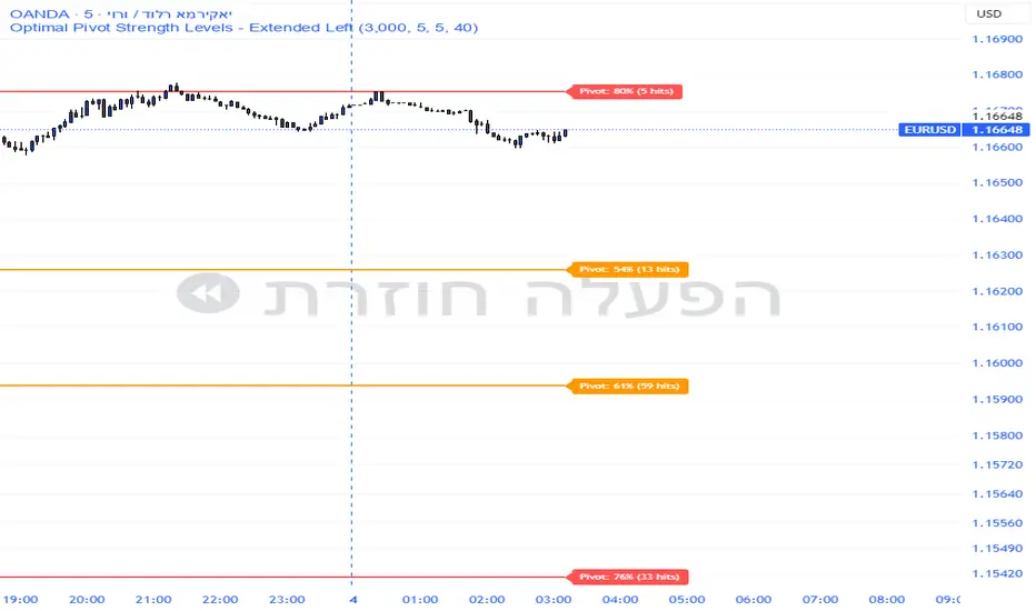
Pivot Edge ProOverview
Smart Pivot Analytics is a highly accurate technical analysis tool designed to identify and validate significant price levels. Unlike standard pivot indicators that only mark recent highs, this tool backtests each identified pivot against thousands of historical candlesticks to calculate its real-world “success rate.”
Key Features
Historical Backtesting: The indicator scans up to 4,900 historical columns to find every instance where price interacted with a specific pivot level.
Strength Score (%): Each level is assigned a percentage score based on its reversal rate. It calculates how many times the price has successfully reached and rejected the level, providing a statistical “hit rate.”
Dynamic Hit Counter: Displays the exact number of times a level has been tested (hit), helping traders distinguish between new levels and established “old” levels.
Smart Filtering: To keep the chart clean, the indicator automatically filters out weak levels and prevents “clutter” by merging levels that are too close together.
Infinite Left Projection: Lines extend left to infinity, allowing traders to see the historical significance of a level across the entire price history at a glance.
How to Trade with It
Red Levels (High Power > 75%): These are “Top Reaction Zones”. Expect a strong price rejection or significant breakout when these levels are tested.
Orange Levels (Medium Power): Suitable for profit targets or as secondary confirmation for entering a trade.
Encounter: Use these levels in conjunction with your existing strategy. When a high power pivot aligns with your entry signal, the probability of a successful trade increases significantly.
Technical Parameters
Lookback Period: Defines how far back in history the script calculates power.
Touch Radius: The "sensitivity" of the level (how close the price has to get to be considered a "hit").
Minimum Strength: A filter to show only the most reliable levels.
Supertrend 14-3 with Auto Fibthis strategy use the supertrend with the Auto fib levels for market analysis

Drawdown % + STD Bands: Log-Scale Macro ToolDrawdown % + STD Bands: Log-Scale Macro ToolDescription: The exact indicator big-macro accounts use: tracks real-time drawdown from the rolling 252-period peak, then plots -1σ (blue) and -2σ (orange) bands on a clean percent scale. Built for weekly charts-shows if a stock, index, or crypto is statistically cheap (hit -1σ) or generational-buy territory (-2σ). Works flawlessly on SPX, Nasdaq, Bitcoin, Gold, Tesla... anything. How to Use (read it aloud like a voice memo): 1. Slap this under any chart, set to weekly timeframe . 2. Flip the price pane to log scale -zero negotiations. 3. Watch the thick red line: • Hovering 0 %? Bullish noise, chill. • Kissing blue (-10 % to -25 %)? Start loading-happens every 1-2 years. • Touching orange (-30 %+)? Panic sale finished. Buy like rent money's burning a hole. 4. Zoom out five-ten years; monthly works too if you want lazy vibes. Daily? Trash-too twitchy. Pro tip: Name your watchlist Panic Plays, drop this in, and ping me when MELI or GOOGL hits orange. I'll confirm if it's actually stupid-cheap.

CVD Table + Alerts📌 Overview
CVD Table + Alerts is a pure order-flow indicator designed to track real buying and selling pressure using Cumulative Volume Delta (CVD).
It highlights momentum shifts and institutional participation through precise, non-repainting alerts, without cluttering your chart with unnecessary visuals.
This indicator does not predict price — it reveals what large participants are actually doing.
🔍 What This Indicator Does
1️⃣ Cumulative Volume Delta (CVD)
Calculates CVD by separating volume into:
Buying volume (close ≥ open)
Selling volume (close < open)
Accumulates this data to show net demand vs supply over time.
This allows traders to see:
Whether moves are sponsored or weak
If price is rising on real buying or just drifting
2️⃣ CVD Flip Detection (Momentum Shift)
The indicator detects when:
CVD changes direction from the previous candle
This represents:
Shift from buyers → sellers
OR sellers → buyers
👉 Acts as an early warning signal before visible price structure changes like ChoCH or BOS.
3️⃣ CVD Burst Detection (Institutional Activity)
A CVD Burst alert triggers when:
The current CVD delta is abnormally large compared to recent averages
This typically signals:
Aggressive market orders
Institutional participation
Potential trend ignition
🔔 Alerts (Exact & Reliable)
This indicator generates only two alert types:
🔹 CVD Flip Alert
Triggered when order-flow direction changes.
CVD Flip! CVD: | Δ: | Direction: ↑ / ↓
🔹 CVD Burst Alert
Triggered when sudden volume imbalance appears.
CVD Burst! CVD: | Δ: | Direction: ↑ / ↓
Alert Behavior
✅ Fires only on candle close
✅ No repainting
✅ No historical spam
✅ One alert per bar maximum
📊 CVD Table (At-a-Glance Insight)
The built-in table shows:
Recent volume
CVD values
Delta direction (↑ / ↓)
Percentage change
Highlights major bull/bear deltas
This gives traders instant context without switching indicators.
🎯 How Traders Benefit
This indicator is best used as a confirmation and context tool, not a standalone strategy.
Ideal Use Cases:
Confirm ChoCH / BOS
Validate EMA-based trend direction
Filter false breakouts at S/R, Gann, Fib, VWAP
Identify trend days vs range days
Spot divergence between price and participation
Best Paired With:
EMA / trend filters
Market structure (ChoCH, BOS)
Support & Resistance
ATR / volatility analysis
⚠️ Important Notes
This is not a buy/sell signal generator
Designed for discretionary traders
Works best in liquid markets (indices, large caps, crypto majors)
🧠 Trading Philosophy
Price shows where it moved.
CVD shows who moved it.
This indicator helps you trade with participation, not hope.

TICK.US Dashboard 5mIt's a very simple script, It displays the TICK.US Timeframe 5 mn on your template
Daily ATR & 20%This is the daily atr value that is put in a table in upper right corner of trading view. it calculated 20% of the daily atr for a quick reference to see if the first candle is a manipulation candle.

Watchlist Auto Buy/Sell AlertsTrial for the best. This indicator is built to assess the chart and make it easier for traders to identify coins that are available for trading and minimize losses.

Box Theory [Interactive Zones] PyraTimeThis script combines Nicholas Darvas’s "Box Theory" with modern Supply and Demand (Premium/Discount) concepts. It automatically identifies the most recent Swing High and Swing Low to delineate the current trading range.
The purpose of this tool is to visualize market structure and help traders identify when price is relatively expensive (Premium) or cheap (Discount) within a defined range.
Visual Guide: What You Are Seeing
The Box: Represents the active trading range defined by the most recent significant Swing High and Swing Low.
Red Zone (Premium): The top 25% of the range. Mathematically, prices here are considered "expensive" relative to the current structure.
Green Zone (Discount): The bottom 25% of the range. Prices here are considered "cheap" relative to the current structure.
Grey Zone (Equilibrium): The middle 50% of the range. This is the area of fair value where price often consolidates.
Dashed Line (EQ): The exact 50% midpoint of the range.
Tutorial: How to Trade Using This Indicator
Method 1: Mean Reversion (Range Trading) This method applies when the market is moving sideways.
Identify Structure: Wait for a box to form.
Wait for Extremes: Do not trade when price is in the middle (Grey/White area). Wait for price to enter the Red or Green zones.
Entry Trigger:
Shorts: When price enters the Red Zone, look for a rejection (wicks leaving the zone) or a lower timeframe breakdown. Target the EQ (Midline) as your first take profit.
Longs: When price enters the Green Zone, look for support formation. Target the EQ (Midline) as your first take profit.
Method 2: Trend Continuation (Breakouts) This method applies when the market is trending strongly.
Breakout: Monitor the alerts. A close outside the box indicates a potential shift in market structure.
Retest: After a breakout up, the old "Red Zone" (Resistance) often flips to become new Support. Wait for price to pull back to the top of the old box before entering.
Configuration Guide (Settings)
Pivot Left/Right Bars (Sensitivity):
Default (20/20): Best for Swing Trading. It filters out market noise and only draws boxes based on major structural points.
Lower (5/5): Best for Scalping. It will create smaller, more frequent boxes but increases the risk of false signals.
Zone Percentage:
Default (25%): Standard deviation for Supply/Demand zones.
Alternative (15%): Use this for "sniping" entries at the absolute extremes of the range.
Multi-Timeframe (MTF):
Enable "Use Higher Timeframe" to see Daily or Weekly ranges while trading on lower timeframes (like the 15m or 1H). This helps keep your intraday trades aligned with the major trend.
Technical Note on "Lag" This indicator uses Pivots to draw the box. A pivot is only confirmed after a certain number of bars have passed (the "Pivot Right Bars" setting).
Example: If "Pivot Right Bars" is set to 20, the box will update 20 bars after the actual high or low occurred. This is necessary to confirm that the point was indeed a Swing High/Low. Do not treat the box lines as predictive; they are reactive to confirmed structure.

Position Avg Line + P/L Table - SightLine LabsPosition Avg – SLL is a lightweight position-tracking indicator designed to display a persistent average price level on the chart along with a real-time position summary table.
This script is non-trading and does not generate signals, entries, or exits. It is intended strictly for position awareness and visual reference.
What this indicator does:
Plots a persistent horizontal average price line (dashed by default)
Displays a live position statistics table showing:
Shares owned
Average price
Current price
Unrealized profit/loss in dollars
Unrealized profit/loss in percent
Updates automatically as price changes
Works across all timeframes
Does not depend on broker integration or strategy logic
Key features:
Average Price Line:
User-defined average price input
Persistent across the entire chart
Adjustable color and width
Visibility toggle
Position Table:
Six selectable table positions:
Top Left, Top Center, Top Right, Bottom Left, Bottom Center, Bottom Right
Adjustable text size (Tiny through Huge)
Optional table background fill
Optional inner grid lines
Optional outer frame border
Independent color control for:
Header background
Header text
Value text
Positive and negative P/L values
Chart Overlay Options:
Optional chart background tint
Does not modify the global chart theme
Inputs overview:
Position Settings:
Shares Owned
Average Price
Visual Settings:
Show or hide average price line
Line color and width
Table Settings:
Table position
Table text size
Color Settings:
Header background and text colors
Value text color
Positive and negative P/L colors
Optional table background, grid, and frame colors
How to use:
Add the indicator to a chart
Open the settings panel
Enter the number of shares and the average price
Adjust table position, size, and colors as desired
Use the average price line and table as a visual reference for trade and risk management
Notes and limitations:
This indicator does not place trades
It does not connect to any broker
All values are manually entered
Unrealized P/L is calculated using the chart’s current price
Commissions, fees, and slippage are not included
Disclaimer:
This script is provided for educational and informational purposes only. It does not constitute financial advice, investment recommendations, or trade signals. All trading decisions are the sole responsibility of the user.
Developed by SightLine Labs.

Jack Dunn (Mean Reversion, Z-score + Vol Filter + Trend Filter))based on mean reversion and z score
FOR 1M XAUUSD or 5M USDJPY


RSI + WVF Confluence [Multi-Stage]Overview
The RSI + WVF Confluence is a sophisticated reversal indicator that merges momentum analysis with market volatility. By combining a "hooking" Relative Strength Index (RSI) with a synthetic Williams VIX Fix (WVF), this tool identifies high-probability turning points where market "panic" meets a recovery in price action.
Unlike standard RSI indicators that fire signals based on a single threshold, this script uses a Multi-Stage Exhaustion System to categorize the depth of a reversal, helping traders distinguish between a minor bounce and a major market bottom.
How It Works
The indicator looks for a specific "Dual-Confirmation" setup:
Volatility Peak (The WVF): The script detects when price has dropped significantly relative to recent highs, creating a "Fear Peak" (indicated by the gray background).
Momentum Pivot (The RSI): It then waits for the RSI to "pivot" or curl upward, confirming that the downward pressure has exhausted and buyers are stepping back in.
The Multi-Stage Signal System
Signals are color-coded based on the severity of the oversold condition at the time of the pivot:
🟣 Magenta (Extreme): RSI below 15. A rare, high-conviction "blow-off" bottom.
🔴 Red (High): RSI between 15–20. Deep exhaustion usually seen in major corrections.
🟠 Orange (Moderate): RSI between 20–25. A strong, reliable reversal zone.
🟡 Gold (Standard): RSI between 25–30. The classic oversold bounce.
💎 Cyan (Early Warning): A tactical signal that fires during high-volatility spikes even if the RSI hasn't touched 30. Perfect for catching "V-Bottoms" and sharp pullbacks in strong uptrends.
Key Features
Volatility Memory: Includes a "WVF Memory" lookback, ensuring signals are captured even if the momentum shift happens a few bars after the peak of market fear.
ATR-Adjusted Labels: Arrows are mathematically positioned below the candles using Average True Range (ATR) to ensure a clean, overlap-free chart regardless of the asset's price.
Modern Pine Script v6: Optimized for performance and high-speed calculation on any timeframe.
Trading Instructions
For Bottom Fishing: Look for Magenta or Red arrows. These indicate the market is severely overextended.
For Trend Following: Use the Cyan (Early Warning) arrows to buy the dip during a bull market when the RSI stays relatively high but volatility spikes briefly.
Confluence: The gray background indicates "Peak Fear." The best signals often occur when an arrow appears while the background is active or immediately after it fades.

Multi-Level RSI Pivot ArrowsRSI Multi-Level Pivot Arrows
This indicator identifies high-probability long entries by detecting RSI "Hooks" at four distinct stages of exhaustion. Unlike standard RSI signals that trigger simply for being low, this script confirms a momentum pivot—firing only when the RSI has bottomed out and begun to tick upward.
How it Works
The script monitors the Relative Strength Index (RSI) for a specific "pivot" pattern: the previous bar must be oversold, and the current bar must show rising momentum. To help you gauge the severity of the oversold condition, the arrows are color-coded by intensity:
🟡 Gold (RSI 30): Standard oversold bounce.
🟠 Orange (RSI 25): Strong exhaustion.
🔴 Red (RSI 20): Extreme exhaustion.
🟣 Magenta (RSI 15): Maximum intensity/Rare "blow-off" bottom.
Key Features
Momentum Confirmation: Avoids "catching a falling knife" by waiting for the RSI to curl upward.
ATR-Based Positioning: Arrows automatically adjust their distance from the candle based on market volatility, keeping your chart clean and readable.
Modern Pine Script v6: Optimized for the latest TradingView engine for high performance and accuracy.
How to Trade
Look for Color Clusters: A Magenta arrow followed by a Gold arrow often confirms a strong base is forming.
Trend Alignment: This indicator works best in ranging markets or as a tool to catch deep pullbacks in an overall uptrend.
Risk Management: Use the deeper levels (Red/Magenta) to identify high-consequence reversal zones.

DDDDD : EMA Pack (Matched Colors + MTF)📌 DDDDD : EMA Pack (Matched Colors + MTF)
🔹 Concept
DDDDD : EMA Pack is a clean and minimal Exponential Moving Average (EMA) overlay designed for trend structure analysis and multi-timeframe context.
This indicator focuses on visual clarity, consistent color mapping, and optional MTF EMA projection, allowing traders to read market structure without clutter or signal noise.
It is not an entry or signal generator, but a trend and regime visualization tool.
🔹 Logic
The script plots a fixed set of EMAs commonly used to define short-term momentum, intermediate trend, and long-term bias:
EMA 5
EMA 10
EMA 25
EMA 50
EMA 75
EMA 200
Each EMA is calculated using the standard exponential moving average formula.
If a higher timeframe is selected, the EMA is calculated on that timeframe and projected onto the current chart using request.security().
🔹 Methodology
Users may select:
Source price (default: close)
EMA timeframe
Empty = current chart timeframe
Any higher timeframe = true MTF EMA projection
All EMA colors are manually matched and fixed to maintain visual consistency across markets and timeframes.
Line thickness is kept uniform to avoid visual hierarchy bias.
This design ensures the indicator remains purely structural, without repainting logic, smoothing tricks, or adaptive parameters.
🔹 How to Use
Use EMA alignment and spacing to assess:
Trend direction
Trend strength
Compression vs expansion
Higher-timeframe EMA projection can be used as:
Dynamic support/resistance
Trend filter
Regime context for lower-timeframe execution
This indicator works best when combined with:
Price action
Market structure
Separate entry/exit logic of your own system
⚠️ This indicator does not provide buy/sell signals and should not be used alone for trade execution.
🔹 Notes
No repainting beyond standard MTF behavior
No performance or profitability claims
Designed for discretionary and systematic traders
Suitable for stocks, crypto, forex, and indices

Elite Net Cash by Mashrab🚀 Elite Net Cash Dashboard code by Mashrab
Stop switching tabs. Get the full fundamental picture instantly.
This dual-panel dashboard puts institutional-grade data right on your chart. It splits the "heavy math" from the "market context," giving you a clean, professional view of a company's true value and trading personality.
🔥 Why You’ll Love It
Two Smart Tables:
Financials: See the health check immediately—Net Cash, Cash Backed %, Free Cash Flow, and Revenue Growth.
Profile: Know who you are trading—Market Cap (with auto-class like "Mega" or "Small"), Volatility (ADR), and Sector.
Auto-ETF Mapping: It automatically tags the sector with its matching ETF (e.g., Technology (XLK)). Perfect for quickly checking relative strength!
Volatility Alerts: The ADR (Average Daily Range) turns Yellow if the stock moves more than 5% a day. Know the risk before you size your position.
Minimalist Mode: Want a clean chart? Uncheck the "Borders" box in settings for a sleek, text-only floating display.
🎯 How to Trade It
Check the Green: Look at the Financials table. Green numbers mean the company is cash-rich and growing.
Check the Moves: Look at the Profile table. High ADR means expect wild swings; Mega Cap means steady stability.
Check the Sector: Use the ETF tag to see if the whole industry is moving or just this stock.
⚙️ Make It Yours
Split the View: Put Financials top-right and Profile bottom-right (or anywhere else).
Style It: Toggle borders on/off and pick your colors.

Sector Rotation ULTIMATE: 7 Narrativas IndependientesSector Rotation ULTIMATE: Crypto Narrative Rotation (7 Independent Sectors)
Advanced indicator displaying the relative strength of major crypto sectors through 7 independently normalized lines (0-100):
• Layer1 (ETH, SOL, BNB, TON, etc.) - Pink
• Enterprise (XRP, HBAR, XLM, QNT, VET) - Yellow
• DeFi (UNI, AAVE, MKR, LDO, CRV, etc.) - Cyan
• Memecoins (SHIB, DOGE, PEPE, WIF, FLOKI, BONK) - Green
• AI (TAO, FET, ICP, GRT, etc.) - Orange
• L2 / Scalability (ARB, OP, MATIC, STRK) - Purple
• RWA + Infra (ONDO, LINK) - Brown
Each sector sums the dominance of its top coins (40 total) and is normalized independently so the lines cross constantly, revealing real capital rotations.
- Colored fills to visually highlight the leading sector
- Works perfectly on any timeframe (clean daily data, no intraday noise)
- Ideal for spotting altseason, sector rotations, and entry timing
Use on CRYPTOCAP:TOTAL. The definitive narrative oscillator for 2026!
#Crypto #Altcoins #SectorRotation #DeFi #Memecoins #AI #RWA
