지표 및 전략

Market Acceptance Zones [Interakktive]Market Acceptance Zones (MAZ) identifies statistical price acceptance — areas where the market reaches agreement and price rotates rather than trends.
Unlike traditional support/resistance tools, MAZ does not assume where price "should" react. Instead, it highlights regions where multiple internal conditions confirm balance: directional efficiency drops, effort approximately equals result, volatility contracts, and participation remains stable.
This is a market-state diagnostic tool, not a signal generator.
█ WHAT THE ZONES REPRESENT
MAZ (ATF) — Chart Timeframe Acceptance
A MAZ marks an area where price displayed rotational behaviour and the auction temporarily agreed on value. These zones often act as compression regions, fair-price areas, or boundaries of consolidation where impulsive follow-through is less likely.
Use ATF MAZs to:
- Identify rotational environments
- Avoid chasing price inside balance
- Frame consolidation prior to expansion
MAZ • HTF / MAZ • 2/3 — Multi-Timeframe Acceptance (AMTF)
When Multi-Timeframe mode is enabled, MAZ evaluates acceptance on:
- The chart timeframe
- Two higher structural timeframes
If the minimum consensus threshold is met (default: 2 of 3), the zone is classified as AMTF. These zones represent stronger agreement and typically decay more slowly than single-timeframe acceptance.
AMTF zones are structurally stronger and are useful for:
- Higher-quality rotation areas
- Pullback framing within trends
- Context alignment across timeframes
H • MAZ — Historic Acceptance Zones
Historic MAZs represent older acceptance that has transitioned out of active relevance. These zones are hidden by default and can be enabled to provide long-term memory context.
█ AUTO MULTI-TIMEFRAME LOGIC
When MTF Mode is set to Auto, MAZ uses a deterministic structural mapping based on the current chart timeframe:
- 5m → 15m + 1H
- 15m → 1H + 4H
- 1H → 4H + 1D
- 4H → 1D + 1W
- 1D → 1W + 1M
This ensures consistent higher-timeframe context without manual configuration. Advanced users may switch to Manual mode to define custom timeframes.
█ ZONE LIFECYCLE
MAZ zones are dynamic and maintain an internal lifecycle:
- Active — Acceptance remains relevant
- Aging — Acceptance quality is degrading
- Historic — Retained only for memory context
Zones track price interaction and re-acceptance, which can stabilise or strengthen them. Weak or stale zones are automatically removed to keep the chart clean.
█ HOW TRADERS USE MAZ
MAZ is designed to provide structure, not entries.
Common applications include:
- Avoiding chop when price is inside acceptance
- Framing expansion after clean breaks from MAZ
- Identifying higher-quality rotational pullbacks (AMTF zones)
- Defining objective invalidation using zone boundaries
█ SETTINGS OVERVIEW
Market Acceptance Zones — Core
- Acceptance Lookback
- ATR Length
- Zone Frequency (Conservative / Balanced / Aggressive)
Market Acceptance Zones — Zones
- Maximum Zones
- Fade & Stale Bars
- Historic Zone Visibility (default OFF)
Market Acceptance Zones — Timeframes
- MTF Mode (Off / Auto / Manual)
- Manual Higher Timeframes
- Minimum Consensus Requirement
Market Acceptance Zones — Visuals
- Neon / Muted Theme
- Zone Labels & Consensus Detail
- Optional Midline Display
█ DISCLAIMER
This indicator is a market context and diagnostic tool only.
It does not generate trade signals, entries, or exits.
Past acceptance behaviour does not guarantee future price action.
Always combine with independent analysis and proper risk management.

ChromaFlows Momentum Index | LUPENIndicator Guide: ChromaFlows Momentum Index
Overview
The ChromaFlows Momentum Index is a next-generation momentum oscillator designed to filter out market noise and visualize pure trend strength. Unlike traditional indicators that often give conflicting signals, ChromaFlows uses a Consensus Algorithm. It simultaneously analyzes three distinct engines—RSI, Fast Stochastic, and Slow Stochastic—and only lights up when they all agree on the market direction.
The result is a fluid, glowing "Wave" that provides an immediate visual read on market sentiment:
Green Glow: Strong Bullish Consensus (Safe to buy/hold).
Red Glow: Strong Bearish Consensus (Safe to sell/short).
Gray/Neutral: Indecision or Choppy Market (Stay out or tread carefully).
Key Visual Components
1. The Gradient Wave (Main Oscillator)
This is the heartbeat of the indicator. It is usually based on the Slow Stochastic (customizable in settings) but its color is determined by the Consensus Logic.
How to read it: The higher the wave, the more overbought; the lower, the more oversold. However, pay attention to the Glow Intensity. A bright, solid color indicates all underlying indicators are aligned.
2. The SMI Line (Gold Line)
Overlaid on the wave is the SMI (Stochastic Momentum Index) Blau line. This acts as a fast-moving "Signal Line".
Usage: Watch for how this line interacts with the main wave. It leads price action and often signals reversals before they happen.
3. Signal Arrows (Triangles on the Wave)
▲ Cyan Triangle: SMI Crossover UP. This occurs when the Main Wave crosses above the SMI Signal line. This is a potential Long Entry.
▼ Magenta Triangle: SMI Crossover DOWN. This occurs when the Main Wave crosses below the SMI Signal line. This is a potential Short Entry.
4. Hull Trend Markers (Circles/Shapes at Edges)
Located at the very top and bottom of the indicator panel are the Hull Moving Average (HMA) filters.
Bottom Blue/Green Marker: The longer-term Hull Trend is UP.
Top Orange/Red Marker: The longer-term Hull Trend is DOWN.
How to Trade Strategy
✅ The "Flow" Setup (High Probability)
This strategy focuses on taking trades with the momentum consensus.
Wait for the Glow: Look for the Wave to turn Neon Green (Bullish) or Neon Red (Bearish). This confirms momentum is present.
Check the Filter: Ensure the Hull Trend Marker (at the top/bottom) matches the wave color (e.g., Blue marker + Green Wave).
The Trigger: Enter when a Triangle Signal Arrow appears in the direction of the color.
Example: Wave is Green + Cyan Triangle appears = STRONG BUY.
⚠️ The "Reversal" Setup (Aggressive)
Divergence: Price makes a new high, but the ChromaFlows Wave makes a lower high.
Color Shift: The wave changes from Green to Gray (Neutral), indicating momentum is dying.
The Trigger: Wait for a Magenta Triangle (Cross Down) to confirm the reversal.
⛔ The "No-Trade" Zone
When the Wave is Gray and hovering near the zero line, the markets are ranging or the indicators are conflicting. It is statistically safer to stand aside until the "ChromaFlow" (Green or Red color) returns.
Settings Configuration
Wave Source: Choose which oscillator drives the main wave (Default: Stochastic_2).
Consensus Sensitivity: Adjust the periods of the RSI and Stochastics to make the "Glow" appear faster (more signals) or slower (more filtering).
Visuals: All colors are fully customizable via Hex codes to match your chart theme.


ICT ORB Killzones by MaxN (15 / 30m)Trading session open/close with first 15/30 min orbs
will just have to adjust time zones to your current time line
GMT +0
I use
Asia 23.00 - 06.00
London 07.00 - 16.00
New York 12.00 - 22.00

Laughing Grid Radar
// ═══ Row 9: 底部装饰线 ═══
table.cell(panel, 0, 9, "▄▄▄▄▄▄▄▄▄▄▄▄▄▄▄▄▄▄▄", bgcolor=c_void, text_color=c_neon_pink, text_halign=text.align_center, text_size=size.tiny)
table.merge_cells(panel, 0, 9, 1, 9)

Anurag - Balanced 0DTE Scalper QQQ SPYBalanced 0DTE Scalper is a professional-grade execution system designed specifically for the high-velocity world of 0DTE (Zero Days to Expiration) options trading on indices like SPY, QQQ, and IWM.
Unlike standard indicators that repaint or lag, this system uses Non-Repainting Multi-Timeframe Logic to align the institutional trend (15m) with precision entry triggers (5m). It is engineered to solve the two biggest killers of 0DTE traders: Theta Decay (holding too long) and Choppy Markets (trading without trend).
How It Works
1. The "Safety Belt" (15-Minute Trend Filter) Before any trade is taken, the system checks the confirmed 15-minute Trend and ADX (Strength).
No Repainting: It strictly uses the previous closed 15m bar to determine bias. Once a signal prints, it stays printed.
Regime Detection: It automatically blocks trades during low-volume "chop" (Low ADX) to save you from theta burn.
2. Precision Entry Triggers (5-Minute) Once the 15m trend gives the "Green Light," the system hunts for 5m setups using a confluence of:
EMA Crossovers: For immediate momentum.
VWAP Filter: Ensuring you are on the right side of institutional volume.
RSI Check: To avoid buying tops or selling bottoms.
3. Aggressive Risk Management (The "Profit Locker") 0DTE profits can vanish in seconds. This script manages the trade for you visually:
Dynamic Trailing Stop: Trails price based on candle Highs/Lows (not closes), allowing it to lock in profits at the peak of a spike.
Time Stop: If a trade stalls for 60 minutes (12 bars), the system triggers a "Time Exit." In 0DTE, time is money—if it's not working, get out.
Visual Levels: Automatically draws your Stop Loss, Target 1 (Conservative), and Target 2 (Runner) lines on the chart.
Features & Dashboard
Live Dashboard: Monitors Trend Bias, ADX Strength, RSI, and Open PnL in real-time.
On-Chart Tickets: Prints a "CALL OPEN" or "PUT OPEN" label with the exact Entry Price, Stop Loss, and Strike Suggestion.
Session Filters: Automatically avoids the first 10 minutes (Open Volatility) and the last 15 minutes (Close Chaos).
Settings Guide
Risk Mode:
Balanced (Default): The recommended blend of Trend + Momentum.
Conservative: Requires a very strong ADX trend. Fewer trades, higher win rate.
Aggressive: Ignores ADX strength. Good for FOMC/CPI days only.
Strike Suggestion: Automatically calculates the nearest Strike Price (ATM/OTM) for SPY/QQQ based on your settings.
Disclaimer
This tool is for educational purposes only. 0DTE options trading involves extreme risk of capital loss. Past performance (even with non-repainting logic) is not indicative of future results. Always manage your risk.

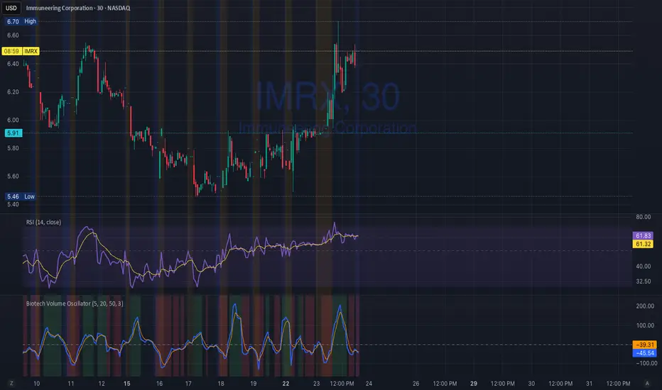
Biotech Volume Oscillator1️⃣ What This Indicator Is (In One Sentence)
It tells you whether people are actually showing up to trade the stock, or if price is just drifting around on low interest.
That’s it.
It does not predict price.
It tells you whether a move is real or fragile.
2️⃣ What the Lines Mean
You see two lines:
🔵 Blue Line = Live Participation
Fast
Reacts immediately
Shows what traders are doing right now
Think:
“Is anyone actually trading this candle?”
🟠 Orange Line = Accepted Participation
Slower
Smoothed
Shows what the market has decided is normal
Think:
“Is this level of activity sticking?”
3️⃣ What the Numbers Mean (Very Important)
The numbers are percentages vs normal volume for this stock.
Around 0
Volume is normal
Nothing special happening
+10 to +25
Healthy interest
Traders are paying attention
Moves can continue
Above +25
Abnormal participation
News, hype, or institutions involved
Moves here tend to be fast
Below –20
Participation drying up
Drift, chop, fake breakouts
Below –30
Nobody is home
Price can move, but it’s fragile
Breakouts usually fail
4️⃣ How to Use It (Step-by-Step)
Step 1: Ignore Price for a Second
Look only at the oscillator.
Ask:
“Is this above zero or below zero?”
Step 2: Look at Direction
Rising oscillator → interest increasing
Falling oscillator → interest fading
Step 3: Compare Blue vs Orange
✅ Good / Healthy
Blue above orange
Both rising
→ New participation is entering
⚠️ Warning
Price rising
Blue flat or falling
Orange flat
→ Float, not conviction
🚨 Distribution
Blue rolls over from high levels
Orange follows
Price still looks “fine”
→ Selling into strength
ICT ORB Killzones by MaxN (15 / 30m)Trading session London, Asia, New York
orb 15/30 min selectable breakout zones with buy/sell signals

#BLTA - CARE 7891🔷 #BLTA - CARE 7891 is an overlay toolkit designed to support structured trading preparation and chart reading. It combines a manual Trade Box + Lot Size/Risk panel, session background highlights (NY time), confirmed Previous Day/Week High-Low levels, an Asian range liquidity box, a 1H ZigZag market-structure projection, and an imbalance map (FVG / OG / VI) with an optional dashboard.
This script is an indicator (not a strategy). It does not place orders and is intended for planning, risk visualization, and market context.
✅ Main Modules
1) 💸 Risk Module (Trade Box + Lot Calculation + Table)
A complete manual trade-planning tool:
Pick an Entry Point (EP) and Stop Loss (SL) directly on the chart using input.price(..., confirm=true).
Automatically calculates:
Cash at Risk
SL distance (pips) (Forex-aware)
Lot size based on your:
Account balance
Risk %
Units per lot
Account base currency (with conversion if needed)
Draws:
Risk box (EP ↔ SL)
Target box (RR-based TP)
Displays a clean table panel with the key values.
🔁 Re-confirm Mode (Wizard)
Use “Re-confirm Trade Box Points” to force a clean logical reset and re-pick EP/SL/time anchors:
Shows temporary EP/SL labels
Shows a small wizard table guiding you step-by-step
Turn it OFF to return to normal risk table + boxes
Tip: If your chart timeframe changes or you want a fresh selection, Re-confirm mode is the safest way to reset everything cleanly.
2) 🎨 Session Visualization (New York Time)
Highlights chart background for these windows:
Day Division (17:00–17:01 NY)
London (03:00–05:00 NY) + sub-windows
New York (08:00–10:30 NY) + sub-windows
Colors are fully configurable from inputs.
3) 📰 Confirmed PDH/PDL (Previous Days)
Optional module that plots confirmed Previous Day High (PDH) and Previous Day Low (PDL):
Trading day is defined as 17:00 → 17:00 NY
Lines start exactly at the candle where the high/low occurred
Lines extend forward and can freeze when price touches them
Configurable: days to keep, style, width, and “stop on hit”
4) 📅 Confirmed Weekly High/Low (Previous Weeks)
Optional module that plots confirmed Weekly High/Low:
Confirmation occurs at Sunday 17:00 NY (typical FX week boundary)
Lines begin at the candle where the weekly extremes formed
Extends forward and can freeze on touch
Configurable: weeks to keep, style, width, stop-on-hit
5) 🈵 Asian Range Liquidity Box
Draws a session box that tracks high/low and optional midline (50%):
Uses New York time
Dynamic updates while session is active
Optional mid label and configurable line style/width
6) 📈 Market Structure - ZigZag (1H projected)
A ZigZag structure engine calculated on 1H and projected onto any timeframe:
Configurable:
Length
Source type (High/Low or Open/Close)
Colors and width
Opacity when viewing non-1H charts
Optional live extension of the last leg
Includes safe cleanup when toggling OFF (no leftover objects)
7) 📊 Imbalance Detector (FVG / OG / VI) + Dashboard
Detects and draws:
Fair Value Gaps (FVG)
Opening Gaps (OG)
Volume Imbalances (VI)
Optional dashboard shows frequencies and fill rates.
Attribution / Credits
This module is inspired by / adapted from the public concept widely known as “Imbalance Detector” (LuxAlgo-style logic). This script is independently packaged and integrated as part of the toolkit with additional modules and custom structure.
⚙️ How to Use (Quick Steps)
Add the indicator to the chart (overlay).
Enable 💸 Risk Module if you want trade planning.
Go to Trade Box Location and pick:
Entry Point (EP)
Stop Loss (SL)
Time anchors for box edges
Adjust:
Account balance, risk %, units per lot, RR target
Enable additional modules as needed:
Session backgrounds
PDH/PDL
Weekly High/Low
Asian range box
ZigZag
Imbalances + dashboard
🔎 Notes & Limitations
This script is for visual planning and context, not trade execution.
Lot sizing is based on the selected EP/SL and your inputs; always double-check broker rules, symbol specifications, and contract size.
Object-heavy features (boxes/lines/tables) may increase load on lower-end devices or very small timeframes.

Lot Size Calculator (Entry + SL) GOLDLot Size Calculator (Entry + SL)
This indicator helps traders calculate the correct position size (lots) based on risk management, using a fixed account balance and risk percentage per trade.
By providing an Entry Price and Stop-Loss Price, the script automatically computes:
Dollar risk per trade
Stop-loss distance
Risk per unit
Total position size in units
Final position size in lots (rounded to broker-compatible steps)
How It Works
Define your Account Balance.
Set your Risk % per trade (e.g., 1%).
Choose your Entry Price:
Manual input, or
Use the current market price.
Enter your Stop-Loss Price.
The indicator calculates the maximum lot size so that your loss at SL equals your predefined risk.
Key Features
Uses TradingView’s syminfo.pointvalue for accurate instrument pricing
Supports any market (Forex, indices, commodities, crypto)
Custom units per lot (FX standard, mini, micro, or custom CFD contracts)
roker-friendly lot rounding
Clean table display for quick decision-making
Ideal for traders who:
Follow strict fixed-percentage risk management
Want consistent position sizing
Trade multiple instruments with different contract sizes
This tool ensures every trade risks the same percentage of capital, regardless of stop-loss distance.

Supertrend 14-3 with Auto Fibthis strategy use the supertrend with the Auto fib levels for market analysis

Momentum Echo Oscillator [Community Edition]Concept: The Momentum Echo Oscillator (MEO) is a modern take on classical momentum oscillators. Most indicators only look at the "now". MEO introduces the concept of Momentum Echoes—historical momentum harmonics that are weighted and blended back into the current price velocity.
Why use MEO? Standard momentum tools (like ROC or RSI) can be very "jittery" or noisy. By integrating historical echoes, MEO provides a smoother, more rhythmic representation of price flow, making it easier to spot genuine trend reversals.
Key Elements:
Primary Momentum: The immediate speed of price.
Echo Harmonics: Two adjustable lookback points that act as a "memory" for the indicator, filtering out false breakouts.
Dynamic Histogram: Visualizes the gap between the Echo Engine and the Trigger Line, highlighting acceleration and deceleration.
Settings:
Echo Weight: Adjust how much "memory" you want the indicator to have.
Smoothing: Clean up the signals for higher timeframes.
This is an open-source tool for the TradingView community. Enjoy!

Next-Gen Market Signal Dashboard Key Features:
Trend Detection: EMA50 and EMA200 highlight bullish and bearish trends with subtle background coloring.
Momentum Indicators: RSI, MACD, and Stochastic Oscillator confirm signal strength and market momentum.
Volatility Filter: ATR ensures signals are only triggered during active market conditions.
Visual Signals: Animated triangles and colored backgrounds for LONG (green) and SHORT (red) signals.
Take Profit / Stop Loss: Automatic, elegant TP and SL lines to guide trades.
Compact Multi-Indicator Panel: Displays RSI, MACD, Stochastic, and ATR with color-coded strength indicators.
Mini-Guide: Integrated panel explanations help quickly interpret signals without confusion.
Alerts: Built-in alerts for all LONG and SHORT signals.

Dual-Timeframe ABR DashboardDual-Timeframe ABR Dashboard 是一款专为日内交易者设计的波动率参考工具,用于同时评估当前周期与日线级别的平均K线波幅(ABR)。
该指标基于 Average Bar Range(高低差的简单平均),帮助交易者快速判断:
单根K线的“正常”波动范围
当前价格相对于 ABR 的百分比位置
当日是否已接近日线级别的常规波动极限
指标不会在图表上绘制干扰性线条,而是通过状态栏与固定表格实时展示最新 ABR 数值,适合用于:
目标利润(TP)与止盈管理
趋势是否具备延续空间的判断
避免在“已走完波幅”的位置追价入场
这是一个为实盘决策服务,而非视觉美观的专业级日内交易辅助指标。
======================================================================
Dual-Timeframe ABR Dashboard is a volatility reference tool designed specifically for day traders, providing a clear view of Average Bar Range (ABR) on both the current timeframe and the daily timeframe.
By measuring the simple average of each bar’s high–low range, this indicator helps traders quickly assess:
What constitutes a “normal” bar movement on the active timeframe
Current price movement expressed as a percentage of ABR
Whether the session has already consumed most of its typical daily range
Instead of plotting lines on the chart, the indicator presents real-time ABR values via the status line and a fixed dashboard table, keeping the chart clean and execution-focused.
This tool is particularly useful for:
Profit target and trade management
Evaluating remaining trend potential during the session
Avoiding late entries after the daily range is largely exhausted
Built for practical intraday decision-making, not visual clutter.

Gamma Levels - Options Flow# 📊 Gamma Levels - Options Flow Indicator
## TradingView Free Indicator - By AsiaQuant
---
## 🎯 What Is This?
**Gamma Levels** is a simplified TradingView indicator that shows estimated support and resistance levels based on institutional options positioning. It helps traders identify key price zones where options market makers are likely positioned.
### Key Features:
- **⚡ Gamma Flip Level**: The inflection point where dealer hedging behavior changes
- **🔴 Call Wall**: Overhead resistance from call option concentration
- **🟢 Put Support**: Downside support from put option concentration
- **🎯 Trading Zone**: The range between support and resistance
- **📊 Regime Detection**: Positive vs Negative Gamma environments
---
## 📈 How To Use
### 1. **Gamma Flip Level (⚡)**
The Gamma Flip is the most critical level. It represents where market maker hedging flips from stabilizing to destabilizing:
- **Above Gamma Flip**: Positive gamma environment → Lower volatility, mean reversion
- **Below Gamma Flip**: Negative gamma environment → Higher volatility, trend continuation
**Trading Strategy:**
- When price is **above** gamma flip: Fade extremes, trade ranges
- When price is **below** gamma flip: Follow momentum, breakouts more likely
### 2. **Call Wall (🔴)**
The Call Wall represents overhead resistance where heavy call open interest sits:
- Acts as a **magnet** when price approaches from below
- Acts as **resistance** when price tests it
- Breaking above often leads to squeeze moves
**Trading Strategy:**
- Use as profit target for long positions
- Watch for rejection and reversal setups
- Breaking through = potential gamma squeeze
### 3. **Put Support (🟢)**
The Put Support level shows where heavy put positioning provides downside support:
- Acts as **support** on pullbacks
- Breaking below signals bearish momentum
- Often bounces near this level
**Trading Strategy:**
- Use as entry zone for long positions
- Stop loss just below this level
- Breaking through = potential flush lower
### 4. **Trading Zone (Blue Shaded Area)**
The zone between Call Wall and Put Support shows the expected trading range:
- **Narrow zones** = Low volatility, potential breakout setup
- **Wide zones** = High volatility, choppy action expected
- Price tends to stay within this zone
---
## 🚦 Regime Guide
### Positive Gamma Regime (Green Background)
- Price above Gamma Flip
- Lower volatility expected
- Mean reversion strategies work better
- Selling premium strategies favorable
### Negative Gamma Regime (Red Background)
- Price below Gamma Flip
- Higher volatility expected
- Trend following strategies work better
- Directional trades more profitable
---
## ⚠️ Important Limitations
This is a **SIMPLIFIED** indicator that uses price action and volume as proxies for options positioning. It does NOT use real options chain data.
### What This Indicator Does:
✅ Estimates levels using VWAP and ATR
✅ Shows general zones of interest
✅ Provides educational framework
✅ Works on any timeframe
### What This Indicator CANNOT Do:
❌ Access real options open interest
❌ Calculate actual gamma exposure
❌ Account for 0DTE dynamics
❌ Include Vanna/Charm effects
❌ Use volatility surface interpolation
---
## 🔓 Want The Full Professional Version?
### **GEX Pro - Institutional Grade Analysis**
**Visit: (gexpro.asiaquant.com)**
#### What You Get:
- ✅ **Real Options Data**: Live OI and volume from actual options chains
- ✅ **20+ Metrics**: GEX, DEX, Vanna, Charm, Volga, IV Skew, and more
- ✅ **0DTE Logic**: Proprietary algorithm for same-day expiration positioning
- ✅ **Volatility Surface**: Cubic spline interpolation eliminates "ghost walls"
- ✅ **Shadow Gamma**: Advanced second-order risk exposure
- ✅ **Multi-Expiration**: Analyze 0DTE, weekly, and monthly expirations simultaneously
- ✅ **Directional Scoring**: AI-powered conviction scoring with 5 components
- ✅ **Trade Ideas**: Specific setups based on positioning
- ✅ **440+ Tickers**: SPY, QQQ, IWM, AAPL, TSLA, NVDA, and more
#### The Difference:
| Feature | TradingView Free | GEX Pro |
|---------|------------------|---------|
| Data Source | Price/Volume Proxy | Real Options Chains |
| Gamma Calculation | Estimated | Actual Black-Scholes |
| Advanced Greeks | ❌ | ✅ Vanna, Charm, Volga |
| 0DTE Handling | ❌ | ✅ Volume Priority |
| Vol Surface | ❌ | ✅ Cubic Spline |
| Conviction Score | ❌ | ✅ 5-Component Model |
| Trade Setups | ❌ | ✅ Directional Ideas |
---
## 📚 Educational Resources
### Recommended Reading:
1. **"Gamma Exposure and Market Dynamics"** - Understanding dealer hedging
2. **"Volatility Trading"** by Euan Sinclair - Options Greeks in practice
3. **"The Volatility Surface"** by Jim Gatheral - Advanced vol modeling
### Key Concepts:
- **Gamma Exposure (GEX)**: The rate of change of delta with respect to price
- **Dealer Hedging**: How market makers adjust their stock positions
- **Positive Gamma**: Dealers buy dips, sell rips → stabilizing
- **Negative Gamma**: Dealers sell dips, buy rips → destabilizing
- **Vanna**: Sensitivity to spot and volatility changes
- **Charm**: Time decay of delta
---
## 🎓 Best Practices
### ✅ DO:
- Use in conjunction with price action and volume
- Combine with support/resistance levels
- Pay attention to regime changes
- Use for planning entries/exits
- Monitor gamma flip proximity
### ❌ DON'T:
- Rely solely on this indicator
- Ignore overall market conditions
- Trade against strong trends
- Over-leverage based on levels
- Treat estimates as absolute truth
---
## 📊 Example Scenarios
### Scenario 1: Approaching Call Wall
- Price rallies toward Call Wall ($595 on SPY)
- Volume increases as it approaches
- **Action**: Consider taking profits on longs, watch for rejection
### Scenario 2: Gamma Flip Cross
- Price crosses below Gamma Flip
- Regime changes to Negative Gamma
- **Action**: Reduce range trading, prepare for momentum
### Scenario 3: Bouncing Off Put Support
- Price tests Put Support ($580 on SPY)
- High volume at the test
- **Action**: Entry for longs with stop below support
---
## 🔧 Settings Guide
### Lookback Period (Default: 20)
- **Lower (10-15)**: More responsive, better for day trading
- **Higher (30-50)**: Smoother, better for swing trading
### Volatility Multiplier (Default: 1.5)
- **Lower (1.0-1.2)**: Tighter zones, more frequent tests
- **Higher (2.0-3.0)**: Wider zones, fewer tests but stronger
### Display Options
- Toggle individual levels on/off based on your strategy
- Customize colors to match your chart theme
---
## ❓ FAQ
**Q: Why don't the levels match actual options strikes?**
A: This free version uses price action approximations. For real strike-level precision, use GEX Pro.
**Q: How often should levels update?**
A: The indicator recalculates every bar. For real options data that updates throughout the day, use GEX Pro.
**Q: Can I use this for day trading?**
A: Yes, but it's approximations. For intraday 0DTE positioning, GEX Pro has specialized logic.
**Q: What timeframe works best?**
A: Works on all timeframes, but 15min-1hour is optimal for the simplified calculation.
**Q: Is this better than just support/resistance?**
A: It adds an options perspective, but should complement (not replace) standard TA.
---
## 🚀 Upgrade To GEX Pro
Ready for institutional-grade analysis?
### ** (gexpro.asiaquant.com)**
- Real options data from 440+ tickers
- 20+ advanced metrics
- AI-powered trade signals
- Professional-grade analytics
- API access available
**Stop guessing. Start knowing where the institutions are positioned.**
---
## 📧 Support & Contact
- **Website**: (gexpro.asiaquant.com)
- **Questions**: Contact form on website
- **TradingView**: Leave comments on the indicator
---
## ⚖️ Disclaimer
This indicator is for **educational purposes only**. It is not financial advice. Options and derivatives trading involves significant risk. Past performance does not guarantee future results. Always do your own research and consult with a financial advisor before making trading decisions.
The simplified calculations in this free version are approximations and may not reflect actual market conditions. For professional trading decisions, use verified data sources and professional-grade tools.
---
**Version**: 1.0
**Last Updated**: December 2024
**Created By**: AsiaQuant Research
### 🔓 **Unlock the full power: (gexpro.asiaquant.com)**

Market State Intelligence [Interakktive]Market State Intelligence (MSI) is a diagnostic market-context indicator that reveals how the market is behaving — not where price "should" go.
MSI does not generate buy/sell signals. Instead, it classifies market conditions into clear behavioural regimes by continuously measuring:
- DRIVE (directional effort)
- OPPOSITION (absorption / resistance)
- STABILITY (structural persistence)
MSI is designed to answer three practical questions:
- What state is the market in right now?
- Is energy building, releasing, or decaying?
- Is participation aligned with price, or opposing it?
█ WHAT MSI DOES
MSI operates as a real-time regime classification engine that processes each closed bar through three independent measurement systems:
DRIVE — Directional Effort (0–100)
- Displacement efficiency (net progress vs total path)
- Range expansion quality (actual range vs expected ATR range)
- Body dominance (body vs candle range)
OPPOSITION — Absorption / Resistance (0–100)
- Wick pressure (rejection relative to attempt)
- Effort–result gap (high effort, low progress)
- Reversal density (counter-moves frequency)
STABILITY — Persistence (0–100)
- Condition persistence (how long conditions hold)
- Variance score (flip frequency)
- Follow-through consistency (reaction continuity)
These three forces feed a deterministic classifier with hysteresis (anti-flicker) to identify five regimes:
COMPRESSION — low drive, low opposition, higher stability (pressure building, direction unclear)
EXPANSION — high drive, low opposition (directional energy release)
TREND — medium-high drive, higher stability, low-medium opposition (healthy continuation)
DISTRIBUTION — medium drive, high opposition (effort absorbed; progress blocked)
TRANSITION — rapidly rising opposition, low stability (regime breakdown / uncertainty)
█ WHAT MSI DOES NOT DO
- No buy/sell signals, entries/exits, or performance claims
- No prediction of future direction
- No repainting: calculations use closed-bar data only
MSI is a market state layer intended to support your execution framework.
█ VISUAL SYSTEM
MSI uses a layered visual grammar designed to remain readable on live charts:
Regime Ribbon
A thin horizontal band showing the current regime via colour. Ribbon opacity reflects regime confidence (stronger confidence = more visible).
Pressure Envelope (core visual)
A soft corridor around price that expands with Drive and becomes more visible as Opposition increases. This visualises "pressure thickness" around current action (not a volatility band for entries).
Structural Memory
Faint background stains appear where regimes previously failed (e.g., expansion collapsing into absorption). These are behavioural context zones showing where market intention was rejected — not support/resistance.
Regime Change Markers (optional)
Subtle labels appear when regimes transition after confirmation. Useful for replay and education.
Effort Halo (optional)
Candle highlighting when Opposition materially exceeds Drive, indicating absorption/inefficiency.
█ HUD PANEL
The HUD displays:
- Current regime name + colour indicator
- A context gate showing whether conditions are aligned with long-bias or short-bias context (not an entry/exit system)
█ REGIME LEGEND
When enabled, displays:
- A one-line definition of the current regime
- Live Drive / Opposition / Stability values for interpretation
█ TIME-TO-DECISION METER
A visual pressure gauge that tends to fill during Compression (energy building) and drain during Expansion (energy releasing). It is a state-tracking meter, not a timing tool.
█ SETTINGS
MSI — Settings
- Preset Mode: Scalper / Swing / Position
- Analysis Mode (Minimal): ON = subtle visuals, OFF = full intensity
- Regime Ribbon, Structural Memory, HUD Panel, Time-to-Decision Meter, Effort Halo
MSI — Visual Options
- Show Regime Changes: Labels when regime transitions occur
- Show Regime Legend: Definition and live values display
- Panel Position: Move the entire panel anywhere on chart
MSI — Advanced (Tuning)
- Sensitivity (0.5–2.0)
- Smoothing (0.5–2.0)
- Memory Decay (0.5–2.0)
- Visual Intensity (Low / Medium / High)
█ PRESETS EXPLAINED
Scalper
Higher sensitivity + lower smoothing + faster memory decay. Best for 1m–15m monitoring.
Swing (default)
Balanced behaviour. Best for 15m–4H analysis.
Position
Lower sensitivity + higher smoothing + slower memory decay. Best for 4H–1D macro context.
█ STRUCTURAL MEMORY
When a regime fails (example: Expansion → Distribution), MSI creates a memory imprint:
- Fixed stain window (preset dependent)
- Strength decays over time
- Limited to a maximum number of imprints to reduce chart clutter
These zones represent behavioural rejection, not levels.
█ SUITABLE MARKETS
MSI is designed for Forex, Crypto, Indices, Stocks, and Commodities.
Works from intraday to Daily, with particularly strong readability on 15m–4H.
█ DISCLAIMER
This indicator is for educational and informational purposes only. It does not constitute financial advice, trading recommendations, or solicitation. Trading involves substantial risk. Always use proper risk management and make independent decisions.

OrderlyWebhookJSONLibrary "OrderlyWebhookJSON"
Orderly 거래소 자동 거래를 위한 JSON Webhook 메시지 생성 라이브러리. Market/Limit 주문, TP/SL 설정, Percent/Absolute 수량 지정 등을 지원합니다.
createMarketOrder(symbol, leverage, side, position, quantity_type, quantity, tp_type, tp_value, sl_type, sl_value)
Market 주문 JSON 생성 (TP/SL 포함)
Parameters:
symbol (string) : 거래 심볼 (예: "BTCUSDT")
leverage (float) : 레버리지 배율 (예: 10)
side (string) : "Long" 또는 "Short"
position (string) : "Open" 또는 "Close"
quantity_type (string) : "Percent" 또는 "Absolute"
quantity (float) : 수량 값 (Percent인 경우 0-100, Absolute인 경우 실제 수량)
tp_type (string) : "percent" 또는 "price"
tp_value (float) : TP 값 (percent인 경우 퍼센트, price인 경우 절대가격)
sl_type (string) : "percent" 또는 "price"
sl_value (float) : SL 값 (percent인 경우 퍼센트, price인 경우 절대가격)
Returns: JSON 형식 문자열
createLimitOrder(symbol, leverage, side, position, limit_price, quantity_type, quantity, tp_type, tp_value, sl_type, sl_value)
Limit 주문 JSON 생성 (TP/SL 포함)
Parameters:
symbol (string) : 거래 심볼 (예: "BTCUSDT")
leverage (float) : 레버리지 배율 (예: 10)
side (string) : "Long" 또는 "Short"
position (string) : "Open" 또는 "Close"
limit_price (float) : Limit 주문 가격
quantity_type (string) : "Percent" 또는 "Absolute"
quantity (float) : 수량 값 (Percent인 경우 0-100, Absolute인 경우 실제 수량)
tp_type (string) : "percent" 또는 "price"
tp_value (float) : TP 값 (percent인 경우 퍼센트, price인 경우 절대가격)
sl_type (string) : "percent" 또는 "price"
sl_value (float) : SL 값 (percent인 경우 퍼센트, price인 경우 절대가격)
Returns: JSON 형식 문자열
createSimpleMarketOrder(symbol, leverage, side, position, quantity_type, quantity)
Market 주문 JSON 생성 (TP/SL 없음 - 간단 버전)
Parameters:
symbol (string) : 거래 심볼 (예: "BTCUSDT")
leverage (float) : 레버리지 배율 (예: 10)
side (string) : "Long" 또는 "Short"
position (string) : "Open" 또는 "Close"
quantity_type (string) : "Percent" 또는 "Absolute"
quantity (float) : 수량 값
Returns: JSON 형식 문자열
createSimpleLimitOrder(symbol, leverage, side, position, limit_price, quantity_type, quantity)
Limit 주문 JSON 생성 (TP/SL 없음 - 간단 버전)
Parameters:
symbol (string) : 거래 심볼 (예: "BTCUSDT")
leverage (float) : 레버리지 배율 (예: 10)
side (string) : "Long" 또는 "Short"
position (string) : "Open" 또는 "Close"
limit_price (float) : Limit 주문 가격
quantity_type (string) : "Percent" 또는 "Absolute"
quantity (float) : 수량 값
Returns: JSON 형식 문자열
createClosePosition(symbol, side, quantity_type, quantity)
포지션 종료 전용 JSON 생성
Parameters:
symbol (string) : 거래 심볼 (예: "BTCUSDT")
side (string) : "Long" 또는 "Short" (종료할 포지션의 반대 방향)
quantity_type (string) : "Percent" 또는 "Absolute"
quantity (float) : 수량 값 (Percent 100 = 전체 종료)
Returns: JSON 형식 문자열

Goldbach Start Finish V6.1 GoldBach Indicator
-Creator - Trevor
-Tks, Ajay and hopi's
-29/35 > 47(50)
Goldbach Market Algorithm — Unlocking Hidden Patterns
This indicator explores the intersection between number theory and market behavior using the concept of Goldbach numbers — the idea that every even number greater than 2 can be expressed as the sum of two prime numbers.
By mapping these numerical relationships into time and price structures, this tool detects potential zones of confluence and algorithmic reaction points often hidden to traditional technical indicators.
Built with a proprietary engine, it analyzes how prime number pairs might influence market movements through cyclical timing, fractal levels, and algorithm-driven behavior.
🔹 Ideal for: Traders looking to explore unconventional edge, time-based analysis, and algorithmic footprints.
🔹 Works well with: Mini Index (WIN), major FX pairs, and high-volume assets.
🔹ALGO2 - 97-59-83-11-47-29
🔹ALGO1 - 100-89-41-3-17-71
Inspired by mathematical order in financial chaos.

Daily & Weekly ConfluenceDaily & Weekly Confluence is a precision momentum-alignment indicator built on Stochastic RSI, designed to highlight high-probability bullish conditions when lower-timeframe momentum aligns with higher-timeframe structure. It combines live Stoch RSI signals with a forward-shifted momentum path and a robust daily/weekly confirmation system to help traders anticipate and confirm trend transitions with clarity and discipline.
Why this indicator matters
Momentum signals are most effective when they agree across timeframes. Daily & Weekly Confluence filters noise by requiring alignment between daily and weekly Stoch RSI behavior, allowing traders to focus on setups that occur within a supportive higher-timeframe context rather than reacting to isolated signals.
What the indicator shows
1. Live Stochastic RSI (%K / %D)
The indicator plots real-time Stoch RSI values for the active chart timeframe, including standard overbought and oversold reference levels. These lines represent current momentum conditions and form the basis for all signal logic.
2. Forward-shifted Stoch RSI path
A user-defined Stoch RSI pattern window is sampled from the past and drawn forward on the chart. This path visually maps how momentum previously evolved and where similar momentum behavior may re-emerge. Optional normalization keeps the path scaled to recent conditions for consistent visual interpretation.
3. Momentum cross visualization
When %K and %D intersect within the forward-shifted path, the indicator can display:
Color-cycling vertical reference lines
Small directional arrows at the crossing point
A single highlighted label marking the next upcoming cross
These visuals are designed to keep attention on momentum inflection zones, not clutter.
Multi-timeframe signal logic
Weekly signals
The indicator independently computes weekly Stoch RSI values and detects:
Confirmed bullish crosses
Near-cross conditions based on distance and slope
Daily signals
Daily bullish crosses and near-cross conditions are detected using the same logic but on the daily timeframe.
Weekly context filter (optional)
Daily signals can be restricted so they only trigger when weekly momentum is already bullish or has recently turned bullish. This alignment filter significantly reduces counter-trend signals.
Dual confirmation
When daily and weekly bullish crosses occur together, the indicator flags a high-confidence confluence event.
Alerts built for real trading
Preconfigured alert conditions include:
Weekly bullish confirmed
Weekly bullish near-cross
Daily bullish confirmed
Daily bullish near-cross
Daily signals with weekly confirmation required
Dual daily + weekly confirmation
Alerts can be configured to trigger only on confirmed bar closes for cleaner execution timing.
How to use it effectively
Use weekly signals to define directional bias
Use daily signals for timing within that bias
Treat “near-cross” alerts as early warnings, not entries
Give the highest weight to dual confirmed alignment events
This indicator is best suited for swing traders, position traders, and systematic momentum strategies that prioritize structure, confirmation, and discipline over reactive entries.


Daily High Low XAUUSD by RizalIndikator ini untuk mengetahui high low daily chart XAUUSD di timeframe 4h

Jimbob Channel/Breakout (Current TF)I have used this indicator to show a breakout of price.
The way to use it is: if there is a channel printing on the time frame you are looking at,
then it means that a directional change is coming in the future.
It is a way to see that something is coming.
It doesn’t tell you which way the price is moving while the channel is printing; it only tells you that something is coming.
I have a directional movement programmed in by an arrow printing after price has moved out of the channel, but this usually means you have missed the move. So it’s better to use these channels as an indication that price will be breaking out soon.
I hope this indicator helps people get prepared for a move that is about to happen.
Use this as an indication that something is coming rather than something that has happened.
One way of looking at this indicator is to check that the current time frame has a channel, then look at the time frames above it and see if there is a channel on them. If there isn’t, then think of it as a freeway for cars: if there is no channel in the time frames above the one you are looking at, then the move out of the current time frame shouldn’t have much headway. But if there is a channel on the higher time frames, then expect the price to go sideways until the channel on the higher time frame has broken out.
Good luck with investing using this indicator.
Cheers
Jimbob :)
