Jerry's True-Open Opening-Ranges and High and Low MarkerShows the UTC Open for Sessions of (Yearly Monthly Weekly) levels, and their corresponding first 12 Hours of price trading as a broader level. Can toggle amount of previous sessions shown, their highs and lows of the session, sessions with shorthand labels, and level's labels (hopefully) overlapping. Can bring the last immediate session up to where price and time is currently.
On the Daily section, marks every 24 hours, the attempted direction in the first hour of price. With all the same logic.
Just take a look. TLDR like spaceman's but a bit different.
Multitimeframe

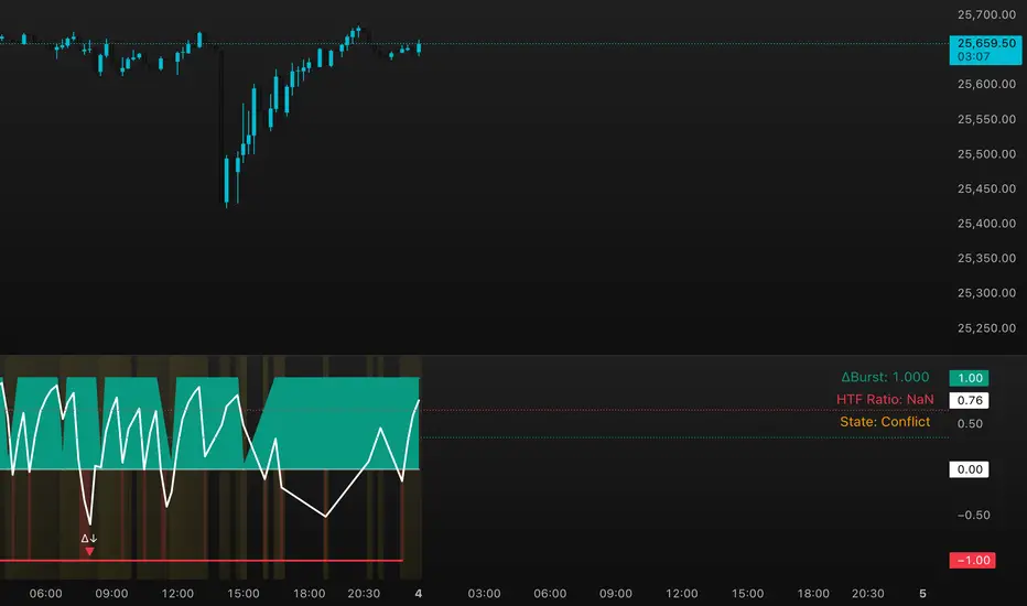
DeltaBurst Locator ## DeltaBurst Locator
DeltaBurst Locator is a sponsorship detector that divides OBV impulse by price thrust, normalizes the ratio, and cross-checks it against a higher timeframe confirmation stream. The oscillator turns the abstract "is this move real?" question into a precise number, exposing accumulation, distribution, and exhaustion across futures and stocks.
HOW IT WORKS
OBV Impulse vs. Price Change – Smoothed deltas of On-Balance Volume and price are ratioed, then normalized using a hyperbolic tangent function to prevent single prints from dominating.
Signal vs. Confirmation – A short EMA produces the execution signal while a higher-timeframe request.security() feed validates whether broader flows agree.
Spectrum Classification – Expansion/compression metrics grade whether current aggression is intense or fading, while ±0.65 bands define exhaust/vacuum zones.
Slope Divergences – Linear regression slopes on both price and the ratio expose bullish/bearish sponsorship mismatches before candles reverse.
HOW TO USE IT
Breakout Validation : Only chase breakouts when both local and higher-timeframe ratios are on the same side of zero; mixed signals suggest liquidity is fading.
Absorption Trades : When the histogram spikes beyond ±0.65 but the EMA lags, expect absorption; combine with price structure for pinpoint reversals.
News/Event Monitoring : During earnings or macro releases, watch for ratio collapses with price still rising—this flags forced moves driven by hedging rather than real demand.
VISUAL FEATURES
Color logic: Positive sponsorship fills teal, negative fills crimson against the zero line, making intent obvious at a glance.
Optional markers: Burst triangles and divergence dots can be enabled when you need explicit annotations or left off for a minimalist panel.
Compression heatmap: Background shading communicates whether the market is coiling (high compression) or erupting (low compression).
Dashboard: Displays the live ratio, higher-timeframe ratio, and agreement state to speed up scanning across tickers.
PARAMETERS
Fast Pulse Length (default: 5): Controls the smoothing window for price change detection.
Slow Equilibrium Length (default: 34): Window for expansion/compression calculation.
OBV Smooth (default: 8): Smoothing period for OBV impulse calculation.
Ratio Ceiling (default: 3.0): Controls how aggressively values saturate; raise for high-volatility tickers.
Signal EMA (default: 4): EMA period for the signal line.
Confirmation Timeframe (default: 240): Pick a higher anchor (e.g., 4H) to validate intraday moves.
Divergence Window (default: 21): Window for slope-based divergence detection.
Show Burst Markers (default: disabled): Toggle burst triangles on demand.
Show Divergence Markers (default: disabled): Toggle divergence dots on demand.
Show Delta Dashboard (default: enabled): Hide when screen space is limited; leave on for desk broadcasts.
ALERTS
The indicator includes four alert conditions:
DeltaBurst Bull: Spotted a bullish liquidity burst
DeltaBurst Bear: Spotted a bearish liquidity burst
DeltaBurst Bull Div: Detected bullish sponsorship divergence
DeltaBurst Bear Div: Detected bearish sponsorship divergence
Hope you enjoy!
Correlation Scanner📊 CORRELATION SCANNER - Financial Instruments Correlation Analyzer
🎯 ORIGINALITY AND PURPOSE
Correlation Scanner is a professional tool for analyzing correlation relationships between different financial instruments. Unlike standard correlation indicators that show the relationship between only two instruments, this script allows you to simultaneously track the correlation of up to 10 customizable instruments with a selected base asset.
The indicator is designed for traders working with cross-market analysis, portfolio diversification, and searching for related assets for arbitrage strategies.
🔧 HOW IT WORKS
The indicator uses the built-in ta.correlation() function to calculate the Pearson correlation coefficient between instrument closing prices over a specified period. Mathematical foundation:
1. Correlation Calculation: for each instrument, the correlation coefficient with the base asset is calculated over N bars (default 60)
2. Results Sorting: instruments are automatically ranked by absolute correlation value (from strongest to weakest)
3. Visualization: results are displayed in a table with color coding:
- Green: positive correlation (instruments move in the same direction)
- Red: negative correlation (instruments move in opposite directions)
- Color intensity depends on correlation strength
4. Correlation Strength Classification:
- Very Strong (💪💪💪): |r| > 0.8 — very strong relationship
- Strong (💪💪): |r| > 0.6 — strong relationship
- Medium (💪): |r| > 0.4 — medium relationship
- Weak: |r| > 0.2 — weak relationship
- Very Weak: |r| ≤ 0.2 — very weak relationship
📋 SETTINGS AND USAGE
MAIN PARAMETERS:
• Main Instrument — base instrument for comparison (default TVC:DXY - US Dollar Index)
• Correlation Period — calculation period in bars (10-500, default 60)
• Number of Instruments to Display — number of instruments to show (1-10)
• Table Position — table location on the chart
INSTRUMENT CONFIGURATION:
The indicator allows configuring up to 10 instruments for analysis. For each, you can specify:
• Instrument — instrument ticker (e.g., FX_IDC:EURUSD)
• Name — display name (emojis supported)
VISUAL SETTINGS:
• Show Chart Label with Correlation — display current chart's correlation with base instrument
• Table Header Color — table header color
• Table Row Background — table row background color
💡 USAGE EXAMPLES
1. DOLLAR IMPACT ANALYSIS: set DXY as the base instrument and track how dollar index changes affect currency pairs, gold, and cryptocurrencies
2. HEDGING ASSETS SEARCH: find instruments with strong negative correlation for risk diversification
3. PAIRS TRADING: identify assets with high positive correlation to find divergences and arbitrage opportunities
4. CROSS-MARKET ANALYSIS: track relationships between stocks, bonds, commodities, and currencies
5. SYSTEMIC RISK ASSESSMENT: identify periods of increased correlation between assets, which may indicate systemic risks
⚠️ IMPORTANT NOTES
• Correlation does NOT imply causation
• Correlation can change over time — regularly review the analysis period
• High past correlation doesn't guarantee the relationship will persist in the future
• Recommended to use the indicator in combination with fundamental analysis
🔔 ALERTS
The indicator includes a built-in alert condition: triggers when strong correlation (|r| > 0.8) is detected between the current chart and the base instrument.

Matt's Multi-Timeframe MACD Direction AlertThe indicator monitors the direction of the Moving Average Convergence Divergence (MACD) lines on four specific timeframes: 1-hour, 15-minute, 5-minute, and 1-minute.
It only generates a signal when the MACD in all four timeframes is trending in the same direction (either all are bullish, or all are bearish). This alignment suggests a strong, synchronized market momentum from short-term scalping views up to immediate-term swing views.
Key Features:
Multi-Timeframe Confirmation: Uses TradingView's request.security() function to fetch data from different timeframes (1h, 15m, 5m, 1m), preventing the need to manually switch charts.
Visual Dashboard: A dashboard table is displayed on your chart, providing an immediate visual status (Bullish/Bearish/Neutral) for each of the four timeframes.
On-Chart Signals: The indicator plots visual shapes (green triangles for bullish alignment, red triangles for bearish alignment) directly on the sub-chart when the condition is met.
Custom Alert Integration: It includes a built-in alertcondition() function, allowing traders to set up real-time, hands-free notifications whenever a synchronized trading opportunity arises.
This tool helps filter out noise and potential false signals that might appear on a single timeframe, focusing instead on robust signals confirmed by a consensus of time perspectives.

Oscillator Matrix ScreenerOscillator Matrix Screener
Oscillator Matrix Screener is a multi asset, multi timeframe dashboard that lets you quickly compare momentum, money flow, and exhaustion conditions across up to 10 symbols in a single table. It is designed as a visual screener so you can spot strength, weakness, reversals, and confluence at a glance without flipping charts.
Core Logic
For each enabled ticker and timeframe the script calculates:
Money Flow
Uses MFI to estimate buying vs selling pressure relative to volume and price movement.
HyperWave Oscillator
Uses RSI to classify the market into regimes such as Overbought Down, Oversold Up, and intermediate up or down states.
Overflow Oscillator
Uses Stochastic to show how extended price is within its recent range.
Reversal Signals
Detects potential bullish and bearish reversal events using RSI crossovers around key zones.
Strong Reversal Up
Reversal Up
Strong Reversal Down
Reversal Down
Divergence
Flags simple bullish or bearish divergence between price and RSI.
Composite Rating and Confluence
Combines multiple components into a single rating:
Strong Bullish
Bullish
Neutral
Bearish
Strong Bearish
That rating is then translated into a confluence label such as Strong, Weak or Mixed to summarize overall pressure.
Table Layout
All results are displayed in a compact table:
Ticker
Last price
Volume
Percent change from the current daily open
Absolute change from the current daily open
Rating
HyperWave signal text
Money Flow value
Overflow value
HyperWave value
Reversal status
Divergence status
Confluence status
Rows alternate background colors for readability, and key cells use context based coloring. For example:
HyperWave cell background shifts between red and green families depending on overbought or oversold states.
Percent change and change columns are green for positive moves and red for negative moves.
Bullish and bearish conditions use distinct color accents so you can scan quickly.
Filters and Controls
You can tailor what appears in the table with several filters:
Rating Filter
Show only symbols that match a chosen rating band such as Strong Bullish, Any Bullish, Bearish, or Strong Bearish.
Money Flow Filter
Restrict results to Money Flow values above, below, or very close to a chosen level.
Ticker and Timeframe Selection
Enable or disable up to 10 tickers, each with its own timeframe input. Examples of lists could be any of these for example:
Same symbol across multiple timeframes
A watchlist of different symbols on the same timeframe
Mixed layout that matches your personal workflow
Display Settings
Choose table position, text size, background and header colors to fit your chart layout.
How to Use
Add your preferred tickers and timeframes.
Optionally apply rating or money flow filters to focus on only the strongest or weakest setups.
Use the table as a top down scanner to:
Find symbols with strong bullish or bearish confluence.
Spot reversals that align with oversold or overbought zones.
Identify divergence backed by supportive money flow or overflow readings.
Oscillator Matrix Screener is intended as a decision support tool. It does not generate direct buy or sell signals by itself. Always combine it with your own technical knowledge and risk mitigation skills

RS Rating Multi-TimeframeRS Rating Multi-Timeframe (IBD-Style Relative Strength)
Short Description:
IBD-style Relative Strength Rating (1-99) comparing any stock's performance vs the S&P 500 across multiple timeframes.
Full Description:
Overview
This indicator calculates an IBD-style Relative Strength (RS) Rating that measures a stock's price performance relative to the S&P 500 over the past 12 months. The rating scale ranges from 1 (weakest) to 99 (strongest), telling you how a stock ranks against all other stocks in terms of relative performance.
How It Works
The RS Rating uses a weighted formula based on quarterly performance:
Last 63 days (1 quarter): 40% weight
Last 126 days (2 quarters): 20% weight
Last 189 days (3 quarters): 20% weight
Last 252 days (4 quarters): 20% weight
This weighting emphasizes recent performance while still accounting for longer-term strength.
Rating Interpretation
90-99 (Elite): Top 10% of all stocks - exceptional relative strength
80-89 (Excellent): Top 20% - strong leadership candidates
50-79 (Average): Middle of the pack
30-49 (Below Average): Underperforming the market
1-29 (Weak): Bottom 30% - avoid or consider shorting
Features
Multi-Timeframe: Works on any timeframe from 1-hour to weekly (always uses daily data for calculation)
Moving Average: Optional EMA or SMA of the RS Rating to smooth signals
Visual Zones: Color-coded zones for quick identification of strength/weakness
Signal Markers: Triangles appear when RS crosses key levels (80 and 30)
Info Table: Displays current RS Rating, change, MA value, and raw score
Alerts: Built-in alerts for key crossover events
Settings
Show Moving Average: Toggle MA line on/off
MA Length: Period for the moving average (default: 10)
MA Type: Choose between EMA or SMA
Benchmark Index: Change the comparison index (default: SP:SPX)
Show Rating Table: Toggle the info table on/off
How To Use
Buy candidates: Look for stocks with RS Rating above 80, ideally rising
Avoid: Stocks with RS Rating below 30 or falling rapidly
Confirmation: Use RS above its moving average as additional confirmation
Divergence: Watch for RS making new highs before price (bullish) or new lows before price (bearish)
Credits
RS Rating calculation methodology inspired by Investor's Business Daily (IBD) and adapted from Fred6724's RS Rating script. Percentile calibration based on analysis of ~6,600 US stocks.
Tags: relative strength, RS rating, IBD, momentum, CAN SLIM, benchmark, SPX, market leaders, stock ranking
Category: Relative Strength

ChronoFlow## ChronoFlow Sentinel
ChronoFlow Sentinel is a regime console that blends normalized fast/mid/slow regression slopes, phases them against a dual-speed EMA spread, and grades alignment so you instantly know whether the time stack is trending, rotating, or fighting itself.
HOW IT WORKS
Multi-Timeframe Slopes – Linear regression slopes are fetched via request.security() for your chosen fast, mid, and slow frames.
Normalized Weighting – User weights are rescaled so the composite chrono score is always on a consistent scale, regardless of configuration.
Phase Differential – The indicator subtracts a slow EMA from a fast EMA to detect whether price impulse confirms the slope mix.
Alignment Score – Signs of the three slopes are compared to compute a 0-1 alignment metric; backgrounds and alerts use this to signal confidence vs. chop.
Diagnostics Console – A bottom-right table streams each slope, the blended score, and which timeframe currently dominates.
HOW TO USE IT
Trend Qualification : Only push multi-contract positions when chrono score is positive, phase is positive, and alignment stays above your alert threshold (default 0.66).
Chop Defense : When alignment dips and conflict markers appear, immediately switch into mean-reversion tactics or sit flat.
Swing + Intraday Bridge : Pair ChronoFlow with other structure tools; require both aligned backgrounds and price confirmation before committing to swing entries.
CRYPTOCAP:SOL | CRYPTOCAP:XRP side by side view with ChronoFlow
VISUAL FEATURES
Optional flow curves: Enable Plot Raw Flows to audit each timeframe's slope when troubleshooting a signal.
Background intensity: Opacity auto-adjusts with alignment, so weak trends look faded while strong regimes glow vividly.
Signal/Conflict toggles: Long/short and chop markers are opt-in, keeping the panel pristine until you need annotations.
Conflict alerts: Built-in alert condition fires whenever alignment falls below your threshold, warning execution layers to scale down risk.
PARAMETERS
Fast Frame (default: 30): Fast timeframe for regression slope calculation.
Mid Frame (default: 120): Mid timeframe for regression slope calculation.
Slow Frame (default: D): Slow timeframe for regression slope calculation.
Fast Regression (default: 21): Regression length for fast timeframe.
Mid Regression (default: 34): Regression length for mid timeframe.
Slow Regression (default: 55): Regression length for slow timeframe.
Phase Length (default: 13): EMA period for phase differential calculation.
Fast Weight (default: 0.45): Influence of the fast timeframe in the composite score.
Mid Weight (default: 0.35): Influence of the mid timeframe in the composite score.
Slow Weight (default: 0.20): Influence of the slow timeframe in the composite score.
Plot Raw Flows (default: disabled): Enable to audit each timeframe's slope when troubleshooting.
Show Signal Labels (default: disabled): Toggle long/short signal markers.
Show Conflict Labels (default: disabled): Toggle conflict/chop markers.
Conflict Alert Level (default: 0.66): Set the alignment threshold that should trigger reduced size or flat positioning.
ALERTS
The indicator includes three alert conditions:
ChronoFlow Bullish: Detected a bullish regime shift
ChronoFlow Bearish: Detected a bearish regime shift
ChronoFlow Conflict: Flagged a low-alignment regime
LIMITATIONS
This indicator requires access to multiple timeframes via request.security() , which may consume additional resources. The alignment score is a simplified metric—real market conditions are more complex than a 0-1 scale can capture. The phase differential calculation assumes EMA spreads are meaningful proxies for momentum, which may not hold in all market regimes. Users should test parameter combinations on their specific instruments and timeframes, as default values are optimized for typical index futures trading.
---

Multi-Tool VWAP + EMAs (Multi-Timeframe) + Key LevelsDescription
This indicator combines several commonly used technical analysis tools into a single script, especially useful for traders using the free version of TradingView or anyone looking to reduce the number of indicators on their chart.
The goal is to provide clear visual references for trend, structure, and key levels—without generating buy/sell signals or automated trading functions.
Included Features
1. VWAP (session-anchored)
Source: HLC3
Purple line, thickness 2
Useful as a reference for daily institutional average price.
2. EMAs of the current timeframe
EMA 200 (red, thickness 3)
EMA 9 (green, thickness 1)
These EMAs help visualize long-term trend and short-term momentum.
3. Dynamic EMAs (MTF – Multi-Timeframe)
The indicator displays the 200 EMA from higher timeframes as dynamic horizontal levels:
5 minutes
15 minutes
30 minutes
1 hour
4 hours
1 day
Each level includes a descriptive label such as “15 min EMA 200”.
These EMAs serve as reference points for potential support/resistance areas coming from higher timeframes.
4. Automatic Key Levels
The indicator plots several important price levels:
Previous day:
PDH (Previous Day High)
PDL (Previous Day Low)
Previous Day 50% Fibonacci level
Pre-market (04:00–09:30 exchange time):
PMH (Pre-Market High)
PML (Pre-Market Low)
Current session:
Open (session opening price)
Previous Close (prior day’s closing price)
Purpose and Scope
This script is designed to provide basic visual reference points to support discretionary analysis.
It does not generate signals or trading suggestions, and it is not intended to predict future price movements.
How to Use It
Enable or disable each block in the Inputs section according to your analysis style.
Observe how the levels, EMAs, and VWAP interact with market structure.
Use it as a visual complement to your personal technical analysis.
Limitations
This indicator is not a trading system and does not guarantee results.
It does not include alerts, backtesting, or entry/exit logic.
Some values (such as PMH/PML) depend on the symbol’s exchange trading hours.
Credits
Designed as an educational and analytical tool for traders seeking to simplify their charts without losing key information.

LiquidityPulse Multi-Timeframe Volume Zones/ LevelsLiquidityPulse Multi-Timeframe Volume Zones/ Levels
Non-repainting: levels appear on bar close and do not change.
What This Indicator Does
This indicator scans lower-timeframe price action to identify bars where volume and candle behaviour suggest that a notable price interaction occurred. When all conditions align, the script extracts a precise price level from that bar, plots it on your higher-timeframe chart, and extends it forward so you can observe whether the market interacts with it again later.
Each selected timeframe is processed independently. For every timeframe you enable, the script looks for the following criteria:
1. A shift in candle direction between the previous bar and the current bar
2. A close-to-open body alignment , helping filter out irregular or noisy movement
3. A volume increase relative to the recent average , based on a user-selected multiplier
If these conditions are met, the script marks the corresponding price level on the chart. You can enable up to seven lower timeframes at once, each with its own independent settings, colours, strength filters, and display capacity. This allows you to build a layered, multi-timeframe view of the levels/ zones.
How It Works
1. Candle Behaviour Shift
The script checks whether the previous bar and the current bar show opposing directional behaviour. This helps highlight moments that may reflect a shift in directional behaviour or a change in price movement characteristics.
2. Body Alignment
The previous bar’s close must closely align with the current bar’s open. This requirement reduces random noise and focuses detection on areas where structure between candles is unusually clean.
3. Volume Requirement
The combined volume of the current bar and the previous bar must exceed the recent average by a multiplier you choose.
Lower multiplier - more levels
Higher multiplier - only the most significant activity spikes qualify
This filters for bars with above-average participation (volume).
4. Price Level Identification
If all conditions are met, a price edge is defined:
Bearish pressure: upper edge
Bullish pressure: lower edge
This edge marks the price level where the qualifying candle behaviour occurred.
5. Zone Drawing
Each qualifying event produces:
A horizontal line marking the level
A (optional) shaded box around the level
A label showing the timeframe and the exact volume multiplier amount detected
The level then extends forward so you can monitor future interactions.
Key Settings
Zone Strength (Volume Multiplier)
Determines how selective the volume filter is.
Lower settings show more frequent activity
Higher settings restrict detection to only the strongest activity (volume) increases
Multi-Timeframe Framework
Enable/disable per timeframe
Custom source timeframe (e.g., 1m, 5m, 15m, etc.)
Strength threshold per timeframe
How many recent levels to display per timeframe (Show Last N Zones.)
You can display a single timeframe or stack several to highlight clustering.
How traders can use this indicator
This script is not a buy/sell signal generator. It is best used as a structural overlay that helps you identify:
Where candle behaviour abruptly shifted with increased volume
Whether multiple timeframes highlight similar levels
Comparing how frequently these conditions appear across different timeframes
How price behaves when revisiting areas of prior activity (levels)
Why this type of detection can be informative
Higher-timeframe charts compress a large amount of lower-timeframe activity. By identifying where the script found notable changes in direction, structure, and relative volume on a lower timeframe, it provides a way to reference points in the price history where behaviour differed from nearby bars. Displaying these levels on a higher timeframe allows traders to see how these conditions align with their broader analysis.
Disclaimer
This indicator does not measure true liquidity or order flow. It uses candle structure and relative-volume comparisons as interpretive tools, and the plotted levels do not represent signals or predictions. All analysis is user-interpreted, and past behaviour does not imply future behaviour.

Market Regime & Bias Assistant [Prototype v1.1]
Market Regime & Bias Assistant
### **Overview**
The **Market Regime & Bias Assistant** is an all-in-one trend filtration and trading system designed to keep traders on the right side of the market. Instead of relying on a single moving average, this indicator combines **ADX (Trend Strength)**, **Multi-Timeframe EMAs**, **RSI**, and **Volume Spread Analysis (VSA)** concepts to generate a quantitative "Confidence Score" for the current market bias.
It automatically adapts its settings based on your timeframe (Intraday vs. Swing) and provides clear visual cues via background shading, candle coloring, and a data panel.
---
### **Key Features**
* **Auto-Adaptive Modes:** Automatically switches between "Intraday" and "Swing" settings based on your timeframe.
* *Intraday:* Uses faster EMAs (Aggressive 9/30 or Conservative 20/50) and VWAP.
* *Swing:* Uses standard 20/50 EMAs with 200/800 long-term context moving averages.
* **Market Regime Detection:** Identifies if the market is in a **Trend (Bull/Bear)** or a **Range (Neutral)** using a combination of ADX thresholds and EMA alignment.
* **Confidence Scoring (0-100):** A proprietary algorithm that scores the quality of the trend based on RSI alignment, Volume confirmation, and Long-term EMA context.
* **Vector Volume Candles:** Color-coded candles to highlight institutional activity (High Volume) vs. Climactic Volume (Exhaustion).
* **Pullback Signals:** "L" and "S" markers indicating high-probability entries after a pullback into the EMA value zone.
* **Data Dashboard:** A bottom-right panel displaying the current Mode, Regime, Bias, and quantitative Confidence Score.
---
### **How to Read the Visuals**
#### **1. Background Colors (The Regime)**
* **Green Background:** Confirmed **Bullish Trend**. Only look for Longs.
* **Red Background:** Confirmed **Bearish Trend**. Only look for Shorts.
* **Gray Background:** **Neutral / Range**. The market is chopping or consolidating. Stand aside or trade strictly mean-reversion.
#### **2. Candle Colors (Vector Volume)**
* **Green/Red Borders:** Normal volume.
* **Blue / Fuchsia:** **High Volume (1.2x Average)**. Indicates institutional interest or a breakout.
* **Lime / Bright Red:** **Climactic Volume (1.8x Average)**. Indicates potential exhaustion or a stopping volume event.
#### **3. The EMAs**
* **Fast/Slow Lines:** Show the immediate trend direction.
* **Gray/White Lines:** The 200 and 800 EMAs. These act as major support/resistance levels and define the "Big Picture" bias.
* **Lime Line (Intraday Only):** The VWAP (Volume Weighted Average Price).
---
### **How to Use This Indicator**
**Step 1: Check the Regime**
Look at the background color and the Dashboard panel. Is the Trend Strength "Strong" or "Very Strong"?
* *Rule:* Do not take trend-following trades if the Regime is "Range/Neutral."
**Step 2: Check the Confidence**
The dashboard calculates a score from 0 to 100.
* **High Confidence (>67):** All systems go. Alignment of RSI, Volume, and Trend.
* **Medium Confidence (34-66):** Caution warranted. Usually implies divergence in RSI or low volume.
* **Low Confidence (<34):** The trend is weak or failing.
**Step 3: Wait for the Setup (The Arrows)**
The indicator looks for pullbacks into the "Value Zone" (the space between the Fast and Slow EMA).
* **Triangle Up (L):** Appears when price pulls back into the zone during a Bull trend, then bounces out with volume confirmation.
* **Triangle Down (S):** Appears when price rallies into the zone during a Bear trend, then rejects lower.
---
### **Settings & Customization**
* **Mode:** Default is "Auto," but you can force "Intraday" or "Swing" manually.
* **Intraday Style:** Choose between "Aggressive" (9 EMA / 30 EMA) for scalping or "Conservative" (20 EMA / 50 EMA) for day trading.
* **ADX Threshold:** Adjusts how strict the trend filter is (Default: 20).
* **Visual Toggles:** Turn off/on the Panel, Background shading, or Vector candles to clean up your chart.
### **Alerts**
This script comes with built-in alert conditions for:
1. **Bullish Regime Start**
2. **Bearish Regime Start**
3. **High-Confidence Setup Detected**

The Biz (ADX/DI/RSI Revised)This is an indicator that will help you trade the GEX, showing when price is trending hard, or about to reverse, and will guide you in picking direction and bias. (INDICATOR SLIGHTLY LAGS)

STRAT - MTF Dashboard + FTFC + Reversals v2.7# STRAT Indicator - Complete Description
## Overview
A comprehensive multi-timeframe STRAT trading system indicator that combines market structure analysis, flip levels, Full Timeframe Continuity (FTFC), and reversal pattern detection across 12 timeframes.
## Core Features
### 1. **Multi-Timeframe STRAT Dashboard**
- Displays STRAT combos (1, 2u, 2d, 3) across 12 timeframes: 1m, 5m, 15m, 30m, 1H, 4H, 12H, Daily, Weekly, Monthly, Quarterly, Yearly
- Color-coded directional bias (green/red/doji)
- Inside bars (●) and Outside bars (●) highlighted
- Current timeframe marked with ★
### 2. **HTF Flip Levels with Smart Grouping**
- Displays higher timeframe (HTF) flip levels (open prices) as labels on the right side
- Automatically groups multiple timeframes at the same price level (e.g., "★ 1H/4H/D")
- Current timeframe flip level always displayed with ★ marker
- Color-coded: Green (above price) / Red (below price)
### 3. **Full Timeframe Continuity (FTFC)**
- User-selectable 4 timeframes for FTFC analysis (default: D, W, M, Q)
- Green line: FTFC Up (highest open of 4 timeframes)
- Red line: FTFC Down (lowest open of 4 timeframes)
- Identifies when price is above/below all 4 timeframe opens
### 4. **Hammer & Shooting Star Detection**
- **Hammer Pattern**: Long lower wick (≥2x body), small upper wick, signals potential bottom reversal
- **Shooting Star Pattern**: Long upper wick (≥2x body), small lower wick, signals potential top reversal
- Scans last 100 bars (adjustable) and marks ALL historical patterns
- Chart markers: 🔨 (Hammer) below bars, 🔻 (Shooting Star) above bars
- Dashboard column shows reversal patterns for each timeframe
- Adjustable wick-to-body ratio sensitivity (1.5 to 5.0)
### 5. **Debug Tables**
- **FTFC Debug**: Shows close vs. 4 timeframe opens, confirms all-green/all-red conditions
- **Reversal Debug**: Real-time analysis of current bar - body size, wick measurements, ratios, and pattern qualification
## Settings
### Display Settings
- Dashboard position (9 options: top-left to bottom-right)
- Dashboard text size (tiny to huge)
- Label offset and text size
- Toggle individual features on/off
### FTFC Settings
- Select 4 custom timeframes for continuity analysis
- Default: Daily, Weekly, Monthly, Quarterly
### Reversal Settings
- **Wick to Body Ratio**: Sensitivity for pattern detection (default 2.0)
- **Lookback Bars**: How many historical bars to scan (default 100, max 500)
- Show/hide reversal markers on chart
- Show/hide reversal debug table
## Use Cases
1. **Momentum Trading**: Identify STRAT setups (2-2, 2-1-2 reversals, 3-bar plays) across multiple timeframes
2. **Swing Trading**: Use HTF flip levels as support/resistance and FTFC for trend confirmation
3. **Reversal Trading**: Catch hammer/shooting star patterns at key levels for counter-trend entries
4. **Multi-Timeframe Analysis**: Confirm alignment across timeframes before entering trades
## How to Use
### For STRAT Traders
- Look for 2-1-2 reversal setups in the dashboard
- Watch for inside bars (●) at HTF flip levels for breakout trades
- Use outside bars (●) to identify potential volatility expansion
### For Reversal Traders
- 🔨 Hammers after downtrends = potential long entries
- 🔻 Shooting stars after uptrends = potential short entries
- Combine with HTF flip levels for high-probability setups
### For Trend Followers
- FTFC green line above = bullish structure
- FTFC red line below = bearish structure
- Enter when price breaks and holds above/below FTFC levels
## Visual Elements
- **Green Labels**: HTF flip levels above current price (resistance)
- **Red Labels**: HTF flip levels below current price (support)
- **Lime Line**: FTFC Up (highest timeframe open)
- **Red Line**: FTFC Down (lowest timeframe open)
- **🔨 Icon**: Hammer pattern (potential reversal up)
- **🔻 Icon**: Shooting Star pattern (potential reversal down)
- **★ Symbol**: Current timeframe or multiple timeframes grouped
## Performance Notes
This indicator performs 12 multi-timeframe security calls and may take 15-30 seconds to calculate on initial load. This is normal for comprehensive MTF analysis.
## Version
v2.7 - Simplified reversal detection, current TF labeling, optimized performance
---
**Perfect for**: STRAT traders, multi-timeframe analysts, reversal pattern traders, swing traders looking for high-probability setups with confluence across timeframes.

RSI < 25 + Price Below 200 SMA (4H) - Text Signal
Price below 200MA on 4hr chart
RSI is below 25 ovsersold
Start buying small positions at every signal
Eventually price will capture the 200MA on 4hr
This will work great for NVDA, AAPL, MSFT, NFLX, PANW, AMZN, PLTR, CRWD and META.
Good for swing trading based on price action, RSI oversold and reversal
Add more on the Pin bar candles on 4hr time frame once the price is oversold.

Harp Day Trading Checklist All-in-one intraday indicator combining key levels, trend analysis, and confluence-based entry signals for options day trading.
Features
EMA Stack Analysis – 5/9/21 EMAs with bullish/bearish stack detection
VWAP – Intraday volume-weighted average price
Opening Range Breakout (ORB) – Customizable ORB period with visual high/low levels
Premarket Levels – Tracks PM high/low for key support/resistance
Previous Day High/Low – Optional prior session reference
Higher Timeframe Bias – 60-min EMA confirmation for directional bias
Entry Signals – CALL/PUT alerts when all conditions align (EMA cross, RSI, MACD, volume, key level)
Auto Stop/Target – ATR-based stop loss and take profit levels
Live Dashboard – Real-time checklist showing bias, HTF trend, VWAP position, RSI, volume, EMA stack, MACD, and key level proximity
How It Works
Signals trigger only when multiple factors align: correct higher-timeframe bias, EMA crossover, RSI confirmation, MACD cross, rising volume, and price near a key level (ORB, premarket, previous day, or VWAP). Background color indicates overall directional bias.
Best For
Intraday options traders looking for high-confluence setups on 1-5 minute charts. Works on stocks, ETFs, and futures.

Trend Exhaustion Engine UnMatrixThis indicator combines classic exhaustion engines to detect market trend exhaustion, generate directional setup signals, and plot intelligent ATR-based entry/SL/TP levels.

Camarilla Pivots with Pre-Market (Labeled)This Script for day trading , including pre market level
Enjoy
Charbillionaire
