First Presented FVGSummary: First Presented FVG Indicator
This is a Pine Script v6 TradingView indicator that identifies and visualizes the first Fair Value Gap (FVG) that forms within configurable time windows during a trading session.
What it Does
1. Detects FVGs : Uses the classic 3-candle FVG definition:
- Bullish FVG: When low > high (gap up)
- Bearish FVG: When high < low (gap down)
2. "First Presented" Logic : For each configured time slot, it captures only the first qualifying FVG that forms—subsequent FVGs in that window are ignored.
3. Visual Display :
- Draws a colored box spanning from detection time to session end
- Optional text label showing detection time (e.g., "9:38 Tue FP FVG")
- Optional grade lines at 25%, 50%, and 75% levels within the FVG
Key Configuration
Setting Description
Timeframe Only works on 5-minute charts or lower
Timezone IANA timezone for session times (default: America/New_York)
Session Futures trading hours (default: 1800-1715)
Min FVG Size Minimum gap size in ticks to qualify
4 Time Slots Each with enable toggle, time window, and color
Default Time Slots
Slot 1 (enabled): 09:30-10:30 — lime green
Slot 2 (enabled): 13:30-14:30 — blue
Slot 3 (disabled): 13:00-13:30 — teal
Slot 4 (disabled): 14:15-14:45 — fuchsia
Technical Features
Handles cross-midnight sessions correctly
Resets all drawings at each new session
Skips the first bar of each window to ensure valid 3-candle lookback
Clamps slot windows to session boundaries
Educational

GME Warrant Tracker [theUltimator5]The GME Warrant Tracker was designed to be used for GME warrants tracking. The theory behind this indicator is that warrants are priced similarly to options and generally follow the same Greeks. With that assumption, we can break down the price of the warrants by using known Greeks to estimate either the theoretical price, or even estimate Implied Volatility (IV).
The base settings for this indicator plot the calculated IV, the theoretical price (there are multiple methods of calculation which I will discuss later) and the current warrant price.
You can toggle on or off all of these plots to display only what you want to track.
For example, you can simply track the difference between the theoretical price and the current price to see if warrants are trading at a premium or a discount vs what the indicator calculates it to be.
Calculating implied volatility is extremely difficult and must be approximated.
The theoretical warrant price produced by this indicator depends primarily on the volatility input (σ) used in the Black–Scholes pricing model.
This script supports five distinct methods for approximating σ, each extracting different information from the market.
1) Close-to-Close Historical Volatility
Close-to-Close computes the standard deviation of daily close-to-close returns and uses a lookback window scaled to time-to-expiry. As the expiration approaches, the lookback window tightens, giving a more responsive volatility approximation relative to time-to-expiry.
This option produces conservative approximations for volatility, and may lag actual volatility intraday.
2) Parkinson High-Low Volatility
Parkinson High-Low volatility uses daily high and low prices to calculate intraday trading range for a more responsive estimation to volatility. It ignores opening and close gaps, so overnight volatility is not accounted for.
This option produces higher theoretical volatility during choppy price action and can over estimate actual volatility.
3) Garman–Klass Volatility
Garman–Klass volatility is a way to estimate how much price is fluctuating by using the open, high, low, and close for each period. Because it draws on multiple intraperiod price points (not just the range or close-to-close moves), it typically produces a tighter, more informative volatility estimate than simpler approaches. It’s often most helpful when gaps occur and when the open and close carry meaningful information about the session’s trading.
4)Yang–Zhang Volatility
The Yang–Zhang volatility estimator is designed to account for both opening jumps and price drift. It estimates volatility by combining overnight (close-to-open) variance, intraday (open-to-close) variance, and a weighted Rogers–Satchell component using OHLC data, often yielding a more robust measure than simpler close-to-close style estimators.
5) Option price
By default, the indicator uses the call option strike dated closest to the warrant expiration date. Since the Greeks for both the warrants and the
options are assumed to be equivalent with a minor difference in theta (time-to-expiry), the theoretical price of the warrants closely matches the trade price of the call strike chosen.
There is a table that can be enabled (off by default because it is large and fills entire screen on mobile) which shows all the configuration settings and Greeks.
You can also manually adjust the "dilution" factor for the warrants, which shifts the number of active warrants and moves the count into the shares outstanding for the underlying (GME). The reason for this is that as warrants get exercised, the total quantity of warrants in circulation decreases and the the total quantity of shares outstanding increases.
Since this indicator was built around the single warrant, ticker NYSE: GME/W, it is only meant to be used with NYSE:GME. Any other ticker will not work properly with this indicator.

A program written by a beginner# TXF Choppy Market Detector (Whipsaw Filter)
## Introduction
This project is a technical indicator developed in **Pine Script v5**, specifically optimized for **Taiwan Index Futures (TXF)** intraday trading.
The TXF market is known for its frequent periods of low-volatility consolidation following sharp moves, often resulting in "whipsaws" (double-loss scenarios for trend followers). This script utilizes **volatility analysis** and **trend efficiency metrics** to filter out noise and detect potential "Stop Hunting" or "Liquidity Sweep" setups within range-bound markets.
## Methodology & Algorithms
The strategy operates on the principle of **Mean Reversion**, combining two core components:
### 1. Market Regime Filter: Choppiness Index (CHOP)
We use the Choppiness Index (originally developed by E.W. Dreiss) to determine if the market is trending or consolidating based on **Fractal Dimension** theory.
* **Logic**:
The index ranges from 0 to 100. Higher values indicate low trend efficiency (consolidation), while lower values indicate strong directional trends.
* **Condition**: `CHOP > Threshold` (Default: 50).
* **Application**: When this condition is met, the background turns **gray**, signaling a "No-Trade Zone" for trend strategies and activating the Mean Reversion logic.
### 2. Whipsaw Detection: Bollinger Bands
Bollinger Bands are used to define the dynamic statistical extremities of price action.
* **Logic**:
We identify **Fakeouts** (False Breakouts) that occur specifically during the choppy regime identified above. This is often where institutional traders hunt for liquidity (stops) before reversing the price.
#### Signal Algorithms (Pseudocode)
**A. Bull Trap (Washout High)**
A false upside breakout designed to trap long traders.
```pine
Condition:
1. Is_Choppy == true (Market is sideways)
2. High > Upper_Bollinger_Band (Price pierces the upper band)
3. Close < Upper_Bollinger_Band (Price fails to hold and closes back inside)

History Trading SessionsThis indicator helps visually structure the trading day by highlighting custom time zones on the chart.
It is designed for historical analysis, trading discipline, and clear separation between analysis time, active trading, and no-trade periods.
Recommended to use on 4h and below time frames.

TWT_MAHA+REVERAL🔹 TWT_MAHA + REVERSAL (Smart Money Reversal System)
TWT_MAHA + REVERSAL is a non-repainting support–resistance + price-action reversal indicator designed to catch high-probability market turning points near extremes.
It combines:
Dynamic Support & Resistance (multi-timeframe)
RSI + MACD momentum exhaustion
Smart Money concepts (Order Blocks & Liquidity grabs)
Advanced price-action patterns (pin bars, engulfing, failures)
✅ How to Use (Simple Rules)
🟢 BUY SETUP
Look for Buy signals near Support / Extreme Lows when:
RSI is oversold and starting to reverse
MACD shows loss of bearish momentum
Strong bullish price action appears (long wick, engulfing, reversal pattern)
A Bullish Order Block (OB) or Bullish SFP (liquidity grab) is printed
📌 Best entries:
First retest of a bullish OB
Strong reversal candle close near support
🔴 SELL SETUP
Look for Sell signals near Resistance / Extreme Highs when:
RSI is overbought and rolling over
MACD shows loss of bullish momentum
Strong bearish price action appears
A Bearish Order Block (OB) or Bearish SFP is printed
📌 Best entries:
First retest of a bearish OB
Rejection wick or strong bearish candle near resistance
🎯 Risk–Reward Guidance
Intraday / Scalping:
🔸 Typical RR: 1:1.5 to 1:2
Swing / Positional:
🔸 Typical RR: 1:2 to 1:4
🛑 Stop-loss:
Just beyond the OB zone or recent swing high/low
🎯 Targets:
Nearest opposing S/R
Partial at 1R, trail the rest
🧠 Key Notes
Works best on 5m, 15m, 30m for intraday
Also effective on 1H+ for swing trading
Designed to reduce noise and avoid late entries
No repainting signals
🔐 Access & Updates
This indicator is private.
📩 To get access:
👉 DM me directly on TradingView
(Serious traders only — this tool is built for education Purpose Only. Before taking any Real Trade consult your own Financial Advisor)

Reversal Score System v3 [Rulph]RSS3 - Reversal Score System v3
RSS3 is a multi-component reversal detection system that quantifies momentum exhaustion and trend weakness through a normalized Score from -1 (maximum bullish pressure) to +1 (maximum bearish pressure). It is designed to work across crypto, stocks, forex and futures, from intraday to 4H/D timeframes.
A full article with real trade examples (BTC, NVDA, GBP/USD, E-mini S&P) is available here:
How to Make 18% in a Week: RSS3 Reversal Trading Across 4 Markets
━━━━━━━━━━━━━━━━━━━━━━━━━━━━━━━━━━
CORE COMPONENTS
━━━━━━━━━━━━━━━━━━━━━━━━━━━━━━━━━━
1. Volatility Pressure Index (VPI)
VPI measures market stress using a composite of:
• RSI deviation from the neutral 50 level (directional momentum bias)
• Annualized volatility (VIX-style) to detect volatility expansion
• Normalized candle range vs recent history
• Price position relative to Bollinger Bands (statistical extension)
These inputs are weighted and normalized into a single pressure reading:
• High VPI → overbought stress zone
• Low VPI → oversold compression zone
Concept: VPI answers " Is the market stretched beyond sustainable levels? "
Example: BTC 15m bearish with high VPI before the drop
2. Trend Direction Force Index (TDFI)
TDFI measures directional trend strength using:
• Spread between a fast MMA and a slower SMMA (trend acceleration/deceleration)
• Average impulse between the two MAs (momentum persistence)
• Normalized trend strength with a weighting scheme
• Positive TDFI → bullish directional pressure
• Negative TDFI → bearish directional pressure
• Extreme values (> 0.7 or < -0.7) highlight overextended trends
Concept: TDFI answers " How strong is the current directional move, and is it overextended? "
Example: ES 4H showing strong TDFI before reversal
3. Final Score
The final Score combines VPI and TDFI with divergence bonuses:
Score = (VPI_weight × VPI) + (TDFI_weight × TDFI) - Bull_Div_Bonus + Bear_Div_Bonus
Key ideas:
• VPI and TDFI are first normalized, then combined
• Divergences modulate Score via bonuses/penalties
• Recent and stronger divergences have more influence (decaying over time)
This produces a single, continuous measure of reversal pressure from -1 to +1.
Example: Score swinging from extreme bearish to extreme bullish zones
━━━━━━━━━━━━━━━━━━━━━━━━━━━━━━━━━━
DIVERGENCES AND SEQUENTIAL LABELS
━━━━━━━━━━━━━━━━━━━━━━━━━━━━━━━━━━
RSS3 automatically detects classic divergences separately for VPI and TDFI:
• Bullish divergence: price makes a lower low, indicator makes a higher low
• Bearish divergence: price makes a higher high, indicator makes a lower high
Each divergence is tracked for:
• VPI (v-series)
• TDFI (t-series)
Sequential labeling:
• v1, v2, v3... = 1st, 2nd, 3rd VPI divergence in the current direction
• t1, t2, t3... = 1st, 2nd, 3rd TDFI divergence in the current direction
• v2t1 = double divergence (2nd VPI + 1st TDFI on the same pivot)
The sequence resets when direction changes (bullish → bearish or vice versa).
This allows you to distinguish:
• early warnings (v1/t1)
• reinforced late-stage signals (v3, v4, …)
• strong confluence (vXtY double divergences)
Example: Sequential v/t labels building up before a major reversal
━━━━━━━━━━━━━━━━━━━━━━━━━━━━━━━━━━
MULTI‑TIMEFRAME FILTER (MTF)
━━━━━━━━━━━━━━━━━━━━━━━━━━━━━━━━━━
The MTF filter uses a higher timeframe to control counter-trend entries:
Modes:
• Off – no filtering
• Reduce – divergence bonus is reduced when signal is against HTF trend
• Block – counter-trend divergences are completely hidden
Use cases:
• On intraday charts, use 4H/D as HTF to avoid shorting strong uptrends
• On 4H, use Daily/Weekly as HTF context for swing trades
This protects capital by avoiding low-probability mean-reversion attempts in strong trends.
Example: BTC 1h counter-trend signals filtered by MTF (grayed out)
━━━━━━━━━━━━━━━━━━━━━━━━━━━━━━━━━━
HOW TO USE RSS3
━━━━━━━━━━━━━━━━━━━━━━━━━━━━━━━━━━
Typical entry logic:
1. Wait for a divergence (green = bullish, red = bearish)
2. Check Score:
• |Score| > 0.5 → stronger, higher-confidence signal
• Score near ±1.0 → extreme exhaustion zone
3. Optionally wait +2 bars after divergence to confirm the pivot
Typical exits:
• Conservative: opposite divergence appears
• More aggressive: Score crosses through 0 or reaches the opposite ±0.5 zone
• Always combine with a volatility-based stop (e.g., 2–3 × ATR)
Recommended timeframes:
• 5–15m: active intraday/swing setups
• 1–4h: swing trading
• D/W: position trading
RSS3 is not a complete trading strategy. It is an advanced reversal and exhaustion engine intended to be combined with:
• support/resistance
• volume/flow tools
• existing trend or breakout systems
━━━━━━━━━━━━━━━━━━━━━━━━━━━━━━━━━━
WHAT MAKES RSS3 ORIGINAL
━━━━━━━━━━━━━━━━━━━━━━━━━━━━━━━━━━
RSS3 is not a simple mashup of standard indicators. It introduces:
• Composite volatility index (VPI) combining RSI deviation, volatility, range and Bollinger position
• Composite trend force index (TDFI) based on MA spread and impulse
• Unified Score from -1 to +1 for reversal strength
• Decay-weighted divergence bonuses with amplitude sensitivity
• Dual-source divergences (VPI + TDFI) with sequential v/t labeling
• MTF-aware filtering that can reduce or block counter-trend signals
Real trade examples and detailed commentary:
English article with 4 markets
Disclaimer: All trading involves risk. This tool does not guarantee profits. Always backtest and manage risk according to your rules.
-----------------------------------------------------------------------------------------------------------
RSS3 - Reversal Score System v3 (Система оценки разворотов)
RSS3 — это многокомпонентная система поиска разворотов, которая количественно оценивает истощение импульса и ослабление тренда через нормализованный Score от -1 (максимальное бычье давление) до +1 (максимальное медвежье давление). Индикатор рассчитан на работу с криптовалютами, акциями, форексом и фьючерсами на разных таймфреймах — от интрадей до 4H/D.
Подробная статья с реальными примерами сделок на NVTK, BTCUSDT и CNY/RUB доступна здесь:
Как заработать 18% за неделю на разворотах: система RSS3
━━━━━━━━━━━━━━━━━━━━━━━━━━━━━━━━━━
КЛЮЧЕВЫЕ КОМПОНЕНТЫ
━━━━━━━━━━━━━━━━━━━━━━━━━━━━━━━━━━
1. Volatility Pressure Index (VPI)
VPI измеряет "напряжение" рынка через комбинацию:
• отклонения RSI от нейтрального уровня 50 (направленный моментум)
• годовой волатильности (по типу VIX) — фиксирует расширение волатильности
• нормализованного диапазона свечей относительно недавней истории
• положения цены относительно полос Боллинджера (статистическое перерастяжение)
Все компоненты взвешиваются и нормализуются в единый индекс давления:
• высокий VPI → зона перекупленности и стресса
• низкий VPI → зона перепроданности и сжатия
Идея: VPI отвечает на вопрос " насколько рынок перерастянут относительно нормального состояния? ".
Пример: NVTK 1H — медвежья дивергенция VPI перед падением
2. Trend Direction Force Index (TDFI)
TDFI оценивает силу направленного движения через:
• расхождение между быстрой MMA и более медленной SMMA (ускорение/замедление тренда)
• средний импульс между двумя скользящими (устойчивость импульса)
• нормализованную силу тренда с весовой схемой
• положительный TDFI → бычье направленное давление
• отрицательный TDFI → медвежье направленное давление
• экстремальные значения (> 0.7 или < -0.7) показывают чрезмерно растянутый тренд
Идея: TDFI отвечает на вопрос " насколько силён текущий тренд и не заходит ли он слишком далеко? ".
Пример: NVTK 1h — сильный TDFI
3. Финальный Score
Финальный Score объединяет VPI и TDFI с учётом бонусов за дивергенции:
Score = (VPI_weight × VPI) + (TDFI_weight × TDFI) - Bull_Div_Bonus + Bear_Div_Bonus
Основные идеи:
• VPI и TDFI предварительно нормализуются
• дивергенции корректируют Score через бонусы/штрафы
• более свежие и сильные дивергенции дают больший вклад (с затуханием во времени)
Результат — единый непрерывный индикатор давления на разворот в диапазоне от -1 до +1.
Пример: BTCUSDT 2H — переход Score из медвежьей зоны в бычью
━━━━━━━━━━━━━━━━━━━━━━━━━━━━━━━━━━
ДИВЕРГЕНЦИИ И ПОСЛЕДОВАТЕЛЬНЫЕ МЕТКИ v/t
━━━━━━━━━━━━━━━━━━━━━━━━━━━━━━━━━━
RSS3 автоматически определяет классические дивергенции отдельно для VPI и TDFI:
• бычья дивергенция — цена делает более низкий минимум, индикатор — более высокий минимум
• медвежья дивергенция — цена делает более высокий максимум, индикатор — более низкий максимум
Для каждой дивергенции ведутся отдельные счётчики:
• для VPI — последовательность v1, v2, v3…
• для TDFI — последовательность t1, t2, t3…
Примеры маркировки:
• v1 — первая дивергенция VPI в текущем направлении
• t2 — вторая дивергенция TDFI
• v2t1 — двойная дивергенция (2‑я VPI + 1‑я TDFI на одном пивоте)
Счётчики сбрасываются при смене направления (бычья → медвежья и наоборот).
Это позволяет отличать:
• ранние сигналы-предупреждения (v1/t1)
• поздние, усиленные сигналы (v3, v4 и далее)
• зоны сильной конфлюенции (vXtY двойные дивергенции)
Пример: CNY/RUB 15m — накопление v/t меток перед разворотом
━━━━━━━━━━━━━━━━━━━━━━━━━━━━━━━━━━
МУЛЬТИ-ТАЙМФРЕЙМОВЫЙ ФИЛЬТР (MTF)
━━━━━━━━━━━━━━━━━━━━━━━━━━━━━━━━━━
MTF-фильтр использует старший таймфрейм, чтобы уменьшать или блокировать контртрендовые сигналы.
Режимы:
• Off — фильтрация отключена
• Reduce — сила дивергенции против старшего тренда уменьшается
• Block — контртрендовые дивергенции полностью скрываются
Примеры:
• на 15m/30m — использовать 4H/D как старший ТФ
• на 1H/4H — использовать Daily/Weekly для свинг-позиций
Это помогает не лезть против сильного тренда только потому, что локально появилась дивергенция.
Пример: NVTK 1H — MTF-фильтр блокирует контртрендовые сигналы (серые маркеры)
━━━━━━━━━━━━━━━━━━━━━━━━━━━━━━━━━━
КАК ИСПОЛЬЗОВАТЬ RSS3
━━━━━━━━━━━━━━━━━━━━━━━━━━━━━━━━━━
Вход:
1) дождаться дивергенции (зелёный треугольник — бычья, красный — медвежья)
2) проверить Score:
• |Score| > 0.5 усиливает значимость сигнала
• значения около ±1.0 указывают на экстремальные зоны истощения
3) при необходимости подождать +2 бара после дивергенции для подтверждения пивота
Выход:
• консервативно — по дивергенции в обратную сторону
• агрессивнее — при пересечении Score через 0 или выходе в противоположную зону ±0.5
• стоп-лосс — от волатильности (например, 2–3 × ATR)
Рекомендуемые таймфреймы:
• 5–15m — активный интрадей/свинг (подходит для CNY/RUB и других ликвидных инструментов)
• 1H — акции типа NVTK, связка с MTF-фильтром по 2H/4H
• 2H–4H — BTCUSDT и фьючерсы для свинг-позиций
RSS3 — это не готовая стратегия, а продвинутый модуль поиска разворотов и зон истощения, который лучше всего работает в связке:
• с уровнями поддержки/сопротивления,
• объёмными/ордерфлоу-индикаторами,
• трендовыми и пробойными системами.
━━━━━━━━━━━━━━━━━━━━━━━━━━━━━━━━━━
ЧТО ДЕЛАЕТ RSS3 ОРИГИНАЛЬНЫМ
━━━━━━━━━━━━━━━━━━━━━━━━━━━━━━━━━━
RSS3 — это не просто "микс" стандартных индикаторов. В нём реализованы:
• составной волатильностный индекс VPI (RSI-отклонение, волатильность, диапазон, полосы Боллинджера)
• составной трендовый индекс TDFI (спред и импульс между скользящими средними)
• единый Score от -1 до +1 для оценки силы разворота
• бонусы за дивергенции с учётом амплитуды и затухания во времени
• двойные дивергенции (VPI + TDFI) с последовательной маркировкой v/t
• MTF-фильтр, который может ослаблять или полностью блокировать контртрендовые сигналы
Детальные примеры сделок на NVTK, BTCUSDT и CNY/RUB:
Русская статья по RSS3
Дисклеймер: Торговля на финансовых рынках связана с риском. Индикатор не гарантирует доходности. Всегда тестируйте и соблюдайте собственные правила риск-менеджмента.

Gap 1-3 candle📊 Gap 1↔3 (Wicks) — Segmented Fills
Gap 1↔3 (Wicks) — Segmented Fills is an advanced price-action indicator designed to visualize wick-based price gaps between the 1st and 3rd candle.
It clearly shows how, when, and by which candles a gap was partially or fully filled.
🔍 What the indicator detects
The indicator identifies gaps between:
1st candle (bar )
3rd candle (current bar)
Bullish gap (up gap):
high < low
Price jumps upward
Bearish gap (down gap):
low > high
Price jumps downward
All calculations are done strictly using wicks (high/low) — no candle bodies or close prices.
🧠 How it works
The gap is drawn starting from the 2nd candle (the candle between the 1st and 3rd).
Active gaps are drawn up to the current bar, with optional extension to the right.
When a candle:
Partially enters the gap, the current box is closed on that candle,
and a new box continues with the remaining unfilled zone.
Fully fills the gap, the box is either:
kept and ended on the fill candle (optionally dimmed), or
removed, depending on user settings.
This segmented approach makes it easy to see:
which candles partially filled the gap,
which candle fully filled it.
⚙️ Indicator settings
Lookback Bars – number of bars displayed on the chart
Minimum Gap Size – filter small gaps (in ticks)
Extend Drawing to the Right – extend active gaps forward
Show Filled Gaps – keep or remove filled gaps
Dim Filled Gaps – visually fade filled gaps
Separate colors for bullish and bearish gaps
📈 Practical use cases
This indicator is suitable for:
Price Action trading
Scalping, Intraday, and Swing trading
Identifying imbalances, FVGs, and liquidity zones
Observing price reactions to unfilled gaps
Works on stocks, indices, forex, and crypto.
👤 Author & Contact
Author: Jakub Doskar
📧 Email:
jakub.doskar@gmail.com
🔗 LinkedIn:
www.linkedin.com
Feel free to reach out for feedback, bug reports, or custom indicator modifications.

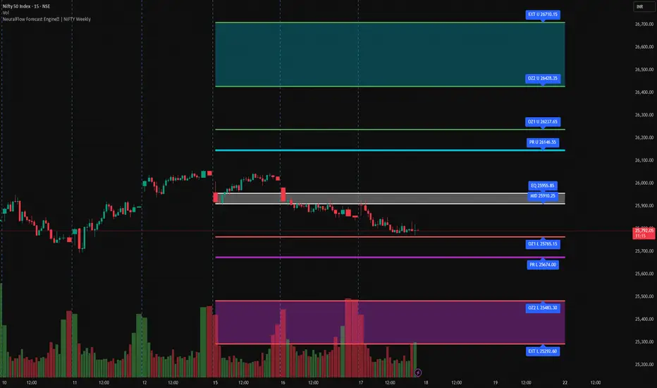
NeuralFlow Forecast Engine | NIFTY WeeklyAI-adaptive market equilibrium & expansion mapping. NeuralFlow doesn’t forecast by direction — it forecasts by where markets prefer to stabilize.
NeuralFlow Forecast Engine™ is a proprietary Artificial Intelligence framework trained to identify where price is statistically inclined to rebalance and where expansion zones historically exhaust rather than extend.
What the Bands Represent
Band Layer Meaning
AI Equilibrium (white core) Primary weekly balance zone where price is most likely to mean-revert
Predictive Rails (aqua / purple) High-confidence corridor of institutional flow containment
Outer Zones (green / red) Expansion limits where continuation historically decays
Extreme Zones (top/bottom) Rare deviation envelope where auction completion is statistically favored
NeuralFlow operates on proprietary, institution-grade Artificial Intelligence models trained specifically to map statistical rebalancing behavior, not trader predictions or sentiment. No discretionary drawing. No correlations. No lagging overlays.
This engine updates only when underlying structure changes — not when candles fluctuate intraday.
⚠ Risk & Use Notice
NeuralFlow Forecast Engine™ provides AI-derived structural zones, not trade signals or financial advice.
Markets can behave outside modeled distributions, especially during macro catalysts, thin liquidity, or surprise volatility events.
By loading or using this indicator, the user acknowledges full responsibility for any trades or outcomes based on its interpretation.
Educational & analytical use only. Not financial advice
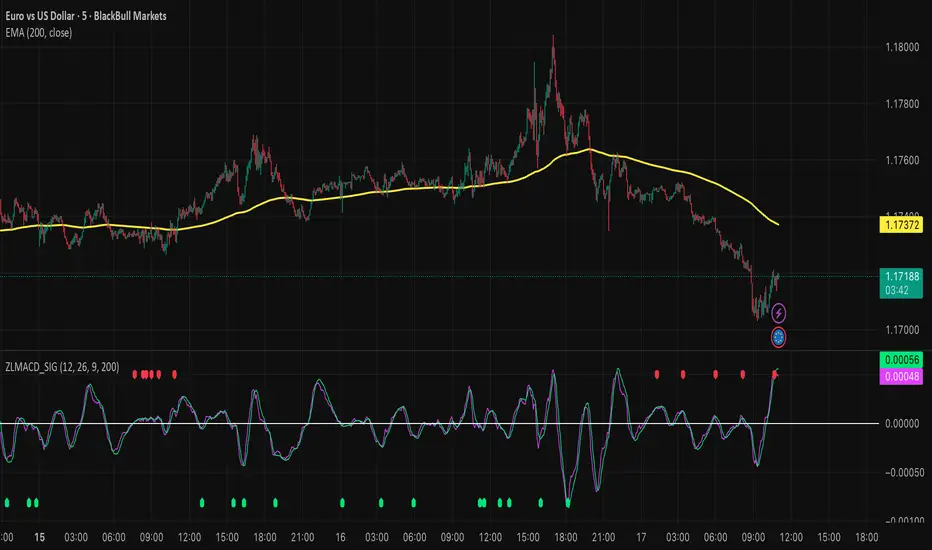
Zero Lag MACD and EMA 200 with SignalsZero Lag MACD with EMA Filter and Smart Signals
This indicator is an enhanced version of the traditional MACD that uses Zero Lag EMA calculations to provide faster and more responsive signals for scalping and day trading.
Key Features:
🎯 Zero Lag Technology - Uses double-smoothed EMA calculations to eliminate lag and provide earlier signals compared to standard MACD
📊 Clean Visualization - Displays histogram with MACD and Signal lines for clear trend analysis
🔍 Smart Signal Logic - Only shows valid trading signals based on strict conditions:
Buy Signal (Green dot at bottom): Triggers when price is above 200 EMA AND MACD crosses Signal line from below AND crossover occurs below zero line
Sell Signal (Red dot at top): Triggers when price is below 200 EMA AND MACD crosses Signal line from above AND crossover occurs above zero line
🔔 Built-in Alerts - Easy alert setup for both buy and sell signals so you never miss a trading opportunity
📈 200 EMA Filter - Incorporates trend filter to avoid counter-trend trades and improve signal quality
⚙️ Fully Customizable - Adjust all parameters:
Fast EMA Length (default: 12)
Slow EMA Length (default: 26)
Signal Length (default: 9)
EMA Filter Length (default: 200)
How to Use:
-Add the indicator to your chart
-Look for green dots (buy signals) when price is in an uptrend above 200 EMA
-Look for red dots (sell signals) when price is in a downtrend below 200 EMA
-Set up alerts by clicking "Create Alert" and selecting "Buy Signal" or "Sell Signal"
-Use signals in conjunction with your trading strategy and risk management
Best Practices:
-Works best on 1-15 minute timeframes for scalping
-Combine with support/resistance levels for confirmation
-Use proper stop-loss and take-profit levels
-Not all signals will be profitable - use proper risk management
-Signals are filtered to reduce noise and false entries
Color Scheme:
Histogram: Red (bearish) / Cyan (bullish)
MACD Line: Fuchsia/Pink
Signal Line: Lime/Green
Buy Signal: Green dot (bottom)
Sell Signal: Red dot (top)
This indicator is perfect for traders who want a cleaner, faster-responding MACD with built-in trend filtering and clear entry signals. Free to use and customize!
Delta Strength (True TV Delta)Description
Delta Strength measures the intensity of aggressive trading activity using TradingView’s native Volume Delta engine (ta.requestVolumeDelta).
Volume Delta shows which side is aggressive (buyers or sellers).
Delta Strength answers a different question:
How strong is that aggression compared to recent market behavior?
This indicator converts true per-bar volume delta into a relative strength ratio, helping identify institutional participation, initiative moves, absorption, and potential traps at key price locations.
No candle-based approximation is used. The calculation relies on TradingView’s internal bid-ask volume classification from lower timeframes.
How It Is Calculated
• Per-bar delta is derived from the difference between cumulative delta at bar close and bar open
• Absolute delta is averaged over a user-defined lookback period
• Current delta is compared against this average to produce a normalized strength value
This makes the indicator adaptive across instruments, volatility regimes, and sessions.
How to Read Delta Strength
• Values below the lower threshold indicate normal or low-quality activity
• Rising values show increasing professional participation
• Very high values indicate strong imbalance or aggressive initiative orders
• Extreme values without price follow-through often signal absorption or trapping
Delta Strength measures intensity only, not direction.
How to Use (Important)
Always combine Delta Strength with price location and structure.
Best locations include:
• VWAP and VWAP bands
• Previous Day High / Low
• Session highs and lows
• Range boundaries or value edges
Interpretation logic:
• Strong delta with price acceptance supports continuation
• Strong delta with price rejection suggests absorption or exhaustion
What This Indicator Is NOT
• Not a directional signal
• Not a standalone entry tool
• Not a trend indicator
Using Delta Strength without context can lead to false conclusions.
Intended Use
This indicator is designed for:
• Order Flow Analysis
• Market microstructure study
• Institutional activity confirmation
• Advanced discretionary trading workflows
It works best when combined with Volume Delta, VWAP, and structure-based analysis.
Summary
Delta shows who is aggressive.
Delta Strength shows how aggressive they are.
Price reaction shows whether that aggression is accepted or absorbed.
Used together, they provide insight into market intent rather than just price movement.

MSP Multi-Time Frame Dashboard A precision market-context overlay for traders who need fast multi-timeframe clarity.
This dashboard displays trend, momentum, bias and RSI across four user-selectable timeframes — giving you a full market read at a glance, without flipping charts or manually analysing each timeframe.
Key Features
4-TF visual dashboard (fully user-configurable)
Trend bias via EMA structure (21/55 default)
Momentum bias via RSI thresholds (Bull >60 / Bear <40)
Per-TF bias score (–2 to +2)
Combined Total Bias score (–8 to +8) with emoji + word label
Bias strength bar meter for instant context
Background-color market sentiment shading
Built-in alignment alert conditions (Bull/Bear total-bias triggers)
How the engine reads the market
Each timeframe is processed individually:
Metric Method Output
Trend Fast vs Slow EMA 🟢 / 🔴 / 🟡
Momentum RSI regime 📈 / 📉 / ➖
Bias Trend + Momentum −2 → +2 per TF
Total Bias Sum of all TF scores Market direction & strength
Bullish Alignment = multiple TFs trending + RSI holding strength
Bearish Alignment = EMAs stacked down + weak RSI environment
Mixed/Chop = conflict between momentum + structure
This keeps you away from low-quality reversals and favours trades in the direction of flow.
🏁 Best used for
✔ Scalpers confirming higher-TF direction
✔ Daytraders timing entries with momentum shifts
✔ Swing traders filtering chop vs trend continuation
✔ System traders needing rule-based directional context
❗ Not a standalone entry system — context tool only
🔔 Alerts Included
Bullish Alignment Trigger → TotalBias ≥ threshold
Bearish Alignment Trigger → TotalBias ≤ threshold
Set once — get notified when the market syncs into opportunity.

EMA SMA Rhythmic Lite Public V1.1 by SRTEMA SMA Rhythmic Lite Public V1.1 by SRT
A clean, lightweight trend-rhythm engine designed for traders of all levels. Built on a robust combination of EMAs and SMAs, this indicator provides clear directional bias signals while remaining fully non-repainting.
Key Features:
Multi-Timeframe Friendly: Works seamlessly on M1 to Daily (D) charts. MA stacking and signal logic automatically adapt to any timeframe.
Bias Detection: Determines bullish, bearish, or neutral market conditions using a 4-MA stack.
Engulfing Bar (EB) & Long-Tail Body (LTB) Detection: Highlights strong price action setups, filtered by body size and ATR-based thresholds.
Flush Markers: Visual cues showing where price aligns with MA stack for trend confirmation.
Bias Table: Displays current MA bias and presence of LTB on the chart for at-a-glance clarity.
Advanced Alerts:
Flush Alerts: Trigger when MA stack aligns with price, signaling trend continuation.
Combo Alerts: Trigger when EB or LTB appears in alignment with MA bias.
LTB-only Alerts: For monitoring significant price action reversals.
Customizable Visualization: Colors, widths, and visibility of all MAs, labels, and flush dots can be tailored to your preference.
Why Lite?
This is the most lightweight version in the SRT rhythm series, optimized for any timeframe, from scalping to swing trading. Perfect for traders who want a clear bias engine without unnecessary complexity.
If you like this EMA SMA Rhythmic Lite, you may also explore:
▶ H1 Bias Rhythmic Lite Public (Free)
▶ SRT Premium Series
Invite-only advanced indicators with stronger bias enforcement and execution frameworks.

Liquidity Sell Signal V2 [StrategyLAB_]Liquidity Sell Signal V2
Liquidity Sell Signal V2 is a TradingView indicator designed to help you spot high-probability Sell setups (reversal / pullback entries) using liquidity concepts around Buy-Side Liquidity (BSL) , combined with a bearish confirmation candle pattern.
OANDA:XAUUSD
This script will:
Automatically detect and plot BSL (Swing High) levels based on your selected Swing Strength.
Visually “fade” levels once price has broken above them.
Print a down triangle when a valid Bearish Liquidity Triangle forms at a qualified BSL area.
How it works
1) Identify Buy-Side Liquidity (BSL)
The indicator detects pivot highs using Swing Strength.
Each pivot high is drawn as a horizontal BSL level, keeping up to Max Buy Side Liquidity (BSL) Levels.
2) Bearish confirmation (Liquidity reaction)
A Sell signal triggers only when a bearish candle structure appears, suggesting strong selling pressure and a potential reversal after a liquidity sweep near/above BSL.
3) Noise filter (Avoid “body-cut” levels)
The script checks whether the BSL level has been repeatedly cut through candle bodies in prior bars.
If the level is considered “dirty” based on olderBodyLookback, it is filtered out to reduce false signals.
How to use
Suggested settings
Swing Strength
Lower (5–8): more levels, faster signals, but more noise.
Higher (12–20): fewer levels, cleaner zones, better for swing.
Max BSL Levels: increase if you want to keep more historical liquidity levels.
Filter lookback older bodies: increase to filter more aggressively (fewer signals, cleaner quality).
Entry idea (example)
Wait for a Sell triangle to appear (signal prints on candle close).
Prefer signals that align with:
a major swing high / key resistance,
clear rejection (wick / bearish reaction),
confluence with HTF supply, trendline, session, etc.
SL/TP idea (example)
SL: above the most recent swing high / above the BSL zone with a safety buffer.
TP: toward imbalance fill, previous lows (SSL), or a fixed RR such as 1:2 / 1:3.
Important notes
This is a probability tool, not a guaranteed signal.
Best results come from combining with market structure (BOS/CHOCH), supply/demand, HTF levels, and session context.
The script uses barstate.isconfirmed, so signals appear only after the candle closes (non-repainting signals).
OANDA:EURUSD

Jim Kombein PhD Mode mHFT Structure Invite OnlyThis is an original, invite-only market micro-structure and state visualization script
developed for private research and educational purposes.
The script is designed to help experienced users observe short-term price structure,
volatility-adjusted turning behavior, and local market state transitions on ETH-based charts.
It does not replicate or repackage any built-in TradingView indicators and is based on
proprietary logic developed independently.
Due to its experimental and research-oriented nature, access to this script is intentionally
restricted to a limited group of invited users only, in order to prevent misuse or
misinterpretation.
This script does not provide financial advice, automated trading, trade execution,
or guaranteed performance. All visual outputs are provided for informational and
educational reference purposes only. Final trading decisions remain entirely the
responsibility of the user.

SPX Volatility EngineWhy This Framework Exists
Intraday markets generate an abundance of information, but not clarity.
Volatility, structure, momentum, and internal conditions often provide conflicting signals in real time, leaving traders uncertain not about what they see, but about what matters now.
Most tools excel at measuring individual aspects of the market. Very few help resolve which information should be prioritized, suppressed, or deferred when conditions are misaligned.
The SVE Volatility Engine was built to address this specific problem:
to provide structured, real-time decision context so traders can understand when the market environment supports participation and when restraint is warranted.
________________________________________
How the SVE Volatility Engine Works (Conceptual)
SVE is a decision-support framework, not a signal generator.
Rather than presenting independent indicators side-by-side, the framework evaluates volatility state, structure, and directional behavior through a contextual hierarchy, emphasizing alignment over activity. Its purpose is to resolve ambiguity created when these dimensions disagree.
At a conceptual level, the framework:
• Interprets volatility regime and compression state to frame market pacing
• Evaluates directional behavior within structural context, not in isolation
• Classifies conditions based on environmental alignment, not indicator triggers
• Suppresses low-quality participation when contextual conflicts exist
The value of the framework lies in how market information is framed and filtered, not in any single calculation. This integration logic is the reason the script is maintained as closed source.
SVE does not attempt to predict outcomes.
It clarifies what type of market is currently present, allowing traders to adapt expectations and behavior accordingly.
________________________________________
What Appears on the Chart
When applied, the SVE Volatility Engine presents a unified on-chart framework that includes:
• A Heads-Up Display (HUD) summarizing directional bias, volatility environment, and contextual classification
• Contextual CALL / PUT markers that are classified, not blindly generated
• Structural reference zones used to frame directional interaction
• Real-time regime and alignment cues designed to support disciplined interpretation
A public companion indicator, SVE Compression Mirror (Companion), is available to display the same compression state and histogram context referenced by this framework in a dedicated lower pane.
Together, these elements provide clarity without clutter, emphasizing decision context rather than frequency.
________________________________________
Intended Use
The SVE Volatility Engine is designed for:
• Intraday traders who value context before conviction
• Discretionary traders seeking a rules-based framework to support judgment
• Professionals and advanced retail traders who prioritize clarity over signal volume
The framework is intended to support interpretation and decision discipline.
It does not provide trade entries, targets, or investment advice.
________________________________________
Access
This script is available by Invite-Only.
________________________________________
Disclaimer
This indicator is provided for informational and analytical purposes only and does not constitute investment advice.

Implicit Dolar MEPWhich stock or CEDEAR offers the best implied MEP dollar rate?
This indicator displays labels positioned at the level of the implied MEP dollar rate for the 10 equity instruments (stocks, CEDEARs and ETFs) with the highest trading volume in MEP dollars over the last month on the BYMA market.
The implied rate for each asset is calculated as the ratio between its price in ARS and its price in MEP dollars, for example:
GGAL / GGALD.
As a reference (benchmark), a white line is plotted representing the implied MEP dollar rate of the AL30 bond, calculated as AL30 / AL30D, which is the most liquid government bond in the BYMA market.
Settings
• The user may enter the ticker of any bi-currency instrument (fixed income or equity) to add its label to the chart.
Key information
An information box highlights:
• The asset with the most expensive implied dollar (Best SELL).
• The asset with the cheapest implied dollar (Best BUY).
Not an investment recommendation.
This information is provided for informational purposes only and does not constitute an offer, solicitation, or investment advice. Investment decisions are the sole responsibility of the investor.

Goldbach Continuum | PO3 Market FrameworkGoldbach Continuum is an indicator recreation and reinterpretation based on the original Goldbach Trifecta methodology and teachings developed by Hopiplaka.
The indicator applies Power of Three (PO3) dealing ranges to visualize institutional price cycles using Goldbach-based mathematical levels. Price is organized into Liquidity, Flow, and Rebalance layers, highlighting where liquidity is engineered, directional bias is established, and price temporarily pauses or redistributes risk.
This implementation was built to preserve the core structural logic of the original model while presenting it in a clear, modular, and execution-focused format. Each layer can be displayed independently, and an optional mini-map provides higher-timeframe context for multi-timeframe analysis.
This project is created with respect to the original framework and is intended as an educational and analytical recreation, not a replacement for the official Goldbach Trifecta indicator.
Credits & Acknowledgments
Original methodology and teachings: Hopiplaka
Framework & code implementation: Noctis
Official reference: hopiplaka.gumroad.com

Goldbach TrifectaGoldbach Trifecta applies Power of Three (PO3) dealing ranges to map institutional price cycles using mathematically derived Goldbach-based levels.
Price is structured into three purpose-driven layers — Liquidity, Flow, and Rebalance — helping traders visualize where liquidity is engineered, bias is defined, and price pauses or redistributes risk with precision. Each layer can be displayed independently, and an optional mini-map provides higher-timeframe structural context at a glance.
This model builds on the foundational teachings of Hopiplaka, whose original Goldbach framework revolutionized how traders interpret engineered price cycles — thank you for the core insights and methodology. The underlying code structure and implementation were developed by Noctis, bringing this advanced framework to life in an easy-to-use indicator.
Credits: Hopiplaka (original founder & methodology), Noctis (framework development)
Reference: hopiplaka.gumroad.com

TASC 2026.01 The Reversion Index█ OVERVIEW
This script implements the Reversion Index as presented by John F. Ehlers in the January 2026 edition of the TASC Traders' Tips , "Identifying Peaks And Valleys In Ranging Markets”. This indicator was created to provide timely buy and sell signals for mean reversion strategies.
█ CONCEPTS
Ehlers came up with the idea for the Reversion Index following the development of the "Continuation Index" (featured in the September 2025 edition). While the Continuation Index provides indications for trend onset, continuation, and exhaustion; the Reversion Index serves as its counterpart for mean-reversion trading.
The raw Reversion Index value is calculated as the net change in price normalized to the sum of the absolute value of change in price over the same period; for clarity, it is then smoothed using Ehlers' SuperSmoother.
The Smooth Reversion Index value is led by a "Trigger" line, which is created by smoothing the raw data to half the smoothing period of the smoothed index.
Note: Ehlers suggests the smoothing lengths be left at 8 and 4 (Reversion Index & Trigger). For this reason these lengths are hard-coded in the script but can be easily modified in the code.
█ USAGE
In order to identify peaks and valleys effectively, the "Length" should ideally be set to half of that of the expected cycle of the data. If the expected cycle of your trading data is 20 bars, a 10 bar length should be set.
Note: The Reversion Index is intended to identify peaks and valleys within a cycle, not over a large sample period. Ehlers suggests that this would create an estimation of trend, which is not the goal here.
Once the length is set, peaks and valleys are interpreted as the cross of the "Trigger" and "Smooth" lines.

GruxxFX EMA Rejection + SMC Bias Kit (v6)new indicator / alert kit for ema20/50 rejection, stay in until alert tells you otherwise, move sl's to break even.

ICT MTF FVG BPR Toolkit [D4A}The ICT MTF FVG BPR Toolkit encompasses the following 5 components:
- Fair Value Gaps - current timeframe
- Fair Value Gaps - higher timeframe
- BPR - Balanced Price Range
- Long Wicks - which are considered to be gaps by ICT
- Immediate Rebalance - it leaves no gaps, but is as important in assessing current workflow
This is advanced Fair Value Gaps script that uses trading methodology taught by ICT trader. To use it effectively it requires at least some basic knowledge of Smart Money Concepts (SMC) as outlined in ICT's lectures found on YT. I may publish another SMC related scripts in future if this kind of tool is useful to anybody.
The idea behind this work, is to have all the necessary tools related to Fair Value Gaps in one script that is easy to use (requires SMC knowledge), fully customizable and will keep the chart as clutter free as possible. Since, I could not find a ready-made script which would tick all my requirements, I created this new script, partially by borrowing some ideas and code from existing open source projects that I liked. Rather than re-inventing the wheel, I focused on adopting and improving existing solutions and have them work together in one tool that could present the information accurately and in a polished way, where the trader can customize almost everything. Full credit goes to other coders, who tackled this subject before me, but particularly to:
QuantVue
LuxAlgo
pmk07
The script have these unique features:
- Can present FVGs from up to 3 different timeframes at any given interval
- The amount and interval of higher timeframe FVGs is fully customizable
- FVGs can be displayed based on size
- Volume Imbalance can be included as part of FVG (as recommended by ICT)
- Higher timeframe FVGs can have quadrants displayed along with C.E. (based on ATR filter)
- Both current and higher timeframe FVGs can be displayed in different ways depending on price interactions
- BPR which works on current timeframe only
- Long Wick detection logic has been slightly changed from the original LuxAlgo code
- Immediate Rebalance code has been simplified and re-focused on clarity
-----------------
Disclaimer
The information contained in my Scripts/Indicators/Ideas/Algos/Systems does not constitute financial advice or a solicitation to buy or sell any securities of any type. I will not accept liability for any loss or damage, including without limitation any loss of profit, which may arise directly or indirectly from the use of or reliance on such information.
All investments involve risk, and the past performance of a security, industry, sector, market, financial product, trading strategy, backtest, or individual's trading does not guarantee future results or returns. Investors are fully responsible for any investment decisions they make. Such decisions should be based solely on an evaluation of their financial circumstances, investment objectives, risk tolerance, and liquidity needs.
My Scripts/Indicators/Ideas/Algos/Systems are only for educational purposes!

SMC Academy [PhenLabs]📊 SMC Academy
Version: PineScript™ v6
📌 Description
The SMC Academy indicator is a comprehensive educational tool designed to demystify Smart Money Concepts (SMC) for traders of all levels. Unlike standard indicators that simply print signals, this script uses a “Learning Phase” system that allows users to toggle between individual concepts—such as Market Structure, Liquidity, Imbalances, and Order Blocks—or view them all simultaneously. It lets you focus on one piece of the puzzle at a time.
🚀 Points of Innovation
Progressive Learning Modes: Toggle between 5 distinct phases to master concepts individually before using the Full Strategy Mode.
Educational Tooltips: Hover over labels to read detailed explanations of why a BOS, MSS, or Liquidity zone was identified.
Smart Filtering: Uses ATR and Volume integration to filter out low-quality Fair Value Gaps and weak Order Blocks.
HTF Dashboard: A built-in panel analyzes Higher Timeframe (4H) data to ensure you are trading in alignment with the broader trend.
🔧 Core Components
Market Structure Engine: Automatically detects Swing Highs and Lows to map out market direction using configurable swing lengths.
Liquidity Manager: Identifies unmitigated swing points that serve as Buy-Side (BSL) and Sell-Side (SSL) liquidity magnets.
Imbalance Detector: Highlights Fair Value Gaps (FVG) where price inefficiencies exist, using ATR thresholds to ignore noise.
Order Block Identifier: Locates the specific candles responsible for structure breaks, validated by volume analysis.
🔥 Key Features
Break of Structure (BOS): Automatically marks trend continuation signals with solid lines and color-coded labels.
Market Structure Shift (MSS): Identifies potential trend reversals when significant swing points are breached.
Dashboard Context: Displays the current trend direction and the 4H context directly on your chart.
Custom Alerts: Built-in alert conditions for structure breaks and new Order Blocks allow for automated tracking.
🎨 Visualization
Structure Lines: Solid lines indicate confirmed breaks (Green for Bullish, Red for Bearish).
Liquidity Zones: Dotted lines extending rightward indicate resting liquidity levels that price may target.
FVG Boxes: Shaded boxes highlight imbalance zones, automatically extending for a user-defined number of bars.
Dashboard: A clean, non-intrusive table in the top-right corner displays trend status and active mode.
📖 Usage Guidelines
Setting Categories
Learning Mode: Select from ‘1. Market Structure’ through ‘5. Full Strategy Mode’ to filter what appears on the chart.
Swing Detection Length: Default (5). Determines the sensitivity of the swing high/low detection.
Structure Break Type: Options (Close/Wick). Choose whether a candle close or just a wick is required to confirm a break.
Min FVG Size: Default (0.5 ATR). Filters out gaps smaller than this multiplier to reduce noise.
Filter Weak OBs by Volume: Default (True). Only highlights Order Blocks where volume exceeds the 20-period average.
✅ Best Use Cases
Educational Study: Isolate “Phase 1: Market Structure” to practice identifying trend changes without distraction.
Trend Following: Use “Phase 3: Imbalances” to find entry points within an established trend.
Reversal Trading: Combine “Phase 2: Liquidity” and “Phase 4: Order Blocks” to catch reversals at key levels.
⚠️ Limitations
Subjectivity: Market structure can be interpreted differently depending on the swing length settings used.
Ranging Markets: Like all trend-following concepts, false BOS/MSS signals may generate during choppy, sideways price action.
Repainting: While the signals are non-repainting once confirmed, the live candle may flash a signal before the close if “Close” mode is selected.
💡 What Makes This Unique
Interactive Learning: The inclusion of tooltip explanations transforms this from a simple tool into an active mentor.
Phase-Based Workflow: The ability to strip the chart back to basics at the click of a button is unique to the PhenLabs ecosystem.
🔬 How It Works
Swing Analysis: The script calculates pivot highs and lows based on your length input to define the structural landscape.
Break Validation: It checks if price crosses these pivot points to trigger BOS (Continuation) or MSS (Reversal) logic.
Volume Confirmation: For Order Blocks, it looks back inside the swing leg to find the specific candle responsible for the move, verifying it has significant volume.
💡 Note:
For the best experience, start in Phase 1 to calibrate your Swing Detection Length to the specific volatility of the asset you are trading before enabling Full Strategy Mode.

RS High Beta Exposure | QuantLapseRS High Beta Exposure | QuantLapse
Conceptual Foundation and Innovation
The RS High Beta Exposure indicator from QuantLapse is a comprehensive multi-asset allocation and momentum-ranking system that integrates beta and trend analysis, pairwise relative strength comparison, and volatility-adjusted filtering.
Its objective is to identify dominant crypto assets while dynamically reallocating High Beta exposure based on a calculated relative strength. The objective is to integrate trend analysis along with volatility filtering to these pairs to determine its relative strength.
At its core, RS High Beta Exposure indicator measures the systematic (β) performance of each asset relative to other assets provided combining these measures with inter-asset ratio trends to determine which assets exhibit superior strength and momentum relative to the other assets.
This integration of relative strength comparison, and trend and filtering analysis represents a quantitative evolution of traditional relative strength analysis, designed for adaptive asset rotation across major cryptocurrencies.
Technical Composition and Calculation
The indicator is structured around three major analytical layers:
1. Beta and Alpha Analysis
-Each asset’s return is decomposed into systematic components relative to the other assets by using a trend based, volatility filtering model.
-Assets with the highest point on a relative strength basis above the median are considered outperformers and eligible for allocation.
2. Pairwise Ratio Momentum
-Every asset is compared against all others through a ratio-trend, where momentum based trend scores quantify the directional momentum between each pair.
-In addition, we filter any false signals with volatility adjusted trends in which ensure high quality signals.
3. High Confidence Ranking
-Using the Pairwise Momentum signals, the RS High Beta Exposure scores them. If the asset comparison is given a signal, the RS High Beta Exposure scores points for each asset.
-If the total points of an asset is 5, its given the rank the dominant asset and is most likely to outperform.
By combining these layers, RS High Beta Exposure determines not only which assets is the strongest but also which assets to be invested.
User Inputs and Feature Adaptability
The indicator includes set of customizable parameters to support portfolio and risk management preferences:
Start Date Filter – Defines the beginning of live strategy evaluation.
Display Options – Able to change the location of the RS Table, Background and equity color.
Asset Selection – Modify or replace up to six crypto assets in the ranking matrix
asset1 = input.symbol("CRYPTO:XRPUSD", title ="Asset 1")
asset2 = input.symbol("CRYPTO:BNBUSD", title ="Asset 2")
asset3 = input.symbol("CRYPTO:ADAUSD", title ="Asset 3")
asset4 = input.symbol("CRYPTO:DOGEUSD", title ="Asset 4")
asset5 = input.symbol("CRYPTO:XLMUSD", title ="Asset 5")
asset6 = input.symbol("CRYPTO:LINKUSD", title ="Asset 6")
Each module operates cohesively to maintain analytical transparency while allowing user-level control over system sensitivity and behavior.
Real World, Practical Applications
The RS High Beta Exposure indicator is designed for systematic traders and quantitative portfolio managers who seek a disciplined framework for dynamic crypto asset rotation.
Key applications include:
High-Beta Asset Identification: Systematically identify crypto assets exhibiting relative dominance and stronger momentum characteristics versus peers within the comparison set.
Rule-Based Portfolio Rotation: Reallocate exposure toward leading assets using objective pairwise signals, reducing emotional decision-making and FOMO-driven trades.
Trend-Aligned Risk Participation: Employ the pairwise relative strength model to maintain exposure only during favorable momentum conditions, helping avoid prolonged participation in weak or deteriorating trends.
By combining relative strength comparisons with trend-aware filtering, this framework bridges quantitative finance and market regime analysis, providing a structured, data-driven approach to crypto asset allocation.
Advantages and Strategic Value
RS High Beta Exposure goes beyond conventional relative strength tools by integrating multi-asset comparison, ratio-based dominance scoring, and volatility-aware regime filtering into a single coherent framework.
By employing a three-layer confluence model — combining trend integrity, relative performance attribution, and volatility-state confirmation — the system improves the reliability of rotation and trend-following decisions.
The model is particularly valuable for traders seeking to:
Mitigate drawdowns while participating in higher-beta assets through regime-aware exposure control.
Identify persistent outperformers early in emerging market trends.
Maintain capital exposure only when statistical and momentum conditions signal elevated confidence.
The inclusion of visual allocation tables and a dynamic alert system makes RS High Beta Exposure both transparent and actionable, supporting discretionary analysis as well as systematic or automated trading workflows.
Alerts and Visualization
The script delivers clear, intuitive visual cues and alert-based feedback to support real-time decision-making:
Color-coded background states visually indicate the current allocation regime.
Allocation labels and summary tables display the dominant asset and its relative strength in real time.
An integrated alert system automatically notifies users whenever allocation states change (e.g., “100% XRP” or “100% CASH”).
Together, these visualization and alert features make RS High Beta Exposure both analytically rigorous and easy to interpret, even in fast-moving live market conditions.
Summary and Usage Tips
RS High Beta Exposure is an advanced interpretation of relative strength analysis, blending pairwise momentum comparisons, multi-asset dominance scoring, and adaptive volatility filters into a disciplined framework for crypto asset rotation.
By combining cross-asset selection with systematic allocation logic, the indicator helps traders determine when to be exposed, which asset demonstrates leadership, and when to step aside during unfavorable conditions. The model is best applied on the 1D timeframe, where its structure is optimized for identifying sustained leadership rather than short-term price noise. For broader context and confirmation, it can be used alongside other QuantLapse systematic models at the portfolio level.
Note: Past performance does not guarantee future results. This indicator is intended for research and educational use within TradingView.
