DataChartLibrary "DataChart"
Library to plot scatterplot or heatmaps for your own set of data samples
draw(this)
draw contents of the chart object
Parameters:
this : Chart object
Returns: current chart object
init(this)
Initialize Chart object.
Parameters:
this : Chart object to be initialized
Returns: current chart object
addSample(this, sample, trigger)
Add sample data to chart using Sample object
Parameters:
this : Chart object
sample : Sample object containing sample x and y values to be plotted
trigger : Samples are added to chart only if trigger is set to true. Default value is true
Returns: current chart object
addSample(this, x, y, trigger)
Add sample data to chart using x and y values
Parameters:
this : Chart object
x : x value of sample data
y : y value of sample data
trigger : Samples are added to chart only if trigger is set to true. Default value is true
Returns: current chart object
addPriceSample(this, priceSampleData, config)
Add price sample data - special type of sample designed to measure price displacements of events
Parameters:
this : Chart object
priceSampleData : PriceSampleData object containing event driven displacement data of x and y
config : PriceSampleConfig object containing configurations for deriving x and y from priceSampleData
Returns: current chart object
Sample
Sample data for chart
Fields:
xValue : x value of the sample data
yValue : y value of the sample data
ChartProperties
Properties of plotting chart
Fields:
title : Title of the chart
suffix : Suffix for values. It can be used to reference 10X or 4% etc. Used only if format is not format.percent
matrixSize : size of the matrix used for plotting
chartType : Can be either scatterplot or heatmap. Default is scatterplot
outliersStart : Indicates the percentile of data to filter out from the starting point to get rid of outliers
outliersEnd : Indicates the percentile of data to filter out from the ending point to get rid of outliers.
backgroundColor
plotColor : color of plots on the chart. Default is color.yellow. Only used for scatterplot type
heatmapColor : color of heatmaps on the chart. Default is color.red. Only used for heatmap type
borderColor : border color of the chart table. Default is color.yellow.
plotSize : size of scatter plots. Default is size.large
format : data representation format in tooltips. Use mintick.percent if measuring any data in terms of percent. Else, use format.mintick
showCounters : display counters which shows totals on each quadrants. These are single cell tables at the corners displaying number of occurences on each quadrant.
showTitle : display title at the top center. Uses the title string set in the properties
counterBackground : background color of counter table cells. Default is color.teal
counterTextColor : text color of counter table cells. Default is color.white
counterTextSize : size of counter table cells. Default is size.large
titleBackground : background color of chart title. Default is color.maroon
titleTextColor : text color of the chart title. Default is color.white
titleTextSize : text size of the title cell. Default is size.large
addOutliersToBorder : If set, instead of removing the outliers, it will be added to the border cells.
useCommonScale : Use common scale for both x and y. If not selected, different scales are calculated based on range of x and y values from samples. Default is set to false.
plotchar : scatter plot character. Default is set to ascii bullet.
ChartDrawing
Chart drawing objects collection
Fields:
properties : ChartProperties object which determines the type and characteristics of chart being plotted
titleTable : table containing title of the chart.
mainTable : table containing plots or heatmaps.
quadrantTables : Array of tables containing counters of all 4 quandrants
Chart
Chart type which contains all the information of chart being plotted
Fields:
properties : ChartProperties object which determines the type and characteristics of chart being plotted
samples : Array of Sample objects collected over period of time for plotting on chart.
displacements : Array containing displacement values. Both x and y values
displacementX : Array containing only X displacement values.
displacementY : Array containing only Y displacement values.
drawing : ChartDrawing object which contains all the drawing elements
PriceSampleConfig
Configs used for adding specific type of samples called PriceSamples
Fields:
duration : impact duration for which price displacement samples are calculated.
useAtrReference : Default is true. If set to true, price is measured in terms of Atr. Else is measured in terms of percentage of price.
atrLength : atrLength to be used for measuring the price based on ATR. Used only if useAtrReference is set to true.
PriceSampleData
Special type of sample called price sample. Can be used instead of basic Sample type
Fields:
trigger : consider sample only if trigger is set to true. Default is true.
source : Price source. Default is close
highSource : High price source. Default is high
lowSource : Low price source. Default is low
tr : True range value. Default is ta.tr
Datascience

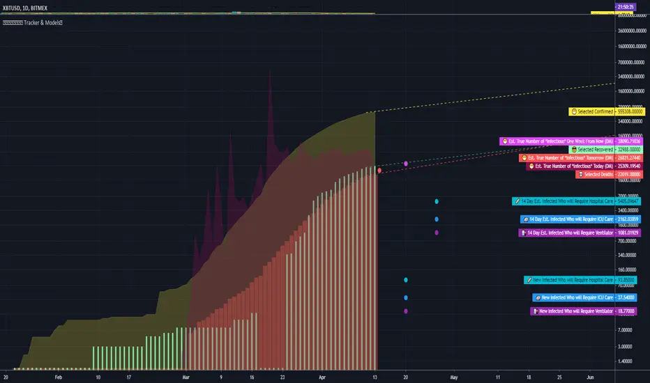
COVID Statistics Tracker & Model Projections by Cryptorhythms😷 COVID-19 Coronavirus Tracker & Statistics Tools by Cryptorhythms 😷
📜Intro
I wanted to put some more meaning behind the numbers for 2020's Covid pandemic. I hope this tool can help people analyze and deal with these hard times. With these metrics I hope to give greater depth and dimension to whats available. While also at the same time creating something that looks decently presentable and gives actionable information.
I had planned on including a few forecasting models and letting the user play with values to see how social distancing works. But alas I couldnt complete those in the scope of time I gave myself for the indicator. If you are interested in collaborating on it, I will share what I have with you and we can further work on it.
📋Description
The script contains 3 main parts you will interact with. I suggest you enable the chart labels for "indicator name" and "indicator last value" to make the charts more readable (right click on the scale of your chart and goto the "labels" pop out menu). Depending on what plots and data you choose to chart, logarithmic and regular scales can both be applied in different situations. To get similar visuals to the examples I will show below, you can goto the indicator options > style tab. I then play with the line styles, colors and transparencies to achieve the nice looking charts. Please also note there is a distinction between "Infected" and "Infectious". A model telling you the number of infected doesnt designate whether that person can still pass the virus on to others (infectious). So Infectious numbers are usually lower than total confirmed, but this isnt always the case if for example a country wasnt testing very much during the early phase or something else.
🚧Disclaimer
I am not a medical professional and none of this should be considered medical advice. All of the models, numbers and math I sourced from professional places but this is not a guarantee of the future only an approximation based on current information. Numbers change daily and so can these models!
🌐PART ONE
In this area you select a region to read the proper statistics data from tradingview. You can do global totals, country totals, or for a few places (AU, CA, CN, US) you can see state/province totals. Remember to SELECT ONLY ONE region.
🧮PART TWO
The Plots/Stats/Data section includes:
1. ) Plot the Days to Double Number of Confirmed
2. ) Plot the Infection Growth Ratio
3. ) Plot Fatality Risk Rate (Total Deaths / Total Outcomes)
4. ) Plot Overall Fatality Rate / Recovery Rate
5. ) Plot % of World Infected & % of USA Infected
6. ) Plot Daily New Deaths, Confirmed & Recovered
7. ) Plot Daily Change Percentages
🎱PART THREE
Forecasting Models and Settings:
1 .) Plot the % of Custom Population Infected (Vs. the Region Selected in Part 1 of Settings)
2 .) Plot the True Num. of Infectious (Death Model / DM)
3 .) Plot the Current and Next Weeks Cumulative Infection Projection (DM)
4 .) Plot Estimated Infection Rates? (DM)
5 .) Enable Basic Trajectory Projection?
6 .) Plot the Likelihood of > 0 **Infectious** in a Group (DM) for Today, Tomorrow and Next Week
7 .) Plot the True Num. of Infected (Confirmed/Tested Model)
8 .) Plot the Estimated Epidemiology for 7 and 14 Days Out (Hospital Beds, ICU Beds, Ventilator Units)
Planned But not completed
9.) SIR Epidemiology Model
10.) Exponential Growth Plot & Correlation
To use the Estimator for likelihood of Infected in N group of people you need to do 2 things. Select and use "Custom Population" as the population source for part 3. Then you need to enable "Custom Infected" as the source for the model. Then you enter your geographical area's population and confirmed cases. Its best to goto the smallest / most granular level of data available to accurately estimate the likelihood. So for instance in the order of least effective to most effective data source: global, country, state, county, city...etc.
If you do not understand what these terms or numbers represent, please read the source materials I have linked in the code, or use google. I dont have the time or expertise to explain all the various specific methods and terms included here. This entire project was a learning journey for me and I have zero experience in epidemiology so please excuse any errors I may have made. (and tell me, so I can change it!)
🔮Future Additions
If anyone has a model or stat they would like included I will be happy to add your code to this toolbox to make it more effective and give you credit here in the description. If you want to collaborate please message me.
📊Some Example Charts:
The Cryptorhythms Team wish you and your families all the absolute best of health!
P.S. Stay safe and act smart I dont think this will be the EOTW.