VIX Filter/RSI/EMA Bias/Cum-TICK w/ Exhaustion Zone DashboardThis all-in-one dashboard gives intraday traders a real-time visual read of market conditions, combining volatility regime, trend bias, momentum exhaustion, and internal strength — all in a fully customizable overlay that won’t clutter your chart.
📉 VIX Market Regime Detector
Identifies "Weak", "Normal", "Volatile", or "Danger" market states based on customizable VIX ranges and symbol (e.g., VXN or VIX).
📊 RSI Momentum Readout
Displays real-time RSI from any selected timeframe or symbol, with adjustable length, OB/OS thresholds, and color-coded exhaustion alerts.
📈 EMA Trend Bias Scanner
Compares fast and slow EMAs to define bullish or bearish bias, using your preferred timeframe, symbol, and EMA lengths — ideal for multi-timeframe setups.
🧠 Cumulative TICK Pressure & Exhaustion Engine
Analyzes internal market strength using cumulative TICK data to classify conditions as:
-Strong / Mild Bullish or Bearish Pressure
-Choppy / No Edge
-⚠️ Exhaustion Zones — when raw TICK values hit extreme highs/lows, a separate highlight box appears in the dashboard, warning of potential turning points
All logic is customizable, including TICK symbol, timeframes, thresholds, and lookback periods.
Scalpers and day traders who want fast, visual insight into market internals, exhaustion, and trend bias.
Biasindicator

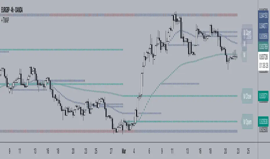
+ Time Weighted Average PriceThis is basically NeoButane's script (which should be more popular than it is) with a few additions, those being primarily plotted lines of the closing price of the previous TWAP, however I've also added the optionality of plotting a second TWAP of say, maybe a different resolution if you are so inclined. Also, you may plot shapes across the top or bottom of your chart color based on if current price is above or below the previous closing price of the TWAP, in case you might want to clean the chart up a bit and not plot the actual closing price lines.
But what is TWAP, exactly, you might be saying to yourself. If you're familiar with VWAP then you've probably a pretty good idea of what this is and how it works. TWAP is a calculation that defines the weighted average price over a specific time period. Traders use TWAP as a trading strategy, or more specifically, an execution strategy, to place large orders without excessively impacting the market price. They break down the large orders into several sets of small orders priced near TWAP. Basically it's VWAP but without the volume element, and most traders will likely use it in a similar fashion as they might use VWAP, and that is like a moving average--dynamic support and resistance.
I like to think of it as displaying a price range over a specified time period (such as a month or a week). This is why I think the closes of the previous period or two are so important. Losing the previous closing price or regaining it can often give you an inclination as to whether at least some of the next period (the one you're currently in) may be bearish or bullish.
Above is a more zoomed out view of ADA/USD
And here's the same image with just the closing price for the time period plotted.
Enjoy!