OPEN-SOURCE SCRIPT
업데이트됨 International [interest, exchange] rates

from my blog to quantguy :
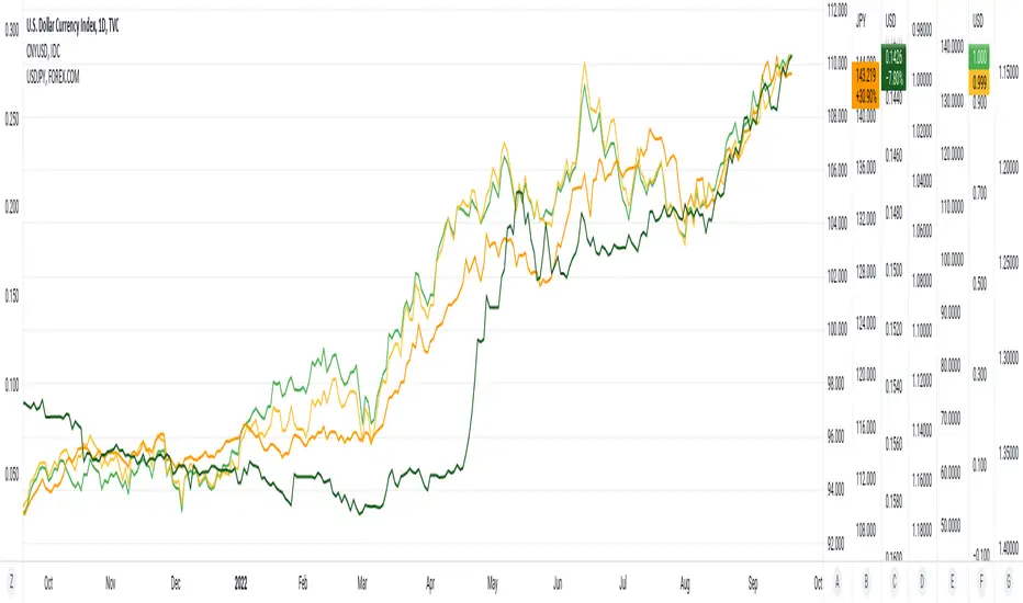
Below are links to a rapid-throw-together set of charts comparing [interest, exchange] rates internationally. There are probably millions of other graphs like this created by organisations and educationals institutes, but far more advanced and accurate. Even so, the graphs show the time relationship between [exchange, interest] rates, and are suggestive of some degree of correlation. No sense pushing this too far, it would be more fun to ferret out more of the network of inter-related factors. One possible current anomaly is the GBPUSD exchange rate?
The charts were generated using a simple PineScript (should be visible?)
// saved graphs - unfortunately, all of the colored labels on the graph were lost!!
// exchange rates are shown by darker colors, interest rates lighter similar colors
// China - green, Euro - purple, Great Britain - blue, Japan - orange (you can see this in the4 code below!)
// stable interest rates : [JP10Y, CN10Y]
// policy-manipulated interest rates : [TNX, EU10Y, GB10Y]
// maybe the "stable rates" countries do more "exchange rate" manipulation?
I haven't put in (min, max) interest rates for time periods EXCEPT for 6month & 1 year. the other periods will be erroneous (eg day, month, 3 month, 5 year, etc)
릴리즈 노트
20Sep2022 - This is an update of yesterday's Pine Script. I have simply provided additional constants for the (3M, 6M) time.periods, adding to constants for (1Y, 5Y) time.periods of yesterday. I did try to implement script to automatically provide the (min, max) of del_CN10Y = v_TNX - v_CN10Y (example), but PineScript does not work on full time-period information accurately, so I abandoned that. Below are links to a rapid-throw-together set of charts comparing rates internationally. There are probably millions of other graphs like this created by organisations and educationals institutes, but far more advanced and accurate. Even so, the graphs show the time relationship between rates, and are suggestive of some degree of correlation. No sense pushing this too far, it would be more fun to ferret out more of the network of inter-related factors. One possible current anomaly is the GBPUSD exchange rate?
// All manually-provided constants for del[Min, Max]_<sym>10Y will become inaccurate with time!!
// ONLY time.periods [3M, 6M, 1Y, 5Y] work.
// time.periods [1D, 5D, 1M, ALL] do NOT work - I haven't manually provided values from charts.
// there are some errors in my manually [read, record] of the 5Y time-periods
// additionally, this Pine Script was thrown together in a day, no rigorous testing
// exchange rates are shown by darker colors, interest rates lighter similar colors
// China - green, Euro - purple, Great Britain - blue, Japan - orange (you can see this in the4 code below!)
// stable rates : [JP10Y, CN10Y]
//
// policy-manipulated rates : [TNX, EU10Y, GB10Y]
//
오픈 소스 스크립트
트레이딩뷰의 진정한 정신에 따라, 이 스크립트의 작성자는 이를 오픈소스로 공개하여 트레이더들이 기능을 검토하고 검증할 수 있도록 했습니다. 작성자에게 찬사를 보냅니다! 이 코드는 무료로 사용할 수 있지만, 코드를 재게시하는 경우 하우스 룰이 적용된다는 점을 기억하세요.
면책사항
해당 정보와 게시물은 금융, 투자, 트레이딩 또는 기타 유형의 조언이나 권장 사항으로 간주되지 않으며, 트레이딩뷰에서 제공하거나 보증하는 것이 아닙니다. 자세한 내용은 이용 약관을 참조하세요.
오픈 소스 스크립트
트레이딩뷰의 진정한 정신에 따라, 이 스크립트의 작성자는 이를 오픈소스로 공개하여 트레이더들이 기능을 검토하고 검증할 수 있도록 했습니다. 작성자에게 찬사를 보냅니다! 이 코드는 무료로 사용할 수 있지만, 코드를 재게시하는 경우 하우스 룰이 적용된다는 점을 기억하세요.
면책사항
해당 정보와 게시물은 금융, 투자, 트레이딩 또는 기타 유형의 조언이나 권장 사항으로 간주되지 않으며, 트레이딩뷰에서 제공하거나 보증하는 것이 아닙니다. 자세한 내용은 이용 약관을 참조하세요.