PROTECTED SOURCE SCRIPT
E³ Trend Guard
We all need help staying in trades as long as possible, buckling down through those pesky pullback and consolidation periods, and this script really helps you gain some better insight!
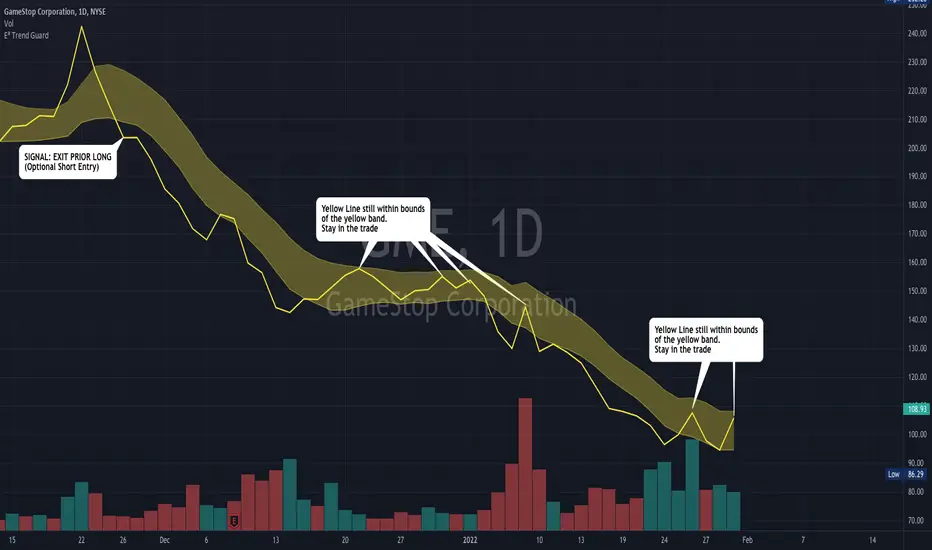
The TREND GUARD indicator is great for keeping you in trending trades through pullbacks and short consolidations. It is a STOP INDICATOR and helps you with your exits. It can work for Swing Trading on strongly trending stocks ( bullish and bearish ) as well as help you on intraday trades of the same. It can also be used to gain insight for entries (see below).
HOW TO USE:
FOR EXITS:
Once you've entered a trending stock that may be providing Alpha (excess returns or depreciation vs the market), you can use the strong Yellow line that is behind the candlesticks (see TIP #1 below) to keep you in your trade or inform you of when you should think about exiting. What you are looking for, is for the yellow line to not cross over to the other side of the yellow band from the "trending side" of your trade. In other words, when price is running up the band, similar to trading Bollinger Bands , or above the band, and the band is curving up or running upward as well, that can be considered "in trend" and LONG ( bullish ) in direction. The converse is true for "in trend" SHORT ( bearish ) direction.
FOR ENTRIES:
It wasn't built for entries, but users are reporting good results for using it for entries. The best technique for entry appears to be to allow the band to run sideways during a consolidation, then enter on the side where a strong breakout/down candle or price occurs through to outside the yellow band. This is very similar and indeed somewhat corresponds to entering breakouts of bases (sideways consolidation areas).
TIP
In order to see the strong yellow line (looks like a thread behind the candlesticks ), you have at least three choices:
Change your charts to LINE type on the CLOSE pricing;
Point at the indicator on the chart and it will highlight it and the line that is behind the Candlesticks will come forward
On the Data Information pane you can toggle HIDE candlesticks to see it more clearly
THE MECHANICS:
So what's going on behind the scenes here?
Instead of the traditional statistical band approach like Bollinger, or Keltner, or ATR bands, which all spread out from a "center line" (calculated as OHLC4, etc) ... I have instead created the upper band with a Moving Average of the Highs of each period (candle) and a lower band with a Moving Average of the Lows of each period (candle). I used the weighted moving average in order to make current pricing more relevant. And through backtesting I have found the ideal period to be 10.
CREDIT TO: The original Moving Average Ribbon by TradingView™
보호된 스크립트입니다
이 스크립트는 비공개 소스로 게시됩니다. 하지만 이를 자유롭게 제한 없이 사용할 수 있습니다 – 자세한 내용은 여기에서 확인하세요.
+517% in 1 year! 🏆 30+ yrs Experience🥇Top Verified Trader on Profit.ly/evanevans ⚡Day Trader, Swing Trader, Mentor
면책사항
해당 정보와 게시물은 금융, 투자, 트레이딩 또는 기타 유형의 조언이나 권장 사항으로 간주되지 않으며, 트레이딩뷰에서 제공하거나 보증하는 것이 아닙니다. 자세한 내용은 이용 약관을 참조하세요.