OPEN-SOURCE SCRIPT
업데이트됨 Move Magnitude Visualizer (beta)
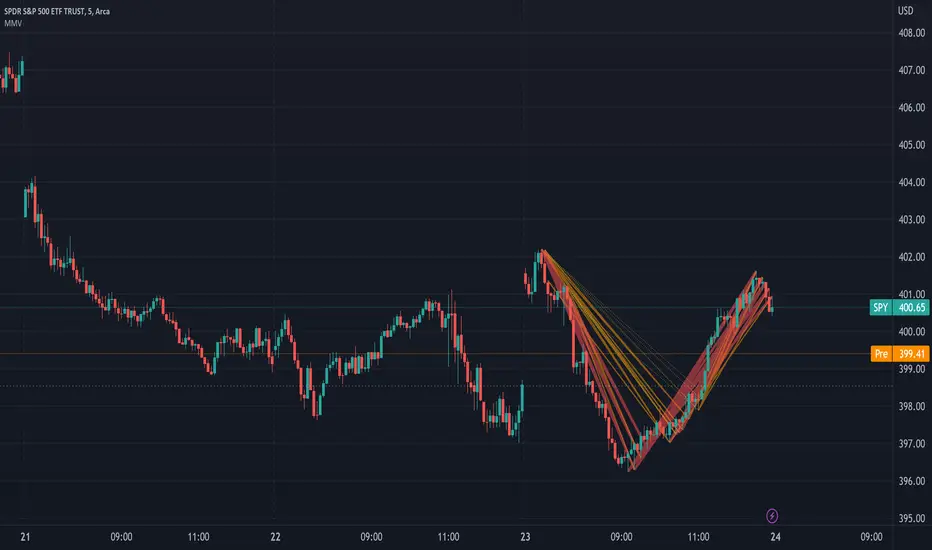
This experimental visualizer measures all price differences across a range of samples to determine what is normal for a measure of time. Based on whether a recent change in price over time has exceeded the norm, a line is drawn to indicate the magnitude/severity of that move. In short, it attempts to visualize when a move is outside the norm and when it may be risky to join that move.
In the end, I've always wanted a tool that gave me a visual warning to when a move is abnormally severe and shouldn't be trusted. RSI and other indicators only work with specific lengths, this attempt to be a deviation detector that isn't bound by length or time-frame.
- A thick red line = greater than 3 standard deviations.
- An orangish/goldish line = greater than 2 standard deviations.
- A thin dotted yellow = greater than 1 standard deviation.
In the end, I've always wanted a tool that gave me a visual warning to when a move is abnormally severe and shouldn't be trusted. RSI and other indicators only work with specific lengths, this attempt to be a deviation detector that isn't bound by length or time-frame.
- This is a work in progress, so feedback is appreciated. I don't have a strong idea yet how to properly visualize this data.
- It is very compute heavy and some users may experience timeouts. I've done everything I can think of to eliminate redundant computer and to optimize for PineScript.
릴리즈 노트
Allow for custom colors.오픈 소스 스크립트
트레이딩뷰의 진정한 정신에 따라, 이 스크립트의 작성자는 이를 오픈소스로 공개하여 트레이더들이 기능을 검토하고 검증할 수 있도록 했습니다. 작성자에게 찬사를 보냅니다! 이 코드는 무료로 사용할 수 있지만, 코드를 재게시하는 경우 하우스 룰이 적용된다는 점을 기억하세요.
면책사항
해당 정보와 게시물은 금융, 투자, 트레이딩 또는 기타 유형의 조언이나 권장 사항으로 간주되지 않으며, 트레이딩뷰에서 제공하거나 보증하는 것이 아닙니다. 자세한 내용은 이용 약관을 참조하세요.
오픈 소스 스크립트
트레이딩뷰의 진정한 정신에 따라, 이 스크립트의 작성자는 이를 오픈소스로 공개하여 트레이더들이 기능을 검토하고 검증할 수 있도록 했습니다. 작성자에게 찬사를 보냅니다! 이 코드는 무료로 사용할 수 있지만, 코드를 재게시하는 경우 하우스 룰이 적용된다는 점을 기억하세요.
면책사항
해당 정보와 게시물은 금융, 투자, 트레이딩 또는 기타 유형의 조언이나 권장 사항으로 간주되지 않으며, 트레이딩뷰에서 제공하거나 보증하는 것이 아닙니다. 자세한 내용은 이용 약관을 참조하세요.