PROTECTED SOURCE SCRIPT
Bimmeresty's MACD
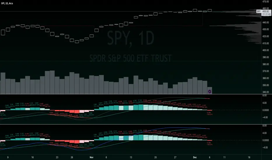
Improved MACD with labels on histogram and color change feature on signal line.
Labels on histogram help gauge how strong the change is rather than visually comparing heights.
example: "histogram just put in its first rising candle, but its only rising by 0.01 therefore i should be suspicious of it and possibly wait for a second rising candle for further confirmation of reversal"
Color change on signal slope is better for gauging the directional bias and spotting reversals.
example: "slope is red, so negative, so i should prioritize shorts"
example: "slope just turned green, so positive, so we might be reversing bias here"
보호된 스크립트입니다
이 스크립트는 비공개 소스로 게시됩니다. 하지만 이를 자유롭게 제한 없이 사용할 수 있습니다 – 자세한 내용은 여기에서 확인하세요.
면책사항
해당 정보와 게시물은 금융, 투자, 트레이딩 또는 기타 유형의 조언이나 권장 사항으로 간주되지 않으며, 트레이딩뷰에서 제공하거나 보증하는 것이 아닙니다. 자세한 내용은 이용 약관을 참조하세요.
보호된 스크립트입니다
이 스크립트는 비공개 소스로 게시됩니다. 하지만 이를 자유롭게 제한 없이 사용할 수 있습니다 – 자세한 내용은 여기에서 확인하세요.
면책사항
해당 정보와 게시물은 금융, 투자, 트레이딩 또는 기타 유형의 조언이나 권장 사항으로 간주되지 않으며, 트레이딩뷰에서 제공하거나 보증하는 것이 아닙니다. 자세한 내용은 이용 약관을 참조하세요.