OPEN-SOURCE SCRIPT
Dominance
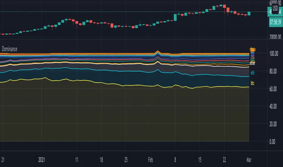
Hi!
A script where you can play with 'Dominance" to make things more clear.
Initially we'll get this,
all available % dominance of BTC/Alts,...:

We can set an EMA on it to smooth things out:

We can filter so we keep want we want to see:

Finally, we can adjust the ratio's, which makes comparisons easier

Do mind, when you do this, don't look at the numbers!
They are changed, only to make it visually easier to see what goes up and down
Also, when doing this it may happen that lines flow in each other
Either way, you can get something like this:

You can see when BTC gets the inflow from ALTS, and USDT, you'll see that BNB recently is getting bigger, more inflow of USDT for some time now, etc...
Have fun!
A script where you can play with 'Dominance" to make things more clear.
Initially we'll get this,
all available % dominance of BTC/Alts,...:
We can set an EMA on it to smooth things out:
We can filter so we keep want we want to see:
Finally, we can adjust the ratio's, which makes comparisons easier
Do mind, when you do this, don't look at the numbers!
They are changed, only to make it visually easier to see what goes up and down
Also, when doing this it may happen that lines flow in each other
Either way, you can get something like this:
You can see when BTC gets the inflow from ALTS, and USDT, you'll see that BNB recently is getting bigger, more inflow of USDT for some time now, etc...
Have fun!
오픈 소스 스크립트
트레이딩뷰의 진정한 정신에 따라, 이 스크립트의 작성자는 이를 오픈소스로 공개하여 트레이더들이 기능을 검토하고 검증할 수 있도록 했습니다. 작성자에게 찬사를 보냅니다! 이 코드는 무료로 사용할 수 있지만, 코드를 재게시하는 경우 하우스 룰이 적용된다는 점을 기억하세요.
Who are PineCoders?
tradingview.com/chart/SSP/yW5eOqtm-Who-are-PineCoders/
TG Pine Script® Q&A: t.me/PineCodersQA
- We cannot control our emotions,
but we can control our keyboard -
tradingview.com/chart/SSP/yW5eOqtm-Who-are-PineCoders/
TG Pine Script® Q&A: t.me/PineCodersQA
- We cannot control our emotions,
but we can control our keyboard -
면책사항
해당 정보와 게시물은 금융, 투자, 트레이딩 또는 기타 유형의 조언이나 권장 사항으로 간주되지 않으며, 트레이딩뷰에서 제공하거나 보증하는 것이 아닙니다. 자세한 내용은 이용 약관을 참조하세요.