Some basic tips on discovering trend changes using Point & Figure (PF) charts in conjunction with MACD and trendlines.
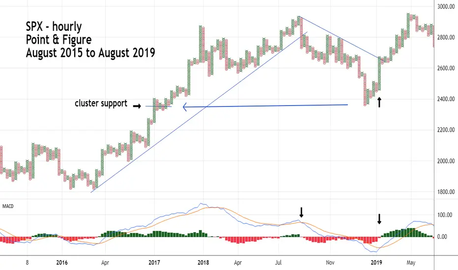
PF charts concentrate on price movements; therefore, the PF chart scale is smaller than when using Bar charts. For example, the SPX chart illustrated covers a period of three years. On a Bar chart weekly scale would be appropriate. With PF charts the scale is hourly in order to see greater detail.
MACD is a good indictor to use with PF charts because its movements are slower than many other price oscillators. This generates less signals, filtering out potential false signals.
Note the break below the multi-year trendline in October 2018 was confirmed by the MACD bearish lines crossover.
Also note that the late 2018 bottom corresponded with a prior PF price cluster of 4 – PF columns. Frequently price clusters can help identify support/resistance zones.
The rally in early 2019 was signaled first by an MACD bullish lines crossover, then confirmed with a trendline break.
면책사항
해당 정보와 게시물은 금융, 투자, 트레이딩 또는 기타 유형의 조언이나 권장 사항으로 간주되지 않으며, 트레이딩뷰에서 제공하거나 보증하는 것이 아닙니다. 자세한 내용은 이용 약관을 참조하세요.
면책사항
해당 정보와 게시물은 금융, 투자, 트레이딩 또는 기타 유형의 조언이나 권장 사항으로 간주되지 않으며, 트레이딩뷰에서 제공하거나 보증하는 것이 아닙니다. 자세한 내용은 이용 약관을 참조하세요.