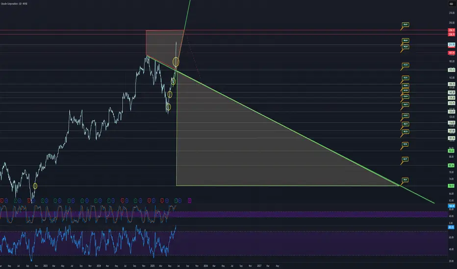
Stock Overview: Looks like Oracle Corporation is on the chart! We’re seeing a wild ride with some key patterns popping up.
Recent Trend: The stock’s been climbing steadily, but that shaded triangle (a descending wedge?) suggests a potential reversal or breakout. Keep an eye on it!
Resistance Level: That red line around 130-140 looks like a tough ceiling. Price has bounced off it a few times—might struggle to break through without strong momentum.
Support Zone: The green line sloping down shows a support trend. If it dips below, watch for a bounce around 100-110.
Indicators: Those lower charts (RSI and TRENDS) are wiggling a lot. RSI might be hinting at overbought conditions lately, so a pullback could be due.
Volume Check: Hard to tell without clear volume bars, but if volume spikes with a breakout above resistance, that’s a bullish sign!
My Take: This could go either way—breakout to new highs or a slide back to support. I’d wait for a clear move past 140 with volume to jump in, or a dip to 110 for a safer entry.
Next Steps: Let’s watch how it behaves this week (June 16, 2025). Want me to edit the chart or dig deeper? Just ask!
Careful, very few top side numbers left with lots of downside targets showing.
Price targets and trends marked on chart.
Follow for more charts like this.
Cashapp: $nicktussing
Venmo: @nicktussing
Donations appreciated, NOT AT ALL REQUIRED OR EXPECTED.
Venmo: @nicktussing
Donations appreciated, NOT AT ALL REQUIRED OR EXPECTED.
관련 발행물
면책사항
이 정보와 게시물은 TradingView에서 제공하거나 보증하는 금융, 투자, 거래 또는 기타 유형의 조언이나 권고 사항을 의미하거나 구성하지 않습니다. 자세한 내용은 이용 약관을 참고하세요.
Cashapp: $nicktussing
Venmo: @nicktussing
Donations appreciated, NOT AT ALL REQUIRED OR EXPECTED.
Venmo: @nicktussing
Donations appreciated, NOT AT ALL REQUIRED OR EXPECTED.
관련 발행물
면책사항
이 정보와 게시물은 TradingView에서 제공하거나 보증하는 금융, 투자, 거래 또는 기타 유형의 조언이나 권고 사항을 의미하거나 구성하지 않습니다. 자세한 내용은 이용 약관을 참고하세요.